A true Apple TV enthusiast can be identified by the plethora of installed apps on their Apple TV. But among the numerous apps installed to your user’s Apple TV are five apps that hold an elevated standing. The user explicitly chooses these apps to reside in a place of privilege on their Apple TV screen: the top shelf.
This space gives you, the developer, an opportunity to showcase what your app’s all about. Think of the top shelf as a billboard to show exceptional content from your app. When one of the top shelf apps in the top row gains focus, the entire top half of your user’s TV populates with one or more banners to charm your users:
A good top shelf is visually appetizing, while a great top shelf is visually appetizing and functionally appealing. In this chapter, you’ll learn how to master the top shelf, and give your future tvOS blockbuster app a decisive edge over other apps in the marketplace!
Getting Started
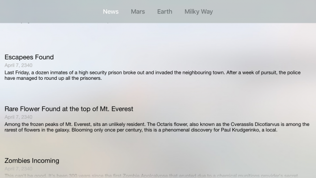
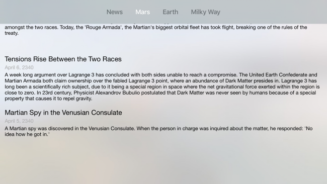
Start by retrieving the starter project for this chapter. Build and run your app, and you’ll see the following:
Imagine it’s the year 2340, and that the Apple TV and Swift are so popular they’re still in use despite over 300 years of technological advancement. The project in this chapter is a news app that showcases the latest news in the galaxy. Like other news apps, there are a variety of topics sectioned into their own tabs. At launch, the app shows the user the top news from every category, and subsequent tabs showcase all the news attributed with the topic:
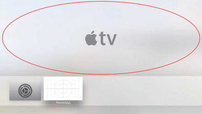
Press Command+Shift+H to bring your tvOS simulator back to the home page. You’ll begin by putting your news app into your top row of apps to expose it in the top shelf.
Bring up the tvOS simulator controller by pressing Command+Shift+R. Navigate to your news app by holding the Option key in your keyboard while making swipe motions with your mouse indicator on top of the tvOS simulator controller.
Once you brought the focus to your news app, click and hold on the touch area until the app icon starts wiggling. Bring the app to the highest row of apps and tap on the tvOS controller. Your app should now reveal its top shelf when you bring it in focus. Right now, it will appear as a blank canvas:
That wouldn’t win over any galactic news fans, in any universe! A good logo and good branding go a long way; in the case of the Apple TV, that extends beyond the app icon. In fact, Apple enforces this: you must provide a top shelf image before you can export your app to production servers. A top shelf image is a 1920×720 widescreen graphic you’ll need to add to the assets catalog.
Adding a Static Image
Later in this chapter, you’ll learn how to create an interactive top shelf, but it’s baby steps for now. You’ll start by implementing the minimum acceptable top shelf: a high quality 1920 x 720 .png image relevant to your app.
Open the resources folder from this chapter’s resources and locate StaticTopShelf.png. Drag and drop this image into your Assets.xcassets folder in the Top Shelf Image compartment:
Ensure your app is still within the top row of apps, then build and run your project. Press Command+Shift+H to return to the home screen, then navigate to your app and you should see your top shelf image in all its glory:
Right now, your top shelf consists of a single banner that acts as a symbol for your app. While that’s great and all, the usability of the top shelf extends far beyond being a “second app icon”. In the following section, you’ll learn how to develop for the interactive top shelf.
An Interactive Top Shelf
There are currently two different interactive top shelf layouts: the sectioned top shelf, and the inset top shelf.
Sectioned Top Shelf
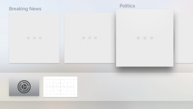
The sectioned top shelf is, as its name implies, a top shelf where the content is divided into sections. If you’ve worked with table and collection views before, this layout should look familiar to you:
The sectioned top shelf is perfect for displaying information that makes sense when it’s grouped together; this makes it a great choice to showcase the top news articles for each news topic. In general, if the purpose of your app is to feed information to the user as quickly as possible, the sectioned layout is a great choice.
Inset Top Shelf
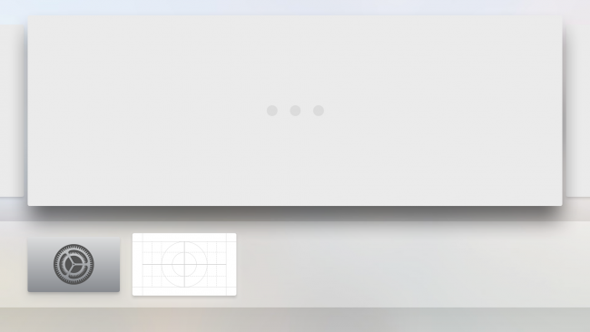
The inset top shelf is great for displaying the overarching themes of your app, particularly if your app is a game. Each item is given the full width of the screen to showcase the features in store for your users:
Both layouts let the user scroll and browse through the your content — and they’re surprisingly easy to implement.
Setting up the Interactive Top Shelf
The process of setting up an interactive top shelf is relatively straightforward. In technical terms, you’ll add a target — a TV Services Extension — and configure the ServiceProvider to use one of the two layouts.
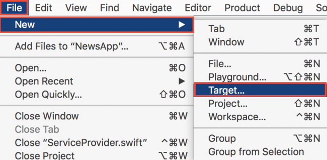
On the top bar, select File\New\Target…:
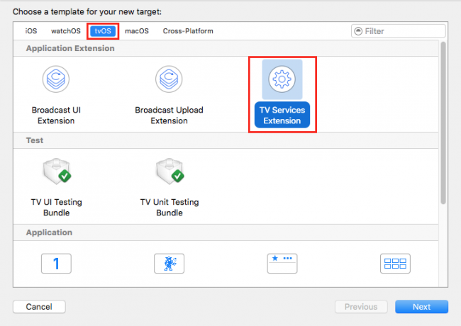
For the template, choose TV Services Extension located within the tvOS section and select Next:
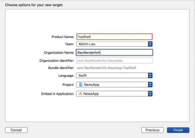
Name the extension TopShelf and select Finish:
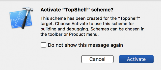
At this point, you may be presented with the following dialog:
Select Activate. This lets the simulator test your extension. With that bit of setup done, you’re ready to begin writing code. Hurrah!
TVTopShelfProvider
When you create the new TV Services Extension target, Xcode automatically generates the new target accompanied by a new file named ServiceProvider.swift. This file contains the ServiceProvider class, which is where you’ll define the interface for your interactive top shelf.
The topShelfStyle computed variable defines the type of top shelf you’d like to present to the user: either the sectioned layout, or the inset layout. In this chapter, you’ll use the sectioned layout.
Linking Up the Sectioned Layout
In ServiceProvider.swift, make sure the topShelfStyle variable is returning .sectioned (it should be returning .sectioned by default):
var topShelfStyle: TVTopShelfContentStyle { return .sectioned } |
Modifying the return value for this computed variable lets the app define an inset or sectioned layout.
The topShelfItems computed variable, as the name implies, will define the UI elements in the top shelf for a given layout.
Modify the topShelfItems computed variable as follows:
var topShelfItems: [TVContentItem] { // 1 let breakingNewsIdentifier = TVContentIdentifier(identifier: "Breaking News", container: nil)! let breakingNewsSection = TVContentItem(contentIdentifier: breakingNewsIdentifier)! breakingNewsSection.title = "Breaking News" // 2 let martianRiotIdentifier = TVContentIdentifier(identifier: "Martian Riot", container: nil)! let martianRiotItem = TVContentItem(contentIdentifier: martianRiotIdentifier)! // 3 breakingNewsSection.topShelfItems = [martianRiotItem] return [breakingNewsSection] } |
Here’s what you did above:
- First you defined a section where your “Breaking News” items will reside.
- Next you defined a single item for your section.
-
Finally you set the
topSelfItemsproperty of thebreakingNewsSectionto an array that contains the item.
To test your top shelf, you can use the schema generated for you when you created the TV Services Extension. Beside the run/stop button on the top left corner of Xcode, select the TopShelf schema:
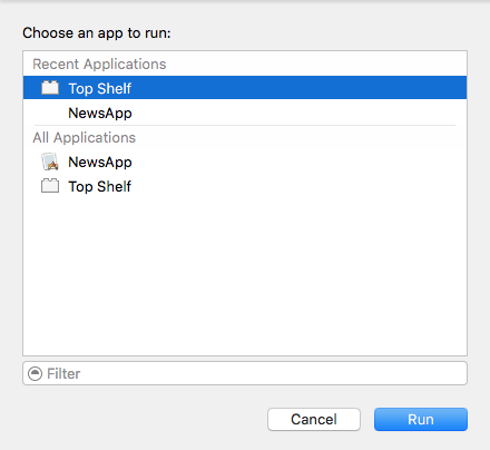
Build and run your app; choose Top Shelf from the “Choose an app to run:” dialog and press Run:
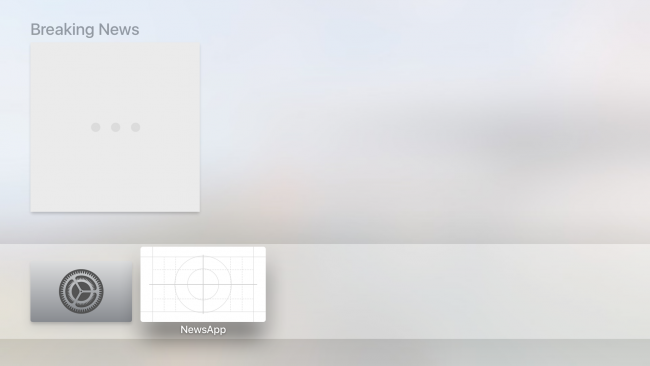
You should see a single cell with a section title above it:
Okay, that takes care of the section title. Now you’ll need an image to go along with it.
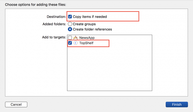
Drag sectionedMartians.png from this chapter’s resources and drop it into your project in the Top Shelf group. Make sure Copy items if needed is checked, and the target is set to TopShelf:
With the asset safely in your project, change to ServiceProvider.swift.
Add the following code just below the line that initializes martianRiotItem:
martianRiotItem.imageURL = Bundle.main.url(forResource: "sectionedMartians", withExtension: "png") |
This tells TVContentItem to look inside your project files to find the image.
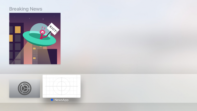
Build and run your app; you should see a nice image accompanying your top shelf item in the breaking news category:
Look out, the Martians are rioting! :]
Adding More News Items
A comet in the Milky Way is misbehaving, and an asteroid is traveling at the speed of light, breaking all laws of physics! While these two pieces of news are super-exciting, they don’t quite belong in the “Breaking News” category. You’ll create a new category to house these two pieces of news.
Drag and drop comet.png and asteroid.png from the project resources to the Top Shelf group, making sure Copy items if needed is checked and the target set to TopShelf.
In the topShelfItems computed property, add the following before the return statement:
// 1 let milkyWayNewsIdentifier = TVContentIdentifier(identifier: "Milky Way News", container: nil)! let milkyWaySection = TVContentItem(contentIdentifier: milkyWayNewsIdentifier)! milkyWaySection.title = "Milky Way" // 2 let cometIdentifier = TVContentIdentifier(identifier: "An odd comet", container: nil)! let cometItem = TVContentItem(contentIdentifier: cometIdentifier)! cometItem.imageURL = Bundle.main.url(forResource: "comet", withExtension: "png") // 3 let asteroidIdentifier = TVContentIdentifier(identifier: "Asteroid Light Speed", container: nil)! let asteroidItem = TVContentItem(contentIdentifier: asteroidIdentifier)! asteroidItem.imageURL = Bundle.main.url(forResource: "asteroid", withExtension: "png") // 4 milkyWaySection.topShelfItems = [cometItem, asteroidItem] |
Take some time to admire the beauty of what you’ve written:
-
You create a new
TVContentItemintended as a new section; hence, you also give it a title. -
You then create
cometItemwith the intention of adding it tomilkyWaySection. -
You also create
asteroidItemto add tomilkyWaySectionas well. -
Finally, you made
cometItemandasteroidItempart of themilkyWaySectionby adding them to itstopShelfItemsproperty.
You’ve created a new section and placed two items inside. Now you need to add this section next to the “Breaking News” section.
Update the return statement to return both the breakingNewsSection and the milkyWaySection:
return [breakingNewsSection, milkyWaySection] |
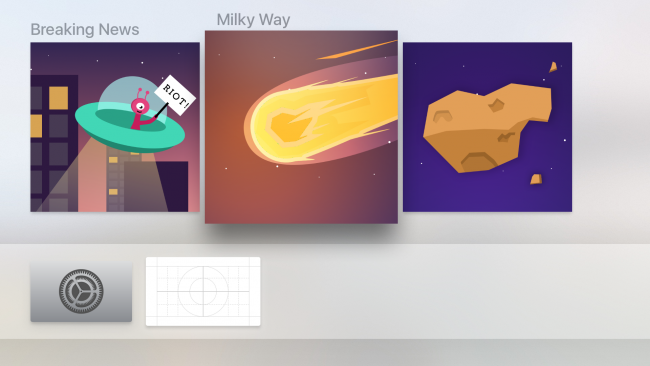
Build and run your app; select any top shelf item:
Hmm — nothing happens! Well, the sections look good, but you haven’t yet provided the code to handle events. You’ll do that in the next section.
Adding User Interaction
You have a visually appealing top shelf, so your next step is to make it functional. A top-of-the-line top shelf provides shortcuts to the advertised content, so you’ll need to find a way for the app to recognize that a user has tapped on a given top shelf item. Unfortunately, you can’t use IBAction event handling here.
So what can you do? How does event handling work for the top shelf?
Event Handling
AppDelegate.swift will call application(_:open:options) when a user selects anything in the top shelf — provided that the item has a non-nil displayURL or playURL. The top shelf can listen to two events on the remote: a press on the touch screen, and a press on the play button.
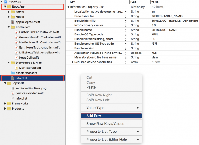
You’ll start by adding a new value to your app’s Info.plist file. Make sure you’ve opened the plist that’s part of your NewsApp target, not your TopShelf target. Right-click and select Add Row:
Name the row URL types. As you’re typing, Xcode may help you out by offering you an autocomplete. Expand the row you’ve just added and you should see another row named Item 0. Expand that as well. Click the + button next to Item 0 to add another row within the Item 0 dictionary. Name it URL Schemes:
Your new rows should look like this:
Set the value of Item 0 of URL Schemes to newsapp, and URL identifier to NewsApp URL. Your finalized plist entry should look like this:
Hooking Up the AppDelegate
You haven’t provided TVContentItems with either of these properties yet — that’s your next job.
Adding the URLs
For your news app, you’ll only supply displayURL. Open ServiceProvider.swift and add the following private method to the bottom of the class:
private func urlFor(identifier: String) -> URL { var components = URLComponents() components.scheme = "newsapp" components.queryItems = [URLQueryItem(name: "identifier", value: identifier)] return components.url! } |
You’ll use this private helper method to generate a URL for displayURL. Your top shelf has three items, so there are three corresponding displayURL properties you must fill in.
Inside the topShelfItems computed variable, find where you’ve declared martianRiotItem. Below that, add the following line:
martianRiotItem.displayURL = urlFor(identifier: "martianRiot") |
Similarly, find cometItem and asteroidItem and add the following code below the points where you instantiate each of those objects:
cometItem.displayURL = urlFor(identifier: "comet") asteroidItem.displayURL = urlFor(identifier: "asteroid") |
Build and run your app; navigate to your app’s top shelf, select any item, and lo and behold, your app launches!
Right now, your app launches to its initial view controller when any of the top shelf items are selected. What you really want is the items to act as a shortcut to their respective categories. It’s these shortcuts that provide a pleasurable — and convenient — user experience.
Differentiating Between Items
Open AppDelegate.swift and add the following:
func application(_ app: UIApplication, open url: URL, options: [UIApplicationOpenURLOptionsKey: Any] = [:]) -> Bool { print(url) return true } |
This method will be called whenever your user selects a top shelf item with a displayURL, passed in as an argument to the method.
Before you can build and run, you’ll have to switch back to the NewsApp scheme:
Build and run your app; once the app launches press Command+Shift+H to bring your tvOS simulator back to the home screen. Navigate to your top shelf and select the Martian Riot news item. You should see the following output in your console:
newsapp:?identifier=martianRiot |
Next, navigate back to your top shelf and select the Comet item. This time, your console should show the following:
newsapp:?identifier=comet |
Hey! Those are the identifiers you’ve added to the displayURL property earlier! w00t! Now you have a distinguishing feature you can rely on.
For this app, you’ll simply bring the user to the associated tab related to the theme of the content. You currently have four tabs in your app. You’ll define their indexes using a few variables.
Add the following variables to AppDelegate.swift, right below the var window: UIWindow? statement:
let newsTab = 0 let martianTab = 1 let earthTab = 2 let milkyWayTab = 3 |
Next, update application(_:open:options:) to the following:
func application(_ app: UIApplication, open url: URL, options: [UIApplicationOpenURLOptionsKey: Any] = [:]) -> Bool { guard let initialViewController = window?.rootViewController as? UITabBarController else { return false } let urlString = url.absoluteString switch urlString { case "newsapp:?identifier=martianRiot": initialViewController.selectedIndex = martianTab case "newsapp:?identifier=comet", "newsapp:?identifier=asteroid": initialViewController.selectedIndex = milkyWayTab default: return false } return true } |
Here, you’ve set out the code to handle the select event for each of the three items. For the Martian Riot news item, you’ve directed the user to the news tab for Mars. For the Comet and Asteroid news items, you’ve directed the user to the Milky Way tab.
Build and run your app; select any of the news category items to ensure you’re launched into the proper spot in your app. You’re ready to assume your spot as the biggest galactic news mogul this side of Saturn! :]
Where to Go From Here?
You’ve covered a lot of ground in this chapter. You’ve learned all about the top shelf and the two layouts associated with it. Although you’ve only worked through the sectioned layout, you’ll be glad to know that using the inset layout involves almost all the same steps you’ve gone through here.
 This tutorial was taken from Chapter 26 of tvOS Apprentice, Second Edition. You also might enjoy the other 27 chapters and 500+ pages in the book! :]
The book has been completely updated to work with Swift 3, tvOS 10 and Xcode 8. Check out the book and let us know what you think!
The post tvOS Top Shelf Tutorial: Static and Interactive appeared first on Ray Wenderlich.

