Update 4/5/17: Updated for Android Studio 2.2.3 by James Nocentini. Original tutorial also by James.
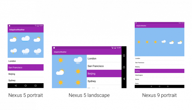
Android runs on a wide variety of devices that offer different screen sizes and densities. Because of this, it is important for Android apps to have a responsive UI that can adapt to these different screens. Since the early days of the Android platform, system APIs have provided very powerful abstractions to design responsive UIs, also known as adaptive layouts.
This is an update to our adaptive UI in Android tutorial which will show you how to build apps that work across different devices by dealing with the fragmentation in the Android device market. You’ll learn about:
- Configuration qualifiers
- Alternative layouts and drawables
- And layout previews in Android Studio — an immensely useful tool
What would a tutorial be without something to tinker with? It’d be pretty boring. So, you’ll build the user interface for a simple weather app completely from scratch! When you’re done, the screen will display an image, text labels and a map in three different configurations. Apps look so cool and well built when they have a responsive UI.
Getting Started
Download the starter project named Adaptive Weather here, and open it in Android Studio. Then build and run.
The app displays a simple RecyclerView listing several cities.
To learn all about RecyclerViews, we recommend reading our Android RecyclerView tutorial.
Open the build.gradle file of the app module to declare the following dependency:
dependencies { ... compile 'com.google.android:flexbox:0.2.5' } |
Google FlexBox provides an implementation of the FlexBox specification on the Android platform. As you will see later on, it is a very useful tool for designing responsive layouts. And combining it with Android’s resource qualifier system makes it even more powerful!
During this tutorial, you’ll often switch between the Android and Project modes in the Project navigator. Generally speaking:
- Android mode is the default when working within Android Studio because it provides a clean and simple file structure.
- Project mode is also necessary for building alternative layouts.
- ldpi (low)
~120dpi - mdpi (medium)
~160dpi - hdpi (high)
~240dpi - xhdpi (extra-high)
~320dpi - xxhdpi (extra-extra-high)
~480dpi - xxxhdpi (extra-extra-extra-high)
~640dpi
Weather Icons
Android devices have different screen densities, and for that reason it’s a good practice to import static images in multiple sizes. This is one way Android’s system APIs provide a way to create responsive UIs. As described in the Supporting Multiple Screens guide, the categories of screen densities are:
Whilst some UI editors make it easy to export images in different sizes, we will be exploring a different approach in this tutorial. Android Studio recently added support for Vector Drawables. This means that all your assets can be imported once and will be scaled at runtime depending on the device configuration (screen size and orientation).
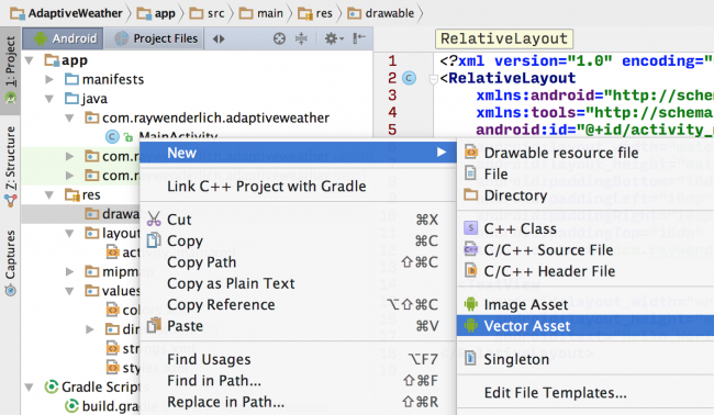
Download the Weather Icons and extract. In Android Studio right-click on res/drawable and click on the New\Vector Asset menu item:
Select Local file (SVG, PSD) under Asset Type. From the filesystem location chooser under Path locate the weather-icons folder and choose the first icon, cloud.svg. Make sure to check the Override under Size setting otherwise your icons will look a bit distorted later on (¯\_(ツ)_/¯). Click Next and Finish:
Now you should see your icon in Android Studio as res/drawable/ic_cloud.xml. Repeat the same operations for the other icons: fog, rain, snow, sun, thunder.
Finally, enable the use of Vector Drawables in the app module’s build.gradle as follows:
android { ... defaultConfig { ... vectorDrawables.useSupportLibrary = true } } |
With scalable assets now in place in the project, you’re ready to start customizing the layouts.
Building layouts
With the dependencies declared, you get to shift your focus to building some layouts!
This simple application only contains one screen, which is represented by MainActivity. From the Project navigator, open res/layout/activity_main.xml. Click on the Preview button on the right side to see it in action.
An activity comprises a Java class — in this case MainActivity.java — and a layout file. In fact, one activity can have several layouts, as you’ll see shortly. For now, it’s important to remember that the existing layout file, activity_main.xml, is the default layout.
Forecast Grid View
First, define the default layout for your main activity. To start this, open res/values/colors.xml and replace its content with the following:
<?xml version="1.0" encoding="utf-8"?> <resources> <color name="color_primary">#9B26AF</color> <color name="color_primary_dark">#89229b</color> <color name="text_color_primary">#ffffff</color> <color name="forecast_grid_background">#89bef2</color> </resources> |
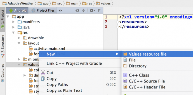
Here you’re overriding the default Material theme colors and providing a background color for the forecast grid. Next, right-click on the values folder and select the New\Value resource file menu:
Enter fractions.xml for the file name and paste the following:
<?xml version="1.0" encoding="utf-8"?> <resources> <item name="weather_icon" type="fraction">33%</item> </resources> |
Here you’re specifying that the width taken by each icon should be 1/3 of the total width.
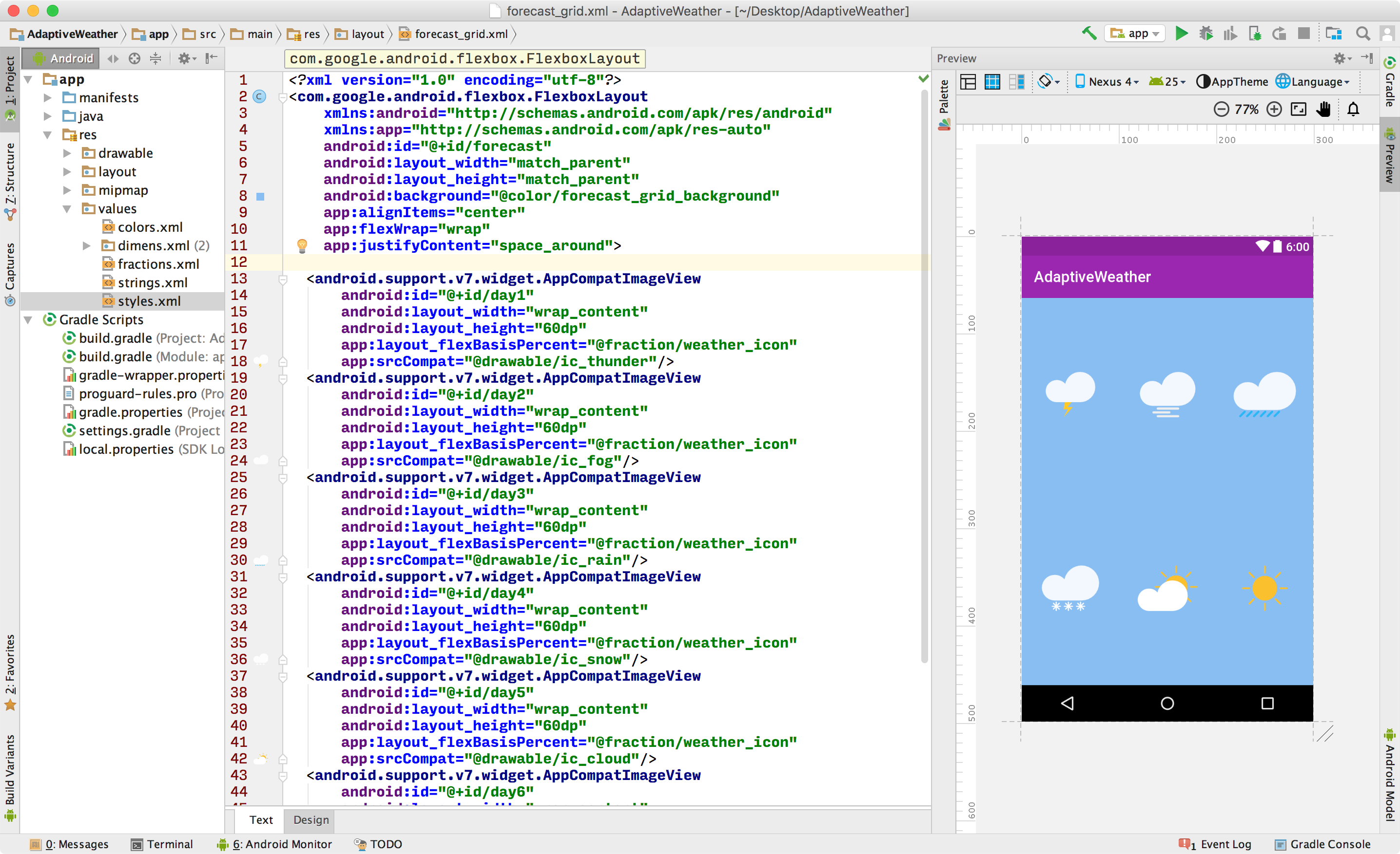
Next, create a new layout called forecast_grid.xml and add the following list of images:
<?xml version="1.0" encoding="utf-8"?> <com.google.android.flexbox.FlexboxLayout xmlns:android="http://schemas.android.com/apk/res/android" xmlns:app="http://schemas.android.com/apk/res-auto" android:id="@+id/forecast" android:layout_width="match_parent" android:layout_height="match_parent" android:background="@color/forecast_grid_background" app:alignItems="center" app:flexWrap="wrap" app:justifyContent="space_around"> <android.support.v7.widget.AppCompatImageView android:id="@+id/day1" android:layout_width="wrap_content" android:layout_height="60dp" app:layout_flexBasisPercent="@fraction/weather_icon" app:srcCompat="@drawable/ic_thunder"/> <android.support.v7.widget.AppCompatImageView android:id="@+id/day2" android:layout_width="wrap_content" android:layout_height="60dp" app:layout_flexBasisPercent="@fraction/weather_icon" app:srcCompat="@drawable/ic_fog"/> <android.support.v7.widget.AppCompatImageView android:id="@+id/day3" android:layout_width="wrap_content" android:layout_height="60dp" app:layout_flexBasisPercent="@fraction/weather_icon" app:srcCompat="@drawable/ic_rain"/> <android.support.v7.widget.AppCompatImageView android:id="@+id/day4" android:layout_width="wrap_content" android:layout_height="60dp" app:layout_flexBasisPercent="@fraction/weather_icon" app:srcCompat="@drawable/ic_snow"/> <android.support.v7.widget.AppCompatImageView android:id="@+id/day5" android:layout_width="wrap_content" android:layout_height="60dp" app:layout_flexBasisPercent="@fraction/weather_icon" app:srcCompat="@drawable/ic_cloud"/> <android.support.v7.widget.AppCompatImageView android:id="@+id/day6" android:layout_width="wrap_content" android:layout_height="60dp" app:layout_flexBasisPercent="@fraction/weather_icon" app:srcCompat="@drawable/ic_sun"/> </com.google.android.flexbox.FlexboxLayout> |
There are a couple things to note with the above block:
- You’re using the com.google.android.flexbox.FlexboxLayout resource to layout the icons on the screen.
- You’re using the android.support.v7.widget.AppCompatImageView resource to draw the weather icons on the screen. You would normally use the ImageView resource with plain images (
.png,.jpg) but for Vector Drawables you must use this component instead.
In the Preview pane, you see should the weather icons aligned perfectly:
This is already starting to feel responsive. Instead of positioning the icons with margins or using a relative layout you have used the FlexBox properties to spread them symmetrically. If you remove a middle icon for example, the remaining ones will automatically shift to the left to fill in the empty space. This is the true power of using FlexBox in layouts. The forecast grid is now ready to be used in your default layout for the main activity.
Main Activity
Open res/layout/activity_main.xml and replace its contents with the following:
<?xml version="1.0" encoding="utf-8"?> <LinearLayout xmlns:android="http://schemas.android.com/apk/res/android" android:layout_width="match_parent" android:layout_height="match_parent" android:orientation="vertical"> <include layout="@layout/forecast_grid" android:layout_width="match_parent" android:layout_height="0dp" android:layout_weight="1"/> <android.support.v7.widget.RecyclerView android:id="@+id/list" android:layout_width="match_parent" android:layout_height="0dp" android:layout_weight="1"/> </LinearLayout> |
Here’s what is happening in this layout:
- Orientation for the
LinearLayoutis set to vertical - Dimensions: using the
layout_weightXML attribute you’re setting each child view to take half of the screen height - Layout reuse: using the
includeXML tag you’re placing the forecast grid on the top half by referencing the forecast_grid.xml layout. This is one of the core functionalities to creating different layouts without duplicating the code.
Notice that the preview in the editor gets instantly updated. At this point you still haven’t deployed the application to a device or emulator which is astonishing.
Build and run. You should now see the weather icons above the list of locations.
Updating the Weather Forecast
Take a look at the static JSON data in assets/data.json. The forecast for a given location is represented as an array of strings. You could create another RecyclerView with a GridLayout to dynamically create the forecast, but that’s asking for trouble :]. Instead you will write a method that maps each possible forecast value to a corresponding drawable icon.
In MainActivity.java, add a new method:
private Drawable mapWeatherToDrawable(String forecast) { int drawableId = 0; switch (forecast) { case "sun": drawableId = R.drawable.ic_sun; break; case "rain": drawableId = R.drawable.ic_rain; break; case "fog": drawableId = R.drawable.ic_fog; break; case "thunder": drawableId = R.drawable.ic_thunder; break; case "cloud": drawableId = R.drawable.ic_cloud; break; case "snow": drawableId = R.drawable.ic_snow; break; } return getResources().getDrawable(drawableId); } |
Now you are ready to write the code that responds to the click event of a RecyclerView row. Add the following method to MainActivity:
private void loadForecast(List<String> forecast) { FlexboxLayout forecastView = (FlexboxLayout) findViewById(R.id.forecast); for (int i = 0; i < forecastView.getChildCount(); i++) { AppCompatImageView dayView = (AppCompatImageView) forecastView.getChildAt(i); dayView.setImageDrawable(mapWeatherToDrawable(forecast.get(i))); } } |
Then find // TODO in MainActivity and replace it with the following:
loadForecast(location.getForecast()); |
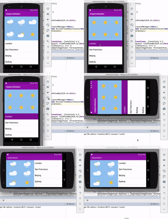
Build and run. Click on a location name and notice the weather forecast gets updated:
Good job, what a beautiful looking weather application! The weather in San Francisco isn’t looking so beautiful though :].
Creating Responsive UI: Landscape Layout
So far, you built this application with the portrait mode in mind but let’s take a look at what happens when the phone is rotated to landscape. Open activity_main.xml and in the layout editor click on the orientation icon:
At this stage, you could run the app on multiple Android devices or simulators. But this method of testing alternative layouts is time consuming and repetitive at best, and error prone at worst. There must be another way.
Thankfully, Android Studio has extensive previewing capabilities. Open the default activity_main.xml file, and hover your mouse over the bottom right corner of the screen to resize the layout. Notice that upon clicking the handle, Android Studio automatically displayed guides for different device sizes.
Ugh — landscape mode is none too kind to your design. Let’s try to have both views side by side instead. To tell the system which resource to pick for a given dimension, you place the layout resource in a folder named in a particular way. The system will pick the correct activity layout for the current device’s screen dimensions. This way, you will have responsive UIs for your app.
Layout qualifiers
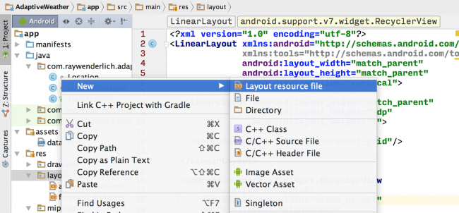
Back in Android Studio, right-click on res/layout and click on the New\Layout resource file menu:
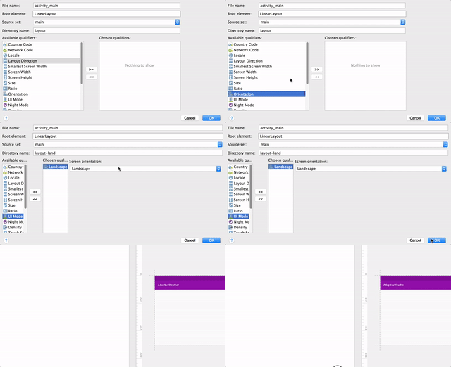
Name the file activity_main and add the landscape resource qualifier:
The layout editor now shows a blank screen for the landscape mode because it picked the newly-created layout file layout-land/activity_main.xml. This only contains an empty LinearLayout, though not for much longer :]. Add the following to reuse the weather forecast layout and Recycler View in a horizontal orientation this time.
<?xml version="1.0" encoding="utf-8"?> <LinearLayout xmlns:android="http://schemas.android.com/apk/res/android" android:layout_width="match_parent" android:layout_height="match_parent" android:orientation="horizontal"> <include layout="@layout/forecast_grid" android:layout_width="0dp" android:layout_height="match_parent" android:layout_weight="1" /> <android.support.v7.widget.RecyclerView android:id="@+id/list" android:layout_width="0dp" android:layout_height="match_parent" android:layout_weight="1"/> </LinearLayout> |
And the layout editor now shows all your elements in landscape orientation.
Well done! You have created the first layout qualifier in this application. There are layout qualifiers for plenty of other configurations (screen width, height, aspect ratio etc.). In the next section we will modify the landscape layout even further with just a one-line change.
Resource qualifiers
Another enhancement you could make to the layout is to organize the weather icons as 2 columns and 3 rows as opposed to the current 3 columns and 2 rows layout. We could duplicate the forecast_grid.xml layout, but then it would be duplicated code and harder to maintain. The width occupied by each weather icon in relation to the FlexBox view width is determined by the layout_flexBasisPercent attribute:
<android.support.v7.widget.AppCompatImageView android:id="@+id/day1" android:layout_width="wrap_content" android:layout_height="60dp" app:layout_flexBasisPercent="@fraction/weather_icon" app:srcCompat="@drawable/ic_thunder"/> |
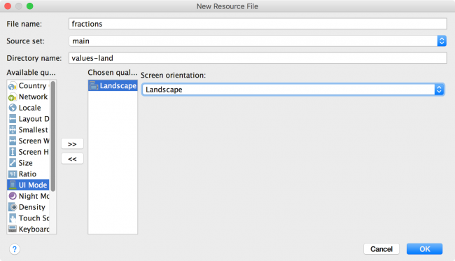
The value is a fraction type and is currently equal to 33% in the resource qualifier file res/values/fractions.xml. Following the same approach to creating a landscape layout, you can create resource files for the landscape configuration. Right-click on res/values and select the New\Values resource file menu item. Name the file fractions and add the landscape orientation qualifier:
Inside the resources XML tag, add the following:
<item name="weather_icon" type="fraction">49%</item> |
Return the main activity layout in landscape mode and notice the weather icons are laid out on 2 columns and 3 rows:
Well done! You can pause here and appreciate the fact that once again, you didn’t have to deploy the application to achieve this result. Of course now you should build & run though and make sure it works :]
The configuration qualifiers can be applied to any attribute type in your XML layout (font size, colors, margins etc.).
Extra Large Layout
Return to the portrait orientation in the layout editor and drag the screen size all the way to the X-Large size range.
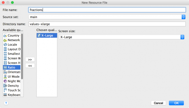
For devices with that much screen real estate, you could show all the weather icons on 1 row. Go ahead and right-click on res/values and select the New\Values resource file menu item. Name the file fractions and add the X-Large size qualifier:
Add the following inside the resources XML tag:
<item name="weather_icon" type="fraction">16%</item> |
Return to the layout editor and notice that all the weather icons are aligned on 1 row.
Configuration Calculations
Don’t worry, the content in this section isn’t as scary as the title makes it sound. When the user interacts with the application, the layout state changes over time (rows are selected, input fields populated with text etc.). When the layout changes (for example when the orientation changes), the existing layout is thrown away a new layout is inflated. But the system has no way of knowing how to restore the state because the two layouts could be completely different as far as it knows.
To see a live example of this in action, build and run the application. Select a location then change the orientation and notice the location isn’t selected anymore!
If you are not already surprised that the forecast in London is sunny all week then you may also notice that the selected row was deselected after switching to landscape.
To fix this, you will hook into the activity lifecycle methods to save the selected location to a bundle and retrieve after the screen rotation.
Add the following field at the top of MainActivity.java:
private static final String SELECTED_LOCATION_INDEX = "selectedLocationIndex"; |
Then add the following method to MainActivity:
@Override protected void onSaveInstanceState(Bundle outState) { super.onSaveInstanceState(outState); outState.putInt(SELECTED_LOCATION_INDEX, mLocationAdapter.getSelectedLocationIndex()); } |
Add the following to the end of onCreate():
if (savedInstanceState != null) { int index = savedInstanceState.getInt(SELECTED_LOCATION_INDEX); mLocationAdapter.setSelectedLocationIndex(index); loadForecast(mLocations.get(index).getForecast()); } |
Build and run again and this time the location remains selected across configuration changes. Hooray!
Where to Go From Here
Well done! You’ve built your first Android app with adaptive layouts and you learned how activities can make use of multiple layouts. You learned how drawables work with different displays, and how to make your app come to life on practically any Android device.
Of course, there’s a lot more to Android than layouts, and no shortage of ways to build on the adaptive UI principles you discovered in this responsive UI for Android tutorial. To learn more, check out Google’s guidelines on the best UI practices. If you want, you can challenge yourself by trying the following:
- Use another available qualifier to have yet another type of layout. For example, what if you’d like to have a different background color based on the locale qualifier?
- Or, try using size qualifier on other resources, such as strings. You could add a TextView which shows a short message, or a longer message with the same name if the screen is in landscape?
Get the full source code for this project as a downloadable zip or as a repo on GitHub.
Feel free to share your feedback, findings or ask any questions in the comments below or in the forums. Talk to you soon!
The post Responsive UI Tutorial for Android appeared first on Ray Wenderlich.

