
Learn how to make your apps use Adaptive Layout!
Update 6/20/17: This tutorial was updated to iOS 11, Xcode 9, and Swift 4 by József Vesza. The original tutorial was written by Sam Davies.
The introduction of Adaptive Layout caused a huge paradigm shift for iOS app designers. When designing your app, you can now create a single layout, which works on all current iOS devices – without crufty platform-specific code!
This tutorial serves as your introduction to Adaptive Layout. You’ll learn about universal storyboards, size classes, layout and font customizations and the improved Interface Builder, which will help you along the way.
You’ll create the user interface for a simple weather app – and you’ll build it completely from scratch. If you’re not a fan of Auto Layout, don’t worry; the first part of this tutorial provides you with a gentle step-by-step approach to build an interface using Auto Layout. You’ll be amazed at how much you can accomplish without writing a single line of code!
Universal Storyboards
Universal Storyboards are the first step on your journey towards Adaptive Layout. The same storyboard can now be used for both iPads and iPhones. There’s no need to keep per-device storyboards in sync with each other – a monotonous process which can be fraught with error.
Open Xcode and select File\New\Project….
Select iOS\Application\Single View App, then click Next:

Set Product Name to AdaptiveWeather, and the Language to Swift. Make sure the tick boxes are all un-ticked, then click Next:

Once you’ve specified the location for your project, take a look at the Project Navigator and you’ll see the following files:
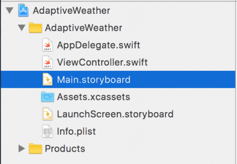
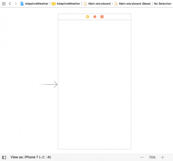
Main.storyboard is the single storyboard for all devices, no matter their screen size. Open the storyboard and you’ll see that it contains a single view controller, currently the size of an iPhone 7’s screen:
The Use Trait Variations option, found in the File Inspector, enables this new format for your project; select the storyboard, open the File Inspector and you’ll see the checkbox option as shown below:
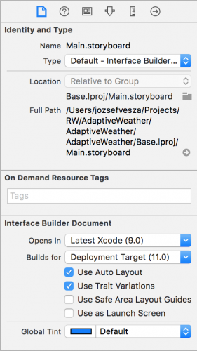
This option is enabled by default for all new iOS projects. You can turn this option on yourself when upgrading your old projects to use the new storyboards.
Setting Up Your Storyboard
To start, open Main.storyboard and drag an Image View from the Object Library onto the view controller canvas. In the Size Inspector, set the X position to 37 and the Y position to 20. Set the Width to 300 and the Height to 265.

Next, drag a View from the Object Library and place it below the image view. In the Size Inspector, set the X position to 37 and the Y position to 340. Set the Width to 300 and the Height to 265:

Select the view you just added, open the Identity Inspector and enter TextContainer in the Label field. Note that the Document pane might be collapsed – if so press the Show button to reveal it. This gives the view a name and makes it easier to see in the Document Inspector. This view will eventually hold the city and temperature labels of your app.

It’s often hard to see views after dragging them in from the Object Library as their default background color is white, the same as the view controller’s view. To fix this, select the view controller’s view, open the Attributes Inspector and set its background color to #4AABF7.
Next, select the TextContainer view and set its background color to #3780BA.
Your view controller should now look like the screenshot below:

These two views are the only direct descendants of the view controller’s view; your task now is to give them some layout constraints.
Adaptive Layout
Select the image view and press the Align button in the auto layout toolbar. Check the Horizontally in Container tick-box, ensuring the value is set to 0, and click Add 1 Constraint.

Then press the Add New Constraints button and add a top spacing to the superview constraint of 20, like so:

Click the Add 1 Constraint button.
The constraints you added above ensure that the image view has a fixed size margin from the top and that it is centered left to right. You now need to configure the space between the image view and the text container view. Ctrl-drag from the image view down to the text container view, like so:

This displays the constraint context menu again. Select Vertical Spacing:

This constraint determines the amount of vertical space between the bottom of the image view and the top of the TextContainer view.
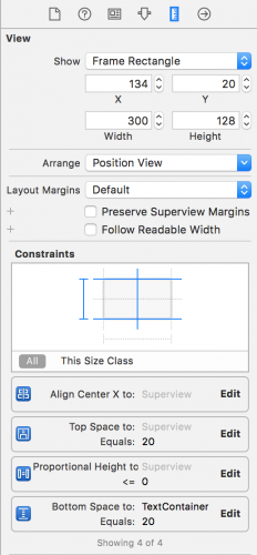
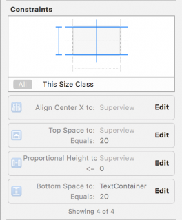
Select your image view and open the Size Inspector to see how it looks now:
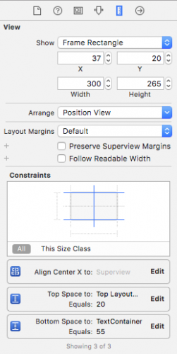
You’ll see the three constraints you just added to your layout; you can easily configure each constraint from within the size inspector. Press the Edit button in the Bottom Space To: TextContainer constraint; you’ll be presented with a dialog to configure the constraint properties. Set Constant equal to 20:

Click away from the dialog to close it.
You’ve already configured your TextContainer view to have a gap of 20 points from the bottom edge of the image view, but you also need to add constraints to the other three sides of the view.
Select your TextContainer view then click the Add New Constraints button in the bottom bar to show the dialog. In the Spacing to nearest neighbor section, set the left, right and bottom spacing to the superview to 0. Ensure that Constrain to margins is unchecked; this removes padding from around your view.
For reference, the dialog should look like the following:

Click Add 3 Constraints to add the new constraints to your view. This pins the text container view to the left, right and bottom edges of the view controller’s view.
Your storyboard should now look like the screenshot below:
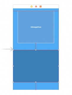
You’ll notice a few orange and red constraints on your view; this indicates there are issues with these constraints that need your attention. It’s possible to have the storyboard automatically update the frames of the contained views to satisfy these constraints, but if you do this right now your image view will shrink to zero size.
That’s because your image view doesn’t yet have any content – which means it has an intrinsic height and width of zero. Auto Layout relies on a view’s intrinsic size to determine its width and height if no physical width or height constraints are supplied.
In the Project Navigator, open Assets.xcassets. Download cloud_images.zip and unzip it. Inside you’ll find three files. Select all three of them in Finder, and drag them to the empty pane on the right hand side of the asset catalog:

This will create a new image set, and assign the three images appropriately:

You can now use your image set to populate your image view. Head back over to Main.storyboard and select your image view. Switch to the Attributes Inspector, type the name cloud_small into the Image field, and select Aspect Fit in the Content Mode drop down list, like so:

Your storyboard now should look like the following:

There’s your image, and thankfully everything seems to be in place; the view controller re-arranged the views automatically to match the new constraints.
Previewing Layouts
Normally you’d now build and run your project on all the different simulator versions – in both orientations – in order to test this new universal storyboard. This process is laborious at best, but Xcode 9 gives you a much better option with the new trait variation previews.
Open Main.storyboard then find the View as button at the bottom of the canvas, and click on it. This expands the trait chooser menu:
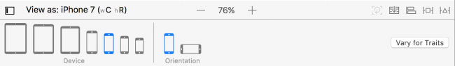
In the Devices section, select iPhone 4s (the right-most icon shown in the Device area).
You’ll notice that the canvas has switched to a different configuration: your views are now on a 4-inch iPhone screen, as shown below:

To view your layout in landscape mode, select Landscape in the Orientation area of the trait chooser:

This is a huge improvement over firing up multiple simulators: with the click of a button, you can check if your layout still holds on a different device.
Notice anything odd about the landscape iPhone preview? That’s right – the cloud image is far too big. To fix this you’ll add a new constraint to the image view.
Head back to the storyboard. Ctrl-drag from the image view to the view controller’s view to create a new constraint. From the context menu, select Equal Heights:

A number of constraints on the storyboard are now colored red. This is because the constraint you just added conflicts with the existing constraints, as it’s not possible for the image view to have the same height as the view controller’s view and maintain the vertical margins you created earlier.
Select the constraint you just added in the Document Outline and open the Attributes Inspector. If the First Item is not set to cloud_small.Height then select Reverse First and Second Item in the First Item dropdown as shown below:

Next, select the Relation to be Less Than or Equal set Multiplier to 0.40 as shown below:

This means that the cloud image will either be the intrinsic size of the image, or be 40% of the height of the screen, whichever is smaller.
You’ll notice that the canvas automatically refreshes as soon as you update the constraint, as demonstrated below:

Perfect!
Since this is supposed to be a weather app, you’ll now add some labels to show the city name and the current temperature.
Adding Content to the TextContainer
In Main.storyboard, switch back to the Portrait iPhone 7 trait, and drag two Labels from the Object Library onto the TextContainer view, and arrange them roughly as shown below:

Select the topmost label and use the Align and Add New Constraints menus to center the label horizontally and add a top spacing to nearest neighbor of 10, as shown below:


Next, select the Attributes Inspector and set Text to Cupertino, Color to White Color, and the font to System, Thin with Size of 150.
You’ve probably noticed the text is currently illegible, and this is due to the frame of the label – you’ll resolve this shortly.
Now select the other label, and again use the Align and Pin menus to center it horizontally, and set a bottom space to nearest neighbor of 10. Check that the Size Inspector matches the following:

Use the Attributes Inspector to set the Text to 28C, the color to White Color, and the font to System, Thin with a size of 250.

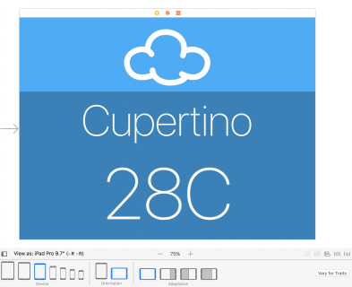
The labels reach out of bounds, and overlap in the storyboard, which isn’t the look you’re going for. However, take a look at a different trait before you fix anything. The iPad Pro 9.7″ version is looking pretty good:
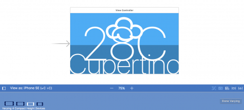
Predictably, the font size is far too big for the iPhone:

You’ll correct these sizing issues in the next section of this Adaptive Layout tutorial.
Size Classes
Universal storyboards are great – but you’ve already discovered that creating one single layout for all displays is a bit of a challenge. However, Adaptive Layout has a few more tools and tricks to solve these issues.
One of the core concepts behind adaptive layout is size classes. A size class is a property applied to any view or view controller that represents the amount of content that can be displayed in a given horizontal or vertical dimension.
Xcode provides two size classes: Regular and Compact. Although they are related to the physical dimensions of a view, they also represent the semantic size of the view.
The following table shows how the size classes apply to the different devices and orientations:

These are the size classes that the device hands down to the app. However, you can override these size classes at any point in the view hierarchy. This can be useful when using a view controller in a container which is significantly smaller than the screen.
Size Classes and You
What does that mean for you and the design of your app? Although your app is aware of size classes, the layout you’ve built is size class agnostic – that is, your layout remains the same for all size classes.
This is an important point when it comes to the design phase of your adaptive layout. You should build a base layout first and then customize each specific size class based on the individual needs of that size class. Don’t treat each of the size classes as a completely separate design. Think of an adaptive layout as a hierarchy, in which you put all of the shared design into the parent and then make any necessary changes in the child size classes.
There’s been almost no mention of configuring layouts for specific devices so far. This is because a core concept of adaptive layout is that size classes are abstracted away from device-specific characteristics. This means that a view that supports adaptive layout could be used in a full-screen view controller as well as in a contained view controller, albeit with different appearances.
This also benefits Apple, as there is room to expand the range and characteristics of their devices without forcing developers and designers to re-engineer their apps.
You’ll use size classes to customize the landscape layout for iPhone since the current layout doesn’t cope well when restricted vertically.
Working with Size Classes
To introduce trait variations, first make sure that you select a Compact Height configuration (e.g. an iPhone SE in landscape), then click on the Vary for Traits button to the right of the Trait chooser menu.
Here you can choose a size class to customize and introduce variations based on width and height:

Note: There is a slight discrepancy in nomenclature. Size classes are always referred to as horizontal and vertical. However, IB uses the terms width and height. There’s an obvious parallel (width = horizontal; height = vertical); just be aware that there are two terms for the same concept.
Your current layout doesn’t work properly for compact heights. To fix this, choose Height in the Vary for Traits menu:
You’ll immediately notice the bottom bar turning a rather fetching shade of blue. This indicates, that you’re now working on a size-class specific layout.
In order to change the layout, you’ll need to temporarily change a few constraints. In Auto Layout terminology this is known as installing and uninstalling constraints. A constraint is installed if it is currently active, whereas an uninstalled constraint is not currently active within the current size class.
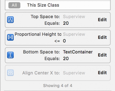
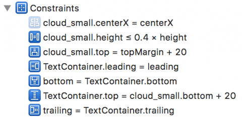
Click on the image view to select it, and open the Size Inspector. You can see a summary of the constraints which affect this view:
Select the Align Center X to: Superview constraint by single clicking it, and then press the Delete key on the keyboard to uninstall the constraint for the current size class. The constraint immediately disappears from the storyboard view and becomes grayed out in both the Document Outline and the view’s Size Inspector:
Note: You might have to toggle from This Size Class to All in the Size Inspector to see the uninstalled constraint.
Double click on the uninstalled constraint in the Size Inspector to select the constraint . There’s an additional line at the bottom as shown below:

This indicates the constraint is installed for the base layout, but not for the Compact Height layout – that is, the one you’re currently editing.
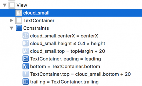
Repeat the same procedure to uninstall the other three constraints associated with the image view. Your document outline and image view’s Size Inspector should resemble the following images:
Now you can add the constraints required for this size class. Use the Align and Pin menus to Vertically Center in the Container, and to set a left spacing to nearest neighbor of 10:


Ctrl-drag from the image view to the view controller’s view and then select Equal Widths in the popup menu.
Open the Size Inspector for the image view and double-click the Equal Width to: Superview constraint to reveal its properties. If the First Item isn’t cloud_small.Width, use the drop down menu to Reverse First and Second Item. Now update the Multiplier to equal 0.45.
The constraints for the image view are now set up correctly for all size classes, but the text container still needs a bit of attention. You’ll need to alter the constraints for this size class to move the label to the right hand side.
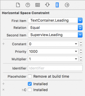
The TextContainer view has internal constraints to position the labels, which work fine as-is. However, the three external constraints – pinning it to the left, right and bottom sides of the view – aren’t quite working properly. To pin the view to the bottom right hand side of the parent view you’ll need to uninstall the left-hand constraint.
Select TextContainer in the document outline, and uninstall the Leading Space constraint in the size inspector. To verify, that the constraint is uninstalled for compact height, select it in the document outline, and check the size inspector:
You now need to add two constraints to your TextContainer to position it correctly. The view should be half the width of its superview, the view controller’s view, and pinned to the top.
In theory, you could simply Ctrl-drag from the TextContainer view to the view controller’s view as you’ve been doing all along. However, in practice it’s often difficult to grab just the view when there’s content in the way. It’s much easier to use the document outline to do your dirty work.
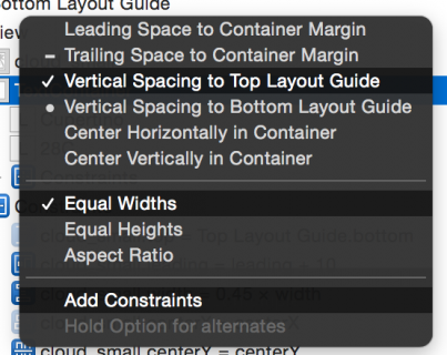
Ctrl-drag from TextContainer in the document outline up to the view controller’s view:
Shift-click on Vertical Spacing to Top Layout Guide and Equal Widths. Click Add Constraints to create the new constraints:
Open the Size Inspector for your TextContainer and update the two new constraints you’ve just created as follows:
- Top Space to: Top Layout Guide should have a Constant of 0
- Equal Width to: Superview should have a Multiplier of 0.5. Note that you might have to switch the first and second items in this constraint, as you have done before. Simply double click on the constraint and choose to Reverse First and Second Item.
The storyboard will update and display the new layout as shown below:

The layout has changed completely; you’re closer to the finished product now. There are still a few issues to correct with the font sizes – you’ll address these in the next section.
Adaptive Fonts
The current font sizes in your TextContainer look pretty good in the iPad view using a container with regular size classes, but the font size is too large for compact size classes. Fear not – it’s also possible to override font sizes within your size classes!
Note: Unlike layout overrides, changing the font configuration will always affect the base layout. Changes to the font configuration don’t respect the current size class overrides in interface builder. Instead, use the method outlined below.
Click the Done Varying button to the right of the Trait chooser menu. The bottom bar of your view turns gray to indicate that you’re back to the base layout.
Select the Cupertino text label and open the Attributes Inspector. Click the small + to the left of the Font:

This reveals a menu for selecting the size class combination in which you’ll override the font size. Select Compact for the Width and Any for the Height like so:

This creates a second font selector box that will apply to the specified size class combination. Update the font size in the new selector box to 90:
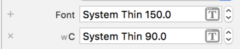
Now select the temperature text label and repeat the same process; this time, set a font size override of 150 for Compact Width, Any Height.
Interface Builder updates automatically to show the effect of the changes you made:

Well, it’s looking a little better, but the Cupertino label is clipped. Fiddling with the font sizes until it fits perfectly isn’t a particularly scalable option. Cupertino is quite a long place name, but Washington, D.C. is longer – and Kleinfeltersville, PA is longer still! What’s a designer to do?
Once again, Auto Layout comes to the rescue! You simply need to limit the width of the two text labels to match the width of the TextContainer. Ctrl-drag from the Cupertino label to the TextContainer, and select Equal Widths.
Repeat the process with the temperature label. The canvas updates to show the effects of your changes as follows:

Hmm, having the text truncate is not exactly what you want. This is the default behavior for labels that contain more text than will fit in the available space. However, there is an option to automatically adjust the font size to fit the content.
Select the Cupertino label and open the Attributes Inspector. Change the AutoShrink drop down to Minimum Font Scale and ensure that it is set to 0.5. Also update the Text Alignment to Centered. Your Attributes Inspector should look as follows:
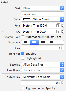
Repeat exactly the same procedure for the temperature label.
Take a look at Interface Builder canvas; the iPhone layouts look much better now:

Working with the preview editor is great, but this is probably a good time to build and run your project to see that everything is still working correctly. The iPhone screens look like everything is sizing correctly:


Congrats, you have learned the basic techniques of Adaptive Layout!
Where To Go From Here?
Here is the finished example project from this Adaptive Layout tutorial.
Take a moment to think about the app you’ve built (or the completed project you’ve downloaded). In particular, consider that it looks really good on all devices, in both orientations, using only one storyboard file!
If nothing else convinces you that Adaptive Layout is the way of the future, consider the fact that this layout will also look good on future devices that haven’t even been released yet.
The takeaway from this tutorial is that, as a developer, you will need to change your approach to app design. Rather than working towards pixel-based layouts, you should be considering the relationship between the UI elements on the screen.
If you want to learn more about Adaptive Layout, check out our Adaptive Layout video tutorial series, which takes you all the way from the beginning to an Adaptive Layout master! It’s also useful to watch Part 1, and Part 2 of Making Apps Adaptive from WWDC 2016.
In the meantime, if you have any questions or comments about this tutorial or Adaptive Layout in general, please join the forum discussion below!
The post Adaptive Layout Tutorial in iOS 11: Getting Started appeared first on Ray Wenderlich.