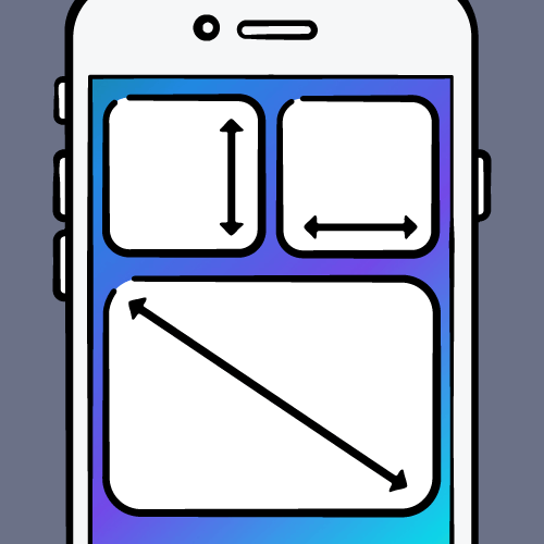
Start thinking in auto layout constraints!
Update note: This tutorial has been updated to iOS 11, Xcode 9, and Swift 4 by Ryan Ackermann. The original tutorial was written by Matthijs Hollemans.
Have you ever been frustrated trying to make your apps look good in both portrait and landscape orientation? Is making screen layouts that support both the iPhone and iPad driving you to the brink of madness?
Despair no longer, I bring you good news!
Not only does Auto Layout make it easy to support different screen sizes in your apps, as a bonus it also makes internationalization almost trivial. You no longer have to make new nibs or storyboards for every language that you wish to support, and this includes right-to-left languages such as Hebrew or Arabic.
In this Auto Layout tutorial, you’ll learn all about constraints and how to apply them!
Auto what now?
If you’re relatively new to iOS development, the phrase “Auto Layout” may be completely foreign to you. So what is it exactly? Well, in the beginning, Apple made only one screen size for the iPhone. And it was good. Developers had an easy time creating interfaces that didn’t have to be terribly flexible, as they really only had to fit that one size. Fast forward to today, and you’re in a much different world: different sized iPhones, iPads, and more emphasis on landscape mode all demand user interfaces of different sizes. Rather than expect developers to create different interfaces for each screen size, Apple came up with a system for allowing elements within a user interface to grow, shrink, and move depending on the size of the screen.. and they called it Auto Layout.
Auto Layout is a system of constraints, or UI based rules, that govern the size and position of elements on the screen. While that may sound simple on the surface, as you’ll see in the tutorial Auto Layout can get quite complex very quickly! Before you dive in, it will be helpful to orient yourself with all the tools in Xcode and Interface Builder.
Auto Layout orientation
Before you start creating a simple user interface, you should take a tour of Xcode and Interface Builder. Interface Builder is a graphical tool inside Xcode that allows developers like you to create user interfaces using Auto Layout. Here’s some of the common terminology you will come across when using Interface Builder.
- The Pin menu is located on the bottom right of the editor. This menu is used to add new constraints to UI elements like buttons and labels.
![auto layout tutorial]()
- The Align menu is located to left of the Pin menu at the bottom right of the editor. This menu creates alignment constraints. You’d use this menu to vertically align a label relative to another view.
![auto layout tutorial]()
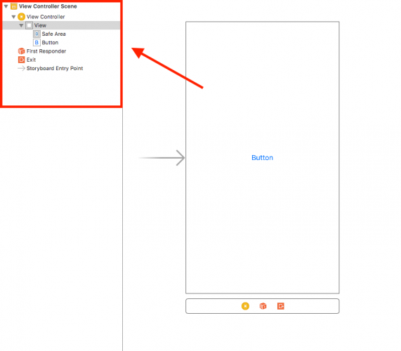
- The Document Outline is located on the left side of the editor. This panel is used to view the hierarchy of a view’s layout. This is useful when trying to figure out the relationship of a view.
![auto layout tutorial]()
- The Attributes Inspector is located in the middle utility pane on the right side of Xcode. This panel is used to customize a view’s attributes. You’d use this panel to change the background color of a view or the text of a button.
![auto layout tutorial]()
- T-bars are Xcode’s way of visualizing constraints on a view. In the image below there are 3 T-bars that represent the button’s top, leading, and trailing constraints. These bars will also indicate if there are any warnings or errors by turning either yellow or red.
![auto layout tutorial]()


To start learning the ins and outs of Interface Builder, you’ll first create an empty iPhone application.
Open up Xcode, and select Create a new Xcode project. Select the Single View App template and enter “Buttons” for the Product Name. Leave other options to their defaults.
Select Main.storyboard and make sure that Use Auto Layout, Use Trait Variations, and Use Safe Area Layout Guides are all enabled via the Storyboard’s File Inspector:

Alright it’s time to get your hands dirty! The best way to get comfortable with Auto Layout is to dive right in and create a user interface, so proceed to the next section and get ready to move fast and furious!
A little runtime excursion
Drag two buttons into the scene and give them a background color of yellow and green. Put the yellow button below the green button.

Select the green button and use the Pin menu on the bottom right to make a constraint to its nearest bottom neighbor (40 points). Then select the lower button and do the same (8 points).

Open the Align menu with the yellow button selected, and check Horizontally in Container. Now, select both buttons, and in the Align menu check Leading Edges and press Add Constraints.

You might see a red circle with an arrow in it on the top left. Usually, this indicates an issue that you need to fix. Don’t worry about this for now, as you’ll fix it later. :]
Playing with this in Interface Builder is all well and good, but now you’ll see how this works at runtime. Add the following method to ViewController.swift:
@IBAction func buttonTapped(_ sender: UIButton) {
  if sender.title(for: .normal) == "X" {
    sender.setTitle("A very long title for this button", for: .normal)
  } else {
    sender.setTitle("X", for: .normal)
  }
}
This toggles between a long title and a short title for the button that triggered the event. Connect this action method to both of the buttons in Interface Builder. Ctrl-drag from each button to the view controller and select buttonTapped: in the popup.
Run the app and tap the buttons to see how it behaves. Perform the test in both portrait and landscape orientations.

Regardless of which button has the long title and which has the short title, the layout always satisfies the constraints you have given it:
- The lower button is always center-aligned in the window, horizontally.
- The lower button always sits 8 points from the bottom of the window.
- The top button is always 40 points above the lower button, and aligned with the lower button.
That is the entire specification for your user interface.

For fun, remove the Leading Alignment constraint (select it in the
and press Delete on your keyboard), then select both buttons in Interface Builder and from the Align menu select the Trailing Edges option.

Now run the app again and notice the differences.

Repeat, but now choose Align\Horizontal Centers. That will always center the top button with respect to the bottom button. Run the app and see how the buttons act when you tap them.

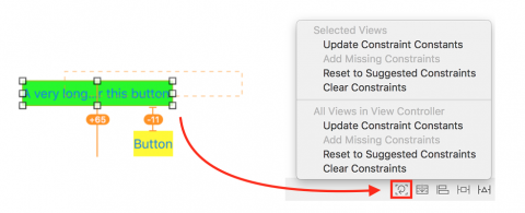
However sometimes the issue might be more tricky to resolve. Selecting the right-most Resolve Auto Layout Issues button presents a menu of options that can help by updating your existing constraints, add missing constraints, resetting your constraints to constraints suggested by Xcode, or clearing the constraints so that you can start over.
Intrinsic Content Size
The Pin menu has a Widths Equally option. If you set this constraint on two views, then Auto Layout will always make both views equally wide, based on which one is the largest.
Select both buttons and choose Pin\Equal Widths. This adds a new constraint to both buttons:

Even though there are two T-bars, in the Document Outline this shows up as a single Equal Widths constraint:

Run the app and tap the buttons. The buttons always have the same width, regardless of which one has the largest label.

Of course, when both labels are very short, both buttons will shrink equally. After all, unless there is a constraint that prevents it, buttons will size themselves to fit their content exactly, no more, no less. What was that called again? Right, the intrinsic content size.
Before Auto Layout, you always had to tell buttons and other controls how big they should be, either by setting their frame or bounds properties or by resizing them in Interface Builder. But it turns out that most controls are perfectly capable of determining how much space they need, based on their content.
A label knows how wide and tall it is because it knows the length of the text that has been set on it, as well as the font size for that text. Likewise for a button, which might combine the text with a background image and some padding.
This is known as the intrinsic content size, and it is an important concept in Auto Layout. You have already seen it in action with the buttons. Auto Layout asks your controls how big they need to be and lays out the screen based on that information.
Usually you want to use the intrinsic content size, but there are some cases where you may not want to do that. You can prevent this by setting an explicit Width or Height constraint on a view.
Fixing the width
So what happens when one of the buttons has a fixed width constraint on it? Buttons calculate their own size, but you can override this by giving them a fixed width. Select the top button and choose Pin\Width from the menu. This adds a solid T-bar below the button:

Because this sort of constraint only applies to the button itself, not to its superview, it is listed in the Document Outline below the button object. In this case, you have fixed the button to a width of 46 points:

You cannot simply drag the button’s resize handles to make the button wider. If you do, you’ll end up with a whole bunch of orange boxes. If you make a change to the button’s frame, it’s up to you to make the constraints match. The alternative approach is to simply change the constraint.
Select the width = 46 constraint and go to the Attributes inspector. Change Constant to 80:

Run the app and tap the buttons. What happens? The button text changes, but it gets truncated because there is not enough room:

Because the top button has a fixed-width constraint and both buttons are required to be the same size, they will never shrink or grow.
Play around with this stuff for a bit to get the hang of pinning and aligning views. Get a feel for it, because not everything is immediately obvious. Just remember that there must always be enough constraints so that Auto Layout can determine the position and size for all views.

Gallery example
You should now have an idea of what constraints are and how you can build up your layouts by forging relationships between the different views. In the following sections, you will see how to use Auto Layout and constraints to create layouts that meet real-world scenarios.
Pretend you want to make an app that has a gallery of your favorite programmers. It looks like this in portrait and landscape:

The screen is divided into four equal quarters. Each quarter has an image view and a label. How would you approach this?
Download and open the starter project so you can get started. The sample project is a blank slate that includes the images you’ll need to display in the gallery. Open Main.storyboard.
Now select the iPhone SE size from the view as panel on the bottom left.

From the Object Library, drag a plain View object onto the canvas. With the view selected, open the Size Inspector, and set the Width to 160, and Height to 284 points.

Next, in the Attributes inspector set the view’s background color to green:

There are two main reasons why you would drop a plain UIView onto a storyboard: a) You’re going to use it as a container for other views, which helps with organizing the content of your scenes; or b) It’s a placeholder for a custom view or control, and you will also set its Class attribute to the name of your own UIView or UIControl subclass.
Select the green view and open the Pin menu. A popup appears which lets you add a variety of constraints, and you will also see a checkbox labeled Constrain to margins:

Remember the blue guides that appear when you drag a view near to the edge of its superview? Instead of creating a constraint from the very edge of the view, you can create a constraint from the view’s margin. A view can define its own margin sizes which allows you to be more flexible about your layouts. For the purposes of this Auto Layout tutorial, you’ll stick to making constraints to the edges of the view. Go ahead and uncheck that box, and create 4 constraints to all four of the green view’s nearest neighbors in each direction by clicking the connector’s between the middle square and text field:

This will create four new constraints between the green view and its superview, one for each side of the view. The actual spacing values may be different for you, depending on where you placed the view – you don’t have the change the values to match the ones above exactly. Click Add 4 Constraints to finish.
Your storyboard should now look something like this:

Maybe you wondered why the constraint at the top of the view doesn’t go all the way up to the top of the screen:

Instead it stops at the status bar. But since iOS 7 the status bar is always drawn on top of the view controller — it is no longer a separate bar — so what gives? When you created the constraint it didn’t actually attach to the top of the screen but the top of an invisible rectangle called the Safe Area.
The Safe Area is the part of the view controller that isn’t obscured by any bars like the status, navigation or tab bar. Because the navigation bar has a different height in landscape, the Safe Area resizes with the bar when the device is rotated. That makes it easy to place views relative to the navigation bar. The same goes for tab bars.
This view needs four constraints to keep it in place. Unlike a button or label, a plain UIView does not have an intrinsic content size. There must always be enough constraints to determine the position and size of each view, so this view also needs constraints to tell it what size it needs to be.
You may wonder, where are these size constraints? In this case, the size of the view is implied by the size of the superview. The constraints in this layout are a leading, trailing, top and bottom constraint, and these all have fixed lengths. You can see this in the Document Outline:

The width of the green view is calculated by the formula “width of safe area minus (80 + 80)” and its height by the formula “height of safe area minus (13 + 163)”. The constraints are fixed, so the view has no choice but to resize. (Again, your values may be different depending on where you put the view.)
When you rotate the app, the dimensions of the superview change, so the view’s size changes with it. Build and run the app, and rotate the simulator to see how the view behaves.

You may not always want your UIView to resize when the device rotates, so you can use constraints to give the view a fixed width and/or height. Do that now. Select the green view and click the Pin button; in the popup put checkmarks in front of Width and Height.

Click Add 2 Constraints to finish. You have now added two new constraints to the view, a 160 point width constraint and a 372 point height constraint:

Because width and height constraints apply to just this view, they are located in the Document Outline under the View. Usually, constraints express a relationship between two different views, but you can consider the width and height constraints to be a relationship between the green view and itself.
Run the app. Yup, looks good in portrait.

Now flip over to landscape. Whoops! Not only does it not look like you wanted – the view has changed size again – but the Xcode debug pane has dumped a nasty error message that looks like this at the top:
Unable to simultaneously satisfy constraints.
Probably at least one of the constraints in the following list is one you don't want.
Try this: (1) look at each constraint and try to figure out which you don't expect;
(2) find the code that added the unwanted constraint or constraints and fix it.
(...)
Will attempt to recover by breaking constraint....
Remember when I said that there must be enough constraints so that Auto Layout can calculate the positions and sizes of all the views? Well, this is an example where there are too many constraints. Whenever you get the error “Unable to simultaneously satisfy constraints”, it means that your constraints are conflicting somewhere.
Look at those constraints again:

There are six constraints set on the green view, the four constraints you saw earlier (1-4) and the new width and height constraints that you have just set on it (5 and 6). So where is the conflict?
In portrait mode there shouldn’t be a problem because the math adds up. If you add the lengths of the leading and trailing constraints and the width constraints, then you should also end up at the width of the super view. Likewise for the vertical constraints.
But when you rotate the device to landscape, the math is off and Auto Layout doesn’t know what to do.
The conflict here is that either the width of the view is fixed and one of the margins must be flexible, or the margins are fixed and the width must be flexible. You can’t have both. So one of these constraints has to go. In the above example, you want the view to have the same width in both portrait and landscape, so the trailing Horizontal Space has got to go.
Remove the Safe Area.trailing = View.trailing at the right and the Safe Area.bottom = View.bottom at the bottom by selecting them in the Document Outline and hitting the delete key. The storyboard should look like this:

Now the view has just the right number of constraints to determine its size and position — no more, no less. Run the app and verify that the error message is gone and that the view stays the same size after rotating.

Painting the portraits
From the Object library, drag a Label onto the green view. Notice that now the guides appear within that green view, because it will be the superview for the label.

Position the label against the bottom margin, spaced equally from the guides. Do this by dding a space constraint to anchor the label against the bottom, left and right of the green view, at 20 points distance. The quickest way is to use the Pin button and selecting the T-bar at the bottom, left and right, and entering 20 for the value:

Now, with the Label selected, in the Attributes inspector, selected the Center Alignment button.

It’s always important to have a right and left constraint on UILabels, since otherwise they would show outside their superview if the text is too long.
Notice that these new constraints are listed under the green view’s own Constraints section, not in the main view.
Drag a new Image View object onto the storyboard, and make the layout look like this:

The image view’s top, left, and right edges are pinned to its superview, but its bottom is connected to the top of the label with a standard spacing of 8 points. If you’re unsure of how to do this, then follow these steps.
1. Drag the image view into the green view but don’t worry too much about its size or position:

2. With the image view selected, press the Pin button and choose the following options:

The top, left, and right T-bars are set to 20 points but the bottom one is set to 8 points.
The constraints you chose result in a different frame than the image view’s current position and size. Interface Builder will automatically adjust the frame as it adds the constraints and everything looks dandy:

As mentioned above if you do end up with a misplaced frame, you can always use the Update Frames (1) or the Resolve Auto Layout Issues (2) button to fix it:

Adding Images
Now you are ready to start adding the images and names to your view. You’ll use the bundled images included in the Assets.xcassets.
Open Main.storyboard. Select the Image View, and in the Attributes Inspector, set Ray as the Image. Also set the Content Mode to Aspect Fit. Then, set the Background to White Color

Double click the Label, and set it’s title to “Ray”.
Next, select the green view’s height constraint, and in the Size Inspector, change its constant to 284. This will make sure it’s half as large as the screen.

Your layout should look like this:

Notice that the constraints inside the green view turned red. This happened the moment you set the image on the image view. How come your layout is suddenly invalid? Fortunately you can take the guesswork out of it and let Xcode tell you exactly what’s wrong.
Click the small red arrow next to View Controller Scene in the Document Outline to view the issues:

You have a Content Priority Ambiguity error. That’s quite the mouthful. This is what it means: If neither the image view nor the label has a fixed height, then Auto Layout doesn’t know by how much to scale each if the height of the green view should change.
Say at some point in your app the green view becomes 100 points taller. How should Auto Layout distribute these new 100 points among the label and the image view? Does the image view become 100 points taller while the label stays the same size? Or does the label become taller while the image view stays the same? Do they both get 50 points extra, or is it split 25/75, 40/60, or some other combination?
If you don’t solve this problem somehow then Auto Layout is going to have to guess and the results may be unpredictable.
The proper solution is to change the Content Hugging Priority of the label. You can imagine “hugging” here to mean “size to fit” – the bounds of the view will “hug” or be close to the intrinsic content size. A higher value here means the view will be less likely to grow and more likely to stay the same.
Go into the Size inspector for the label and set the Vertical Content Hugging Priority to 252. That makes it one higher than the priority of the image view. When the superview changes size, that means the image view will be the one to resize, and the label will stay pretty much the same size. Also change it’s Vertical Content Compression Resistance Priority to 751, which will make sure it doesn’t shrink.

The T-bars should turn blue again and the Auto Layout warnings are gone.
Adding the other heads
Drag the green view into the main view’s top-left corner. Recall that the green view had Horizontal Space and Vertical Space constraints that determined its position in the parent view. It still has those and they cause the frame of the view to be misaligned.

To fix this, use the Resolve Auto Layout Issues button and choose Update Constraints Constants. This will update the constraints to match the frame.

The leading constraint now has size 0 and is represented by a thick blue line at the left edge of the window. Even though the view sits completely in the corner, it still needs constraints to anchor it there:

Xcode was able to generate most of the constraints correctly however, you’ll need to modify the view’s top constraint. In the size inspector double click on the Align Top to Safe Area row in the Sibling & Ancestor Constraints section and set the Second Item to Superview:

Now you are going to start adding more views to show more people. Select the green view and tap ⌘D to duplicate it. Move the duplicate into the top-right corner:

Notice that the T-bars are red. When you made the duplicate, it lost its constraints for the X and Y position. To fix that, pin the view to the top and the right edges of the window (make sure to uncheck Constrain to margins).

Duplicate two more times and put these copies in the bottom-left and bottom-right corners, respectively. The bottom-left view should have its leading and bottom pinned, while the bottom right should have its trailing and bottom edges pinned to the superview.
Time to make the screen more colorful. Select each of the green views and change their backgrounds like you did before, to a different color. Also change the labels’ titles and the images views’ images to represent the programmers. In the end, your screen should look something like this:

Those are some good-looking programmers! :]
Run the app on the iPhone SE simulator. It looks good in portrait, but not in landscape:

It should be pretty obvious what went wrong: you’ve set a fixed width and height on the four brightly-colored container views, so they will always have those sizes, regardless of the size of their superview.
Select the fixed width and fixed height constraints from all four views and delete them (this is easiest in the Document Outline). If you run the app now, you’ll get something like this:

To achieve your desired layout your going to set each view’s width and height to be 50% of the ViewController’s view. Start by Ctrl + dragging from the green Ray view to the white containing view:

While holding Shift click Equal Widths and Equal Heights then press Enter. This will allow you to select multiple items at once. Once those constraints are active Ray will fill the screen, which is not the intention. :]

In the size inspector click the edit button on the Equal Width to Superview row in the Sibling & Ancestor Constraints section:

In the multiplier field enter 0.5 and press Enter. This will set the width of Ray’s view to be 50% of Ray’s container view. Repeat this for the Equal Height to Superview row and you should see that Ray is now the correct size:

Now repeat this for the remaining 3 views. Build and run. Everything looks great!

Where To Go From Here?
You can find the final project for this Auto Layout tutorial here.
If you’ve made it this far through this Auto Layout tutorial, congratulations – you now know what Auto Layout is all about, and have experimented with the basics! But there’s a lot left to learn…
To continue, check out our Auto Layout tutorial video series.
If you have any questions or comments as you continue on you Auto Layout journey, join the forum discussion below!
The post Auto Layout Tutorial in iOS 11: Getting Started appeared first on Ray Wenderlich.


