 Developers and designers don’t always get along. We spend days working on something and then hear “That’s not possible, change your design” or “we’ve changed our minds — change your code”. But fortunately, designers and developers do agree that what matters in the end is shipping a useful app that is enjoyable to use.
The apps we create aren’t completely unique. For example, Uber, YouTube, and Slack solve three very distinct problems: getting from A to B, video access and creation, and communication.
Along with their differences, these widely used mobile apps also have similarities. Consider that they all face the recurring (and boring) problem that is authentication, and they do it by using the recurring solution that is the log-in form.
Solutions for recurring problems like this are known as UX design patterns. UX design patterns offer three main advantages:
- Cost savings: You can reuse and adapt solutions rather than start from scratch.
- Reduced risk: Patterns emerge after a solution has been tried and tested by many, making it more likely to result in a good outcome with fewer bugs than usual.
- Familiarity: Patterns enable a shared vocabulary between designers and developers and reduce barriers between groups in the organization.
UX Design patterns can be composed of smaller, more specific patterns, such as a password visibility toggle that reduces mistakes from not being able to see what you’ve already typed.
Which UX Design Patterns
In this article, we’ll skip basics such as lists, search or log-in forms. Instead, we’ll focus on these five advanced UX design patterns for mobile app UX — speed, security, and comfort:
- Skeleton Views
- 2-Step Authentication
- Accelerator
- One-Handed Usage
- Intelligence
Each UX design pattern is described in detail below, with tips on how and when to use it, along with some real-world examples of each.
Skeleton Views

The Skeleton view makes your app feel faster.
My experience is that users are more time-sensitive than you think. Research by Google suggests even delays as small as 200ms push users away. This is why Google has invested heavily into making content appear faster with a fast web browser, and numerous other technologies such as AMP, HTTP2, and many other initiatives.
Instagram, now with 700 million users, understood very early that speed matters. To drive engagement, it made posting and other common actions in its app appear to happen instantly for the user.
When To Use It
Skeleton views should be used whenever network or processing speed limitations prevent your app from responding immediately to user choices.
Do not assume everyone has a fast network connection or a fast processor in their phone. At the same time, creating a skeleton view for every single view and screen is unnecessary if the view doesn’t depend on the network, or if it’s not accessed daily by most of your customers.
A skeleton view can be used to replace a launch screen. Facebook does this on its web, Android, and iOS apps. It’s the first thing you see when you launch the app.
You can also provide a skeleton view for specific items in a list, grid, or any other view. This is particularly relevant if you’re doing partial data loading, such as when you’re loading just the bytes you don’t have already cached.
Instagram loads likes for a post and a few of the post’s comments when that post is displayed in the timeline, but it only loads the full comment thread once you tap to see the details of that post. Interestingly enough, it doesn’t yet provide a skeleton view for the comment thread or timeline posts like Facebook does.
Tips
When I first started adding skeleton views to the apps I design, I had to ask myself: Which views should have a skeleton equivalent? How tall should the skeleton of a text label be? Which shade of grey should I use? How do I transition from skeleton to the loaded view? How should I animate the skeleton views?
As you likely have similar questions, I’ve included the answers in the form of a video and list of tips below.

Some tips on creating skeletons:
- The skeleton views use a subtle grey for placeholders.
- Use a subtle transparent-white-transparent gradient, animated left-to-right on all placeholders.
- Images/Icons simply become grey frames.
- Text becomes a slightly rounded rectangle with a height matching the lowercase x character of the font used in it.
- States have no skeleton, e.g. tab bar selected state.
- The layout is simplified with conditional and smaller icons or details removed. For example, Foursquare only displays skeleton views for title and description of a search result, not the visit count detail or optional last visited time text.
- Prioritize frequently accessed screens that depend on network or processing speed to be displayed
- Create skeleton views for elements such as images and lists so they can be reused throughout the app, instead of creating a skeleton for the screen itself.
Two-Step Authentication

Two-step authentication improves the security of user accounts.
The problem with the traditional username and password UX design pattern is that passwords aren’t changed often, they’re shared between services, and password managers are often required to handle hundreds of service-specific passwords.
Two-step works by generating a temporary One-Time Password (OTP) remotely on the server when the user starts the log in process, and sharing that temporary OTP with the user via SMS or Email. The user then types the temporary OTP, completing the log in process and causing the password to expire. See the tips below for ways to avoid the typing step.
The temporary nature of OTP and their delivery methods means that users don’t need to create or remember passwords, nor they can share them between services.
When To Use It
For most services, Two-Step offers a balance between security and convenience.
Two-Step is the primary authentication method for mobile apps such as WhatsApp, with 1.2 billion monthly users. Others such as Facebook, Google, Dropbox, and Apple offer Two-Step as a fallback for Two-Factor Authentication.
Without going into much detail, the drawback of Two-Step is that SMS and email, with some effort, can be compromised. Two-Factor is a stronger but harder to use alternative. Two-Factor is stronger because it doesn’t rely on SMS or email.
Instead, codes are generated locally within an app or dedicated hardware as the second factor, the first being the username or email. This makes it harder to access the OTP for both attacker and user.
The bottom line is this: While not perfect, Two-Step is an improvement over username and password authentication. Most users will make the claim “as a user, I don’t want to install an app so I can register or log in to my account” — despite what you may have read in other (fantasy) user stories.
Also note: as Two-Step requires an SMS or Email sender, you may have to weight OTP distribution costs based on how many users you’ve got.
Tips
You can make Two-Step even safer for your customers by pairing it with Delayed Registration, Magic Links, and Android’s SMS Access.

Delayed Registration means the first thing your users see isn’t a form or an onboarding flow. Foursquare is an example of this. You’re allowed to browse freely without an account, but certain actions and screens promote registration and log in (see the image above).
The advantage is that users are more likely to register after they’ve tested your app and understand how it’s valuable to them.

During this period, it’s likely the user has provided a phone number or email while ordering or booking a cab, so you can even prefill the Two-Step registration form for an even simpler registration flow.

One tricky bit is merging data created by the user during their usage as a guest. What happens when the address provided during a guest booking is different from what is in the account they then log into?
My recommendation is to adopt a save-everything approach.
For properties that may contain multiple values, save all existing values; for single-value properties, the best you can do is display a review screen where the user can pick the desired version. Optionally, you may simply override older values with the latest ones provided by the user.

Magic Links: Apps like Slack generate what they call “Magic Links”, which is a fancy name for a URL containing the One-Time Password. When followed, this URL opens the app, which can then read the OTP from the URL itself instead of relying on the user to manually type it in. You can implement your own Magic Links with App Links (Android) or Universal Links (iOS), and send them via SMS or email.
SMS Access: On Android O, you can add a new method to automatically retrieve One-Time Passwords sent via SMS, saving the user from manual inputting and allowing your app full SMS access.
This was the method I chose for a previous client, as it offers by far the best experience on Android (or any other platform) as it takes literally seconds for a user to log in or register.
In one case, my client went from a 12-field form down to a 2-second registration process. Consequently, conversion rates for registration went way, way up.
Ensuring account access: Although unlikely, users may change phone numbers or lose access to email.
Always remember to collect multiple contact details to use as a backup contact method for sending OTP codes. This is mainly a non-issue, as the longer the user uses your service, the more likely it is for a backup method to be in place.
Immediately after registration, you may not have a backup contact method, but there’s also no data to lose in the newly-created user account.
Tips
- To increase the likelihood users don’t loose access to their account, ensure you gather alternative contact methods.
- Be mindful of places where users naturally provide their contact method, and prompt for authentication when they’re not mid-task, such as when they’re waiting for their order to be completed.
- Use Android O’s new SMS Retriever API to retrieve the authentication code without burdening the user. Full SMS access might work on older Android versions. Consider using Magic Links as detailed above.
- Copy matters! Place the authentication code at the very beginning of your message so people can see it in the system notification preview. Use Chunking to make it easier to read by splitting the 6-digit code in two 3-digit parts.
Accelerator
Accelerators are hidden shortcuts that allow users to perform actions or view content more efficiently.
Because they’re hidden, Accelerators should never be the only alternative, but instead complement slower ways of using your app.

This single Instagram screen contains five hidden accelerators:
- Tapping the status bar instantly takes you to the top, faster than scrolling.
- 3D Touch on the author (or long-press on Android) displays an account summary with name, post/follower/following count, and the top six photos. While a simple tap would display the same information, 3D Touch shows it as fast as tapping, unlike long-press, and exposes the three most used actions. More importantly, it allows for instant dismissal by releasing the finger. This is valuable for those who peek into multiple photos or accounts in a short space of time (as seen in the above video).
- Swiping left/right lets you create a story/direct message, which is easier than tapping the icons on the hard-to-reach top area of the screen.
- Long-pressing the tab bar plus button invokes post from your Photo Library, which is one less step compared to tapping the plus icon, waiting for the animation to finish, and then tapping library.
- Long-pressing the tab bar account button displays the account picker. This is easier than tapping account, tapping settings, and scrolling down past all settings.
The takeaway is that all these shortcuts are hiding in plain sight, facilitating or doubling functionality without adding extra buttons to this screen.
When To Use It
Use Accelerators when you want your app to serve the majority of your users who need an obvious but slower interface, as well as serve advanced users who are willing to learn shortcuts to get things done more quickly — without compromising the experience for either of these groups.
In a content app such as Instagram, the majority of users will skim through the timeline, and you’ll want to promote content interaction by making it obvious and dead-easy to use. A smaller group will post content more often, grow their follower base, and have multiple accounts. In this case, Instagram has filled its consumption interface with shortcuts for the creators, as seen above.
Even when all your users are part of the advanced group, accelerators are still a better option than alternatives such as customizable interfaces that, while powerful, burden everyone with thinking about the right settings. This also makes your app more complex to use and maintain.
On authoring apps such as Final Cut Pro, or code editors such as Xcode or Android Studio, the majority of users are familiar with accelerators such as keyboard shortcuts, and rely heavily on them to get work done. Without keyboard shortcuts, giving emphasis to this piece of text would’ve taken me more than a simple Command+B. As a developer, searching the project navigator and clicking the file I want to edit would be a distraction compared to Shift+Cmd+O (Quick Open) or Ctrl+Tab.
Tips
- Accelerators should not be the only way to access a feature or content in your app.
- Use analytics and talk to customers to determine what content and features should be made more accessible through accelerators
- Educate your users, as accelerators are usually invisible to your users. Show them where the accelerators are, how they work, and what users get out of them.
- Consider all available triggers for your accelerators:
- Tap
- Double-tap
- Long-press
- 3D Touch (Peek & Pop, Quick Actions)
- Swipe Navigation (swiping between screens, dismiss by swiping upwards)
- Swipe Actions (swiping on list items)
- Look for common accelerators on Android and iOS. Users are more likely to know them and expect them to work on your app as well. For instance, swipe actions are now part of many iOS and Android apps. Apps like Mail and Gmail let users swipe left on an email to reveal archive, toggle unread, or other common actions.
- Use long-press only when 3D Touch isn’t available, such as on Android or older iOS devices. Long-press adds a 1-second delay and is more likely to be triggered accidentally compared to 3D Touch.
- When using an accelerator, people aren’t looking for the full content or all possible actions. Pick a goal such as searching for a specific venue on a map so you can get directions to it, and instead of showing all photos/reviews/full address, show only one photo, overall rating, and the distance. Narrow down the possible actions to getting directions, calling, sharing, viewing the website or seeing full details.
One-Handed Usage
One-handed usage makes your app easier to use on larger screens as well as on regular-sized devices where you only have one hand available. To allow for one-handed usage, navigation and primary actions must be possible without repositioning the holding hand or use a second one.
In the video above, Apple Music is used as an example of an app where playback, browsing, and functions like Add to Queue can be performed without reaching beyond the bottom area of the screen. Notice how Edit (library shortcuts), User Account, Add (to library) and other secondary, less-used actions are nearer the top of the screen and thus can be put out of easy reach.
Android and iOS already provide components such as bottom/tab bars, floating action button and swipe navigation, but it’s up to you to use them in a way that makes your app easy to use.
Built-in behaviors like iOS’s swipe navigation or Android’s back button are designed with one-handed usage in mind. But it’s up to you to use built-in components like the bottom/tab/tool bar, floating action button, bottom sheet or snack bar, to make your app easy to use with one hand.
When To Use It
With enough effort, any app is usable with one hand. What one-handed usage aims for is effortlessness, as opposed to balancing your phone in your hand while trying to beat the world record for the longest thumb just so you can book a cab while holding your luggage at the airport.
If you’re not designing a desktop or tablet app, one-handed usage should always be on your mind. It doesn’t mean that every single thing in your app should be usable with one hand, but the main actions should be within easy reach.
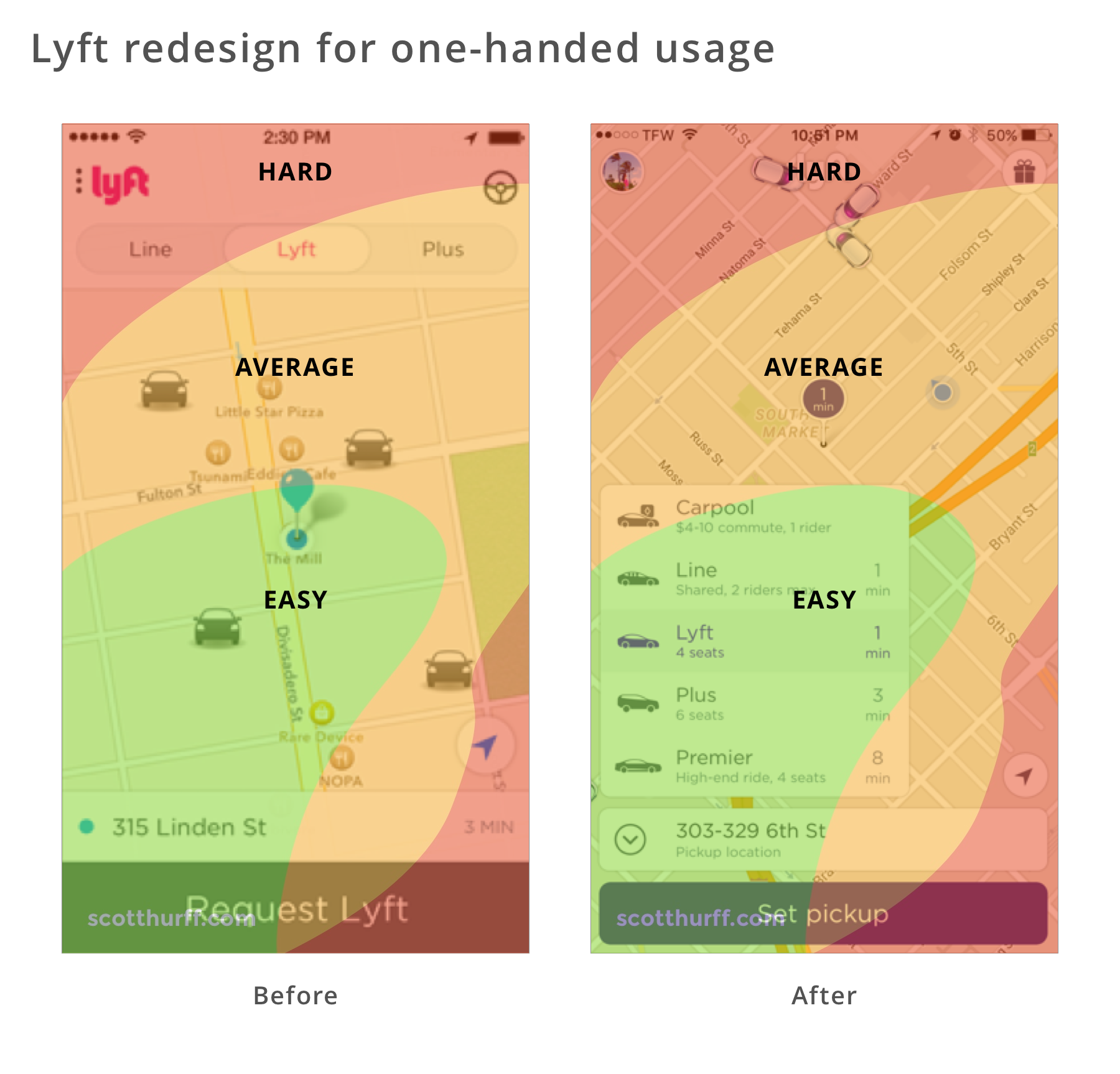
The above screenshots show the Lyft app before and after it was redesigned for one-handed usage. When ordering a Lyft, users primarily need to select the service type and pickup location. Notice how in the redesign these actions are within the easy and average comfort zones, but account and free rides remain out of reach as they’re less-frequently used secondary actions.
Tips
- Exhaust the possibilities of system-provided user interface components first, such as tab bars, bottom sheets, floating action buttons, swipe navigation and swipe-to-refresh, before creating custom solutions users may not be familiar with and ones that you’ll have to spend time creating and maintaining.
- On every screen, think about what has and what doesn’t have to be reachable. Make sure you don’t clutter the bottom of the screen with unrelated or too many features that are unrelated to the goal the user is trying to achieve or doesn’t use often.
- Keep in mind that techniques such as double-tapping or swiping up/down to zoom in/out and edge-gestures lack discoverability. Therefore, you’ll have to educate your users about them during the on-boarding process.
- Use icons on the navigation bar to also display state, such as adding a red dot to the Direct Messages icon to inform about unread messages.
- Educate users about adjacent screens. For instance, Instagram shows Stories and Direct Messages buttons on the navigation bar, which is also accessible by swiping left or right anywhere on the screen.
Intelligence

“A computer should never ask the user for any information that it can auto-detect, copy or deduce.” — Eric Raymond
Eric’s right: Computers can access and understand large amounts of data, and use that data to make predictions or act on our behalf.
Users expect your app to have some basic intelligence, they’ll use it more and rate it higher.
When To Use It
Basic intelligence doesn’t require you to be a machine learning specialist. Something as simple as setting an input field type enables the OS to offer its own intelligence in the form of password suggestions or credential autofill. A good example is the Android O Autofill from the 1Password blog.

With a little bit more code, you can let the OS understand content in your app and present that content in a context that makes sense for the user. In the example above, Apple Maps shows a venue I’ve looked at recently on Foursquare, making it easy to get directions.

You can also be smart about using sensor data to present relevant suggestions for a given moment. Uber avoids suggesting you get a ride home when you’re already there. Instead, they display recent destinations that exclude your current location.
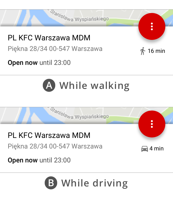
The Awareness API is built-in to Android. Recently, I’ve used it to offer driving directions, if the user is driving, or walking directions when the user is on foot. It also supports other forms of intelligence based on time, location, place, activity, weather, beacons, headphone status, or a combination or multiple characteristics.

The Card.io Uber integration for automatically adding a credit card was what allowed me to signup to Uber and quickly get out of a dodgy neighborhood at night the first time I visited San Francisco. Instead of typing in the 12-digit card number, name, and expiry date in the street at night, I simply pointed it at the card and moments later I’m counting the seconds until my driver arrives.

Users of ASOS, a UK online retailer, were finding it difficult to find the right product in a catalog of thousands of products, even with advanced search and filtering. What ASOS did was relatively simple: they trained a basic image recognition algorithm with images from their catalog, and allowed users to upload arbitrary images so they could be matched with similar products in their catalog.

Natural language processing is an interesting way to add intelligence to your app. In the past, I’ve used it to present people with trivia and products related to the content they were reading and watching.
Back then, I had to partner with a machine learning specialist company, later acquired by Microsoft. Fun fact: the app wasn’t able to understand that when Big Bird says “C is for Chair”, he wasn’t talking about an “Electric Chair”. Nowadays, natural language processing is built right into Android and iOS. It probably still doesn’t know it’s inappropriate to show electric chairs to kids, but the technology itself has become a commodity.
Another interesting example shown at WWDC 2017 involved using NLP to group content from multiple social networks into themes. Searching “hiking” photos given a search term of “hike”, “hiked”, “hiker”, or any other variation.
Tips
- You don’t need a machine learning model to suggest event locations. Simply look at similarly-named events and their location. Move up to machine learning only when necessary.
- Give the user an opportunity to review and accept suggestions.
- Explore and understand available sensors, such as camera, GPS and others, along with available data sources, such as the Photo Library, Contacts, SMS, Apple Pay, Android Pay, and Autofill.
- When accessing data sources, use a just-in-time approach when the user accesses the feature, or use pre-permission dialogs to set things up ahead of time.
- Research available technologies. Android and iOS make it easy to add general intelligence and Machine Learning to your app.
Summary
You’ve covered five advanced UX design patterns to address users’ needs for speed, security, and comfort:
- Speed matters when it comes to retaining users. Skeleton Views make your app appear faster and are used by Facebook, Slack, others.
- The convenience of 2-Step Authentication increases registration metrics and account security.
- Advanced users can count on Accelerators to get more done in less time.
- For when you’re out-and-about, One-Handed Usage is crucial.
- Finally, our apps must use Intelligence to make our lives simpler and stand out against competitors.
As a good next step, keep an eye on how users use your app. Talk to them and understand their problems in a deep and meaningful way. Prioritize those problems by looking at how often they occur and how many people experience them. Focus on frequent problems, experienced by the majority.
Once you understand the problem, then turn to UX design patterns and Apple’s and Google’s design guidelines to see if there is a feature that would solve those problem and make users’ lives simpler. If you manage to solve their problem and improve their experience, you’ll see a related boost in app ratings — and app revenue!
Do you have any UX design patterns you’d add to this list? Let me know in the comments!
The post UX Design Patterns for Mobile Apps: Which and Why appeared first on Ray Wenderlich.