
Create awesome user interfaces with collection views and custom layouts!
UICollectionView, introduced in iOS 6, has become one of the most popular UI elements among iOS developers. What makes it so attractive is the separation between the data and presentation layers, which depends upon a separate object to handle the layout. The layout is then responsible for determining the placement and visual attributes of the views.
You’ve likely used the default flow layout — a layout class provided by UIKit — which consists of a basic grid layout with some customizations. But you can also implement your own custom layouts to arrange the views any way you like; this is what makes the collection view so flexible and powerful.
In this UICollectionView custom layout tutorial, you’ll create a layout inspired by the popular Pinterest app.
In the process, you’ll learn a lot about custom layouts, how to calculate and cache layout attributes, how to handle dynamically sized cells and much more.
Note: This tutorial requires a basic knowledge of UICollectionView. If you’re not familiar with it, you can learn more about it in our written or video tutorial series:
Ready to pimp-up your collection view? Read on!
Getting Started
Download the starter project for this tutorial and open it in Xcode.
Build and run the project, and you’ll see the following:
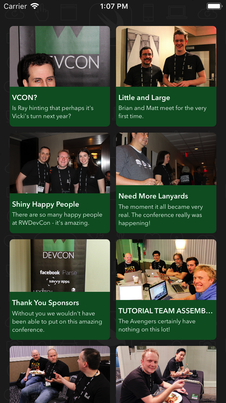
The app presents a gallery of photos from RWDevCon. You can browse the photos and see how much fun the attendees had while at the conference.
The gallery is built using a collection view with a standard flow layout. At first sight, it looks all right. But the layout design could certainly be improved. The photos don’t completely fill the content area and long annotations end up truncated.
The overall user experience appears quite boring and static because all cells have the same size. One way to improve the design would be to create a custom layout where each cell is free to have the size that perfectly fits its needs.
Creating Custom Collection View Layouts
Your first step in creating a stunning collection view is to create a custom layout class for your gallery.
Collection view layouts are subclasses of the abstract UICollectionViewLayout class. They define the visual attributes of every item in your collection view. The individual attributes are instances of UICollectionViewLayoutAttributes and contain the properties of each item in your collection view, such as the item’s frame or transform.
Create a new file inside the Layouts group. Select Cocoa Touch Class from the iOS\Source list. Name it PinterestLayout and make it a subclass of UICollectionViewLayout. Make sure the selected language is Swift and finally create the file.
Next you’ll need to configure the collection view to use your new layout.
Open Main.storyboard and select the Collection View in the Photo Stream View Controller Scene as shown below:

Next, open the Attributes Inspector. Select Custom in the Layout drop-down list and select PinterestLayout in the Class drop-down list:

Okay — time to see how it looks. Build and run your app:


Don’t panic! This is a good sign, believe it or not. This means the collection view is using your custom layout class. The cells aren’t shown because the PinterestLayout class doesn’t yet implement any of the methods involved in the layout process.
Core Layout Process
Take a moment to think about the collection view layout process, which is a collaboration between the collection view and the layout object. When the collection view needs some layout information, it asks your layout object to provide it by calling certain methods in a specific order:

Your layout subclass must implement the following methods:
collectionViewContentSize: This method returns the width and height of the collection view’s contents. You must override it. Then return the height and width of the entire collection view’s content — not just the visible content. The collection view uses this information internally to configure its scroll view’s content size.prepare(): This method is called whenever a layout operation is about to take place. It’s your opportunity to prepare and perform any calculations required to determine the collection view’s size and the positions of the items.layoutAttributesForElements(in:): In this method you need to return the layout attributes for all the items inside the given rectangle. You return the attributes to the collection view as an array ofUICollectionViewLayoutAttributes.layoutAttributesForItem(at:): This method provides on demand layout information to the collection view. You need to override it and return the layout attributes for the item at the requestedindexPath.
Okay, so you know what you need to implement — but how do you go about calculating these attributes?
Calculating Layout Attributes
For this layout, you need to dynamically calculate the height of every item since you don’t know what the height of the photo will be in advance. You’ll declare a protocol that will provide this information when PinterestLayout needs it.
Now, back to the code. Open PinterestLayout.swift and add the following delegate protocol declaration before the PinterestLayout class:
protocol PinterestLayoutDelegate: class {
  func collectionView(_ collectionView:UICollectionView, heightForPhotoAtIndexPath indexPath:IndexPath) -> CGFloat
}
This code declares the PinterestLayoutDelegate protocol, which has a method to request the height of the photo. You’ll implement this protocol in PhotoStreamViewController shortly.
There’s just one more thing to do before implementing the layout methods; you need to declare some properties that will help with the layout process.
Add the following to PinterestLayout:
// 1
weak var delegate: PinterestLayoutDelegate!

// 2
fileprivate var numberOfColumns = 2
fileprivate var cellPadding: CGFloat = 6

// 3
fileprivate var cache = [UICollectionViewLayoutAttributes]()

// 4
fileprivate var contentHeight: CGFloat = 0

fileprivate var contentWidth: CGFloat {
  guard let collectionView = collectionView else {
    return 0
  }
  let insets = collectionView.contentInset
  return collectionView.bounds.width - (insets.left + insets.right)
}

// 5
override var collectionViewContentSize: CGSize {
  return CGSize(width: contentWidth, height: contentHeight)
}
This code defines some properties you’ll need later on to provide the layout information. Here it is, explained step-by-step:
- This keeps a reference to the delegate.
- These are two properties for configuring the layout: the number of columns and the cell padding.
- This is an array to cache the calculated attributes. When you call
prepare(), you’ll calculate the attributes for all items and add them to the cache. When the collection view later requests the layout attributes, you can be efficient and query the cache instead of recalculating them every time. - This declares two properties to store the content size.
contentHeightis incremented as photos are added, andcontentWidthis calculated based on the collection view width and its content inset. - This overrides the
collectionViewContentSizemethod to return the size of the collection view’s contents. You use bothcontentWidthandcontentHeightfrom previous steps to calculate the size.
You’re ready to calculate the attributes for the collection view items, which for now will consist of the frame. To understand how this will be done, take a look at the following diagram:
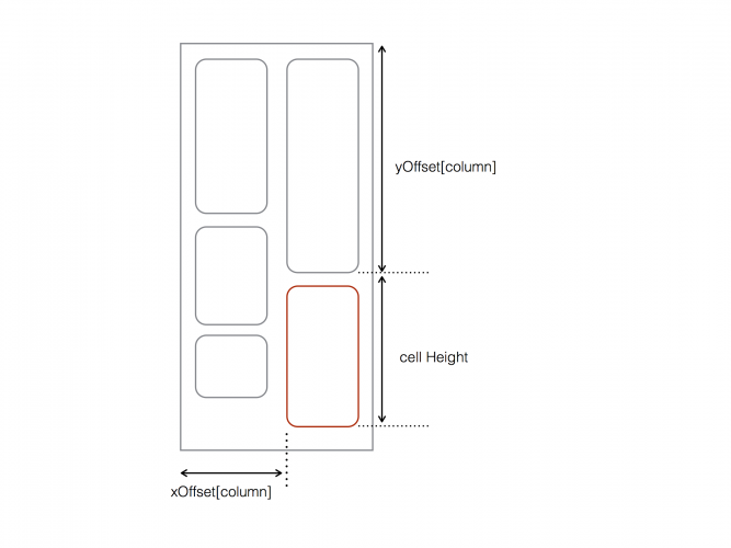
You’ll calculate the frame of every item based on its column (tracked by xOffset) and the position of the previous item in the same column (tracked by yOffset).
To calculate the horizontal position, you’ll use the starting X coordinate of the column the item belongs to, and then add the cell padding. The vertical position is the starting position of the prior item in that column, plus the height of that prior item. The overall item height is the sum of the image height and the content padding.
You’ll do this in prepare(), where your primary objective is to calculate an instance of UICollectionViewLayoutAttributes for every item in the layout.
Add the following method to PinterestLayout:
override func prepare() {
  // 1
  guard cache.isEmpty == true, let collectionView = collectionView else {
    return
  }
  // 2
  let columnWidth = contentWidth / CGFloat(numberOfColumns)
  var xOffset = [CGFloat]()
  for column in 0 ..< numberOfColumns {
    xOffset.append(CGFloat(column) * columnWidth)
  }
  var column = 0
  var yOffset = [CGFloat](repeating: 0, count: numberOfColumns)

  // 3
  for item in 0 ..< collectionView.numberOfItems(inSection: 0) {

    let indexPath = IndexPath(item: item, section: 0)

    // 4
    let photoHeight = delegate.collectionView(collectionView, heightForPhotoAtIndexPath: indexPath)
    let height = cellPadding * 2 + photoHeight
    let frame = CGRect(x: xOffset[column], y: yOffset[column], width: columnWidth, height: height)
    let insetFrame = frame.insetBy(dx: cellPadding, dy: cellPadding)

    // 5
    let attributes = UICollectionViewLayoutAttributes(forCellWith: indexPath)
    attributes.frame = insetFrame
    cache.append(attributes)

    // 6
    contentHeight = max(contentHeight, frame.maxY)
    yOffset[column] = yOffset[column] + height

    column = column < (numberOfColumns - 1) ? (column + 1) : 0
  }
}
Taking each numbered comment in turn:
- You only calculate the layout attributes if
cacheis empty and the collection view exists. - This declares and fills the
xOffsetarray with the x-coordinate for every column based on the column widths. TheyOffsetarray tracks the y-position for every column. You initialize each value inyOffsetto0, since this is the offset of the first item in each column. - This loops through all the items in the first section, as this particular layout has only one section.
- This is where you perform the
framecalculation.widthis the previously calculatedcellWidth, with the padding between cells removed. You ask thedelegatefor the height of the photo and calculate the frame height based on this height and the predefinedcellPaddingfor the top and bottom. You then combine this with the x and y offsets of the current column to create theinsetFrameused by the attribute. - This creates an instance of
UICollectionViewLayoutAttribute, sets its frame usinginsetFrameand appends the attributes tocache. - This expands
contentHeightto account for the frame of the newly calculated item. It then advances theyOffsetfor the current column based on the frame. Finally, it advances thecolumnso that the next item will be placed in the next column.
Note: As prepare() is called whenever the collection view's layout is invalidated, there are many situations in a typical implementation where you might need to recalculate attributes here. For example, the bounds of the UICollectionView might change - such as when the orientation changes - or items may be added or removed from the collection. These cases are out of scope for this tutorial, but it's important to be aware of them in a non-trivial implementation.
Now you need to override layoutAttributesForElements(in:), which the collection view calls after prepare() to determine which items are visible in the given rect.
Add the following code to the very end of PinterestLayout:
override func layoutAttributesForElements(in rect: CGRect) -> [UICollectionViewLayoutAttributes]? {

  var visibleLayoutAttributes = [UICollectionViewLayoutAttributes]()

  // Loop through the cache and look for items in the rect
  for attributes in cache {
    if attributes.frame.intersects(rect) {
      visibleLayoutAttributes.append(attributes)
    }
  }
  return visibleLayoutAttributes
}
Here you iterate through the attributes in cache and check if their frames intersect with rect, which is provided by the collection view. You add any attributes with frames that intersect with that rect to layoutAttributes, which is eventually returned to the collection view.
The last method you must implement is layoutAttributesForItem(at:)
override func layoutAttributesForItem(at indexPath: IndexPath) -> UICollectionViewLayoutAttributes? {
  return cache[indexPath.item]
}
Here you simply retrieve and return from cache the layout attributes which correspond to the requested indexPath.
Before you can see your layout in action, you need to implement the layout delegate. PinterestLayout relies upon this to provide photo and annotation heights when calculating the height of an attribute's frame.
Open PhotoStreamViewController.swift and add the following extension to the end of the file to adopt the PinterestLayoutDelegate protocol:
extension PhotoStreamViewController: PinterestLayoutDelegate {
  func collectionView(_ collectionView: UICollectionView,
                      heightForPhotoAtIndexPath indexPath:IndexPath) -> CGFloat {

    return photos[indexPath.item].image.size.height
  }
}
Here you provide the layout with the exact height of the photos.
Next, add the following code inside viewDidLoad(), just below the call to super:
if let layout = collectionView?.collectionViewLayout as? PinterestLayout {
  layout.delegate = self
}
This sets the PhotoStreamViewController as the delegate for your layout.
Time to see how things are shaping up! Build and run your app. You'll see the cells are properly positioned and sized based on the heights of the photos:
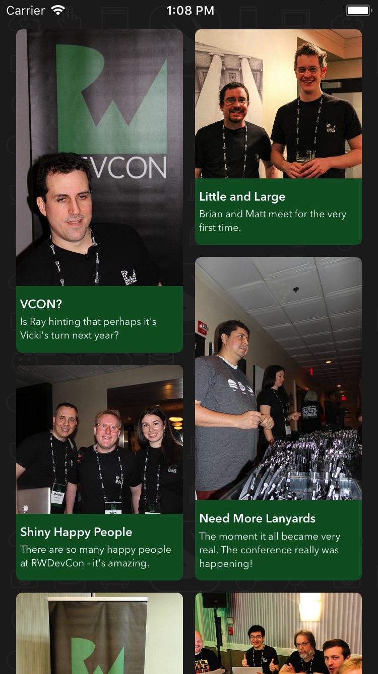
You've now built a completely custom collection view layout - great work!
Where to Go From Here?
You can download the final project with all of the code from the tutorial.
With less work than you probably thought, you've created your very own Pinterest-like custom layout!
If you're looking to learn more about custom layouts, consider the following resources:
- Read the Creating Custom Layouts section of the Collection View Programming Guide for iOS, which covers this subject extensively.
- Follow our Custom Collection View Layout Video Tutorial Series, where you can learn how to build amazing custom layouts inspired by popular iOS apps and dig into some advanced topics like creating interactive layouts and manipulating scroll behaviour.
If you have any questions or comments on this tutorial, feel free to join the discussion below in the forums!
The post UICollectionView Custom Layout Tutorial: Pinterest appeared first on Ray Wenderlich.