Quantcast
Channel: Kodeco | High quality programming tutorials: iOS, Android, Swift, Kotlin, Unity, and more
Viewing all 4374 articles
Browse latest View live

Health and Fitness for Developers

$
0
0

Health and Fitness for Developers

You’re likely already a master of Swift, iOS 11, Kotlin, and Android Oreo. Perhaps you, like me, find yourself visiting raywenderlich.com to read the latest tutorial or continue with an awesome course you’ve been eager to try out. But do you give the same amount of attention and care to your mind, health, and fitness as you do to your technical skills? Most of us don’t.

In this article you’ll see why it’s very important to take care of your health. I’ll also share a personal story to drive home the fact that staying fit, caring for your posture, eating well, and exercising is just as important to your career as is learning the latest API or programming language.

Disclaimer: We are not doctors, nor has this article been revised/edited by one for medical accuracy. These tips and suggestions are based on our experience. For any questions, doubts, or concerns involving major changes in your health and fitness, please consult with your doctor or primary healthcare provider!

Health and Fitness 101: Listen To Your Body And Mind

Do you ever wake up with neck or back pain? Are your hands, fingers, or joints achy at times? Maybe your leg has a pinched nerve or it goes numb when sitting for too long. It could also be that you lack energy and motivation, or you’re feeling a bit blue and have no real reason for it.

These signals are your body and mind gently trying to get your attention, telling you a tiny adjustment (or few) to your lifestyle may be due.

Not all aches, pains, or changes in your body mean you must go to a doctor. We all have those nights where our pillow gets funky and we wake up with neck pain, or sometimes have the occasional bloaty day.

It’s normal to have off days and occasional bouts where you lack energy and motivation. Sometimes it’s just a tinge of burnout or exhaustion that a week or two off might fix. Or maybe you’re beating back some kind of microbial attack.

What’s not normal is chronic, recurring problems that can’t be explained by a recent seasonal, dietary, emotional, or lifestyle change.

“But Felipe, these aches and pains are obviously not normal for you at just 30 years of age. Just wait until you’re my age, that’s when the real fun begins!”

You are totally correct, dear reader, which brings me to the topic of time and age: both huge factors which we often take for granted.

Our teens and twenties feel limitless and invincible. Being up all night working on a project or out with friends and sleeping in late is the norm, and juggling studies, work, and hobbies barely make it onto our personal tiredness radars.

As we age, however, our bodies change. We don’t sleep the same way, tolerate the same foods, or have the same amount of energy as we used to. These changes can often be slow and unnoticeable, but it’s guaranteed to happen. It sounds cliché, but enjoy every day to the fullest. Tomorrow you could have a cold, and only then will you be yearning for better days!

My Story

Once upon a time, my little aches, pains, or anomalies affected me more than they had in the past. I was incredibly tired all the time, and no amount of rest or vacation time had an effect on my body. I figured this was all due to taking on too many projects, while prepping for my wedding, while moving to a new home, while trying to get ready for Christmas and New Year’s!

Christmas came and went, but there was no change. January came and went as well — and again, no change. Once again, I figured things would improve later in February, after my wedding was over.

Things were just getting started.

The Epstein Barr Virus

Fast forward a month or two, and I was diagnosed with Chronic Fatigue Syndrome caused by the Epstein Barr Virus. The TL;DR is that Epstein Barr is a virus for which there is no medication. I was told it could take from six months to three years for the virus to go away, and all I could do was eat more fruits and vegetables, perhaps get into juicing, exercise (which was ironic, considering I barely had any energy to get through half a day), and try therapy to cope with the discomfort.

How Did I Cope?

I followed my doctor’s instructions. I kept going to my therapy sessions, started juicing at home, improved my diet, received acupuncture, walked more, and tried to be as patient as possible.

The days were long, and the anxiety was at times unbearable. After six or months, I would have a few days in a row where I felt noticeably better. I wasn’t feeling 100% better, but it was an improvement. The key takeaway here is discipline. Even though taking care of yourself may not be the most enjoyable task, remaining disciplined can help your health and prevent issues in the future.

What I Learned and How it Motivated Me

It’s been over a year since my doctor reviewed my bloodwork and told me I was cured, but only now, two years since I was diagnosed, can I say I’m fully cured and have been without symptoms for a few months.

In the next few sections, I want to share with you what I’ve learned — the hard way — about taking care of my health.

Posture and Ergonomics

Maintaining a proper posture and ensuring your chair, desk, or work environment is as ergonomic as possible is the first step to taking care of your body.

Why You Should Care And Why It Matters

There are both short and long-term complications that can develop from not paying attention to posture and ergonomics.

For instance, conditions that come and go, such as tendinitis or repetitive strain injury, could become a chronic problem that could affect you for the rest of your life.

Even without going to such extremes, ignoring your posture could create the right conditions for a silly injury that could prevent you from doing your job for days, or even weeks.

Tips on Good Posture and Ergonomics

Bad posture can lead to aches and pains that will eventually sap your energy and cost you productive hours at work and home.

  • Put your monitor/display at eye level so you don’t have to constantly tilt your head up or down to see it properly.
  • Maintain a proper distance between your eyes and the display; Otherwise, you will find yourself leaning forward, backward, or even slouching, which will cause problems in your neck and back.

    As shown in the image, your arms and legs should be bent at a near-90 degree angle. You should also have some wrist support to help avoid repetitive-strain injuries.

  • Ensure you have good lower-back support, and if you like, you could try a headrest as well.

For further reading: here’s a great article on five habits that can create bad posture.

Exercises and Remedies

Exercise is really good at healing and preventing problems related to posture in sedentary jobs, as programming jobs tend to be.

As you code all day long, you put a lot of stress on your back, neck, and all the muscles that are involved in maintaining your posture. Be aware of the signs of circulation problems, and learn how to sit to increase your circulation.

You don’t need to hit the gym twice daily or go all to feel the positive effects. A light walk every day, or even just several times a week, along with some simple crunches and push-ups should help keep you in relatively decent shape!

Here are some tips that can help you overcome the boredom of exercise:

  • Prioritize exercises and activities you actually like. If you prefer swimming to circuit training, or find walking more relaxing than running, then by all means do more of that.
  • Buddy up — exercise, run, or go to the gym with a friend. Mutual motivation and being able to chat with someone else are proven hacks that make exercise less tedious.
  • Mix technology with exercise. Your phone or smart watch likely has support for fitness tracking. The Apple Watch even has achievements that can be earned on specific holidays. With support for a plethora of indoor or outdoor activities, social features, water resistance, and even wireless music, smart watches are definitely a great way to stay motivated when exercising. Alternatively, you could take your cell phone or handheld gaming device on a static bike ride, or even catch up on Netflix while on the elliptical or treadmill.
  • Why not try exercise games like Just Dance? You can dance alone or with friends, burn calories, and have some fun! Pull the curtains tight if you’re concerned about neighbors catching a glimpse of you getting funky.

While I can’t deny that exercise can be tedious, I encourage you to try some of the above ideas — you’ll likely be more motivated and willing to stay active.

Home Remedies

When pain strikes and it’s too late for prevention, there are still some things you can do:

  • Try alternating hot and cold therapy that you can do yourself with a warm cloth or compress and ice pack.
  • Massages are another fantastic way to alleviate tension and stress.
  • Stretching exercises can do wonders in the long term. I’ve often had finger, wrist, or arm pain due to typing or playing video games, and stretching exercises have helped me recover faster and kept me feeling better, longer. These same stretching exercises are something you can do every hour or two throughout your work day to help prevent pain from rearing its head.
  • Finally, you can always resort to ibuprofen or a similar equivalent for pain relief.

One of my favorite resources on YouTube is Dr. Levi.

I’ve found the above video to be super-useful for preventing pain, or managing it when it strikes. Dr. Levi has several videos that cover different exercises you can do to stay healthy. He also has videos on exercises, prevention strategies, tips, and more.

Diet And Exercise

Have you ever felt super thirsty at some point in the day? Perhaps your lips are chapped. Or maybe you’ve been a bit constipated lately. These are signs you are dehydrated. Nutritionists usually recommend you drink half of your body weight in fluid ounces.

To give an example, my weight is around 145 lbs. So I take my weight in pounds (145) and divide it by two, which in my case comes out to 72.2 fluid ounces. To get that in quarts, simply divide by 32. So in my case the recommended fluid intake is 2.27 quarts.

The formula would be:

(weight in pounds / 2) / 32

This isn’t a strict rule, so do what works best for you and what you feel comfortable drinking. A good sign of drinking enough fluid is not being crazy thirsty, or if your urine is not super yellow/dark but is instead more towards the clear side.

One thing that helps me estimate how much water I’ve had in a day is using a water bottle. This way I know if I’ve gone through two bottles, it’s X amount of water, and so on.

The Importance Of A Good Diet

Living off Doritos and ramen? How is your body supposed to fuel your magnificent brain and sustain your body through a day of debugging on those empty calories? Weight gain, lack of energy, disturbed sleep, or not feeling like your usual self can be signs you need changes to your diet.

Think about your computer for a moment. You don’t just buy the cheapest, jankiest possible RAM out there, or some cheap, used hard drive, and shove it into your brand-new laptop. So why would you fill your body with processed foods filled with chemicals, fat and sugar, and rely on unnatural foods for fuel?

There are a few key things to keep in mind when it comes to food:

  • Choose natural, unprocessed, fresh foods whenever possible. If this sounds like more work than heating up a microwaveable pizza, then try planning your meals ahead of time. It’s helpful to keep pre-cooked foods in your fridge, or increase the portions you cook so that by prepping lunch, you have enough leftovers for dinner.
  • Keep your portions in check. It takes your brain about 20 minutes from your first bite until you get the “full” signal. Chew slowly, stay relaxed while eating, and try to stop before you reach the point of OMG TOO FULL. I like to stay a tiny bit hungry as this is an indicator that I’ve eaten just enough for my body to digest.
  • Snack in between meals; ideally, 2 to 2-1/2 hours after each meal. You won’t be as hungry when it’s time for a big meal, which reduces your chances of eating too-large portions, and the snack will help give you energy throughout the day. Snacks can also help prevent gastritis or stomach acids from damaging an empty stomach, and they can also help you lose weight by taming hunger.
  • Remember that snacks are just that — snacks — not a meal! Eat just enough to give your body a little fuel until the next big meal. But DO NOT snack mindlessly!
  • Apples, bananas, nuts, fruits, and veggies make great in-between snacks as they are easy to eat, require absolutely no preparation, provide nutrients and enzymes to your body, and are low-calorie.
  • Color and variety are key. Vitamins are found in abundance in brightly-colored fruits and vegetables. Eat many different foods to keep your diet varied, and unless your doctor has specifically prohibited certain foods, then feel free to occasionally indulge in heavy foods such as sweets, baked goods, bread, or fried food. Everything in moderation.
  • Start paying more attention to the nutritional details of the food you buy the next time you’re out shopping. You’ll be surprised at how much fat and sugar they can pack into something as simple as a sausage, ham, jam, or slice of bread!

Don’t Fear Food

Eat, and enjoy what you eat. One of the biggest mistakes I made when I fell ill was cutting out all foods that were outside the bounds of my diet. I stopped eating a plethora of foods that I’d always enjoyed without worry, as I now considered them too risky for maintaining my energy levels, digestion and mood, when in reality it was affecting me more to NOT eat them. There is truth to the notion that we always want what we can’t have!

Eating is one of the most amazing pleasures in life, and it’s not necessary to give up all the foods you love to be healthy. Moderation is key — for example, instead of starting each day with a creamy latte, opt for drip coffee with a bit of cream most days then splurge on a small latte once a week or so. Little changes like this add up quickly!

There are tons of resources and recipes online to help get you started. Services such as Blue Apron or Plated can help you eat healthier and enjoy more varied food without requiring hours and hours of food preparation and dreadful trips to the grocery store.

Here are a few great resources to get you started:

Where to Go From Here?

If I’d eaten better and been more conscious of my health, I may have avoided my woes, or at least reduced their impact. Skipping breakfast, barely drinking fluids throughout the day, not eating fruits or vegetables, and preferring processed foods to whole foods may have caused a compromised immune system.

Don’t wait to learn things the hard way, like I did. Take small steps today to improve your current health and maintain it in the future.

A flu or headache will go away eventually; osteoporosis, diabetes, and others will be with you forever. Don’t take your health for granted and be proactive about taking care of yourself.

Simple lifestyle tweaks can go a long way toward changing your health and fitness for the long term! If you make the changes fit your lifestyle and your schedule as opposed to to other way around, you’ll be better positioned for long-term success.

Start small and go from there, focus on what matters most to you, and remember that a happier you is a better you. And a better you means a better developer that produces better-quality code!

We hope you enjoyed this article. Let us know in the comments what resources you’d like to share with others, cool tips you have, or simply leave us your thoughts!

The post Health and Fitness for Developers appeared first on Ray Wenderlich.


How To Secure iOS User Data: The Keychain and Biometrics – Face ID or Touch ID

$
0
0
Update note: This tutorial has been updated for Xcode 9.2, Swift 4, iOS 11 and the iPhone X by Tim Mitra. The original tutorial was also written by Tim Mitra.
How To Secure iOS User Data: The Keychain and Biometrics - Face ID or Touch ID

Learn how to secure your app using Face ID or Touch ID

Protecting an app with a login screen is a great way to secure user data – you can use the Keychain, which is built right in to iOS, to ensure their data stays secure. Apple also offers yet another layer of protection with Face ID and Touch ID. 

Available since the iPhone 5S, biometric data is stored in a secure enclave in the A7 and newer chips. All of this means you can comfortably hand over the responsibility of handling login information to the Keychain and either Face ID or Touch ID. 

In this tutorial you’ll start out with static authentication. Next you’ll be using the Keychain to store and verify login information. Finally, you’ll explore using Touch ID or Face ID in your app.

Note: Face ID requires you test on a physical device. Touch ID can now be emulated in Xcode 9 in the Simulator. The Keychain can also be used in the simulator. Throughout the tutorial I refer to Touch ID and it applies to Face ID in most cases. Under the hood, is the Local Authentication framework.

Getting Started

Download the starter project for this tutorial here.

This is a basic note taking app that uses Core Data to store user notes; the storyboard has a login view where users can enter a username and password, and the rest of the app’s views are already connected to each other and ready to use.

Build and run to see what your app looks like in its current state:

TouchMeIn starter

Note: You can ignore any compiler error about Note type missing. It will be autogenerated by Core Data

At this point, tapping the Login button simply dismisses the view and displays a list of notes – you can also create new notes from this screen. Tapping Logout takes you back to the login view. If the app is pushed to the background it will immediately return to the login view; this protects data from being viewed without being logged in.

Before you do anything else, you should change the Bundle Identifier, and assign an appropriate Team.

Select TouchMeIn in the Project navigator, and then select the TouchMeIn target. In the General tab change Bundle Identifier to use your own domain name, in reverse-domain-notation – for example com.raywenderich.TouchMeIn.

Then, from the Team menu, select the team associated with your developer account like so:

With all of the housekeeping done, it’s time to code! :]

Logging? No. Log In.

To get the ball rolling, you’re going to add the ability to check the user-provided credentials against hard-coded values.

Open LoginViewController.swift and add the following constants just below managedObjectContext:

let usernameKey = "Batman"
let passwordKey = "Hello Bruce!"

These are simply the hard-coded username and password you’ll check the user-provided credentials against.

Next, add the following method below loginAction(_:):

func checkLogin(username: String, password: String) -> Bool {
  return username == usernameKey && password == passwordKey
}

Here you check the user-provided credentials against the constants previously defined.

Next, replace the contents of loginAction(_:) with the following:

if checkLogin(username: usernameTextField.text!, password: passwordTextField.text!) {
  performSegue(withIdentifier: "dismissLogin", sender: self)
}

Here you call checkLogin(username:password:), which dismisses the login view only if the credentials are correct.

Build and run. Enter the username Batman and the password Hello Bruce!, and tap the Login button. The login screen should dismiss as expected.

While this simple approach to authentication seems to work, it’s not terribly secure, as credentials stored as strings can easily be compromised by curious hackers with the right tools and training. As a best practice, passwords should NEVER be stored directly in the app. To that end, you’ll employ the Keychain to store the password.

Note: Passwords in most apps are simply strings and are hidden as bullets. The best way to handle a password in your app is to SALT it and/or encrypt it with a SHA-2 encryption as soon as it is captured. Only the user should know the actual string. This is beyond the scope of this tutorial, but you should keep this in mind.

Check out Chris Lowe’s Basic Security in iOS 5 – Part 1 tutorial for the lowdown on how the Keychain works.

Rapper? No. Wrapper.

The next step is to add a Keychain wrapper to your app.

Along with the starter project, you downloaded a folder with useful resources. Locate and open the Resources folder in Finder. You’ll see the file KeychainPasswordItem.swift; this class comes from Apple’s sample code GenericKeychain.

Drag the KeychainPasswordItem.swift into the project, like so:

When prompted, make sure Copy items if needed and TouchMeIn target are both checked:

Copy files if needed

Build and run to make sure you have no errors. All good? Great — now you can leverage the Keychain from within your app.

Keychain, Meet Password. Password, Meet Keychain

To use the Keychain, you first store a username and password in it. Next, you’ll check the user-provided credentials against the Keychain to see if they match.

You’ll track whether the user has already created some credentials so you can change the text on the Login button from “Create” to “Login”. You’ll also store the username in the user defaults so you can perform this check without hitting the Keychain each time.

The Keychain requires some configuration to properly store your app’s information. You’ll provide that configuration in the form of a serviceName and an optional accessGroup. You’ll use a struct to store these values.

Open LoginViewController.swift. Add the following just below the import statements:

// Keychain Configuration
struct KeychainConfiguration {
  static let serviceName = "TouchMeIn"
  static let accessGroup: String? = nil
}

Next, add the following below managedObjectContext:

var passwordItems: [KeychainPasswordItem] = []
let createLoginButtonTag = 0
let loginButtonTag = 1

@IBOutlet weak var loginButton: UIButton!

passwordItems is an empty array of KeychainPasswordItem types you’ll pass into the keychain. You’ll use the next two constants to determine if the Login button is being used to create some credentials, or to log in; you’ll use the loginButton outlet to update the title of the button depending on its state.

Next, you’ll handle the two cases for when the button is tapped: if the user hasn’t yet created their credentials, the button text will show “Create”, otherwise the button will show “Login”.

First you’ll need a way to tell the user if the login fails. Add the following after checkLogin(username:password:):

private func showLoginFailedAlert() {
  let alertView = UIAlertController(title: "Login Problem",
                                    message: "Wrong username or password.",
                                    preferredStyle:. alert)
  let okAction = UIAlertAction(title: "Foiled Again!", style: .default)
  alertView.addAction(okAction)
  present(alertView, animated: true)
}

Now, replace loginAction(sender:) with the following:

@IBAction func loginAction(sender: UIButton) {
  // 1
  // Check that text has been entered into both the username and password fields.
  guard let newAccountName = usernameTextField.text,
    let newPassword = passwordTextField.text,
    !newAccountName.isEmpty,
    !newPassword.isEmpty else {
      showLoginFailedAlert()
      return
  }

  // 2
  usernameTextField.resignFirstResponder()
  passwordTextField.resignFirstResponder()

  // 3
  if sender.tag == createLoginButtonTag {
    // 4
    let hasLoginKey = UserDefaults.standard.bool(forKey: "hasLoginKey")
    if !hasLoginKey && usernameTextField.hasText {
      UserDefaults.standard.setValue(usernameTextField.text, forKey: "username")
    }

    // 5
    do {
      // This is a new account, create a new keychain item with the account name.
      let passwordItem = KeychainPasswordItem(service: KeychainConfiguration.serviceName,
                                              account: newAccountName,
                                              accessGroup: KeychainConfiguration.accessGroup)

      // Save the password for the new item.
      try passwordItem.savePassword(newPassword)
    } catch {
      fatalError("Error updating keychain - \(error)")
    }

    // 6
    UserDefaults.standard.set(true, forKey: "hasLoginKey")
    loginButton.tag = loginButtonTag
    performSegue(withIdentifier: "dismissLogin", sender: self)
  } else if sender.tag == loginButtonTag {
     // 7
    if checkLogin(username: newAccountName, password: newPassword) {
      performSegue(withIdentifier: "dismissLogin", sender: self)
    } else {
      // 8
      showLoginFailedAlert()
    }
  }
}

Here’s what’s happening in the code:

  1. If either the username or password is empty, you present an alert to the user and return from the method.
  2. Dismiss the keyboard if it’s visible.
  3. If the login button’s tag is createLoginButtonTag, then proceed to create a new login.
  4. Next, you read hasLoginKey from UserDefaults which you use to indicate whether a password has been saved to the Keychain. If hasLoginKey is false and the username field has any text, then you save that text as username to UserDefaults.
  5. You create a KeychainPasswordItem with the serviceNamenewAccountName (username) and accessGroup. Using Swift’s error handling, you try to save the password. The catch is there if something goes wrong.
  6. You then set hasLoginKey in UserDefaults to true to indicate a password has been saved to the keychain. You set the login button’s tag to loginButtonTag to change the button’s text, so it will prompt the user to log in the next time they run your app, rather than prompting the user to create a login. Finally, you dismiss loginView.
  7. If the user is logging in (as indicated by loginButtonTag), you call checkLogin to verify the user-provided credentials; if they match then you dismiss the login view.
  8. If the login authentication fails, then present an alert message to the user.
Note: Why not just store the password along with the username in UserDefaults? That would be a bad idea because values stored in UserDefaults are persisted using a plist file. This is essentially an XML file that resides in the app’s Library folder, and is therefore readable by anyone with physical access to the device. The Keychain, on the other hand, uses the Triple Digital Encryption Standard (3DES) to encrypt its data. Even if somebody gets the data, they won’t be able to read it.

Next, replace checkLogin(username:password:) with the following updated implementation:

func checkLogin(username: String, password: String) -> Bool {
  guard username == UserDefaults.standard.value(forKey: "username") as? String else {
    return false
  }

  do {
    let passwordItem = KeychainPasswordItem(service: KeychainConfiguration.serviceName,
                                            account: username,
                                            accessGroup: KeychainConfiguration.accessGroup)
    let keychainPassword = try passwordItem.readPassword()
    return password == keychainPassword
  } catch {
    fatalError("Error reading password from keychain - \(error)")
  }
}

Here you check that the username entered matches the one stored in UserDefaults and that the password matches the one stored in the Keychain.

Next, delete the following lines:

let usernameKey = "Batman"
let passwordKey = "Hello Bruce!"

Now it’s time to set the button title and tags appropriately depending on the state of hasLoginKey.

Add the following code to viewDidLoad(), just below the call to super:

// 1
let hasLogin = UserDefaults.standard.bool(forKey: "hasLoginKey")

// 2
if hasLogin {
  loginButton.setTitle("Login", for: .normal)
  loginButton.tag = loginButtonTag
  createInfoLabel.isHidden = true
} else {
  loginButton.setTitle("Create", for: .normal)
  loginButton.tag = createLoginButtonTag
  createInfoLabel.isHidden = false
}

// 3
if let storedUsername = UserDefaults.standard.value(forKey: "username") as? String {
  usernameTextField.text = storedUsername
}

Taking each numbered comment in turn:

  1. You first check hasLoginKey to see if you’ve already stored a login for this user.
  2. If so, change the button’s title to Login, update its tag to loginButtonTag, and hide createInfoLabel, which contains the informative text “Start by creating a username and password“. In case you don’t have a stored login for this user, you set the button label to Create and display createInfoLabel to the user.
  3. Finally, you set the username field to what is saved in UserDefaults to make logging in a little more convenient for the user.

Finally, you need to connect your outlet to the Login button. Open Main.storyboard and select the Login View Controller Scene. Ctrl-drag from the Login View Controller to the Login button, as shown below:

From the resulting popup, choose loginButton:

Build and run. Enter a username and password of your own choosing, then tap Create.

Note: If you forgot to connect the loginButton IBOutlet then you might see the error Fatal error: unexpectedly found nil while unwrapping an Optional value. If you do, connect the outlet as described in the relevant step above.

Now tap Logout and attempt to login with the same username and password – you should see the list of notes appear.

Tap Logout and try to log in again; this time, use a different password and then tap Login. You should see the following alert:

wrong password

Congratulations – you’ve now added authentication use the Keychain. Next up, Touch ID.

Touching You, Touching Me

Note: Face ID requires that you test on a physical device, such as an iPhone X. Touch ID can now be emulated in Xcode 9 in the Simulator. You can test biometric ID on any device with a A7 chip or newer and Face ID/Touch ID hardware.

In this section, you’ll add biometric ID to your project in addition to using the Keychain. While Keychain isn’t necessary for Face ID/Touch ID to work, it’s always a good idea to implement a backup authentication method for instances where biometric ID fails, or for users that don’t have at least a Touch ID compatible device.

Open Assets.xcassets.

Next, open the Resources folder from the starter project you downloaded earlier in Finder. Locate FaceIcon and Touch-icon-lg.png images (all three sizes), select all six and drag them into Images.xcassets so that Xcode knows they’re the same image, only with different resolutions:

Open Main.storyboard and drag a Button from the Object Library onto the Login View Controller Scene, just below the Create Info Label, inside the Stack View. You can open the Document Outline, swing open the disclosure triangles and make sure that the Button is inside the Stack View. It should look like this:

If you need to review stack views, take a look at UIStackView Tutorial: Introducing Stack Views.

In the Attributes inspector, adjust the button’s attributes as follows:

  • Set Type to Custom.
  • Leave the Title empty.
  • Set Image to Touch-icon-lg.

When you’re done, the button’s attributes should look like this:

Screen Shot 2014-12-22 at 3.05.58 AM

Ensure your new button is selected, then click the Add New Constraints button in the layout bar at the foot of the storyboard canvas and set the constraints as below:

constraints on Touch button

  • Width should be 66
  • Height should be 67

Click Add 2 Constrains. Your view should now look like the following:

login view

Still in Main.storyboard, open the Assistant Editor and make sure LoginViewController.swift is showing.

Next, Control-drag from the button you just added to LoginViewController.swift, just below the other IBOutlets, like so:

connect touchButton

In the popup enter touchIDButton as the Name and click Connect:

This creates an IBOutlet you’ll use to hide the button on devices that don’t have biometric ID available.

Next, you need to add an action for the button.

Control-drag from the same button to LoginViewController.swift to just above checkLogin(username:password:):

connect touch action

In the popup, change Connection to Action, set Name to touchIDLoginAction, set Arguments to none for now. Then click Connect.

Build and run to check for any errors. You can still build for the Simulator at this point since you haven’t yet added support for biometric ID. You’ll take care of that now.

Adding Local Authentication

Implementing biometric ID is as simple as importing the Local Authentication framework and calling a couple of simple yet powerful methods.

Here’s what the Local Authentication documentation has to say:

“The Local Authentication framework provides facilities for requesting authentication from users with specified security policies.”

The specified security policy in this case will be your user’s biometrics — A.K.A their face or fingerprint! :]

New in iOS 11 is support for Face ID. LocalAuthentication adds a couple of new things: a required FaceIDUsageDescription and a LABiometryType to determine whether the device supports Face ID or Touch ID.

In Xcode’s Project navigator select the project and click the Info tab. Hover over the right edge of one of the Keys and click the +. Start typing “Privacy” and from the pop up list that appears select “Privacy – Face ID Usage Description” as the key.

Note: you can also enter “NSFaceIDUsageDescription” as the key.

The type should be a String. In the value field enter We use Face ID to unlock the notes.

In the Project navigator right-click the TouchMeIn group folder and select New File…. Choose iOS\Swift File. Click Next. Save the file as TouchIDAuthentication.swift with the TouchMeIn target checked. Click Create.

Open TouchIDAuthentication.swift and add the following import just below import Foundation:

import LocalAuthentication

Next, add the following to create a new class:

class BiometricIDAuth {

}

Now you’ll need a reference to the LAContext class.

Inside the class add the following code between the curly braces:

let context = LAContext()

The context references an authentication context, which is the main player in Local Authentication. You’ll need a function to see if biometric ID is available to the user’s device or in the Simulator.

Add the following method to return a Bool if biometric ID is supported inside BiometricIDAuth:

func canEvaluatePolicy() -> Bool {
  return context.canEvaluatePolicy(.deviceOwnerAuthenticationWithBiometrics, error: nil)
}

Open LoginViewController.swift and add the following property to create a reference to BiometricIDAuth.

let touchMe = BiometricIDAuth()

At the bottom of viewDidLoad() add the following:

touchIDButton.isHidden = !touchMe.canEvaluatePolicy()

Here you use canEvaluatePolicy(_:) to check whether the device can implement biometric authentication. If so, show the Touch ID button; if not, leave it hidden.

Build and run on the Simulator; you’ll see the Touch ID logo is hidden. Now build and run on your physical Face ID/Touch ID-capable device; you’ll see the Touch ID button is displayed. In the Simulator you can choose Touch ID > Enrolled from the Hardware menu and test the button.

Face ID or Touch ID

If you’re running on an iPhone X or later Face ID equipped device you may notice a problem. You’ve taken care of the Face ID Usage Description, and now the Touch ID icon seems out of place. You’ll use the biometryType enum to fix this.

Open, TouchIDAuthentication.swift and add a BiometricType enum above the class.

enum BiometricType {
  case none
  case touchID
  case faceID
}

Next, add the following function to return which biometric type is supported using the canEvaluatePolicy.

func biometricType() -> BiometricType {
  let _ = context.canEvaluatePolicy(.deviceOwnerAuthenticationWithBiometrics, error: nil)
  switch context.biometryType {
  case .none:
    return .none
  case .touchID:
    return .touchID
  case .faceID:
    return .faceID
  }
}

Open, LoginViewController and add the following to the bottom of viewDidLoad() to fix the button’s icon.

switch touchMe.biometricType() {
case .faceID:
  touchIDButton.setImage(UIImage(named: "FaceIcon"),  for: .normal)
default:
  touchIDButton.setImage(UIImage(named: "Touch-icon-lg"),  for: .normal)
}

Build and run on the Simulator with Touch ID Enrolled to see the Touch ID icon; you’ll see the correct icon is shown on the iPhone X – the Face ID icon.

Putting Touch ID to Work

Open, TouchIDAuthentication.swift and add the following variable below context:

var loginReason = "Logging in with Touch ID"

The above provides the reason the application is requesting authentication. It will display to the user on the presented dialog.

Next, add the following method to the bottom of BiometricIDAuth to authenticate the user:

func authenticateUser(completion: @escaping () -> Void) { // 1
  // 2
  guard canEvaluatePolicy() else {
    return
  }

  // 3
  context.evaluatePolicy(.deviceOwnerAuthenticationWithBiometrics,
    localizedReason: loginReason) { (success, evaluateError) in
      // 4
      if success {
        DispatchQueue.main.async {
          // User authenticated successfully, take appropriate action
          completion()
        }
      } else {
        // TODO: deal with LAError cases
      }
  }
}

Here’s what’s going on in the code above:

  1. authenticateUser(completion:) takes a completion handler in the form of a closure.
  2. You’re using canEvaluatePolicy() to check whether the device is capable of biometric authentication.
  3. If the device does support biometric ID, you then use evaluatePolicy(_:localizedReason:reply:) to begin the policy evaluation — that is, prompt the user for biometric ID authentication. evaluatePolicy(_:localizedReason:reply:) takes a reply block that is executed after the evaluation completes.
  4. Inside the reply block, you are handling the success case first. By default, the policy evaluation happens on a private thread, so your code jumps back to the main thread so it can update the UI. If the authentication was successful, you will call the segue that dismisses the login view.

You’ll come back and deal with errors in little while.

Open, LoginViewController.swift, locate touchIDLoginAction(_:) and replace it with the following:

@IBAction func touchIDLoginAction() {
  touchMe.authenticateUser() { [weak self] in
    self?.performSegue(withIdentifier: "dismissLogin", sender: self)
  }
}

If the user is authenticated, you can dismiss the Login view.

Go ahead and build and run to see if all’s well.

Dealing with Errors

Wait! What if you haven’t set up biometric ID on your device? What if you are using the wrong finger or are wearing a disguise? Let’s deal with that.

An important part of Local Authentication is responding to errors, so the framework includes an LAError type. There also is the possibility of getting an error from the second use of canEvaluatePolicy.

You’ll present an alert to show the user what has gone wrong. You will need to pass a message from the TouchIDAuth class to the LoginViewController. Fortunately you have the completion handler that you can use it to pass the optional message.

Open, TouchIDAuthentication.swift and update the authenticateUser method.

Change the signature to include an optional message you’ll pass when you get an error.

func authenticateUser(completion: @escaping (String?) -> Void) {

Next, find the // TODO: and replace it with the following:

// 1
let message: String

// 2
switch evaluateError {
// 3
case LAError.authenticationFailed?:
  message = "There was a problem verifying your identity."
case LAError.userCancel?:
  message = "You pressed cancel."
case LAError.userFallback?:
  message = "You pressed password."
case LAError.biometryNotAvailable?:
  message = "Face ID/Touch ID is not available."
case LAError.biometryNotEnrolled?:
  message = "Face ID/Touch ID is not set up."
case LAError.biometryLockout?:
  message = "Face ID/Touch ID is locked."
default:
  message = "Face ID/Touch ID may not be configured"
}
// 4
completion(message)

Here’s what’s happening

  1. Declare a string to hold the message.
  2. Now for the “failure” cases. You use a switch statement to set appropriate error messages for each error case, then present the user with an alert view.
  3. If the authentication failed, you display a generic alert. In practice, you should really evaluate and address the specific error code returned, which could include any of the following:
    • LAError.biometryNotAvailable: the device isn’t Face ID/Touch ID-compatible.
    • LAError.passcodeNotSet: there is no passcode enabled as required for Touch ID
    • LAError.biometryNotEnrolled: there are no face or fingerprints stored.
    • LAError.biometryLockout: there were too many failed attempts.
  4. Pass the message in the completion closure.

iOS responds to LAError.passcodeNotSet and LAError.biometryNotEnrolled on its own with relevant alerts.

There’s one more error case to deal with. Add the following inside the else block of the guard statement, just above return.

completion("Touch ID not available")

The last thing to update is the success case. That completion should contain nil, indicating that you didn’t get any errors. Inside the first success block add the nil.

completion(nil)

Once you’ve completed these changes your finished method should look like this:

func authenticateUser(completion: @escaping (String?) -> Void) {

  guard canEvaluatePolicy() else {
    completion("Touch ID not available")
    return
  }

  context.evaluatePolicy(.deviceOwnerAuthenticationWithBiometrics,
    localizedReason: loginReason) { (success, evaluateError) in
      if success {
        DispatchQueue.main.async {
          completion(nil)
        }
      } else {

        let message: String

        switch evaluateError {
        case LAError.authenticationFailed?:
          message = "There was a problem verifying your identity."
        case LAError.userCancel?:
          message = "You pressed cancel."
        case LAError.userFallback?:
          message = "You pressed password."
        case LAError.biometryNotAvailable?:
          message = "Face ID/Touch ID is not available."
        case LAError.biometryNotEnrolled?:
          message = "Face ID/Touch ID is not set up."
        case LAError.biometryLockout?:
          message = "Face ID/Touch ID is locked."
        default:
          message = "Face ID/Touch ID may not be configured"
        }

        completion(message)
      }
  }
}
Note: When you compile this new error handling, you will see three warnings complaining of using deprecated constants. This is due to a combination of the way Apple added support for Face ID and the way Swift imports Objective-C header files. There are some potential workarounds, but they are much less “Swift-like”. Since Apple is aware of the issue and plans to fix it at a future date, the cleaner code is presented here.

Open LoginViewController.swift and update the touchIDLoginAction(_:) to look like this:

@IBAction func touchIDLoginAction() {
  // 1
  touchMe.authenticateUser() { [weak self] message in
    // 2
    if let message = message {
      // if the completion is not nil show an alert
      let alertView = UIAlertController(title: "Error",
                                        message: message,
                                        preferredStyle: .alert)
      let okAction = UIAlertAction(title: "Darn!", style: .default)
      alertView.addAction(okAction)
      self?.present(alertView, animated: true)
    } else {
      // 3
      self?.performSegue(withIdentifier: "dismissLogin", sender: self)
    }
  }
}

Here’s what you’re doing in this code snippet:

  1. You’ve updated the trailing closure to accept an optional message. If biometric ID works, there is no message.
  2. You use if let to unwrap the message and display it with an alert.
  3. No change here, but if you have no message, you can dismiss the Login view.

Build and run on a physical device and test logging in with Touch ID.

Since LAContext handles most of the heavy lifting, it turned out to be relatively straight forward to implement biometric ID. As a bonus, you were able to have Keychain and biometric ID authentication in the same app, to handle the event that your user doesn’t have a Touch ID-enabled device.

Note: If you want test the errors in Touch ID, you can try to login with an incorrect finger. Doing so five times will disable Touch ID and require password authentication. This prevents strangers from trying to break into other applications on your device. You can re-enable it by going to Settings -> Touch ID & Passcode.

Look Mom! No Hands.

One of the coolest things about the iPhone X is using Face ID without touching the screen. You added a button which you can use to trigger the Face ID, but you can trigger Face ID automagically as well.

Open LoginViewController.swift and add the following code right below viewDidLoad():

override func viewDidAppear(_ animated: Bool) {
  super.viewDidAppear(animated)
  let touchBool = touchMe.canEvaluatePolicy()
  if touchBool {
   touchIDLoginAction()
  }
}

The above will verify if biometric ID is supported and if so try and authenticate the user.

Build and run on an iPhone X or Face ID equipped device and test logging in hands free!

Where to Go from Here?

You can download the completed sample application from this tutorial here.

The LoginViewController you’ve created in this tutorial provides a jumping-off point for any app that needs to manage user credentials.

You can also add a new view controller, or modify the existing LoginViewController, to allow the user to change the password from time to time. This isn’t necessary with biometric ID, since the user’s biometrics probably won’t change much in their lifetime! :] However, you could create a way to update the Keychain; you’d want to prompt the user for their current password before accepting their modification.

Apple also recommends hiding the username and password fields and login button when using Face ID. I’ll leave that for you as a simple challenge.

You can read more about securing your iOS apps in Apple’s official iOS Security Guide.

As always, if you have any questions or comments on this tutorial, feel free to join the discussion below!

The post How To Secure iOS User Data: The Keychain and Biometrics – Face ID or Touch ID appeared first on Ray Wenderlich.

Unity and ShaderKit – Podcast S07 E08

$
0
0

In this episode Independent Creative Professional Tammy Coron joins Dru and Janie to talk about her transition from SpriteKit and Scene Kit to developing with Unity, and then Janie introduces us to ShaderKit.

[Subscribe in iTunes] [RSS Feed]

This episode was sponsored by Rollbar.

Interested in sponsoring a podcast episode? We sell ads via Syndicate Ads, check it out!

Episode Links

Making the Jump to Unity

ShaderKit

Contact Us

Where To Go From Here?

We hope you enjoyed this episode of our podcast. Be sure to subscribe in iTunes to get notified when the next episode comes out.

We’d love to hear what you think about the podcast, and any suggestions on what you’d like to hear in future episodes. Feel free to drop a comment here, or email us anytime at podcast@raywenderlich.com.

The post Unity and ShaderKit – Podcast S07 E08 appeared first on Ray Wenderlich.

Document Based Apps: Creating and Editing Documents

RWDevCon 2018: First Batch of Sponsors Announced!

$
0
0

RWDevCon 2017: First Batch of Sponsors Announced!

This April, we are running our 4th annual iOS conference called RWDevCon 2018.

RWDevCon is different than most other conferences you’ll go to. Instead of just passively watching talks, you get to participate – via hands-on tutorials!

The conference has 18 tutorials across three simultaneous tracks, so you can definitely find something to fit your interests.

We’ll be covering topics like Machine Learning, ARKit, App Architecture, and more – check out the full list.

In addition to all the hands-on tutorials, the new RWConnect brings a design lab, open spaces, a hackathon, and much more!

And today, I’m happy to announce our first batch of sponsors for the conference!

5 New Sponsors!

rwdevcon-sponsors-1

Today, we are happy to announce 5 new sponsors for the conference:

  • IBM: IBM are the creators of Kitura: a high performance and simple to use web framework for building modern Swift applications.
  • Savvy Apps: Savvy Apps is a mobile development company headquartered in Washington DC, on a mission to make life better – one app at a time.
  • Firebase: Firebase helps you build better mobile apps and grow your business.
  • Capital One: Capital One is a leading information-based technology company, on a quest to change banking for good.
  • JetBrains: JetBrains is the world’s leading vendor of professional development tools, and the creator of the Kotlin programming language.

Huge thanks to IBM, Savvy Apps, Firebase, Capital One, and JetBrains for being a part of RWDevCon!

Get Your Ticket

Over 200 people have already registered for RWDevCon 2018 and there aren’t many tickets left – be sure to register now before we sell out.

The team and I look forward to meeting you at RWDevCon for some tutorials, inspiration, and fun!

The post RWDevCon 2018: First Batch of Sponsors Announced! appeared first on Ray Wenderlich.

Core Bluetooth Tutorial for iOS: Heart Rate Monitor

$
0
0
Update note: This tutorial has been written for Xcode 9 & iOS 11 by Jawwad Ahmad. The original Objective-C version was written by Steven Daniel.
Learn how to use Core Bluetooth on a real-world device!

Learn how to use Core Bluetooth on a real-world device!

Given the proliferation of gadgets in today’s world, communication between those devices can lead to using those gadgets, and the information provided by those gadgets, in more effective ways. To this end, Apple has introduced the Core Bluetooth framework, which can communicate with many real-world devices such as heart rate sensors, digital thermostats, and workout equipment. If you can connect to it via BLE (Bluetooth Low Energy) wireless technology, the Core Bluetooth framework can connect to it.

In this tutorial, you’ll learn about the key concepts of the Core Bluetooth framework and how to discover, connect to, and retrieve data from compatible devices. You’ll use these skills to build a heart rate monitoring application that communicates with a Bluetooth heart rate sensor.

The heart rate sensor we use in this tutorial is the Polar H7 Bluetooth Heart Rate Sensor, but any other Bluetooth heart rate sensor should work as well.

First, let’s take a moment to go over a few Bluetooth-specific terms: centrals, peripherals, services, and characteristics.

Centrals and Peripherals

A Bluetooth device can be either a central or peripheral:

  • Central: the object that receives the data from a Bluetooth device.
  • Peripheral: the Bluetooth device that publishes data to be consumed by other devices.

In this tutorial, the iOS device will be the central, receiving heart rate data from the peripheral.

Advertising Packets

Bluetooth peripherals broadcast some of the data they have in the form of advertising packets. These packets can contain information such as the peripheral’s name and main functionality. They can also include extra information related to what kind of data the peripheral can provide.

The job of the central is to scan for these advertising packets, identify any peripherals it finds relevant, and connect to individual devices for more information.

Services and Characteristics

Advertising packets are very small and cannot contain a great deal of information. To share more data, a central needs to connect to a peripheral.

The peripheral’s data is organized into services and characteristics:

  • Service: a collection of data and associated behaviors describing a specific function or feature of a peripheral. For example, a heart rate sensor has a Heart Rate service. A peripheral can have more than one service.
  • Characteristic: provides further details about a peripheral’s service. For example, the Heart Rate service contains a Heart Rate Measurement characteristic that contains the beats per minute data. A service can have more than one characteristic. Another characteristic that the Heart Rate service may have is Body Sensor Location, which is simply a string that describes the intended body location of the sensor.

Each service and characteristic is represented by a UUID which can be either a 16-bit or a 128-bit value.

Getting Started

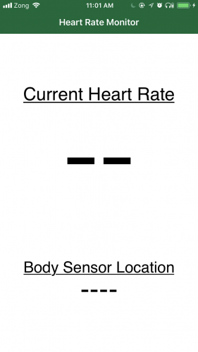
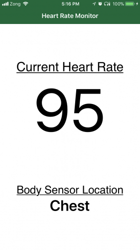
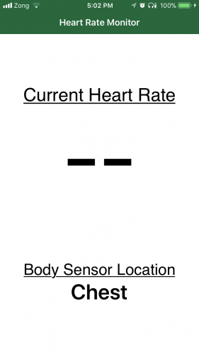
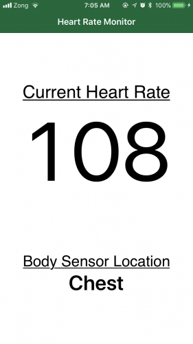
First, download the starter project for this tutorial. It’s a very simple app to display the intended body sensor location and heart rate. The starter project has placeholders for the data to be retrieved from the heart rate monitor.

Starter Project

Starter Project

Starter Project

Final Project

Note: The iOS Simulator doesn’t support Bluetooth – you’ll need to build and run on an actual device.

Before you start coding, you’ll need to set the Team for your project. Select the project root in the project navigator, select the HeartRateMonitor target, and in the General ▸ Signing section, set the Team to your Apple ID. (You might also need to set the bundle Identifier for the project to something else …)

Once that’s done, run the app. If you see an error, you need to navigate to the Settings app on your device, go to General ▸ Device Manangement, and Trust your Apple ID. After that, you will be able to run the app from Xcode on your iOS device.

Preparing for Core Bluetooth

You’ll first import the Core Bluetooth framework. Open HRMViewController.swift and add the following:

import CoreBluetooth

Most of the work in the Core Bluetooth framework will be done through delegate methods. The central is represented by CBCentralManager and its delegate is CBCentralManagerDelegate. CBPeripheral is the peripheral and its delegate is CBPeripheralDelegate.

You’ll lean on Xcode to help you add the required methods. The first thing you’ll do is add conformance to CBCentralManagerDelegate, but you’ll use Xcode’s fix-it feature to add the required protocol method.

Add the following extension to the end of HRMViewController.swift, outside the class:

extension HRMViewController: CBCentralManagerDelegate {

}

You should see an Xcode error appear shortly. Click on the red dot to expand the message and then click Fix to have Xcode add the required protocol method for you.

Would I like to add protocol stubs? Why of course I would, thank you for asking!

Xcode should have added centralManagerDidUpdateState(_:) for you. Add an empty switch statement to the method to handle the various states of the central manager:

switch central.state {

}

In a moment, you’ll see an error stating that switch must be exhaustive. Click on the red dot and click on Fix to have Xcode add all of the cases for you:

Xcode, you are too kind!

Xcode will helpfully add the following code:

You can replace the placeholders with appropriate values from the following code or just replace the whole switch statement if you prefer to cut and paste:

switch central.state {
  case .unknown:
    print("central.state is .unknown")
  case .resetting:
    print("central.state is .resetting")
  case .unsupported:
    print("central.state is .unsupported")
  case .unauthorized:
    print("central.state is .unauthorized")
  case .poweredOff:
    print("central.state is .poweredOff")
  case .poweredOn:
    print("central.state is .poweredOn")
}

If you build and run at this point, nothing will be printed to the console because you haven’t actually created the CBCentralManager.

Add the following instance variable right below the bodySensorLocationLabel outlet:

var centralManager: CBCentralManager!

Next, add the following to the beginning of viewDidLoad() to initialize the new variable:

centralManager = CBCentralManager(delegate: self, queue: nil)

Build and run, and you should see the following printed to the console:

central.state is .poweredOn
Note: If you had Bluetooth turned off on your device, you’ll see central.state is .poweredOff instead. In this case, turn on Bluetooth and run the app again.

Now that the central has been powered on, the next step is for the central to discover the heart rate monitor. In Bluetooth-speak, the central will need to scan for peripherals.

Scanning for Peripherals

For many of the methods you’ll be adding, instead of giving you the method name outright, I’ll give you a hint on how to find the method that you would need. In this case, you want to see if there is a method on centralManager with which you can scan.

On the line after initializing centralManager, start typing centralManager.scan and see if you can find a method you can use:

The scanForPeripherals(withServices: [CBUUID]?, options: [String: Any]?) method looks promising. Select it, use nil for the withServices: parameter and remove the options: parameter since you won’t be using it. You should end up with the following code:

centralManager.scanForPeripherals(withServices: nil)

Build and run. Take a look at the console and note the API MISUSE message:

API MISUSE: <CBCentralManager: 0x1c4462180> can only accept this command while in the powered on state

Well, that certainly makes sense right? You’ll want to scan after central.state has been set to .poweredOn.

Move the scanForPeripherals line out of viewDidLoad() and into centralManagerDidUpdateState(_:), right under the .poweredOn case. You should now have the following for the .poweredOn case:

case .poweredOn:
  print("central.state is .poweredOn")
  centralManager.scanForPeripherals(withServices: nil)
}

Build and run, and then check the console. The API MISUSE message is no longer there. Great! But has it found the heart rate sensor?

It probably has; you simply need to implement a delegate method to confirm that it has found the peripheral. In Bluetooth-speak, finding a peripheral is known as discovering, so the delegate method you’ll want to use will have the word discover in it.

Below the end of the centralManagerDidUpdateState(_:) method, start typing the word discover. The method is too long to read fully, but the method starting with centralManager will be the correct one:

Select that method and replace the code placeholder with print(peripheral).

You should now have the following:

func centralManager(_ central: CBCentralManager, didDiscover peripheral: CBPeripheral,
                    advertisementData: [String: Any], rssi RSSI: NSNumber) {
  print(peripheral)
}

Build and run; you should see a variety of Bluetooth devices depending on how many gadgets you have in your vicinity:

<CBPeripheral: 0x1c4105fa0, identifier = D69A9892-...21E4, name = Your Computer Name, state = disconnected>
<CBPeripheral: 0x1c010a710, identifier = CBE94B09-...0C8A, name = Tile, state = disconnected>
<CBPeripheral: 0x1c010ab00, identifier = FCA1F687-...DC19, name = Your Apple Watch, state = disconnected>
<CBPeripheral: 0x1c010ab00, identifier = BB8A7450-...A69B, name = Polar H7 DCB69F17, state = disconnected>

One of them should be your heart rate monitor, as long as you are wearing it and have a valid heart rate.

Scanning for Peripherals with Specific Services

Wouldn’t it be better if you could only scan for heart rate monitors, since that is the only kind of peripheral you are currently interested in? In Bluetooth-speak, you only want to scan for peripherals that provide the Heart Rate service. To do that, you’ll need the UUID for the Heart Rate service. Search for heart rate in the list of services on the Bluetooth services specification page and note the UUID for it; 0x180D.

From the UUID, you’ll create a CBUUID object and pass it to scanForPeripherals(withServices:), which actually takes an array. So, in this case, it will be an array with a single CBUUID object, since you’re only interested in the heart rate service.

Add the following to the top of the file, right below the import statements:

let heartRateServiceCBUUID = CBUUID(string: "0x180D")

Update the scanForPeripherals(withServices: nil) line to the following:

centralManager.scanForPeripherals(withServices: [heartRateServiceCBUUID])

Build and run, and you should now only see your heart rate sensor being discovered:

<CBPeripheral: 0x1c0117220, identifier = BB8A7450-...A69B, name = Polar H7 DCB69F17, state = disconnected>
<CBPeripheral: 0x1c0117190, identifier = BB8A7450-...A69B, name = Polar H7 DCB69F17, state = disconnected>

Next you’ll store a reference to the heart rate peripheral and then can stop scanning for further peripherals.

Add a heartRatePeripheral instance variable of type CBPeripheral at the top, right after the centralManager variable:

var heartRatePeripheral: CBPeripheral!

Once the peripheral is found, store a reference to it and stop scanning. In centralManager(_:didDiscover:advertisementData:rssi:), add the following after print(peripheral) :

heartRatePeripheral = peripheral
centralManager.stopScan()

Build and run; you should now see the peripheral printed just once.

<CBPeripheral: 0x1c010ccc0, identifier = BB8A7450-...A69B, name = Polar H7 DCB69F17, state = disconnected>

Connecting to a Peripheral

To obtain data from a peripheral you’ll need to connect to it. Right below centralManager.stopScan(), start typing centralManager.connect and you should see connect(peripheral: CBPeripheral, options: [String: Any]?) appear:

Select it, use heartRatePeripheral for the first parameter and delete the options: parameter so that you end up with the following:

centralManager.connect(heartRatePeripheral)

Great! Not only have you discovered your heart rate sensor, but you have connected to it as well! But how can you confirm that you are actually connected? There must be a delegate method for this with the word connect in it. Right after the centralManager(_:didDiscover:advertisementData:rssi:) delegate method, type connect and select centralManager(_:didConnect:):

Replace the code placeholder as follows:

func centralManager(_ central: CBCentralManager, didConnect peripheral: CBPeripheral) {
  print("Connected!")
}

Build and run; you should see Connected! printed to the console confirming that you are indeed connected to it.

Connected!

Discovering a Peripheral’s Services

Now that you’re connected, the next step is to discover the services of the peripheral. Yes, even though you specifically requested a peripheral with the heart rate service and you know that this particular peripheral supports this, you still need to discover the service to use it.

After connecting, call discoverServices(nil) on the peripheral to discover its services:

heartRatePeripheral.discoverServices(nil)

You can pass in UUIDs for the services here, but for now you’ll discover all available services to see what else the heart rate monitor can do.

Build and run and note the two API MISUSE messages in the console:

API MISUSE: Discovering services for peripheral <CBPeripheral: 0x1c010f6f0, ...> while delegate is either nil or does not implement peripheral:didDiscoverServices:
API MISUSE: <CBPeripheral: 0x1c010f6f0, ...> can only accept commands while in the connected state

The second message indicates that the peripheral can only accept commands while it’s connected. The issue is that you initiated a connection to the peripheral, but didn’t wait for it to finish connecting before you called discoverServices(_:)!

Move heartRatePeripheral.discoverServices(nil) into centralManager(_:didConnect:) right below print("Connected!"). centralManager(_:didConnect:) should now look like this:

func centralManager(_ central: CBCentralManager, didConnect peripheral: CBPeripheral) {
  print("Connected!")
  heartRatePeripheral.discoverServices(nil)
}

Build and run. Now you should only see the other API MISUSE message which is:

API MISUSE: Discovering services for peripheral <CBPeripheral: ...> while delegate is either nil or does not implement peripheral:didDiscoverServices:

The Core Bluetooth framework is indicating that you’ve asked to discover services, but you haven’t implemented the peripheral(_:didDiscoverServices:) delegate method.

The name of the method tells you that this is a delegate method for the peripheral, so you’ll need to conform to CBPeripheralDelegate to implement it.

Add the following extension to the end of the file:

extension HRMViewController: CBPeripheralDelegate {

}

Xcode doesn’t offer to add method stubs for this since there are no required delegate methods.

Within the extension, type discover and select peripheral(_:didDiscoverServices:):

Note that this method doesn’t provide you a list of discovered services, only that one or more services has been discovered by the peripheral. This is because the peripheral object has a property which gives you a list of services. Add the following code to the newly added method:

guard let services = peripheral.services else { return }

for service in services {
  print(service)
}

Build and run, and check the console. You won’t see anything printed and, in fact, you’ll still see the API MISUSE method. Can you guess why?

It’s because you haven’t yet pointed heartRatePeripheral at its delegate. Add the following after heartRatePeripheral = peripheral in centralManager(_:didDiscover:advertisementData:rssi:):

heartRatePeripheral.delegate = self

Build and run, and you’ll see the peripheral’s services printed to the console:

<CBService: 0x1c046f280, isPrimary = YES, UUID = Heart Rate>
<CBService: 0x1c046f5c0, isPrimary = YES, UUID = Device Information>
<CBService: 0x1c046f600, isPrimary = YES, UUID = Battery>
<CBService: 0x1c046f680, isPrimary = YES, UUID = 6217FF4B-FB31-1140-AD5A-A45545D7ECF3>

To get just the services you’re interested in, you can pass the CBUUIDs of those services into discoverServices(_:). Since you only need the Heart Rate service, update the discoverServices(nil) call in centralManager(_:didConnect:) as follows:

heartRatePeripheral.discoverServices([heartRateServiceCBUUID])

Build and run, and you should only see the Heart Rate service printed to the console.

<CBService: 0x1c046f280, isPrimary = YES, UUID = Heart Rate>

Discovering a Service’s Characteristics

The heart rate measurement is a characteristic of the heart rate service. Add the following statement right below the print(service) line in peripheral(_:didDiscoverServices:):

print(service.characteristics ?? "characteristics are nil")

Build and run to see what is printed to the console:

characteristics are nil

To obtain the characteristics of a service, you’ll need to explicitly request the discovery of the service’s characteristics:

Replace the print statement you just added with the following:

peripheral.discoverCharacteristics(nil, for: service)

Build and run, and check the console for some API MISUSE guidance on what should be done next:

API MISUSE: Discovering characteristics on peripheral <CBPeripheral: 0x1c0119110, ...> while delegate is either nil or does not implement peripheral:didDiscoverCharacteristicsForService:error:

You need to implement peripheral(_:didDiscoverCharacteristicsFor:error:). Add the following after peripheral(_:didDiscoverServices:) to print out the characteristic objects:

func peripheral(_ peripheral: CBPeripheral, didDiscoverCharacteristicsFor service: CBService,
                error: Error?) {
  guard let characteristics = service.characteristics else { return }

  for characteristic in characteristics {
    print(characteristic)
  }
}

Build and run. You should see the following printed to the console:

<CBCharacteristic: 0x1c00b0920, UUID = 2A37, properties = 0x10, value = (null), notifying = NO>
<CBCharacteristic: 0x1c00af300, UUID = 2A38, properties = 0x2, value = (null), notifying = NO>

This shows you that the heart rate service has two characteristics. If you are using a sensor other than the Polar H7, you may see additional characteristics. One with UUID 2A37, and the other with 2A38. Which one of these is the heart rate measurement characteristic? You can find out by searching for both numbers in the characteristics section of the Bluetooth specification.

On the Bluetooth specification page, you’ll see that 2A37 represents Heart Rate Measurement and 2A38 represents Body Sensor Location.

Add constants for these at the top of the file, below the line for heartRateServiceCBUUID. Adding the 0x prefix to the UUID is optional:

let heartRateMeasurementCharacteristicCBUUID = CBUUID(string: "2A37")
let bodySensorLocationCharacteristicCBUUID = CBUUID(string: "2A38")

Each characteristic has a property called properties of type CBCharacteristicProperties and is an OptionSet. You can view the different types of properties in the documentation for CBCharacteristicProperties, but here you’ll only focus on two: .read and .notify. You’ll need to obtain each characteristic’s value in a different manner.

Checking a Characteristic’s Properties

And the following code in peripheral(_:didDiscoverCharacteristicsFor:error:) after the print(characteristic) to see the characteristic’s properties:

if characteristic.properties.contains(.read) {
  print("\(characteristic.uuid): properties contains .read")
}
if characteristic.properties.contains(.notify) {
  print("\(characteristic.uuid): properties contains .notify")
}

Build and run. In the console you’ll see:

2A37: properties contains .notify
2A38: properties contains .read

The 2A37 characteristic — the heart rate measurement — will notify you when its value updates, so you’ll need to subscribe to receive updates from it. The 2A38 characteristic — the body sensor location — lets you read from it directly…although not quite that directly. You’ll see what I mean in the next section.

Obtaining the Body Sensor Location

Since getting the body sensor location is easier than getting the heart rate, you’ll do that first.

In the code you just added, after print("\(characteristic.uuid): properties contains .read"), add the following:

peripheral.readValue(for: characteristic)

So where is the value read to? Build and run for some further guidance from the Xcode console:

API MISUSE: Reading characteristic value for peripheral <CBPeripheral: 0x1c410b760, ...> while delegate is either nil or does not implement peripheral:didUpdateValueForCharacteristic:error:

The Core Bluetooth framework is telling you that you’ve asked to read a characteristic’s value, but haven’t implemented peripheral(_:didUpdateValueFor:error:). At first glance, this seems like a method that you’d need to implement only for characteristics that would notify you of an update, such as the heart rate. However, you also need to implement it for values that you read. The read operation is asynchronous: You request a read, and are then notified when the value has been read.

Add the method to the CBPeripheralDelegate extension:

func peripheral(_ peripheral: CBPeripheral, didUpdateValueFor characteristic: CBCharacteristic,
                error: Error?) {
  switch characteristic.uuid {
    case bodySensorLocationCharacteristicCBUUID:
      print(characteristic.value ?? "no value")
    default:
      print("Unhandled Characteristic UUID: \(characteristic.uuid)")
  }
}

Build and run; you should see a “1 bytes” message printed to the console, which is the type of message you’d see when you print a Data object directly.

Interpreting the Binary Data of a Characteristic’s Value

To understand how to interpret the data from a characteristic, you have to refer to the Bluetooth specification for the characteristic. Click on the Body Sensor Location link on the Bluetooth characteristics page which will take you to the following page:

The specification shows you that Body Sensor Location is represented by an 8-bit value, so there are 255 possibilities, and only 0 – 6 are used at present. Based on the specification, add the following helper method to the end of the CBPeripheralDelegate extension:

private func bodyLocation(from characteristic: CBCharacteristic) -> String {
  guard let characteristicData = characteristic.value,
    let byte = characteristicData.first else { return "Error" }

  switch byte {
    case 0: return "Other"
    case 1: return "Chest"
    case 2: return "Wrist"
    case 3: return "Finger"
    case 4: return "Hand"
    case 5: return "Ear Lobe"
    case 6: return "Foot"
    default:
      return "Reserved for future use"
  }
}

Since the specification indicates the data consists of a single byte, you can call first on a Data object to get its first byte.

Replace peripheral(_:didUpdateValueFor:error:) with the following:

func peripheral(_ peripheral: CBPeripheral, didUpdateValueFor characteristic: CBCharacteristic,
                error: Error?) {
  switch characteristic.uuid {
    case bodySensorLocationCharacteristicCBUUID:
      let bodySensorLocation = bodyLocation(from: characteristic)
      bodySensorLocationLabel.text = bodySensorLocation
    default:
      print("Unhandled Characteristic UUID: \(characteristic.uuid)")
  }
}

This uses your new helper function to update the label on the UI. Build and run, and you’ll see the body sensor location displayed:

Is there anywhere else I could have worn it?

Obtaining the Heart Rate Measurement

Finally, the moment you’ve been waiting for!

The heart rate measurement characteristic’s properties contained .notify, so you would need to subscribe to receive updates from it. The method you’ll need to call looks a bit weird: it’s setNotifyValue(_:for:).

Add the following to peripheral(_:didDiscoverCharacteristicsFor:error:) after print("\(characteristic.uuid): properties contains .notify"):

peripheral.setNotifyValue(true, for: characteristic)

Build and run, and you’ll see a number of “Unhandled Characteristic UUID: 2A37” messages printed out:

Unhandled Characteristic UUID: 2A37

Congratulations! Within that characteristic’s value is your heart rate. The specification for the heart rate measurement is a bit more complex than that for the body sensor location. Take a look: heart rate measurement characteristic:

The first byte contains a number of flags, and the first bit within the first byte indicates if the heart rate measurement is an 8-bit value or a 16-bit value. If the first bit is a 0 then the heart rate value format is UINT8, i.e. an 8-bit number, and if the first byte is set to 1, the heart rate value format is UINT16, i.e. a 16-bit number.

The reason for this is that in most cases, your heart rate hopefully won’t go above 255 beats per minute, which can be represented in 8 bits. In the exceptional case that your heart rate does go over 255 bpm, then you’d need an additional byte to represent the heart rate. Although you’d then be covered for up to 65,535 bpm!

So now you can determine if the heart rate is represented by one or two bytes. The first byte is reserved for various flags, so the heart rate will be found in either the second byte or the second and third bytes. You can tell that the flags are contained in one byte since the Format column shows 8bit for it.

Note that the very last column, with the title Requires, shows C1 when the value of the bit is 0, and a C2 when the value of the bit is 1.

Scroll down to the C1 and C2 fields, which you’ll see immediately after the specification for the first byte:

Add the following helper method to the end of the CBPeripheralDelegate extension to obtain the heart rate value from the characteristic:

private func heartRate(from characteristic: CBCharacteristic) -> Int {
  guard let characteristicData = characteristic.value else { return -1 }
  let byteArray = [UInt8](characteristicData)

  let firstBitValue = byteArray[0] & 0x01
  if firstBitValue == 0 {
    // Heart Rate Value Format is in the 2nd byte
    return Int(byteArray[1])
  } else {
    // Heart Rate Value Format is in the 2nd and 3rd bytes
    return (Int(byteArray[1]) << 8) + Int(byteArray[2])
  }
}

From characteristic.value, which is an object of type Data, you create an array of bytes. Depending on the value of the first bit in the first byte, you either look at the second byte, i.e. byteArray[1], or you determine what the value would be by combining the second and third bytes. The second byte is shifted by 8 bits, which is equivalent to multiplying by 256. So the value in this case is (second byte value * 256) + (third byte value).

Finally, add another case statement above the default case in peripheral(_:didUpdateValueFor:error:) to read the heart rate from the characteristic.

case heartRateMeasurementCharacteristicCBUUID:
  let bpm = heartRate(from: characteristic)
  onHeartRateReceived(bpm)

onHeartRateReceived(_:) updates the UI with your heart rate.

Build and run your app, and you should finally see your heart rate appear. Try some light exercise and watch your heart rate rise!

Get that heart rate up!

Where to Go From Here?

Here is the completed final project with all of the code from the above tutorial.

In this tutorial, you learned about the Core Bluetooth framework and how you can use it to connect to and obtain data from Bluetooth devices.

You also may want to take a look at the Bluetooth Best Practices section of Apple's Energy Efficiency Guide for iOS Apps.

Want to learn about iBeacons? If so check out our iBeacon Tutorial with iOS and Swift tutorial.

If you have any questions or comments, please join the discussion below!

The post Core Bluetooth Tutorial for iOS: Heart Rate Monitor appeared first on Ray Wenderlich.

Introduction to Google Maps API for Android with Kotlin

$
0
0

Update Note: This tutorial is now up to date with the latest version of the Google Maps API, the latest version of Android Studio version 3.0.1, and uses Kotlin for app development. Update by Joe Howard. Original tutorial by Eunice Obugyei.

Mapping-feature

From fitness apps such as Runkeeper to games such as Pokemon Go, location services are an increasingly important part of modern apps.

In this Google Maps API tutorial, you will create an app named City Guide. The app allows a user to search for a location, use Google Maps to show the address of the location and listen for the user’s location changes.

You will learn how to use the Google Maps Android API, the Google Location Services API and the Google Places API for Android to do the following:

  • Show a user’s current location
  • Display and customize markers on a map
  • Retrieve the address of a location given the coordinates
  • Listen for location updates
  • Search for places
Note: This Google Maps API tutorial assumes you are already familiar with the basics of Android development with Kotlin. If you are completely new to Android development, read through our Beginning Android Development with Kotlin tutorial to familiarize yourself with the basics.

Getting Started

Open Android Studio 3.0.1 or later and select Start a new Android Studio project from the Quick Start menu, or choose File/New Project…:

Quick Start menu

In the Create New Project dialog, on the Create Android Project view, enter the name of the app as City Guide, company domain of android.raywenderlich.com, select your preferred folder location for the project files, make sure that Include Kotlin support, and click Next:

Create Android Project

On the Target Android Devices view, check the Phone and Tablet box and select the minimum SDK you want the app to support. Specify API 16 from the Minimum SDK drop down and click Next.

Target Android Devices

On the Add an Activity to Mobile view, select the Google Maps Activity and click Next.

Add an Activity to Mobile

On the Configure Activity view, click Finish to complete the project creation process.

Configure Activity

Android Studio will use Gradle to build your project. This may take a few seconds.

Open MapsActivity.kt. It should look like this:

package com.raywenderlich.android.cityguide

import android.support.v7.app.AppCompatActivity
import android.os.Bundle

import com.google.android.gms.maps.CameraUpdateFactory
import com.google.android.gms.maps.GoogleMap
import com.google.android.gms.maps.OnMapReadyCallback
import com.google.android.gms.maps.SupportMapFragment
import com.google.android.gms.maps.model.LatLng
import com.google.android.gms.maps.model.MarkerOptions

class MapsActivity : AppCompatActivity(), OnMapReadyCallback {

  private lateinit var mMap: GoogleMap

  override fun onCreate(savedInstanceState: Bundle?) {
    super.onCreate(savedInstanceState)
    setContentView(R.layout.activity_maps)
    // Obtain the SupportMapFragment and get notified when the map is ready to be used.
    val mapFragment = supportFragmentManager
        .findFragmentById(R.id.map) as SupportMapFragment
    mapFragment.getMapAsync(this)
  }

  /**
   * Manipulates the map once available.
   * This callback is triggered when the map is ready to be used.
   * This is where we can add markers or lines, add listeners or move the camera. In this case,
   * we just add a marker near Sydney, Australia.
   * If Google Play services is not installed on the device, the user will be prompted to install
   * it inside the SupportMapFragment. This method will only be triggered once the user has
   * installed Google Play services and returned to the app.
   */
  override fun onMapReady(googleMap: GoogleMap) {
    mMap = googleMap

    // Add a marker in Sydney and move the camera
    val sydney = LatLng(-34.0, 151.0)
    mMap.addMarker(MarkerOptions().position(sydney).title("Marker in Sydney"))
    mMap.moveCamera(CameraUpdateFactory.newLatLng(sydney))
  }
}
  1. MapsActivity currently implements the OnMapReadyCallback interface and extends AppCompatActivity.
  2. The class overrides AppCompatActivity’s onCreate() method
  3. You also override OnMapReadyCallback’s onMapReady() method. This method is called when the map is ready to be used. The code declared in this method creates a marker with coordinates near Sydney, Australia and adds the marker to the map.

The template adds the following in the manifests/AndroidManifest.xml:

  1. A declaration of the ACCESS_FINE_LOCATION permission. This is required to access the user’s precise location.
  2. The com.google.android.geo.API_KEY meta-data. This is used to specify the API key.

The template also adds a Google Play Services dependency to build.gradle. This dependency exposes the Google Maps and Location Services APIs to the application.

compile 'com.google.android.gms:play-services:VERSION_HERE'

When the build is complete, run the app to see what you have:

mapping_start_project_6_run_1

All you have is a blank screen with no map; you haven’t yet set up the API key for the Google Map. You’ll do that next.

Note: If you’re using an emulator, the emulator’s installed version will have to satisfy the version of Google Play Services required in your build.gradle file. If you see a message that you need to update the emulator’s Google Play Services version, you can either download the latest Google APIs using your Android Studio SDK Manager and install on your Virtual Device, or lower the version in your gradle dependency.

Using the Google Maps APIs

To use any of the Google Maps APIs, you need to create an API key and enable any required APIs from the developer console. If you don’t already have a Google account, create one now — it’s free!

Creating API Keys

Open res/values/google_maps_api.xml. You will see the following:

google_maps_api.xml

Now copy and paste the link shown above into your browser.

On the Enable an API page, select Create a project and click Continue.

mapping_start_project_8_create_api_2

On the next screen, click the Create API key button to continue.

mapping_start_project_9_create_api_3

When that’s done, copy the API key shown in the API key created dialog and click Close.

Getting an API Key

Head back to google_maps_api.xml, replace the value of google_maps_key key with the copied API key.

Build and run again. You should see a map with a red marker on the screen.

Run with API key

Go back to the developer console and enable the Google Places API for Android. You will be using this later on to search for a place:

Enable Google Places

Setting up a Fused Location Client

Before adding any Kotlin code, you’ll need to configure Android Studio to automatically insert import statements to save you from having to add each one manually.

Go to your Android Studio Preferences (or Settings on PC) and go to Editor > General > Auto Import, select the Add unambiguous imports on the fly and the Show import popup checkboxes, and click OK.

Import Settings

Open MapsActivity.kt and first rename the GoogleMap property to map by setting the cursor on it and hitting Shift + F6:

private lateinit var map: GoogleMap

Open your app build.gradle file and add the Google Maps location dependency:

implementation 'com.google.android.gms:play-services-location:11.8.0'

Next, add a FusedLocationProviderClient to MapActivity

private lateinit var fusedLocationClient: FusedLocationProviderClient

Add the following line of code to the end of onCreate(),

fusedLocationClient = LocationServices.getFusedLocationProviderClient(this)

Have MapActivity implement the GoogleMap.OnMarkerClickListener interface, which defines the onMarkerClick(), called when a marker is clicked or tapped:

class MapsActivity : AppCompatActivity(), OnMapReadyCallback,
    GoogleMap.OnMarkerClickListener {

Now you need to implement all methods declared in each of the interfaces added above. To do this, follow the steps below:

  1. Place the cursor anywhere on the class declaration and click on the red light bulb icon that appears above the class declaration.
  2. Select Implement members from the options that appear.
  3. On the Implement members dialog, click OK.
  4. Implement members

Update onMarkerClick() to be

override fun onMarkerClick(p0: Marker?) = false

Add the following code to onMapReady():

map.getUiSettings().setZoomControlsEnabled(true)
map.setOnMarkerClickListener(this)

Here you enable the zoom controls on the map and declare MapsActivity as the callback triggered when the user clicks a marker on this map.

Now build and run the app and click the marker on the map near Sydney, and you’ll see the title text appear:

Sydney

Enter a different set of latitude and longitude values and you’ll see the marker move to your chosen location.

Replace the Sydney code with the following code to set a marker at New York City with the title “My Favorite City”:

val myPlace = LatLng(40.73, -73.99)  // this is New York
map.addMarker(MarkerOptions().position(myPlace).title("My Favorite City"))
map.moveCamera(CameraUpdateFactory.newLatLng(myPlace))

Build and run.

New York

Notice the map automatically centered the marker on the screen; moveCamera() does this for you. However, the zoom level of the map isn’t right, as it’s fully zoomed out.

Modify moveCamera() as shown below:

map.moveCamera(CameraUpdateFactory.newLatLngZoom(myPlace, 12.0f))

Zoom level 0 corresponds to the fully zoomed-out world view. Most areas support zoom levels up to 20, while more remote areas only support zoom levels up to 13. A zoom level of 12 is a nice in-between value that shows enough detail without getting crazy-close.

Build and run to view your progress so far.

New York - Zoomed

User Permissions

Your app needs the ACCESS_FINE_LOCATION permission for getting the user’s location details; you’ve already included this in AndroidManifest.xml.

Starting with Android 6.0, user permissions are handled a little differently than before. You don’t request permission during the installation of your app; rather, you request them at run time when the permission is actually required.

Permissions are classified into two categories: normal and dangerous categories. Permissions that belong to the dangerous category require run time permission from the user. Permissions that request access to the user’s private information such as the user’s CONTACTS, CALENDAR, LOCATION etc. are categorised as dangerous permissions.

Open MapsActivity.kt and add a companion object with the code to request location permission:

companion object {
  private const val LOCATION_PERMISSION_REQUEST_CODE = 1
}

Create a new method called setUpMap() as follows.

private fun setUpMap() {
  if (ActivityCompat.checkSelfPermission(this,
      android.Manifest.permission.ACCESS_FINE_LOCATION) != PackageManager.PERMISSION_GRANTED) {
    ActivityCompat.requestPermissions(this,
        arrayOf(android.Manifest.permission.ACCESS_FINE_LOCATION), LOCATION_PERMISSION_REQUEST_CODE)
    return
  }
}

The code above checks if the app has been granted the ACCESS_FINE_LOCATION permission. If it hasn’t, then request it from the user.

Add a call to setUpMap() at the end of onMapReady().

Build and run; click “Allow” to grant permission.

Allow location

Note: A thorough discussion of user permissions is beyond the scope of this tutorial, but check out this document on requesting permissions at run time.

Getting Current Location

One of the most common uses for location services is finding the user’s current location. You do this by requesting the last known location of the user’s device from the Google Play services location APIs.

In MapsActivity.kt, add the following new property:

private lateinit var lastLocation: Location

Next, remove the code in onMapReady() that put a marker in New York:

override fun onMapReady(googleMap: GoogleMap) {
  map = googleMap

  map.uiSettings.isZoomControlsEnabled = true
  map.setOnMarkerClickListener(this)

  setUpMap()
}

Add the code below to the bottom of setUpMap():

// 1
map.isMyLocationEnabled = true

// 2
fusedLocationClient.lastLocation.addOnSuccessListener(this) { location ->
  // Got last known location. In some rare situations this can be null.
  // 3
  if (location != null) {
    lastLocation = location
    val currentLatLng = LatLng(location.latitude, location.longitude)
    map.animateCamera(CameraUpdateFactory.newLatLngZoom(currentLatLng, 12f))
  }
}

Taking each commented section in turn:

  1. isMyLocationEnabled = true enables the my-location layer which draws a light blue dot on the user’s location. It also adds a button to the map that, when tapped, centers the map on the user’s location.
  2. fusedLocationClient.getLastLocation() gives you the most recent location currently available.
  3. If you were able to retrieve the the most recent location, then move the camera to the user’s current location.

Build and run to view your progress so far. You’ll see a light blue dot on the user’s location:

User location dot

Emulator Testing

It’s best to use a real Android device to test a map application. If for some reason, you need to test from an emulator, you can do so by mocking location data in the emulator.

One way to do this is by using the emulator’s extended controls. Here’s how you’d do that:

  1. Start the emulator. On the right hand panel, click the more icon () to access the Extended Controls.
  2. Screen Shot 2016-11-24 at 9.09.43 AM

  3. Select the Location item on the left hand side of the Extended Controls dialog.
  4. Enter the latitude and longitude values in the specified fields and click Send.

using_emulator_for_testing_location

Markers

As you may have noticed from the last run, the blue dot on the user’s location is not very prominent. The Android Maps API lets you use a marker object, which is an icon that can be placed at a particular point on the map’s surface.

In MapsActivity.kt add the following code.

private fun placeMarkerOnMap(location: LatLng) {
  // 1
  val markerOptions = MarkerOptions().position(location)
  // 2
  map.addMarker(markerOptions)
}
  1. Create a MarkerOptions object and sets the user’s current location as the position for the marker
  2. Add the marker to the map

Now replace the setUpMap() with the following:

private fun setUpMap() {
  if (ActivityCompat.checkSelfPermission(this,
      android.Manifest.permission.ACCESS_FINE_LOCATION) != PackageManager.PERMISSION_GRANTED) {
    ActivityCompat.requestPermissions(this,
        arrayOf(android.Manifest.permission.ACCESS_FINE_LOCATION), LOCATION_PERMISSION_REQUEST_CODE)
    return
  }

  map.isMyLocationEnabled = true

  fusedLocationClient.lastLocation.addOnSuccessListener(this) { location ->
    // Got last known location. In some rare situations this can be null.
    if (location != null) {
      lastLocation = location
      val currentLatLng = LatLng(location.latitude, location.longitude)
      placeMarkerOnMap(currentLatLng)
      map.animateCamera(CameraUpdateFactory.newLatLngZoom(currentLatLng, 12f))
    }
  }
}

The only change you made to setUpMap() here is adding a call to placeMarkerOnMap() to show the marker.

Build and run to view your progress so far. You should see a pin on the user’s location:

Location pin

Don’t like the default Android pins? You can also create a marker with a custom icon as the pin. Go back to placeMarkerOnMap() and add the following line of code after the MarkerOptions instantiation:

    markerOptions.icon(BitmapDescriptorFactory.fromBitmap(
        BitmapFactory.decodeResource(resources, R.mipmap.ic_user_location)))

Download custom pins named ic_user_location from this link and unzip it. Switch to the Project view in the Project pane and copy all the files to the corresponding mipmap folders of the project as shown below.

Mipmap folders

Build and run to view your progress so far. The marker on your location should now be using the ic_user_location icon in the project:

Custom Marker

What if all you want is the default pin but in a different color? Try to figure this out by yourself, and then check the spoiler below if you need more help:

Solution Inside SelectShow>

Changing the Map Type

Depending on the functionality of your app, the normal map view might not be detailed enough for you.
The Android Maps API provides different map types to help you out: MAP_TYPE_NORMAL, MAP_TYPE_SATELLITE, MAP_TYPE_TERRAIN, MAP_TYPE_HYBRID

Add the following inside setUpMap() just below the setMyLocationEnabled() call:

map.mapType = GoogleMap.MAP_TYPE_TERRAIN

GoogleMap.MAP_TYPE_TERRAIN displays a more detailed view of the area, showing changes in elevation:

Map Type Terrain

GoogleMap.MAP_TYPE_NORMAL displays a typical road map with labels. This is default type. Here’s what the other types look like:

GoogleMap.MAP_TYPE_SATELLITE displays a satellite view of an area with no labels:

Map Type Satellite

GoogleMap.MAP_TYPE_HYBRID displays a combination of the satellite and normal mode:

Map Type Hybrid

Implementing Geocoding

Now that you have the user’s location, it would be nice if you could show the address of that location when the user clicks on the marker. Google has a class that does exactly that: Geocoder. This takes the coordinates of a location and returns a readable address and vice versa.

Open MapsActivity. Add the following method:

private fun getAddress(latLng: LatLng): String {
  // 1
  val geocoder = Geocoder(this)
  val addresses: List<Address>?
  val address: Address?
  var addressText = ""

  try {
    // 2
    addresses = geocoder.getFromLocation(latLng.latitude, latLng.longitude, 1)
    // 3
    if (null != addresses && !addresses.isEmpty()) {
      address = addresses[0]
      for (i in 0 until address.maxAddressLineIndex) {
        addressText += if (i == 0) address.getAddressLine(i) else "\n" + address.getAddressLine(i)
      }
    }
  } catch (e: IOException) {
    Log.e("MapsActivity", e.localizedMessage)
  }

  return addressText
}

The import for Address is ambiguous, so specify the following import to resolve the issue:

import android.location.Address

Briefly, here’s what’s going on:

  1. Creates a Geocoder object to turn a latitude and longitude coordinate into an address and vice versa.
  2. Asks the geocoder to get the address from the location passed to the method.
  3. If the response contains any address, then append it to a string and return.

Replace placeMarkerOnMap() with the following.

private fun placeMarkerOnMap(location: LatLng) {
  val markerOptions = MarkerOptions().position(location)

  val titleStr = getAddress(location)  // add these two lines
  markerOptions.title(titleStr)

  map.addMarker(markerOptions)
}

Here you added a call to getAddress() and added this address as the marker title.

Build and run to view your progress so far. Click on the marker to see the address:

Address

Click anywhere on the map to dismiss the address.

Notice that when you move locations, the blue dot moves with you, but the marker remains at it’s first location. If you’re using a physical device, try moving around to see this. If you are on emulator, change your coordinates to another location in your emulator control.

The marker doesn’t move because your code does not know that the location has changed. The blue dot is controlled by the Google API, not your code. If you want the marker to follow the blue dot always, you need to receive location updates as a call-back in your code.

Receiving Location Updates

Knowing your user’s location at all times can help you provide a better experience. This section of the tutorial shows you how to continuously receive updates of your user’s location.

To do this, you first have to create a location request.

Open MapsActivity. Now add the following properties:

// 1
private lateinit var locationCallback: LocationCallback
// 2
private lateinit var locationRequest: LocationRequest
private var locationUpdateState = false

companion object {
  private const val LOCATION_PERMISSION_REQUEST_CODE = 1
  // 3
  private const val REQUEST_CHECK_SETTINGS = 2
}
  1. Declare a LocationCallback property.
  2. Declare a LocationRequest property and a location updated state property.
  3. REQUEST_CHECK_SETTINGS is used as the request code passed to onActivityResult.

Next add the following:

private fun startLocationUpdates() {
  //1
  if (ActivityCompat.checkSelfPermission(this,
      android.Manifest.permission.ACCESS_FINE_LOCATION) != PackageManager.PERMISSION_GRANTED) {
    ActivityCompat.requestPermissions(this,
        arrayOf(android.Manifest.permission.ACCESS_FINE_LOCATION),
        LOCATION_PERMISSION_REQUEST_CODE)
    return
  }
  //2
  fusedLocationClient.requestLocationUpdates(locationRequest, locationCallback, null /* Looper */)
}
  1. In startLocationUpdates(), if the ACCESS_FINE_LOCATION permission has not been granted, request it now and return.
  2. If there is permission, request for location updates.

Now add the following method:

private fun createLocationRequest() {
  // 1
  locationRequest = LocationRequest()
  // 2
  locationRequest.interval = 10000
  // 3
  locationRequest.fastestInterval = 5000
  locationRequest.priority = LocationRequest.PRIORITY_HIGH_ACCURACY

  val builder = LocationSettingsRequest.Builder()
      .addLocationRequest(locationRequest)

  // 4
  val client = LocationServices.getSettingsClient(this)
  val task = client.checkLocationSettings(builder.build())

  // 5
  task.addOnSuccessListener {
    locationUpdateState = true
    startLocationUpdates()
  }
  task.addOnFailureListener { e ->
    // 6
    if (e is ResolvableApiException) {
      // Location settings are not satisfied, but this can be fixed
      // by showing the user a dialog.
      try {
        // Show the dialog by calling startResolutionForResult(),
        // and check the result in onActivityResult().
        e.startResolutionForResult(this@MapsActivity,
            REQUEST_CHECK_SETTINGS)
      } catch (sendEx: IntentSender.SendIntentException) {
        // Ignore the error.
      }
    }
  }
}

Here’s what’s going on in createLocationRequest():

  1. You create an instance of LocationRequest, add it to an instance of LocationSettingsRequest.Builder and retrieve and handle any changes to be made based on the current state of the user’s location settings.
  2. interval specifies the rate at which your app will like to receive updates.
  3. fastestInterval specifies the fastest rate at which the app can handle updates. Setting the fastestInterval rate places a limit on how fast updates will be sent to your app.
  4. Before you start requesting for location updates, you need to check the state of the user’s location settings.

  5. You create a settings client and a task to check location settings.
  6. A task success means all is well and you can go ahead and initiate a location request.
  7. A task failure means the location settings have some issues which can be fixed. This could be as a result of the user’s location settings turned off. You fix this by showing the user a dialog as shown below:
  8. Now add the following three methods:

    // 1
    override fun onActivityResult(requestCode: Int, resultCode: Int, data: Intent) {
      super.onActivityResult(requestCode, resultCode, data)
      if (requestCode == REQUEST_CHECK_SETTINGS) {
        if (resultCode == Activity.RESULT_OK) {
          locationUpdateState = true
          startLocationUpdates()
        }
      }
    }
    
    // 2
    override fun onPause() {
      super.onPause()
      fusedLocationClient.removeLocationUpdates(locationCallback)
    }
    
    // 3
    public override fun onResume() {
      super.onResume()
      if (!locationUpdateState) {
        startLocationUpdates()
      }
    }
    

    Here’s what’s going on:

    1. Override AppCompatActivity’s onActivityResult() method and start the update request if it has a RESULT_OK result for a REQUEST_CHECK_SETTINGS request.
    2. Override onPause() to stop location update request
    3. Override onResume() to restart the location update request.

    Setup the LocationCallback() in onCreate() to be:

    locationCallback = object : LocationCallback() {
      override fun onLocationResult(p0: LocationResult) {
        super.onLocationResult(p0)
    
        lastLocation = p0.lastLocation
        placeMarkerOnMap(LatLng(lastLocation.latitude, lastLocation.longitude))
      }
    }
    

    Here you update lastLocation with the new location and update the map with the new location coordinates.

    Next, add a call to createLocationRequest() to the bottom of onCreate():

    createLocationRequest()
    

    Your app is now set to receive location updates. When you change your location, the map will update with a new marker showing your new location. Note that the markers are still clickable to get the address as before.

    Build and run. Play around with the app to view the changes:

    Moving around

    Place Search

    Since this app is supposed to be a guide, a user should be able to search for places of interest to them, right?

    That’s where the Google Places API comes in; it provides your app the functionality to search for millions of institutions and places of interest. It’s Android Library provides a number of cool functionalities, one of them being the Place Picker, which is a UI widget that lets you provide a place search functionality with very few lines of code. Too good to be true? Try it!

    Add the places API to your app build.gradle:

    implementation 'com.google.android.gms:play-services-places:11.8.0'
    

    Once again, open MapsActivity.

    Add this constant to the companion object:

    private const val PLACE_PICKER_REQUEST = 3
    

    Now add the following method:

    private fun loadPlacePicker() {
      val builder = PlacePicker.IntentBuilder()
    
      try {
        startActivityForResult(builder.build(this@MapsActivity), PLACE_PICKER_REQUEST)
      } catch (e: GooglePlayServicesRepairableException) {
        e.printStackTrace()
      } catch (e: GooglePlayServicesNotAvailableException) {
        e.printStackTrace()
      }
    }
    

    This method creates a new builder for an intent to start the Place Picker UI and then starts the PlacePicker intent.

    Now add the following lines of code to onActivityResult():

    if (requestCode == PLACE_PICKER_REQUEST) {
      if (resultCode == RESULT_OK) {
        val place = PlacePicker.getPlace(this, data)
        var addressText = place.name.toString()
        addressText += "\n" + place.address.toString()
    
        placeMarkerOnMap(place.latLng)
      }
    }
    

    Here you retrieve details about the selected place if it has a RESULT_OK result for a PLACE_PICKER_REQUEST request, and then place a marker on that position on the map.

    You are almost ready to try out the place search — you just need to call loadPlacePicker() inside the code.

    You’ll create a floating action button (FAB) at the bottom-right of the map to trigger this method. FAB requires CoordinatorLayout which is part of the design support library.

    Go back to build.gradle for the app and add the Android support design library as a dependency:

    implementation 'com.android.support:design:26.1.0'
    
    Note: As usual, if you are using a newer Android SDK version, you may need to update the version of this dependency as well so they match.

    Then replace the contents of res > layout > activity_maps.xml with the following lines of code:

    <?xml version="1.0" encoding="utf-8"?>
    <android.support.design.widget.CoordinatorLayout
      xmlns:android="http://schemas.android.com/apk/res/android"
      android:layout_width="match_parent"
      android:layout_height="match_parent"
      android:fitsSystemWindows="true">
    
      <fragment
        android:id="@+id/map"
        class="com.google.android.gms.maps.SupportMapFragment"
        android:layout_width="match_parent"
        android:layout_height="match_parent"/>
    
      <android.support.design.widget.FloatingActionButton
        android:id="@+id/fab"
        android:layout_width="wrap_content"
        android:layout_height="wrap_content"
        android:layout_gravity="bottom|end"
        android:layout_marginRight="8dp"
        android:layout_marginBottom="112dp"
        android:src="@android:drawable/ic_menu_search"/>
    
    </android.support.design.widget.CoordinatorLayout>
    

    You were using a fragment element for map earlier; you’ve kept that and added a floating action button.

    In MapsActivity, add the following lines of code to onCreate():

    val fab = findViewById<FloatingActionButton>(R.id.fab)
    fab.setOnClickListener {
      loadPlacePicker()
    }
    

    Build and run. Now when you click the search button at the bottom of the map the place picker will load:

    Place Picker

    Where to Go From Here?

    You can download the final project from this tutorial here. Remember to put a valid Google Maps API key in google_maps_api.xml when running the final project.

    This Google Maps API tutorial only brushed the surface of what you can do with the Google Maps APIs. The official Google documentation has much more about web services and and the Android API here.

    You can also check out the developer page on other ways to customize the marker. User permission checks for run-time permissions need a better implementation than what you’ve done in this Google Maps API tutorial; the docs also have some great information about more advanced permission granting here.

    Check out the developer pages for extensive reading on the Google Places API for Android, receiving location updates and mocking location data via the emulator’s extended controls.

    If you have any questions or comments, please feel free to join the forum discussion below!

    The post Introduction to Google Maps API for Android with Kotlin appeared first on Ray Wenderlich.

Document Based Apps: Opening Files from Other Apps


How to Create a Simple FPS in Unreal Engine 4

$
0
0

How to Create a Simple FPS in Unreal Engine 4

A first-person shooter (FPS) is a genre where the player uses guns and experiences the game through the eyes of the character. FPS games are immensely popular, as shown by franchises such as Call of Duty and Battlefield.

Unreal Engine was originally built to create FPS games so it only makes sense to create one using it. In this tutorial, you will learn how to:

  • Create a first-person Pawn that can move and look around
  • Create a gun and attach it to the player Pawn
  • Shoot bullets using a line trace (also known as a ray cast)
  • Apply damage to actors
Note: This tutorial is part of a 10-part tutorial series on Unreal Engine:

Getting Started

Download the starter project and unzip it. Navigate to the project folder and open BlockBreaker.uproject. You will see the following scene:

unreal engine 4 fps

The green wall consists of multiple targets. When they take damage, they will turn red. Once their health reaches zero, they will disappear. The red button will reset all the targets.

First, you will create the player’s Pawn.

Creating the Player Pawn

Navigate to the Blueprints folder and create a new Blueprint Class. Select Character as the parent class and name it BP_Player.

unreal engine 4 fps

Character is a type of Pawn but with additional functionality such as the CharacterMovement component.

unreal engine 4 fps

This component automatically handles movement such as walking and jumping. You simply call the appropriate function and it will move the Pawn. You can also set variables such as walk speed and jump velocity within this component.

Before you can make the Pawn move, it needs to know when the player presses a movement key. To do this, you will map movement to the W, A, S and D keys.

Note: If you are not familiar with mappings, you can learn about them in our Blueprints tutorial. Key mapping is how you define which keys will perform an action.

Creating Movement Mappings

Select Edit\Project Settings and open the Input settings.

Create two Axis Mappings called MoveForward and MoveRight. MoveForward will handle moving forwards and backwards. MoveRight will handle moving left and right.

unreal engine 4 fps

For MoveForward, change the key to W. Afterwards, create another key and set it to S. Change the Scale for S to -1.0.

unreal engine 4 fps

Note: If you’d like to learn about the Scale field, read our Blueprints tutorial. The Axis Value and Input Scale section describes what it is and how to use it.

Later on, you will multiply the scale value with the Pawn’s forward vector. This will give you a vector that points forward if the scale is positive. If the scale is negative, the vector will point backwards. By using the resulting vector, you can make your Pawn move forwards and backwards.

unreal engine 4 fps

Next, you need to do the same for moving left and right. Change the key for MoveRight to D. Afterwards, create a new key and set it to A. Change the Scale for A to -1.0.

unreal engine 4 fps

Now that you have the mappings set up, you need to use them to move.

Implementing Movement

Open BP_Player and open the Event Graph. Add a MoveForward (the one listed under Axis Events) event. This event will execute every frame, even if you don’t press anything.

unreal engine 4 fps

It will also output an Axis Value which will be the Scale values you set earlier. It will output 1 if you press W and -1 if you press S. If you don’t press either key, it will output 0.

Next, you need to tell the Pawn to move. Add an Add Movement Input and connect it like so:

unreal engine 4 fps

Add Movement Input will take a vector and multiply it by Scale Value. This will convert it to the appropriate direction. Since you are using Character, the CharacterMovement component will move the Pawn in that direction.

Now, you need to specify which direction to move in. Since you want to move forward, you can use Get Actor Forward Vector. This will return a vector pointing forwards. Create one and connect it like so:

unreal engine 4 fps

Summary:

  1. MoveForward will run every frame and output an Axis Value. This value will be 1 if you press W and -1 if you press S. If you don’t press either key, it will be 0.
  2. Add Movement Input will multiply the Pawn’s forward vector with Scale Value. This will cause the vector to point forwards or backwards depending on which key you press. If you don’t press any key, the vector will not have a direction, meaning the Pawn will not move.
  3. CharacterMovement component will get the result from Add Movement Input. It will then move the Pawn in that direction.

Repeat the process for MoveRight but replace Get Actor Forward Vector with Get Actor Right Vector.

unreal engine 4 fps

Before you can test the movement, you need to set the default pawn in the game mode.

Setting the Default Pawn

Click Compile and then go back to the main editor. Open the World Settings panel and locate the Game Mode section. Change Default Pawn Class to BP_Player.

unreal engine 4 fps

Note: If you don’t have the World Settings panel, go to the Toolbar and select Settings\World Settings.

Now you will automatically use BP_Player when the game starts. Press Play and use the W, A, S and D keys to move around.

unreal engine 4 fps

Next, you will create mappings for looking around.

Creating Look Mappings

Open the Project Settings. Create two more Axis Mappings called LookHorizontal and LookVertical.

unreal engine 4 fps

Change the key for LookHorizontal to Mouse X.

unreal engine 4 fps

This mapping will output a positive value when you move the mouse right and vice versa.

Next, change the key for LookVertical to Mouse Y.

unreal engine 4 fps

This mapping will output a positive value when you move the mouse up and vice versa.

Now, you need to create the logic for looking around.

Implementing Looking

If a Pawn does not have a Camera component, Unreal will automatically create a camera for you. By default, this camera will use the rotation of the controller.

Note: If you’d like to learn more about controllers, take a look at our Getting Started with AI tutorial.

Even though controllers are non-physical, they still have their own rotation. This means you can make the Pawn and camera face different directions. For example, in a third-person game, the character and camera do not always face the same direction.

unreal engine 4 fps

To rotate the camera in a first-person game, all you need to do is change the rotation of the controller.

Open BP_Player and then create a LookHorizontal event.

unreal engine 4 fps

To make the camera look left or right, you need to adjust the controller’s yaw. Create an Add Controller Yaw Input and connect it like so:

unreal engine 4 fps

Now, when you move the mouse horizontally, the controller will yaw left or right. Since the camera is using the controller’s rotation, it will also yaw.

Repeat the process for LookVertical but replace Add Controller Yaw Input with Add Controller Pitch Input.

unreal engine 4 fps

If you use test the game right now, you’ll notice that vertical looking is inverted. This means when you move the mouse up, the camera will look down.

If you prefer non-inverted controls, multiply Axis Value by -1. This will invert Axis Value which will invert the controller pitching.

unreal engine 4 fps

Click Compile and then press Play. Use your mouse to start looking around.

unreal engine 4 fps

Now that all the movement and looking is done, it’s time to create the gun!

Creating the Gun

You know how when you create a Blueprint Class, you can select a parent class? Well, you can also select your own Blueprints as the parent too. This is useful when you have different types of objects that share common functionality or attributes.

Let’s say you want to have multiple types of cars. You can create a base car class that contains variables such as speed and color. You can then create classes (the children) that use the base car class as the parent. Each child will also contain the same variables. Now you have an easy way to create cars with different speed and color values.

unreal engine 4 fps

You can use the same method to creating guns. To do this, you need to create a base class first.

Creating the Base Gun Class

Go back to the main editor and create a Blueprint Class of type Actor. Name it BP_BaseGun and then open it.

Next, you will create a few variables that will define some properties of the gun. Create the following float variables:

  • MaxBulletDistance: How far each bullet can travel
  • Damage: How much damage to apply when a bullet hits an actor
  • FireRate: How long (in seconds) before the gun can shoot another bullet

unreal engine 4 fps

Note: The default values for each variable is zero which is fine for this tutorial. However, if you wanted new gun classes to have a default value, you would set it in BP_BaseGun.

Now, you need a physical representation of the gun. Add a Static Mesh component and name it GunMesh.

unreal engine 4 fps

Don’t worry about selecting a static mesh for now. You will do this in the next section when you create a child gun class.

Creating a Child Gun Class

Click Compile and then go back to the main editor. To create a child class, right-click on BP_BaseGun and select Create Child Blueprint Class.

unreal engine 4 fps

Name it BP_Rifle and then open it. Open the Class Defaults and set each variable to the following values:

  • MaxBulletDistance: 5000
  • Damage: 2
  • FireRate: 0.1

unreal engine 4 fps

This means each bullet can travel a maximum distance of 5000. If it hits an actor, it will deal 2 damage. When firing consecutive shots, the duration between each shot will be at least 0.1 seconds.

Next, you need to specify which mesh the gun should use. Select the GunMesh component and set its Static Mesh to SM_Rifle.

unreal engine 4 fps

The gun is now complete. Click Compile and then close BP_Rifle.

Next, you will create your own camera component. This will give you better control of camera placement. It will also allow you to attach the gun to the camera which will keep the gun in front of the camera.

Creating the Camera

Open BP_Player and then create a Camera component. Name it FpsCamera.

unreal engine 4 fps

The default position is a bit too low which might make the player feel small. Set the location of FpsCamera to (0, 0, 90).

unreal engine 4 fps

By default, Camera components don’t use the controller’s rotation. To fix this, go to the Details panel and enable Camera Settings\Use Pawn Control Rotation.

unreal engine 4 fps

Next, you need to define where the gun should be located.

Defining the Gun Location

To create the gun location, you can use a Scene component. These components are perfect for defining locations because they only contain a Transform. Make sure you have FpsCamera selected and then create a Scene component. This will attach it to the camera. Name it GunLocation.

unreal engine 4 fps

By attaching GunLocation to FpsCamera, the gun will maintain the same position relative to the camera. This is how you always keep the gun in front of the camera.

Next, set the location of GunLocation to (30, 14, -12). This will place it to the front and slighly to the side of the camera.

unreal engine 4 fps

Afterwards, set the rotation to (0, 0, -95). When you attach the gun, this will make it appear as though it is aiming towards the center of the screen.

unreal engine 4 fps

Now, you need to spawn the gun and attach it to GunLocation.

Spawning and Attaching the Gun

Locate Event BeginPlay and create a Spawn Actor From Class. Set Class to BP_Rifle.

unreal engine 4 fps

Since you will need to use the gun later, you should store it in a variable. Create a variable of type BP_BaseGun and name it EquippedGun.

It is important that the variable is not of type BP_Rifle. This is because the player can use different types of guns, not just the rifle. If you spawned a different type of gun, you would not be able to store it in a variable of type BP_Rifle. It would be like trying to fit a circle into a rectangular hole.

By making the variable of type BP_BaseGun, you are creating a big hole that can accept many shapes.

Next, set EquippedGun to the Return Value of Spawn Actor From Class.

unreal engine 4 fps

To attach the gun, you can use an AttachToComponent. Create one and set Location Rule and Rotation Rule to Snap to Target. This will make the gun have the same location and rotation as its parent.

unreal engine 4 fps

Next, create a reference to GunLocation and connect everything like so:

unreal engine 4 fps

Summary:

  1. When BP_Player spawns, it will spawn an instance of BP_Rifle
  2. EquippedGun will keep a reference to the spawned BP_Rifle for later use
  3. AttachToComponent will attach the gun to GunLocation

Click Compile and then press Play. Now you will have a gun when you spawn! When you look around, the gun will always be in front of the camera.

unreal engine 4 fps

Now comes the fun part: shooting bullets! To check if a bullet hits something, you can use a line trace.

Shooting Bullets

A line trace is a function that takes in a start and end point (which form a line). It will then check each point along the line (from start to end) until it hits something. In games, this is the most common method to check if a bullet hits something.

Since shooting is a function of guns, it should go in the gun class rather than the player. Open BP_BaseGun and create a function called Shoot.

Afterwards, create two Vector inputs and name them StartLocation and EndLocation. These will be the start and end points of the line trace (which you will pass in from BP_Player).

unreal engine 4 fps

You can perform a line trace using a LineTraceByChannel. This node will check for hits using the Visibility or Camera collision channel. Create one and connect it like so:

unreal engine 4 fps

Next, you need to check if the line trace hit anything. Create a Branch and connect it like so:

unreal engine 4 fps

Return Value will output true if there was a hit and vice versa.

To give the player some visual feedback on where the bullet hit, you can use a particle effect.

Spawning Bullet Impact Particles

First, you need to get the location of the trace hit. Drag-click on Out Hit and release left-click in the graph. From the menu, select Break Hit Result.

unreal engine 4 fps

This will give you a node with various pins relating to the result of the line trace.

Create a Spawn Emitter at Location and set Emitter Template to PS_BulletImpact. Afterwards, connect its Location to Location of Break Hit Result.

unreal engine 4 fps

Here is the function so far:

unreal engine 4 fps

Summary:

  1. When Shoot executes, it will perform a line trace using the provided start and end points
  2. If there was a hit, Spawn Emitter at Location will spawn PS_BulletImpact at the hit location

Now that the shooting logic is complete, you need to use it.

Calling the Shoot Function

First, you need to create a key mapping for shooting. Click Compile and then open the Project Settings. Create a new Axis Mapping called Shoot. Set its key to Left Mouse Button and then close the Project Settings.

unreal engine 4 fps

Afterwards, open BP_Player and create a Shoot event.

unreal engine 4 fps

To check if the player is pressing the Shoot key, you just need to check if Axis Value equals 1. Create the highlighted nodes:

unreal engine 4 fps

Next, create a reference to EquippedGun and then call its Shoot function.

unreal engine 4 fps

Now you need to calculate the start and end points for the line trace.

Calculating the Line Trace Locations

In many FPS games, the bullet starts from the camera rather than the gun. This is because the camera is already perfectly aligned with the crosshair. So if you shoot from the camera, the bullet is guaranteed to go where the crosshair is.

Note: Some games do shoot from the gun. However, it requires extra calculations to shoot towards the crosshair.

Create a reference to FpsCamera and then connect it to a GetWorldLocation.

unreal engine 4 fps

Now you need the end location. Remember that the guns have a MaxBulletDistance variable. This means the end location needs to be MaxBulletDistance amount of units in front of the camera. To do this, create the highlighted nodes:

unreal engine 4 fps

Afterwards, connect everything like so:

unreal engine 4 fps

Summary:

  1. When the player presses or holds left-click, the gun will shoot a bullet starting from the camera
  2. The bullet will travel forward by the distance specified by MaxBulletDistance

Click Compile and then press Play. Hold left-click to start shooting.

unreal engine 4 fps

Currently, the gun is shooting every frame. That’s a bit too fast so the next step is to decrease the gun’s fire rate.

Decreasing the Fire Rate

First, you need a variable to decide if the player can shoot. Open BP_Player and create a boolean variable named CanShoot. Set its default value to true. If CanShoot equals true, the player can shoot and vice versa.

Change the Branch section to the following:

unreal engine 4 fps

Now, the player can only shoot if the Shoot key is being pressed and CanShoot equals true.

Next, add the highlighted nodes:

Changes:

  1. The player can only shoot if holding left-click and CanShoot equals true
  2. Once the player shoots a bullet, CanShoot will be set to false. This will prevent the player from shooting again.
  3. CanShoot will be set back to true after the duration provided by FireRate

Click Compile and then close BP_Player. Press Play and test out the new fire rate.

unreal engine 4 fps

Next, you will make the targets and button respond to bullets. You can do this by applying damage to them.

Applying Damage

In Unreal, every actor has the ability to receive damage. However, it is up to you to decide how the actor responds to it.

For example, when receiving damage, a fighting game character would lose health. However, something like a balloon would not have health. Instead, you would program the balloon to pop when it receives damage.

Before you handle how the actor receives damage, you first need to apply damage. Open BP_BaseGun and add an Apply Damage at the end of the Shoot function.

unreal engine 4 fps

Next, you need to specify which actor you want to damage. In this case, it is the actor hit by the line trace. Connect Damaged Actor to Hit Actor of the Break Hit Result.

unreal engine 4 fps

Finally, you need to specify how much damage to apply. Get a reference to Damage and connect it to Base Damage.

unreal engine 4 fps

Now, when you call Shoot, it will damage any actors hit by the line trace. Click Compile and then close BP_BaseGun.

Now you need to handle how each actor receives damage.

Handling Damage

First, you will handle how the targets take damage. Open BP_Target and then create an Event AnyDamage. This event will execute whenever the actor receives damage that is not zero.

unreal engine 4 fps

Afterwards, call the TakeDamage function and connect the Damage pins. This will subtract health from the target’s Health variable and update the target’s color

unreal engine 4 fps

Now, when the target takes damage, it will lose health. Click Compile and then close BP_Target.

Next, you need to handle how the button takes damage. Open BP_ResetButton and create an Event AnyDamage. Afterwards, call the ResetTargets function.

unreal engine 4 fps

This will reset all of the targets when the button receives damage. Click Compile and then close BP_ResetButton.

Press Play and start shooting the targets. If you want to reset the targets, shoot the button.

unreal engine 4 fps

Where to Go From Here?

You can download the completed project here.

Even though the FPS you created in this tutorial is simple, you can use easily extend it. Try creating more guns with different types of fire rate and damage. Maybe try adding reload functionality too!

That’s it for our Unreal Engine for Beginners tutorial series. But don’t worry – we’re hoping to make many more tutorials in the months ahead.

And that’s where you come in! Tomorrow, we’re going to start recruiting for our new Unreal Engine tutorial team, to help create more great Unreal Engine tutorials like this series for the community. I hope to see some of you apply! :]

The post How to Create a Simple FPS in Unreal Engine 4 appeared first on Ray Wenderlich.

Unity Cheat Sheet and Quick Reference 2018

$
0
0

Unity Cheat Sheet and Quick Reference Now Available!

Unity Cheat Sheet and Quick Reference Now Available!

When working on Unity projects, I often find myself asking the same questions over and over.

When should I use FixedUpdate() over Update()?

What’s the process of kicking off a coroutine again?

Why are my 2D collisions not working?

What are some of the static Vector3 variables available to me?

These simple questions can be answered by a quick Google search, but the process of answering them can break the flow of a work session. Once a flow has been broken, it can be a non-trivial affair to get back into it.

So I put together a Cheat Sheet to keep the flow alive, and you can download it here:

The sheet summarizes some of the more commonly used features in Unity using C#. Here’s what’s included!

MonoBehaviour Event Execution Order

Ordered by first to last method to execute.

private void Awake() { /* Called when the script is being loaded */ }
private void OnEnable() { /* Called every time the object is enabled */ }
private void Start() { /* Called on the frame when the script is enabled */ }
private void Update() { /* Called once per frame */ }
private void LateUpdate() { /* Called every frame after Update */ }
private void OnBecameVisible() { /* Called when the renderer is visible by any Camera */ }
private void OnBecameInvisible() { /* Called when the renderer is no longer visible by any Camera */ }
private void OnDrawGizmos() { /* Allows you to draw Gizmos in the Scene View */ }
private void OnGUI() { /* Called multiple times per frame in response to GUI events */ }
private void OnApplicationPause() { /* Called at the end of a frame when a pause is detected */ }
private void OnDisable() { /* Called every time the object is disabled */ }
private void OnDestroy() { /* Only called on previously active GameObjects that have been destroyed */ }

Physics updates on a Fixed Timestep are defined under Edit ▸ Project Settings ▸ Time ▸ Fixed Timestep and may execute more or less than once per actual frame.

private void FixedUpdate() { /* Called every Fixed Timestep */ }

See the Physics Events section for a quick reference on associated Physics methods.

GameObject Manipulation

/* Create a GameObject */
Instantiate(GameObject prefab);
Instantiate(GameObject prefab, Transform parent);
Instantiate(GameObject prefab, Vector3 position, Quaternion rotation);
/* In Practice */
Instantiate(bullet);
Instantiate(bullet, bulletSpawn.transform);
Instantiate(bullet, Vector3.zero, Quaternion.identity);
Instantiate(bullet, new Vector3(0, 0, 10), bullet.transform.rotation);

/* Destroy a GameObject */
Destroy(gameObject);

/* Finding GameObjects */
GameObject myObj = GameObject.Find("NAME IN HIERARCHY");
GameObject myObj = GameObject.FindWithTag("TAG");

/* Accessing Components */
Example myComponent = GetComponent<Example>();
AudioSource audioSource = GetComponent<AudioSource>();
Rigidbody rgbd = GetComponent<Rigidbody>();

Vector Quick Reference

X = Left/Right   Y = Up/Down   Z = Forward/Back

Vector3.right /* (1, 0, 0) */   Vector2.right /* (1, 0) */
Vector3.left /* (-1, 0, 0) */   Vector2.left /* (-1, 0) */
Vector3.up /* (0, 1, 0) */      Vector2.up /* (0, 1) */
Vector3.down /* (0, -1, 0) */   Vector2.down /* (0, -1) */
Vector3.forward /* (0, 0, 1) */
Vector3.back /* (0, 0, -1) */
Vector3.zero /* (0, 0, 0) */    Vector2.zero /* (0, 0) */
Vector3.one /* (1, 1, 1) */     Vector2.one /* (1, 1) */
float length = myVector.magnitude /* Length of this Vector */
myVector.normalized /* Keeps direction, but reduces length to 1 */

Time Variables

/* The time in seconds since the start of the game */
float timeSinceStartOfGame = Time.time;

/* The scale at which the time is passing */
float currentTimeScale = Time.timeScale;
/* Pause time */
Time.timeScale = 0;

/* The time in seconds it took to complete the last frame */
/* Use with Update() and LateUpdate() */
float timePassedSinceLastFrame = Time.deltaTime;

/* The interval in seconds at which physics and fixed frame rate updates are performed */
/* Use with FixedUpdate() */
float physicsInterval =  Time.fixedDeltaTime;

Physics Events

/* Both objects have to have a Collider and one object has to have a Rigidbody for these Events to work */
private void OnCollisionEnter(Collision hit) { Debug.Log(gameObject.name + " just hit " + hit.gameObject.name); }
private void OnCollisionStay(Collision hit) { Debug.Log(gameObject.name + " is hitting " + hit.gameObject.name); }
private void OnCollisionExit(Collision hit) { Debug.Log(gameObject.name + " stopped hitting " + hit.gameObject.name); }

/* Trigger must be checked on one of the Colliders */
private void OnTriggerEnter(Collider hit) { Debug.Log(gameObject.name + " just hit " + hit.name); }
private void OnTriggerStay(Collider hit) { Debug.Log(gameObject.name + " is hitting " + hit.name); }
private void OnTriggerExit(Collider hit) { Debug.Log(gameObject.name + " stopped hitting " + hit.name); }

/* For 2D Colliders just add 2D to the Method name and the Parameter Type */
private void OnCollisionEnter2D(Collision2D hit) { }
private void OnCollisionStay2D(Collision2D hit) { }
private void OnCollisionExit2D(Collision2D hit) { }
private void OnTriggerEnter2D(Collider2D hit) { }
private void OnTriggerStay2D(Collider2D hit) { }
private void OnTriggerExit2D(Collider2D hit) { }

Coroutines

/* Create a Coroutine */
private IEnumerator CountSeconds(int count = 10)
{
  for (int i = 0; i <= count; i++) {
    Debug.Log(i + " second(s) have passed");
    yield return new WaitForSeconds(1.0f);
  }
}

/* Call a Coroutine */
StartCoroutine(CountSeconds());
StartCoroutine(CountSeconds(10));

/* Call a Coroutine that may need to be stopped */
StartCoroutine("CountSeconds");
StartCoroutine("CountSeconds", 10);

/* Stop a Coroutine */
StopCoroutine("CountSeconds");
StopAllCoroutines();

/* Store and call a Coroutine from a variable */
private IEnumerator countSecondsCoroutine;

countSecondsCoroutine = CountSeconds();
StartCoroutine(countSecondsCoroutine);

/* Stop a stored Coroutine */
StopCoroutine(countSecondsCoroutine);

/* Coroutine Return Types */
yield return null; // Waits until the next Update() call
yield return new WaitForFixedUpdate(); // Waits until the next FixedUpdate() call
yield return new WaitForEndOfFrame(); // Waits until everything this frame has executed
yield return new WaitForSeconds(float seconds); // Waits for game time in seconds
yield return new WaitUntil(() => MY_CONDITION); // Waits until a custom condition is met
yield return new WWW("MY/WEB/REQUEST"); // Waits for a web request
yield return StartCoroutine("MY_COROUTINE"); // Waits until another Coroutine is completed

Input Quick Reference

if (Input.GetKeyDown(KeyCode.Space)) { Debug.Log("Space key was Pressed"); }
if (Input.GetKeyUp(KeyCode.W)) { Debug.Log("W key was Released"); }
if (Input.GetKey(KeyCode.UpArrow)) { Debug.Log("Up Arrow key is being held down"); }

/* Button Input located under Edit >> Project Settings >> Input */
if (Input.GetButtonDown("ButtonName")) { Debug.Log("Button was pressed"); }
if (Input.GetButtonUp("ButtonName")) { Debug.Log("Button was released"); }
if (Input.GetButton("ButtonName")) { Debug.Log("Button is being held down"); }

Hotkeys

Where to Go From Here?

Looking to learn Unity? Feel free to watch our Unity video tutorial series or read our written Unity tutorials.

If you have any suggestions on how to improve this Cheat Sheet, please let me know in the comments!

The post Unity Cheat Sheet and Quick Reference 2018 appeared first on Ray Wenderlich.

Open Call for Applications on the Unreal Engine Team

$
0
0

OpenCall-Unity-feature

Do you like making games with Unreal Engine, using Blueprints or C++?

Better yet… have you seen our 10-part tutorial series on Unreal Engine and thought it would be fun to help create more high quality Unreal Engine tutorials like this for the community?

If you answered yes to either of these questions, then you may be exactly who we’re looking for to join the brand new Unreal Engine tutorial team on our site.

That’s right! We’re putting together an Unreal Engine team to create written tutorials for this site (and maybe even a book!), and we’re actively looking for great new authors and tech editors.

Do you want to know more? Then keep reading to find out what’s involved and how to apply!

Note: This is not a full time job; these are part-time, informal paid contracting positions that you can do in the evenings and weekends.

Why Join Our Team?

Here are the top 5 reasons to join the Unreal Engine Team:

  1. Learning. You’ll always be learning something new — and you’ll have fun doing it! You’ll become a better developer and writer. The best part… you’ll make a lot of new friends also passionate about Unreal Engine along the way.
  2. Money! Get paid to learn! We offer the highest rates in the industry.
  3. Special Opportunities. Members of the Tutorial Team get access to special opportunities such as contributing to our books and products, speaking at our conference, being a guest on our podcast, working on team projects and much more. Did we mention books? That’s right, we’re thinking of making a book on Unreal Engine, and you could be a part of it! :]
  4. You’ll Make a Difference. We get emails every day about how our tutorials help our readers make their first app, get their dream job or accomplish a lifelong dream of making their own game. This means a lot to us, and it makes all the hard work worth it!
  5. Free Stuff! As a final bonus, by joining the Tutorial Team you’ll get a lot of free stuff! You’ll get a free copy of all of the products we sell on the site — over $1,000 in value!

Aww Yeah!

Requirements and How to Apply

Here are the requirements:

  • You must be an experienced Unreal Engine developer.
  • You should be a great writer with fluent English writing skills.
  • You should be comfortable learning brand new topics that you’ve never done before; some of which may not yet be documented or poorly documented.
  • You should have a strong work ethic — this will be a significant time commitment and it’s not easy.

To apply, send me an email, and be sure to include the following information:

  • Why do you want to be an Unreal Engine author or tech editor? Please specify which role you prefer.
  • Please tell me a little bit about yourself and your experience.
  • What is the best game you’ve made or worked on using Unreal Engine, and why are you proud of the work you did on this game? [Please include link]
  • Please link to any examples of technical writing you’ve done in the past.
  • Please include links to your Twitter account, your Unreal Engine AnswerHub profile and/or your Unreal Engine Community Forum account.

If you’re applying to be an author, you’ll be required to write a sample tutorial to gauge your writing skills. If you’re applying to be a tech editor, you’ll be given a tech editor tryout so we can gauge your editing skills.

If you pass the tryout, you’re in!

Now’s The Time!

Don’t sit on the sidelines wishing you had applied. Tryout for the team. Use your brain and share your knowledge, and let’s help the Unreal Engine community grow!

Now what are you waiting for? Send me that email! :]

The post Open Call for Applications on the Unreal Engine Team appeared first on Ray Wenderlich.

Recreating the Apple Music Now Playing transition

$
0
0

Recreating the Apple Music Now Playing transition

A common visual pattern in many iPhone apps is stacks of cards that slide in from the edge of the screen. You can see this in apps like Reminders, where the lists are represented by a stack of cards that spring up from the bottom. The Music app does this as well, where the current song expands from a mini player to a full screen card.

These animations can seem simple when examined in a casual fashion. But if you look closer, you’ll see there’s actually many things happening that make up the animation. Good animations are like good special effects in movies: they should go almost unnoticed.

In this tutorial, you are going to reproduce the Music app’s transition from mini-player to full-screen card. To keep things clean, you’ll use ordinary UIKit APIs.

Apple Music Now Playing transition

To follow along with this tutorial, you’ll need the following:

  • Xcode 9.2 or later.
  • Familiarity with Auto Layout concepts.
  • Experience with creating and modifying UI and Auto Layout constraints within Interface Builder.
  • Experience with connecting IBOutlets in code to Interface Builder entities.
  • Experience with UIView animation APIs.

Getting Started

Download the starter project for this tutorial here.

Build and run the app. This app is RazePlayer, which provides a simple music catalog UI. Touch any song in the collection view to load the mini player at the bottom with that song. The mini player won’t actually play the song, which might be a good thing judging by the playlist!

start point

Introducing the Storyboard

The starter project includes a full set of semi-complete view controllers so you can spend your time concentrating on creating the animation. Open Main.storyboard in the Project navigator to see them.

prebuilt view controllers

Use the iPhone 8 Plus simulator for this tutorial so the starter views make sense.

use 8 plus simulator

Have a look at the storyboard from left to right:

  • Tab Bar Controller with SongViewController: This is the collection view you see when you launch the app. It has a repeating collection of fake songs.
  • Mini Player View Controller: This view controller is embedded as a child of SongViewController. This is the view you’ll be animating from.
  • Maxi Song Card View Controller: This view will display the final state of the animation. Along with the storyboard, it’s the class you’ll be working with most.
  • Song Play Control View Controller: You’ll use this as part of the animation.

Expand the project in the project navigator. The project uses a normal Model-View-Controller pattern to keep data logic outside of the view controllers. The file you’ll be using most frequently is Song.swift, which represents a single song from the catalog.

You can explore these files later if you’re curious, but you don’t need to know what’s inside for this tutorial. Instead, you’ll be working with the following files in the View Layer folder:

  • Main.storyboard: Contains all the UI for the project.
  • SongViewController.swift: The main view controller.
  • MiniPlayerViewController.swift: Shows the currently selected song.
  • MaxiSongCardViewController.swift: Displays the card animation from mini player to maxi player.
  • SongPlayControlViewController.swift: Provides extra UI for the animation.

Take a moment to examine the transition in Apple’s Music app from the mini player to the large card. The album art thumbnail animates continuously into a large image, and the tab bar animates down and away. It might be hard to spot all the effects that contribute to this animation in real time. Fortunately, you’ll animate things in slow motion as you recreate this animation.

Your first task will be to jump from the mini player to the full-screen card.

Animating the Background Card

iOS animations often involve smoke and mirrors that fool users’ eyes into thinking what they are seeing is real. Your first task will be to make it appear the underlying content shrinks.

Creating a Fake Background

Open Main.storyboard and expand Maxi Song Card View Controller. The two views you’re going to work with are Backing Image View and Dimmer Layer

layers to work with in this section

Open MaxiSongCardViewController.swift and add the following properties to the class, below the dimmerLayer outlet:

//add backing image constraints here
@IBOutlet weak var backingImageTopInset: NSLayoutConstraint!
@IBOutlet weak var backingImageLeadingInset: NSLayoutConstraint!
@IBOutlet weak var backingImageTrailingInset: NSLayoutConstraint!
@IBOutlet weak var backingImageBottomInset: NSLayoutConstraint!

Next, open Main.storyboard in the assistant editor by holding down the Option key and clicking Main.storyboard in the project navigator. You should now have MaxiSongCardViewController.swift open on the left and Main.storyboard on the right. The other way ’round is OK too if you’re in the southern hemisphere.

connect outlets in code to interface builder

Next, connect the backing image IBOutlet's to the storyboard objects as shown below:

  • Expand the top level view of MaxiSongCardViewController and its top level constraints.
  • Connect backingImageTopInset to the top constraint of the Backing Image View.
  • Connect backingImageBottomInset to the bottom constraint of the Backing Image View.
  • Connect backingImageLeadingInset to the leading constraint of the Backing Image View.
  • Connect backingImageTrailingInset to the trailing constraint of the Backing Image View.

You’re now ready to present MaxiSongCardViewController. Close the assistant editor by pressing Cmd + Return or, alternately, View ▸ Standard Editor ▸ Show Standard Editor.

Open SongViewController.swift. First, add the following extension to the bottom of the file:

extension SongViewController: MiniPlayerDelegate {
  func expandSong(song: Song) {
    //1.
    guard let maxiCard = storyboard?.instantiateViewController(
              withIdentifier: "MaxiSongCardViewController")
              as? MaxiSongCardViewController else {
      assertionFailure("No view controller ID MaxiSongCardViewController in storyboard")
      return
    }

    //2.
    maxiCard.backingImage = view.makeSnapshot()
    //3.
    maxiCard.currentSong = song
    //4.
    present(maxiCard, animated: false)
  }
}

When you tap the mini player, it delegates that action back up to the SongViewController. The mini player should neither know nor care what happens to that action.

Let’s go over this step-by-step:

  1. Instantiate MaxiSongCardViewController from the storyboard. You use an assertionFailure within the guard statement to ensure you catch setup errors at design time.
  2. Take a static image of the SongViewController and pass it to the new view controller. makeSnapshot is a helper method provided with the project.
  3. The selected Song object is passed to the MaxiSongCardViewController instance
  4. Present the controller modally with no animation. The presented controller will own its animation sequence.

Next, find the function prepare(for:sender:) and add the following line after miniPlayer = destination:

miniPlayer?.delegate = self

Build and run app, select a song from the catalog, then touch the mini player. You should get an instant blackout. Success!

maxi player has been presented

You can see the status bar has vanished. You’ll fix that now.

Changing the Status Bar’s Appearance

The presented controller has a dark background, so you’re going to use a light style for the status bar instead. Open MaxiSongCardViewController.swift and add the following code to the MaxiSongCardViewController class;

override var preferredStatusBarStyle: UIStatusBarStyle {
  return .lightContent
}

Build and run app, tap a song then tap the mini player to present the MaxiSongCardViewController. The status bar will now be white-on-black.

status bar now appears correctly

The last task in this section is to create the illusion of the controller falling away to the background.

Shrinking the View Controller

Open MaxiSongCardViewController.swift and add the following properties to the top of the class:

let primaryDuration = 4.0 //set to 0.5 when ready
let backingImageEdgeInset: CGFloat = 15.0

This provides the duration for the animation as well as the inset for the backing image. You can speed up the animation later, but for now it will run quite slowly so you can see what’s happening.

Next, add the following extension to the end of the file:

//background image animation
extension MaxiSongCardViewController {

  //1.
  private func configureBackingImageInPosition(presenting: Bool) {
    let edgeInset: CGFloat = presenting ? backingImageEdgeInset : 0
    let dimmerAlpha: CGFloat = presenting ? 0.3 : 0
    let cornerRadius: CGFloat = presenting ? cardCornerRadius : 0

    backingImageLeadingInset.constant = edgeInset
    backingImageTrailingInset.constant = edgeInset
    let aspectRatio = backingImageView.frame.height / backingImageView.frame.width
    backingImageTopInset.constant = edgeInset * aspectRatio
    backingImageBottomInset.constant = edgeInset * aspectRatio
    //2.
    dimmerLayer.alpha = dimmerAlpha
    //3.
    backingImageView.layer.cornerRadius = cornerRadius
  }

  //4.
  private func animateBackingImage(presenting: Bool) {
    UIView.animate(withDuration: primaryDuration) {
      self.configureBackingImageInPosition(presenting: presenting)
      self.view.layoutIfNeeded() //IMPORTANT!
    }
  }

  //5.
  func animateBackingImageIn() {
    animateBackingImage(presenting: true)
  }

  func animateBackingImageOut() {
    animateBackingImage(presenting: false)
  }
}

Let’s go over this step-by-step:

  1. Set the desired end position of the image frame. You correct the vertical insets with the aspect ratio of the image so the image doesn’t look squashed.
  2. The dimmer layer is a UIView above the Image View with a black background color. You set the alpha on this to dim the image slightly.
  3. You round off the corners of the image.
  4. Using the simplest UIView animation API, you tell the image view to animate into its new layout. When animating Auto Layout constraints you must make a call to layoutIfNeeded() within the block or the animation will not run.
  5. Provide public accessors to keep your code clean.

Next, add the following to viewDidLoad() after the call to super:

backingImageView.image = backingImage

Here you install the snapshot you passed through from SongViewController previously.

Finally add the following to the end of viewDidAppear(_:):

animateBackingImageIn()

Once the view appears, you tell the animation to start.

Build and run the app, select a song and then touch the mini player. You should see the current view controller receding into the background…very…slowly…

backing image recedes and dims

Awesome stuff! That takes care of one part of the sequence. The next significant part of the animation is growing the thumbnail image in the mini player into the large top image of the card.

Growing the Song Image

Open Main.storyboard and expand its view hierarchy again.

views to work with in this section

You’re going to be focusing on the following views:

  • Cover Image Container: This is a UIView with a white background. You’ll be animating its position in the scroll view.
  • Cover Art Image: This is the UIImageView you’re going to transition. It has a yellow background so it’s easier to see and grab in Xcode. Note the following two things about this view:
    • The Aspect Ratio is set to 1:1. This means it’s always a square.
    • The height is constrained to a fixed value. You’ll learn why this is in just a bit.

Open MaxiSongCardViewController.swift. You can see the outlets for the two views and dismiss button are already connected:

//cover image
@IBOutlet weak var coverImageContainer: UIView!
@IBOutlet weak var coverArtImage: UIImageView!
@IBOutlet weak var dismissChevron: UIButton!

Next, find viewDidLoad(), and delete the following lines:

//DELETE THIS LATER
scrollView.isHidden = true

This makes the UIScrollView visible. It was hidden previously so you could see what was going on with the background image.

Next, add the following lines to the end of viewDidLoad():

coverImageContainer.layer.cornerRadius = cardCornerRadius
coverImageContainer.layer.maskedCorners = [.layerMaxXMinYCorner, .layerMinXMinYCorner]

This sets corner radii for the top two corners only.

Build and run the app, tap the mini player and you’ll see you now see the container view and image view displayed above the background image snapshot.

Also notice that the image view has rounded corners. This was accomplished without code; instead, it was done via the User Defined Runtime Attributes panel.

you can use user defined attributes within Interface Builder

Configuring the Cover Image Constraints

In this part you are going to add the constraints needed to animate the cover image display.

Open MaxiSongCardViewController.swift. Next, add the following constraints:

//cover image constraints
@IBOutlet weak var coverImageLeading: NSLayoutConstraint!
@IBOutlet weak var coverImageTop: NSLayoutConstraint!
@IBOutlet weak var coverImageBottom: NSLayoutConstraint!
@IBOutlet weak var coverImageHeight: NSLayoutConstraint!

Next, open Main.storyboard in the assistant editor and connect the outlets as follows:

Connect cover image constraint outlets

  • Connect coverImageLeading, coverImageTop and coverImageBottom to the leading, top and bottom constraints of the Image View.
  • Connect coverImageHeight to the height constraint of the Image View.

The last constraint to add is the distance from the top of the cover image container to the content view of the scroll view.

Open MaxiSongCardViewController.swift. Next, add the following property to the class declaration:

//cover image constraints
@IBOutlet weak var coverImageContainerTopInset: NSLayoutConstraint!

Finally, connect coverImageContainerTopInset to the top inset of the cover image container; this is the constraint with the constant parameter of 57, visible in Interface Builder.

connect top inset outlet for container

Now all the constraints are set up to perform the animation.

Build and run the app; tap a song then tap the mini player to make sure everything is working fine.

Creating a Source Protocol

You need to know the starting point for the animation of the cover image. You could pass a reference of the mini player to the maxi player to derive all the necessary information to perform this information, but that would create a hard dependency between MiniPlayerViewController and MaxiSongCardViewController. Instead, you’ll add a protocol to pass the information.

Close the assistant editor and add the following protocol to the top of MaxiSongCardViewController.swift:

protocol MaxiPlayerSourceProtocol: class {
  var originatingFrameInWindow: CGRect { get }
  var originatingCoverImageView: UIImageView { get }
}

Next, open MiniPlayerViewController.swift and add the following code at the end of the file:

extension MiniPlayerViewController: MaxiPlayerSourceProtocol {
  var originatingFrameInWindow: CGRect {
    let windowRect = view.convert(view.frame, to: nil)
    return windowRect
  }

  var originatingCoverImageView: UIImageView {
    return thumbImage
  }
}

This defines a protocol to express the information the maxi player needs to animate. You then made MiniPlayerViewController conform to that protocol by supplying that information. UIView has built in conversion methods for rectangles and points that you’ll use a lot.

Next, open MaxiSongCardViewController.swift and add the following property to the main class:

weak var sourceView: MaxiPlayerSourceProtocol!

The reference here is weak to avoid retain cycles.

Open SongViewController.swift and add the following line to expandSong before the call to present(_, animated:):

maxiCard.sourceView = miniPlayer

Here you pass the source view reference to the maxi player at instantiation.

Animating in From the Source

In this section, you’re going to glue all your hard work together and animate the image view into place.

Open MaxiSongCardViewController.swift. Add the following extension to the file:

//Image Container animation.
extension MaxiSongCardViewController {

  private var startColor: UIColor {
    return UIColor.white.withAlphaComponent(0.3)
  }

  private var endColor: UIColor {
    return .white
  }

  //1.
  private var imageLayerInsetForOutPosition: CGFloat {
    let imageFrame = view.convert(sourceView.originatingFrameInWindow, to: view)
    let inset = imageFrame.minY - backingImageEdgeInset
    return inset
  }

  //2.
  func configureImageLayerInStartPosition() {
    coverImageContainer.backgroundColor = startColor
    let startInset = imageLayerInsetForOutPosition
    dismissChevron.alpha = 0
    coverImageContainer.layer.cornerRadius = 0
    coverImageContainerTopInset.constant = startInset
    view.layoutIfNeeded()
  }

  //3.
  func animateImageLayerIn() {
    //4.
    UIView.animate(withDuration: primaryDuration / 4.0) {
      self.coverImageContainer.backgroundColor = self.endColor
    }

    //5.
    UIView.animate(withDuration: primaryDuration, delay: 0, options: [.curveEaseIn], animations: {
      self.coverImageContainerTopInset.constant = 0
      self.dismissChevron.alpha = 1
      self.coverImageContainer.layer.cornerRadius = self.cardCornerRadius
      self.view.layoutIfNeeded()
    })
  }

  //6.
  func animateImageLayerOut(completion: @escaping ((Bool) -> Void)) {
    let endInset = imageLayerInsetForOutPosition

    UIView.animate(withDuration: primaryDuration / 4.0,
                   delay: primaryDuration,
                   options: [.curveEaseOut], animations: {
      self.coverImageContainer.backgroundColor = self.startColor
    }, completion: { finished in
      completion(finished) //fire complete here , because this is the end of the animation
    })

    UIView.animate(withDuration: primaryDuration, delay: 0, options: [.curveEaseOut], animations: {
      self.coverImageContainerTopInset.constant = endInset
      self.dismissChevron.alpha = 0
      self.coverImageContainer.layer.cornerRadius = 0
      self.view.layoutIfNeeded()
    })
  }
}

Let’s go over this step-by-step:

  1. Get the start position based on the location of the source view, less the vertical offset of the scroll view.
  2. Place the container in its start position.
  3. Animate the container to its finished position.
  4. The first animation fades in the background color to avoid a sharp transition.
  5. The second animation changes the top inset of the container and fades the dismiss button in.
  6. Animate the container back to its start position. You’ll use this later. It reverses the animateImageLayerIn sequence.

Next, add the following to the end of viewDidAppear(_:):

animateImageLayerIn()

This adds the animation to the timeline.

Next, add the following to the end of viewWillAppear(_:):

configureImageLayerInStartPosition()

Here you set up the start position before the view appears. This lives in viewWillAppear so the change in start position of the image layer isn’t seen by the user.

Build and run the app, and tap the mini player to present the maxi player. You’ll see the container rise into place. It won’t change shape just yet because the container depends on the height of the image view.

image

Your next task is to add the shape change and animate the image view into place.

Animating From the Source Image

Open MaxiSongCardViewController.swift and add the following extension to the end of the file:

//cover image animation
extension MaxiSongCardViewController {
  //1.
  func configureCoverImageInStartPosition() {
    let originatingImageFrame = sourceView.originatingCoverImageView.frame
    coverImageHeight.constant = originatingImageFrame.height
    coverImageLeading.constant = originatingImageFrame.minX
    coverImageTop.constant = originatingImageFrame.minY
    coverImageBottom.constant = originatingImageFrame.minY
  }

  //2.
  func animateCoverImageIn() {
    let coverImageEdgeContraint: CGFloat = 30
    let endHeight = coverImageContainer.bounds.width - coverImageEdgeContraint * 2
    UIView.animate(withDuration: primaryDuration, delay: 0, options: [.curveEaseIn], animations:  {
      self.coverImageHeight.constant = endHeight
      self.coverImageLeading.constant = coverImageEdgeContraint
      self.coverImageTop.constant = coverImageEdgeContraint
      self.coverImageBottom.constant = coverImageEdgeContraint
      self.view.layoutIfNeeded()
    })
  }

  //3.
  func animateCoverImageOut() {
    UIView.animate(withDuration: primaryDuration,
                   delay: 0,
                   options: [.curveEaseOut], animations:  {
      self.configureCoverImageInStartPosition()
      self.view.layoutIfNeeded()
    })
  }
}

This code is similar to the image container animation from the previous section. Let’s go over this step-by-step:

  1. Place the cover image in its start position using information from the source view.
  2. Animate the cover image into its end position. The end height is the container width less its insets. Since the aspect ratio is 1:1, that will be its width as well.
  3. Animate the cover image back to its start position for the dismissal action.

Next, add the following to the end of viewDidAppear(_:):

animateCoverImageIn()

This fires off the animation once the view is on screen.

Next, add the following lines to the end of viewWillAppear(_:):

coverArtImage.image = sourceView.originatingCoverImageView.image
configureCoverImageInStartPosition()

This uses the UIImage from the source to populate the image view. It works in this particular case, because the UIImage has sufficient resolution so the image will not appear pixelated or stretched.

Build and run the app, the image view now grows from the source thumbnail and changes the frame of the container view at the same time.

image view controls the height of the container

Adding the Dismissal Animations

The button at the top of the card is connected to dismissAction(_:). Currently, it simply performs a modal dismiss action with no animation.

Just like you did when presenting the view controller, you want MaxiSongCardViewController to handle its own dismiss animation.

Open MaxiSongCardViewController.swift and replace dismissAction(_:) with the following:

@IBAction func dismissAction(_ sender: Any) {
  animateBackingImageOut()
  animateCoverImageOut()
  animateImageLayerOut() { _ in
    self.dismiss(animated: false)
  }
}

This plays out the reverse animations that you set up previously in animating from source image. Once the animations have completed, you dismiss the MaxiSongCardViewController.

Build and run the app, bring up the maxi player and touch the dismiss control. The cover image and container view reverse back into the mini player. The only visible evidence of the dismissal is the Tab bar flickering in. You’ll fix this soon.

Displaying Song Information

Have a look at the Music app again and you’ll notice the expanded card contains a scrubber and volume control, information about the song, artist, album and upcoming tracks. This isn’t all contained in one single view controller — it’s built from components.

Your next task will be to embed a view controller in the scroll view. To save you time, there’s a controller all ready for you: SongPlayControlViewController.

Embedding the Child Controller

The first task is to detach the bottom of the image container from the scroll view.

Open Main.storyboard. Delete the constraint which binds the bottom of the cover image container to the bottom of the superview. You’ll get some red layout errors that the scroll view needs constraints for Y position or height. That’s OK.

detach the bottom of the image container from the scroll view content

Next, you’re going to setup a child view controller to display the song details by following the instructions below:

  1. Add a Container View as a subview of Scroll View.
  2. Ensure the Container View is above Stretchy Skirt in the view hierarchy (which requires it be below the Stretchy Skirt view in the Interface Builder Document Outline.
  3. Another view controller will be added with a segue connection. Delete that new view controller.

drag Container View from Object library to object hierarchy

Now add the following constraints to the new container view:

  • Leading, trailing and bottom. Pin to the scroll view and make them equal to 0.
  • Top to Cover Image Container bottom = 30

You may find it helpful to first adjust the view’s Y position, so that it is positioned below the image container view where it will be easier to define the constraints.

add edge constraints to Container View

Lastly, bind the Container View embed segue to the SongPlayControlViewController. Hold down Control and drag from the container view to SongPlayControlViewController.

Release the mouse, and choose Embed from the menu that appears.

Finally, constrain the height of the Container view within the scroll view to unambiguously define the height of the scroll view’s content.

  1. Select the Container View.
  2. Open the Add New Constraints popover.
  3. Set Height to 400. Tick the height constraint.
  4. Press Add 1 Constraint.

At this stage, all the Auto Layout errors should be gone.

Animating the Controls

The next effect will raise the controls from the bottom of the screen to join the cover image at the end of the animation.

Open MaxiSongCardViewController.swift in the standard editor and Main.storyboard in the assistant editor.

Add the following property to the main class of MaxiSongCardViewController:

//lower module constraints
@IBOutlet weak var lowerModuleTopConstraint: NSLayoutConstraint!

Attach the outlet to the constraint separating the image container and the Container View.

connect top constraint outlet

Close the assistant editor and add the following extension to the end of MaxiSongCardViewController.swift:

//lower module animation
extension MaxiSongCardViewController {

  //1.
  private var lowerModuleInsetForOutPosition: CGFloat {
    let bounds = view.bounds
    let inset = bounds.height - bounds.width
    return inset
  }

  //2.
  func configureLowerModuleInStartPosition() {
    lowerModuleTopConstraint.constant = lowerModuleInsetForOutPosition
  }

  //3.
  func animateLowerModule(isPresenting: Bool) {
    let topInset = isPresenting ? 0 : lowerModuleInsetForOutPosition
    UIView.animate(withDuration: primaryDuration,
                   delay:0,
                   options: [.curveEaseIn],
                   animations: {
      self.lowerModuleTopConstraint.constant = topInset
      self.view.layoutIfNeeded()
    })
  }

  //4.
  func animateLowerModuleOut() {
    animateLowerModule(isPresenting: false)
  }

  //5.
  func animateLowerModuleIn() {
    animateLowerModule(isPresenting: true)
  }
}

This extension performs a simple animation of the distance between SongPlayControlViewController‘s view and the Image container as follows:

  1. Calculates an arbitrary distance to start from. The height of the view less the width is a good spot.
  2. Places the controller in its start position.
  3. Performs the animation in either direction.
  4. A helper method that animates the controller into place.
  5. Animates the controller out.

Now to add this animation to the timeline. First, add the following to the end of viewDidAppear(_:):

animateLowerModuleIn()

Next, add the following to the end of viewWillAppear(_:).

stretchySkirt.backgroundColor = .white //from starter project, this hides the gap
configureLowerModuleInStartPosition()

Next, add this line to dismissAction(_:) before the call to animateImageLayerOut(completion:), for the dismissal animation:

animateLowerModuleOut()

Finally, add the following to MaxiSongCardViewController.swift to pass the current song across to the new controller.

override func prepare(for segue: UIStoryboardSegue, sender: Any?) {
  if let destination = segue.destination as? SongSubscriber {
    destination.currentSong = currentSong
  }
}

This checks if the destination conforms to SongSubscriber then passes the song across. This is a simple demonstration of dependency injection.

Build and run the app. Present the maxi player and you’ll see the SongPlayControl’s view rise into place.

Hiding the Tab Bar

The last thing to do before you finish is to deal with the Tab bar. You could possibly hack the frame of the tab bar, but that would create some messy interactions with the active view controller frame. Instead, you’ll need a bit more smoke and a few more mirrors:

  • Take a snapshot image of the Tab bar.
  • Pass it through to the MaxiSongCardViewController.
  • Animate the tab bar snapshot image.

First, add the following to MaxiSongCardViewController:

//fake tabbar contraints
var tabBarImage: UIImage?
@IBOutlet weak var bottomSectionHeight: NSLayoutConstraint!
@IBOutlet weak var bottomSectionLowerConstraint: NSLayoutConstraint!
@IBOutlet weak var bottomSectionImageView: UIImageView!

Next, open Main.storyboard and drag an Image View into the MaxiSongCardViewController view hierarchy. You want it to be above the scroll view in the view hierarchy (which means below it, in Interface Builder’s navigator).

Using the Add Constraints popover, Untick Constrain to margins. Pin its leading, trailing and bottom edges to the superview with size 0. This will, in fact, pin to the safe area. Add a height constraint of 128, and press Add 4 Constraints to commit the changes.

Next, open MaxiSongCardViewController.swift in the assistant editor and connect the three properties you added to the Image view.

connect tab bar image view to outlets

  • bottomSectionImageView connects to the Image View.
  • bottomSectionLowerConstraint connects to the Bottom constraint.
  • bottomSectionHeight connects to the height constraint.

Finally, close the assistant editor, and add the following extension to the end of MaxiSongCardViewController.swift:

//fake tab bar animation
extension MaxiSongCardViewController {
  //1.
  func configureBottomSection() {
    if let image = tabBarImage {
      bottomSectionHeight.constant = image.size.height
      bottomSectionImageView.image = image
    } else {
      bottomSectionHeight.constant = 0
    }
    view.layoutIfNeeded()
  }

  //2.
  func animateBottomSectionOut() {
    if let image = tabBarImage {
      UIView.animate(withDuration: primaryDuration / 2.0) {
        self.bottomSectionLowerConstraint.constant = -image.size.height
        self.view.layoutIfNeeded()
      }
    }
  }

  //3.
  func animateBottomSectionIn() {
    if tabBarImage != nil {
      UIView.animate(withDuration: primaryDuration / 2.0) {
        self.bottomSectionLowerConstraint.constant = 0
        self.view.layoutIfNeeded()
      }
    }
  }
}

This code is similar to the other animations. You’ll recognize all the sections.

  1. Set up the image view with the supplied image, or collapse to zero height in the case of no image.
  2. Drop the image view below the edge of the screen.
  3. Lift the image view back into the normal position.

The last thing to do in this file is add the animations to the timeline.

First, add the following to the end of viewDidAppear(_:):

animateBottomSectionOut()

Next, add the following to the end of viewWillAppear(_:):

configureBottomSection()

Next, add the following to dismissAction(_:) before the call to animateImageLayerOut(completion:):

animateBottomSectionIn()

Next, open SongViewController.swift and add the following code before the call to present(animated:) in expandSong(song:):

if let tabBar = tabBarController?.tabBar {
  maxiCard.tabBarImage = tabBar.makeSnapshot()
}

Here you take a snapshot of the Tab bar, if it exists, and then pass it through to MaxiSongCardViewController.

Finally, open MaxiSongCardViewController.swift and change the primaryDuration property to 0.5 so you don’t have to be tortured by the slow animations anymore!

Build and run the app, present the maxi player, and the tab bar will rise and fall into place naturally.

Congratulations! You’ve just completed a recreation of the card animation that closely resembles the one in the Music app.

Where to Go From Here

You can download the finished version of the project here.

In this tutorial, you learned all about the following:

  • Animating Auto Layout constraints.
  • Placing multiple animations into a timeline to composite a complex sequence.
  • Using static snapshots of views to create the illusion of change.
  • Using the delegate pattern to create weak bindings between objects.

Note that the method of using a static snapshot would not work where the underlying view changes while the card is being presented, such as in the case where an asynchronous event causes a reload.

Animations are costly in terms of development time, and they’re hard to get just right. However, it’s usually worth the effort, as they add an extra element of delight and can turn an ordinary app into an extraordinary one.

Hopefully this tutorial has triggered some ideas for your own animations. If you have any comments or questions, or want to share your own creations, come join the discussion below!

The post Recreating the Apple Music Now Playing transition appeared first on Ray Wenderlich.

Screencast: Internationalization

Video Tutorial: Beginning App Asset Design Part 1: Introduction

Video Tutorial: Beginning App Asset Design Part 1: Vector Basics with Sketch


New Course: Beginning App Asset Design

$
0
0

Beginning App Asset Design

Image assets are everywhere! And to be successful at making apps, you’ll want to have a solid understanding of them. The best way to get a handle on how modern image assets work is to have a go at creating them yourself, using the latest tools. That’s what this course is all about!

In this 23-video course, we’ll help you gain a deep understanding of exactly what image assets are, how they’re made, and how to integrate them into your apps for optimal results.

Are you a developer who’s interested in being able to better speak the language of designers? Or maybe you know how to code basic apps, and are interested in learning to design them too? In either case, this is a good place to start.

Let’s have a look at what’s inside.

Part 1: Vector Assets

In this first part, you’ll discover what vector assets are, and get experience creating them in Sketch.

Part 1 - Vector Assets

This part contains 9 videos:

  1. Introduction: What is design and what are assets? Find out about the two basic types of image assets: Vector and Raster.
  2. Vector Basics with Sketch: Learn some basic tools you should expect to find in any vector design app, and build a grayscale wireframe.
  3. Challenge: Create a Wireframe: Use your new knowledge of vector tools to create a wireframe for one more screen.
  4. Composing Shapes: Use simple shapes and boolean operations to design a tab bar icon. Build up your own symbol library.
  5. Challenge: Boolean Operations: Create more complex icons with the help of boolean operations. Learn about gestalt principles!
  6. Bezier Curves: Find out what bezier curves are, and how to manipulate them. Use the “pen tool” to create an app icon featuring the RW logo.
  7. Challenge: Tracing Complex Shapes: Practice using the pen tool by tracing a complex curved object: the Swift logo!
  8. Text and Typography: Fonts are the most common resolution-independent assets! Pick up a few tips for using them in your apps.
  9. Conclusion: Review what you learned about vector design, and get ready to learn about resolution dependence!

Part 2: Raster Assets

In part 2, you’ll dive into raster graphics, and learn how to utilize them in harmony with vectors.

This part contains 7 videos:

  1. Introduction:  Let’s review what you’ll be learning in this section, and why it’s important.
  2. Raster Basics:  Answer questions like: What’s a “raster”? What’s the difference between points and pixels? What is resolution and how much do I need?
  3. Resolution Dependence:  Experiment with upsampling, downsampling, and analyzing raster assets for use in your apps.
  4. Challenge: Resolution:  Will these raster images look great in your app?
  5. Masks and Compositing:  What happens when you layer images? What are blend modes? Opacity? Find out in this video!
  6. Challenge: Vector Masks:  Try using vector shapes to mask raster images in a thrilling mash-up of asset types!
  7. Conclusion:  Review what you’ve learned about raster images, and prepare to learn about color.

Part 3: Color and File Format

In the final part of this course, you’ll gain an understanding of how graphics of any type finally make their way to the screen, using color!

This part contains 7 videos:

  1. Introduction:  You’ve got a bunch of potential assets! Now what do you do?
  2. Working with Color:  Grab a helmet for this crash course in color theory as expressed through digital color.
  3. Challenge: Contrast and Accessibility:  Practice analyzing contrast with the help of some handy Sketch plugins.
  4. Color Spaces:  Discover the challenges of maintaining color fidelity across multiple digital color spaces, and why you can’t just divide everything by 255.
  5. Image Asset Formats:  Explore your options for image asset file types. Learn when to use which type, and how to export to them.
  6. Challenge: Exporting Image Assets:  Export all of your vector and raster assets, using the best file type for each.
  7. Conclusion:  Review everything you’ve learned in this course, and find out where to go next.

Where To Go From Here?

Want to check out the course? You can watch the introduction video for free! Bezier Curves will also be free when it is released.

The rest of the course is for raywenderlich.com subscribers only. Here’s how you can get access:

  • If you are a raywenderlich.com subscriber: The first two videos are ready for you today! The rest of the course will be released over the next few weeks. You can check out the course here.
  • If you are not a subscriber yet: What are you waiting for? Subscribe now to get access to our new Beginning App Asset Design course and our entire catalog of over 500 videos.

Stay tuned for more new and updated courses to come. I hope you enjoy the course! :]

The post New Course: Beginning App Asset Design appeared first on Ray Wenderlich.

Top 10 iOS Conferences in 2018

$
0
0

Looking to keep your skills fresh and up-to-date? Do you want to meet other developers in your community? Maybe even getting a boost of energy to bring back to the office? Attend a conference! Or three! :]

There are plenty of good iOS conferences held in different countries and with beginner and advanced talks. This post will help you pick the best match for you in 2018.

Choosing the top 10 conferences would be a pretty complicated task. Luckily our community is very friendly and happy to provide feedback. We surveyed over 300 developers and collected their opinions about the conferences they attended in 2017.

I’d love to hear from you too – please add a comment below if you think there’s an interesting conference missing in this list.

Note: The conferences are listed in no particular order.

Without further ado, let’s check out the list!

1) WWDC

WWDC logo

Every year Apple runs WWDC. It’s the official conference for developers in the Apple ecosystem. Tickets are usually sold using a lottery system, so getting one requires some luck. And a credit card with some allowance. :]

At WWDC Apple announces new frameworks and APIs for iOS, macOS, tvOS and watchOS. If you are invested in the Apple ecosystem you should definitely pay attention to announcements made during WWDC.

Even if Apple releases videos a few hours after the presentation, there are still a compelling reasons to attend the conference:

  • Meeting people face to face: Have you ever seen 5000+ developers in one place? With struggles and dreams similar to yours? You’ll find them at WWDC. They’ll gather together spontaneously and chat. It’s an invaluable experience.
  • The labs: Did you ever try to figure out the nitty gritty details of a framework? Or how to best use an API? At the WWDC labs you can talk to the authors of your favorite frameworks and get insights on how to use them at best. The line at the labs might be long, so I suggest you be prepared with specific questions and a sample project to kickstart the discussion.

“WWDC is a one of a kind experience. It offers some things that none of the other conferences do – A sneak peak into the greatest and latest technologies, frameworks, and APIs – right from the developers who built them, awesome labs where you can consult with Apple engineers about many areas regarding your very own apps: Bugs, Issues, Design, etc.

It offers much more than just technical talks, though. For example, this year’s session with Michelle Obama has been truly mind-opening and I’ve personally been awed sharing a room with such a remarkable person.”—Shai Mishali

2) AltConf

AltConf logo

You didn’t get a ticket for WWDC? Fear not, you can still go to San Jose and have a great experience. During that week there are plenty of third-party events related to iOS developers. One of these is AltConf, which hosts plenty of presentations focused on the Apple ecosystem but includes also topics like design, business, marketing and ethics of software. Check out the videos of the last edition to get an idea.

“I was lucky enough to have WWDC tickets but I also went to AltConf sessions across the road. AltConf is no longer just an alternative to WWDC, it’s a supplement. It adds the community factor and the more independent talks, enriching the WWDC experience”Ivo Jansch

3) 360iDev

360iDev

Excluding WWDC, 360iDev is the oldest of iOS conference around. It features a great blend of presentations about development, design and business. It is attended particularly by indie developers. If you are running your own software business, it is highly recommended.

“I attended 360iDev. It was a life changing experience. Other than the really freaking awesome photo guy, it was also a great networking opportunity, there were lots of great folks and the organizers are amazing. They really do a great job, it’s just better every year, and they are such nice people.”Fuad Kamal

4) RWDevCon

RWDevCon logo

Full disclosure: RWDevCon is organized by our team, so we may be a bit biased. :]

RWDevCon is different from other conferences on this list, because the focus is 100% on hands-on tutorials. The speakers don’t simply “give a presentation”; instead, attendees code along with the speakers in an interactive tutorial.

Like on this site, all tutorials are high quality, and have two rounds of tech editing and practice before the conference. Just to give you an idea of how much care is put in RWDevCon, speakers start preparing and rehearsing tutorials in October, and the conference is in April.

New this year is a brand new RWConnect, which includes a design lab, a hackathon, open spaces, and more.

The conference has been sold out for the past three years, so don’t miss your chance to get a ticket!

“RWDevCon is another piece in the piece of the puzzle to give you the amazing understanding and picture that it the raywenderlich.com world. It gives both another method to learn unbelievable tech and gives you access to one of the best tech communities I’ve ever had the privilege to know.”Dru Freeman

5) try! Swift

TrySwift logo

try! Swift was started by Natasha the Robot a few years ago. It’s an international conference, held in different locations and featuring 20-minute talks. Attendees can also attend office hours with the speakers, to discuss more personal issues.

“try!Swift – Tokyo – is one of the best conference I ever attended for iOS/Swift developer (on the eastern part of the world)”Sergio Utama

6) UIKonf

UIKonf logo

UIKonf is a conference held in Berlin and focused on development, design and business. While the organizers personally invite some of the speakers, for UIKonf you can vote on the talk proposals and be actively involved in creating a schedule that you’d like. See the website for more info.

“UIKonf was great! Great speakers, great attendees, great organizers! Attend the ‘extracurricular’ activities and talk to everyone. The talks were informative and engaging but, more than that, the entire experience was invigorating!”TJ Usiyan

“I loved UIKonf because it didn’t just focus on tech talks but also people. The conference offered numerous opportunities for speakers and attendees to connect, share knowledge and get to know each other. The talks themselves were wonderfully diverse, ranging from code gen to compassion and AutoLayout to empathy! Finally, the Berlin location made even the moments outside of the conference full of adventure and fun.”Sommer Panage

7) Appdevcon

Appdevcon logo

Appdevcon is a mobile conference in Amsterdam. Besides iOS, it includes also topics like Android, cross-platform development and IoT.

“One of the best reasons for putting Appdevcon on your list of yearly conferences is that it is organized by people that are actually in the business of making wonderful apps for everyone. That is proven by their endeavor, Year-over-year to bring in the best speakers from around the globe, to improve the craft of fine software making not just for the attendees but for themselves as well.” –Saurabh Garg

8) The Swift Alps

The Swift Alps logo

The Swift Alps is an experimental conference. It proposes an alternative to the “presentation on stage” format. Mentors propose a topic, and attendees can join them in a group to work on it. It can be a sample project, a framework, a technology. People are encouraged to work together is a workshop-like experience and then give a lightning talk to present the outcome.

“Swift Alps bills itself as an “experimental conference”, and they mean that in a couple of different ways. First, it’s a conference unlike many others and trying out a new concept. Second is the actual concept itself: you get a chance to really experiment with the things you’re learning about from the mentors – you work with the people in the session with you to learn or create cool new things. It’s incredibly fun and a great way to learn.”Ellen Shapiro

9) Pragma Conference

Pragma logo

Pragma Conference is held in Italy but usually in a different city every year. It features technical and design topics that cover iOS, macOS, tvOS and watchOS.

“I attended PragmaConf… Great talks, great social experience and great food!!!” Andrej Krizmancic

10) iOSDevUK

iOSDevUK Logo

iOSDevUK is held a the University of Aberystwyth in Wales. It’s a pretty remote location and that fosters attendees to gather together and make friends. It started as a very technical conference but now includes presentations about business and user experience.

“iOSDevUK was amazing. Lots of interesting talks and friendly people. Would highly recommend, and it’s a good conference if you are on a budget.”Greg Spiers

Honorable Mentions

Picking 10 conferences to highlight was hard. Here are a few honorable mentions:

  • iOSDevCampDC: One-track conference focused on iOS development in DC.
  • NSSpain: Single track, with both design and development topics.
  • dotSwift: Single track conference held in Paris, mostly focused on Swift.

Which Should I Pick?

Conferences Flowchart

Many thanks to everybody who sent their thoughts and quotes about the conferences listed here. We really appreciate it. :]

Feel free to drop your comments and questions below. The team and I hope to see you at some iOS conferences in 2018!

The post Top 10 iOS Conferences in 2018 appeared first on Ray Wenderlich.

Firebase Tutorial: iOS A/B Testing

$
0
0
Update note: This tutorial has been updated to iOS 11, Swift 4, and Firebase 4.x by Todd Kerpelman. The original tutorial was also written by Todd Kerpelman.
One of these options might have a dramatic effect on your business. So choose wisely...

One of these options might have a dramatic effect on your business. So choose wisely…

We’ve all heard stories about how some developer changed the label of a button or the flow of their welcome screens, and suddenly found their retention rate or their in-app purchase rate increased by some crazy amount.

Maybe somewhere on your to-do list, you have an “experiment with my purchase button” item still there, waiting to be checked off because you discovered running these experiments correctly is actually a lot of work.

In Firebase Remote Config Tutorial for iOS we showed you how to use Remote Config to update certain parts of your app on the fly and deliver customized content to users in particular countries.

This follow-up tutorial will explore how to use Firebase Remote Config to conduct A/B testing by experimenting with different values and viewing the results to find out which sets of values work better. We’ll follow this up with a quick lesson how to perform even more advanced customization based on user properties.

Prerequisites: This tutorial was designed to follow the first Firebase Remote Config Tutorial for iOS. That said, if you’re pretty familiar with Firebase Remote Config and have used it before, you can probably jump into this one without having completed the first tutorial.

Getting Started

Download the Planet Tour 2 Starter app. Even if you have the project from the previous Remote Config tutorial, it will be better to start with the new Starter project as it has been updated for iOS 11, Swift 4, and Firebase 4. The necessary libraries, packaged as CocoaPods, are included in the starter project.

Open the project in Xcode, remembering to open the .xcworkspace file instead of the .xcodeproj file.

You’ll need to create a Firebase project for the app and download a GoogleServices-info.plist file from the console, which you can do by following these directions:

  1. Go to console.firebase.google.com
  2. Click on Add project.
  3. Name your project Planet Tour, make sure your region is selected, then click CREATE PROJECT.
    Creating a new project
  4. Click on Add Firebase to your iOS app.

    Add to your iOS App

  5. Add the bundle ID of your project (com.razeware.Planet-Tour), give it a fun nickname, leave the App Store ID field blank, then click REGISTER APP.
    Configuring your iOS app
  6. At this point, your browser will allow you to download a GoogleServices-info.plist file for you.
  7. Open Planet Tour.xcworkspace in Xcode, and drag this file into the Planet Tour project (select Copy Items if Needed).
  8. Then you can just click CONTINUE through the next few steps of the setup wizard. We’ve already done those for you.

Build and run your app; you should see a lovely tour of our solar system. Click on a few planets to see details about them.

iOS A/B Testing

If you’re new to the project, review RCValues.swift to understand how we’re using Remote Config within the project. Then go back to the main screen and check out the banner at the bottom where the app is asking you to sign up for the newsletter.

An Introduction to iOS A/B testing

The higher-ups at Planet Tour, Inc. are concerned there aren’t enough people subscribing to the Planet Tour newsletter. After all, how can you build a successful business if you’re not able to email people about exciting new Planet Tour offers?

iOS A/B Testing

Any way we can make this Subscribe button more enticing?

The folks from marketing have a theory. You might be able to get more subscribers if you change the label of the Subscribe button to Continue. While you’re at it, maybe you should try changing the text of the banner from Get our newsletter to Get more facts.

These are easy changes to make now that your app is wired up to use Remote Config. It would just be a few seconds of work publishing these new values in the Firebase console. Then after a week, you could see if you get more newsletter subscribers. Simple, right?

Well, hang on. How would you know the changes you made are directly responsible for the results you’re seeing? What happens if some influential blogger mentions your app’s newsletter in their latest post? Or you end up running an ad campaign in another app’s newsletter, thereby bringing in an audience more inclined to subscribe to newsletters in the first place?

These are factors you can’t really control, and they might lead you to draw the wrong conclusions.

Ideally, you’d want to release two versions of your app simultaneously. One random group of users gets to see the new newsletter labels, and the other group gets to see the current ones. So long as these two groups are unbiased, you can compare the results between them and feel reasonably confident the differences are due to the changes you made, and not some external factor.

Well, that’s exactly what A/B testing is, and it’s a very common way to run these kinds of experiments. Many larger companies have built up their own infrastructure to run and measure these tests, but with Firebase Remote Config, you can do it on top of the infrastructure Firebase has already created.

Adding Analytics to your App

One of the main steps in creating an A/B test is telling Firebase what the goal of your experiment is. Sometimes it might be a high-level goal, such as increasing retention (how many of your users return after a few days) or user engagement (how much time your users spend with your app each day). But other times it might be a very specific goal, like increasing the number of users who visit your in-app store or, in our case, increasing the number of users who sign up for the Planet Tour newsletter.

Of course, the only way Firebase knows whether or not your user has signed up for your newsletter is if you tell it, and that’s something you can do using Google Analytics for Firebase (the product formerly known as Firebase Analytics.) If you’re not familiar with the concept of mobile analytics, there’s a great tutorial on the subject here.

So before you start creating an A/B test in your app, let’s add some analytics to your app, so you have a few goals you can start working towards.

Adding Events

Google Analytics for Firebase, like most other mobile analytics solutions, is an event-based model. As users perform actions in your app, Analytics sends events to its servers. Sometime later, these servers process those events and turn them into meaningful graphs for you to analyze.

Open ContainerViewController.swift. Add the following to the top of the file:

import Firebase

Next, add the following to the end of viewDidLoad():

Analytics.logEvent("mainPageLoaded", parameters: nil)

This will send off an event named mainPageLoaded when your user first starts up the app and makes it to your main screen. The parameters argument is a dictionary of optional key/value pairs associated with this event. You don’t need any here, so this is left as nil.

Next, open GetNewsletterViewController.swift. Add the following to the top of the file:

import Firebase

Add the following to the end of viewDidLoad():

Analytics.logEvent("newsletterPageLoaded", parameters: nil)

Finally, add the following to the end of submitButtonWasPressed(_:):

Analytics.logEvent("newsletterSubscribed", parameters: nil)

Your app will now trigger events when users first visit the main page, the newsletter page, and when they click the Submit button to sign up for the newsletter.

Before you build and run, you’ll want to turn on Firebase Analytics debug mode, which lets you see the results of all these analytics calls in the console.

To do this, select Product\Scheme\Edit Scheme. Within the Run scheme, select Arguments. Within Arguments Passed On Launch, click the + symbol and enter the argument -FIRAnalyticsDebugEnabled. Make sure you include the dash at the beginning.

When you’re done, you should have something like the following:

Close the dialog and build and run. There will be much more output in the console. You should see entries similar to the following:

[Firebase/Analytics][I-ACS023051] Logging event: origin, name, params: app, mainPageLoaded, {
    firebase_event_origin (_o) = app;
    firebase_screen_class (_sc) = WaitingViewController;
    firebase_screen_id (_si) = -5666061486001356881;
}

When you tap the Get our newsletter! (or Get more facts!) button, this will also be logged to your console:

[Firebase/Analytics][I-ACS023051] Logging event: origin, name, params: app, newsletterPageLoaded, {
    firebase_event_origin (_o) = app;
    firebase_screen_class (_sc) = ContainerViewController;
    firebase_screen_id (_si) = 8191694734847900543;
}

A similar event will be logged when you tap the Subscribe button.

You should also be able to see these results trickle in in almost-real time by going to the DebugView section of the Firebase console. This will let you know about any events Firebase receives from devices that have debug mode enabled.

Because you’ve turned on debug mode, Firebase Analytics is very aggressive about sending data to its servers. It sends a batch either when it has data that’s more than 10 seconds old, or when your app moves into the background. In a production app, this behavior would probably kill your phone’s battery life. Therefore, when you don’t have debug mode turned on, Firebase Analytics sends data either when it has data that’s more than an hour old, or when your app goes into the background.

Incidentally, this debug setting does persist. So if you want to turn off Analytics debug mode (because, say, you want to stress test your app’s battery performance), you either disable the flag and then delete and reinstall the app, or explicitly turn off debug mode by changing the flag to -noFIRAnalyticsDebugEnabled

At this point, it takes about 24 hours for the events that you created to propagate to the A/B testing system. You can still continue the tutorial without waiting that long; just keep in mind you might need to pick a different goal than one of these events.

Throttling: In RCValues.swift, you have developer mode enabled so that Firebase did not throttle frequent updates. Sometimes, particularly with a new project, you will still be throttled. If this happens, either wait for an hour or reset the simulator and try again.

Creating Your First A/B Test

Head over to the Remote Config section of the Firebase console. If you’re prompted to select a project, pick the Planet Tour project you created.

Instead of creating a new parameter at this point, click the A/B Testing tab on the right side of the page. Next, click the CREATE EXPERIMENT button on the panel that appears.

Create an experiment

You’ll see a form to create a new experiment. The first few fields should be pretty easy to fill out. Give your experiment a name like, Newsletter sign-ups and whatever description you want.

For target users, make sure you select your iOS app from the drop-down list. You don’t have an Android app, but even if you did, it makes sense to experiment on them separately, since your app — or your users — might behave quite differently on different platforms.

Since you’re experimenting with text labels, it probably makes sense to limit your experiment to English-speaking users. Click the AND button, select Device language, and then select English from the second drop-down list.

Creating an experiment audience

Finally, you can decide what percentage of users to put into this experiment. The more users in your experiment, the more confident your results will end up being. But if you’re trying something risky that could anger your community or throw your in-app economy into chaos, it might make sense to keep this population small.

Since your changes seem pretty safe, you could probably afford to make this percentage larger. 30 seems like a good percentage to start with.

When you’re all done, the first part of your experiment panel should look like this.

Creating an experiment

Click NEXT. You’re now going to assign different Remote Config values to the different groups of people (also known as Variants) who are placed into your experiment.

Let’s start by trying different variations of the text that appears in the little banner at the bottom of your main screen. This value is set by the Remote Config variable subscribeBannerButton.

Click ADD PARAMETER. If you used this app in the previous Remote Config tutorial, you will probably see the names of those parameters in a drop-down list, but you don’t have to use those; you can also create new ones, too! So enter subscribeBannerButton and select the Create parameter option.

You now have the option to add different values of subscribeBannerButton for the different variants in your experiment.

For your control group, leave this value as the default value of (no value). This will tell Remote Config to use whatever value it would otherwise use if the user weren’t in your experiment. In your case, this will be the default value of “Get our newsletter!” as set in RCValues.swift. As a general rule, it’s best if you keep your control group values set to (no value) — that’s the best way to compare your changes against whatever’s currently running in your app.

For the next variant, give the subscribeBannerButton a value of Get more facts!.

Your panel should now look something like this.

Adding your first variant

You also want to experiment with the button that appears in your GetNewsletterViewController — this is the parameter called subscribeVCButton. Click the ADD PARAMETER link and create a new parameter with that name.

You could make this change in Variant A…

Two parameters, one variant

…but this leaves you with a problem. Suppose you found out that Variant A did better than your control group. How would you know if the change was due to the Get more facts! button on the front page, or because you renamed the Subscribe button to Continue? You really wouldn’t know. In fact, there’s always a chance Variant A would have done even better if you hadn’t changed the Subscribe button.

So a better option would be to try all the different combinations in several different variants — this a technique called multi-variant testing and you’re going to perform a simple version of that now. Leave subscribeVCButton set to (no value) in Variant A.

Click Add Variant, and this time, leave subscribeBannerButton set to the default and give subscribeVCButton a value of Continue. Then click Add Variant one more time, give subscribeBannerButton a value of Get more facts! and subscribeVCButton a value of Continue.

Your experiment panel should now look like this:

Click NEXT and you’re on to the last step of your experiment, defining a goal. This is the thing you’re looking to maximize within your app. In your case, you’re looking to increase the occurrence of the newsletterSubscribed event that you created in the previous section.

Assuming enough time has gone by that the events you created in the previous section have made it into the A/B testing system, you should see newsletterSubscribed listed as one of your goals in the drop-down list. If it’s there, select it. If it’s not there yet, you might need to wait a day or two for the events to propagate into the system. If you don’t feel like waiting that long, feel free to pick another goal like Retention (1 day).

Goal selected

Firebase has already included a number of other secondary goals to measure along with your main goal. These extra goals are useful in getting the “big picture” view of your experiment, and making sure that you don’t accidentally, say, hurt your app’s retention because you’re too focused on improving your newsletter subscriptions.

You’re done creating your experiment! Click REVIEW.

Testing Your Experiment

You probably want to test your experiment before you push it out to the world. Luckily, Firebase makes it easy to try out all of your experiment variations on a single device. To do this, you’re going to need your Instance ID token, which is a unique identifier assigned to every instance of your app.

To fetch it, go back to Planet Tour and open AppDelegate.swift. Then add the following right after the call to FirebaseApp.configure():

let idToken = InstanceID.instanceID().token()
print ("Your instance ID token is \(idToken ?? "n/a")")

Build and run your app. You should see a line like the following somewhere in your Xcode console.

The instance ID in your console

If you get n/a as your instance ID token, just wait a few seconds and then try again. (Fetching an instance ID token is asynchronous. I’m simplifying the process by assuming that your app already fetched and cached one of these tokens in a previous session.)

Go back to your experiment in the Firebase Console and expand the Details section of your experiment. Then click on Manage test devices. In the dialog that appears, copy and paste the big instance ID token string from your Xcode console. Then select a variant from the drop-down list — I like trying Option C because you can test both your changes at once.

Managing test devices

Click ADD. Then click SAVE.

Quit and restart your app. Because your app explicitly has a Remote Config cache time set to zero (see the previous tutorial if you need a refresher on this), you should see your new values right away.

iOS A/B Testing

Feel free to try out your other variations, too. Just revisit your Manage test devices dialog, select a different variant from the drop-down list, click Save, and you should see the different variant on your test device.

Launching an Experiment

When you’ve tested out all of your variants and you’re happy with how each one looks on your test devices, you can start the experiment for real. Back in the Firebase A/B test console, click the START EXPERIMENT button, and then click START.

At this point, 30 percent of your English-speaking audience will be randomly selected to be placed into one of your four different variants. A/B testing will measure their progress, note how many of them reach your final goal of subscribing to the newsletter, and will tell you in the end which variant appeared to do best in guiding your users towards that goal.

Understanding Your Experiment Results

Firebase A/B testing doesn’t just tell you what variant had the highest “user subscribed to newsletter” rate. It also uses some fancy math known as Bayesian statistics to let you know if these differences are due to the changes you made to your app, and not just random chance. This is what people usually mean when they use the phrase, “statistically significant”.

For this math to work, Firebase needs to try out these different variants in front of a fairly large number of users. And while Planet Tour sure is a lovely app, it’s still a test app with a total user count of one. This means that for this tutorial, Firebase A/B testing won’t be able to gather enough data to give you any meaningful results, and you’ll probably be left with a screen that looks like this:

Luckily through the power of imagination (and some Photoshop), we can picture what some actual results might look like.

There are a lot of statistics here, but let’s cover the important ones.

This giant label on top gives you the executive summary of your experiment. In this case, it’s telling you that Variant B did the best in reaching your primary goal of getting users to subscribe to your newsletter.

Below that you’ll see how each variant compares to your control group as a general improvement range in each of the goals that you’re measuring.

For example, you can see that it’s predicting that Variant A would do somewhere between 4 percent worse and 14 percent better than the control group in driving newsletterSubscribed events. Since this is a fairly wide range, it can’t say for sure it’s a change for the better, so it’s presented in this light gray color.

Variant B on the other hand, is predicted to do somewhere between 10% and 29% better than the control group for getting people to subscribe to your newsletter. Since this is definitely a change for the better, it’s presented in a strong green color with an upward-facing arrow.

Further down, you can see more details about the goal you’re measuring. You can see both whether A/B testing thinks each variant will do better than the control group, and which variant A/B testing thinks will perform best out of all of them. So while all variants seem to work better than our control group, very clearly Variant B is the best out of all of three.

The two columns on the right measure more of the raw data of the experiment. They’re usually interesting to look at, but I tend to not get anything actionable out of them.

Rolling Out an Experiment

Depending on the results of your experiment, you might want to take one of your variants and push that out to the rest of the world. If your experiment has a clear winner, you should see a button that says “ROLL OUT THE LEADER”.

Clicking this button will stop the experiment and present you with a dialog that allows you to publish all the variables from the winning variant into Remote Config as the new default values for everybody. And just like that, your new newsletter options are available to the world!

Advanced User Targeting with User Properties

Or, “Pluto Returns!”

Let’s change gears to investigate what else we can do with Firebase Remote Config outside of an A/B test.

In our previous tutorial, you avoided an international crisis by setting shouldWeIncludePluto to true for your users in Scandinavia. It turns out, however, setting this by country wasn’t enough. The choice of whether or not Pluto is a planet is a deeply personal one, and many individuals from around the world feel strongly about Pluto’s planetary status. How can we customize Planet Tour for all of them?

Well, rather than just altering this value by country, you’re going to add in much more fine-grained control by changing this setting based on a user property.

User Properties in Analytics

A user property in Google Analytics for Firebase is simply a property associated with a particular user.

Some examples of user properties are premium users within your app, user fitness goals in your exercise app, or any other user-associated data you might want to filter your event data by.

In your case, you’ll record a likesSmallRocks property to record how the user feels about small, cold rocks in the outskirts of our solar system. You’ll then use this property in conjunction with Remote Config to deliver a custom experience to users based on this value.

While there are different ways to determine if a user is a fan of small, remote, rocks in space, the easiest way is to just ask them.

At the top of PlanetsCollectionViewController.swift, add this line:

import Firebase

Next, add the following above the reuseIdentifier definition:

private let takenSurveyKey = "takenSurvey"

Finally, add the following inside the extension with the MARK: - Internal line, just above the addFancyBackground() function.

@objc func runUserSurvey() {
  let alertController = UIAlertController(title: "User survey",
    message: "How do you feel about small, remote, cold rocks in space?",
    preferredStyle: .actionSheet)

  let fanOfPluto = UIAlertAction(title: "They're planets, too!", style: .default) { _ in
      Analytics.setUserProperty("true", forName: "likesSmallRocks")
  }

  let notAFan = UIAlertAction(title: "Not worth my time", style: .default) { _ in
      Analytics.setUserProperty("false", forName: "likesSmallRocks")
  }

  alertController.addAction(fanOfPluto)
  alertController.addAction(notAFan)
  navigationController?.present(alertController, animated: true)

  UserDefaults.standard.set(true, forKey: takenSurveyKey)
}

Two things you should note with the survey you added: First, after you get a response back from the user, you’re recording this in a new user property called likesSmallRocks. Second, you’re making a note in UserDefaults this user has taken the survey, so they don’t get asked every visit.

Now that you’ve set your user property in code, you need to perform the second step, which is letting the Firebase console know that this property exists, so that it can start generating reports based on it. It’s best to get into the habit of adding a user property in the Firebase console the same time you add it in code. Open the Firebase console and select Analytics, then User Properties.

Now be careful in this next step — the Firebase console doesn’t let you edit or delete user properties once you create them! Select NEW USER PROPERTY and create a new one called likesSmallRocks. I recommend copying-and-pasting the name to make sure it matches exactly. Give it any description you’d like. Then click CREATE.

iOS A/B Testing

Go back to PlanetsCollectionViewController.swift, and at the end of viewDidAppear(_:), add these lines to make sure you only ask this once per app install:

if !UserDefaults.standard.bool(forKey: takenSurveyKey) {
  runUserSurvey()
}

If you want to make testing a little easier, add this code to viewWillAppear(_:) above customizeNavigationBar(), which will add a button to the navigation bar to run the survey at any time, bypassing the check if we’ve already seen it:

let retakeSurveyButton = UIBarButtonItem(barButtonSystemItem: .compose,
                                         target: self,
                                         action: #selector(runUserSurvey))
parent?.navigationItem.rightBarButtonItem = retakeSurveyButton

Build and run your app. You’ll now get asked how you feel about small rocks in space. Feel free to answer honestly.

iOS A/B Testing

Customizing Your App

Now you can start adjusting Remote Config values based on this value. Open the Firebase console and select Remote Config. If you completed the previous tutorial, you should still see your entry for shouldWeIncludePluto. And if you didn’t, go ahead and create one.

If you need to create one, first click on ADD YOUR FIRST PARAMETER. Then enter shouldWeIncludePluto for the Parameter key and keep the Default value blank. Then click ADD PARAMETER.

Click the pencil icon next to the shouldWeIncludePluto entry to edit it, then select Add value for condition > Define new condition. Name the new condition Small rock fans, and state this condition applies if User property > likesSmallRocks | exactly matches | true.

Note: Don’t pick the == comparison operator in this dialog box — that’s only used for numbers.

iOS A/B Testing

Click CREATE CONDITION, then set this value to true and the default value to false.

iOS A/B Testing

Note: If you didn’t follow the previous tutorial then you won’t have the “Pluto fans”
condition here. That’s ok!

Click UPDATE, then PUBLISH CHANGES.

Now build and run your app again.

iOS A/B Testing

If you said you’re a fan of small remote rocks, you should now see Pluto listed among your planets. If you didn’t, you won’t see Pluto…unless your device thinks it’s in a Scandinavian country, in which case Pluto is still there (assuming you went through the previous tutorial and have that condition set up).

If you want to see what your app looks like for people who answered the user survey differently, click the bar button item on top to retake the survey, then quit and re-run your app.

How about making some more subtle changes to appeal to your Pluto fans? There’s a variable in your app — planetImageScaleFactor — that determines how closely the size of the planet images match the actual size of their corresponding planet.

At a value of 1.0, they’re perfectly to scale, so planets like Pluto are barely a pixel large. At a value of 0.0, all planets are the same size. Right now, this variable has a default value of 0.33, which gives you a sense of the planets’ relative size, while still making the smaller ones easy to see.

You’re going to make this value slightly lower for fans of small rocks, so the smaller planets like Pluto and Mercury show up bigger than they would otherwise.

Go back to Remote Config in the Firebase console, and create a new entry for planetImageScaleFactor. Give it a value of 0.2 for users in the Small rock fans condition and a default value of 0.45. Click UPDATE, then PUBLISH CHANGES.

iOS A/B Testing

Build and run Planet Tour again. Depending on how you feel about small remote rocks, planets like Mars or Pluto should look proportionately larger or smaller.

iOS A/B Testing

Mars has been looking so svelte, ever since it went on that “no carbon-based life-forms” diet.

While this might seem like a fun but inconsequential change, these types of customizations can be quite powerful. As you learn more about your users and the parts of your app they prefer, you can start to deliver a truly customized experience to your users, making sure the elements that appeal to them are always front and center.

And, you could do some A/B testing on these parameters to see what makes users of your app the most happy!

Where To Go From Here?

You can download the fully completed Planet Tour 2 project for this Firebase iOS A/B Testing tutorial. Please note, however, you still need to create a project in the Firebase Console and drag in your GoogleServices-info.plist file for the project to work.

There’s plenty more you can do with Firebase Analytics and Remote Config, and you can always read the documentation for more information.

In the meantime, think about elements of your app you’ve always wanted to experiment with. Try running one of them through iOS A/B testing, and let us know what you discovered in the comments below!

The post Firebase Tutorial: iOS A/B Testing appeared first on Ray Wenderlich.

Video Tutorial: Beginning App Asset Design Part 1: Challenge – Create a Wireframe

Custom and Downloadable Fonts on Android

$
0
0
Custom fonts

Make awsome quizzes with custom fonts!

Since the beginning of Android, there was no out of the box solution for using custom fonts. Only a small set of preinstalled fonts on the device was available.

You had to be creative and write a lot of code for such a trivial thing.

Recently, Google introduced Custom and Downloadable fonts for Android 8.0. They’ve also provided support for earlier Android versions through Support Library version 26.

In this tutorial, you’ll get to know how to use them by creating a simple quiz app. In the process, you’ll learn:

  • How to add custom fonts in your app
  • How to define font families
  • How to add downloadable fonts from a provider
  • How to retrieve font information

Let there be fonts! :]

Note: This tutorial assumes you know the basics of Android development with Kotlin. If you are new to Kotlin check out our Kotlin introduction tutorial. If you are new to Android development, check out our Android Tutorials first.

History: Difficulties in the Past

Up until recently, to use a custom font on a View, you had to do several things:

  1. Put your font files in the assets folder
  2. Load the font from the asset file into a Typeface object
  3. Set that Typeface to your view using setTypeface()

The main disadvantage in this approach was that you couldn’t set the font in layout files – you had to do it in code:

val myTypeface = Typeface.createFromAsset(assets, "fonts/myFont.ttf")
myTextView.typeface = myTypeface

To remedy that you could extend your view classes and add a custom attribute for passing the font file from layout. That was a little bit better but there were still issues:

  • You had to extend every type of View you wanted to apply a custom font to
  • On some devices loading from assets could take a long time so you had to cache fonts in memory
  • In some cases things could get messy – for example if you had to change the font on Toolbar

Not to mention that it felt wrong extending a TextView just for setting a custom font.

Getting Started

Requirements

To work with custom fonts you’ll first have to install the latest Android Studio 3.x. This is important as some of the features are not supported on Android Studio 2.x – for example the font resource directory.

Install Android Studio by following the instructions in our Beginning Android development tutorial.

Your first task will be to switch to the latest support library. You can download the starter project here.

Open up Android Studio and import the starter project with File\Open. Select the location where you extracted the starter project and click Open on the dialog.

Once the project is open and synced, build and run the project.

You have a simple font quiz app. If you start the quiz you’ll get a series of 5 questions which ask you to guess the font of the text.

But wait – the text is always in the same (default) font! We’ll get to that shortly. First let’s add the latest support library.

Add the latest support library

Open build.gradle file in \app folder (in the Android project view you can find it under Gradle Scripts) and update the support library line in the dependencies { … } section:


implementation 'com.android.support:support-v4:27.0.2'


This will add the latest version of the Android support library that ports Custom and Downloadable fonts back to Android from API versions 14 up.

You also need to change your compileSdkVersion and targetSdkVersion to 27. Finally, change the other support library dependencies (i.e., appcompat and design) to version 27.0.2.

Once done, click Sync now on the gradle notification on top of editor window.

After gradle has synced up, build and run the app again to make sure everything is still working:

There is no visible change for now, but hold tight – we are ready to add some custom fonts!

Bundled fonts

Google introduced a new feature with Android 8 – font resources. Put font files into the res\font folder to bundle them in the .apk as resources. These fonts compile in the R file and are available in Android Studio the same way as string, drawable and color resources.

Note: Using font resources is possible in Android Studio 3.x and not in Android Studio 2.x.

The next thing you will do is add a custom .ttf font to the app. Download the OpenSans-regular font here.

Go back to Android Studio and make sure you select Android in Project navigator:

Click on the res folder, press ⌘N (or File\New) and select Directory.

A dialog to enter a new directory name will pop up. Name it font:

Now, right click on the new directory and click Reveal in Finder (macOS), Reveal in Explorer (Windows), or Show in Files (Linux). Move the downloaded OpenSans-Regular.ttf file to the fonts folder you’ve opened and rename it to opensans_regular.ttf. Only alphanumeric characters and underscore are valid in an android resource name.

Go back to Android Studio and open the res\layout\activity_main.xml file. Find AppCompatTextView with the id tvFontQuiz. Add the following property to it:

app:fontFamily="@font/opensans_regular"

The layout code for the text view should look like this now:


<android.support.v7.widget.AppCompatTextView
  android:id="@+id/tvMessage"
  android:layout_width="wrap_content"
  android:layout_height="wrap_content"
  android:text="@string/quiz_message"
  android:textAlignment="center"
  app:fontFamily="@font/opensans_regular"
  app:layout_constraintBottom_toTopOf="@+id/startButton"
  app:layout_constraintLeft_toLeftOf="parent"
  app:layout_constraintRight_toRightOf="parent"
  app:layout_constraintTop_toTopOf="parent" />

Build and run your project.

You can see that the message is now in OpenSans font. Easy peasy!

Creating a font family

Another new capability is that you can create font families which contain a set of font files along with their style and weight details. To create a new font family you will actually create a new XML font resource. The benefit is that you can access it as a single unit instead of referencing individual font files for each style and weight as a separate resource.

You’ll now create a new font family. First, let’s get the bold version of OpenSans.

Repeat the same procedure from the last step and add new font file to the font folder of the project. Rename the file to opensans_bold.ttf.

The next thing you’ll do is create a font family resource.

Click on the res\font folder, press ⌘N (or File\New) and select Font resource file.

Type opensans under File name and click Ok.

Android studio will generate an empty font family resource:


<?xml version="1.0" encoding="utf-8"?>
<font-family xmlns:android="http://schemas.android.com/apk/res/android">

</font-family>

Add two font files to the font family by using the <font> element. It has three attributes:

  • font: font file resource identifier
  • fontStyle: style to which the font file corresponds, can be normal or italic
  • fontWeight: text weight to use for the font

To add regular and italic font resource you’ll add two <font> elements:

<?xml version="1.0" encoding="utf-8"?>
<font-family xmlns:android="http://schemas.android.com/apk/res/android">
  <font
      android:fontStyle="normal"
      android:fontWeight="400"
      android:font="@font/opensans_regular" />
  <font
      android:fontStyle="italic"
      android:fontWeight="400"
      android:font="@font/opensans_bold" />
</font-family>

Note that to be backwards compatible to Android versions older than 8.0 you have to declare all font properties in the app namespace as well. This will use the custom font implementation from the support library. After adding them your resource file should look like this:

<?xml version="1.0" encoding="utf-8"?>
<font-family xmlns:android="http://schemas.android.com/apk/res/android"
    xmlns:app="http://schemas.android.com/apk/res-auto">
    <font
        android:font="@font/opensans_regular"
        android:fontStyle="normal"
        android:fontWeight="400"
        app:fontFamily="@font/opensans_regular"
        app:fontStyle="normal"
        app:fontWeight="400" />
    <font
        android:font="@font/opensans_bold"
        android:fontStyle="italic"
        android:fontWeight="400"
        app:font="@font/opensans_bold"
        app:fontStyle="italic"
        app:fontWeight="400" />
</font-family>

Now go back to res/layout/activity_main.xml and change the app:fontFamily property on tvMessage to opensans:

<android.support.v7.widget.AppCompatTextView
  android:id="@+id/tvMessage"
  android:layout_width="wrap_content"
  android:layout_height="wrap_content"
  android:text="@string/quiz_message"
  android:textAlignment="center"
  app:fontFamily="@font/opensans"
  app:layout_constraintBottom_toTopOf="@+id/startButton"
  app:layout_constraintLeft_toLeftOf="parent"
  app:layout_constraintRight_toRightOf="parent"
  app:layout_constraintTop_toTopOf="parent" />

Build and run your project.

Custom fonts in layouts

You’ve already seen in previous steps how to add a custom font to TextView. Now you will add a custom font to a Theme, changing the default font on all Activities that use the Theme.

Open the file res/values/styles.xml.

Change app theme Theme.FontQuiz – add the fontFamily attribute:

<style name="Theme.FontQuiz" parent="Theme.AppCompat.Light.DarkActionBar">
    <item name="colorPrimary">@color/colorPrimary</item>
    <item name="colorPrimaryDark">@color/colorPrimaryDark</item>
    <item name="colorAccent">@color/colorAccent</item>
    <item name="fontFamily">@font/opensans</item>
</style>

Build and run the app.

You can see that across the app, OpenSans is now used:

Custom fonts programatically

You can set the custom font programatically as well. To do that you will use the ResourcesCompat class from the support library. Type the following at the end of the onCreate() method in MainActivity:

val typeface = ResourcesCompat.getFont(this, R.font.opensans_bold)
startButton.typeface = typeface

Build and run your project.

You can see that the font on the start button has been set to OpenSans Bold.

Note again that you use the support library to support Android versions earlier than Android 8.0.

Downloadable fonts

Now that you’ve seen how custom fonts work, let’s jump onto another novelty – downloadable fonts. Downloadable fonts allow you to add fonts to your application that download on demand or when your application starts.

This has more benefits:

  • fonts get downloaded only when required
  • reduced application .apk size
  • more applications can share fonts through font providers which can reduce used disk space

How Font Providers work

Font providers take care of retrieving and caching downloadable fonts used across applications. This is what the process of requesting a font looks like:

All applications that use downloadable fonts pass their requests via FontsContractCompat. It then communicates with the requested font provider. A font provider is an application that takes care of fetching and caching the appropriate fonts. There can be more of them installed on a device but currently only a Google font provider is available.

Security & certificates

To ensure security when using font providers, you have to provide the certificate used to sign by the font provider. This enables Android to verify the identity of the font provider. You have to do this for font providers that are not pre-installed on the device or when using support library.

Your next task is to add the certificate for the Google font provider.

Click on the res\values folder, press ⌘N (or File\New) and select Values resource file.

In the dialog, name it font_certs and click Ok.

You define font provider certificates in a string-array. If the font provider has more than one set of certificates, then you must define an array of string arrays. The Google font provider used with the support library uses two sets of certificates, and the next step is to define an array for each set.

Add a string array in the new file by adding <string-array> in the <resources> section and name it com_google_android_gms_fonts_certs_dev.

Add a single item to it with the following content:

<item>
MIIEqDCCA5CgAwIBAgIJANWFuGx90071MA0GCSqGSIb3DQEBBAUAMIGUMQswCQYDVQQGEwJVUzETMBEGA1UECBMKQ2FsaWZvcm5pYTEWMBQGA1UEBxMNTW91bnRhaW4gVmlldzEQMA4GA1UEChMHQW5kcm9pZDEQMA4GA1UECxMHQW5kcm9pZDEQMA4GA1UEAxMHQW5kcm9pZDEiMCAGCSqGSIb3DQEJARYTYW5kcm9pZEBhbmRyb2lkLmNvbTAeFw0wODA0MTUyMzM2NTZaFw0zNTA5MDEyMzM2NTZaMIGUMQswCQYDVQQGEwJVUzETMBEGA1UECBMKQ2FsaWZvcm5pYTEWMBQGA1UEBxMNTW91bnRhaW4gVmlldzEQMA4GA1UEChMHQW5kcm9pZDEQMA4GA1UECxMHQW5kcm9pZDEQMA4GA1UEAxMHQW5kcm9pZDEiMCAGCSqGSIb3DQEJARYTYW5kcm9pZEBhbmRyb2lkLmNvbTCCASAwDQYJKoZIhvcNAQEBBQADggENADCCAQgCggEBANbOLggKv+IxTdGNs8/TGFy0PTP6DHThvbbR24kT9ixcOd9W+EaBPWW+wPPKQmsHxajtWjmQwWfna8mZuSeJS48LIgAZlKkpFeVyxW0qMBujb8X8ETrWy550NaFtI6t9+u7hZeTfHwqNvacKhp1RbE6dBRGWynwMVX8XW8N1+UjFaq6GCJukT4qmpN2afb8sCjUigq0GuMwYXrFVee74bQgLHWGJwPmvmLHC69EH6kWr22ijx4OKXlSIx2xT1AsSHee70w5iDBiK4aph27yH3TxkXy9V89TDdexAcKk/cVHYNnDBapcavl7y0RiQ4biu8ymM8Ga/nmzhRKya6G0cGw8CAQOjgfwwgfkwHQYDVR0OBBYEFI0cxb6VTEM8YYY6FbBMvAPyT+CyMIHJBgNVHSMEgcEwgb6AFI0cxb6VTEM8YYY6FbBMvAPyT+CyoYGapIGXMIGUMQswCQYDVQQGEwJVUzETMBEGA1UECBMKQ2FsaWZvcm5pYTEWMBQGA1UEBxMNTW91bnRhaW4gVmlldzEQMA4GA1UEChMHQW5kcm9pZDEQMA4GA1UECxMHQW5kcm9pZDEQMA4GA1UEAxMHQW5kcm9pZDEiMCAGCSqGSIb3DQEJARYTYW5kcm9pZEBhbmRyb2lkLmNvbYIJANWFuGx90071MAwGA1UdEwQFMAMBAf8wDQYJKoZIhvcNAQEEBQADggEBABnTDPEF+3iSP0wNfdIjIz1AlnrPzgAIHVvXxunW7SBrDhEglQZBbKJEk5kT0mtKoOD1JMrSu1xuTKEBahWRbqHsXclaXjoBADb0kkjVEJu/Lh5hgYZnOjvlba8Ld7HCKePCVePoTJBdI4fvugnL8TsgK05aIskyY0hKI9L8KfqfGTl1lzOv2KoWD0KWwtAWPoGChZxmQ+nBli+gwYMzM1vAkP+aayLe0a1EQimlOalO762r0GXO0ks+UeXde2Z4e+8S/pf7pITEI/tP+MxJTALw9QUWEv9lKTk+jkbqxbsh8nfBUapfKqYn0eidpwq2AzVp3juYl7//fKnaPhJD9gs=
</item>

Now add another string array with the name com_google_android_gms_fonts_certs_prod and add a single item to it with the following content:


<item>
MIIEQzCCAyugAwIBAgIJAMLgh0ZkSjCNMA0GCSqGSIb3DQEBBAUAMHQxCzAJBgNVBAYTAlVTMRMwEQYDVQQIEwpDYWxpZm9ybmlhMRYwFAYDVQQHEw1Nb3VudGFpbiBWaWV3MRQwEgYDVQQKEwtHb29nbGUgSW5jLjEQMA4GA1UECxMHQW5kcm9pZDEQMA4GA1UEAxMHQW5kcm9pZDAeFw0wODA4MjEyMzEzMzRaFw0zNjAxMDcyMzEzMzRaMHQxCzAJBgNVBAYTAlVTMRMwEQYDVQQIEwpDYWxpZm9ybmlhMRYwFAYDVQQHEw1Nb3VudGFpbiBWaWV3MRQwEgYDVQQKEwtHb29nbGUgSW5jLjEQMA4GA1UECxMHQW5kcm9pZDEQMA4GA1UEAxMHQW5kcm9pZDCCASAwDQYJKoZIhvcNAQEBBQADggENADCCAQgCggEBAKtWLgDYO6IIrgqWbxJOKdoR8qtW0I9Y4sypEwPpt1TTcvZApxsdyxMJZ2JORland2qSGT2y5b+3JKkedxiLDmpHpDsz2WCbdxgxRczfey5YZnTJ4VZbH0xqWVW/8lGmPav5xVwnIiJS6HXk+BVKZF+JcWjAsb/GEuq/eFdpuzSqeYTcfi6idkyugwfYwXFU1+5fZKUaRKYCwkkFQVfcAs1fXA5V+++FGfvjJ/CxURaSxaBvGdGDhfXE28LWuT9ozCl5xw4Yq5OGazvV24mZVSoOO0yZ31j7kYvtwYK6NeADwbSxDdJEqO4k//0zOHKrUiGYXtqw/A0LFFtqoZKFjnkCAQOjgdkwgdYwHQYDVR0OBBYEFMd9jMIhF1Ylmn/Tgt9r45jk14alMIGmBgNVHSMEgZ4wgZuAFMd9jMIhF1Ylmn/Tgt9r45jk14aloXikdjB0MQswCQYDVQQGEwJVUzETMBEGA1UECBMKQ2FsaWZvcm5pYTEWMBQGA1UEBxMNTW91bnRhaW4gVmlldzEUMBIGA1UEChMLR29vZ2xlIEluYy4xEDAOBgNVBAsTB0FuZHJvaWQxEDAOBgNVBAMTB0FuZHJvaWSCCQDC4IdGZEowjTAMBgNVHRMEBTADAQH/MA0GCSqGSIb3DQEBBAUAA4IBAQBt0lLO74UwLDYKqs6Tm8/yzKkEu116FmH4rkaymUIE0P9KaMftGlMexFlaYjzmB2OxZyl6euNXEsQH8gjwyxCUKRJNexBiGcCEyj6z+a1fuHHvkiaai+KL8W1EyNmgjmyy8AW7P+LLlkR+ho5zEHatRbM/YAnqGcFh5iZBqpknHf1SKMXFh4dd239FJ1jWYfbMDMy3NS5CTMQ2XFI1MvcyUTdZPErjQfTbQe3aDQsQcafEQPD+nqActifKZ0Np0IS9L9kR/wbNvyz6ENwPiTrjV2KRkEjH78ZMcUQXg0L3BYHJ3lc69Vs5Ddf9uUGGMYldX3WfMBEmh/9iFBDAaTCK
</item>

Finally, create an array named com_google_android_gms_fonts_certs and add the two previously defined string arrays as its items.

Your font_certs.xml file should now look like this:


<?xml version="1.0" encoding="utf-8"?>
<resources>
    <array name="com_google_android_gms_fonts_certs">
        <item>@array/com_google_android_gms_fonts_certs_dev</item>
        <item>@array/com_google_android_gms_fonts_certs_prod</item>
    </array>
    <string-array name="com_google_android_gms_fonts_certs_dev">
        <item>
            MIIEqDCCA5CgAwIBA…
        </item>
    </string-array>
    <string-array name="com_google_android_gms_fonts_certs_prod">
        <item>
            MIIEQzCCAyugAwIBAgIJAMLgh0…
        </item>
    </string-array>
</resources>

Build and run your project.

There is no visible change but you are now ready to add downloadable fonts.

Downloadable fonts programatically

The FontQuiz application is still missing one key feature – text in quiz questions always must be in font from the question.

You can implement requests to fetch downloadable fonts and apply them to a View in code as well. You must use the FontsContractCompat class from the support library to support Android versions older than 8.0.

Your task will be to use it to request and set a random font on the quiz question Activity.

Open QuestionActivity and find the showFont() method.

Font family names available for the quiz are in a list in res\values\family_names.xml file. The logic to pick a random font for the question and four offered answers is already there. Your job is to request and show the font with the name passed to showFont().

First, hide all the buttons and show a ProgressView that will show hat font is loading by adding:

buttons.forEach { button -> button.isEnabled = false }
progressView.visibility = View.VISIBLE

Build and run your project.

Click on “Start Quiz” and you’ll see disabled buttons and a progress indicator when the first question opens up:

Time to add the font request.

Creating a font request

Your next task is to add requesting downloadable fonts to QuestionActivity.

Create a query string and a request for the downloadable font:

val query = "name=$familyName"
val request = FontRequest(
  "com.google.android.gms.fonts",
  "com.google.android.gms",
  query,
  R.array.com_google_android_gms_fonts_certs
)
Note: make sure you’re using the FontRequest class from android.support.v4.provider package. The one from android.provider is not compatible with support library.

When creating a FontRequest you have to pass:


  • provider authority – only Google provider com.google.android.gms.fonts is available so far
  • provider package – for Google font provider it’s com.google.android.gms
  • query – query string that describes the font you are requesting
  • array of certificates – to verify the provider

To request a new font use requestFont() method from FontsContractCompat. Add following to the end of showFont():

FontsContractCompat.requestFont(
    this,
    request,
    object : FontsContractCompat.FontRequestCallback() {
      override fun onTypefaceRetrieved(typeface: Typeface?) {

      }

      override fun onTypefaceRequestFailed(reason: Int) {

      }
    },
    handler
)

Requesting a downloadable font is an asynchronous operation. Method requestFont() passes the result through a FontsContractCompat.FontRequestCallback interface. If the request is successful, FontContractorCompat calls onTypefaceRetreived(). Use the Typeface instance passed to set the font on a View. Enable all the buttons and hide progress indicator:

override fun onTypefaceRetrieved(typeface: Typeface?) {
  buttons.forEach { button -> button.isEnabled = true }

  progressView.visibility = View.INVISIBLE
  fontTextView.typeface = typeface
}

In case of an error, FontContractorCompat will call onTypefaceRequestFailed(). Use it to display an error message by calling showError() and passing it error code:

override fun onTypefaceRequestFailed(reason: Int) {
  showError(reason)
}

The last thing you need when requesting fonts is a Handler instance.

Note: In short, a Handler enables you to send code to a different thread which it will then execute.

FontContractorCompat uses it to execute retrieving a font on a Thread associated with that Handler. Make sure you provide a Handler that is not associated with a UI thread.

val handlerThread = HandlerThread("fonts")
handlerThread.start()

handler = Handler(handlerThread.looper)

For convenience, create a private field that will hold the handler and a property that will initialize and retrieve it:

private var handler: Handler? = null

private val handlerThreadHandler: Handler
  get() {
    if (handler == null) {
      val handlerThread = HandlerThread("fonts")
      handlerThread.start()
      handler = Handler(handlerThread.looper)
    }

    return handler ?: throw AssertionError("Set to null by another thread")
  }

Using the handlerThreadHandler property will initialize the handler on the first use and return it.

The call at the end of showFont() should now look like:

FontsContractCompat.requestFont(
    this,
    request,
    object : FontsContractCompat.FontRequestCallback() {
      override fun onTypefaceRetrieved(typeface: Typeface?) {
        buttons.forEach { button -> button.isEnabled = true }

        progressView.visibility = View.INVISIBLE
        fontTextView.typeface = typeface
      }

      override fun onTypefaceRequestFailed(reason: Int) {
        showError(reason)
      }
    },
    handlerThreadHandler
)

Build and run your project. Start the quiz:

Now you can see the text on each question in the appropriate font! :]

Retrieving font information

After you answer a question on the quiz, it would be cool to display a simple fact about the font in question. So your next task will be to retrieve information about a font family.

Go to loadFontFact() in QuestionActivity.

To get information about available fonts use fetchFonts() from FontsContractCompat. Like in the previous task, create a FontRequest first:

val query = "name=$familyName"
val request = FontRequest(
  "com.google.android.gms.fonts",
  "com.google.android.gms",
  query,
  R.array.com_google_android_gms_fonts_certs
)

Then pass it to fetchFonts():

val result = FontsContractCompat.fetchFonts(this@QuestionActivity, null, request)

This will return the information about the requested font family if there is one available with the given name. You’ll look it up in the fonts array of the object returned.

Note: unlike requestFont(), fetchFonts() is synchronous. It will execute on the same thread that it’s called and return information about available fonts.

There are several properties for each font:

  • uri – a URI associated to the font file by the font provider
  • ttcIndex – If providing a TTC_INDEX file, the index to point to. Otherwise, 0.
  • weight – font weight as an integer
  • italic – boolean with value true if the font is italic style

Check that the status code of the result is ok and show the weight of the font to the user:

if (result.statusCode == FontsContractCompat.FontFamilyResult.STATUS_OK) {
  with(textView) {
    text = getString(R.string.correct_answer_message, familyName, result.fonts[0].weight)
    visibility = View.VISIBLE
  }
}

The string R.string.correct_answer_message is already prepared and takes one integer format param that represents the font weight.

Fetching font data is a blocking operation that should execute in the background. Use doAsync and uiThread blocks from Kotlin to execute it on a background thread:

doAsync {
  val query = "name=$familyName"
  val request = FontRequest(
    "com.google.android.gms.fonts",
    "com.google.android.gms",
    query,
    R.array.com_google_android_gms_fonts_certs
  )

  val result = FontsContractCompat.fetchFonts(this@QuestionActivity, null, request)

  if (result.statusCode == FontsContractCompat.FontFamilyResult.STATUS_OK) {
    uiThread {

      with(textView) {
        text = getString(R.string.correct_answer_message, familyName, result.fonts[0].weight)
        visibility = View.VISIBLE
      }
    }
  }
}

Finally, add error handling and hide the progress indicator. The final code should in loadFontFact()look like:

progressView.visibility = View.INVISIBLE

doAsync {
  val query = "name=$familyName"
  val request = FontRequest(
      "com.google.android.gms.fonts",
      "com.google.android.gms",
      query,
      R.array.com_google_android_gms_fonts_certs
  )

  val result = FontsContractCompat.fetchFonts(this@QuestionActivity, null, request)

  if (result.statusCode == FontsContractCompat.FontFamilyResult.STATUS_OK) {
    uiThread {
      progressView.visibility = View.GONE

      with(textView) {
        text = getString(R.string.correct_answer_message, familyName, result.fonts[0].weight)
        visibility = View.VISIBLE
      }
    }
  } else {
    uiThread {
      showError(result.statusCode)
    }
  }
}

Build and run your project. After answering a question you’ll see a fun fact about the font.

Downloadable fonts as XML resources

You can also define downloadable fonts as XML resources.

Right click on the res\font folder. Choose New\Font resource file. For the name type acme in the dialog.

Add font related attributes to the <font-family> element:

<?xml version="1.0" encoding="utf-8"?>
<font-family xmlns:app="http://schemas.android.com/apk/res-auto"
  app:fontProviderAuthority="com.google.android.gms.fonts"
  app:fontProviderPackage="com.google.android.gms"
  app:fontProviderQuery="Acme"
  app:fontProviderCerts="@array/com_google_android_gms_fonts_certs">
</font-family>

All this looks familiar. Yes, that’s right – you are setting the attributes that you earlier passed to requestFont(). Only this time using XML.

Refer to the created font resource like you did with font family and .ttf files. Open res/activity_main.xml layout and set the acme font to tvFontQuiz textView:

<android.support.v7.widget.AppCompatTextView
  android:id="@+id/tvFontQuiz"
  android:layout_width="wrap_content"
  android:layout_height="wrap_content"
  android:text="@string/app_name"
  android:textColor="@android:color/black"
  android:textSize="@dimen/logo_text_size"
  android:textStyle="bold"
  app:fontFamily="@font/acme"
  app:layout_constraintRight_toRightOf="parent"
  app:layout_constraintLeft_toLeftOf="parent"
  app:layout_constraintTop_toBottomOf="@+id/horizontalGuideline" />

Now repeat the process and add the font named Bilbo Swash Caps.

Open res/activity_main.xml and set the bilbo_swash_caps font on tvTheGreat textView:

<android.support.v7.widget.AppCompatTextView
  android:id="@+id/tvTheGreat"
  android:layout_width="wrap_content"
  android:layout_height="wrap_content"
  android:text="@string/the_great"
  android:textColor="@color/colorAccent"
  android:textSize="@dimen/logo_text_size_small"
  app:fontFamily="@font/bilbo_swash_caps"
  app:layout_constraintBottom_toTopOf="@+id/horizontalGuideline"
  app:layout_constraintLeft_toLeftOf="parent"
  app:layout_constraintRight_toRightOf="parent" />

Build and run your project:

You should see the FontQuiz labels in fonts now. When you first run the app you’ll notice that the font takes a little bit to load before showing because it’s not downloaded and cached yet.

Pre-declaring fonts in manifest

As a bonus – you can specify fonts that Android should preload before your app starts! To do this, you must specify them in the manifest.

Click on the res\values folder, press ⌘N (or File\New) and select Values resource file.

Name the file preloaded_fonts in the dialog.

Add an array of fonts with the resources tag and name it preloaded_fonts:

<array name="preloaded_fonts" translatable="false">
  <item>@font/acme</item>
  <item>@font/bilbo_swash_caps</item>
</array>

Open manifests\AndroidManifest.xml and add the following <meta-data> element inside <application> tag:

<meta-data android:name="preloaded_fonts" android:resource="@array/preloaded_fonts" />

Build and run your project:

Voila! Your fonts are now preloaded and ready to use once the app starts.

And, you have a nice Font Quiz app – it’s time to have fun! Can you score 5 / 5? :]

Where To Go From Here?

Here is the final project with all the code you’ve developed in this tutorial.

Now you know how to add custom and downloadable fonts in your application.

A great place to find more information is the official documentation from Google on
font resources, Fonts in XML and Downloadable fonts.

If you want to browse fonts that are available from the Google font provider check here.

If you have any questions or tips for other custom and downloadable font users, please join in the forum discussion below!

The post Custom and Downloadable Fonts on Android appeared first on Ray Wenderlich.

Viewing all 4374 articles
Browse latest View live


<script src="https://jsc.adskeeper.com/r/s/rssing.com.1596347.js" async> </script>