Quantcast
Channel: Kodeco | High quality programming tutorials: iOS, Android, Swift, Kotlin, Unity, and more
Viewing all 4373 articles
Browse latest View live

IGListKit Tutorial: Better UICollectionViews

$
0
0
IGListKit

Mission accomplished

Each app starts off the same way: a few screens, some buttons, and maybe a list or two. But as time goes on and the app grows, features start to creep their way in. Your clean data sources start to crumble under the pressure of deadlines and product managers. After a while, you’re left with the massive-view-controller ruins to maintain. Adopt IGListKit today to ease some of that burden!

IGListKit was created to make feature-creep and massive-view-controllers a thing of the past when working with UICollectionView. By creating lists with IGListKit, you can build apps with decoupled components, blazing-fast updates, and support for any type of data.

In this tutorial you will refactor a basic UICollectionView to use IGListKit, then extend the app and take it out of this world!

Getting Started

You are one of NASA’s top software engineers and on staff for the latest manned mission to Mars. The team already built the first version of the Marslink app which you can download here. After the project is downloaded, open Marslink.xcworkspace and run the app.

IGListKit

So far, the app simply shows a list of astronaut journal entries.

You’re tasked with adding features to this app whenever the crew needs new features. Familiarize yourself with the project by opening the Marslink\ViewControllers\ClassicFeedViewController.swift and having a look around. If you’ve ever worked with UICollectionView, what you see looks pretty standard:

  • ClassicFeedViewController is a UIViewController subclass that implements UICollectionViewDataSource in an extension.
  • viewDidLoad() creates a UICollectionView, registers cells, sets the data source, and adds it to the view hierarchy.
  • The loader.entries array powers the number of sections, each having just two cells (one for the date, one for the text).
  • Date cells are configured with the Sol date and text entry cells with Journal text.
  • collectionView(_:layout:sizeForItemAt:) returns a fixed size for the date cell and calculates the size of the text for the actual entry.

Everything seems to be working just fine, but the mission director comes with some urgent product update requests:

An astronaut has just been stranded on Mars. We need you to add a weather module and realtime chat. You have 48 hours.

IGListKit

Engineers from JPL have some of these systems working, but they need your help putting them into the app.

If all the pressure of bringing an astronaut home wasn’t enough, NASA’s head designer just handed you requirements that each subsystem’s update in the app has to be animated, which means no reloadData().

IGListKit

How in the world are you supposed to integrate these new modules into an existing app and make all the transitions animated? The astronaut only has so many potatoes!

Introducing IGListKit

While UICollectionView is an incredibly powerful tool, with great power comes great responsibility. Keeping your data source and the view in sync is of utmost importance, and crashes are commonly caused by disconnects here.

IGListKit is a data-driven UICollectionView framework built by the team at Instagram. With this framework, you provide an array of objects to display in the UICollectionView. For each type of object an adapter creates something called a section controller, which has all of the details for creating cells.

IGListKit

IGListKit automatically diffs your objects and performs animated batch updates on the UICollectionView for whatever changed. This way you never have to write batch updates yourself, avoiding the issues listed under caveats here.

Replacing a UICollectionView with IGListKit

IGListKit does all the hard work of identifying changes in a collection and updating the appropriate rows with animation. It is also structured to easily handle multiple sections with different data and UI. With that in mind, it is a perfect solution to the new batch of requirements – so it’s time to start implementing it!

With Marslink.xcworkspace still open, right-click on the ViewControllers group and select New File…. Add a new Cocoa Touch Class that subclasses UIViewController named FeedViewController.

Open AppDelegate.swift and find the application(_:didFinishLaunchingWithOptions:) method. Find the line that pushes ClassicFeedViewController() onto the navigation controller and replace it with this:

nav.pushViewController(FeedViewController(), animated: false)

FeedViewController is now the root view controller. You’ll keep ClassicFeedViewController.swift around for reference, but FeedViewController is where you’ll implement the new IGListKit powered collection view.

Build and run and make sure a new, empty view controller shows up on screen.

IGListKit

Adding the Journal loader

Open FeedViewController.swift and add the following property to the top of FeedViewController:

let loader = JournalEntryLoader()

JournalEntryLoader is a class that loads hard-coded journal entries into an entries array.

Add the following to the bottom of viewDidLoad():

loader.loadLatest()

loadLatest() is a JournalEntryLoader method that loads the latest journal entries.

Adding the collection view

It’s time to start adding some IGListKit specific controls to the view controller. Before you do, you need to import the framework. Near the top of FeedViewController.swift add a new import:

import IGListKit

Note: The project in this tutorial uses CocoaPods to manage dependencies. IGListKit is written in Objective-C, so if you manually add it to your project you’ll need to #import into your bridging header

Add an initialized collectionView constant to the top of FeedViewController:

// 1
let collectionView: IGListCollectionView = {
  // 2
  let view = IGListCollectionView(frame: CGRect.zero, collectionViewLayout: UICollectionViewFlowLayout())
  // 3
  view.backgroundColor = UIColor.black
  return view
}()
  1. IGListKit uses IGListCollectionView, which is a subclass of UICollectionView, which patches some functionality and prevents others.
  2. This starts with a zero-sized rect since the view isn’t created yet. It uses the UICollectionViewFlowLayout just as the ClassicFeedViewController did.
  3. The background color is set to the NASA-approved black.

Add the following to the bottom of viewDidLoad():

view.addSubview(collectionView)

This adds the new collectionView to the controller’s view.

Below viewDidLoad(), add the following:

override func viewDidLayoutSubviews() {
  super.viewDidLayoutSubviews()
  collectionView.frame = view.bounds
}

viewDidLayoutSubviews() is overridden, setting the collectionView frame to match the view bounds.

IGListAdapter and data source

With UICollectionView, you need some sort of data source that adopts UICollectionViewDataSource. Its job is to return section and row counts as well as individual cells.

In IGListKit, you use what is called an IGListAdapter to control the collection view. You still need a data source that conforms to the protocol IGListAdapterDataSource, but instead of returning counts and cells, you provide arrays and section controllers (more on this later).

For starters, in FeedViewController.swift add the following at the top of FeedViewController:

lazy var adapter: IGListAdapter = {
  return IGListAdapter(updater: IGListAdapterUpdater(), viewController: self, workingRangeSize: 0)
}()

This creates a lazily-initialized variable for the IGListAdapter. The initializer requires three parameters:

  1. updater is an object conforming to IGListUpdatingDelegate, which handles row and section updates. IGListAdapterUpdater is a default implementation that is suitable for your usage.
  2. viewController is a UIViewController that houses the adapter. This view controller is later used for navigating to other view controllers.
  3. workingRangeSize is the size of the working range, which allows you to prepare content for sections just outside of the visible frame.
Note: Working ranges are a more advanced topic not covered by this tutorial. However there is plenty of documentation and even an example app in the IGListKit repo!

Add the following to the bottom of viewDidLoad():

adapter.collectionView = collectionView
adapter.dataSource = self

This connects the collectionView to the adapter. It also sets self as the dataSource for the adapter — resulting in a compiler error because you haven’t adopted the IGListAdapterDataSource protocol yet.

Fix this by extending FeedViewController to adopt IGListAdapterDataSource. Add the following to the bottom of the file:

extension FeedViewController: IGListAdapterDataSource {
  // 1
  func objects(for listAdapter: IGListAdapter) -> [IGListDiffable] {
    return loader.entries
  }
 
  // 2
  func listAdapter(_ listAdapter: IGListAdapter, sectionControllerFor object: Any) -> IGListSectionController {
    return IGListSectionController()
  }
 
  // 3
  func emptyView(for listAdapter: IGListAdapter) -> UIView? { return nil }
}

FeedViewController now adheres to IGListAdapterDataSource and implements its three required methods:

  • objects(for:) returns an array of data objects that should show up in the collection view. loader.entries is provided here as it contains the journal entries.
  • For each data object, listAdapter(_:sectionControllerFor:) must return a new instance of a section controller. For now you’re returning a plain IGListSectionController to appease the compiler — in a moment, you’ll modify this to return a custom journal section controller.
  • emptyView(for:) returns a view that should be displayed when the list is empty. NASA is in a bit of a time crunch, so they didn’t budget for this feature.

Creating Your First Section Controller

A section controller is an abstraction that, given a data object, configures and controls cells in a section of a collection view. This concept is similar to a view-model that exists to configure a view: the data object is the view-model, and the cells are the view. The section controller acts as the glue between the two.

In IGListKit, you create a new section controller for different types of data and behavior. JPL engineers already built a JournalEntry model, so you need to create a section controller that can handle it.

Right-click on the SectionControllers group and select New File…. Create a new Cocoa Touch Class named JournalSectionController that subclasses IGListSectionController.

IGListKit

Xcode doesn’t automatically import third-party frameworks, so in JournalSectionController.swift add a line at the top:

import IGListKit

Add the following properties to the top of JournalSectionController:

var entry: JournalEntry!
let solFormatter = SolFormatter()

JournalEntry is a model class that you’ll use when implementing the data source. The SolFormatter class provides methods for converting dates to Sol format. You’ll need both shortly.

Also inside JournalSectionController, override init() by adding the following:

override init() {
  super.init()
  inset = UIEdgeInsets(top: 0, left: 0, bottom: 15, right: 0)
}

Without this, the cells between sections will butt up next to each other. This adds a 15 point padding to the bottom of JournalSectionController objects.

Your section controller needs to conform to the IGListSectionType protocol before it can be used in IGListKit. Start by adding the following extension to the bottom of the file:

extension JournalSectionController: IGListSectionType {
  func numberOfItems() -> Int {
    return 2
  }
 
  func sizeForItem(at index: Int) -> CGSize {
    return .zero
  }
 
  func cellForItem(at index: Int) -> UICollectionViewCell {
    return UICollectionViewCell()
  }
 
  func didUpdate(to object: Any) {
  }
 
  func didSelectItem(at index: Int) {}
}
Note: IGListKit makes heavy use of required protocol methods. Though you might end up with empty methods, or ones that return nil, you don’t have to suffer from silently missing methods or fight a dynamic runtime. It makes using IGListKit very hard to mess up.

You’ve implemented the IGListSectionType protocol’s four required methods.

All methods are stubbed out implementations except for numberOfItems() — which simply returns 2 for a date and text pair. You can refer back to ClassicFeedViewController.swift and notice that you also return 2 items-per-section in collectionView(_:numberOfItemsInSection:). This is basically the same thing!

In didUpdate(to:), add the following:

entry = object as? JournalEntry

didUpdate(to:) is used to hand an object to the section controller. Note this method will always be called before any of the cell protocol methods. Here, you save the passed object in entry.

Note: Objects can change multiple times during the lifetime of a section controller. This only happens when you start unlocking more advanced features of IGListKit like custom model diffing. You wont have to worry about diffing in this tutorial.

Now that you have some data, you can start configuring your cells. Replace the placeholder implementation of cellForItem(at:) with the following:

// 1
let cellClass: AnyClass = index == 0 ? JournalEntryDateCell.self : JournalEntryCell.self
// 2
let cell = collectionContext!.dequeueReusableCell(of: cellClass, for: self, at: index)
// 3
if let cell = cell as? JournalEntryDateCell {
  cell.label.text = "SOL \(solFormatter.sols(fromDate: entry.date))"
} else if let cell = cell as? JournalEntryCell {
  cell.label.text = entry.text
}
return cell

cellForItem(at:) is called when a cell is required at a given index in the section. Here’s what you do inside:

  1. If the index is the first, use a JournalEntryDateCell cell, otherwise use JournalEntryCell cell. Journal entries always appear with a date followed by the text.
  2. Dequeue the cell from the reuse pool using the cell class, a section controller (self), and the index.
  3. Depending on the cell type, configure it using the JournalEntry you set earlier in didUpdate(to object:).

Next, replace the placeholder implementation of sizeForItem(at:) with the following:

// 1
guard let context = collectionContext, let entry = entry else { return .zero }
// 2
let width = context.containerSize.width
// 3
if index == 0 {
  return CGSize(width: width, height: 30)
} else {
  return JournalEntryCell.cellSize(width: width, text: entry.text)
}
  1. The collectionContext is a weak variable and must be nullable. Though it should never be nil, it’s best to take precaution, and Swift guard makes that simple!
  2. IGListCollectionContext is a context object with information about the adapter, collection view, and view controller that is using the section controller. Here you need to get the width of the container.
  3. If the first index (a date cell), return a size as wide as the container and 30 points tall. Otherwise, use the cell helper method to calculate the dynamic text size of the cell.

The last method is didSelectItem(at:), which is called whenever someone taps on a cell. It’s a required method so you must add it, but since you aren’t doing anything when tapped just leave it empty.

This pattern of dequeuing a cell of different types, configuring, and returning sizes should all feel familiar if you’ve ever worked with UICollectionView before. Again, you can refer back to ClassicFeedViewController and see that a lot of this code is almost exactly the same!

Now you have a section controller that receives a JournalEntry object and returns and sizes two cells. It’s time to bring it all together.

Back in FeedViewController.swift, replace the contents of listAdapter(_:sectionControllerFor:) with the following:

return JournalSectionController()

Your new journal section controller is now returned when this method is called.

Build and run the app. You should see a list of journal entries!

IGListKit

Adding Messages

JPL engineering is pretty happy that you got the refactor done so quickly, but they really need to establish communication with the stranded astronaut. They’ve asked you to integrate the messaging module ASAP.

Before you add any views, you first need the data.

Open FeedViewController.swift and add a new property to the top of FeedViewController:

let pathfinder = Pathfinder()

PathFinder() acts as a messaging system, and represents the physical Pathfinder rover the astronaut dug up on Mars.

Locate objects(for:) in your IGListAdapterDataSource extension and modify the contents to match the following:

var items: [IGListDiffable] = pathfinder.messages
items += loader.entries as [IGListDiffable]
return items

You might recall that this method provides data source objects to your IGListAdapter. The modification here adds the pathfinder.messages to items to provide messages for a new section controller.

Note: You have to cast the array of messages simply to make the Swift compiler happy. The objects already conform to IGListDiffable.

Right-click the SectionControllers group to create a new IGListSectionController subclass named MessageSectionController. Add the IGListKit import to the top:

import IGListKit

With the compiler happy, you’ll leave the rest unchanged for now.

Go back to FeedViewController.swift and update listAdapter(_:sectionControllerFor:) in the IGListAdapterDataSource extension so it appears as follows:

if object is Message {
  return MessageSectionController()
} else {
  return JournalSectionController()
}

This now returns the new message section controller if the data object is of type Message.

The JPL team wants you to try and setup MessageSectionController with the following requirements:

  • Receives a Message
  • Has a bottom inset of 15 points
  • Returns a single cell sized using the MessageCell.cellSize(width:text:) function
  • Dequeues and configures a MessageCell using the Message object’s text and user.name values to populate labels.

Give it a shot! The team drafted up a solution below in case you need help.

Solution Inside: MessageSectionController SelectShow>

Once you’re ready, build and run to see messages integrated in the feed!

IGListKit

Weather on Mars

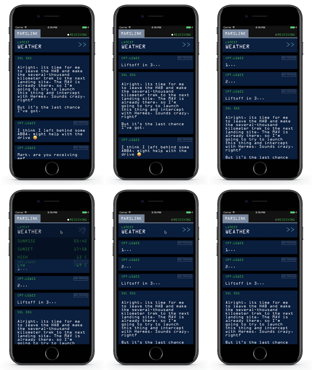
Our astronaut needs to be able to get the current weather in order to navigate around things like dust storms. JPL built another module that displays the current weather. There’s a lot of information in there though, so they ask that the weather only display when tapped.

IGListKit

Create one last section controller named WeatherSectionController. Start the class off with an initializer and some variables:

import IGListKit
 
class WeatherSectionController: IGListSectionController {
  // 1
  var weather: Weather!
  // 2
  var expanded = false
 
  override init() {
    super.init()
    // 3
    inset = UIEdgeInsets(top: 0, left: 0, bottom: 15, right: 0)
  }
}
  1. This section controller will receive a Weather object in didUpdate(to:).
  2. expanded is a bool used to track if the weather section is expanded or not. It is initialized to false so the detail cells are initially collapsed.
  3. Just like the other sections, use a bottom inset of 15 points.

Now add an extension to conform to IGListSectionType, as well as implementing three of the required methods:

extension WeatherSectionController: IGListSectionType {
  // 1
  func didUpdate(to object: Any) {
    weather = object as? Weather
  }
 
  // 2
  func numberOfItems() -> Int {
    return expanded ? 5 : 1
  }
 
  // 3
  func sizeForItem(at index: Int) -> CGSize {
    guard let context = collectionContext else { return .zero }
    let width = context.containerSize.width
    if index == 0 {
      return CGSize(width: width, height: 70)
    } else {
      return CGSize(width: width, height: 40)
    }
  }
}
  1. In didUpdate(to:), you save the passed Weather object.
  2. If the weather is expanded, numberOfItems() returns five cells that will contain different pieces of weather data. If not expanded, a single cell is needed to display a placeholder.
  3. The first cell should be a little larger than the others, as it displays a header. You don’t have to check the state of expanded, because that header cell is shown as the first cell in either case.

Next you need to implement cellForItem(at:) to configure the weather cells. Here are some detailed requirements:

  • The first cell should be of type WeatherSummaryCell, others should be WeatherDetailCell.
  • Configure the weather summary cell with cell.setExpanded(_:).
  • Configure four different weather detail cells with the following title and detail labels:
    1. “Sunrise” with weather.sunrise
    2. “Sunset” with weather.sunset
    3. “High” with "\(weather.high) C"
    4. “Low” with "\(weather.low) C"

Give this cell setup a shot! The solution is just below.

Solution Inside: WeatherSectionController.cellForItem(at index:) SelectShow>

The last thing that you need to do is toggle the section expanded and update the cells when tapped. Add the last required method in the IGListSectionType extension:

func didSelectItem(at index: Int) {
  expanded = !expanded
  collectionContext?.reload(self)
}

reload() reloads the entire section. You can use this whenever the contents or number of cells changes in the section controller. Since you toggle the expansion with numberOfItems(), this will add or remove cells based on the expanded flag.

Return to FeedViewController.swift, and add the following near the top of FeedViewController, with the other properties:

let wxScanner = WxScanner()

WxScanner is the model object for weather conditions.

Next, update objects(for:) in the IGListAdapterDataSource extension so that it looks like the following:

// 1
var items: [IGListDiffable] = [wxScanner.currentWeather]
items += loader.entries as [IGListDiffable]
items += pathfinder.messages as [IGListDiffable]
// 2
return items.sorted(by: { (left: Any, right: Any) -> Bool in
  if let left = left as? DateSortable, let right = right as? DateSortable {
    return left.date > right.date
  }
  return false
})

You’ve updated the data source method to include currentWeather. Here are details on what this does:

  1. Adds the currentWeather to the items array.
  2. All the data conforms to the DataSortable protocol, so this sorts it using that. This ensures data appears chronologically.

Finally, update listAdapter(_:sectionControllerFor:) to appear as follows:

if object is Message {
  return MessageSectionController()
} else if object is Weather {
  return WeatherSectionController()
} else {
  return JournalSectionController()
}

This now returns a WeatherSectionController when a Weather object appears.

Build and run again. You should see the new weather object at the top. Try tapping on the section to expand and contract it!

IGListKit

Performing Updates

IGListKit

JPL is ecstatic about your progress! While you were working, the director of NASA coordinated a rescue operation for the astronaut, requiring him to launch and intercept with another ship! It’s going to be a complicated launch, so he will have to liftoff at precisely the right time.

JPL engineering extended the messaging module with realtime chat and are asking you to integrate it.

Open FeedViewController.swift and add the following lines to the end of viewDidLoad():

pathfinder.delegate = self
pathfinder.connect()

The Pathfinder module is all patched up with realtime support. All you need to do is connect to the unit and respond to delegate events.

Add the following extension to the bottom of the file:

extension FeedViewController: PathfinderDelegate {
  func pathfinderDidUpdateMessages(pathfinder: Pathfinder) {
    adapter.performUpdates(animated: true)
  }
}

FeedViewController now conforms to PathfinderDelegate. The single method performUpdates(animated:completion:) tells the IGListAdapter to ask its data source for new objects and then update the UI. This handles objects that are deleted, updated, moved, or inserted.

Build and run to see the captain’s messages updating! All you had to do was add one single method for IGListKit to figure out what has changed in the data source and animate the changes when new data arrives.

IGListKit

All you need to do now is transmit the latest build to the astronaut and he’ll be coming home. A job well done!

Where To Go From here?

You can download the finished project here.

Aside from bringing a stranded astronaut home, you’ve learned a lot about the basic features of IGListKit: section controllers, adapters, and how to bring them all together. There are other important features in IGListKit like supplementary views and display events.

You can read and watch more about the origin of IGListKit at Instagram from a talk published by Realm. This talk covers a lot of the common UICollectionView problems that apps see as they get bigger.

If you’re interested in helping contribute to IGListKit, the team set up starter-task tags on Github for an easy way to get started.

The post IGListKit Tutorial: Better UICollectionViews appeared first on Ray Wenderlich.

Updated Course: Beginning Collection Views

$
0
0

x-post-feature-CV

We’ve been releasing tons of new and updated videos for subscribers lately, on Swift 3, iOS 10, Server Side Swift, Metal, Concurrency, and more.

But that’s not all – today, I am happy to announce that our popular Beginning Collection Views course is now fully updated for Swift 3 & iOS 10!

In this 10-part course, you’ll learn all about using Collection Views in iOS. You’ll start with the basics, such as setting up an collection view in Interface Builder, and then move right through to some more advanced topics, like creating and manipulating custom cells and layouts.

Let’s take a look at what’s inside.

1-Intro

Video 1: Introduction. You’ll get a quick overview of what’s covered in the series, and get a brief history of UICollectionView.

2-Getting-Started

Video 2: Getting Started. In this video, you’ll make your first collection view. It may look simple but you’re doing a lot: setting up a collection view in Interface Builder, subclassing UICollectionViewController, implementing three of the data source protocol methods, and sizing the cells relative to the device that the app is running on.

3-Custom-Cells

Video 3: Custom Cells. Learn how to subclass UICollectionViewCell to create your own custom look for a cell.

4-Multiple-Sections

Video 4: Multiple Sections. Learn how to sort the collection view into multiple sections with each displaying a title, using the power of supplementary views.

5-Inserting-Cells

Video 5: Inserting Cells. Learn how to insert cells into your collection view in an animated fashion, to give a nice user experience.

6-Subclassing-Layout

Video 6: Subclassing Layout. Learn how to customize your layout by creating a subclass of UICollectionViewFlowLayout and add an animation when an item is inserted into the collection view.

7-Deleting-Cells

Video 7: Deleting Cells. Learn how to let users delete cells from your collection view, by creating your own editing mode.

8-Moving-Cells

Video 8: Moving Cells. Learn how you can move cells around using drag-and-drop using installsStandardGestureForInteractiveMovement.

9-Cell-Prefetching

Video 9: Cell Pre-Fetching. Learn about the new cell pre-fetching feature introduced in iOS 10, which can greatly improve the scrolling performance of your collection views, especially when displaying data retrieved off the network.

10-Conclusion

Video 10: Conclusion. Review what you’ve learned about using collection views in this course, and discuss where to go from here.

Where To Go From Here?

Want to check out the course? You can watch the introduction for free!

The rest of the course is for raywenderlich.com subscribers only. Here’s how you can get access:

  • If you are a raywenderlich.com subscriber: The entire course is complete and available today You can check out the first part here.
  • If you are not subscribed yet: What are you waiting for – subscribe now to get access to our updated iOS Concurrency course and our entire catalog of over 500 videos.

We hope you enjoy, and stay tuned for more new Swift 3 courses and updates to come! :]

The post Updated Course: Beginning Collection Views appeared first on Ray Wenderlich.

Swift Style Guide Updated for Swift 3

$
0
0
Swift Style Guide Swift 3

Back to the bike shed one final time for 2016.

Good news – we have updated our Swift Style Guide for Swift 3!

Here at raywenderlich.com, we want to have a consistent style for you in our tutorials, books, videos, and conference materials. We believe it improves readability, and makes our content easier and quicker to understand. Our style guide helps us accomplish this.

This update resolves dozens of issues and enhancements from the community since our last update in April.

Let’s look at some of the highlights in this latest update.

The Grand Renaming

This year, alongside the release of Swift 3, the Swift community tackled naming in a major way.

Basically, the core team recognized that libraries using consistent, predictable names significantly elevate the overall development experience and determine the character of the language.

Not only did the community formalize a consistent set of naming rules, they also adopted these rules in both the standard library and in how Objective-C libraries are imported into Swift projects. The core team decided that the massive breakage would be worth it in the long run. We agree. It’s that good.

The new naming rules are set forth in an important document called the API Design Guidelines, which provides numerous examples and some rationale for the changes.

The Swift 3 update to our Swift Style Guide fully embraces these rules and enumerates the important takeaways that you should keep in your head as you are writing code. For example:

  • Creating a factory method? It should begin with make.
  • Writing a non-mutating method that returns a modified version of the model? It should end with -ed or -ing.

Armed with these rules and with all of the good examples from the Standard library and Cocoa, writing your own Swifty APIs should become secondhand nature in no time.

name_it

In addition to the API Design Guidelines, our style guide spells out some additional recommendations. For example, delegates. Delegates should always have a first unnamed parameter that specifies the delegate’s source.

 
func namePickerView(_ namePickerView: NamePickerView, didSelectName name: String)
 
func namePickerViewShouldReload(_ namePickerView: NamePickerView) -> Bool
 

Context is Everything

Recognizing context is something Swift does really well. Our previous style guide emphasized using compiler type inference to make code shorter and easier to understand. This update further encourages utilization of context.

In his WWDC 2016 session on the API Design Guidelines, Doug Gregor (core team & compiler engineer extraordinaire) demonstrates how we can reduce cognitive load by using context, strong types and omitting needless words. One of his examples focuses on how Objective-C types map much better into Swift 3. The old Swift 2 code:

 
let cal = NSCalendar(calendarIdentifier: NSCalendarIdentifierGregorian)
 

in Swift 3, becomes the more readable:

 
let cal = Calendar(identifier: .gregorian)
 

It’s a nice example. Not only is it more readable but you have the piece of mind that the Swift compiler is enforcing guarantees about correctness. By the way, I see what you did there using the .gregorian example, Doug Gregor. :] Similarly, our updated style guide recommends that you use context to write shorter code where clarity is not being sacrificed. For example:

 
let view = UIView(frame: .zero)
 
view.backgroundColor = .red
 

Access Control

Swift 3 changed the access control keywords, adding fileprivate and making private specify lexical scope privacy.

Although many tutorials may omit access control to keep things simple, encapsulation with private and fileprivate is encouraged.

There are rumblings that there may be changes to access control in Swift 4. In the meantime, authors should use private when possible and only fileprivate when it is required. For example when it is used by an extension in the same file. private and fileprivate mean the same thing at file scope, and in this case you should prefer private.

Space Wars

space_wars

Tabs versus spaces. Two space indents versus four. Space before colons for type declarations. These are almost religious issues that seem to come up every time we do an update.

We have decided to continue to use two-space indenting as it is the best choice for printed material in which page real-estate is limited. That said, we have added some additional recommendations about white space this time:

  1. Keep line lengths reasonable.
  2. No trailing whitespace.
  3. One newline at the end of the file.

Formatting guard statements was also an item of some discussion. Should they be one-liners or always span multiple lines? How should you indent multiple let bindings and conditions? How should the else clause be indented?

In the end, we decided to not make a specific rule about it, and leave it to the discretion of the author. Perhaps a universal standard will emerge. We will keep an eye on some of the larger open source projects and code written by luminaries in the Swift community to see if one does.

Referring to Methods in Prose

The way that methods will be referred to in prose (e.g. tutorials and books) has also changed. Since external argument names now often don’t include the type name, there are potentially cases where even if you write out all of the external parameters, your method can still be ambiguous. In these cases, the types should be included.

In general, our guidance is when referring to a method name in prose, use the simplest form possible without being unambiguous.

  1. Write the method name with no parameters. Example: Next, you need to call the method addTarget.
  2. Write the method name with argument labels. Example: Next, you need to call the method addTarget(_:action:).
  3. Write the full method name with argument labels and types. Example: Next, you need to call the method addTarget(_: Any?, action: Selector?).

Resisting Feature Creep and Removing Rules

There is a tendency to want to keep adding rules to a style guide. However, doing so can make it less approachable for a newcomer. We have been mindful to keep the number of rules relatively small and even remove rules when possible. Swift lets us do that.

For example, a section on struct initialization could be completely removed as Swift 3 makes it impossible to compile the discouraged form. Thanks Swift 3!

Where to Go From Here?

There are numerous other small changes not mentioned here–everything has been updated to valid Swift 3, the Organization and Bundle ID are now specified for Xcode projects and more. Over time, you will see our tutorials and books adopt this style.

We encourage you to read through the entire guide as it is not that long. Also, be sure to check out the API Design Guidelines which is linked from the guide. Finally, it is worth your time to watch the WWDC session about the about the why of API design guidelines.

The style guide has been improved by individuals both inside and outside of raywenderlich.com. I personally would like to thank the many people that have helped this year to make it a better document and added to the discussion. If you don’t see your name in the credits and should be, drop me a line or send a pull request.

This is a living document. If you want to get even more involved, open (or reopen) a Github issue and start a discussion. Typos and errors that need to be immediately fixed will go directly into the master branch after a brief review period. A update branch will handle larger changes for a future update next year. See the contributing guide for more information.

What do you like or not like? Leave a comment below.

The post Swift Style Guide Updated for Swift 3 appeared first on Ray Wenderlich.

RWDevCon 2017: List of Topics Sneak Peek!

$
0
0

RWDevCon-feature

One of the unique things at RWDevCon 2017 is that we choose the tutorial topics by popular vote (while picking a few extra topics that we think are cool).

We recently had a call for suggestions and then a tutorial vote – and I know a lot of folks have been wondering which topics won.

Well, today I am happy to give you a sneak peek of the results! Note that the full schedule and session descriptions will come after the holidays.

We are offering 24 tutorials across 3 tracks this year:

  1. Modern Core Data
  2. Advanced Auto Layout
  3. Machine Learning in iOS
  4. iOS Concurrency
  5. Practical Animation
  6. Mastering Git
  7. Building Reusable Frameworks
  8. Swift Memory Management
  9. Building a Real-World Android App
  10. fastlane
  11. RxSwift
  12. How to Make a Platformer Game Like Super Meat Boy
  13. iMessage Apps
  14. Practical Unit Testing
  15. Server Side Swift
  16. Swift Playgrounds in Depth
  17. Continuous Integration
  18. Cocoa Bindings
  19. Creating Engaging On-Boarding Experiences
  20. Advanced iOS Design Patterns
  21. Cross-Platform React Native
  22. Accessibility & Internationalization
  23. Swift Error Handling
  24. Game AI with GameplayKit

This is addition to the 2 optional pre-conference workshops on Advanced App Architecture and Advanced App Debugging & Reverse Engineering, the 6 inspiration talks, the awesome opening reception, the conference party, the board game playing, and the classic “special surprise” at the end.

Tickets are selling fast, so if you are interested in any of these topics be sure to register now.

The team and I look forward to seeing some of you next March for some awesome hands-on tutorials! :]

The post RWDevCon 2017: List of Topics Sneak Peek! appeared first on Ray Wenderlich.

Introduction to Google Maps API for Android

$
0
0

Mapping-feature

From fitness apps such as Runkeeper to games such as Pokemon Go, location services are an increasingly important part of modern apps.

In this Google Maps API tutorial, you will create an app named City Guide. The app allows a user to search for a location, use Google Maps to show the address of the location and listen for the user’s location changes.

You will learn how to use the Google Maps Android API, the Google Location Services API and the Google Places API for Android to do the following:

  • Show a user’s current location
  • Display and customize markers on a map
  • Retrieve the address of a location given the coordinates
  • Listen for location updates
  • Search for places
Note: This Google Maps API tutorial assumes you are already familiar with the basics of Android development. If you are completely new to Android development, read through our Android Tutorial for Beginners to familiarize yourself with the basics.

Getting Started

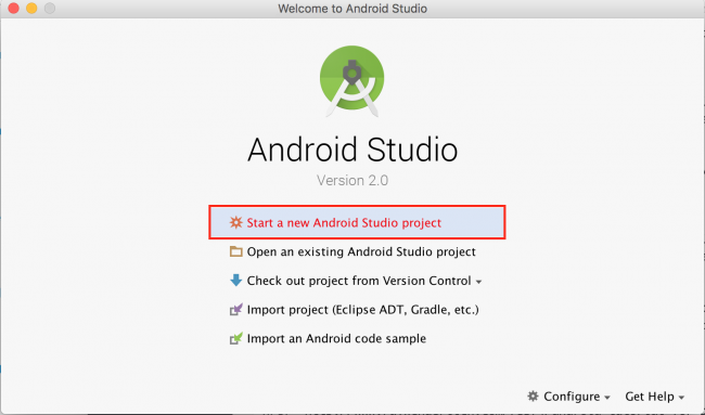
Open Android Studio and select Start a new Android Studio project from the Quick Start menu:

mapping_start_project_1

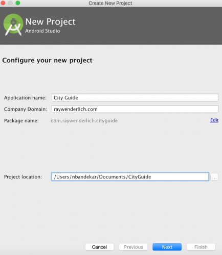
In the Create New Project dialog, on the New Project view, enter the name of the app as City Guide, select your prefered folder location for the project files and click Next.

google_maps_api_create_project

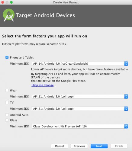
On the Target Android Devices view, check the Phone and Tablet box and select the minimum SDK you want the app to support. Specify API 14 from the Minimum SDK drop down and click Next.

google_maps_api_tutorial_select_sdk

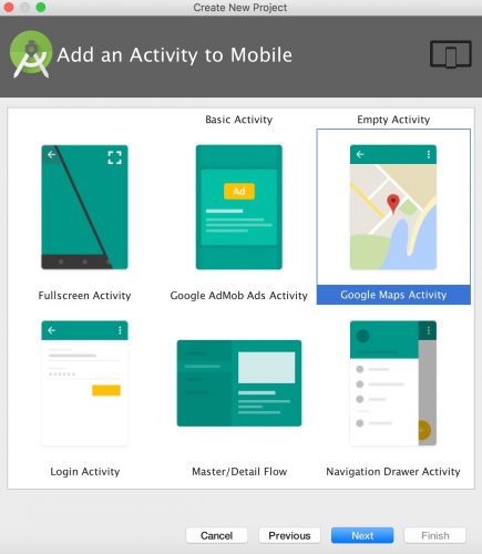
On the Add an Activity to Mobile view, select the Google Maps Activity and click Next.

select_google_maps_activity

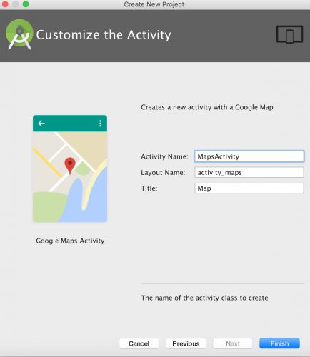
On the Customize the Activity view, click Finish to complete the project creation process.

customize_Activity

Android Studio will start Gradle and build your project. This may take a few seconds.

Open MapsActivity.java. It should look like this:

package com.raywenderlich.cityguide;
 
import android.support.v4.app.FragmentActivity;
import android.os.Bundle;
 
import com.google.android.gms.maps.CameraUpdateFactory;
import com.google.android.gms.maps.GoogleMap;
import com.google.android.gms.maps.OnMapReadyCallback;
import com.google.android.gms.maps.SupportMapFragment;
import com.google.android.gms.maps.model.LatLng;
import com.google.android.gms.maps.model.MarkerOptions;
 
// 1
public class MapsActivity extends FragmentActivity implements OnMapReadyCallback {
 
  private GoogleMap mMap;
 
  // 2
  @Override
  protected void onCreate(Bundle savedInstanceState) {
    super.onCreate(savedInstanceState);
    setContentView(R.layout.activity_maps);
    // Obtain the SupportMapFragment and get notified when the map is ready to be used.
    SupportMapFragment mapFragment = (SupportMapFragment) getSupportFragmentManager()
        .findFragmentById(R.id.map);
    mapFragment.getMapAsync(this);
  }
 
  // 3
  @Override
  public void onMapReady(GoogleMap googleMap) {
    mMap = googleMap;
 
    // Add a marker in Sydney and move the camera
    LatLng sydney = new LatLng(-34, 151);
    mMap.addMarker(new MarkerOptions().position(sydney).title("Marker in Sydney"));
    mMap.moveCamera(CameraUpdateFactory.newLatLng(sydney));
  }
}
  1. MapsActivity currently implements the OnMapReadyCallback interface and extends FragmentActivity.
  2. The class overrides FragmentActivity’s onCreate() method
  3. You also override OnMapReadyCallback’s onMapReady() method. This method is called when the map is ready to be used. The code declared in this method creates a marker with coordinates near Sydney, Australia and adds the marker to the map.

The template adds the following in the manifests/AndroidManifest.xml:

  1. A declaration of the ACCESS_FINE_LOCATION permission. This is required to access the user’s precise location.
  2. The com.google.android.geo.API_KEY meta-data. This is used to specify the API key.

The template also adds a Google Play Services dependency to build.gradle. This dependency exposes the Google Maps and Location Services APIs to the application.

compile 'com.google.android.gms:play-services:VERSION_HERE'

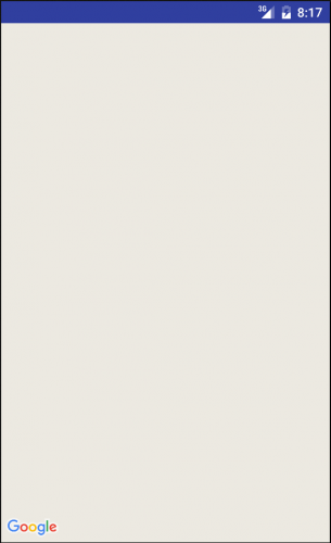
When the build is complete, run the app to see what you have:

mapping_start_project_6_run_1

All you have is a blank screen with no map; you haven’t yet set up the API key for the Google Map. You’ll do that next.

Note: If you’re using an emulator, the emulator’s installed version will have to satisfy the version of Google Play Services required in your build.gradle file. If you see a message that you need to update the emulator’s Google Play Services version, you can either download the latest Google APIs using your Android Studio SDK Manager and install on your Virtual Device, or lower the version in your gradle dependency.

Using the Google Maps APIs

To use any of the Google Maps APIs, you need to create an API key and enable any required APIs from the developer console. If you don’t already have a Google account, create one now — it’s free!

Creating API Keys

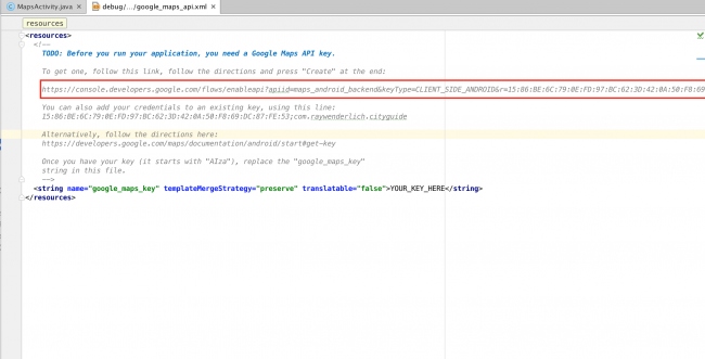
Open res/values/google_maps_api.xml. You will see the following:

mapping_start_project_7_create_api_1

Now copy and paste the link shown above into your browser.

On the Enable an API page, select Create a project and click Continue.

mapping_start_project_8_create_api_2

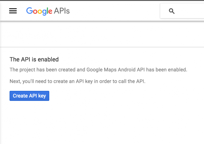
On the next screen, click the Create API key button to continue.

mapping_start_project_9_create_api_3

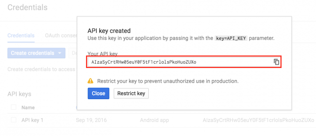
When that’s done, copy the API key shown in the API key created dialog and click Close.

mapping_start_project_10_create_api_4

Head back to google_maps_api.xml, replace the value of google_maps_key key with the copied API key.

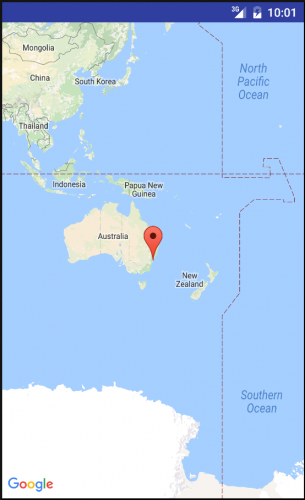
Build and run again. You should see a map with a red marker on the screen.

mapping_start_project_11_create_api_5

Go back to the developer console and enable the Google Places API for Android. You will be using this later on to search for a place.

Setting up Play Services Connection

Before adding any Java code, you’ll need to configure Android Studio to automatically insert import statements to save you from having to add each one manually.

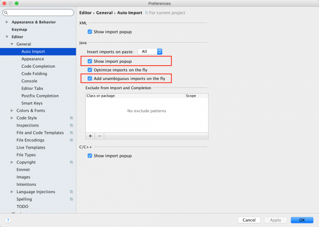
Go to Android Studio > Preferences > Editor > General > Auto Import, select the Add unambiguous imports on the fly and the Show import popup checkboxes, and click OK.

auto_import_android_studio

Open MapsActivity.java and have MapsActivity implement the following interfaces:

public class MapsActivity extends FragmentActivity implements OnMapReadyCallback, GoogleApiClient.ConnectionCallbacks, GoogleApiClient.OnConnectionFailedListener, GoogleMap.OnMarkerClickListener, LocationListener

The import for LocationListener is ambiguous, so tell Android Studio to import it from Google Mobile Services:

import com.google.android.gms.location.LocationListener;

Here’s what each interface does:

  • GoogleApiClient.ConnectionCallbacks provides callbacks that are triggered when the client is connected (onConnected()) or temporarily disconnected (onConnectionSuspended()) from the service.
  • GoogleApiClient.OnConnectionFailedListener provides a callback method (onConnectionFailed()) that is triggered when an attempt to connect the client to the service results in a failure.
  • GoogleMap.OnMarkerClickListener defines the onMarkerClick() which is called when a marker is clicked or tapped.
  • LocationListener defines the onLocationChanged() which is called when a user’s location changes. This method is only called if the LocationListener has been registered.

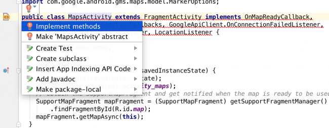
Now you need to implement all methods declared in each of the interfaces added above. To do this, follow the steps below:

  1. Place the cursor anywhere on the class declaration and click on the red light bulb icon that appears above the class declaration.
  2. Select Implement methods from the options that appear.
  3. implement_methods_android_studio

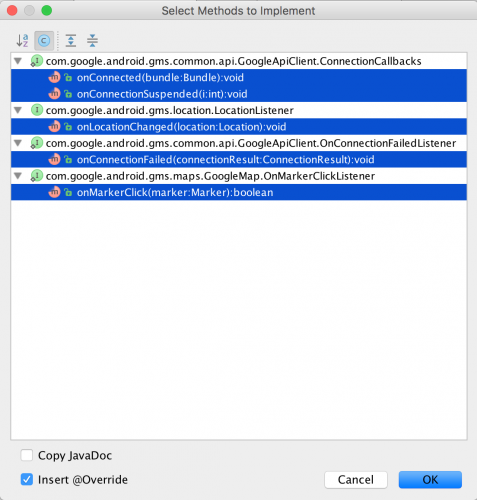
  4. On the Select Methods to implement dialog, click OK.
  5. select_methods_to_implement

This will add implementations of all the methods shown in the dialog to the class.

To connect to any Google API provided by the Google Play Services library, you need to create an instance of the GoogleApiClient first.

Add the following field in MapsActivity.java:

private GoogleApiClient mGoogleApiClient;

Add the following lines of code to onCreate(),

// 1
if (mGoogleApiClient == null) {
  mGoogleApiClient = new GoogleApiClient.Builder(this)
      .addConnectionCallbacks(this)
      .addOnConnectionFailedListener(this)
      .addApi(LocationServices.API)
      .build();
}

Add the following methods:

@Override
protected void onStart() {
  super.onStart();
  // 2
  mGoogleApiClient.connect();
}
 
@Override
protected void onStop() {
  super.onStop();
  // 3
  if( mGoogleApiClient != null && mGoogleApiClient.isConnected() ) {
    mGoogleApiClient.disconnect();
  }
}

Here’s what’s going on above:

  1. Instantiates the mGoogleApiClient field if it’s null.
  2. Initiates a background connection of the client to Google Play services.
  3. Closes the connection to Google Play services if the client is not null and is connected.

Add the following code to onMapReady():

mMap.getUiSettings().setZoomControlsEnabled(true);
mMap.setOnMarkerClickListener(this);

Here you enable the zoom controls on the map and declare MapsActivity as the callback triggered when the user clicks a marker on this map.

Now click the marker on the map near Sydney, and you’ll see the title text appear:

google_maps_api_marker

Enter a different set of latitude and longitude values and you’ll see the marker move to your chosen location.

Add the following code to set a marker at New York City with the title “My Favorite City”:

LatLng myPlace = new LatLng(40.73, -73.99);  // this is New York 
mMap.addMarker(new MarkerOptions().position(myPlace).title("My Favorite City"));
mMap.moveCamera(CameraUpdateFactory.newLatLng(myPlace));

Build and run.
google_maps_api_nyc

Notice the map automatically centered the marker on the screen; moveCamera() does this for you. However, the zoom level of the map isn’t right, as it’s fully zoomed out.

Modify moveCamera() as shown below:

mMap.moveCamera(CameraUpdateFactory.newLatLngZoom(myPlace, 12));

Zoom level 0 corresponds to the fully zoomed-out world view. Most areas support zoom levels up to 20, while more remote areas only support zoom levels up to 13. A zoom level of 12 is a nice in-between value that shows enough detail without getting crazy-close.

Build and run to view your progress so far.

show_place_marker

User Permissions

Your app needs the ACCESS_FINE_LOCATION permission for getting the user’s location details; you’ve already included this in AndroidManifest.xml.

Starting with Android 6.0, user permissions are handled a little differently than before. You don’t request permission during the installation of your app; rather, you request them at run time when the permission is actually required.

Permissions are classified into two categories: normal and dangerous categories. Permissions that belong to the dangerous category require run time permission from the user. Permissions that request access to the user’s private information such as the user’s CONTACTS, CALENDAR, LOCATION etc. are categorised as dangerous permissions.

Open MapsActivity.java and add the following field:

private static final int LOCATION_PERMISSION_REQUEST_CODE = 1;

Create a new method called setUpMap() as follows.

private void setUpMap() {
  if (ActivityCompat.checkSelfPermission(this,
    android.Manifest.permission.ACCESS_FINE_LOCATION) != PackageManager.PERMISSION_GRANTED) {
    ActivityCompat.requestPermissions(this, new String[]
      {android.Manifest.permission.ACCESS_FINE_LOCATION}, LOCATION_PERMISSION_REQUEST_CODE);
    return;
  }
}

The code above checks if the app has been granted the ACCESS_FINE_LOCATION permission. If it hasn’t, then request it from the user.

Call setUpMap() inside the onConnected() method as below:

@Override
public void onConnected(@Nullable Bundle bundle) {
  setUpMap();
}

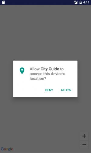
Compile and run; click “Allow” to grant permission.

grant_location_permissions

Note: A thorough discussion of user permissions is beyond the scope of this tutorial, but check out this document on requesting permissions at run time.

Getting Current Location

One of the most common uses for location services is finding the user’s current location. You do this by requesting the last known location of the user’s device from the Google Play services location APIs.

In MapsActivity.java, add the following new field:

private Location mLastLocation;

Next, add the code below to the bottom of setUpMap():

// 1
mMap.setMyLocationEnabled(true);
 
// 2
LocationAvailability locationAvailability =
    LocationServices.FusedLocationApi.getLocationAvailability(mGoogleApiClient);
if (null != locationAvailability && locationAvailability.isLocationAvailable()) {
  // 3
  mLastLocation = LocationServices.FusedLocationApi.getLastLocation(mGoogleApiClient);
  // 4
  if (mLastLocation != null) {
    LatLng currentLocation = new LatLng(mLastLocation.getLatitude(), mLastLocation
        .getLongitude());
    mMap.animateCamera(CameraUpdateFactory.newLatLngZoom(currentLocation, 12));
  }
}

Taking each commented section in turn:

  1. setMyLocationEnabled enables the my-location layer which draws a light blue dot on the user’s location. It also adds a button to the map that, when tapped, centers the map on the user’s location.
  2. getLocationAvailability determines the availability of location data on the device.
  3. getLastLocation gives you the most recent location currently available
  4. If you were able to retrieve the the most recent location, then move the camera to the user’s current location.

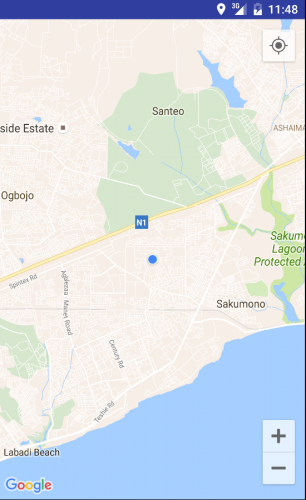
Build and run to view your progress so far. You’ll see a light blue dot on the user’s location:

users_location_GoogleMapsAPI

Emulator Testing

It’s best to use a real Android device to test a map application. If for some reason, you need to test from an emulator, you can do so by mocking location data in the emulator.

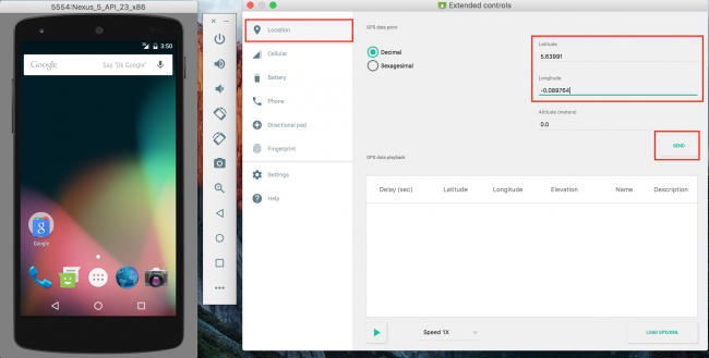
One way to do this is by using the emulator’s extended controls. Here’s how you’d do that:

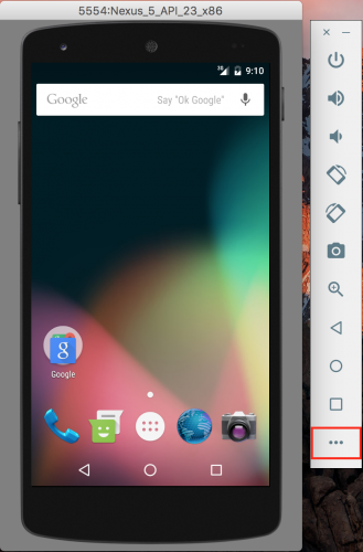
  1. Start the emulator. On the right hand panel, click the more icon () to access the Extended Controls.
  2. Screen Shot 2016-11-24 at 9.09.43 AM

  3. Select the Location item on the left hand side of the Extended Controls dialog.
  4. Enter the latitude and longitude values in the specified fields and click Send.

using_emulator_for_testing_location

Markers

As you may have noticed from the last run, the blue dot on the user’s location is not very prominent. The Android Maps API lets you use a marker object, which is an icon that can be placed at a particular point on the map’s surface.

In MapsActivity.java add the following code.

protected void placeMarkerOnMap(LatLng location) {
  // 1
  MarkerOptions markerOptions = new MarkerOptions().position(location);
  // 2
  mMap.addMarker(markerOptions);
}
  1. Create a MarkerOptions object and sets the user’s current location as the position for the marker
  2. Add the marker to the map

Now replace setUpMap() with the following:

private void setUpMap() {
  if (ActivityCompat.checkSelfPermission(this,
      android.Manifest.permission.ACCESS_FINE_LOCATION) != PackageManager.PERMISSION_GRANTED) {
    ActivityCompat.requestPermissions(this, new String[]
        {android.Manifest.permission.ACCESS_FINE_LOCATION},LOCATION_PERMISSION_REQUEST_CODE);
    return;
  }
 
  mMap.setMyLocationEnabled(true);
 
  LocationAvailability locationAvailability =
      LocationServices.FusedLocationApi.getLocationAvailability(mGoogleApiClient);
  if (null != locationAvailability && locationAvailability.isLocationAvailable()) {
    mLastLocation = LocationServices.FusedLocationApi.getLastLocation(mGoogleApiClient);
    if (mLastLocation != null) {
      LatLng currentLocation = new LatLng(mLastLocation.getLatitude(), mLastLocation
          .getLongitude());
      //add pin at user's location
      placeMarkerOnMap(currentLocation);
      mMap.animateCamera(CameraUpdateFactory.newLatLngZoom(currentLocation, 12));
    }
  }
}

The only change you made to setUpMap() here is adding a call to placeMarkerOnMap() to show the marker.

Build and run to view your progress so far. You should see a pin on the user’s location:

Screen Shot 2016-10-02 at 10.34.13 PM

Don’t like the default Android pins? You can also create a marker with a custom icon as the pin. Go back to placeMarkerOnMap() and add the following line of code after the MarkerOptions instantiation:

markerOptions.icon(BitmapDescriptorFactory.fromBitmap(BitmapFactory.decodeResource
    (getResources(), R.mipmap.ic_user_location)));

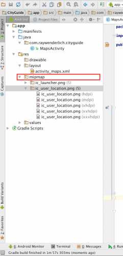
Download custom pins named ic_user_location from this link and unzip it. Copy all the files to the corresponding mipmap folders of the project as shown below.

Screen Shot 2016-11-24 at 11.01.55 AM

Build and run to view your progress so far. The marker on your location should now be using the ic_user_location icon in the project:

Screen Shot 2016-10-02 at 11.00.18 PM

What if all you want is the default pin but in a different color? Try to figure this out by yourself, and then check the spoiler below if you need more help:

Solution Inside SelectShow>

Changing the Map Type

Depending on the functionality of your app, the normal map view might not be detailed enough for you.
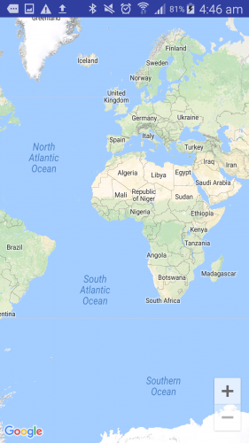
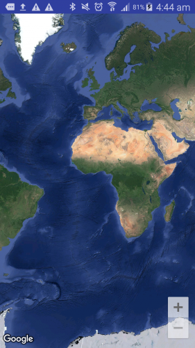
The Android Maps API provides different map types to help you out: MAP_TYPE_NORMAL, MAP_TYPE_SATELLITE, MAP_TYPE_TERRAIN, MAP_TYPE_HYBRID

Add the following inside setUpMap() just below the setMyLocationEnabled() call:

mMap.setMapType(GoogleMap.MAP_TYPE_TERRAIN);

GoogleMap.MAP_TYPE_TERRAIN displays a more detailed view of the area, showing changes in elevation:

Screenshot_2016-08-21-04-46-28

Here’s what the other types look like:

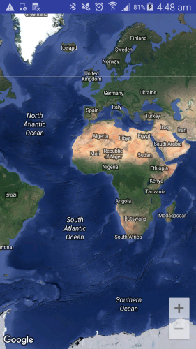
GoogleMap.MAP_TYPE_SATELLITE displays a satellite view of an area with no labels.

Screenshot_2016-08-21-04-44-07

GoogleMap.MAP_TYPE_HYBRID displays a combination of the satellite and normal mode

Screenshot_2016-08-21-04-48-25

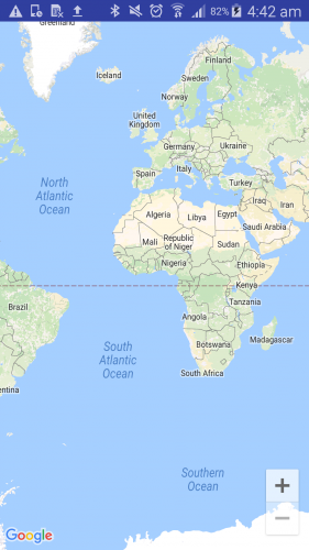
GoogleMap.MAP_TYPE_NORMAL displays a typical road map with labels. This is default type.

Screenshot_2016-08-21-04-42-54

Implementing Geocoding

Now that you have the user’s location, it would be nice if you could show the address of that location when the user clicks on the marker. Google has a class that does exactly that: Geocoder. This takes the coordinates of a location and returns a readable address and vice versa.

Open MapsActivity. Add the following method:

private String getAddress( LatLng latLng ) {
  // 1
  Geocoder geocoder = new Geocoder( this );
  String addressText = "";
  List<Address> addresses = null;
  Address address = null;
  try {
    // 2
    addresses = geocoder.getFromLocation( latLng.latitude, latLng.longitude, 1 );
    // 3
    if (null != addresses && !addresses.isEmpty()) {
      address = addresses.get(0);
      for (int i = 0; i < address.getMaxAddressLineIndex(); i++) {
        addressText += (i == 0)?address.getAddressLine(i):("\n" + address.getAddressLine(i));
      }
    }
  } catch (IOException e ) {
  }
  return addressText;
}

The import for Address is ambiguous, so specify the following import to resolve the issue:

import android.location.Address;

Briefly, here’s what’s going on:

  1. Creates a Geocoder object to turn a latitude and longitude coordinate into an address and vice versa.
  2. Asks the geocoder to get the address from the location passed to the method.
  3. If the response contains any address, then append it to a string and return.

Replace placeMarkerOnMap() with the following.

protected  void placeMarkerOnMap(LatLng location) {
  MarkerOptions markerOptions = new MarkerOptions().position(location);
 
  String titleStr = getAddress(location);  // add these two lines
  markerOptions.title(titleStr);
 
  mMap.addMarker(markerOptions);
}

Here you added a call to getAddress() and added this address as the marker title.

Build and run to view your progress so far. Click on the marker to see the address:

Screen Shot 2016-10-02 at 10.46.45 AM

Click anywhere on the map to dismiss the address.

Notice that when you move locations, the blue dot moves with you, but the marker remains at it’s first location. If you’re using a physical device, try moving around to see this. If you are on emulator, change your coordinates to another location in your emulator control.

The marker doesn’t move because your code does not know that the location has changed. The blue dot is controlled by the Google API, not your code. If you want the marker to follow the blue dot always, you need to receive location updates as a call-back in your code.

Receiving Location Updates

Knowing your user’s location at all times can help you provide a better experience. This section of the tutorial shows you how to continuously receive updates of your user’s location.

To do this, you first have to create a location request.

Open MapsActivity. Now add the following fields:

// 1
private LocationRequest mLocationRequest;
private boolean mLocationUpdateState;
// 2
private static final int REQUEST_CHECK_SETTINGS = 2;
  1. Declare a LocationRequest member variable and a location updated state variable.
  2. REQUEST_CHECK_SETTINGS is used as the request code passed to onActivityResult.

Next add the following:

protected void startLocationUpdates() {
  //1
  if (ActivityCompat.checkSelfPermission(this,
      android.Manifest.permission.ACCESS_FINE_LOCATION) != PackageManager.PERMISSION_GRANTED){
    ActivityCompat.requestPermissions(this,
               new String[]{android.Manifest.permission.ACCESS_FINE_LOCATION},
               LOCATION_PERMISSION_REQUEST_CODE);
    return;
  }
  //2
  LocationServices.FusedLocationApi.requestLocationUpdates(mGoogleApiClient, mLocationRequest,
  this);
}
  1. In startLocationUpdates(), if the ACCESS_FINE_LOCATION permission has not been granted, request it now and return.
  2. If there is permission, request for location updates.

Now add the following method:

// 1
protected void createLocationRequest() {
  mLocationRequest = new LocationRequest();
  // 2
  mLocationRequest.setInterval(10000);
  // 3
  mLocationRequest.setFastestInterval(5000);
  mLocationRequest.setPriority(LocationRequest.PRIORITY_HIGH_ACCURACY);
 
  LocationSettingsRequest.Builder builder = new LocationSettingsRequest.Builder()
      .addLocationRequest(mLocationRequest);
 
  PendingResult<LocationSettingsResult> result =
      LocationServices.SettingsApi.checkLocationSettings(mGoogleApiClient,
          builder.build());
 
  result.setResultCallback(new ResultCallback<LocationSettingsResult>() {
    @Override
    public void onResult(@NonNull LocationSettingsResult result) {
      final Status status = result.getStatus();
      switch (status.getStatusCode()) {
        // 4
        case LocationSettingsStatusCodes.SUCCESS:
          mLocationUpdateState = true;
          startLocationUpdates();
          break;
        // 5
        case LocationSettingsStatusCodes.RESOLUTION_REQUIRED:
          try {
            status.startResolutionForResult(MapsActivity.this, REQUEST_CHECK_SETTINGS);
          } catch (IntentSender.SendIntentException e) {
          }
          break;
        // 6
        case LocationSettingsStatusCodes.SETTINGS_CHANGE_UNAVAILABLE:
          break;
      }
    }
  });
}

The ResultCallback import is ambiguous, so add the following import statement:

import com.google.android.gms.common.api.ResultCallback;

Here’s what’s going on in createLocationRequest():

  1. You create an instance of LocationRequest, add it to an instance of LocationSettingsRequest.Builder and retrieve and handle any changes to be made based on the current state of the user’s location settings.
  2. setInterval() specifies the rate at which your app will like to receive updates.
  3. setFastestInterval() specifies the fastest rate at which the app can handle updates. Setting the fastestInterval rate places a limit on how fast updates will be sent to your app.
  4. Before you start requesting for location updates, you need to check the state of the user’s location settings.

  5. A SUCCESS status means all is well and you can go ahead and initiate a location request.
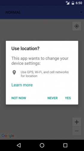
  6. A RESOLUTION_REQUIRED status means the location settings have some issues which can be fixed. This could be as a result of the user’s location settings turned off. You fix this by showing the user a dialog as shown below:
  7. Screenshot_20160921-065033

  8. A SETTINGS_CHANGE_UNAVAILABLE status means the location settings have some issues that you can’t fix. This could be as a result of the user choosing NEVER on the dialog above.

Now add the following three methods:

// 1
@Override
protected void onActivityResult(int requestCode, int resultCode, Intent data) {
  super.onActivityResult(requestCode, resultCode, data);
  if (requestCode == REQUEST_CHECK_SETTINGS) {
    if (resultCode == RESULT_OK) {
      mLocationUpdateState = true;
      startLocationUpdates();
    }
  }
}
 
// 2
@Override
protected void onPause() {
  super.onPause();
  LocationServices.FusedLocationApi.removeLocationUpdates(mGoogleApiClient, this);
}
 
// 3
@Override
public void onResume() {
  super.onResume();
  if (mGoogleApiClient.isConnected() && !mLocationUpdateState) {
    startLocationUpdates();
  }
}

Here’s what’s going on:

  1. Override FragmentActivity’s onActivityResult() method and start the update request if it has a RESULT_OK result for a REQUEST_CHECK_SETTINGS request.
  2. Override onPause() to stop location update request
  3. Override onResume() to restart the location update request.

Next, add a call to createLocationRequest() to the bottom of onCreate():

createLocationRequest();

Then, add the following lines of code to onConnected():

if (mLocationUpdateState) {
  startLocationUpdates();
}

Here you start location updates if user’s location settings are turned on.

Next add these lines of code to onLocationChanged():

mLastLocation = location;
if (null != mLastLocation) {
  placeMarkerOnMap(new LatLng(mLastLocation.getLatitude(), mLastLocation.getLongitude()));
}

Here you update mLastLocation with the new location and update the map with the new location coordinates.

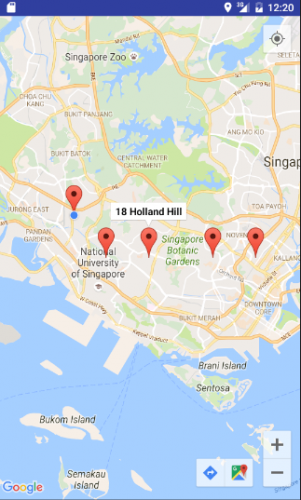
Your app is now set to receive location updates. When you change your location, the map will update with a new marker showing your new location. Note that the markers are still clickable to get the address as before.

Build and run. Play around with the app to view the changes:

Screen Shot 2016-10-03 at 12.19.52 AM

Place Search

Since this app is supposed to be a guide, a user should be able to search for places of interest to them, right?

That’s where the Google Places API comes in; it provides your app the functionality to search for millions of institutions and places of interest. It’s Android Library provides a number of cool functionalities, one of them being the Place Picker, which is a UI widget that lets you provide a place search functionality with very few lines of code. Too good to be true? Try it!

Once again, open MapsActivity.

Add this field:

private static final int PLACE_PICKER_REQUEST = 3;

Now add the following method:

private void loadPlacePicker() {
  PlacePicker.IntentBuilder builder = new PlacePicker.IntentBuilder();
 
  try {
    startActivityForResult(builder.build(MapsActivity.this), PLACE_PICKER_REQUEST);
  } catch(GooglePlayServicesRepairableException | GooglePlayServicesNotAvailableException e) {
      e.printStackTrace();
  }
}

This method creates a new builder for an intent to start the Place Picker UI and then starts the PlacePicker intent.

Now add the following lines of code to onActivityResult():

if (requestCode == PLACE_PICKER_REQUEST) {
  if (resultCode == RESULT_OK) {
    Place place = PlacePicker.getPlace(this, data);
    String addressText = place.getName().toString();
    addressText += "\n" + place.getAddress().toString();
 
    placeMarkerOnMap(place.getLatLng());
  }
}

Here you retrieve details about the selected place if it has a RESULT_OK result for a PLACE_PICKER_REQUEST request, and then place a marker on that position on the map.

You are almost ready to try out the place search — you just need to call loadPlacePicker() inside the code.

You’ll create a floating action button (FAB) at the bottom-right of the map to trigger this method. FAB requires CoordinatorLayout which is part of the design support library.

First open build.gradle for the app and add the Android support design library as a dependency:

dependencies {
  ...
  compile 'com.android.support:design:24.1.1'
}
Note: As usual, if you are using a newer Android SDK version, you may need to update the version of this dependency as well so they match.

Then replace the contents of res > layout > activity_maps.xml with the following lines of code:

<?xml version="1.0" encoding="utf-8"?>
<android.support.design.widget.CoordinatorLayout
    xmlns:android="http://schemas.android.com/apk/res/android"
    xmlns:app="http://schemas.android.com/apk/res-auto"
    xmlns:tools="http://schemas.android.com/tools"
    android:layout_width="match_parent"
    android:layout_height="match_parent"
    android:fitsSystemWindows="true">
 
    <fragment
        android:id="@+id/map"
        class="com.google.android.gms.maps.SupportMapFragment"
        android:layout_width="match_parent"
        android:layout_height="match_parent"/>
 
    <android.support.design.widget.FloatingActionButton
        android:id="@+id/fab"
        android:layout_width="wrap_content"
        android:layout_height="wrap_content"
        android:layout_gravity="bottom|end"
        android:src="@android:drawable/ic_menu_search"/>
 
</android.support.design.widget.CoordinatorLayout>

You were using a fragment element for map earlier; you’ve kept that and added a floating action button.

In MapsActivity, add the following lines of code to onCreate():

FloatingActionButton fab = (FloatingActionButton) findViewById(R.id.fab);
fab.setOnClickListener(new View.OnClickListener() {
  @Override
  public void onClick(View view) {
    loadPlacePicker();
  }
});

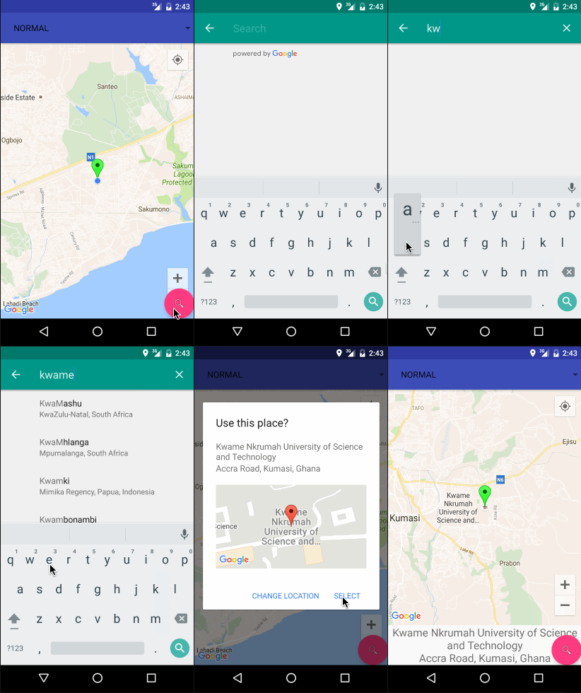
Build and run. Now when you click the search button at the bottom of the map the place picker will load:

placepickerdemo4

Where to Go From Here?

You can download the final project from this tutorial here.

This Google Maps API tutorial only brushed the surface of what you can do with the Google Maps APIs. The official Google documentation has much more about web services and and the Android API here.

You can also check out the developer page on other ways to customize the marker. User permission checks for run-time permissions need a better implementation than what you’ve done in this Google Maps API tutorial; the docs also have some great information about more advanced permission granting here.

Check out the developer pages for extensive reading on the Google Places API for Android, receiving location updates and mocking location data via the emulator’s extended controls.

If you have any questions or comments, please feel free to join the forum discussion below!

The post Introduction to Google Maps API for Android appeared first on Ray Wenderlich.

Call For Apple Game Framework Authors and Editors

$
0
0

OpenCall-AGF-feature

Do you like making games with any of Apple’s Game Frameworks, like SpriteKit, SceneKit, GameplayKit or Metal?

Have you read 2D Apple Games by Tutorials or 3D Apple Games by Tutorials?

Do you think zombies are wildly fantastic?

If you answered yes to any of these questions, then you may have the makings of either an author or tech editor extraordinaire! But not just any author or tech editor — a Ray Wenderlich Apple Game Frameworks author or tech editor.

That’s right! We’re looking for great new authors and tech editors to join our team. Want to know more? Keep reading to find out what’s involved, and how to apply!

Note: This is not a full time job; these are part-time informal positions you can do in the evenings/weekends.

Why Join Our Team?

Here are the top 5 reasons to join the Apple Game Frameworks Tutorial Team:

  1. Learning. You’ll always be learning something new — and will have fun doing it! You’ll become a better developer, writer and person. The best part… you’ll make a lot of new friends along the way.
  2. Money! Get paid to learn! We offer the highest rates in the industry.
  3. Special Opportunities. Members of the Tutorial Team get access to special opportunities such as contributing to our books and products, speaking at our conference, being a guest on our podcast, working on team projects and much more.
  4. You’ll Make a Difference. We get emails every day about how our tutorials help our readers make their first app, get their dream job or accomplish a lifelong dream of making their own game. This means a lot to us, and makes all the hard work worth it!
  5. Free Stuff! And as a final bonus, by joining the Tutorial Team you’ll get a lot of free stuff! You’ll get a free copy of all of the products we sell on the site — over $1,000 in value!

Aww Yeah!

Requirements and How to Apply

Here are the requirements:

  • You must be an experienced SpriteKit, SceneKit, or Metal developer.
  • You should be a great writer with fluent English writing skills.
  • You should be comfortable learning brand new topics that you’ve never done before, which are either not documented or poorly documented.
  • You should have a strong work ethic — this will be a significant time commitment and is not easy.

To apply, send our Apple Game Frameworks Team Lead, Tammy Coron, an email (that’s me!). Be sure to include the following information:

  • Why do you want to be an Apple Game Frameworks author or tech editor?
  • Please tell me a little bit about yourself and your experience.
  • What is the best game you’ve made or worked on using Apple Game Frameworks, and why are you proud of the work you did on this game? [Please include link]
  • Please link to any examples of technical writing you’ve done in the past.
  • Please include links to: your GitHub account, your StackOverflow account and your Twitter account.

If you’re applying to be an author, you’ll be required to write a sample tutorial to gauge your writing skills. If you’re applying to be a tech editor, you’ll be given a tech editor tryout which will gauge your editing skills.

If you pass the tryout, you’re in!

Now’s The Time

Don’t sit on the sidelines waiting for the zombies to bite. Tryout for the team. Use your brain and share your knowledge!

Now what are you waiting for? Send me that email because the Apple Game Frameworks Team and I look forward to creating some great tutorials with you! :]

The post Call For Apple Game Framework Authors and Editors appeared first on Ray Wenderlich.

Screencast: Server Side Swift with Vapor: Custom Validation

RWDevCon 2017 Call for Inspiration Speakers: Last Chance

$
0
0

RWDevCon-feature

Last week, we announced a Call for Inspiration Speakers for RWDevCon 2017.

This is a final reminder that today is the last day to apply!

If you are a great speaker with a powerful message to share, please contact us with the following info:

  • Please send us 1-2 ideas you have for inspiration talks. Remember – these are short 18-minute non-technical talks with the goal of giving your new idea, some battle-won advice, and leaving you excited and energized. You can watch examples here (search inspiration).
  • Can you arrive on Wed March 29, 2017, and depart Sun April 2, 2017?
  • Please send us links to any videos you have of you giving a talk.
  • Please send us a brief history of your background and major accomplishments.

Inspiration speakers get a free ticket, 4-nights at the conference hotel, and reimbursement for their flight.

Please understand that although we wish we could invite everyone kind enough to volunteer for this, slots are limited.

We can’t wait to hear from you! :]

The post RWDevCon 2017 Call for Inspiration Speakers: Last Chance appeared first on Ray Wenderlich.


Swift Algorithm Club: Swift Stack Data Structure

$
0
0

SwiftAlgClub_Stack-featureThe Swift Algorithm Club is an open source project to implement popular algorithms and data structures in Swift, with over 9,000 stars on GitHub.

Every month, Chris Pilcher, Vincent Ngo, and I feature a cool data structure or algorithm from the club in a tutorial on this site. If your want to learn more about algorithms and data structures, follow along with us!

In this tutorial, you’ll learn how to implement a Swift stack data structure. Stacks are a fundamental data structure that help solve many problems.

This algorithm was first implemented by Matthijs Hollemans, and is now refactored for tutorial format.

Note: New to the Swift Algorithm Club? Check out our getting started post first.

Getting Started

Stacks are like arrays, but with limited functionality. You can only push to add a new element to the top of the stack, pop to remove the element from the top, and peek at the top element without popping it off.

Why would you want to do this? Well, in many algorithms, you want to add objects to a temporary list at some point and then pull them off this list again at a later time. Often, the order in which you add and remove these objects matter.

A stack gives you a LIFO or last-in first-out order. The element you pushed last is the first one to come off with the next pop. (A very similar data structure, the queue is FIFO, or first-in first-out.)

A 'stack' of RW books!

A ‘stack’ of RW books. We’ll use this as an example to explain how stacks work.

Note: You’ll implement the internal storage of the stack using an array. This isn’t the most efficient approach, but will do for the purposes of this tutorial.

Stack Operations

Stacks have a relatively limited small scope of functionality. Using the stack of books as an example, here’s what a stack should be able to do:

Push

When you want to add an element onto the stack, you push onto the stack. You may think of it as adding a book on top of the stack of books.

stackPush

Peek

By design, a stack doesn’t allow you to check it’s contents, with the exception of the top element of the stack. A peek method allows you to check what’s on the top of your stack.

You may not check underneath the top of the stack!

You may not check underneath the top of the stack!

Pop

When you want to remove an element in the stack, you pop an element off the stack. You may think of it as removing the top book from the stack of books.

stackPop

Swift Stack Implementation

Open up a playground to begin implementing your Swift stack!

To start off, write the following into your playground:

struct Stack {
  fileprivate var array: [String] = []
}

Here, you’ve declared a Stack with an array property. You’ll be interacting with the array to implement the push, pop, and peek methods.

Push

Pushing an object into the stack is relatively straightforward. Add the following method inside the stack:

// 1
mutating func push(_ element: String) {
  // 2
  array.append(element)
}
  1. The push method takes a single parameter, an element to add to top of the stack.
  2. Notice that a push puts the new element at the end of the array, not the beginning. Inserting at the beginning of an array is expensive, an O(n) operation, because it requires all existing array elements to be shifted in memory. Adding at the end is O(1); it always takes the same amount of time, regardless of the size of the array.

Pop

Popping the stack is also straightforward. Add the following method inside the stack, just under the push method:

// 1
mutating func pop() -> String? {
  // 2
  return array.popLast()
}
  1. The pop method returns an optional String. The return type is optional to handle the case where the stack is empty in the first place. If you try to pop an empty stack, then you’ll get a nil.
  2. The Swift array has a handy method for removing it’s last element. popLast does just that.

Peek

Peeking into the stack is to check the top element of the stack. This should be relatively simple. Swift arrays have a last property that returns it’s last element without mutating itself. Try to do this yourself!

Solution Inside: Solution SelectShow>

Give it a Whirl!

At this point, your Swift stack is ready for some testing. Write the following at the bottom of your playground:

// 1 
var rwBookStack = Stack()
 
// 2
rwBookStack.push("3D Games by Tutorials")
// 3
rwBookStack.peek()
 
// 4
rwBookStack.pop()
// 5
rwBookStack.pop()

On the right panel of your playground, you should see the results of each line:

  1. You’ve declared a rwBookStack property and initialized it with a Stack. This needs to be a variable rather than a constant because you need to mutate the stack’s contents.
  2. You’ve pushed a string on the stack.
  3. Peeking into the stack should yield “3D Games by Tutorials”, the last element you’ve pushed into the stack.
  4. Popping the stack should yield “3D Games by Tutorials”, the last element you’ve pushed into the stack.
  5. This should yield nil as you’ve popped everything in the stack.

CustomStringConvertible

Currently, it’s quite hard to visualize how the stack is at work. Luckily for you, Swift has a built in protocol called CustomStringConvertible that allows you to define how you want print out to the console. Write the following just under the Stack implementation (not inside):

// 1
extension Stack: CustomStringConvertible {
  // 2
  var description: String {
    // 3
    let topDivider = "---Stack---\n"
    let bottomDivider = "\n-----------\n"
 
    // 4
    let stackElements = array.reversed().joined(separator: "\n")
    // 5
    return topDivider + stackElements + bottomDivider
  }
}

This is relatively straightforward:

  1. To leverage CustomStringConvertible, you create an extension and adopt the CustomStringConvertible protocol.
  2. Implementing description property is what’s required to conform to CustomStringConvertible.
  3. For aesthetic design, you’ll use some fab ASCII art in the form of dashes :]. \n is called the newline delimiter, and let’s the system know that you want to create a new line.
  4. To show the elements in the stack, you’ll stack up the elements in the array. Since you’ve been appending elements to the back of the array, you’ll need to first reverse the array. After that, the joined(separator:) method simply takes every element in the array and connects them together with a separator in between every element. For example, the array ["3D Games by Tutorials", "tvOS Apprentice"] will become "3D Games by Tutorials\ntvOS Apprentice" after being joined.
  5. Finally, you sandwich the stackElements in between the two dividers and return the result as the description for the stack.

Remove the test code from earlier and write the following at the bottom of the playground:

var rwBookStack = Stack()
rwBookStack.push("3D Games by Tutorials")
rwBookStack.push("tvOS Apprentice")
rwBookStack.push("iOS Apprentice")
rwBookStack.push("Swift Apprentice")
print(rwBookStack)

At the bottom of your playgrounds, your console should show the correct representation for your stack:

---Stack---
Swift Apprentice
iOS Apprentice
tvOS Apprentice
3D Games by Tutorials
-----------

Generics

Currently, your stack can only store strings. If you wanted to create a stack to store integers, you’ll have to implement a whole new stack geared towards integers. Luckily for you, Swift has your back on this. To start off, update the declaration of your stack to the following:

struct Stack<Element> {
  // ...
}

The pointy brackets declare the struct as generic, allowing the stack to deliver it’s purpose to all types in Swift. Next, find and update all instances of where you wrote “String” and replace it with “Element”. Your Stack should look like this:

struct Stack<Element> {
  fileprivate var array: [Element] = []
 
  mutating func push(_ element: Element) {
    array.append(element)
  }
 
  mutating func pop() -> Element? {
    return array.popLast()
  }
 
  func peek() -> Element? {
    return array.last
  }
}

Finally, you’ll have to update the description property. There’s just one change to make. Update the following line to match the following:

// previous
let stackElements = array.reversed().joined(separator: "\n")
 
// now
let stackElements = array.map { "\($0)" }.reversed().joined(separator: "\n")

The idea here is to transform the elements in the array into String before joining them together. Since your stack is now generic, you can’t be sure that the values you’re joining are strings.

Finally, find the line where you initialized your stack and specialize the stack to type String:

var rwBookStack = Stack<String>()

Now your stack can be specialized to all types, whether it be String, Int, or even custom types you create, such as Person objects!

Finishing Touches

There are two other properties that often come with the stack. Often times, you’d like to know whether the stack is empty or not, and how many elements are currently in the stack. Add the following computed properties inside the Stack:

var isEmpty: Bool {
  return array.isEmpty
}
 
var count: Int {
  return array.count
}

Where To Go From Here?

I hope you enjoyed this tutorial on making a Stack data structure!

Here is a Swift Playground with the above code. You can also find the original implementation and further discussion in the Stack section of the Swift Algorithm Club repository.

This was just one of the many algorithm clubs focused on the Swift Algorithm Club repository. If you’re interested in more, check out the repo.

It’s in your best interest to know about algorithms and data structures – they’re solutions to many real world problems, and are frequently asked as interview questions. Plus it’s fun!

So stay tuned for many more tutorials from the Swift Algorithm club in the future. In the meantime, if you have any questions on implementing trees in Swift, please join the forum discussion below!

Note: The Swift Algorithm Club is always looking for more contributors. If you’ve got an interesting data structure, algorithm, or even an interview question to share, don’t hesitate to contribute! To learn more about the contribution process, check out our Join the Swift Algorithm Club article.

The post Swift Algorithm Club: Swift Stack Data Structure appeared first on Ray Wenderlich.

AsyncDisplayKit 2.0 Tutorial: Automatic Layout

$
0
0
AsyncDisplayKit 2.0 tutorial


Learn how to easily build flexible and fast layouts.

Welcome back to the second part of this series on AsyncDisplayKit!

AsyncDisplayKit’s layout system lets you write declarative layout code that is incredibly fast.

In addition to being fast, it will automatically adapt to the device on which your app is running. Let’s say you’re trying to build a node that could be used in a view controller in your app, or as a popover in an iPad app. If its layout is built up properly, you should be able to port the node to this new environment without having to worry about changing the underlying layout code!

In this AsyncDisplayKit 2.0 tutorial, you’ll circle back to the CardNode class you used in part one and learn about the layout specs that were used to build it up. You’ll see how easy it is to compose layout specs to achieve that hot new look you’re going for.

The Problem with Auto Layout

I hear you crying out, “What’s wrong with Auto Layout?!” With Auto Layout, each constraint you create is represented as an equation in a system of equations. This means that each constraint you add increases the running time of the constraint solver exponentially. This calculation is always run on the main thread.

One of ASDK’s design goals is to stick as closely to UIKit’s APIs as possible. Unfortunately, Auto Layout is an opaque system with no way to tell the constraint solver to do its work on another thread.

Getting Started

To get started, download the starter project here. Since you’ll be learning about the layout specs portion of things, you’ll need to start with an altered version of the finished product from Part 1 of this AsyncDisplayKit 2.0 tutorial series.

Note: Before working through this AsyncDisplayKit 2.0 tutorial, make sure to check out Part 1 for an introduction to Async Display Kit..

Introducing ASLayoutSpec

Before you begin, a little history is necessary.

Layout specs are a generalization of the layout system briefly talked about in the Building Paper Event. The idea is that the calculation and application of sizes and positions of a node and its subnodes should be unified as well as reusable.

In ASDK 1.9.X, you could create asynchronous layouts, but the layout code was similar to the pre-Auto Layout way of doing things in UIKit. The size of a node’s subnodes could be calculated in a method called -calculateSizeThatFits:. These sizes could be cached and then applied later in -layout. The positions of the nodes still had to be calculated using good old-fashioned math — and no one loves messing around with math.

AsyncDisplayKit 2.0 tutorial

OK, fine, most people don’t like messing around with math! :]

Layout Specs

With ASDK 2.0, ASDisplayNode subclasses can implement -layoutSpecThatFits:. An ASLayoutSpec object determines the size and position of all of subnodes. In doing so, the layout spec also determines the size of said parent node.

A node will return a layout spec object from -layoutSpecThatFits:. This object will determine the size of the node, and will also end up determining the sizes and positions of all of its subnodes recursively.

The ThatFits argument is an ASSizeRange. It has two CGSize properties, min and max, which define the smallest and largest sizes the node can be.

ASDK provides many different kinds of layout specs. Here are a few:

  • ASStackLayoutSpec: Allows you to define a vertical or horizontal stack of children. The justifyContent property determines spacing between children in the direction of the stack, and alignItems determines their spacing along the opposite axis. This spec is configured similar to UIKit’s UIStackView.
  • ASOverlayLayoutSpec: Allows you to stretch one layout element over another. The object which is being overlaid upon must have an intrinsic content size for this to work.
  • ASRelativeLayoutSpec: A relative layout spec places an item at a relative position inside its available space. Think of the nine sections of a nine-sliced image. You can instruct an item to live in one of those sections.
  • ASInsetLayoutSpec: An inset spec lets you wrap an existing object in some padding. You want that classic iOS 16 points of padding around your cell? No problem!

ASLayoutElement Protocol

Layout specs manage the layout of one or more children. A layout spec’s child could be a node such as an ASTextNode or an ASImageNode. Or, in addition to nodes, a layout spec’s child could also be another layout spec.

Whoa, how’s that possible?

Layout spec children must conform to ASLayoutElement. Both ASLayoutSpec and ASDisplayNode conform to ASLayoutElement; therefore both types and their subclasses can be layout spec children.

AsyncDisplayKit 2.0 tutorial

This simple concept turns out to be incredibly powerful. One of the most important layout specs is ASStackLayoutSpec. Being able to stack an image and some text is one thing, but being able to stack an image and another stack is quite another!

AsyncDisplayKit 2.0 tutorial

You’re totally right. It’s time to duel! I mean, write code…

Laying Out the Animal Image

So you’re at work and your designer sends you a screenshot of what she wants for the new animal encyclopedia app you’re working on.

AsyncDisplayKit 2.0 tutorial

The first thing to do is break the screen down into the appropriate layout specs to express the overall layout. Sometimes this can feel a little overwhelming, but remember, the power of layout specs comes from how easily they can be composed. Just start simple.

I’ll give away the ending a little by saying the top half and bottom half will work perfectly in a stack together. Now that you know that, you can lay out the two halves separately and bring them together in the end.

Unzip the starter project and open RainforestStarter.xcworkspace. Navigate to CardNode.m and go to -layoutSpecThatFits:. Right now it simply returns an empty ASLayoutSpec object.

If you build and run you’ll see the following:

Well, it’s a start. How about just showing the animal image first?

By default, a network image node has no content and therefore no intrinsic size. You’ve determined by looking at the screenshot that the animal’s image should be the full screen width and 2/3 the screen’s size.

To accomplish this, replace the existing return statement with the following:

//1
CGFloat ratio = constrainedSize.min.height/constrainedSize.min.width;
 
//2
ASRatioLayoutSpec *imageRatioSpec = [ASRatioLayoutSpec
                                            ratioLayoutSpecWithRatio:ratio
                                                               child:self.animalImageNode];
//3
return imageRatioSpec;

Taking each numbered comment in turn:

  1. Calculate Ratio: First, you define the ratio you want to apply to your image. Ratios are defined in a height/width manner. Here, you state you want this image’s height to be 2/3 the minimum height of the cell, which happens to be the screen height.
  2. Create Ratio Layout Spec: Next, you create a a new ASRatioLayoutSpec using the calculated ratio and a child, the animalImageNode.
  3. Return a Spec: Returning the imageRatioSpec defines the cell’s height and width.

Build and run to see how your layout spec looks:

AsyncDisplayKit 2.0 tutorial

Pretty easy, eh? Since the image is the only thing that has a size, the cells grew to accommodate that size.

Note: The constrainedSize passed into a table node cell consists of a min of (0, 0) and a max of (tableNodeWidth, INF) which is why you needed to use the preferredFrameSize for the image’s height. The preferredFrameSize was set in AnimalPagerController in Part 1.

Adding the Gradient

Now that you have the animal image, the next logical step is to add the gradient node on top of it. ASOverlayLayoutSpec is just the spec for the job.

First, add the following line after the initialization of imageRatioSpec:

ASOverlayLayoutSpec *gradientOverlaySpec = [ASOverlayLayoutSpec
                                              overlayLayoutSpecWithChild:imageRatioSpec
                                                                 overlay:self.gradientNode];

When building up your layout specs, you’ll always end up with one that contains the rest. This is now the case for the gradientOverlaySpec.

Replace the current return statement with the following.

return gradientOverlaySpec;

Build and run to see the gradient stretched over the entirety of each imageNode.

AsyncDisplayKit 2.0 tutorial

A gradient for every bird — how nice!

Adding the Animal Name Text

The only thing left to do on the top half is to display the animal’s name.

While it seems simple, there are a few requirements to consider:

  1. The name should be placed above the gradient.
  2. The name should be in the bottom left hand corner of the animal image.
  3. There should be 16 points of padding on the left side and 8 points of padding on the bottom.

You already know how to stick that text on top of what’s been laid out. Its time to break out the tried and true overlay spec.

Add the following line right after the gradientOverlaySpec.

ASOverlayLayoutSpec *nameOverlaySpec = [ASOverlayLayoutSpec
                                          overlayLayoutSpecWithChild:gradientOverlaySpec
                                                             overlay:self.animalNameTextNode];

As well, you need to change the return statement to the following:

return nameOverlaySpec;

Now you can build and run to see the text on the screen:

AsyncDisplayKit 2.0 tutorial

Not bad; you just need to move it to the bottom corner.

This is a good time to mention a common case you’ll run into. You have some text on the bird, so your natural tendency may be to wrap the nameOverlaySpec in other specs to put it where you want. You’ll usually need to take a step back and think about what you’re trying to express.

In this case, you’re using nameOverlaySpec to stretch something else over the existing content.

But you don’t actually want to stretch the name over the content. You want to tell the name it should be in the bottom left hand corner of its available space, and then stretch that layout spec over the available space.

Introducing ASRelativeLayoutSpec

What you actually want is ASRelativeLayoutSpec.

ASRelativeLayoutSpec takes an ASLayoutElement child object, considers the space it has available, and then places that child item according to your instructions.

When you define a relative spec, you can set its verticalPosition and horizontalPosition properties.

These two properties can be one of the following:

  • ASRelativeLayoutSpecPositionStart
  • ASRelativeLayoutSpecPositionCenter
  • ASRelativeLayoutSpecPositionEnd

The combination lets you place your object at one of the corners, one of the edges, or in the center of the space it has available.

As an exercise, how would you put this frog on the right edge of his available space?

AsyncDisplayKit 2.0 tutorial

If you said, “Set verticalPosition to ASRelativeLayoutSpecPositionCenter and horizontalPosition to ASRelativeLayoutSpecPositionEnd”, you’d be right!

Now that you’ve had practice, the next line should make a little more sense. Add the following line right before nameOverlaySpec you added earlier:

ASRelativeLayoutSpec *relativeSpec = [ASRelativeLayoutSpec
      relativePositionLayoutSpecWithHorizontalPosition:ASRelativeLayoutSpecPositionStart
                                      verticalPosition:ASRelativeLayoutSpecPositionEnd
                                          sizingOption:ASRelativeLayoutSpecSizingOptionDefault
                                                 child:self.animalNameTextNode];

As you can see, you’re setting the child’s horizontalPosition to start and the verticalPosition to end. In froggy terms it would look something like this:

AsyncDisplayKit 2.0 tutorial

Now that you have the relative spec set up, change the nameOverlaySpec definition to the following:

ASOverlayLayoutSpec *nameOverlaySpec = [ASOverlayLayoutSpec
                                           overlayLayoutSpecWithChild:gradientOverlaySpec
                                                              overlay:relativeSpec];

Build and run to see what you have:

AsyncDisplayKit 2.0 tutorial

All right! There’s just one more thing to do on this half of the cell.

Introducing ASInsetLayoutSpec

The last thing you need to do is pad the animal name by 16 points on the left and 8 points on the bottom. You have ASInsetLayoutSpec at your disposal for this.

To add a little padding around any of your objects, simply wrap an object in an inset spec and provide UIEdgeInsets to define exactly how much padding you want.

Add the following line after your nameOverlaySpec:

ASInsetLayoutSpec *nameInsetSpec = [ASInsetLayoutSpec
                               insetLayoutSpecWithInsets:UIEdgeInsetsMake(0, 16.0, 8.0, 0.0)
                                                   child:nameOverlaySpec];

Then, once again, change the return statement to return the outermost spec.

return nameInsetSpec;

Build and run and you’ll see the following:

AsyncDisplayKit 2.0 tutorial

Kidding — I was just trying to see if you were awake! :]

You don’t want the inset to be applied to the entire area the overlay encompasses, since that includes your animal image.

What you actually want is to apply an inset to the space relativeSpec has available. To fix this, first delete the current nameInsetSpec definition.

Next, add the following new and improved version right before the nameOverlaySpec definition:

ASInsetLayoutSpec *nameInsetSpec = [ASInsetLayoutSpec
            insetLayoutSpecWithInsets:UIEdgeInsetsMake(0, 16.0, 8.0, 0.0) child:relativeSpec];

Now you need nameOverlaySpec to overlay the new inset, not relativeSpec anymore. Replace the old nameOverlaySpec definition with:

ASOverlayLayoutSpec *nameOverlaySpec = [ASOverlayLayoutSpec
	                overlayLayoutSpecWithChild:gradientOverlaySpec overlay:nameInsetSpec];

Finally, change return back to:

return nameOverlaySpec;

Now build and run to see exactly what you were hoping for:

AsyncDisplayKit 2.0 tutorial

Top half accomplished!

The Bottom Half

The second half of things is quite a bit easier; it’s simply the animal’s description with an inset around it…and you already know how to do that.

Add the following line before the return statement to create an inset with the description text.

ASInsetLayoutSpec *descriptionTextInsetSpec = [ASInsetLayoutSpec
                            insetLayoutSpecWithInsets:UIEdgeInsetsMake(16.0, 28.0, 12.0, 28.0)
                                                child:self.animalDescriptionTextNode];

If you were to return this inset and then build and run, you’d see the following:

AsyncDisplayKit 2.0 tutorial

This is exactly what you’d expect. Now that you have both halves figured out, putting them together is a snap.

Intrinsic Content Sizes

You may have noticed that you didn’t have to worry about the text having a content size to fill the space. That’s because ASTextNode has an intrinsic content size based on its text and attributes.

The following nodes do not have a default size:

  • ASDisplayNode subclasses
  • ASNetworkImageNode and ASMultiplexImageNode
  • ASVideoNode and ASVideoPlayerNode

The commonality is that these nodes have no content to start with, and therefore no way of defining their own size. These nodes will either need to have preferredFrameSize set or be put in a layout spec before they’ll have a concrete size to work with.

Introducing ASStackLayoutSpec

This is the perfect time to use the stack layout spec. You can think of it as being the layout spec equivalent to UIStackView, except that its automatically backwards compatible, which is pretty nifty.

Stacks can be defined as either vertical or horizontal and, like all layout specs, can take either nodes or other layout specs as children.

To get this stack set up, add these three lines after the description inset definition:

ASStackLayoutSpec *verticalStackSpec = [[ASStackLayoutSpec alloc] init];
verticalStackSpec.direction = ASStackLayoutDirectionVertical;
verticalStackSpec.children = @[nameOverlaySpec, descriptionTextInsetSpec];

Here you’re creating a stack, setting its direction to be vertical, and adding the top half and bottom half as children.

And again, return your new layout spec.

return verticalStackSpec;

Build and run; you’re pretty close to being done!

AsyncDisplayKit 2.0 tutorial

Note: As mentioned earlier, stacks are easily one of the most important layout specs. Most layouts can be expressed as some sort of stack or series of nested stacks.

Nesting stacks, each having their own justifyContent and alignItems settings, means stacks can be the incredibly expressive, as well as incredibly frustrating. Make sure to check out the flex box froggy game and Async Display Kit docs for a more in-depth look.

Introducing ASBackgroundLayoutSpec

Hey, remember your old friend the overlay spec? Her one rule is that in an overlay spec, the item that is being overlaid upon must have its own size.

The item in the back defines the size and the item in front is simply being stretched over it.

A background spec is exactly the opposite. If you have one item that can define its own size, and another you want to stretch out behind it, then you need a background spec.

In this case, you’ll need to use a background layout spec to stretch the blurred animal image behind the whole stack you’ve build up.

To do so, add this line:

ASBackgroundLayoutSpec *backgroundLayoutSpec = [ASBackgroundLayoutSpec
                                      backgroundLayoutSpecWithChild:verticalStackSpec
                                                         background:self.backgroundImageNode];

And replace the return statement for the final time

return backgroundLayoutSpec;

Now build and run to see the finished product:

AsyncDisplayKit 2.0 tutorial

Where To Go From Here?

To see the completed project, download it here. Once again, this is available in Swift as well.

Once you feel comfortable with the concepts you’ve seen here, a good place to learn more would be the docs. This was really just a taste of what the layout system is capable of.

We hope you enjoyed this AsyncDisplayKit 2.0 tutorial and if you have any layout questions, feel free to leave them in the comments!

The post AsyncDisplayKit 2.0 Tutorial: Automatic Layout appeared first on Ray Wenderlich.

Updated Course: Beginning iOS Unit & UI Testing

$
0
0

x-post-feature-Unit-UI-Testing

In the past few weeks, we’ve released new courses for subscribers on Swift 3, iOS 10, Server Side Swift, Metal, Concurrency, Collection Views and more.

Today we’ve got one final holiday gift for for subscribers: we’ve updated our Beginning iOS Unit & UI Testing course for Swift 3 & iOS 10!

In this 8-part course, you’ll take a deep dive into unit testing and user interface testing in iOS.

You’ll start with the basics such as writing your first unit and UI tests, and you’ll progress to more advanced topics such as creating mock objects and following test driven development.

Let’s take a look at what’s inside.

BeginningiOSTesting1

Video 1: Introduction. Get a quick overview of what Unit & UI testing is, and why it is worth doing.

BeginningiOSTesting2

Video 2: Test Basics. Learn the basics of unit testing by setting up a test target, accessing your app’s code and writing your first set of tests.

BeginningiOSTesting3

Video 3: Async and Mocking. Learn how to write unit tests for your asynchronous code and create mock objects in Swift.

BeginningiOSTesting4

Video 4: Performance and Coverage. Learn how to write performance tests to measure your time-sensitive code and view code coverage for your app.

BeginningiOSTesting5

Video 5: UI Testing. Learn how to automate taps, swipes and more to test your app’s user-facing functionality.

BeginningiOSTesting6

Video 6: Recording UI Tests. Learn about element queries and how to use Xcode’s UI recorder to help write your UI tests.

BeginningiOSTesting7

Video 7: TDD Example. Learn about test driven development by working through a hands-on example.

BeginningiOSTesting8

Video 8: Conclusion. Review what was covered in our “Beginning iOS Unit & UI Testing” video tutorial series and find out how you can learn more.

Where To Go From Here?

Want to check out the course? You can watch the introduction for free!

The rest of the course is for raywenderlich.com subscribers only. Here’s how you can get access:

  • If you are a raywenderlich.com subscriber: The entire course is complete and available today You can check out the first part here.
  • If you are not a subscriber yet: What are you waiting for? Subscribe now to get access to our updated iOS Unit & UI Testing course and our entire catalog of over 500 videos.

We hope you enjoy, and stay tuned for more new Swift 3 courses and updates to come! :]

The post Updated Course: Beginning iOS Unit & UI Testing appeared first on Ray Wenderlich.

RWDevCon 2017: First Batch of Sponsors Announced!

$
0
0

RWDevCon 2017: First Batch of Sponsors Announced!

Next March, we are running an iOS conference called RWDevCon 2017.

RWDevCon is different than most other conferences you’ll go to. Instead of just passively watching talks, you get to participate – via hands-on tutorials!

The conference includes 24 hands-on tutorials across 3 tracks, and has 2 optional pre-conference workshops.

We’ll be covering topics like Advanced Auto Layout, Machine Learning in iOS, Building Reusable Frameworks, RxSwift, and more – check out the full list.

Here on out, I’ll be giving regular status updates. And in this first update, I have some exciting news: we’re announcing our first batch of sponsors!

5 New Sponsors!

rwdevcon-sponsors-1

Today, we are happy to announce 5 new sponsors for the conference:

  • Capital One: Capital One is a leading information-based technology company, on a quest to change banking for good.
  • Savvy Apps: Savvy Apps is a mobile development company headquartered in Washington DC, on a mission to make life better – one app at a time.
  • FastSpring: FastSpring is an eCommerce platform that enables purchases & subscriptions across web, mobile, and in-app experiences. It even powers this site!
  • AppCode: AppCode is an intelligent IDE that helps iOS/OSX developers create outstanding apps with ease and pleasure – with Swift 3 support!
  • MacPaw: Mac-paw is a team of like-minded techies, looking for ways to make your Mac life better. They are the creators of Setapp, DevMate, CleanMyMac, and more!

Huge thanks to Capital One, Savvy Apps, FastSpring, JetBrains, and MacPaw for being a part of RWDevCon!

Get Your Ticket

There aren’t many tickets for RWDevCon 2017 left – be sure to register now before we sell out.

The team and I look forward to meeting you at RWDevCon for some tutorials, inspiration, and fun!

The post RWDevCon 2017: First Batch of Sponsors Announced! appeared first on Ray Wenderlich.

Unity Games by Tutorials Blasting to the Asset Store!

$
0
0

twin-stick-shooterWe’re trying something new at raywenderlich.com: we’re publishing our Unity tutorials on the Unity Asset Store!

This is a new process for us, and that’s why we’d love to have your help. If you are interested in free voucher codes for our Unity tutorials, please leave a comment below.

10 commenters will be selected at random, and will receive free access to our first tutorial, The Twin Stick Shooter Tutorial. This is an adaption of the first eight chapters in Unity Games by Tutorials. Eventually, the entire book will be released on the asset store.

All we ask is that once you download the asset, please go through the tutorial, send us any feedback, and of course, please leave a honest review in the Unity Asset store. If you loved the tutorial, please let people know. If the tutorial wasn’t to your satisfaction, feel free to let people know as well.

This is an awesome opportunity for you to not only learn Unity, but also to help us grow! To enter, simply leave a comment below. Thanks everyone!

The post Unity Games by Tutorials Blasting to the Asset Store! appeared first on Ray Wenderlich.

8 Free Apple Game Framework Tutorials Updated For Swift 3

$
0
0

Swift3Update-AGF-featureAs you may have noticed, we recently updated a ton of tutorials to Swift 3: 27 iOS tutorials, 8 Swift tutorials and 6 macOS tutorials.

But don’t worry Sprite Kit, Scene Kit, and Metal fans: we also updated some Apple Game Frameworks tutorials too. =]

Today we’re happy to announce that we’ve updated 8 Apple Game Framework tutorials to Swift 3, and more are on the way! And even better — these updates are free and available today.

Here are the 8 tutorials we’ve updated:

Apple Game Frameworks Tutorials Updated For Swift 3

How to Make a Game Like Candy Crush with SpriteKit and Swift

  1. How to Make a Game Like Candy Crush with SpriteKit and Swift: In this four-part “How to” tutorial with SpriteKit and Swift series, you’ll learn how to make a game like Candy Crush named Cookie Crunch Adventure. Yum, that sounds even better than candy!

What’s New In SpriteKit on iOS 10

  1. What’s New In SpriteKit on iOS 10: A Look At Tile Maps: In this tutorial, you’ll learn all about tiles – how to import them and paint them in the new Tile Editor. In the new game Rubber Duckie Rescue that’s sure to be a smash-hit, you’ll rescue some rubber duckies along the way.

How To Create a Breakout Game with Sprite Kit and Swift

  1. How To Create a Breakout Game with Sprite Kit and Swift: In this two-part tutorial series, you’re going to learn how to create a Breakout game using Sprite Kit, complete with collision detection, ball bouncing using physics effects, dragging the paddle via touches, and game states.

  1. How To Make a Game Like Space Invaders with Sprite Kit and Swift Tutorial: In this tutorial, you’ll build an iOS version of Space Invaders, using Swift and Sprite Kit, Apple’s 2D game framework.

Card Game Mechanics in Sprite Kit with Swift

  1. Card Game Mechanics in Sprite Kit with Swift: In this tutorial, you’ll use Sprite Kit to manipulate images that serve as cards in a CCG app. You’ll move cards on the screen, animate them to show which cards are active, flip them over and enlarge them so you can read the text — or just admire the artwork.

How to Make a Game Like Monster Island Tutorial

  1. How to Make a Game Like Monster Island Tutorial: In this tutorial, you’ll level up your knowledge of the SpriteKit physics system by creating a game named ZombieCat.

Sprite Kit and Inverse Kinematics with Swift

  1. Sprite Kit and Inverse Kinematics with Swift: In this tutorial, you’ll learn how to use Sprite Kit’s inverse kinematics feature to implement dynamic punches and kicks in a fun and simple ninja game. :]

iOS Metal Tutorial with Swift

  1. iOS Metal Tutorial with Swift Part 5: Switching to MetalKit: In this tutorial, you’ll learn how to update your Metal app to take advantage of the MetalKit framework.

Where to Go From Here?

This is only the beginning. We’ll be releasing a new or updated Apple Game Framework tutorial each and every month: fully compatible with Swift 3!

Thanks to all of the authors for updating their tutorials, and thanks to you for reading this site – stay tuned for more new Swift 3 tutorials each and every week.

As always, if there’s something you’d like to see a tutorial for, or if there’s an old favorite tutorial you’d like to see updated, please drop me a note! :]

The post 8 Free Apple Game Framework Tutorials Updated For Swift 3 appeared first on Ray Wenderlich.

Screencast: Server Side Swift with Vapor: Basic Validation


Screencast: Beginning C# Part 19: Methods

Introduction to Unity UI – Part 1

$
0
0

Update 20th December 2016: This tutorial was updated to Unity 5.5 by Brian Moakley. Original post by Kirill Muzykov.

You will love getting gooey with Unity’s new GUI!

You will love getting gooey with Unity’s new GUI!

In previous versions of Unity, the old UI system was downright horrific. It required you to write all your GUI code in OnGUI. It was very programmer-centric which goes against the visual centric nature of Unity itself, and not mention slow and inefficient.

Thankfully, the folks over at Unity Technologies have listened.

In this three-part series, you’re going to explore Unity’s new UI system by adding an interactive UI to a small game named Rocket Mouse.

To add a little spice and satisfy your users’ cravings for an engaging UI, you will also:

  • Animate the buttons;
  • Create a settings dialog that slides into the scene;
  • Use more GUI controls like Text, Slider, Panel, Mask and so on;

If you want a sneak peak, just play the game below:


(Click inside the game area if you aren’t able to control the game)

Getting Started

You will need some images for backgrounds, buttons and other UI elements, as well as a few fonts for the labels and buttons. And no, you won’t have to draw anything yourself or scour the web for the right assets because I’ve prepared a special package that has everything you need. You’re welcome. :]

Note: Keep in mind that this tutorial does not cover the creation of the game itself. The goal here is to provide an introduction to the new Unity UI system and familiarize you with its components.

You can download the package here: RocketMouse_GUI_Assets.

Within the package you will find background images, buttons, icons and other game art, in addition to two fonts from dafont.com. The game art is provided by Game Art Guppy, where you can find a lot of other game art for your practice games: www.gameartguppy.com. You can thank Rodrigo Fuenzalida for the Titan One font and Draghia Cornel for the DCC Dreamer font.

Lastly, you’ll need to download the starter project containing the RocketMouse game. Download and unpack the Rocket Mouse project using the following link: Rocket Mouse starter project

This is all you need! Well, except love, if you take the Beatles song to heart. :]

Creating MenuScene

Open the RocketMouse_Starter project in Unity by selecting OPEN within Unity’s startup dialog and specifying the root folder of the project.

Project Start

You’re going to spend most of your time working with a new scene that you’ll create now. From menubar, Select File\New Scene to create a new empty scene.

It’s better to save the scene straight-away, so open the Save Scenes dialog by choosing File\Save Scenes. Then, enter MenuScene as the scene name and save it to the Scenes folder, right next to the RocketMouse scene.

03

Take a look at the Project window to confirm that there are two scenes in one folder:

04

Importing Images and Fonts

First on your to do list is to add assets to the scene, so unpack the assets package. There you’ll find two folders: Menu and Fonts.

Select both folders, and then drag them to the Assets folder in Unity’s Project window:

DragFolders

Woo-hoo! You’ve finished the setup and you are ready to create your first UI element using the new Unity GUI system.

Adding your First UI Element

The first element you’ll make is the background image for the menu scene.

From the top bar, select GameObject \ UI \ Image. This adds an object named Image to the scene. You should see it in the Hierarchy as a child of Canvas. All elements must be placed on a Canvas, so if you don’t already have one, Unity will create one for you.

To ensure you can see the image in the scene view, select Image in the Hierarchy and set both its Pos X and Pos Y to 0.

06

Note: The Rect Transform is the UI equivalent to Transform and is used to position, rotate and scale UI elements within a Canvas. You will be working with it frequently throughout this tutorial.

You’ll set the correct position and size in a moment – right now, there is another interesting thing to muse upon. Look carefully in the Hierarchy, and you’ll see there are three new objects in the scene:

  1. Image
  2. Canvas
  3. EventSystem

07

The Image is a non-interactive control that displays a Sprite and has many options to tweak.

For instance, you can apply a color to the image, assign a material to it, control how much of the image that displays, or even animate how it appears on the screen using a clockwise wipe.

The Canvas is the root object for all your UI elements and, as previously stated, it’s created automatically when you add your first UI element. It has multiple properties that allow you to control how your UI renders, and you’ll explore some of them during this tutorial.

The EventSystem processes and routes input events to objects within a scene. It is also responsible for managing raycasting. Like the Canvas, it is required for the UI to work so it is also added automatically by Unity.

Setting Up the Menu Background Image

The first thing to do is rename your image. In the Hierarchy, select Image and rename it to Img_Background.

Next, open the Menu folder in the Project window and find the menu_background image. Drag it to the Source Image field of the Image component in Img_Background in the Inspector:

08

Now you have a background image instead of the default white image. However, it doesn’t look like a good background because it’s too small and the aspect ratio is incorrect.

To fix this, find the Set Native Size button in the Inspector and click it to set the size to 1136 x 640.

09

Now it looks like a proper background.

10

However, there is still one issue:

  • Shrink your Scene view, and you’ll see the Canvas (the white rectangle) covers only part of the image. If you switch to the Game view, you’ll see only a part of the background image, as if the camera is too close to the image to capture it completely.

11

Note: The original game was designed for iPhones with 3.5- and 4-inch displays. This is why all the game art supports 1136 x 640 and 960 x 640 resolutions. You will soon see how the UI can adapt to different game resolutions.

You’ll tackle this issue by using a Canvas Scaler.

Using the Canvas Scaler

You will use the Canvas Scaler to adjust the way the background image displays.

First, however, you need to know that the display is not the result of a bug. From Unity’s point of view, you have the Game view — or viewport — set to such a small size that it just displays a portion of the image that fits within the Game view.

If you were to run the game on a device with a large enough resolution or simply stretch the Game view to fit the whole image, you would see the entire background image.

Although Unity’s settings make sense in most scenarios, there are times when you need different behavior. An example is when you have a small monitor that doesn’t fit your target device’s resolution.

Additionally, many games support only one resolution. Designers use this reference resolution to dictate sizes, positions, and other data. When you develop a game based on a single reference resolution, you want to make sure to enter the designer’s specifications without additional calculations so that the user sees everything exactly as intended.

If you’ve ever ignored your designer’s directions, surely you know there’s a price to pay. Really though, the user’s experience and the varying resolutions out there are more important, but you have to keep your designer happy, too. :]

Fortunately, a special component comes to the rescue. This component is called Canvas Scaler and you will find it attached to every Canvas by default.

Select Canvas in the Hierarchy, and in the Inspector, you should see the Canvas Scaler component:

12

The Canvas Scaler has three scale modes:

  • Constant Pixel Size: Makes all the user interface elements retain the same pixel size, regardless of the screen size. This is the default value of the Canvas.
  • Scale With Screen Size: User interface elements are sized and positioned in accordance to a referenced resolution. If the current resolution is larger than the referenced resolution, then the Canvas will maintain the reference resolution, while scaling up the elements to match the target resolution.
  • Constant Physical Size: Positions of the user interface elements are specified in physical units such as millimeters or points. This requires the correct reporting of the screen DPI.

Change the component mode to Scale With Screen Size and set its Reference Resolution to 1136 x 640. Also, slide the Match Width or Height all the way to the right, or simply enter 1 in the input field.

13

After making those changes, you’ll immediately see the full background image, even in a small Game view window.

14

Change the Game view resolution to see how your game might look in a different resolution, for example on iPhone Wide 480×320. You’ll notice it still looks good!

Note: If you don’t see any of the iPhone options, then chances are, you are building for a different platform. From the menubar, select FileBuild Settings. In the build settings dialog underneath the platform settings, make sure to select iOS.

Screen Shot 2015-11-17 at 3.59.31 PM

Unity will reprocess all your assets so it may take a while. At the end, you should now have access to the various iOS screen sizes.

15

Now switch to the Scene view, and you’ll see the Canvas’s size doesn’t change when you resize the Scene view.

The side edges of the screen are neatly cropped, while the central part is fully visible. This is the result of setting Match Width or Height to 1 (match height). It works perfectly for your target resolutions.

But what about the buttons? What happens when they’re too close to the left or the right edge of the screen? You sure don’t want to crop or hide them.

Fortunately, Unity has a feature that will help you sidestep this rookie mistake. You’ll learn about it soon.

Adding a Header Image

It might have seemed a bit time consuming to add just the background image, but that’s mostly because you were setting up the initial UI. Plus, after doing this a couple of times you’ll find the setup to be so fast and easy that you’ll barely have time to blink before you’re done.

Before moving on to buttons and other UI controls, you’ll add one more image — the header image. For this exercise, you’ll use a non-fullscreen image to demonstrate a few other important concepts of Unity’s new UI system.

Open the Scene view and from the top bar, select GameObject \ UI \ Image. This will add another image as a child of Canvas:

16

Note: If you can’t see the image in the Scene view, set its Pos X and Pos Y properties to 0 to center it.

Now, turn that white rectangle into an actual image by following these steps:

  1. Select Image in the Hierarchy and rename it to Img_Header.
  2. Open the Menu folder in the Project window and search for the header_label image.
  3. Drag the image to the Source Image field on the Inspector.
  4. Click Set Native Size in the Inspector.

17

As you can see, it was easy enough to add another image. Now you just need to work on its positioning, which brings you to your next exercise: working with the Rect Transform component.

Rect Transform, Anchors, Pivot and You

If you worked with Unity before, or at least completed some Unity tutorials on this website, then you’ve probably had some exposure to the Transform component.

If not, that’s fine too. It’s simply a tool that can position, rotate and scale objects in a scene. Here’s what it looks like:

18

You will see the Transform component when you select any type of non-UI GameObject in your Hierarchy view. However, if you select any UI element, for example Img_Header, you’ll see a different component named Rect Transform.

As you can see, Transform and Rect Transform look a bit different. Additionally, the Rect Transform can change the way it looks, depending on its Anchor settings. For example, it can look like this:

Rect Transform

Here, instead of Pos X, Pos Y, Width and Height, you have Left, Top, Right and Bottom.

Are you wondering about the Anchors setting that changes the look of Rect Transform so dramatically? You’ll find the answers you seek in the next section.

Anchors

Setting anchors is a simple, elegant and powerful way to control the position and size of your UI elements, relative to their parent. It’s especially handy when you have to resize the parents.

When you set anchors, you specify several positions in the parent, usually one in each corner of the parent’s UI element Rect. When the parent is resized, your UI element will try to maintain a uniform distance to the anchor points, thus forcing it to move or resize right along with its parent.

To see different Anchor Presets just select Img_Header in the Hierarchy and click on the rectangle right above the Anchors field in the Rect Transform component.

22

After clicking, you’ll see various Anchor Presets: these are the most common settings for anchors. However, you are not restricted to them and you can customize any of them. You can also select different horizontal and vertical behavior for your UI element.

This will all make more sense once you work with it. If you look at the next image, which has the background image disabled, you’ll be able to see the Canvas size changes a bit better.

As you can see, the anchors settings control how your UI element adapts to screen size changes.

23

Anchors are represented by 4 triangular handles which kind of look like a flower. Here is how it looks with anchors set to the top-center preset:

24

I’m sure you want to try some different settings to understand how they work, but before you do be sure to at least read through the next section. It’ll help you understand Anchors a little better so that you can get more out of your experimentation.

Custom Anchors

You can manually move Anchors to a custom position as the presets are entirely optional — they are just for your convenience.

Note: You might find yourself in a situation where the translation gizmo covers the anchor icon, making it impossible to select the anchor.

In this case, just select the anchor icon by choosing an anchor preset (for example, the left-hand side of the screen). The anchor icon will shift to that part of the screen, allowing you to select and move it at will.

25

See how the image moves to the right when you resize the Canvas? It moves only a little in relation to the right edge of the Canvas, this happens because these anchors are set to 25% width of the Canvas.

Splitting Anchors

You can split anchors to make them stretch an UI Element horizontally, vertically or both.

26

Note: You’re not actually resizing the Canvas when dragging one if its edges. In fact, you can’t resize the Canvas this way.
Look for the word Preview next to the cursor when you try to resize it. Use this technique to experiment and see how your UI elements adapt to different screen sizes.
27

Rect Transform Depends on the Current Anchors Setting

Depending on the anchors setting, the Rect Transform provides different ways to control the size and position of your UI element.

If you set anchors to a single point without stretching, you’ll see the Pos X, Pos Y, Width and Height properties.

However, if you set anchors in a way that stretches your UI Element, you’ll get Left and Right instead of Pos X and Width (if you set it to stretch horizontally) and Top and Bottom instead of Pos Y and Height (if you set it to stretch vertically).

In this screenshot, Img_Header’s Anchors are set to middle-stretch. This means that the image stays in the middle of the Canvas vertically and stretches horizontally.

28

Pivot

There is one final property to discuss in the Rect Transform component, and this is Pivot.

The pivot is the point around which all transformations are made. In other words, if you change your UI Element position, you also change the pivot point position. If you rotate your UI Element, it’ll rotate around that point.

The pivot is set in normalized coordinates. This means that it goes from 0 to 1 for both height and width where (0,0) is the bottom left corner and (1,1) is the top right corner.

Note: You can also set Pivot outside the UI Element bounds. In this case, Pivot will be outside (0,0) – (1,1) range. This can be useful. For example, you might want to rotate your object around some point in the scene. To alter the pivot, you must make sure the Pivot/Center button is toggled to Pivot like so:
29

You can change pivot in the Rect Transform component in the Inspector or you can use the Rect Tool.

30

Take a look at the following two images that demonstrate the UI Element with the same Pos X and Pos Y values, yet each shows different placement in the scene.

The first image shows the pivot at its default value of (0.5 , 0.5), which is the center of the UI element. The Position is set to (0, 0) and the anchors are set to top-left.

31

Note: It’s important to understand that the position of a UI Element is set relative to the anchors. This is why (0,0) position means the distance from anchors, which are set to top-left corner of the Canvas.

Now take a look at the second image. As you can see, the position is unchanged at (0,0), but since the Pivot is set to left bottom corner (0,0) you can see that the image’s bottom corner, and not the center, is now placed at the Canvas’s top-left.

32

It’s harder to show how pivot affects rotation and size using a still image, so here are few animations:

33

Observe how the image rotates around the pivot point indicated by a blue circle, which is an element you can freely move.

34

Note: Hold down the Option / ALT key while scaling to scale around the pivot point.

As you can see, the pivot also affects how your UI Element resizes.

Note: Another important thing to understand is that when you change the size of a UI Element, you don’t change its Scale. Instead, you change its size using Width and Height or Top, Right, Left, and Bottom paddings.

Be aware that there are a few differences between size and scale. For example, size can’t be negative, but scale can be. Also, using a negative scale value will flip your UI element. In most cases, you should only change the size of your UI Elements.

Placing a Header Image

Phew! That was quite a few words dedicated to Rect Transform, Anchors and Pivot. Believe me, you’ll be grateful you spent the time working through the exercise, as understanding them is essential to awesome UI in your games.

Going forward, you’ll concentrate on actually creating the menu scene. The rest of the sections will go by in the twinkle of an eye.

All those manipulations completely exhausted the poor little img_header. It’s time to place it where it should be and leave it alone to recover.

35

Before you continue, re-enable Img_Background if you disabled it to see the Canvas border.

Then select Img_Header in the Hierarchy and set its properties in the Inspector as follows:

  1. Click Set Native Size to reset the size, as you probably messed with it while playing around with the pivot.
  2. Set Anchors to top-center.
  3. Set Pos X to 0 and Pos Y to -100.

36

You should see something like this in your Scene view:

37

That’s it! Now, leave the header image alone. It’s a little tired, too. :]

38

Adding the Start Button

Now, that your game has a nice background with a label, it’s time to add some buttons.

From the top bar, choose GameObject \ UI \ Button. This will add a Button object to the scene, you should see it in the Hierarchy. If you expand it in the Hierarchy, you’ll see that the button contains a Text child — you’ll learn about these later.

39

Look at the button in the Inspector, and you’ll see it has a familiar Image component, the same as you used to add the background and the header label.

Additionally, there is a Button component. In other words, a button is just an image with a child Text element and an attached button script.

Note: The Text element is optional, so if you have a button image with text drawn right into the image, you can delete it. You’ll do this a couple of times during this tutorial.

Positioning the Button

Now it’s all about positioning and resizing the button. Follow these steps:

  1. Select Button in the Hierarchy view and rename it to Btn_Start.
  2. Set its Anchors to bottom-stretch, since you want it to stretch horizontally if the screen size changes.
  3. Set both Left and Right to 350.
  4. Set Height to 80.
  5. Set Pos Y to 300.

40

Then select the nested Text element and set its Text to Start Game. Change the Font Size to 32 to make the text of the button larger.

41

This is what you should see in the Scene view:

Screen Shot 2015-11-17 at 4.28.15 PM

Well… you definitely have a button now, that’s for sure, and it’s in need of a facelift. To make the button look good, you’ll set an image as its background and then use a fancier font.

9-Slice Scaling

You set the image for the Button the same way you set an image for the Image. After all, they use exactly the same component. However, unlike images that rarely scale, especially non-uniformly, buttons often come in completely different sizes.

Of course, you could create a background image for every single button size in your game, but why waste all that space? You’ll use a technique called 9-Slice scaling, which allows you to provide one small image that scales to fit all the sizes.

There is no magic involved here, you won’t have to put your images in a magic fountain before you can use them. :]

This technique works by creating different images for each of nine zones, all of which scale differently.

43

This ensures the image will look good at any scale.

Preparing Button Images

Before you can use a sliced image, you need to set those 9 zones. To do this, open the Menu folder in the Project window and select btn_9slice_normal image.

In the Inspector’s Import Settings, set Texture Type to Sprite (2D and UI) and apply the change. Next, click on the Sprite Editor button to open the Sprite Editor view.

Screen Shot 2016-12-05 at 3.38.40 PM

In the Sprite Editor, set the Border values to L:14, R:14, B:16, T:16. Remember to click Apply!

45

Repeat the same process for btn_9slice_highlighted and btn_9slice_pressed images, which you’ll use for different button states.

Setting Button Images

After preparing all images, you only need to drag them to the corresponding fields in the Inspector. Select Btn_Start in the Hierarchy and follow these steps:

  1. Change Image Type to Sliced in the Image component.
  2. Change the Transition property in the Button component to SpriteSwap.
  3. Drag btn_9slice_normal to Source Image in the Image component.
  4. Drag btn_9slice_highlighted to Highlighted Sprite in the Button component.
  5. Drag btn_9slice_pressed to Pressed Sprite in the Button component.

46

Note: If you encounter this error message, This image doesn’t have a border, then you probably forgot to set the Border in the Sprite Editor in the Import Settings as described above.
47

Before running the scene and enjoying your cool buttons you are going to take a few seconds to change the font used by the nested Text label. This will make the button mega-awesome.

Setting a Custom Font for the Button

Using a custom font is easy. Remember the Fonts folder in the package you downloaded and added to the project? Now it’s time to break it out and use one of those fonts.

Select the Text element nested within Btn_Start in the Hierarchy. Then open the Fonts folder in the Project window and drag the TitanOne-Regular font into the Font field. Also set the Color to white.

48

Now run the scene and enjoy your new mega-awesome button! :]

Screen Shot 2015-11-17 at 4.37.36 PM

Adding the Settings Button

There are only few things left to do before moving on to the next part, and one of them is adding the Settings button.

You can probably do this yourself, so you’re only getting the size and position of the button to start. The rest is almost identical to how you created the Start Game button.

Note: The easiest way is of course to duplicate the button and adjust some properties, but try creating the button from scratch since you’re here to learn.

So, here are the properties of the Settings button that are different:

  • Name: Btn_Settings
  • Rect Transform: Left and Right are 400, Height is 70 and Pos Y is 180
  • Text: Settings
  • Fontsize: 24
Solution Inside: Solution Inside: Need help creating the Settings button? SelectShow>

This is what you should see in the Scene view after adding the Settings button:

52
Now Save Scenes your work.

Starting the Game

The final task for this part is to actually click the Start Game button and run the second scene in the game itself.

Adding Scenes to Build

Before you can run different scenes, you need to add them to the Scenes in Build list in the Project Settings, so that they are included in the final application.

To do this, on the menu select File \ Build Settings. This will open the Build Settings dialog. Then open the Scenes folder in the Project Browser and drag the MenuScene first, and then the RocketMouse scene to the Scenes in Build list.

53

Finally, close the Build Settings dialog.

Creating UIManager

When you add an event handler to the button, you need to specify which method to call when you click the button. Since you cannot use static methods, you will need to select a public method from a script that is attached to a GameObject.

From the top bar, choose GameObject \ Create Empty. Then select GameObject in the Hierarchy view and rename it to UIManager.

After that, click Add Component in the Inspector and select New Script. Name it UIManagerScript. Make sure the Language is set to CSharp and click Create and Add.

This is what you should see in the Hierarchy view and the Inspector view:

54

Double-click on the UIManagerScript in the Inspector to open the script in MonoDevelop. Once the script loads, remove both Start() and Update().

Next add the following statement underneath the previous `using` statements.

using UnityEngine.SceneManagement;

This allows you to load other scenes. Next add the following:

public void StartGame()
{
    SceneManager.LoadScene("RocketMouse");
}

Save the script and move on to the next step:

Calling the StartGame method when the Player Clicks the Button

Switch back to Unity and follow these steps:

  1. Select Btn_Start in the Hierarchy and scroll down in the Inspector to the On Click() list.
  2. Click the + button to add new item.
  3. Then drag UIManager from the Hierarchy to the newly added item in the list.
  4. Click on the dropdown to select the function. Right now, it’s set to No Function.
  5. In the opened menu select UIManagerScript and the select StartGame () in the menu that opens next.

55-new

Save Scenes your work and then Run the scene and click the Start Game button, this should open the game scene.

Where to go From Here?

Stuck on any issues? Feel free to download the completed project for this part.

It might feel like you didn’t do much in this last section but this is not true. You set up the UI, added images and buttons, and even wrote the code that starts the game when you click on the button!

In many games, that’s all that comprises the UI.

You also learned a lot about Rect Transform, Anchors, Pivot and so on. What’s cool is now that you understand them, you’ll be able to move much faster when you apply these new skills to your own projects.

In the next part of this series, you’ll learn how to animate UI elements, create dialogs, and use controls like Slider and Toggle. By the end of it you’ll have a working menu scene.

If you have any questions or comments please leave them below! See you in Part 2!

The post Introduction to Unity UI – Part 1 appeared first on Ray Wenderlich.

Introduction to Unity UI – Part 2

$
0
0

Update 20th December 2016: This tutorial was updated to Unity 5.5 by Brian Moakley. Original post by Kirill Muzykov.

Learn to add some animation to your UI.

Learn to add some animation to your UI.

Welcome back! In part 1 of this three-part tutorial series, you created a nice scene with two buttons. You learned how to use the Image, Button and Text UI controls, as well as concepts such as anchors and anchors. However, the scene itself is pretty simple and in need of an upgrade.

In this tutorial, you’ll spruce up the scene by adding animations, a settings dialog and more UI controls like the slider and the toggle. If you don’t have the project already, download it here.

So, go ahead and open the project in Unity. Open the MenuScene, grab an invigorating beverage and start thinking UI!

Animating Buttons

You’re going to jump right into the exercises by adding some cool animations. There are several reasons for that. First — animations are cool! Second, they’re practical for this project. You need the buttons to exit from the scene so that there will be enough space to display the new dialog that you’ll create later.

Creating Animation and Animator

Animating buttons is no different from animating any other Unity object. You’ll need to add an Animator component, create a few animations and set up states and transitions between them.

Here are the steps to success:

  1. Select Btn_Start in the Hierarchy
  2. Open the Animation view.
  3. Click on the Create button in the Animation view. This will create the Animator and an animation clip.
  4. Name the animation btn_start_slide_out and save it in the Animations folder.

02

In addition to creating the animation itself, Unity also kindly adds an Animator component to btn_start and creates an Animator Controller.

03

Animating a Button Sliding Out of the Screen

Although you’ll technically make two animations — the button slide out and then the slide back in — you’re going to be a savvy developer and create one, and then reverse it.

To create the slide-out animation, follow these steps:

Screen Shot 2016-12-11 at 2.55.12 PM

  1. Select Btn_Start in the Hierarchy
  2. Make sure the Animation view is visible.
  3. Click on the 1:00 mark in the timeline and make sure animation recording turns on. It should do this automatically.
  4. Note: The easiest way to make sure recording is on is to take a look at the playback controls and watch for them to turn red.

    04

  5. Change anchors to top-stretch.
  6. Change Pos Y to 60 in the Inspector.
  7. Stop the recording by clicking the red circle button.

A: A keyframe was inserted automatically at the 0:00 mark. At this point, the button is at its starting position, precisely where you positioned it in the previous tutorial.

B: Although the anchors’ visual representation didn’t turn red, you can see the numeric values changed and turned red, indicating that you’ve also animated the anchors.

Make both the Animation view and Scene view visible and play the animation. You’ll see something like this:

06

Did you notice the animation on the anchors? If not, surely you noticed that annoying blinking red arrow.

Anyways, why do you need to reposition anchors?

Well, when you think about it this way, it’ll be obvious: the position of the button is the distance to its anchors. In the case of btn_start, it was the distance from the bottom edge. Right now, you’re only working with vertical movement, so only the bottom edge matters.

To make sure the button “leaves” the screen, you move it up until it’s no longer visible. What do you do if you don’t know the height of the screen? How do you make sure the button stops right after it’s no longer visible?

The answer is by changing its anchors.

If you set the anchors to the top edge of the screen, you simply set set the distance from the top edge of the screen. Thus, the button will always be above the edge and independent from the height of the screen, since it’s positioned relative to the screen’s top edge.

Animating Button Slide In

Nice work! You have a button that slides out of the screen, and now you need a reverse animation. You’ll use it in two cases:

  1. When the scene loads, you want the button to slide into position instead of simply appearing.
  2. When you close the settings dialog, the buttons should return to their initial positions

It’s quite easy to do. First, you need to disable looping of the animation, since the button should move either up or down and then stop instead of moving back and forth like a ping-pong ball.

To disable looping, open the Animations folder in the Project window and select the btn_start_slide_out animation. In the Inspector, uncheck Loop Time.

07

Then select Btn_Start in the Hierarchy and open the Animator view. Right-click on the btn_start_slide_out state and select Copy.

Screen Shot 2015-11-18 at 1.20.11 PM

Then right-click somewhere on the free space inside the Animator view and select Paste. This duplicates the btn_start_slide_out state.

Screen Shot 2015-11-18 at 1.22.01 PM

Now, select this duplicated state, likely called something like btn_start_slide_out 0, and rename it to btn_start_slide_in in the Inspector. Additionally, set Speed to -1.

Screen Shot 2015-11-18 at 1.25.33 PM

Then, inside the Animator view, right-click on the btn_start_slide_in and select Set As Layer Default State, since you want the button to start its lifecycle by sliding into the screen and not vice-versa.

Screen Shot 2015-11-18 at 1.27.29 PM

Next, you need a parameter to control the state of the button. In the left hand column of the Animator window, click the Parameters tab. Next, Click the + button and add new Bool parameter named isHidden.

Screen Shot 2015-11-18 at 1.32.11 PM

Finally, add two transitions between the states. To do this, right-click on the btn_start_slide_out state and select Make Transition. Then click on the btn_start_slide_in to make a transition.

After that, create a reverse transition by right-clicking btn_start_slide_in, selecting Make Transition and then clicking on the btn_start_slide_out. This is what you should get in the end:

Screen Shot 2015-11-18 at 1.35.55 PM

You’re close, but you still need to assign a value to isHidden based on which transition is occurring.

Select the transition from btn_start_slide_out to btn_start_slide_in. In the Inspector, click the + in the Conditions panel. Set isHidden to false.

Screen Shot 2015-11-18 at 8.05.39 PM

Then select the transition that goes in opposite direction, from btn_start_slide_in to btn_start_slide_out and set its Conditions to be isHidden equals true.

Screen Shot 2015-11-18 at 8.08.30 PM

Select File / Save Scenes to save your work so far and then run the scene. You should see your button sleekly sliding in. Then change isHidden manually to make the button slide back.

play4

Animating the Settings Button

The Settings button should slide down the screen to make some space in the center for the dialog.

Do you think you can animate the settings button yourself? All you need to know is:

  • Offscreen Pos Y should be -50
  • You don’t need to change anchors, since the button is already positioned relative to the bottom edge of the screen.

Give it a try on your own. If you need a nudge, feel free to sneak a peek into the spoiler below.

Solution Inside: Animating Settings Button SelectShow>

This is what you should get in the end:

settingsfly

Well, it’s nice to see the Settings button going up and down, but shouldn’t both buttons slide out simultaneously, just as they slide in at the start?

Of course they should, and you’re going to make that happen next.

Triggering Buttons Animation from the Script

In MonoDevelop, open the UIManagerScript that you created in Part One, and add the following instance variables just inside the class definition:

public Animator startButton;
public Animator settingsButton;

After that, add following method:

public void OpenSettings()
{
    startButton.SetBool("isHidden", true);
    settingsButton.SetBool("isHidden", true);
}

That is the all code you need. Save the script and switch back to Unity.

In Unity, select UIManager in the Hierarchy. Drag Btn_Start from the Hierarchy to the Start Button field in the Inspector and drag Btn_Settings to the Settings Button field.

18

Then select Btn_Settings in the Hierarchy and click + in the On Click() list. Drag UIManager from the Hierarchy to the new item in the list. After that, open the function selection menu and select UIManagerScript \ OpenSettings ().

19

Select File / Save Scenes to save your work so far and then Run the scene. Wait for the buttons to stop moving and click on the Settings button. You should see both buttons move out of the screen in opposite directions simultaneously.

20

Adding the Settings Dialog

Look at all that gorgeous free space you created! That seems like the perfect place for a dialog to slide in there and fill the empty space. After all, nature abhors a vacuum :]

Creating the Panel

Usually, dialogs contain some other controls that should appear and move with dialog. Hence, it’s effective to create the dialog as a panel and set other UI Elements as child objects.

To create a panel, select GameObject \ UI \ Panel in the menu. This will create a full-screen panel that uses a white, semi-transparent image as a background. So, you should see some kind of full-screen veil.

21

However, this dialog won’t be full-screen; in fact, it will be relatively small. Follow these steps to set the dialog’s size and position:

  1. Select Panel in the Hierarchy and rename it to Dlg_Settings.
  2. Set its anchors to middle-right, since you’ll position the dialog beyond the right edge and off the screen, so that it’s not visible when you run the scene.
  3. Set Width to 400 and Height to 150.
  4. Set Pos X to 220 and Pos Y to 0.

22

You should see a semi-transparent rectangle to the right of the canvas rectangle. All UI elements outside this rectangle are not visible on the screen. This is precisely what you want for the dialog!

Setting the Dialog’s Background Image

You’re going to use a 9-slice image as the dialog’s background, so you need to set the border in the Import Settings first.

Open the Menu folder in the Project window and select settings_panel_bg_9slice. In the Inspector, click Sprite Editor to open the Sprite Editor view.

Set all Border values to 20 and click Apply at the top.

23

Now you can use this image as the dialog background.

Select Dlg_Settings in the Hierarchy and drag settings_panel_bg_9slice to the Source Image field in the Inspector. Double-click on Color right next to the Source Image field, and set A to 255 to remove transparency.

24

This is how the dialog should look like after you set the background image:

25

Adding the Label

In its present state, it’s difficult to argue that the nondescript, green rectangle is actually a settings dialog, but there’s an easy way to fix this — all you need to do is to write “Settings” on it. Poof! Whoosh! Magic. :]

Select GameObject \ UI \ Text to create a new Text UI element. Select Text in the Hierarchy and rename it to Lbl_Settings. Then drag Lbl_Settings over Dlg_Settings to add it as a child object.

26

After that, select Lbl_Settings in the Hierarchy and make following changes:

  1. Set anchors to top-center.
  2. Set Pos X to 0 and Pos Y to -40.
  3. Change Text to Settings.
  4. Open the Fonts folder in the Project window and drag the DCC – Dreamer font to the Font field in the Inspector.
  5. Set Font Size to 30.
  6. Set Alignment to Center Align.
  7. Set Color to White, with A (Alpha) 255 to remove transparency.

27

Animating the Settings Dialog

Now you’ve got a legitimate Settings dialog, the next step is to make it appear when the user clicks the Settings button.

You’re going to use almost exactly the same technique as you did to make the buttons slide in and out, the only difference being that the dialog won’t slide in automatically after the scene starts.

Select Dlg_Settings in the Hierarchy and open the Animation view. Then create a new animation by clicking on the Create button in the Animator.

Name the animation dlg_settings_slide_in and save it in the Animations folder.

29

Then click on the 1:00 mark in the timeline and make sure recording is started, or start it manually by clicking the record button.

Creating a new animation

In the Inspector, set anchors to middle-center and Pos X to 0.

31

Stop recording the animation, open the Animations folder in the Project window and select dlg_settings_slide_in. In the Inspector. Finally, uncheck Loop Time.

33

Select Dlg_Settings in the Hierarchy and open the Animator view. Copy and paste the dlg_settings_slide_in state to duplicate it. Rename the duplicate to dlg_settings_slide_out, and set its Speed to -1.

Screen Shot 2015-11-18 at 3.28.05 PM

Note: This time, don’t change the default state! The dialog’s default state should stay dlg_settings_slide_in.

Click the + button and add a new Bool parameter named isHidden.

Create two transitions between the states, just as you did for the buttons. Then add the isHidden parameter of type Bool.

Change the condition of the dlg_settings_slide_out => dlg_settings_slide_in transition to be isHidden equals false. For the dlg_settings_slide_in => dlg_settings_slide_out transition change the condition to isHidden equals true.

Screen Shot 2015-11-18 at 3.31.36 PM

Next, right click in the Animator and select Create State and then choose Empty.

Screen Shot 2015-11-18 at 8.35.29 PM (2)

In the Inspector, name the state idle. Next, right click the state and choose Set as Layer Default State. Finally, create a transition between idle to dlg_settings_slide_in. Set the Condition as isHidden is equal to false.

It should look as follows:

Screen Shot 2015-11-18 at 8.40.32 PM

Select File / Save Scenes to save your work so far and then Run the scene and you’ll see the dialog sliding in at the start, and then overlapping the buttons.

36

This is getting there, but still not what you want. You need to disable the Animator component so it won’t play the animation at the start. You want the dialog to appear on demand which you’ll do next.

Displaying Dialog on Button Click

Disable the Animator component so it won’t play the animation at the start by setting the default value for the isHidden to true. Click on some empty space in the Animator window and then set isHidden to true

ishidden to true

When you now run the scene, the dialog doesn’t appear straight away — which is good — however, it won’t show up even when you click the settings button. This is not good.

Open the UIManagerScript and add following instance variable:

public Animator dialog;

Then add following code to the end of OpenSettings:

public void OpenSettings()
{
    //..skipped..
 
    dialog.SetBool("isHidden", false);
}

This enables the Animator component and sets the correct value to the isHidden parameter.

Finally add new method called CloseSettings as follows:

public void CloseSettings()
{
    startButton.SetBool("isHidden", false);
    settingsButton.SetBool("isHidden", false);
    dialog.SetBool("isHidden", true);
}

This returns the buttons and hides the dialog. You’ll add the UI element that calls this method in a moment.

Save the UIManagerScript and switch back to the Unity editor.

Select UIManager in the Hierarchy and drag Dlg_Settings to the Dialog field in the Inspector.

38

Run the scene, then click the Settings button and see how the buttons slide out as the dialog slides in.
That’s better, but you can’t close the dialog.

To fix this, you need to add some kind of close button to the dialog.

Adding the Close Button

Select GameObject \ UI \ Button to create a button. Rename this new button to Btn_Close and drag it over Dlg_Settings in the Hierarchy to add it as a child object. Also, this button won’t have text on it, so remove the Text object nested in Btn_Close.

This is what you should have in the Hierarchy at this point:

39

Now select Btn_Close and follow these steps:

  1. Set anchors to top-right.
  2. Set both Pos X and Pos Y to 0.
  3. Open the Menu folder in the Project window and drag settings_btn_close to the Source Image field in the Inspector.
  4. Click Set Native Size.

40

This is how the dialog should look in the Scene view now:

41

Note: This time, you’re going to use another method to highlight the button’s image (Transition property in the Button script) called ColorTint, which is the default transition type. You’ll do this instead of adding two more images to represent highlighted and pressed button states.

The button looks great, but it does nothing. Fortunately, you’ve already added the method this button needs to call.

Select Btn_Close in the Hierarchy, scroll down to the On Click() list and click +. Drag UIManager from the Hierarchy to the new item and then select the UIManagerScript \ CloseSettings () method in the dropdown.

42

Select File / Save Scenes to save your work so far and then Run the scene. Click the Settings button and close the scene by clicking Close after the dialog slides into the scene.

43

Hey, you’ve done well. That looks nice! :]

Adding Sound Settings

There’s not much sense in keeping a meaningless settings dialog, so, it’s time to add some actual settings to it. In this dialog, the player will have control over the music’s volume in the menu scene.

Music? Yes, what fun is a game without a rockin’ soundtrack?

Adding Music to the Menu Scene

You’re welcome to rummage around your files for a suitable clip, but you don’t have to because the project already contains a snappy music track. All you need to do is to play it.

Select Main Camera in the Hierarchy and add the Audio Source component. Then, in the Project window, open the Audio folder and drag music to the Audio Clip field in the Inspector.

Enable Play On Awake.

44

Toggling Music On and Off

To toggle music on and off you’re going to use a…wait for it…toggle control. Select GameObect\UI\Toggle to add a toggle UI element to the scene.

45

The toggle controls consist of the root object which has a Toggle script attached, and several child objects:

  • Background: Image that is always visible (i.e. in both On and Off states)
  • Checkmark: Image that is only visible when toggle is active (ON).
  • Label: A label displayed next to toggle.

You don’t need a label this time, so remove the nested Label. Then rename toggle to Tgl_Sound and drag it over Dlg_Settings to put it inside the dialog. This is what you should see in the Hierarchy after you’re done:

46

Select Tgl_Sound in the Hierarchy. Set its anchors to middle-left, Pos X to 115 and Pos Y to -10.

47

Note: Remember how anchors and position are set relative to the parent? This is why it’s important to add tgl_sound as a child of dlg_settings first and only after that set its position.

Keep in mind, changing anchors and pivot won’t change the UI element position, instead, they update position fields (e.g. Pos X, Pos Y, Left, Right) to values that position the element at the same place by using new anchors and pivot. Set these first, and play with the them to set the correct position.

Also, under the Toggle (Script) component, uncheck the Is On checkbox.

Now you need to specify images for the Background and Checkmark child objects. Just as you’ve done with the other images, you will take them from the Menu folder, so open that folder in the Project window.

You’re going to need two images:

  • settings_btn_sound for Background
  • settings_btn_sound_checkmark for Checkmark

Select Background contained in tgl_sound in the Hierarchy and drag settings_btn_sound from the Project window to Source Image in the Inspector. Then click Set Native Size.

48

Then select Checkmark and repeat the previous steps, but this time use the settings_btn_sound_checkmark image from the Project window.

49

This is what you should see in the Scene View:

50

Note: As you can see, the size of the root object (wide rectangle) doesn’t match the background images. You can adjust its size, but it is just fine this way.

Muting the Music

The good thing about UI elements’ event handlers is that sometimes you can get away without writing any code at all. Instead, you can set the UI element to change the property or directly call a function of the component attached to the object using only Unity’s interface.

Here’s how you can change the mute property of the Audio Source component attached to MainCamera.

Select Tgl_Sound in the Hierarchy, and in the Inspector find the On Value Changed (Boolean) list. Click + to add a new item.

51

Drag MainCamera from the Hierarchy to the newly added item. Open the function selection dropdown and select AudioSource\mute from the Dynamic bool section at the top.

52

Note: When you look closely at the function selection options, you’ll see two mute properties: one in the Dynamic bool section and the other in Static Parameters.

The difference is quite trivial. If you select mute in the Dynamic bool section, its value will be set to the current value of the toggle’s Active property each time you toggle it.

If you select the mute property from the Static Parameters section, the new input field will appear and you’ll be able to set its value in the Inspector to some constant value.

Of course, in the Dynamic bool section there are only properties and methods that take bool values, because toggle’s active property type is bool. Since you can specify any value as the static parameter, the Static Parameters section contains all public properties and methods.

Hence, when the toggle is active (e.g. active equals true) it sets the mute property of AudioSource to true and mutes the music.

Select File / Save Scenes to save your work so far and then run the scene, open the settings dialog and try switching music ON and OFF.

Using Slider to Regulate the Volume

It’s really cool that toggle can synchronize its ON and OFF states with some other component’s field, but what if you have a range of values? In this case, you can use the Slider UI element.

Select GameObject \ UI \ Slider to add a slider. Rename it to Sdr_Volume and put it inside Dlg_Settings.

53

Select Sdr_Volume in the Hierarchy and set its anchors to middle-right. Then set its anchors to (1, 0.5) so that you could position it using the middle point of its right edge.

Finally set its Pos X to -20, Pos Y to -10, Width to 270 and Height to 35.

54

This is how the Settings dialog should look right now:

Screen Shot 2015-11-18 at 9.36.13 PM

If you take a look at the Hierarchy, you’ll see the slider control has more parts than a toggle or button. Here are the main parts:

  • Background: Image that shows the bounds of the slider and its inner area when it’s not filled (i.e. when handle is all the way to the left).
  • Handle: Image for the handle. You drag it to change the slider’s value.
  • Fill: Image that stretches to show the value of the slider.

In fact, the fill image is not the only part that can stretch, so normally it’s better to use 9-scale images for all three parts. And you have such images! Lucky you! :]

Open the Menu folder in the Project window and find three images corresponding to each part of the slider: slider_background, slider_fill and slider_handle.

56

For each image, open the Sprite Editor in the Inspector and set all values for Border to 8. Click Apply.

57

Now you need to set the corresponding image for each part of the slider:

  1. Select Background and drag slider_background to Source Image in the Inspector.
  2. Select Fill (not Fill Area) and drag slider_fill to Source Image.
  3. Select Handle and drag slider_handle to Source image.

If you run the scene now and open the Settings dialog, you should see something like this:

58

Changing the Volume of the AudioSource Component

Changing the music volume using the slider is similar to what you did with the toggle.

Select Sdr_Volume in the Hierarchy. In the Inspector, scroll down to see the On Value Changed (Single) list and click + to add a new item.

Drag MainCamera from the Hierarchy to that new item in the list, open the function selection dropdown and select AudioSource\volume in the Dynamic float section.

59

Select File / Save Scenes to save your work so far and then run the scene, open the Settings dialog and change the slider’s value. You should hear the volume go up and down as you drag the slider handle. Personally, I find it to be a super-awesome feature. :]

Where To Go From Here?

Just as I promised in the end of Part 1, in this part you’ve added more controls, learned how to animate them and made a fully functioning menu scene. While it’s fairly simple, you’ve explored most of the UI controls.

If you’d like to see it in its final, perfect form, download it here: Rocket Mouse Part Two Final Project

In Part 3, the final part, you’re going to learn advanced techniques, including using the mask component to create a sliding menu. Also, you’ll create more animations and learn how to migrate legacy GUI code to the Unity UI.

If you have any questions, comments or discoveries to share, please feel free to join the conversation below.

The post Introduction to Unity UI – Part 2 appeared first on Ray Wenderlich.

Introduction to Unity UI – Part 3

$
0
0

Update 20th December 2016: This tutorial was updated to Unity 5.5 by Brian Moakley. Original post by Kirill Muzykov.

Creating sliding menus in Unity is now a snap!

Creating sliding menus in Unity is now a snap!

The third and final part of this series all about Unity’s UI.

In Part 1, you created a menu scene, complete with an adaptive background and neatly controlled graphical elements, thanks to expert-level use of anchors, pivot and other cool tricks.

Part 2 was all about animating buttons and actions to make your game uber-interactive.

Now you’re going to build on these skills to round out your understanding of Unity’s UI, but you’re not going to stop with a fancy new menu. You’ll also migrate the RocketMouse game scene from the old legacy GUI system to the new UI system!

Getting Started

Start off by opening the Unity project at the point where you left it at the end of Part 2. If you tinkered with your old project file to a point beyond recognition — or skipped the last part — you can download the starter project for Part 3 here: Rocket Mouse part 3 Starter Project. Unpack it and open it in Unity.

Strap yourself in, this tutorial is about to get real.

01

Creating a Sliding Menu

In many cases, you want to provide your users easy access to some game options or features, but don’t want to waste space on the screen. This is a job for a sliding menu.

You’ve seen these before: they’re a control that comprises a small, unassuming button that is always visible and a menu that slides out to reveal options. Your first step is adding that button.

Adding an Open Button

You should already know how to add a button after working through the first two parts of this series, but if not, the following directions should be ample for you to accomplish the task.

Select GameObject \ UI \ Button in the menu. Rename the newly added button to Btn_Slide and remove the nested Text object, since the button won’t need a label.

Select Btn_Slide in the Hierarchy and open the Menu folder in the Project window. Drag the btn_9slice_normal image to the Source Image field in the Inspector.

Now set the button position and size as follows:

  1. Set Anchors to bottom-left.
  2. Set both Pos X and Pos Y to 80.
  3. Set Width and Height to 64.

02

And that’s how simple it is to complete the first step.

Add the Masking Panel

To create this control, you’re going to need two panels. One will define the mask and the other will move within the mask.

Note: If you’re not entirely sure what a mask is, don’t sweat it. Just follow the steps and you’ll see how it works in real-time. You’ll need to have both panels to see it in action.

Select GameObject \ UI \ Panel to create the first panel that will be the mask. This will add a Panel to the Hierarchy. Select it and follow these steps:

  1. Rename it to Pnl_Mask.
  2. Drag it over Btn_Slide to add it as a child object.
  3. Set Anchors to top-center.
  4. Set Pivot to (0.5, 0)
  5. Set both Pos X and Pos Y to 0.
  6. Set Width to 64 and Height to 192.
  7. Add the mask component by clicking Add Component button and selecting UI \ Mask.
  8. Uncheck Show Mask Graphic inside the mask component dialog.

Screen Shot 2016-12-11 at 10.22.18 PM

Note: You don’t always have to add the panel with a mask as a child node of the button. But when you do, you ensure that when the button moves, the masking panel moves with it.

Adding the Content Panel

Add another panel by selecting GameObject \ UI \ Panel and following these steps:

  1. Rename it to Pnl_Content
  2. Add it as a child of Pnl_Mask

    Note: Did you notice that you can see only a small portion of the white panel, although its size didn’t change? After adding it as a child of the panel with a mask, you now only see the portion of pnl_content that is inside the rect of pnl_mask.

  3. Set the Anchors to stretch-stretch.
  4. Set Left, Top, Right and Bottom to 0.
  5. Set Pivot to (0.5, 1)

04

Now it’s time to change the background image for the content panel.

Open the Menu folder in the Project window and select the slide_menu_panel_9slice image. Open Sprite Editor in the Inspector and set all Border values to 8. Click Apply!

After that, select Pnl_Content in the Hierarchy, and then drag slide_menu_panel_9slice from the Project window to the Source Image field in the Inspector.

On the following GIF, you can see both how the content panel should look and how the mask component works. Now you see it, now you don’t

06

Note: As you can see, a mask works similarly to a window in a wall. If someone is walking along a wall, you can only see him when he passes by a window. Another way to think of it is as a cloaking device that allows only a portion of the image to show through.

Adding Buttons

You’re about to add three buttons to the sliding menu.

To create the first button, select GameObject \ UI \ Button. Rename it to Btn_About and remove the text child.

Drag the Btn_About button onto Pnl_Content in the Hierarchy to add it as a child. Open the Menu folder in the Project window and drag slide_menu_btn_about to the Source Image in the Inspector. Click Set Native Size.

Set Anchors to top-center and Pivot to (0.5, 1). After that, set both Pos X to 0 and Pos Y to 0.

Now it’s your turn to add two remaining buttons, all by yourself.

Name them Btn_Achievements and Btn_Leaderboards and use the slide_menu_btn_achievements and the slide_menu_btn_leaderboards images respectively.

If you need a nudge, feel free to open up the spoiler.

Solution Inside: Adding More Buttons SelectShow>

This is what you see in the end:

07

Making the Panel Slide Up and Down

To make the panel slide up and down, you’re going to use the same technique you’ve already employed for buttons and the settings dialog.

It will be easy, just follow these steps:

  1. Select Pnl_Content in the Hierarchy and open the Animation view.
  2. Create a new clip by clicking on the Create button.
  3. Name the animation sliding_menu_down and save it the Animations folder.

    09

  4. Click on the 1:00 mark in the timeline. This should also enable recording in the Animation view. Turn it on by pressing the red circle button, and then look for the playback controls to turn red.
  5. Set the Top to 192 in the Inspector and then stop recording.
    Inspector values
  6. Open the Animations folder in Project window and select sliding_menu_down. Uncheck Loop Time in the Inspector.

    12

  7. Select Pnl_Content in Hierarchy and open the Animator view. Copy and paste the sliding_menu_down state to create a duplicate.

    Screen Shot 2015-11-18 at 10.24.05 PM

  8. Rename the duplicate to sliding_menu_up and set its Speed to -1 in the Inspector.
  9. Screen Shot 2015-11-18 at 10.29.29 PM

  10. Create two transitions: from sliding_menu_up to sliding_menu_down and from sliding_menu_down to sliding_menu_up.

    Screen Shot 2015-11-19 at 12.09.55 AM

  11. Add a new Bool parameter named isHidden and set its default value to true.

    Screen Shot 2015-11-18 at 10.34.43 PM

  12. Select the transition from sliding_menu_up to sliding_menu_down, and in the list of conditions set isHidden to true.
  13. Screen Shot 2015-11-19 at 12.12.54 AM

  14. Select the transition from sliding_menu_down to sliding_menu_up, and this time set Conditions to be isHidden equals false.

    Screen Shot 2015-11-19 at 12.14.36 AM

  15. Next, right click in the Animator and select Create State and then choose Empty.
    Screen Shot 2015-11-19 at 12.16.10 AM (2)
  16. In the Inspector, name the state idle. Next, right click the state and choose Set as Layer Default State. Create a transition between idle to sliding_menu_up. Set the Condition as isHidden is equal to false.
    Screen Shot 2015-11-19 at 12.18.28 AM
  17. Select Pnl_Content in the Hierarchy and open the Animation View. Create a new animation clip and call it idle.
    create a new animation
  18. In the first keyframe, set the Top to be 192. Then Stop the recording.

That’s it, 16 easy steps! :] Select Save Scenes to save your work so far. Unfortunately, when you run your game, nothing happens.

Adding Code to Toggle the Menu

Now it’s time to make things move and you’ll do this in code. Open the UIManagerScript in a code editor and add following instance variable:

public Animator contentPanel;

After that, add the following method:

public void ToggleMenu()
{
    bool isHidden = contentPanel.GetBool("isHidden");
    contentPanel.SetBool("isHidden", !isHidden);
}

This enables the animator component when you open the sliding menu and sets the correct isHidden parameter value.

Save the script and switch back to Unity. In Unity, select UIManager in the Hierarchy and drag Pnl_Content from the Hierarchy to the Content Panel field in the Inspector.

20

Now, select Btn_Slide in the Hierarchy. In the Inspector, find a list of On Click (Button) event handlers and add a new one by clicking the + button.

After that, drag UIManager from the Hierarchy to that new handler. Then, in the function selection dropdown, select UIManagerScript \ ToggleMenu ().

21

Select Save Scenes to save your work, run the scene and relish in your cool sliding-up-and-down menu.

Adding a Rotating Gear Icon

There is something missing, don’t you think? Oh, of course! The rotating gears icon on the opening button itself — the one shown in the animated GIF image at the start of this part.

Adding the Gear Image

Your first step is to add an image as a child object of btn_slide, and animate it during the menu opening and closing animations.

Choose GameObject \ UI \ Image to create a new image. Drag it over Btn_Slide in the Hierarchy to add it as a child object.

After that, follow these steps:

  1. Rename the image to Img_Gear
  2. Set the Anchors to middle-center
  3. Set both Pos X and Pos Y to 0.
  4. Open the Menu folder in Project window and drag the slide_menu_gear image to the Source Image field in the Inspector.
  5. Click Set Native Size.

22

Animating the Gear Image

By now, the technique of creating two animation states and a parameter to switch between them should be second nature. So, you should be able to create a left-rotating gear and reverse the animation to make a right-rotating gear on your own.

Here are the need-to-know details:

  • Animation duration should be identical to the sliding panel animation, and this is easy since all animations in this tutorial are exactly 1 second long.
  • The gear should rotate 360 degrees around the Z axis (Rotation Z).
  • Use the same name isHidden for parameter name and set its default value to true.
  • Remember to disable looping and the Animator component.

Should you find that you need more detailed directions, feel free to open the spoiler below.

Solution Inside: Rotating the Gear SelectShow>

Triggering the Gear Animation from Code

To complete the sliding menu control, you need to trigger the gear animation from code, but you only need to write a few lines.

Open the UIManagerScript in a code editor and add following instance variable:

public Animator gearImage;

Then scroll down and find the ToggleMenu method. Add the following to the bottom of the method’s body:

public void ToggleMenu()
{
    //..skipped..
 
    gearImage.SetBool("isHidden", !isHidden);
}

This enables the Animator component and sets its isHidden parameter to the same value as the content panel’s Animator isHidden parameter.

Save the script file and switch back to Unity.

In Unity, select UIManager in the Hierarchy. Drag Img_Gear to the Gear Image field in the Inspector.

23

Save Scenes your work and run the scene and enjoy your fancy rotating gear icon.

24

Good job! The sliding menu is complete and your scene is coming together.

You’re not going to handle clicks on the buttons in the menu, because you should be already familiar with handling UI events and actually integrating Game Center would send this tutorial down a rabbit hole. Instead, you’re going to update the old GUI-based RocketMouse scene so that it uses the new GUI system.

Updating the RocketMouse Scene to use Unity’s UI

In the RocketMouse game, a few UI elements use the old GUI method to display: the points scored and the button to restart the game. You’re going to replace them with new text and image UI elements, and a dialog that allows you to restart the game or exit to the main menu.

Adding the Points Label

Switch to the RocketMouse scene and open the Scenes folder in the Project window. Double-click on the RocketMouse scene to open it.

Choose GameObject \ UI \ Text to create a new Text UI element. You’re also going to work with Canvas and EventSystem while you’re in here.

25

Select Text in the Hierarchy and make following changes in the Inspector:

  1. Rename it to Txt_Points.
  2. Set Anchors to top-left.
  3. Set Pivot to (0, 0.5).
  4. Set Pos X to 50 and Pos Y to -30.
  5. Change Text to 0, since the player starts with zero points.
  6. Open the Fonts folder in the Project window and drag TitanOne-Regular to the Font field in the Inspector.
  7. Set Font Size to 24.
  8. Set Horizontal Overflow to Overflow to make sure the label can display even the most outrageous scores.

26

Also, don’t forget to change the color of the text to be white.

Adding a Points Icon

Nowadays, simply displaying text to show the points is not enough. You need to make sure that it’s perfectly clear what this text means from the moment the player’s eyes see it.

Yes, players these days are spoiled by impressive UI on even the simplest apps, so you need to add an icon to make the score perfectly crisp, clear and well-defined.

Select GameObject \ UI \ Image to create a new Image. Select it in the Hierarchy and follow these steps:

  1. Rename it to Img_Points
  2. Drag it over Txt_Points to add it as a child, so that when you move the label the icon moves, too.
  3. Set Anchors to middle-left.
  4. Set Pivot to (1, 0.5).
  5. Set both Width and Height to 32.
  6. Set Pos X to -5 and Pos Y to 0.
  7. Open the Sprites folder in the Project window and drag the coin image to the Source Image field in the Inspector.

Note: This time you do not click Set Native Size, because you’re going to reuse the image for coins in the game, which will be a bit bigger than the icon.

Updating the Points Label

Most of the code of the game lives in the MouseController.cs script, so you’ll edit this script to update the points label. In fact, until the end of this tutorial, you’ll only work with this script.

Note: Normally, I’d break this huge script into several smaller chunks, but I don’t want you to waste your time on housekeeping, especially because refactoring will take more time and will require a strong understanding of existing code.

It’s better to work with it in a big ol’ block so you can just make the small changes needed and move on with your life.

Open the Scripts folder in the Project window and double-click on the MouseController script to open it in a code editor.

When the script loads, find and remove following methods, which use the old GUI system:

  • onGUI
  • DisplayCoinsCount
  • DisplayRestartButton

Add the following using directive:

using UnityEngine.UI;

After that, add the following instance variable to contain a reference to the label:

public Text coinsLabel;

Finally, add the following line at the end of CollectCoin(), which is called every time the mouse collects a coin.

coinsLabel.text = coins.ToString();

Save the script file and switch back to Unity.

In Unity, select mouse in the Hierarchy and drag Txt_Points to the Coins Label field in the Inspector.

27

Run the scene and send the mouse out to collect a few coins. You should see the label update when he collects a coin.

28

Everything is looking good, but you might have noticed one rather embarrassing problem. When you removed the old onGUI method you also removed the button that displayed when the mouse dies, leaving the player unable to restart the game. Doh!

Adding a Restart Dialog

I think you’ve got a good handle on the new GUI system and can create this dialog without a bunch of prodding from me. So create a panel with a label and two buttons that looks like this:

29

Place it in the center of the canvas.

30

Come back when you’re done – you’re on your own, friend!

Gotcha? :] Of course I’m not going to leave you hanging. If you’d like a step-by-step, just open up the spoiler below.

Solution Inside: Solution SelectShow>

Displaying the Restart Dialog

You’re not going to animate the appearance of the dialog. Instead, you’ll just hide the dialog at the start and show it when the player loses the game.

Open the MouseController script in a code editor and add the following instance variable:

public GameObject restartDialog;

Then add following line of code toStart() to hide the dialog at the start:

restartDialog.SetActive(false);

Scroll down and add following line to the end of HitByLaser():

restartDialog.SetActive(true);

As you probably guessed, HitByLaser() is called when the mouse dies. Hence, it’s the perfect place to display a restart dialog.

Add the following two methods to restart and exit the game:

public void RestartGame()
{
    Application.LoadLevel (Application.loadedLevelName);
}
 
public void ExitToMenu()
{
    Application.LoadLevel ("MenuScene");
}

You’ll link them to the corresponding buttons in a moment.

Save the script file and switch back to Unity.

In Unity, select Mouse in the Hierarchy and drag Dlg_Restart to the Restart Dialog field in the Inspector.

36

Then select Btn_Restart in the Hierarchy and scroll down to the On Click (Button) list.

Click + to add a new item. After that, drag Mouse from the Hierarchy to the new item. In the function selection dropdown, select MouseController \ RestartGame ().

37

Now, select Btn_Exit, and repeat the process, but this time select the MouseController \ ExitToMenu () function.

Save the scene to save your work then run the scene and send your mouse into the laser’s line of fire. You should see a dialog appear instantly after he dies. If you press Restart, you’ll restart the game. If you press Exit you’ll return to the main menu.

38

And once again I’m ending a tutorial on a high note — with an image of the poor, lifeless mouse. Sorry, no kittens today, maybe in the next series. :]

Where To Go From Here?

Congratulations on completing this tutorial! You can download the final project here: Rocket Mouse Starter Project

I hope you like the UI system and are excited to create some cool user interfaces in your games! Surely, the prospect of minimal coding alone should have you feeling a bit gleeful.

If you create some awesome control using the UI system, we’d all love to see your handiwork. Go ahead and post a screenshot, video or GIF animation in comments to show the world your awesome new skills — and maybe inspire a fellow dev or few (or make them jealous). :]

If you have any questions or comments, please leave them below. I will be happy to answer!

Good luck!

The post Introduction to Unity UI – Part 3 appeared first on Ray Wenderlich.

HTC Vive Tutorial for Unity

$
0
0

unity-htc-vive

The HTC Vive is a virtual reality headset developed by HTC and Valve Corporation. It lets you step into virtual worlds and experience it as yourself, instead of through an on-screen avatar.

If you are a Unity developer, making virtual reality games with the HTC Vive into your own games is easy — you might even say the HTC Vive and Unity are a match made in heaven.

In this HTC Vive Tutorial, you’ll learn how to integrate the HTC Vive into your own Unity games. Specifically, you’ll learn how to:

  • Download and configure SteamVR
  • Handle the controller’s input
  • Interact with physics objects in VR
  • Make a laser pointer
  • Teleport around an area

At the end of this HTC Vive tutorial, you’ll have a nice little sandbox that’s primed for further experimentation. Let’s get started!

Note: Everyone reacts differently to movement and rotation while wearing a head-mounted display. If it’s your first time, go easy on yourself and take a break if you feel nauseous or uncomfortable. Most people get used to VR quickly. Don’t fret if you’re not feeling well the first few times — it’ll probably pass.

Getting Started

Before you delve into this tutorial, make sure you’ve got the following:

Make sure that HTC Vive is powered on and connected!

Download the starter project, unzip it somewhere and open the folder inside Unity. Take a look at the folders in the Project window:

AssetFolders

Each folder serves as home base for specific assets:

  • Materials: Materials used for the scene including the blue bouncy balls
  • Models: All the models
  • Physics Materials: Bouncy ball physics material
  • Prefabs: Loose object prefabs
  • Scenes: The game scene is in here
  • Scripts: All the scripts
  • Textures: The single texture shared by all objects in the scene

Look at the scene view and press the play button to give the “game” a try:

FirstSceneView

At the moment, not much is happening because there’s no VR rig in the scene yet. You’ll need to add SteamVR to the project to connect the Vive to Unity.

Setting Up SteamVR

SteamVR SDK is an official library made by Valve that makes it easier to develop for the Vive. It’s currently free on the Asset Store and supports the Oculus Rift and the HTC Vive.

Open the Asset Store by selecting Window > Asset Store in the top bar:

AssetStoreSelect

Once the store loads, type SteamVR in the search field at the top and press Enter. Scroll down a bit to see a selection of assets. Click SteamVR Plugin to open its store page:

SteamVRAssetStore

Click the Download button and give it a moment. Once it’s done, you’ll see the package import dialog. Click Import at the bottom-right corner to import the package:

ImportPackage

At the end of the import, you may see the following message:

ApiUpdate

Click the button that says I Made a Backup to let the editor recompile the scripts. You’ll get this window after a few seconds:

SteamVrSettings

This is a part of the SteamVR plugin. It shows which editor settings can be improved to maximize performance and compatibility.

When you open a fresh project and import SteamVR, you’ll see quite a few entries. Since the starter project is already well optimized, the only recommendation here is to disable the resolution dialog.

Click the Accept All button to perform all the recommended changes. Close the Asset Store and switch back to the Scene view. You’ll now have a new folder named SteamVR in your Project window:

SteamVRFolder

Open the folder and look at the folders inside. You’ll add VR GameObjects from the Prefabs folder to the scene.

SteamVrPrefabsFolder

Select both [CameraRig] and [SteamVR] and drag them to the Hierarchy window:

DragVRPrefabs

[SteamVR] handles a few things. It automatically pauses the game when a player opens the system menu and syncs the physics update rate with that of the rendering system. It also handles smoothing of room-scale VR movement.

Review the properties in the Inspector panel:

SteamVrComponent

[CameraRig] is more interesting because it controls the Vive’s headset and controllers. Select [CameraRig] and in the Inspector panel set its Position at (X:0, Y:0, Z:-1.1) to slide the whole rig just behind the table.

ZPosCameraRig

Delete the Main Camera from the Hierarchy because it’ll interfere with the [CameraRig] and its embedded camera.

Turn on the controllers and start the scene. Take both controllers and swing them around a bit. You’ll notice that you actually see the virtual controllers waving around in the Scene view:

ControllerMoveScene

Once the SteamVR plugin detects the controllers, it creates these virtual versions. The controllers are mapped to the two Controller children of [CameraRig]:

ControllersHierarchy

Now — while still running the scene — select Camera(eye) in the Hierarchy and carefully pick up your head-mounted display by the top strap. Move and rotate it a bit and watch the Scene view:

HeadMove

The camera is linked to the head-mounted display and precisely tracks every movement.

Now put the head-mounted display on your head, grab the controllers and look and walk around a bit to get a feel for the room.

You’ll be disappointed if you try interacting with the objects — nothing happens. To add functionality beyond movement tracking, you’ll need to do some scripting.

Handling Input

Take one of the controllers in your hand and give it a proper look. Each controller has the following inputs:

ViveControllerButtons

The touchpad acts as a button and an analog “joystick”. The controller also has a velocity and rotational velocity as you move and rotate it; this will prove especially handy when interacting with physics objects.

Time for some code! Create a new C# script in the Scripts folder, name it ViveControllerInputTest and open it in your favorite code editor.

Remove the Start() method and add the following right above the Update() method:

// 1
private SteamVR_TrackedObject trackedObj;
// 2
private SteamVR_Controller.Device Controller
{
    get { return SteamVR_Controller.Input((int)trackedObj.index); }
}

In here, you’ve made:

  1. A reference to the object being tracked. In this case, a controller.
  2. A Device property to provide easy access to the controller. It uses the tracked object’s index to return the controller’s input.

Both the head-mounted display and the controllers are tracked objects — their movement and rotation in the real world are tracked by the HTC Vive base stations and sent to the virtual world.

Now add the following method right above Update():

void Awake()
{
    trackedObj = GetComponent<SteamVR_TrackedObject>();
}

Once this script is loaded, the trackedObj gets a reference to the SteamVR_TrackedObject component that’s attached to the controllers:

ControllerTrackedObj

Now that you have controller access, you can easily read out the input. Add the following inside the Update() method:

// 1
if (Controller.GetAxis() != Vector2.zero)
{
    Debug.Log(gameObject.name + Controller.GetAxis());
}
 
// 2
if (Controller.GetHairTriggerDown())
{
    Debug.Log(gameObject.name + " Trigger Press");
}
 
// 3
if (Controller.GetHairTriggerUp())
{
    Debug.Log(gameObject.name + " Trigger Release");
}
 
// 4
if (Controller.GetPressDown(SteamVR_Controller.ButtonMask.Grip))
{
    Debug.Log(gameObject.name + " Grip Press");
}
 
// 5
if (Controller.GetPressUp(SteamVR_Controller.ButtonMask.Grip))
{
    Debug.Log(gameObject.name + " Grip Release");
}

The code above covers most ways you can access the player’s input while they are in VR. It writes the name of the GameObject to the Console to easily differentiate between the left and right controller. Here’s a section-by-section breakdown:

  1. Get the position of the finger when it’s on the touchpad and write it to the Console.
  2. When you squeeze the hair trigger, this line writes to the Console. The hair trigger has special methods to check whether it is pressed or not: GetHairTrigger(), GetHairTriggerDown() and GetHairTriggerUp()
  3. If you release the hair trigger, this if statement writes to the Console.
  4. If you press a grip button, this section writes to the Console. Using the GetPressDown() method is the standard method to check if a button was pressed.
  5. When you release one of the grip buttons, this writes that action to the Console. Using the GetPressUp() method is the standard way to check if a button was released.

The script is now ready to be tested. Save it and return to the Unity editor.

Select both controllers in the Hierarchy and add the ViveControllerInputTest component to them by dragging the script you just made to the Inspector:

AddControllerTestComponents

Run the game again, take both controllers in your hands and look at the Console line at the bottom of the screen:

ConsoleDebugLocation

Press buttons, squeeze the trigger and move around on the touchpads. You’ll see the console is busy because each action is registered:

ControllerInputDebug

That’s it for basic input config. Now you have the power to manipulate the virtual world at your fingertips — literally!

Using The Controllers With Physics Objects

VR affords users many opportunities that are not possible in the “real world”, including picking objects up, examining them and throwing them around without having to clean up afterward.

HTC Vive lets you create this carefree virtual experience by employing some trigger colliders and doing a bit of scripting.

Select both controllers in the Hierarchy and add a Rigidbody component to them. (Add Component > Physics > Rigidbody)

Check the Is Kinematic checkbox and uncheck Use Gravity:

RigidBodySetup

Add a Box Collider (Add Component > Physics > Box Collider) to both controllers and check Is Trigger.

The default collider is huge, so you’ll need to resize and reposition it. Set Center to (X:0, Y:-0.04, Z:0.02) and Size to (X:0.14, Y:0.07, Z:0.05). In this case, you require these kinds of precise values because even a hundredth of a unit affects where the collider ends up.

ControllerBoxCollider

Run the game again. Select a controller in the Hierarchy and pick up the real controller. Look at the Scene view and focus on the controller you’re holding (press F). The collider goes right over the top part of the controller, which is the part you use to pick up objects.

ControllerColliderScene

Without a script, this collider is little more than a useless cube — create a new C# script in the Scripts folder, name it ControllerGrabObject and open it.

Remove the Start() method and add this familiar code in its place:

private SteamVR_TrackedObject trackedObj;
 
private SteamVR_Controller.Device Controller
{
    get { return SteamVR_Controller.Input((int)trackedObj.index); }
}
 
void Awake()
{
    trackedObj = GetComponent<SteamVR_TrackedObject>();
}

This is exactly the same code you used for the input test script. It gets the controller and stores a reference to it for later use.

Add these variables just beneath trackedObj :

// 1
private GameObject collidingObject;
// 2
private GameObject objectInHand;

Each variable has a purpose:

  1. Stores the GameObject that the trigger is currently colliding with, so you have the ability to grab the object.
  2. Serves as a reference to the GameObject that the player is currently grabbing.

Add this underneath the Awake() method:

private void SetCollidingObject(Collider col)
{
    // 1
    if (collidingObject || !col.GetComponent<Rigidbody>())
    {
        return;
    }
    // 2
    collidingObject = col.gameObject;
}

This method accepts a collider as a parameter and uses its GameObject as the collidingObject for grabbing and releasing. Moreover, it:

  1. Doesn’t make the GameObject a potential grab target if the player is already holding something or the object has no rigidbody.
  2. Assigns the object as a potential grab target.

Now add these trigger methods:

// 1
public void OnTriggerEnter(Collider other)
{
    SetCollidingObject(other);
}
 
// 2
public void OnTriggerStay(Collider other)
{
    SetCollidingObject(other);
}
 
// 3
public void OnTriggerExit(Collider other)
{
    if (!collidingObject)
    {
        return;
    }
 
    collidingObject = null;
}

These methods handle what should happen when the trigger collider enters and exits another collider.

  1. When the trigger collider enters another, this sets up the other collider as a potential grab target.
  2. Similar to section one (// 1), but different because it ensures that the target is set when the player holds a controller over an object for a while. Without this, the collision may fail or become buggy.
  3. When the collider exits an object, abandoning an ungrabbed target, this code removes its target by setting it to null.

Next you’ll add code to grab an object:

private void GrabObject()
{
    // 1
    objectInHand = collidingObject;
    collidingObject = null;
    // 2
    var joint = AddFixedJoint();
    joint.connectedBody = objectInHand.GetComponent<Rigidbody>();
}
 
// 3
private FixedJoint AddFixedJoint()
{
    FixedJoint fx = gameObject.AddComponent<FixedJoint>();
    fx.breakForce = 20000;
    fx.breakTorque = 20000;
    return fx;
}

In here, you:

  1. Move the GameObject inside the player’s hand and remove it from the collidingObject variable.
  2. Add a new joint that connects the controller to the object using the AddFixedJoint() method below.
  3. Make a new fixed joint, add it to the controller, and then set it up so it doesn’t break easily. Finally, you return it.

What can be grabbed must be released. This next block handles releasing the object:

private void ReleaseObject()
{
    // 1
    if (GetComponent<FixedJoint>())
    {
        // 2
        GetComponent<FixedJoint>().connectedBody = null;
        Destroy(GetComponent<FixedJoint>());
        // 3
        objectInHand.GetComponent<Rigidbody>().velocity = Controller.velocity;
        objectInHand.GetComponent<Rigidbody>().angularVelocity = Controller.angularVelocity;
    }
    // 4
    objectInHand = null;
}

This code removes the grabbed object’s fixed joint and controls its speed and rotation when the player tosses it away. The controller’s velocity is key here. Without using it, the discarded object would drop straight down no matter how perfect your throw might be. Trust me, it doesn’t feel right. :]

Section-by-section breakdown:

  1. Make sure there’s a fixed joint attached to the controller.
  2. Remove the connection to the object held by the joint and destroy the joint.
  3. Add the speed and rotation of the controller when the player releases the object, so the result is a realistic arc.
  4. Remove the reference to the formerly attached object.

Finally, add this inside Update() to handle the controller input:

// 1
if (Controller.GetHairTriggerDown())
{
    if (collidingObject)
    {
        GrabObject();
    }
}
 
// 2
if (Controller.GetHairTriggerUp())
{
    if (objectInHand)
    {
        ReleaseObject();
    }
}
  1. When the player squeezes the trigger and there’s a potential grab target, this grabs it.
  2. If the player releases the trigger and there’s an object attached to the controller, this releases it.

I bet you can’t wait to try this out! Save the script and return to the editor.

Select both controllers in the Hierarchy and drag your new script onto the Inspector to make it into a component.

DragGrabScript

Time to have some fun! Get your controllers ready, start the game and put on the headset. Pick up and toss around some cubes and balls using the hair trigger. You can even juggle with a bit of practice.

GrabbingPlay

You have to hand it to yourself — you’re pretty awesome right now. But I think you can make your VR experience even cooler!

Making A Laser Pointer

A laser pointer is handy in a VR world for all sorts of reasons. You can use them to pop virtual balloons, aim guns better and frustrate digital kittens.

Making one is quite simple. You’ll just need a cube and another script. Start off by creating a new Cube in the Hierarchy (Create > 3D Object > Cube).

CreateCube

Name it Laser, set its position to (X:0, Y:5, Z:0), change the scale to (X:0.005, Y:0.005, Z:0) and remove the Box Collider component. Focus on it and you should see it floating above the rest of the level:

FloatLaser

Lasers shouldn’t cast shadows, and they’re always the same color, so you can get the desired effect by using an unlit material.

Create a new material in the Materials folder and name it Laser, and then change its shader to Unlit/Color and set its Main Color to pure red:

LaserMat

Assign the new material by dragging it onto the Laser in the Scene view. Alternatively, you can drag it onto the laser in the Hierarchy.

DragLaserMat

Make a new C# script named LaserPointer in the Scripts folder and open it. Remove the Start() method and add this familiar helper code:

private SteamVR_TrackedObject trackedObj;
 
private SteamVR_Controller.Device Controller
{
    get { return SteamVR_Controller.Input((int)trackedObj.index); }
}
 
void Awake()
{
    trackedObj = GetComponent<SteamVR_TrackedObject>();
}

Add these variables underneath trackedObj:

// 1
public Transform laserTransform;
// 2
private Vector3 hitPoint;
  1. This is a reference to the Laser’s transform.
  2. This is the position where the laser hits.

Add this method to show the laser:

private void ShowLaser(RaycastHit hit)
{
    // 1
    laserTransform.gameObject.SetActive(true);
    // 2
    laserTransform.position = Vector3.Lerp(trackedObj.transform.position, hitPoint, .5f);
    // 3
    laserTransform.LookAt(hitPoint);
    // 4
    laserTransform.localScale = new Vector3(laserTransform.localScale.x, laserTransform.localScale.y,
        hit.distance);
}

This method takes a RaycastHit as a parameter because it contains the position of the hit and the distance it traveled.

Stepping through each section:

  1. Show the laser.
  2. Position the laser between the controller and the point where the raycast hits. You use Lerp because you can give it two positions and the percent it should travel. If you pass it 0.5f, which is 50%, it returns the precise middle point.
  3. Point the laser at the position where the raycast hit.
  4. Scale the laser so it fits perfectly between the two positions.

Add the following inside the Update() method to make use of the player’s input:

// 1
if (Controller.GetPress(SteamVR_Controller.ButtonMask.Touchpad))
{
    RaycastHit hit;
 
    // 2
    if (Physics.Raycast(trackedObj.transform.position, transform.forward, out hit, 100))
    {
        hitPoint = hit.point;
        ShowLaser(hit);
    }
}
else // 3
{
    laserTransform.gameObject.SetActive(false);
}
  1. If the touchpad is held down…
  2. Shoot a ray from the controller. If it hits something, make it store the point where it hit and show the laser.
  3. Hide the laser when the player released the touchpad.

Save this script and return to the editor. Select both controllers in the Hierarchy and drag the laser script onto the Inspector to make it into a component.

Draglaser

Now drag the Laser onto the Laser Transform slot in the Inspector:

DragLaserTransform

Save your project and give the game another run. Pick up a controller, put on the headset and try holding the touchpad. You’ll see a laser now:

ShootLaser

Before moving on, remove the input test components from the controllers by right-clicking them and selecting Remove Component.

You’re removing them because they write strings for every frame and log them to the Console. It’s not a great thing for performance, and every millisecond counts in VR. They were handy for testing the input, but should not be used for actual gameplay.

The next step is using this laser to teleport around the room!

Moving Around

Moving around in VR isn’t as simple as pushing the player forward; doing so is a sure-fire way to induce nausea. A more feasible way to get around is teleportation.

The player’s sense of perception will accept a sudden position change more readily than a gradual one. Subtle changes in a VR setting can upset your feeling of balance and velocity more than suddenly finding yourself in a new place.

To show exactly where you’ll end up, you’ll use a marker or reticle that’s provided in the starter kit. Drag the TeleportReticle from the Prefabs folder into the Hierarchy:

DragReticle

Look at the reticle in the Scene view. You’ll see a simple, unlit, circular disk that’s positioned outside the room.

Reticle

To use the reticle, you’ll append the LaserPointer script, so open it in a code editor and add these variables to the top of the class:

// 1
public Transform cameraRigTransform;
// 2
public Transform teleportReticleTransform;
// 3
public Transform headTransform;
// 4
public Vector3 teleportReticleOffset;
// 5
public LayerMask teleportMask;
// 6
private bool shouldTeleport;

Each variable plays a role:

  1. Is the transform of [CameraRig].
  2. Stores a reference to the teleport reticle transform.
  3. Stores a reference to the player’s head (the camera).
  4. Is the reticle offset from the floor, so there’s no “Z-fighting” with other surfaces.
  5. Is a layer mask to filter the areas on which teleports are allowed.
  6. Is set to true when a valid teleport location is found.

In the Update() method, replace this line:

if (Physics.Raycast(trackedObj.transform.position, transform.forward, out hit, 100))

With this one that takes the layer mask into account:

if (Physics.Raycast(trackedObj.transform.position, transform.forward, out hit, 100, teleportMask))

This makes sure the laser can only hit GameObjects that you can teleport to.

Also in the Update() method, add this code underneath the call to ShowLaser():

// 1
teleportReticleTransform.gameObject.SetActive(true);
// 2
teleportReticleTransform.transform.position = hitPoint + teleportReticleOffset;
// 3
shouldTeleport = true;

Here’s what this does:

  1. Show the teleport reticle.
  2. Move the reticle to where the raycast hit with the addition of an offset to avoid Z-fighting.
  3. Set shouldTeleport to true to indicate the script found a valid position for teleporting.

While still in the Update() method, find laserTransform.gameObject.SetActive(false); and add the following line underneath it:

teleportReticleTransform.gameObject.SetActive(false);

This hides the reticle in the absence of a valid target.

Add the following method to handle the act of teleporting:

private void Teleport()
{
    // 1
    shouldTeleport = false;
    // 2
    teleportReticleTransform.gameObject.SetActive(false);
    // 3
    Vector3 difference = cameraRigTransform.position - headTransform.position;
    // 4
    difference.y = 0;
    // 5
    cameraRigTransform.position = hitPoint + difference;
}

Who knew teleporting is as simple as five lines? Let’s step through that code:

  1. Set the shouldTeleport flag to false when teleportation is in progress.
  2. Hide the reticle.
  3. Calculate the difference between the positions of the camera rig’s center and the player’s head.
  4. Reset the y-position for the above difference to 0, because the calculation doesn’t consider the vertical position of the player’s head.
  5. Move the camera rig to the position of the hit point and add the calculated difference. Without the difference, the player would teleport to an incorrect location. See the example below:

TeleportDifference

As you can see, the difference plays a crucial role in precisely positioning the camera rig and putting the player exactly where they expect to land.

Add this at the end of Update(), just outside the touchpad press if-else statement:

if (Controller.GetPressUp(SteamVR_Controller.ButtonMask.Touchpad) && shouldTeleport)
{
    Teleport();
}

This teleports the player if the touchpad is released and there’s a valid teleport position.

That’s it! Save your script and return to Unity.

Select both controllers in the Hierarchy and take note of the new fields:

UpdatedLaserComponent

Drag [CameraRig] to the Camera Rig Transform slot, drag TeleportReticle to the Teleport Reticle Transform slot and drag Camera (head) to the Head Transform slot.

DraggingForTeleport

Now set the Teleport Reticle Offset to (X:0, Y:0.05, Z:0) and set the Teleport Mask to CanTeleport. CanTeleport is not a default layer — it was created for this tutorial. The Floor and Table objects are the only ones that are part of this layer.

Now play the game and use your laser on the floor to teleport around the room.

FinalGame

This sandbox is now fully functional and ready for endless tinkering!

Where To Go From Here?

You can download the complete project here. In this HTC Vive tutorial for Unity, you learned how to:

  • Download and configure SteamVR.
  • Handle the HTC Vive controller input.
  • Interact with physics objects in VR.
  • Make a laser pointer.
  • Teleport around an area.

This project is just the beginning — make it your own! I’m curious to see what you all come up with.

If you’re enjoyed this tutorial want to learn more, you should definitely check out our book Unity Games by Tutorials, which has more info on making VR games with Unity, including support for the Oculus Rift.

The easiest way to understand what’s in the book is to watch the trailer:

Thanks for reading, I hope you enjoyed following along with this tutorial as much as I did writing it!

If you have any suggestions, questions or if you want to show off what you did to improve this project, join the discussion below.

The post HTC Vive Tutorial for Unity appeared first on Ray Wenderlich.

Viewing all 4373 articles
Browse latest View live


<script src="https://jsc.adskeeper.com/r/s/rssing.com.1596347.js" async> </script>