
Learn how to easily build flexible and fast layouts.
Welcome back to the second part of this series on AsyncDisplayKit!
AsyncDisplayKit’s layout system lets you write declarative layout code that is incredibly fast.
In addition to being fast, it will automatically adapt to the device on which your app is running. Let’s say you’re trying to build a node that could be used in a view controller in your app, or as a popover in an iPad app. If its layout is built up properly, you should be able to port the node to this new environment without having to worry about changing the underlying layout code!
In this AsyncDisplayKit 2.0 tutorial, you’ll circle back to the CardNode class you used in part one and learn about the layout specs that were used to build it up. You’ll see how easy it is to compose layout specs to achieve that hot new look you’re going for.
The Problem with Auto Layout
I hear you crying out, “What’s wrong with Auto Layout?!” With Auto Layout, each constraint you create is represented as an equation in a system of equations. This means that each constraint you add increases the running time of the constraint solver exponentially. This calculation is always run on the main thread.
One of ASDK’s design goals is to stick as closely to UIKit’s APIs as possible. Unfortunately, Auto Layout is an opaque system with no way to tell the constraint solver to do its work on another thread.
Getting Started
To get started, download the starter project here. Since you’ll be learning about the layout specs portion of things, you’ll need to start with an altered version of the finished product from Part 1 of this AsyncDisplayKit 2.0 tutorial series.
Introducing ASLayoutSpec
Before you begin, a little history is necessary.
Layout specs are a generalization of the layout system briefly talked about in the Building Paper Event. The idea is that the calculation and application of sizes and positions of a node and its subnodes should be unified as well as reusable.
In ASDK 1.9.X, you could create asynchronous layouts, but the layout code was similar to the pre-Auto Layout way of doing things in UIKit. The size of a node’s subnodes could be calculated in a method called -calculateSizeThatFits:. These sizes could be cached and then applied later in -layout. The positions of the nodes still had to be calculated using good old-fashioned math — and no one loves messing around with math.

OK, fine, most people don’t like messing around with math! :]
Layout Specs
With ASDK 2.0, ASDisplayNode subclasses can implement -layoutSpecThatFits:. An ASLayoutSpec object determines the size and position of all of subnodes. In doing so, the layout spec also determines the size of said parent node.
A node will return a layout spec object from -layoutSpecThatFits:. This object will determine the size of the node, and will also end up determining the sizes and positions of all of its subnodes recursively.
The ThatFits argument is an ASSizeRange. It has two CGSize properties, min and max, which define the smallest and largest sizes the node can be.
ASDK provides many different kinds of layout specs. Here are a few:
- ASStackLayoutSpec: Allows you to define a vertical or horizontal stack of children. The
justifyContentproperty determines spacing between children in the direction of the stack, andalignItemsdetermines their spacing along the opposite axis. This spec is configured similar to UIKit’sUIStackView. - ASOverlayLayoutSpec: Allows you to stretch one layout element over another. The object which is being overlaid upon must have an intrinsic content size for this to work.
- ASRelativeLayoutSpec: A relative layout spec places an item at a relative position inside its available space. Think of the nine sections of a nine-sliced image. You can instruct an item to live in one of those sections.
- ASInsetLayoutSpec: An inset spec lets you wrap an existing object in some padding. You want that classic iOS 16 points of padding around your cell? No problem!
ASLayoutElement Protocol
Layout specs manage the layout of one or more children. A layout spec’s child could be a node such as an ASTextNode or an ASImageNode. Or, in addition to nodes, a layout spec’s child could also be another layout spec.
Whoa, how’s that possible?
Layout spec children must conform to ASLayoutElement. Both ASLayoutSpec and ASDisplayNode conform to ASLayoutElement; therefore both types and their subclasses can be layout spec children.

This simple concept turns out to be incredibly powerful. One of the most important layout specs is ASStackLayoutSpec. Being able to stack an image and some text is one thing, but being able to stack an image and another stack is quite another!

You’re totally right. It’s time to duel! I mean, write code…
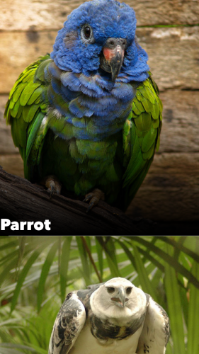
Laying Out the Animal Image
So you’re at work and your designer sends you a screenshot of what she wants for the new animal encyclopedia app you’re working on.

The first thing to do is break the screen down into the appropriate layout specs to express the overall layout. Sometimes this can feel a little overwhelming, but remember, the power of layout specs comes from how easily they can be composed. Just start simple.
I’ll give away the ending a little by saying the top half and bottom half will work perfectly in a stack together. Now that you know that, you can lay out the two halves separately and bring them together in the end.
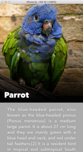
Unzip the starter project and open RainforestStarter.xcworkspace. Navigate to CardNode.m and go to -layoutSpecThatFits:. Right now it simply returns an empty ASLayoutSpec object.
If you build and run you’ll see the following:

Well, it’s a start. How about just showing the animal image first?
By default, a network image node has no content and therefore no intrinsic size. You’ve determined by looking at the screenshot that the animal’s image should be the full screen width and 2/3 the screen’s size.
To accomplish this, replace the existing return statement with the following:
//1 CGFloat ratio = constrainedSize.min.height/constrainedSize.min.width; //2 ASRatioLayoutSpec *imageRatioSpec = [ASRatioLayoutSpec ratioLayoutSpecWithRatio:ratio child:self.animalImageNode]; //3 return imageRatioSpec; |
Taking each numbered comment in turn:
- Calculate Ratio: First, you define the ratio you want to apply to your image. Ratios are defined in a height/width manner. Here, you state you want this image’s height to be 2/3 the minimum height of the cell, which happens to be the screen height.
-
Create Ratio Layout Spec: Next, you create a a new
ASRatioLayoutSpecusing the calculated ratio and a child, theanimalImageNode. -
Return a Spec: Returning the
imageRatioSpecdefines the cell’s height and width.
Build and run to see how your layout spec looks:

Pretty easy, eh? Since the image is the only thing that has a size, the cells grew to accommodate that size.
constrainedSize passed into a table node cell consists of a min of (0, 0) and a max of (tableNodeWidth, INF) which is why you needed to use the preferredFrameSize for the image’s height. The preferredFrameSize was set in AnimalPagerController in Part 1.Adding the Gradient
Now that you have the animal image, the next logical step is to add the gradient node on top of it. ASOverlayLayoutSpec is just the spec for the job.
First, add the following line after the initialization of imageRatioSpec:
ASOverlayLayoutSpec *gradientOverlaySpec = [ASOverlayLayoutSpec overlayLayoutSpecWithChild:imageRatioSpec overlay:self.gradientNode]; |
When building up your layout specs, you’ll always end up with one that contains the rest. This is now the case for the gradientOverlaySpec.
Replace the current return statement with the following.
return gradientOverlaySpec; |
Build and run to see the gradient stretched over the entirety of each imageNode.

A gradient for every bird — how nice!
Adding the Animal Name Text
The only thing left to do on the top half is to display the animal’s name.
While it seems simple, there are a few requirements to consider:
- The name should be placed above the gradient.
- The name should be in the bottom left hand corner of the animal image.
- There should be 16 points of padding on the left side and 8 points of padding on the bottom.
You already know how to stick that text on top of what’s been laid out. Its time to break out the tried and true overlay spec.
Add the following line right after the gradientOverlaySpec.
ASOverlayLayoutSpec *nameOverlaySpec = [ASOverlayLayoutSpec overlayLayoutSpecWithChild:gradientOverlaySpec overlay:self.animalNameTextNode]; |
As well, you need to change the return statement to the following:
return nameOverlaySpec; |
Now you can build and run to see the text on the screen:

Not bad; you just need to move it to the bottom corner.
This is a good time to mention a common case you’ll run into. You have some text on the bird, so your natural tendency may be to wrap the nameOverlaySpec in other specs to put it where you want. You’ll usually need to take a step back and think about what you’re trying to express.
In this case, you’re using nameOverlaySpec to stretch something else over the existing content.
But you don’t actually want to stretch the name over the content. You want to tell the name it should be in the bottom left hand corner of its available space, and then stretch that layout spec over the available space.
Introducing ASRelativeLayoutSpec
What you actually want is ASRelativeLayoutSpec.
ASRelativeLayoutSpec takes an ASLayoutElement child object, considers the space it has available, and then places that child item according to your instructions.
When you define a relative spec, you can set its verticalPosition and horizontalPosition properties.
These two properties can be one of the following:
ASRelativeLayoutSpecPositionStartASRelativeLayoutSpecPositionCenterASRelativeLayoutSpecPositionEnd
The combination lets you place your object at one of the corners, one of the edges, or in the center of the space it has available.
As an exercise, how would you put this frog on the right edge of his available space?

If you said, “Set verticalPosition to ASRelativeLayoutSpecPositionCenter and horizontalPosition to ASRelativeLayoutSpecPositionEnd”, you’d be right!
Now that you’ve had practice, the next line should make a little more sense. Add the following line right before nameOverlaySpec you added earlier:
ASRelativeLayoutSpec *relativeSpec = [ASRelativeLayoutSpec relativePositionLayoutSpecWithHorizontalPosition:ASRelativeLayoutSpecPositionStart verticalPosition:ASRelativeLayoutSpecPositionEnd sizingOption:ASRelativeLayoutSpecSizingOptionDefault child:self.animalNameTextNode]; |
As you can see, you’re setting the child’s horizontalPosition to start and the verticalPosition to end. In froggy terms it would look something like this:

Now that you have the relative spec set up, change the nameOverlaySpec definition to the following:
ASOverlayLayoutSpec *nameOverlaySpec = [ASOverlayLayoutSpec overlayLayoutSpecWithChild:gradientOverlaySpec overlay:relativeSpec]; |
Build and run to see what you have:
All right! There’s just one more thing to do on this half of the cell.
Introducing ASInsetLayoutSpec
The last thing you need to do is pad the animal name by 16 points on the left and 8 points on the bottom. You have ASInsetLayoutSpec at your disposal for this.
To add a little padding around any of your objects, simply wrap an object in an inset spec and provide UIEdgeInsets to define exactly how much padding you want.
Add the following line after your nameOverlaySpec:
ASInsetLayoutSpec *nameInsetSpec = [ASInsetLayoutSpec insetLayoutSpecWithInsets:UIEdgeInsetsMake(0, 16.0, 8.0, 0.0) child:nameOverlaySpec]; |
Then, once again, change the return statement to return the outermost spec.
return nameInsetSpec; |
Build and run and you’ll see the following:


Kidding — I was just trying to see if you were awake! :]
You don’t want the inset to be applied to the entire area the overlay encompasses, since that includes your animal image.
What you actually want is to apply an inset to the space relativeSpec has available. To fix this, first delete the current nameInsetSpec definition.
Next, add the following new and improved version right before the nameOverlaySpec definition:
ASInsetLayoutSpec *nameInsetSpec = [ASInsetLayoutSpec insetLayoutSpecWithInsets:UIEdgeInsetsMake(0, 16.0, 8.0, 0.0) child:relativeSpec]; |
Now you need nameOverlaySpec to overlay the new inset, not relativeSpec anymore. Replace the old nameOverlaySpec definition with:
ASOverlayLayoutSpec *nameOverlaySpec = [ASOverlayLayoutSpec overlayLayoutSpecWithChild:gradientOverlaySpec overlay:nameInsetSpec]; |
Finally, change return back to:
return nameOverlaySpec; |
Now build and run to see exactly what you were hoping for:

Top half accomplished!
The Bottom Half
The second half of things is quite a bit easier; it’s simply the animal’s description with an inset around it…and you already know how to do that.
Add the following line before the return statement to create an inset with the description text.
ASInsetLayoutSpec *descriptionTextInsetSpec = [ASInsetLayoutSpec insetLayoutSpecWithInsets:UIEdgeInsetsMake(16.0, 28.0, 12.0, 28.0) child:self.animalDescriptionTextNode]; |
If you were to return this inset and then build and run, you’d see the following:
This is exactly what you’d expect. Now that you have both halves figured out, putting them together is a snap.
Intrinsic Content Sizes
You may have noticed that you didn’t have to worry about the text having a content size to fill the space. That’s because ASTextNode has an intrinsic content size based on its text and attributes.
The following nodes do not have a default size:
ASDisplayNodesubclassesASNetworkImageNodeandASMultiplexImageNodeASVideoNodeandASVideoPlayerNode
The commonality is that these nodes have no content to start with, and therefore no way of defining their own size. These nodes will either need to have preferredFrameSize set or be put in a layout spec before they’ll have a concrete size to work with.
Introducing ASStackLayoutSpec
This is the perfect time to use the stack layout spec. You can think of it as being the layout spec equivalent to UIStackView, except that its automatically backwards compatible, which is pretty nifty.
Stacks can be defined as either vertical or horizontal and, like all layout specs, can take either nodes or other layout specs as children.
To get this stack set up, add these three lines after the description inset definition:
ASStackLayoutSpec *verticalStackSpec = [[ASStackLayoutSpec alloc] init]; verticalStackSpec.direction = ASStackLayoutDirectionVertical; verticalStackSpec.children = @[nameOverlaySpec, descriptionTextInsetSpec]; |
Here you’re creating a stack, setting its direction to be vertical, and adding the top half and bottom half as children.
And again, return your new layout spec.
return verticalStackSpec; |
Build and run; you’re pretty close to being done!
Nesting stacks, each having their own justifyContent and alignItems settings, means stacks can be the incredibly expressive, as well as incredibly frustrating. Make sure to check out the flex box froggy game and Async Display Kit docs for a more in-depth look.
Introducing ASBackgroundLayoutSpec
Hey, remember your old friend the overlay spec? Her one rule is that in an overlay spec, the item that is being overlaid upon must have its own size.
The item in the back defines the size and the item in front is simply being stretched over it.
A background spec is exactly the opposite. If you have one item that can define its own size, and another you want to stretch out behind it, then you need a background spec.
In this case, you’ll need to use a background layout spec to stretch the blurred animal image behind the whole stack you’ve build up.
To do so, add this line:
ASBackgroundLayoutSpec *backgroundLayoutSpec = [ASBackgroundLayoutSpec backgroundLayoutSpecWithChild:verticalStackSpec background:self.backgroundImageNode]; |
And replace the return statement for the final time
return backgroundLayoutSpec; |
Now build and run to see the finished product:
Where To Go From Here?
To see the completed project, download it here. Once again, this is available in Swift as well.
Once you feel comfortable with the concepts you’ve seen here, a good place to learn more would be the docs. This was really just a taste of what the layout system is capable of.
We hope you enjoyed this AsyncDisplayKit 2.0 tutorial and if you have any layout questions, feel free to leave them in the comments!
The post AsyncDisplayKit 2.0 Tutorial: Automatic Layout appeared first on Ray Wenderlich.