Storyboards, Scenes and View Controllers
Update note: This tutorial has been updated for Xcode 9, iOS 11, and Swift 4 by Nicholas Sakaimbo. The original tutorial was written by Matthijs Hollemans.
Storyboards are an exciting feature first introduced in iOS 5 that save time building user interfaces for your apps. Storyboards allow you to prototype and design multiple view controller views within one file.
Before Storyboards you had to use XIB files and you could only use one XIB file per view (UITableViewCell, UITableView or other supported UIView types).
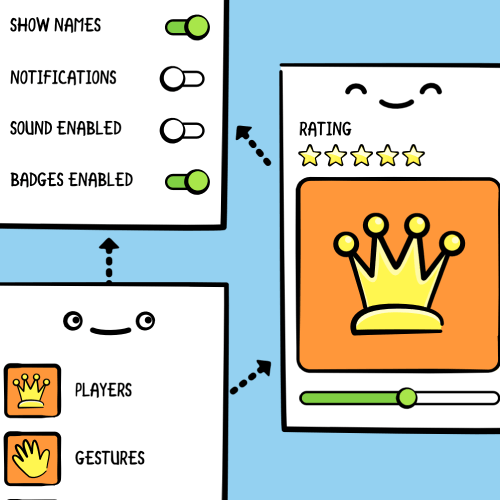
The following image shows you what a storyboard looks like, and it’s similar to the storyboard you’ll build during this tutorial:
You may not know what the app does but you can see its scenes and how they’re related.
Storyboards have a number of advantages:
- You can visually lay out all your view controllers in “scenes” and describe the connections between them. With a storyboard you’ve a better conceptual overview of all the scenes in your app.
- Describe the transitions between the various scenes. These transitions are called “segues” and you create them by connecting your view controllers in the storyboard. Thanks to segues you need less code to take care of your UI.
- Make working with table views a lot easier with prototype and static cells features. You can design your table views almost completely in the storyboard editor, cutting down the amount of code you have to write.
- Make it easier to use Auto Layout, a feature that allows you to define mathematical relationships between elements defining their position and sizing. This powerful feature makes it easier to handle devices of varying screen sizes and dimensions. In this tutorial you’ll use Auto Layout a little, but it’s outside the scope of this tutorial. You can read more in our Auto Layout Tutorial or watch the video series.
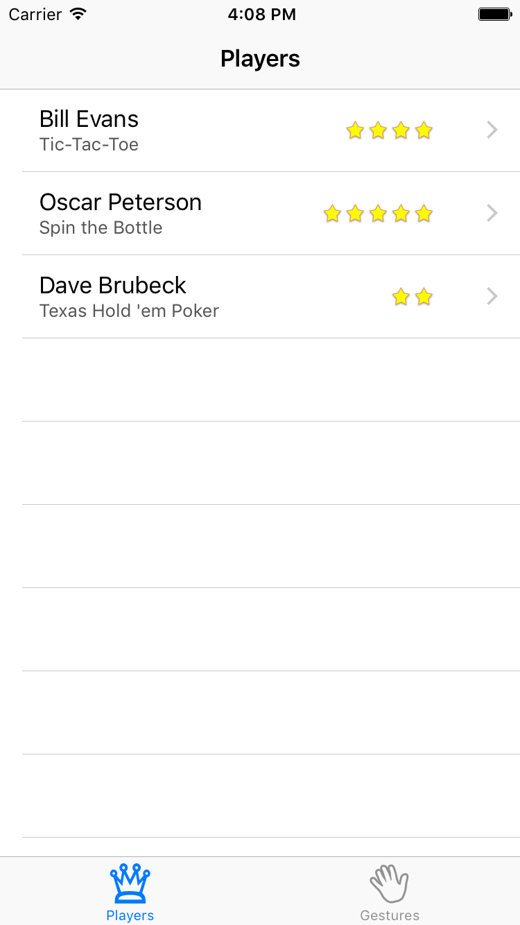
In this tutorial you’re going to build a sample app to create a list of players and show you the games they play and their skill rating. In the process, you’ll learn common tasks which can be accomplished using in storyboards.
Getting Started
Open Xcode and create a new project. Use the Single View Application template as the starting point.
Fill in the template options as follows, click Next and then Create:
- Product Name: Ratings
- Organization Name: fill this in however you like
- Organization Identifier: the identifier you use for your apps
- Language: Swift
- Make sure Use Core Data, Include Unit Tests and UI Tests are unchecked
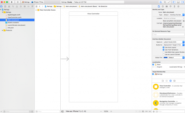
Once created, the main Xcode window should look like the following:
The new project consists of three files, AppDelegate.swift, ViewController.swift, and the star of this tutorial: Main.storyboard.
Under Deployment Info > Device Orientation in the General project settings, set Devices to iPhone. Since this is a portrait-only app, uncheck the Landscape Left and Landscape Right options.
Open Main.storyboard in the project navigator to view it in the Interface Builder editor:
The official storyboard terminology for a view controller is “scene”, but you can use the terms interchangeably. A scene represents a view controller in the storyboard.
Here you see a single view controller containing an empty view. The arrow pointing to the view controller from the left indicates it’s the initial view controller to be displayed for this storyboard.
Designing a layout in the storyboard editor is done by dragging controls from the Object Library (see bottom-right corner) into your view controller.
You’ll notice the default scene size is for a 4.7-inch screen. Xcode enables Auto Layout and Size Classes by default for storyboards. Auto Layout and Size Classes allow you to make flexible user interfaces that can easily resize, which is useful for supporting the various sizes of iPhones and iPads. To change the scene size to another device, click the button at the bottom left of the storyboard. You’ll then be able to select from the full range of supported device sizes, ranging from the iPad Pro (12.9-inch) to the iPhone 4S (3.5-inch), in both portrait and landscape orientations.
For this tutorial, we’ll leave the default scene size – iPhone 7 – unchanged, so make sure to switch it back if you’ve toggled through a couple of different device sizes. Xcode will automatically re-size existing and new scenes added to the storyboard for the currently-selected device size.
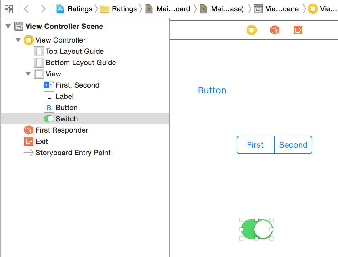
To get a feel for how the storyboard editor works, drag some controls from the Object Library into the blank view controller:
As you drag controls in, they should show up in the Document Outline on the left:
The storyboard shows the contents of all your scenes. Currently there’s only one scene in your storyboard, but over the course of this tutorial you’ll add several others.
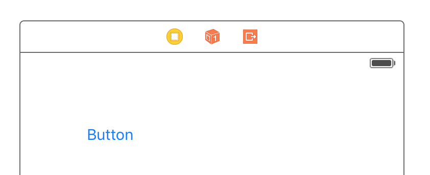
There’s a miniature version of this Document Outline above the scene called the Dock:
The Dock shows the top-level objects in the scene. Each scene has at least a View Controller object, a First Responder object, and an Exit object. It can potentially have other top-level objects as well. The Dock is convenient for making connections to outlets and actions. If you need to connect something to the scene, you can simply drag to its icon in the Dock.
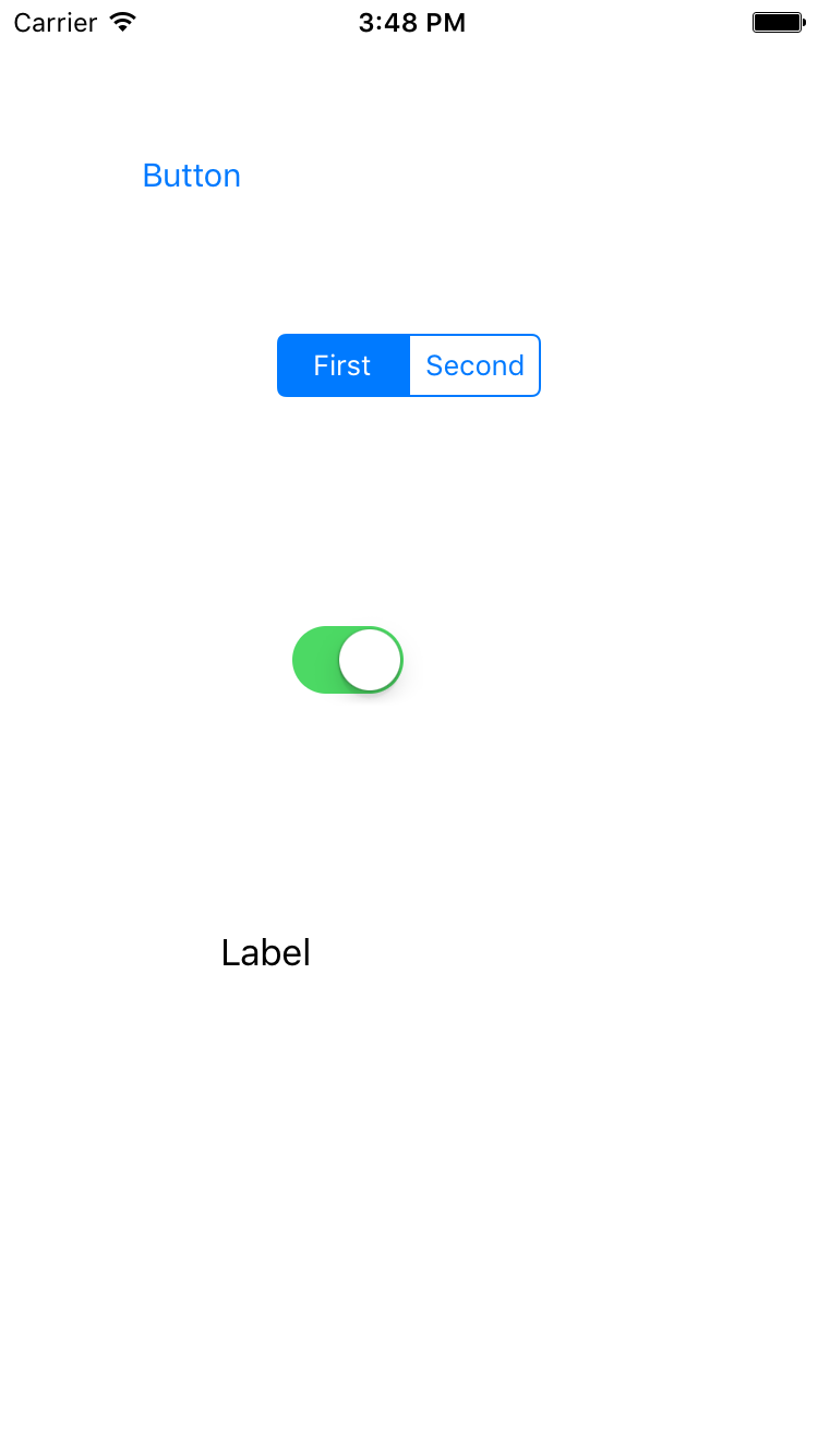
cut: selector. If at some point a text field has input focus then you can press that button to make the text field, which is now the first responder, cut its text to the pasteboard.Build and run the app, it should look exactly like what you designed in the editor (yours may look different than the screenshot below):
The single view controller you defined was set as the Initial View Controller – but how did the app load it? Open AppDelegate.swift to find the answer:
import UIKit

@UIApplicationMain
class AppDelegate: UIResponder, UIApplicationDelegate {

  var window: UIWindow?

  func application(_ application: UIApplication,
                   didFinishLaunchingWithOptions launchOptions: [UIApplicationLaunchOptionsKey: Any]?)
                   -> Bool {
    // Override point for customization after application launch.
    return true
  }
The @UIApplicationMain attribute at the top of the file designates the AppDelegate class as the entry point for the module. It’s a requirement for using storyboards your application delegate inherits from UIResponder and has a UIWindow property. All the methods are practically empty. Even application(_:didFinishLaunchingWithOptions:) simply returns true.
The secret’s in the Info.plist file. Open Info.plist in the Project Navigator and you’ll see the following:
Storyboard apps use the UIMainStoryboardFile key, also known as “Main storyboard file base name”, to specify the name of the storyboard to load when the app starts. When this setting is present, UIApplication will load the named storyboard file, automatically instantiate the “Initial View Controller”, and put that controller’s view into a new UIWindow object.
You can also see this in the Project Settings under the General tab and Deployment Info section:
Now to create the real Ratings app with several view controllers.
Just Add It To My Tab
The Ratings app you’re about to build has a tabbed interface with two scenes. With a storyboard it’s easy to create tabs.
Open Main.storyboard and delete the scene you worked with earlier. This can be done by clicking on View Controller in the Document Outline and pressing the delete key.
Drag a Tab Bar Controller from the Object Library into the canvas. You may want to maximize your Xcode window first, because the Tab Bar Controller comes with two view controllers attached and you’ll need some room to maneuver. You can zoom in and out by double-clicking the canvas, or set the zoom scale by ctrl-clicking the canvas and selecting the zoom level.
The new Tab Bar Controller comes pre-configured with two additional view controllers – one for each tab. UITabBarController is a so-called container view controller because it contains one or more other view controllers. Two other common containers are Navigation Controller and Split View Controller (you’ll use the Navigation Controller later).
The container Relationship is represented by the arrows between the Tab Bar Controller and the view controllers it contains. An embed Relationship in particular is signified by the icon seen below in the middle of the arrow body.
⌘-click or click and drag to select multiple scenes. This makes it possible to move them around together. (Selected scenes have a thin blue outline.)Drag a label into the first view controller (currently titled “Item 1”), double click it, and give it the text “First Tab”. Next, drag a label into the second view controller (“Item 2”) and give it the text “Second Tab”. This allows you to see something happen when you switch between the tabs.
Build and run the app. You’ll see something similar to this in the console:
Ratings[18955:1293100] Failed to instantiate the default view controller for UIMainStoryboardFile 'Main' - perhaps the designated entry point is not set?
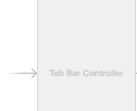
Fortunately, the error is pretty clear here – you never set an entry point, meaning you didn’t set the Initial View Controller after you deleted the previous scene. To fix this, select the Tab Bar Controller, go to the Attributes Inspector and check Is Initial View Controller.
In the canvas, an arrow now points at the Tab Bar Controller:
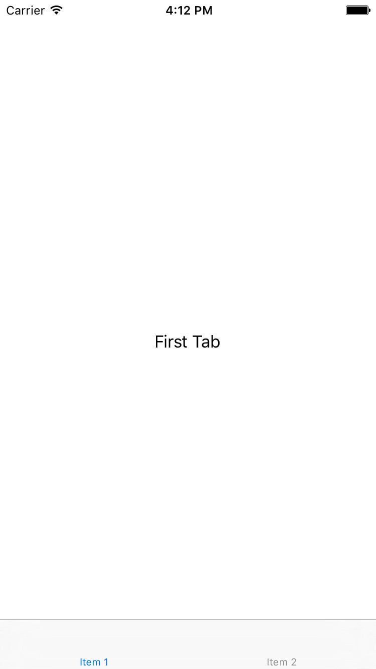
Now when you run the app, UIApplication will make the Tab Bar Controller the main screen. Build and run the app. Now you can see a tab bar and can switch between the two view controllers:
Xcode comes with a template for building a tabbed app (called the Tabbed Application template). You could have used it, but it’s good to know how this works so you can create a Tab Bar Controller by hand if you have to.
Adding a Table View Controller
The two scenes currently attached to the Tab Bar Controller are both UIViewController instances. You’re going to replace first tab scene with a UITableViewController instead.
Click on the first view controller in the Document Outline to select it, then delete it. Drag a new Table View Controller into the canvas where the previous scene used to be:
Next, you want to place the Table View Controller inside a navigation controller. First, select the Table View Controller. Next, choose Editor\Embed In\Navigation Controller from Xcode’s menubar. This adds another controller to the canvas:
You could have dragged in a Navigation Controller from the Object Library and embedded the table view, but this Embed In command is a nice time saver for a common action.
Since the Navigation Controller is also a container view controller (just like the Tab Bar Controller), it has a relationship arrow pointing to the Table View Controller. You can also see these relationships in the Document Outline:
Notice embedding the Table View Controller gave it a navigation bar. Interface Builder automatically put it there because this scene will now be displayed inside the Navigation Controller’s frame. It’s not a real UINavigationBar object, but a simulated one. Simulated Metrics will infer the context around the scene and show a navigation bar when it’s inside a Navigation Controller, a tab bar when it’s inside a Tab Bar Controller, and so on.
To connect these two new scenes to the Tab Bar Controller, ctrl-drag from the Tab Bar Controller to the Navigation Controller. When you let go, a small popup menu appears. Choose the Relationship Segue – view controllers option:
This creates a new relationship arrow between the two scenes. This is also an embed Relationship as you saw with the other controllers contained by the Tab Bar Controller.
The Tab Bar Controller has two embed relationships, one for each tab. The Navigation Controller itself has an embed Relationship with the Table View Controller.
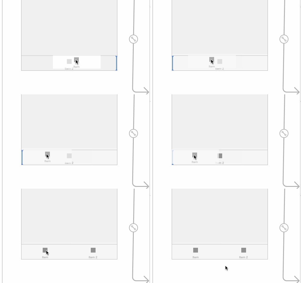
When you made this new connection, a new tab was added to the Tab Bar Controller, simply named “Item”. For this app, you want this new scene to be the first tab, so drag the tabs around to change their order:
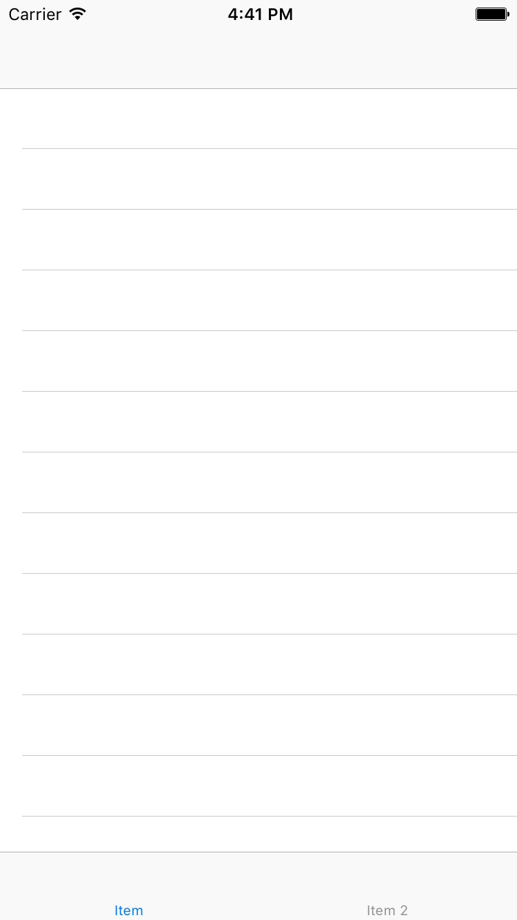
Build and run the app to try it out. The first tab now contains a table view inside a navigation controller.
Before you put some actual functionality into this app, you need to clean up the storyboard a little. You’ll name the first tab “Players” and the second “Gestures”. You don’t change this on the Tab Bar Controller itself, but in the view controllers connected to these tabs.
As soon as you connect a view controller to a Tab Bar Controller, it’s given a Tab Bar Item object which you can see in the Document Outline or the bottom of the scene. Use this Tab Bar Item to configure the tab’s title and image seen on the Tab Bar Controller.
Select the Tab Bar Item inside the Navigation Controller, and in the Attributes inspector set its Title to Players:
Next, rename the Tab Bar Item for the second tab to Gestures the same way you did above.
A well-designed app should also put icons on these tabs. The resources for this tutorial contains a subfolder named Images. Drag that folder into the Assets.xcassets subfolder in the project.
Open Main.storyboard, in the Attributes inspector for the Players Tab Bar Item, choose the Players image.
Next, give the Gestures Tab Bar Item the image Gestures.
A view controller embedded inside a Navigation Controller has a Navigation Item used to configure the navigation bar. Select the Navigation Item for the Table View Controller in the Document Outline and change its title in the Attributes inspector to Players. .
Notice the Scene title in the Document Outline now changes to Players
Build and run the app. Now marvel at your pretty tab bar, created without writing a single line of code!
Prototype Cells
Prototype cells allow you to easily design a custom layout for your table view cells directly within the storyboard editor.
The Table View Controller comes with a blank prototype cell. Click the cell to select it and in the Attributes inspector set the Style option to Subtitle. This immediately changes the appearance of the cell to include two labels.
If you’ve used table views before and created your own cells by hand, you may recognize this as the UITableViewCellStyle.Subtitle style. With prototype cells you can pick one of the built-in cell styles as you just did, or create your own custom design (which you’ll do shortly).
Set the Accessory attribute to Disclosure Indicator and the Identifier to PlayerCell. All prototype cells must have a reuse identifier so you can refer to them in code. In addition, set the cell’s Selection to None.
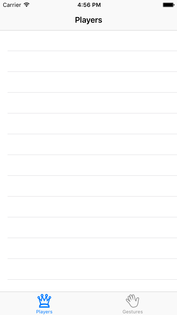
Build and run the app, nothing has changed. That’s not so strange: you still have to make a data source for the table so it knows which rows to display. You’re going to do that next.
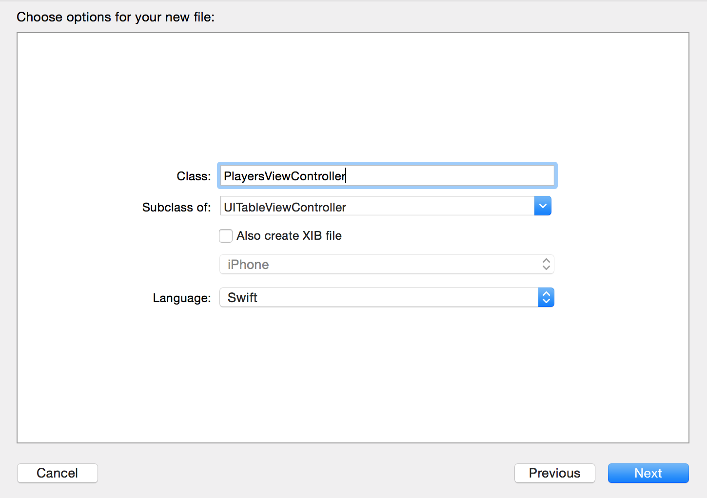
Add a new file to the project. Choose the Cocoa Touch Class template under iOS/Source. Name the class PlayersViewController and make it a subclass of UITableViewController. Uncheck Also create XIB file. Choose the Swift language and hit Next followed by Create.
Open Main.storyboard and select the Table View Controller (make sure you select the actual view controller and not one of its views). In the Identity inspector, set its Class to PlayersViewController. This is an essential step for hooking up a scene from the storyboard with your custom view controller subclass. Don’t forget this or your class won’t be used!
Now when you run the app the table view controller from the storyboard is an instance of the PlayersViewController class.
The table view should display a list of players, so now you’ll create the main data model for the app – an array containing Player objects. Add a new file to the project using the Swift File template under iOS/Source and name the file Player.
Replace the code in Player.swift with the following:
import Foundation

struct Player {

  // MARK: - Properties
  var name: String?
  var game: String?
  var rating: Int
}
There’s nothing special going on here. Player is simply a container object for these three properties: the name of the player, the game they’re playing, and a rating of 1 to 5 stars. Note because you didn’t define a custom initializer, the struct will automatically receive a default memberwise initializer which can be used to set all of its properties.
Next, create a new file using the Swift File template named SampleData. Replace the contents of SampleData.swift with the following:
import Foundation

final class SampleData {

  static func generatePlayersData() -> [Player] {
    return [
      Player(name: "Bill Evans", game: "Tic-Tac-Toe", rating: 4),
      Player(name: "Oscar Peterson", game: "Spin the Bottle", rating: 5),
      Player(name: "Dave Brubeck", game: "Texas Hold 'em Poker", rating: 2)
    ]
  }
}
Here you’ve defined a static method on SampleData to generate an array of hard coded Player objects.
Next, open PlayersViewController.swift and replace the contents of the file with the following:
import UIKit

class PlayersViewController: UITableViewController {

  // MARK: - Properties
  var players = SampleData.generatePlayersData()
}
You could have set up the sample data in PlayersViewController when defining the players variable. But this data might be provided from a plist or other outside source, hence it’s wise to handle loading the data outside of the view controller.
Now you’ve an array full of Player objects, continue hooking up the data source in PlayersViewController. Still in PlayersViewController.swift, add the following extension to the end of the file:
// MARK: - UITableViewDataSource
extension PlayersViewController {

  override func tableView(_ tableView: UITableView, numberOfRowsInSection section: Int) -> Int {
    return players.count
  }

  override func tableView(_ tableView: UITableView,
                          cellForRowAt indexPath: IndexPath) -> UITableViewCell {
    let cell = tableView.dequeueReusableCell(withIdentifier: "PlayerCell", for: indexPath)

    let player = players[indexPath.row]
    cell.textLabel?.text = player.name
    cell.detailTextLabel?.text = player.game
    return cell
  }
}
The method dequeueReusableCell(withIdentifier:for:) will check to see if there’s an existing cell that can be recycled. If not, it will automatically allocate a prototype cell and return it to you. All you need to do is supply the re-use identifier you set on the prototype cell in the storyboard editor – in this case PlayerCell. Don’t forget to set the identifier, or this little scheme won’t work!
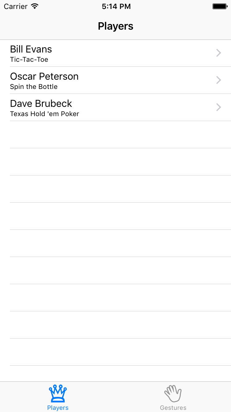
Build and run the app, the table view has players in it!
It takes just a few lines of code to use these prototype cells. I think that’s just great!
Designing Your Own Prototype Cells
Using a standard cell style is fine for most apps, but for this app you want to add an image on the right-hand side of the cell showing the player’s rating. Having an image view in that spot is not supported by the standard cell styles, so you’ll have to make a custom design.
Open Main.storyboard, select the prototype cell in the table view, and in Attributes inspector, set its Style attribute to Custom. The default labels now disappear.
First make the cell a little taller. Either change the Row Height value in the Size inspector (after checking Custom) or drag the handle at the bottom of the cell. Make the cell 60 points high.
Drag two Label objects from the Objects Library into the cell and place them roughly where the standard labels were previously. Just play with the font and colors in the Attributes Inspector and pick something you like. Set the text of the top label to Name and the bottom label to Game.
Select both the Name and Game labels in the Document Outline using Command+click, and choose Editor\Embed In\Stack View.
Drag an Image View into the cell and place it on the right, next to the disclosure indicator. In the Size Inspector, make it 81 points wide and 35 points high. Set its Content Mode to Center (under View in the Attributes inspector) so whatever image you put into this view is not stretched.
Command + click the Stack View and Image View in the Document Outline to select both of them. Choose Editor\Embed in\Stack View. Xcode will create a new horizontal stack view containing these two controls.
Select this new horizontal stack view, and in the Attributes Inspector, change the Alignment to Center and the Distribution to Equal Spacing.
Now for some simple auto layout for this control. At the bottom right of the storyboard, click the Pin icon:
Change the top constraints to Top: 0, Right: 20, Bottom: 0 and Left: 20. Make sure the four red pointers to the values are highlighted as in the picture. Click Add 4 Constraints at the bottom of the popover window.
If your stack view has orange constraints, it is misplaced. To fix this, select the horizontal stack view and choose Editor\Resolve Auto Layout Issues\Update Frames (in the Selected Views section of the menu). The stack view should position itself correctly and the orange constraint errors go away.
To position the image view within the stack view, select the image view in the Document Outline and choose Editor\Resolve Auto Layout Issues\Add Missing Constraints (in the Selected Views section of the menu).
You may see a small arrow highlighted in red in the Document Outline indicating unresolved layout issues with the stack view. Click on this arrow and click on the red circle to view Xcode’s suggested auto-fix. Selecting Change Priority for either the Name or Game labels’ hugging priority should silence this warning.
The final design for the prototype cell looks something like this:
Because this is a custom designed cell, you can no longer use UITableViewCell’s textLabel and detailTextLabel properties to put text into the labels. These properties refer to labels that aren’t on this cell anymore; they’re only valid for the standard cell types. Instead, you’ll subclass UITableViewCell to provide the functionality.
Tags in this situation, however tags do not provide the type of object which the compiler can check at runtime hence you have to use type casting and checking during runtime which you should avoid if at all possible. For this reason, tags were no longer considered prudent to teach in this situation.Using a Subclass for the Cell
Add a new file to the project, with the Cocoa Touch Class template. Name it PlayerCell and make it a subclass of UITableViewCell. Don’t check the option to create a XIB, as you already have the cell in your storyboard.
Next, add the following to the PlayerCell class, just below the class definition:
// MARK: - IBOutlets
@IBOutlet weak var gameLabel: UILabel!
@IBOutlet weak var nameLabel: UILabel!
@IBOutlet weak var ratingImageView: UIImageView!
These IBOutlets can be connected to your scene using the storyboard.
Next, add the following property below the IBOutlets:
// MARK: - Properties
var player: Player? {
  didSet {
    guard let player = player else { return }

    gameLabel.text = player.game
    nameLabel.text = player.name
    ratingImageView.image = image(forRating: player.rating)
  }
}
Whenever the player property is set, it’ll verify there’s a value and if so, update the IBOutlets with the correct information.
Next, add the following method below player:
func image(forRating rating: Int) -> UIImage? {
  let imageName = "\(rating)Stars"
  return UIImage(named: imageName)
}
This returns a different star image depending on the provided rating.
Next, open Main.storyboard, select the prototype cell PlayerCell and change its class to PlayerCell in the Identity inspector. Now whenever you ask the table view for a new cell with dequeueReusableCell(withIdentifier:for:), it’ll return a PlayerCell instance instead of a regular UITableViewCell.
PlayerCell – but that’s only because I like to keep things consistent. The class name and reuse identifier have nothing to do with each other, so you can name them differently if you wish.Finally, connect the labels and the image view to these outlets. Navigate to the Connections Inspector in the storyboard and then select the Player Cell from either the canvas or Document Outline. Drag from the nameLabel Outlet in the Connections inspector to the Name label object in either the Document Outline, or the canvas. Repeat for gameLabel and ratingImageView.
Note: You should hook up the controls to the table view cell, not to the view controller! You see, whenever your data source asks the table view for a new cell with dequeueReusableCell, the table view doesn’t give you the actual prototype cell but a copy (or one of the previous cells is recycled if possible).
This means there will be more than one instance of PlayerCell at any given time. If you were to connect a label from the cell to an outlet on the view controller, then several copies of the label will try to use the same outlet. That’s just asking for trouble. (On the other hand, connecting the prototype cell to actions on the view controller is perfectly fine. You would do that if you’ve custom buttons or other UIControls on your cell.)
Now you’ve hooked up the properties, you can simplify the data source code a bit. Open PlayersViewController.swift, and change tableView(_:cellForRowAt:) to the following:
override func tableView(_ tableView: UITableView,
                        cellForRowAt indexPath: IndexPath) -> UITableViewCell {
    let cell = tableView.dequeueReusableCell(withIdentifier: "PlayerCell",
                                             for: indexPath) as! PlayerCell

    let player = players[indexPath.row]
    cell.player = player
    return cell
}
That’s more like it. You now cast the object you receive from dequeueReusableCell to a PlayerCell, and pass the correct player to the cell. Setting the player variable in PlayerCell will automatically propagate the values into the labels and image view. Isn’t it great how using prototype cells makes table views a whole lot less messy?
Build and run the app.
Hmm, that doesn’t look quite right – the cells appear to be squished. You did change the height of the prototype cell, but the table view doesn’t take that into consideration. There’s two ways to fix it: you can change the table view’s Row Height attribute, or implement the tableView(_:heightForRowAt:) method. The former is fine in this case because we only have one type of cell and we know the height in advance.
Note: You would use tableView(_:heightForRowAt:) if you didn’t know the height of your cells in advance, or if different rows can have different heights.
Open Main.storyboard, in the Size inspector of the Table View, set Row Height to 60:
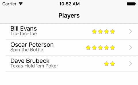
Build an run the app.
That’s much better isn’t it!
Where To Go From Here?
Click here to download the full source code for the project up to this point.
Check out part two of this tutorial, where we’ll cover segues, static table view cells, the Add Player scene, a game picker scene, and the full downloadable example project for this tutorial!
If you felt lost at any point during this tutorial, you also might want to brush up on the basics with our iOS Apprentice series. In that series, you’ll learn the foundational knowledge you need as an iOS developer from the ground up — perfect for complete beginners, or those looking to fill in some gaps.
If you have any questions or comments on this tutorial or on storyboards, please join the forum discussion below!
The post Storyboards Tutorial for iOS: Part 1 appeared first on Ray Wenderlich.


