Welcome back to the third and final part of the Core Graphics tutorial series! Flo, your water drinking tracking app, is ready for its final evolution, which you’ll make happen with Core Graphics.
In part one, you drew three custom-shaped controls with UIKit. Then in the part two, you created a graph view to show the user’s water consumption over a week, and you explored transforming the context transformation matrix (CTM).
In this third and final part of our Core Graphics tutorial, you’ll take Flo to its final form. Specifically, you’ll:
- Create a repeating pattern for the background.
- Draw a medal from start to finish to award the users for successfully drinking eight glasses of water a day.
If you don’t have it already, download a copy of the Flo project from the second part of this series.
Background Repeating Pattern
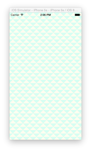
Your mission in this section is to use UIKit’s pattern methods to create this background pattern:
Note: If you need to optimize for speed, then work through Core Graphics Tutorial: Patterns which demonstrates a basic way to create patterns with Objective-C and Core Graphics. For most purposes, like when the background is only drawn once, UIKit’s easier wrapper methods should be acceptable.
Go to File\New\File… and select the iOS iOS\Source\Cocoa Touch Class template to create a class named BackgroundView with a subclass of UIView. Click Next and then Create.
Go to Main.storyboard, select the main view of ViewController, and change the class to BackgroundView in the Identity Inspector.

Set up BackgroundView.swift and Main.storyboard so they are side-by-side, using the Assistant Editor.
Replace the code in BackgroundView.swift with:
import UIKit

@IBDesignable
class BackgroundView: UIView {

  //1
  @IBInspectable var lightColor: UIColor = UIColor.orange
  @IBInspectable var darkColor: UIColor = UIColor.yellow
  @IBInspectable var patternSize: CGFloat = 200

  override func draw(_ rect: CGRect) {
    //2
    let context = UIGraphicsGetCurrentContext()!

    //3
    context.setFillColor(darkColor.cgColor)

    //4
    context.fill(rect)
  }
}
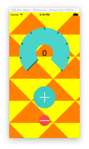
The background view of your storyboard should now be yellow. More detail on the above code:
lightColoranddarkColorhave@IBInspectableattributes so it’s easier to configure background colors later on. You’re using orange and yellow as temporary colors, just so you can see what’s happening.patternSizecontrols the size of the repeating pattern. It’s initially set to large, again so it’s easy to see what’s happening.UIGraphicsGetCurrentContext()gives you the view’s context and is also wheredraw(_ rect:)draws.- Use the Core Graphics method
setFillColor()to set the current fill color of the context. Notice that you need to useCGColor, a property ofdarkColorwhen using Core Graphics. - Instead of setting up a rectangular path,
fill()fills the entire context with the current fill color.
You’re now going to draw these three orange triangles using UIBezierPath(). The numbers correspond to the points in the following code:
Still in BackgroundView.swift, add this code to the end of draw(_ rect:):
let drawSize = CGSize(width: patternSize, height: patternSize)

//insert code here

let trianglePath = UIBezierPath()
//1
trianglePath.move(to: CGPoint(x: drawSize.width/2, y: 0))
//2
trianglePath.addLine(to: CGPoint(x: 0, y: drawSize.height/2))
//3
trianglePath.addLine(to: CGPoint(x: drawSize.width, y: drawSize.height/2))

//4
trianglePath.move(to: CGPoint(x: 0,y: drawSize.height/2))
//5
trianglePath.addLine(to: CGPoint(x: drawSize.width/2, y: drawSize.height))
//6
trianglePath.addLine(to: CGPoint(x: 0, y: drawSize.height))

//7
trianglePath.move(to: CGPoint(x: drawSize.width, y: drawSize.height/2))
//8
trianglePath.addLine(to: CGPoint(x: drawSize.width/2, y: drawSize.height))
//9
trianglePath.addLine(to: CGPoint(x: drawSize.width, y: drawSize.height))

lightColor.setFill()
trianglePath.fill()
Notice how you use one path to draw three triangles. move(to:) is just like lifting your pen from the paper when you’re drawing and moving it to a new spot.
Your storyboard should now have an orange and yellow image at the top left of your background view.
So far, you’ve drawn directly into the view’s drawing context. To be able to repeat this pattern, you need to create an image outside of the context, and then use that image as a pattern in the context.
Find the following. It’s close to the top of draw(_ rect:), but after the initial context calls:
let drawSize = CGSize(width: patternSize, height: patternSize)
Add the following code where it conveniently says Insert code here:
UIGraphicsBeginImageContextWithOptions(drawSize, true, 0.0)
let drawingContext = UIGraphicsGetCurrentContext()!

//set the fill color for the new context
darkColor.setFill()
drawingContext.fill(CGRect(x: 0, y: 0, width: drawSize.width, height: drawSize.height))
Hey! Those orange triangles disappeared from the storyboard. Where’d they go?
UIGraphicsBeginImageContextWithOptions() creates a new context and sets it as the current drawing context, so you’re now drawing into this new context. The parameters of this method are:
- The size of the context.
- Whether the context is opaque — if you need transparency, then this needs to be false.
- The scale of the context. If you’re drawing to a retina screen, this should be 2.0, and if to an iPhone 6 Plus, it should be 3.0. However, this uses 0.0, which ensures the correct scale for the device is automatically applied.
Then you used UIGraphicsGetCurrentContext() to get a reference to this new context.
You then filled the new context with yellow. You could have let the original background show through by setting the context opacity to false, but it’s faster to draw opaque contexts than it is to draw transparent, and that’s argument enough to go opaque.
Add this code to the end of draw(_ rect:):
let image = UIGraphicsGetImageFromCurrentImageContext()!
UIGraphicsEndImageContext()
This extracts a UIImage from the current context. When you end the current context with UIGraphicsEndImageContext(), the drawing context reverts to the view’s context, so any further drawing in draw(_ rect:) happens in the view.
To draw the image as a repeated pattern, add this code to the end of draw(_ rect:):
UIColor(patternImage: image).setFill()
context.fill(rect)
This creates a new UIColor by using an image as a color instead of a solid color.
Build and run the app. You should now have a rather bright background for your app.
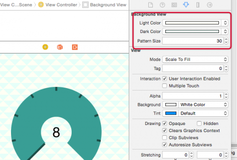
Go to Main.storyboard, select the background view, and in the Attributes Inspector change the @IBInspectable values to the following:
- Light Color: RGB(255, 255, 242)
- Dark Color: RGB(223, 255, 247)
- Pattern Size: 30
Experiment a little more with drawing background patterns. See if you can get a polka dot pattern as a background instead of the triangles.
And of course, you can substitute your own non-vector images as repeating patterns.
Drawing Images
In the final stretch of this tutorial, you’ll make a medal to handsomely reward users for drinking enough water. This medal will appear when the counter reaches the target of eight glasses.
I know that’s certainly not a museum-worthy piece of art, so please know that I won’t be offended if you improve it, or even take it to the next level by drawing a trophy instead of a medal.
Instead of using @IBDesignable, you’ll draw it in a Swift Playground, and then copy the code to a UIImageView subclass. Though interactive storyboards are often useful, they have limitations; they only draw simple code, and storyboards often time out when you create complex designs.
In this particular case, you only need to draw the image once when the user drinks eight glasses of water. If the user never reaches the target, there’s no need to make a medal.
Once drawn, it also doesn’t need to be redrawn with draw(_ rect:) and setNeedsDisplay().
Time to put the brush to the canvas. You’ll build up the medal view using a Swift playground, and then copy the code into the Flo project when you’ve finished.
Go to File\New\Playground…. Choose the Blank template, click Next, name the playground MedalDrawing and then click Create.
In the new playground window, replace the playground code with:
import UIKit

let size = CGSize(width: 120, height: 200)

UIGraphicsBeginImageContextWithOptions(size, false, 0.0)
let context = UIGraphicsGetCurrentContext()!


//This code must always be at the end of the playground
let image = UIGraphicsGetImageFromCurrentImageContext()
UIGraphicsEndImageContext()
This creates a drawing context, just as you did for the patterned image.
Take note of these last two lines; you always need them at the bottom of the playground so you can preview the image in the playground.
Next, in the gray results column click the square button to the right of this code:
let image = UIGraphicsGetImageFromCurrentImageContext()

This will place a preview image underneath the code. The image will update with every change that you make to the code.
It’s often best to do a sketch to wrap your head around the order you’ll need to draw the elements — look at the “masterpiece” I made while conceptualizing this tutorial:
This is the order in which to draw the medal:
- The back ribbon (red)
- The medallion (gold gradient)
- The clasp (dark gold)
- The front ribbon (blue)
- The number 1 (dark gold)
Remember to keep the last two lines of the playground (where you extract the image from the context at the very end), and add this drawing code to the playground before those lines:
First, set up the non-standard colors you need.
//Gold colors
let darkGoldColor = UIColor(red: 0.6, green: 0.5, blue: 0.15, alpha: 1.0)
let midGoldColor = UIColor(red: 0.86, green: 0.73, blue: 0.3, alpha: 1.0)
let lightGoldColor = UIColor(red: 1.0, green: 0.98, blue: 0.9, alpha: 1.0)
This should all look familiar by now. Notice that the colors appear in the right margin of the playground as you declare them.
Add the drawing code for the red part of the ribbon:
//Lower Ribbon
let lowerRibbonPath = UIBezierPath()
lowerRibbonPath.move(to: CGPoint(x: 0, y: 0))
lowerRibbonPath.addLine(to: CGPoint(x: 40, y: 0))
lowerRibbonPath.addLine(to: CGPoint(x: 78, y: 70))
lowerRibbonPath.addLine(to: CGPoint(x: 38, y: 70))
lowerRibbonPath.close()
UIColor.red.setFill()
lowerRibbonPath.fill()
Nothing too new here, just creating a path and filling it. You should see the red path appear in the right hand pane.
Add the code for the clasp:
//Clasp
let claspPath = UIBezierPath(roundedRect: CGRect(x: 36, y: 62, width: 43, height: 20), cornerRadius: 5)
claspPath.lineWidth = 5
darkGoldColor.setStroke()
claspPath.stroke()
Here you make use of UIBezierPath(roundedRect:) with rounded corners by using the cornerRadius parameter. The clasp should draw in the right pane.
Add the code for the medallion:
//Medallion
let medallionPath = UIBezierPath(ovalIn: CGRect(x: 8, y: 72, width: 100, height: 100))
//context.saveGState()
//medallionPath.addClip()

let colors = [darkGoldColor.cgColor, midGoldColor.cgColor, lightGoldColor.cgColor] as CFArray
let gradient = CGGradient(colorsSpace: CGColorSpaceCreateDeviceRGB(), colors: colors, locations: [0, 0.51, 1])!
context.drawLinearGradient(gradient, start: CGPoint(x: 40, y: 40), end: CGPoint(x: 40, y: 162), options: [])
//context.restoreGState()
Notice the commented out the lines. These are here to temporarily show how the gradient is drawn:
To put the gradient on an angle, so that it goes from top-left to bottom-right, change the end x coordinate of the gradient. Alter the drawLinearGradient() code to:
context.drawLinearGradient(gradient, start: CGPoint(x: 40, y: 40), end: CGPoint(x: 100, y: 160), options: [])
Now uncomment those three lines in the medallion drawing code to create a clipping path to constrain the gradient within the medallion’s circle.
Just as you did when drawing the graph in Part 2 of this series, you save the context’s drawing state before adding the clipping path and restore it after the gradient is drawn so that the context is no longer clipped.
To draw the solid internal line of the medal, use the medallion’s circle path, but scale it before drawing. Instead of transforming the whole context, you’ll just apply the transform to one path.
Add this code after the medallion drawing code:
//Create a transform
//Scale it, and translate it right and down
var transform = CGAffineTransform(scaleX: 0.8, y: 0.8)
transform = transform.translatedBy(x: 15, y: 30)
medallionPath.lineWidth = 2.0

//apply the transform to the path
medallionPath.apply(transform)
medallionPath.stroke()
This scales the path down to 80 percent of its original size, and then translates the path to keep it centered within the gradient view.
Add the upper ribbon drawing code after the internal line code:
//Upper Ribbon
let upperRibbonPath = UIBezierPath()
upperRibbonPath.move(to: CGPoint(x: 68, y: 0))
upperRibbonPath.addLine(to: CGPoint(x: 108, y: 0))
upperRibbonPath.addLine(to: CGPoint(x: 78, y: 70))
upperRibbonPath.addLine(to: CGPoint(x: 38, y: 70))
upperRibbonPath.close()

UIColor.blue.setFill()
upperRibbonPath.fill()
This is very similar to the code you added for the lower ribbon: making a bezier path and filling it.
The last step is to draw the number one on the medal. Add this code after the upper ribbon code:
//Number One

//Must be NSString to be able to use draw(in:)
let numberOne = "1" as NSString
let numberOneRect = CGRect(x: 47, y: 100, width: 50, height: 50)
let font = UIFont(name: "Academy Engraved LET", size: 60)!
let numberOneAttributes = [
  NSAttributedStringKey.font: font,
  NSAttributedStringKey.foregroundColor: darkGoldColor
]
numberOne.draw(in: numberOneRect, withAttributes: numberOneAttributes)
Here you define a NSString with text attributes, and draw it into the drawing context using draw(_in:).
Looking good!
You’re getting close, but it’s looking a little two-dimensional. It would be nice to have some drop shadows.
Shadows
To create a shadow, you need three elements: color, offset (distance and direction of the shadow) and blur.
At the top of the playground, after defining the gold colors but just before the //Lower Ribbon line, insert this shadow code:
//Add Shadow
let shadow: UIColor = UIColor.black.withAlphaComponent(0.80)
let shadowOffset = CGSize(width: 2.0, height: 2.0)
let shadowBlurRadius: CGFloat = 5

context.setShadow(offset: shadowOffset, blur: shadowBlurRadius, color: shadow.cgColor)
That makes a shadow, but the result is probably not what you pictured. Why is that?
When you draw an object into the context, this code creates a shadow for each object.
Ah-ha! Your medal comprises five objects. No wonder it looks a little fuzzy.
Fortunately, it’s pretty easy to fix. Simply group drawing objects with a transparency layer, and you’ll only draw one shadow for the whole group.
Add the code to make the group after the shadow code. Start with this:
context.beginTransparencyLayer(auxiliaryInfo: nil)
When you begin a group you also need to end it, so add this next block at the end of the playground, but before the point where you retrieve the final image:
context.endTransparencyLayer()
Now you’ll have a completed medal image with clean, tidy shadows:
That completes the playground code, and you have a medal to show for it!
Adding the Medal Image to an Image View
Now that you’ve got the code in place to draw a medal (which looks fabulous, by the way), you’ll need to render it into a UIImageView in the main Flo project.
Switch back to the Flo project and create a new file for the image view.
Click File\New\File… and choose the Cocoa Touch Class template. Click Next , and name the class MedalView. Make it a subclass of UIImageView, then click Next, then click Create.
Go to Main.storyboard and add a UIImageView as a subview of Counter View. Select the UIImageView, and in the Identity Inspector change the class to MedalView.
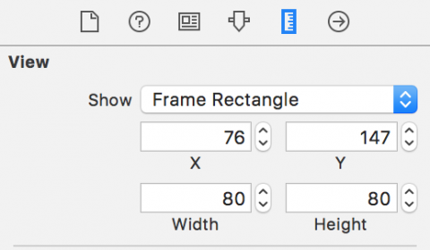
In the Size Inspector, give the Image View the coordinates X=76, Y=147, Width=80, and Height=80:
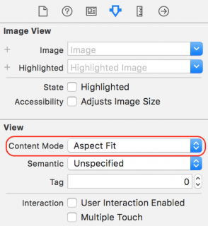
In the Attributes Inspector, change the Content Mode to Aspect Fit, so that the image automatically resizes to fit the view.
Go to MedalView.swift and add a method to create the medal:
func createMedalImage() -> UIImage {
  println("creating Medal Image")

}
This creates a log so that you know when the image is being created.
Switch back to your MedalDrawing playground, and copy the entire code except for the initial import UIKit.
Go back to MedalView.swift and paste the playground code into createMedalImage().
At the end of createMedalImage(), add:
return image!
That should squash the compile error.
At the top of the class, add a property to hold the medal image:
lazy var medalImage: UIImage = self.createMedalImage()
The lazy declaration modifier means that the medal image code, which is computationally intensive, only draws when necessary. Hence, if the user never records drinking eight glasses, the medal drawing code will never run.
Add a method to show the medal:
func showMedal(show: Bool) {
  image = (show == true) ? medalImage : nil
}
Go to ViewController.swift and add an outlet at the top of the class:
@IBOutlet weak var medalView: MedalView!
Go to Main.storyboard and connect the new MedalView to this outlet.
Go back to ViewController.swift and add this method to the class:
func checkTotal() {
  if counterView.counter >= 8 {
    medalView.showMedal(show: true)
  } else {
    medalView.showMedal(show: false)
  }
}
This shows the medal if you drink enough water for the day.
Call this method at both the end of viewDidLoad() and pushButtonPressed(_:):
checkTotal()
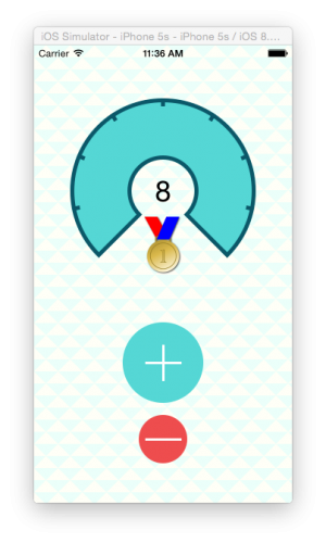
Build and run the application. It should look like this:
In the debug console, you’ll see the creating Medal Image log only outputs when the counter reaches eight and displays the medal, since medalImage uses a lazy declaration.
Where to Go From Here?
You’ve come a long way in this epic Core Graphics tutorial series. You’ve mastered the basics of Core Graphics: drawing paths, creating patterns and gradients, and transforming the context. To top it all off, you learned how to put it all together in a useful app.
Download the complete version of Flo right here. This version also includes extra sample data and radial gradients to give the buttons a nice UI touch so they respond when pressed.
I hope you enjoyed making Flo, and that you’re now able to make some stunning UIs using nothing but Core Graphics and UIKit! If you have any questions, comments, or you want to hash out how to draw a trophy instead of a medal, please join the forum discussion below.
The post Core Graphics Tutorial Part 3: Patterns and Playgrounds appeared first on Ray Wenderlich.
