In this watchOS 4 Tutorial, you’ll build a simple but fully functional watchOS 4 app. Specifically, you will work on a Watch app for a fictional airline called Air Aber.
In the process, you’ll learn:
- How to add a watchOS 4 target to an iOS app.
- How to share data across the two targets.
- How to add a watchOS 4 interface controller to the Storyboard, and lay out the interface objects.
- How to create the
WKInterfaceControllersubclass, and wire everything up.
Let’s get started! ┗(°0°)┛
Getting Started
Start by downloading the starter project for this tutorial.
Open it in Xcode, and build and run. You should see a blank white screen:
There’s not much to this project as it stands: it includes a few helper files you’ll need, and not much else. You’ll address that now!
Adding the WatchKit App
Select File\New\Target…. In the dialog that appears, choose watchOS\Application\WatchKit App, then click Next:
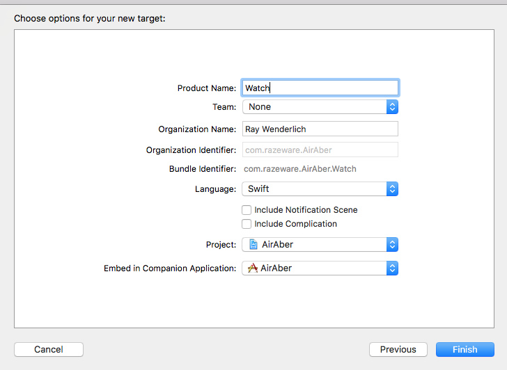
In the following screen, set Product Name to Watch, make sure Language is set to Swift, and uncheck any checkboxes that are checked. Click Finish:
You’ll be asked if you want to activate the watch scheme, which you do, so make sure to choose Activate:
Congratulations, you’ve just created your first Watch app! It really is that easy.
You’ll notice this action actually created two targets, not one, and two corresponding groups in the Project navigator. This is because the code of a Watch app actually runs as an extension bundled within the Watch app, in much the same way Today extensions on iOS work.
Expand the Watch and Watch Extension groups in the Project navigator, and you’ll see that the storyboard is in the Watch group, and the classes created by the target template are in the Watch Extension group:
Here’s the pattern you’ll follow moving forward: any code you add must reside within the Watch Extension group, and be added to the Watch Extension target, whereas any assets or storyboards must be added to the Watch group.
A Little Housekeeping
Before continuing, you need to remove a couple of things added by the target template that you’re going to replace.
Right-click on InterfaceController.swift in the Project navigator, and choose Delete. When prompted, choose Move to Trash to make sure the file is actually removed from the project:
Next, open Interface.storyboard, select the only interface controller in there, and hit the delete key. This should leave you with an empty storyboard, or as I prefer to think of it, a blank canvas.
Sharing Data and Code
The starter project includes a JSON file containing all the Air Aber flight details, and a model class that represents that data. This is exactly the kind of thing that you should share amongst targets, since it’s highly likely the iOS app and the Watch app will use the same model class and data – you do remember DRY, right?
Expand the Shared group in the Project navigator, and select Flights.json. Next, find the Target Membership section in the File inspector, and check Watch Extension:
The file is now included in both the AirAber and Watch Extension targets.
Repeat the process for the other file in the Shared group, Flight.swift.
And with that done, you can finally begin building the flight details interface!
Building the Interface
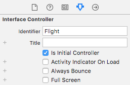
Open Watch\Interface.storyboard, and drag an interface controller from the Object Library onto the storyboard canvas. With the interface controller selected, open the Attributes inspector, and set Identifier to Flight, and check Is Initial Controller. Uncheck Activity Indicator On Load:
Here, you’ve set the identifier so you can refer to the interface controller in code. Checking Is Initial Controller simply informs WatchKit this is the interface controller you want to display when the Watch app first launches. This interface doesn’t download any data, so it doesn’t need to display the activity indicator.
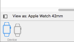
In order to simplify this tutorial, you will build your layout only for the 42mm watch. For your own apps, you’ll want to verify that they work properly on all watch sizes. At the bottom left of the storyboard pane, ensure that it says View as: Apple Watch 42mm.
Watch app layout is completely different from iOS layout. The first thing you’ll notice: you can’t move or resize UI objects by dragging them around in the interface controller. When you drag an object onto the controller, it slots in under the previous objects, and the screen fills up pretty fast. To organize objects side-by-side, you use groups, which are a lot like stack views in iOS and macOS.
So first, drag a group from the Object Library onto the interface controller:
Although it doesn’t look like much now, this group will eventually contain the Air Aber logo, flight number and route.
With the new group selected, head over to the Attributes inspector, and change Insets to Custom. Four text fields appear, where you can manually set the top, bottom, left and right insets of the group.
Change Top to 6:
This simply gives the layout group a little extra padding at the top.
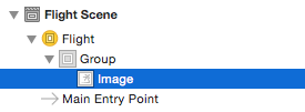
Next, drag an image into the group. If your group shrank in response to changing the top inset (thanks Xcode!), drag the image into the document outline instead, making sure it’s a child of the group, rather than a sibling:
Now you need an image to display. Download this logo image and drag it into your Watch\Assets.xcassets. This creates a new image set called Logo, with the actual image in the 2x slot:
You want to tint this image to Air Aber’s corporate color, so select the image, then in the Attributes inspector, set Render As to Template Image.
Re-open Watch\Interface.storyboard, and select the image. Using the Attributes inspector, make the following changes:
- Set Image to Logo – if it doesn’t appear in the dropdown, simply type it in.
- Set Tint to #FA114F (you can type this in the Color RGB Sliders panel).
- Set Width to Fixed, with a value of 40.
- Set Height to Fixed, with a value of 40.
The Attributes inspector should now look like the following:
Don’t worry if you can’t see the logo: it turns out Xcode doesn’t tint template images at design time! Trust me, it’ll be a vibrant pink when you build and run!
Next, drag another group into the existing group, making sure it appears to the right of the image, and use the Attributes inspector to change its Layout to Vertical. Also, change Spacing to Custom\0 and Width to Size to Fit Content.
Next, drag two labels into the new group. Because you set layout to vertical, the labels appear one above the other:
Select the upper label, and use the Attributes inspector to set Text to Flight 123 and Text Color to #FA114F (instead of typing this into the RGB panel again, you can select the pink color from Recently Used Colors in the Color menu).
Next, select the lower label, and set its Text to MEL to SFO. Your interface controller should now look like the following:
This text is simply placeholder text that’ll be replaced when you hook the interface up to its controller class.
Next, drag another group onto the interface controller, but this time make sure it’s a sibling of the very first group you added. If you can’t get the group positioned at the correct place in the hierarchy, use the document outline instead.
With this new group selected, set its Layout to Vertical and Spacing to Custom\0.
Next, drag three labels into this new group:
Check in the document outline to make sure all three labels are inside the group, not siblings of the group!
Select the top label, and use the Attributes inspector to change its Text to AA123 Boards.
Next, select the middle label, and change its Text to 15:06. Next, change Text Color to #FA114F and Font to System, with a Style of Regular and a Size of 54. Finally, change Height to Fixed, with a value of 44.
Select the bottom label, and change its Text to On time and Text Color to #04DE71.
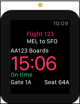
Your interface controller should now look like the following:
Now you only have to add one more group, before you create the outlets, and have this interface display some real data.
Drag a new group from the Object Library into the lower group, this time making sure it’s a child rather than a sibling, and that it’s positioned at the very bottom of the containing group. Next, add two labels to it. Your complete interface object hierarchy should now look like this:
Use the Attributes inspector to set Text to Gate 1A for the left label. For the right label, set Text to Seat 64A, and set Horizontal Alignment to Right.
The completed interface should now look like the following:
Congratulations, you’ve finished laying out your very first Watch app interface! Now it’s time to populate it with some real data, and get it up and running in the simulator.
Creating the Controller
Right-click on the Watch Extension group in the Project navigator, and choose New File…. In the dialog that appears, select watchOS\Source\WatchKit Class, and click Next. Name the new class FlightInterfaceController, making sure it’s subclassing WKInterfaceController, and Language is set to Swift:
Click Next, and then Create.
When the new file opens in the code editor, delete the three empty method stubs, so you’re left with only the import statements and the class definition.
Add the following outlets to the top of FlightInterfaceController:
@IBOutlet var flightLabel: WKInterfaceLabel!
@IBOutlet var routeLabel: WKInterfaceLabel!
@IBOutlet var boardingLabel: WKInterfaceLabel!
@IBOutlet var boardTimeLabel: WKInterfaceLabel!
@IBOutlet var statusLabel: WKInterfaceLabel!
@IBOutlet var gateLabel: WKInterfaceLabel!
@IBOutlet var seatLabel: WKInterfaceLabel!
Here, you’re simply adding an outlet for each of the labels you added to the interface earlier. You’ll hook them up in just a moment.
Next, add the following property and property observer below the outlets:
// 1
var flight: Flight? {
  // 2
  didSet {
    // 3
    guard let flight = flight else { return }
    // 4
    flightLabel.setText("Flight \(flight.shortNumber)")
    routeLabel.setText(flight.route)
    boardingLabel.setText("\(flight.number) Boards")
    boardTimeLabel.setText(flight.boardsAt)
    // 5
    if flight.onSchedule {
      statusLabel.setText("On Time")
    } else {
      statusLabel.setText("Delayed")
      statusLabel.setTextColor(.red)
    }
    gateLabel.setText("Gate \(flight.gate)")
    seatLabel.setText("Seat \(flight.seat)")
  }
}
Here’s the play-by-play of what’s happening:
- You declare an optional property of type
Flight. This class is declared in Flight.swift, which is part of the shared code you added to the Watch Extension target earlier. - You add a property observer that is triggered whenever the property is set.
- You make sure there’s an actual flight rather than
nilin the optional property. You only want to proceed with configuring the labels when you know you have a valid instance ofFlight. - You configure the labels using the relevant properties of
flight. - If the flight is delayed, you change the text color of the label to red.
Now you need to set flight when the controller is first shown. Add the following below the declaration of flight:
override func awake(withContext context: Any?) {
  super.awake(withContext: context)

  flight = Flight.allFlights().first
}
In the next part of this series, you’ll change this implementation to use the context that’s passed to it, but for now, you simply load all the flights from the shared JSON file, then take the first one from the array.
awake(withContext:) is called after the controller is loaded from the storyboard, and all its outlets are set up, so it’s a great place to set flight.Now, there’s one final step before you can build and run, and that’s to connect the outlets.
Connecting the Outlets
Open Watch\Interface.storyboard, and select the interface controller. Using the Identity inspector, set Custom Class\Class to FlightInterfaceController.
Next, use your favorite method to connect the outlets according to the list below:
flightLabel: Flight 123routeLabel: MEL to SFOboardingLabel: AA123 BoardsboardTimeLabel: 15:06statusLabel: On timegateLabel: Gate 1AseatLabel: Seat 64A
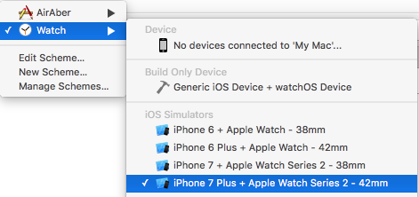
Before you hit run, there’s just one more thing to do. The sample app you’re building throughout this tutorial has been designed for the 42mm Apple Watch, so you need to make sure you have the correct watch simulator set up, otherwise some things may look a little off. For a real world app, you’d want to make sure your interfaces work equally well across both sizes of watch, but that’s outside the scope of this tutorial.
Open the Watch scheme menu, and select one of the 42mm simulators:
Build and run. Once the simulator has finished loading, you should see your elaborate layout, with the logo tinted Air Aber pink. The Flight object generates random values for boarding time and seat number, so you’ll see different values there:
Congratulations! You’ve now finished implementing your very first WatchKit interface, and got it up and running in the watch simulator using real data — nice work. :]
Where To Go From Here?
Here is the finished example from this tutorial series so far.
In this exercise, you’ve learned how to add a Watch app to an existing iOS app, how to create an interface controller, and lay out a pretty complex interface using nested groups, and how to tie the whole thing together using a WKInterfaceController subclass. So, where to next?
Part 2 of this tutorial series, of course! In Part 2, you’ll learn all about tables and navigation in WatchKit.
If you have any questions or comments on this tutorial, please join the forum discussion below! :]
 If you enjoyed this tutorial series, you’d definitely enjoy our book watchOS by Tutorials.
The book goes into further detail on making watchOS apps and is written for intermediate iOS developers who already know the basics of iOS and Swift development but want to learn how to make Apple Watch apps for watchOS 4.
It’s been fully updated for Swift 4, watchOS 4 and Xcode 9 — get it on the raywenderlich.com store today!
The post watchOS 4 Tutorial Part 1: Getting Started appeared first on Ray Wenderlich.


