 Welcome back to our watchOS 4 tutorial series!
In Part 1 of this series, you learned about the basics of watchOS 4 development by creating your first interface controller.
In this second part of the series, you’ll add a table to your app that displays a list of flights.
In the process, you’ll learn:
- How to add a new interface controller, add a table to it, and build the prototype row.
- How to create a subclass of
WKInterfaceControllerto populate the table, configure the rows, and handle selection. - How to present an interface controller modally, and pass it data to present.
And with that, let’s get going! ┗(°0°)┛
Getting Started
Open Watch\Interface.storyboard, and drag another interface controller from the Object Library onto the storyboard canvas, to the left of the existing Flight controller.
With the new interface controller selected, open the Attributes inspector, and make the following changes:
- Set Identifier to Schedule.
- Set Title to Air Aber.
- Check Is Initial Controller.
- Check Activity Indicator On Load is checked.
As with the Flight controller, you set the identifier so you can refer to this interface controller in code. This is the real initial controller for the Watch app, so you set its title, and check the box. This controller loads a table from some data source, so you display the activity indicator.
Now for the interface: drag a table from the Object Library onto the new interface controller:
Select the Table Row Controller in the document outline:
Use the Attributes inspector to set its Identifier to FlightRow. The identifier doubles as the row type when you’re informing the table which rows it should be instantiating, which is why it’s important that you set it.
Building the Row’s Interface
The table row is actually a group, so you can set it up with a layout as complex as you want.
Your first task is to make two changes to the default layout group. In the document outline, select the group inside the table row, then use the Attributes inspector to set Spacing to 6 and Height to Size To Fit Content.
Table rows have a standard, fixed height by default. However, most of the time you’ll want your rows to display all the interface objects you add to them, so it’s always worthwhile changing the Height attribute in this way.
Next, drag a separator from the Object Library into the table row’s group. You won’t be using it to actually separate anything, but just to add a little visual flair to your table row. With the separator selected, use the Attributes inspector to make the following changes:
- Set Color to #FA114F (recently used color Air Aber pink).
- Set Vertical Alignment to Center.
- Set Height to Relative to Container.
- Set Adjustment to –4.
The inspector should now look like the following:
The table row suddenly grows to fill the screen! But you’ll fix that now, as you layout the row.
Drag a group from the Object Library onto the table row, to the right of the separator. With the group still selected, change the following attributes in the Attributes inspector:
- Set Layout to Vertical.
- Set Spacing to 0.
- Set Width to Size To Fit Content.
You’ve probably noticed that you’re often manipulating the Spacing attribute; this simply tightens up the space between each of the interface objects in the group, and makes things look a little sharper on the small screen.
Drag another group into the group you just added, and make the following changes:
- Set Spacing to 4.
- Set Height to Fixed, with a value of 32.
Now the table row is back to a reasonable height!
Next, add a label and an image to this new group. You’ll configure the label, then copy and update it, to display the origin and destination of each flight.
Now you need something to put in that image. Download this image, and add it to Watch\Assets.xcassets. This should create a new image set called Plane, with the actual image in the 2x slot:
You want to tint this image to Air Aber pink, so select the image, then use the Attributes inspector to set Render As to Template Image.
Re-open Watch\Interface.storyboard, and select the image in the document outline. Using the Attributes inspector, make the following changes:
- Set Image to Plane.
- Set Tint to #FA114F.
- Set Horizontal and Vertical Alignment to Center.
- Set Width to Fixed, with a value of 24.
- Set Height to Fixed, with a value of 20.
Select the label, and set its Text to MEL. Next, change its Font to System, with a style of Semibold and a size of 20. Finally set its Vertical Alignment to Center.
Copy the label, then paste it on the right of the image. Change its text to SFO and its Horizontal Alignment to Right. Your table row should now look like the following:
The interface object hierarchy should now resemble the following:
You’re almost done with the table row’s interface; you just need to add the flight number and status.
Drag another group from the Object Library onto the table row, making sure it’s a sibling of the group that contains the origin and destination labels:
As you continue to build this interface, you’re seeing further examples of how you can use nested groups with mixed layouts to create complex layouts. Who needs Auto Layout?! ;]
Drag two labels into this new horizontal group. Use the Attributes inspector to make these changes to the left label:
- Set Text to AA123.
- Set Text Color to Light Gray Color.
- Set Font to Caption 2.
- Set Vertical Alignment to Bottom.
Next, make these changes to the right label:
- Set Text to On time.
- Set Text Color to #04DE71.
- Set Font to Caption 2.
- Set Horizontal Alignment to Right.
- Set Vertical Alignment to Bottom.
With these final changes, the completed table row should look like this:
Now that the table is set up in Interface Builder, it’s time to populate it with some data.
Populating the Table
The first thing you need to do is create a subclass of WKInterfaceController to control the table.
Right-click on the Watch Extension group in the Project navigator, and choose New File…. In the dialog that appears, select watchOS\Source\WatchKit Class, and click Next. Name the new class ScheduleInterfaceController. Make sure it’s subclassing WKInterfaceController, and that Language is set to Swift:
Click Next, and then Create.
When the new file opens in the code editor, delete the three empty method stubs, so you’re left with just the import statements and the class definition.
Re-open Watch\Interface.storyboard, and select the new interface controller. In the Identity inspector, change Custom Class\Class to ScheduleInterfaceController:
With the interface controller still selected, open the assistant editor, and make sure it’s displaying ScheduleInterfaceController. Next, Control-drag from Table in the document outline to inside the class declaration of ScheduleInterfaceController, to create an outlet:
Name the outlet flightsTable, make sure the type is set to WKInterfaceTable, and click Connect.
Now you’ve set the custom class and created an outlet to the table, it’s finally time to populate the thing!
Close the assistant editor, open ScheduleInterfaceController.swift, and add the following, just below the outlet:
var flights = Flight.allFlights()
Here you’re simply adding a property that holds all the flight information as an array of Flight instances.
Next, add the following implementation of awake(withContext:):
override func awake(withContext context: Any?) {
  super.awake(withContext: context)
  flightsTable.setNumberOfRows(flights.count, withRowType: "FlightRow")
}
Here, you’re informing the table to create an instance of the row you just built in Interface Builder, for each flight in flights. The number of rows is equal to the size of the array, and the row type is the identifier you set in the storyboard.
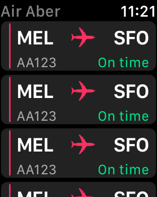
Build and run. You’ll see a table populated with several rows, all with our Air Aber pink plane:
But hey! The title is dark gray, not Air Aber’s vibrant pink corporate color. You’ll fix that now.
Open Watch\Interface.storyboard, select the Air Aber interface controller. In the File inspector, change Global Tint to #FA114F.
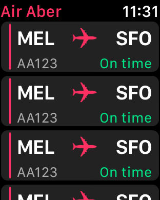
Build and run. That’s much better!
But now, you’ll notice the rows all display the placeholder text you set in Interface Builder. You’ll fix this next, by adding a row controller to configure the labels for each row.
Adding a Row Controller
WatchKit tables are much simpler than iOS tables: no data source or delegates here! You just need to create a row controller class which, despite its name, is a subclass of NSObject.
Right-click on the Watch Extension group in the Project navigator and choose New File…. In the dialog that appears, select watchOS\Source\WatchKit Class, and click Next. Name the new class FlightRowController. Make sure it’s subclassing NSObject — not WKInterfaceController! — and that Language is set to Swift:
Click Next, and then Create.
When the new file opens in the code editor, add the following to the top of the class:
@IBOutlet var separator: WKInterfaceSeparator!
@IBOutlet var originLabel: WKInterfaceLabel!
@IBOutlet var destinationLabel: WKInterfaceLabel!
@IBOutlet var flightNumberLabel: WKInterfaceLabel!
@IBOutlet var statusLabel: WKInterfaceLabel!
@IBOutlet var planeImage: WKInterfaceImage!
Here, you’re simply adding an outlet for each of the labels you added to the table row. You’ll connect them shortly.
Next, add the following property and property observer, just below the outlets:
// 1
var flight: Flight? {
  // 2
  didSet {
    // 3
    guard let flight = flight else { return }
    // 4
    originLabel.setText(flight.origin)
    destinationLabel.setText(flight.destination)
    flightNumberLabel.setText(flight.number)
    // 5
    if flight.onSchedule {
      statusLabel.setText("On Time")
    } else {
      statusLabel.setText("Delayed")
      statusLabel.setTextColor(.red)
    }
  }
}
Here’s the play-by-play of what’s happening:
- You declare an optional property of type
Flight. Remember, this class is declared in Flight.swift which is part of the shared code you added to the Watch Extension in the previous tutorial. - You add a property observer that is triggered whenever the property is set.
- You exit early if
flightisnil: it’s an optional and you want to proceed with configuring the labels only when you know you have a valid instance ofFlight. - You configure the labels using the relevant properties of
flight. - If the flight is delayed, then you change the text color of the label to red, and update the text accordingly.
With the row controller set up, you now need to update the table row to use it.
Open Watch\Interface.storyboard, and select FlightRow in the document outline. Using the Identity inspector, set Custom Class\Class to FlightRowController.
In the document outline, open all the groups in FlightRow, then right-click on FlightRow to invoke the outlets and actions popup:
You can drag this popup to the right, so you can see all the objects in FlightRow.
First, connect planeImage to the image in the table row and separator to the separator. Next, connect the remaining outlets according to the list below:
destinationLabel: SFOflightNumberLabel: AA123originLabel: MELstatusLabel: On time
The final step is to update ScheduleInterfaceController, so it passes an instance of Flight to each row controller in the table.
Open ScheduleInterfaceController.swift, and add the following to the bottom of awakeWithContext(_:):
for index in 0..<flightsTable.numberOfRows {
  guard let controller = flightsTable.rowController(at: index) as? FlightRowController else { continue }

  controller.flight = flights[index]
}
Here, you’re iterating over each row in the table using a for loop, and asking the table for the row controller at the given index. If you successfully cast the controller, you’re handed back an instance of FlightRowController. Then you set controller.flight to the corresponding flight item in the flights array. This triggers the didSet observer in FlightRowController, and configures all the labels in the table row.
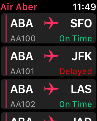
It’s time to see the fruits of your labor: build and run. You’ll see your table rows are now populated with the relevant flight details:
And now for the final part of this tutorial: when a user taps on a table row, ScheduleInterfaceController should pass the corresponding flight as the context to the flight details interface you created in the previous tutorial, then present it.
Responding to Row Selection
The first thing you need to do is override the WKInterfaceTable method that’s responsible for handling table row selection.
Add the following to ScheduleInterfaceController:
override func table(_ table: WKInterfaceTable, didSelectRowAt rowIndex: Int) {
  let flight = flights[rowIndex]
  presentController(withName: "Flight", context: flight)
}
Here, you retrieve the appropriate flight from flights, using the row index passed into this method. You then present the flight details interface, passing flight as the context. Remember the name you pass to presentController(withName:context:) is the identifier you set in the storyboard, in the previous tutorial.
Now, as promised in Part 1, you’ll update FlightInterfaceController, so it uses context to configure its interface.
Open FlightInterfaceController.swift, and find awake(withContext:). Find this statement:
flight = Flight.allFlights().first
And replace it with the following:
if let flight = context as? Flight {
  self.flight = flight
}
Here, you try to cast context to an instance of Flight. If it succeeds, you use it to set self.flight, which will in turn trigger the property observer, and configure the interface.
For the final time in this tutorial, build and run. Tap on a table row, and you’ll now see the flight details interface presented modally, displaying the details of the selected flight:
Congratulations! You’ve now finished implementing your very first table, and have populated it using real data. Nice work!
Where to Go From Here?
Here is the finished example project from this tutorial series so far.
In this tutorial, you’ve learned how to add a table to an interface controller, build the table row interface, create a row controller, handle table row selection, present another interface controller, and even pass contexts. Phew! That’s a lot to cram into 20 minutes or so.
So, where to next? Part 3 of this tutorial, of course! There, you’ll learn all about animation in watchOS.
If you have any questions or comments on this tutorial, please join the forum discussion below! :]
 If you enjoyed this tutorial series, you'd definitely enjoy our book watchOS by Tutorials.
The book goes into further detail on making watchOS apps and is written for intermediate iOS developers who already know the basics of iOS and Swift development but want to learn how to make Apple Watch apps for watchOS 4.
It's been fully updated for Swift 4, watchOS 4 and Xcode 9 — get it on the raywenderlich.com store today!
The post watchOS 4 Tutorial Part 2: Tables appeared first on Ray Wenderlich.


