This Origami Studio tutorial was written with version 84231315 and macOS High Sierra 10.13.2.
Introduction
If you want your project to stand out in the crowded App Store, a good idea isn’t good enough. The best apps have beautiful interactions in the user interface, clever navigations or subtle animations to lend polish. For most of us, getting the right level of pizazz into a project doesn’t come easily. What you need, then, is a tool to help you to build prototypes quickly and efficiently to test your ideas. Enter Origami Studio!
Getting Started
Origami Studio is a macOS desktop application written and used by Facebook. There is also a mobile app counterpart, which allows you to view your prototypes on a real device. It’s designed to help you to build and quickly test user interface interactions and flows. It’s not designed to be a drag and drop development environment, so don’t think you can build your next MVP with Origami. Rather, you might use Origami to put several prototypes of your next design idea in front of potential users to gather their opinions before spending the time to build it properly in code.
First, you’ll have to download Origami Studio. Head over to https://origami.design and hit the big blue button! While that’s downloading, you can download the rest of the materials you’ll need using the Download Materials at the top or bottom of this tutorial. Once both downloads are complete, install Origami Studio and double-click Getting Started (Start).origami to open the starter project.
Introduction to the Interface
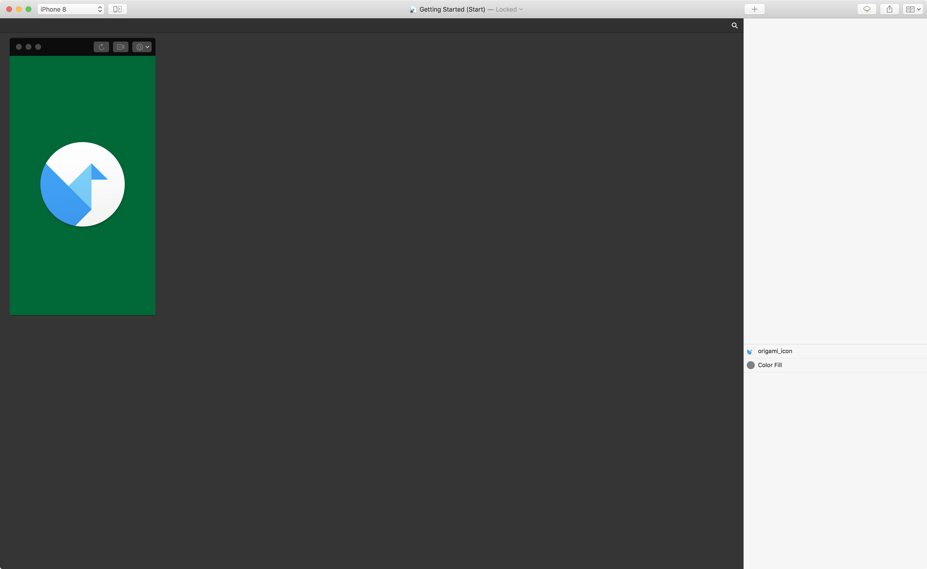
Before you start building a prototype, take a look around the user interface of Origami Studio itself. Your window should look like the image of the starter project below. On the top left of the window, you can find a green area which looks like a phone screen with the standard macOS traffic light buttons on the left of its title bar, and three buttons on the right. This is the Viewer. It shows your prototype and allows you to interact with it. Move your mouse over the viewer and notice how the cursor changes to represent a finger tap.
On the right of the main window, there is the Layer Inspector. If you’ve used tools like Photoshop or Sketch before, you should be comfortable with the concept of Layers. In case you haven’t, a Layer represents an area on the screen. Layers have properties — such as size, background color and opacity — and can be grouped together to form more complex components. If you’re familiar with UIKit, you can consider a Layers like CALayer or UIView.
The big dark grey area — between the Viewer and Layer Inspector — is the Patch Editor. Patches add functionalities to your prototype (like functions in code) and with this editor you can create new functionalities in your prototype.
Creating a Simple Interaction
Theory is all very well, but there’s nothing like actually creating things. It’s time to start adding some functionalities to our prototype. In this example, you’re simply going to change the background color of the prototype when you tap on the screen.
Select the Color Fill layer in the Layer Inspector. On the right hand side, click the Touch button and select Tap in the dropdown.
A purple Interaction patch appears in the Patch Editor. Patches, like functions, take inputs (on the left hand side of the patch) and convert them to outputs (on the right hand side). This Interaction patch is linked to a layer, and changes its outputs when the layer is tapped. Tap the green background. Notice how the Down checkbox on the right hand side of the Interaction patch is selected while your mouse button is pressed. Similarly, the Tap output flicks on briefly for each tap. If you’re using a trackpad that measures force, the Force output similarly changes depending on how hard you press.
Next, create a new Color Fill layer by clicking the New Layer button (the plus icon) at the top of the Layer Inspector. Select Color Fill in the pop-up dialog. The Viewer will now have turned grey, and the image will have disappeared. This is because the new Color Fill layer is on top of the green Color Fill layer and the icon image. In the Layer Inspector, move the new layer below the origami_icon layer. Select the new Color Fill layer and set its Opacity property to 0. The Viewer should look as before. Next, double-click in the Patch Editor. A pop-up dialog appears. Type Switch and hit enter. A new, grey, patch will appear.
Wiring up Your Prototype
Bring your attention back to the Interaction patch. Next to each of its inputs and outputs there is a little dot, called Port. If you click and hold on an output port and move your mouse, you’ll notice a blue line connecting the output to your cursor, very similar to connecting outlets and actions in Xcode’s Interface Builder.
Click the port for the Tap output and drag it over to the Flip input port on the Switch patch. Release and an orange line should connect the tap output from the Interaction patch to the flip output on the Switch patch. Click the green background in the Viewer a few times and notice the state stored in the Switch patch by the value of its On/Off output.
Click the On/Off port in the Switch patch and drag it over to the top Color Fill layer in the Layer Inspector. Hold briefly over the name of the layer and it will expand the list of properties. Highlight the Opacity property of the layer and release the mouse. You have just linked the tap gesture on the green layer with the opacity property of the grey layer, represented by the Color Fill patch that has appeared in the Patch Editor.
Tap the green background and watch it turning grey. Tap again to turn it back. Congratulations, your first prototype! You can find the finished prototype in the materials you downloaded earlier.
RW News
For the rest of this tutorial, you’re going to focus on building a prototype news app called RW News, modeling the Apple News app in iOS 11. Find and open RW News App (Start).origami. The starter project contains three top level layers, as shown in the Layer Inspector. Only the Loading Screen is currently visible: a dark green screen with the Ray Wenderlich logo at the top and a static progress ring in the middle. The prototype also includes layers for a Feed Screen and a Detail Screen, which you’ll use later on in the tutorial.
Animations
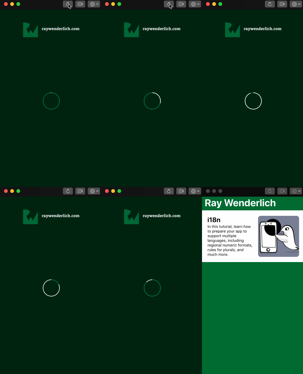
As first step of the tutorial, you’re going to animate the loading indicator to show the app is starting up. To make the progress ring spin, double-click the patch editor and insert a Repeating Animation. Connect the port on the progress output to the Progress property of the Progress Ring by dragging from the port to the layer, as you did with the Opacity property before.
The output from the repeating animation cycles from 0 to 1 to 0, and the progress in the ring now animates to match. This is nice, but not exactly what you’re looking for.
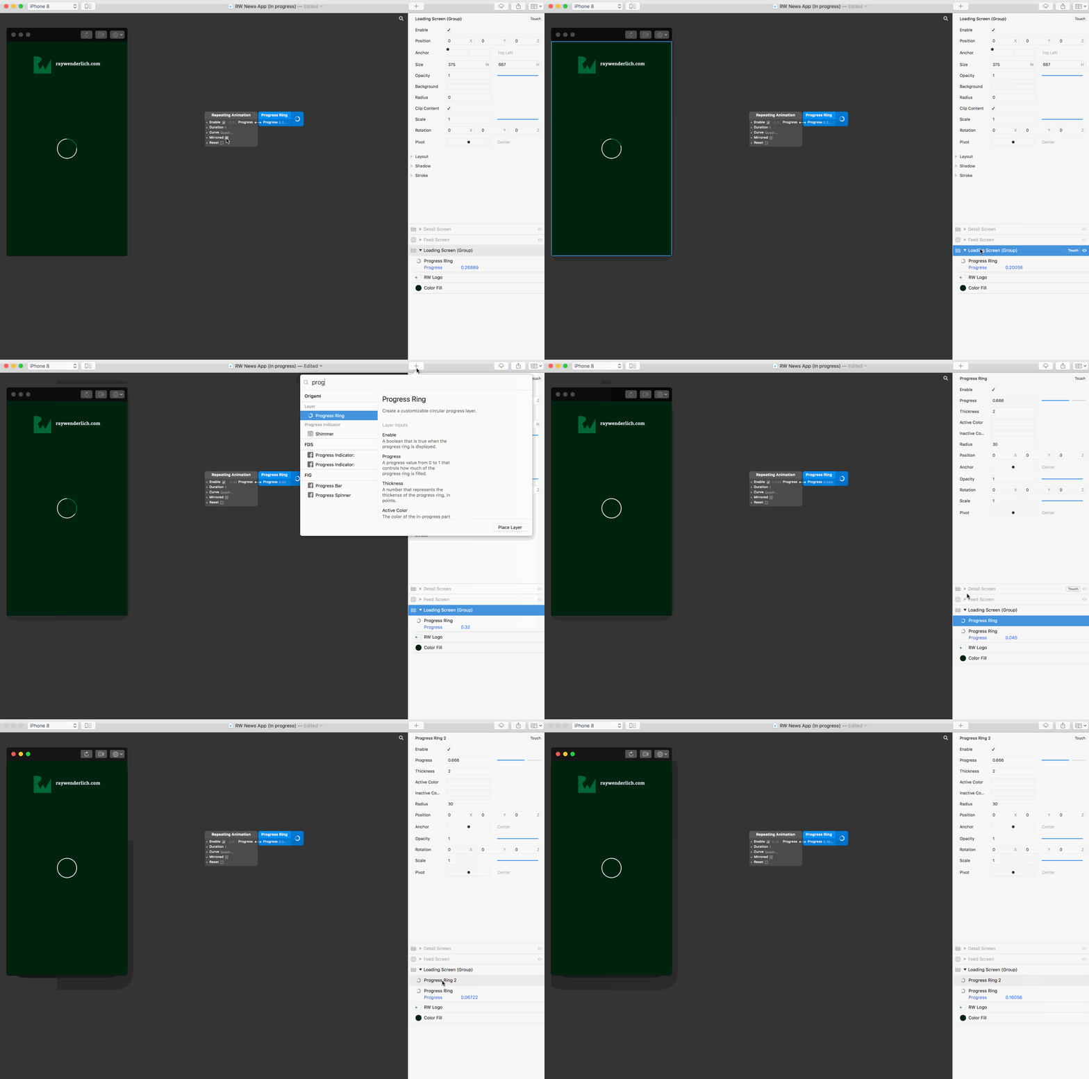
In order to achieve a more realistic spinner, you’re going to have to get creative. Unselect the Mirrored input in the Repeating Animation patch. Then, select the Loading Screen layer in the Layer Inspector and click the New Layer icon. Choose a Progress Ring layer; it appears in the middle of your prototype on top of the existing one. Change its title to Progress Ring 2 by double-clicking it in the Layer Inspector.
Then, change its opacity to 0 and its inactive color to the same green of the active color in the first progress ring. In order to produce the animation we want, you’re going to alternate which progress ring to show for each animation loop. To do this, you want to use the patch editor to switch the opacity of the second progress ring every time the animation reaches 1.
Double-click the patch editor and insert an Equals patch. Set the First Value input to 1 and connect the Progress output from the Repeating Animation patch to the Second Value input in the Equals patch. Next, add a Switch patch and connect the output from the Equals patch to its Flip input. Notice the switch turns on and off for each cycle in the animation. Connect the output of the switch to the opacity property of the second progress ring. Finally, connect the output from the Repeating Animation to the Progress property of the second progress ring.
And there it is! A beautiful spinner.
Transitions
Next, the prototype needs a transition to the Feed Screen after a short period of loading. Double-click the patch editor and add a When Prototype Starts patch, followed by a Wait patch. Change the Duration input in the wait patch to 3, and connect the output of the When Prototype Starts patch to the Start input in the Wait patch.
Restart your prototype by clicking the leftmost button on the Viewer – the clockwise “refresh” arrow — or Cmd + R. Wait three seconds and you should see the output of the Wait patch switch on. Finally, connect the output from the Wait patch to the Present property of the Feed Screen layer.
Restart the prototype again and wait another three seconds. Nothing happens. What gives? Earlier, only the loading screen was visible. It’s time to fix that! Hover over the Feed Screen in the Layer Inspector and click the eye icon to the right of the Touch icon. The Feed View should appear, showing a single story. Restart the prototype to check the spinner is shown for three seconds, then the feed view is presented as expected.
Getting Fancy
The transition is all good and nice, but Origami is all about the bling and that default transition is, well, a little boring. Time to add some personality!
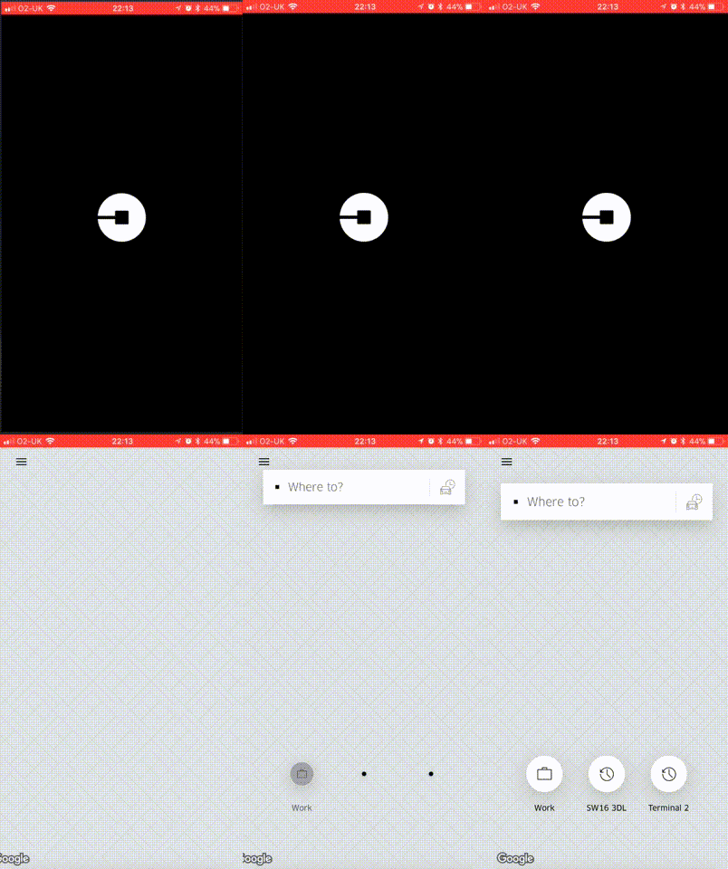
If you’ve ever used the Uber app, you’ll likely have noticed how it transitions from loading to the main screen with a zoom effect, where the loading screen zooms out until it is replaced by the map screen. You’re going to build a similar effect now.
To prototype your fancy transition, you need an opaque layer with a hole, which will act as a mask over the Feed Screen. The hole will start small in the center of the screen and the layer will animate to scale up until the hole is bigger than the screen. Rather than trying to create a shape with a hole in Origami, the sample project provides one for you already, created in Sketch and imported into Origami. A nifty trick for more complicated designs!
Animating the Mask
Add a Classic Animation patch near your Wait patch. Connect the output of the Wait patch to the Number input on the Classic Animation patch. Next, add a Transition patch. Transition patches take an input which varies between 0 and 1 (such as the progress of an animation) and smoothly scale that between its Start and End inputs.
Connect the output from the Classic Animation to the Progress input of the Transition, set the Start input to 0.5 and the End input to 2.5. Now, as the Classic Animation progresses from 0 to 1, the output from the transition patch will progress from 0.5 to 2.5.
In the Layer Inspector, expand the Feed Screen Group by clicking its disclosure arrow, and locate the Combined Shape layer. Connect the output from the Transition patch to the Scale property of the Combined Shape layer and set the Combined Shape layers Opacity to 1.
Restart the prototype and watch your beautiful new transition!
Using the inputs on the Classic Animation patch you can easily alter the duration and curve of the animation. Change the values, restart the prototype and see how that impacts the animation.
A Finishing Touch
Keep your eye on the progress ring patches. Notice how the Progress property is still continually updating long after the transition has completed? This is wasteful as the progress rings are not onscreen any more. As a final touch, double-click the Patch Editor and add a Not patch. Connect its output to the Enable property of the Repeating Animation patch driving the progress rings. Connect the output of the Classic Animation patch to the input of the Not patch. This will stop the progress rings from spinning once they are no longer visible.
Building a News Feed
The feed view is pretty basic at the moment. A single story which doesn’t respond to any interaction. Time to fix that!
First, add vertical scrolling to the view. Since this is such a common UI paradigm, Origami Studio makes it really simple. Locate the group called Feed Screen Content within the Feed Screen group — it contains all the content in the feed. On the right hand side, click the Touch button and select Scroll Y in the dropdown. Verify that swiping the feed in the viewer now works correctly.
Our feed is still looking a little thin, with just a single story. You could add multiple stories individually, but this would be tedious and error-prone. Moreover, it would be difficult to update if you later want to make a change across all stories.
Don’t worry, Origami has you covered. Enter Loops! Just like in code, a loop allows you to repeat an operation; in this instance, displaying and laying out a layer or group.
Going Loopy
Add a Loop patch to your project, followed by Multiply (x) and Plus (+) patches. Connect the Index output from the loop patch to the first input in the multiply patch, and the output from the multiply patch to the first input in the plus patch.
Update the second input in the multiply patch to be 190, and the second input in the plus patch to be 50. This tells the prototype to set the output from the plus patch to be 190i + 50, where i is the index in the loop. Connect the output from the plus patch to the Y Position property of News Cell group and watch the feed story is repeated along the vertical axis.
Grid Layout
Building layout manually like this is fairly easy, but Origami provides an easier method that’s more declarative. Delete the four patches added in Going Loopy and insert a Grid Layout patch. Set the inputs for the Grid Layout patch as follows:
- Columns: 1
- X Position: 0
- Y Position: 50
- Width: 375
- Item Height: 190
- Padding: 0
Connect the Position output of the Grid Layout patch to the Position property of News Cell. The Grid Layout patch hasn’t been told how many items to add. To do this, you’re going to use a Loop Builder patch. Loop Builders are like data: they specify the number of some type (text, images, colors) and can be used to populate loops with values.
Find the project folder containing the prototype in the Finder. Locate the News Items directory and drag it, from the Finder, onto the Patch Editor. This creates a Loop Builder patch containing the four images in the directory. Connect the Index output from the Loop Builder patch to the Index input of the Grid Layout patch.
Notice the change in the Viewer: the Feed is back! Finally, connect the Images output from the Loop Builder to the Image property of the Cell Image layer within the News Cell group. Each cell now has a unique image.
Adding Personalized Content
To finish the Feed, add two new Loop Builder patches. The first will be connected to the Text property of the Title layer and the second to the Text property of the Subtitle layer. Create the two patches manually. In the contextual menu (right-click on the patch title) set the number of inputs for both to 4, and the type to Text.
Paste the following text into the patch, one line for each input:
Titles
- i18n
- Top Libraries
- Android Wear
- Transitions
Subtitles
- In this tutorial, learn how to prepare your app to support multiple languages, including regional numeric formats, rules for plurals, and much more.
- What are the best iOS developer libraries? Ask 10 colleagues and you’ll get 10 different answers. This article reveals the most popular — by the numbers.
- In this Android Wear tutorial, you’ll learn how to build an Android app for the Android Wear platform using the Kotlin language.
- iOS supports custom transitions between view controllers. In this tutorial you’ll implement a UIViewController transition animation like the Ping app.
Connect the Strings output of each Loop Builder patch to the Text property in the relevant layer. Your Feed screen should now be populated with dummy data, each cell containing its own personalized content.
More Complicated Transitions
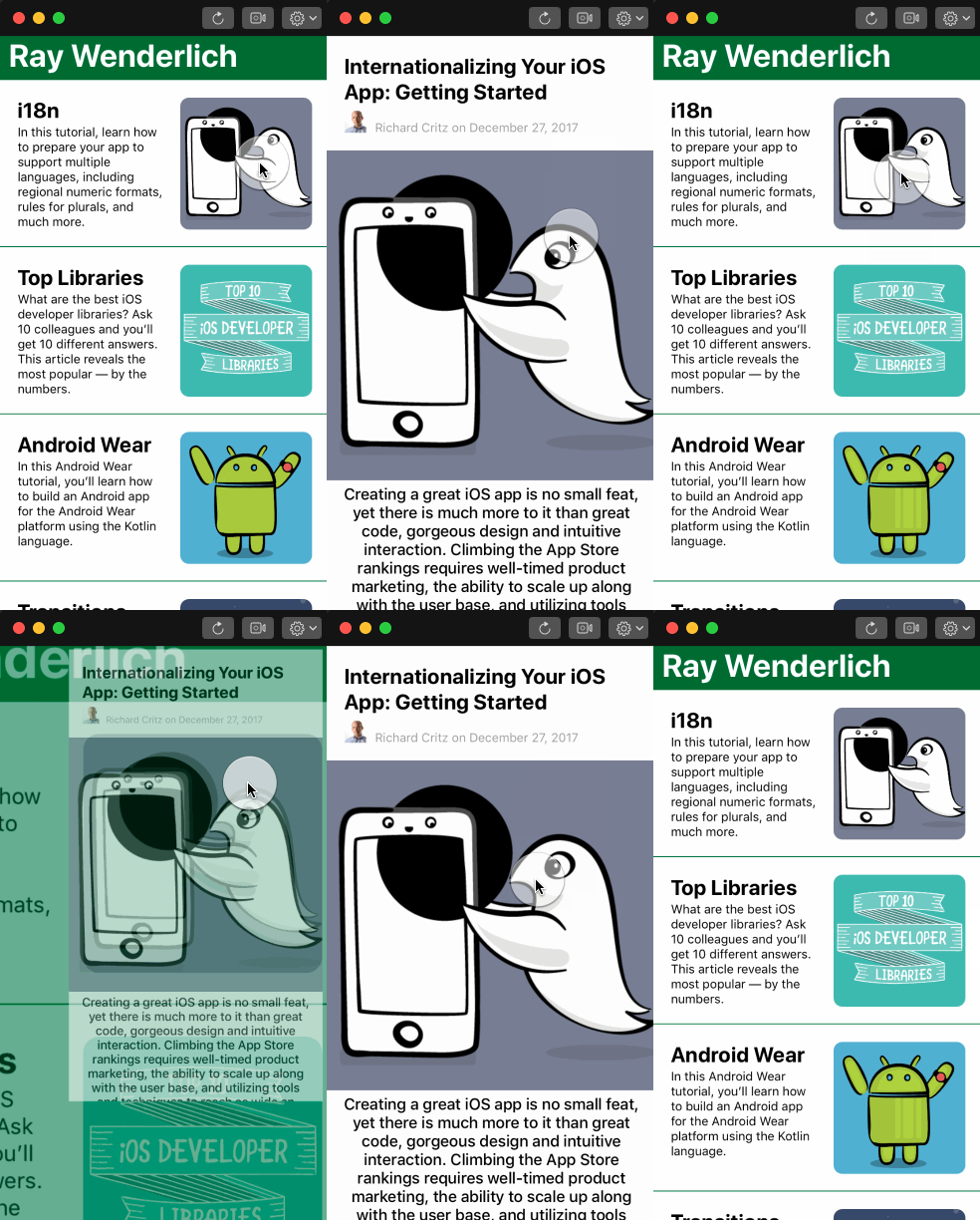
If you own an iPhone and have ever used the Apple News app, you may have noticed the subtle transition when navigating from the main feed to an individual story. The GIF below is a demonstration in case you’ve not. Notice how the push transition animation appears to expand from the center of the image in the item cell, and how the pop animation zooms back to that image. Pretty neat, huh?
In this final section of the tutorial you’re going to learn how to build a prototype with this kind of effect.
Interactions
In order to respond to touch events, the prototype needs to contain interactions. An interaction is defined as a touch event on a specific layer, and Origami provides the Interaction Patch for just this purpose.
Add an Interaction Patch to the prototype. Make sure the Enable input is ticked and set the Layer input by clicking on None and choosing the Cell Image layer.
In the viewer, click on the top most image in the prototype and watch the Down and Tap outputs trigger. Add a second Interaction patch under the first, and this time select the Story Image layer within the Detail Screen Group for its Layer input. These two interactions will form the basis of your transition: clicking the image in the cell to push the Detail Screen, then clicking the Story Image in the Detail Screen to pop back to the Feed.
Next, add a Switch patch, and wire it up so the Tap output from the first interaction turns the Switch on, and the Tap output from the second interaction turns it off again. Wire the output of the switch to a new Classic Animation patch. This Classic Animation is going to drive six transitions to create the effect.
Customizing the Detail Screen Transition
Start by changing the opacity of the Detail Screen layer. Add a transition patch, and connect the output from the Classic Animation patch to its Progress input. Connect its output to the Detail Screen layers Opacity property, then make sure the Detail Screen is visible by clicking the eye icon for the layer in the Layer Inspector.
Tap the image in the cell and notice a mini Detail Screen appearing right where you tapped. Tap again and it disappears, as expected. Feel free to change the starting position of the Detail Screen by adjusting its Position property to get the starting position you want.
Next, add a Transition patch to change the Scale of the Detail Screen from 0.5 to 1.0, and, as before, connect it up to the output of the Classic Animation. Tap the image and watch the Detail Screen appear and grow. Tap again and watch it shrink and disappear.
Finally for the Detail Screen. It needs to move it such that it rests in the right position on the screen. Add a third Transition patch, wire it up to the Classic Animation patch as before but this time connect it to the Position property of the Detail Screen layer.
Edit the patch by accessing the contextual menu (right-click in the header of the patch) and change its Type from Number to Position. Set the start position to (x: -17, y: -159) and its end position to (x: 0, y:0). Once again, tap the image and notice the change in the transition. Feel free to tweak the values to make the transition suit your preferences.
Customizing the Feed Screen Transition
To complete the effect, you need to scale, translate and fade the cell containing the tapped image to give the appearance of the cell becoming the Detail Screen.
As before, connect three new transition patches to the output from the Classic Animation (remembering to update the type of one of them to Position). This time, wire up the output for each transition to the Scale, Opacity and Position properties of the Inner Content layer of the Feed Screen.
Experiment setting different values for the Position and Scale values. As a sensible place to start, try changing the Position from (x: 0, y: 0) to (x: -230, y: 550) and the Scale from 1 to 2.5. Invert the Opacity so it starts at 1 and ends at 0.
Tap the image – it’s nearly there!
When the feed image is tapped, the top cell and title transition, but the rest of the cells don’t. These cells don’t appear in the layer hierarchy as shown in Layer Inspector, so how do you get them to move as well?
Origami provides a Loop Select patch for exactly this purpose.
Break the connection between the Interaction patch for the Cell Image layer and the Switch by dragging the connection out of the Switch. Now, insert and connect a Loop Select patch between them. Restart the prototype and tap the top image to review your masterpiece. Nice job!
Where to Go From Here?
You can download the completed version of the project using the Download Materials button at the top or bottom of this tutorial.
Hopefully, this tutorial has given you an insight into the power and flexibility of Origami Studio for building interactive prototypes for your mobile apps. You’ve only just scratched the surface of this powerful tool!
To find out more and continue your adventure, check out the excellent tutorials on the Origami Studio website and other examples of projects created at Facebook.
The documentation provides a complete overview of all the built in patches as well as a detailed descriptions of all the inputs and outputs for each patch.
Learn how to preview your prototype on a real device, use a pop animation to create bouncy animations simply or add sounds to your prototype.
Finally, there’s a thriving community on Facebook as well.
If you’re interested in other prototyping tools, check out the tutorial on Framer.
If you have any questions or comments about this tutorial, come join the discussion below!
The post Origami Studio Tutorial For Mobile Prototyping: Getting Started appeared first on Ray Wenderlich.
