
Custom UI controls are extremely useful when you need some new functionality in your app — especially when they’re generic enough to be reusable in other apps.
We have an excellent tutorial providing an introduction to custom UI Controls in Swift. That tutorial walks you through the creation of a custom double-ended UISlider that lets you select a range with start and end values.
This custom control tutorial takes that concept a bit further and covers the creation of a control kind of like a circular slider inspired by a control knob, such as those found on a mixer:

UIKit provides the UISlider control, which lets you set a floating point value within a specified range. If you’ve used any iOS device, then you’ve probably used a UISlider to set volume, brightness, or any one of a multitude of other variables. Your project will have the same functionality, but in a circular form.
Getting Started
Use the Download Materials button at the top or bottom of this tutorial to download the starter project.
Go to ReusableKnob/Starter and open the starter project. It’s a simple single view application. The storyboard has a few controls that are wired up to the main view controller. You’ll use these controls later in the tutorial to demonstrate the different features of the knob control.
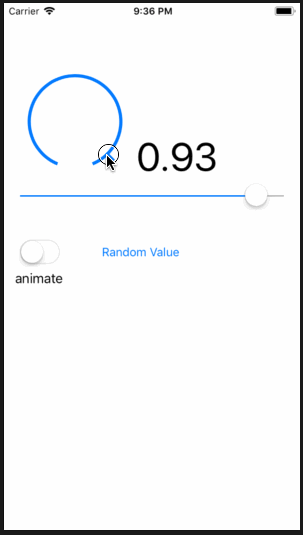
Build and run your project to get a sense of how everything looks before you dive into the code. It should look like this:

To create the class for the knob control, click File ▸ New ▸ File… and select iOS ▸ Source ▸ Cocoa Touch Class. On the next screen, specify the class name as Knob, subclass UIControl and make sure the language is Swift. Click Next, choose the ReusableKnob group and click Create.
Before you can write any code for the new control, you have to add it to your view controller.
Open Main.storyboard and select the view to the left of the label. In Identity Inspector, set the class to Knob like this:

Now create an outlet for your knob. In the storyboard, open the Assistant editor; it should display ViewController.swift.
To create the outlet, click the Knob and control-drag it right underneath the animateSwitch IBOutlet. Release the drag and, in the pop-up window, name the outlet knob then click Connect. You’ll use it later in the tutorial.

Switch back to the Standard editor and, in Knob.swift, replace the boiler-plate class definition with the following code:
class Knob: UIControl {
  override init(frame: CGRect) {
    super.init(frame: frame)
    commonInit()
  }

  required init?(coder aDecoder: NSCoder) {
    super.init(coder: aDecoder)
    commonInit()
  }

  private func commonInit() {
    backgroundColor = .blue
  }
}
This code defines the two initializers and sets the background color of the knob so that you can see it on the screen.
Build and run your app and you’ll see the following:

With the basic building blocks in place, it’s time to work on the API for your control!
Designing Your Control’s API
The main reason for creating a custom UI control is to create a reusable component. It’s worth taking a bit of time up-front to plan a good API for your control. Developers should understand how to use your component from looking at the API alone, without browsing the source code.
Your API consists of the public functions and properties of your custom control.
In Knob.swift, add the following code to the Knob class above the initializers:
var minimumValue: Float = 0

var maximumValue: Float = 1

private (set) var value: Float = 0

func setValue(_ newValue: Float, animated: Bool = false) {
  value = min(maximumValue, max(minimumValue, newValue))
}

var isContinuous = true
minimumValue,maximumValueandvalueset the basic operating parameters for your control.setValue(_:animated:)lets you set the value of the control programmatically, while the additional boolean parameter indicates whether or not the change in value should be animated. Becausevaluecan only be set between the limits ofminimumandmaximumyou make its setter private with theprivate (set)qualifiers.- If
isContinuousistrue, the control calls back repeatedly as the value changes. If it’sfalse, the control calls back once after the user has finished interacting with it.
You’ll ensure that these properties behave appropriately later on in this tutorial.
Now, it’s time to get cracking on the visual design.
Setting the Appearance of Your Control
In this tutorial, you’ll use Core Animation layers.
A UIView is backed by a CALayer, which helps iOS optimize the rendering on the GPU. CALayer objects manage visual content and are designed to be incredibly efficient for all types of animations.
Your knob control will be made up of two CALayer objects: one for the track, and one for the pointer itself.
The diagram below illustrates the structure of your knob control:

The blue and red squares represent the two CALayer objects. The blue layer contains the track of the knob control, and the red layer the pointer. When overlaid, the two layers create the desired appearance of a moving knob. The difference in coloring above is just for illustration purposes.
The reason to use two separate layers becomes obvious when the pointer moves to represent a new value. All you need to do is rotate the layer containing the pointer, which is represented by the red layer in the diagram above.
It’s cheap and easy to rotate layers in Core Animation. If you chose to implement this using Core Graphics and override drawRect(_:), the entire knob control would be re-rendered in every step of the animation. Since it’s a very expensive operation, it would likely result in sluggish animation.
To keep the appearance parts separate from the control parts, add a new private class to the end of Knob.swift:
private class KnobRenderer {
}
This class will keep track of the code associated with rendering the knob. That will add a clear separation between the control and its internals.
Next, add the following code inside the KnobRenderer definition:
var color: UIColor = .blue {
  didSet {
    trackLayer.strokeColor = color.cgColor
    pointerLayer.strokeColor = color.cgColor
  }
}

var lineWidth: CGFloat = 2 {
  didSet {
    trackLayer.lineWidth = lineWidth
    pointerLayer.lineWidth = lineWidth
    updateTrackLayerPath()
    updatePointerLayerPath()
  }
}

var startAngle: CGFloat = CGFloat(-Double.pi) * 11 / 8 {
  didSet {
    updateTrackLayerPath()
  }
}

var endAngle: CGFloat = CGFloat(Double.pi) * 3 / 8 {
  didSet {
    updateTrackLayerPath()
  }
}

var pointerLength: CGFloat = 6 {
  didSet {
    updateTrackLayerPath()
    updatePointerLayerPath()
  }
}

private (set) var pointerAngle: CGFloat = CGFloat(-Double.pi) * 11 / 8

func setPointerAngle(_ newPointerAngle: CGFloat, animated: Bool = false) {
  pointerAngle = newPointerAngle
}

let trackLayer = CAShapeLayer()
let pointerLayer = CAShapeLayer()
Most of these properties deal with the visual appearance of the knob. The two CAShapeLayer properties represent the layers shown above. The color and lineWidth properties just delegate to the strokeColor and lineWidth of the two layers. You’ll see unresolved identifier compiler errors until you implement updateTrackLayerPath and updatePointerLayerPath in a moment.
Now add an initializer to the class right underneath the pointerLayer property:
init() {
  trackLayer.fillColor = UIColor.clear.cgColor
  pointerLayer.fillColor = UIColor.clear.cgColor
}
Initially you set the appearance of the two layers as transparent.
You’ll create the two shapes that make up the overall knob as CAShapeLayer objects. These are a special subclasses of CALayer that draw a bezier path using anti-aliasing and some optimized rasterization. This makes CAShapeLayer an extremely efficient way to draw arbitrary shapes.
Add the following two methods to the KnobRenderer class:
private func updateTrackLayerPath() {
  let bounds = trackLayer.bounds
  let center = CGPoint(x: bounds.midX, y: bounds.midY)
  let offset = max(pointerLength, lineWidth  / 2)
  let radius = min(bounds.width, bounds.height) / 2 - offset

  let ring = UIBezierPath(arcCenter: center, radius: radius, startAngle: startAngle,
                          endAngle: endAngle, clockwise: true)
  trackLayer.path = ring.cgPath
}

private func updatePointerLayerPath() {
  let bounds = trackLayer.bounds

  let pointer = UIBezierPath()
  pointer.move(to: CGPoint(x: bounds.width - CGFloat(pointerLength)
    - CGFloat(lineWidth) / 2, y: bounds.midY))
  pointer.addLine(to: CGPoint(x: bounds.width, y: bounds.midY))
  pointerLayer.path = pointer.cgPath
}
updateTrackLayerPath creates an arc between the startAngle and endAngle values with a radius that ensures the pointer will fit within the layer, and positions it on the center of the trackLayer. Once you create the UIBezierPath, you use the cgPath property to set the path on the appropriate CAShapeLayer.
Since UIBezierPath has a more modern API, you use that to initially create the path, and then convert it to a CGPathRef.
updatePointerLayerPath creates the path for the pointer at the position where angle is equal to zero. Again, you create a UIBezierPath, convert it to a CGPathRef and assign it to the path property of your CAShapeLayer. Since the pointer is a straight line, all you need to draw the pointer are move(to:) and addLine(to:).
Calling these methods redraws the two layers. This must happen when you modify any of the properties used by these methods.
You may have noticed that the two methods for updating the shape layer paths rely on one more property which has never been set — namely, the bounds of each of the shape layers. Since you never set the CAShapeLayer bounds, they currently have zero-sized bounds.
Add a new method to KnobRenderer:
func updateBounds(_ bounds: CGRect) {
  trackLayer.bounds = bounds
  trackLayer.position = CGPoint(x: bounds.midX, y: bounds.midY)
  updateTrackLayerPath()

  pointerLayer.bounds = trackLayer.bounds
  pointerLayer.position = trackLayer.position
  updatePointerLayerPath()
}
The above method takes a bounds rectangle, resizes the layers to match and positions the layers in the center of the bounding rectangle. When you change a property that affects the paths, you must call the updateBounds(_:) method manually.
Although the renderer isn’t quite complete, there’s enough here to demonstrate the progress of your control. Add a property to hold an instance of your renderer to the Knob class:
private let renderer = KnobRenderer()
Replace the code of commonInit() method of Knob with:
private func commonInit() {
  renderer.updateBounds(bounds)
  renderer.color = tintColor
  renderer.setPointerAngle(renderer.startAngle, animated: false)

  layer.addSublayer(renderer.trackLayer)
  layer.addSublayer(renderer.pointerLayer)
}
The above method sets the knob renderer’s size, then adds the two layers as sublayers of the control’s layer.
Build and run your app, and your control should look like the one below:

Exposing Appearance Properties in the API
Currently, all of the properties which manipulate the look of the knob are hidden away in the private renderer.
To allow developers to change the control’s appearance, add the following properties to the Knob class:
var lineWidth: CGFloat {
  get { return renderer.lineWidth }
  set { renderer.lineWidth = newValue }
}

var startAngle: CGFloat {
  get { return renderer.startAngle }
  set { renderer.startAngle = newValue }
}

var endAngle: CGFloat {
  get { return renderer.endAngle }
  set { renderer.endAngle = newValue }
}

var pointerLength: CGFloat {
  get { return renderer.pointerLength }
  set { renderer.pointerLength = newValue }
}
The four properties are simple proxies for the properties in the renderer.
To test that the new API bits are working as expected, add this code to the end of viewDidLoad() in ViewController.swift:
knob.lineWidth = 4
knob.pointerLength = 12
Build and run again. You’ll see that the line thickness and the length of the pointer have both increased based on the values you just set:

Setting the Control’s Value Programmatically
The knob doesn’t actually do anything. In this next phase, you’ll modify the control to respond to programmatic interactions — that is, when the value property of the control changes.
At the moment, the value of the control is saved when the value property is modified directly or when you call setValue(_:animated:). However, there isn’t any communication with the renderer, and the control won’t re-render.
The renderer has no concept of value; it deals entirely in angles. You’ll need to update setValue(_:animated:) in Knob so that it converts the value to an angle and passes it to the renderer.
In Knob.swift, replace setValue(_:animated:) with the following code:
func setValue(_ newValue: Float, animated: Bool = false) {
  value = min(maximumValue, max(minimumValue, newValue))

  let angleRange = endAngle - startAngle
  let valueRange = maximumValue - minimumValue
  let angleValue = CGFloat(value - minimumValue) / CGFloat(valueRange) * angleRange + startAngle
  renderer.setPointerAngle(angleValue, animated: animated)
}
The code above works out the appropriate angle for the given value by mapping the minimum and maximum value range to the minimum and maximum angle range and sets the pointerAngle property on the renderer.
Note you’re just passing the value of animated to the renderer, but nothing is actually animating at the moment — you’ll fix this later.
Although the pointerAngle property is being updated, it doesn’t yet have any effect on your control. When the pointer angle is set, the layer containing the pointer should rotate to the specified angle to give the impression that the pointer has moved.
Update setPointerAngle(_:animated:) as follows:
func setPointerAngle(_ newPointerAngle: CGFloat, animated: Bool = false) {
  pointerLayer.transform = CATransform3DMakeRotation(newPointerAngle, 0, 0, 1)

  pointerAngle = newPointerAngle
}
This simply creates a rotation transform which rotates the layer around the z-axis by the specified angle.
The transform property of CALayer expects to be passed a CATransform3D, not a CGAffineTransform like UIView. This means that you can perform transformations in three dimensions.
CGAffineTransform uses a 3×3 matrix and CATransform3D uses a 4×4 matrix; the addition of the z-axis requires the extra values. At their core, 3D transformations are simply matrix multiplications. You can read more about matrix multiplication in this Wikipedia article.
To demonstrate that your transforms work, you’re going to link the UISlider with the knob control in the view controller. As you adjust the slider, the value of the knob will change.
The UISlider has already been linked to handleValueChanged(_:). Open ViewController.swift and add the following to that method:
knob.setValue(valueSlider.value)
Now the knob value is set to match the valueSlider as it slides.
Build and run. Now, change the value of the UISlider and you’ll see the pointer on the knob control move to match as shown below:

Despite the fact that you haven’t started coding any of the animations yet, your control is animating. Why?
Core Animation is quietly calling implicit animations on your behalf. When you change certain properties of CALayer — including transform — the layer animates smoothly from the current value to the new value.
Now try sliding quickly from the end to the start. Rather than rotating counter-clockwise, the pointer will rotate clockwise over the end of the track, and into the bottom. That’s not what you want!
To solve this, you need to disable these animations. Update setPointerAngle(_:animated:) by replacing the CATransform3DMakeRotation line with:
CATransaction.begin()
CATransaction.setDisableActions(true)

pointerLayer.transform = CATransform3DMakeRotation(newPointerAngle, 0, 0, 1)

CATransaction.commit()
You wrapped the property change in a CATransaction and disable animations for that interaction.
Build and run once more. You’ll see that as you move the UISlider, the knob follows instantaneously, and the knob moves predictably.
Animating Changes to the Control’s Value
Currently, setting the animated parameter to true has no effect on your control. To enable this bit of functionality, add the following to setPointerAngle(_:animated:) just below the CATransform3DMakeRotation call and before the commit:
if animated {
  let midAngleValue = (max(newPointerAngle, pointerAngle) - min(newPointerAngle, pointerAngle)) / 2
    + min(newPointerAngle, pointerAngle)
  let animation = CAKeyframeAnimation(keyPath: "transform.rotation.z")
  animation.values = [pointerAngle, midAngleValue, newPointerAngle]
  animation.keyTimes = [0.0, 0.5, 1.0]
  animation.timingFunctions = [CAMediaTimingFunction(name: kCAMediaTimingFunctionEaseInEaseOut)]
  pointerLayer.add(animation, forKey: nil)
}
Now when animated is true, you create an explicit animation that rotates the pointer in the correct direction. In order to specify the rotation direction, you use a keyframe animation. That’s simply an animation where you specify some in-between points in addition to the usual start and end points.
You create a CAKeyFrameAnimation and specify that the property to animate is the rotation around the z-axis with transform.rotation.z as its keypath.
Next, in animation.values, you specify three angles through which the layer should rotate: the start point, mid-point and end point. Along with that, there’s the array animation.keyTimes specifying the normalized times (as percentages) at which to reach those values. Adding the animation to the layer ensures that once the transaction is committed the animation will start.
To see this new functionality in action, you’ll need the knob to jump to a value. To do this, you’ll implement the method wired up to the Random Value button to cause the slider and knob controls to move to a random value.
Open ViewController.swift and add the following to handleRandomButtonPressed(_:):
let randomValue = Float(arc4random_uniform(101)) / 100.0
knob.setValue(randomValue, animated: animateSwitch.isOn)
valueSlider.setValue(Float(randomValue), animated: animateSwitch.isOn)
The above generates a random value between 0.00 and 1.00 and sets the value on both controls. It then inspects the isOn property of animateSwitch to determine whether or not to animate the transition to the new value.
Build and run. Now tap the Random Value button a few times with the animate switch toggled on, then tap the Random Value button a few times with the animate switch toggled off to see the difference the animated parameter makes.
Updating the Label
Next you’ll populate the label to the right of the knob with its current value. Open ViewController.swift and add this method below the two @IBAction methods:
func updateLabel() {
  valueLabel.text = String(format: "%.2f", knob.value)
}
This will show the current value selected by the knob control. Next, call this new method at the end of both handleValueChanged(_:) and handleRandomButtonPressed(_:) like this:
updateLabel()
Finally, update the initial value of the knob and the label to be the initial value of the slider so that all they are in sync when the app starts. Add the following code to the end of viewDidLoad():
knob.setValue(valueSlider.value)
updateLabel()
Build and run, and perform a few tests to make sure the label shows the correct value.

Responding to Touch Interaction
The knob control you’ve built responds only to programmatic interaction, but that alone isn’t terribly useful for a UI control. In this final section, you’ll see how to add touch interaction using a custom gesture recognizer.
Apple provides a set of pre-defined gesture recognizers, such as tap, pan and pinch. However, there’s nothing to handle the single-finger rotation you need for your control.
Add a new private class to the end of Knob.swift:
import UIKit.UIGestureRecognizerSubclass

private class RotationGestureRecognizer: UIPanGestureRecognizer {
}
This custom gesture recognizer will behave like a pan gesture recognizer. It will track a single finger dragging across the screen and update the location as required. For this reason, it subclasses UIPanGestureRecognizer.
The import is necessary so you can override some gesture recognizer methods later.
Add the following property to your RotationGestureRecognizer class:
private(set) var touchAngle: CGFloat = 0
touchAngle represents the touch angle of the line which joins the current touch point to the center of the view to which the gesture recognizer is attached, as demonstrated in the following diagram:

There are three methods of interest when subclassing UIGestureRecognizer: they represent the time that the touches begin, the time they move and the time they end. You’re only interested when the gesture starts and when the user’s finger moves on the screen.
Add the following two methods to RotationGestureRecognizer:
override func touchesBegan(_ touches: Set<UITouch>, with event: UIEvent) {
  super.touchesBegan(touches, with: event)
  updateAngle(with: touches)
}

override func touchesMoved(_ touches: Set<UITouch>, with event: UIEvent) {
  super.touchesMoved(touches, with: event)
  updateAngle(with: touches)
}
Both of these methods call through to their super equivalent, and then call a utility function which you’ll add next:
private func updateAngle(with touches: Set<UITouch>) {
  guard
    let touch = touches.first,
    let view = view
  else {
    return
  }
  let touchPoint = touch.location(in: view)
  touchAngle = angle(for: touchPoint, in: view)
}

private func angle(for point: CGPoint, in view: UIView) -> CGFloat {
  let centerOffset = CGPoint(x: point.x - view.bounds.midX, y: point.y - view.bounds.midY)
  return atan2(centerOffset.y, centerOffset.x)
}
updateAngle(with:) takes the set of touches and extracts the first one. It then uses location(in:) to translate the touch point into the coordinate system of the view associated with this gesture recognizer. It then updates the touchAngle property using angle(for:in:), which uses some simple geometry to find the angle as demonstrated below:

x and y represent the horizontal and vertical positions of the touch point within the control. The tangent of the rotation, that is the touch angle is equal to h / w. To calculate touchAngle all you need to do is establish the following lengths:
h = y - (view height) / 2.0(since the angle should increase in a clockwise direction)w = x - (view width) / 2.0
angle(for:in:) performs this calculation for you, and returns the angle required.
Finally, your gesture recognizer should work with one touch at a time. Add the following initializer to the class:
override init(target: Any?, action: Selector?) {
  super.init(target: target, action: action)

  maximumNumberOfTouches = 1
  minimumNumberOfTouches = 1
}
Wiring Up the Custom Gesture Recognizer
Now that you’ve completed the custom gesture recognizer, you just need to wire it up to the knob control.
In Knob, add the following to the end of commonInit():
let gestureRecognizer = RotationGestureRecognizer(target: self, action: #selector(Knob.handleGesture(_:)))
addGestureRecognizer(gestureRecognizer)
This creates a recognizer, specifies it should call Knob.handleGesture(_:) when activated, then adds it to the view. Now you need to implement that action!
Add the following method to Knob:
@objc private func handleGesture(_ gesture: RotationGestureRecognizer) {
  // 1
  let midPointAngle = (2 * CGFloat(Double.pi) + startAngle - endAngle) / 2 + endAngle
  // 2
  var boundedAngle = gesture.touchAngle
  if boundedAngle > midPointAngle {
    boundedAngle -= 2 * CGFloat(Double.pi)
  } else if boundedAngle < (midPointAngle - 2 * CGFloat(Double.pi)) {
    boundedAngle -= 2 * CGFloat(Double.pi)
  }

  // 3
  boundedAngle = min(endAngle, max(startAngle, boundedAngle))

  // 4
  let angleRange = endAngle - startAngle
  let valueRange = maximumValue - minimumValue
  let angleValue = Float(boundedAngle - startAngle) / Float(angleRange) * valueRange + minimumValue

  // 5
  setValue(angleValue)
}
This method extracts the angle from the custom gesture recognizer, converts it to the value represented by this angle on the knob control, and then sets the value to trigger the UI updates.
Here’s what happening in the code above:
- You calculate the angle which represents the mid-point between the start and end angles. This is the angle which is not part of the knob track, and instead represents the angle at which the pointer should flip between the maximum and minimum values.
- The angle calculated by the gesture recognizer will be between -π and π, since it uses the inverse tangent function. However, the angle required for the track should be continuous between the
startAngleand theendAngle. Therefore, create a newboundedAnglevariable and adjust it to ensure that it remains within the allowed ranges. - Update
boundedAngleso that it sits inside the specified bounds of the angles. - Convert the angle to a value, just as you converted it in
setValue(_:animated:)earlier. - Set the knob control's value to the calculated value.
Build and run your app. Play around with your knob control to see the gesture recognizer in action. The pointer will follow your finger as you move it around the control :]
Sending Action Notifications
As you move the pointer around, you'll notice that the UISlider doesn't update. You'll wire this up using the target-action pattern which is an inherent part of UIControl.
Open ViewController.swift and add the following code at the end of viewDidLoad():
knob.addTarget(self, action: #selector(ViewController.handleValueChanged(_:)), for: .valueChanged)
Here you're listening for value-changed events.
Now replace the contents of handleValueChanged(_:) with:
if sender is UISlider {
  knob.setValue(valueSlider.value)
} else {
  valueSlider.value = knob.value
}
updateLabel()
If the user changes the value on the knob, you update the slider. If they change the slider, you update the knob. You continue to update the label in either case.
Build and run. Now move the knob around and...nothing has changed. Whoops. You haven't actually fired the event from within the knob control itself.
To fix that, inside the Knob class, add the following code to the end of handleGesture(_:):
if isContinuous {
  sendActions(for: .valueChanged)
} else {
  if gesture.state == .ended || gesture.state == .cancelled {
    sendActions(for: .valueChanged)
  }
}
If isContinuous is true, then the event should be fired every time that the gesture sends an update, so call sendActions(for:).
If isContinuous is false, then the event should only fire when the gesture ends or is cancelled.
Since the control is only concerned with value changes, the only event you need to handle is UIControlEvents.valueChanged.
Build and run again. Move the knob once again and you'll see the UISlider move to match the value on the knob. Success!
Where to Go From Here?
Congrats, your knob control is now fully functional and you can drop it into your apps.
You can download the final version of the project using the Download Materials button at the top or bottom of this tutorial.
However, there are still a lot of ways to improve your control:
- Add extra configuration options to the appearance of the control — you could allow an image to be used for the pointer.
- Ensure that a user can only interact with the control if their first touch is on the pointer.
- At the moment, if you resize the knob control, the layers won't be re-rendered. You can add this functionality with just a few lines of code.
These suggestions are quite good fun, and will help you hone your skills with the different features of iOS you've encountered in this tutorial. You can also apply what you've learned in other controls that you build.
To learn how to make another custom UIControl, check out this tutorial on making a reusable UISlider.
I'd love to hear your comments or questions in the forums below!
The post How To Make a Custom Control Tutorial: A Reusable Knob appeared first on Ray Wenderlich.