Quantcast
Channel: Kodeco | High quality programming tutorials: iOS, Android, Swift, Kotlin, Unity, and more
Viewing all 4373 articles
Browse latest View live

tvOS Apprentice Updated for Swift 3 and tvOS 10

$
0
0

tvOS-2nd-ed-featureHappy Wednesday – it’s book release day during the iOS 10 Feast!

This Wednesday’s book release is the tvOS Apprentice, Second Edition.

The tvOS Apprentice teaches you everything you need to know to develop great apps for the Apple TV – whether you’re a seasoned iOS pro, or a web developer looking to leverage your skills to a new platform.

The book team has been working hard to bring this book fully up to date for Swift 3 and tvOS 10 — and even added some brand-new chapters in the process! More on that shortly.

This will be a free update for existing tvOS Apprentice customers — our way to say “thanks” to our readers for their support!

Don’t own the tvOS Apprentice yet? Read on to see how you can get a copy!

What is the tvOS Apprentice?

The book covers both of the ways you can make tvOS apps:

  • TVML apps: The first way to make apps is via TVML and TVJS – a new markup language and programming language created specifically for tvOS apps. Web developers will rejoice, and even native iOS developers will discover this is quite powerful, and can save a lot of development time.
  • Traditional apps: The second way to make apps is the traditional approach – coding apps in Swift or Objective-C, using frameworks from iOS like UIKit, AVFoundation, StoreKit, and more. iOS developers will discover this leverages your existing expertise and code, and allows you to make a fully custom user interface.

It’s been a little under a year since we released the first edition of tvOS Apprentice, and every single chapter in this book has been updated to Swift 3 to ensure it works flawlessly with Xcode 8 and tvOS 10.

The most important update for the second edition was the upgrade from Swift 2.3 to 3, but we didn’t stop there. Apple introduced a few new APIs in tvOS 10 that we thought were critically important for anyone learning the platform. The full list of changes include:

  • A cover-to-cover update of all chapters, sample projects, and final projects to Swift 3.
  • A new chapter on PhotoKit (introduced in tvOS 10) to show great Photo Library integrations.
  • A new chapter on Multipeer Connectivity (also introduced in tvOS 10) to show how tvOS and iOS apps can better communicate with one another.
  • Inclusion of Dark Mode APIs in the UI chapters to show how your interface can better display in low light interfaces.
  • Updated all chapters to be compatible with tvOS 10, including new APIs where relevant.
  • Updated all chapters to be compatible with the Xcode 8.

This book is a whopping 27 chapters and 536 pages, covering all aspects of tvOS development from beginner to advanced. Here’s what’s inside.

Section I: Architecture

TVMLDiagram2

This section contains just one chapter, designed to give you a birds-eye view of how tvOS works and help you decide what to read next.

  1. Chapter 1, Architecture: The architecture chapter is the introduction to the technology behind Apple TV apps. This chapter will be your guide to help you decide your path through the rest of the book.

Section II: TVML Apps

22_playback

This section covers the basics for creating an app via the TVML approach. From the basics of Hello World through a real world example, by the end of this section you’ll know everything you need to create client / server apps for Apple TV.

  1. Chapter 2, Hello, TVML: Shows you how to set up a basic Hello World app using TVML and Javascript.
  2. Chapter 3, Beginning TVML: You’ll use basic TVML templates to manipulate the UI in a simple application.
  3. Chapter 4, Intermediate TVML: Building off of chapter 3, you’ll learn more complicated interfaces and templates.
  4. Chapter 5, TVJS: Start working in Javascript and learn to manipulate the TVML DOM.
  5. Chapter 6, Exploiting Native Functionality from TVML: Learn how to take advantage of native libraries and integrate them with your TVML app.

Section III: Traditional Apps

HeaderView

This section covers the basics for creating apps via the traditional approach. You’ll learn the new libraries created for Apple TV, and how the ported libraries from iOS can be used.

  1. Chapter 7, Hello, Traditional App: Learn how to set up a basic “Hello World” app using native libraries in Swift.
  2. Chapter 8, Basic Controls: Learn the basic controls your users can use to interact with your apps.
  3. Chapter 9, Stack Views: Stack Views are the backbone to the layout of your app – learn how to use them here.
  4. Chapter 10, Collection Views: See how easy it is to display a list of items in an engaging layout.
  5. Chapter 11, Navigation: Learn how to set up different forms of screen to screen navigation.
  6. Chapter 12, Focus: Apple TV uses a whole new Focus paradigm to show the user what control is currently selected – learn how this works and what it means for your apps.
  7. Chapter 13, Animation: Get ready to add some delightful animation to your tvOS apps.

Section IV: Advanced Frameworks

shuffle

This section covers some of the more advanced frameworks you’ll need for many TV app use cases. Whether you took the TVML approach or the Traditional approach, these frameworks will be important to understand to make your app stand out.

  1. Chapter 14, User Input and the Controller: Learn how your app can interact with the new Apple TV remote.
  2. Chapter 15, Beginning Video Playback: One of the most common requirements for Apple TV apps will be to play video – learn how to do that here.
  3. Chapter 16, Advanced Video Playback: Learn about some of the more advanced topics in playing videos.
  4. Chapter 17, On Demand Resources: Learn how to use Apple’s easy to use storage system, so your app can download assets on the fly.
  5. Chapter 18, Beginning CloudKit: Learn how to use CloudKit on tvOS to store your app’s data.
  6. Chapter 19, Advanced CloudKit: Go further in depth with CloudKit with user specific storage and error handling.
  7. Chapter 20, In App Purchase: Monetize your app by allowing users to purchase digital goods.
  8. (New!) Chapter 21, Photos Framework: Integrate with the user’s Photo Library and Videos.
  9. (New!) Chapter 22, Multipeer Connectivity: Enable your Apple TV to communicate with other pieces of Apple hardware.
  10. Chapter 23, Native UI in TVML Apps: Learn how to augment the TVML-to-UIKit engine to create custom resources, TVML tags, and styling properties.

Section V: Design

layersMixup

This chapter covers new design concepts introduced in tvOS. For your app to stand apart from the rest, you’ll need to understand these new design concepts well.

  1. Chapter 24, tvOS Design: Learn how to design your apps to fit in well with the tvOS ecosystem.
  2. Chapter 25, Creating Layered Images: Shows how to create a new kind of image specifically for the TV.
  3. Chapter 26, The Top Shelf: The Top Shelf is a new design concept that allows your app to show off specific content – learn how to use this in your apps.

Bonus Chapter

And that’s not all – on top of the above, we have a bonus chapter for you!

  1. Chapter 27, Javascript Crash Course: Developing TVML apps for tvOS requires some Javascript knowledge. If you’re new to Javascript, check here for a quick crash course.

About the Authors

Of course, our book would be nothing without our team of experienced and dedicated authors:

ChristineAChristine Abernathy is a Developer Advocate on the Open Source team at Facebook, with previous Developer Advocacy roles with Parse and Facebook Platform. Christine has a passion for developers and mobile technologies. Prior to Facebook, Christine headed up engineering at Mshift, a mobile banking software provider, delivering Android, iOS and mobile browser-based products.

JerryBJerry Beers is an author of this book. Jerry is co-founder of Five Pack Creative, a mobile development company specializing in iOS, Apple Watch, and tvOS development. He is passionate about creating well-crafted code and teaching others, recently partnering with RayWenderlich.com to launch Alt-U, a developer training program focused on preparing students to become rock star iOS developers! You can find out more at http://www.fivepackcreative.com/.

EricCEric Cerney is an author of this book. Eric is an iOS Software Engineer in San Francisco. After being acquired by Capital One, he likes to spend his days at work hanging out with Samuel L. Jackson and asking everyone “What’s in your wallet?”. Lately, his main focuses have been on Swift, gaining a deeper knowledge of programming languages at the core, and of course, the Apple TV. You can find him hiding in the shadows on Twitter at @ecerney.

SamDSam Davies is an author of this book. Sam is a strange mashup of developer, writer and trainer. By day you’ll find him recording videos for Razeware, writing tutorials, attending conferences and generally being a good guy. By night he’s likely to be out entertaining people, armed with his trombone and killer dance moves. He’d like it very much if you were to say “hi” to him on Twitter at @iwantmyrealname

EvanDEvan Dekhayser is an author of this book. Evan is a 17 year old developer who hopes to continue learning and improving while helping others take their first steps into coding. If he is not programming, he is at school or playing baseball. You can find him on Twitter at @ERDekhayser.

JoshGJoshua Greene is an author of this book. Joshua is a passionate iOS developer who loves creating elegant apps. When he’s not slinging code, he enjoys martial arts, Netflix, and spending time with his wonderful wife and daughter. You can reach him on Twitter at @jrg_developer.

MichaelKMichael Katz is an author of this book. Michael envisions a world where mobile apps always work, respect users’ privacy, and integrate well with their users’ life. When not coding, he can be found with his family playing board games, brewing, gardening, and watching the Yankees.

KelvinLKelvin Lau is an author of this book. Kelvin is a physicist turned Swift iOS Developer. While he’s currently entrenched with iOS development, he often reminisces of his aspirations to be part of the efforts in space exploration. Outside of programming work, he’s an aspiring entrepreneur and musician.

JulienMJulien Martin is an author and designer of this book. After years working in print, Julien discovered an unquenchable passion for icon and interface design while working with startups in New York City. Back home in France, he has since designed multiple successful and award-winning mobile apps for established businesses, entrepreneurs and passionate individuals who value the importance of great design and expertise in that matter. You can get in touch via http://julien.design.

MikeOMike Oliver is an author and final pass editor of this book. He has been a mobile junkie every since his first “Hello World” on a spinach-screened Blackberry. Lately, he works primarily with iOS, but he’s always looking for new ways to push the envelope from your pocket. Mike is currently the VP of Product Engineering at RunKeeper, where he leads and empowers an incredible team of software engineers. He can be found on Twitter at @moliver816.

Free tvOS Chapters this Week

To help celebrate the launch, we’re going to open up the book and share three free chapters with you this week! This will give you a chance to check out the book — we’re confident you’ll love it! :]

Where To Go From Here?

The tvOS Apprentice, Second Edition is now 100% complete, fully updated for Swift 3 and tvOS 10 and available today.

  • If you’ve already bought the tvOS Apprentice, you can download the new book immediately on your My Loot page.
  • If you don’t have the tvOS Apprentice yet, you can grab your own copy in our store.

You can get 10% off on this book — or anything else in our store — with the code IOS10FEAST.

Speaking of which, be sure to check out everything we’re offering this year in the iOS 10 Feast, including $40,000 in giveaways!

To enter, simply retweet this post with the #ios10feast hashtag using the button below:


We hope you enjoy this massive free update, and stay tuned for more book releases and updates coming soon!

The post tvOS Apprentice Updated for Swift 3 and tvOS 10 appeared first on Ray Wenderlich.


tvOS Tutorial: Using TVML Templates

$
0
0

tvml-templates-feature

In our beginning tvOS development tutorial, you created your first-ever TVML app. You saw how simple it can be to start developing for the Apple TV, and how easy it is to play video in a fully-featured player. However, the UI design of your app left a bit to be desired.

In this tutorial, you’ll learn how to use the plethora of TVML templates that Apple has provided to make some stunning interfaces. You’ll use these templates to build a comprehensive screen for RWDevCon 2015 videos, which will include a wide range of information about the video and display it in an appealing and recognizable manner.

Getting Started

The sample app for this and subsequent tutorials in this series in this section is wenderTV; it lets you browse and watch raywenderlich.com video content on your Apple TV, so you can enjoy a vast quantity of knowledge – and bad jokes – from the comfort of your sofa. Right now, wenderTV is quite empty. In fact it’s very similar to the skeleton HelloTVML app you built in the previous chapter.

wenderTV includes a lot of resources you’ll use during this tutorial; we’ve also reorganized some of the code to make it easier to understand.

Build and run your app from Xcode; you’ll notice the screen is completely blank. This is because there aren’t any TVML documents in wenderTV yet. Before you can turn your attention to creating some TVML documents, you have a little housekeeping to do.

Note: Although you can use Xcode to write all the code you need for a TVML-based app, it can be quite a painful experience. Xcode is good for editing Swift or Objective-C, but has only rudimentary support for XML and JavaScript. It’s definitely worth using Xcode when you need to, and then switching to a more capable editor such as Sublime Text, Atom, Visual Studio Code or MacVim to work with TVML documents and JavaScript files.

Loading Scripts

In the previous tutorial, the JavaScript code was in a single file: main.js. This is great for a simple project, but it doesn’t scale well. The project for wenderTV already has ResourceLoaderJS split out into its own file, so you need to discover how to import it into main.js.

TVJS provides the evaluateScripts() function which takes an array of URLs of JavaScript files and a callback. The function reads each URL in turn, attempts to parse it and adds any contained functions and object definitions to the context’s global object. Finally, it invokes the supplied callback with a Boolean denoting success or failure.

The AppDelegate contains code that provides the JavaScript application with a list of URLs to the required JavaScript files as part of the launch options object. Open main.js and add the following code to the App.onLaunch() function:

// 1:
evaluateScripts(options.initialJSDependencies,
  function(success){
    if (success) {
      // 2:
      resourceLoader =
        new ResourceLoaderJS(NativeResourceLoader.create());
      var initialDoc = loadInitialDocument(resourceLoader);
      navigationDocument.pushDocument(initialDoc);
    } else {
      // 3:
      var alert = _createAlert("Evaluate Scripts Error",
        "Error attempting to evaluate the external JS files.");
      navigationDocument.presentModal(alert);
 
      throw ("Playback Example: unable to evaluate scripts.");
    }
  });

Taking this new function body step-by-step:

  1. The options object is prepared in Swift and then passed to the JavaScript app in the app delegate, while the initialJSDependencies property is an array of URLs for the different JavaScript files that need to be loaded as the app starts. evaluateScript() performs this action and then invokes the callback indicating whether it was successful.
  2. If the JavaScript sources evaluated successfully, create a ResourceLoaderJS object (defined in the previous tutorial), before using it to load the initial document and then pushing this TVML document onto the navigation stack. loadInitialDocument() is currently a stub method you’ll populate in a bit.
  3. If the JavaScript files failed to load, there is nothing more that the app can do. Therefore it uses _createAlert(), defined at the bottom of main.js, to build and present an alert document and then throw an error.

Add the following to loadInitialDocument():

return resourceLoader.getDocument("video.tvml");

You’ll recognize this from the previous tutorial; it uses the resource loader to get the TVML file from the app’s resource bundle and return it as a DOM object.

Next up, you’ll need to create the file your app is trying to load: video.tvml.

Head into Xcode, and right-click on the layouts group in the project navigator. Select New File…:

01_layouts_group

Navigate to tvOS\Other\Empty and hit Next. Name the file video.tvml and ensure that the wenderTV target is checked:

02_video_tvml
Open the new file in either your favorite XML editor (or Xcode, if you insist) and add the following lines:

<?xml version="1.0" encoding="UTF-8" ?>
<document>
  <productTemplate>
  </productTemplate>
</document>

This defines a simple TVML document using a new type of template: productTemplate.

Build and run the app to see how things look so far:

03_bar_01
Hmm. The screen is still blank. Although you’ve created the file and provided the template, you haven’t provided any content. You’ll fix that shortly, but first you need to cover a bit of background on on TVML templates.

TVML Templates

A TVML document is just an XML (eXtentible Markup Language) document with a specific schema defined by Apple. If you’ve used HTML in the past, XML will look familiar. HTML isn’t actually XML (despite some failed efforts with XHTML), but the syntax and structure is fairly similar.

Since TVML documents are XML they should start with the following line:

<?xml version="1.0" encoding="UTF-8" ?>

This is known as the XML prologue; it notes this file is an XML document and which character encoding it uses.

The TVML document has a root <document> element, which is a single element at the top level of the document and the parent (or ancestor) of all other elements. The <document> element has a single direct descendant, which can be one of 18 possible template tags.

A template tag specifies the top-level layout tvOS should use to render the document on screen. In addition to specifying the appearance onscreen, template tags also convey some semantic information about the content they contain. Templates might look similar, but have entirely different purposes.

TVML templates can be divided into the following categories:

  • Informational: Shows a small amount of information to the user, and optionally requests input from the user. It’s not designed for browsable content. Includes alertTemplate and loadingTemplate.
  • Data Entry: The user experience of entering data on TVs is pretty horrendous, and Apple TV is no different. However, there are a few templates for requesting data from the user, including searchTemplate and ratingTemplate.
  • Single Item: Displays information or content about a single product or item, such as a film or episode in a TV series. Includes productTemplate, oneupTemplate, compilationTemplate and showcaseTemplate.
  • Collections: Displays a collection of products, such as a TV series, a genre of films or tracks on an album. Includes stackTemplate, listTemplate and productBundle.
  • Other: Includes menuBarTemplate, which hosts a set of other templates, and divTemplate, which is a completely clean slate upon which you draw.

This and subsequent TVML tutorials will cover nine of the eighteen templates, so by the end of it you’ll have a great grounding in TVML templates.

Note: Rather than go into detail here about each and every template, you’ll learn about them as you leverage them throughout the TVML section of this book. The Apple reference is a great resource for getting the low-down on the different templates, their capabilities and layouts: apple.co/1PJuOAV.

The Product Template

The first document you’ll create uses <productTemplate>, which is designed to display all information relating to a specific product — in this case, a video.

Open video.tvml and add the following code between the <productTemplate> tags:

<banner>
  <infoList>
    <info>
      <header>
        <title>Presenter</title>
      </header>
      <text>Ray Wenderlich</text>
    </info>
    <info>
      <header>
        <title>Tags</title>
      </header>
      <text>development</text>
      <text>teams</text>
      <text>business</text>
    </info>
  </infoList>
</banner>

This code snippet introduces a lot of new element types. Taking them one-by-one:

  • <banner>: Displays content across the top of a page.
  • <infoList>: Displays a list of <info> elements, arranged in a vertical list.
  • <info>: Acts as a container for the content to appear as an item in an <infoList> or an <infoTable>.
  • <header>: Serves as a description of the content of the section in which it resides.
  • <title>: Contains the text of a short title.
  • <text>: Displays text.

Build and run the app to see what your new TVML looks like:

05_bar_03

This page represents a video, but it currently lacks a title. Time to change that.

Add the following inside the <banner> tags, just after the </infoList> closing tag:

<stack>
  <title>Teamwork</title>
  <row>
    <text>17m 54s</text>
    <text>Inspiration</text>
    <text>2015</text>
    <badge src="resource://nr" />
    <badge src="resource://cc" />
    <badge src="resource://hd" />
  </row>
</stack>

This section introduces more TVML elements:

  • <stack>: Stacks lay out their content vertically down the screen in a manner similar to <infoList>. There’s a wider range of tags that can be in a Stack.
  • <row>: A row is like a stack, but with a horizontal orientation instead of vertical.
  • <badge>: Badges display a small inline image. The URL is provided by the src attribute.

Notice that the URL of the two badge images begin with resource://. This is a special URL scheme that points to images that exist within tvOS itself. These images include common action icons, such as “play”, rating images for different countries and video information such as HD.

Note: For a full list of the resource images available within tvOS, check out Apple’s documentation at apple.co/1T930o9.

Build and run again to see how the page is shaping up:

06_bar_04

It’s starting to look good, but there’s still a long way to go. Before continuing with the template coding, you first need to consider the separation of the data and the view.

Data Injection

As your video document currently stands, all the data is hard-coded. To show information about a different video, you’d have to create a whole new page. If you wanted to reformat the video page once you’ve created all the pages, you’d have to go back through and edit every single one of them.

A much better approach is to use a templating engine, where you build the video page as a template and specify where the data should be injected. At runtime, the template engine takes the page template along with the data and generates the TVML page for tvOS to display.

Note: The word “template” is now being used for two different purposes: TVML templates are the layouts provided by tvOS that render your documents on the screen, whereas a templating engine uses template documents combined with data to generate complete TVML documents. Don’t worry too much about the distinction; it’ll be much more clear once you’ve used them both.

Mustache.js is a popular simple templating engine for JavaScript. You might recognize the templating syntax which is based around curly-braces:

{{property-name}}

The Mustache.js library is already part of wenderTV, but you need to build the mechanisms to use it. This presents you with several tasks to accomplish:

  • The data is stored as JSON files in the app bundle. The JavaScript app needs the ability to request them.
  • When a document is loaded, it now requires data, and this should be combined with the document string using Mustache.js.
  • Images that are present in the app bundle need their complete URL substituted.
  • The video document should be updated to turn it into a templated document.

You’ll address each of these in order.

Reading JSON From the App Bundle

Open ResourceLoader.js and add the following method to ResourceLoaderJS:

getJSON(name) {
  var jsonString = this.nativeResourceLoader
    .loadBundleResource(name);
  var json = JSON.parse(jsonString);
  return json;
}

This function uses the native resource loader to pull the JSON file from the app bundle before parsing it into a JavaScript object.

Note: It would be relatively simple to replace this functionality with a method that calls a remote server for data instead of finding static data inside the app bundle. The rest of this templating approach would continue to work as it stands.

Injecting Data into the Document String

Now that you can obtain the data for a given page, you need to combine it with the document template itself. Update getDocument() in ResourceLoaderJS to match the following:

getDocument(name, data) {
  data = data || {};
  var docString = this.nativeResourceLoader
    .loadBundleResource(name);
  var rendered = Mustache.render(docString, data);
  return this.domParser.parseFromString(rendered,
    "application/xml");
}

Here you’ve added an additional data argument to the method and used render on Mustache to convert the template and data to a completed document. As before, you use a DOMParser to convert the document string to a DOM object.

Resolving Image URLs

For simplicity’s sake, your sample data stores images as the names of files in the app bundle, which need to be converted to URLs before you can display them. The utility functions to do this are already in the resource loader, so you just need to call them. You’ll do this at the same time as you update the initial document loading to use the templating engine.

Open main.js and update loadInitialDocument() to match the following:

function loadInitialDocument(resourceLoader) {
  var data = resourceLoader.getJSON("teamwork.json");
  data["images"] = resourceLoader
    .convertNamesToURLs(data["images"]);
  data = resourceLoader
    .recursivelyConvertFieldsToURLs(data, "image");
  data["sharedImages"] = _sharedImageResources(resourceLoader);
  return resourceLoader.getDocument("video.tvml", data);
}

First, you load the data using the new getJSON() method. Then you use the utility functions to perform the image name-to-URL conversion. These convert three different image name sources:

  • Each value in the images object on the data array.
  • Every value associated with a key of image anywhere within the JSON data structure.
  • A set of shared images that are useful for all documents in wenderTV.

That takes care of the plumbing underneath; you’re ready to use this powerful new functionality.

Using the Mustache.js templates

Open teamwork.json and take a look at the data you’ll use to populate the video page. There’s quite a lot of data, but it’s a standard JSON object and fairly easy to understand. You should spot some fields such as title, presenter and duration that you’ve already hard-coded into video.tvml. You’re now going to swap these out.

Open video.tvml and find the title tag that contains Ray Wenderlich. Replace the name with {{presenter}}, so that the first <info> section now looks like this:

<info>
  <header>
    <title>Presenter</title>
  </header>
  <text>{{presenter}}</text>
</info>

The syntax for Mustache.js is really simple; it will replace {{presenter}} with the value of presenter in the data object supplied to it.

Now that you’ve got the hang of that, you can replace the following content with the respective template tags:

  • Teamwork{{title}}
  • 17m 54s{{duration}}
  • Inspiration{{category}}
  • 2015{{year}}
  • resource://nrresource://{{rating}}

Build and run; you shouldn’t see any difference, which is exactly what you want. The page is now data-driven, and even better, you didn’t break anything. Bonus! :]

There are still some parts of the template you haven’t touched: closed-captions, HD and tags. These use some slightly more advanced parts of the Mustache.js templating engine.

Template Sections

Remove the three <text> tags in the Tags section and add the following in their place:

{{#tags}}
  <text>{{.}}</text>
{{/tags}}

This new syntax defines a template section. Look at teamwork.json and you’ll see that tags is an array of strings. The Mustache.js syntax here loops through the array, with {{.}} rendering the content of the current index.

Finally, you need to handle the two Boolean badges. Replace the cc and hd badges with the following:

{{#closed-captions}}
  <badge src="resource://cc" />
{{/closed-captions}}
{{#hd}}
  <badge src="resource://hd" />
{{/hd}}

Once again you’re using sections, but this time they’re structured like an if statement. If the specified property exists and has a true value, then render this section; otherwise, ignore it.

Build and run again; check out your newly templated video page.

To confirm that the data injection is actually working, open main.js and change the data file loaded in loadInitialDocument() from teamwork.json to identity.json. Build and run again to see the data change:

07_bar_05

You can now see details of Vicki’s talk on identity — sweet!

Filling Out the TVML Template

The video page is still looking a little barren. It’s time to double-down on adding some content.

Open video.tvml and add the following inside the <stack>, just below the existing <row>:

<description allowsZooming="true"
  moreLabel="more">{{description}}</description>
<text>{{language}}</text>
<row>
  <buttonLockup type="play">
    <badge src="resource://button-play" />
    <title>Play</title>
  </buttonLockup>
  <buttonLockup type="buy">
    <text>$9.99</text>
    <title>Buy</title>
  </buttonLockup>
</row>

Once again, this introduces some new TVML elements:

  • <description>: Displays a larger amount of text that’s used to describe content. If the text is too long for the display area then a label will be displayed with a title defined by the moreLabel attribute.
  • <buttonLockup>: A lockup is a class of element that joins its children together as a single element. A button lockup can contain text and a badge and will appear as a button.

Remember that these elements are all contained within a <stack>, so they’ll appear on top of each other.

Before checking your work, you need to add one more element to the top banner. Add the following line immediately after the </stack> closing tag:

<heroImg src="{{images.hero}}" />

A heroImg element is a large image that defines the content of this document. It appears inside the <banner> and tvOS uses it to define the blurred page background.

Build and run to see the completed top banner:

08_bar_06

It’s starting to look really cool – But wait! You may now have noticed that the text color has changed from black to white. How did that happen?

tvOS has decided that because the background image you specified is darker than a certain threshold, it needed to increase the contrast of your text, so it changed the default text color.

Update the <productTemplate> tag to match the following:

<productTemplate theme="light">

Build and run to see the difference:

09_bar_07

The visual effect on the background has changed along with the foreground font colors. You can change the theme attribute to dark if you wish to force the previous look if you prefer it.

Note: The default bahavior has changed since the previous version of tvOS so you may need to explicity define the theme to get the effect you’re used to. Also, please don’t get this behavior confused with the new dark mode introduced by Apple in tvOS 10. That will be covered in more detail later in the book.

Adding Shelves

The remainder of the productTemplate is made up of “shelves”. A shelf is a horizontal section of the page with content elements scrolling on and off the screen.

Add the following below the closing </banner> tag, towards the bottom of video.tvml:

<shelf>
  <header>
    <title>You might also like</title>
  </header>
  <section>
    {{#recommendations}}
      <lockup>
        <img src="{{image}}" width="402" height="226" />
        <title>{{title}}</title>
      </lockup>
    {{/recommendations}}
  </section>
</shelf>

This shelf displays a set of other videos that the user might enjoy as defined in the recommendations property of the data model. Each recommendation has an image and a title, each of which you use in the code above.

There are two other elements introduced in this code segment:

  • <section>: Defines a set of related content that should all be laid out together. A section can contain a title and multiple lockup elements.
  • <lockup>: You saw <buttonLockup> before; <lockup> is a more general type of lockup. It provides layout for an image, a title, a badge and a description.

Now add another shelf below the one you just created:

<shelf>
  <header>
    <title>Production</title>
  </header>
  <section>
    {{#people}}
      <monogramLockup>
        <monogram firstName="{{firstname}}"
          lastName="{{lastname}}"/>
        <title>{{firstname}} {{lastname}}</title>
        <subtitle>{{role}}</subtitle>
      </monogramLockup>
    {{/people}}
   </section>
</shelf>

This shelf displays a list of people associated with the production; it’s stored in the people property in the data model.

This introduces the <monogramLockup> and <monogram> elements, which let you represent a person when an avatar isn’t available. Like the other lockup elements, a monogram lockup simply locks its content together.

A monogram has firstName and lastName attributes, from which it generates a monogram (initials) and places it in a large circle.

Build and run to see how your shelves are taking shape:

10_bar_08

Take a look at the description for the “Identity” talk. Notice that the more label has appeared, because there is too much text to display in the available space. Navigate to the label and you’ll see you can focus on the description and press select to trigger an action. This action doesn’t currently do anything, but wouldn’t it be nice if it would display the full text?

Time for another TVML template.

Handling Text Overflow

The descriptive alert template provides space for an extended area of text and buttons. It sounds ideal for this purpose. You’ll use this template and a spot of JavaScript to wire it up.

In the Xcode project, right-click on the layouts group and select New File…. Choose tvOS\Other\Empty and name the file expandedDetailText.tvml.

Open the new file and add the following:

<?xml version="1.0" encoding="UTF-8" ?>
<document>
  <descriptiveAlertTemplate>
    <title>{{title}}</title>
    <description>{{text}}</description>
    <button action="dismiss">
      <text>Dismiss</text>
    </button>
  </descriptiveAlertTemplate>
</document>

This should be quite straightforward to understand. There’s the usual XML prologue, the <descriptiveAlertTemplate> tag and some elements you’ve used before. Notice that the button tag has an action attribute; this is a user-defined attribute that’s not part of the TVML specification.

You can define any attributes that you want (provided they don’t clash with existing attributes) and then read them from your JavaScript app. You’ll write some code to handle this dismiss action in just a bit.

Open video.tvml and find the <description> tag. Update the element to match the following:

<description allowsZooming="true"
  moreLabel="more"
  action="showOverflow"
  title="{{title}}">{{description}}</description>

You’ve added two new attributes: action and title. You’ll use both of these in the event handler to create the expanded detail text document.

Event Handling

Now that the document templates are ready to go you can turn your attention to the JavaScript that wires everything up.

Open main.js and add the following function:

function _handleEvent(event) {
  // 1:
  var sender = event.target;
  var action = sender.getAttribute("action");
  // 2:
  switch(action) {
    case "showOverflow":
      // 3:
      var data = {
        text: sender.textContent,
        title: sender.getAttribute("title")
      };
      // 4:
      var expandedText = resourceLoader
        .getDocument("expandedDetailText.tvml", data);
      expandedText.addEventListener("select", _handleEvent);
      navigationDocument.presentModal(expandedText);
      break;
    case "dismiss":
      // 5:
      navigationDocument.dismissModal();
      break;
  }
}

Taking this piece-by-piece:

  1. The target property of the event argument represents the DOM object that fired the event. getAttribute() of a DOM object will return the value for the specified attribute. Here you’re using it to find the value of the action attribute you added above.
  2. Switch on the action attribute to invoke the appropriate code.
  3. If the action is showOverflow, then you have a description field with too much content. Construct an object with the data required by the expanded detail text document. Once again you’re using getAttribute() along with textContent, which returns the content of the tag itself.
  4. Load the expandedDetailText.tvml document in the usual way, add an event listener and use presentModal() on NavigationDocument to display the new document on top of the current document.
  5. If the action is set to dismiss, use dismissModal() on NavigationDocument to perform the dismissal.

Now that you’ve created this event handler, you need to wire it up to the initial document. Add the following line to App.onLaunch, just after you call loadInitialDocument():

initialDoc.addEventListener("select", _handleEvent);

As you saw in the previous tutorial, this registers _handleEvent as a listener for the select event, and uses event bubbling to handle all events triggered within the document.

Build and run the app, navigate down to the over-full description and hit the select button. You’ll see your new expanded detail text page:

11_bar_09
You can use the dismiss button to return to the video screen.

Now that is one swell-looking – and extensible – interface.

Where to Go From Here?

In this tutorial, you accomplished a lot – you created a great-looking TVML app using TVML templates, and integrated a Javascript templating engine to separate the UI from the data.

tvt@2xThis tutorial was taken from Chapter 3 of tvOS Apprentice, Second Edition. The chapter in the book goes into further detail and show you how to make the TVML to allow users to rate videos from 1-5 stars. You also might enjoy the other 27 chapters and 500+ pages in the book! :]

The book has been completely updated to work with Swift 3, tvOS 10 and Xcode 8. Check out the book and let us know what you think!

In the meantime, if you have any questions or comments about using TVML templates, please join the forum discussion below!

The post tvOS Tutorial: Using TVML Templates appeared first on Ray Wenderlich.

Unity Cloud Services, and the Unity Asset Store – Podcast S06 E08

$
0
0
unity cloud services

Find out all about Unity cloud services and the asset store in the episode.

Join Mic, Jake, and Sean as they delve in Unity cloud services such as ads and Cloud Build, before moving on to discuss the asset store, some popular 3rd party assets, and wonder how great the Xcode ecosystem could be if Apple took the same approach as Unity.

[Subscribe in iTunes] [RSS Feed]

Our Sponsor

buddybuild is a mobile-optimized, continuous integration and delivery platform that takes minutes to set up.

Thousands of mobile development teams love buddybuild because it’s the fastest way to distribute their apps to users and gather bug reports, feedback and crash reports. Then, use built-in integrations for bug trackers and tools like Slack to seamlessly integrate that information back into their development process.

With a simple screenshot, testers can send their feedback directly to you, along with important diagnostic details.

If your app ever crashes, buddybuild will record the frequency, affected users and traces back to the exact lines of source code that caused the crash in the first place.

buddybuild gives you even better visibility into crashes with Instant Replay – a video recording that shows exactly what your users were doing when the app crashed, giving you the exact steps needed to repro the issue.

buddybuild gives development teams like yours perfect insight into bugs and empowers you to iterate on your app faster than ever – knowing you’re building an app your users love.

Join the thousands of developers who’ve already added buddybuild to their development process. Try it free at buddybuild.com.

Interested in sponsoring a podcast episode? We sell ads via Syndicate Ads, check it out!

Show Notes

Contact Us

Where To Go From Here?

We hope you enjoyed this episode of our podcast. Be sure to subscribe in iTunes to get notified when the next episode comes out.

We’d love to hear what you think about the podcast, and any suggestions on what you’d like to hear in future episodes. Feel free to drop a comment here, or email us anytime at podcast@raywenderlich.com.

The post Unity Cloud Services, and the Unity Asset Store – Podcast S06 E08 appeared first on Ray Wenderlich.

iOS 10 Screencast: Handling Interactions with SiriKit

On-Demand Resources in tvOS Tutorial

$
0
0

When I got my first iPod Touch several years ago, I excitedly opened the App Store and started downloading the first ten games from the Top Charts. It wasn’t long before I came to the sad realization that my iPod storage wasn’t infinite: the alert telling me I didn’t have enough storage to download all the apps quashed my youthful enthusiasm.

iOS 9 and tvOS introduced On-Demand Resources (ODR) as a way to manage the size of your apps. The idea behind ODR is that your app only retrieves the resources it needs when they’re required. If the app needs additional resources, it downloads them on-demand.

There are two main reasons to take advantage of ODR in your apps:

  1. Faster initial download: The faster the user can download the app, the faster they can start falling in love with it.
  2. Smaller app size: When storage is limited, the biggest apps are usually the first ones that users will delete. You want to keep your app’s storage footprint well under the radar!
Note: tvOS apps have a maximum initial download size of 200 MB, and any additional resources must be available through ODR. Not only is ODR recommended, it is a requirement for many apps!

Time to size things up — and dive right into adding ODR to an existing app.

Getting Started

Open the starter project named RWHomeTheater; this is the same app you developed in the two video playback chapters, with a few changes added in.

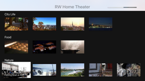
In case you haven’t gone through the video playback chapters, RWHomeTheater lets you pick from a collection of remarkable, entertaining videos that range from a cow eating grass to water boiling. The app has 14 videos, which take up nearly 200 MB by themselves.

Run the app in the tvOS Simulator; you’ll see the main difference from the video playback chapters is the lack of a Play All option in the app. All classes and collection view cells for Play All have been removed from the project.

In Xcode, open Main.storyboard and zoom in on the top-right of the RW Home Theater Scene. There’s a UIProgressView that’s hidden by default; later on, you’ll use this to show the user the status of their downloads.

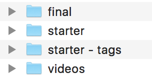
If you haven’t already downloaded the videos for the video playback chapters, you need to download them from this location: http://bit.ly/22obxJJ. Now that you have these files on your computer, you need to copy them into the directory alongside starter, starter-tags, and final.

Your directory should now look like this:

FinderVideosAdded

NSBundleResourceRequest and Tags

To work with ODR, you’ll need a basic understanding of Bundles and how they handles files.

A Bundle represents a group of files on the device. In the case of ODR, these files will include resources such as videos, images, sounds, 3D models, and shaders; the main exception is that you can’t include Swift, Objective-C or C++ source code in ODR.

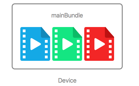
Most of the time, you’ll use Bundle.main as your main bundle. By default, all the resources downloaded in your app are included in the main bundle.

Think of the main bundle as a big box that holds all of your app’s “stuff”.

diagram_1

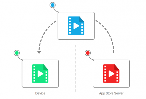
However, when you use ODR, the resources you download aren’t in the main bundle; instead, they’re in a separate bundle that contains all the resources of a given tag. The OS only downloads a tag’s resources when needed.

When you request a tag, the OS downloads all resources for that tag and stores it in a Bundle. Then, instead of using the main bundle to find the resource, you simply look inside this alternative bundle.

diagram_2

You request a tag using an instance of NSBundleResourceRequest. This resource request takes strings that represent the tags as parameters and lets you know when your resources are available. Once the resource has been loaded, you can use the resource request’s bundle property to access the files in the bundle.

Once you’re done with an NSBundleResourceRequest, you can call endAccessingResources() on the request and let it deallocate. This lets the system know you’re done with the resources and that it can delete them if necessary.

Now that you understand the foundations of ODR, you can get started on the coding!

Adding Tags

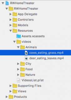
In the project navigator, expand the videos group and the Animals subgroup under the Resources folder and select cows_eating_grass.mp4:

CowsEatingGrassLocation

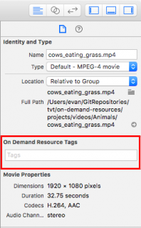
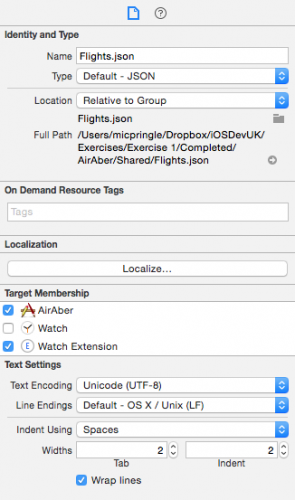
Show the File Inspector using the Utilities menu. Notice the section named On Demand Resource Tags:

ShowingResourceTagField

To add a tag to a file, you simply type the name of the tag in this text box and press Enter.

In order to make things easier to discern from code, you’ll add the video’s name as its tag.

Be careful — if you don’t name the tag exactly the same as the video, then ODR won’t work properly.

For cows_eating_grass.mp4, add “cows_eating_grass” to the On Demand Resource Tags text field and press Enter:

ResourceTagFieldNameAdded

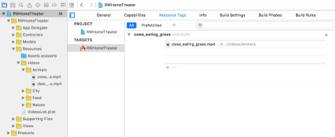
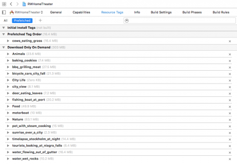
Select the project in the project navigator, select the target, and go into the Resource Tags tab; you’ll see the Resource Tags menu.

The app has a tag named “cows_eating_grass” with a single associated file:

ResourceTagTable

Next up — adding the tags for every single video file. Oh, come on, it’ll be fun! :]

If you don’t want to go through the laborious task of adding these tags — good news! You can simply open the project from this chapter’s folder named starter – tags.

Once you’ve added all of the tags, whichever way you chose to do it, the Resource Tags menu should look like the following:

ResourceMenuAfterFilesAdded

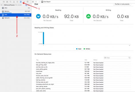
Build and run your app; when the app loads, open the debug navigator in Xcode and select Disk. This will show you the status of all tags in the app:

DiskDebug

The app won’t work at the moment since you haven’t downloaded the files to the Apple TV yet: every tag says “Not Downloaded”. Time to fix that problem!

Resource Utility Class

In order to keep all your ODR code organized, you’ll create a class to manage your on-demand resources. Select File\New\File\Swift File, and name it ResourceManager.

Add the following class declaration to the file:

class ResourceManager {
  static let shared = ResourceManager()
}

This code creates a new class named ResourceManager and creates a class variable for a shared instance.

Now, add the following code to ResourceManager:

// 1
func requestVideoWith(tag: String,
  onSuccess: @escaping () -> Void,
  onFailure: @escaping (Error) -> Void) -> NSBundleResourceRequest {
 
    // 2
    let videoRequest = NSBundleResourceRequest(tags: [tag])
    videoRequest.loadingPriority
      = NSBundleResourceRequestLoadingPriorityUrgent
 
    // 3
    videoRequest.beginAccessingResources { error in
      OperationQueue.main.addOperation {
        if let error = error {
          onFailure(error)
        } else {
          onSuccess()
        }
      }
    }      
    // 4
    return videoRequest
}

There’s a lot of new stuff going on here, so taking it piece by piece:

  1. Create a method to easily request a new video in your app. This method takes the tag name as a parameter, as well as two closures: one to call if the download succeeds, and one to call if the download fails.
  2. Instantiate a new NSBundleResourceRequest with the given tag. By setting loadingPriority of the request to NSBundleResourceRequestLoadingPriorityUrgent, the system knows that the user is waiting for the content to load and that it should download it as soon as possible.
  1. To start loading the resources, call beginAccessingResources. The completion handler is called on a background thread, so you add an operation to the main queue to respond to the download’s result. If there is an error, the onFailure closure is called; otherwise, onSuccess is called.
  2. Return the bundle request so that the requester can access the bundle’s contents after the download finishes.

Before you can add this to the project, you need to make a small change to the video struct. Open Video.swift and find the current declaration of videoURL:

var videoURL: URL {
  return url(forResource: videoName,
    withExtension: "mp4")!
}

Replace that declaration with the following:

var videoURL: URL!

Also, change the implementation of video(fromDictionary:) to match the following:

static func videoFrom(dictionary: [String: String]) -> Video {
  let previewImageName = dictionary["previewImageName"]!
  let title = dictionary["videoTitle"]!
  let videoName = dictionary["videoName"]!
  return Video(previewImageName: previewImageName,
    title: title, videoName: videoName, videoURL: nil)
}

In the original code, videoURL pointed to a location in the main bundle for the file. However, since you’re now using ODR, the resource is now in a different bundle. You’ll set the video’s URL once the video is loaded — and once you know where the video is located.

Requesting Tags on Selection

Open VideoListViewController.swift and add the following property to VideoListViewController:

var currentVideoResourceRequest: NSBundleResourceRequest?

This property will store the NSBundleResourceRequest for the most recently requested video.

Next, you’ll need to request this video when the user selects one of the videos in the collection view.

Find didSelectVideoAt(_:) and replace its implementation with the following:

func didSelectVideoAt(_ indexPath: IndexPath) {
  // 1
  currentVideoResourceRequest?.progress.cancel()
  // 2
  guard var video = collectionViewDataSource
      .videoFor(indexPath: indexPath),
      let videoCategory = collectionViewDataSource
      .videoCategoryFor(indexPath: indexPath) else {
          return
  }
  // 3
  currentVideoResourceRequest = ResourceManager.shared
    .requestVideoWith(tag: video.videoName,
      onSuccess: { [weak self] in
 
      },
      onFailure: { [weak self] error in
 
      }
  )
}

The code breaks down as follows:

  1. If there’s a video request in progress, cancel that resource request and let the new video request take priority.
  2. This is the same code from didSelectVideoAt(_:); it’s how you find the video and category of the selected cell.
  3. Set currentVideoResourceRequest equal to a new NSBundleResourceRequest created by ResourceManager. The resource tag passed as a parameter is the name of the video; this is why you followed that strict naming scheme earlier.

The next step is to handle the failure case. Add the following method to the VideoListViewController extension:

func handleDownloadingError(_ error: NSError) {
  switch error.code{
  case NSBundleOnDemandResourceOutOfSpaceError:
    let message = "You don't have enough storage left to download this resource."
    let alert = UIAlertController(title: "Not Enough Space",
      message: message,
      preferredStyle: .alert)
    alert.addAction(UIAlertAction(title: "OK",
      style: .cancel, handler: nil))
    present(alert, animated: true, completion: nil)
  case NSBundleOnDemandResourceExceededMaximumSizeError:
    assert(false, "The bundle resource was too large.")
  case NSBundleOnDemandResourceInvalidTagError:
    assert(false, "The requested tag(s) (\(currentVideoResourceRequest?.tags ?? [""])) does not exist.")
  default:
    assert(false, error.description)
  }
}

handleDownloadingError(_:) handles all the possible errors from a resource request.

The main three error cases occur when either the device is out of storage, the resource is too large, or you’ve requested an invalid tag. If the device is out of storage, you alert the user of the problem. You’ll need to catch the other two issues before you deploy your app; at that point, it’s too late to make changes. So that they don’t go unnoticed in your testing phase (you are testing, right?), you crash the app with an error message.

The default assertion catches any other errors that could occur, such as network loss.

Now, call your new method in the onFailure(_:) closure:

self?.handleDownloadingError(error as NSError)

In the onSuccess closure, add the following code to handle the successful download:

guard let currentVideoResourceRequest =
  self?.currentVideoResourceRequest else { return }
video.videoURL = currentVideoResourceRequest.bundle
  .url(forResource: video.videoName, withExtension: "mp4")
let viewController = PlayVideoViewController
  .instanceWith(video: video, videoCategory: videoCategory)
self?.navigationController?.pushViewController(viewController,
  animated: true)

Here you set the URL of the selected video to the downloaded resource within the requested bundle. Then, you present a new instance of PlayVideoViewController with the video as a parameter.

Run your app; select video to play and you’ll notice there’s a bit of a delay before the video starts. This is because the video is being downloaded from the server — or in this case, from your computer.

To check that your app is using the on-demand bundle, open the debug navigator and select Disk; the Status column of your chosen video will now show “In Use”.

If you press Menu on your remote, you’ll notice the tag still shows as “In Use”. That’s not quite right, is it? The resource should change to “Downloaded” since you’re no longer using the resource. You’ll fix this in the next section.

Purging Content

Responsible management of your resources includes releasing them when you’re done. This takes two steps:

  1. Call endAccessingResources() on the NSBundleResourceRequest.
  2. Let the resource request deallocate.

The best time to let ODR know you no longer need the video is once the user’s finished watching the video. This happens when you dismiss PlayVideoViewController and VideoListViewController reappears on-screen.

Add the following method to VideoListViewController.swift:

override func viewWillAppear(_ animated: Bool) {
  super.viewWillAppear(animated)
 
  currentVideoResourceRequest?.endAccessingResources()
  currentVideoResourceRequest = nil
}

This code first checks that VideoListViewController reappears once you’ve dismissed a different view controller from the navigation stack. It then calls endAccessingResources() on the resource request and sets the property to nil, which lets the resource request deallocate.

Build and run your app; watch the Resource Tags menu as you play a video, then press Menu to go back. The Resource Tags menu now shows the requested resource as “Downloaded”. Perfect! You won’t delete the resource until the system needs the space. As long as the device has room, the resources will remain in storage.

Progress Reporting

At present, the user has no way to see the progress of the download. Is the video almost completely downloaded? Or is it not downloading at all?

In order to indicate the progress of the download, you’ll use a progress bar to observe the progress of the NSBundleResourceRequest.

Back in VideoListViewController.swift, add the following line to the beginning of didSelectVideoAt(_:):

progressView.isHidden = false

At the beginning of both the onSuccess and onFailure closures, add the following line — which does the exact opposite as the previous line:

self?.progressView.isHidden = true

This code shows the progress bar when the download begins, and hides it when the download ends.

Key-Value Observing

To connect the progress bar with the NSBundleResourceRequest, you need to use Key-Value Observing.

Open ResourceManager.swift and add the following to the top of the file, above the class declaration:

let progressObservingContext: UnsafeMutableRawPointer? = nil

Next, you need to change requestVideoWith(tag:onSuccess:onFailure:) to accept the progress observer as a parameter.

Replace the declaration of requestVideoWith(tag:onSuccess:onFailure:) with the following:

func requestVideoWith(tag: String,
  progressObserver: NSObject?,
  onSuccess: () -> Void,
  onFailure: (NSError) -> Void) -> NSBundleResourceRequest {

This method now has a new progressObserver parameter that will make it easier to use KVO with your custom view controller and progress bar.

Within this method, add the following code before the return statement:

if let progressObserver = progressObserver {
  videoRequest.progress.addObserver(progressObserver,
    forKeyPath: "fractionCompleted",
    options: [.new, .initial],
    context: progressObservingContext)
}

Here, you add the argument as an observer to the request’s progress.

Just like you added the observer before the resource was loaded, you’ll need to remove the observer once it’s loaded. Add the code below to the beginning of the OperationQueue.main.addOperation block:

if let progressObserver = progressObserver {
  videoRequest.progress.removeObserver(progressObserver,
    forKeyPath: "fractionCompleted")
}

Xcode will respond with an error in VideoListViewController; this is because you changed the method signature of requestVideoWith(tag:onSuccess:onFailure) to requestVideoWith(tag:progressObserver:onSuccess:onFailure).

Open VideoListViewController.swift and change the line with the error to the following:

currentVideoResourceRequest = ResourceManager.shared
  .requestVideoWith(tag: video.videoName, progressObserver: self,
  onSuccess: { [weak self] in
    ...
  },
  onFailure: { [weak self] error in
    ...
  }
)

The only change here is that you added the progressObserver parameter and passed self as the observer.

In order to respond to changes as the download progresses, you’ll need to implement observeValue(forKeyPath:of:change:context:) in the view controller — your observer.

Add the following method to VideoListViewController:

override func observeValue(forKeyPath keyPath: String?,
  of object: Any?,
  change: [NSKeyValueChangeKey : Any]?,
  context: UnsafeMutablePointer?) {
 
    if context == progressObservingContext
      && keyPath == "fractionCompleted" {
 
        OperationQueue.main.addOperation {
          self.progressView.progress
            = Float((object as! Progress).fractionCompleted)
        }
    }
}

When the value of the download’s progress changes, you reflect this change in the progress bar on the main thread.

Build and run your app; select a video to watch and you’ll see the progress bar at the top-right corner of the screen. Once the progress bar has filled, it will disappear and the video will play:

ProgressBarScreenshot

Anticipating User Action

The biggest challenge with ODR is delivering resources in a timely fashion. You can’t read your user’s mind, but you can preemptively download resources related to the selected video to make it look like you read their mind! :]

Once again, you’ll use tags, but instead of using the video name as the tag, you’ll use the video category. When the user selects a video, you’ll download all files in that category, as the user is likely to watch other videos in that category.

Select cows_eating_grass.mp4 and go to the Inspector where the resource’s tags are located. In the tags field, add Animals. The Inspector should now look like this:

ResourceTagFieldCategoryAdded

Perform the same action for each file’s respective category name. When you’re done, you should have two Animal tags, four City Life tags, three Food tags, and five Nature tags in the Resource Tags menu.

Note: Be sure to use City Life since that is the category name, and not the name of the folder the video is in which is City.

Your Resource Tags menu should look like this:

ResourceMenuAfterCategoriesAdded

Just as you used ResourceManager to help create the video resource request, you’re going to write a method to help create this category resource request.

Add the following method to ResourceManager:

func requestCategoryWith(tag: String) -> NSBundleResourceRequest {
  let currentCategoryBundleRequest
    = NSBundleResourceRequest(tags: [tag])
  currentCategoryBundleRequest.loadingPriority = 0.5
  currentCategoryBundleRequest
    .beginAccessingResources { error in }
  return currentCategoryBundleRequest
}

There are two particularly interesting parts of this method: the loading priority and the completion handler.

The loading priority was chosen arbitrarily. When you request the individual video, you set the priority to NSBundleResourceRequestLoadingPriorityUrgent. If you don’t use this constant, the priority must be between 0.0 and 1.0.

Note: These values are only important within your app, so you don’t need to consider other apps that may be downloading content at the same time. Since there aren’t a lot of concurrent downloads in this app, the loading priority could have been any number in this range.

You’ll notice the completion handler is empty. There’s no immediate action to take once the download completes; it’s purely a preemptive gesture.

Open VideoListViewController.swift and add these two properties to the class:

var selectedIndexPath: IndexPath?
var currentCategoryResourceRequest: NSBundleResourceRequest?

selectedIndexPath helps you track the last video selected. currentCategoryResourceRequest makes it easy to control the deallocation of the request, just as you did before with currentVideoResourceRequest.

Add the following line to the beginning of didSelectVideoAt(_:):

selectedIndexPath = indexPath

This simply stores the most recent selection in selectedIndexPath.

At the end of didSelectVideoAt(_:), add the following code to use your ResourceManager:

currentCategoryResourceRequest?.endAccessingResources()
currentCategoryResourceRequest = ResourceManager
  .shared.requestCategoryWith(tag: videoCategory.name)

If there’s a category resource request in progress, you call endAccessingResources() so that the system knows you don’t need those resources anymore. You then pass in the name of the new video category as the tag. The video category name in this method matches the tags added to all the videos.

Finally, add the following code to the bottom of viewWillAppear(_:):

if let selectedIndexPath = selectedIndexPath,
  selectedIndexPath.item + 1 == collectionView
    .numberOfItems(inSection: selectedIndexPath.section) {
 
      currentCategoryResourceRequest?.endAccessingResources()
      currentCategoryResourceRequest = nil
}

This code checks if the most recent video was the last one in the category. If so, you alert the resource request that you’re done using it so it can be deallocated.

Build and run your app. When you select a video in a category for the first time, it will take a bit of time to load. When you select the next video in the category, it will load almost instantly because the app downloaded it in anticipation of your actions.

Different Types of Tags

In ODR, there are three types of resource tags:

  1. Initial Install Tags: These resources are downloaded with the rest of the app, but can be purged when no longer needed.

    One possible use of initial install tags is for resources that you need during the app introduction.

  2. Prefetch Tag Order: These resources are downloaded in the order that they are arranged after the app finishes downloading.
  3. Download On Demand: This is the same type you’ve been using all along in this chapter; they’re only downloaded when you request them.

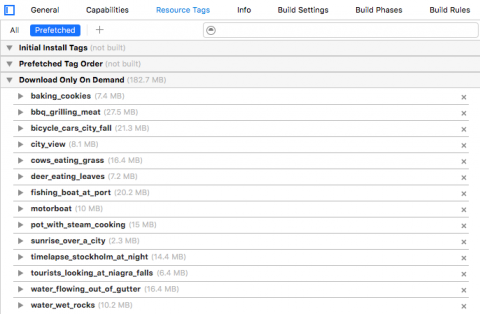
Select the project’s target and open the Resource Tags interface. There’s one section for each of the three types of resource tags.

Currently, only the Download On Demand section has tags, as tags are added automatically to this category.

When the user first downloads the app, they’re most likely to watch the first video they see.

In the case of RWHomeTheater, the first video is cows_eating_grass.mp4, and the tag for that video is, unsurprisingly, cows_eating_grass.

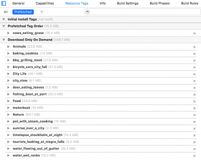
To make this video available to the user as soon as possible after the app download has completed, you’ll need to make cows_eating_grass a prefetched tag.

In the Resource Tags menu, drag the cows_eating_grass tag into the Prefetch Tag Order category.

Your menu should now look like this:

ResourceTagTablePrefetched
Currently, there is no way to test the initial install or prefetched tags in the iOS Simulator. Make sure to use TestFlight Beta Testing to test these changes in your app.

Where to Go From Here?

You now know everything you need to bring On-Demand Resources into your tvOS apps. ODR lets you create large, resource-intensive apps that fit within the 200MB initial download requirement.

To learn more about best practices for working with On-Demand Resources, check out the On-Demand Resources Guide (http://apple.co/1Ol7VSC).

tvt@2xThis tutorial was taken from Chapter 17 of tvOS Apprentice, Second Edition. You also might enjoy the other 27 chapters and 500+ pages in the book! :]

The book has been completely updated to work with Swift 3, tvOS 10 and Xcode 8. Check out the book and let us know what you think!

The post On-Demand Resources in tvOS Tutorial appeared first on Ray Wenderlich.

Screencast: Beginning C# Part 13: For Loops

tvOS Top Shelf Tutorial: Static and Interactive

$
0
0

A true Apple TV enthusiast can be identified by the plethora of installed apps on their Apple TV. But among the numerous apps installed to your user’s Apple TV are five apps that hold an elevated standing. The user explicitly chooses these apps to reside in a place of privilege on their Apple TV screen: the top shelf.

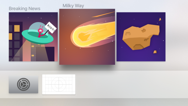
This space gives you, the developer, an opportunity to showcase what your app’s all about. Think of the top shelf as a billboard to show exceptional content from your app. When one of the top shelf apps in the top row gains focus, the entire top half of your user’s TV populates with one or more banners to charm your users:

staticTopShelfDemo

A good top shelf is visually appetizing, while a great top shelf is visually appetizing and functionally appealing. In this chapter, you’ll learn how to master the top shelf, and give your future tvOS blockbuster app a decisive edge over other apps in the marketplace!

Getting Started

Start by retrieving the starter project for this chapter. Build and run your app, and you’ll see the following:

newsApp

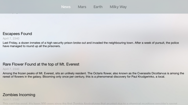
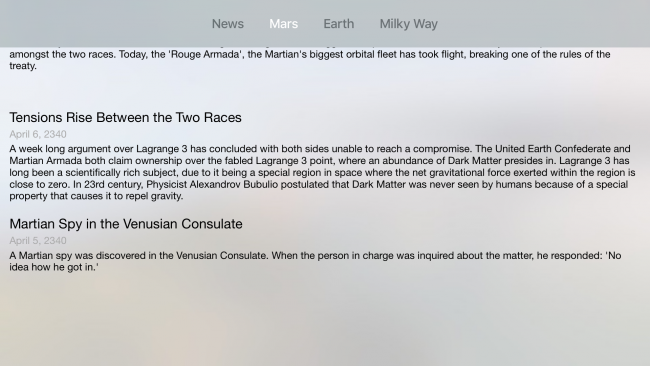
Imagine it’s the year 2340, and that the Apple TV and Swift are so popular they’re still in use despite over 300 years of technological advancement. The project in this chapter is a news app that showcases the latest news in the galaxy. Like other news apps, there are a variety of topics sectioned into their own tabs. At launch, the app shows the user the top news from every category, and subsequent tabs showcase all the news attributed with the topic:

martianFeaturedNews

Press Command+Shift+H to bring your tvOS simulator back to the home page. You’ll begin by putting your news app into your top row of apps to expose it in the top shelf.

Bring up the tvOS simulator controller by pressing Command+Shift+R. Navigate to your news app by holding the Option key in your keyboard while making swipe motions with your mouse indicator on top of the tvOS simulator controller.

Once you brought the focus to your news app, click and hold on the touch area until the app icon starts wiggling. Bring the app to the highest row of apps and tap on the tvOS controller. Your app should now reveal its top shelf when you bring it in focus. Right now, it will appear as a blank canvas:

blankCanvas

That wouldn’t win over any galactic news fans, in any universe! A good logo and good branding go a long way; in the case of the Apple TV, that extends beyond the app icon. In fact, Apple enforces this: you must provide a top shelf image before you can export your app to production servers. A top shelf image is a 1920×720 widescreen graphic you’ll need to add to the assets catalog.

Adding a Static Image

Later in this chapter, you’ll learn how to create an interactive top shelf, but it’s baby steps for now. You’ll start by implementing the minimum acceptable top shelf: a high quality 1920 x 720 .png image relevant to your app.

Open the resources folder from this chapter’s resources and locate StaticTopShelf.png. Drag and drop this image into your Assets.xcassets folder in the Top Shelf Image compartment:

settingStaticTopShelf

Ensure your app is still within the top row of apps, then build and run your project. Press Command+Shift+H to return to the home screen, then navigate to your app and you should see your top shelf image in all its glory:

staticTopShelf

Note: As of tvOS 10, you’ll also need to provide a wide version of the the top shelf image, which has the dimensions 2320px x 720px.

Right now, your top shelf consists of a single banner that acts as a symbol for your app. While that’s great and all, the usability of the top shelf extends far beyond being a “second app icon”. In the following section, you’ll learn how to develop for the interactive top shelf.

awwYeahMoney

An Interactive Top Shelf

There are currently two different interactive top shelf layouts: the sectioned top shelf, and the inset top shelf.

Sectioned Top Shelf

The sectioned top shelf is, as its name implies, a top shelf where the content is divided into sections. If you’ve worked with table and collection views before, this layout should look familiar to you:

sectionedTopShelfExample

The sectioned top shelf is perfect for displaying information that makes sense when it’s grouped together; this makes it a great choice to showcase the top news articles for each news topic. In general, if the purpose of your app is to feed information to the user as quickly as possible, the sectioned layout is a great choice.

Inset Top Shelf

The inset top shelf is great for displaying the overarching themes of your app, particularly if your app is a game. Each item is given the full width of the screen to showcase the features in store for your users:

insetTopShelf

Both layouts let the user scroll and browse through the your content — and they’re surprisingly easy to implement.

Setting up the Interactive Top Shelf

The process of setting up an interactive top shelf is relatively straightforward. In technical terms, you’ll add a target — a TV Services Extension — and configure the ServiceProvider to use one of the two layouts.

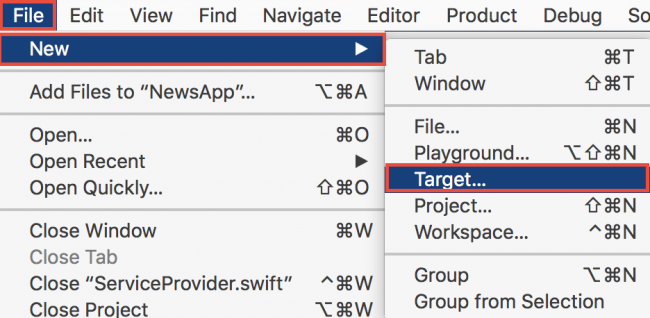
On the top bar, select File\New\Target…:

newTarget

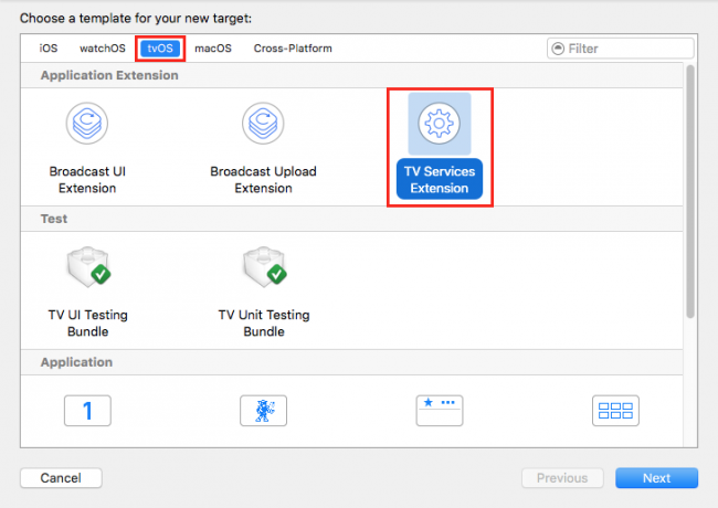
For the template, choose TV Services Extension located within the tvOS section and select Next:

tvServicesExtension

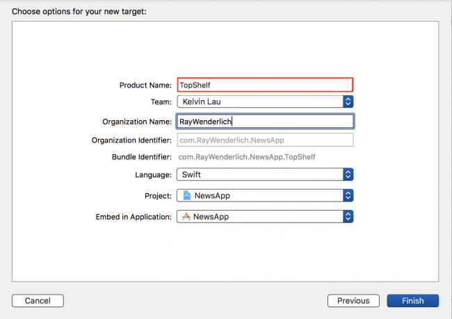
Name the extension TopShelf and select Finish:

namingExtension

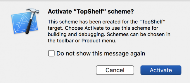
At this point, you may be presented with the following dialog:

schemeDialog

Select Activate. This lets the simulator test your extension. With that bit of setup done, you’re ready to begin writing code. Hurrah!

TVTopShelfProvider

When you create the new TV Services Extension target, Xcode automatically generates the new target accompanied by a new file named ServiceProvider.swift. This file contains the ServiceProvider class, which is where you’ll define the interface for your interactive top shelf.

The topShelfStyle computed variable defines the type of top shelf you’d like to present to the user: either the sectioned layout, or the inset layout. In this chapter, you’ll use the sectioned layout.

Linking Up the Sectioned Layout

In ServiceProvider.swift, make sure the topShelfStyle variable is returning .sectioned (it should be returning .sectioned by default):

var topShelfStyle: TVTopShelfContentStyle {
  return .sectioned
}

Modifying the return value for this computed variable lets the app define an inset or sectioned layout.

The topShelfItems computed variable, as the name implies, will define the UI elements in the top shelf for a given layout.

Modify the topShelfItems computed variable as follows:

var topShelfItems: [TVContentItem] {
  // 1
  let breakingNewsIdentifier = TVContentIdentifier(identifier:
    "Breaking News", container: nil)!
  let breakingNewsSection = TVContentItem(contentIdentifier:
    breakingNewsIdentifier)!
  breakingNewsSection.title = "Breaking News"
 
  // 2
  let martianRiotIdentifier = TVContentIdentifier(identifier:
    "Martian Riot", container: nil)!
  let martianRiotItem = TVContentItem(contentIdentifier:
    martianRiotIdentifier)!
 
  // 3
  breakingNewsSection.topShelfItems = [martianRiotItem]
 
  return [breakingNewsSection]
}

Here’s what you did above:

  1. First you defined a section where your “Breaking News” items will reside.
  2. Next you defined a single item for your section.
  3. Finally you set the topSelfItems property of the breakingNewsSection to an array that contains the item.

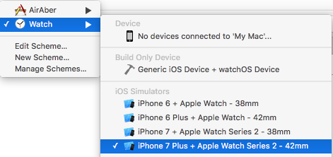
To test your top shelf, you can use the schema generated for you when you created the TV Services Extension. Beside the run/stop button on the top left corner of Xcode, select the TopShelf schema:

schemaSelection

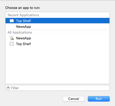
Build and run your app; choose Top Shelf from the “Choose an app to run:” dialog and press Run:

chooseAnAppToRun

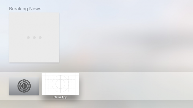
You should see a single cell with a section title above it:

sectionedTopShelfOneCell

Okay, that takes care of the section title. Now you’ll need an image to go along with it.

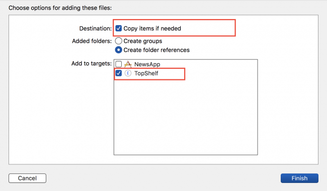
Drag sectionedMartians.png from this chapter’s resources and drop it into your project in the Top Shelf group. Make sure Copy items if needed is checked, and the target is set to TopShelf:

dragAndDrop

With the asset safely in your project, change to ServiceProvider.swift.

Add the following code just below the line that initializes martianRiotItem:

martianRiotItem.imageURL = Bundle.main.url(forResource: 
  "sectionedMartians", withExtension: "png")

This tells TVContentItem to look inside your project files to find the image.

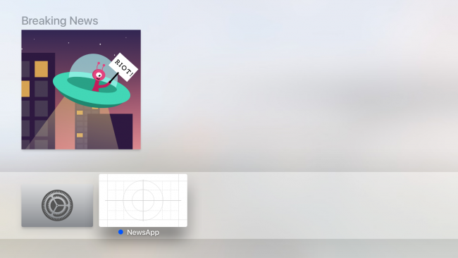
Build and run your app; you should see a nice image accompanying your top shelf item in the breaking news category:

martiansAreRioting

Look out, the Martians are rioting! :]

Adding More News Items

A comet in the Milky Way is misbehaving, and an asteroid is traveling at the speed of light, breaking all laws of physics! While these two pieces of news are super-exciting, they don’t quite belong in the “Breaking News” category. You’ll create a new category to house these two pieces of news.

Drag and drop comet.png and asteroid.png from the project resources to the Top Shelf group, making sure Copy items if needed is checked and the target set to TopShelf.

In the topShelfItems computed property, add the following before the return statement:

// 1
let milkyWayNewsIdentifier = TVContentIdentifier(identifier:
  "Milky Way News", container: nil)!
let milkyWaySection = TVContentItem(contentIdentifier:
  milkyWayNewsIdentifier)!
milkyWaySection.title = "Milky Way"
 
// 2
let cometIdentifier = TVContentIdentifier(identifier:
  "An odd comet", container: nil)!
let cometItem = TVContentItem(contentIdentifier:
  cometIdentifier)!
cometItem.imageURL = Bundle.main.url(forResource:
  "comet", withExtension: "png")
 
// 3
let asteroidIdentifier = TVContentIdentifier(identifier:
  "Asteroid Light Speed", container: nil)!
let asteroidItem = TVContentItem(contentIdentifier:
  asteroidIdentifier)!
asteroidItem.imageURL = Bundle.main.url(forResource:
  "asteroid", withExtension: "png")
 
// 4
milkyWaySection.topShelfItems = [cometItem, asteroidItem]

Take some time to admire the beauty of what you’ve written:

  1. You create a new TVContentItem intended as a new section; hence, you also give it a title.
  2. You then create cometItem with the intention of adding it to milkyWaySection.
  3. You also create asteroidItem to add to milkyWaySection as well.
  4. Finally, you made cometItem and asteroidItem part of the milkyWaySection by adding them to its topShelfItems property.

You’ve created a new section and placed two items inside. Now you need to add this section next to the “Breaking News” section.

Update the return statement to return both the breakingNewsSection and the milkyWaySection:

return [breakingNewsSection, milkyWaySection]

Build and run your app; select any top shelf item:

cometAndAsteroid

Hmm — nothing happens! Well, the sections look good, but you haven’t yet provided the code to handle events. You’ll do that in the next section.

Adding User Interaction

You have a visually appealing top shelf, so your next step is to make it functional. A top-of-the-line top shelf provides shortcuts to the advertised content, so you’ll need to find a way for the app to recognize that a user has tapped on a given top shelf item. Unfortunately, you can’t use IBAction event handling here.

So what can you do? How does event handling work for the top shelf?

Event Handling

AppDelegate.swift will call application(_:open:options) when a user selects anything in the top shelf — provided that the item has a non-nil displayURL or playURL. The top shelf can listen to two events on the remote: a press on the touch screen, and a press on the play button.

You’ll start by adding a new value to your app’s Info.plist file. Make sure you’ve opened the plist that’s part of your NewsApp target, not your TopShelf target. Right-click and select Add Row:

addPlistRow

Name the row URL types. As you’re typing, Xcode may help you out by offering you an autocomplete. Expand the row you’ve just added and you should see another row named Item 0. Expand that as well. Click the + button next to Item 0 to add another row within the Item 0 dictionary. Name it URL Schemes:

addButtonInPlist

Your new rows should look like this:

unfinishedURLSchemes

Set the value of Item 0 of URL Schemes to newsapp, and URL identifier to NewsApp URL. Your finalized plist entry should look like this:

finalizedPlist

Hooking Up the AppDelegate

You haven’t provided TVContentItems with either of these properties yet — that’s your next job.

Adding the URLs

For your news app, you’ll only supply displayURL. Open ServiceProvider.swift and add the following private method to the bottom of the class:

private func urlFor(identifier: String) -> URL {
  var components = URLComponents()
  components.scheme = "newsapp"
  components.queryItems = [URLQueryItem(name: "identifier", value: identifier)]
 
  return components.url!
}

You’ll use this private helper method to generate a URL for displayURL. Your top shelf has three items, so there are three corresponding displayURL properties you must fill in.

Inside the topShelfItems computed variable, find where you’ve declared martianRiotItem. Below that, add the following line:

martianRiotItem.displayURL = urlFor(identifier: "martianRiot")

Similarly, find cometItem and asteroidItem and add the following code below the points where you instantiate each of those objects:

cometItem.displayURL = urlFor(identifier: "comet")
asteroidItem.displayURL = urlFor(identifier: "asteroid")

Build and run your app; navigate to your app’s top shelf, select any item, and lo and behold, your app launches!

Right now, your app launches to its initial view controller when any of the top shelf items are selected. What you really want is the items to act as a shortcut to their respective categories. It’s these shortcuts that provide a pleasurable — and convenient — user experience.

Differentiating Between Items

Open AppDelegate.swift and add the following:

func application(_ app: UIApplication, open url: URL,
  options: [UIApplicationOpenURLOptionsKey: Any] = [:]) -> Bool {
    print(url)
    return true
}

This method will be called whenever your user selects a top shelf item with a displayURL, passed in as an argument to the method.

Before you can build and run, you’ll have to switch back to the NewsApp scheme:

selectNewsAppScheme

Build and run your app; once the app launches press Command+Shift+H to bring your tvOS simulator back to the home screen. Navigate to your top shelf and select the Martian Riot news item. You should see the following output in your console:

newsapp:?identifier=martianRiot

Next, navigate back to your top shelf and select the Comet item. This time, your console should show the following:

newsapp:?identifier=comet

Hey! Those are the identifiers you’ve added to the displayURL property earlier! w00t! Now you have a distinguishing feature you can rely on.

For this app, you’ll simply bring the user to the associated tab related to the theme of the content. You currently have four tabs in your app. You’ll define their indexes using a few variables.

Add the following variables to AppDelegate.swift, right below the var window: UIWindow? statement:

let newsTab = 0
let martianTab = 1
let earthTab = 2
let milkyWayTab = 3

Next, update application(_:open:options:) to the following:

func application(_ app: UIApplication, open url: URL,
  options: [UIApplicationOpenURLOptionsKey: Any] = [:]) -> Bool {
    guard let initialViewController = window?.rootViewController
      as? UITabBarController else { return false }
 
    let urlString = url.absoluteString
    switch urlString {
    case "newsapp:?identifier=martianRiot":
      initialViewController.selectedIndex = martianTab
    case "newsapp:?identifier=comet",
    "newsapp:?identifier=asteroid":
      initialViewController.selectedIndex = milkyWayTab
    default:
      return false
    }
    return true
}

Here, you’ve set out the code to handle the select event for each of the three items. For the Martian Riot news item, you’ve directed the user to the news tab for Mars. For the Comet and Asteroid news items, you’ve directed the user to the Milky Way tab.

Build and run your app; select any of the news category items to ensure you’re launched into the proper spot in your app. You’re ready to assume your spot as the biggest galactic news mogul this side of Saturn! :]

awwYeahMoney

Where to Go From Here?

You’ve covered a lot of ground in this chapter. You’ve learned all about the top shelf and the two layouts associated with it. Although you’ve only worked through the sectioned layout, you’ll be glad to know that using the inset layout involves almost all the same steps you’ve gone through here.

tvt@2xThis tutorial was taken from Chapter 26 of tvOS Apprentice, Second Edition. You also might enjoy the other 27 chapters and 500+ pages in the book! :]

The book has been completely updated to work with Swift 3, tvOS 10 and Xcode 8. Check out the book and let us know what you think!

The post tvOS Top Shelf Tutorial: Static and Interactive appeared first on Ray Wenderlich.

How to Make a Game Like Can Knockdown

$
0
0

CanKnockdown-featureWelcome to another fantastic SceneKit tutorial!

Nowadays, 3D games are pushing the realism factor to a whole new level, giving it that slight visual edge over basic 2D games. Life-like materials and 3D assets, combined with realistic lighting and physics simulation pushes your games to that next level of realism for an immersive gaming experience.

In this tutorial, you’ll learn how easy it is to create your own version of Can Knockdown using SceneKit and Swift.

You’ll learn about the following topics:

  • Building a basic 3D scene using the SceneKit editor.
  • Loading and presenting a 3D scene programmatically.
  • Setting up realistic physics and how to applying forces.
  • Interacting with objects in a 3D scene through touch.
  • Designing and implementing basic collision detection.

This tutorial assumes you have working knowledge of SceneKit and Swift. If you’re new to the “scene”, be sure to check out our beginner SceneKit tutorials and also our 3D iOS Games by Tutorials book. For a swift introduction to Swift, there’s a beginner Swift tutorial available too.

Getting Started

Before you continue, download the starter project first.

Open the project and take a moment to check out what’s included. You’ll find the assets for the ball and can, as well as a GameHelper file that provides you some additional helper functions that you’ll use while creating this game.

Build and run, to see what it looks like:

Blank Screen

Stare into the black screen of endless possibilities! :]

Don’t distress, this is merely a clean slate for you to begin with. You’re now ready to get this ball rolling!

Setting Up and Presenting the Menu

Before you can start knocking some cans around, you’ll have to add the menu screen for the game first. Open GameViewController.swift and add a new property to GameViewController:

// Scene properties
var menuScene = SCNScene(named: "resources.scnassets/Menu.scn")!

This loads the menu scene. You will also be able to use menuScene as a reference to jump back and forth between the menu and the level scenes later on.

To present the menu scene, add the following below viewDidLoad():

// MARK: - Helpers
func presentMenu() {
  let hudNode = menuScene.rootNode.childNode(withName: "hud", recursively: true)!
  hudNode.geometry?.materials = [helper.menuHUDMaterial]
  hudNode.rotation = SCNVector4(x: 1, y: 0, z: 0, w: Float(M_PI))
 
  helper.state = .tapToPlay
 
  let transition = SKTransition.crossFade(withDuration: 1.0)
  scnView.present(
    menuScene,
    with: transition,
    incomingPointOfView: nil,
    completionHandler: nil
  )
}

This function configures the heads-up-display (HUD) node in the menu scene, and then presents it with a cross-fade transition using present(scene:with:incomingPointOfView:completionHandler:) from SCNView.

Add the call to presentMenu() at the bottom of viewDidLoad():

override func viewDidLoad() {
  super.viewDidLoad()
  presentMenu()
}

Build and run – you should now see the menu scene:

Menu Scene

Building the Level With the SceneKit Editor

Now that the menu is loaded and looking great, it’s time to build the level scene for the game. Open up the empty resources.scnassets/Level.scn scene:

Blank Scene

Start by dragging a Floor node from the Object Library into the scene:

Add a Floor Node

In the Attributes Inspector change Reflectivity to 0.05 so that the floor is slightly reflective.

Select the Material Inspector and set wood-floor.jpg as the Diffuse texture. Expand the Diffuse heading to see additional properties. Set the Offset to (x: 0, y: 0.2) and the Scale to (x: 15, y: 15), this shifts the texture slightly forward and shrinks it down to size. Finally, set the Rotation to 90 degrees:

Floor Settings

Now that the floor is in place, you’ll add a brick wall as a background. The wall’s geometry is already configured for you in the Wall.scn scene. To add this wall to the level scene you’ll use it as a Reference Node.

While still inside the Level.scn scene, drag and drop a Wall reference node from the Media Library into the scene.

Add a Wall reference node

Inside the Node Inspector set the name of the node to wall and its position to (x: 0, y: 0, z: -5).

Next, you’ll need a spot to stack the cans. Drag and drop a Box from the Object Library and name it shelf, then set its position to (x: 0.0, y: 2.25, z: -2.25), placing it slightly in-front of the wall.

In the Attributes Inspector set the Width to 10 and the Height to 0.25. Finally, in the Material Inspector, set the Diffuse to wood-table.png and under additional properties, set both WrapS and WrapT to Repeat, and Scale to (x: 2, y: 2). That will make sure the texture fills the entire box, making it look like a proper shelf.

To complete the level, you just need to add a couple of lights and a camera. Start off by dragging in a Spot light from the Object Library, then set its Position to (x: 8.3, y: 13.5, z: 15.0) and the Euler to (x: -40, y: 28, z: 0). This places the spot light high up in the air, then aims it downwards to highlight the focal point of the game, the shelf, where the cans will be stacked.

In the Attributes Inspector, set Inner Angle to 35 and Outer Angle to 85. This softens the light somehwat and also widens the spot light cone, spreading the light to more parts of the scene.

Finally, under Shadow, set Sample radius to 4 and Sample count to 1 and set the Color to black with 50% opacity. This will allow the spot light to cast a soft shadow:

Shadow Settings

Just to break those black shadows, add some ambient lighting by dragging and dropping an Ambient light into the scene. The default settings are all that you need.

Last but not least, you need to add a camera to the scene to give the game some perspective. Drag a Camera into the scene. Position it at (x: 0.0, y: 2.5, z: 14.0) with a Rotation of (x: -5, y:0 , z:0). In the Attributes Inspector, change the Y fov to 45.

Great job! That completes the design of the level. You should now have a level looking like this:

Level Complete

Loading and Presenting the Level

You have a level for your game set up in Level.scn, but how do you see your creation on your device?

In GameViewController add the following right below the menuScene property:

var levelScene = SCNScene(named: "resources.scnassets/Level.scn")!

This loads the scene, and will also grant you access to all the nodes you just added to the level.

Now to present the level scene, add the following function below presentMenu():

func presentLevel() {
  helper.state = .playing
  let transition = SKTransition.crossFade(withDuration: 1.0)
  scnView.present(
    levelScene,
    with: transition,
    incomingPointOfView: nil,
    completionHandler: nil
  )
}

The function sets the game state to .playing, then presents the level scene with a cross-fade transition effect, pretty much the same way as you did with the menu scene.

Add the following to the bottom of touchesBegan(_:with:):

if helper.state == .tapToPlay {
  presentLevel()
}

This will start the game when you touch the menu scene.

Build and run, then tap on the menu scene to see the level you just designed fade in:

Level Loaded on Device

Physics in SceneKit

A huge benefit to creating games in SceneKit is being able to leverage the built-in physics engine to implement realistic physics very easily.

To enable physics on a node, you simply attach a physics body to it and configure its properties. There are various factors you can tweak to simulate a real world object; the most common properties you will work with are shape, mass, friction, damping and restitution.

In this game, you will use physics and forces to launch balls at the cans. The cans will have physics bodies that make them behave like empty aluminum cans. Your baseballs will feel more heavy and will bash through the light cans and lump together on the floor.

Dynamically Adding Physics to the Level

Before you can add physics to the game, you need a way of accessing the nodes you created in the SceneKit editor. To do this, add the following below the scene properties in GameViewController:

// Node properties
var cameraNode: SCNNode!
var shelfNode: SCNNode!
var baseCanNode: SCNNode!

You will need these nodes to layout the cans, configure physics bodies, and position other nodes in the scene.

Next, add the following below the scnView computed property:

// Node that intercept touches in the scene
lazy var touchCatchingPlaneNode: SCNNode = {
  let node = SCNNode(geometry: SCNPlane(width: 40, height: 40))
  node.opacity = 0.001
  node.castsShadow = false
  return node
}()

This is a lazy property for an invisible node that you’ll use later on when handling touches in the scene.

Now you’re ready to start wiring up the physics in the level. Add the following function after presentLevel():

// MARK: - Creation
func createScene() {
  // 1
  cameraNode = levelScene.rootNode.childNode(withName: "camera", recursively: true)!
  shelfNode = levelScene.rootNode.childNode(withName: "shelf", recursively: true)!
 
  // 2
  guard let canScene = SCNScene(named: "resources.scnassets/Can.scn") else { return }
  baseCanNode = canScene.rootNode.childNode(withName: "can", recursively: true)!
 
  // 3
  let shelfPhysicsBody = SCNPhysicsBody(
    type: .static,
    shape: SCNPhysicsShape(geometry: shelfNode.geometry!)
  )
  shelfPhysicsBody.isAffectedByGravity = false
  shelfNode.physicsBody = shelfPhysicsBody
 
  // 4
  levelScene.rootNode.addChildNode(touchCatchingPlaneNode)
  touchCatchingPlaneNode.position = SCNVector3(x: 0, y: 0, z: shelfNode.position.z)
  touchCatchingPlaneNode.eulerAngles = cameraNode.eulerAngles
}

Here’s what’s going on in the code above:

  1. You first find the nodes you created in the editor and assign them to the camera and shelf properties.
  2. Next you assign baseCanNode to a node from a pre-built can scene for you to use later when creating the cans.
  3. Here you create a static physics body with the shape of the shelf and attach it to shelfNode.
  4. Finally you position and angle the invisible touch catching node towards the scene’s camera.

To put this new function to use, call it right after presentMenu() in viewDidLoad():

createScene()

The new physics properties you added won’t have any visual effect on the game yet, so now you’ll move on to adding the cans to the level.

Creating the Cans

In the game, there will be varying arrangements of the cans to make the game difficult, yet interesting. To accomplish this, you’ll need a reusable way of creating the cans, configuring their physics properties and adding them to the level.

Start off by adding the following function after presentLevel():

func setupNextLevel() {
  // 1
  if helper.ballNodes.count > 0 {
    helper.ballNodes.removeLast()
  }
 
  // 2
  let level = helper.levels[helper.currentLevel]
  for idx in 0..<level.canPositions.count {
    let canNode = baseCanNode.clone()
    canNode.geometry = baseCanNode.geometry?.copy() as? SCNGeometry
    canNode.geometry?.firstMaterial = baseCanNode.geometry?.firstMaterial?.copy() as? SCNMaterial
 
    // 3
    let shouldCreateBaseVariation = GKRandomSource.sharedRandom().nextInt() % 2 == 0
 
    canNode.eulerAngles = SCNVector3(x: 0, y: shouldCreateBaseVariation ? -110 : 55, z: 0)
    canNode.name = "Can #\(idx)"
 
    if let materials = canNode.geometry?.materials {
      for material in materials where material.multiply.contents != nil {
        if shouldCreateBaseVariation {
          material.multiply.contents = "resources.scnassets/Can_Diffuse-2.png"
        } else {
          material.multiply.contents = "resources.scnassets/Can_Diffuse-1.png"
        }
      }
    }
 
    let canPhysicsBody = SCNPhysicsBody(
      type: .dynamic,
      shape: SCNPhysicsShape(geometry: SCNCylinder(radius: 0.33, height: 1.125), options: nil)
    )
    canPhysicsBody.mass = 0.75
    canPhysicsBody.contactTestBitMask = 1
    canNode.physicsBody = canPhysicsBody
    // 4
    canNode.position = level.canPositions[idx]
 
    levelScene.rootNode.addChildNode(canNode)
    helper.canNodes.append(canNode)
  }
}

In the code above:

  1. If the player completed the previous level, meaning they have balls remaining, then they’ll receive a ball as a reward.
  2. You loop over each can position in the current level and create and configure a can by cloning baseCanNode. You’ll find out what can positions are in the next step.
  3. Here you create a random bool that decides which texture and rotation the can will have.
  4. The positioning of each can will be defined by the level data stored in canPositions.

With that in place, you are almost ready to see some cans in the level. Before you can see them though, you’ll need to create some levels first.

In GameHelper.swift, you’ll find is a GameLevel struct that contains a single property representing an array of 3D coordinates for each of the cans in that level. There is also an array of levels where you’ll store the levels you create.

To populate the levels array add the following back in GameViewController below setupNextLevel():

func createLevelsFrom(baseNode: SCNNode) {
  // Level 1
  let levelOneCanOne = SCNVector3(
    x: baseNode.position.x - 0.5,
    y: baseNode.position.y + 0.62,
    z: baseNode.position.z
  )
  let levelOneCanTwo = SCNVector3(
    x: baseNode.position.x + 0.5,
    y: baseNode.position.y + 0.62,
    z: baseNode.position.z
  )
  let levelOneCanThree = SCNVector3(
    x: baseNode.position.x,
    y: baseNode.position.y + 1.75,
    z: baseNode.position.z
  )
  let levelOne = GameLevel(
    canPositions: [
      levelOneCanOne,
      levelOneCanTwo,
      levelOneCanThree
    ]
  )
 
  // Level 2
  let levelTwoCanOne = SCNVector3(
    x: baseNode.position.x - 0.65,
    y: baseNode.position.y + 0.62,
    z: baseNode.position.z
  )
  let levelTwoCanTwo = SCNVector3(
    x: baseNode.position.x - 0.65,
    y: baseNode.position.y + 1.75,
    z: baseNode.position.z
  )
  let levelTwoCanThree = SCNVector3(
    x: baseNode.position.x + 0.65,
    y: baseNode.position.y + 0.62,
    z: baseNode.position.z
  )
  let levelTwoCanFour = SCNVector3(
    x: baseNode.position.x + 0.65,
    y: baseNode.position.y + 1.75,
    z: baseNode.position.z
  )
  let levelTwo = GameLevel(
    canPositions: [
      levelTwoCanOne,
      levelTwoCanTwo,
      levelTwoCanThree,
      levelTwoCanFour
    ]
  )
 
  helper.levels = [levelOne, levelTwo]
}

That function simply creates positions for various numbers of cans and stores it in the helper class’ levels array.

To see your progress, add the following to the bottom of createScene():

createLevelsFrom(baseNode: shelfNode)

Finally add this to the top of presentLevel():

setupNextLevel()

Build and run, then tap the menu to see the cans stacked up like this:

Added can to the scene

Great job! :] You now have an efficient and reusable way of loading levels of varying layouts in the game. It’s now time to add in the ball and start bashing away.

Adding the Ball

At the moment you aren’t able to interact with your game; you’re just left to stare at those pesky cans until they rust. Time to do something about that!

Add the following to the top of the file along with the other node properties just below baseCanNode:

var currentBallNode: SCNNode?

This will keep track of the current ball the player is interacting with.

Next add the following new function right after createLevelsFrom(baseNode:):

func dispenseNewBall() {
  // 1
  let ballScene = SCNScene(named: "resources.scnassets/Ball.scn")!
 
  let ballNode = ballScene.rootNode.childNode(withName: "sphere", recursively: true)!
  ballNode.name = "ball"
  let ballPhysicsBody = SCNPhysicsBody(
    type: .dynamic,
    shape: SCNPhysicsShape(geometry: SCNSphere(radius: 0.35))
  )
  ballPhysicsBody.mass = 3
  ballPhysicsBody.friction = 2
  ballPhysicsBody.contactTestBitMask = 1
  ballNode.physicsBody = ballPhysicsBody
  ballNode.position = SCNVector3(x: -1.75, y: 1.75, z: 8.0)
  ballNode.physicsBody?.applyForce(SCNVector3(x: 0.825, y: 0, z: 0), asImpulse: true)
 
  // 2
  currentBallNode = ballNode
  levelScene.rootNode.addChildNode(ballNode)
}

In this function:

  1. You create a ball from Ball.scn and configure it with a physics body that simulates a baseball.
  2. After the ball is positioned, you apply an initial force to launch the ball into view from the left.

To use this new function, add the following to the end of setupNextLevel():

// Delay the ball creation on level change
let waitAction = SCNAction.wait(duration: 1.0)
let blockAction = SCNAction.run { _ in
  self.dispenseNewBall()
}
let sequenceAction = SCNAction.sequence([waitAction, blockAction])
levelScene.rootNode.runAction(sequenceAction)

This will dispense the first ball after a short delay while the level sets itself up.

There’s a tiny problem with the physics in the level. Build and run to see it in action:

Falling Ball

Tap the menu; you’ll see the the ball fall into view, then fall off the screen. Whoops!

The floor doesn’t have a physics body yet, so the ball doesn’t know that it should bounce off the floor and instead falls into oblivion.

Instead of adding the physics for the floor through code, you can add it in the SceneKit editor. This way with only a few clicks, you’ll get the ball bouncing as it should.

Adding Physics Using the SceneKit Editor

Head over to resources.scnassets/Level.scn and click on the floor node. Select the Physics Inspector and change Type to Static, then change the Category mask to 5.

That’s it for adding a physics body in the SceneKit Editor! The other settings can be tweaked to offer different behaviors, but the defaults are perfect for your game.

Visual Physics Settings

Build and run to see the ball bounce and roll right to the center, ready to be thrown:

Ball Centered

Repeat the same steps to add a physics body to the wall as well, since you don’t want the ball disappearing through the back wall and off into the sunset.

Throwing the Ball

It’s now time to start bashing those cans around. Start off by adding the following properties to GameViewController:

// Ball throwing mechanics
var startTouchTime: TimeInterval!
var endTouchTime: TimeInterval!
var startTouch: UITouch?
var endTouch: UITouch?

The start and end touch times will help determine how quickly the player moved their finger across the screen. This lets you figure out how hard to thrust the ball towards those poor cans. The location of the touches are important as well so the the ball flies off in the right direction.

Next add the following function right after dispenseNewBall():

func throwBall() {
  guard let ballNode = currentBallNode else { return }
  guard let endingTouch = endTouch else { return }
 
  // 1
  let firstTouchResult = scnView.hitTest(
    endingTouch.location(in: view),
    options: nil
    ).filter({
      $0.node == touchCatchingPlaneNode
    }).first
 
  guard let touchResult = firstTouchResult else { return }
 
  // 2
  levelScene.rootNode.runAction(
    SCNAction.playAudio(
      helper.whooshAudioSource,
      waitForCompletion: false
    )
  )
 
  // 3
  let timeDifference = endTouchTime - startTouchTime
  let velocityComponent = Float(min(max(1 - timeDifference, 0.1), 1.0))
 
  // 4
  let impulseVector = SCNVector3(
    x: touchResult.localCoordinates.x,
    y: touchResult.localCoordinates.y * velocityComponent * 3,
    z: shelfNode.position.z * velocityComponent * 15
  )
 
  ballNode.physicsBody?.applyForce(impulseVector, asImpulse: true)
  helper.ballNodes.append(ballNode)
 
  // 5
  currentBallNode = nil
  startTouchTime = nil
  endTouchTime = nil
  startTouch = nil
  endTouch = nil
}

In this function:

  1. First, you apply a hit test to get the touch result located on the touch catching node you created earlier.
  2. Next, you play a whooshing sound effect to provide some audible feedback.
  3. You calculate the velocity from the time difference from the start and end of the player’s touch.
  4. Then you create a vector from the local coordinate of the touch result to the shelf’s location. You use the velocity to elongate the vector.
  5. Finally you clear out the throw’s properties for the next throw.

In order for that function to work, you need to modify the touch handling in the game.

Replace the entire touchesBegan(_:with:) with:

override func touchesBegan(_ touches: Set<UITouch>, with event: UIEvent?) {
  super.touchesBegan(touches, with: event)
 
  if helper.state == .tapToPlay {
    presentLevel()
  } else {
    guard let firstTouch = touches.first else { return }
 
    let point = firstTouch.location(in: scnView)
    let hitResults = scnView.hitTest(point, options: [:])
 
    if hitResults.first?.node == currentBallNode {
      startTouch = touches.first
      startTouchTime = Date().timeIntervalSince1970
    }
  }
}

At the beginning of a touch, if the game is in the playing state and the touch is on the current ball, then you record the beginning of a touch.

Next, replace touchesEnded(_: with:) to:

override func touchesEnded(_ touches: Set<UITouch>, with event: UIEvent?) {
  super.touchesEnded(touches, with: event)
 
  guard startTouch != nil else { return }
 
  endTouch = touches.first
  endTouchTime = Date().timeIntervalSince1970
  throwBall()
}

When the player lifts their finger off the screen, you’ll need to hold on to the end touch as well as the time since those are critical to throwing the ball in the right direction.

Build and run and try to bully those cans to the ground:

First Bashed Can

Collision Detection

You can throw the ball at the cans, and if your aim is any good, they’ll tumble to the ground. That’s great, but you can’t tell if all cans hit the ground so that you can advance to the next level.

SceneKit makes it really easy to handle this type of collision detection. The SCNPhysicsContactDelegate protocol defines a few useful collision handling functions:

  • physicsWorld(_:didBegin:): This gets called when two physics bodies come into contact with each other.
  • physicsWorld(_:didUpdate:): This gets triggered after contact has begun and provides additional information about an ongoing collision between two bodies.
  • physicsWorld(_:didEnd:): This gets called when the contact between bodies comes to an end.

While all are useful, physicsWorld(_:didBeginContact:) is really the only function you’ll have to worry about in your game.

Adding Collision Detection

When the ball collides with other nodes in the level, you typically want to play sounds based on types of nodes participating in the collision. Also, when a can hits the floor you need to increase the score.

First, add the following property to GameViewController:

var bashedCanNames: [String] = []

You will use this to keep track of cans that have been hit.

To get started on handling collisions, add the following extension to the bottom of GameViewController.swift:

extension GameViewController: SCNPhysicsContactDelegate {
 
  // MARK: SCNPhysicsContactDelegate
  func physicsWorld(_ world: SCNPhysicsWorld, didBegin contact: SCNPhysicsContact) {
    guard let nodeNameA = contact.nodeA.name else { return }
    guard let nodeNameB = contact.nodeB.name else { return }
 
    // 1
    var ballFloorContactNode: SCNNode?
    if nodeNameA == "ball" && nodeNameB == "floor" {
      ballFloorContactNode = contact.nodeA
    } else if nodeNameB == "ball" && nodeNameA == "floor" {
      ballFloorContactNode = contact.nodeB
    }
 
    if let ballNode = ballFloorContactNode {
      // 2
      guard ballNode.action(forKey: GameHelper.ballFloorCollisionAudioKey) == nil else { return }
 
      ballNode.runAction(
        SCNAction.playAudio(
          helper.ballFloorAudioSource,
          waitForCompletion: true
        ),
        forKey: GameHelper.ballFloorCollisionAudioKey
      )
      return
    }
 
    // 3
    var ballCanContactNode: SCNNode?
    if nodeNameA.contains("Can") && nodeNameB == "ball" {
      ballCanContactNode = contact.nodeA
    } else if nodeNameB.contains("Can") && nodeNameA == "ball" {
      ballCanContactNode = contact.nodeB
    }
 
    if let canNode = ballCanContactNode {
      guard canNode.action(forKey: GameHelper.ballCanCollisionAudioKey) == nil else { 
        return 
      }
 
      canNode.runAction(
        SCNAction.playAudio(
          helper.ballCanAudioSource,
          waitForCompletion: true
        ),
        forKey: GameHelper.ballCanCollisionAudioKey
      )
      return
    }
 
    // 4
    if bashedCanNames.contains(nodeNameA) || bashedCanNames.contains(nodeNameB) { return }
 
    // 5
    var canNodeWithContact: SCNNode?
    if nodeNameA.contains("Can") && nodeNameB == "floor" {
      canNodeWithContact = contact.nodeA
    } else if nodeNameB.contains("Can") && nodeNameA == "floor" {
      canNodeWithContact = contact.nodeB
    }
 
    // 6
    if let bashedCan = canNodeWithContact {
      bashedCan.runAction(
        SCNAction.playAudio(
          helper.canFloorAudioSource,
          waitForCompletion: false
        )
      )
      bashedCanNames.append(bashedCan.name!)
      helper.score += 1
    }
  }
}

There’s a lot going on above, so let’s unpack what’s happening:

  1. First you check to see if the contact was between the ball and the floor.
  2. You play a sound effect if the ball hits the floor.
  3. If the ball didn’t make contact with the floor, then you check to see if the ball contacted a can. If so, you also play an appropriate sound effect.
  4. If the can has already collided with the floor, simply bail because you’ve already resolved this collison.
  5. You now check if a can hit the floor.
  6. If the can contacted the floor, you keep track of the can’s name so you only handle this collision once. You also increment the score when a new can hits the floor.
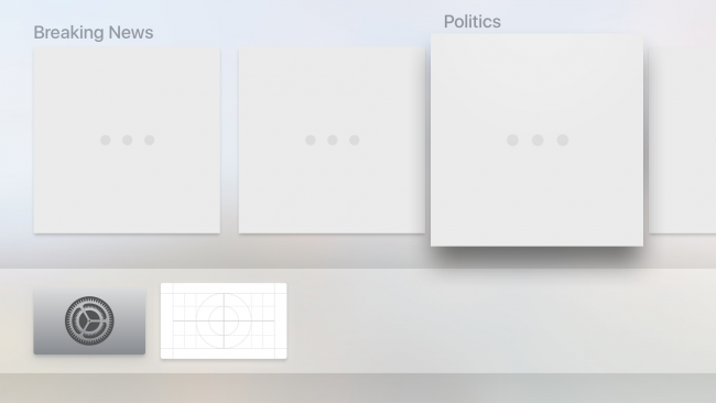
There are a lot of collisions going on — and a lot to handle! But now that you now know when collisions occur, you can add in one of the best parts of a game — winning! :]

Add the following to the bottom of physicsWorld(_:didBegin:):

// 1
if bashedCanNames.count == helper.canNodes.count {
  // 2
  if levelScene.rootNode.action(forKey: GameHelper.gameEndActionKey) != nil {
    levelScene.rootNode.removeAction(forKey: GameHelper.gameEndActionKey)
  }
 
  let maxLevelIndex = helper.levels.count - 1
 
  // 3
  if helper.currentLevel == maxLevelIndex {
    helper.currentLevel = 0
  } else {
    helper.currentLevel += 1
  }
 
  // 4
  let waitAction = SCNAction.wait(duration: 1.0)
  let blockAction = SCNAction.run { _ in
    self.setupNextLevel()
  }
  let sequenceAction = SCNAction.sequence([waitAction, blockAction])
  levelScene.rootNode.runAction(sequenceAction)
}

Here’s what’s going on above:

  1. If the number of bashed cans is the same as the number of cans in the level, we advance to the next level.
  2. This removes the old game end action
  3. Once the last level is complete, loop through the levels again since the game is based on getting the highest score.
  4. Load the next level after a short delay.

To get the contact delegate working for your level scene, add the following at the top of createScene():

levelScene.physicsWorld.contactDelegate = self

Finally add the following right after presentLevel():

func resetLevel() {
  // 1
  currentBallNode?.removeFromParentNode()
 
  // 2
  bashedCanNames.removeAll()
 
  // 3
  for canNode in helper.canNodes {
    canNode.removeFromParentNode()
  }
  helper.canNodes.removeAll()
 
  // 4
  for ballNode in helper.ballNodes {
    ballNode.removeFromParentNode()
  }
}

This helps to clear out the state being tracked while the player is in the middle of playing through a level. Here’s what’s going on:

  1. If there is a current ball, remove it.
  2. Remove all of the bashed can names used in the contact delegate.
  3. Loop through the can nodes and remove each can from its parent, then clear out the array.
  4. Remove each ball node from the scene.

You’ll need to call this function in a couple places. Add the following code at the top of presentLevel():

resetLevel()

Replace the blockAction used to move on to the next level inside physicsWorld(_:didBegin:) with the following:

let blockAction = SCNAction.run { _ in
  self.resetLevel()
  self.setupNextLevel()
}

Build and run your game; you can finally play through the game! Well, that is, if you can beat each level in just one throw:

Game Play Through

You can’t really expect every player to have the skill to finish a level with one ball. Your next job is to implement a HUD so the player will be able to see their score and remaining balls.

Improving the Gameplay

Add the following at the end of createScene():

levelScene.rootNode.addChildNode(helper.hudNode)

Now the player can see their score and track the remaining balls. You still need a way of checking whether you should dispense another ball, or end the game.

Add the following at the end of throwBall():

if helper.ballNodes.count == GameHelper.maxBallNodes {
  let waitAction = SCNAction.wait(duration: 3)
  let blockAction = SCNAction.run { _ in
    self.resetLevel()
    self.helper.ballNodes.removeAll()
    self.helper.currentLevel = 0
    self.helper.score = 0
    self.presentMenu()
  }
  let sequenceAction = SCNAction.sequence([waitAction, blockAction])
  levelScene.rootNode.runAction(sequenceAction, forKey: GameHelper.gameEndActionKey)
} else {
  let waitAction = SCNAction.wait(duration: 0.5)
  let blockAction = SCNAction.run { _ in
    self.dispenseNewBall()
  }
  let sequenceAction = SCNAction.sequence([waitAction, blockAction])
  levelScene.rootNode.runAction(sequenceAction)
}

This if statement handles the case of the player throwing their last ball. It gives them a grace period of three seconds so the final can or two can stubbornly roll off the shelf. Otherwise, once the player has thrown the ball, you dispense a new ball after a short delay to give them another chance at bashing some more cans! :]

One final improvement is to also show the player their highest score so they can brag about it to their friends!

Add the following to presentMenu(), right after helper.state = .tapToPlay:

helper.menuLabelNode.text = "Highscore: \(helper.highScore)"

That piece of code refreshes the menu’s HUD so that the player can view their highest score!

You’re all done! Build and run and see if you can beat your own high-score? :]

High Score

Where to Go From Here?

The final project for this tutorial can be found here.

You can take the SceneKit knowledge from this tutorial and add some rather clever and realistic throwing mechanics into your own game.

To further your knowledge of SceneKit, check out Apple’s developer videos covering SceneKit and its advances over time.

If you’d like to learn more about making 3D games with SceneKit and Swift, check out our book 3D iOS Games by Tutorials. The book teaches you everything you need to know to make 3D iOS games, by making a series of mini-games like this one, including games like Breakout, Marble Madness, and even Crossy Road. Check out the epic trailer below:

As an extra challenge, we encourage you to try and build some of your own levels. Try adding more than four cans and creating more challenging layouts. You simply need to add or edit the levels declared in createLevelsFrom(baseNode:).

We’d love you see what you can come up with — join the discussion below to comment, ask questions or share your ideas for improving this game. Feel free to post some bragging screenshots of those high-scores on Twitter too!

The post How to Make a Game Like Can Knockdown appeared first on Ray Wenderlich.


Readers’ App Reviews – September 2016

$
0
0

Review-2016-09-feature

September has been a great month:

  • We got iOS 10, with all its new goodies for us.
  • We got the brand new iPhone 7, which is such a powerhouse.
  • We got the iOS 10 Feast, with 10 books updated for Swift 3!

I can’t wait to see what you all do with that power. In the meantime, you guys have been busy, and have released tons of new apps this September.

I’ve tried out all the apps you sent to me and I’ve selected a few to share with you. As always, I don’t have time to write about them all, so make sure you check out the honorable mentions too.

This month we have:

  • The first wave of iMessage apps
  • An app for avid readers looking for more
  • Apps to help you get things done
  • And of course, much more!

Keep reading to see the the latest apps released by raywenderlich.com readers like you.

Short Stories

Shortstories
Short Stories is exactly what it sounds like: amazing short stories from tons of authors that you can read on the go.

Short Stories has an entire store of short stories ranging from free to a dollar, but most of them only cost a dime or less.

The store has summaries, biographies about the authors, average reading time, and a community rating. You can make your own profile to leave comments and ratings on stories in the store. And it will save your reading progress on individual stories.

All stories featured on the main page and saved in your library are available offline so you can easily read when you’re out and about.

Short Stories is a great addition for the readers out there. It’s nice to read some shorter stories without having to commit to a whole book.

Checkers for iMessage

Checkers

Checkers for iMessage is a promise delivered.

For those that don’t know, iMessage has opened up as an app platform in iOS 10. But its not just for stickers. There are a few great games out there and Checkers is one of them.

It couldn’t be easier to play. Just open an iMessage conversation with a friend. Tap on the iMessage apps button and open Checkers. It will start a new game and let you make the first move.

Then you send the message to your friend and they can make their move as well. There is nothing to sign up for, no GameCenter login. Its all just right there in iMessage: it couldn’t be easier!

Checkers for iMessage supports both 8 by 8 and 10 by 10 boards. You’re also able to choose if your game supports backward jumps. Download Checkers for iMessage today and give it a try.

1Wallet

1Wallet
The Wallet app on our iPhones has made tickets harder to lose, loyalty programs easier to participate in, and even paying for things easier and more secure than ever.

But what about all the businesses with loyalty programs behind the times still using their own loyalty cards you have to lug around or give up on? Thats where 1Wallet comes in.

1Wallet lets you convert your old physical loyalty cards into easy to use iOS Wallet cards. You simply snap a picture of the barcode, give it a name, and you’re ready to go.

You can even set a custom GPS location so the card appears automatically on your lockscreen when you’re in the store. And of course it works great with Apple Watch as well so you don’t even need to read in your pocket.

Tooth Frenzy

ToothFrenzy
Dirty Teeth, Pirates, an a Monkey. Three things you never expected together.

Tooth Frenzy is a unique, fun game all about cleaning up some dirty pirate teeth. When teeth are left alone on a treasure island, they decay into dirty pirates only interested in gold. Its up to a monkey with some magic tooth paste to clean em up and get them shining like new.

But don’t clean the few remaining clean teeth; if you scrub them too hard when they’re already clean, you’ll scrub em to the bone.

The magic paste is limited so use it sparingly. Oh, and make sure you collect your coins before the greedy crab does, you can use those for upgrades to help you clean more teeth!

Feed Hawk

FeedHawk
Feed Hawk makes it super easy to subscribe to an RSS feed for any website you’re visiting.

While you are visiting a website you’d like to subscribe to, tap the share sheet, right within Safari. Feed Hawk will look through the page and find the feed urls available to subscribe to.

If there are multiple feeds for websites that split their content, Feed Hawk will show you a list of choices before it subscribes you. Feed Hawk makes it so quick and painless to subscribe to new blogs in your favorite RSS reeder.

Feed Hawk works with Feed Wrangler, Feedbin, The Old Reader, NewsBlur, and more. Just sign in to your favorite feed aggregator and Feed Hawk will handle your subscriptions from there.

get-time

gettime
get-time is a powerful timer app that could change the way you manage timers on your phone.

get-time’s first big feature is supporting multiple timers. You can create multiple timers, save them for later use, and even have multiple timers running simultaneously. These timers work exactly like you expect counting down from your preset time.

But get-time doesn’t stop there. You can easily add time to a timer without stopping and restarting the timer. This is fantastic while you’re cooking and something needs to bake for just a couple more minutes.

get-time also supports Geolocation for starting and stoping timers. iCloud will sync your timers across devices. The app is universal for your iPad and iPhone. You can easily customize the theme and alarm sounds for your timers. get-time is a very powerful timer app, so if you’re tired of the basic timer on your phone, give it a try.

WhenLast?

WhenLast
When was the last time you replaced your air filters? How about the last time you checked your oil? WhenLast will make sure you don’t have to deal with these type of problems anymore.

WhenLast is a really simple app that keeps track of the last time you did things. It couldn’t be easier to use: just create the events you’d like to track and when one happens, open the app and tap it. WhenLast will reset the time and log that you performed the task.

Now the next time someone asks the last time you took out the trash, just check WhenLast and you’ll know exactly.

Emoji Kit

EmojiKit
There have been a flood of stickers for iMessage since iOS 10 dropped this month. But what if you could make your own stickers without having to open up Xcode? Now you can!

Emoji Kit allows you to snap photos and turn them into iMessage stickers right within iMessage. You can also crop, resize, and rotate your picture before turning it into a sticker.

Emoji kit also has a ton of add ons itself so you can dress up your new sticker with tears, hats, mustaches, and more. It couldn’t be easier to create your very own iMessage sticker from your own favorite moments.

Honorable Mentions

Every month I get way more submissions than I have time to write about. I download every app to try them out, but only have time to review a select few. I love seeing our readers through the apps submitted to me every month.

It’s not a popularity contest or even a favorite picking contest — I just try to share a snapshot of the community through your submissions. Please take a moment and try these other fantastic apps from readers like you.

Jackal
Mega Hasan
MediaCollection
Witcher Map Guide
Just Quiz – Concorsi Infermieri
Retro Formula 3D
AB The Game
Go Man United
Dump Trump – Make Messaging Great Again!
ChatBooster

Where To Go From Here?

Each month, I really enjoy seeing what our community of readers comes up with. The apps you build are the reason we keep writing tutorials. Make sure you tell me about your next one, submit here.

If you saw an app your liked, hop to the App Store and leave a review! A good review always makes a dev’s day. And make sure you tell them you’re from raywenderlich.com; this is a community of makers.

If you’ve never made an app, this is the month! Check out our free tutorials to become an iOS star. What are you waiting for – I want to see your app next month.

The post Readers’ App Reviews – September 2016 appeared first on Ray Wenderlich.

watchOS by Tutorials Updated for Swift 3 and watchOS 3

$
0
0

w2t-update-featureHappy Monday – it’s another iOS 10 Feast book release!

It’s been about a year since we released the first edition of watchOS by Tutorials, and the team has been working incredibly hard to bring you watchOS by Tutorials, Second Edition — fully updated for Swift 3, watchOS 3 and Xcode 8!

watchOS by Tutorials teaches you everything you need to know to develop your own apps for watchOS 3, including new features such as the Dock, CloudKit, Digital Crown access and more.

This will be a free update for existing watchOS by Tutorials customers — our way to say “thanks” to our readers for their support.

Don’t own watchOS by Tutorials yet? Read on to see how you can get a copy!

What is watchOS by Tutorials?

This book is for intermediate iOS developers who already know the basics of iOS and Swift development but want to learn how to make Apple Watch apps for watchOS 3.

Besides updating this book fully for Swift 3, we wanted to give you some real experience with the new API’s in watchOS 3 that we thought were critically important for anyone learning the platform. The full list of changes include:

  • Glances replaced by the Dock: Glances have been replaced by Dock, and apps in the Dock launch immediately as the operating system now keeps these apps in memory. There are several new APIs that help you configure the view of your app in the Dock. The Snapshot API and the Background Refresh API help you make sure that the content displayed is always up-to-date, while the Background Refresh API will also let you keep code running after the user drops her wrist.
  • CloudKit: CloudKit allows user to keep the watch and phone data in sync even when the phone isn’t around, as long as user is on a known WiFi network – this is a huge leap forward.
  • Richer interactions with Digital Crown and gesture recognizers: New in watchOS 3, you have access to raw Digital Crown data, and can add various gesture recognizers to your interfaces, such as swipe, tap, pan, and long press.
  • SpriteKit and SceneKit: SpriteKit and SceneKit are now available in watchOS 3. Although people generally think of them as game development frameworks, you can use them to design interactivity with lively animation into any kind of app.

watchOS by Tutorials is a whopping 27 chapters and 515 pages. Let’s take a quick look at what’s inside:

  • Chapter 1, Hello, Apple Watch!: Dive straight in and build your first watchOS app–a very modern twist on the age-old “Hello, world!” app.

bezelHello

  • Chapter 2, Designing Great Watch Apps: Apple has repeatedly emphasized glanceable, actionable, and responsive as the design goal of watchOS 3 apps. From icon design to the new interactivity APIs, make your apps stand out from the rest.
  • Chapter 3, Architecture: watchOS might support native apps, but they still have an unusual architecture. This chapter will teach you everything you need to know about this unique aspect of watch apps.
  • Chapter 4, UI Controls: There’s not a UIView to be found! In this chapter you’ll dig into the suite of interface objects that ship with WatchKit–watchOS’ user interface framework.

image32

  • Chapter 5, Pickers: WKInterfacePicker is the only programmatic way to work with the Digital Crown. You’ll learn how to set one up, what the different visual modes are, and how to respond to the user interacting with the Digital Crown via the picker.

finished

  • Chapter 6, Layout: Auto Layout? Nope. Springs and Struts then? Nope. Guess again. Get an overview of the layout system you’ll use to build the interfaces for your watchOS apps.

finished

  • Chapter 7, Tables: Tables are the staple ingredient of almost any watchOS app. Learn how to set them up, how to populate them with data, and just how much they differ from UITableView.
  • Chapter 8, Navigation: You’ll learn about the different modes of navigation available on watchOS, as well as how to combine them.

b6

  • Chapter 9, Digital Crown and Gesture Recognition: Explore the rich set of physical interactions with the Watch, including the Digital Crown, pan gestures, and force touch!
  • Chapter 10, Snapshot API: Glances are out, snapshots are in. Learn how to make your app appear in the new Dock — and update the icon dynamically!

new-display-name

  • Chapter 11, Background Refresh: Learn how the Watch keeps your app data refreshed behind the scenes.

image9

image11

  • Chapter 12, Animation: The way you animate your interfaces has changed in watchOS. You’ll learn everything you need to know about both animated image sequences and the new API in this chapter.
  • Chapter 13, CloudKit: Learn how to persist and retrieve data with CloudKit and keep your Watch and iPhone synchronized — even when they’re not in range of each other.

phone_to_watch_side_by_side

  • Chapter 14, Notifications: watchOS offers support for several different types of notifications, and allows you to customize them to the individual needs of your watch app. In this chapter, you’ll get the complete overview.

custom_dynamic_long_look_notification_bezel

  • Chapter 15, Complications: Complications are small elements that appear on the user’s selected watch face and provide quick access to frequently used data from within your app. This chapter will walk you through the process of setting up your first complication, along with introducing each of the complication families and their corresponding layout templates.

familyTypes

  • Chapter 16, Watch Connectivity: With the introduction of native apps, the way the watch app and companion iOS app share data has fundamentally changed. Out are App Groups, and in is the Watch Connectivity framework. In this chapter you’ll learn the basics of setting up device-to-device communication between the Apple Watch and the paired iPhone.

watch_to_phone_side_by_side

  • Chapter 17, Audio and Video: As a developer, you can now play audio and video on the Apple Watch. In this chapter, you’ll gain a solid understanding of how to implement this, as well as learn about some of the idiosyncrasies of the APIs, which are related to the unique architecture of a watch app.

final-watch

  • Chapter 18, Interactive Animations: Build a simple game that you can control with just your wrist — using SpriteKit and SceneKit.

final-notification

  • Chapter 19, Advanced Watch Connectivity: In earlier chapters, you learned how to set up a Watch Connectivity session and update the application context. In this chapter, you’ll take a look at some of the other features of the framework, such as background transfers and real-time messaging.

qr_phone_and_watch

  • Chapter 20, Advanced Complications: Now that you know how to create a basic complication, this chapter will walk you through adding Time Travel support, as well giving you the lowdown on how to efficiently update the data presented by your complication.

timeTravelAnimation

  • Chapter 21, Handoff: Want to allow your watch app users to begin a task on their watch and then continue it on their iPhone? Sure you do, and this chapter will show exactly how to do that through the use of Handoff.

handoff02

  • Chapter 22, Core Motion: The Apple Watch doesn’t have every sensor the iPhone does, but you can access what is available via the Core Motion framework. In this chapter, you’ll learn how to set up Core Motion, how to request authorization, and how to use the framework to track the user’s steps.

bezelDreamWalker

  • Chapter 23, HealthKit: The HealthKit framework allows you to access much of the data stored in user’s health store, including their heart rate! This chapter will walk you through incorporating HealthKit into your watch app, from managing authorization to recording a workout session.

Watch_ActiveWorkout_bez

  • Chapter 24, Core Location: A lot of apps are now location aware, but in order to provide this functionality you need access to the user’s location. With watchOS 3, developers now have exactly that via the Core Location framework. Learn everything you need to know about using the framework on the watch in this chapter.

bezel-01

  • Chapter 25, Haptic Feedback: The Taptic Engine in the Apple Watch allows apps to send taps to the wearers wrist, as a subtle and discreet way to communicate information or provide feedback. In this chapter, you’ll learn how to take advantage of the Taptic Engine to provide Haptic feedback to your users.

Watch_ResultsTop_bezel

bezel

  • Chapter 26, Localization: Learn how to expand your reach and grow a truly international audience by localizing your watch app using the tools and APIs provided by Apple.

bezel-4

  • Chapter 27, Accessibility: You want as many people as possible to enjoy your watch app, right? Learn all about the assistive technologies available in watchOS, such as VoiceOver and Dynamic Type, so you can make your app just as enjoyable for those with disabilities as it is for those without.

bezel

One thing you can count on: after reading this book you’ll have all the experience necessary to build rich and engaging apps for the Apple Watch platform.

About the Authors

Of course, our book would be nothing without our team of experienced and dedicated authors:

ScottScott Atkinson is a software developer in Alexandria, Virginia. USA. For a day job, Scott is the iOS developer for Homesnap, a really great real estate discovery app. When he’s not developing, Scott rows on the Potomac River, explores new restaurants and cooks great food.

SoheilSoheil Azarpour is an engineer, developer, author, creator, husband and father. He enjoys bicycling, boating and playing the piano. He lives in Merrimack, NH, and creates iOS apps both professionally and independently.

MatthewMatthew Morey is an engineer, author, hacker, creator and tinkerer. As an active member of the iOS community and Director of Mobile Engineering at MJD Interactive he has led numerous successful mobile projects worldwide. When not developing apps he enjoys traveling, snowboarding, and surfing. He blogs about technology and business at matthewmorey.com.

BenBen Morrow delights in discovering the unspoken nature of the world. He’ll tell you the surprising bits while on a walk. He produces beauty by drawing out the raw wisdom that exists within each of us.

RyanRyan Nystrom is an iOS Engineer at Instagram and passionate open source contributor for both Facebook and his personal work. In his free time, Ryan enjoys flying planes as a private pilot. You can reach Ryan on Twitter at @_ryannystrom.

AudreyAudrey Tam retired in 2012 from a 25yr career as a computer science academic. Her teaching included many programming languages, as well as UI design and evaluation. Before moving to Australia, she worked on Fortran and PL/1 simulation software at IBM. Audrey now teaches iOS app development to non-programmers.

JackJack Wu has built dozens of iOS apps and enjoys it very much. Outside of work, Jack enjoys coding on the beach, coding by the pool, and sometimes just having a quick code in the park.

Free watchOS Chapters this Week

To help celebrate the launch, we’re going to open up the book and share three free chapters with you this week! This will give you a chance to check out the book — we’re confident you’ll love it! :]

Where To Go From Here?

watchOS by Tutorials, Second Edition is now 100% complete, fully updated for Swift 3, watchOS 3 and Xcode 8 — and available today.

  • If you’ve already bought watchOS by Tutorials, you can download the new book immediately on your My Loot page.
  • If you don’t have watchOS by Tutorials yet, you can grab your own copy in our store.

You can get 10% off on this book — or anything else in our store — with the code IOS10FEAST.

Speaking of which, be sure to check out everything we’re offering this year in the iOS 10 Feast, including $40,000 in giveaways!

To enter, simply retweet this post with the #ios10feast hashtag using the button below:


We hope you enjoy this massive free update, and stay tuned for more book releases and updates coming soon!

The post watchOS by Tutorials Updated for Swift 3 and watchOS 3 appeared first on Ray Wenderlich.

CareKit Tutorial for iOS: Part 1

$
0
0
CareKit tutorial

Learn how easy it is to build a personal health app with CareKit!

In a zombie apocalypse (or any other time, really) there’s nothing as important as health. Thankfully we have CareKit, an open source framework designed for building iOS apps that help users manage and understand their personal health. CareKit apps help users create and follow health plans, track progress, analyze the resulting data and even share that data with care providers.

Thanks to Apple’s continued interest in improving personal health with open source software, along with the health tracking capabilities of the iPhone and Apple Watch, it’s never been easier to put together an app that can have a powerful impact on the lives of many people!

In this CareKit tutorial, you’ll leverage CareKit in an app aimed at users trying to stay infection-free during a zombie apocalypse. You’ll create a care plan consisting of treatments to minimize risk and assessments to track signs of infection. You’ll also learn how integrating ResearchKit and HealthKit can make CareKit much more powerful.

If you’re unfamiliar with ResearchKit tasks, you may benefit from reviewing our ResearchKit tutorial before starting.

In Part 1 of the CareKit tutorial you’ll work on Zombie Training and Symptom Tracker; Part 2 will cover Insights and Connect.

Grab some … err … your brains, and let’s dive in!

Getting Started

Download the ZombieKit starter project and open it in Xcode. This contains a stubbed-out Tab Bar Controller, ResearchKit and HealthKit, plus a few helpers you’ll learn about during this CareKit tutorial.

Build and run ZombieKit to see the placeholder Tab Bar Controller in all its glory.

CareKit tutorial

Note: The ResearchKit build in this starter is a pre-release version with Swift 3 support. As a result, you’ll see a few compile warnings on the ResearchKit target. Don’t worry about them—they won’t impact your work in this tutorial.

First, add the CareKit framework to your project. Head over to the CareKit repository on GitHub and download the stable_xcode80_candidate zip or clone that branch using the following terminal command:

git clone -b stable_xcode80_candidate --recurse-submodules https://github.com/carekit-apple/carekit.git
Note: As of this writing, stable_xcode80_candidate is your best bet for CareKit with Swift 3 and Xcode 8 compatibility. You’ll want to use stable, once Swift 3 changes make it there.

Drag the downloaded CareKit.xcodeproj from Finder into the Project Navigator under the Linked Frameworks group. It should look like this:

CareKit tutorial

Note: Don’t try to add a framework to a project while another Xcode project using that framework is open, because it won’t properly import. If your end result doesn’t look like the screenshot, close any other open projects and try again.

Select the ZombieKit target, then the General tab of the target editor. Add CareKit.framework under the Embedded Binaries section.

CareKit tutorial

To confirm that you’ve successfully added CareKit to the project, add the following to the top of TabBarViewController.swift:

import CareKit

Build and run. If the project builds successfully, you’re all set!

CareKit tutorial

Anatomy of a CareKit App

Functionally, CareKit consists of four main UI modules:

  1. Care Card defines and tracks actions meant to positively impact the user’s health. For example, a weight loss app might track minutes spent exercising each day.
  2. Symptom and Measurement Tracker defines and tracks symptoms or vitals. For instance, that weight loss app would track your weight each day.
  3. Insights allows you to chart the collected data as well as present written alerts or findings. The weight loss app could chart exercise against weight to help visualize the correlation.
  4. Connect enables communication with care providers and friends. The chart showing weight loss compared to exercise efforts could, for example, be put into PDF format and emailed to your physician.
Note: Remember, you’ll only work on Care Card and Symptom and Measurement Tracker in Part 1 of this CareKit tutorial. You’ll add Insights and Connect modules in Part 2.

Care Plan Store

The core of a CareKit app is the Care Plan Store, which manages and provides an interface to a database that persists the care plan. Its data are mapped to any connected Care Card and Symptom and Measurement Tracker controllers. When information is entered in views owned by these controllers, the Care Plan Store automatically picks it up.

The store handles two primary data types you’ll use throughout this CareKit tutorial:

  • Activities represent the activities users will perform to manage their care and track their condition. These are often referred to collectively as the care plan.
  • Events represent an individual occurrence of a scheduled activity. They are made up of the activity itself along with scheduling data, completion status and results when applicable.

Activities are further broken down into two types:

  • Intervention Activities are actions users take as part of their treatment. They appear on the Care Card.
  • Assessment Activities represent activities users take within the app to evaluate their health. These appear on the Symptom and Measurement Tracker.

You might have noticed that the Connect module wasn’t mentioned in the store. It actually doesn’t live there; instead, it’s up to you to persist OCKContact objects on your own.

The below chart shows the flow of information between the store, your contacts and the primary UI modules:

CareKit tutorial

Now that you’ve got the basics down, it’s time to set up the Care Plan Store so it persists training and tracking data in ZombieKit. Open CarePlanStoreManager.swift and replace import Foundation with:

import CareKit

You’ll use CareKit in this file, and it already includes Foundation.

Add the following property to the top of the CarePlanStoreManager class:

var store: OCKCarePlanStore

Next, add the following inside init(), just above super.init():

store = OCKCarePlanStore(persistenceDirectoryURL: storeURL)

This creates a Care Plan Store at storeURL in your documents directory. Note that the starter project includes a type property singleton called sharedCarePlanStoreManager—this allows you to access the store from anywhere in ZombieKit.

Build and run to confirm a successful build. You won’t notice any differences until you add data and start hooking up CareKit controllers.

CareKit tutorial

Care Card

In a zombie apocalypse, your users need to stay sharp. A great first step is to define a training plan and track adherence to it. CareKit has just the thing you need—the Care Card!

Open TabBarViewController.swift and add the following property to the top of the TabBarViewController class:

fileprivate let carePlanStoreManager = CarePlanStoreManager.sharedCarePlanStoreManager

This provides a pointer to the store you created in CarePlanStoreManager.

Find createCareCardStack() and replace this line:

let viewController = UIViewController()

With this:

let viewController = OCKCareCardViewController(carePlanStore: carePlanStoreManager.store)
viewController.maskImage = UIImage(named: "heart")
viewController.smallMaskImage = UIImage(named: "small-heart")
viewController.maskImageTintColor = UIColor.darkGreen()

This initializes an OCKCareCardViewController, the main controller for the Care Card, and passes a Care Plan Store to act as the data source. You also set the maskImage, smallMaskImage and maskImageTintColor with images and colors from the starter project that help zombify the look of the progress indicator. If these aren’t set, the Care Card progress image defaults to a red heart with red fill.

Build and run—your Care Card should show a header with weekly navigation and progress as well as a detail view with a larger progress indicator. Right now both show 100% because you’ve completed 100% of your non-existent Intervention Activities. You’re great at doing nothing!

CareKit tutorial

Preparing Care Plan Data

Now you need to generate some care plan data, which will require a bit of setup. Select the Care Plan Store group in the Project Navigator and select File\New\File…, then choose the iOS\Source\Swift File template and click Next. Name the file CarePlanData.swift and click Create. In the new file, replace the template code with the following:

import CareKit
 
enum ActivityIdentifier: String {
  case cardio
  case limberUp = "Limber Up"
  case targetPractice = "Target Practice"
  case pulse
  case temperature
}
 
class CarePlanData: NSObject {
  let carePlanStore: OCKCarePlanStore
 
  init(carePlanStore: OCKCarePlanStore) {
    self.carePlanStore = carePlanStore
 
    //TODO: Define intervention activities
 
    //TODO: Define assessment activities
 
    super.init()
 
    //TODO: Add activities to store
  }
}

This code creates an enum, ActivityIdentifier, that will provide unique identifiers for intervention and assessment activities. It then defines a stubbed-out CarePlanData class which will be tasked with defining activities and adding them to the data store. Its initializer currently grabs a reference to OCKCarePlanStore for this purpose.

To initialize an OCKCarePlanActivity to define an activity, you need to provide a schedule minimally defining a start date and frequency. Add the following to CarePlanData just below the properties:

class func dailyScheduleRepeating(occurencesPerDay: UInt) -> OCKCareSchedule {
  return OCKCareSchedule.dailySchedule(withStartDate: DateComponents.firstDateOfCurrentWeek,
                                       occurrencesPerDay: occurencesPerDay)
}

This method calls the convenience initializer dailySchedule(withStartDate:occurrencesPerDay:), which creates an OCKCareSchedule with the given start date and number of daily occurrences. For the start date, you’re using NSDateComponents.firstDateOfCurrentWeek which is a computed property included with the starter project. This will generate results to cover the current week.

Intervention Activities

Now you’re ready to create some intervention activities. Replace //TODO: Define intervention activities with:

let cardioActivity = OCKCarePlanActivity(
  identifier: ActivityIdentifier.cardio.rawValue,
  groupIdentifier: nil,
  type: .intervention,
  title: "Cardio",
  text: "60 Minutes",
  tintColor: UIColor.darkOrange(),
  instructions: "Jog at a moderate pace for an hour. If there isn't an actual one, imagine a horde of zombies behind you.",
  imageURL: nil,
  schedule:CarePlanData.dailyScheduleRepeating(occurencesPerDay: 2),
  resultResettable: true,
  userInfo: nil)
 
let limberUpActivity = OCKCarePlanActivity(
  identifier: ActivityIdentifier.limberUp.rawValue,
  groupIdentifier: nil,
  type: .intervention,
  title: "Limber Up",
  text: "Stretch Regularly",
  tintColor: UIColor.darkOrange(),
  instructions: "Stretch and warm up muscles in your arms, legs and back before any expected burst of activity. This is especially important if, for example, you're heading down a hill to inspect a Hostess truck.",
  imageURL: nil,
  schedule: CarePlanData.dailyScheduleRepeating(occurencesPerDay: 6),
  resultResettable: true,
  userInfo: nil)
 
let targetPracticeActivity = OCKCarePlanActivity(
  identifier: ActivityIdentifier.targetPractice.rawValue,
  groupIdentifier: nil,
  type: .intervention,
  title: "Target Practice",
  text: nil,
  tintColor: UIColor.darkOrange(),
  instructions: "Gather some objects that frustrated you before the apocalypse, like printers and construction barriers. Keep your eyes sharp and your arm steady, and blow as many holes as you can in them for at least five minutes.",
  imageURL: nil,
  schedule: CarePlanData.dailyScheduleRepeating(occurencesPerDay: 2),
  resultResettable: true,
  userInfo: nil)

This code allocates three OCKCarePlanActivity objects of type intervention, which correlate to your Care Card. Each has a unique identifier based on your enum along with the title, instructions, tint color and schedule created with the helper. Soon you’ll be able to view where each of these fields map.

To get the activities to appear in your Care Card View Controller, add them to the store by adding the following method to the bottom of CarePlanData:

func add(activity: OCKCarePlanActivity) {
  // 1
  carePlanStore.activity(forIdentifier: activity.identifier) {
    [weak self] (success, fetchedActivity, error) in
    guard success else { return }
    guard let strongSelf = self else { return }
    // 2
    if let _ = fetchedActivity { return }
 
    // 3
    strongSelf.carePlanStore.add(activity, completion: { _ in })
  }
}

What this code does:

  1. You call activity(forIdentifier:completion:) to search the store for an activity with the given identifier. This is required to avoid inserting items with duplicate identifiers.
  2. If the fetch is successful, fetchedActivity unwraps; since there’s nothing to add, you return.
  3. If the identifier didn’t exist, you call add(_:completion:) on the store to add the activity to the carePlanStore.

Now you can use that code to add each of the activities you defined. Back in init(carePlanStore:), replace //TODO: Add activities to store with:

for activity in [cardioActivity, limberUpActivity, targetPracticeActivity] {
                  add(activity: activity)
}

This iterates through the activities you defined and adds each one to the store.

You need to initialize this data class so the process to add data to the store will begin, so head over to TabBarViewController.swift and add the following property at the top of TabBarViewController:

fileprivate let carePlanData: CarePlanData

Now add the following to init(coder:), before the call to super:

carePlanData = CarePlanData(carePlanStore: carePlanStoreManager.store)

This kicks off the initialization you wrote for CarePlanData that adds activities to the store.

Note: Hard-coding activities will likely be used in some cases, but many CareKit apps will take other routes. Plans might be generated dynamically based on responses to a guided tour or derived from curated health plans maintained on a web service.

Build and run—you’ve got yourself a zombie apocalypse training plan! Tap any bubble to fill it in, indicating you’ve completed one instance (or event) of the activity, and Care Completion updates accordingly. Tap elsewhere on the cell to see the instructions you provided for that activity.

CareKit tutorial

After a modest amount of code, mostly to seed the data source, you now have a UI that displays and updates persisted Care Card data. That’s great news for your zombie-apocalypse users!

Symptom and Measurement Tracker

Now that your users have a plan to avoid infection, it’s time to tackle symptom tracking to monitor their zombie status.

While the Care Card tracks actions taken to improve or maintain a condition, the Symptom and Measurement Tracker monitors progress. For ZombieKit, that means checking for signs of infection—or (un)death.

In TabBarViewController.swift, add the following property to the others at the top of TabBarViewController:

fileprivate var symptomTrackerViewController: OCKSymptomTrackerViewController? = nil

You’ll need a reference to the OCKSymptomTrackerViewController, as it will be used throughout this class.

In createSymptomTrackerStack(), replace:

let viewController = UIViewController()

with the following:

let viewController = OCKSymptomTrackerViewController(carePlanStore: carePlanStoreManager.store)
viewController.progressRingTintColor = UIColor.darkGreen()
symptomTrackerViewController = viewController

This initializes your OCKSymptomTrackerViewController while providing its datasource, the Care Plan Store. You also set the progressRingTintColor, which optionally colors the progress indicator. Finally, you store the reference in symptomTrackerViewController for use elsewhere.

Build and run, and check out the Symptom Tracker tab. Similarly to the Care Card, you’ll see a weekly and detail progress indicator, currently set to 100% due to your lack of activities.

CareKit tutorial

Assessment Activities

As you might have guessed, it’s time to eat some brai … Rather, it’s time to add some assessment activities to the store!

Open CarePlanData.swift and head over to init(carePlanStore:). Replace the line //TODO: Define assessment activities with the following:

let pulseActivity = OCKCarePlanActivity
  .assessment(withIdentifier: ActivityIdentifier.pulse.rawValue,
                            groupIdentifier: nil,
                            title: "Pulse",
                            text: "Do you have one?",
                            tintColor: UIColor.darkGreen(),
                            resultResettable: true,
                            schedule: CarePlanData.dailyScheduleRepeating(occurencesPerDay: 1),
                            userInfo: ["ORKTask": AssessmentTaskFactory.makePulseAssessmentTask()])
 
let temperatureActivity = OCKCarePlanActivity
  .assessment(withIdentifier: ActivityIdentifier.temperature.rawValue,
                            groupIdentifier: nil,
                            title: "Temperature",
                            text: "Oral",
                            tintColor: UIColor.darkYellow(),
                            resultResettable: true,
                            schedule: CarePlanData.dailyScheduleRepeating(occurencesPerDay: 1),
                            userInfo: ["ORKTask": AssessmentTaskFactory.makeTemperatureAssessmentTask()])

You’ve defined two OCKCarePlanActivity objects—one for pulse and one for temperature—using a convenience initializer that creates assessment activities. This required a couple parameters not used in the intervention activities created earlier:

  1. resultResettable takes a Boolean that indicates whether the user can re-take the assessment. When turned off, once data is entered, there’s no covering it up if you’re a zombie.
  2. You place a dictionary in userInfo with the key "ORKTask". The value is a ResearchKit task (ORKTask) created by calling factory methods provided in AssessmentTaskFactory, a struct included with the starter project. CareKit can leverage ResearchKit tasks for obtaining health data, and you’ll see shortly how these tasks are used when the user completes an assessment.

At the bottom of init(carePlanStore:), add your new tasks to the array you loop through when calling addActivity(). It should now look like this:

for activity in [cardioActivity, limberUpActivity, targetPracticeActivity,
                 pulseActivity, temperatureActivity] {
                  add(activity: activity)
}

Build and run, and your new activities will appear in the Symptom Tracker tab. You’re now at 0% progress, because you haven’t completed either assessment yet. Note that as long as it isn’t the first day of the week, you can select and view prior days. Future days are never selectable.
CareKit tutorial

There’s no putting it off—you might as well check to see if you’ve become a zombie. Select one of the assessments and … nothing happens!

CareKit tutorial

Handling Input

On the Care Card, intervention activities have a binary input—the user simply taps an event on or off to indicate if it occurred. Assessments are more versatile; they can capture all types of data and thus require a variety of user interfaces. For this reason, you’re required to provide a view controller to handle assessment input.

ResearchKit provides a number of options for handling input of health data, and CareKit is designed to work well with them. As you may recall from the ResearchKit with Swift tutorial, input is gathered with ORKTaskViewController objects which require ORKTask objects. You’ve already bundled a task in the userInfo of your assessment object—now it’s time to use it.

Open TabBarViewController.swift and add the following to the bottom of the file:

// MARK: - OCKSymptomTrackerViewControllerDelegate
extension TabBarViewController: OCKSymptomTrackerViewControllerDelegate {
  func symptomTrackerViewController(_ viewController: OCKSymptomTrackerViewController,
                                    didSelectRowWithAssessmentEvent assessmentEvent: OCKCarePlanEvent) {
    guard let userInfo = assessmentEvent.activity.userInfo,
      let task: ORKTask = userInfo["ORKTask"] as? ORKTask else { return }
 
    let taskViewController = ORKTaskViewController(task: task, taskRun: nil)
    //TODO: Set a delegate
 
    present(taskViewController, animated: true, completion: nil)
  }
}

The Symptom and Measurement Tracker view controller requires an OCKSymptomTrackerViewControllerDelegate that must implement symptomTrackerViewController(_:didSelectRowWithAssessmentEvent:). This method is required to present a view controller for obtaining assessment data. It unwraps the ORKTask you stored in userInfo and uses that to initialize an ORKTaskViewController, then present it.

Hop back up to createSymptomTrackerStack() and add the following just after viewController is allocated:

viewController.delegate = self

This sets the TabBarViewController as the delegate, which means the extension you just defined will be used when an assessment is selected.

Build and run, then head to the Symptom Tracker tab. Select either Pulse or Temperature and…you’ll get a crash. If you look in the console, there will be a message similar to this:

*** Terminating app due to uncaught exception 'NSInvalidArgumentException', reason: 'NSHealthShareUsageDescription must be set in the app's Info.plist in order to request read authorization.'

This is because ResearchKit tasks rely on HealthKit, and you haven’t yet enabled that capability. You’ll get to that in a bit, but for now you need to add the plist entry to appease this check.

Open Info.plist within ZombieKit and add the NSHealthShareUsageDescription key with the value I want to obtain your pulse and temperature data because zombies:

Screen Shot 2016-09-24 at 1.19.09 PM

You’ll access HealthKit data later in this tutorial, at which point the user will be prompted for authorization including the description you just provided.

Build and run, and once again select Pulse or temperature on the Symptom Tracker tab. Your ResearchKit controller now presents data from the task factory.

Note: In the console, you might see a warning beginning with [ResearchKit][Warning]. This is because ResearchKit wants to check HealthKit for the data, and you haven’t set that up yet.

CareKit tutorial

If you try to hit Done or Cancel then End Task, nothing happens. This is because an ORKTaskViewController requires a delegate callback to handle its results. Back in TabBarViewController.swift, add the following at the bottom of the file:

// MARK: - ORKTaskViewControllerDelegate
extension TabBarViewController: ORKTaskViewControllerDelegate {
  func taskViewController(_ taskViewController: ORKTaskViewController, didFinishWith
    reason: ORKTaskViewControllerFinishReason, error: Error?) {
    // 1
    defer {
      dismiss(animated: true, completion: nil)
    }
 
    // 2
    guard reason == .completed else { return }
    guard let symptomTrackerViewController = symptomTrackerViewController,
      let event = symptomTrackerViewController.lastSelectedAssessmentEvent else { return }
    //TODO: convert ORKTaskResult to CareKit result and add to store
  }
}
  1. This dismisses the task view controller in a defer block that will execute after handling the results.
  2. Upon successful completion, you unwrap symptomTrackerViewController.lastSelectedAssessmentEvent to gain access to the event tied to the task that triggered the current task flow. In a moment, you’ll use this reference to save the results to the store.

You can’t simply save a ResearchKit task result into CareKit—you need to first convert it. Open CarePlanStoreManager.swift and import ResearchKit:

import ResearchKit

Then add the following method to CarePlanStoreManager:

func buildCarePlanResultFrom(taskResult: ORKTaskResult) -> OCKCarePlanEventResult {
  // 1
  guard let firstResult = taskResult.firstResult as? ORKStepResult,
    let stepResult = firstResult.results?.first else {
      fatalError("Unexepected task results")
  }
 
  // 2
  if let numericResult = stepResult as? ORKNumericQuestionResult,
    let answer = numericResult.numericAnswer {
    return OCKCarePlanEventResult(valueString: answer.stringValue, unitString: numericResult.unit, userInfo: nil)
  }
 
  // 3
  fatalError("Unexpected task result type")
}

This converts a ResearchKit result into a CareKit result.

  1. The ORKTaskResults you created have a single step, so you pull the first and only one into firstResult. Next you grab the first and only question result of this step, which will contain the data you collected.
  2. You cast the result as a ORKNumericQuestionResult, which is the only result type your tasks collect. You then grab the answer and pass it as the value when creating and returning an OCKCarePlanEventResult.
  3. Remember that you only call this method when a task successfully completes, so if it doesn’t contain a value, you’re simply failing.

Return to TabBarViewController.swift and replace //TODO: convert ORKTaskResult to CareKit result and add to store with:

let carePlanResult = carePlanStoreManager.buildCarePlanResultFrom(taskResult: taskViewController.result)
carePlanStoreManager.store.update(event, with: carePlanResult, state: .completed) {
  success, _, error in
  if !success {
    print(error?.localizedDescription)
  }
}

This passes your ResearchKit task result to buildCarePlanResultFrom(taskResult:) and gets back an OCKCarePlanEventResult. You pass that carePlanResult along with the current event to update(:_with:state:completion:) to commit it to the store. You print an error message if it was unsuccessful.

Finally, head back to symptomTrackerViewController(_:didSelectRowWithAssessmentEvent:) and replace //TODO: Set a delegate with:

taskViewController.delegate = self

Now when the user submits a completed ResearchKit task, your new delegate method will be invoked to convert and save it.

Build and run. Now when you complete an assessment, the task controller will dismiss, your care store will update, and the symptom tracker will update to reflect changes to the completion percent and recorded value.

CareKit tutorial

Note: You’ll likely want to employ local notifications to notify users when it’s time to complete an activity. To learn more about creating local notifications, check out the Local and Remote Notification Programming Guide from Apple.

HealthKit Integration

As you’ve seen, CareKit is able to leverage ResearchKit to gather health data. Both of these frameworks also work closely with HealthKit, which makes it easy to access, transform and store health data. This enables powerful flows such as CareKit obtaining a pulse from HealthKit, which may have passively collected it from an Apple Watch or other device.

Because you’re already using ResearchKit to gather this data, enabling the option to pull from HealthKit is as trivial as enabling HealthKit in your project. Just be warned—there’s no hiding the fact that you’re a zombie from your Watch. :]

First, select the ZombieKit target, then the General tab. Set the bundle identifier to match your domain or naming convention, then select the Team associated with your development account. This is necessary so that Xcode can create an App ID with the appropriate entitlement.

CareKit tutorial

With the target still selected, switch to the Capabilities tab. Flip the switch for HealthKit to enable it for your newly created app ID.

Select ResearchKit.xcodeproj from the Linked Frameworks group, then the ResearchKit target. Set your team here for this target as well.

Build and run, select the Symptom Tracker tab, and attempt one of the assessments. You will now see a prompt requesting HealthKit access, with the message you defined earlier, before the task controller is displayed. And if you’re running on a device that has pulse or temperature data stored, you’ll see the most recent reading automatically populate!

Note: In the console, you may see a warning about Unbalanced calls to begin/end appearance transitions. This is a known ResearchKit issue that occurs on the automatic display of the initial permission request view controller. Unfortunately, it’s built into the ResearchKit framework, so it can’t be avoided.
HealthKit Permission Prompt

HealthKit Permission Prompt

CareKit tutorial

Data populated from HealthKit!

Note: While it’s out of the scope of this CareKit tutorial, you could and likely would want to save assessment data to HealthKit. Since CareKit data is sandboxed within your app, saving it to HealthKit is your best bet for sharing with other apps. For more info, check out Sharing Data with HealthKit.

Where To Go From Here?

Download the completed code for this CareKit tutorial here. Note that the final project does not have HealthKit enabled, since doing so requires access to your developer account. If you want to skip to the final project and wish to see HealthKit, follow the quick config steps in the HealthKit Integration section above.

To learn about more ResearchKit tasks you can leverage for assessments, check out ResearchKit Tutorial with Swift: Getting Started and Accessing Heart Rate Data for Your ResearchKit Study. You can also review HealthKit Tutorial with Swift: Getting Started for a refresher on working with HealthKit.

Stay tuned for Part 2 of this series, where you’ll build on ZombieKit to visualize the collected data via Insights and share it using Connect.

We hope you enjoyed the CareKit tutorial and feel empowered to help people take control of their health. Please join the discussion about this CareKit tutorial and the coming zombie apocalypse below!

The post CareKit Tutorial for iOS: Part 1 appeared first on Ray Wenderlich.

CareKit Tutorial for iOS: Part 2

$
0
0
CareKit tutorial

Insights, Connect, and … Brains?

Welcome to the second and final installment of our CareKit Tutorial series. Now with more zombies!

In Part 1, you learned that CareKit primarily consists of four UI modules and a persistence store. You built an app called ZombieKit and implemented the Care Plan Store, a Care Card and a Symptom and Measurement Tracker.

In this second half of the CareKit tutorial, you’ll build on ZombieKit by implementing the last two UI modules:

  • Insights will be used to visualize patterns in the data collected by the Care Card and the Symptom and Measurement Tracker.
  • Connect will allow you to display contacts involved in the user’s care plan and share data with them.

Insights will require lots of asynchronous calls to read from the Care Plan Store. If you don’t have much experience with multithreading, Grand Central Dispatch and especially Dispatch Groups, consider reading Grand Central Dispatch Tutorial Part 1 and Part 2 before proceeding.

You’ll pick up exactly where you left off, so open up your completed project from Part 1, or download the Part 1 final project.

Note: If you download the final project, you’ll optionally need to enable HealthKit, because access to your development account is required for that. Follow the instructions under HealthKit Integration in Part 1.

Time to re-join the fray and try to code away the zombie epidemic!

Insights

In Part 1, you learned that OCKCarePlanActivity is the primary model object in the Care Plan Store, representing user activities and everything needed to display them. Each occurrence of an activity is defined by an OCKCarePlanEvent, and data are persisted to the Care Plan Store as events are completed.

Insights help the user make conclusions from the data. Two output formats are supported:

  • Charts: CareKit currently only supports bar charts, which can be grouped for comparing data and visualizing patterns. In a weight-loss app, you’d likely chart adherence to exercise goals against weight to visualize the correlation over time.

    CareKit tutorial

  • Messages: These are simple views with a title and some detail text that come as either tips or alerts. The only difference between the types is the appearance of the icon by the message title. For the weight-loss app, you might include an alert informing the user if they are missing their goal.

    CareKit tutorial

Insights reads from Intervention and Assessment activities in the store. However, while it’s designed to work with CareKit, Insights can display any data you like.

CareKit tutorial

Insights View Controller

Users of ZombieKit should be able to track their training adherence against their vital signs to judge how successful their care plan is. You’ll start by getting the Insights controller going with something simple.

Create a new file named OCKInsightItem.swift in the Utilities group. Replace the template code with the following:

import CareKit
 
extension OCKInsightItem {
  static func emptyInsightsMessage() -> OCKInsightItem {
    let text = "You haven't entered any data, or reports are in process. (Or you're a zombie?)"
    return OCKMessageItem(title: "No Insights", text: text,
                          tintColor: UIColor.darkOrange(), messageType: .tip)
  }
}

You’ve extended OCKInsightItem, the base class from which message and chart insights inherit. emptyInsightsMessage() creates and returns an OCKMessageItem. It includes a placeholder title and message and uses a tip messageType, which places a tinted asterisk by the title.

Open TabBarViewController.swift and add the following to the properties in TabBarViewController:

fileprivate var insightsViewController: OCKInsightsViewController? = nil

OCKInsightsViewController is the main controller for Insights, and you’ll reference it throughout this file.

In createInsightsStack(), replace:

let viewController = UIViewController()

with:

let viewController = OCKInsightsViewController(insightItems: [OCKInsightItem.emptyInsightsMessage()],
                                               headerTitle: "Zombie Check", headerSubtitle: "")
insightsViewController = viewController

The initializer for OCKInsightsViewController requires an array of OCKInsightItem objects, so you wrap the result of OCKInsightItem.emptyInsightsMessage() in an array. You also provide a headerTitle to appear at the top of the Insight view. Finally, you save a reference to the controller in insightsViewController for later use.

Build and run, then check out the Insights tab to see the header text and your placeholder tip.

CareKit tutorial

Contrary to the name, this isn’t all that insightful yet. It’s time to get your survivor’s data in here!

Completion Data

To generate meaningful insight items, you’ll gather and process data from the Care Plan Store. Start by calculating what percentage of the training plan was completed each day.

Create a new file named InsightsDataManager.swift in the Care Plan Store group. Replace the template code with:

import CareKit
 
class InsightsDataManager {
  let store = CarePlanStoreManager.sharedCarePlanStoreManager.store
  var completionData = [(dateComponent: DateComponents, value: Double)]()
  let gatherDataGroup = DispatchGroup()
}

InsightsDataManager is responsible for pulling data from the Care Plan Store and generating insights from it. You’ve defined the following properties:

  • store references your Care Plan Store.
  • completionData is an array of tuples tying a date to its corresponding intervention completion value.
  • gatherDataGroup is a dispatch group you’ll use to control the order in which several asynchronous operations complete during data processing.

Next, add the following method:

func fetchDailyCompletion(startDate: DateComponents, endDate: DateComponents) {
  // 1
  gatherDataGroup.enter()
  // 2
  store.dailyCompletionStatus(
    with: .intervention,
    startDate: startDate,
    endDate: endDate,
    // 3
    handler: { (dateComponents, completed, total) in
      let percentComplete = Double(completed) / Double(total)
      self.completionData.append((dateComponents, percentComplete))
    },
    // 4
    completion: { (success, error) in
      guard success else { fatalError(error!.localizedDescription) }
      self.gatherDataGroup.leave()
  })
}

This calculates the percentage of Intervention events completed for each day in the specified date range.

  1. Before kicking off the query, you enter the gatherDataGroup dispatch group. Later in this tutorial, you’ll add additional queries that will occur concurrently with this one—the group allows you to track when they all complete.
  2. You have the Care Plan Store method dailyCompletionStatus(with:startDate:endDate:handler:completion:) query all intervention activities in the date range for completion data.
  3. The handler closure is called once for each day in the range, and is passed several pieces of information pertaining to that day: dateComponents has the date, completed is a count of events that were completed on that date and total is a count of events in any state. From this, you calculate the daily completion percentage and save it with the date in completionData.
  4. The completion closure is called after all days in the range return. You halt execution in the case of a failure. On success, you leave the gatherDataGroup which will later clear the way for insight creation to proceed.

To control the flow of data collection through insight creation, add the following to InsightsDataManager:

func updateInsights(_ completion: ((Bool, [OCKInsightItem]?) -> Void)?) {
  guard let completion = completion else { return }
 
  // 1
  DispatchQueue.global(qos: DispatchQoS.QoSClass.default).async {
    // 2
    let startDateComponents = DateComponents.firstDateOfCurrentWeek
    let endDateComponents = Calendar.current.dateComponents([.day, .month, .year], from: Date())
 
    //TODO: fetch assessment data
    self.fetchDailyCompletion(startDate: startDateComponents, endDate: endDateComponents)
 
    // 3
    self.gatherDataGroup.notify(queue: DispatchQueue.main, execute: { 
      print("completion data: \(self.completionData)")
      completion(false, nil)
    })
  }
}

This will be used as an interface to kick off Insight data operations, and includes a closure that accepts an array of OCKInsightItems.

  1. Because this method will kick off asynchronous database calls and do computations on the results, it needs to happen on a background queue.
  2. You call fetchDailyCompletion(startDate:endDate:) with the start date of the current week and the current date. This will populate completionData with the results.
  3. notify(queue:execute:) defines a completion closure that will run on the main queue when all operations running under gatherDataGroup complete. This means it will fire when the completion data has been fetched and processed. In the closure, you temporarily print the fetched data and pass nil data to the completion—you’ll replace this later.

In Part 1, you created CarePlanStoreManager to handle Care Plan Store operations; this is where you’ll create an interface to the InsightsDataManager. Open CarePlanStoreManager.swift and add the following to CarePlanStoreManager:

func updateInsights() {
  InsightsDataManager().updateInsights { (success, insightItems) in
    guard let insightItems = insightItems, success else { return }
    //TODO: pass insightItems to the insights controller
  }
}

This calls updateInsights(_:) in the InsightsDataManager and applies a guard in the completion closure to unwrap the results when successful. Later, you’ll pass these to the Insights controller for display.

To ensure insights are ready when the user pulls them up, you refresh them every time the store is updated. Add the following to the bottom of the file:

// MARK: - OCKCarePlanStoreDelegate
extension CarePlanStoreManager: OCKCarePlanStoreDelegate {
  func carePlanStore(_ store: OCKCarePlanStore, didReceiveUpdateOf event: OCKCarePlanEvent) {
    updateInsights()
  }
}

You’ve implemented a delegate method that the OCKCarePlanStore calls whenever an event is updated. You use it to keep Insights updated via updateInsights().

Go to init() in CarePlanStoreManager and add this line just below super.init():

store.delegate = self

CarePlanStoreManager is now the store’s delegate, so your new extension method will trigger.

Take a deep breath (assuming you’re still among the living). It wasn’t easy, but you’ve got all the bones here to start cranking out Insights!

Build and run, then tap on some training events in Zombie Training or complete an activity in the Symptom Tracker. Watch the console—you’ll see updated completionData from your logging. This means you’ve successfully received notifications of event updates, queried the events and calculated completion percentages.

Completion percentage in Double format

Completion percentage in Double format

Now that you have completion data by date, it’s time to pretty it up a bit in chart form!

Completion Bar Chart

Like its message item counterpart, OCKBarChart inherits from OCKInsightItem. For each bar it displays, it requires an OCKBarSeries to provide values and labels.

Open InsightsDataManager.swift and add the following computed property to InsightsDataManager:

var completionSeries: OCKBarSeries {
  // 1
  let completionValues = completionData.map({ NSNumber(value:$0.value) })
 
  // 2
  let completionValueLabels = completionValues
    .map({ NumberFormatter.localizedString(from: $0, number: .percent)})
 
  // 3
  return OCKBarSeries(
    title: "Zombie Training",
    values: completionValues,
    valueLabels: completionValueLabels,
    tintColor: UIColor.darkOrange())
}

This creates a series for completion data.

  1. You extract the value property from completionData and store it as an NSNumber in completionValues.
  2. You use localizedString(from:number:) to create an array of strings in percent format to be used as labels on the chart.
  3. You create and return the OCKBarSeries using the above values and labels, also passing a title and tint color to be used on the chart.

With the series ready to go, create the bar chart. Add the following to InsightsDataManager:

func produceInsightsForAdherence() -> [OCKInsightItem] {
  // 1
  let dateStrings = completionData.map({(entry) -> String in
    guard let date = Calendar.current.date(from: entry.dateComponent)
      else { return "" }
    return DateFormatter.localizedString(from: date, dateStyle: .short, timeStyle: .none)
  })
 
  //TODO: Build assessment series
 
  // 2
  let chart = OCKBarChart(
    title: "Zombie Training Plan",
    text: "Training Compliance and Zombie Risks",
    tintColor: UIColor.green,
    axisTitles: dateStrings,
    axisSubtitles: nil,
    dataSeries: [completionSeries])
 
  return [chart]
}
  1. You map the DateComponents in completionData to formatted strings. You’ll use these as axis titles as you display a series of bars for each date.
  2. You create the OCKBarChart using the above dateStrings as axis titles and the completionSeries of completion percentages as the sole data source. As you can see, it will be easy to later add additional OCKBarSeries here to compare multiple datasets.

Now that you have some Insights, you just have to get them up to the OCKInsightsViewController for display. Start by going to updateInsights(_:) and replacing:

print("completion data: \(self.completionData)")
completion(false, nil)

with:

let insightItems = self.produceInsightsForAdherence()
completion(true, insightItems)

This creates your Insight items and passes them up to the caller’s completion closure. Follow it to CarePlanStoreManager.swift and find where updateInsights() implements this closure. You don’t yet have a hook into the Insights controller, so you’ll need to create a way to get it there before adding anything here.

It wouldn’t be good practice for the store manager to maintain a reference to one of your controllers. Instead, you’ll create a protocol that can be used to delegate insight updates. Add the following definition just above CarePlanStoreManager:

protocol CarePlanStoreManagerDelegate: class {
  func carePlanStore(_: OCKCarePlanStore, didUpdateInsights insights: [OCKInsightItem])
}

The protocol defines a single method that will pass along an array of OCKInsightItem objects.

Add a property to the top of CarePlanStoreManager:

weak var delegate: CarePlanStoreManagerDelegate?

This allows you to assign a delegate that adopts your new protocol.

In updateInsights(), replace //TODO: pass insightItems to the insights controller with:

self.delegate?.carePlanStore(self.store, didUpdateInsights: insightItems)

This calls the delegate, passing the insightItems provided by the InsightsDataManager.

To make sure someone’s listening, go to TabBarViewController.swift and add the following extension to the file:

// MARK: - CarePlanStoreManagerDelegate
extension TabBarViewController: CarePlanStoreManagerDelegate {
  func carePlanStore(_ store: OCKCarePlanStore, didUpdateInsights insights: [OCKInsightItem]) {
    insightsViewController?.items = insights
  }
}

TabBarViewController now adopts the new protocol and implements carePlanStore(_:didUpdateInsights:). Setting items on an Insights controller causes it to automatically refresh with that data. Here, you’ve set it to the value passed over by the CarePlanStoreManager.

Go to init(coder:) and add the following just below the call to super.init(coder:):

carePlanStoreManager.delegate = self
carePlanStoreManager.updateInsights()

TabBarViewController is now the CarePlanStoreManagerDelegate, ready to be notified when new insights arrive. You also call updateInsights() directly here to ensure insights are ready at launch, even if no updates have occurred.

Build and run, then complete some items in Zombie Training. Unless it’s the first day of the week, use the date selector header to jump to earlier dates and complete some there too. Check the Insights tab, and you’ll see a bar chart representing the completion data you’ve generated this week!

CareKit tutorial

That was a lot of work, but now that you have the architecture in place, adding additional insights just requires packaging up their data.

CareKit tutorial

Assessment Bar Chart

Seeing the daily adherence percentage only tells part of the story. If you could view them alongside collected pulse and temperature assessments, you might be able to tell a full story. Possibly a horror story!

To obtain pulse and temperature values for each day, you need to fetch the associated activities. Open InsightsDataManager.swift and add the following method to InsightsDataManager:

func findActivityWith(_ activityIdentifier: ActivityIdentifier) -> OCKCarePlanActivity? {
  let semaphore = DispatchSemaphore(value: 0)
  var activity: OCKCarePlanActivity?
 
  DispatchQueue.main.async {
    self.store.activity(forIdentifier: activityIdentifier.rawValue) { success, foundActivity, error in
      activity = foundActivity
      semaphore.signal()
    }
  }
 
  let _ = semaphore.wait(timeout: DispatchTime.distantFuture)
 
  return activity
}

You use a semaphore and semaphore.wait in this method to effectively make it run synchronously. This is because you’ll eventually call it on a background thread that requires it to return an activity before moving on.

Beyond that, it simply calls activity(forIdentifier:completion:) which will query the store for an activity with the passed identifier.

Note: You call activity(forIdentifier:completion:) on the main queue due to a bug that results in a crash if run elsewhere. Apple references a radar that exists for this in their sample CareKit application.

Remember that the results of interventions and assessments don’t reside in the activity itself, but rather in the events associated with it. You need to write some code to read through the events for an activity and pull out results, so add the following method to the same class:

func fetchActivityResultsFor(_ activity: OCKCarePlanActivity,
                             startDate: DateComponents, endDate: DateComponents,
                             completionClosure: @escaping (_ fetchedData: [DateComponents: Double]) ->()) {
  var fetchedData = [DateComponents: Double]()
  // 1
  self.gatherDataGroup.enter()
  // 2
  store.enumerateEvents(
    of: activity,
    startDate: startDate,
    endDate: endDate,
    // 3
    handler: { (event, stop) in
      if let event = event,
        let result = event.result,
        let value = Double(result.valueString) {
        fetchedData[event.date] = value
      }
    },
    // 4
    completion: { (success, error) in
      guard success else { fatalError(error!.localizedDescription) }
      completionClosure(fetchedData)
      self.gatherDataGroup.leave()
  })
}

This method will pull result data for the passed activity. It takes a completionClosure to simplify getting the returned data back to the caller asynchronously. You’ll see this work shortly.

  1. As you did with the percentage complete, you’re using the gatherDataGroup dispatch group to hold off the creation of OCKInsightItem objects until all data has been fetched.
  2. enumerateEvents(of:startDate:endDate:handler:completion:) is similar to the method used for completion data, except that it’s looking more generically at each event for a given activity.
  3. For each event, you store the result in fetchedData with the event date as key. Note that in ZombieKit you only scheduled one assessment per type each day, and this implementation isn’t built to handle more.
  4. You fail in the case of an error, then call the completionClosure with the data fetched for each day. Finally, you notify gatherDataGroup that your work is done.

Next, add two properties to the top of this class:

var pulseData = [DateComponents: Double]()
var temperatureData = [DateComponents: Double]()

You’ll use these dictionaries to store your pulse and temperature data.

In updateInsights(_:), replace //TODO: fetch assessment data with:

guard let pulseActivity = self.findActivityWith(ActivityIdentifier.pulse) else { return }
self.fetchActivityResultsFor(pulseActivity, startDate: startDateComponents,
                             endDate: endDateComponents) { (fetchedData) in
  self.pulseData = fetchedData
}
 
guard let temperatureActivity = self.findActivityWith(ActivityIdentifier.temperature) else { return }
self.fetchActivityResultsFor(temperatureActivity, startDate: startDateComponents,
                             endDate: endDateComponents) { (fetchedData) in
  self.temperatureData = fetchedData
}

Here you grab both activities using findActivityWith(), then fetch the associated assessment data via fetchActivityResultsFor(_:startDate:endDate:completionClosure:). In the completion closures, you save the fetched data in pulseData and temperatureData.

Now you have the data to create an OCKBarSeries for each activity. Create the following method to do just that:

func barSeriesFor(data: [DateComponents: Double], title: String, tintColor: UIColor) -> OCKBarSeries {
  // 1
  let rawValues = completionData.map({ (entry) -> Double? in
    return data[entry.dateComponent]
  })
 
  // 2
  let values = DataHelpers().normalize(rawValues)
 
  // 3
  let valueLabels = rawValues.map({ (value) -> String in
    guard let value = value else { return "N/A" }
    return NumberFormatter.localizedString(from: NSNumber(value:value), number: .decimal)
  })
 
  // 4
  return OCKBarSeries(
    title: title,
    values: values,
    valueLabels: valueLabels,
    tintColor: tintColor)
}

Going through this:

  1. For each date in completionData, which covers the range being mapped, you extract the corresponding value from the passed data array.
  2. normalize is a method packaged with the starter project. This will normalize a dataset such that the highest value is 1.0 and lowest is 0.0. The values are also unwrapped and nils replaced with 0.0. With this, all of your bars plot on the same relative scale.
  3. This creates the labels for your bar, replacing nil values with "N/A" and displaying others in decimal format.
  4. An OCKBarSeries is created using the passed title and tintColor as well as the values and labels you just derived.

Return to produceInsightsForAdherence(), where you earlier converted the percentage OCKBarSeries into a chart. Replace //TODO: Build assessment series with the following:

let pulseAssessmentSeries = barSeriesFor(data: pulseData, title: "Pulse",
                                         tintColor: UIColor.darkGreen())
let temperatureAssessmentSeries = barSeriesFor(data: temperatureData, title: "Temperature",
                                               tintColor: UIColor.darkYellow())

This creates two OCKBarSeries you can use in the chart for the pulse and temperature. Add these to the array passed in the dataSeries parameter in the OCKBarChart initialization, so it looks like this:

[completionSeries, temperatureAssessmentSeries, pulseAssessmentSeries]

Build and run, make sure you’ve filled out some assessments and intervention activities, and head to the Insights tab. You’ll see something like this:

CareKit tutorial

It took some effort, but now you have great visual insights that update automatically as events complete. It’s just too bad your survivor didn’t put as much effort into his or her training. Looking at the chart, I’d say the infection started late on the 13th. :]

Connect

The final UI module in our series is Connect, which allows you to contact your friends, supporters and care team about your health. You’re even able to share things like the bar chart you just created directly with your team.

OCKContact is the model class used for contacts. As you may recall, it doesn’t reside in the Care Plan Store.

For simplicity, you’ll add it to your CarePlanData class where all of the other data for this app is seeded. Open CarePlanData.swift and paste the following at the bottom of CarePlanData‘s existing properties:

let contacts =
  [OCKContact(contactType: .personal,
    name: "Shaun Riley",
    relation: "Friend",
    tintColor: nil,
    phoneNumber: CNPhoneNumber(stringValue: "888-555-5512"),
    messageNumber: CNPhoneNumber(stringValue: "888-555-5512"),
    emailAddress: "shaunofthedead@example.com",
    monogram: "SR",
    image: UIImage(named: "shaun-avatar")),
   OCKContact(contactType: .careTeam,
    name: "Columbus Ohio",
    relation: "Therapist",
    tintColor: nil,
    phoneNumber: CNPhoneNumber(stringValue: "888-555-5235"),
    messageNumber: CNPhoneNumber(stringValue: "888-555-5235"),
    emailAddress: "columbus@example.com",
    monogram: "CO",
    image: UIImage(named: "columbus-avatar")),
   OCKContact(contactType: .careTeam,
    name: "Dr Hershel Greene",
    relation: "Veterinarian",
    tintColor: nil,
    phoneNumber: CNPhoneNumber(stringValue: "888-555-2351"),
    messageNumber: CNPhoneNumber(stringValue: "888-555-2351"),
    emailAddress: "dr.hershel@example.com",
    monogram: "HG",
    image: UIImage(named: "hershel-avatar"))]

Most of these are self-explanatory for a contact. A few things to note:

  • contactType: Takes a value from the OCKContactType enum that identifies someone as a personal or careTeam contact for display grouping.
  • relation: A string used to identify the user’s relation to the contact.
  • monogram: The contact’s initials, to be displayed in place of an avatar if no image is provided.
  • image: An image used as an avatar on both a summary cell and detail view. The starter project included some zombified contacts in Assets.xcassets for use here.

Head back to TabBarViewController.swift and find createConnectStack(). Replace:

let viewController = UIViewController()

with:

let viewController = OCKConnectViewController(contacts: carePlanData.contacts)

This allocates a OCKConnectViewController and passes it the array of contacts you just defined.

Build and run, then check out the Connect tab. You can see all of your contacts grouped by type, and you’ll be able to drill through to details. On the detail view you can email, call or text depending on your device capabilities.

CareKit tutorial

The real power of Connect is the ability to share your data with contacts. For instance, it would be great to share the chart you created with Dr. Hershel Greene for some clinical feedback.

First, cache the most current OCKBarChart created for Insights. Still in TabBarViewController, add the following property with the others up top:

fileprivate var insightChart: OCKBarChart? = nil

You’ll use this to hang onto the chart. Go to your CarePlanStoreManagerDelegate extension and add the following to the top of carePlanStore(_:didUpdateInsights:):

if let trainingPlan = (insights.filter { $0.title == "Zombie Training Plan" }.first) {
  insightChart = trainingPlan as? OCKBarChart
}

This filters your OCKInsightItem array by title in a lightweight attempt to identify the chart. Because there should be only one, you grab the first, cast it and point your property to it.

You need to put the chart into an OCKDocument before it can be shared. Open CarePlanData.swift and add the following extension to the bottom of the file:

extension CarePlanData {
  func generateDocumentWith(chart: OCKChart?) -> OCKDocument {
    let intro = OCKDocumentElementParagraph(content: "I've been tracking my efforts to avoid becoming a Zombie with ZombieKit. Please check the attached report to see if you're safe around me.")
 
    var documentElements: [OCKDocumentElement] = [intro]
    if let chart = chart {
      documentElements.append(OCKDocumentElementChart(chart: chart))
    }
 
    let document = OCKDocument(title: "Re: Your Brains", elements: documentElements)
    document.pageHeader = "ZombieKit: Weekly Report"
 
    return document
  }
}

documentElements is an array of OCKDocumentElement objects, which all components of an OCKDocument must be. You initialze the array with an OCKDocumentElementParagraph containing some introductory text, then add an OCKDocumentElementChart with the passed chart. This is used to create an OCKDocument that also has a title and page header.

Open TabBarViewController.swift and add the following extension to the bottom of the file:

// MARK: - OCKConnectViewControllerDelegate
extension TabBarViewController: OCKConnectViewControllerDelegate {
 
  func connectViewController(_ connectViewController: OCKConnectViewController,
                             didSelectShareButtonFor contact: OCKContact,
                             presentationSourceView sourceView: UIView) {
    let document = carePlanData.generateDocumentWith(chart: insightChart)
    let activityViewController = UIActivityViewController(activityItems: [document.htmlContent],
                                                          applicationActivities: nil)
 
    present(activityViewController, animated: true, completion: nil)
  }
}

Here you create a UIActivityViewController, pass it an HTML version of your latest insight bar chart and present it.

The presence of a delegate conforming to OCKConnectViewControllerDelegate causes a cell to appear on the contact detail screen called Send reports. When this cell is selected, connectViewController(_:didSelectShareButtonFor:presentationSourceView:) will be called.

To connect the delegate, go to createConnectStack() and add the following just below where your OCKConnectViewController is allocated.

viewController.delegate = self

Build and run. In the Connect tab, select a contact and then the Send reports cell at the bottom.

CareKit tutorial

Doing so creates an activity sheet that will send your document to the selected service. Select Mail, and you’ll see your report in the email body!

CareKit tutorial

Note: There is currently an issue in iOS 10 impacting rendering of the OCKBarChart—it may turn up completely blank. An issue is open for this in the CareKit repository, and this tutorial will be updated when resolved. The above screenshot was generated on an iOS 9 device.

Where to Go From Here?

Download the final project for this CareKit tutorial series here. If you want to enable HealthKit, remember to follow the HealthKit Integration instructions in part one.

For a deeper dive into the framework, check out Apple’s official CareKit documentation as well as the API Reference. You can also keep on top of the latest changes to the framework, and even contribute some of your own, on GitHub.

We hope you enjoyed this CareKit tutorial series and have a good grasp on what CareKit can do. Apple has provided the hardware and software to do amazing things for personal health, but it’s up to people like you to employ them to help others stay healthy and non-zombiefied. Please join the discussion about this CareKit tutorial series, CareKit, and your plans to improve lives below!

The post CareKit Tutorial for iOS: Part 2 appeared first on Ray Wenderlich.

iOS 10 Screencast: Introducing UIPreviewInteraction

watchOS 3 Tutorial Part 1: Getting Started

$
0
0
Update Note: This tutorial has been updated to Swift 3/watchOS 3 by Audrey Tam. The original tutorial was written by Mic Pringle.

w3-feature-1

In this watchOS 3 Tutorial, you’ll build a simple but fully functional watchOS 3 app. Specifically, you will work on a watchOS app for a fictional airline called Air Aber.

In the process, you’ll learn:

  • How to add a watchOS 3 target to an iOS app;
  • How to share data across the two targets;
  • How to add a watchOS 3 interface controller to the Storyboard, and lay out the interface objects; and
  • How to create the WKInterfaceController subclass and wire everything up.

Let’s get started! ┗(°0°)┛

Getting Started

Start by downloading the starter project for this tutorial.

Open it in Xcode, and build and run. You should see a blank white screen:

There’s not much to this project as it stands: it just includes a few helper files you’ll need, and not much else. You’ll address that now!

Adding the WatchKit App

Select File\New\Target…. In the dialog that appears, choose watchOS\Application\WatchKit App, then click Next:

Add-Target

In the following screen, set Product Name to Watch, make sure Language is set to Swift, and uncheck any checkboxes that are checked. Click Finish:

Target-Details

You’ll be asked if you want to activate the watch scheme, which you do, so make sure to choose Activate:

Activate watchOS 3 Scheme

Congratulations, you’ve just created your first watch app! It really is that easy.

You’ll notice this action actually created two targets, not one, and two corresponding groups in the Project Navigator. This is because the code of a watch app actually runs as an extension bundled within the watch app, in much the same way Today extensions on iOS work.

Expand the Watch and Watch Extension groups in the Project Navigator, and you’ll see that the storyboard resides in the Watch group, and the classes created by the target template reside in the Watch Extension group:

Project Navigator with watchOS 3 Groups

This is the pattern you’ll follow moving forward. Any code you add must reside within the Watch Extension group and be added to the Watch Extension target, whereas any assets or storyboards need to be added to the Watch group.

A Little Housekeeping

Before continuing, you need to remove a couple of things added by the target template that you don’t need.

Right-click on InterfaceController.swift in the Project Navigator and choose Delete. When prompted, choose Move to Trash to make sure the file is actually removed from the project:

Delete

Next, open Interface.storyboard, select the only interface controller in there, and hit the delete key. This should leave you with an empty storyboard, or as I prefer to think of it, a blank canvas.

Sharing Data and Code

The starter project includes a JSON file containing all the Air Aber flight details, and a model class that represents that data. This is exactly the kind of thing that should be shared amongst targets, since it’s highly likely the iOS app and the watch app will use the same model class and data – you do remember DRY, right?

Expand the Shared group in the Project Navigator and select Flights.json. Next, find the Target Membership section in the File Inspector, and check Watch Extension:

File-Inspector

The file should now be included in both the AirAber and Watch Extension targets.

Repeat the process for the other file in the Shared group, Flight.swift.

And with that done, you can finally begin building the flight details interface!

Building the Interface

Open Watch\Interface.storyboard, and drag an Interface Controller from the Object Library onto the storyboard canvas. With the interface controller selected, open the Attributes Inspector, and set Identifier to Flight, and check Is Initial Controller. Uncheck Display Activity Indicator When Loading:

Flight

You set the identifier so you can refer to the interface controller in code. Checking Is Initial Controller simply informs WatchKit this is the interface controller you want to display when the watch app first launches. This interface doesn’t download any data, so it doesn’t need to display the activity indicator.

Next, drag a Group from the Object Library onto the interface controller:

Group

Although it doesn’t look much now, this group will eventually contain the Air Aber logo, flight number, and route.

With the new group selected, head over to the Attributes Inspector and change Insets to Custom. This will reveal four extra text boxes where you can manually set the insets for the top, bottom, left, and right of the group. Change Top to 6:

Insets

This just gives the layout group a little extra padding at the top.

Next, drag an Image into the group. If your group shrank in response to changing the Top inset (thanks Xcode!), drag the image into the Document Outline instead, making sure it’s a child of the group, rather than a sibling:

Image

Now you need an image to display. Download this logo image and drag it into your Watch\Assets.xcassets. This should create a new image set called Logo, with the actual image in the 2x slot:

Logo-Image-Set

You want to tint this image, so select the image, then in the Attributes Inspector, change Render As to Template Image.

Template-Image

Re-open Watch\Interface.storyboard and select the Image. Using the Attributes Inspector, make the following changes:

  • Set Image to Logo – if it doesn’t appear in the dropdown, you can simply type it;
  • Set Tint to #FA114F (you can type this in the Color RGB Sliders panel);
  • Set Width to Fixed, with a value of 40;
  • Set Height to Fixed, with a value of 40.

The Attributes Inspector should now look like the following:

Image-Attributes

Don’t worry if you can’t see the logo, as it turns out that Xcode doesn’t tint template images at design time!

Next, drag another Group into the existing group, making sure it appears to the right of the image, and set its Layout to Vertical using the Attributes Inspector. Also, change Spacing to Custom\0 and Width to Size to Fit Content. Next, drag two Labels into the new group, positioning one underneath the other:

Top-Group-Labels

Select the upper label and, using the Attributes Inspector, set Text to Flight 123 and Text Color to #FA114F.

Next, select the lower label, and set its Text to MEL to SFO. Your interface controller should now look like the following:

Top-Group-Complete

This text is simply placeholder text that’ll be replaced when you hook the interface up to its controller class.

Next, drag another Group onto the interface controller, but this time make sure it’s a sibling of the very first group you added. If you can’t get the group positioned at the correct place in the hierarchy use the Document Outline instead.

Sibling

With this new group selected, set its Layout to Vertical and Spacing to 0.

Next, drag three Labels into this new group:

Middle-Group-Labels

Make sure the labels are inside the group, not siblings of the group!

Select the top label and use the Attributes Inspector to change its Text to AA123 Boards.

Next, select the middle label, and change its Text to 15:06. Next, change Text Color to #FA114F and Font to System, with a Style of Regular and a Size of 54.0. Finally, change Height to Fixed, with a value of 44.

Select the bottom label, and change its Text to On time and Text Color to #04DE71.

Your interface controller should now look like the following:

Middle-Group-Complete

You’ve now just one more group to add before you can create the outlets, and have this interface display some real data.

Drag a new Group from the Object Library into the lower group, this time making sure it’s a child rather than a sibling, and that it’s positioned at the very bottom of the containing group. Next, add two Labels to it. Your complete interface object hierarchy should now look like this:

Hierarchy

Using the Attributes Inspector, set Text to Gate 1A for the left label. For the right label, set Text to Seat 64A and set the Horizontal alignment to Right.

The completed interface should now look like the following:

Interface-Completed

Congratulations, you’ve finished laying out your very first watch app interface. Now it’s time to populate it with some real data and get it up and running in the simulator.

Creating the Controller

Right-click on the Watch Extension group in the Project Navigator, and choose New File…. In the dialog that appears, select watchOS\Source\WatchKit Class and click Next. Name the new class FlightInterfaceController, making sure it’s subclassing WKInterfaceController and Language is set to Swift:

File-Options

Click Next, and then Create.

When the new file opens in the code editor, delete the three empty method stubs, so you’re left with just the import statements and the class definition.

Add the following outlets to the top of FlightInterfaceController:

@IBOutlet var flightLabel: WKInterfaceLabel!
@IBOutlet var routeLabel: WKInterfaceLabel!
@IBOutlet var boardingLabel: WKInterfaceLabel!
@IBOutlet var boardTimeLabel: WKInterfaceLabel!
@IBOutlet var statusLabel: WKInterfaceLabel!
@IBOutlet var gateLabel: WKInterfaceLabel!
@IBOutlet var seatLabel: WKInterfaceLabel!

Here, you’re simply adding an outlet for each of the labels you added to the interface earlier. You’ll hook them up in just a moment.

Next, add the following property and property observer just below the outlets:

// 1
var flight: Flight? {
  // 2
  didSet {
    // 3
    guard let flight = flight else { return }
    // 4
    flightLabel.setText("Flight \(flight.shortNumber)")
    routeLabel.setText(flight.route)
    boardingLabel.setText("\(flight.number) Boards")
    boardTimeLabel.setText(flight.boardsAt)
    // 5
    if flight.onSchedule {
      statusLabel.setText("On Time")
    } else {
      statusLabel.setText("Delayed")
      statusLabel.setTextColor(.red)
    }
    gateLabel.setText("Gate \(flight.gate)")
    seatLabel.setText("Seat \(flight.seat)")
  }
}

Here’s the play-by-play of what’s happening:

  1. You declare an optional property of type Flight. This class is declared in Flight.swift, which is part of the shared code you added to the Watch Extension target earlier;
  2. You add a property observer that is triggered whenever the property is set;
  3. You make sure there’s an actual flight rather than nil in the optional property. You only want to proceed with configuring the labels when you know you have a valid instance of Flight;
  4. You configure the labels using the relevant properties of flight;
  5. If the flight is delayed then you change the text color of the label to red.

Now you need to set flight when the controller is first shown. Add the following just below the declaration of flight:

override func awake(withContext context: Any?) {
  super.awake(withContext: context)
 
  flight = Flight.allFlights().first
}

Later in the series, you’ll change this implementation to use the context that’s passed to it, but for now, you simply load all the flights from the shared JSON file, and then take the first one from the array.

You’ll also learn more about awake(withContext:) later in the tutorial, but for now, just know that it’s called early enough in the interface controller’s lifecycle to make it a great place to set flight.

Now there’s just one final step before you can build and run, and that’s to connect the outlets.

Connecting the Outlets

Open Watch\Interface.storyboard and select the interface controller. Using the Identity Inspector, set Custom Class\CLASS to FlightInterfaceController.

Next, use your favorite method to connect the outlets as per the list below:

  • flightLabel: Flight 123
  • routeLabel: MEL to SFO
  • boardingLabel: AA123 Boards
  • boardTimeLabel: 15:06
  • statusLabel: On time
  • gateLabel: Gate 1A
  • seatLabel: Seat 64A

Connect-Outlets

Before you hit run, there’s just one more thing to do. The sample app you’re building throughout this tutorial has been designed for the 42mm Apple Watch, so you need to make sure you have the correct watch simulator set up, otherwise some things may look a little off. For a real world app, you’d want to make sure your interfaces work equally well across both sizes of watch, but that’s outside the scope of this tutorial.

Open the Watch scheme menu, and select one of the 42mm simulators:

Select-Scheme

Build and run. Once the simulator has finished loading, you should see the following:

Final

Note: If you receive an error message stating the installation failed, then you can either try again with Xcode, or manually install the app in the watch simulator. To do this, open the Watch app in the iOS simulator, tap on AirAber, and then flick Show App on Apple Watch to On. Once that’s done, jump back to the watch simulator, press Shift-Command-H to navigate to the home screen, and then tap the AirAber icon to launch the app.

Congratulations! You’ve now finished implementing your very first WatchKit interface, and got it up and running in the watch simulator using real data — nice work. :]

Where To Go From Here?

Here is the finished example project from this tutorial series so far.

In this exercise, you’ve learned how to add a watch app to an existing iOS app, how to create an interface controller and lay out a pretty complex interface using nested groups, and how to tie the whole thing together using a WKInterfaceController subclass. So, where to next?

Part 2 of this tutorial series, of course! In Part 2, you’ll learn all about tables and navigation in WatchKit.

If you have any questions or comments on this tutorial, please join the forum discussion below! :]

W2T@2xIf you enjoyed this tutorial series, you’d definitely enjoy our book watchOS by Tutorials.

The book goes into further detail on making watchOS apps and is written for intermediate iOS developers who already know the basics of iOS and Swift development but want to learn how to make Apple Watch apps for watchOS 3.

It’s been fully updated for Swift 3, watchOS 3 and Xcode 8 — get it on the raywenderlich.com store today!

The post watchOS 3 Tutorial Part 1: Getting Started appeared first on Ray Wenderlich.

watchOS 3 Tutorial Part 2: Tables

$
0
0
Update Note: This tutorial has been updated to Swift 3/watchOS 3 by Audrey Tam. The original tutorial was written by Mic Pringle.

w3-feature-2Welcome back to our watchOS 3 tutorial series!

In Part 1 of this series, you learned about the basics of watchOS 3 development by creating your first interface controller.

In this second part of the series, you’ll add a table to your app that displays a list of flights.

In the process, you’ll learn:

  • How to add a new interface controller, add a table to it, and build the prototype row;
  • How to create a subclass of WKInterfaceController to populate the table, configure the rows, and handle selection;
  • How to present an interface controller modally, and pass it data to present.

And with that, let’s get going! ┗(°0°)┛

Note: This tutorial picks up where we left things off in Part 1 of this series. You can either continue with the same project, or download it here, if you want to start fresh.

Getting Started

Open Watch\Interface.storyboard, and drag another Interface Controller from the Object Library onto the storyboard canvas, to the left of the existing Flight controller.

With the new interface controller selected, open the Attributes Inspector and make the following changes:

  • Set Identifier to Schedule;
  • Set Title to Air Aber;
  • Check Is Initial Controller:
  • Check Display Activity Indicator When Loading is checked.

Next, drag a Table from the Object Library onto the new interface controller:

Add-Table

Select the Table Row Controller in the Document Outline:

Table-Row-Controller

Use the Attributes Inspector to set its Identifier to FlightRow. The identifier doubles-up as the row type when you’re informing the table which rows it should be instantiating, which is why it’s important that you set it.

Building the Row’s Interface

Your first task is to make two changes to the default layout group provided by the row. In the Document Outline, select the group inside the table row, then use the Attributes Inspector to set Spacing to 6 and Height to Size To Fit Content.

Table rows have a standard, fixed height by default. However, most of the time you’ll want your rows to display all the interface objects you add to them, so it’s always worthwhile changing the Height attribute in this way.

Next, drag a Separator from the Object Library into the table row. You won’t be using it to actually separate anything, but rather to just add a little visual flair to your table row. With the separator selected, use the Attributes Inspector to make the following changes:

  • Set Color to #FA114F;
  • Set Vertical Alignment to Center;
  • Set Height to Relative to Container;
  • Set Adjustment to –4.

The inspector should now look like the following:

Separator

The table row suddenly grows to fill the screen, but you’ll fix that now, as you layout the row!

Drag a Group from the Object Library onto the table row, to the right of the separator. With the group still selected, change the following attributes in the Attributes Inspector:

  • Set Layout to Vertical;
  • Set Spacing to 0;
  • Set Width to Size To Fit Content.

You’ve probably noticed that you’re often manipulating the Spacing attribute; this simply tightens up the space between each of the interface objects in the group and makes things look a little sharper on the small screen.

Drag another Group into the group you just added, and make the following changes:

  • Set Spacing to 4;
  • Set Height to Fixed, with a value of 32.

Now the table row is back to a reasonable height!

Next, add a Label and an Image to this new group. You’ll configure the label, then copy and update it, to display the origin and destination of each flight.

Now you need something to put in that image. Download this image and add it to Watch\Assets.xcassets. This should create a new image set called Plane, with the actual image in the 2x slot:

Plane-Image-Set

You want to tint this image, so select the image, then in the Attributes Inspector change Render As to Template Image.

Re-open Watch\Interface.storyboard, and select the image in the Document Outline. Using the Attributes Inspector, make the following changes:

  • Set Image to Plane;
  • Set Tint to #FA114F;
  • Set Horizontal and Vertical Alignment to Center;
  • Set Width to Fixed, with a value of 24;
  • Set Height to Fixed, with a value of 20.

Select the label, and set its Text to MEL. Next, change its Font to System, with a style of Semibold and a size of 20.0. Finally set its Vertical Alignment to Center.

Copy the label, then paste it on the right of the image. Change its text to SFO and its Horizontal Alignment to Right. Your table row should now look like the following:

Table-Row-Upper-Group

The interface object hierarchy should resemble the following:

Table-Row-Hierarchy-1

You’re almost done with the table row’s interface: you just need to add the flight number and status.

Drag another Group from the Object Library onto the table row, making sure it’s a sibling of the group that contains the origin and destination labels:

Table-Row-Lower-Group

As you continue to build this interface, you’re seeing further examples of how you can use nested groups with mixed layouts to create complex layouts. Who needs Auto Layout?! ;]

Drag two labels into this new horizontal group. Use the Attributes Inspector to make these changes to the left label:

  • Set Text to AA123;
  • Set Text Color to Light Gray Color;
  • Set Font to Caption 2;
  • Set Vertical Alignment to Bottom.

Now, make these changes to the right label:

  • Set Text to On time;
  • Set Text Color to #04DE71;
  • Set Font to Caption 2;
  • Set Horizontal Alignment to Right;
  • Set Vertical Alignment to Bottom.

With these final changes, the completed table row should now look like this:

Table-Row-Complete

Now the table is set up in Interface Builder, it’s time to populate it with some data.

Populating the Table

The first thing you need to do is create a subclass of WKInterfaceController to provide the data for the table.

Right-click on the Watch Extension group in the Project Navigator and choose New File…. In the dialog that appears, select watchOS\Source\WatchKit Class, and click Next. Name the new class ScheduleInterfaceController. Make sure it’s subclassing WKInterfaceController and that Language is set to Swift:

File-Options

Click Next, and then Create.

When the new file opens in the code editor, delete the three empty method stubs, so you’re left with just the import statements and the class definition.

Re-open Watch\Interface.storyboard, and select the new interface controller. In the Identity Inspector, change Custom Class\Class to ScheduleInterfaceController:

Custom-Class

With the interface controller still selected, open the Assistant Editor, and make sure it’s displaying ScheduleInterfaceController. Next, Control-drag from Table in the Document Outline to inside the class declaration of ScheduleInterfaceController to create an outlet:

Table-Outlet

Name the outlet flightsTable, make sure the type is set to WKInterfaceTable, and click Connect.

Now you’ve set the custom class and created an outlet to the table, it’s finally time to populate the thing!

Close the Assistant Editor, open ScheduleInterfaceController.swift, and add the following, just below the outlet:

var flights = Flight.allFlights()

Here you’re simply adding a property that holds all the flight information as an array of Flight instances.

Next, add the following implementation of awake(withContext:):

override func awake(withContext context: Any?) {
  super.awake(withContext: context)
  flightsTable.setNumberOfRows(flights.count, withRowType: "FlightRow")
}

Here, you’re informing the table to create an instance of the row you just built in Interface Builder, for each flight in flights. The number of rows is equal to the size of the array, and the row type is the identifier you set in the storyboard.

Build and run. You’ll see a table populated with several rows:

Identical-Rows.png

But hey! The title is dark grey, rather than Air Aber’s vibrant pink corporate color. You’ll fix that now.

Open Watch\Interface.storyboard, select the Air Aber interface controller. In the File Inspector, change Global Tint to #FA114F.

Global-Tint

Build and run. That’s much better!

Title-Pink.png

But now, you’ll notice the rows all display the placeholder text you set in Interface Builder. You’ll fix this next, by adding a row controller you can use to configure the labels for each row individually.

Adding a Row Controller

Right-click on the Watch Extension group in the Project Navigator and choose New File…. In the dialog that appears, select watchOS\Source\WatchKit Class, and click Next. Name the new class FlightRowController. Make sure it’s subclassing NSObjectnot WKInterfaceController! — and that Language is set to Swift:

File-Options-Row-Controller

Click Next, and then Create.

When the new file opens in the code editor, add the following to the top of the class:

@IBOutlet var separator: WKInterfaceSeparator!
@IBOutlet var originLabel: WKInterfaceLabel!
@IBOutlet var destinationLabel: WKInterfaceLabel!
@IBOutlet var flightNumberLabel: WKInterfaceLabel!
@IBOutlet var statusLabel: WKInterfaceLabel!
@IBOutlet var planeImage: WKInterfaceImage!

Here you’re simply adding an outlet for each of the labels you added to the table row. You’ll connect them shortly.

Next, add the following property and property observer, just below the outlets:

// 1
var flight: Flight? {
  // 2
  didSet {
    // 3
    guard let flight = flight else { return }
    // 4
    originLabel.setText(flight.origin)
    destinationLabel.setText(flight.destination)
    flightNumberLabel.setText(flight.number)
    // 5
    if flight.onSchedule {
      statusLabel.setText("On Time")
    } else {
      statusLabel.setText("Delayed")
      statusLabel.setTextColor(.red)
    }
  }
}

Here’s the play-by-play of what’s happening:

  1. You declare an optional property of type Flight. Remember, this class is declared in Flight.swift, which is part of the shared code you added to the Watch Extension in the previous tutorial;
  2. You add a property observer that is triggered whenever the property is set;
  3. You exit early if flight is nil: it’s an optional and you want to proceed with configuring the labels only when you know you have a valid instance of Flight;
  4. You configure the labels using the relevant properties of flight;
  5. If the flight is delayed, then you change the text color of the label to red, and update the text accordingly.

With the row controller set up, you now need to update the table row to use it.

Open Watch\Interface.storyboard and select FlightRow in the Document Outline. Using the Identity Inspector, set Custom Class\Class to FlightRowController.

In the Document Outline, open all the Groups in FlightRow, then right-click on FlightRow to invoke the outlets and actions popup:

Outlets-Popup

You can drag this popup to the right, so you can see all the objects in FlightRow.

First, connect planeImage to the image in the table row and separator to the separator. Next, connect the remaining outlets as per the list below:

  • destinationLabel: SFO
  • flightNumberLabel: AA123
  • originLabel: MEL
  • statusLabel: On time

The final step is to update ScheduleInterfaceController, so it passes an instance of Flight to each row controller in the table.

Open ScheduleInterfaceController.swift, and add the following to the bottom of awakeWithContext(_:):

for index in 0..<flightsTable.numberOfRows {
  guard let controller = flightsTable.rowController(at: index) as? FlightRowController else { continue }
 
  controller.flight = flights[index]
}

Here, you’re iterating over each row in the table using a for loop, and asking the table for the row controller at the given index. If you successfully cast the controller, you’re handed back an instance of FlightRowController. Then you set controller.flight to the corresponding flight item in the flights array. This triggers the didSet observer in FlightRowController, and configures all the labels in the table row.

It’s time to see the fruits of your labor: build and run. You’ll see your table rows are now populated with the relevant flight details:

Populated-Rows.png

Now for the final part of this tutorial: when a user taps on a table row, ScheduleInterfaceController should pass the corresponding flight as the context to the flight details interface you created in the previous tutorial, then present it.

Responding to Row Selection

The first thing you need to do is override the WKInterfaceTable method that’s responsible for handling table row selection.

Add the following to ScheduleInterfaceController:

override func table(_ table: WKInterfaceTable, didSelectRowAt rowIndex: Int) {
  let flight = flights[rowIndex]
  presentController(withName: "Flight", context: flight)
}

Here, you retrieve the appropriate flight from flights using the row index passed into this method. You then present the flight details interface, passing flight as the context. Remember the name you pass to presentController(withName:context:) is the identifier you set in the storyboard, in the previous tutorial.

Now you need to update FlightInterfaceController, so it uses context to configure its interface.

Open FlightInterfaceController.swift, and find awake(withContext:). Find this statement:

flight = Flight.allFlights().first

And replace it with the following:

if let flight = context as? Flight {
  self.flight = flight
}

Here, you try to cast context to an instance of Flight. If it succeeds, you use it to set self.flight, which will in turn trigger the property observer, and configure the interface.

For the final time in this tutorial, build and run. Tap on a table row, and you’ll now see the flight details interface presented modally, displaying the details of the selected flight:

Final

Congratulations! You’ve now finished implementing your very first table, and have populated it using real data. Nice work!

Where to Go From Here?

Here is the finished example project from this tutorial series so far.

In this tutorial, you’ve learned how to add a table to an interface controller, build the table row interface, create a row controller, handle table row selection, present another interface controller, and even pass contexts. Phew! That’s a lot to cram into 20 minutes or so.

So, where to next? Part 3 of this tutorial, of course! There, you’ll learn all about animation in watchOS.

If you have any questions or comments on this tutorial, please join the forum discussion below! :]

W2T@2xIf you enjoyed this tutorial series, you’d definitely enjoy our book watchOS by Tutorials.

The book goes into further detail on making watchOS apps and is written for intermediate iOS developers who already know the basics of iOS and Swift development but want to learn how to make Apple Watch apps for watchOS 3.

It’s been fully updated for Swift 3, watchOS 3 and Xcode 8 — get it on the raywenderlich.com store today!

The post watchOS 3 Tutorial Part 2: Tables appeared first on Ray Wenderlich.


Indie Devstock 2016 Conference Highlights

$
0
0

IndieDevstock-featureI recently got back from Indie Devstock: a small conference focused on indie developers, held in Nashville Tennessee.

The conference was born with a simple idea: organizer Tammy Coron was chatting on Slack about how fun it would be to have everyone come hang out at her farm, eat some BBQ, shoot off some fireworks, drink some beer, and maybe talk about Xcode and Swift.

Well, that simple idea morphed into Indie DevStock. Organizers Tammy Coron and Angela Scott pulled out all the stops, holding an amazing event at the beautiful Gaylord Opryland Resort & Convention Center, with over 60 attendees and 13 speakers.

The subjects covered were a mix of technology and inspiration talks. The talks included many tips on how to succeed as an indie developer, how to build a business, and how to foster creativity. There were lots of laughs and at least one talk drew some tears.

In this post, I’ll share some of the highlights of the conference, with the goal to give you a sense of what the conference was about, and which talks you should watch.

group-shot

Keynote: We Are All Mad Here – Tammy Coron

Tammy-250

Tammy Coron likes to borrow from Lewis Carroll saying, “We’re all mad here.” In her keynote she spoke about this mad idea she had: organizing Indie DevStock itself!

Tammy mentioned that ideas are often too loud to be ignored, yet all ideas need help to be nurtured so they can grow. Listen to your ideas, and share them with those you respect. Try not to get bogged down by others who may dissuade you, even while they are trying to protect you. Ultimately you are responsible for the life and death of your ideas.

Tammy listened to her mad idea and as result held this amazing gathering for over sixty attendees, giving us all a place to share ideas, learn some code, enjoy some southern hospitality.

All of us at Indie Devstock were certainly glad grateful that Tammy carried her “mad” idea to fruition! :]

No One is an Island – Joe Cieplinski

Joec
Joe Cieplinski is a designer, developer and podcaster based in New York City. He opened his talk with two opposing poems on isolation: ’No Man is an Island‘ by John Donne and ‘I Am a Rock” by Paul Simon.

In general, indies, designers and developers tend to be introverted. “We enjoy being alone,” he continues, while in many ways, the extroverts in society seem to suck out the introverts life force.

Technology enables us to appear anti-social. We hide with our noses buried in our devices, isolated by our headphones. However it is the technology that we seem obsessed with that actually connects us.

We now live in a world where we can communicate with anyone instantly, regardless of where in the world they may live. So although we may be solo as an indie developer, we can still leverage technology to get the help we need – through the power of people.

  • Customers. Customers are the first obvious group of people we need. It’s important to consider what that customer will want from your apps. You need to provide value to them, outside of what you might want. You also need people to want to share your products with their friends. You need their feedback, to make the your apps better. Engage your friends, followers and fans.
  • Journalists. Reach out the journalists and in turn share their work with others. It’s a two way street.
  • Collaborators. As an indie, you’re also going to need collaborators. Connect with others to assist in aspects of the apps; code and design. To be successful be prepared to give up some power.
  • Tool builders. The tool builders are also vital – Apple most of all in the our world.
  • The community. Finally, join the community, such as local meetups and attend conferences to learn from and share with others.

This is a people business, he concludes, and a lone wolf won’t survive alone. You need others to grow and be successful. Be part of the pack.

Taming the Massive Controller – Mohammad Azam

Mohammad Azam’s first talk was a technology demo covering cleaning up code.

azam-tw-250

Generally, we start with an Apple template and add function after function. Soon our applications grow and become more complex – a typical view controller can grow to many lines of code. Values can easily get buried making it difficult to come back to work on later.

Using a simple grocery list application, Mohammad demonstrated how common functions can be collected either by putting chunks into separate classes. He showed various techniques, such as using extensions to break down the complexity.

By the end of this talk, you learned how using clean code practices makes large projects easier to manage.

26 Techniques To Improve, Learn, Create, Share and Ship – Simon Allardice

Simon

If you have a chance to see Simon Allardice speak in person, be sure to take it! You may have seen his online classes, and you would be delighted to see his enthusiasm in person.

Simon started by reviewing his four principals for effectively explaining something:

  1. You are in the way.
  2. Teach the priorities, not the facts.
  3. Structure is your friend and enemy
  4. Focus on getting the correct result.

Instead of teaching the facts and figures, teach what the student needs to know now. It’s not about what you know, but what the students will learn to build.

Among his other points were: keep the lessons short and try to encourage the students. Our job as instructors is to illuminate the subject. Remove any complexities as they can get in the way, however keep the necessary complexities.

Overall, Simon, gave one of the most interesting and animated talks. I can’t wait to see his talk again when the videos are published. Conference organizer, Tammy, is a big fan and sees him as a mentor. We are certainly richer since she was able to share Simon with us.

Swift Playgrounds Workshop – Simon Allardice & Tammy Coron

IMG_8851

Simon and Tammy teamed up late in the day to give a workshop on Apple’s new Swift Playgrounds for iPad in iOS 10. Simon explained that the included lessons are not representative of the full power of Swift Playgrounds. Playgrounds in Xcode are more like a blank space to work out ideas, Swift Playgrounds are more like a workbook. Resources and many frameworks and classes can easily be incorporated.

There are two important things to understand about Swift Playgrounds:

  1. Swift Playgrounds are not a simulated environment. You are not working in a “locked down” environment with what you can accomplish. The only exclusions are privacy frameworks.
  2. Swift Playgrounds are not fully cross platform. That said, there is a lot of overlap between the two versions. You can move playgrounds back and forth from Mac to iPad.

You can author Swift Playgrounds and playgound book files, in Xcode 8. This is special file type that creates a self contained folder structure. There is no authoring tool at the moment, other than Xcode on the Mac.

Unlike the Xcode counterpart, a Swift Playground book can also include a live view that can render the code in a true REPL like environment. Views can be created, sprites can be added and all of which can be animated. Playground books which include multiple chapters, pages and swift file benefit from a built in navigation. Cutscenes can also be added using HTML5 to add more dynamism when navigating around a book.

Even if you have the mildest interest in Swift Playgrounds, this workshop was well worth it. Simon and Tammy’s easy rapport made for another delightful session.

LIVE Podcast – Joe Cieplinski, Tammy Coron, Greg Heo, Jaime Lopez Jr and Tim Mitra

“Three podcasts go in. One podcast comes out.” – Greg Heo

At the end of the first day, members of the three podcasts: Release Notes, Roundabout Creative Chaos and More Than Just Code, gathered to record a special live podcast:

Joe Cieplinsky, Tim Mitra, Jaime Lopez Jr, Tammy Coron & Greg Heo

Joe Cieplinsky, Tim Mitra, Jaime Lopez Jr, Tammy Coron & Greg Heo

Hosted by Greg Heo, the discussion focused on a couple of questions from the MTJC fans. The speakers discussed whether refactoring old projects was necessary or to be avoided. They discussed Sticker Packs in the Messages framework in iOS 10. Joe Cieplinski was asked about his own recently published sticker pack, Leo Collection.

Digging deeper Tammy and Joe discussed the challenges of diversity in tech conferences. They spoke about their efforts to be inclusive, as well as, the challenges of attending conferences for parents.

As a special surprise Tammy Coron was asked the 13 questions from her own Inside the Chaotic Studios, which she puts her own show’s guests through. The crowd had thinned but those that stayed had the treat of seeing the podcasters in IRL as Greg would say. The episode is published on the More Than Just Code website.

Staying Indie – Curtis Herbert

Ratings

Another great talk was given by Curtis Herbert, successful independent developer and creator of the Slopes app. Slopes combines two of Curtis’ favorite things: snowboarding and development. In this talk, he examines the history of the App Store, the perceived problems and what Indies can do about them.

The App Store has been in existence for 8 years now and the market has certainly matured. There has been an ongoing discussion along the the same theme: does Apple need to “fix” the problems for indies to succeed, or is that not their problem?

There are a lot of challenges indies face with the App Store: no paid upgrades, no trials, and no customer info, weak App Store discovery, and that customers expect apps to be free.

Curtis maintained we need to challenge the belief that the issues we face are Apple’s fault: that’s simply baggage that is holding us back. Curtis said we need to unpack that baggage and realize that the market is the true enemy, not Apple.

As a success story, Curtis shared his experience with his app, Slopes, where he was able to move with the market and adapt his pricing strategy over time:

  • Paid app. He first introduced the app in 2013, as a paid app for $3.99.
  • In-app purchase. When Slopes 2 was introduced, he included a free trial scheme that provided the full experience for one day, with an in-app purchase to upgrade to the full app afterwards.
  • Subscriptions. Later, Curtis added subscriptions to the app for recurring revenue.

Curtis gave some other great tips, such as how to encourage users to leave ratings and reviews. This is important, because unfortunately reviews suffer from a negativity bias. One tactic that Curtis has tried is to add a view that appears explaining that he’s just “one guy working hard”. He also has tried less obtrusive dialogs that can be scrolled past and even offered stickers. Snow boarders love stickers!

Curtis argued that as an indie developer, sometimes you have to force yourself to step away from development, and spend some time working on the business of your apps. Like eating your vegetables, it may not be enjoyable but is vital to the overall health of the app.

If you’re an indie developer trying to make a living, this is definitely a video you want to check out.

Mindful Developers With A Champion Heart – Francie Van Wirkus

“I don’t have time to learn to swim. I’m too busy drowning.”

Francie
Francie Van Wirkus is an ironman competitor, agile coach and co-host of the Agile Bettys podcast. Her talk was about the importance of mindfulness.

Francie related the story of the 1995 ironman competition where the incumbent champion, Paula Newby Frazier, was expected to win. However she miscalculated the conditions of the race environment, wasn’t focused and living in the moment, and ended up collapsing in the race. She did finish but only with encouragement from her supporters.

We are surrounded by a lot of noise in daily life. This can distract from what need to focus on right now. In this talk, Francie argued that we should avoid asking “what if?” as the what-ifs can block our progress. Instead, living in the moment gives us greater clarity, fosters creativity and aids in problem solving.

We consider ourselves to be experts in technology. We should be able to put the technology away from time to time. How can we be experts, in fact, if we can’t put it away?

One of her favorite excuses is “I don’t have time to learn to swim. I’m too busy drowning.” She suggests that we start with 5 minutes away from our devices. We need to stop thrashing ourselves with life and work on our relationships with others. Work on mindfulness and seek out or become epic people.

Other Great Talks

“I enjoyed learning something new with each presentation.”
Tammy, Angela & Delia

Tammy, Angela & Delia

By all accounts, every talk was great and inspiring. This article has covered some of the standouts, but you should definitely check out the rest of the talks, available with the Remote Access Pass:

  • Greg Heo spoke about Cross Platform Swift.
  • Janie Clayton who spoke about the challenges of mental health vs and work environment.
  • Ellen Shapiro spoke about being a part-time indie because sometimes you need a steady income.
  • Michelle Titolo gave an awesome talk about the history or tools, from the knife to the computer.
  • Ben DiFrancesco gave a tech talk about creating a compiler to convert a contrived language into Swift code.
  • Angela Scott spoke about sometimes needing to get lost before you can find your way.
  • Mohammad Azam gave a second talk on the new hotness; Messages extensions and sticker packs.

Venue – Gaylord Opryland Resort & Convention Center

“OMG! The venue is great!”

Opryland

Before we wrap up, I just wanted to note that the Gaylord Opryland Resort & Convention Center is spectacular. It contains three enormous green houses with 9 acres of lush indoor gardens and tropical plants, amazing waterfalls, and even a riverboat ride!

The resort sits on 57 acres and has 700,000 square feet of convention space. Regular tech conference attendees stated that any other conference would be hard pressed to top this choice of venue.

The Gaylord is so large that guests are each given a map. During the stay at the conference every attendee delighted in getting lost going from place to place. The adventure of the stay was certainly a highlight of the conference. “We wanted to make sure you got your 10,000 steps,” says Angela Scott.

Where To Go From Here?

Overall the response to the conference was very positive. The venue was great and Nashville is a mecca for music. It was two days of great talks, great food and that awesome southern hospitality.

  • Want to watch these talks? Check out the Indie Dev Stock site, where you can purchase a Remote Access Pass that gives you access to all the videos.
  • Want more Tammy and Angela? You can hear organizers Tammy and Angela on Tammy’s Roundabout Creative Chaos podcast, and their joint InvisibleRed podcast.
  • Want to meet the raywenderlich.com team in-person? Come meet us at our own conference RWDevCon 2017 in the DC area early next year, and enjoy some intense hands-on tutorials. Act quick because there are only a few early bird tickets left.

Everyone in attendance is hoping that there will be another Indie Devstock next year – so keep an eye out for that as well! :]

Photo Credits: Tim Mitra, Fuad Kamal, Jeromi Coleman, Janie Clayton, Mohammad Azam & Curtis Herbert

The post Indie Devstock 2016 Conference Highlights appeared first on Ray Wenderlich.

Core Data by Tutorials Updated for Swift 3 and iOS 10

$
0
0

CDT-update-featureHappy Wednesday – it’s another iOS 10 Feast book release!

Believe it or not, we’re already on the Third Edition of Core Data by Tutorials — fully updated for Swift 3, iOS 10 and Xcode 8!

Core Data by Tutorials teaches you everything you need to know to take control of your data in iOS apps using Core Data, Apple’s powerful object graph and persistence framework.

This will be a free update for existing Core Data by Tutorials customers — our way to say “thanks” to our readers for their support.

Don’t own Core Data by Tutorials yet? Read on to see how you can get a copy!

What is Core Data by Tutorials?

This book is for intermediate iOS developers who already know the basics of iOS and Swift development but want to learn how to leverage Core Data to persist data in their apps.

Core Data this year is all about lowering the barrier of entry:

  • Say goodbye to screens and screens of code just to set up the Core Data “stack”.
  • Say goodbye to generating and maintaining managed object subclasses.
  • Say goodbye to having to tell Swift what type of managed object you’re using.
  • Say goodbye to single readers at the persistent store level.
  • Say goodbye, sadly, to iCloud. Hey — it can’t all be good news. :]

Here’s a quick look at what’s inside Core Data by Tutorials:

  • Chapter 1, Your First Core Data App: You’ll click File\New Project and write a Core Data app from scratch! This chapter covers the basics of setting up your data model and then adding and fetching records.
  • Chapter 2, NSManagedObject Subclasses: NSManagedObject is the base data storage class of your Core Data object graphs. This chapter will teach you how you customize your own managed object subclasses to store and validate data.
  • Chapter 3, The Core Data Stack: Under the hood, Core Data is made up of many parts working together. In this chapter, you’ll learn about how these parts fit together, and move away from the starter Xcode template to build your own customizable system.
  • Chapter 4, Intermediate Fetching: Your apps will fetch data all the time, and Core Data offers many options for getting the data to you efficiently. This chapter covers more advanced fetch requests, predicates, sorting and asynchronous fetching.
  • Chapter 5, NSFetchedResultsController: Table views are at the core of many iOS apps, and Apple wants to make Core Data play nicely with them! In this chapter, you’ll learn how NSFetchedResultsController can save you time and code when your table views are backed by data from Core Data.
  • Chapter 6, Versioning and Migration: As you update and enhance your app, its data model will almost certainly need to change. In this chapter, you’ll learn how to create multiple versions of your data model and then migrate your users forward so they can keep their existing data as they upgrade.
  • Chapter 7, Unit Tests: Testing is an important part of the development process, and you shouldn’t leave Core Data out of those tests! In this chapter, you’ll learn how to set up a separate test environment for Core Data and see examples of how to test your models.
  • Chapter 8, Measuring and Boosting Performance: No one ever complained that an app was too fast, so it’s important to be vigilant about tracking performance. In this chapter, you’ll learn how to measure your app’s performance with various Xcode tools and then pick up some tips for dealing with slow spots in your code.
  • Chapter 9, Multiple Managed Object Contexts: In this final chapter, you’ll expand the usual Core Data stack to include multiple managed object contexts. You’ll learn how this can improve perceived performance and help make your app architecture less monolithic and more compartmentalized.

About the Authors

Of course, our book would be nothing without our team of experienced and dedicated authors:

AaronAaron Douglas was that kid taking apart the mechanical and electrical appliances at five years of age to see how they worked. He never grew out of that core interest – to know how things work. He took an early interest in computer programming, figuring out how to get past security to be able to play games on his dad’s computer. He’s still that feisty nerd, but at least now he gets paid to do it. Aaron works for Automattic (WordPress.com, Akismet, Simplenote) as a Mobile Maker primarily on the WordPress for iOS app. Find Aaron on Twitter as @astralbodies.

SaulSaul Mora is trained in the mystical and ancient arts of manual memory management, compiler macros and separate header files. Saul is a developer who honors his programming ancestors by using Optional variables in swift on all UIs created from Nib files. Despite being an Objective C neckbeard, Saul has embraced the Swift programming language. Currently, Saul resides in Shanghai, China working at 流利说 (Liulishuo) helping Chinese learn English while he is learning 普通话 (mandarin).

MatthewMatthew Morey is an engineer, author, hacker, creator and tinkerer. As an active member of the iOS community and Director of Mobile Engineering at MJD Interactive he has led numerous successful mobile projects worldwide. When not developing apps he enjoys traveling, snowboarding, and surfing. He blogs about technology and business at matthewmorey.com.

PietroPietro Rea is the founder and CEO of Sweetpea Mobile, a mobile-focused strategy, design and software development agency based just outside Washington D.C. Pietro’s work has been featured in Apple’s App Stores many times across several different categories: media, e-commerce, lifestyle and more. From Fortune 500 companies, to venture-backed startups to bootstrapped independents, Pietro has a passion for mobile software development done right. You can find Pietro on Twitter as @pietrorea.

Free Core Data Chapters this Week

To help celebrate the launch, we’re going to open up the book and share three free chapters with you this week! This will give you a chance to check out the book — we’re confident you’ll love it! :]

Where To Go From Here?

Core Data by Tutorials, Third Edition is now 100% complete, fully updated for Swift 3, iOS 10 and Xcode 8 — and available today.

  • If you’ve already bought Core Data by Tutorials, you can download the new book immediately on your My Loot page.
  • If you don’t have Core Data by Tutorials yet, you can grab your own copy in our store.

You can get 10% off on this book — or anything else in our store — with the code IOS10FEAST.

Speaking of which, be sure to check out everything we’re offering this year in the iOS 10 Feast, including $40,000 in giveaways!

To enter, simply retweet this post with the #ios10feast hashtag using the button below:


We hope you enjoy this free update, and stay tuned for more book releases and updates coming soon!

The post Core Data by Tutorials Updated for Swift 3 and iOS 10 appeared first on Ray Wenderlich.

watchOS 3 Tutorial Part 3: Animation

$
0
0
Update Note: This tutorial has been updated to Swift 3/watchOS 3 by Audrey Tam. The original tutorial was written by Mic Pringle.

w3-feature-3Welcome back to our watchOS 3 tutorial series!

In the first part of this series, you learned about the basics of watchOS 3 development by creating your first interface controller.

In the second part of the series, you learned how to add tables to your app.

In this third part of the series, you’ll learn how to use watchOS 3 animations by adding a new check-in interface into your app.

In the process, you’ll learn:

  • How to create image-based animations;
  • How to use the new watchOS 3 animation API.

And with that, let’s get cracking! ┗(°0°)┛

Note: This tutorial picks up where we left things off in the previous tutorial. You can either continue with the same project, or download it here, if you don’t have it already.

Getting Started

Open Watch\Interface.storyboard and drag an Interface Controller from the Object Library onto the storyboard canvas. With the interface controller selected, open the Attributes Inspector, and set Identifier to CheckIn. You do this so you can present the interface controller from within ScheduleInterfaceController.

Next, drag a Group onto the new interface controller from the Object Library. Use the Attributes Inspector to make the following changes:

  • Set Layout to Vertical;
  • Set Mode to Center;
  • Set the Horizontal Alignment to Center;
  • Set Height to Relative to Container.

Your interface controller should now look like this:

Background-Group

Drag another Group into the existing group, and make the following changes using the Attributes Inspector:

  • Set Spacing to 4;
  • Set the Horizontal Alignment to Center;
  • Set Width to Size To Fit Content;
  • Set Height to Fixed, with a value of 30.

Add a Label and an Image to this new layout group. You’ll configure the label, then copy and update it, to display the origin and destination of each flight.

Select the image, either in the storyboard or in the Document Outline. Using the Attributes Inspector, make the following changes:

  • Set Image to Plane;
  • Set Tint to #FA114F;
  • Set Vertical Alignment to Center;
  • Set Width to Fixed, with a value of 24;
  • Set Height to Fixed, with a value of 20.

As the image is black, it might be difficult to see against the black background of the interface controller. You’ll just have to trust me that it’s there.

Select the label, and set its Text to MEL. Next, change its Font to System, with a style of Semibold and a size of 20.0. Finally, set its Vertical alignment to Center, and check that its Width and Height are both Size To Fit Content.

Copy the label, then paste it on the right of the image. Change its text to SFO and its Horizontal Alignment to Right. Your interface controller should now look like the following:

Upper-Group-Complete

Now it’s time to add that huge check-in button!

Adding the Check-In Button

Drag a Button from the Object Library onto the interface controller, making sure it’s positioned as a sibling of the group containing the origin and destination labels:

Button-Position

Buttons in WatchKit are incredibly flexible; you can use them with their stock appearance – the way the one you just added looks – or you can turn them into a layout group, and add other interface objects to customize their appearance. That’s exactly what you’re going to do here.

Select the button, and using the Attributes Inspector make the following changes:

  • Set Content to Group;
  • Set the Horizontal Alignment to Center;
  • Set the Vertical Alignment to Center.

Your interface controller should now look like this:

Button-Group

You may have noticed when you changed the Content attribute of the button, a new Group appeared in the Document Outline:

Button-Embedded-Group

This is what you’re going to use as the background of your custom check-in button. Select this group, and using the Attributes Inspector make the following changes:

  • Set Color to #FA114F;
  • Set Radius to 39;
  • Set Width to Fixed, with a value of 78;
  • Set Height to Fixed, with a value of 78.

The interface controller should now look like this:

Round-Button

Your check-in button is really starting to take shape. The only thing missing is the label, so you’ll add that next.

Drag a Label from the Object Library into the group belonging to the button, and then select it. Once again, make the following changes using the Attributes Inspector:

  • Set Text to Check In;
  • Set Font to System, with a style of Semibold and a size of 16.0;
  • Set the Horizontal Alignment to Center;
  • Set the Vertical Alignment to Center.

Your finished check-in interface controller should now look like this:

Check-In-Interface-Complete

With the interface complete, it’s now time to create a subclass of WKInterfaceController to manage this controller, and to update ScheduleInterfaceController to show it.

Creating the Controller

Right-click on the Watch Extension group in the Project Navigator and choose New File…. In the dialog that appears, select watchOS\Source\WatchKit Class, and click Next. Name the new class CheckInInterfaceController, and make sure it’s subclassing WKInterfaceController, and that Language is set to Swift:

File-Options

Click Next, and then Create.

When the new file opens in the code editor, delete the three empty method stubs, so you’re left with just the import statements and the class definition.

Next, add the following to the top of the class:

@IBOutlet var backgroundGroup: WKInterfaceGroup!
@IBOutlet var originLabel: WKInterfaceLabel!
@IBOutlet var destinationLabel: WKInterfaceLabel!

Here you’re simply adding outlets for the outer-most group and the two labels of the interface you just created. You’ll hook everything up soon.

Next, add the following just below the outlets:

var flight: Flight? {
  didSet {
    guard let flight = flight else { return }
 
    originLabel.setText(flight.origin)
    destinationLabel.setText(flight.destination)
  }
}

You know the score by now! Here you’ve added an optional property of type Flight, which includes a property observer. When the observer is fired, you try to unwrap flight, and if successful, use flight to configure the two labels. This is all familiar territory now, right?

Now you just need to set flight when the controller is presented. Add the following to CheckInInterfaceController:

override func awake(withContext context: Any?) {
  super.awake(withContext: context)
 
  if let flight = context as? Flight {
    self.flight = flight
  }
}

Again, this should be super familiar by now. You try to unwrap and cast context to an instance of Flight. If that succeeds you use it to set self.flight, which in-turn triggers the property observer configuring the interface.

Finally, add the following action just below awake(withContext:):

@IBAction func checkInButtonTapped() {
  // 1
  let duration = 0.35
  let delay = DispatchTime.now() + Double(Int64((duration + 0.15) * 
    Double(NSEC_PER_SEC))) / Double(NSEC_PER_SEC)
  // 2
  backgroundGroup.setBackgroundImageNamed("Progress")
  // 3
  backgroundGroup.startAnimatingWithImages(in: NSRange(location: 0, length: 10), 
    duration: duration,
    repeatCount: 1)
  // 4
  DispatchQueue.main.asyncAfter(deadline: delay) { [weak self] in
    // 5
    self?.flight?.checkedIn = true
    self?.dismiss()
  }
}

Here’s the play-by-play of what’s happening:

  1. You create two constants: one for the duration of the animation, and one for the delay after which the controller will be dismissed. Instead of being a Double, delay is an instance of DispatchTime since you’ll be using it with Grand Central Dispatch.
  2. You load a sequence of images named Progress and set them as the background image of backgroundGroup. Remember that layout groups conform to WKImageAnimatable, which allows you to use them to play back animated image sequences.
  3. You begin playback of the image sequence. The range you supply covers the entire sequence, and a repeatCount of 1 means the animation will play just once.
  4. WatchKit doesn’t have completion handlers, so you use Grand Central Dispatch to execute the closure after the given delay.
  5. In the closure, you mark flight as checked-in, and then dismiss the controller.

Now you just need to add the images to the project, and hook up the outlets and single action.

Download this zip file, unzip the file, and drag the folder into your Watch\Assets.xcassets.

Make sure you drag the folder and not its contents. This should create a new group in the asset catalog called Progress, containing several image sets:

Progress-Image-Group

With the images sorted, it’s time to set up the outlets and button action.

Open Watch\Interface.storyboard and select your new interface controller. In the Identity Inspector, change Custom Class\Class to CheckInInterfaceController:

Custom-Class

Next, in the Document Outline, right-click on CheckIn to invoke the outlets and actions popup. Connect backgroundGroup to the outer-most group in the interface controller:

Background-Group-Outlet

In the storyboard canvas, connect destinationLabel to the label containing SFO, and connect originLabel to the label containing MEL.

Next, connect checkInButtonTapped to the big, round, pink button:

Connect-Action-2

The final change you need to make before you can build and run is to actually present this interface controller.

Presenting the Controller

Open ScheduleInterfaceController.swift, find table(_:didSelectRowAt:), and replace its contents with the following:

let flight = flights[rowIndex]
let controllers = ["Flight", "CheckIn"]
presentController(withNames: controllers, contexts: [flight, flight])

Here, you retrieve the appropriate flight from flights using rowIndex, create an array containing the identifiers of the two interface controllers you want to present, and then present them, passing flight as the context to both.

Build and run. Tap a flight and you’ll see a pair of interface controllers are presented. Swipe left to reveal the check-in controller, then tap the button to trigger the animation and check-in:

Image-Animation

This looks great as-is, but it’d be even better if checked-in flights were highlighted on the schedule interface controller, as well. You’ll address that in the next, and final, section.

Highlighting the Flight

Open FlightRowController.swift, and add the following method to it:

func updateForCheckIn() {
  let color = UIColor(red: 90/255, green: 200/255, blue: 250/255, alpha: 1)
  planeImage.setTintColor(color)
  separator.setColor(color)
}

Here, you’re creating an instance of UIColor, then using it to set the tint color and color of planeImage and separator, respectively. This method will be called from within an animation closure, so the color change will animate nicely.

Next, open ScheduleInterfaceController.swift, and add the following property below flights:

var selectedIndex = 0

You’ll use this to remember which table row was selected when presenting the two interface controllers. Now you just need to set it when a table row is selected. Add the following just above the call to presentController(withNames:contexts:) in table(_:didSelectRowAt:):

selectedIndex = rowIndex

This sets selectedIndex to the index of the selected table row.

Finally, add the following to ScheduleInterfaceController, just below awake(withContext:):

override func didAppear() {
  super.didAppear()
  // 1
  guard flights[selectedIndex].checkedIn,
    let controller = flightsTable.rowController(at: selectedIndex) as? FlightRowController else {
      return
  }
 
  // 2
  animate(withDuration: 0.35) {
    // 3
    controller.updateForCheckIn()
  }
}

Here’s what’s happening in the code above:

  1. You check to see if the selected flight is checked-in. If so, you try to cast the row controller, at the corresponding index in the table, to an instance of FlightRowController.
  2. If that succeeds, you use the animation API on WKInterfaceController to execute the given closure, over a duration of 0.35 seconds.
  3. In the closure, you call the method you just added to FlightRowController, which changes the color of the plane image and separator of that table row, and provides users with some visual feedback that they’re now checked-in.

Build and run. Follow the same steps as before to check-in for a flight, and you’ll see that when you’re returned to the schedule interface controller, the colors of the plane image and separator on the corresponding table row crossfade to a new color:

Crossfade-Animation

Congratulations! You’ve now finished implementing your very first set of WatchKit animations.

Where to Go From Here?

Here is the finished example project from this tutorial series.

In this tutorial you’ve learned how to create two different kinds of WatchKit animation. The first, using an animated sequence of images, and the second, using the animation API on WKInterfaceController. You’re now suitably primed to add plenty of visual flair to your own watchOS 3 apps!
Sadly, this is where we end this tutorial series.

If you have any questions or comments on this tutorial, please join the forum discussion below! :]

W2T@2xIf you enjoyed this tutorial series, you’d definitely enjoy our book watchOS by Tutorials.

The book goes into further detail on making watchOS apps and is written for intermediate iOS developers who already know the basics of iOS and Swift development but want to learn how to make Apple Watch apps for watchOS 3.

It’s been fully updated for Swift 3, watchOS 3 and Xcode 8 — get it on the raywenderlich.com store today!

The post watchOS 3 Tutorial Part 3: Animation appeared first on Ray Wenderlich.

Cocoa Bindings on macOS

$
0
0

Update note: This Cocoa Bindings on macOS tutorial has been updated to Xcode 8 and Swift 3 by Andy Pereira. The original tutorial was written by Jake Gundersen.

Cocoa-Bindings-on-macOS

Cocoa bindings, or simply bindings, free you up from having to spend hours writing glue code; that is, creating links between the model and the view in the controller when using the Model-View-Controller (MVC) pattern.

Cocoa bindings have a simple goal: write less code. You’ll discover as you work through this that they do indeed live up to this objective.

In this Cocoa Bindings on macOS tutorial, you’ll create an app that displays search results from the App Store via the iTunes API as you learn how to use Cocoa bindings to do the following:

  • Set the relationship within Interface Builder between a data model property and a UI element, such as a label or a button
  • Set up default values
  • Apply formatting, such as a currency or date format
  • Change the data structure, e.g. when converting a value into a representing color

cb-rageface1

Getting Started

Although you won’t have to spend the next several of your hours coding, there’s still a fair amount of work ahead in Interface Builder using Auto Layout, so familiarity with both of these tools is a prerequisite.

Download the starter project here.

Build and run the project, and you’ll see it has a nice interface — but no data.

First run

You’ll also see there are a couple of files to help you along. iTunesRequestManager.swift contains a struct with two static methods. The first sends a query to the iTunes API and downloads a JSON payload that contains iOS apps results for a provided search string, while the second is a helper method to download an image asynchronously.

The second file, iTunesResults.swift, defines a data model class that matches the data downloaded by the iTunes search method.

Note: All variables in the Result class are defined as dynamic. This is because bindings rely on key-value coding, and therefore require the Objective-C runtime. Adding the dynamic keyword guarantees that access to that property is always dynamically dispatched using the Objective-C runtime.

The class inherits from NSObject; this is also a requirement for bindings. You’ll discover why a little later, when you add a variable to your view controller class.

Searching via iTunes

First, you’re going to retrieve search results via the iTunes API and add them to an NSArrayController.

Open Main.storyboard and look at the objects in the View Controller Scene. Note that objects on which you’ll set bindings all have the labels ‘(Bind)’.

Setting Up an NSArrayController

The NSArrayController object manages the content of a NSTableView. This content often takes the form of an array of model objects.

Note: NSArrayController offers much more than a simple array, including managing object selection, sorting and filtering. Cocoa Bindings make heavy use of this functionality.

Open Main.storyboard. Find an NSArrayController object in the Object Library, and drag it into the list of objects under the View Controller Scene grouping in the document outline:

add array controller

Next, open the assistant editor and make sure ViewController.swift is the file you’re working on. Control-drag from the Array Controller object in the Storyboard to the ViewController.swift source to add an outlet to it, and name it searchResultsController:

add outlet

Adding the Search Box and Button

Now you’re ready to use the search box and button to get a list of search results and add them to the searchResultsController object.

Control-drag from the search button in the storyboard to the ViewController.swift source to create an action method. Select to create an Action connection and name it searchClicked.

addConnectionMethod

Now add the following code inside searchClicked(:_) :

//1
if (searchTextField.stringValue == "") {
  return
}
//2
guard let resultsNumber = Int(numberResultsComboBox.stringValue) else { return }
//3
iTunesRequestManager.getSearchResults(searchTextField.stringValue,
  results: resultsNumber,
  langString: "en_us") { results, error in
    //4
    let itunesResults = results.map { return Result(dictionary: $0) }
 
    //Deal with rank here later  
 
    //5
    DispatchQueue.main.async {
      //6
      self.searchResultsController.content = itunesResults
      print(self.searchResultsController.content)
  }
}

Taking each line in turn:

  1. Check the text field; if it’s blank, don’t send that query to iTunes search API.
  2. Get the value in the dropdown. This number is passed to the API and controls how many search results to return. There’s a number of preconfigured options in the dropdown, but you can also type in other numbers — 200 is the maximum.
  3. Make a call to getSearchResults(_:results:langString:completionHandler:). This passes in the number of results from the combo box and the query string you typed into the text field. It returns, via a completion handler, either an array of Dictionary result objects or an NSError object if there’s a problem completing the query. Note that the method already handles the JSON parsing.
  4. Here you use some Swift-style array mapping to pass the dictionary into an initialization method that creates a Result object. When done, the itunesResults variable contains an array of Result objects.
  5. Before you can set this new data on the searchResultsController, you need to make sure you’re on the main thread. Therefore you use DispatchQueue.main.async to get to the main queue. You haven’t set up any bindings, but once you have, altering the content property on the searchResultsController will update the NSTableView (and potentially other UI elements) on the current thread. Updating UI on a background thread is always a no-no.
  6. Finally you set the content property of the NSArrayController. The array controller has a number of different methods to add or remove objects it manages. Each time you search, you want to clear out the previous results and work with the results of the latest query. For now, print the content of searchResultsController to the console to verify that everything works as planned.

Now, add the following ViewController extension:

extension ViewController: NSTextFieldDelegate {
  func control(_ control: NSControl, textView: NSTextView, doCommandBy commandSelector: Selector) -> Bool {
    if commandSelector == #selector(insertNewline(_:)) {
      searchClicked(searchTextField)
    }
    return false
  }
}

This invokes searchClicked(_:) when the user presses Enter in the text field, just as if you’d clicked the search button. This simply makes it easier to run a quick search using the keyboard.

Build and run, type flappy into the search bar and press Enter or click the Search button. You should see something like the following show up in the console:

Search result

Your First Bindings

It’s time to get to the meat of this tutorial!

allthethings1

The first step is to bind the array controller to the table view.

Open up Main.storyboard and select the table view titled Search Results Table View (Bind). Open the Bindings Inspector: it’s the second-to-last-icon in the right pane, just before the View Effects Inspector.

Expand the Content option under the Table Contents heading. Check the box next to ‘Bind to ‘ and make sure Search Results Controller is displayed in the dropdown box. Finally, make sure the Controller Key is set to arrangedObjects, like so:

TableViewBinding

Build and run, and search for something you know will return a large number of results. You’ll see at most five results, unless you changed the number in the dropdown. Thanks to the bindings, the array controller automatically represents its content in the table view. However, they all say “Table View Cell”.

arrayboundnotitlesintable

You’re getting a bunch of duplicate hits because the text fields in the cells have no idea which properties on the data model they should read.

Binding Text Fields to Their Properties

Open up Main.storyboard and go to the View Controller Scene. Expand the objects in the table view until you find the text field named Title TextField (Bind). Select this object and open the Bindings Inspector.

Expand the Value option and bind to the Table Cell View object. Ensure the Model Key Path is objectValue.trackName.

objectValue is a property on the table cell view that gets set by the NSTableView on each cell view object from its binding to the table.

objectValue is, in this case, equal to the Result model object for that row.

trackName

Repeat the above process for Publisher TextField (Bind) by binding the value of this element to objectValue.artistName.

Build and run, and search again. This time, the title and publisher show up:

title and publisher

Adding in Rank

How about that missing rank column? Rank isn’t set on the data model object you get from iTunes. However, the order of the results from iTunes does tell you the order in which they display on a device when searching iTunes.

With a little more work you can set the rank value.

Add the following code in ViewController under the //Deal with rank here later comment:

.enumerated()
.map({ index, element -> Result in
  element.rank = index + 1
  return element
})

This code calls enumerated() in order to get the index and the object at the index. Then it calls map(:_) to set the rank value for each object and return an array with that result.

Now, go back to Main.storyboard, select Rank TextField (Bind) and open the Bindings Inspector. In the Value section, bind to the Table Cell View. Make sure Controller Key is empty, and set Model Key Path to objectValue.rank.

Build and run, and the app shows the rank in the first column of the table view:

ranktitlepublisher

Now you need to bind the Result object selected by the user to the rest of the UI.

Binding a Table View’s Selection

Binding to a selection in a table involves two steps:

  1. You first bind the NSArrayController to the table selection.
  2. Then you can bind the properties of the selection object in the NSArrayController to the individual labels and other properties.

Open Main.storyboard. Select the Search Results Table View (Bind) and open the Bindings Inspector.

Expand the Selection Indexes option in the Table Content section. Check Bind to the Search Results Controller object.

Enter selectionIndexes into the Controller Key box. The table has a selectionIndexes property that contains a set of indexes that the user has selected in the table.

In this case, I’ve set the table view to only allow a single selection. You could work with more than one selection if your app requires it, similar to how Finder lets you select multiple files.

selectionIndexes

The NSArrayController object has a selection property that returns an array of objects. When you bind the selectionIndexes property from the table view to the array controller, the selection property will be populated with the objects in the array controller that correspond to the indexes selected in the table.

The next step is to bind the labels and other UI elements to the selected object.

Find and select the App Name Label (Bind). Bind its value to the Search Results Controller. Controller Key should be selection, and Model Key Path should be trackName.

mainTrackName

Build and run, select any app in the table view and its title will appear in the text field:

Main Title

You’ve seen how easy it can be to get data from your model into your UI. But what if the data needs to be formatted in some way, such as a currency or as a date?

Luckily, there’s a built-in set of objects that make it easy to change the way a specific piece of data is displayed in a label.

Formatting Bound Data

Find the label titled Price Label (Bind). Bind it to the Search Results Controller object, and ensure Controller Key is selection.

Set Model Key Path to price. Next, find a Number Formatter in the Object Library. Drag it to the NSTextFieldCell named Label, just under the Price text field.

Finally, select the Number Formatter, open the Attributes Inspector and change the Style to Currency.

When you’re done, your storyboard and inspector should look like the following:

currencyFormatter

Build and run, select any app from the list and the currencies should all display correctly:

priceformatted

Note: Number formatters are very powerful. In addition to currencies, you can also control how many digits follow a decimal point, percentages, or have the number spelled out in words.

There are formatter objects for dates, byte counts and several other less-common situations. If none of those suit your needs, you can even create your own custom formatters.

Formatting as Bytes

You’ll be using a Byte Count Formatter next to show the file size.

Find and select File Size Label (Bind), open the Bindings Inspector and bind it to the Search Results Controller. Set Controller Key to selection and Model Key Path to fileSizeInBytes.

Then find a Byte Count Formatter in the Object Library and attach it to the NSTextFieldCell. There’s no need to configure anything here; the default settings on a byte formatter will work just fine.

You should see your byte count formatter in the document outline like so:

byte count formatter

Build and run, select an app in the list, and you’ll see file size using the proper units, such as KB, MB, and GB:

byte count final

You’re quite used to binding things by now, so here’s a short list of the remaining keys you need to bind:

  • Bind the Artist Label (Bind) to artistName.
  • Bind the Publication Date (Bind) to releaseDate.
  • Add a Date Formatter; the default settings are fine.
  • Bind the All Ratings Count (Bind) to userRatingCount.
  • Bind the All Ratings (Bind) to averageUserRating.
  • Bind the Genre Label (Bind) to primaryGenre.

All these labels should be bound to the Search Results Controller and the selection controller key.

For more precision in your UI, you can also bind the Description Text View (Bind), the Attributed String binding, to the itemDescription Model Key Path. Make sure you bind the NSTextView, which is several levels down in the hierarchy, not the NSScrollView which is at the top.

selecttextView

Build and run, and you’ll see most of the UI populate:

mostly populated

Binding Images

The next step is to bind the image for the icon to the Icon Image View. This is a little trickier because the JSON doesn’t contain the actual image, but instead a URL for the image.

Result includes a method to download the image file and make it available as an NSImage on the artworkImage property.

Just-in-Time Downloads

You don’t want to download all the icons at once — just the one for the current selection in the table. You’ll download a new icon whenever the selection changes.

Add the following method to ViewController:

//1
func tableViewSelectionDidChange(_ notification: NSNotification) {
  //2
  guard let result = searchResultsController.selectedObjects.first as? Result else { return }
  //3
  result.loadIcon()
}

Here’s the play-by-play:

  1. tableViewSelectionDidChange(_:) fires every time the user selects a different row in the table.
  2. The array controller property selectedObjects returns an array containing all the objects for the indexes of the rows selected in the table. In your case, the table will only permit a single selection, so this array always contains a single object. You store the object in the result object.
  3. Finally, you call loadIcon(). This method downloads the image on a background thread and then updates the Result objects artworkImage property when the image downloads on the main thread.

Binding the Image View

Now that your code is in place, you’re ready to bind the image view.

Head back to Main.storyboard, select the Icon Image View (Bind) object and open the Bindings Inspector.

Go to the Value section and bind to the Search Results Controller, set Controller Key to selection and Model Key Path to artworkImage.

Did you notice the Value Path and a Value URL sections? Both of these bindings are intended for local resources only. You can connect them to a network resource, but that will block the UI thread until the resource has finished downloading.

Build and run, search for fruit and then select a row. You’ll see the icon image appear once it has downloaded:

icon populated

The collection view beneath the description text view is currently looking a little bare. Time to populate that with some screenshots.

Populating the Collection View

First you’ll bind the collection view to the screenShots property and then ensure the screenShots array populated correctly.

Select the Screen Shot Collection View (Bind). Open the Bindings Inspector and expand the Content binding in the Content group.

Bind to the Search Results Controller, set Controller Key to selection and Model Key Path to screenShots.

The screenShots array starts out empty. loadScreenShots() downloads the image files and populates the screenShots array with NSImage objects.

Add the following line to ViewController.swift, in tableViewSelectionDidChange(_:), right after result.loadIcon():

result.loadScreenShots()

This populates the screenshot images and creates the right number of views.

The next thing you need to do is set the right collection view item prototype. Although the collection view item scene is present in the storyboard, it’s not connected to the collection view. You’ll have to create this connection in code.

Add the following code to the end of viewDidLoad() in ViewController.swift:

let itemPrototype = self.storyboard?.instantiateController(withIdentifier:
  "collectionViewItem") as! NSCollectionViewItem
collectionView.itemPrototype = itemPrototype

Now that the collection view knows how to create each item via the prototype, you need to provide the content for each item via a binding.

Open Main.storyboard and select Screen Shot Image View (Bind) inside the Collection View Item Scene. You’ll find this floating next to the main view controller.

Bind the Value option to the Collection View Item object. The controller key should be blank, and Model Key Path should be representedObject.

The representedObject property represents the object in the collection view array for that item; in this case, it’s an NSImage object.

Build and run, and you’ll see see the screenshots appearing below the description text:

screenshots

Great work! There’s just a few more features of Cocoa Bindings to cover before wrapping up.

Binding Other Properties

Your UI could use a bit of feedback. Users don’t like to stare at static screens when something is loading, and they’ll assume the worst when nothing happens in response to a user action.

Instead of leaving a static screen, you’ll show a spinner to the user while the image downloads.

Seting Up a Progress Spinner

You can easily bind a progress spinner to a new property in the ViewController. Add the following property to ViewController:

dynamic var loading = false

Loading requires two things in order to work correctly: the dynamic keyword, and the parent class to be a subclass of NSObject. Bindings relies on KVO (Key Value Observing), and a Swift class that doesn’t inherit from NSObject wouldn’t be able to use KVO.

Add the following line of code inside searchClicked(:_), right before the line that executes the call to getSearchResults(_:results:langString:completionHandler:):

loading = true

Locate the line in the same method that sets the content property on searchResultsController. Add the following code immediately before that line:

self.loading = false

Next, open Main.storyboard and select Search Progress Indicator (Bind). You’re going to bind two properties of the progress spinner: hidden and animate.

First, expand the Hidden group, and bind to the View Controller. Controller Key should be blank, and Model Key Path should be self.loading.

In this case, you want hidden to be false when loading is true, and vice versa. There’s an easy way to do that: use NSValueTransformer to flip the value of the boolean.

NSValueTransformer is a class that helps you convert the form or value of data when moving between UI and data model.

You can subclass this object in order to do much more complex conversions, you can learn more about NSValueTransformers in this tutorial: How to Use Cocoa Bindings and Core Data in a Mac App.

Choose NSNegateBoolean from the Value Transformer dropdown list.

Bind the Animate value to the View Controller object. Set Controller Key as blank, and set Model Key Path as self.loading.

This Boolean doesn’t need to be negated. The bindings look like this:

Binding animating

Build and run; search for something that will return a large number of results so you have time to watch the spinner do its thing:

Spinner animating

Adding a Little More Detail

Cocoa Bindings can do more than what you’ve learned so far: you can bind colors and fonts to labels, enable and disable controls, and even set different values for labels depending on their state.

Build and run your app, and you’ll notice that you see No Selection on all your labels before. This isn’t very nice for a user to see when they start your app.

Find the label titled Price Label (Bind), and expand Value. Under No Selection Placeholder, put -- as shown below:

Screen Shot 2016-08-30 at 12.37.50 PM

Build and run your app, and you’ll see that the Price label now has a nice placeholder value:

Screen Shot 2016-08-30 at 12.38.00 PM

Set all labels that say No Selection to have a placeholder of your choice.

Note: If you want the label to be blank, you can set the No Selection Placeholder to a space.

Where to Go From Here?

That’s the basics of Cocoa Bindings on macOS. You’ve seen how easy it can be to connect data and UI.

In this tutorial, you learned the following:

  1. How to use Interface Builder to quickly and easily bind objects to data.
  2. How to keep models and views in sync with the user’s current selection.
  3. How to use methods and bindings together to control behaviors and organize data.
  4. How to quickly build out UI features like progress spinners.

You can download the final project here. Hopefully, you can save a lot of time (and code!) by adopting this technology.

Each binding has a lot of little settings and options, many of which you didn’t explore in this tutorial. Check out this resource on Cocoa bindings provided by Apple. It covers a lot of the details about what the options in the bindings windows do.

I hope you enjoyed this Cocoa Bindings on macOS tutorial and picked up some new techniques to use to accelerate your development process. You’ve just opened up a whole new universe!

Questions and comments are always welcomed in the discussion below.

The post Cocoa Bindings on macOS appeared first on Ray Wenderlich.

iOS 10 Screencast: Creating a SiriKit UI Extension

Viewing all 4373 articles
Browse latest View live


<script src="https://jsc.adskeeper.com/r/s/rssing.com.1596347.js" async> </script>