Did you know that creating game levels can be easy, fun and done with almost no contact with code? In this tutorial, you’ll learn how to do just that using the powerful SpriteKit scene editor.
You’ll create a fancy level for a spooky 2D zombie game named Fear the Dead. In the process, you’ll learn:
- What the scene editor is, how to navigate its layout, and how you can add sprites to it
- How you can use file references to reuse an SKScene
- How to create a dark vibe using an SKLightNode
- How to work with SKCameraNodes
- How to use the Action Editor to add animations to nodes without any code
- How to use SKAudioNodes to create positional audio
- How to survive a zombie apocalypse. :]
As you can see we have a lot to cover, so let’s get started!
Note: This SpriteKit scene editor tutorial assumes that you already know the basics of Swift as well as the basics of the SpriteKit. If you’re new to Swift, check out the Swift Apprentice book, and if you’re new to SpriteKit, check out the SpriteKit Swift 3 Tutorial for Beginners.
Getting Started
In order to get you up and running without a bunch of noise, download the starter project for this tutorial. It’s based on the SpriteKit Game template and already has some of the more tedious work done for you.
This way you can focus on creating an awesome zombie-rich environment level without tinkering with all the underlying logic. The starter project comes with:
- The logic needed for actually playing the game, including the logic for moving around the player and the zombies, as well as logic for when these collide.
- All the sounds and images you need.
- A MenuScene that denotes the end of a game and also gives the option to restart the game.
Once you’ve downloaded and unzipped the project, open it in Xcode and build and run. After the splash screen intro, you should see the following appear on your device or in the simulator:
As you can see, there’s not much to play with yet, so let’s get started with the scene editor, shall we?
The Scene Editor
First, a bit about the game you’re building. Fear the Dead leads you on a nail-biting adventure where you have to escape from one room into another without being bitten by nasty, infected zombies. For a full-blown game, there would be tons of exciting levels.
Creating levels in code, however, can be very tedious and cumbersome, and could lead you to become one of the zombies you’re trying to escape. This is where the scene editor, a built-in Xcode tool designed to help you build levels without having to write everything in code, comes in.
Setting up the Scene
In the project navigator, locate the Scenes folder and select the file GameScene.sks. You’ll see an editor panel that shows a gray background as shown in the screenshot below:
The scene hierarchy appears to the left of the editor panel. When you have multiple elements in the scene, you can select them here. You can even drag and drop to rearrange parent / child relationships.
Click the – button in the lower right corner until you see a black rectangle appear. This is the boundary of your scene and all of your level’s components will be placed within this. Alternatively, you can also pinch your trackpad to zoom in and out. You should now have a view similar to:
When creating a new scene, the default scene size is 750 x 1334 pixels, but you want your level to be a bit bigger. First, make sure you have the utilities editor open on the right-hand side, and select the Attributes Inspector.
If you do not see the utilities editor, simply click View\Utilities\Show Attributes Inspector and it should show itself. Next, change the dimensions of the scene to be 1080 x 1920.
Awesome! The scene is now ready for you to add some elements to it.
The Object Library
At the bottom of the utilities editor, select the Object Library.
The Object Library displays all the different objects you can drop onto your scene and configure. In this tutorial you’ll be working primarily with Color Sprites, but there many other objects to choose from, including:
- Shape Node: a node that allows you to easily draw squares, circles and other shapes with Core Graphics paths.
- Label: you’ve probably used labels in your games before, and this one is no different. However, this time you’ll be able to easily place it on the screen and edit it with a few clicks.
- Light: A very cool object you can add is a light, and by placing one on your scene you get a spotlight effect; you can then make your other objects cast shadows. You’ll add a light later in the tutorial. :]
If you’ve used SKSpriteNodes in other games, then you’ll already be familiar with the configuration options that come with a Color Sprite. You can determine the node’s size, position, texture and even add a physics body to it.
Here’s the best part: you don’t have to manage these in code nor re-run your program every few seconds to make sure everything is placed correctly. Quite neat, right?
Adding a Player Sprite
So how about you add a sprite to the scene?
Drag and drop a Color Sprite from the Object Library onto the scene. You’ll notice that the sprite is selected by default and that a ton of properties are shown in the Attributes Inspector to the right.
Most of these properties should be recognizable. You can set the sprite’s name, position and anchor point, its parent node and the image file you want to use as the texture.
The default anchor point for the scene is X: 0.5, Y: 0.5. If you add a node to the scene with position X: 0, Y: 0, the node will be exactly at the center of the scene.
To position a node on the left of the scene, you’ll use negative X values, and to position the node in the bottom half of the scene, you’ll use negative Y values.
Make this sprite your player by changing the following properties:
- Name: player
- Texture: character
- Position: (-340, 520)
- Size: 75 x 75
But wait! There’s more. If you scroll further down the Attributes Inspector, you’ll notice a section called Physics Definition where you can set the body type of your sprite. That way you don’t have to define it in code. Awesome, right?
When it comes to body type, you have three different options to choose from:
- Bounding rectangle: This sets the body be the exact size of the node.
- Bounding circle: This sets the body be a circle with a diameter the size of the node’s longest side.
- Alpha mask: This makes SpriteKit define the physical shape of your node based on the outline of the sprite’s texture image – unless you’re working with rectangles and/or circles, this is the most accurate one of the three.
Generally, you want to choose the simplest possible shape to get the desired accuracy you need for your game, as the more complicated the shape, the higher the performance cost. For this game, you want collisions to be very accurate (after all, it’s hard enough to survive a zombie apocalypse), so you will choose alpha mask.
With the player node selected in the scene, click the Body Type menu and select Alpha mask. Next, uncheck Allows Rotation and Affected By Gravity as neither are needed for this tutorial. Finally, change the Category Mask to 1.
Note: The category mask will come into play later to detect contacts between the player and other nodes.
As previously mentioned, Fear the Dead will also use lighting to create a spooky feel. To ensure that the game is ready for this, set the Light Mask, Shadow Cast Mask and Shadowed Mask of the player to be 1.
One last thing before you build and run. Open GameScene.swift and add the following lines to didMove(to:), right after the contact delegate has been set:
// Set up player
player = childNode(withName: "player") as? SKSpriteNode
With this simple line of code you have hooked up the player sprite from the scene editor to the actual code inside GameScene.swift. This works because you set the name of the sprite to “player” inside the scene editor earlier.
Easy, right? Build and run the game and you should now be able to move the player around by touching the screen. Oh yeah, progress!
Adding Zombie Sprites
Now that you know how to add a sprite it’s time to practice by adding some brain-hungry zombies to the mix! In this level, you’ll add five zombie sprites. Every zombie sprite will have a unique position but all will have the following properties:
- Name: zombie
- Texture: zombie
- Size: 50 x 50
- Lighting, Shadow Cast and Shadowed Mask: 1
- Body Type: Alpha mask
- Allows Rotation & Affected By Gravity: Disabled
- Category Mask: 2
- Contact Mask: 1
Now, add five zombie sprites with the following positions using the above properties.
- (330, 750)
- (-340, -160)
- (330, 140)
- (-390, -810)
- (410, -410)
Done? Awesome! Your game scene should now have five zombies in these positions:
So, there is a little more coding to do. You didn’t actually think that you could get out of a tutorial with zero coding, did you?
Just like you did with the player, you need to add a few lines of code before these zombies will operate with the rest of the game. Open GameScene.swift, and add the following lines to didMove(to:) right after the line where you set up the player:
// Set up zombies
for child in self.children {
  if child.name == "zombie" {
    if let child = child as? SKSpriteNode {
      zombies.append(child)
    }
  }
}
These lines will find every child node with the name zombie and add them to an array of zombies – that sounds truly terrifying!
Build and run the game and the zombies should now be chasing you. Yikes! Hope you’ve been keeping up on your cardio.
Adding a Goal, Walls and a Background
All this running about is tiresome, and the zombies have you trapped. Your player might as well be the main course at a buffet as far as they are concerned.
Wouldn’t it be great to have a way to complete the level by adding a goal?
Open GameScene.sks. Select a Color Sprite from the Object Library and drop it on the scene. Then add the following properties to the sprite:
- Name: goal
- Texture: goal
- Position: x: 515, y: -825
- Size: 50 x 170
- Light, Shadow Cast, and Shadowed Masks: 1
- Body Type: Bounding rectangle
- Dynamic, Allows Rotation & Affected By Gravity: Disabled
- Category Mask: 3
- Contact Mask: 1
Your game scene should now look like this:
Just like before, you’ll need to set up this sprite in code. Open GameScene.swift, and add the following lines to didMove(to:) right after the lines where you set up the zombies:
// Set up goal
goal = childNode(withName: "goal") as? SKSpriteNode
When running the game, it’s hard to tell where the boundaries of the level are. In order to fix this you’ll need some walls around your level. You’ll add four walls with the following properties:
- Light, Shadow Cast, and Shadowed Masks: 1
- Body Type: Bounding rectangle
- Dynamic, Allows Rotation & Affected By Gravity: disabled
In GameScene.sks, add four color sprites to the scene for the four walls with the above properties and customize the position properties as follows:
Wall 1:
- Texture: wall_50x1920
- Position: (-515, 0)
- Size: 50 x 1920
Wall 2:
- Texture: wall_50x1700
- Position: (515, 110)
- Size: 50 x 1700
Wall 3:
- Texture: wall_1080x50
- Position: (0, 935)
- Size: 1080 x 50
Wall 4:
- Texture: wall_1080x50
- Position: (0, -935)
- Size: 1080 x 50
Good job! Your game scene should now look as follows:
Last, but not least, add a background to the game scene. Select a Color Sprite from the Object Library and drop it on the scene. Add the following properties to the sprite:
- Name: background
- Texture: background
- Position: (0, 0)
- Z-position: -1 (This layers the background behind all other nodes.)
- Size: 1080 x 1920
- Light Mask: 1
Control-click background in the scene hierarchy and choose Locked. This will allow you to still drag the scene around when zoomed in (as long as you don’t click on any other sprites!).
Build and run the game. As you run around the level the walls should keep you in place – see if you can get to the goal before the zombies get to you.
Camera Positioning with SKCameraNode
Being able to view the whole level at once isn’t really the best experience. The player and the zombies look too small, and the game feels a bit too predictable. To fix this, you’ll just need to implement a camera node.
Using a SKCameraNode, you can specify the rendering position of the scene. Because the camera is a node, it can be moved just like any other node in the scene using actions, physics and so on. When a scene renders with a camera node, two things happen:
- The scene renders so that the origin of the camera node is placed directly in the middle of the scene.
- The inverse of the camera node’s xScale, yScale and zRotation properties are applied to all nodes in the scene.
What this means is that if, for example, the camera is moved 20 pixels to the right, then the scene is rendered as if everything else moved 20 pixels to the left. If the camera is scaled by (0.5, 0.5) then only a quarter of the screen will show.
Adding a Camera to the Scene
So now you might be wondering – possibly even dreading – whether the camera node is something you’ll have to create programmatically. The answer is, as you might expect, that you can create it using the scene editor. Whew!
In GameScene.sks, go to the Object Library, and locate the Camera node. Next, drag and drop it onto the scene. Open the Attributes Inspector, and change these properties:
- Name: camera
- Position: (0, 0)
- Scale: (0.5, 0.5)
The camera’s position doesn’t have to be exact as it’s updated in code as the player moves, but centering it keeps the scene tidy.
If you were to run the game right now, the camera would not yet be activated because you need to tell the game scene to use the camera node as its camera.
Click Scene in the scene hierarchy to select the scene and set its Camera property to the camera node you just created.
With this done, the camera should work as expected. Good job! Build and run the game and you should now only see a quarter of the level at any given time. The camera should also follow the player as you move it around.
Reference Nodes
The scene editor allows you to reference content between different .sks (scene) files, meaning you can put together a bunch of sprites in a single archived scene and then reference the archive from another scene.
You might wonder why you would need more than one scene. There are a couple of reasons:
- You can reuse the same collection of sprites in multiple different scenes, so you don’t have to recreate them over and over again.
- If you need to change the referenced content in all of your scenes, all you have to do is edit the original scene and the content automatically updates in every scene that references it. Smart, right?
Creating a Wall Scene
And now that you’ve read about it, you’ll create some reusable components. For your game, it would be nice if you could add some walls, so kick off this part by adding a wall scene.
In the project navigator, control-click the Scenes folder and from the pop-up menu, click New File…. Choose the iOS/Resource/SpriteKit Scene file template, and then click Next. Call the new file Wall.sks, and save it in the project’s folder.
Xcode automatically opens the newly created Wall.sks file and presents you with an empty editor window. In exactly the same way as before, your task is to resize the scene to your needs and add some sprites. Set the scene size to be 50 x 400 pixels.
Next, select a Color Sprite from the Object Library, drop it onto the scene and add the following properties to it:
- Texture: wall_50x400
- Position: (0, 0)
- Size: 50 x 400
- Light, Shadow Cast, and Shadowed Masks: 1
- Body Type: Bounding rectangle
- Dynamic, Allows Rotation, Affected By Gravity: Unchecked
That’s it – you now have a reusable wall!
Creating a Room Scene
Now that you have a reusable wall, you have the building blocks to create a new reusable room scene. Just like before, in the project navigator, control-click the Scenes folder and select New File…. Choose the SpriteKit Scene file template, click Next, name the new file Room.sks and save it in the project’s folder. Next, set the scene’s size to be 400 x 400 pixels.
Now, instead of selecting Color Sprite, select a Reference from the Object Library.
Drag and drop three reference objects onto the scene and give them the following properties:
Wall 1:
- Reference: Wall – this is the .sks scene archive file you’re referencing
- Position: (-175, 0)
Wall 2:
- Reference: Wall
- Position: (175, 0)
Wall 3:
- Reference: Wall
- Position: (0, -175)
- Rotation: 270
With this in place your room should look as follows:
Adding Rooms and Walls to the level
Go back to GameScene.sks and add a Reference object from the Object Library for each of the following:
Rooms (Reference / Position)
- Room / (-340, 550)
- Room / (340, 550)
- Room / (-340, -90)
Walls (Reference / Position / Rotation)
- Wall / (10, 85) / 90
- Wall / (340, -265) / 90
- Wall / (340, -580) / 90
- Wall / (-165, -755) / 0
That was quite the task, but with these fancy reference objects added your amazing level should look like this:
Build and run the game to see if you can complete your newly created level. It’s harder than it looks…
Positional Audio using SKAudioNode
SKAudioNodes allow you to add positional sound right in your SpriteKit game. Best of all, they are super simple to set up.
All you have to do is specify the sound asset that should play back, as well as the node that will be the listener for positional audio coming from SKAudioNodes. With these in place, SpriteKit automatically calculates volume based on the relative distance of the listener and the SKAudioNode, ensuring immersive, positional audio in your game.
A quiet zombie just isn’t right, so let’s add some sound to make them more, um, undead-like. First, open GameScene.swift, locate didMove(to:), and add the following line underneath the setup of the player:
listener = player
This sets the player as the node listening for positional audio.
Next, directly underneath, change the for-loop for adding zombies so that it looks like this:
// Set up zombies
for child in children {
  if child.name == "zombie" {
    if let child = child as? SKSpriteNode {

      // Add SKAudioNode to zombie
      let audioNode = SKAudioNode(fileNamed: "fear_moan.wav")
      child.addChild(audioNode)

      zombies.append(child)
    }
  }
}
Here you first create an audio node with the file named fear_moan.wav, and then add it to the individual zombie. This ensures that the moaning sound comes from the zombie and only the zombie itself.
Before running your code, add an audio node to your scene. Select GameScene.sks, open the Object Library and locate the Audio object. Drag and drop the object on top of the player and set its Filename to be fear_bg and its parent to be player.
Easy, right?
Build and run the game, and you should be able to hear the zombies moaning and the background music. You should notice the zombie’s audio becoming richer, more centered and louder as it nears the player, which is the listener, and more one-sided and distant as it moves away.
For a more immersive feel, try wearing headphones.
Animations and Action-References
Wouldn’t it be cool if you could also add actions to nodes without having to write it all in code? Well, you can! In the Action Editor View you can drag and drop actions from the Object Library.
To open the Action Editor View, open GameScene.sks and click the Show the Action Editor View icon. This is at the bottom left of the editor panel, to the left of the word Animate:
The action editor displays all the nodes in the scene and a timeline with rows that correspond to each node. If you’ve ever worked with animation or video software, you might be familiar with this user interface. You’re going to use the action editor to create a nifty zoom-out effect when you first launch the game.
Grab a Scale Action object from the Object Library and drop it onto the timeline track for the camera node. Next, locate the Attributes Inspector for the action up in the upper-right corner, and change the properties as follows:
- Start time: 0.3
- Duration: 1.5
- Timing Function: Ease in, Ease out
- Scale Amount: 5
With this action, you scale the camera by a factor of five. However, you don’t want to change the scene-to-camera ratio you previously defined. Therefore, click the camera node in the scene hierarchy and change its scale to be X = 0.1, Y = 0.1. After the action has been triggered, this will end up being 0.5, just like it was before.
Build and run the game, and you should see a cool zoom-out effect happening at launch.
Creating a Dark Vibe using SKLightNodes
A game called Fear the Dead needs a spooky feel and so far it’s not very spooky. Change this by adding a SKLightNode to the player.
Because lights are nodes, you can move them or set them to perform actions. This means that if you add a light node to the player, it’ll follow the player around as it moves through the level – just the effect needed here.
The light node itself is invisible except for the effects you configure on the sprite nodes to interact with them.
Ah-ha!!! So that’s why I’ve had you setting the light, shadow cast and shadowed masks on all sprites throughout this tutorial. Each property has a different effect:
- Light Mask: The sprite is illuminated by the light with specular, diffuse and ambient lighting.
- Shadow Cast Mask: Whenever a sprite intersects with a light, a shadow projects past the sprite.
- Shadowed Mask: If the sprite is inside a shadow cast by a light, and the sprite has a lower z position than the light, the shadow affects how the sprite is lit.
Time to light it up!
In GameScene.sks, locate the Light object from the Object Library and drop it on top of the player sprite’s torch. Next, change the light’s Parent to player and change its Falloff to 2.
The Falloff denotes the exponent for the rate of decay of the light source, so the higher the number, the spookier and darker the level.
One more thing before you’re done: The outside of the level is still a very non-spooky gray color. To fix this, select the scene in the scene hierarchy, and change its Color to Black.
Note: At the time of writing, the iOS Simulator is having a hard time running the game without lag after implementing the light. I’d suggest running it on a device, where it shouldn’t cause any problems, or simply disable the light while you build your level.
Build and run the game, and as you move the player, the light will follow him and cast shadows as it moves.
Note: Xcode 8.3 crashes when SKLightNodes are used on top of Metal (i.e. when you run the game on a device). To overcome this until a further Xcode update, the starter project runs on top of OpenGL. To accomplish this, in Info.plist there is a key PrefersOpenGL set to to YES. You can test to see if the project runs on Metal in future updates by deleting this key.
Normal maps
One of the clever techniques in computer graphics is faking detailed textures by using normal maps. A normal indicates the perpendicular from a surface. This means that if you have a flat plane, the surface normal would point straight up from the plane. By indicating what the normal is at a certain pixel, you can manipulate how that pixel is lit.
Normal maps are RGB images, where red corresponds to the x value of the normal, green to y and blue to z.
Here is the background texture with a normal map. The lit result is on the right. You can see that the texture now appears bumpy and much more interesting.
The scene editor can automatically generate normal maps, so this effect is really easy to do. In GameScene.sks, select background in the scene hierarchy and change these Normal Map properties:
- Smoothness: 0.2
- Contrast: 0.2
Feel free to experiment with the Smoothness and Contrast values to make the cobbles more or less bumpy.
Note: In Xcode 8.3, the normal map value resets, and the normal map is created from the sprite’s own texture. In this case that is the desired effect.
That’s it! Now you’ve created a terrifying place where zombies run wild. Build and run the game, and you should see the following:
Where To Go From Here?
Congratulations! You’ve made it to the end of this tutorial and have now built a complete level for Fear the Dead. You have learned a ton of cool new features that you’ll be able to implement in your own projects going forward. You can download the final project here.
One of the best ways to make sure you remember what you’ve learned is to apply it in practice. For that reason, you should try and create another level or maybe even build your own game full of increasingly challenging levels.
We love seeing what you guys come up with, so make sure to share your creations in the comments below or on the forums.
If you want to learn more about SpriteKit, you should check out our book 2D iOS & tvOS Games by Tutorials. In this book we’ll teach you everything you need to know to make great games for iOS & tvOS – from physics, to tile maps, to particle systems, and even how to make your games “juicy” with polish and special effects.
Enjoy playing your new game; I look forward to hearing from you with comments below or questions on the forums. :]
The post Introduction to the SpriteKit Scene Editor appeared first on Ray Wenderlich.






 We’re excited to announce that the full version of Advanced Apple Debugging & Reverse Engineering is available now on the


 This tutorial has been taken from Chapter 10, “Assembly Register Calling Convention” of our book
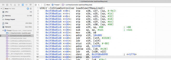 in many of their devices, but have since moved to 64-bit ARM processors. 32-bit devices are almost obsolete as Apple has phased them out through various iOS versions. For example, the iPhone 4s is a 32-bit device which is not supported in iOS 10. All that remains in the 32-bit iPhone lineup is the iPhone 5, which iOS 10 does support.








 Many apps let the user enter information via a form interface. Forms can vary in complexity, from simple username and password screens, to more involved interfaces like those for a contact book or calendar.


