Quantcast
Channel: Kodeco | High quality programming tutorials: iOS, Android, Swift, Kotlin, Unity, and more
Viewing all 4374 articles
Browse latest View live

ReSwift Tutorial: Memory Game App

$
0
0

Build a Memory Game App with ReSwift!

As the size of iOS apps continues to grow, MVC is slowly losing its stronghold as the “go-to” architectural pattern of choice.

There are more scalable architectural patterns available to iOS developers, such as MVVM, VIPER and Riblets. They all look quite different, but they have a common goal: to divide the code into blocks with single responsibility with multidirectional data flow. In a multidirectional flow, the data moves in many directions between the various modules.

Sometimes, you don’t want (or need) multidirectional data flow — instead, you want the data to flow in one direction: that’s unidirectional data flow. In this ReSwift tutorial, you’ll veer off the beaten path and learn how to use the ReSwift framework to implement unidirectional data flow in a state-heavy Memory Game app named MemoryTunes.

But first – what is ReSwift?

Introducing ReSwift

ReSwift is a small framework that helps you to create Redux-like architectures in Swift.

ReSwift has four major components:

  • Views: React to Store changes and display them on screen. Views send Actions.
  • Actions: Initiate a state change in the app. An Action is handled by a Reducer.
  • Reducers: Directly change the application state, which is stored in the Store.
  • Store: Stores the current value of the application state. Other modules like Views can subscribe and react to its changes.

ReSwift presents many interesting advantages:

  • Very strong constraints: It’s so tempting to place little bits of code in a convenient location where they don’t really belong. ReSwift prevents that by setting very strong constraints on what happens and where that happens.
  • Unidirectional data flow: Apps that implement multidirectional data flow can be very hard to read and debug. One change can lead to a cascade of events that send data around the program. Unidirectional flow is more predictable and greatly reduces the cognitive load needed to read the code.
  • Easy to test: Most of the logic is contained in the Reducers, which are pure functions.
  • Platform independent: All elements of ReSwift — Stores, Reducers, and Actions — are platform independent. You can easily reuse them on iOS, macOS or tvOS.

Multidirectional vs. Unidirectional Flow

To show what I mean about data flow, take the following example. An app architechted with VIPER supports multidirectional data flow between its components:
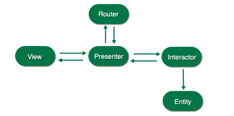
VIPER – Multidirectional data flow

Compare that with the unidirectional data flow in an app built on ReSwift:
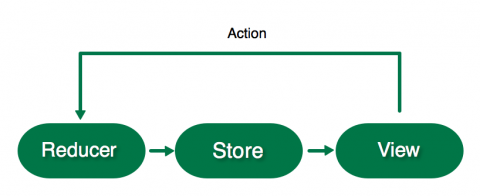
ReSwift – Unidirectional data flow

Since data can only flow in one direction, it’s much easier to visually follow along with the code and track down any issues in your app.

Getting Started

Start by downloading the starter project here which currently contains some skeleton code and frameworks, including ReSwift, that you’ll learn more about as you go.

First, you’ll need to set up the wiring of ReSwift. You’ll begin by setting up the core of the application: its state.

Open AppState.swift and create an AppState structure that conforms to StateType.:

import ReSwift

struct AppState: StateType {

}

This structure will define the entire state of the app.

Before you can create a Store that will contain the AppState value you have to create the main Reducer.

Reducers are the only blocks that can directly change the current value of the AppState held by the Store. Only Actions can initiate a Reducer to start changing the current application state. The Reducer changes the current value of AppState depending on the type of Action it receives.

Note: There’s only one Store in the app, and it has only one main Reducer.

Create the main app reducer function in AppReducer.swift:

import ReSwift

func appReducer(action: Action, state: AppState?) -> AppState {
  return AppState()
}

appReducer is a function that takes an Action and returns the changed AppState. state is the current state of the app; this function should change it accordingly depending on the type of action received. Right now it simply creates a new AppState value — you’ll return to this once you have a Store configured.

It’s time to create the Store so the reducer has a state, something to act upon.

The Store contains the current state of your whole app: this is the value of your AppState structure. Open AppDelegate.swift and replace import UIKit with the following:

import ReSwift

var store = Store<AppState>(reducer: appReducer, state: nil)

This creates a store global variable initialized by the appReducer. appReducer is the Store’s main Reducer, which contains instructions on how the store should change when it receives an Action. Because this is the initial creation, rather than an iterative change, you pass a nil state.

Build and run the app to ensure it compiles:

ReSwift tutorial

It’s not very exciting… But at least it works :]

App Routing

It’s time to create the first actual state in your app. You’ll start with interface navigation, or routing.

App routing is a challenge in every architecture, not just ReSwift. You’re going to use a very simple approach in MemoryTunes, where you’ll define all the destinations in an enum, and your AppState will hold the current destination value. AppRouter will react to changes in that value and show the current destination on screen.

Open AppRouter.swift and replace import UIKit with the following:

import ReSwift

enum RoutingDestination: String {
  case menu = "MenuTableViewController"
  case categories = "CategoriesTableViewController"
  case game = "GameViewController"
}

This enum represents all of the view controllers in your app.

Finally! You have something to store in the app’s State. There’s only one main state structure (AppState in this case), but you can divide the state of the app into sub-states referenced in the main state.

Because it’s good practice, you’ll group state variables into sub-state structures. Open RoutingState.swift and add the following sub-state structure for routing:

import ReSwift

struct RoutingState: StateType {
  var navigationState: RoutingDestination

  init(navigationState: RoutingDestination = .menu) {
    self.navigationState = navigationState
  }
}

RoutingState contains navigationState, which represents the current destination on screen.

Note: menu is the default value of navigationState. It implicitly makes it the default value of the application state at start if you don’t indicate otherwise while initializing RoutingState.

In AppState.swift, add the following inside the struct:

let routingState: RoutingState

AppState now contains the RoutingState sub-state.

Build and run, and you’ll notice a problem:

ReSwift tutorial

Oops…

appReducer no longer compiles! This is because you added routingState to AppState, but didn’t pass it anything in the default initializer call. To create the routingState, you need a reducer.

There’s only one main Reducer function, but just as with state, reducers should be divided between sub-reducers.
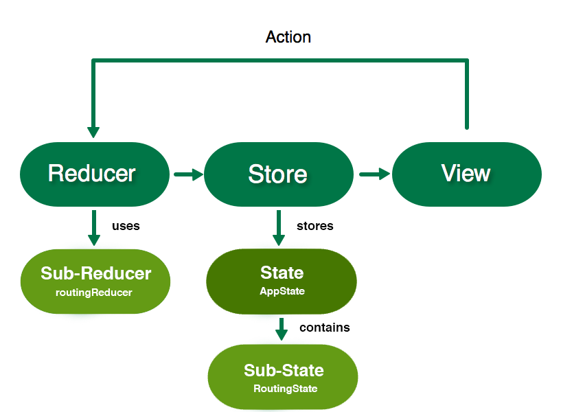
ReSwift tutorial

Sub-State and Sub-Reducers

Add the following Reducer for routing in RoutingReducer.swift:

import ReSwift

func routingReducer(action: Action, state: RoutingState?) -> RoutingState {
  let state = state ?? RoutingState()
  return state
}

Similar to the main Reducer, routingReducer changes the state depending on the action it receives, then returns it. You don’t have any actions yet, so this creates a new RoutingState if state is nil and returns it.

Sub-reducers are responsible for initializing the start values of their corresponding sub-states.

Go back to AppReducer.swift to fix the compiler warning. Modify the contents of appReducer to match the following:

return AppState(routingState: routingReducer(action: action, state: state?.routingState))

This adds the routingState argument to the AppState initializer. action and state from the main reducer are passed to routingReducer to determine the new state. Get used to this routine, because you’ll have to repeat it for each sub-state and sub-reducer you create.

Subscribing

Remember that default menu value in RoutingState? That’s actually the current state of your app! You’re just not subscribing to it anywhere.

Any class can subscribe to the Store, not just Views. When a class subscribes to the Store, it gets informed of every change that happens in the current state or sub-state. You’ll want to do this on AppRouter so it can change the current screen in the UINavigationController when the routingState changes.

Open AppRouter.swift and replace AppRouter with the following:

final class AppRouter {

  let navigationController: UINavigationController

  init(window: UIWindow) {
    navigationController = UINavigationController()
    window.rootViewController = navigationController
    // 1
    store.subscribe(self) {
      $0.select {
        $0.routingState
      }
    }
  }

  // 2
  fileprivate func pushViewController(identifier: String, animated: Bool) {
    let viewController = instantiateViewController(identifier: identifier)
    navigationController.pushViewController(viewController, animated: animated)
  }

  private func instantiateViewController(identifier: String) -> UIViewController {
    let storyboard = UIStoryboard(name: "Main", bundle: nil)
    return storyboard.instantiateViewController(withIdentifier: identifier)
  }
}

// MARK: - StoreSubscriber
// 3
extension AppRouter: StoreSubscriber {
  func newState(state: RoutingState) {
    // 4
    let shouldAnimate = navigationController.topViewController != nil
    // 5
    pushViewController(identifier: state.navigationState.rawValue, animated: shouldAnimate)
  }
}

In the code above, you updated AppRouter and added an extension. Here’s a closer look at what this does:

  1. AppState now subscribes to the global store. In the closure, select indicates you are specifically subscribing to changes in the routingState.
  2. pushViewController will be used to instantiate and push a given view controller onto the navigation stack. It uses instantiateViewController, which loads the view controller based on the passed identifier.
  3. Make the AppRouter conform to StoreSubscriber to get newState callbacks whenever routingState changes.
  4. You don’t want to animate the root view controller, so check if the current destination to push is the root.
  5. When the state changes, you push the new destination onto the UINavigationController using the rawValue of state.navigationState, which is the name of the view controller.

AppRouter will now react to the initial menu value and push the MenuTableViewController on the navigation controller.

Build and run the app to check it out:

ReSwift tutorial

Your app displays MenuTableViewController, which is empty. You’ll populate it with menu options that will route to other screens in the next section.

The View

ReSwift tutorial

Anything can be a StoreSubscriber, but most of the time it will be a view reacting to state changes. Your objective is to make MenuTableViewController show two different menu options. It’s time for your State/Reducer routine! 

Go to MenuState.swift and create a state for the menu with the following:

import ReSwift

struct MenuState: StateType {
  var menuTitles: [String]

  init() {
    menuTitles = ["New Game", "Choose Category"]
  }
}

MenuState consists of menuTitles, which you initialize with titles to be displayed in the table view.

In MenuReducer.swift, create a Reducer for this state with the following code:

import ReSwift

func menuReducer(action: Action, state: MenuState?) -> MenuState {
  return MenuState()
}

Because MenuState is static, you don’t need to worry about handling state changes. So this simply returns a new MenuState.

Back in AppState.swift, add MenuState to the bottom of AppState.

let menuState: MenuState

It won’t compile because you’ve modified the default initializer once again. In AppReducer.swift, modify the AppState initializer as follows:

return AppState(
  routingState: routingReducer(action: action, state: state?.routingState),
  menuState: menuReducer(action: action, state: state?.menuState))

Now that you have the MenuState, it’s time to subscribe to it and use it when rendering the menu view.

Open MenuTableViewController.swift and replace the placeholder code with the following:

import ReSwift

final class MenuTableViewController: UITableViewController {

  // 1
  var tableDataSource: TableDataSource<UITableViewCell, String>?

  override func viewWillAppear(_ animated: Bool) {
    super.viewWillAppear(animated)
    // 2
    store.subscribe(self) {
      $0.select {
        $0.menuState
      }
    }
  }

  override func viewWillDisappear(_ animated: Bool) {
    super.viewWillDisappear(animated)
    // 3
    store.unsubscribe(self)
  }
}

// MARK: - StoreSubscriber
extension MenuTableViewController: StoreSubscriber {

  func newState(state: MenuState) {
    // 4
    tableDataSource = TableDataSource(cellIdentifier:"TitleCell", models: state.menuTitles) {cell, model in
      cell.textLabel?.text = model
      cell.textLabel?.textAlignment = .center
      return cell
    }

    tableView.dataSource = tableDataSource
    tableView.reloadData()
  }
}

The controller now subscribes to MenuState changes and renders the state in the UI declaratively.

  1. TableDataSource is included in the starter and acts as a declarative data source for UITableView.
  2. Subscribe to the menuState on viewWillAppear. Now you’ll get callbacks in newState every time menuState changes.
  3. Unsubscribe, when needed.
  4. This is the declarative part. It’s where you populate the UITableView. You can clearly see in code how state is transformed into view.
Note: As you might have noticed, ReSwift favors immutability – heavily using structures (values) not objects. It also encourages you to create declarative UI code. Why?

The newState callback defined in StoreSubscriber passes state changes. You might be tempted to capture the value of the state in a property, like this:

final class MenuTableViewController: UITableViewController {
  var currentMenuTitlesState: [String]
  ...

But writing declarative UI code that clearly shows how state is transformed into view is cleaner and much easier to follow. The problem in this example is that UITableView doesn’t have a declarative API. That’s why I created TableDataSource to bridge the gap. If you’re interested in the details, take a look at TableDataSource.swift.

Build and run, and you should now see the menu items:

ReSwift tutorial

Actions

ReSwift tutorial

Now that you have menu items, it would be awesome if they opened new screens. It’s time to write your first Action.

Actions initiate a change in the Store. An Action is a simple structure that can contain variables: the Action’s parameters. A Reducer handles a dispatched Action and changes the state of the app depending on the type of the action and its parameters.

Create an action in RoutingAction.swift:

import ReSwift

struct RoutingAction: Action {
  let destination: RoutingDestination
}

RoutingAction changes the current routing destination.

Now you’re going to dispatch RoutingAction when a menu item gets selected.

Open MenuTableViewController.swift and add the following in MenuTableViewController:

override func tableView(_ tableView: UITableView, didSelectRowAt indexPath: IndexPath) {
  var routeDestination: RoutingDestination = .categories
  switch(indexPath.row) {
  case 0: routeDestination = .game
  case 1: routeDestination = .categories
  default: break
  }

  store.dispatch(RoutingAction(destination: routeDestination))
}

This sets routeDestination based on the row selected. It then uses dispatch to pass the RoutingAction to the Store.

The Action is getting dispatched, but it’s not supported by any reducer yet. Go to RoutingReducer.swift and replace the contents of routingReducer with the following code that updates the state:

var state = state ?? RoutingState()

switch action {
case let routingAction as RoutingAction:
  state.navigationState = routingAction.destination
default: break
}

return state

The switch checks if the passed action is a RoutingAction. If so, it uses its destination to change the RoutingState, then returns it.

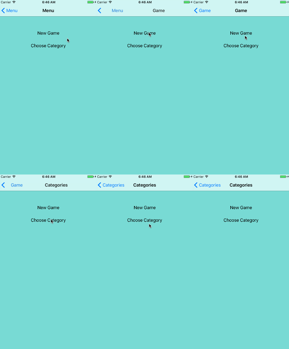
Build and run. Now when you tap on menu items, the corresponding view controllers will be pushed on top of the navigation controller.

ReSwift tutorial

Updating the State

You may have noticed a flaw with the current navigation implementation. When you tap on the New Game menu item, the navigationState of RoutingState gets changed from menu to game. But when you use the navigation controller’s back arrow to go back to the menu, nothing is updating the navigationState!

In ReSwift, it’s important to keep the state synchronized with the current UI state. It’s easy to forget about it when something is managed completely by UIKit, like the navigation back arrow or user typing something into a UITextField.

Fix this by updating the navigationState when MenuTableViewController appears.

In MenuTableViewController.swift, add this line at the bottom of viewWillAppear:

store.dispatch(RoutingAction(destination: .menu))

This updates the store manually if the navigation back arrow was used.

Run the app and test the navigation again. Aaaaand… now the navigation is completely broken. Nothing ever appears to get fully pushed on, and you may see a crash.

ReSwift tutorial

Open AppRouter.swift; you’ll recall that pushViewController is called each time a new navigationState is received. This means that you respond to the menu RoutingDestination update by…pushing the menu on again!

You have to dynamically check if the MenuViewController isn’t already visible before pushing. Replace the contents of pushViewController with:

let viewController = instantiateViewController(identifier: identifier)
let newViewControllerType = type(of: viewController)
if let currentVc = navigationController.topViewController {
  let currentViewControllerType = type(of: currentVc)
  if currentViewControllerType == newViewControllerType {
    return
  }
}

navigationController.pushViewController(viewController, animated: animated)

You call type(of:) against the current top view controller and compare it to the new one being pushed on. If they match, you return without pushing on the controller in duplicate.

Build and run, and navigation should work normally again, with the menu state being properly set when you pop the stack.

ReSwift tutorial

Updating state with UI actions and checking the current state dynamically is often complex. It’s one of the challenges you’ll have to overcome when dealing with ReSwift. Fortunately it shouldn’t happen very often.

Categories

Now you’ll go a step further and implement a more complex screen: CategoriesTableViewController. You need to allow the user to choose the category of music, so they can enjoy the game of Memory with their favorite bands. Start by adding the state in CategoriesState.swift:

import ReSwift

enum Category: String {
  case pop = "Pop"
  case electronic = "Electronic"
  case rock = "Rock"
  case metal = "Metal"
  case rap = "Rap"
}

struct CategoriesState: StateType {
  let categories: [Category]
  var currentCategorySelected: Category

  init(currentCategory: Category) {
    categories = [ .pop, .electronic, .rock, .metal, .rap]
    currentCategorySelected = currentCategory
  }
}

The enum defines several music categories. CategoriesState contains an array of available categories as well as the currentCategorySelected for tracking state.

In ChangeCategoryAction.swift, add the following:

import ReSwift

struct ChangeCategoryAction: Action {
  let categoryIndex: Int
}

This creates an Action that can change CategoriesState, using categoryIndex to reference music categories.

Now you need to implement a Reducer that accepts the ChangeCategoryAction and stores the updated state. Open CategoriesReducer.swift and add the following:

import ReSwift

private struct CategoriesReducerConstants {
  static let userDefaultsCategoryKey = "currentCategoryKey"
}

private typealias C = CategoriesReducerConstants

func categoriesReducer(action: Action, state: CategoriesState?) -> CategoriesState {
  var currentCategory: Category = .pop
  // 1
  if let loadedCategory = getCurrentCategoryStateFromUserDefaults() {
    currentCategory = loadedCategory
  }
  var state = state ?? CategoriesState(currentCategory: currentCategory)

  switch action {
  case let changeCategoryAction as ChangeCategoryAction:
    // 2
    let newCategory = state.categories[changeCategoryAction.categoryIndex]
    state.currentCategorySelected = newCategory
    saveCurrentCategoryStateToUserDefaults(category: newCategory)

  default: break
  }

  return state
}

// 3
private func getCurrentCategoryStateFromUserDefaults() -> Category? {
  let userDefaults = UserDefaults.standard
  let rawValue = userDefaults.string(forKey: C.userDefaultsCategoryKey)
  if let rawValue = rawValue {
    return Category(rawValue: rawValue)
  } else {
    return nil
  }
}

// 4
private func saveCurrentCategoryStateToUserDefaults(category: Category) {
  let userDefaults = UserDefaults.standard
  userDefaults.set(category.rawValue, forKey: C.userDefaultsCategoryKey)
  userDefaults.synchronize()
}

Just as with the other reducers, this implements a method to complete state updates from actions. In this case, you’re also persisting the selected category to UserDefaults. Here’s a closer look at what it does:

  1. Loads the current category from UserDefaults if available, and uses it to instantiate CategoriesState if it doesn’t already exist.
  2. Reacts to ChangeCategoryAction by updating the state and saving the new category to UserDefaults.
  3. getCurrentCategoryStateFromUserDefaults is a helper function that loads the category from UserDefaults.
  4. saveCurrentCategoryStateToUserDefaults is a helper function that saves the category to UserDefaults.

The helper functions are also pure global functions. You could put them in a class, or a structure, but they should always remain pure.

Naturally, you have to update the AppState with the new state. Open AppState.swift and add the following to the end of the struct:

let categoriesState: CategoriesState

categoriesState is now part of the AppState. You’re getting the hang of this!

Open AppReducer.swift and modify the returned value to match this:

return AppState(
  routingState: routingReducer(action: action, state: state?.routingState),
  menuState: menuReducer(action: action, state: state?.menuState),
  categoriesState: categoriesReducer(action:action, state: state?.categoriesState))

Here you’ve added categoriesState to appReducer passing the action and categoriesState.

Now you need to create the categories screen, similarly to MenuTableViewController. You’ll make it subscribe to the Store and use TableDataSource.

Open CategoriesTableViewController.swift and replace the contents with the following:

import ReSwift

final class CategoriesTableViewController: UITableViewController {

  var tableDataSource: TableDataSource<UITableViewCell, Category>?

  override func viewWillAppear(_ animated: Bool) {
    super.viewWillAppear(animated)
    // 1
    store.subscribe(self) {
      $0.select {
        $0.categoriesState
      }
    }
  }

  override func viewWillDisappear(_ animated: Bool) {
    super.viewWillDisappear(animated)
    store.unsubscribe(self)
  }

  override func tableView(_ tableView: UITableView, didSelectRowAt indexPath: IndexPath) {
    // 2
    store.dispatch(ChangeCategoryAction(categoryIndex: indexPath.row))
  }
}

// MARK: - StoreSubscriber
extension CategoriesTableViewController: StoreSubscriber {
  func newState(state: CategoriesState) {
    tableDataSource = TableDataSource(cellIdentifier:"CategoryCell", models: state.categories) {cell, model in
      cell.textLabel?.text = model.rawValue
      // 3
      cell.accessoryType = (state.currentCategorySelected == model) ? .checkmark : .none
      return cell
    }

    self.tableView.dataSource = tableDataSource
    self.tableView.reloadData()
  }
}

This should look pretty similar to MenuTableViewController. Here are some highlights:

  1. Subscribe to categoriesState changes on viewWillAppear and unsubscribe on viewWillDisappear.
  2. Dispatch the ChangeCategoryAction when user selects a cell.
  3. On newState, mark the cell for the currently selected category with a checkmark.

Everything’s set. Now you can choose the category. Build and run the app, and select Choose Category to see for yourself.

ReSwift tutorial

Asynchronous Tasks

Asynchronous programming is hard, huh? Well, not in ReSwift.

You’ll fetch the images for Memory cards from the iTunes API. First, you’ll have to create a game state, reducer and associated action.

Open GameState.swift, and you’ll see a MemoryCard struct that represents a game card. It includes the imageUrl to be displayed on the card. isFlipped identifies if the front of the card is visible and isAlreadyGuessed indicates if the card was already matched.

You’ll add game state to this file. Start by importing ReSwift at the top:

import ReSwift

Now add the following to the bottom of the file:

struct GameState: StateType {
  var memoryCards: [MemoryCard]
  // 1
  var showLoading: Bool
  // 2
  var gameFinished: Bool
}

These define the state of the game. In addition to containing the array of available memoryCards, the properties here indicate if:

  1. the loading indicator is visible or not
  2. the game is finished

Add a game Reducer in GameReducer.swift:

import ReSwift

func gameReducer(action: Action, state: GameState?) -> GameState {
    let state = state ?? GameState(memoryCards: [], showLoading: false, gameFinished: false)

    return state
}

This currently just creates a new GameState. You’ll circle back to this later.

In AppState.swift, add gameState to the bottom of AppState:

let gameState: GameState

In AppReducer.swift, update the initializer for the last time:

return AppState(
  routingState: routingReducer(action: action, state: state?.routingState),
  menuState: menuReducer(action: action, state: state?.menuState),
  categoriesState: categoriesReducer(action:action, state: state?.categoriesState),
  gameState: gameReducer(action: action, state: state?.gameState))
Note: Notice how predictable, easy and familiar everything is after doing the Action/Reducer/State routine a few times? This programmer-friendly routine is thanks to the unidirectional nature of ReSwift and the strict constraints it sets on each module. As you’ve learned, only Reducers can change the app Store and only Actions can initiate that change. You instantly know where to look, and where to add new code.

Now define an action for updating cards by adding the following in SetCardsAction.swift:

import ReSwift

struct SetCardsAction: Action {
  let cardImageUrls: [String]
}

This Action sets the image URLs for cards in the GameState

Now you’re ready to create your first asynchronous action. In FetchTunesAction.swift, add the following:

import ReSwift

func fetchTunes(state: AppState, store: Store<AppState>) -> FetchTunesAction {

  iTunesAPI.searchFor(category: state.categoriesState.currentCategorySelected.rawValue) { imageUrls in
    store.dispatch(SetCardsAction(cardImageUrls: imageUrls))
  }

  return FetchTunesAction()
}

struct FetchTunesAction: Action {
}

fetchTunes fetches the images using iTunesAPI (included with the starter). In the closure you’re dispatching a SetCardsAction with the result. Asynchronous tasks in ReSwift are that simple: just dispatch an action later in time, when complete. That’s it.

fetchTunes returns FetchTunesAction which will be used to signify the fetch has kicked off.

Open GameReducer.swift and add support for the two new actions. Replace the contents of gameReducer with the following:

var state = state ?? GameState(memoryCards: [], showLoading: false, gameFinished: false)

switch(action) {
// 1
case _ as FetchTunesAction:
  state = GameState(memoryCards: [], showLoading: true, gameFinished: false)
// 2
case let setCardsAction as SetCardsAction:
  state.memoryCards = generateNewCards(with: setCardsAction.cardImageUrls)
  state.showLoading = false
default: break
}

return state

You changed state to be a constant, and then implemented an action switch that does the following:

  1. On FetchTunesAction, this sets showLoading to true.
  2. On SetCardsAction, this randomizes the cards and sets showLoading to false. generateNewCards can be found in MemoryGameLogic.swift, which is included with the starter.

It’s time to draw the cards in the GameViewController. Start with setting up the cell.

Open CardCollectionViewCell.swift and add the following method to the bottom of CardCollectionViewCell:

func configureCell(with cardState: MemoryCard) {
  let url = URL(string: cardState.imageUrl)
  // 1
  cardImageView.kf.setImage(with: url)
  // 2
  cardImageView.alpha = cardState.isAlreadyGuessed || cardState.isFlipped ? 1 : 0
}

configureCell does the following:

  1. Uses the awesome Kingfisher library to cache images.
  2. Shows the card image when a card is already guessed or the card is flipped.

Next you will implement the collection view that displays the cards. Just as there is for table views, there is a declarative wrapper for UICollectionView named CollectionDataSource included in the starter that you’ll leverage.

Open GameViewController.swift and first replace the UIKit import with:

import ReSwift

In GameViewController, add the following just above showGameFinishedAlert:

var collectionDataSource: CollectionDataSource<CardCollectionViewCell, MemoryCard>?

override func viewWillAppear(_ animated: Bool) {
  super.viewWillAppear(animated)
  store.subscribe(self) {
    $0.select {
      $0.gameState
    }
  }
}

override func viewWillDisappear(_ animated: Bool) {
  super.viewWillDisappear(animated)
  store.unsubscribe(self)
}

override func viewDidLoad() {
  // 1
  store.dispatch(fetchTunes)
  collectionView.delegate = self
  loadingIndicator.hidesWhenStopped = true

  // 2
  collectionDataSource = CollectionDataSource(cellIdentifier: "CardCell", models: [], configureCell: { (cell, model) -> CardCollectionViewCell in
    cell.configureCell(with: model)
    return cell
  })
  collectionView.dataSource = collectionDataSource
}

Note this will result in a few compiler warnings until you adopt StoreSubscriber in a moment. The view subscribes to gameState on viewWillAppear and unsubscribes on viewWillDisappear. In viewDidLoad it does the following:

  1. Dispatches fetchTunes to start fetching the images from iTunes API.
  2. Configures cells using CollectionDataSource which gets the appropriate model to configureCell.

Now you need to add an extension to adhere to StoreSubscriber. Add the following to the bottom of the file:

// MARK: - StoreSubscriber
extension GameViewController: StoreSubscriber {
  func newState(state: GameState) {

    collectionDataSource?.models = state.memoryCards
    collectionView.reloadData()

    // 1
    state.showLoading ? loadingIndicator.startAnimating() : loadingIndicator.stopAnimating()

    // 2
    if state.gameFinished {
      showGameFinishedAlert()
      store.dispatch(fetchTunes)
    }
  }
}

This implements newState to handle state changes. It updates the datasource as well as:

  1. Updating the loading indicator status depending on the state.
  2. Restarting the game and showing an alert when the game has been finished.

Build and run the game, select New Game, and you’ll now be able to see the memory cards.

ReSwift tutorial

Playing The Game

The logic of the game allows the user to flip two cards, If they’re the same, they remain uncovered; if not, they get hidden again. The player’s objective is to uncover all cards with the fewest steps possible.

To do this, you’ll need a flip action. Open FlipCardAction.swift and add the following:

import ReSwift

struct FlipCardAction: Action {
  let cardIndexToFlip: Int
}

FlipCardAction will use cardIndexToFlip to update GameState when a card is flipped.

Change gameReducer to support FlipCardAction and perform the game algorithm magic. Open GameReducer.swift and add the following case, just before default:

case let flipCardAction as FlipCardAction:
  state.memoryCards = flipCard(index: flipCardAction.cardIndexToFlip, memoryCards: state.memoryCards)
  state.gameFinished = hasFinishedGame(cards: state.memoryCards)

For a FlipCardAction, flipCard changes the state of the memory cards based on the cardIndexToFlip and other game logic. hasFinishedGame is called to determine if the game has finished and update the state accordingly. Both functions can be found in MemoryGameLogic.swift.

The final piece of the puzzle is to send a flip action when a card is selected. This will kick off the game logic and make associated state changes.

In GameViewController.swift, find the UICollectionViewDelegate extension. Add the following to collectionView(_:didSelectItemAt:):

store.dispatch(FlipCardAction(cardIndexToFlip: indexPath.row))

When a card is selected in the collection view, the associated indexPath.row is sent with FlipCardAction.

Run the game and now you can play it. Come back when you’re done having fun! :]

ReSwift tutorial

Where to Go From Here?

You can download the final MemoryTunes project here.

There’s still a lot to learn about ReSwift.

  • Middleware: There isn’t currently a good way to handle Cross Cutting Concerns in Swift. In ReSwift, you get it for free! You can implement all sorts of concerns using ReSwift’s Middleware feature. It allows you to easily wrap up actions with concerns (logging, statistics, caching).
  • Routing: You implemented your own routing for the MemoryTunes app. You could also use a more general solution like ReSwift-Router. It’s still an open problem – maybe you will be the one that solves it? :]
  • Testing: ReSwift is probably the easiest architecture out there to create tests for. Reducers contain the code you need to test, and they’re pure functions. Pure functions always give the same output for the same input, don’t rely on the state of the app and have no side effects.
  • Debugging: With ReSwift’s state defined in one structure and unidirectional flow, debugging is much easier. You can even record steps of state leading to a crash.
  • Persistence: Because all the state of your app is in one place, you can easily serialize and persist it. Caching content for offline mode is a hard architectural problem, but not with ReSwift – you almost get it for free.
  • Other Implementations: Redux-like architecture is not a library: it’s a paradigm. You can implement it yourself, use ReSwift or other libraries like Katana or ReduxKit.

If you want to expand your knowledge on the subject, listen to this ReSwift talk by Benjamin Encz, the creator of ReSwift.

ReSwift’s repo also has a lot of interesting example projects. And finally, Christian Tietze’s blog has a lot of interesting advanced ReSwift topics. 

If you have any questions, comments or ideas, come join the discussion in the forums below!

The post ReSwift Tutorial: Memory Game App appeared first on Ray Wenderlich.

RWDevCon 2017 Keynote: Reflect and Refactor by Marin Todorov

$
0
0
Note from Ray: At our recent RWDevCon tutorial conference, Marin Todorov gave a keynote speech challenging us to periodically stop to reflect and refactor our own lives. Marin and I hope you enjoy it!

Transcript

Imagine this: you’re in an airplane cruising at 30,000 feet in the air. The Earth is far below. The AV turns on and the flight attendant speaks up.

“Attention, attention. Remain calm. If there are any medical doctors on board, please make yourself known to the aircraft personnel, thank you.”

Where it all hit me

Not a great place for a medical emergency!

Even if you know that this is not about you, even if you know that things are probably going to be alright, still your stomach jumps and cold sweat covers your palms and you start looking around. “What’s going on?”

You see the flight attendant escort somebody to the front of the airplane. You hope it’s a doctor and worry for the person who’s in trouble. Most importantly, you hope that this situation never happens to you.

Now, in this particular story and on that particular airplane, this is happening to me. I was the one sitting in the front row and my hand was held by the flight attendant as I was having a breakdown.

Yep, I was that guy.

The problem was that my life had changed quite a bit. There were big changes; there were a ton of small changes as well. I really didn’t have the time to have a look at my personal state and think about everything that was going on.

The one thing that I learned from the situation was that had I done things differently, had I looked more into all these changes happening in my life, I could’ve prevented this breakdown at 30,000 feet in the air.

Dreams Change

Let’s take a step back. I posit that what leads you anywhere in life is your dreams. However, your dreams are not static; your dreams change as you change.

To see what I mean, think about the dreams that you had ten years ago. Were those the same dreams you have right now, or have some of those dreams changed so drastically that you can’t help but smile when you think about them?

My dreams have certainly changed a lot. A long time ago, I thought, “I want to work with Bill Gates on the next version of Windows.” Then I thought, “I want to be a drummer in a rock band made entirely out of drummers.”

It would have been awesome!

Finally, my dream became, “I want to be my own man. Write books, speak at conferences, but also have a lot of time to spend with my family.”

Now, some of these dreams I’ve accomplished, and some I haven’t, but the crazy thing is how much these dreams have changed over time. I bet yours have, too. Why do our dreams change so much? Are we not the same person we used to be before? My fingerprint says yes, but my weight scale says no.

And would it kill you to exercise?

Time to lay off the Doritos.

Just like our dreams change, we also change all the time. The funny thing is that these changes are so gradual that we might not even notice it.

Think of yourself as a massive code base that you do commit to all the time, each day. When you have enough commits, you might end up with a completely different project than what you started working on.

You know how it is: you start with a to-do app, and one day you wake up and you have on your hands a massive, multi-player cooperative game set in space in a parallel universe. After you have enough commits to your code base, if you don’t periodically take a step back and reflect on all the code changes and refactor your code a little bit, you might end up with a big, hairy problem.

Watch out, it bites!

Our lives are the same way, really. We always have the best intentions, but life changes so much and it causes so much change in ourselves that we don’t even notice all the small and gradual changes, just like those tiny commits all the time. We can get ourselves into a big, hairy problem if we don’t periodically take a step back and reflect upon all the gradual changes happening in our lives.

Every so often, we need to ask ourselves, “How can we refactor our lives given what we know now?”

Let’s get back to the airplane. I’d gotten myself into one of these big, hairy problems.

watch out, me!

There was one big change: my father had just passed a few months before, and I was missing him so much. Also, there were a lot of small changes happening. Since I didn’t really have any time to reflect on all these changes, I got into this big, hairy problem 30,000 feet in the air. All these changes and all this trouble and all the work piled up until they hit this boiling point on the airplane.

All of this had been putting an immense pressure on me because I couldn’t really do any work, I couldn’t meet any deadlines—the first time in my life when I couldn’t meet work deadlines. All of this kept piling up.

The real thing was that I did not give myself time to grieve. I was trying to run shop as usual, be a busy iOS developer, speak around the world, work like crazy, but I no longer had the energy to do all of this. I thought, “I’ll just keep going as usual, because work will help me deal with grief, right?” I was always able to pull off immense amount of work—up to that moment, at least.

What I didn’t realize was that things had changed and I had changed too. All of this grew and grew until that moment in the airplane. That trigger event on the airplane was what forced me to sit down and have a look at my situation. At that moment, I knew that I needed to reevaluate what I was capable of. Certainly not work; I was barely even able to go grocery shopping.

Like any good programmer facing a big, hairy problem in my code, I refactored. I canceled all the work projects I could and postponed any deadlines indefinitely, because this is what the “me” of that time needed.

Now, needless to say, my work contacts were not very happy and I’ve received an immense amount of pressure from the users of my open source libraries. Sending out these e-mails to everyone was really hard because I felt that I was letting everyone down, but you know what? If I hadn’t done that, I would be letting myself down.

In the end, it took me a few solid months of not working, of just resting in the sun and reflecting and remembering. Only by answering the needs of me at the time could I move on to the next stage.

I’m glad I got through this time, but it’s crazy looking back that it took a medical emergency in the air to make me reflect and look into my own life. The good thing is you don’t have to be up in that airplane to start doing the same.

Reflect

The first step is to periodically take some time to reflect.

You might be thinking that self-reflection is something like a yearly job review where you sit down and look at how to do things better or faster, but that’s not what I’m talking about. Self-reflection is different.

To self-reflect, you should not look into how to do things better or faster, but instead look into how you feel, what you need and why. It’s all about you, not about what other people tell you.

For example, maybe you’ve been maintaining an open source library for a while. Instead of thinking how you can do better at that, ask yourself: “Is this still fun? Does it still give me anything, or has it become a chore and a source of stress?”

Another trick is to build a current image of yourself right now, a mental image, and compare it with the last time you thought about yourself. Are you doing things differently right now? Maybe you have a new perception about how and where you stand. Are you older? Probably. Maybe you learned or experienced something new. Do you see the world or yourself in a different light than you used to?

One handsome dude

For example, maybe you’ve always loved the meals of your childhood. Butter fried chicken, pork chops and more. Those certainly have been yummy! However, as you age you might need to reflect on your health and align your diet to your body’s new needs.

All of this takes time. You can’t self-reflect in your lunch break or between meetings. You need a relaxed mind and a little bit of space. Personally, I like traveling in the train, sipping coffee, maybe crossing the Alps.

The key is to carve out some specific time to do some self-reflection and be okay with the fact that it’s going to take a while. Eventually you’ll discover whether you’re still aligned with your inner self, your previous self, or whether something has changed, and you now have different dreams than before.

Refactor

Once you’ve had a chance to reflect, the next step is to refactor.

Have Your Dreams Changed?

If you found that your dreams have changed, the best way to refactor is to answer three questions:

  1. Old Dreams: Do you have any old dreams that you want to completely discard, or some perceptions that are not valid anymore?
  2. For example, if you’ve felt like just an assistant in the office for a couple of years, but in fact you launched the last two projects on your own, maybe it’s time to think of yourself in a different, more capable light.

  3. Expectations: Do you have any expectations of yourself that you need to adjust?
  4. In my case, I’d been expecting myself to always pull off immense amounts of work, help the family, do open source and so forth, but an adjustment was due in order to be able to get back on track.

  5. New Dreams: Are there any completely new dreams that you might want to take up?
  6. For example, if you’ve just paid off your student loans, is buying a house something you would like to do next?

Hero’s Journey

You might be wondering: when is the best time for self-reflection? In movies or books, it’s easy to tell. The hero starts from modest origins, meets a mentor and goes on a ton of adventures over the arc of the story. Once the battle is over, the big revelation happens and they’re brought to a higher state of consciousness. By default, they reflect and refactor.

Gollum needs to refactor a bit

Unfortunately, our lives are not stories from books or movies. There is no single battle and the Gates of Mordor, where after the battle we sit down, light up a pipe and reflect. Instead, there are millions of stories with their own little arcs in our lives.

We do, however, all have moments in our lives that give us a built-in opportunity to reflect and refactor.

PhD in Reflection!

For a number of people I spoke to, such a moment was finishing their studies; after a bachelor’s or master’s degree, they realized they had completely different dreams than when they started, and completely different expectations of themselves. After multiple years of study and tons of new information gained, many of them began working on something completely different.

Another great moment to reflect and refactor is if you’re moving on to a different stage in your career. If you’ve been a junior developer for a while and now you’re taking a leadership position, it’s a really good moment to think of who you’ve become and what could be next for you.

Even if you don’t stumble upon one of these natural moments to reflect and refactor, it’s important to periodically take a bit of time and listen to your inner self.

Make the time to reflect.

For example, you could head to the spa and reflect while you’re getting a massage or soaking in a hot tub. Take a weekend trip and reflect along the way, or head to a museum and reflect among the paintings. The important thing is to make time for reflection.

When we reflect on our lives, we tell a story about ourselves to ourselves. We build a character in our minds, that person we perceive ourselves to be, and that character, our hero, gets transformed each day, little by little.

In my story, I was seeing myself as the hero who could manage all this work and support the family, all while dealing with grief, so to say, on the fly. I didn’t notice that a lot of things had changed and that I wasn’t exactly that person anymore.

Change the Story

Now, the good thing is that we can also change the story we tell ourselves. Once you reflect and realign with yourself, you can alter your story with little changes that can drive your hero (yourself) in the desired direction.

In my story, after the airplane incident, I adjusted my work life. After a while, I started imagining my hero recovering and getting back on track.

This showed me what to look forward to. Plus, not only can you ensure that you’re in sync with your inner self, but you can also give yourself a little nudge in the direction you think is best for your future self.

Recently I’ve had some more changes in my life that have caused me to reflect and refactor quite a bit. Although it’s been a tough year for me, I’m full of hope because my girlfriend and I are expecting a baby.

A bundle of reflection!

This has been another great opportunity to reflect and refactor, to consider who I am, what I stand for and why.

Because of this change, I’ve refactored quite a lot. I adjusted the amounts of work and travel I take. I worked on strengthening ties with my extended family and have even chosen to start reading a new and exciting set of books. I feel this new adventure is going to be so much fun.

Eye-opening stuff

My new reading list!

Right now, all of you have a perfect opportunity to reflect and refactor, because you’re here at RWDevcon.

Changes in our perception of ourselves or the world are often driven by new knowledge, and in the next few days, all of you are going to gain a lot of experience. You’re going to meet a plethora of exciting people and make new friends. Most importantly, you’re going to gain a ton of new knowledge.

Use this moment while you’re inspired, while you’re making new friends, while you’re away from your normal life, and take this opportunity to reflect and refactor. I hope it helps you move on to your next heroic adventure in the stories of your lives.

Thank you very much.

Note from Ray: If you enjoyed this talk, you should join us at the next RWDevCon! We’ve sold out in previous years, so don’t miss your chance.

The post RWDevCon 2017 Keynote: Reflect and Refactor by Marin Todorov appeared first on Ray Wenderlich.

Video Tutorial: Beginning Git Part 3: Creating a Repo

Screencast: Swift Playground Books: Getting Started

Video Tutorial: Beginning Git Part 4: Creating a Remote

Command Line Programs on macOS Tutorial

$
0
0
Update 7/21/17: This command line programs on macOS tutorial has been updated for Xcode 9 and Swift 4.

CommandLinePrograms-feature

The typical Mac user interacts with their computer using a Graphical User Interface (GUI). GUIs, as the name implies, are based on the user visually interacting with the computer via input devices such as the mouse by selecting or operating on screen elements such as menus, buttons etc.

Not so long ago, before the advent of the GUI, command-line interfaces (CLI) were the primary method for interacting with computers. CLIs are text-based interfaces, where the user types in the program name to execute, optionally followed by arguments.

Despite the prevalence of GUIs, command-line programs still have an important role in today’s computing world. Command-line programs such as ImageMagick or ffmpeg are important in the server world. In fact, the majority of the servers that form the Internet run only command-line programs.

Even Xcode uses command-line programs! When Xcode builds your project, it calls xcodebuild, which does the actual building. If the building process was baked-in to the Xcode product, continuous integration solutions would be hard to achieve, if not impossible!

In this Command Line Programs on macOS tutorial, you will write a command-line utilty named Panagram. Depending on the options passed in, it will detect if a given input is a palindrome or anagram. It can be started with predefined arguments, or run in interactive mode where the user is prompted to enter the required values.

Typically, command-line programs are launched from a shell (like the bash shell in macOS) embedded in a utility application like Terminal in macOS. For the sake of simplicity and ease of learning, in this tutorial, most of the time you will use Xcode to launch Panagram. At the end of the tutorial you will learn how to launch Panagram from the terminal.

Getting Started

Swift seems like an odd choice for creating a command-line program since languages like C, Perl, Ruby or Java are the more traditional choice. But there are some great reasons to choose Swift for your command-line needs:

  • Swift can be used as an interpreted scripting language, as well as a compiled language. This gives you the advantages of scripting languages, such as zero compile times and ease of maintenance, along with the choice of compiling your app to improve execution time or to bundle it for sale to the public.
  • You don’t need to switch languages. Many people say that a programmer should learn one new language every year. This is not a bad idea, but if you are already used to Swift and its standard library, you can reduce the time investment by sticking with Swift.

For this tutorial, you’ll create a classic compiled project.

Open Xcode and go to File/New/Project. Find the macOS group, select Application/Command Line Tool and click Next:

For Product Name, enter Panagram. Make sure that Language is set to Swift, then click Next.

Choose a location on your disk to save your project and click Create.

In the Project Navigator area you will now see the main.swift file that was created by the Xcode Command Line Tool template.

Many C-like languages have a main function that serves as the entry point — i.e. the code that the operating system will call when the program is executed. This means the program execution starts with the first line of this function. Swift doesn’t have a main function; instead, it has a main file.

When you run your project, the first line inside the main file that isn’t a method or class declaration is the first one to be executed. It’s a good idea to keep your main.swift file as clean as possible and put all your classes and structs in their own files. This keeps things streamlined and helps you to understand the main execution path.

The Output Stream

In most command-line programs, you’d like to print some messages for the user. For example, a program that converts video files into different formats could print the current progress or some error message if something went wrong.

Unix-based systems such as macOS define two different output streams:

  • The standard output stream (or stdout) is normally attached to the display and should be used to display messages to the user.
  • The standard error stream (or stderr) is normally used to display status and error messages. This is normally attached to the display, but can be redirected to a file.
Note: When launching a command-line program from either Xcode or from Terminal, by default, stdout and stderr are the same and messages for both are written to the console. It is a common practice to redirect stderr to a file so error messages scrolled off the screen can be viewed later. Also this can make debugging of a shipped application much easier by hiding information the user doesn’t need to see, but still keep the error messages for later inspection.

With the Panagram group selected in the Project navigator, press Cmd + N to create a new file. Under macOS, select Source/Swift File and press Next:

Save the file as ConsoleIO.swift. You’ll wrap all the input and output elements in a small, handy class named ConsoleIO.

Add the following code to the end of ConsoleIO.swift:

class ConsoleIO {
}

Your next task is to change Panagram to use the two output streams.

In ConsoleIO.swift add the following enum at the top of the file, above the ConsoleIO class implementation and below the import line:

enum OutputType {
  case error
  case standard
}

This defines the output stream to use when writing messages.

Next, add the following method to the ConsoleIO class (between the curly braces for the class implementation):

func writeMessage(_ message: String, to: OutputType = .standard) {
  switch to {
  case .standard:
    print("\(message)")
  case .error:
    fputs("Error: \(message)\n", stderr)
  }
}

This method has two parameters; the first is the actual message to print, and the second is the destination. The second parameter defaults to .standard.

The code for the .standard option uses print, which by default writes to stdout. The .error case uses the C function fputs to write to stderr, which is a global variable and points to the standard error stream.

Add the following code to the end of the ConsoleIO class:

func printUsage() {

  let executableName = (CommandLine.arguments[0] as NSString).lastPathComponent

  writeMessage("usage:")
  writeMessage("\(executableName) -a string1 string2")
  writeMessage("or")
  writeMessage("\(executableName) -p string")
  writeMessage("or")
  writeMessage("\(executableName) -h to show usage information")
  writeMessage("Type \(executableName) without an option to enter interactive mode.")
}

This code defines the printUsage() method that prints usage information to the console. Every time you run a program, the path to the executable is implicitly passed as argument[0] and accessible through the global CommandLine enum. CommandLine is a small wrapper in the Swift Standard Library around the argc and argv arguments you may know from C-like languages.

Note: It is common practice to print a usage statement to the console when the user tries to start a command-line program with incorrect arguments.

Create another new Swift file named Panagram.swift (following the same steps as before) and add the following code to it:

class Panagram {

  let consoleIO = ConsoleIO()

  func staticMode() {
    consoleIO.printUsage()
  }

}

This defines a Panagram class that has one method. The class will handle the program logic, with staticMode() representing non-interactive mode — i.e. when you provide all data through command line arguments. For now, it simply prints the usage information.

Now, open main.swift and replace the print statement with the following code:

let panagram = Panagram()
panagram.staticMode()
Note: As explained above, for main.swift these are the first lines of code that will be executed when the program is launched.

Build and run your project; you’ll see the following output in Xcode’s Console:

usage:
Panagram -a string1 string2
or
Panagram -p string
or
Panagram -h to show usage information
Type Panagram without an option to enter interactive mode.
Program ended with exit code: 0

So far, you’ve learned what a command-line tool is, where the execution starts, how to send messages to stdout and stderr and how you can split your code into logical units to keep main.swift organized.

In the next section, you’ll handle command-line arguments and complete the static mode of Panagram.

Command-Line Arguments

When you start a command-line program, everything you type after the name is passed as an argument to the program. Arguments can be separated with whitespace characters. Usually, you’ll run into two kind of arguments: options and strings.

Options start with a dash followed by a character, or two dashes followed by a word. For example, many programs have the option -h or --help, the first being simply a shortcut for the second. To keep things simple, Panagram will only support the short version of options.

Open Panagram.swift and add the following enum at the top of the file, outside the scope of the Panagram class:

enum OptionType: String {
  case palindrome = "p"
  case anagram = "a"
  case help = "h"
  case unknown

  init(value: String) {
    switch value {
    case "a": self = .anagram
    case "p": self = .palindrome
    case "h": self = .help
    default: self = .unknown
    }
  }
}

This defines an enum with String as its base type so you can pass the option argument directly to init(_:). Panagram has three options: -p to detect palindromes, -a for anagrams and -h to show the usage information. Everything else will be handled as an error.

Next, add the following method to the Panagram class:

func getOption(_ option: String) -> (option:OptionType, value: String) {
  return (OptionType(value: option), option)
}

The above method accepts an option argument as a String and returns a tuple of OptionType and String.

Note: If you’re not yet familiar with Tuples in Swift, check out our video series on Beginning Swift 3, specifically PART 5: Tuples.

In the Panagram, class replace the contents of staticMode() with the following:

//1
let argCount = CommandLine.argc
//2
let argument = CommandLine.arguments[1]
//3
let (option, value) = getOption(argument.substring(from: argument.index(argument.startIndex, offsetBy: 1)))
//4
consoleIO.writeMessage("Argument count: \(argCount) Option: \(option) value: \(value)")

Here’s what’s going on in the code above:

  1. You first get the number of arguments passed to the program. Since the executable path is always passed in (as CommandLine.arguments[0]), the count value will always be greater than or equal to 1.
  2. Next, take the first “real” argument (the option argument) from the arguments array.
  3. Then you parse the argument and convert it to an OptionType. The index(_:offsetBy:) method is simply skipping the first character in the argument’s string, which in this case is the hyphen (`-`) character before the option.
  4. Finally, you log the parsing results to the Console.

In main.swift, replace the line panagram.staticMode() with the following:

if CommandLine.argc < 2 {
  //TODO: Handle interactive mode
} else {
  panagram.staticMode()
}

If your program is invoked with fewer than 2 arguments, then you're going to start interactive mode - you'll do this part later. Otherwise, you use the non-interactive static mode.

You now need to figure out how to pass arguments to your command-line tool from within Xcode. To do this, click on the Scheme named Panagram in the Toolbar:

Scheme

Select Edit Scheme... from the menu that appears:

Edit_Scheme

Ensure Run is selected in the left pane, click the Arguments tab, then click the + sign under Arguments Passed On Launch. Add -p as argument and click Close:

Scheme_Settings

Now build and run, and you'll see the following output in the Console:

Argument count: 2 Option: Palindrome value: p
Program ended with exit code: 0

So far, you've added a basic option system to your tool, learned how to handle command-line arguments and how to pass arguments from within Xcode.

Next up, you'll build the main functionality of Panagram.

Anagrams and Palindromes

Before you can write any code to detect palindromes or anagrams, you should be clear on what they are!

Palindromes are words or sentences that read the same backwards and forwards. Here are some examples:

  • level
  • noon
  • A man, a plan, a canal - Panama!

As you can see, capitalization and punctuation are often ignored. To keep things simple, Panagram will ignore capitalization and white spaces, but will not handle punctuation.

Anagrams are words or sentences that are built using the characters of other words or sentences. Some examples are:

  • silent <-> listen
  • Bolivia <-> Lobivia (it's a cactus from Bolivia)

You'll encapsulate the detection logic inside a small extension to String.

Create a new file named StringExtension.swift and add the following code to it:

extension String {
}

Time for a bit of design work. First, how to detect an anagram:

  1. Ignore capitalization and whitespace for both strings.
  2. Check that both strings contain the same characters, and that all characters appear the same number of times.

Add the following method to StringExtension.swift:

func isAnagramOf(_ s: String) -> Bool {
  //1
  let lowerSelf = self.lowercased().replacingOccurrences(of: " ", with: "")
  let lowerOther = s.lowercased().replacingOccurrences(of: " ", with: "")
  //2
  return lowerSelf.sorted() == lowerOther.sorted()
}

Taking a closer look at the algorithm above:

  1. First, you remove capitalization and whitespace from both Strings.
  2. Then you sort and compare the characters.

Detecting palindromes is simple as well:

  1. Ignore all capitalization and whitespace.
  2. Reverse the string and compare; if it's the same, then you have a palindrome.

Add the following method to detect palindromes:

func isPalindrome() -> Bool {
  //1
  let f = self.lowercased().replacingOccurrences(of: " ", with: "")
  //2
  let s = String(f.reversed())
  //3
  return  f == s
}

The logic here is quite straightforward:

  1. Remove capitalization and whitespace.
  2. Create a second string with the reversed characters.
  3. If they are equal, it is a palindrome.

Time to pull this all together and help Panagram do its job.

Open Panagram.swift and replace the call to writeMessage(_:to:) in staticMode() with the following:

//1
switch option {
case .anagram:
    //2
    if argCount != 4 {
        if argCount > 4 {
            consoleIO.writeMessage("Too many arguments for option \(option.rawValue)", to: .error)
        } else {
            consoleIO.writeMessage("Too few arguments for option \(option.rawValue)", to: .error)
        }
        consoleIO.printUsage()
    } else {
        //3
        let first = CommandLine.arguments[2]
        let second = CommandLine.arguments[3]

        if first.isAnagramOf(second) {
            consoleIO.writeMessage("\(second) is an anagram of \(first)")
        } else {
            consoleIO.writeMessage("\(second) is not an anagram of \(first)")
        }
    }
case .palindrome:
    //4
    if argCount != 3 {
        if argCount > 3 {
            consoleIO.writeMessage("Too many arguments for option \(option.rawValue)", to: .error)
        } else {
            consoleIO.writeMessage("Too few arguments for option \(option.rawValue)", to: .error)
        }
        consoleIO.printUsage()
    } else {
        //5
        let s = CommandLine.arguments[2]
        let isPalindrome = s.isPalindrome()
        consoleIO.writeMessage("\(s) is \(isPalindrome ? "" : "not ")a palindrome")
    }
//6
case .help:
    consoleIO.printUsage()
case .unknown:
    //7
    consoleIO.writeMessage("Unknown option \(value)")
    consoleIO.printUsage()
}

Going through the above code step-by-step:

  1. First, switch based on what argument you were passed, to determine what operation will be performed.
  2. In the case of an anagram, there must be four command-line arguments passed in. The first is the executable path, the second the -a option and finally the two strings to check. If you don't have four arguments, then print an error message.
  3. If the argument count is good, store the two strings in local variables, check them to see if they are anagrams of each other, and print the result.
  4. In the case of a palindrome, you must have three arguments. The first is the executable path, the second is the -p option and finally the string to check. If you don't have three arguments, then print an error message.
  5. Check the string to see if it is a palindrome and print the result.
  6. If the -h option was passed in, then print the usage information.
  7. If an unknown option is passed, print the usage information.

Now, modify the arguments inside the scheme. For example, to use the -p option you must pass two arguments (in addition to the first argument, the executable's path, which is always passed implicitly).

Select Edit Scheme... from the Set Active Scheme toolbar item, and add a second argument with the value "level" as shown below:

p-option-settings

Build and run, and you'll see the following output in the console:

level is a palindrome
Program ended with exit code: 0

Handle Input Interactively

Now that you have a basic version of Panagram working, you can make it even more useful by adding the ability to type in the arguments interactively via the input stream.

In this section, you will add code so when Panagram is started without arguments, it will open in interactive mode and prompt the user for the input it needs.

First, you need a way to get input from the keyboard. stdin is attached to the keyboard and is therefore a way for you to collect input from users interactively.

Open ConsoleIO.swift and add the following method to the class:

func getInput() -> String {
  // 1
  let keyboard = FileHandle.standardInput
  // 2
  let inputData = keyboard.availableData
  // 3
  let strData = String(data: inputData, encoding: String.Encoding.utf8)!
  // 4
  return strData.trimmingCharacters(in: CharacterSet.newlines)
}

Taking each numbered section in turn:

  1. First, grab a handle to stdin.
  2. Next, read any data on the stream.
  3. Convert the data to a string.
  4. Finally, remove any newline characters and return the string.

Next, open Panagram.swift and add the following method to the class:

func interactiveMode() {
  //1
  consoleIO.writeMessage("Welcome to Panagram. This program checks if an input string is an anagram or palindrome.")
  //2
  var shouldQuit = false
  while !shouldQuit {
    //3
    consoleIO.writeMessage("Type 'a' to check for anagrams or 'p' for palindromes type 'q' to quit.")
    let (option, value) = getOption(consoleIO.getInput())

    switch option {
    case .anagram:
      //4
      consoleIO.writeMessage("Type the first string:")
      let first = consoleIO.getInput()
      consoleIO.writeMessage("Type the second string:")
      let second = consoleIO.getInput()

      //5
      if first.isAnagramOf(second) {
        consoleIO.writeMessage("\(second) is an anagram of \(first)")
      } else {
        consoleIO.writeMessage("\(second) is not an anagram of \(first)")
      }
    case .palindrome:
      consoleIO.writeMessage("Type a word or sentence:")
      let s = consoleIO.getInput()
      let isPalindrome = s.isPalindrome()
      consoleIO.writeMessage("\(s) is \(isPalindrome ? "" : "not ")a palindrome")
    default:
      //6
      consoleIO.writeMessage("Unknown option \(value)", to: .error)
    }
  }
}

Taking a look at what's going on above:

  1. First, print a welcome message.
  2. shouldQuit breaks the infinite loop that is started in the next line.
  3. Prompt the user for input and convert it to one of the two options, if possible.
  4. If the option was for anagrams, prompt the user for the two strings to compare.
  5. Write the result out. The same logic flow applies to the palindrome option.
  6. If the user enters an unknown option, print an error and start the loop again.

At the moment, you have no way to interrupt the while loop. In Panagram.swift add the following line to the OptionType enum:

case quit = "q"

Next, add the following line to the enum's init(_:):

case "q": self = .quit

In the same file, add a .quit case to the switch statement inside interactiveMode():

case .quit:
  shouldQuit = true

Then, change the .unknown case definition inside staticMode() as follows:

case .unknown, .quit:

Open main.swift and replace the comment //TODO: Handle interactive mode with the following:

panagram.interactiveMode()

To test interactive mode, you must not have any arguments defined in the Scheme.

So, remove the two arguments you defined earlier. Select Edit Scheme... from the toolbar menu. Select each argument and then click the - sign under Arguments Passed On Launch. Once all arguments are deleted, click Close:

Build and run, and you'll see the following output in the Console:

Welcome to Panagram. This program checks if an input string is an anagram or palindrome.
Type 'a' to check for anagrams or 'p' for palindromes type 'q' to quit.

Try out the different options. Type an option letter (do not prefix with a hyphen) followed by Return. You will be prompted for the arguments. Enter each value followed by Return. In the Console you should see something similar to this:

a
Type the first string:
silent
Type the second string:
listen
listen is an anagram of silent
Type 'a' to check for anagrams or 'p' for palindromes type 'q' to quit.
p
Type a word or sentence:
level
level is a palindrome
Type 'a' to check for anagrams or 'p' for palindromes type 'q' to quit.
f
Error: Unknown option f
Type 'a' to check for anagrams or 'p' for palindromes type 'q' to quit.
q
Program ended with exit code: 0

Launching Outside Xcode

Normally, a command-line program is launched from a shell utility like Terminal (vs. launching it from an IDE like Xcode). The following section walks you through launching your app in Terminal.

There are different ways to launch your program via Terminal. You could find the compiled binary using the Finder and start it directly via Terminal. Or, you could be lazy and tell Xcode to do this for you. First, you'll learn the lazy way.

Launch your app in Terminal from Xcode

Create a new scheme that will open Terminal and launch Panagram in the Terminal window. Click on the scheme named Panagram in the toolbar and select New Scheme:

Name the new scheme Panagram on Terminal:

Ensure the Panagram on Terminal scheme is selected as the active scheme. Click the scheme and select Edit Scheme... in the popover.

Ensure that the Info tab is selected and then click on the Executable drop down and select Other. Now, find the Terminal.app in your Applications/Utilities folder and click Choose. Now that Terminal is your executable, uncheck Debug executable.

Your Panagram on Terminal scheme's Info tab should look like this:

Note: The downside is that you can't debug your app in Xcode this way because now the executable that Xcode launches during a run is Terminal and not Panagram.

Next, select the Arguments tab, then add one new argument:

${BUILT_PRODUCTS_DIR}/${FULL_PRODUCT_NAME}

passed_arguments2

Finally, click Close.

Now, make sure you have the scheme Panagram on Terminal selected, then build and run your project. Xcode will open Terminal and pass through the path to your program. Terminal will then launch your program as you'd expect.

Finished_Program

Launch your app directly from Terminal

Open Terminal from your Applications/Utilities folder.

In the Project Navigator select your product under the Products group. Copy your debug folder's Full Path from Xcode's Utility area as shown below (do not include "Panagram"):

Open a Finder window and select the Go/Go to Folder... menu item and paste the full path you copied in the previous step into the dialog's text field:

Click Go and Finder navigates to the folder containing the Panagram executable:

Drag the Panagram executable from Finder to the Terminal window and drop it there. Switch to the Terminal window and hit Return on the keyboard. Terminal launches Panagram in interactive mode since no arguments were specified:

Finished_Program

Note: To run Panagram directly from Terminal in static mode, perform the same steps as described above for the interactive mode, but before hitting Return type the relevant arguments. For example: -p level or -a silent listen etc..

Displaying Errors

Finally, you will add some code to display error messages in red.

Open ConsoleIO.swift and in writeMessage(_:to:), replace the two case statements with the following:

    case .standard:
      // 1
      print("\u{001B}[;m\(message)")
    case .error:
      // 2
      fputs("\u{001B}[0;31m\(message)\n", stderr)

Taking each numbered line in turn:

  1. The sequence \u{001B}[;m is used in the standard case to reset the terminal's text color back to the default.
  2. The sequence \u{001B}[0;31m are control characters that cause Terminal to change the color of the following text strings to red.
Note: When you run the Panagram scheme (and not the Terminal one), the [;m at the beginning of the output might look a bit awkward. That's because the Xcode Console doesn't support using control characters to colorize text output.

Build and run, this will launch Panagram in Terminal. Type f for option, the Unknown option f error message will display in red:

Colored_Output

Where to Go From Here?

You can download the final project for this tutorial here.

If you want to write more command-line programs in the future, take a look at how to redirect stderr to a log file and also look at ncurses, which is a C library for writing "GUI-style" programs for the terminal.

You can also check out the article Scripting in Swift is pretty awesome if you're interested in Swift for scripting.

I hope you enjoyed this Command Line Programs on macOS tutorial; if you have any questions or comments, feel free to join the forum discussion below!

The post Command Line Programs on macOS Tutorial appeared first on Ray Wenderlich.

Readers’ App Reviews – July 2017

$
0
0
Note from Ray: Last month was Ryan Poolos‘s last column as our reader’s apps reviewer.

On behalf of the entire raywenderlich.com community, I’d like to thank Ryan for all of his hard work and selfless giving over the past few years, helping give our readers recognition and making their days just a little bit brighter. Thank you Ryan!

I’d also love to introduce our new columnist, Stephan Dowless. Stephan is fresh out out of college with a game design & marketing degree, and has been interested in getting into game reviews, so this should be right up his alley. Welcome, Stephan! :]

Hi everyone, this is Stephan, and I’m excited to be your new Readers’ Apps Reviewer!

After cleaning up the fireworks and storing all of the American flag apparel, everyone has been working on some new and exciting apps.

I’m honored you’re taking a quick break to see what the community has been building. Every month, readers like you release great apps built with a little help from our tutorials, books, and videos. I want to highlight a few today to give just a peek at what our fantastic readers are creating.

This month we have:

  • A classic Match Three game with a twist
  • An advanced multi-search app
  • An app to help you keep track of your recipes
  • And of course, much more!

Keep reading to see the latest apps released by raywenderlich.com readers like you.

Triumvirate


Everyone knows and loves the classic match three genre of games. But none have been done in a way like Triumvirate.

Triumvirate is a spin on the match three genre of games by allowing you to place mixed up groups of colored orbs and dealing with the orbs that weren’t matched yet.

By placing groups that have the same colors in a line, you are able to remove the orbs when you have three. Then you must do the same to the remaining colors. It sounds a bit complicated but is easy to understand once you get into the game.

Triumvirate is a great way to spend your time if your waiting on something or someone for a few minutes or just love seeing how high your scores can go.

Searchr


Do you always have hundreds of tabs open while you’re going on a searching spree for something you can quite remember the correct search term for? Instead of using multiple search engines and having hundreds of tabs open on your phone, you could just use Searchr.

Searchr allows you to add different search engines to a group, and then use one simultaneous search bar to look through all of their results at once.

You can search the App Store, Bing, Youtube, and Twitter about a cool app that you’re thinking about buying, and get all of the information about it all within the Searchr app. You can also add trigger words to your groups so that whenever you use certain keywords, and it will automatically switch your groups of search engines to one that matches that key word.

Searchr is a fantastic way to browse through multiple search engines all at once and see their results in a clear manner. Give it a try next time you’re on the hunt for something on the web.

BeatMirror: Beat detector for rhythm training


It’s inevitable: many musicians struggle to stay on tempo. Thankfully, Beat Mirror is here to help.

Beat Mirror is a neat app to help any music lover play at the right speed. It helps you to keep track of your tempo and gives you real time feedback of when you need to slow down or speed up.

Beat Mirror also has visual cues that allow you to see how many beats per minute you are off by as well as keeping track of your average tempo.

It’s quick, easy, and would be a huge help to any musician. Grab a group of buddies, download the app, pick a tempo, and jam out without worrying about anyone getting out of sync.

Let’s Surf


Surf’s up! Now you can know when and where the best spots to surf are in your area with the help of the Let’s Surf app.

This app helps you track and keep tabs on all of your favorite surfing spots. It also shows you the weather forecast, ocean currents, and swell of the waves to make sure that you’re finding the best possible conditions for your day of surfing.

Then, after you’ve found all of your favorite spots, you can save them so that you always know which places are the best. With the most recent update, you are able to take a picture within the app and share your favorite spots with your friends so that they can come and join you or just for rubbing it in their faces.

Let’s Surf will definitely help you spend more time surfing and less time driving!

Game’s World


Game’s World is a great app for video game lovers to be able to track news about new games, as well as visiting the history of the video game world by looking at the classics that started it all.

You are able to follow your favorite games to see new updates, get developer information, and watch videos all in one place. Game’s World helps you learn more about the titles that you love and share them with your friends. The app also lets you locate video game stores in your area so that you can find the closest place to pick up your games.

I’ve especially enjoyed reading about the newest games from this year and finding some that I’ve saved to my favorites. Download it today and become the ultimate video game connoisseur.

Chopstick Champion


Chopstick Champion allows you to explore the wonders of Asian food and culture through a fun interactive game. The game aims to educate the player by exposing them to historically accurate accounts of famous people and events.

You can play more to learn more, as well as upgrading your chopsticks and dishes in order to feed your character more efficiently. Before each match there is also a betting system that allows you to complete challenges faster in order to receive more rewards. But don’t get too over zealous, because if you bet too highly you could lose more than you bargained for. Overall, Chopstick Champions is a fun game with great art and music.

It successfully reaches its goal of being entertaining and educational. Download it for free and feed you gaming appetite while also learning something along the way.

Cookbook – Recipes manager


Sifting through paper after paper or website after website trying to find a recipe to use can be frustrating whenever there are so many options available.

Cookbook is an app that allows you to copy down your favorite recipes and have them all stored in one location on your phone. It allows you to select the category for the recipe, as well as the number of servings, preparation time, and ingredients.

You can easily search through your list of recipes and see everything you need in order to make your meals or snacks for the day. Adding pictures of your finished products to your recipe will also help you to locate them again.

After you’ve perfected your recipes, you can then share them with your friends and family so that they can enjoy your creations as well. Cookbook is a great aid for anyone that enjoys spending time in the kitchen!

P.S. I’m only a little obsessed with chocolate.

Where To Go From Here?

Each month, I really enjoy seeing what our community of readers comes up with. The apps you build are the reason we keep writing tutorials. Make sure you tell me about your next one, submit here.

If you saw an app you liked, hop to the App Store and leave a review! A good review always makes a dev’s day. And make sure you tell them you’re from raywenderlich.com; this is a community of makers.

If you’ve never made an app, this is the month! Check out our free tutorials to become an iOS star. What are you waiting for – I want to see your app next month.

The post Readers’ App Reviews – July 2017 appeared first on Ray Wenderlich.

Video Tutorial: Beginning Git Part 5: Committing Changes


UIStackView Tutorial: Introducing Stack Views

$
0
0
Update note: This tutorial has been updated to iOS 11, Xcode 9 and Swift 4 by Kevin Colligan. The original tutorial was written by Jawwad Ahmad.

UIStackView Tutorial: Introducing Stack Views

We’ve all been there. There’s a new requirement and you need to add or remove a view at runtime, and also need to reposition adjacent views.

What approach do you take? Do you add outlets to constraints in your storyboard so that you can activate or deactivate certain ones? Or do you use a third party library? Or depending on the complexity maybe you do everything in code.

Maybe this time around your view hierarchy didn’t have to change at runtime, but you still had to figure out how to squeeze this one new view into your storyboard.

Did you ever end up just clearing all constraints and re-adding them from scratch because it was easier than performing painstaking constraints-surgery?

With the introduction of UIStackView, the above tasks become trivial. In this UIStackView tutorial, you’ll learn how stack views provide an easy way to lay out a series of views horizontally or vertically. You’ll learn how to get views to automagically adjust themselves to the available space by using properties such as alignment, distribution, and spacing. Enjoy :]

Note: This UIStackView tutorial assumes basic familiarity with Auto Layout. If you’re new to Auto Layout check out the Beginning Auto Layout video tutorial.

Getting started

In this UIStackView tutorial, you’ll work on an app called Vacation Spots. It’s a simple app that shows you a list of places to get away from it all.

But don’t pack your bags just yet, because there are a few issues you’ll fix by using stack views, and in a much simpler way than if you were using Auto Layout alone.

Start by downloading the starter project for this UIStackView tutorial. Open the project and run it on the iPhone 7 Simulator. You’ll see a list of places you can go on vacation.

uistackview tutorial

Go to the info view for London by tapping on the London cell.

At first glance, the view may seem okay, but it has a few issues.

  1. Look at the row of buttons at the bottom of the view. They are currently positioned with a fixed amount of space between themselves, so they don’t adapt to the screen width. To see the problem in full glory, temporarily rotate the simulator to landscape orientation by pressing Command-left arrow.

uistackview tutorial

  1. Tap on the Hide button next to WEATHER. It successfully hides the text, but it doesn’t reposition the section below it, leaving a block of blank space.

uistackview tutorial

  1. The ordering of the sections can be improved. It would be more logical if the what to see section was positioned right after the why visit section, instead of having the weather section in between them.
  2. The bottom row of buttons is a bit too close to the bottom edge of the view in landscape mode. It would be better if you could decrease the spacing between the different sections – but only in landscape mode.

Now that you have an idea of the improvements you’ll be making, it’s time to dive into the project.

Open Main.storyboard. The first time you do that, you’ll be asked to Choose an initial device view. This view has no effect at runtime — the view will resize for different devices — this just makes it a bit easier to work with the storyboard. Select the iPhone 7.

uistackview tutorial

You can change the view any time by clicking the View As: iPhone 7 link at the bottom left of the storyboard canvas.

uistackview tutorial

Now take a close look at the Spot Info View Controller scene. Whoa! What’s with all the colors?

uistackview tutorial

These labels and buttons have various background colors set that will be cleared at runtime. In the storyboard, they’re simply visual aids to help show how changing various properties of a stack view will affect the frames of its embedded views.

You don’t need to do this now, but if at any point you’d actually like to see the background colors while running the app, you can temporarily comment out the following lines in viewDidLoad() inside SpotInfoViewController.

// Clear background colors from labels and buttons
for view in backgroundColoredViews {
    view.backgroundColor = UIColor.clear
}

Also, any outlet-connected labels have placeholder text that’s set to the name of the outlet variable to which they are connected. This makes it a bit easier to tell which labels will have their text updated at runtime. For example, the label with text <whyVisitLabel> is connected to:

@IBOutlet weak var whyVisitLabel: UILabel!

Enough introduction, let’s get started!

Your first stack view

The first thing you’ll fix by using a stack view is the spacing between the bottom row of buttons. A stack view can distribute its views along its axis in various ways, and one of the ways is with an equal amount of spacing between each view.

Fortunately, embedding existing views into a new stack view is not rocket science. First, select all of the buttons at the bottom of the Spot Info View Controller scene by clicking on one, then Command-click on the other two:

uistackview tutorial

If the outline view isn’t already open, go ahead and open it by using the Show Document Outline button at the bottom left of the storyboard canvas:

uistackview tutorial

Verify that all 3 buttons are selected by checking them in the outline view:

uistackview tutorial

In case they aren’t all selected, you can also Command-click on each button in the outline view to select them.

Once selected, click on the new Stack button in the Auto Layout toolbar at the bottom right of the storyboard canvas:

uistackview tutorial

The buttons will become embedded in a new stack view:

uistackview tutorial

The buttons are now flush with each other – you’ll that fix shortly.

While the stack view takes care of positioning the buttons, you still need to add Auto Layout constraints to position the stack view itself.

When you embed a view in a stack view, any constraints to other views are removed. For example, prior to embedding the buttons in a stack view, the top of the Submit Rating button had a vertical spacing constraint connecting it to the bottom of the Rating: label:

uistackview tutorial

Click on the Submit Rating button to see that it no longer has any constraints attached to it:

uistackview tutorial

Another way to verify that the constraints are gone is by looking at the Size inspector (⌥⌘5):

uistackview tutorial

In order to add constraints to position the stack view itself, you’ll first need to select it. Selecting a stack view in the storyboard can get tricky if its views completely fill the stack view.

One simple way is to select the stack view in the outline view:

uistackview tutorial

Another trick is to hold Shift and Right-click on any of the views in the stack view, or Control-Shift-click if you’re using a trackpad. You’ll get a context menu that shows the view hierarchy at the location you clicked, and you simply select the stack view by clicking on it in the menu.

For now, select the stack view using the Shift-Right-click method:

uistackview tutorial

Now, click the Pin button on the Auto Layout toolbar to add constraints to it:

uistackview tutorial

First add a check to Constrain to margins. Then add the following constraints to the edges of your stack view:

Top: 20, Leading: 0, Trailing: 0, Bottom: 0

Double-check the numbers for the top, leading, trailing, and bottom constraints and make sure that the I-beams are selected. Then click on Add 4 Constraints:

uistackview tutorial

Now the stack view is the correct size, but it has stretched the first button to fill in any extra space:

uistackview tutorial

The property that determines how a stack view lays out its views along its axis is its distribution property. Currently, it’s set to Fill, which means the contained views will completely fill the stack view along its axis. To accomplish this, the stack view will only expand one of its views to fill that extra space; specifically, it expands the view with the lowest horizontal content hugging priority, or if all of the priorities are equal, it expands the first view.

However, you’re not looking for the buttons to fill the stack view completely – you want them to be equally spaced.

Make sure the stack view is still selected, and go to the Attributes inspector. Change the Distribution from Fill to Equal Spacing:

uistackview tutorial

Now build and run, tap on any cell, and rotate the simulator (⌘→). You’ll see that the bottom buttons now space themselves equally!

But there’s one more thing to consider. Build and run your app using the smaller iPhone SE simulator. Tap through to London and you’ll notice the Submit Rating is squashed.
uistackview tutorial

Fortunately, that’s an easy fix. Go back to the Attributes inspector. Change the Distribution from Equal Spacing to Fill Proportionally and add 10 for spacing.

uistackview tutorial

Now build and run one more time on the iPhone SE simulator and everything should look in order.

uistackview tutorial

Congratulations, you’ve built your first stack view!

uistackview tutorial

In order to solve this problem without a stack view, you would have had to use spacer views, one between each pair of buttons. You’d have to add equal width constraints to all of the spacer views as well as lots of additional constraints to position the spacer views correctly.

It would have looked something like the following. For visibility in the screenshot, the spacer views have been given a light gray background:

uistackview tutorial

This isn’t too much of an issue if you only have to do this once in the storyboard, but many views are dynamic. It’s not a straightforward task to add a new button or to hide or remove an existing button at runtime because of the adjacent spacer views and constraints.

In order to hide a view within a stack view, all you have to do is set the contained view’s hidden property to true and the stack view handles the rest. This is how you’ll fix the spacing under the WEATHER label when the user hides the text below it. You’ll do that a bit later in this UIStackView tutorial once you’ve added the weather section labels into a stack view.

Note: You now know how to specify the spacing between subviews in your stack. But what if you want different spacing after a specific subview? In iOS 11, you can do that with a new method, setCustomSpacing:afterView.

Converting the sections

You will convert all of the other sections in SpotInfoViewController to use stack views as well. This will enable you to easily complete the remaining tasks. You’ll convert the rating section next.

Rating section

Right above the stack view that you just created, select the RATING label and the stars label next to it:

uistackview tutorial

Then click on the Stack button to embed them in a stack view:

uistackview tutorial

Now click on the Pin button. Place a checkmark in Constrain to margins and add the following three constraints:

Top: 20, Leading: 0, Bottom: 20

uistackview tutorial

Now go to the Attributes inspector and set the spacing to 8:

uistackview tutorial

It’s possible you may see a Misplaced Views warning and see something like this in which the stars label has stretched beyond the bounds of the view:

uistackview tutorial

Sometimes Xcode may temporarily show a warning or position the stack view incorrectly, but the warning will disappear as you make other updates. You can usually safely ignore these.

However, to fix it immediately, click the Refresh Layout button right next to the stack view button.

uistackview tutorial

uistackview tutorial

Build and run to verify that everything looks exactly the same as before.

Unembedding a stack view

Before you go too far, it’s good to have some basic “first aid” training. Sometimes you may find yourself with an extra stack view that you no longer need, perhaps because of experimentation, refactoring or just by accident.

Fortunately, there is an easy way to unembed views from a stack view.

First, you’d select the stack view you want to remove. Then hold down the Option key and click on the Stack button. The click Unembed on the context menu that appears:

uistackview tutorial

Another way to do this is to select the stack view and then choose Editor \ Unembed from the menu.

Your first vertical stack view

Now, you’ll create your first vertical stack view. Select the WHY VISIT label and the <whyVisitLabel> below it:

uistackview tutorial

Xcode will correctly infer that this should be a vertical stack view based on the position of the labels. Click the Stack button to embed both of these in a stack view:

uistackview tutorial

The lower label previously had a constraint pinning it to the right margin of the view, but that constraint was removed when it was embedded in the stack view. Currently, the stack view has no constraints, so it adopts the intrinsic width of its largest view.

With the stack view selected, click on the Pin button. Checkmark Constrain to margins, and set the Top, Leading and Trailing constraints to 0.

Then, click on the dropdown to the right of the bottom constraint and select WEATHER (current distance = 20):

uistackview tutorial

By default, constraints are shown to the nearest neighbor, which for the bottom constraint is the Hide button at a distance of 15. You actually needed the constraint to be to the WEATHER label below it.

Finally, click Add 4 Constraints. You should now see the following:

uistackview tutorial

You now have an expanded stack view with its right edges pinned to the right margin of the view. However, the bottom label is still the same width. You’ll fix this by updating the stack view’s alignment property.

Alignment property

The alignment property determines how a stack view lays out its views perpendicular to its axis. For a vertical stack view, the possible values are Fill, Leading, Center, and Trailing.

The possible alignment values for a horizontal stack view differ slightly:

uistackview tutorial

It has .top instead of .leading and has .bottom instead of .trailing. There are also two more properties that are valid only in the horizontal direction, .firstBaseline and .lastBaseline.

Select each value to see how it affects the placement of the labels for the vertical stack view:

Fill:

uistackview tutorial

Leading:

uistackview tutorial

Center:
uistackview tutorial

Trailing:

uistackview tutorial

When you’re done testing each value, set the Alignment to Fill:

uistackview tutorial

Then build and run to verify that everything looks good and that there are no regressions.

Specifying Fill means you want all the views to completely fill the stack view perpendicular to its axis. This causes the WHY VISIT label to expand itself to the right edge as well.

But what if you only wanted the bottom label to expand itself to the edge?

For now, it doesn’t matter since both labels will have a clear background at runtime, but it will matter when you’re converting the weather section.

You’ll learn how to accomplish that with the use of an additional stack view.

Convert the “what to see” section

This section is very similar to the previous one, so the instructions here are brief.

  1. First, select the WHAT TO SEE label and the <whatToSeeLabel> below it.
  2. Click on the Stack button.
  3. Click on the Pin button.
  4. Checkmark Constrain to margins, and add the following four constraints:
Top: 20, Leading: 0, Trailing: 0, Bottom: 20
  1. Set the stack view’s Alignment to Fill.

Your storyboard should now look like this:

uistackview tutorial

Build and run to verify that everything still looks the same.

This leaves you with just the weather section left.

Convert the weather section

The weather section is more complex than the others due to the inclusion of the Hide button.

One approach you could take would be to create a nested stack view by embedding the WEATHER label and the Hide button into a horizontal stack view, and then embedding that horizontal stack view and the <weatherInfoLabel> into a vertical stack view.

It would look something like this:

uistackview tutorial

Notice that the WEATHER label has expanded to be equal to the height of the Hide button. This isn’t ideal since this will cause there to be extra space between the baseline of the WEATHER label and the text below it.

Remember that alignment specifies positioning perpendicular to the stack view. So, you could set the alignment to Bottom:

uistackview tutorial

But you really don’t want the height of the Hide button to dictate the height of the stack view.

The actual approach you’ll take is to have the Hide button not be in the stack view for the weather section, or any other stack view for that matter.

It will remain a subview of the top-level view, and you’ll add a constraint from it to the WEATHER label — which will be in a stack view. That’s right, you’ll add a constraint from a button outside of a stack view to a label within a stack view!

Select the WEATHER label and the <weatherInfoLabel> below it:

uistackview tutorial

Click on the Stack button:

uistackview tutorial

Click on the Pin button, checkmark Constrain to margins and add the following four constraints:

Top: 20, Leading: 0, Trailing: 0, Bottom: 20

Set the stack view’s Alignment to Fill:

uistackview tutorial

You need a constraint between the Hide button’s left edge and the WEATHER label’s right edge, so having the WEATHER label fill the stack view won’t work.

However, you do want the bottom <weatherInfoLabel> to fill the stack view.

You can accomplish this by embedding just the WEATHER label into a vertical stack view. Remember that the alignment of a vertical stack view can be set to .leading, and if the stack view is stretched beyond its intrinsic width, its contained views will remain aligned to its leading side.

Select the WEATHER label using the document outline, or by using the Control-Shift-click method:

uistackview tutorial

Then click on the Stack button:

uistackview tutorial

Set Alignment to Leading, and make sure Axis is set to Vertical:

uistackview tutorial

Perfect! You’ve got the outer stack view stretching the inner stack view to fill the width, but the inner stack view allows the label to keep its original width!

Build and run. Why on earth is the Hide button hanging out in the middle of the text?

uistackview tutorial

It’s because when you embedded the WEATHER label in a stack view, any constraints between it and the Hide button were removed.

To add new constraints Control-drag from the Hide button to the WEATHER label:

uistackview tutorial

Hold down Shift to select multiple options, and select Horizontal Spacing and Baseline. Then click on Add Constraints:

uistackview tutorial

Build and run. The Hide button should now be positioned correctly, and since the label that is being set to hidden is embedded in a stack view, pressing Hide hides the label, and adjusts the views below it — all without having to manually adjust any constraints.

uistackview tutorial

Now that all the sections are in unique stack views, you’re set to embed them all into an outer stack view, which will make the final two tasks trivial.

Top-level stack view

Command-click to select all five top-level stack views in the outline view:

uistackview tutorial

Then click on the Stack button:

uistackview tutorial

Click the Pin button, checkmark Constrain to margins add constraints of 0 to all edges. Then set Spacing to 20 and Alignment to Fill. Your storyboard scene should now look like this:

uistackview tutorial

Build and run:

uistackview tutorial

Whoops! Looks like the hide button lost its constraints again when the WEATHER stack view was embedded in the outer stack view. No problem, just add constraints to it again in the same way you did before.

Control-drag from the Hide button to the WEATHER label, hold down Shift, select both Horizontal Spacing and Baseline. Then click on Add Constraints:

uistackview tutorial

Build and run. The Hide button is now positioned correctly.

Repositioning views

Now that all of the sections are in a top-level stack view, you’ll modify the position of the what to see section so that it’s positioned above the weather section.

Select the middle stack view from the outline view and drag it between the first and second view.

Note: Keep the pointer slightly to the left of the stack views that you’re dragging it between so that it remains a subview of the outer stack view. The little blue circle should be positioned at the left edge between the two stack views and not at the right edge:

uistackview tutorial

And now the weather section is third from the top. If the Hide doesn’t move along with the weather section, click on the Refresh Layout button.

uistackview tutorial

The Hide button will now be back in the correct position:

uistackview tutorial

Granted, repositioning the view with Auto Layout and re-adding constraints would not have been the most difficult thing you’ve ever done, but didn’t this feel oh-so-much nicer?

Size class based configuration

Finally, you can turn your attention to the one remaining task on your list. In landscape mode, vertical space is at a premium, so you want to bring the sections of the stack view closer together. To do this, you’ll use size classes to set the spacing of the top-level stack view to 10 instead of 20 when the vertical size class is compact.

Select the top-level stack view and click on the little + button next to Spacing:

uistackview tutorial

Choose Any Width > Compact Height and select Add Variation

uistackview tutorial

And set the Spacing to 10 in the new wAny hC field:

uistackview tutorial

Build and run. The spacing in portrait mode should remain unchanged. Rotate the simulator (⌘←) and note that the spacing between the sections has decreased and the buttons now have ample space from the bottom of the view:

uistackview tutorial

If you didn’t add a top-level stack view, you still could have used size classes to set the vertical spacing to 10 on each of the four constraints that separate the five sections, but isn’t it so much better to set it in just a single place?

You have better things to do with your time, like animation!

Animation

Currently, it’s a bit jarring when hiding and showing the weather details. You’ll add some animation to smooth the transition.

Stack views are fully compatible with the UIView animation engine. This means that animating the appearance/disappearance of an arranged subview, is as simple as toggling its hidden property inside an animation block.

It’s time to write some code! Open SpotInfoViewController.swift and take a look at updateWeatherInfoViews(hideWeatherInfo:animated:).

You’ll see this line at the end of the method:

weatherInfoLabel.hidden = shouldHideWeatherInfo

Replace it with the following:

if animated {
    UIView.animate(withDuration: 0.3) {
        self.weatherInfoLabel.isHidden = shouldHideWeatherInfo
    }
} else {
    weatherInfoLabel.isHidden = shouldHideWeatherInfo
}

Build and run, and tap the Hide or Show button. Doesn’t the animated version feel much nicer?

In addition to animating the hidden property on views contained within the stack view, you can also animate properties on the stack view itself, such as alignment, distribution, spacing and even the axis.

Where to go from here?

You can download the completed project here.

In this UIStackView tutorial, you learned a lot about stack views as well as the various properties that a stack view uses to position its subviews. Stack views are highly configurable, and there may be more than one way achieve the same result.

The best way to build on what you’ve learned is to experiment with various properties yourself. Instead of setting a property and moving on, see how playing with the other properties affects the layout of views within the stack view.

In the meantime, if you have any questions or comments about this UIStackView tutorial or Stack Views in general, please join the forum discussion below!

The post UIStackView Tutorial: Introducing Stack Views appeared first on Ray Wenderlich.

Swift Playground Books: Challenges and Assessments

Video Tutorial: Beginning Git Part 6: The Staging Area

Video Tutorial: Beginning Git Part 7: Ignoring Files

Video Tutorial: Beginning Git Part 8: Viewing History

Unreal Engine 4 Materials Tutorial

$
0
0

Unreal Engine 4 Materials Tutorial

Like the real world, games contain a variety of objects — each with their own appearance. In Unreal Engine, materials define these appearances. What color is it? How shiny is it? Is it transparent? These are all defined within a material.

Materials are used for pretty much any visual element in Unreal Engine. You can apply materials to various things such as meshes, particles and UI elements.

In this tutorial, you will learn how to:

  • Manipulate textures to change their brightness and color
  • Use material instances to quickly create variations
  • Use dynamic material instances to change the color of the avatar as the player collects items

In this tutorial, you will be navigating the material and Blueprint editors. If you are not familiar with them, please read our Getting Started and Blueprints tutorials.

Getting Started

Download the starter project and unzip it. To open the project, go to the project folder and open BananaQuestStarter.uproject.

Note: If you get a message saying that the project was created with an earlier version of the Unreal editor, that’s OK (the engine is updated frequently). You can either choose the option to open a copy, or the option to convert in place.

You will see a small area containing bananas. Press Play to control a red cube using the W, A, S and D keys. You can collect bananas by moving into them.

To start, you will modify the banana material to change its brightness. Navigate to the Materials folder and double-click on M_Banana to open it in the material editor.

To adjust the brightness of the banana, you need to manipulate its texture.

Manipulating Textures

At its most basic, a texture is an image, and an image is a collection of pixels. In a colored image, the color of a pixel is determined by its red (R), green (G) and blue (B) channels.

Below is an example of a 2×2 image with each pixel’s RGB values labelled.

Note: In Unreal Engine, the range of the RGB channels is 0.0 to 1.0. However, in most other applications, the range of the RGB channels is 0 to 255. These are just different ways of displaying the same information and does not mean Unreal Engine’s color range is smaller.

Texture manipulation works by performing an operation on every pixel of the texture. Operations can be something as simple as adding a value to the channels.

Below is an example of clamping each channel to a range of 0.4 to 1.0. Doing this raises the minimum value of each channel which makes each color lighter.

Here’s how you would do it in the material editor:

Next, you will use the Multiply node to adjust the brightness of a texture.

The Multiply Node

The Multiply node does as its name suggests: it multiplies one input by another input.

Using multiplication, you can change a pixel’s brightness without affecting its hue or saturation. Below is an example of decreasing the brightness by half by multiplying each channel by 0.5.

By performing this operation on every pixel, you can change the brightness of the entire texture.

Although not covered in this tutorial, you can use the Multiply node in conjunction with a mask texture. Using a mask, you can specify which areas of the base texture should be darker. This is an example of masking a stone texture using a tiles texture:

Masking works because the greyscale represents the 0 (black) to 1 (white) range.

White areas have full brightness because the channels are multiplied by 1. Grey areas are darker because the channels are multiplied by values less than 1. Black areas have no brightness because the channels are multiplied by 0.

Now, it’s time to use the Multiply node.

Adjusting Texture Brightness

Break the link between the Texture Sample node and the Base Color pin. You can do this by right-clicking either pin and selecting Break Link(s). Alternatively, you can hold the Alt key and left-click on the wire.

Create a Multiply and a Constant node. You can create these quickly by holding the M key (for the Multiply node) or the 1 key (for the Constant node) and then left-clicking an empty space in the graph. Afterwards, link everything like so:

This setup will iterate over every pixel and multiply each channel by the Constant node’s value. Finally, the resulting texture is then outputted as the Base Color.

Right now, the resulting texture will be black because the multiplier is set to zero (multiplying by zero results in zero). To change the value of the multiplier, select the Constant node and go to the Details panel. Set the Value field to 5.

Click Apply and then go back to the main editor. You will see that the bananas are a lot brighter now.

Let’s spice it up by adding some different colored bananas. Although you could create a new material for each color, an easier way is to create a material instance.

About Material Instances

A material instance is a copy of a material. Any changes made in the base material are also made in the material instance.

Material instances are great because you can make changes to them without recompiling. When you clicked Apply in the material, you may have noticed a notification stating that the shaders were compiling.

This process only takes a few seconds on basic materials. However, on complex materials, the compile times can increase dramatically.

It’s a good idea to use material instances when you:

  • Have a complex material and want to quickly make changes
  • Want to create variations of a base material. These can be anything such as changing the color, brightness or even the texture itself.

Below is a scene using material instances to create color variations. All the instances share the same base material.

Before you create an instance, you need to create parameters in the base material. These will show up in your material instance and will allow you to adjust properties of your material.

Creating Material Parameters

Go back to the material editor and make sure you are still in the M_Banana material.

First, you need a node that will change the hue of a texture. You can use the HueShift node for this. Add one to your graph and link it like so:

Solution Inside: Forgot how to do this? SelectShow>

Next, you need to create a Scalar Parameter node. This node holds a single value and will be editable in the material instance. You can create one quickly by holding the S key and left-clicking an empty space in the graph. Once created, connect it to the Hue Shift Percentage (S) pin on the HueShift node.

It’s also a good idea to name your parameters. Select the Scalar Parameter node and then go to the Details panel. Change the Parameter Name to HueShiftPercentage.

You can also convert Constant nodes to Scalar Parameters. Right-click the Constant node you added earlier, and then select Convert to Parameter. Afterwards, rename the parameter to Brightness.

You have now finished parameterizing the base material. Click Apply and then close the material editor.

Next, you will create a material instance.

Creating a Material Instance

Go to the Content Browser and make sure you are in the Materials folder. Right-click on M_Banana and select Create Material Instance. Rename the new asset to MI_Banana_Green.

Double-click on MI_Banana_Green to open it. This will open it in the material instance editor.

The material instance editor is composed of three panels:

  1. Details: This is where your parameters and other general settings will appear
  2. Instance Parents: Displays a list of the current instance’s parent materials. In this case, the only parent is M_Banana
  3. Viewport: Contains a preview mesh that will display your material instance. Rotate the camera by holding left-click and moving your mouse. Zoom by scrolling your mouse wheel.

To see the changes on the banana mesh instead, go to the Details panel and locate the Previewing section. Left-click the drop-down next to Preview Mesh and select SM_Banana. You will now see the banana mesh instead of the sphere.

Next, you will edit the parameters to adjust the banana’s color to green. To make the parameters editable, left-click the checkbox next to each parameter.

Set Brightness to 0.5 and set HueShiftPercentage to 0.2. You will end up with this:

Now that you have created your material instance, it’s time to apply it to some bananas! Close the material instance and go to the Viewport in the main editor.

Applying the Material Instance

Actors that you place into the scene can be individually edited. This means if you change the material for one banana, it won’t affect the others. You can use this behavior to change some of the bananas to green.

Select any banana and then go to the Details panel. In the component list, select the StaticMesh component.

The Details panel will update with the properties of the StaticMesh component. Change the material to MI_Banana_Green.

Repeat this process a few more times to get a better distribution of yellow and green bananas. See if you can create another material instance to make some purple bananas as well!

A Dynamically Changing Material

Materials don’t have to be entirely cosmetic; you can use them to aid in game design as well. Next, you will learn how to dynamically change the color of the cube from white to red as the player collects more bananas.

Before you create the material instance, you will need to setup the cube material.

Make sure you are in the Materials folder and then double-click on M_Cube to open it.

First, you need a way to create colors. You will see a Constant3Vector node connected to the Base Color. These nodes are perfect for picking colors because they have a red, green and blue channel.

Since the red color has already been created, you will create the white color. Add another Constant3Vector node. You can do this quickly by holding the 3 key and left-clicking an empty space in the graph.

Bring up the color picker by double-clicking on the Constant3Vector node.

Set the color to white by either using the sliders or by entering a value of 1.0 into the R, G and B channels. Afterwards, press the OK button.

To change the color from white to red, you need a way to smoothly transition between them. An easy way to do this is to use linear interpolation.

What is Linear Interpolation?

Linear interpolation is a way to find the values between A and B. For example, you can use linear interpolation to find a value that is halfway between 100 and 200.

Linear interpolation becomes even more powerful when you control the alpha. You can think of the alpha as the percentage between A and B. An alpha of 0 will return A while an alpha of 1 will return B.

For example, you can increase the alpha over time to smoothly move an object from point A to point B.

In this tutorial, you will control the alpha by using the amount of bananas collected.

Using the LinearInterpolate node

First, add a LinearInterpolate node. You can do this quickly by holding the L key and left-clicking an empty space in the graph.

Next, create a Scalar Parameter node and name it ColorAlpha. Afterwards, connect your nodes like so (notice how white is now at the top):

Summary: the LinearInterpolate node will output the value of the A input. This is because the initial value of the alpha is 0. As the alpha approaches 1, the output will approach the value of the B input.

The material is now complete. There’s more to do, but to see where you’re at so far, click Apply and then close the material editor. If you press Play, you will see that the cube is now white instead of red.

To make the cube change colors, you need to edit the ColorAlpha parameter. However, there is one problem. You cannot edit parameters on a material instance while the game is running. The solution is to use a dynamic material instance.

About Dynamic Material Instances

Unlike a regular instance, you can edit a dynamic material instance during gameplay. You can do this using either Blueprints or C++.

You can use dynamic instances in a variety of ways such as changing an object’s opacity to make it invisible. Or, you can increase an object’s specularity as it gets wet.

Another good thing about dynamic material instances is that you can individually edit them.

Below is an example of updating individual instances to mask out areas of an object.

Let’s start by creating a dynamic material instance.

Creating a Dynamic Material Instance

You can only create dynamic material instances during gameplay. You can use Blueprints (or C++) to do this.

In the Content Browser, go to the Blueprints folder and double-click on BP_Player to open it.

The first thing you will do is create a new dynamic material instance and then apply it to the cube mesh. It is a good idea to do this when Unreal spawns the actor, which is the purpose of the Event BeginPlay node.

Make sure you are in the Event Graph and then locate the Event BeginPlay node.

Now, add a Create Dynamic Material Instance (StaticMesh) node. This node will simultaneously create and apply a new dynamic material instance to the cube mesh.

Next, you need to specify which material the cube should use. Click the drop-down under Source Material and select M_Cube.

To easily reference the material later, it’s a good idea to store it in a variable. An easy way to do this is by right-clicking the Return Value pin on the Create Dynamic Material Instance node. Afterwards, select Promote to Variable.

If you look at the My Blueprint tab, you’ll notice you have a new variable. Rename it to CubeMaterial. You can quickly do this by pressing the F2 key.

Finally, link the Event BeginPlay node to the Create Dynamic Material Instance node.

Summary: once Unreal spawns BP_Player, it will create a new dynamic material instance and apply it to the StaticMesh component. It will then store the material into a variable named CubeMaterial.

The next step is to create a counter to keep track of the amount of bananas collected.

Creating the Banana Counter

If you pan down a little bit from the Event BeginPlay node, you will see the setup below. This is where you will update the banana counter and material.

The On Component Begin Overlap node will execute when the cube overlaps another actor. Next, the Cast to BP_Banana node checks if the overlapping actor is a banana. If the actor is a banana, the DestroyActor node will destroy it so it disappears from the game.

The first thing to do is to create a variable to store the amount of bananas collected. Afterwards, you will increment the variable by one every time the cube overlaps a banana.

Create a new Float variable and name it BananaCounter. Drag-click the BananaCounter variable into the Event Graph and select Get.

To increment the counter by one, add an IncrementFloat node. Once created, connect BananaCounter to it.

Next, connect the DestroyActor node to the IncrementFloat node.

Now, whenever the player collects a banana, the BananaCounter variable will increment by one.

If you were to use BananaCounter as the alpha right now, you would get unexpected results. This is because the LinearInterpolation node expects a value in the range of 0 to 1. You can use normalization to convert the counter to a range of 0 to 1.

To normalize, simply divide BananaCounter by a max value. This value is how many bananas the player needs to collect before the cube is completely red.

Add a float / float node and connect its top pin to the remaining pin of the IncrementFloat node.

Set the bottom input of the float / float node to 6. This means the cube will be completely red once the player has collected 6 bananas.

There is a small problem. When the player collects more than 6 bananas, you will get an alpha greater than 1. To fix this, use the Clamp (float) node to keep the alpha in the range of 0 to 1.

Add a Clamp (float) node and connect the Value pin to the right pin of the float / float node.

Now, that you have an alpha, it’s time to send it to the material.

Updating the Material

Drag-click the CubeMaterial variable into Event Graph and select Get.

Next, drag-click the pin of the CubeMaterial variable onto an empty space and then release left-click. This will bring up a list of nodes that can use this type of variable. Any node selected will automatically link with the variable. Add a Set Scalar Parameter Value node. This node will set a specified parameter to the supplied value.

Now, you need to specify which parameter to update. Set the Parameter Name field to ColorAlpha. This is the parameter you created in the cube material.

Link the result of the Clamp (float) node to the Value pin of the Set Scalar Parameter Value node.

Finally, link the IncrementFloat node to the Set Scalar Parameter Value node.

Here is the order of execution:

  1. On Component Begin Overlap (StaticMesh): Executes when the cube mesh overlaps with another actor
  2. Cast to BP_Banana: Checks if the overlapping actor is a banana
  3. DestroyActor: If the overlapping actor is a banana, destroy it so it disappears
  4. IncrementFloat: Increments the BananaCounter variable by one
  5. float / float: Divides the counter by a specified number to normalize it
  6. Clamp (float): Clamps the result of the division so that you don’t get a value higher than 1
  7. Set Scalar Parameter Value: Sets the ColorAlpha parameter of the cube material to the supplied value. In this case, the value is the normalized and clamped version of BananaCounter

It’s time to test it out! Click Compile and then close the Blueprint editor.

Click Play and start collecting bananas. The cube will start off as white and progressively become more red as you collect bananas. Once you collect 6 bananas, it will be completely red.

Where to Go From Here?

You can download the completed project here.

I love materials because they are so powerful and there are so many things you can do with them. You can layer materials together to create a complex material like stone with moss growing in the cracks. You can also make cool effects like the disintegration effect shown in the tutorial.

If you would like to learn more about materials, I recommend reading the Material Inputs page in the Unreal Engine documentation. Learning what these inputs do will allow you to create more advanced materials.

I encourage you to mess around with materials and test out a bunch of nodes (there are a lot of them). The best way to learn something is by trying it yourself :)

Let me know what topic you’d like me to cover next by leaving a comment below!

The post Unreal Engine 4 Materials Tutorial appeared first on Ray Wenderlich.

Video Tutorial: Beginning Git Part 9: Branching


Sourcery Tutorial: Generating Swift code for iOS

$
0
0

Sourcery Tutorial: Generating Swift code for iOS

If you’re like most developers, writing the same thing over and over can get pretty boring. You might find yourself doing the same thing five different ways purely out of a need for variety.

While it’s not a bad idea to find better solutions to the same problem, it is a bad idea to have these solutions littered across your projects. The worst thing you can do to your project is muddle the underlying architecture principles with various ideas.

So where does that leave you? Writing boring boilerplate code? Maybe you can think up some super generic magically dynamic framework to do the work for you. But three months from now, you’ll try to untangle your undocumented magic code and have no idea what is going on.

So, what if there was a way to have someone write the tedious boilerplate code for you, do it to spec with 100% accuracy — and work for free?

Sourcery is an open source tool that generates Swift code from predefined templates. But it’s not simply a dumb macro that spits out source files based on a set of rules. It’s a smart tool that scans your source code and uses that information in your templates, which means you can create very detailed solutions.

This Sourcery tutorial is aimed at intermediate Swift developers. Since you will be writing templates to generate Swift code, you should have a solid understanding of the Swift language, Xcode, and some experience using the command line via Terminal.

Getting Started

First and foremost, install Sourcery. There are a number of ways to do this, and they’re described under the Installing section of the project’s Readme on GitHub.

I opted to install the binary from the project’s Releases page.

Once the binary is downloaded and extracted you can simply copy the contents of the bin directory to /usr/local/bin. Given that /usr/local/bin is on your $PATH you will be able to run Sourcery by typing sourcery from any directory in Terminal.

Once you have Sourcery installed run sourcery --help from Terminal to verify it is working, you should see something like the following:

sourcery --help result

The next step is to download the starter project. Unzip the downloaded file and open Brew Guide.xcodeproj.

This Sourcery tutorial has an example app that lets you browse data from the Brew Guide at brewerydb.com. You’ll require an API key to access the data, but it’s a quick, free, and painless process.

Note: This Sourcery tutorial will get you going writing templates, and generating source code. The sample app is not the main focus of the tutorial; rather, it’s an example to show how Sourcery can be applied to a project. At the end of the Sourcery tutorial you will be sent off on your own to do further studying of provided Sourcery templates and the sample app’s source code.

BreweryDB API Key

To register for an API key, head over to the Developer section of the site. Click Create An Account and fill out the registration form. You will need to agree to their terms of service. After agreeing, you’ll be taken to your account screen where you can switch to the My Apps section and click Register A New App.

Registering an app on BreweryDB

Registering a new app requires you to fill in an App Name, Description, Website and Platform. Enter anything you want for these fields, or use the following:

Registering an app on BreweryDB

Once you complete the registration form, you’ll be taken back to your account screen which will list the newly registered app along with its API Key.

BreweryDB API key location

Copy the API Key to your clipboard and go back to Xcode. Open StylesTableViewController.swift. At the top you will find an instance variable named apiManager initialized inline. Replace YOUR_API_KEY with the key in your clipboard.

At this point you’re all set to continue with the Sourcery tutorial. Running the app won’t yield any interesting results, as you have yet to to the legwork to retrieve data from the BreweryDB API!

Sourcery 101

Before diving in, it’s a good idea to get a handle on the basics of Sourcery. The Sourcery templating system is by and far the most important aspect to understand when using Sourcery.

There are three types of template languages that you can choose from: Stencil, Swift, and JavaScript. For this tutorial, the focus will be on Stencil. While it may seem obvious to go with Swift, I personally felt the Stencil templating language was easier to write and better documented. It simply feels more mature for this task.

To get your feet wet, you’ll write a template that generates the requirements for the Swift Equatable protocol.

Open the playground named AutoEquatable.playground under the appetizer directory in the downloaded starter project. With the playground opened, open the Navigator pane if it is not already by pressing ⌘+0 or going to View, Navigators, Show Navigator. Once the Navigator is visible, twist open the Sources directory and open Person.swift.

Contents of Person.swift

This file defines a basic struct for a Person type. Your goal is to add Equatable conformance using Sourcery.

The first step is to create a new protocol that will be used to effectively annotate the Person type so Sourcery knows which types to make Equatable. Define a new protocol below import Foundation:

protocol AutoEquatable { }

This is a requirement-free protocol. Now mark Person as a conformer of the AutoEquatable protocol:

public struct Person: AutoEquatable {
    public let name: String
    public let age: Int
    public let gender: Gender

    public init(name: String, age: Int, gender: Gender) {
        self.name = name
        self.age = age
        self.gender = gender
    }
}

If you’re confused, don’t worry; the reasoning is coming.

Now, using your favorite text editor create an empty text file named AutoEquatable.stencil in the same directory as AutoEquatable.playground. Add the following Stencil template code to the file and save it.

{% for type in types.implementing.AutoEquatable %}
// hello, sourcery!
{% endfor %}

This probably looks foreign if you’ve never used Stencil. This tells Sourcery to search all of the source files you’ve provided for types that implement AutoEquatable. For each type found, it will print // hello, sourcery!. The important thing to note is that anything between {% %} is interpreted as Stencil code; everything in the brackets needs to “compile” and follow the Stencil syntax requirements. Anything outside of the brackets, however, is printed straight to the generated file.

Using Terminal, change to the same directory as the AutoEquatable.playground file and run the following command:

sourcery --sources AutoEquatable.playground/Sources \
--output AutoEquatable.playground/Sources \
--templates . \
--watch

There are a few flags here to tell Sourcery what to do:

  • --sources: Scan for .swift files under AutoEquatable.playground/Sources.
  • --output: Put generated files under AutoEquatable.playground/Sources.
  • --templates: Find all template files in the current directory.
  • --watch: Continue running and generating files anytime a template or source file changes. You must terminate the process when finished using CTRL+C.

Go back to the Xcode Playground, and you should see a new file under Sources named AutoEquatable.generated.swift. Open it up.

Contents of AutoEquatable.generated.swift

Great work! You’ve generated your first file. Now switch back to your text editor with AutoEquatable.stencil open.

If you can, arrange your windows side-by-side so that you’re viewing both the stencil file and AutoEquatable.generated.swift in Xcode Playgrounds. If not, be ready to switch back and forth between the two. As you make changes in the stencil template, you will see updates in the generated file. This is incredibly helpful to catch errors quickly.

Update the stencil template with the following:

{% for type in types.implementing.AutoEquatable %}
extension {{ type.name }}: Equatable {

}
{% endfor %}

This tells Sourcery to create an extension for each type implementing AutoEquatable, and mark the type as a conformer of Equatable. What you may notice is that this looks like Swift — and it is! You’re simply writing Swift code inline with the Stencil templating language.

The non-Swift part is {{ type.name }}, which prints out the value of the Stencil property between the brackets; in this case, the type’s name. Save the stencil template and go back to AutoEquatable.generated.swift.

Contents of AutoEquatable.generated.swift

There’s a compilation error, but… wow. Are you feeling powerful yet? Isn’t it awesome how you didn’t tell Sourcery anything about Person, but it was able to pick it up from the AutoEquatable protocol and print its name right there in the generated file? Like magic… err, sorcery!

Get your wand and wizard hat ready, because you’re in for a treat.

Go back to AutoEquatable.stencil and add the following to your template within the brackets of the extension.

  public static func ==(lhs: {{ type.name }}, rhs: {{ type.name }}) -> Bool {
    {% for var in type.variables %}
    guard lhs.{{ var.name }} == rhs.{{ var.name }} else { return false }
    {% endfor %}

    return true
  }

Aside from a few places, this is mostly Swift code. {{ type.name }} is used again in a number of places, and another for-loop is defined to iterate over the type’s variables. The syntax of Stencil for-loops is very similar to Swift for-loops.

Jump back to the generated file to see what happened.

Contents of AutoEquatable.generated.swift

Whoa — all that tedious boilerplate code was magically written for you!

Go back to the main playground page by clicking on AutoEquatable in the navigator, and uncomment the equality tests to verify your generated code is working.

If you followed along the Sourcery tutorial correctly, you should see equality tests passing and failing correctly.

Nice work!

Sample App Architecture

Before you start generating source code for an app, you should have a clear picture of what your architecture is, or which design patterns you want to follow. It doesn’t make sense to script something until it’s clear what is being repeated, right? This section is all theory, so don’t worry about adding or editing any files in your project just yet.

The sample app’s networking architecture has already been thought out. But you should understand what it is so you’re clear on what the templates you write are for. Like all networking stacks, there will be some component that takes a request, sends it and handles the response from a server. That component will be called APIManager: a class with a method that takes an APIRequest instance as well as a completion closure that is executed when the network request finishes.

Its signature is as follows:

public func send<R: APIRequest>(_ request: R, completion: @escaping (APIResult<R.Response>) -> Void)

The APIManager class comes fully implemented for the purpose of this tutorial using the power of Swift’s protocol-oriented-programming. While you may want to see the inner workings of send(_:completion:), understanding that is not the purpose of the tutorial. You will however need to be familiar with the following protocols.

Most of these are very basic, but stay tuned.

JSONDecodable

Allows a type to be initialized with a [String: Any] typed dictionary.

public protocol JSONDecodable {
  init?(json: [String: Any])
}

JSONDecodableAPIModel

A more explicitly named type that conforms to JSONDecodable, there are no additional requirements for this type.

public protocol JSONDecodableAPIModel: JSONDecodable {}

APIResponse

A type that represents a response from the API that can be initialized with a JSON dictionary, as it is JSONDecodable, has an associatedtype named Model that conforms to JSONDecodableAPIModel, and a status string to hold the status returned from the API.

The most interesting part here is the associatedtype, Model; you’ll see why soon.

public protocol APIResponse: JSONDecodable {
  associatedtype Model: JSONDecodableAPIModel
  var status: String { get }
}

RESTful/RESTlike/JSON APIs typically return a body of JSON with some metadata about the request and response, as well as a nested data model. Sometimes it is a single entity, but often it’s an array of entities. To represent both scenarios there are two more protocols conforming to APIResponse.

APIEntityResponse

An API response for a single record, accessible through a data property. Notice how the type is Model. This is referencing the associatedtype defined in APIResponse.

public protocol APIEntityResponse: APIResponse {
  var data: Model { get }
}

APICollectionResponse

Much like APIEntityResponse this type has a data property but it is an array of Model instances. This response type is used when the API returns more than one record.

public protocol APICollectionResponse: APIResponse {
  var data: [Model] { get }
}

So there are requirements for initialization with JSON as well as what a response type looks like. What about requests?

APIRequest

This type defines a request to be sent to the API for an associated APIResponse type. If you’re comfortable with protocols or generic programming, you may be starting to see the picture here.

This type also requires httpMethod, path, and any queryItems necessary to make the call.

public protocol APIRequest {
  associatedtype Response: APIResponse
  var httpMethod: String { get }
  var path: String { get }
  var queryItems: [URLQueryItem] { get }
}

Whew, that’s a lot to digest. So how does it all fit together? Take a look back at the APIManager method for sending a request.

public func send<R: APIRequest>(request: R, completion: @escaping (APIResult<R.Response>) -> Void)

Notice that the completion handler takes a parameter with the type APIResult<R.Response>. The APIResult type has not yet been introduced, but you can see that it is a generic type. R.Response is listed in the generic parameter clause, where R is an APIRequest and Response is the request’s associated APIResponse.

Now, look at the definition of APIResult.

public enum APIResult<Response> {
  case success(Response)
  case failure(Error)
}

It’s a simple enum that’s either success with an associated value or failure with an associated Error. In the case of the send method, the associated value for a successful result is the associated response type for the request, Which if you recall, has to be of the type APIResponse.

The first view in the Brew Guide app is a list of beer styles. To get those styles, you make a request to the /styles endpoint which returns an array of Style models. Since an APIRequest definition requires an APIResponse, you will define that first.

Open GetStylesResponse.swift in the BreweryDBKit/Responses folder, and add the following protocol conformance:

public struct GetStylesResponse: APICollectionResponse {
  public typealias Model = Style

  public let status: String
  public let data: [Style]

  public init?(json: [String: Any]) {
    guard let status = json["status"] as? String else { return nil }
    self.status = status

    if let dataArray = json["data"] as? [[String: Any]] {
        self.data = dataArray.flatMap { return Style(json: $0) }
    } else {
        self.data = []
    }

  }
}

The response conforms to APICollectionResponse, defines its associatedtype Model as Style, and initializes with the JSON response from the server.

Now, you can define a request object by navigating to GetStylesRequest.swift and adding the following:

public struct GetStylesRequest: APIRequest {
  public typealias Response = GetStylesResponse

  public let httpMethod = "GET"
  public let path = "styles"
  public let queryItems: [URLQueryItem] = []

  public init() {
  }
}

Here you satisfy the requirements for APIRequest and define the associatedtype Response as GetStylesResponse. The beauty of all of this is that now when you send a request, you get back the model you expect with no extra work on your part. All of the JSON deserialization is done for you by the APIManager‘s send method using the methods and properties defined through this series of protocols. Here’s what it looks like in use.

let stylesRequest = GetStylesRequest()
apiManager.send(request: stylesRequest) { (result) in
  switch result {
  case .failure(let error):
    print("Failed to get styles: \(error.localizedDescription)")
  case .success(let response):
    let styles = response.data // <- This type is [Style]
  }
}

Now you're just left to writing these really boring APIRequest and APIResponse definitions. Sounds like a job for Sourcery!

Advanced Template Writing

Now you'll work on a template to begin supporting the architecture described above.

Before requests are made and responses are parsed, you need to create the models to support them. For Brew Guide, those models need to conform to JSONDecodableAPIModel. A good practice when using Sourcery is to create empty protocols for annotating your types that Sourcery should generate code for. You did this above with the AutoEquatable protocol.

Open Brew Guide.xcodeproject from the starter project and then Protocols.swift located under the BreweryDBKit folder.

Add a new protocol right above JSONDecodableAPIModel.

public protocol AutoJSONDecodableAPIModel {}

In your text editor, create a new file named AutoJSONDecodableAPIModel.stencil and save it under the SourceryTemplates directory. This template will be used to generate the implementations of init?(json: [String: Any]) for the JSONDecodable protocol for each model that conforms to AutoJSONDecodableAPIModel.

Thankfully, JSON deserialization is a lot better in Swift 4 than it was in Swift 3. However, parsing [String: Any] dictionaries can still be tedious, so it's an excellent candidate for automation. You will start with the Style model.

Open Style.swift and add the following:

public struct Style: AutoJSONDecodableAPIModel {
  public let id: Int
  public let categoryId: Int
  public let name: String
  public let shortName: String
  public let description: String
}

The type is marked as AutoJSONDecodableAPIModel and a number of properties are added. Each property name is conveniently the same as the keys returned in the JSON response. Your goal is to write a Sourcery template to generate the following:

extension Style: JSONDecodableAPIModel {
  public init?(json: [String: Any]) {
    guard let id = json["id"] as? Int else { return nil }
    self.id = id
    guard let categoryId = json["categoryId"] as? Int else { return nil }
    self.categoryId = categoryId
    guard let name = json["name"] as? String else { return nil }
    self.name = name
    guard let shortName = json["shortName"] as? String else { return nil }
    self.shortName = shortName
    guard let description = json["description"] as? String else { return nil }
    self.description = description
  }
}

In AutoJSONDecodableAPIModel.stencil, add the following:

{% for type in types.implementing.AutoJSONDecodableAPIModel %}

// TODO: Implement

{% endfor %}

Now, from Terminal start Sourcery with the --watch flag so you can watch the results as you make changes. From the root level of the starter project directory, run the following:

sourcery --sources BreweryDBKit \
--templates SourceryTemplates \
--output BreweryDBKit/Generated \
--watch

This will start Sourcery and immediately generate an output file of AutoJSONDecodableAPIModel.generated.swift. You need to add this file to your Xcode project so it is included in the builds.

Control-click on the Generated folder under BreweryDBKit in Xcode and choose Add Files to "Brew Guide" .... Select AutoJSONDecodableAPIModel.generated.swift.

Adding a new file to an Xcode group

Open the generated file in Xcode to see and watch the results of your template. Right now it'll only have the standard Sourcery header and the TODO comment from your template.

With the the AutoJSONDecodableAPIModel.generated.swift file opened, swing open Utilities and under the File inspector, make sure Target Membership is checked for BreweryDBKit.

Checking Target Membership for a file

Go back to AutoJSONDecodableAPIModel.stencil and update the for-loop body with the following:

extension {{ type.name }}: JSONDecodableAPIModel {
  public init?(json: [String: Any]) {
  }
}

This creates an extension for every type implementing AutoJSONDecodableAPIModel and adds the required init?(json:) method with an empty implementation. What you want to do next is iterate over each of the type's variables and extract the value from the JSON dictionary.

Update the body of init?(json:) with:

{% for variable in type.variables %}
guard let {{variable.name}} = json["{{variable.name}}"] as? {{variable.typeName}} else { return nil }
self.{{variable.name}} = {{variable.name}}
{% endfor %}

This starts another for-loop for each variable defined on the type, generates a guard statement, accesses a key in the json dictionary matching the variable name, and attempts to cast the acessed value to the variables type. Otherwise, it returns nil. If the value is successfully extracted, it’s set on the instance. Save the template and check the generated code.

Generated code for the Sourcery tutorial

Success! You've completed your goal. Now watch how easy it is to do the same for another model. Open Brewery.swift and update it with the following definition:

public struct Brewery: AutoJSONDecodableAPIModel {
  public let id: String
  public let name: String
  public let description: String
  public let website: String
  public let established: String
}

Jump back to AutoJSONDecodableAPIModel.generated.swift, and BAM!

Sourcery also generated the code for a Brewery

Just like that, you have deserialization code for the Brewery model as well.

These are pretty simple models with basic properties; there are no optionals, no collections, and no custom types. In the real world it's not always so simple. And for the Beer model, things get a bit more complicated.

Open Beer.swift and update it with the following:

public struct Beer: AutoJSONDecodableAPIModel {

  public let id: String
  public let name: String
  public let description: String
  public let abv: String?
  public let ibu: String?

  public let style: Style?
  public let labels: Labels?
  public let breweries: [Brewery]?

  public struct Labels: AutoJSONDecodableAPIModel {
    public let icon: String
    public let medium: String
    public let large: String

    // sourcery:begin: ignore
    public var iconUrl: URL?   { return URL(string: icon) }
    public var mediumUrl: URL? { return URL(string: medium) }
    public var largeUrl: URL?  { return URL(string: large) }
    // sourcery:end
  }
}

There's a lot going on here, as some properties are optional. There is an array of Brewery models, there's a nested type, and even some strange comments.

Unfortunately, in this tutorial you won't be able to walk through all of the details of the template updates required to make this work, but the template is available for your use. There are also templates available for assisting with APIRequest and APIResponse implementations.

At this point, the starter project won’t compile because the template isn’t generating the right code for the nested Labels type. You are, however, well on your way to becoming a Sorcerer! Uh, err... Sourcery master!

You can challenge yourself to write the templates yourself, or jump into the final project and review them. You can find the full documentation for Sourcery here.

To see the finalized templates, download the final project and look in the SourceryTemplates directory. Each template is documented using Stencil's comment tag which looks like {# This is a comment #}.

The final project download includes the generated Sourcery files, but you can run the sourcery command yourself, too. Doing so is as simple as running sourcery as there is a .sourcery.yml file at the root level that configures the sources, templates, and output locations. This is a nice thing to add to your projects so that you don’t need to remember the long-form command with all of the flags. You will find the final, generated files under the BreweryDBKit/Generated group in Xcode.

Add your API Key to StylesTableViewController.swift like you did for the starter project and build and run.

Sourcery tutorial final app

The app will load a list of styles. You can select a style, and then select a beer to view its details. This project is here to use as a guide and example for utilizing Sourcery in your projects.

Where to Go From Here?

You can download the final project here.

This Sourcery tutorial gave you a taste for the efficiency and accuracy that Sourcery can bring to your projects. If you enjoyed it, think about the areas in your projects that feel redundant – where you're on cruise control banging implementations.

Think about how you might incorporate a template to generate code for you. Think about how you can re-architect areas of your app to be boring and simple enough to be generated. This takes practice, but it is a good practice. Your future self or teammates will appreciate the upfront thought put into the project.

For resources on how to take full advantage of Sourcery check out the following:

  • Sourcery GitHub: Sourcery's repository, to find new releases and documentation.
  • Sourcery Documentation: The full documentation for Sourcery.
  • Stencil Website: The official website for the Stencil templating language. You'll find more documentation on how to write Stencil templates here.

If you have any comments or questions about Sourcery, join the discussion below!

The post Sourcery Tutorial: Generating Swift code for iOS appeared first on Ray Wenderlich.

Introduction to Android Activities with Kotlin

$
0
0

Update Note: This tutorial has been updated to Kotlin and Android Studio 3.0 by Joe Howard. The original tutorial was written by Namrata Bandekar.

Learn how to juggle like an Android!

When you make an Android app, it’s pretty likely that the first thing you’ll do is plot and plan how you’ll take over the world. Just kidding. Actually, the first thing you do is create an Activity. Activities are where all the action happens, because they are the screens that allow the user to interact with your app.

In short, activities are one of the basic building blocks of an Android application.

In this Introduction to Android Activities Tutorial, you’ll dive into how to work with activities. You’ll create a to-do list app named Forget Me Not and along the way learn:

  • The process for creating, starting and stopping an activity, and how to handle navigation between activities.
  • The various stages in the lifecycle of an activity and how to handle each stage gracefully.
  • The way to manage configuration changes and persist data within your activity.

In addition, you’ll use the (newly official) Kotlin programming language and Android Studio 3.0. You’ll need to use Kotlin 1.1.3 or later and Android Studio 3.0 Canary 5 or later.

This tutorial assumes you’re familiar with the basics of Android development. If you’re completely new to Kotlin, XML or Android Studio, you should take a look at the Beginning Android Development Series and Kotlin For Android: An Introduction before you start.

Getting Started

Download and extract the starter project for this tutorial. Open Android Studio 3.0 or later, and choose Open an existing Android Studio project. Then select the project you just extracted.

Your subject and new best friend for the rest of the tutorial is Forget Me Not, which is a simple app that lets you add and delete tasks from a list. It also displays the current date and time so you’re always on top of your game!

Run the project as it is now and you’ll see a very basic screen:

At this point, there isn’t much you can do. Your to-do list is empty and the “ADD A TASK” button does nothing when you tap it. Your mission is to liven up this screen by making the to-do list modifiable.

Activity Lifecycle

Before firing up your fingers, indulge yourself in a bit of theory.

As mentioned earlier, activities are the foundations upon which you build screens for your app. They encompass multiple components the user can interact with, and it’s likely that your app will have multiple activities to handle the various screens you create.

Having all these activities doing different things makes it sound like developing an Android app is a complicated undertaking.

Fortunately, Android handles this with specific callback methods that initiate code only when it’s needed. This system is known as the activity lifecycle.

Handling the various lifecycle stages of your activities is crucial to creating a robust and reliable app. The lifecycle of an activity is best illustrated as a step pyramid of different stages linked by the core callback methods:

Adapted from developer.android.com

Following the diagram above, you can picture the lifecycle in action as it courses through your code. Take a closer look at each of the callbacks:

  • onCreate(): Called by the OS when the activity is first created. This is where you initialize any UI elements or data objects. You also have the savedInstanceState of the activity that contains its previously saved state, and you can use it to recreate that state.
  • onStart(): Just before presenting the user with an activity, this method is called. It’s always followed by onResume(). In here, you generally should start UI animations, audio based content or anything else that requires the activity’s contents to be on screen.
  • onResume(): As an activity enters the foreground, this method is called. Here you have a good place to restart animations, update UI elements, restart camera previews, resume audio/video playback or initialize any components that you release during onPause().
  • onPause(): This method is called before sliding into the background. Here you should stop any visuals or audio associated with the activity such as UI animations, music playback or the camera. This method is followed by onResume() if the activity returns to the foreground or by onStop() if it becomes hidden.
  • onStop(): This method is called right after onPause(), when the activity is no longer visible to the user, and it’s a good place to save data that you want to commit to the disk. It’s followed by either onRestart(), if this activity is coming back to the foreground, or onDestroy() if it’s being released from memory.
  • onRestart(): Called after stopping an activity, but just before starting it again. It’s always followed by onStart().
  • onDestroy(): This is the final callback you’ll receive from the OS before the activity is destroyed. You can trigger an activity’s desctruction by calling finish(), or it can be triggered by the system when the system needs to recoup memory. If your activity includes any background threads or other long-running resources, destruction could lead to a memory leak if they’re not released, so you need to remember to stop these processes here as well.

Note: You do not call any of the above callback methods directly in your own code (other than superclass invocations) — you only override them as needed in your activity subclasses. They are called by the OS when a user opens, hides or exits the activity.

So many methods to remember! In the next section, you’ll see some of these lifecycle methods in action, and then it’ll be a lot easier to remember what everything does.

Configuring an Activity

Keeping the activity lifecycle in mind, take a look at an activity in the sample project. Open MainActivity.kt, and you’ll see that the class with its onCreate() override looks like this:

class MainActivity : AppCompatActivity() {
  // 1
  private val taskList: MutableList<String> = mutableListOf()
  private val adapter by lazy { makeAdapter(taskList) }

  override fun onCreate(savedInstanceState: Bundle?) {
    // 2
    super.onCreate(savedInstanceState)
    // 3
    setContentView(R.layout.activity_main)

    // 4
    taskListView.adapter = adapter

    // 5
    taskListView.onItemClickListener = AdapterView.OnItemClickListener { parent, view, position, id -> }
  }

  // 6
  fun addTaskClicked(view: View) {

  }

  // 7
  private fun makeAdapter(list: List<String>): ArrayAdapter<String> =
      ArrayAdapter(this, android.R.layout.simple_list_item_1, list)
}

Here’s a play-by-play of what’s happening above:

  1. You initialize the activity’s properties, which include an empty mutable list of tasks and an adapter initialized using by lazy.
  2. You call onCreate() on the superclass — remember that this is (usually) the first thing you should do in a callback method. There are some advanced cases in which you may call code prior to calling the superclass.
  3. You set the content view of your activity with the corresponding layout file resource.
  4. Here you set up the adapter for taskListView. The reference to taskListView is initialized using Kotlin Android Extensions, on which you can find more info here. This replaces findViewById() calls and the need for other view-binding libraries.
  5. You add an empty OnItemClickListener() to the ListView to capture the user’s taps on individual list entries. The listener is a Kotlin lambda.
  6. An empty on-click method for the “ADD A TASK” button, designated by the activity_main.xml layout.
  7. A private function that initializes the adapter for the list view. Here you are using the Kotlin = syntax for a single-expression function.

Note: To learn more about ListViews and Adapters, refer to the Android Developer docs.

Your implementation follows the theory in the previous section — you’re doing the layout, adapter and click listener initialization for your activity during creation.

Starting an Activity

In its current state, the app is a fairly useless lump of ones and zeros because you can’t add anything to the to-do list. You have the power to change that, and that’s exactly what you’ll do next.

In the MainActivity.kt file you have open, add a property to the top of the class:

private val ADD_TASK_REQUEST = 1

You’ll use this immutable value to reference your request to add new tasks later on.

Then add this import statement at the top of the file:

import android.content.Intent

And add the following implementation for addTaskClicked():

val intent = Intent(this, TaskDescriptionActivity::class.java)
startActivityForResult(intent, ADD_TASK_REQUEST)

When the user taps the “ADD A TASK” button, the Android OS calls addTaskClicked(). Here you create an Intent to launch the TaskDescriptionActivity from MainActivity.

Note: There will be a compile error since you have yet to define TaskDescriptionActivity.

You can start an activity with either startActivity() or startActivityForResult(). They are similar except that startActivityForResult() will result in onActivityResult() being called once the TaskDescriptionActivity finishes. You’ll implement this callback later so you can know if there is a new task to add to your list or not.

But first, you need a way to enter new tasks in Forget Me Not — you’ll do so by creating the TaskDescriptionActivity.

Note: Intents are used to start activities and pass data between them. For more information, check out the Android: Intents Tutorial

Creating an Activity

Android Studio makes it very easy to create an activity. Just right-click on the package where you want to add the activity — in this case, the package is com.raywenderlich.android.forgetmenot. Then navigate to New\Activity, and choose Empty Activity, which is a basic template for an activity:

On the next screen, enter TaskDescriptionActivity as the Activity Name and Android Studio will automatically fill the other fields based on that.

Click Finish and put your hands in the air to celebrate. You’ve just created your first activity!

Android Studio will automatically generate the corresponding resources needed to create the activity. These are:

  • Class: The class file is named TaskDescriptionActivity.kt. This is where you implement the activity’s behavior. This class must subclass the Activity class or an existing subclass of it, such as AppCompatActivity.
  • Layout: The layout file is located under res/layout/ and named activity_task_description.xml. It defines the placement of different UI elements on the screen when the activity is created.

The layout file created from the Empty Activity template in Android Studio 3.0 defaults to using a ConstraintLayout for the root view group. For more information on ConstraintLayout, please see the android developer docs here.

In addition to this, you will see a new addition to your app’s AndroidManifest.xml file:

<activity android:name=".TaskDescriptionActivity"></activity>

The activity element declares the activity. Android apps have a strong sense of order, so all available activities must be declared in the manifest to ensure the app only has control of activities declared here. You don’t want your app to accidentally use the wrong activity, or even worse, have it use activities that are used by other apps without explicit permission.

There are several attributes that you can include in this element to define properties for the activity, such as a label or icon, or a theme to style the activity’s UI.

android:name is the only required attribute. It specifies the activity’s class name relative to the app package (hence the period at the beginning).

Now build and run the app. When you tap on ADD A TASK, you’re presented with your newly generated activity!

Looking good, except for the fact that it’s lacking substance. Now for a quick remedy to that!

In your newly generated TaskDescriptionActivity, paste the following into your class file, overwriting anything else except the class declaration and its brackets.

// 1
companion object {
  val EXTRA_TASK_DESCRIPTION = "task"
}

// 2
override fun onCreate(savedInstanceState: Bundle?) {
  super.onCreate(savedInstanceState)
  setContentView(R.layout.activity_task_description)
}

// 3
fun doneClicked(view: View) {

}

Note: You can quickly fix any missing imports that Android Studio complains about by placing your cursor on the item and pressing Option-Enter.

Here, you’ve accomplished the following:

  1. Used the Kotlin companion object for the class to define attributes common across the class, similar to static members in Java.
  2. Overriden the onCreate() lifecycle method to set the content view for the activity from the layout file.
  3. Added an empty click handler that will be used to finish the activity.

Jump over to your associated layout in res/layout/activity_task_description.xml and replace everything with the following:

<?xml version="1.0" encoding="utf-8"?>
<android.support.constraint.ConstraintLayout xmlns:android="http://schemas.android.com/apk/res/android"
  xmlns:app="http://schemas.android.com/apk/res-auto"
  xmlns:tools="http://schemas.android.com/tools"
  android:layout_width="match_parent"
  android:layout_height="match_parent"
  android:padding="@dimen/default_padding"
  tools:context="com.raywenderlich.android.forgetmenot.TaskDescriptionActivity">

  <TextView
    android:id="@+id/descriptionLabel"
    android:layout_width="wrap_content"
    android:layout_height="wrap_content"
    android:padding="@dimen/default_padding"
    android:text="@string/description"
    app:layout_constraintLeft_toLeftOf="parent"
    app:layout_constraintRight_toRightOf="parent"
    app:layout_constraintTop_toTopOf="parent" />

  <EditText
    android:id="@+id/descriptionText"
    android:layout_width="match_parent"
    android:layout_height="100dp"
    android:inputType="textMultiLine"
    android:padding="@dimen/default_padding"
    app:layout_constraintLeft_toLeftOf="parent"
    app:layout_constraintRight_toRightOf="parent"
    app:layout_constraintTop_toBottomOf="@+id/descriptionLabel" />

  <Button
    android:id="@+id/doneButton"
    android:layout_width="wrap_content"
    android:layout_height="wrap_content"
    android:onClick="doneClicked"
    android:padding="@dimen/default_padding"
    android:text="@string/done"
    app:layout_constraintLeft_toLeftOf="parent"
    app:layout_constraintTop_toBottomOf="@+id/descriptionText" />

</android.support.constraint.ConstraintLayout>

Here you change the layout so there is a TextView prompting for a task description, an EditText for the user to input the description, and a Done button to save the new task.

Run the app again, tap ADD A TASK and your new screen will look a lot more interesting.

Stopping an Activity

Just as important as starting an activity with all the right methods is properly stopping it.

In TaskDescriptionActivity.kt, add these imports, including one for Kotlin Android Extensions:

import android.app.Activity
import android.content.Intent
import kotlinx.android.synthetic.main.activity_task_description.*

Then add the following to doneClicked(), which is called when the Done button is tapped in this activity:

// 1
val taskDescription = descriptionText.text.toString()

if (!taskDescription.isEmpty()) {
  // 2
  val result = Intent()
  result.putExtra(EXTRA_TASK_DESCRIPTION, taskDescription)
  setResult(Activity.RESULT_OK, result)
} else {
  // 3
  setResult(Activity.RESULT_CANCELED)
}

// 4
finish()

You can see a few things are happening here:

  1. You retrieve the task description from the descriptionText EditText, where Kotlin Android Extensions has again been used to get references to view fields.
  2. You create a result Intent to pass back to MainActivity if the task description retrieved in step one is not empty. Then you bundle the task description with the intent and set the activity result to RESULT_OK, indicating that the user successfully entered a task.
  3. If the user has not entered a task description, you set the activity result to RESULT_CANCELED.
  4. Here you close the activity.

Once you call finish() in step four, the callback onActivityResult() will be called in MainActivity — in turn, you need to add the task to the to-do list.

Add the following method to MainActivity.kt, right after onCreate():

override fun onActivityResult(requestCode: Int, resultCode: Int, data: Intent?) {
  // 1
  if (requestCode == ADD_TASK_REQUEST) {
    // 2
    if (resultCode == Activity.RESULT_OK) {
      // 3
      val task = data?.getStringExtra(TaskDescriptionActivity.EXTRA_TASK_DESCRIPTION)
      task?.let {
        taskList.add(task)
        // 4
        adapter.notifyDataSetChanged()
      }
    }
  }
}

Let’s take this step-by-step:

  1. You check the requestCode to ensure the activity result is indeed for your add task request you started with TaskDescriptionActivity.
  2. You make sure the resultCode is RESULT_OK — the standard activity result for a successful operation.
  3. Here you extract the task description from the result intent and, after a null check with the let function, add it to your list.
  4. Finally, you call notifyDataSetChanged() on your list adapter. In turn, it notifies the ListView about changes in your data model so it can trigger a refresh of its view.

Build and run the project to see it in action. After the app starts, tap ADD A TASK. This will bring up a new screen that lets you enter a task. Now add a description and tap Done. The screen will close and the new task will be on your list:

Registering Broadcast Receivers

Every to-do list needs to have a good grasp on date and time, so a time display should be the next thing you add to your app. Open MainActivity.kt and add the following after the existing property declarations at the top:

private val tickReceiver by lazy { makeBroadcastReceiver() }

Then add a companion object near the top of MainActivity:

companion object {
  private const val LOG_TAG = "MainActivityLog"

  private fun getCurrentTimeStamp(): String {
    val simpleDateFormat = SimpleDateFormat("yyyy-MM-dd HH:mm", Locale.US)
    val now = Date()
    return simpleDateFormat.format(now)
  }
}

And initialize the tickReceiver by adding the following to the bottom of MainActivity:

private fun makeBroadcastReceiver(): BroadcastReceiver {
  return object : BroadcastReceiver() {
    override fun onReceive(context: Context, intent: Intent?) {
      if (intent?.action == Intent.ACTION_TIME_TICK) {
        dateTimeTextView.text = getCurrentTimeStamp()
      }
    }
  }
}

Here, you create a BroadcastReceiver that sets the date and time on the screen if it receives a time change broadcast from the system. You use getCurrentTimeStamp(), which is a utility method in your activity, to format the current date and time.

Note: If you’re not familiar with BroadcastReceivers, you should refer to the Android Developer documentation.

Next add the following methods to MainActivity underneath onCreate()

override fun onResume() {
  // 1
  super.onResume()
  // 2
  dateTimeTextView.text = getCurrentTimeStamp()
  // 3
  registerReceiver(tickReceiver, IntentFilter(Intent.ACTION_TIME_TICK))
}

override fun onPause() {
  // 4
  super.onPause()
  // 5
  try {
    unregisterReceiver(tickReceiver)
  } catch (e: IllegalArgumentException) {
    Log.e(MainActivity.LOG_TAG, "Time tick Receiver not registered", e)
  }
}

Here you do a few things:

  1. You call onResume() on the superclass.
  2. You update the date and time TextView with the current time stamp, because the broadcast receiver is not currently registered.
  3. You then register the broadcast receiver in onResume(). This ensures it will receive the broadcasts for ACTION_TIME_TICK. These are sent every minute after the time changes.
  4. In onPause(), you first call onPause() on the superclass.
  5. You then unregister the broadcast receiver in onPause(), so the activity no longer receives the time change broadcasts while paused. This cuts down unnecessary system overhead.

Build and run the app. Now you should now see the current date and time at the top of the screen. Even if you navigate to the add task screen and come back, the time still gets updated.

Persisting State

Every to-do list is good at remembering what you need to do, except for your friend Forget Me Not. Unfortunately, the app is quite forgetful at the moment. See it for yourself.

Open the app and follow these steps.

  1. Tap ADD A TASK.
  2. Enter “Replace regular with decaf in the breakroom” as the task description and tap Done. You’ll see your new task in the list.
  3. Close the app from the recent apps.
  4. Open the app again.

You can see that it forgot about your evil plans.

Persisting Data Between Launches

Open MainActivity.kt, and add the following properties to the top of the class:

private val PREFS_TASKS = "prefs_tasks"
private val KEY_TASKS_LIST = "tasks_list"

And add the following underneath the rest of your activity lifecycle methods.

override fun onStop() {
  super.onStop()

  // Save all data which you want to persist.
  val savedList = StringBuilder()
  for (task in taskList) {
    savedList.append(task)
    savedList.append(",")
  }

  getSharedPreferences(PREFS_TASKS, Context.MODE_PRIVATE).edit()
      .putString(KEY_TASKS_LIST, savedList.toString()).apply()
}

Here you build a comma separated string with all the task descriptions in your list, and then you save the string to SharedPreferences in the onStop() callback. As mentioned earlier, onStop() is a good place to save data that you want to persist across app uses.

Next add the following to onCreate() below the existing initialization code:

val savedList = getSharedPreferences(PREFS_TASKS, Context.MODE_PRIVATE).getString(KEY_TASKS_LIST, null)
if (savedList != null) {
  val items = savedList.split(",".toRegex()).dropLastWhile { it.isEmpty() }.toTypedArray()
  taskList.addAll(items)
}

Here you read the saved list from the SharedPreferences and initialize taskList by converting the retrieved comma separated string to a typed array.

Note: You used SharedPreferences since you were only saving primitive data types. For more complex data you can use a variety of storage options available on Android.

Now, build and run the app. Add a task, close and reopen the app. Do you see a difference? You are now able to retain tasks in your list!

Configuration Changes

You need the ability to delete entries from Forget Me Not.

Still in MainActivity.kt, at the bottom of the class add:

private fun taskSelected(position: Int) {
  // 1
  AlertDialog.Builder(this)
    // 2
    .setTitle(R.string.alert_title)
    // 3
    .setMessage(taskList[position])
    .setPositiveButton(R.string.delete, { _, _ ->
      taskList.removeAt(position)
      adapter.notifyDataSetChanged()
    })
    .setNegativeButton(R.string.cancel, {
      dialog, _ -> dialog.cancel()
    })
    // 4
    .create()
    // 5
    .show()
}

In a nutshell, you’re creating and showing an alert dialog when you select a task from the list. Here is the step-by-step explanation:

  1. You create an AlertDialog.Builder which facilitates the creation of an AlertDialog.
  2. You set the alert dialog title.
  3. You set the alert dialog message to be the description of the selected task. Then you also implement the PositiveButton to remove the item from the list and refresh it, and the NegativeButton to dismiss the dialog.
  4. You create the alert dialog.
  5. You display the alert dialog to the user.

Update the OnItemClickListener of the taskListView in onCreate():

taskListView.onItemClickListener = AdapterView.OnItemClickListener { _, _, position, _ ->
  taskSelected(position)
}

Your app won’t compile though until you define some strings. It’s good practice to keep text you want in your app separate from the code. The reason is so that you can easily change it, which is especially useful for text that you use in multiple places. It’s also handy for those times you need to translate your app into another language.

To configure the strings, open res/values/strings.xml and within the resources element add:

<string name="alert_title">Task</string>
<string name="delete">Delete</string>
<string name="cancel">Cancel</string>

Build and run the app. Tap on one of the tasks. You’ll see an alert dialog with options to CANCEL or DELETE the task from the list:

Now try rotating the device. (Make sure you have rotation in the device settings set to auto-rotate.)

As soon as you rotate the device, the alert dialog is dismissed. This makes for an unreliable, undesirable user experience — users don’t like it when things just vanish from their screen without reason.

Handling Configuration Changes

Configuration changes, such as rotation, keyboard visibility and so on, cause an activity to shut down and restart. You can find the full list of system events that cause an activity to be recreated here.

There are a couple of ways you can handle a configuration change.

One way is as follows. In AndroidManifest.xml, find the start tag:

<activity android:name=".MainActivity">

And change it to:

<activity android:name=".MainActivity" android:configChanges="orientation|screenSize">

Here, you declare that your MainActivity will handle any configuration changes that arise from a change in orientation or screen size. This simple line prevents a restart of your activity by the system, and it passes the work to MainActivity.

You can then handle these configuration changes by implementing onConfigurationChanged(). In MainActivity.kt, add the following method after onStop():

override fun onConfigurationChanged(newConfig: Configuration?) {
  super.onConfigurationChanged(newConfig)
}

Here you’re just calling the superclass’s onConfigurationChanged() method since you’re not updating or resetting any elements based on screen rotation or size.

onConfigurationChanged() is passed a Configuration object that contains the updated device configuration.

By reading fields in this newConfig, you can determine the new configuration and make appropriate changes to update the resources used in your interface.

Now, build and run the app and rotate the device again. This time, the dialog stays in place until you dismiss it.

An alternative way to handle configuration changes is to retain a stateful object that’s carried forward to the recreated instance of your activity. You can accomplish this by implementing the onSaveInstanceState() callback.

When you do this, the system saves your activity’s state in a Bundle, and you can restore it when you implement the corresponding onRestoreInstanceState() callback. However, the Bundle is not designed to hold large data sets such as bitmaps, and it can only store data that is serializable.

The downside of the stateful object solution is that serializing and deserializing the data during a configuration change can come at a high cost. It can consume a lot of memory and slow down the activity restart process.

In such instances, retaining a Fragment is currently the most preferable way to handle a configuration change. You can learn more about fragments and how to use them to retain information when your activity is restarted in our Android Fragments Tutorial.

Where To Go From Here?

Congratulations! You have just learned the basics of using activities in Android and now have an excellent understanding of the ever-important activity lifecycle.

You covered quite a few concepts, including:

  • How to create an activity
  • How to stop an activity
  • How to persist data when an activity stops
  • How to work around a configuration change

congratulations

You can download the completed project here. If you’re still hungry for more, check out Google’s documentation.

I hope you enjoyed this introduction to Android activities tutorial, and if you have any questions, comments, or awesome modifications to this project app please join the forum discussion and comment below!

The post Introduction to Android Activities with Kotlin appeared first on Ray Wenderlich.

Video Tutorial: Beginning Git Part 10: Merging

RWDevCon 2017 Inspiration Talk: I’m an Idiot by Richard Turton

$
0
0
Note from Ray: At our recent RWDevCon tutorial conference, in addition to hands-on tutorials, we also had a number of “inspiration talks” – non-technical talks with the goal of giving you a new idea or some battle-won advice, and leaving you excited and energized.

We recorded these talks so that you can enjoy them even if you didn’t get to attend the conference. Here’s an inspiration talk from RWDevCon 2017: “I’m an Idiot” by Rich Turton. I hope you enjoy it!

Transcript

Hello. My name’s Rich, and I’m an idiot.

“Surely not,” you’re thinking. “I haven’t come all this way to listen to an idiot speak.” I’m afraid you have, and today I want to tell you three things: That I am an idiot, that maybe you’re an idiot, and how to idiot.

If I’ve spoken to you before or you saw me this morning, you might not need much persuasion on the first point.

But maybe some of what I’m going to say will resonate with you, and you’ll start to wonder, “Maybe I want to be in this idiot club because of all the cool and successful people that are in it.” If so, you’re going to be interested in point three, because I’m going to tell you how I unleash the idiocy to achieve, if not greatness, then at least non-terribleness.

Step 1: I Am an Idiot.

That’s me on the left.

How can I prove to you that I’m an idiot? I’m standing in a room full of potential colleagues, clients, employers, in front of a massive slide that says I’m an idiot, wearing this T-shirt.

All signs point to idiot.

That’s not the smartest move in the book, is it? I’m giving a talk in public, which makes me incredibly nervous. I didn’t have to do this. I could have come here for free by reviewing the talks, or I could have bought a ticket, or I could have stayed at home in bed. But I came here to do this talk. Why?

I regularly get confused at the most basic and simple things in life. I’ll give you an example: I’ve got two young daughters and they have drawers for their clothes. Two drawers each. It’s the same way I do my clothes. I work at home, so I do all the laundry while Xcode is recovering from crashes or processing symbols or whatever it is it spends most of its time doing. So when I’m doing the laundry and putting clothes away, I think, well, two drawers. One drawer for tops, one drawer for bottoms. That’s how I do my clothes, that’s the only way that makes sense. So I put their clothes away. There’s a T-shirt, that’s a top. Leggings, that’s a bottom.

A dress? Is a dress a top or a bottom? I don’t know. Science doesn’t know. I give myself a different answer every single time, which is probably one of the reasons it takes my kids so long to get changed.

I blunder about with a similar level of confusion at work, which means that sometimes in the cold dark nights, I get the fear. The fear that I don’t belong here. The fear that I’m only doing this job until I get found out.

This dog knows more than I do.

I had no programming or computer science training. I was a biochemist, and then I was a chef, and then I went back to being a biochemist again. I tried to cure cancer. That is really hard. Then I worked a bone marrow registry at a blood bank, and then I thought, “I quite fancy being a programmer.” But I couldn’t get a job anywhere because, of course, I’d had nothing to do with programming my entire life. The only place I could get a job was at a company that had written its own programming language, so nobody who ever applied there knew how to write in it.

So while I was working there and sort of learning the art of programming, which is kind of generally applicable to everything, I taught myself Objective C, I taught myself how to make iOS apps, and I managed to trick my way into a job where someone would pay me to write iOS apps.

But I’ve never had one of those interviews. If you asked me to implement a binary sort on a whiteboard, I’d have two problems:

  1. I don’t know what a binary sort is.
  2. I’m left-handed, so when I write on the whiteboard, it just gets wiped out.
  3. In fact, three problems, because my writing is illegibly bad.

When I’m coding, there are certain kinds of mistakes I make all the time. For example, the greater-than and less-than operators. I always get those confused, even though I know the rule about the hungry crocodile. It just doesn’t fit in my brain when I’m typing it. It’s the same with min and max. If you were in Caroline’s talk this morning, she had a thing where she did the min of this and the max of that and zero and it’s supposed to be one or zero. Every time I try and do that, I always get it wrong.

Today, I work with some super smart people at an agency called MartianCraft. I don’t know if you’ve heard of MartianCraft, but the people that founded MartianCraft literally wrote the books on how to make iOS apps. So you can easily imagine that I sometimes feel like I don’t belong there, that these people probably can use the greater-than and less-than operators correctly the first time they try.

But this is fine. If you think you’re the best person in the room, you’re either wrong, or you’re in the wrong room. If I’m working or chatting at a conference or on Twitter or Slack with people, and I think, “Oh, this person is so much smarter than me, they’re so much better than me,” that’s great! That’s my chance to learn something from them.

Via memegenenerator.net

But, and this is my key point, or one of my key points: it’s entirely possible that those people feel the same way as well. It’s entirely possible that we’re all idiots, and successful people are just good at idioting.

Step 2: We’re All Idiots

Hopefully I’ve established my first point that I am an idiot. This is the slightly harder part of the talk: I have to convince you that maybe you’re an idiot. The way I’m going to do this is show you some quotes I’ve collected some quotes from people I’ve lumped together under the term “high-performing idiots”.

I’m hoping some of these quotes will resonate with you and you’ll think, “Oh yeah, I’ve been like that. I’ve been in that situation.” And then maybe you’re going to start to think you’re an idiot as well.

We’ve all had that moment where you’ve been trying to do something all day and it’s just not been working, not been working, not been working. And then suddenly a light goes on, and you’re a genius! You’ve made this thing, and it’s amazing! That transition, that feeling … It’s probably the main reason I do this job, actually; I love it. The transition back from the genius state to the idiot state is not so enjoyable, but I think it was William Shakespeare who said, “Life is a rollercoaster, you’ve just gotta ride it.”

Billy Shakespeare totally possibly might have said this. (image via Pixabay.com)

Onward. :]

This is from Alexis. If you were in Alexis’ talk this morning, you’re thinking, “That man is not an idiot.” But look: “No one really knows how to code and we’re all stumbling around on a barren heath praying for deliverance.” He’s very poetic, isn’t he?

You must have had days where you’ve just been trying random things to solve a problem. You’ve been trying to do it so long, you’re just trying anything, anything that will work. And then all of a sudden, you fixed it. You just commit it and move on.

How does it all work, really? I mean, I think most people know about the level of technology they work at and maybe a little bit about the levels above and below that, but the human brain can’t encompass the amount of knowledge it needs to be an expert in something like SpriteKit and be an expert in everything else all the way down to the subatomic physics that makes an electron dance around inside a chip.

There is too much knowledge in this field for somebody to know it all. You can’t do it. Don’t expect to try and know everything.

This is a great one. “The most important skill for programmers is being comfortable having no idea what you’re doing.” Almost every time I start something, I’m very comfortable with this feeling.

When Swift first came out, I happened to be at the start of a brand new project at work, and I had one of my great ideas. “I’m going to do this in Swift! What a great opportunity.” So you start the new project dropdown, you choose a language. Swift comes up. How … how do you … how do I Swift? I don’t know!

That’s fine, that’s okay, that’s how you learn things.

Xcode is not very keen on characters it doesn’t like hanging around in places that it doesn’t want them to be, and with Swift in Xcode, your problem down here gives you an error message up there, and it can take a very long time to figure out what’s happening.

Ready to Join the Club?

Hopefully you’ve been able to relate to some of these situations and you’re now feeling ready to join my idiot club. If you’re still not convinced, here’s a recent search of commit messages that you can’t actually read, but it says, “I’m an idiot, I’m an idiot, I’m an idiot, I’m an idiot.” It’s a big club. We’ve got a very open membership policy.

If you’re still not convinced, then maybe you’re in the hazard phase on this graph.

This is a graph, therefore it’s science. If you can read the captions, you’ve got the orange line, which is “How much I think I know”. The blue line is “How much I actually know”, and the green line is “How much more I realize there is to know”.

So let’s assume that I’ve convinced you that you’re idiots. Now we can move on to the third part of the talk: how to idiot.

Step 3: How to Idiot

The first step in successful idioting is to keep in your brain the idea the whole time that you’re an idiot. Don’t give your idiot brain too much to do. Don’t try and remember everything. Write stuff down. Use a task list. Use a code snippet manager. Write notes.

As soon as you get a flash of understanding where you think you’ve figured out how something works, write it down, because tomorrow you will have forgotten. Don’t hold all this stuff in your head; your head can’t do that. That’s not how brains work.

The sign of an idiot who knows how to idiot. (Image: pixabay.com)

And when you’re doing your work, keep on remembering that you’re an idiot. The coworker whose code I spend the most time looking at is probably me, and as we’ve established, I’m an idiot. But I quite like my code and other people like my code. It works, and I get things done on time.

How do I manage that despite being an idiot? I manage it by using my idiocy to make better code. I write for an idiot.

Write for Idiots

I’ve worked on a lot of what we call “rescue projects”, where you get some steaming pile of an app delivered and the client says, “We just can’t get it to work and we’ve got this release next week.”

The standard problem in these projects is always this: it’s too complicated. You can’t look at it and think, “I know what this code is doing.” You have to really, really think about it and tear it to pieces, and it shouldn’t be like that. You should be able to look at a piece of code and understand what it means on a certain scale.

If I don’t understand what a section of code is doing or how it’s doing it or why it’s doing it, then it doesn’t get to stay like that. It might just need comments, it might need a couple things renamed, or it might need complete rewriting, but it doesn’t get to stay the way it is.

I don’t know who the next idiot to look at that code is going to be. It could be me. So I always write for the next idiot who’s going to come along, the next idiot who has to be able to read and understand the code.

I write for this idiot.

Which means you write your code to be read. You spend far more time reading code than you spend writing it. I strongly believe that writing code should be treated like writing prose, mainly because I’ve always fancied myself as a novelist, though I could never get anyone but Ray to pay me to write a book. It means I try to write code that tells a story, that passes my ideas into the mind of the person who is reading it.

There’s a cautionary note here: I’m talking about the kind of prose you might read in a book you pick up at the airport on the way to this conference. James Joyce would not have been a good coder; he’d probably have used Perl.

James Joyce doesn’t know how to idiot. Image via wikipedia.com

You’re Probably Doing It Wrong

There’s another thing I bear in mind when treating my code as prose: I’m probably doing it wrong.

Like prose, there are limitless ways to write anything. If there are limitless ways to write anything, then statistically speaking, the way you’re writing it is wrong. If it’s not wrong, it’s still not perfect, and it might not be the best way of doing it. But that’s not so important. It’s more important that what you’ve written works and that it’s easy to change than that it’s perfect. Because remember: it will never be perfect.

I’ve learned to get comfortable with that idea. It doesn’t matter if what I’m writing isn’t the best or the cleverest or the most elegant or the most beautiful way of writing it. If it’s understandable and someone else can understand it, and if you’re really feeling good about it, it’s got tests, that’s great. It’s much easier to refactor that working code later on than it is to spend a day agonizing over your design pattern, because your customers and your users don’t care. They just want an app that works.

And if you have this idea that you’re probably doing it wrong, that any part of this app could be rewritten at any point in the future, then that app evolves a more sensible and decoupled architecture. You ask yourself, “Is this bit too big? How hard would it be to dump this bit and put something else in instead?” You continue to ask yourself these questions while you’re writing, and you end up with a very sensible structure.

Don’t Be Clever

There’s another question you must ask yourself when you’re writing. “Am I getting too clever?”

I’ve got more quotes about this. Here’s a famous one:

Clever code is unfixable.

Clever code is like eating an entire blooming onion from Outback, which I intend to do on this trip, by the way. You feel quite proud of yourself at the time, but you pay a price later on.

A classic from Outback Steakhouse (Image from outback.com)

Clever code is not good code. Cleverness in code is not a virtue. I spent last summer working on educational materials teaching people how to use Swift, people that had no computer knowledge whatsoever. It was absolutely fascinating to go back to the first principles, to take away all the knowledge I’d accumulated in my own head. What is a variable, what is a constant? How do you tell a computer what to do? And Swift allows you to express those ideas really, really clearly.

Unfortunately, it also allows you to write incomprehensible nonsense. And writing incomprehensible nonsense in Swift is kind of the emperor’s new clothes of our community at the moment.

There are entire blogs filled with stuff like this. Can you tell what this code is doing without moving your lips? Would you be able to tell again in three months’ time? Even the code’s confused about itself—it’s got a face in the middle.

Don’t be that blogger. Don’t write code like that. Don’t let code like that through code review. Don’t encourage people to do code like that. Idiots can’t understand code like that.

Yes, you can do things like this. You can use custom operators, you can wrap things in things that process things and give you a thing all in one line of code. But are you actually helping anyone, or are you just masturbating in public about how clever you are? How many hipster language features you can cram into this one little snippet? Who are you helping with code like this? And don’t tell me that this is easy to “reason about”. It’s not.

Brevity is not clarity. Write for reading. Write for idiots.

That was a small rant. I can now move on to slightly more positive things you can do as an idiot, like: You can ask for help.

Ask for Help

People are afraid to ask for help. They don’t want to look stupid. They don’t want to look like they don’t know what they’re doing. They don’t want to expose themselves as not being an expert.

This is ridiculous; people shouldn’t feel like that.

If you’re afraid to ask questions, how do you think the people that you’re scared to ask good questions of got to know the things that they know? Asking for help is simply how it’s done. It’s not a situation where it’s you, who knows nothing, and someone else, who knows everything. You simply have overlapping areas of knowledge.

In these two diagrams, if you stood in the middle of that blue circle and look around, you’re surrounded by yellow. But the truth is closer to the right diagram than the left. If you make asking questions and answering questions part of your team’s culture, you’ll be happier and more productive.

If you work alone or your colleagues aren’t helpful, you can ask questions on Stack Overflow. Here, you can ask questions about the things you don’t know in front of every developer on the planet.

Let me do a quick show of hands: who uses Stack Overflow? Could you imagine doing this job without Stack Overflow? Keep your hand up if you’ve asked a question on Stack Overflow. Keep your hand up if you’ve answered a question on Stack Overflow. Keep your hand up if you’ve searched Stack Overflow, found an answer, and it was yours from a year ago because apparently you keep forgetting how to do this thing.

Yep, my hand is still raised.

When you’re asking a question on a site like Stack Overflow, you need to use your idiocy. You have to explain things clearly and avoid adding confusing extra details. Imagine that your question is going to be read by idiots, because it will. And a lot of those idiots are going to try and answer your question.

Give Help

How does an idiot answer a question successfully? You use your idiocy.

Ask clarifying questions if you don’t understand. This is a great trick, because sometimes you just say, “Oh, what’s this bit here doing?” And then that person suddenly realizes that that bit there is their entire problem, and they get to feel great, because they’ve actually solved their own problem. You get to feel great because you’ve helped them solve their own problem without needing to know anything.

Remember how it feels when you don’t know something and how hard it can be to ask for help. Don’t act surprised that somebody doesn’t know something that you know. You didn’t know once. Don’t belittle someone for having the self-awareness to know what they don’t know.

This duckling only learned how to swim (and code) by asking helpful idiots on Stack Overflow. (Image via pixabay.com)

Give simple answers, but give clear answers with reasons behind them. Don’t just dump a load of code on people and say, “Try this!”

And of course, you might not know the answer to the question. This is fine. You can move on, or you can do a bit of research and try to find the answer yourself. I learned a lot by doing that on Stack Overflow. I’d see questions and have no idea what the answer was, so I’d go and find out all about the thing. You can learn a lot more that way; it gives you a broader range of things to get involved in than simply making a project, because a project is usually constrained to a few areas.

Go Forth and Idiot

We can see that a strategy for successful idioting boils down to these two points:

  1. Communicate clearly
  2. Help each other

You have to communicate clearly with yourself and with the other idiots. It’s much more important to be clear than to be clever. You have to realize that your idioting overlaps with the idioting of others, and that we can build amazing things if we help each other and work together.

There’s too much knowledge in the world for one idiot to keep it all in their head, so we literally do have to share it; there’s no other way.

Thank you very much, idiots!

Note from Ray: If you enjoyed this talk, you should join us at the next RWDevCon! We’ve sold out in previous years, so don’t miss your chance.

The post RWDevCon 2017 Inspiration Talk: I’m an Idiot by Richard Turton appeared first on Ray Wenderlich.

Screencast: Swift Playground Books: Always-On Live Views

Viewing all 4374 articles
Browse latest View live


<script src="https://jsc.adskeeper.com/r/s/rssing.com.1596347.js" async> </script>