Quantcast
Channel: Kodeco | High quality programming tutorials: iOS, Android, Swift, Kotlin, Unity, and more
Viewing all 4374 articles
Browse latest View live

Video Tutorial: Beginning Git Part 11: Syncing with a Remote


Swift Algorithm Club: July Digest 2017

$
0
0

SwiftAlgClub-Sept-Digest-feature

The Swift Algorithm Club is a popular open source project to implement popular algorithms and data structures in Swift, with over 13,000 stars on GitHub.

We periodically give status updates with how things are going with the project. This month, we’ll discuss our plans on the Swift 4 update.

Swift 4 Migration

It’s that time of the year again. A new version of Swift is imminent, which means it’s time to overhaul all the code in the repo.

There are 88 different topics to migrate over this year. Migration has generally been straightforward – it’s just the process of:

  • Making sure the playground compiles correctly
  • Making sure README.md file reflects the updated playground

The migration from Swift 3 to Swift 4 has been quite painless relative to previous years, so I expect it to be pretty simple!

If you’ve ever wanted to contribute to the Swift Algorithm Club, now’s a great time! It’s a great way to learn about algorithms and Swift 4 at the same time.

If you’d like to contribute, check out the Swift 4 migration issue for more information on how to sign up.

Note: The most straightforward way of compiling in Swift 4 is to use Xcode 9 beta, which you may download from Apple here.

Other News

In addition to the usual minor updates and fixes to the repo, we’ve got a new topic on the LRU Cache by ck.

This is a short and sweet sampler on how a Least Recently Used cache is implemented. Caches usually have limited space, and one way to efficiently manage resources is to purge the least recently accessed item.

Expect half a dozen more contributions from ck next month… there’s quite a few in the backlog already!

Where To Go From Here?

The Swift Algorithm Club is always looking for new members. Whether you’re here to learn or here to contribute, we’re happy to have you around.

To learn more about the SAC, check out our introductory article. We hope to see you at the club! :]

The post Swift Algorithm Club: July Digest 2017 appeared first on Ray Wenderlich.

Video Tutorial: Beginning Git Part 12: Pull Requests

Video Tutorial: Beginning Git Part 13: Conclusion

Adaptive Layout Tutorial in iOS 11: Getting Started

$
0
0
Learn how to make your apps use Adaptive Layout!

Learn how to make your apps use Adaptive Layout!

Update 6/20/17: This tutorial was updated to iOS 11, Xcode 9, and Swift 4 by József Vesza. The original tutorial was written by Sam Davies.

The introduction of Adaptive Layout caused a huge paradigm shift for iOS app designers. When designing your app, you can now create a single layout, which works on all current iOS devices – without crufty platform-specific code!

This tutorial serves as your introduction to Adaptive Layout. You’ll learn about universal storyboards, size classes, layout and font customizations and the improved Interface Builder, which will help you along the way.

You’ll create the user interface for a simple weather app – and you’ll build it completely from scratch. If you’re not a fan of Auto Layout, don’t worry; the first part of this tutorial provides you with a gentle step-by-step approach to build an interface using Auto Layout. You’ll be amazed at how much you can accomplish without writing a single line of code!

Universal Storyboards

Universal Storyboards are the first step on your journey towards Adaptive Layout. The same storyboard can now be used for both iPads and iPhones. There’s no need to keep per-device storyboards in sync with each other – a monotonous process which can be fraught with error.

Open Xcode and select File\New\Project….

Select iOS\Application\Single View App, then click Next:

Set Product Name to AdaptiveWeather, and the Language to Swift. Make sure the tick boxes are all un-ticked, then click Next:

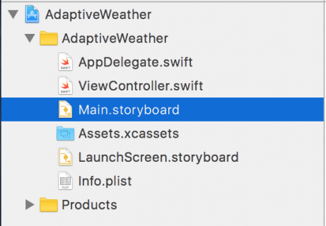
Once you’ve specified the location for your project, take a look at the Project Navigator and you’ll see the following files:

Main.storyboard is the single storyboard for all devices, no matter their screen size. Open the storyboard and you’ll see that it contains a single view controller, currently the size of an iPhone 7’s screen:

The Use Trait Variations option, found in the File Inspector, enables this new format for your project; select the storyboard, open the File Inspector and you’ll see the checkbox option as shown below:

This option is enabled by default for all new iOS projects. You can turn this option on yourself when upgrading your old projects to use the new storyboards.

Setting Up Your Storyboard

To start, open Main.storyboard and drag an Image View from the Object Library onto the view controller canvas. In the Size Inspector, set the X position to 37 and the Y position to 20. Set the Width to 300 and the Height to 265.

Next, drag a View from the Object Library and place it below the image view. In the Size Inspector, set the X position to 37 and the Y position to 340. Set the Width to 300 and the Height to 265:

Select the view you just added, open the Identity Inspector and enter TextContainer in the Label field. Note that the Document pane might be collapsed – if so press the Show button to reveal it. This gives the view a name and makes it easier to see in the Document Inspector. This view will eventually hold the city and temperature labels of your app.

It’s often hard to see views after dragging them in from the Object Library as their default background color is white, the same as the view controller’s view. To fix this, select the view controller’s view, open the Attributes Inspector and set its background color to #4AABF7.

Next, select the TextContainer view and set its background color to #3780BA.

Your view controller should now look like the screenshot below:

These two views are the only direct descendants of the view controller’s view; your task now is to give them some layout constraints.

Adaptive Layout

Select the image view and press the Align button in the auto layout toolbar. Check the Horizontally in Container tick-box, ensuring the value is set to 0, and click Add 1 Constraint.

Then press the Add New Constraints button and add a top spacing to the superview constraint of 20, like so:

Click the Add 1 Constraint button.

The constraints you added above ensure that the image view has a fixed size margin from the top and that it is centered left to right. You now need to configure the space between the image view and the text container view. Ctrl-drag from the image view down to the text container view, like so:

This displays the constraint context menu again. Select Vertical Spacing:

This constraint determines the amount of vertical space between the bottom of the image view and the top of the TextContainer view.

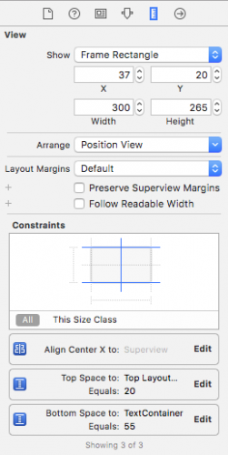
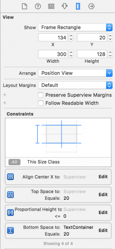
Select your image view and open the Size Inspector to see how it looks now:

You’ll see the three constraints you just added to your layout; you can easily configure each constraint from within the size inspector. Press the Edit button in the Bottom Space To: TextContainer constraint; you’ll be presented with a dialog to configure the constraint properties. Set Constant equal to 20:

Click away from the dialog to close it.

You’ve already configured your TextContainer view to have a gap of 20 points from the bottom edge of the image view, but you also need to add constraints to the other three sides of the view.

Select your TextContainer view then click the Add New Constraints button in the bottom bar to show the dialog. In the Spacing to nearest neighbor section, set the left, right and bottom spacing to the superview to 0. Ensure that Constrain to margins is unchecked; this removes padding from around your view.

For reference, the dialog should look like the following:

Click Add 3 Constraints to add the new constraints to your view. This pins the text container view to the left, right and bottom edges of the view controller’s view.

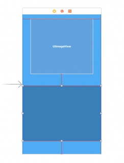
Your storyboard should now look like the screenshot below:

You’ll notice a few orange and red constraints on your view; this indicates there are issues with these constraints that need your attention. It’s possible to have the storyboard automatically update the frames of the contained views to satisfy these constraints, but if you do this right now your image view will shrink to zero size.

That’s because your image view doesn’t yet have any content – which means it has an intrinsic height and width of zero. Auto Layout relies on a view’s intrinsic size to determine its width and height if no physical width or height constraints are supplied.

In the Project Navigator, open Assets.xcassets. Download cloud_images.zip and unzip it. Inside you’ll find three files. Select all three of them in Finder, and drag them to the empty pane on the right hand side of the asset catalog:

This will create a new image set, and assign the three images appropriately:

You can now use your image set to populate your image view. Head back over to Main.storyboard and select your image view. Switch to the Attributes Inspector, type the name cloud_small into the Image field, and select Aspect Fit in the Content Mode drop down list, like so:

Your storyboard now should look like the following:

There’s your image, and thankfully everything seems to be in place; the view controller re-arranged the views automatically to match the new constraints.

Previewing Layouts

Normally you’d now build and run your project on all the different simulator versions – in both orientations – in order to test this new universal storyboard. This process is laborious at best, but Xcode 9 gives you a much better option with the new trait variation previews.

Open Main.storyboard then find the View as button at the bottom of the canvas, and click on it. This expands the trait chooser menu:

In the Devices section, select iPhone 4s (the right-most icon shown in the Device area).

You’ll notice that the canvas has switched to a different configuration: your views are now on a 4-inch iPhone screen, as shown below:

To view your layout in landscape mode, select Landscape in the Orientation area of the trait chooser:

This is a huge improvement over firing up multiple simulators: with the click of a button, you can check if your layout still holds on a different device.

Notice anything odd about the landscape iPhone preview? That’s right – the cloud image is far too big. To fix this you’ll add a new constraint to the image view.

Head back to the storyboard. Ctrl-drag from the image view to the view controller’s view to create a new constraint. From the context menu, select Equal Heights:

A number of constraints on the storyboard are now colored red. This is because the constraint you just added conflicts with the existing constraints, as it’s not possible for the image view to have the same height as the view controller’s view and maintain the vertical margins you created earlier.

Select the constraint you just added in the Document Outline and open the Attributes Inspector. If the First Item is not set to cloud_small.Height then select Reverse First and Second Item in the First Item dropdown as shown below:

Next, select the Relation to be Less Than or Equal set Multiplier to 0.40 as shown below:

This means that the cloud image will either be the intrinsic size of the image, or be 40% of the height of the screen, whichever is smaller.

You’ll notice that the canvas automatically refreshes as soon as you update the constraint, as demonstrated below:

Perfect!

Since this is supposed to be a weather app, you’ll now add some labels to show the city name and the current temperature.

Adding Content to the TextContainer

In Main.storyboard, switch back to the Portrait iPhone 7 trait, and drag two Labels from the Object Library onto the TextContainer view, and arrange them roughly as shown below:

Select the topmost label and use the Align and Add New Constraints menus to center the label horizontally and add a top spacing to nearest neighbor of 10, as shown below:

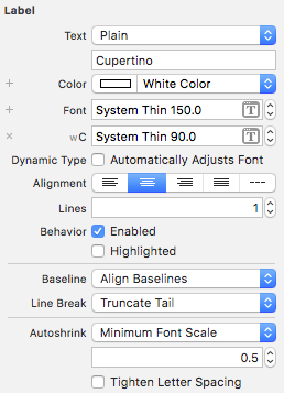
Next, select the Attributes Inspector and set Text to Cupertino, Color to White Color, and the font to System, Thin with Size of 150.

You’ve probably noticed the text is currently illegible, and this is due to the frame of the label – you’ll resolve this shortly.

Now select the other label, and again use the Align and Pin menus to center it horizontally, and set a bottom space to nearest neighbor of 10. Check that the Size Inspector matches the following:

Use the Attributes Inspector to set the Text to 28C, the color to White Color, and the font to System, Thin with a size of 250.

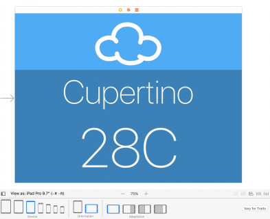
The labels reach out of bounds, and overlap in the storyboard, which isn’t the look you’re going for. However, take a look at a different trait before you fix anything. The iPad Pro 9.7″ version is looking pretty good:

Predictably, the font size is far too big for the iPhone:

You’ll correct these sizing issues in the next section of this Adaptive Layout tutorial.

Size Classes

Universal storyboards are great – but you’ve already discovered that creating one single layout for all displays is a bit of a challenge. However, Adaptive Layout has a few more tools and tricks to solve these issues.

One of the core concepts behind adaptive layout is size classes. A size class is a property applied to any view or view controller that represents the amount of content that can be displayed in a given horizontal or vertical dimension.

Xcode provides two size classes: Regular and Compact. Although they are related to the physical dimensions of a view, they also represent the semantic size of the view.

The following table shows how the size classes apply to the different devices and orientations:

Screen Shot 2014-09-23 at 10.53.49 AM

These are the size classes that the device hands down to the app. However, you can override these size classes at any point in the view hierarchy. This can be useful when using a view controller in a container which is significantly smaller than the screen.

Size Classes and You

What does that mean for you and the design of your app? Although your app is aware of size classes, the layout you’ve built is size class agnostic – that is, your layout remains the same for all size classes.

This is an important point when it comes to the design phase of your adaptive layout. You should build a base layout first and then customize each specific size class based on the individual needs of that size class. Don’t treat each of the size classes as a completely separate design. Think of an adaptive layout as a hierarchy, in which you put all of the shared design into the parent and then make any necessary changes in the child size classes.

There’s been almost no mention of configuring layouts for specific devices so far. This is because a core concept of adaptive layout is that size classes are abstracted away from device-specific characteristics. This means that a view that supports adaptive layout could be used in a full-screen view controller as well as in a contained view controller, albeit with different appearances.

This also benefits Apple, as there is room to expand the range and characteristics of their devices without forcing developers and designers to re-engineer their apps.

You’ll use size classes to customize the landscape layout for iPhone since the current layout doesn’t cope well when restricted vertically.

Working with Size Classes

To introduce trait variations, first make sure that you select a Compact Height configuration (e.g. an iPhone SE in landscape), then click on the Vary for Traits button to the right of the Trait chooser menu.

Here you can choose a size class to customize and introduce variations based on width and height:

Note: There is a slight discrepancy in nomenclature. Size classes are always referred to as horizontal and vertical. However, IB uses the terms width and height. There’s an obvious parallel (width = horizontal; height = vertical); just be aware that there are two terms for the same concept.

Your current layout doesn’t work properly for compact heights. To fix this, choose Height in the Vary for Traits menu:

You’ll immediately notice the bottom bar turning a rather fetching shade of blue. This indicates, that you’re now working on a size-class specific layout.

In order to change the layout, you’ll need to temporarily change a few constraints. In Auto Layout terminology this is known as installing and uninstalling constraints. A constraint is installed if it is currently active, whereas an uninstalled constraint is not currently active within the current size class.

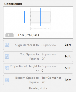
Click on the image view to select it, and open the Size Inspector. You can see a summary of the constraints which affect this view:

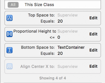
Select the Align Center X to: Superview constraint by single clicking it, and then press the Delete key on the keyboard to uninstall the constraint for the current size class. The constraint immediately disappears from the storyboard view and becomes grayed out in both the Document Outline and the view’s Size Inspector:

Note: You might have to toggle from This Size Class to All in the Size Inspector to see the uninstalled constraint.

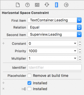
Double click on the uninstalled constraint in the Size Inspector to select the constraint . There’s an additional line at the bottom as shown below:

This indicates the constraint is installed for the base layout, but not for the Compact Height layout – that is, the one you’re currently editing.

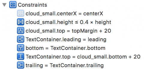
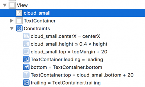
Repeat the same procedure to uninstall the other three constraints associated with the image view. Your document outline and image view’s Size Inspector should resemble the following images:

Now you can add the constraints required for this size class. Use the Align and Pin menus to Vertically Center in the Container, and to set a left spacing to nearest neighbor of 10:

Ctrl-drag from the image view to the view controller’s view and then select Equal Widths in the popup menu.

Open the Size Inspector for the image view and double-click the Equal Width to: Superview constraint to reveal its properties. If the First Item isn’t cloud_small.Width, use the drop down menu to Reverse First and Second Item. Now update the Multiplier to equal 0.45.

The constraints for the image view are now set up correctly for all size classes, but the text container still needs a bit of attention. You’ll need to alter the constraints for this size class to move the label to the right hand side.

The TextContainer view has internal constraints to position the labels, which work fine as-is. However, the three external constraints – pinning it to the left, right and bottom sides of the view – aren’t quite working properly. To pin the view to the bottom right hand side of the parent view you’ll need to uninstall the left-hand constraint.

Select TextContainer in the document outline, and uninstall the Leading Space constraint in the size inspector. To verify, that the constraint is uninstalled for compact height, select it in the document outline, and check the size inspector:

You now need to add two constraints to your TextContainer to position it correctly. The view should be half the width of its superview, the view controller’s view, and pinned to the top.

In theory, you could simply Ctrl-drag from the TextContainer view to the view controller’s view as you’ve been doing all along. However, in practice it’s often difficult to grab just the view when there’s content in the way. It’s much easier to use the document outline to do your dirty work.

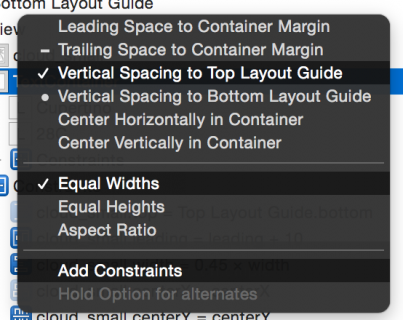
Ctrl-drag from TextContainer in the document outline up to the view controller’s view:

Shift-click on Vertical Spacing to Top Layout Guide and Equal Widths. Click Add Constraints to create the new constraints:

Open the Size Inspector for your TextContainer and update the two new constraints you’ve just created as follows:

  • Top Space to: Top Layout Guide should have a Constant of 0
  • Equal Width to: Superview should have a Multiplier of 0.5. Note that you might have to switch the first and second items in this constraint, as you have done before. Simply double click on the constraint and choose to Reverse First and Second Item.

The storyboard will update and display the new layout as shown below:

The layout has changed completely; you’re closer to the finished product now. There are still a few issues to correct with the font sizes – you’ll address these in the next section.

Adaptive Fonts

The current font sizes in your TextContainer look pretty good in the iPad view using a container with regular size classes, but the font size is too large for compact size classes. Fear not – it’s also possible to override font sizes within your size classes!

Note: Unlike layout overrides, changing the font configuration will always affect the base layout. Changes to the font configuration don’t respect the current size class overrides in interface builder. Instead, use the method outlined below.

Click the Done Varying button to the right of the Trait chooser menu. The bottom bar of your view turns gray to indicate that you’re back to the base layout.

Select the Cupertino text label and open the Attributes Inspector. Click the small + to the left of the Font:

This reveals a menu for selecting the size class combination in which you’ll override the font size. Select Compact for the Width and Any for the Height like so:

This creates a second font selector box that will apply to the specified size class combination. Update the font size in the new selector box to 90:

Now select the temperature text label and repeat the same process; this time, set a font size override of 150 for Compact Width, Any Height.

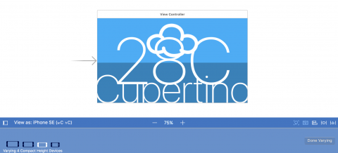
Interface Builder updates automatically to show the effect of the changes you made:

Well, it’s looking a little better, but the Cupertino label is clipped. Fiddling with the font sizes until it fits perfectly isn’t a particularly scalable option. Cupertino is quite a long place name, but Washington, D.C. is longer – and Kleinfeltersville, PA is longer still! What’s a designer to do?

Once again, Auto Layout comes to the rescue! You simply need to limit the width of the two text labels to match the width of the TextContainer. Ctrl-drag from the Cupertino label to the TextContainer, and select Equal Widths.

Repeat the process with the temperature label. The canvas updates to show the effects of your changes as follows:

Hmm, having the text truncate is not exactly what you want. This is the default behavior for labels that contain more text than will fit in the available space. However, there is an option to automatically adjust the font size to fit the content.

Select the Cupertino label and open the Attributes Inspector. Change the AutoShrink drop down to Minimum Font Scale and ensure that it is set to 0.5. Also update the Text Alignment to Centered. Your Attributes Inspector should look as follows:

Repeat exactly the same procedure for the temperature label.

Take a look at Interface Builder canvas; the iPhone layouts look much better now:

Working with the preview editor is great, but this is probably a good time to build and run your project to see that everything is still working correctly. The iPhone screens look like everything is sizing correctly:

Congrats, you have learned the basic techniques of Adaptive Layout!

Where To Go From Here?

Here is the finished example project from this Adaptive Layout tutorial.

Take a moment to think about the app you’ve built (or the completed project you’ve downloaded). In particular, consider that it looks really good on all devices, in both orientations, using only one storyboard file!

If nothing else convinces you that Adaptive Layout is the way of the future, consider the fact that this layout will also look good on future devices that haven’t even been released yet.

The takeaway from this tutorial is that, as a developer, you will need to change your approach to app design. Rather than working towards pixel-based layouts, you should be considering the relationship between the UI elements on the screen.

If you want to learn more about Adaptive Layout, check out our Adaptive Layout video tutorial series, which takes you all the way from the beginning to an Adaptive Layout master! It’s also useful to watch Part 1, and Part 2 of Making Apps Adaptive from WWDC 2016.

In the meantime, if you have any questions or comments about this tutorial or Adaptive Layout in general, please join the forum discussion below!

The post Adaptive Layout Tutorial in iOS 11: Getting Started appeared first on Ray Wenderlich.

iOS 11 by Tutorials: First 4 Chapters Now Available!

$
0
0

Great news everyone: The first early access release of iOS 11 by Tutorials is now available, and we can finally reveal the winner of the cover contest!

This release has four chapters:

  • Chapter 6: Beginning Drag and Drop: Take advantage of the new drag-and-drop features to select one or more files from within your application, drag them around, and drop them on target locations within your app. In this chapter you’ll dive straight in and get your hands dirty with the latter set of APIs, by integrating drag and drop into an iPad bug-tracking app known as Bugray.
  • Chapter 10: Natural Language Processing: Learn how to detect the language of a body of text, how to work with named entities, how senitment analysis works, how to perform searches with NSLinguisticTagger, and more! In this chapter, you’ll build an app that analyzes movie reviews for salient information. It will identify the review’s language, any actors mentioned, calculate sentiment (whether the reviewer liked, or hated, the movie), and provide text-based search.
  • Chapter 11: Introduction to ARKit: Build your own augmented reality app as you learn how to set up ARKit, detect feature points and draw planes, how to create and locate 3D models in your scene, handle low lighting conditions and manage session interruptions. With all the amazing things happening in AR lately, you won’t want to miss this chapter!
  • Chapter 12: PDFKit: Finally — you can easily create and annotate PDFs using native Apple libraries on the iPhone with PDFKit. Learn how to create thumbnails, add text, UI controls and watermarks to your documents, and even create custom actions for the UI controls in your PDF documents.

This is the first of many early access releases for the book – stay tuned for some more early access releases soon!

Cover Contest Winners

When we announced iOS 11 by Tutorials, we ran a contest where you could pick the sea creature that would appear on the cover. Two people at random would win their choice of a free PDF book of their choice from the raywenderlich.com store. The reader whose sea creature made it onto the cover would win a framed, high-quality print of the cover, signed by the artist, along with a free PDF book of their choice from the raywenderlich.com store.

The reader whose sea creature appears on the front cover of iOS 11 by Tutorials is @bncwhite with their suggestion of the Blue Surgeonfish:

And the two random winners of a free copy of a PDF book of their choice are…

We’ll be in touch shortly with the winners to let them know how to collect their prizes. Thanks to all for entering!

Where to Go From Here?

Here’s how you can get your early access copy of iOS 11 by Tutorials:

  • If you’ve pre-ordered iOS 11 by Tutorials, you can log in to the store and download the early access edition of iOS 11 by Tutorials here.
  • If you haven’t yet pre-ordered iOS 11 by Tutorials

    , we’re offering a limited-time, pre-order sale price of $44.99.

    When you pre-order the book, you’ll get exclusive access to the upcoming early access releases of the book so you can get a jumpstart on learning all the new APIs. The full edition of the book will be released in Fall 2017.

Gone are the days when every third-party developer knew everything there is to know about iOS. The sheer size of iOS can make new releases seem daunting. That’s why the Tutorial Team has been working really hard to extract the important parts of the new APIs, and to present this information in an easy-to-understand tutorial format. This means you can focus on what you want to be doing — building amazing apps!

What are you most looking forward to learning about in iOS 11? Respond in the comments below and let us know!

The post iOS 11 by Tutorials: First 4 Chapters Now Available! appeared first on Ray Wenderlich.

Video Tutorial: Mastering Git Part 1: Implementation of Git

Video Tutorial: Mastering Git Part 2: Merge Conflicts

$
0
0

In the Beginning Git video series, you discovered how powerful the branch-and-merge paradigm is. But merging isn't always as simple as it might first appear. In this video you will learn how to handle merge conflicts—which occur when Git cannot work out how to automatically combine changes.

The post Video Tutorial: Mastering Git Part 2: Merge Conflicts appeared first on Ray Wenderlich.


New Course: Mastering Git

$
0
0

Two weeks ago we released an introduction to version control with the Beginning Git video course. Today, we’re pleased to offer the new, follow-up course: Mastering Git.

Git is an incredibly powerful platform-agnostic tool. In the Beginning Git video series you learnt the basics around how and why to use Git. If you haven’t seen that series, it comes highly recommended. Even if you think you know Git, give it a watch—there’s almost certainly some content in there that you don’t know about.

In this 14-part Mastering Git course, you’ll take the solid foundation laid by the Beginning Git course, and build upon it. You’ll focus on fixing real-world problems, as you take a multi-user Git repository and work through the final steps of releasing a software product. You’ll also find out what Git GUIs have to offer, and take a tour of several popular options.

Let’s take a look at what’s inside:

Video 1: Implementation of Git (Free!)

If you’ve been using Git for a while, you might be wondering how it actually works. In the first video of the Mastering Git video course, you’ll discover how Git is built on top of a simple key-value store-based file system, and what power this provides to you.

Video 2: Merge Conflicts

In the Beginning Git video series, you discovered how powerful the branch-and-merge paradigm is. But merging isn’t always as simple as it might first appear. In this video you will learn how to handle merge conflicts—which occur when Git cannot work out how to automatically combine changes.

Video 3: Stashes

Git stashes offer a great way for you to create a temporary snapshot of what you’re working on, without having to create a full-blown commit. Discover when that might be useful, and how to go about it.

Video 4: Aliases

Do you ever find yourself typing out the same long Git commands repeatedly? Well, now there’s another way. Git aliases allow you to create new Git commands that can streamline your workflow.

Video 5: Rebase: A Merge Alternative

Rebasing is often thought of as a mystical and complex tool. This video will demystify one of the primary uses of Git rebase—integrating branches without merge commits.

Video 6: Rebase: Rewriting History (Free!)

Rebase is a whole lot more powerful than just as a replacement for merge. It offers the ability to completely rewrite the history of your Git repo. Discover how in this action-packed video.

Video 7: Gitignore After the Fact

Gitignore is easy right? If you’ve been using it for a while you’ll know that isn’t always true. Discover how you can fix problems with gitignore such as handling files that have been accidentally committed to the repository.

Video 8: Cherry Picking

Cherry picking provides a way to grab single commits from other branches, and apply them to your own branch. Learn how to achieve this, and why you might want to in the next video in the Mastering Git video course.

Video 9: Filter Branch

Interactive rebase allows you to rewrite history one commit at a time. But what if you want to automate that? In this video you’ll see how you can use the filter-branch tool to programmatically rewrite history—kinda like a nerdy time traveller.

Video 10: Many Faces of Undo

One of the common questions associated with git is “how can I get out of this mess?”. In this video you’ll learn about the different “undo” commands that git provides—what they are and when to use them.

Video 11: GUIs: Gitk

In the first of three videos about GUIs for Git, you’ll take a look at Gitk and GitGUI—two simple tools that are distributed with Git itself.

Video 12: GUIs: SourceTree

Next up on the whistlestop tour of popular Git GUIs is SourceTree. Learn how to get started with SourceTree, and some of the top tools it offers.

Video 13: GUIs: GitUp

And finally, it’s GitUp—objectively the best Git GUI there is. Find out why as we take a quick tour of how to get started with GitUp.

Video 14: Conclusion

A quick summary of what you’ve learnt throughout this Mastering Git video course. Remember that Git is a tool that you can use irrespective of your chosen platform, but that it is very much a tool.

Where To Go From Here?

Want to check out the course? You can watch two of the videos for free:

The rest of the course is for raywenderlich.com subscribers only. Here’s how you can get access:

  • If you are a raywenderlich.com subscriber: You can access the first two parts of Mastering Git. today, and the rest will be coming out over the next two weeks.
  • If you are not a subscriber yet: What are you waiting for? Subscribe now to get access to our new Mastering Git course and our entire catalog of over 500 videos.

There’s much more in store for raywenderlich.com subscribers – if you’re curious, you can check out our full schedule of upcoming courses.

I hope you enjoy our new course, and stay tuned for many more new courses and updates to come! :]

The post New Course: Mastering Git appeared first on Ray Wenderlich.

Open Call for Applications on the Unity Team

$
0
0

OpenCall-Unity-feature

Since we set up the Unity team last year, we’ve made over 35 free Unity tutorials for everyone to enjoy and learn from.

We’ve also recently released our first book – Unity Games by Tutorials – that teaches you how to create 4 complete Unity games from scratch! We’re currently updating the book for 2017.

We want to offer our readers more awesome Unity tutorials, so we’re currently recruiting new Unity developers to join the tutorial team.

Specifically, we’re looking for the following:

  • 2 writers: Writers focus on writing new high quality tutorials, and updating existing tutorials. If you love learning new things and teaching people about them, this is perfect for you. Time commitment: Write 1 tutorial every 3 months.
  • 1 tech editor: As a tech editor you make sure that everything that gets released is of superior quality and you help the writers grow through your improvements and comments. Time commitment: Tech edit 1 tutorial every month.

Here are some skillsets that would greatly complement the team (not required but helpful):

  • Shaders
  • Networking
  • 3D modelling
  • VR (HTC Vive and/or Oculus Rift)

Joining our team is a great way to learn and improve – not to mention, getting paid for it!

If this sounds interesting, keep reading to find out what’s involved and how to apply.

Why Join Our Team?

Here are the top 5 reasons to join the Unity team:

  1. Learning. You’ll always be learning something new — and will have fun doing it! You’ll become a better developer, writer and person. The best part… you’ll make a lot of new friends along the way.
  2. Money! Get paid to learn! We offer the highest rates in the industry.
  3. Special Opportunities. Members of the team get access to special opportunities such as contributing to our books and products, speaking at our conference, being a guest on our podcast, working on team projects and much more.
  4. You’ll Make a Difference. We get emails every day about how our tutorials help our readers make their first game, improve their skills and achieve their dreams. This means a lot to us, and makes all the hard work worth it!
  5. Free Stuff! And as a final bonus, by joining the team you’ll get a lot of free stuff! You’ll get a free copy of all of the products we sell on the site — over $1,000 in value!

Aww Yeah!

Requirements and How to Apply

Here are the requirements:

  • You must be an experienced Unity developer.
  • You should be a great writer with fluent English writing skills.
  • You should be comfortable learning brand new topics that you’ve never done before.
  • You should have a strong work ethic — this will be a significant time commitment and is not easy.

To apply, send me an e-mail. Be sure to include the following information:

  • Please tell me a little bit about yourself and your experience with Unity.
  • What is the best game you’ve ever worked on in Unity? [Please include link]
  • Please link to any examples of technical writing you’ve done in the past.
  • Please include links to: your GitHub account, your Twitter account and your Unity Answers/Unity Forums account (if you have one).

If your application looks promising, we’ll send you a tryout to gauge your writing and/or editing skills.

If you pass the tryout, you’re in!

What Are You Waiting For?

If this opportunity interests you, go on and send me an e-mail! I look forward to creating some great tutorials with you. :]

The post Open Call for Applications on the Unity Team appeared first on Ray Wenderlich.

Video Tutorial: Mastering Git Part 3: Stashes

React Native Tutorial: Building iOS and Android Apps with JavaScript

$
0
0
React Native tutorial

React Native Tutorial: Build native iOS applications with JavaScript.

Update note: This tutorial has been updated to React Native 0.46, Xcode 9, and iOS 11 by Christine Abernathy. The previous tutorial was written by iOS Team member Tom Elliot.

In this React Native tutorial you’ll learn how to build native apps based on the hugely popular React JavaScript library.

What makes React Native different from other frameworks such as PhoneGap (Apache Cordova) or Appcelerator Titanium, that use JavaScript to create iOS apps?

  1. (Unlike PhoneGap) with React Native your code may be written in JavaScript but the app’s UI is fully native. It doesn’t have the drawbacks typically associated with a hybrid HTML5 app.
  2. Additionally (unlike Titanium), React introduces a novel, radical and highly functional approach to constructing user interfaces. Your UI is simply a function of the current app state.

React Native brings the React paradigm to mobile app development. It’s goal isn’t to write the code once and run it on any platform. The goal is to learn-once (the React way) and write-anywhere. An important distinction to make. This tutorial only covers iOS, but once you’ve learned the concepts here you could port that knowledge into creating an Android app very quickly.

If you have only ever written applications in Swift, you might not be particularly excited about the prospect of using JavaScript. However, the functional programming aspect should pique your interest!

Swift has introduced more functional ways to encode algorithms, as well as techniques that encourage transformation and immutability. However, the way in which you construct your UI is very much the same as it was when developing with Objective-C: it’s still UIKit-based and imperative.

The community has even added tools such as Expo and Create React Native App to help you quickly build React Native apps without having to touch Xcode or Android Studio!

This React Native tutorial takes you through the process of building an iOS app for searching UK property listings:

React Native tutorial finished app

Don’t worry if you’ve never written any JavaScript or used the CSS-like properties you’ll see. This tutorial will guide you through every step and provide resources where you can learn more.

Ready to get going? Read on!

Getting Started

React Native uses Node.js, a JavaScript runtime, to build your JavaScript code. If you don’t already have Node.js installed, it’s time to get it!

First install Homebrew using the instructions on the Homebrew website. Then install Node.js by executing the following in a Terminal window:

brew install node

Next, use homebrew to install watchman, a file watcher from Facebook:

brew install watchman

This is used by React Native to figure out when your code changes and rebuild accordingly. It’s like having Xcode do a build each time you save your file.

Next use npm to install the React Native Command Line Interface (CLI) tool:

npm install -g react-native-cli

This uses the Node Package Manager to fetch the CLI tool and install it globally; npm is similar in function to CocoaPods or Carthage and is packaged with Node.js.

Navigate to the folder where you would like to develop your app and run the following in Terminal:

react-native init PropertyFinder

This uses the CLI tool to create a starter project containing everything you need to build and run a React Native app.

If you get complaints about the version of node, make sure the one installed by brew is the one in use. Run brew link --overwrite node in the terminal.

In Terminal, run:

cd PropertyFinder

In the created folders and files you will find a few items of note:

  • node_modules is a folder which contains the React Native framework
  • index.ios.js is the skeletal app created by the CLI tool
  • ios is a folder containing an Xcode project and the code required to bootstrap
    your application
  • Android counterparts to the above, although you won’t be touching those in this tutorial.

Open the PropertyFinder.xcodeproj in the ios folder with Xcode, then build and run. The simulator will start and display the following:

React Native welcome screen

If you encounter a compiler error indicating 'config.h' file not found in the third-party target, you may need to install Glog manually. Try these instructions.

If you see build-time warnings related to updating PropertyFinder project settings, go ahead and make those updates. Ignore warnings related to the other projects.

Many of the warnings may be related to unused parameters. You may also see null pointer logic errors in the yoga library that are actually not errors.

You might also have noticed that a terminal window has popped up, displaying the following:

React Native packager terminal window

This is the React Native packager, running under node. You’ll find out what it does shortly.

Note: If you get an error starting up the packager, then in Terminal run: react-native start

Don’t close the terminal window; just keep it running in the background. If you do close it by mistake, simply stop and re-run the project via Xcode.

Note: You’ll be mostly writing JavaScript code for this React Native tutorial. Instead of using Xcode, I use Sublime Text, which is a cheap and versatile editor, but Atom, Brackets or any other lightweight editor will do the job.

React Native Basics

In this section, you’ll be introduced to React Native basics as you begin working on PropertyFinder.

Open index.ios.js in your text editor of choice and take a look at the structure of the code in the file:

import React, { Component } from 'react'; // 1
import {
  AppRegistry,
  StyleSheet,
  Text,
  View
} from 'react-native';

export default class PropertyFinder extends Component { ... } // 2

const styles = StyleSheet.create({ ... }); // 3

AppRegistry.registerComponent('PropertyFinder', () => PropertyFinder); // 4

Let’s go through the code step-by-step:

  1. Import the required modules.
  2. Defines the component that represents the UI.
  3. Creates a style object that controls the component’s layout and appearance.
  4. Registers the component that handles the app’s entry point.

Take a closer look at this import statement:

import React, { Component } from 'react';

This uses the ECMAScript 6 (ES6) import syntax to load the react module and assign it to a variable called React. This is roughly equivalent to linking and importing libraries in Swift. It also uses what’s called a destructuring assignment to bring in the Component object. Destructuring lets you extract multiple object properties and assign them to variables using a single statement.

Note: For more information about ES6 modules I’d recommend reading this blog post by Dr. Axel Rauschmayer.

ES6 is a much nicer way to write JavaScript, supporting features like default parameters, classes, arrow functions, and destructuring assignments. Apple has supported ES6 since iOS 10, but older browsers may not be compatible with it. React Native uses a tool called Babel to automatically translate modern JavaScript into compatible legacy JavaScript where necessary.

Back to index.ios.js, check out the class definition:

export default class PropertyFinder extends Component

This defines a class which extends a React Component. The export default class modifier makes the class “public”, allowing it to be used in other files.

It’s time to start building your app.

In index.ios.js, add the following at the top of the file, just before the import statements:

'use strict';

This enables Strict Mode, which adds improved error handling and disables some less-than-ideal JavaScript language features. In simple terms, it makes JavaScript better!

Inside the PropertyFinder class replace render() with the following:

render() {
  return React.createElement(Text, {style: styles.description}, "Search for houses to buy!");
}

PropertyFinder extends React.Component, the basic building block of the React UI. Components contain immutable properties, mutable state variables and expose a method for rendering. Your current application is quite simple and only requires a render method.

React Native components are not UIKit classes; instead they are a lightweight equivalent. The framework takes care of transforming the tree of React components into the required native UI.

Next, replace the const styles statement with the following:

const styles = StyleSheet.create({
  description: {
    fontSize: 18,
    textAlign: 'center',
    color: '#656565',
    marginTop: 65,
  },
});

This defines a single style that you’ve applied to the description text. If you’ve done any web development before, you’ll probably recognize those property names. The React Native StyleSheet class used to style the application UI is similar to the Cascading Style Sheets (CSS) used on the Web.

Save your changes to index.ios.js and return to the simulator. Press Cmd+R, and you’ll see your fledgling property search app starting to take shape:

First signs of the React Native tutorial app

That’s a JavaScript application running in the simulator, rendering a native UI, without a browser in sight!

Still don’t trust me? :] Verify it for yourself: within Xcode, select Debug\View Debugging\Capture View Hierarchy and take a look at the native view hierarchy. You will see no UIWebView instances anywhere! Your text is being displayed in a view called RCTText. But what is that? Back in Xcode select File\Open Quickly… and type in RCTView.h. Notice RCTView inherits directly from UIView. Neat!

React Native tutorial app's view hierarchy

Curious as to how it all works? In Xcode open AppDelegate.m and locate application:didFinishLaunchingWithOptions:. This method constructs a RCTRootView, which loads the JavaScript application from the index.ios JavaScript file and renders the resultant view.

The Terminal window that was opened when you ran this application started a packager and server that allows your JavaScript code to be fetched, by default on port 8081. For example:

http://localhost:8081/index.ios.bundle

Open this URL in Safari; you’ll see the JavaScript code for your app. You can find your “Search for houses to buy!” description code embedded among the React Native framework.

When your app starts, this code is loaded and executed by the JavaScriptCore framework. In the case of your application, it loads the PropertyFinder component, then constructs the native UIKit view.

Using JSX

Your current application uses React.createElement to construct the simple UI for your application, which React turns into the native equivalent. While your JavaScript code is perfectly readable in its present form, a more complex UI with nested elements would rapidly become quite a mess.

Make sure the app is still running, then return to your text editor to edit index.ios.js. Modify the body of render to be the following:

return <Text style={styles.description}>Search for houses to buy! (Again)</Text>;

This is JSX, or JavaScript syntax extension, which mixes HTML-like syntax directly in your JavaScript code; if you’re already a web developer, this should feel rather familiar. You’ll use JSX throughout this article.

Save your changes to index.ios.js and return to the simulator. Press Cmd+R, and you’ll see your application refresh to display the updated message:

React Native tutorial app with updated message

Re-running a React Native application is really as simple as refreshing a web browser! :] Note that this will only reflect changes made to your JavaScript files – native code or resource changes will require a rebuild in Xcode.

You can even skip having to refresh the app by enabling live reload. Press Cmd+D in the simulator then select Enable Live Reload:

Enabling live reload in a React Native iOS app

In index.ios.js, modify the render method’s body to the following:

return <Text style={styles.description}>Search for houses to buy!</Text>;

Save your changes. Note that the simulator automatically refreshes to reflect your changes:

Live reload in a React Native iOS app

Adding Navigation

PropertyFinder uses the standard stack-based navigation experience provided by UIKit’s navigation controller. It’s time to add this behavior.

In index.ios.js, find the import statements near the top and add a comma following the View destructuring assignment. Then add the following below it:

NavigatorIOS,

This brings in NavigatorIOS that you’ll use for navigation.

Next, replace the PropertyFinder class definition with the following:

class SearchPage extends Component {

You’ve just renamed the class. You’ll see an error as a result, but will clean that up next.

Add the following class below the SearchPage component:

class PropertyFinder extends Component {
  render() {
    return (
      <NavigatorIOS
        style={styles.container}
        initialRoute={{
          title: 'Property Finder',
          component: SearchPage,
        }}/>
    );
  }
}

This constructs a navigation controller, applies a style and sets the initial route to the SearchPage component. In web development, routing is a technique for defining the navigation structure of an application, where pages — or routes — are mapped to URLs.

Within the same file, add the following to the styles list under the closing brace of the description style:

container: {
  flex: 1,
},

This tells the component using this style to fill all available space. This ensures that the component’s children are visible.

Save your changes and check the simulator to see the updated UI:

React Native tutorial app with a navigator

There’s the navigation controller with its root view, which is currently the search description text. Excellent — you now have the basic navigation structure in place.

Building out the Search Page

Add a new file named SearchPage.js and place it in the same folder as index.ios.js. Add the following code to this file:

'use strict';

import React, { Component } from 'react';
import {
  StyleSheet,
  Text,
  TextInput,
  View,
  Button,
  ActivityIndicator,
  Image,
} from 'react-native';

This imports the modules you’ll need to build the UI.

Add the following Component subclass after the import statements:

export default class SearchPage extends Component {
  render() {
    return (
      <View style={styles.container}>
        <Text style={styles.description}>
          Search for houses to buy!
        </Text>
        <Text style={styles.description}>
          Search by place-name or postcode.
        </Text>
      </View>
    );
  }
}

render is a great demonstration of JSX and the structure it provides. Along with the style, you can very easily visualize the UI constructed by this component: a container with two text labels.

Now, add the following style code at the bottom of the file:

const styles = StyleSheet.create({
  description: {
    marginBottom: 20,
    fontSize: 18,
    textAlign: 'center',
    color: '#656565'
  },
  container: {
    padding: 30,
    marginTop: 65,
    alignItems: 'center'
  },
});

Again, these are standard CSS properties. Setting up styles like this is less visual than using Interface Builder, but it’s better than setting view properties one by one in your viewDidLoad() methods! :]

Save your changes.

Open index.ios.js and add the following just after the current import statements near the top of the file:

import SearchPage from './SearchPage';

This imports SearchPage from the file you just created – which will temporarily break your app! This is because SearchPage is now declared twice – once in SearchPage.js, and again in the current file.

Remove the SearchPage class and its associated description style from index.ios.js. You won’t be needing that code any longer.

Save your changes and return to the simulator to check out the new UI:

React Native tutorial app with a search label

Styling with Flexbox

So far, you’ve seen basic CSS properties that deal with margins, paddings and color. However, you might not be familiar with Flexbox, a more recent addition to the CSS specification that’s useful for handling complex layout across different screen sizes.

React Native uses the Yoga library under the hood to drive layout. Yoga is a C implementation of Flexbox and it includes bindings for Swift, Objective-C, Java (for Android), and C# (for .NET).

Generally you use a combination of flexDirection, alignItems, and justifyContent Yoga properties to manage your layout.

So far, your layout has a container with two children arranged vertically:

Flexbox elements arranged vertically and centered horizontally

This is due to the default flexDirection value of column being active. flexDirection helps define the main axis and cross axis. Your container’s main axis is vertical. It’s cross axis is therefore horizontal.

alignItems determines the placement of children in the cross axis. Your app has set this value to center. This means the children are center-aligned.

You’re going to see some other layout options at play.

Open SearchPage.js and insert the following just after the closing tag of the second Text element:

<View style={styles.flowRight}>
  <TextInput
    style={styles.searchInput}
    placeholder='Search via name or postcode'/>
  <Button
    onPress={() => {}}
    color='#48BBEC'
    title='Go'
  />
</View>

You’ve added a view that holds a text input and a button.

In your styles definition, add the following new styles below the container style:

flowRight: {
  flexDirection: 'row',
  alignItems: 'center',
  alignSelf: 'stretch',
},
searchInput: {
  height: 36,
  padding: 4,
  marginRight: 5,
  flexGrow: 1,
  fontSize: 18,
  borderWidth: 1,
  borderColor: '#48BBEC',
  borderRadius: 8,
  color: '#48BBEC',
},

These set the placement of the text input and button.

Save your changes and check the simulator to see your updates:

React Native tutorial app with a Go button

The text field and Go
button are on the same row, so you’ve wrapped them in a container view using the flowRight style which uses flexDirection: 'row' to horizontally place the items in a row.

You’ve also added a flexGrow: 1 style to the text input. Yoga first lays out the text input and button according to their sizes. It then distributes the remaining space according to the flexGrow values. The text input therefore takes over the remaining space.

The basic Button doesn’t provide much UI customization. You could build and customize your own buttons using TouchableOpacity or TouchableHighlight.

Handling Assets

The final step to complete the search screen of the application is to add the house graphic. Download and unzip the images zip file.

Next, create a directory in your root project folder and call it ’Resources’. Place the three images of the house in this directory.

Asset Catalogs: Apple recommends placing images in Asset Catalogs where possible. In React Native, however, it’s recommended not to. Placing your assets alongside your components helps to keep your components self contained, doesn’t require the app to be relaunched if you add new images. It also provides a single place for adding images if you are building for both iOS and Android.

Back in SearchPage.js, add the following beneath the closing tag of the View component that wraps the text input and button:

<Image source={require('./Resources/house.png')} style={styles.image}/>

Now, add the image’s corresponding style to the end of the style list:

image: {
  width: 217,
  height: 138,
},

Save your changes and check out your new UI:

React Native tutorial app with a house image

Note: If you don’t see the house image at this point and see an image that “house” cannot be found instead, try restarting the packager (i.e. the react-native start command you have in the terminal).

Your current app looks good, but it’s somewhat lacking in functionality. Your task now is to add some state to your app and perform some actions.

Adding Component State

A React component can manage its internal state through an object called, you guessed it, state. Whenever a component’s state changes, render() is called.

Within SearchPage.js, add the following code just before render():

constructor(props) {
  super(props);
  this.state = {
    searchString: 'london'
  };
}

Your component now has a state variable, with searchString set to an initial value of london.

Within render(), change TextInput to the following:

<TextInput
  style={styles.searchInput}
  value={this.state.searchString}
  placeholder='Search via name or postcode'/>

This sets the TextInput value property — that is, the text displayed to the user — to the current value of the searchString state variable. This takes care of setting the initial state, but what happens when the user edits this text?

The first step is to create a method that acts as an event handler. Within the SearchPage class add the following method below the constructor:

_onSearchTextChanged = (event) => {
  console.log('_onSearchTextChanged');
  this.setState({ searchString: event.nativeEvent.text });
  console.log('Current: '+this.state.searchString+', Next: '+event.nativeEvent.text);
};

This defines a function using the => syntax. This is an arrow function, another recent addition to the JavaScript language that provides a succinct syntax for creating anonymous functions.

The function takes the value from the native browser event’s text property and uses it to update the component’s state. It also adds some logging code that will make sense shortly.

Note: JavaScript classes do not have access modifiers, so they have no concept of private. As a result you often see developers prefixing methods with an underscore to indicate that they should be considered private.

To wire up this method so it gets called when the text changes, return to the TextInput field within the render method and add an onChange property so the tag looks like the following:

<TextInput
  style={styles.searchInput}
  value={this.state.searchString}
  onChange={this._onSearchTextChanged}
  placeholder='Search via name or postcode'/>

Whenever the user changes the text, you invoke the function supplied to onChange; in this case, it’s _onSearchTextChanged.

There’s one final step before you refresh your app again: add the following logging statement to the top of render(), just before return:

console.log('SearchPage.render');

Save your changes and return to your simulator.

React Native tutorial app with initial state

You should see the text input’s initial value set to london. You should also see Xcode console logs when editing the text:

2017-07-04 00:05:48.642 [info][tid:com.facebook.React.JavaScript] SearchPage.render
2017-07-04 00:06:04.229 [info][tid:com.facebook.React.JavaScript] _onSearchTextChanged
2017-07-04 00:06:04.230 [info][tid:com.facebook.React.JavaScript] Current: london, Next: londona
2017-07-04 00:06:04.231 [info][tid:com.facebook.React.JavaScript] SearchPage.render

Looking at the console logs, the order of the logging statement seems a little odd:

  1. This is the initial call to render() to set up the view.
  2. You invoke _onSearchTextChanged() when the text changes.
  3. You call this.setState() to schedule an update to the component state to reflect the new input text. This triggers another render.
  4. You log the current and the next search text values.

Note: You may see frequent log messages related to nw_connection_get_connected_socket. These are due to attempted connections to the React debugging tools. Silence these temporarily by going to Product \ Scheme \ Edit Scheme and finding the Arguments tab of the Run config. Add a new environment variable called OS_ACTIVITY_MODE with the value disable.

Disabling React Native log messages in Xcode

Build and run the project for the settings to take effect.

A React component state change triggers a UI update. This de-couples the rendering logic from state changes affecting the UI. Most other UI frameworks put the onus on you to update the UI based on state changes. Alternatively, the updates are done through an implicit link between the state and UI. For an example of the latter, see this article on implementing the MVVM pattern with ReactiveCocoa.

At this point you’ve probably spotted a fundamental flaw in this concept. Yes, that’s right — performance!

Surely you can’t just throw away your entire UI and re-build it every time something changes? This is where React gets really smart.

Each time the UI renders itself, it takes the view tree returned by your render methods, and reconciles — or diffs — it with the current UIKit view. The output of this reconciliation process is a simple list of updates that React needs to apply to the current view. That means only the things that have actually changed will re-render!

You can wrap your head around all that later; you still have some work to do in the app.

Initiating a Search

First, remove the logging code you just added above, since it’s no longer necessary.

In order to implement the search functionality you need to handle the Go button press, create a suitable API request, and provide a visual indication that a query is in progress.

Within SearchPage.js, update the initial state within the constructor:

this.state = {
  searchString: 'london',
  isLoading: false,
};

The new isLoading property will keep track of whether a query is in progress.

Add the following logic to the start of render:

const spinner = this.state.isLoading ?
  <ActivityIndicator size='large'/> : null;

This is a ternary if statement that optionally adds an activity indicator, depending on the component’s isLoading state. Because the entire component is rendered each time, you are free to mix JSX and JavaScript logic.

Within the JSX that defines the search UI in return, add the following line below the Image to place the spinner:

{spinner}

Next, add the following methods to the SearchPage class:

_executeQuery = (query) => {
  console.log(query);
  this.setState({ isLoading: true });
};

_onSearchPressed = () => {
  const query = urlForQueryAndPage('place_name', this.state.searchString, 1);
  this._executeQuery(query);
};

_executeQuery() will eventually run the query, but for now it simply logs a message to the console and sets isLoading appropriately so the UI can show the new state.

_onSearchPressed() configures and initiates the search query. This should kick off when the Go button is pressed.

To accomplish that, go back to the render method and replace the onPress prop for the Go Button as follows:

onPress={this._onSearchPressed}

Finally, add the following utility function just above the SearchPage class declaration:

function urlForQueryAndPage(key, value, pageNumber) {
  const data = {
      country: 'uk',
      pretty: '1',
      encoding: 'json',
      listing_type: 'buy',
      action: 'search_listings',
      page: pageNumber,
  };
  data[key] = value;

  const querystring = Object.keys(data)
    .map(key => key + '=' + encodeURIComponent(data[key]))
    .join('&');

  return 'https://api.nestoria.co.uk/api?' + querystring;
}

urlForQueryAndPage doesn’t depend on SearchPage, so it’s implemented as a free function rather than a method. It first creates the query string based on the parameters in data. Then it transforms the data into name=value pairs separated by ampersands. Finally, it calls the Nestoria API to return the property listings.

Save your changes, head back to the simulator and press Go. You’ll see the activity indicator spin:

React Native tutorial app search screen with spinner

Your Xcode console should show something like this:

2017-07-04 00:23:23.769 [info][tid:com.facebook.React.JavaScript] https://api.nestoria.co.uk/api?country=uk&pretty=1&encoding=json&listing_type=buy&action=search_listings&page=1&place_name=london

Copy and paste that URL into your browser to see the result. You’ll see a massive JSON object. Don’t worry — you don’t need to understand that! You’ll add code to parse that now.

Performing an API Request

Still within SearchPage.js, update the initial state in the class constructor to add a message variable to the end of the list:

message: '',

Within render, add the following to the bottom of your UI, right after the spinner:

<Text style={styles.description}>{this.state.message}</Text>

You’ll use this to display a range of messages to the user.

Add the following code to the end of _executeQuery:

fetch(query)
  .then(response => response.json())
  .then(json => this._handleResponse(json.response))
  .catch(error =>
     this.setState({
      isLoading: false,
      message: 'Something bad happened ' + error
   }));

This makes use of the fetch function, which is part of the Fetch API. The asynchronous response is returned as a Promise. The success path calls _handleResponse which you’ll define next, to parse the JSON response.

Add the following function to SearchPage:

_handleResponse = (response) => {
  this.setState({ isLoading: false , message: '' });
  if (response.application_response_code.substr(0, 1) === '1') {
    console.log('Properties found: ' + response.listings.length);
  } else {
    this.setState({ message: 'Location not recognized; please try again.'});
  }
};

This clears isLoading and logs the number of properties found if the query was successful.

Note: Nestoria has a number of non-1** response codes that are potentially useful. For example, 202 and 200 return a list of best-guess locations.

Save your changes, head back to the simulator and press Go. You should see an Xcode console log message saying that 20 properties (the default result size) were found:

2017-07-04 00:34:12.425 [info][tid:com.facebook.React.JavaScript] Properties found: 20

Also note that when this message is logged, the spinner goes away.

It’s time to see what those 20 properties actually look like!

Displaying the Results

Create a new file SearchResults.js, and add the following:

'use strict';

import React, { Component } from 'react'
import {
  StyleSheet,
  Image,
  View,
  TouchableHighlight,
  FlatList,
  Text,
} from 'react-native';

This imports the relevant modules you’ll use.

Next, add the component:

export default class SearchResults extends Component {
  _keyExtractor = (item, index) => index;

  _renderItem = ({item}) => {
    return (
      <TouchableHighlight
        underlayColor='#dddddd'>
        <View>
          <Text>{item.title}</Text>
        </View>
      </TouchableHighlight>
    );

  };

  render() {
    return (
      <FlatList
        data={this.props.listings}
        keyExtractor={this._keyExtractor}
        renderItem={this._renderItem}
      />
    );
  }
}

The above code makes use of a more specialized component — FlatList — which displays rows of data within a scrolling container, similar to UITableView. Here’s a look at the FlatList properties:

  • data provides the data to display
  • keyExtractor provides a unique key that React uses for efficient list item management
  • renderItem specifies how the UI is rendered for each row

Save your new file.

Add the following to SearchPage.js just beneath the import statements:

import SearchResults from './SearchResults';

This brings in the newly added SearchResults class.

In _handleResponse, replace the console.log statement with the following:

this.props.navigator.push({
  title: 'Results',
  component: SearchResults,
  passProps: {listings: response.listings}
});

This navigates to your newly added SearchResults component and passes in the listings from the API request. Using the push method ensures the search results are pushed onto the navigation stack, which means you’ll get a Back button to return to the root.

Save your changes, head back to the simulator and press Go. You’ll be greeted by a list of properties:

React Native tutorial app results screen

It’s great to see the property listings, but that list is a little drab. Time to liven things up a bit.

A Touch of Style

Add the following style definition at the end of SearchResults.js:

const styles = StyleSheet.create({
  thumb: {
    width: 80,
    height: 80,
    marginRight: 10
  },
  textContainer: {
    flex: 1
  },
  separator: {
    height: 1,
    backgroundColor: '#dddddd'
  },
  price: {
    fontSize: 25,
    fontWeight: 'bold',
    color: '#48BBEC'
  },
  title: {
    fontSize: 20,
    color: '#656565'
  },
  rowContainer: {
    flexDirection: 'row',
    padding: 10
  },
});

This defines all the styles that you are going to use to render each row.

Add a new component representing a row by adding the following just under the import statements:

class ListItem extends React.PureComponent {
  _onPress = () => {
    this.props.onPressItem(this.props.index);
  }

  render() {
    const item = this.props.item;
    const price = item.price_formatted.split(' ')[0];
    return (
      <TouchableHighlight
        onPress={this._onPress}
        underlayColor='#dddddd'>
        <View>
          <View style={styles.rowContainer}>
            <Image style={styles.thumb} source={{ uri: item.img_url }} />
            <View style={styles.textContainer}>
              <Text style={styles.price}>{price}</Text>
              <Text style={styles.title}
                numberOfLines={1}>{item.title}</Text>
            </View>
          </View>
          <View style={styles.separator}/>
        </View>
      </TouchableHighlight>
    );
  }
}

This manipulates the returned price, which is in the format 300,000 GBP, to remove the GBP suffix. Then it renders the row UI using techniques that you are by now quite familiar with. Of note, an Image is added to the row and is loaded from a returned URL (item.img_url) which React Native decodes off the main thread.

You may have noticed that this component extends React.PureComponent. React re-renders a Component if its props or state changes. React only re-renders a PureComponent if a shallow compare of the state and props shows changes. Used under the right conditions, this can give your app a performance boost.

Now replace _renderItem with the following:

_renderItem = ({item, index}) => (
  <ListItem
    item={item}
    index={index}
    onPressItem={this._onPressItem}
  />
);

_onPressItem = (index) => {
  console.log("Pressed row: "+index);
};

_onPressItem is passed into ListItem to handle a row selection. This design pattern is equivalent to a callback. In this callback, the index for the selected row is logged.

Save your work, head back to the simulator, press Go, and check out your results:

React Native tutorial finished results screen

That looks a lot better — although it’s a wonder anyone can afford to live in London!

Tap the first row and check that the Xcode console reflects the selection:

2017-07-04 01:29:19.799 [info][tid:com.facebook.React.JavaScript] Pressed row: 0

Try tapping other listings or searching other locations in the UK.

Where To Go From Here?

Congratulations on completing this React Native tutorial! You can find the complete project here if you want to compare notes. :]

As a challenge, try showing a property’s details when the user selects one from the search list. You can check out the challenge solution if you get stuck.

Before opening the finished project or the challenge solution, first run npm install via the Terminal in the root folder of the project.

Check out the React Native’s source code if you’re curious. I suggest taking a look at this ES6 resource to continue brushing up on modern JavaScript.

If you’re a web developer, you’ve seen how to use JavaScript to easily create a native app. If you’re a native app developer, you’ve gained some appreciation for React Native’s fast iteration cycle. Whether you decide to use React Native in a future app or simply stick with Swift, I hope you’ve learned some interesting principles to apply to your next project.

If you have any questions or comments on this React Native tutorial, feel free to join the discussion in the forums below!

The post React Native Tutorial: Building iOS and Android Apps with JavaScript appeared first on Ray Wenderlich.

Call for Applicants: raywenderlich.com Kotlin Update Team

$
0
0

OpenCall-Android

Currently our site has over 25 free Android tutorials, and the list continues to expand.

This past spring, Google had an exciting announcement: Kotlin is now officially supported by Google as an Android development language.

We’re huge fans of Kotlin at raywenderlich.com, so we’re very excited about the announcement and want to make sure we cover Kotlin + Android development in a big way moving forward.

So today, I’m very happy to announce that we’re starting up a brand new project called the “Great Kotlin Update” to update our entire collection of Android tutorials to Kotlin!

This is where you come in! We are currently looking for applicants to join this brand new team. Keep reading to find out why you might want to join, and what’s involved.

Why Join Our Team?

Here are the top reasons to join the team to help us update our Android tutorials to Kotlin:

  1. It’s a learning experience. By following along with a tutorial and updating it, you’ll be learning the concepts as you go. It’s also a great way to get up to speed on Kotlin while getting paid!
  2. Great foot in the door. We don’t recruit that often for the team; we only have call for applicants like this a couple times a year. This is a great way to get your foot in the door on our site.
  3. Become part of the community. You’ll be joining our community of writers and editors. Team members get access to opportunities not available to anyone else, such as joining our private Slack channel, contributing to our books and products, working on team projects, and much more.
  4. Personal Exposure. This site gets a lot of traffic which means your updates will be read, commented on, tweeted out, and generate feedback. You can be sure that a lot of people will notice and enjoy your hard work!
  5. Ease into writing. Updating an existing tutorial is easier than coming up with a new one from scratch, and is a much lighter time commitment too.
  6. Money! The first tutorial you update is not paid, but after that you will be paid for each update. We offer the highest rates in the industry, and basically you’ll get paid to learn :]
  7. Special Opportunities. Members of the team get access to special opportunities such as contributing to our books and products, speaking at our conference, being a guest on our podcast, working on team projects and much more.
  8. Free Stuff! And as a final bonus, by joining the team you’ll get a lot of free stuff! You’ll get a free copy of all of the products we sell on the site — over $1,000 in value!

Requirements and How to Apply

Here are the requirements:

  • You must be an experienced Android developer.
  • You should be a great writer with fluent English writing skills.
  • You should be comfortable learning brand new topics that you’ve never done before.
  • This is an informal, part-time position – you’d be updating a tutorial every 1-2 months. We do expect that when you are assigned a tutorial, that you complete the update within 1 week.

To apply, send me an e-mail. Be sure to include the following information:

  • Please tell me a little bit about yourself and your experience with Android development.
  • Do you have any Kotlin experience? If not, please describe your interest in Kotlin.
  • What is the best app or game you’ve ever worked on for Android? [Please include link]
  • Please link to any examples of technical writing you’ve done in the past.
  • Please include links to: your GitHub account and your Twitter account.

If your application looks promising, we’ll send you a tryout to gauge your writing and/or editing skills.

If you pass the tryout, you’re in!

What Are You Waiting For?

If this opportunity interests you, go on and send me an e-mail! I look forward to working on some great tutorials with you. :]

The post Call for Applicants: raywenderlich.com Kotlin Update Team appeared first on Ray Wenderlich.
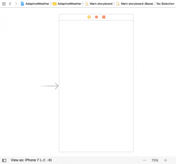
Video Tutorial: Mastering Git Part 4: Aliases

Screencast: Elegant Transitions with Hero


Unreal Engine 4 UI Tutorial

$
0
0

Unreal Engine 4 UI Tutorial

In video games, developers use graphics and text to display relevant information to the player such as health or score. This is known as the user interface (UI).

You can create a UI in Unreal Engine 4 using Unreal Motion Graphics (UMG). UMG allows you to construct a UI easily by dragging and dropping UI elements such as buttons and text labels.

In this tutorial, you will learn how to:

  • Create a heads-up display (HUD) that displays a counter and a timer
  • Display the HUD
  • Update the counter and timer to display variable values

Please note, you will be using Blueprints in this tutorial. If you need a refresher, check out our Blueprints tutorial.

Getting Started

Download the starter project and unzip it. Go to the project folder and open GeometryCatcher.uproject.

Note: If you get a message saying that the project was created with an earlier version of the Unreal editor, that’s OK (the engine is updated frequently). You can either choose the option to open a copy, or the option to convert in place.

Press Play to control a white cube and try to catch the falling shapes. You can move the catcher horizontally by moving your mouse. After ten seconds, the shapes will stop spawning.

Unreal Engine 4 UI Tutorial

The first thing you will do is create a HUD that displays two things:

  • A counter that keeps track of how many shapes the player has collected
  • A timer that displays how many seconds remain until the shapes stop spawning

To create all of these, you need to use widgets.

About Widgets

A widget is a UI element that provides some sort of visual functionality to the UI. For example, a Button widget provides an object that the user can see and click on.

The widget itself does not have to be visible. For example, a Grid Panel widget divides its space evenly between its contents. The user cannot see the Grid Panel but can see its effect.

Widgets can also contain other widgets. Here is an example of a custom widget that contains a Text widget (the Name label) and a Text Box widget:

You can even construct a widget to be an entire interface such as a menu screen. Below is an example of a widget constructed to look like a title screen. All the UI elements are also widgets and are contained within the title screen widget.

Now that you know what widgets are, it’s time to create one for the HUD.

Creating a Widget

Go to the Content Browser and navigate to the UI folder. Click the Add New button and select User Interface\Widget Blueprint. Rename the new asset to WBP_HUD.

Double-click on WBP_HUD to open it in the UMG UI Designer.

The UMG UI Designer

The UMG UI Designer is composed of seven main elements:

  1. Designer: This area contains the visual representation of your widget. Pan by holding right-click and moving your mouse. Zoom by scrolling your mouse wheel.
  2. Details: Any widget you select will have its properties displayed here
  3. Palette: A list of all the widgets you can use. Any user created widgets will also appear here.
  4. Hierarchy: A list of all the widgets you are currently using
  5. Animations: Widgets can have certain properties animated such as position and size. This panel lists all your animations.
  6. Timeline: When you select an animation, this panel will display the animated properties and keyframes
  7. Editor Mode: Here, you can switch between the Designer and Graph modes. The Graph mode is almost identical to a Blueprint’s Event Graph.

Creating a Text Widget

Text widgets are perfect for displaying numerical information such as the counter and timer.

Go to the Palette panel and search for the Text widget. Add the widget by holding left-click and dragging it into the Designer panel.

Don’t worry about the text content for now, you will replace it later.

Rename the widget to CounterText. You can do this by selecting the Text widget and going to the Details panel. Type in CounterText into the text box located at the top.

You can move widgets by left-clicking and dragging the widget in the Designer.

You can also resize widgets by left-clicking and dragging the handles. Resizing allows you to set the bounds for the widget. Unreal will not render anything outside the bounds.

Alternatively, you can set the position and size by modifying the values in the Details panel. Set the following properties and values for CounterText:

  • Position X: 200
  • Position Y: 50
  • Size X: 500
  • Size Y: 100

At the moment, the text only takes up a small portion of the box.

You can increase the font size by going to the Details panel and navigating to the Appearance section. At the very right of the Font property, there is a text box to set the font size.

Set the font size to 68.

Let’s make the counter look nicer by adding an icon next to it.

Creating an Image Widget

Image widgets are an easy way to display graphics in your UI such as icons.

Create an Image widget and name it CounterIcon. Set Position X to 75 and Position Y to 50. This will place it next to CounterText.

To set an image, go to the Details panel and go to the Appearance section. Expand the Brush property and then click the drop-down for Image. Select T_Counter.

The image will look stretched because the widget has a different size to the image.

Instead of resizing the widget, you can use the Size To Content option. This option will automatically resize a widget to accommodate for its contents.

While still in the Details panel, go to the Slot (Canvas Panel Slot) section. Check the checkbox next to Size To Content.

The widget will resize itself to fit the image.

When playing the game across different screen sizes, the UI needs to move its widgets accordingly. To maintain the layout of your UI, you can use anchors.

Anchors

An anchor point defines where a widget’s position is relative to. By default, widgets have their anchor set to the top-left of their parent. So, when you’re setting a widget’s position, you’re actually setting its position relative to that anchor point.

In the example below, each image is anchored to a single point (the nearest corner).

Notice how each image is maintaining its position relative to its anchor. Using anchors, you can ensure your UI has the same layout across different screen sizes.

You can also use anchors to automatically resize widgets. When anchoring to two or more points, the widget will resize itself to maintain its relative size.

In the example below, the bar is anchored to the top-left and top-right corners.

Vertically, the bar moves but does not resize. This is because it only has one anchor on the Y-axis (the top). However, the bar resizes horizontally because it has two anchor points on the X-axis.

The Anchor Medallion represents the location of your anchor. It will appear whenever you have a widget selected.

The anchors for CounterText and CounterIcon are already in the correct position so you don’t need to set them.

Next, you will create another Text and Image widget for the timer. However, this time you will place them on the right-hand side.

Creating the Timer

Create a Text widget and name it TimerText. Set the following properties:

  • Position X: 1225
  • Position Y: 50
  • Size X: 500
  • Size Y: 100
  • Font Size: 68
  • Justification: Align Text Right (This will align the text to the right side of the widget)

Next, you will set the anchor to the top-right. You can do this by left-clicking and dragging the circle on the Anchor Medallion. Move the Anchor Medallion to the top-right corner.

Notice how the position has updated to be relative to the anchor.

Create an Image widget and name it TimerIcon. Set the following properties:

  • Position X: 1750
  • Position Y: 50
  • Size To Content: Checked
  • Brush\Image: T_Timer

Instead of setting the anchor by using the Anchor Medallion, you can use presets. Go to the Details panel and click the drop-down next to Anchors to display the presets. Select the third preset (the one with the square at the top-right).

The layout for the UI is now complete. You can see the anchors working by emulating different screen sizes. Go to the Designer panel and click the Screen Size drop-down.

Selecting an option will change the size of WBP_HUD to match the option. Below is how the HUD would look on an iPad Air. Notice how the widgets are closer together.

In the next section, you will learn how to display the WBP_HUD widget.

Displaying the HUD

Click Compile and then go back to the main editor. Navigate to the Blueprints folder and double-click on BP_GameManager to open it.

The HUD should be visible as soon as the game starts. You can use the Event BeginPlay node to do this.

Find the Event BeginPlay node and then add a Create Widget node to the end of the node chain. This node will create an instance of the specified widget.

Click the drop-down next to Class and select WBP_HUD.

To display the HUD, you need to use an Add to Viewport node. Left-click and drag the Return Value pin of the Create Widget node. Release left-click on an empty space to bring up the context menu. Add an Add to Viewport node.

Let’s go over the order of events:

  1. Once Unreal spawns BP_GameManager, the Restart and SetUpCamera functions will execute. These functions set up a few variables and the camera. If you don’t know what a function is, don’t worry. The tutorial will cover them later on.
  2. The Create Widget node creates an instance of WBP_HUD
  3. The Add to Viewport node displays WBP_HUD

Click Compile and then go back to the main editor. Press Play to play the game with your new HUD.

To display the values for the counter and timer, you will need the variables holding that information. You can find these variables in BP_GameManager.

To use these variables, you need a way to access BP_GameManager from WBP_HUD. You can use a reference variable to accomplish this.

Reference Variables

Storing a reference is useful because it means you can access a specific instance easily.

Imagine you had a single box with a ball in it. If you wanted to find the ball and examine it, it’d be easy because there’s only one box.

Now, imagine you had one hundred boxes but only one contains a ball. You would have to check each box until you found the box with the ball.

Whenever you want to examine the ball, you would you have to perform this operation. This would quickly lead to performance issues.

Using references, you can keep track of the box with the ball. This way, you don’t have to check every box.

Creating a Reference Variable

Open WBP_HUD and switch to the Graph mode by going to the Editor Mode and selecting Graph.

Navigate to the My Blueprint tab and create a new variable called GameManager.

Go to the Details panel and click the drop-down next to Variable Type. Search for BP_GameManager and select BP Game Manager\Reference.

Setting the Reference Variable

Click Compile and then open BP_GameManager.

Locate the Create Widget node and then left-click and drag the Return Value pin. Release left-click on an empty space and then select Set Game Manager from the menu.

Afterwards, link the Add to Viewport node to the Set Game Manager node.

Note: You can reroute wires by double-clicking on them to create a Reroute node. Left-click and drag the Reroute node to reroute the wire.

Next, create a Self node and connect it to the left pin of the Set Game Manager node. The Self node will be listed as Get a reference to self.

Now, when WBP_HUD is created, it will have a reference to BP_GameManager.

In the next section, you will learn how to update a widget with the help of functions.

Functions

In Blueprints, functions are graphs similar to the Event Graph. Unlike the Event Graph, you can call a function using a node. But why would you want to do this?

Organization

One of the reasons to use functions is organization. By using functions, you can collapse multiple nodes into a single node.

Take a look at the Event BeginPlay section of BP_GameManager. There are two functions: Restart and SetUpCamera.

Here is what that section would look like without functions:

As you can see, it looks a lot cleaner using functions.

Reusability

Another reason to use functions is reusability. For example, if you wanted to reset the counter and timer, you could easily do so by using the Restart function.

This saves you the work of having to recreate the nodes every time you want to reset those variables.

Now that you know what functions are, you will use one to update the CounterText widget.

Updating a Widget

When you create a widget, a reference variable for the widget is automatically created as well. However, Text widgets do not have reference variables by default. This means you won’t be able to set their Text property. Luckily, this is an easy fix.

Click Compile and then open WBP_HUD. Switch to Designer mode.

Select CounterText and then go to the Details panel. Check the Is Variable checkbox located at the very top.

Now, you will be able to update CounterText. The next step is to create a function to update the text.

Creating the Update Function

Switch back to Graph mode and then go to the My Blueprint tab. Click the + sign to the right of the Functions section.

This will create a new function and take you to its graph. Rename the function to UpdateCounterText.

By default, the graph will contain an Entry node. When the function executes, this is where it will start.

To make CounterText display the ShapesCollected variable, you’ll need to link them.

Drag the GameManager variable into the graph. Left-click and drag its pin and then release left-click on an empty space. From the menu, select Get Shapes Collected.

To set the text, you will use the SetText (Text) node. Drag the CounterText variable into the graph. Left-click and drag its pin and then release left-click on an empty space. From the menu, add a SetText (Text) node.

The SetText (Text) only accepts an input of type Text. However, the ShapesCollected variable is of type Integer. Luckily, Unreal will do the conversion automatically when you try to plug an Integer to a Text input.

Connect the ShapesCollected variable to the In Text pin for the Set Text (Text) node. Unreal will automatically create a ToText (int) node for you.

To complete the function, connect the Entry node to the Set Text (Text) node.

Order of events:

  1. When you call UpdateCounterText, the function will get the ShapesCollected variable from BP_GameManager
  2. The ToText (int) node converts the value of ShapesCollected to a Text type
  3. SetText (Text) will set the text for CounterText to the value from ToText (int)

The next thing to do is call UpdateCounterText whenever the player collects a shape.

Calling the Update Function

The best place to call UpdateCounterText is right after the game increments ShapesCollected. I’ve created a function called IncrementShapesCollected that increments the counter for you. The shapes call this function whenever they overlap the player.

Click Compile and then go back to BP_GameManager.

Before you can call UpdateCounterText, you need a reference to WBP_HUD. See if you can create a reference variable by yourself!

Solution Inside SelectShow>

Once you have created the variable, rename it to HUDWidget.

Next, drag-click the right pin of the Set HUDWidget node and release on an empty space. Add an Update Counter Text node. This will make sure CounterText displays the value of ShapesCollected when the game starts.

Afterwards, navigate to the My Blueprint panel and go to the Functions section. Double-click on IncrementShapesCollected to open its graph.

Drag the HUDWidget variable into the graph. Left-click drag its pin and release on an empty space. Add an Update Counter Text node and connect it like so:

Now, whenever IncrementShapesCollected executes, it will increment ShapesCollected and then call UpdateCounterText. This function will then update CounterText to the value of ShapesCollected.

Click Compile and then close BP_GameManager. Press Play and collect some shapes to see the CounterText widget update.

Next, you will update the TimerText widget using a different method called binding.

Bindings

Bindings allow you to automatically update certain widget properties. To be bindable, the property must have the Bind drop-down.

You can bind properties to a function or variable contained within the widget. The binding will constantly obtain a value from the function or variable. It will then set the bound property to that value.

You might be wondering why you shouldn’t just use bindings all the time. Bindings are inefficient because they are constantly updating. This means the game wastes time updating the property even if there isn’t any new information. Compare it to the previous method where the widget only updates when it needs to.

With that said, bindings are great for elements that change frequently such as the timer. Let’s go ahead and create a binding for TimerText.

Creating a Binding

Open WBP_HUD and switch to Designer mode.

Select TimerText and then go to the Content section in the Details panel. You will see that the Text property is bindable. Click the Bind drop-down and select Create Binding.

This will create a new function for you and take you to its graph. Rename the function to UpdateTimerText.

The function will have a Return node with a Return Value pin of type Text. TimerText will display whatever text you plug into this pin.

Drag GameManager into the graph and then get the TimeRemaining variable from it.

Connect the TimeRemaining variable to the Return Value of the Return node. Like last time, Unreal will automatically add a conversion node for you.

Summary:

  • The binding will constantly call the UpdateTimerText function
  • The function will get the TimeRemaining variable from BP_GameManager
  • The ToText (float) node will convert the value from TimeRemaining to a Text type.
  • The converted value is then outputted to the Return node

The HUD is finally complete. Click Compile and then close WBP_HUD. Press Play to see the final results.

Where to Go From Here?

You can download the completed project here.

Now that you know the basics of UMG, it is relatively easy to build more complex interfaces. Try to experiment with other widgets and try out the panel widgets.

If you would like to learn what the other widgets do, head over to the Widget Type Reference page in the Unreal Engine documentation.

Let me know what topic you’d like me to cover next by leaving a comment below!

The post Unreal Engine 4 UI Tutorial appeared first on Ray Wenderlich.
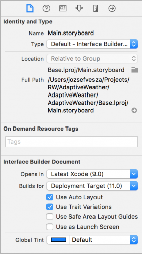
Video Tutorial: Mastering Git Part 5: Rebase: A Merge Alternative

Using Streaming Assets in Unity

$
0
0

Using Streaming Assets in Unity

How does a game gain traction and become a hit? There’s no secret recipe, but letting players take full control of the game and customize it to their liking with streaming assets is a powerful selling feature for sure.

In this tutorial, you’ll use the streaming assets directory under Unity to let your users customize the game’s UI, soundtrack, player model, and even create their own levels!

Along the way, you’ll learn:

  • How the Streaming Assets directory works.
  • How to load resources from the Streaming Assets directory at runtime.
  • How to harness the data from files added by your users.

Note: You’ll need to be familiar with some basic C# and know how to work within the Unity 2017.1 development environment. If you need some assistance getting up to speed, check out the Unity tutorials on this site.

Getting Started

Download the starter project here, and unzip and open the TankArena_Starter project in Unity. Another folder called TankArenaAllAssets is included with some sample assets you can use later on in this tutorial.

Note: Credit goes to Eric, our venerable Unity Team Leader for the tank model. I’ve been dying for find a use for that tank! The royalty-free music later in the tutorial is from the excellent Bensound. Finally, thanks to my kids who helped create some of the custom content!

Hit play and you’ll find yourself in a little tank in a little arena. Your goal is to proceed to the glimmering tower of light that constitutes the target tile. But be warned — there are a number of obstacles you need to avoid or destroy in order to reach your goal.

The game as it stands is a little “meh”, so you’ll add some on-demand assets to let the player customize the game and create some exciting levels.

Loading Resources at Runtime

There are several ways to serve up resources to Unity at runtime, and each method has its place in game development: asset bundles, resource folders, and streaming assets. Let’s look at each one in turn.

Asset Bundles

Asset bundles let you deliver content to your application outside of your Unity build. Generally, you’d host these files on a remote web server for users to access dynamically.

Why use asset bundles? When developing cross-platform games, you may need to create more than one texture or model to respect the limitations of the target platform. Asset bundles let you deliver the appropriate asset on a per-platform basis while keeping the initial game install size to a minimum.

Asset bundles can contain anything from individual assets to entire scenes, which also makes them ideal for delivering downloadable content (DLC) for your game.

Resource Folders

Unlike Asset bundles, resource folders are baked into the Unity Player as part of the game. You can do this by adding the required assets to a folder named Resources in your assets directory.

Resource folders are useful for loading assets at runtime that would not normally be part of the scene or associated with a GameObject. For example, an extremely rare event or hidden object that’s not seen often is not something you’d want to load 100% of the time.

Streaming Assets

Like Resource Folders, a Streaming Assets directory can be created by intuitively creating a folder named StreamingAssets in your project’s assets directory. Unlike Resource folders, this directory remains intact and accessible in the Unity player. This creates a unique access point for users to add their own files to the game.

Adding Streaming Assets

In the assets window, click on Create and add a new folder to your project. Rename the folder StreamingAssets.

Now click on File\Build Settings and ensure the Target Platform is correctly assigned to the platform you are working on. Click Build to build the player. Navigate to where you output the Unity player.

  • On a PC, look in the accompanying folder titled <SaveName>_Data.
  • On a Mac, right-click the player and click Show Package Contents. From the popup Finder window, navigate through Contents\Resources\Data.

Any file or folder you drop into there will be accessible to your game. Feel free to drop files directly into the StreamingAssets folder in your Project view so you can quickly test in the Editor as you go.

Adding your First Image

Who is going to step up the plate and take on TankArena? Is it you? Your pet? Your favorite soft toy when you were a kid? Grab a saved photo of them and drag it into the StreamingAssets directory you created in the Project Window. I chose my fearless cat Nando.

If you want to forgo collecting and/or creating a bunch of assets to import, feel free use the assets included in the starter project download under the TankArenaAllAssets folder. I’m sure Nando will not let you down either.

You need to rename your image asset for two reasons:

  1. The name must contain a specific key word so the game will know what to do with the image.
  2. The additional text in the file name will give you something to parse to give your hero a screen name.

Rename your image asset in the format “player1 <name>.png”. For example, I named my picture of Nando player1 Captain Patch.png.

Most of the files you add will have a similar format. They’ll have a tag to help identify them to the game, and subsequent text will enable you to add additional parameters to play with.

Loading your First Resource

In the Project Window, navigate to Assets\Scripts and double click on the Game Manager Script to open it in the IDE of your choice.

Under the class declaration, add these public variables to reference the UI Game Objects you will customize:

public Image playerAvatar;
public Text playerName;

Before you add any code to find and access the files in your streaming assets directory, you will need to add the following to the top of your GameManager script:

using System.IO;

This adds support for files and directories and allows the reading and writing of files.

Add the following to Start() under playerTank = GameObject.FindGameObjectWithTag("Player");:

DirectoryInfo directoryInfo = new DirectoryInfo(Application.streamingAssetsPath);
print("Streaming Assets Path: " + Application.streamingAssetsPath);
FileInfo[] allFiles = directoryInfo.GetFiles("*.*");

The streaming assets directory resides in different locations depending on the platform. However, Application.streamingAssetsPath will always return the correct path. The entirely optional print statement will show you to see where your streamingAssetsPath points.

The final line creates an array containing all the files in the streaming assets directory. You will create a series of conditionals as you work through this tutorial to handle the files found.

To send the player’s image to be processed, add the following under the code you just added:

foreach (FileInfo file in allFiles)
{
    if (file.Name.Contains("player1"))
    {
        StartCoroutine("LoadPlayerUI", file);
    }
}

The foreach loop iterates through the files, and the conditional checks to see if the file name contains the key word “player1”. Once found, the file is passed to a Coroutine LoadPlayerUI() which you’ll add next:

IEnumerator LoadPlayerUI(FileInfo playerFile)
{
    //1
    if (playerFile.Name.Contains("meta"))
    {
        yield break;
    }
    //2
    else
    {
        string playerFileWithoutExtension = Path.GetFileNameWithoutExtension(playerFile.ToString());
        string[] playerNameData = playerFileWithoutExtension.Split(" "[0]);
        //3
        string tempPlayerName = "";
        int i = 0;
        foreach (string stringFromFileName in playerNameData)
        {
            if (i != 0)
            {
                tempPlayerName = tempPlayerName + stringFromFileName + " ";
            }
            i++;
        }
        //4
        string wwwPlayerFilePath = "file://" + playerFile.FullName.ToString();
        WWW www = new WWW(wwwPlayerFilePath);
        yield return www;
        //5
        playerAvatar.sprite = Sprite.Create(www.texture, new Rect(0, 0, www.texture.width, www.texture.height), new Vector2(0.5f, 0.5f));
        playerName.text = tempPlayerName;
    }
}

Why a Coroutine? Although loading this image will happen very quickly, you will soon be loading and manipulating many more files. A Coroutine runs off the main thread and will not interrupt the game loop.

On to the code:

  1. The conditional at the start of the function checks to ensure the file name does not contain meta. If so, the file is likely to be the Unity generated backup file and the function exits. This snippet will be repeated in subsequent file processing coroutines.
  2. The file name is saved without the extension and subsequently split into a string array containing the individual words.
  3. An empty string is created for the player’s name. The foreach loop iterates through the playerNameData array. Each item in the array except for the first one (player1) is concatenated to the playerName string.
  4. The full path of the file is needed to load a WWW Object. yield return ensures execution of the function is delayed until the file is loaded.
  5. A sprite is created with the loaded texture and applied to playerAvatar. playerName is populated using the tempPlayerName you constructed.

Before you hit that play button to see the fruits of your labor, remember to connect the playerAvatar and playerName to their respective Game Objects in Unity.

In the Unity Editor, select the Game Manager from the Hierarchy Window to expose the public variables in the inspector. Hold Alt and click on the disclosure triangle next to UICanvas in the Hierarchy Window. This should expand UICanvas and all of its children’s children.

Under the GameUIPanel drag PlayerAvatar and PlayerName to their identically named public variables on the Game Manager in the Inspector:

Press the play button and check out your new avatar and name label. Nice!

But wait! There is no way your awesome new avatar would jump into their tank without their own custom soundtrack, right? On to that next.

Beat the game to your own Beats!

There’s a soundtrack.ogg bundled with the resources for your use, but if you think you can find something even more epic, use that instead.

Drag your audio file into the Project Window StreamingAssets folder and rename the file soundtrack.

Note: There are many different audio file types out there. If you have trouble, convert the file to .ogg as it is a well supported format in Unity. Have a look here for free online conversion tools, but be warned: DRM-protected files will not convert.

Add a new public variable to the GameManager:

public AudioSource musicPlayer;

With the GameManager selected in the Hierarchy Window, connect this new variable to the AudioSource on the scene’s Main Camera by dragging the whole Main Camera over the variable in the Inspector.

The Main Camera is a child of your Player’s Tank model, so it obediently follows you around. Remember, you can use the hierarchy’s search box to find any Game Object quickly in the scene.

Head back to the GameManager Start() function and add a new conditional underneath the other one to pass the soundtrack file to a new Coroutine:

else if (file.Name.Contains("soundtrack"))
{
    StartCoroutine("LoadBackgroundMusic", file);
}

Under the LoadPlayerUI Coroutine, add a new Coroutine titled LoadBackgroundMusic.

IEnumerator LoadBackgroundMusic (FileInfo musicFile)
{
    if (musicFile.Name.Contains("meta"))
    {
        yield break;
    }
    else
    {
        string musicFilePath = musicFile.FullName.ToString();
   	string url = string.Format("file://{0}", musicFilePath);
   	WWW www = new WWW(url);
   	yield return www;
   	musicPlayer.clip = www.GetAudioClip(false, false);
        musicPlayer.Play();
    }
}

This code should look pretty familiar. Loading an audio file is very similar to loading a texture. You use the URL to load the file and then apply audio to musicPlayer's clip property.

Finally, you call Play() on musicPlayer to get the soundtrack thumping.

Click play and hit that first level even harder than would have been possible before!

Player Model Customization

Now to customize the tank model. You’ll be walked through two different approaches for customizing the tank model. The first will use simple color swatches to let the user apply their favorite colors to the tank. The second will be a complete re-skin, similar to Minecraft skin mods.

Find the small 20 x 10 pixel playercolor image in the TankArenaAllAssets resources folder that came with the starter project download.

Drag the file into the Project Window StreamingAssets folder as you’ve done before.

You thought this was going to be hard?

Add the following new variables to the Game Manager, all under the new Header tag Tank Customisation:

[Header("Tank Customisation")]
public Texture2D tankTexture;
public Texture2D tankTreads;
public Renderer tankRenderer;
private Texture2D newTankTexture;
private Vector3 defaultTankPrimary = new Vector3(580, 722, 467);
private Vector3 defaultTankSecondary = new Vector3(718, 149, 0);

The Game Manager will need to reference the tank models’ textures and the renderers so that changes can be made and the model reassembled. Additionally, you save the military green primary and red accent secondary color values as integers in a Vector3 for the upcoming conditional statements. You’re using Vector3 as opposed to Color, since comparing one Color to another is very unreliable.

This is the tanks Texture file as output by the 3D modeling program.

Jump back into Start() and add another conditional:

else if (file.Name.Contains("playercolor"))
{
    StartCoroutine("LoadPlayerColor", file);
}

Under the LoadBackgroundMusic() Coroutine, add the following;

IEnumerator LoadPlayerColor(FileInfo colorFile)
{
    //1
    if (colorFile.Name.Contains("meta"))
    {
        yield break;
    }
    else
    {
        string wwwColorPath = "file://" + colorFile.FullName.ToString();
        WWW www = new WWW(wwwColorPath);
        yield return www;
        Texture2D playerColorTexture = www.texture;
        //2
        Color primaryColor = playerColorTexture.GetPixel(5, 5);
        Color secondaryColor = playerColorTexture.GetPixel(15, 5);
        //3
        Color[] currentPixelColors = tankTexture.GetPixels();
        Color[] newPixelColors = new Color[currentPixelColors.Length];
        //4
        float percentageDifferenceAllowed = 0.05f;
        int i = 0;
        foreach (Color color in currentPixelColors)
        {
            Vector3 colorToTest = new Vector3((Mathf.RoundToInt(color.r * 1000)), (Mathf.RoundToInt(color.g * 1000)), (Mathf.RoundToInt(color.b * 1000)));
            if ((colorToTest - defaultTankPrimary).sqrMagnitude <= (colorToTest * percentageDifferenceAllowed).sqrMagnitude)
            {
                newPixelColors.SetValue(primaryColor, i);
            }
            else if ((colorToTest - defaultTankSecondary).sqrMagnitude <= (colorToTest * percentageDifferenceAllowed).sqrMagnitude)
            {
                newPixelColors.SetValue(secondaryColor, i);
            }
            else
            {
                newPixelColors.SetValue(color, i);
            }
            i++;
        }
        //5
        newTankTexture = new Texture2D(tankTexture.width, tankTexture.height);
        newTankTexture.SetPixels(newPixelColors);
        newTankTexture.Apply();
        //6
        ApplyTextureToTank(tankRenderer, newTankTexture);
    }
}
  1. There's the good old meta check.
  2. You save the color data of a pixel on the left side and the right side of the color swatch in these two variables.
  3. You then create two Color arrays. The first, currentPixelColors contains all of the color information from the tank's default texture. The second, newPixelColors will be populated with same color information — but only once the custom color scheme has been applied. That's why you can instantiate it with the size of the first array.
  4. The foreach loop takes each pixel from the currentPixelColors and tests it.
    If the color matches the defaultTankPrimary you hard coded, the new primaryColor value is saved in its place to the newPixelColor array. If the color matches the defaultTankSecondary, save the new secondaryColor; if the color matches neither, simply save the same color back.
  5. Once the newPixelColors array is populated, you create a new texture2D and call Apply() to save all pixel changes.
  6. What is this strange method? Fear not, you'll write that next.

Add the following method under the one you just created:

public void ApplyTextureToTank(Renderer tankRenderer, Texture2D textureToApply)
{
    Renderer[] childRenderers = tankRenderer.gameObject.GetComponentsInChildren<Renderer>();
    foreach (Renderer renderer in childRenderers)
    {
        renderer.material.mainTexture = textureToApply;
    }
    tankRenderer.materials[1].mainTexture = textureToApply;
    tankRenderer.materials[0].mainTexture = tankTreads;
}

ApplyTextureToTank() takes two arguments: the tank Renderer and the new Texture2D that you want to apply. You use GetComponentsInChildren to fetch all of the renderers in the tank model and apply the new modified texture.

With the primary and secondary colors replaced. The texture is applied to the tank.

GetComponentsInChildren, rather counter-intuitively, fetches the requested component in the parent GameObject. In this particular model, the tank treads have their own texture. You have to reapply this, otherwise your tank will have "tank" tank treads, and that's just weird!

You also place this part of the tank customization in it's own public method as you'll need identical functionality to this later.

The final step is to connect up the new public Game Manager variables in the Inspector.

Ensure Game Manager is selected in the Hierarchy Window. In the Project Window, look in the Assets\Tank Model directory. You will find the two default texture files used to skin the tank model. Drag the LowPolyTank to the Tank Texture and NewThreads to the Tank Treads variable. Back in the Hierarchy Window, drag Player\Tank to Tank Renderer.

Click play and check out your sharp new Tank:

Here are a few other examples I created earlier.

More than One Way to Skin a Tank

The other way to customize tanks is to let the user add new skins to streaming assets and let them select and apply them at runtime.

There's a ScrollView and a Skin Object prefab situated in the Pause menu that you can use for the UI.

The SkinObject prefab is customised using the texture and filename.

Each skin will be showcased by a tank, and a button will enable you to add it.

Some tank "skin" textures were included in the TankArenaAllAssets folder that you got along with the starter project download. Place them in the Project Window StreamingAssets folder now.

Head back to the Game Manager script to get this new feature working.

The skins and their names will be stored in Lists. Therefore, add the Generic namespace at the top of the Game Manager script;

using System.Collections.Generic;

Add the following variables under your other tank customization variables;

//1
public List<Texture2D> tankSkins;
public List<string> tankSkinNames;
//2
public GameObject skinContainer;
public GameObject skinObject;
//3
private bool skinMenuAssembled = false;
  1. When a skin is found, this adds the texture to the tankSkins list and its name to the tankSkinNames list.
  2. To instantiate a Skin Object in the ScrollView, you require a reference to both the prefab to instantiate and the container which will be its parent.
  3. Finally a Boolean is used to determine whether you have already processed and assembled the skin list in the ScrollView. This will be used to ensure this process is not repeated unnecessarily between level restarts.

As before, add another conditional to the start function:

else if (file.Name.Contains("skin"))
{
    StartCoroutine("LoadSkin", file);
}

Create a new coroutine to process the skin files:

IEnumerator LoadSkin(FileInfo skinFile)
{
    if (skinFile.Name.Contains("meta"))
    {
        yield break;
    }
    else
    {
        //1
        string skinFileWithoutExtension = Path.GetFileNameWithoutExtension(skinFile.ToString());
        string[] skinData = skinFileWithoutExtension.Split(" "[0]);
        string skinName = skinData[0];
        //2
        string wwwSkinPath = "file://" + skinFile.FullName.ToString();
        WWW www = new WWW(wwwSkinPath);
        yield return www;
        Texture2D newTankSkin = www.texture;
        tankSkins.Add(newTankSkin);
        tankSkinNames.Add(skinName);
    }
}
  1. The name of the skin is the first word in the filename.
  2. There may be multiple skin files to process. At this stage, the textures and the names are simply added to lists.

Note: For this tutorial, you simply throw up a loading screen for one second before gameplay starts as this is sufficient for demonstration purposes. For a real game, you may want to add a cool little cut scene if you expect a more involved loading stage, and perhaps a callback of some sort when loading is finally complete.

For this tutorial, you'll assume that when the loading screen dismisses, all of the streaming assets have been processed.

Add the following to the end of RemoveLoadingScreen():

if (!skinMenuAssembled)
{
    StartCoroutine("AssembleSkinMenu");
}

Create a new Coroutine and add the following code:

IEnumerator AssembleSkinMenu()
{
    skinMenuAssembled = true;
    int i = 0;
    //1
    foreach (Texture2D skinTexture in tankSkins)
    {
        GameObject currentSkinObject = Instantiate(skinObject, new Vector3(0, 0, 0), Quaternion.identity, skinContainer.transform);
        //2
        currentSkinObject.transform.localPosition = new Vector3(100 + (200 * i),-80,0);
        //3
        SkinManager currentSkinManager = currentSkinObject.GetComponent<SkinManager>();
        currentSkinManager.ConfigureSkin(tankSkinNames[i], i);
        ApplyTextureToTank(currentSkinManager.tankRenderer, tankSkins[i]);
        i++;
    }
    yield return null;
}
  1. The foreach loop iterates through tankSkins. For each item, you instantiate a Skin Object and add it to the content object in the ScrollView.
  2. The position of the Skin Object in the Scrollview is offset depending on the index of the list. This ensures all of the skins are neatly spaced out in the view.
  3. You fetch the SkinManager script in Skin Object and pass it the skin's name and index in the list. You reuse ApplyTextureToTank() to apply the custom skin to the Skin Object's tank.

Navigate to the Scripts folder in the Project Window and double click on SkinManager script to open it in your IDE.

ConfigureSkin() saves the index it was passed in a private variable and the button label is customized using the skin name.

When the player presses the button to apply a skin, ApplySkinTapped() sends the saved index back to ApplySkin() in the GameManager.

Finish off ApplySkin() at the bottom of the GameManager Script by adding the following code:

ApplyTextureToTank(tankRenderer, tankSkins[indexOfSkin]);
PlayerUI.SetActive(true);
pauseMenuCamera.SetActive(false);
isPaused = false;
Time.timeScale = 1.0f;

This extracts the relevant texture from the list and applies it to the players tank. You also remove the pause menu and resume gameplay.

Time to get this all hooked up!

Tap on the Game Manager in the Hierarchy to reveal the Game Manager script in the Inspector. Drag the Skin Object prefab from the Project Window Prefabs folder to the public skinObject variable in the Inspector.

Type content in the Hierarchy search field to find the ScrollView’s content object without losing the Game Manager in the inspector (or tap the lock icon at the top right in the inspector view). Finally, drag the content object into the skinContainer variable.

Tap the play button and press Escape to pause the game. Tap a button and select a new skin for the tank:

Level Design, Now you are Playing with Power!

Okay, it's time to move on to custom level design and creation. Interestingly, you won't need more skills than you've already learned.

First, have a look at the anatomy of an arena so you can get a feel of how it will be constructed.

In the Hierarchy View, double-tap on the Default Arena Game Object to select it and bring it into view in the Scene View. The Arena is constructed from hundreds of tiles, and each tile type is a prefab from the Prefab folder in the Project View. You will use these prefabs to assemble a level in any combination or permutation you can imagine.

The other day I was sitting down with my kids and I asked them if they wanted to design a level for my upcoming tutorial. It went something like this:

Suffice to say I got the kids on the computer and they created two levels from their designs.

You can find these custom levels in the included starter download TankArenaAllAssets folder.

Have a look at the files, by using any image editor a fairly complex level can be constructed...

Now you will create your own custom level and write the code to load any of these levels up.

Open the image editor of your choice and create a new document/canvas 100 px X 100 px square.
Use a hard 1 px pencil tool or line tool to create objects using the following color scheme.

A 100 x 100 level created with any image editing package.

Use the cursor tool to get the x and y coordinates of where you would like the player to start and where the target tile should be.
Save the file as a png when you are finished using the following naming scheme.

arena <x coordinate of player start> <y coordinate of player start> <x coordinate of target> <y coordinate of target> <Name of your level>.png

Once you are happy with your design, add the file to the Project Window StreamingAssets folder.

Head back to the Game Manager. Above the class declaration, add the following code:

[System.Serializable]
public class Arena
{
    public string arenaFilePath;
    public int levelNumber;
    public string levelName;
    public float startX;
    public float startZ;
    public float targetX;
    public float targetZ;
}

This creates an Arena class, containing all of the variables necessary to accommodate the data extracted from an arena file. The Serializable property allows this class to be displayed in the inspector.

Add a new list to the GameManager that will hold all of the instances of the Arena class you create:

[Header("Arena")]
public List<Arena> arenaList = new List<Arena>();

Add the following additional public variables to the GameManager under the arenaList:

public Texture2D arenaTexture;

[Header("Arena Prefabs")]
public GameObject floorPrefab;
public GameObject weakFloorPrefab;
public GameObject wallPrefab;
public GameObject weakWallPrefab;
public GameObject mineTilePrefab;

[Header("Arena Objects")]
public GameObject defaultArena;
public GameObject arenaTiles;
public GameObject target;
[Space]

These variables comprise all of the building blocks for the level and serve as references to the player and the target object so you can customize their position. You also reference the defaultArena so we can remove it, and arenaTiles so that you have a container for new instantiated tiles.

Just like you did previously, add a new conditional statement to the start function:

else if (file.Name.Contains("Arena"))
{
    StartCoroutine("LoadArena", file);
}

Create a new coroutine named LoadArena():

IEnumerator LoadArena (FileInfo arenaFile)
{
    if (arenaFile.Name.Contains(".meta"))
    {
        yield break;
    }
    else
    {
        //1
        Arena arenaInstance = new Arena();

        string arenaFileWithoutExtension = Path.GetFileNameWithoutExtension(arenaFile.ToString());
        string[] arenaDataArray = arenaFileWithoutExtension.Split(" "[0]);
        arenaInstance.startX = int.Parse(arenaDataArray[1]);
        arenaInstance.startZ = int.Parse(arenaDataArray[2]);
        arenaInstance.targetX = int.Parse(arenaDataArray[3]);
        arenaInstance.targetZ = int.Parse(arenaDataArray[4]);
        //2
        string levelName = "";
        if (arenaDataArray.Length <= 5)
        {
            if (arenaList.Count != 0)
            {
                levelName = "Level " + (arenaList.Count + 1);
            }
            else
            {
                levelName = "Level 1";
            }
        }
        else
        {
            int i = 0;
            foreach (string stringFromDataArray in arenaDataArray)
            {
                if (i > 4)
                {
                    levelName = levelName + stringFromDataArray + " ";
                }
            i++;
            }
        }
        arenaInstance.levelName = levelName;
        //3
        arenaInstance.arenaFilePath = "file://" + arenaFile.FullName.ToString();
        //4
        arenaList.Add(arenaInstance);
    }
}
  1. Here you create a new instance of an Arena. As you've done before, the file name is split and used to populate the class variables.
  2. For the arena name, you test the number of items in the split file name. If it's less than 6, there is no level name and a default name is assigned based on the number of levels already loaded.
  3. The file path is saved with the arena instance so that the level can be loaded only when required.
  4. The fully populated arenaInstance is saved into the GameManagers list of arenas.

Back in Start(), add the following to load the first level (if one exists) once all of the files have been sent to their coroutines, right after the foreach loop:

if (arenaList.Count != 0 )
{
    //1
    Destroy(defaultArena);
    StartCoroutine("LoadLevel", arenaList[0]);
}

Add this final Coroutine to load an arena:

IEnumerator LoadLevel(Arena arenaToLoad)
{
    arenaName = arenaToLoad.levelName;
    //2
    loadingScreen.SetActive(true);
    gameOverScreen.SetActive(false);
    winScreen.SetActive(false);
    //3
    foreach (Transform child in arenaTiles.transform)
    {
        GameObject.Destroy(child.gameObject);
    }
    //4
    WWW www = new WWW(arenaToLoad.arenaFilePath);
    yield return www;
    arenaTexture = www.texture;
    Color[] arenaData = arenaTexture.GetPixels();
    //5
    int x = 0;
    foreach (Color color in arenaData)
    {
        int xPosition = ((x + 1) % 100);
        if (xPosition == 0)
        {
            xPosition = 100;
        }
        int zPosition = (x / 100) + 1;
        //6
        if (color.a < 0.1f)
        {
            GameObject.Instantiate(floorPrefab, new Vector3(xPosition / 1.0f, 0.0f, zPosition / 1.0f), Quaternion.Euler(90, 0, 0), arenaTiles.transform);
        }
        else
        {
            if (color.r > 0.9f && color.g > 0.9f && color.b < 0.1f)
            {
            }
            else if (color.r > 0.9f && color.g < 0.1f && color.b < 0.1f)
            {
                GameObject.Instantiate(mineTilePrefab, new Vector3(xPosition / 1.0f, 0.0f, zPosition / 1.0f), Quaternion.identity, arenaTiles.transform);
            }
            else if (color.r < 0.1f && color.g > 0.9f && color.b < 0.1f)
            {
                GameObject.Instantiate(weakWallPrefab, new Vector3(xPosition / 1.0f, 0.0f, zPosition / 1.0f), Quaternion.identity, arenaTiles.transform);
            }
            else if (color.r < 0.1f && color.g < 0.1f && color.b > 0.9f)
            {
                GameObject.Instantiate(weakFloorPrefab, new Vector3(xPosition / 1.0f, 0.0f, zPosition / 1.0f), Quaternion.identity, arenaTiles.transform);
            }
            else
            {
                GameObject.Instantiate(wallPrefab, new Vector3(xPosition / 1.0f, 0.0f, zPosition / 1.0f), Quaternion.identity, arenaTiles.transform);
            }
        }
        x++;
    }
    //7
    StartCoroutine("RemoveLoadingScreen");
    Time.timeScale = 1.0f;
    //8
    playerTank.transform.position = new Vector3(arenaToLoad.startX / 1.0f, 1.0f, (100 - arenaToLoad.startZ) / 1.0f);
    playerTank.transform.localRotation = Quaternion.Euler(0.0f, 0.0f, 0.0f);
    target.transform.position = new Vector3(arenaToLoad.targetX / 1.0f, 0.6f, (100 - arenaToLoad.targetZ) / 1.0f);
}
  1. I bet you have been looking forward to this. Destroy the default arena!
  2. Since this method could also be called when you complete a level, you reapply the loading screen and remove the win or game over screen.
  3. Remove any existing Arena tiles in the scene.
  4. You load the texture from the saved file path and getPixels captures all of the pixel data. This process reduces the 2D 100 x 100 pixels image into a 1D list of color values.
  5. Iterate over the list of pixel data. You use the index value to determine where the pixel would be in 2D space. The correct tile can then be instantiated in the correct position in the scene.
  6. The color value of the pixel will determine which tile you should instantiate. Since some image editors may bleed adjacent pixels, you include a small margin of error. The conditionals check the pixel’s color value and instantiate the applicable tile in the correct position.
  7. Once you've processed all the pixel data, call RemoveLoadingScreen() to drop the screen after a second and resume gameplay.
  8. Move the player’s tank and the target tile into their respective positions as recorded in their Arena instance.

You're almost there! Find the empty function StartNextLevel and add the following code:

//1
if (arenaList.Count >= currentLevel + 1)
{
    currentLevel++;
    StartCoroutine("LoadLevel", arenaList[currentLevel - 1]);
}
else
{
    SceneManager.LoadScene("MainScene");
}
//2
Rigidbody playerRB = playerTank.GetComponent<Rigidbody>();
playerRB.isKinematic = true;
playerRB.isKinematic = false;
  1. Once a level is completed, check to see if another level exists. If so, pass it to LoadLevel(). Otherwise, reload the entire scene to start over at the first level.
  2. There may be residual input applied to the tank when restarting or transitioning between levels. Toggle the player's Rigidbody from kinematic to non-kinematic to zero this out.

Now that StartNextLevel() is fleshed out a little, type "Next" into the Hierachy Window Searchbar in Unity. This should filter down to a single Game Object named Next Level Button. Click to select it, and in the inspector tick interactable under the Button component.

You now need to make a few code amendments to accommodate the fact that you can now have multiple levels (and not just the original starter level).

Replace SceneManager.LoadScene("MainScene"); in RestartLevel() with the following:

if (arenaList.Count != 0)
{
    StartCoroutine("LoadLevel", arenaList[currentLevel - 1]);
}
else
{
    SceneManager.LoadScene("MainScene");
}

This code ensures that instead of just loading the game scene with the default starter level on level restart, the LoadLevel() coroutine is called instead, which destroys the default arena, and replaces it with the content of the custom level that was loaded from streaming assets.

Also replace timerText.text = arenaName + " " + formattedTime; in UpdateTimerUI() with the following line:

timerText.text = arenaList[currentLevel-1].levelName + " " + formattedTime;

This bit of code will ensure that the level name text label in the game UI is updated with the custom level name.

Before you get excited and press Play, don't forget to connect up the prefab outlets in the inspector.

Select the Prefabs folder in the Project Window, and select the Game Manager in the Hierarchy Window. This should expose everything you need.

In the Inspector, you will find the variables for the prefab arena tiles under the Arena Prefabs heading. Each of these has an identically named prefab in the Prefabs folder in the Project Window. Drag each one from the Prefab folder to their respective variable.

Next, take a look at the Arena Objects header in the Inspector. These three GameObject variables are found in the Hierarchy Window. Drag the Target, Default Arena and ArenaTiles from the Hierarchy Window to their respective variables in the Inspector.

Click play and see your designs come to life!

Adding Custom Assets to a Real Build

To wrap this tutorial up, you'll add some custom assets to a real build. After all, that's what your users will be doing!

Remove all of the custom assets from the Project Window StreamingAssets folder and click on File\Build Settings. Ensure the Target Platform is correctly assigned to the platform you are working on and click Build and Run.

You're back to square one! However, the code is still in place to handle any customizations you many want to add.

Navigate to the StreamingAssets folder in the Player Build. On a PC, have a look in the accompanying folder named <SaveName>_Data. On the Mac, right-click the player and click Show Package Contents. From the popup Finder window, navigate to Contents\Resources\Data.

Drop in any or all of the custom assets you've used from the starter project download (under the TankArenaAllAssets folder).

Launch the player again; the customizations should be correctly applied and custom levels loaded. Perfect. :]

Where to Go From Here?

Here's a link to the completed project from this tutorial.

In this tutorial, you learned how to use the streaming assets to customize an existing game in a number of ways. Now you can open that door to your users!

I hope you found this tutorial useful! I'd love to know how it helped you develop something cool. Questions, thoughts or improvements are most welcome in the comments below!

One last thing. If you’re interested in learning more about creating killer games with Unity, check out our book, Unity Games By Tutorials.

In this book, you create four complete games from scratch:

  • A twin-stick shooter
  • A first-person shooter
  • A tower defense game (with VR support!)
  • A 2D platformer

By the end of this book, you’ll be ready to make your own games for Windows, macOS, iOS, and more!

This book is for complete beginners to Unity, as well as for those who’d like to bring their Unity skills to a professional level. The book assumes you have some prior programming experience (in a language of your choice).

The post Using Streaming Assets in Unity appeared first on Ray Wenderlich.

Video Tutorial: Mastering Git Part 6: Rebase: Rewriting History

Design Patterns on iOS using Swift – Part 1/2

$
0
0

Design Patterns on iOS using Swift – Part 1/2

Update note: This tutorial was updated for iOS 11, Xcode 9 and Swift 4 by Lorenzo Boaro. Original post by Tutorial team member Eli Ganem.

iOS Design Patterns – you’ve probably heard the term, but do you know what it means? While most developers probably agree that design patterns are very important, there aren’t many articles on the subject and we developers sometimes don’t pay too much attention to design patterns while writing code.

Design patterns are reusable solutions to common problems in software design. They’re templates designed to help you write code that’s easy to understand and reuse. They also help you create loosely coupled code so that you can change or replace components in your code without too much hassle.

If you’re new to design patterns, then I have good news for you! First, you’re already using tons of iOS design patterns thanks to the way Cocoa is built and the best practices you’re encouraged to use. Second, this tutorial will bring you up to speed on all the major (and not so major) iOS design patterns that are commonly used in Cocoa.

In this two-part tutorial, you will create a music library app that will display your albums and their relevant information.

In the process of developing this app, you’ll become acquainted with the most common Cocoa design patterns:

  • Creational: Singleton.
  • Structural: MVC, Decorator, Adapter, Facade.
  • Behavioral: Observer, and, Memento

Don’t be misled into thinking that this is an article about theory; you’ll get to use most of these design patterns in your music app. Your app will look like this by the end of the tutorial:

How the album app will look when the design patterns tutorial is complete

Let’s get started!

Getting Started

Download the Starter project, extract the contents of the ZIP file, and open RWBlueLibrary.xcodeproj in Xcode.

Note the following things in the project:

  1. The ViewController has three IBOutlet connecting the table view, the undo bar button item and the trash in storyboard.
  2. The storyboard has 3 components which are setup with constraints for your convenience. The top component is where the album covers will be displayed. Below the album covers will be a table view which lists information related to an album cover. Lastly the tool bar has two buttons, one to undo an action and another to delete an album that you select. The storyboard is shown below:
    swiftDesignPatternStoryboard
  3. A starter HTTP Client class (HTTPClient) with an empty implementation for you to fill in later.

Note: Did you know that as soon as you create a new Xcode project your code is already filled with design patterns? Model-View-Controller, Delegate, Protocol, Singleton – You get them all for free! :]

MVC – The King of Design Patterns

mvcking

Model-View-Controller (MVC) is one of the building blocks of Cocoa and is undoubtedly the most-used design pattern of all. It classifies objects according to their general role in your application and encourages clean separation of code based on role.

The three roles are:

  • Model: The objects that hold your application data and define how to manipulate it. For example, in your application the Model is the Album struct, which you can find in Album.swift. Most applications will have more than one type as part of their Model :]
  • View: The objects that are in charge of the visual representation of the Model and the controls the user can interact with; basically, all the UIView-derived objects. In your application the View is represented by AlbumView, which you can find in AlbumView.swift.
  • Controller: The controller is the mediator that coordinates all the work. It accesses the data from the model and displays it with the views, listens to events and manipulates the data as necessary. Can you guess which class is your controller? That’s right: ViewController.

A good implementation of this design pattern in your application means that each object falls into one of these groups.

The communication between View to Model through Controller can be best described with the following diagram:

mvc0

The Model notifies the Controller of any data changes, and in turn, the Controller updates the data in the Views. The View can then notify the Controller of actions the user performed and the Controller will either update the Model if necessary or retrieve any requested data.

You might be wondering why you can’t just ditch the Controller, and implement the View and Model in the same class, as that seems a lot easier.

It all comes down to code separation and reusability. Ideally, the View should be completely separated from the Model. If the View doesn’t rely on a specific implementation of the Model, then it can be reused with a different model to present some other data.

For example, if in the future you’d also like to add movies or books to your library, you could still use the same AlbumView to display your movie and book objects. Furthermore, if you want to create a new project that has something to do with albums, you could simply reuse your Album struct, because it’s not dependent on any view. That’s the strength of MVC!

How to Use the MVC Pattern

First, you need to ensure that each class in your project is either a Controller, a Model or a View; don’t combine the functionality of two roles in one class.

Second, in order to ensure that you conform to this method of work you should create three project groups to hold your code, one for each category.

Navigate to File\New\Group (or press on Command+Option+N) and name the group Model. Repeat the same process to create View and Controller groups.

Now drag Album.swift to the Model group. Drag AlbumView.swift to the View group, and finally drag ViewController.swift to the Controller group.

At this point the project structure should look like this:

Your project already looks a lot better without all those files floating around. Obviously you can have other groups and classes, but the core of the application is contained in these three categories.

Now that your components are organized, you need to get the album data from somewhere. You’ll create an API class to use throughout your code to manage the data — which presents an opportunity to discuss your next design pattern — the Singleton.

The Singleton Pattern

The Singleton design pattern ensures that only one instance exists for a given class and that there’s a global access point to that instance. It usually uses lazy loading to create the single instance when it’s needed the first time.

Note: Apple uses this approach a lot. For example: UserDefaults.standard, UIApplication.shared, UIScreen.main, FileManager.default all return a Singleton object.

You’re likely wondering why you care if there’s more than one instance of a class floating around. Code and memory is cheap, right?

There are some cases in which it makes sense to have exactly one instance of a class. For example, there’s only one instance of your application and one main screen for the device, so you only want one instance of each. Or, take a global configuration handler class: it’s easier to implement a thread-safe access to a single shared resource, such as a configuration file, than to have many class modifying the configuration file possibly at the same time.

How to Use the Singleton Pattern

To ensure there is only one instance of your singleton, you must make it impossible for anyone else to make an instance. Swift allows you to do this by marking the initializers as private. You can then add a static property for the shared instance, which is initialized inside the class.

You’ll implement this pattern by creating a singleton class to manage all the album data.

You’ll notice there’s a group called API in the project; this is where you’ll put all the classes that will provide services to your app. Create a new file inside this group by right-clicking the group and selecting New File. Select iOS > Swift File. Set the file name to LibraryAPI.swift and click Create.

Now go to LibraryAPI.swift and insert this code:

final class LibraryAPI {
  // 1
  static let shared = LibraryAPI()
  // 2
  private init() {

  }
}

Here’s the breakdown:

  1. The shared static constant approach gives other objects access to the singleton object LibraryAPI.
  2. The private initializer prevents creating new instances of LibraryAPI from outside.

You now have a Singleton object as the entry point to manage the albums. Take it a step further and create a class to handle the persistence of your library data.

Now within the group API create a new file. Select iOS > Swift File. Set the class name to PersistencyManager.swift and click Create.

Open PersistencyManager.swift and add the following code.

final class PersistencyManager {

}

Inside the curly braces put this snippet:

private var albums = [Album]()

Here you declare a private property to hold album data. The array is mutable, so you can easily add and delete albums.

Now add the following initializer to the class:

init() {
  //Dummy list of albums
  let album1 = Album(title: "Best of Bowie",
                     artist: "David Bowie",
                     genre: "Pop",
                     coverUrl: "https://s3.amazonaws.com/CoverProject/album/album_david_bowie_best_of_bowie.png",
                     year: "1992")

  let album2 = Album(title: "It's My Life",
                     artist: "No Doubt",
                     genre: "Pop",
                     coverUrl: "https://s3.amazonaws.com/CoverProject/album/album_no_doubt_its_my_life_bathwater.png",
                     year: "2003")

  let album3 = Album(title: "Nothing Like The Sun",
                     artist: "Sting",
                     genre: "Pop",
                     coverUrl: "https://s3.amazonaws.com/CoverProject/album/album_sting_nothing_like_the_sun.png",
                     year: "1999")

  let album4 = Album(title: "Staring at the Sun",
                     artist: "U2",
                     genre: "Pop",
                     coverUrl: "https://s3.amazonaws.com/CoverProject/album/album_u2_staring_at_the_sun.png",
                     year: "2000")

  let album5 = Album(title: "American Pie",
                     artist: "Madonna",
                     genre: "Pop",
                     coverUrl: "https://s3.amazonaws.com/CoverProject/album/album_madonna_american_pie.png",
                     year: "2000")

  albums = [album1, album2, album3, album4, album5]
}

In the initializer, you’re populating the array with five sample albums. If the above albums aren’t to your liking, feel free to replace them with the music you enjoy. :]

Now add the following functions to the class:

func getAlbums() -> [Album] {
  return albums
}

func addAlbum(_ album: Album, at index: Int) {
  if (albums.count >= index) {
    albums.insert(album, at: index)
  } else {
    albums.append(album)
  }
}

func deleteAlbum(at index: Int) {
  albums.remove(at: index)
}

These methods allow you to get, add, and delete albums.

Build your project just to make sure everything still compiles correctly.

At this point, you might wonder where the PersistencyManager class comes in since it’s not a Singleton. You’ll see the relationship between LibraryAPI and PersistencyManager in the next section where you’ll look at the Facade design pattern.

The Facade Design Pattern

The Facade design pattern provides a single interface to a complex subsystem. Instead of exposing the user to a set of classes and their APIs, you only expose one simple unified API.

The following image explains this concept:

facade2

The user of the API is completely unaware of the complexity that lies beneath. This pattern is ideal when working with a large number of classes, particularly when they are complicated to use or difficult to understand.

The Facade pattern decouples the code that uses the system from the interface and implementation of the classes you’re hiding; it also reduces dependencies of outside code on the inner workings of your subsystem. This is also useful if the classes under the facade are likely to change, as the facade class can retain the same API while things change behind the scenes.

For example, if the day comes when you want to replace your backend service, you won’t have to change the code that uses your API, just the code inside your Facade.

How to Use the Facade Pattern

Currently you have PersistencyManager to save the album data locally and HTTPClient to handle the remote communication. The other classes in your project should not be aware of this logic, as they will be hiding behind the facade of LibraryAPI.

To implement this pattern, only LibraryAPI should hold instances of PersistencyManager and HTTPClient. Then, LibraryAPI will expose a simple API to access those services.

The design looks like the following:

facade3

LibraryAPI will be exposed to other code, but will hide the HTTPClient and PersistencyManager complexity from the rest of the app.

Open LibraryAPI.swift and add the following constant properties to the class:

private let persistencyManager = PersistencyManager()
private let httpClient = HTTPClient()
private let isOnline = false

isOnline determines if the server should be updated with any changes made to the albums list, such as added or deleted albums. The HTTP client doesn’t actually work with a real server and is only here to demonstrate the usage of the facade pattern, so isOnline will always be false.

Next, add the following three methods to LibraryAPI.swift:

func getAlbums() -> [Album] {
  return persistencyManager.getAlbums()
}

func addAlbum(_ album: Album, at index: Int) {
  persistencyManager.addAlbum(album, at: index)
  if isOnline {
    httpClient.postRequest("/api/addAlbum", body: album.description)
  }
}

func deleteAlbum(at index: Int) {
  persistencyManager.deleteAlbum(at: index)
  if isOnline {
    httpClient.postRequest("/api/deleteAlbum", body: "\(index)")
  }
}

Take a look at addAlbum(_:at:). The class first updates the data locally, and then if there’s an internet connection, it updates the remote server. This is the real strength of the Facade; when some class outside of your system adds a new album, it doesn’t know — and doesn’t need to know — of the complexity that lies underneath.

Note: When designing a Facade for classes in your subsystem, remember that unless you’re building a separate module and are using access control, nothing prevents the client from accessing these “hidden” classes directly. Don’t be stingy with defensive code and don’t assume that all the clients will necessarily use your classes the same way the Facade uses them.

Build and run your app. You’ll see two empty views, and a toolbar. The top view will be used to display your album covers, and the bottom view will be used to display a table of information related to that album.

Album app in starting state with no data displayed

You’ll need something to display the album data on screen — which is a perfect use for your next design pattern: the Decorator.

The Decorator Design Pattern

The Decorator pattern dynamically adds behaviors and responsibilities to an object without modifying its code. It’s an alternative to subclassing where you modify a class’s behavior by wrapping it with another object.

In Swift there are two very common implementations of this pattern: Extensions and Delegation.

Extensions

Adding extensions is an extremely powerful mechanism that allows you to add new functionality to existing classes, structures or enumeration types without having to subclass. What’s also really awesome is you can extend code you don’t have access to, and enhance their functionality. That means you can add your own methods to Cocoa classes such as UIView and UIImage!

Swift extensions are slightly different from the classic definition of a decorator, because a extension doesn’t hold an instance of the class it extends.

How to Use Extensions

Imagine a situation in which you have an Album instance that you want to present inside a table view:

swiftDesignPattern3

Where will the album titles come from? Album is a Model, so it doesn’t care how you present the data. You’ll need some external code to add this functionality to the Album struct.

You’ll create a extension of the Album struct; it will define a new method that returns a data structure which can be used easily with UITableView.

Go to Album.swift and add the following code at the end of the file:

typealias AlbumData = (title: String, value: String)

This typealias defines a tuple which contains all of the information that the table view needs to display a row of data. Now add the following extension to access this information:

extension Album {
  var tableRepresentation: [AlbumData] {
    return [
      ("Artist", artist),
      ("Album", title),
      ("Genre", genre),
      ("Year", year)
    ]
  }
}

An array of AlbumData will be much easier to display in a table view!

Note: Classes can of course override a superclass’s method, but with extensions you can’t. Methods or properties in an extension cannot have the same name as methods or properties in the original class.

Consider for a moment how powerful this pattern can be:

  • You’re using properties directly from Album.
  • You have added to the Album struct but you haven’t modified it.
  • This simple addition lets you return a UITableViewish representation of an Album.

Delegation

The other implementation of the Decorator design pattern, Delegation, is a mechanism in which one object acts on behalf of, or in coordination with, another object. UITableView is greedy – it has two delegate-type properties, one called a data source, and one called a delegate. They do slightly different things – for example, the table view asks its data source how many rows should be in a particular section, but it asks its delegate what to do when a row is selected.

You can’t expect the UITableView to know how many rows you want to have in each section, as this is application-specific. Therefore, the task of calculating the amount of rows in each section is passed on to the data source. This allows the UITableView class to be independent of the data it displays.

Here’s a pseudo-explanation of what goes on when you create a new UITableView:

Table: Here I am! All I want to do is SHOW CELLS. Hey, how many sections do I have?
Data source: One!
Table: OK, nice and easy! And how many cells in that first section?
Data source: Four!
Table: Thanks! Now, bear with me, this might get a bit repetitive. Can I have the cell at section 0, row 0?
Data source: Here you go!
Table: And now section 0, row 1?

…and so on.

The UITableView object does its job of displaying a table view. However, eventually it will need some information that it doesn’t have. Then, it turns to its delegate and data source and sends a message asking for additional information.

It might seem easier to just subclass an object and override the necessary methods, but consider that you can only subclass based on a single class. If you want an object to be the delegate of two or more other objects, you won’t be able to achieve this by subclassing.

Note: This is an important pattern. Apple uses this approach in most of the UIKit classes: UITableView, UITextView, UITextField, UIWebView, UICollectionView, UIPickerView, UIGestureRecognizer, UIScrollView. The list goes on and on.

How to Use the Delegate Pattern

Open up ViewController.swift and add these private properties to the class:

private var currentAlbumIndex = 0
private var currentAlbumData: [AlbumData]?
private var allAlbums = [Album]()

Starting from Swift 4, variables marked as private can share the same access control scope between a type and any extension on said type. If you want to browse the new features introduced by Swift 4, take a look to What’s New in Swift 4?.

You’re going to make ViewController the table view’s data source. Add this extension to the end of ViewController.swift, after the closing brace of the class definition:

extension ViewController: UITableViewDataSource {

}

The compiler will warn you because UITableViewDataSource has a few mandatory functions. Add the following code inside the extension to make it happy:

func tableView(_ tableView: UITableView, numberOfRowsInSection section: Int) -> Int {
  guard let albumData = currentAlbumData else {
    return 0
  }
  return albumData.count
}

func tableView(_ tableView: UITableView, cellForRowAt indexPath: IndexPath) -> UITableViewCell {
  let cell = tableView.dequeueReusableCell(withIdentifier: "Cell", for: indexPath)
  if let albumData = currentAlbumData {
    let row = indexPath.row
    cell.textLabel!.text = albumData[row].title
    cell.detailTextLabel!.text = albumData[row].value
  }
  return cell
}

tableView(_:numberOfRowsInSection:) returns the number of rows to display in the table view, which matches the number of items in the “decorated” representation of the album.

tableView(_:cellForRowAtIndexPath:) creates and returns a cell with the title and its value.

Note: You can actually add the methods to the main class declaration or to the extension; the compiler doesn’t care that the data source methods are actually inside the UITableViewDataSource extension. For humans reading the code though, this kind of organization really helps with readability.

Next, replace viewDidLoad() with this code:

override func viewDidLoad() {
  super.viewDidLoad()

  //1
  allAlbums = LibraryAPI.shared.getAlbums()

  //2
  tableView.dataSource = self
}

Here’s a breakdown of the above code:

  1. Get a list of all the albums via the API. Remember, the plan is to use the facade of LibraryAPI rather than PersistencyManager directly!
  2. This is where you setup the UITableView. You declare that the view controller is the UITableView data source; therefore, all the information required by UITableView will be provided by the view controller. Note that you can actually set the delegate and datasource in a storyboard, if your table view is created there.

Now, add the following method to the ViewController class:

private func showDataForAlbum(at index: Int) {

  // defensive code: make sure the requested index is lower than the amount of albums
  if (index < allAlbums.count && index > -1) {
    // fetch the album
    let album = allAlbums[index]
    // save the albums data to present it later in the tableview
    currentAlbumData = album.tableRepresentation
  } else {
    currentAlbumData = nil
  }
  // we have the data we need, let's refresh our tableview
  tableView.reloadData()
}

showDataForAlbum(at:) fetches the required album data from the array of albums. When you want to present the new data, you just need to call reloadData on the UITableView. This causes the table view to ask its data source such things as how many sections should appear in the table view, how many rows in each section, and how each cell should look, etc.

Add the following line to the end of viewDidLoad()

showDataForAlbum(at: currentAlbumIndex)

This loads the current album at app launch. And since currentAlbumIndex is set to 0, this shows the first album in the collection.

Build and run your project. Your app should start and present you with the following screen:

Album app showing populated table view

Table view data source success!

Final Touches

In order to not pollute your code with hardcoded values, like the string Cell, go to ViewController and, just after the opening brace of the class definition, add the following:

private enum Constants {
  static let CellIdentifier = "Cell"
}

Here you are creating an enumeration that acts as a container for your constants.

Note: The advantage of using a case-less enumeration is that it can’t accidentally be instantiated and works as a pure namespace.

Now just replace "Cell" with Constants.CellIdentifier.

Where to go from here?

Things are looking pretty good so far! You have the MVC pattern in place, and you’ve also seen the singleton, facade, and decorator patterns in action. You can see how these are used within Cocoa by Apple, and also how to apply the patterns to your own code.

Here is the final project for this part if you want to have a look or compare.

There’s a lot more in store: there are still the adapter, observer, and memento patterns to cover in part two of this tutorial. And if that’s not enough, we have a follow-up tutorial coming up covering even more design patterns as you work on refactoring a simple iOS game.

If you have questions or just want to talk about your favorite design patterns, join in on the forum discussion below!

The post Design Patterns on iOS using Swift – Part 1/2 appeared first on Ray Wenderlich.

Viewing all 4374 articles
Browse latest View live


<script src="https://jsc.adskeeper.com/r/s/rssing.com.1596347.js" async> </script>