Quantcast
Channel: Kodeco | High quality programming tutorials: iOS, Android, Swift, Kotlin, Unity, and more
Viewing all 4374 articles
Browse latest View live

Auto Layout Visual Format Language Tutorial

$
0
0
Update note: This tutorial has been updated to iOS 11, Xcode 9 and Swift 4 by József Vesza. The original tutorial was written by Darren Ferguson.
VisualFormatIcon

Learn how to layout elements using ASCII art!

The Auto Layout Visual Format Language (VFL) allows you to define constraints by using an ASCII-art formatted string.

With a single line of code, you can specify multiple constraints in either the horizontal or vertical direction. This can save a lot of code compared to creating constraints one at a time.

In this tutorial, you and VFL will become buddies as you do the following:

  • Construct horizontal and vertical constraints
  • Use views definitions inside your VFL string
  • Use metrics constants inside your VFL string
  • Use layout options to position interface elements relative to others
  • Use safe area to take the iPhone X into consideration

Note: this tutorial assumes you’re well acquainted with Auto Layout. If you’re fairly new to it, you may want to start with Auto Layout Tutorial in iOS 11: Getting Started.

Getting Started

Start by downloading the starter project for this tutorial, which comprises a basic welcome screen for a fledgling social networking app — Grapevine. Build and run (Product \ Run or ⌘R) the project in Xcode; you’ll see the following (to rotate the simulator go to Hardware \ Rotate Right):

Note: Please use of one of the rectangular iPhones (e.g., iPhone 8) for this part of the tutorial. You’ll see how to handle the iPhone X later.

Initial screen

Well, that’s a hot mess. Why is this happening and what are you going to do about it?

All the interface elements are currently pinned to the top and left of the view, and this is the result of them having no associated Auto Layout constraints. You’ll make the view much prettier during the course of this tutorial.

Open Main.storyboard and look at the interface elements. Note the interface elements are set with Auto Layout constraints that are removed at compile time. You wouldn’t do this in a real project, but this saves you having to enter a lot of view creation code :]

Next, open ViewController.swift and have a look inside. At the top, you’ll see outlets connected to the Interface Builder (IB) interface elements inside Main.storyboard.

There’s not much else to talk about in the app at this point, but there’s a lot good stuff to learn about VFL!

Visual Format String Grammar

Before you dive into setting up layouts and constraints, you’ll need some background knowledge on the VFL format string.

First thing to know: The format string can be split into the following components:

Auto Layout visual format language

Here’s a step-by-step explanation of the VFL format string:

  1. Direction of your constraints, not required. Can have the following values:
    • H: indicates horizontal orientation.
    • V: indicates vertical orientation.
    • Not specified: Auto Layout defaults to horizontal orientation.
  2. Leading connection to the superview, not required.
    • Spacing between the top edge of your view and its superview’s top edge (vertical)
    • Spacing between the leading edge of your view and its superview’s leading edge (horizontal)
  3. View you’re laying out, is required.
  4. Connection to another view, not required.
  5. Trailing connection to the superview, not required.
    • Spacing between the bottom edge of your view and its superview’s bottom edge (vertical)
    • Spacing between the trailing edge of your view and its superview’s trailing edge (horizontal)

There’s two special (orange) characters in the image and their definition is below:

  • ? component is not required inside the layout string.
  • * component may appear 0 or more times inside the layout string.

Available Symbols

VFL uses a number of symbols to describe your layout:

  • | superview
  • - standard spacing (usually 8 points; value can be changed if it is the spacing to the edge of a superview)
  • == equal widths (can be omitted)
  • -20- non standard spacing (20 points)
  • <= less than or equal to
  • >= greater than or equal to
  • @250 priority of the constraint; can have any value between 0 and 1000
    • 250 - low priority
    • 750 - high priority
    • 1000 - required priority

Example Format String

  H:|-[icon(==iconDate)]-20-[iconLabel(120@250)]-20@750-[iconDate(>=50)]-|

Here's a step-by-step explanation of this string:

  • H: horizontal direction.
  • |-[icon icon's leading edge should have standard distance from its superview's leading edge.
  • ==iconDate icon's width should be equal to iconDate's width.
  • ]-20-[iconLabel icon's trailing edge should be 20 points from iconLabel's leading edge.
  • [iconLabel(120@250)] iconLabel should have a width of 120 points. The priority is set to low, and Auto Layout can break this constraint if a conflict arises.
  • -20@750- iconLabel's trailing edge should be 20 points from iconDate's leading edge. The priority is set to high, so Auto Layout shouldn't break this constraint if there's a conflict.
  • [iconDate(>=50)] iconDate's width should be greater than or equal to 50 points.
  • -| iconDate's trailing edge should have standard distance from its superview's trailing edge.

Now you have a basic understanding of the VFL -- and more importantly the format string -- it's time to put that knowledge to use.

Creating Constraints

Apple provides the class method constraints(withVisualFormat:options:metrics:views:) on NSLayoutConstraint to create constraints. You'll use this to create constraints programmatically inside of the Grapevine app.

Open ViewController.swift in Xcode, and add the following code:

override func viewDidLoad() {
  super.viewDidLoad()

  appImageView.isHidden = true
  welcomeLabel.isHidden = true
  summaryLabel.isHidden = true
  pageControl.isHidden = true
}

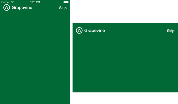
This code hides all interface elements except the iconImageView, appNameLabel and skipButton. Build and run your project; you should see the following:

Grapevine-Hidden-Icons

Cool. You've cleared the cluttery interface elements, now add the following code to the bottom of viewDidLoad():

// 1
let views: [String: Any] = [
  "iconImageView": iconImageView,
  "appNameLabel": appNameLabel,
  "skipButton": skipButton]

// 2
var allConstraints: [NSLayoutConstraint] = []

// 3
let iconVerticalConstraints = NSLayoutConstraint.constraints(
  withVisualFormat: "V:|-20-[iconImageView(30)]",
  metrics: nil,
  views: views)
allConstraints += iconVerticalConstraints

// 4
let nameLabelVerticalConstraints = NSLayoutConstraint.constraints(
  withVisualFormat: "V:|-23-[appNameLabel]",
  metrics: nil,
  views: views)
allConstraints += nameLabelVerticalConstraints

// 5
let skipButtonVerticalConstraints = NSLayoutConstraint.constraints(
  withVisualFormat: "V:|-20-[skipButton]",
  metrics: nil,
  views: views)
allConstraints += skipButtonVerticalConstraints

// 6
let topRowHorizontalConstraints = NSLayoutConstraint.constraints(
  withVisualFormat: "H:|-15-[iconImageView(30)]-[appNameLabel]-[skipButton]-15-|",
  metrics: nil,
  views: views)
allConstraints += topRowHorizontalConstraints

// 7
NSLayoutConstraint.activate(allConstraints)

Here's a step-by-step explanation of the above code:

  1. Create a views dictionary that holds string representations of views to resolve inside the format string.
  2. Create a mutable array of constraints. You'll build this up in the rest of the code.
  3. Set up vertical constraints for the iconImageView, placing its top edge 20 points from its superview's top edge, with a height of 30 points.
  4. Set up vertical constraints for the appNameLabel, placing its top edge 23 points from its superview's top edge.
  5. Set up vertical constraints for the skipButton, placing its top edge 20 points from its superview's top edge.
  6. Set up horizontal constraints for all three interface elements. The iconImageView's leading edge is placed 15 points from the leading edge of its superview, with a width of 30 points. Next, a standard spacing of 8 points is placed between the iconImageView and appNameLabel. Next, a standard spacing of 8 points is placed between the appNameLabel and skipButton. Finally, the skipButton's trailing edge is placed 15 points from the trailing edge of its superview.
  7. Activate the layout constraints using the class method activate(_:) on NSLayoutConstraint. You pass in the allConstraints array you've been adding to all this time.

Note: The string keys inside the views dictionary must match the view strings inside the format string. If they don't, Auto Layout won't be able to resolve the reference and will crash at runtime.

Build and run your project. How do the interface elements look now?

Grapevine-Horizontal-Layout

Hey, look at that! You've already made it prettier.

Now stick with it here, that first part was just a teaser. You've got a lot of code to write, but it'll be worth it at the end.

Next, you'll lay out the remaining interface elements. First, you need to remove the code you originally added to viewDidLoad(). I know, I know...you just put it there. Delete the following lines:

appImageView.isHidden = true
welcomeLabel.isHidden = true
summaryLabel.isHidden = true
pageControl.isHidden = true

Removing this reverts the display so it shows the remaining interface elements that you previously hid from yourself.

Next, replace your current views dictionary definition with the following:

let views: [String: Any] = [
  "iconImageView": iconImageView,
  "appNameLabel": appNameLabel,
  "skipButton": skipButton,
  "appImageView": appImageView,
  "welcomeLabel": welcomeLabel,
  "summaryLabel": summaryLabel,
  "pageControl": pageControl]

Here you've added view definitions for the appImageView, welcomeLabel, summaryLabel and pageControl, which can now be used inside the VFL format string.

Add the following to the bottom of viewDidLoad(), above the activate(_:) call:

// 1
let summaryHorizontalConstraints = NSLayoutConstraint.constraints(
  withVisualFormat: "H:|-15-[summaryLabel]-15-|",
  metrics: nil,
  views: views)
allConstraints += summaryHorizontalConstraints

let welcomeHorizontalConstraints = NSLayoutConstraint.constraints(
  withVisualFormat: "H:|-15-[welcomeLabel]-15-|",
  metrics: nil,
  views: views)
allConstraints += welcomeHorizontalConstraints

// 2
let iconToImageVerticalConstraints = NSLayoutConstraint.constraints(
  withVisualFormat: "V:[iconImageView]-10-[appImageView]",
  metrics: nil,
  views: views)
allConstraints += iconToImageVerticalConstraints

// 3
let imageToWelcomeVerticalConstraints = NSLayoutConstraint.constraints(
  withVisualFormat: "V:[appImageView]-10-[welcomeLabel]",
  metrics: nil,
  views: views)
allConstraints += imageToWelcomeVerticalConstraints

// 4
let summaryLabelVerticalConstraints = NSLayoutConstraint.constraints(
  withVisualFormat: "V:[welcomeLabel]-4-[summaryLabel]",
  metrics: nil,
  views: views)
allConstraints += summaryLabelVerticalConstraints

// 5
let summaryToPageVerticalConstraints = NSLayoutConstraint.constraints(
  withVisualFormat: "V:[summaryLabel]-15-[pageControl(9)]-15-|",
  metrics: nil,
  views: views)
allConstraints += summaryToPageVerticalConstraints

Here's a step-by-step explanation of the above:

  1. Set up horizontal constraints for the summaryLabel and welcomeLabel, placing them 15 points from the leading and trailing edges of their superview.
  2. Set up vertical constraints for the icon to the app image, with spacing of 10 points
  3. Set up vertical constraints for the app image to the welcome label, with spacing of 10 points
  4. Set up vertical constraints between the welcome label and summary label, with a spacing of 4 points
  5. Set up vertical constraints between the summary label and the page control, with a spacing of 15 points and a height of 9 points for the page control, then spacing of 15 points to the superview

Build and run your project; how do the interface elements look?

Grapevine layout before options

Now you're getting somewhere. No, it's not exactly what you're looking for; some interface elements are laid out correctly, however, others are not. The image and the page control aren't centered.

Never fear, the next section will provide you with more ammunition to get the layout to clean up its act.

Layout Options

Layout options provide the ability to manipulate view constraints perpendicular to the current layout orientation being defined.

Applying vertical centering to all views in a horizontal layout orientation by using NSLayoutFormatOptions.AlignAllCenterY is an example of layout options.

You wouldn't use this option in vertical orientation since there's no sense in trying to set all of the views' centers vertically while laying them out vertically, edge by edge. It's also not provided for vertical orientation, so there you go.

Next, you'll see how layout options are useful when it comes to constructing layouts. Remove the following code from viewDidLoad():

let nameLabelVerticalConstraints = NSLayoutConstraint.constraintsWithVisualFormat(
  "V:|-23-[appNameLabel]",
  metrics: nil,
  views: views)
allConstraints += nameLabelVerticalConstraints

let skipButtonVerticalConstraints = NSLayoutConstraint.constraintsWithVisualFormat(
  "V:|-20-[skipButton]",
  metrics: nil,
  views: views)
allConstraints += skipButtonVerticalConstraints

You're just removing the vertical constraints from the appNameLabel and skipButton. Instead, you're going to use the layout options to give them a vertical position.

Find the code that creates topRowHorizontalConstraints and set the options parameter to [.alignAllCenterY]. It should now look like the following:

let topRowHorizontalConstraints = NSLayoutConstraint.constraints(
  withVisualFormat: "H:|-15-[iconImageView(30)]-[appNameLabel]-[skipButton]-15-|",
  options: [.alignAllCenterY],
  metrics: nil,
  views: views)
allConstraints += topRowHorizontalConstraints

You've provided the NSLayoutFormatOption .alignAllCenterY that takes each view inside the format string and creates layout constraints to align each of them by their vertical centers. This code works since the iconImageView has previously defined vertical layout constraints, including its height. Thus, the appNameLabel and skipButton are vertically centered with the iconImageView.

If you build and run now, the layout will look exactly the same, but you know the code is better :]

Remove the code that creates welcomeHorizontalConstraints and adds it to the constraints array.

This removes the horizontal constraints from the welcomeLabel.

Next, update the options when creating summaryLabelVerticalConstraints definition to the following:

let summaryLabelVerticalConstraints = NSLayoutConstraint.constraints(
  withVisualFormat: "V:[welcomeLabel]-4-[summaryLabel]",
  options: [.alignAllLeading, .alignAllTrailing],
  metrics: nil,
  views: views)
allConstraints += summaryLabelVerticalConstraints

This code adds the NSLayoutFormatOptions options .alignAllLeading and .alignAllTrailing to the options array. The welcomeLabel and summaryLabel's leading and trailing spacing will be aligned 15 points from the leading and trailing edge of their superview. This occurs because the summaryLabel already has its horizontal constraints defined.

Again, this will give you the same layout as you already had, but in a better way.

Next, update the options when you create summaryToPageVerticalConstraints to match the following:

let summaryToPageVerticalConstraints = NSLayoutConstraint.constraints(
  withVisualFormat: "V:[summaryLabel]-15-[pageControl(9)]-15-|",
  options: [.alignAllCenterX],
  metrics: nil,
  views: views)
allConstraints += summaryToPageVerticalConstraints

Adding this option aligns the views on the center X axis. Do the same for imageToWelcomeVerticalConstraints:

let imageToWelcomeVerticalConstraints = NSLayoutConstraint.constraints(
  withVisualFormat: "V:[appImageView]-10-[welcomeLabel]",
  options: [.alignAllCenterX],
  metrics: nil,
  views: views)
allConstraints += imageToWelcomeVerticalConstraints

Build and run your project; how do the interface elements look?

Grapevine-SublayoutViewHeights

Feeling centered yet? Layout options have taken you closer to that nice user interface you're after.

NSLayoutFormat Options Quick Reference

Here are the options you've used in Grapevine:

  • .alignAllCenterX -- align interface elements using NSLayoutAttribute.centerX.
  • .alignAllCenterY -- align interface elements using NSLayoutAttribute.centerY.
  • .alignAllLeading -- align interface elements using NSLayoutAttribute.leading.
  • .alignAllTrailing -- align interface elements using NSLayoutAttribute.trailing.

Below are some more of these options:

  • .alignAllLeft -- align interface elements using NSLayoutAttribute.left.
  • .alignAllRight -- align interface elements using NSLayoutAttribute.right.
  • .alignAllTop -- align interface elements using NSLayoutAttribute.top.
  • .alignAllBottom -- align interface elements using NSLayoutAttribute.bottom.
  • .alignAllLastBaseline -- align interface elements using NSLayoutAttribute.lastBaseline.

You can find the complete list in the documentation.

Note: At least one of the elements must have enough defined perpendicular constraints for layout options to work. See the example below:

  NSLayoutConstraints.constraintsWithVisualFormat(
    "V:[topView]-[middleView]-[bottomView]",
    options: [.alignAllLeading],
    metrics: nil,
    views: ["topView": topView, "middleView": middleView, "bottomView": bottomView"])

The topView, middleView or bottomView must have constraints defining the position of their leading edge for Auto Layout to generate the correct constraints.

And now for a new concept! Meet Metrics.

Metrics

Metrics are a dictionary of number values that can appear inside the VFL format string. These are particularly useful if you have standardized spacing or calculated size values that you can't type directly into the format string.

Add the following constant declaration above your @IBOutlet declarations in ViewController.swift:

private enum Metrics {
  static let padding: CGFloat = 15.0
  static let iconImageViewWidth: CGFloat = 30.0
}

Now you have a constant for the padding, and icon image width, you can create a metrics dictionary and utilize the constant. Add the following code above your views declaration in viewDidLoad():

let metrics = [
  "horizontalPadding": Metrics.padding,
  "iconImageViewWidth": Metrics.iconImageViewWidth]

The above code creates a dictionary of key / value pairs to be substituted into the format string.

Next, replace the topRowHorizontalConstraints and summaryHorizontalConstraints definitions with the following:

let topRowHorizontalFormat = """
  H:|-horizontalPadding-[iconImageView(iconImageViewWidth)]-[appNameLabel]-[skipButton]-horizontalPadding-|
  """
let topRowHorizontalConstraints = NSLayoutConstraint.constraints(
    withVisualFormat: topRowHorizontalFormat,
    options: [.alignAllCenterY],
    metrics: metrics,
    views: views)
allConstraints += topRowHorizontalConstraints

let summaryHorizontalConstraints = NSLayoutConstraint.constraints(
    withVisualFormat: "H:|-horizontalPadding-[summaryLabel]-horizontalPadding-|",
    metrics: metrics,
    views: views)
allConstraints += summaryHorizontalConstraints

You're replacing the hard coded values in the format string with placeholders that represent keys from the metrics dictionary. You also set the metrics parameter to the metrics dictionary.

Auto Layout will perform string substitution, replacing the placeholder text with the value inside the metrics dictionary. In the above case, horizontalPadding will be replaced with the constant 15 points, and iconImageViewWidth will be replaced with the constant 30 points.

You've removed a repeatedly used magic number and replaced it with a nice clean variable. If you decide to change the padding, you only have to change one thing. Isn't that better? The metrics dictionary isn't limited to constants either; if you need to calculate things at run time and put them in the dictionary, that's fine too.

The final piece of the puzzle to place is how you lay out interface elements when your view controllers are embedded inside a UINavigationController or UITabBarController.

Safe Area

The UI is starting to look great, but so far you've only tried it on the traditional, rectangle-shaped screens. In September 2017, Apple introduced a new device, which doesn't quite fit this description: the iPhone X. To see how Grapevine looks on this new device, start the app in the iPhone X simulator.

Well, it isn't the most pleasant sight. While the image, and the welcome text is mostly okay, you'll notice the UI interferes with system elements on both the top and the bottom of the screen. Luckily, with the use of safe area, you can easily work around this issue!

Introduced in iOS 11, safe area indicates the area in which apps can show their UI without interfering with any special elements defined by UIKit, like the status bar, or a tab bar. In case of the iPhone X, the safe area is different in portrait, and landscape mode:

You'll notice in portrait mode, there's more space on the top, and bottom. In landscape however, the left, and right insets are larger. So far you've put all your constraint-related code in viewDidLoad(), but since the safe area may change during runtime, that'll no longer cut it. Luckily, view controllers will be notified by the viewSafeAreaInsetsDidChange() on safe area changes, so you can start there.

Open, ViewController.swift and completely remove your viewDidLoad() method. That's right, you read correctly; you'll re-implement this functionality in viewSafeAreaInsetsDidChange() later.

Next, add the following property below your IBOutlet definitions:

private var allConstraints: [NSLayoutConstraint] = []

This property will store all currently active constraints within the view controller so they can be deactivated and removed when new constraints are required.

Next, add the following implementation for viewSafeAreaInsetsDidChange():

override func viewSafeAreaInsetsDidChange() {
  super.viewSafeAreaInsetsDidChange()

  if !allConstraints.isEmpty {
    NSLayoutConstraint.deactivate(allConstraints)
    allConstraints.removeAll()
  }

  let newInsets = view.safeAreaInsets
  let leftMargin = newInsets.left > 0 ? newInsets.left : Metrics.padding
  let rightMargin = newInsets.right > 0 ? newInsets.right : Metrics.padding
  let topMargin = newInsets.top > 0 ? newInsets.top : Metrics.padding
  let bottomMargin = newInsets.bottom > 0 ? newInsets.bottom : Metrics.padding

  let metrics = [
    "horizontalPadding": Metrics.padding,
    "iconImageViewWidth": Metrics.iconImageViewWidth,
    "topMargin": topMargin,
    "bottomMargin": bottomMargin,
    "leftMargin": leftMargin,
    "rightMargin": rightMargin]
}

The code above will make sure you remove any previously activated constraints otherwise you'll get auto layout errors. It also extends the metrics dictionary with calculated margins. You can access the new insets by the safeAreaInsets property of the view. In case of the rectangle-shaped phones, insets will be 0; the iPhone X however will have different values based on its orientation. To cater to both of these cases, you'll use the inset value if it's greater than zero, but will fall back to the padding defined earlier if it's not.

Finally, add the following constraints using the new metrics to the end of viewSafeAreaInsetsDidChange():

let views: [String: Any] = [
  "iconImageView": iconImageView,
  "appNameLabel": appNameLabel,
  "skipButton": skipButton,
  "appImageView": appImageView,
  "welcomeLabel": welcomeLabel,
  "summaryLabel": summaryLabel,
  "pageControl": pageControl]

let iconVerticalConstraints = NSLayoutConstraint.constraints(
  withVisualFormat: "V:|-topMargin-[iconImageView(30)]",
  metrics: metrics,
  views: views)
allConstraints += iconVerticalConstraints

let topRowHorizontalFormat = """
  H:|-leftMargin-[iconImageView(iconImageViewWidth)]-[appNameLabel]-[skipButton]-rightMargin-|
  """
let topRowHorizontalConstraints = NSLayoutConstraint.constraints(
  withVisualFormat: topRowHorizontalFormat,
  options: [.alignAllCenterY],
  metrics: metrics,
  views: views)
allConstraints += topRowHorizontalConstraints

let summaryHorizontalConstraints = NSLayoutConstraint.constraints(
  withVisualFormat: "H:|-horizontalPadding-[summaryLabel]-horizontalPadding-|",
  metrics: metrics,
  views: views)
allConstraints += summaryHorizontalConstraints

let iconToImageVerticalConstraints = NSLayoutConstraint.constraints(
  withVisualFormat: "V:[iconImageView]-10-[appImageView]",
  metrics: nil,
  views: views)
allConstraints += iconToImageVerticalConstraints

let imageToWelcomeVerticalConstraints = NSLayoutConstraint.constraints(
  withVisualFormat: "V:[appImageView]-10-[welcomeLabel]",
  options: [.alignAllCenterX],
  metrics: nil,
  views: views)
allConstraints += imageToWelcomeVerticalConstraints

let summaryLabelVerticalConstraints = NSLayoutConstraint.constraints(
  withVisualFormat: "V:[welcomeLabel]-4-[summaryLabel]",
  options: [.alignAllLeading, .alignAllTrailing],
  metrics: nil,
  views: views)
allConstraints += summaryLabelVerticalConstraints

let summaryToPageVerticalConstraints = NSLayoutConstraint.constraints(
  withVisualFormat: "V:[summaryLabel]-15-[pageControl(9)]-bottomMargin-|",
  options: [.alignAllCenterX],
  metrics: metrics,
  views: views)
allConstraints += summaryToPageVerticalConstraints

NSLayoutConstraint.activate(allConstraints)

Build and run the project, and you'll notice the updated UI looks much better on the iPhone X:

Limitations

VFL makes it possible to write multiple constraints using just one line of code, reducing the burden on your fingertips. However, there are some limitations to the current implementation; a couple of the more notable are important to understand:

  • Centering of views
  • Using the multiplier component of constraints

Centering of Views

Within Grapevine, you've centered views using the layout options .alignAllCenterY and .alignAllCenterX.

Using these means you aligned views with other views respective to horizontal and vertical centers, however this only works if one of the views you're aligning already has enough constraints to describe its horizontal or vertical centers.

While there are tricks you can use to center views using the VFL, there are no guarantees that they'll work in future versions.

Using the Multiplier Component of Constraints

With this, you have the ability to set fixed aspect ratios on views or to do something like make a label take up only 60 percent of its superview's width. Since the VFL creates multiple constraints and returns only an array of un-named constraints, the multiplier cannot be set through the format string.

Note: You could loop through each of the constraints returned by the constraintsWithVisualFormat method, but you would have to process each of them in turn to determine the NSLayoutAttribute so that you could correctly set your multiplier. But even then, you still have to replace that constraint because the multiplier isn't mutable.

Now that you know how the Visual Format Language works, you’re ready to take this knowledge and layout your own interfaces.

You've seen how to use layout options to reduce the number of constraints you have to define. You've seen how metrics can be defined not only at compile time, but also at runtime. Lastly, you've seen that there are limitations to the Visual Format Language, but it has more pros than cons and you should take advantage of it where appropriate.

Where To Go From Here?

You can download the finished project here.

Note: Sometimes Xcode has problems when several projects share the same bundle identifier. So, if you've worked through the tutorial and try to run the downloaded final project, you might need to clean the build folder by pressing option and selecting Product \ Clean Build Folder.

For more information on the iPhone X and safe area, be sure to check out the following articles:

I hope you enjoyed this Visual Format Language tutorial. If you have any questions or comments, please join the forum discussion below!

The post Auto Layout Visual Format Language Tutorial appeared first on Ray Wenderlich.


RxSwift: Reactive Programming with Swift Updated for RxSwift 4.0

$
0
0

We’ve been hard at work updating our massively popular book RxSwift: Reactive Programming with Swift for RxSwift 4.0, and we’re happy to announce that it’s available today!

Changes in the book include:

  • Updates for RxSwift 4.0
  • Integrating all the great feedback from readers
  • Migrating all deprecated APIs to their RxSwift 4 counterparts
  • Covering all newly introduced APIs like materialize/dematerialize, Single, Maybe, Completable and more!

Read on to see how to get your updated copy!

What is RxSwift?

Rx is one of the hottest topics in mobile app development. From international conferences to local meetups, it seems like everyone is talking about observables, side effects and (gulp) schedulers.

And no wonder — Rx is a multi-platform standard, so whether it’s a web development conference, local Android meetup, or a Swift workshop, you might end up joining a multi-platform discussion on Rx.

The RxSwift library (part of the larger family of Rx ports across platforms and languages) lets you use your favorite Swift programming language in a completely new way. The somewhat difficult-to-handle asynchronous code in Swift becomes much easier and a lot saner to write with RxSwift.

What’s In the RxSwift Book?

In RxSwift: Reactive Programming with Swift, you’ll learn how RxSwift solves issues related to asynchronous programming. You’ll also master various reactive techniques, from observing simple data sequences, to combining and transforming asynchronous value streams, to designing the architecture and building production quality apps.

By the end of the book, you’ll have learned all about the ins and outs of RxSwift, you’ll have hands-on experience solving the challenges at the end of the chapters — and you’ll be well on your way to coming up with your own Rx patterns and solutions!

Here’s a detailed look at what’s inside the book:

Section I: Getting Started with RxSwift

The first section of the book covers RxSwift basics. Don’t skip this section, as you will be required to have a good understanding of how and why things work in the following sections.

  1. Hello RxSwift!: Learn about the reactive programming paradigm and what RxSwift can bring to your app.
  2. Observables: Now that you’re ready to use RxSwift and have learned some of the basic concepts, it’s time to play around with observables.
  3. Subjects:In this chapter, you’re going to learn about the different types of subjects in RxSwift, see how to work with each one and why you might choose one over another based on some common use cases.
  4. Observables and Subjects in Practice: In this chapter, you’ll use RxSwift and your new observable super-powers to create an app that lets users to create nice photo collages — the reactive way.

Learn the Zen of sequences in RxSwift!

Section II: Operators and Best Practices

In this section, once you’ve mastered the basics, you will move on to building more complex Rx code by using operators. Operators allow you to chain and compose little pieces of functionality to build up complex logic.

  1. Filtering Operators: This chapter will teach you about RxSwift’s filtering operators that you can use to apply conditional constraints to .next events, so that the subscriber only receives the elements it wants to deal with.
  2. Filtering Operators in Practice: In the previous chapter, you began your introduction to the functional aspect of RxSwift. In this chapter, you’re going to try using the filtering operators in a real-life app.
  3. Transforming Operators: In this chapter, you’re going to learn about one of the most important categories of operators in RxSwift: transforming operators.
  4. Transforming Operators in Practice: In this chapter, you’ll take an existing app and add RxSwift transforming operators as you learn more about map and flatMap, and in which situations you should use them in your code.
  5. Combining Operators: This chapter will show you several different ways to assemble sequences, and how to combine the data within each sequence.
  6. Combining Operators in Practice: You’ll get an opportunity to try some of the most powerful RxSwift operators. You’ll learn to solve problems similar to those you’ll face in your own applications.
  7. Time Based Operators: Managing the time dimension of your sequences is easy and straightforward. To learn about time-based operators, you’ll practice with an animated playground that visually demonstrates how data flows over time.

Leverage the power of operators in RxSwift!

Section III: iOS Apps with RxCocoa

Once you’ve mastered RxSwift’s basics and know how to use operators, you will move on to iOS specific APIs, which will allow you to use and integrate your RxSwift code with the existing iOS classes and UI controls.

  1. Beginning RxCocoa: In this chapter you’ll be introduced to another framework: RxCocoa. RxCocoa works on all platforms and targets the specific UI needs of iOS, watchOS, tvOS and macOS.
  2. Intermediate RxCocoa: Following on from Chapter 12, you’ll learn about some advanced RxCocoa integrations and how to create custom wrappers around existing UIKit components.

Learn how to create a reactive UI as you build a fully-featured app!

Section IV: Intermediate RxSwift/RxCocoa

In this section, you will look into more topics like building an error-handling strategy for your app, handling your networking needs the reactive way, writing Rx tests, and more.

  1. Error Handling in Practice: Even the best RxSwift developers can’t avoid encountering errors. You’ll learn how to deal with errors, how to manage error recovery through retries, or just surrender yourself to the universe and letting the errors go.
  2. Intro to Schedulers: This chapter will cover the beauty behind schedulers, where you’ll learn why the Rx abstraction is so powerful and why working with asynchronous programming is far less less painful than using locks or queues.
  3. Testing with RxTest: For all the reasons why you started reading this book and are excited to begin using RxSwift in your app projects, RxTest (and RxBlocking) may very soon have you excited to write tests against your RxSwift code, too.
  4. Creating Custom Reactive Extensions: In this chapter, you will create an extension to NSURLSession to manage the communication with an endpoint, as well as managing the cache and other things which are commonly part of a regular application.

There’s nothing mysterious about schedulers in RxSwift – they’re powerful and easy to use!

Section V: RxSwift Community Cookbook

Many of the available RxSwift-based libraries are created and maintained by the community – people just like you. In this section, we’ll look into a few of these projects and how you can use them in your own apps.

  1. Table and Collection Views: RxSwift not only comes with the tools to perfectly integrate observable sequences with tables and collections views, but also reduces the amount of boilerplate code by quite a lot.
  2. Action: Action exposes observables for errors, the current execution status, an observable of each work observable, guarantees that no new work starts when the previous has not completed, and generally is such a cool class that you don’t want to miss it!
  3. RxGesture: Gesture processing is a good candidate for reactive extensions. Gestures can be viewed as a stream of events, either discrete or continuous. Working with gestures normally involves using the target-action pattern, where you set some object as the gesture target and create a function to receive updates.
  4. RxRealm: A long time ago, in a parallel universe far away, developers who needed a database for their application had the choice between using the ubiquitous but tortuous Core Data, or creating custom wrappers for SQLite. Then Realm appeared, and using databases in applications became a breeze.
  5. RxAlamofire: One of the basic needs of modern mobile applications is the ability to query remote resources. RxAlamofire adds an idiomatic Rx layer to Alamofire, making it straightforward to integrate into your observable workflow.

Get a handle on some of the most popular RxSwift libraries, along with example code!

Section VI: Putting it All Together

This part of the book deals with app architecture and strategies for building production-quality, full-blown iOS applications. You will learn how to structure your project and explore a couple of different approaches to designing your data streams and the project navigation.

  1. MVVM with RxSwift: RxSwift is such a big topic that this book hasn’t covered application architecture in any detail yet. And this is mostly because RxSwift doesn’t enforce any particular architecture upon your app. However, since RxSwift and MVVM play very nicely together, this chapter is dedicated to the discussion of that specific architecture pattern.
  2. Building a Complete RxSwift App: To conclude the book, you’ll architect and code a small RxSwift application. The goal is not to use Rx “at all costs”, but rather to make design decisions that lead toa clean architecture with stable, predictable and modular behavior. The application is simple by design, to clearly present ideas you can use to architect your own applications.

The RxSwift Book Authors

Check out the amazing team of authors behind this book:

Florent Pillet has been developing for mobile platforms since the last century and moved to iOS on day 1. He adopted reactive programming before Swift was announced and has been using RxSwift in production since 2015. A freelance developer, Florent also uses Rx on Android and likes working on tools for developers like the popular NSLogger when he’s not contracting for clients worldwide. Say hello to Florent on Twitter at @fpillet.

Junior Bontognali has been developing on iOS since the first iPhone and joined the RxSwift team in the early development stage. Based in Switzerland, when he’s not eating cheese or chocolate, he’s doing some cool stuff in the mobile space, without denying to work on other technologies. Other than that he organizes tech events, speaks and blogs. Say hello to Junior on Twitter at @bontoJR.

Marin Todorov is one of the founding members of the raywenderlich.com team and has worked on seven of the team’s books. Besides crafting code, Marin also enjoys blogging, teaching, and speaking at conferences. He happily open-sources code. You can find out more about Marin at www.underplot.com.

Scott Gardner has been developing iOS apps since 2010, Swift since the day it was announced, and RxSwift since before version 1. He’s authored several video courses, tutorials, and articles on iOS app development, presented at numerous conferences, meetups, and online events, and this is his second book. Say hello to Scott on Twitter at @scotteg.

Who Is this Book For?

This book is for iOS developers who already feel comfortable with iOS and Swift, and want to dive deep into development with RxSwift.

If you’re a complete beginner to iOS, we suggest you first read through the latest edition of the iOS Apprentice. That will give you a solid foundation of building iOS apps with Swift from the ground up but you might still need to learn more about intermediate level iOS development before you can work through all chapters in this book.

If you know the basics of iOS development but are new to Swift, we suggest you read through Swift Apprentice first, which goes through the features of Swift using playgrounds to teach the language.

Now Available in ePub!

And as another exciting announcement, by popular request, RxSwift: Reactive Programming with Swift is now available in ePub format. Take it on the go with you on your iPad, iPhone or other digital reader and enjoy all the mobile reading benefits that ePub has to offer!

How to Get the Update

This free update is available today for all RxSwift: Reactive Programming with Swift PDF customers, as our way of saying “thanks” for supporting the book and the site.

  • If you’ve already bought the RxSwift: Reactive Programming with Swift PDF, you can download the updated book (v2.0) immediately from your owned books on the store page.
  • If you don’t have RxSwift: Reactive Programming with Swift yet, you can grab your own updated copy in our store.

We hope you enjoy this version of the book, fully updated for RxSwift 4.0. And a big thanks to the book team that helped us get this update out!

The post RxSwift: Reactive Programming with Swift Updated for RxSwift 4.0 appeared first on Ray Wenderlich.

Screencast: What’s New in Foundation: Parsing JSON in Swift 4

RWDevCon 2018 Early Bird Discount Ends Today!

$
0
0

This is just a quick note to remind you that the early bird discount for RWDevCon 2018 ends in just a few hours!

As explained in the this video, RWDevCon is something really special, due to its focus on hands-on experience, team coordination, inspiration, and friendship.

If you’ve been thinking of attending, now’s the time! You can register here:

The team and I look forward to meeting you in DC! :]

The post RWDevCon 2018 Early Bird Discount Ends Today! appeared first on Ray Wenderlich.

raywenderlich.com iOS 11 and Swift 4 Print Books Available Now!

$
0
0

The Swift 4 and iOS 11 print books are ready — and we’re excited!

We have some great news — the print versions of our new Swift 4 and iOS 11 books are now available!

Call us traditional, but there’s something amazing about holding a physical book in your hand that is hard to replicate with an electronic version.

It’s awesome to visually see your place within the book and have “thumb memory” of your favorite chapters — not to mention that feeling of happiness when a new print book arrives at your door!

Why Print Books Are Great

Although the PDF and ePub versions of our books are amazingly handy, and extremely portable, there are lots of great reasons to own a print copy as well:

  • You can read it anywhere, at anytime — no device or laptop needed!
  • You can easily jot notes in the margins or mark pages for future reference as you make your way through the books.
  • You can even display it proudly on your bookshelf or on your desk to show off to your family and co-workers. You can’t do that with a PDF!

A stack of iPads on a shelf would look far less impressive, don’t you think?

RxSwift and Advanced Apple Debugging

Since we’ve just recently released the RxSwift and Advanced Apple Debugging & Reverse Engineering books in digital format, they’ll take a little longer to appear on Amazon – expect them in the coming weeks.

Where to Go From Here?

You can get all of these books in our new raywenderlich.com store. Each book has links to buy the digital edition directly from us, or the print version from Amazon.com.

And as a suggestion, these books would make great holiday gifts for your employees, colleagues, or students that want to boost their development skills. You can avoid the crowds at the malls, and give that special someone a book that they’ll read and use!

A huge thanks goes out to all of our book authors, editors, artists and designers who helped create an amazing set of books this year — we couldn’t be more proud of them.

Happy reading!

The post raywenderlich.com iOS 11 and Swift 4 Print Books Available Now! appeared first on Ray Wenderlich.

Intermediate Recyclerview Tutorial with Kotlin

$
0
0

Android RW

Have you ever wanted to go to Mars or just look out over Mars’ horizon? We can’t send you there but we can give you the next best thing: an app with images from all the Mars rovers.

To show those images, we’ll use one of Android’s most popular views: the RecyclerView.

The RecyclerView layout was introduced in the Lollipop support library and Android developers have been using it for awhile. It is one of the most useful layouts and gives you more flexibility compared to a ListView in a much more performant package.

However, you may not know all that you can do with it. In this tutorial, you’ll see how to add sections, animations, dividers, and swipe gestures.

You should be familiar with the basics of using ReyclerView. If not, you can read an introduction to using RecyclerView here.

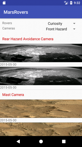
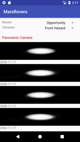
Here is a screenshot from the final version of our app:

mars rover screenshot

Checkout those amazing Mars landscapes! :]

You’re going to continue with the NASA site used in the previous RecyclerView tutorial, but do things a bit differently. You’ll be using an API that will return a list of Mars rover photos. Along with the RecyclerView of photos, there are two spinners to change the list of photos: one for rovers and the other for cameras.

Getting Started

Download the starter project here. Open it up in Android Studio 3.0.1 or later.

Next, head to the NASA site (https://api.nasa.gov/index.html#apply-for-an-api-key) and get an API key to use for the rover photos.

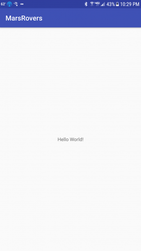
Build and run your app on an emulator or phone. You should see a default “Hello World!” TextView in the center.

Manifest

Add the following to your AndroidManifest.xml file before the application tag:

<uses-permission android:name="android.permission.INTERNET"/>

This will allow you to get information from the NASA website. Note that this is not considered a “dangerous” permission and the user will not be asked to approve it.

String Data

To populate the spinners on the main screen, you will need to add strings for the spinners to the strings.xml file. Open strings.xml in the res/values folder and add the following after the app_name string:

<string name="api_error">Problems getting Photos</string>
<string name="rovers">Rovers</string>
<string name="cameras">Cameras</string>
<string-array name="rovers">
   <item>Curiosity</item>
   <item>Opportunity</item>
   <item>Spirit</item>
</string-array>
<string-array name="camera_names">
   <item>Front Hazard</item>
   <item>Rear Hazard</item>
   <item>Navigation</item>
   <item>Panoramic</item>
   <item>Mast</item>
</string-array>
<string-array name="camera_values">
   <item>FHAZ</item>
   <item>RHAZ</item>
   <item>NAVCAM</item>
   <item>PANCAM</item>
   <item>MAST</item>
</string-array>

Main Layout

You need to modify the main layout and add some code to the MainActivity class. Start out by replacing the layout in the activity_main.xml file.

<?xml version="1.0" encoding="utf-8"?>
<android.support.constraint.ConstraintLayout xmlns:android="http://schemas.android.com/apk/res/android"
  xmlns:app="http://schemas.android.com/apk/res-auto"
  xmlns:tools="http://schemas.android.com/tools"
  android:layout_width="match_parent"
  android:layout_height="match_parent"
  tools:context="com.raywenderlich.marsrovers.MainActivity">

  <android.support.constraint.ConstraintLayout
    android:id="@+id/control_layout"
    android:layout_width="match_parent"
    android:layout_height="wrap_content"
    android:padding="10dp"
    app:layout_constraintLeft_toLeftOf="parent"
    app:layout_constraintTop_toTopOf="parent">

    <TextView
      android:id="@+id/roverLabel"
      android:layout_width="wrap_content"
      android:layout_height="wrap_content"
      android:text="@string/rovers"
      app:layout_constraintTop_toTopOf="parent" />

    <android.support.v7.widget.AppCompatSpinner
      android:id="@+id/rovers"
      android:layout_width="wrap_content"
      android:layout_height="wrap_content"
      app:layout_constraintRight_toRightOf="parent"
      app:layout_constraintTop_toTopOf="parent" />

    <TextView
      android:id="@+id/cameraLabel"
      android:layout_width="wrap_content"
      android:layout_height="wrap_content"
      android:layout_marginTop="4dp"
      android:text="@string/cameras"
      app:layout_constraintTop_toBottomOf="@+id/roverLabel" />

    <android.support.v7.widget.AppCompatSpinner
      android:id="@+id/cameras"
      android:layout_width="wrap_content"
      android:layout_height="wrap_content"
      app:layout_constraintRight_toRightOf="parent"
      app:layout_constraintTop_toBottomOf="@+id/rovers" />
  </android.support.constraint.ConstraintLayout>

  <android.support.v7.widget.RecyclerView
    android:id="@+id/recycler_view"
    android:layout_width="0dp"
    android:layout_height="0dp"
    android:visibility="gone"
    app:layout_constraintBottom_toBottomOf="parent"
    app:layout_constraintLeft_toLeftOf="parent"
    app:layout_constraintRight_toRightOf="parent"
    app:layout_constraintTop_toBottomOf="@+id/control_layout" />

  <ProgressBar
    android:id="@+id/progress"
    android:layout_width="wrap_content"
    android:layout_height="wrap_content"
    android:indeterminate="true"
    app:layout_constraintBottom_toBottomOf="parent"
    app:layout_constraintLeft_toLeftOf="parent"
    app:layout_constraintRight_toRightOf="parent"
    app:layout_constraintTop_toBottomOf="@+id/control_layout" />

</android.support.constraint.ConstraintLayout>

This uses Android’s new ConstraintLayout to add two rows of spinners, one for the Rover and one for the camera. There’s a RecyclerView below the spinners. Below the RecyclerView there is a ProgressBar that will spin while the data is loading.

Now, time to modify MainActivity.kt. In the onCreate() method, after the call to setContentView, add the following:

recycler_view.visibility = View.GONE
recycler_view.layoutManager = LinearLayoutManager(this)

When Android Studio gives you an error on recycler_view, put your cursor on recycler_view and hit option+return on Mac or Alt+Enter on PC and select “Import”. This uses the Kotlin Android Extensions to turn the R.id.recycler_view id into a recycler_view variable.

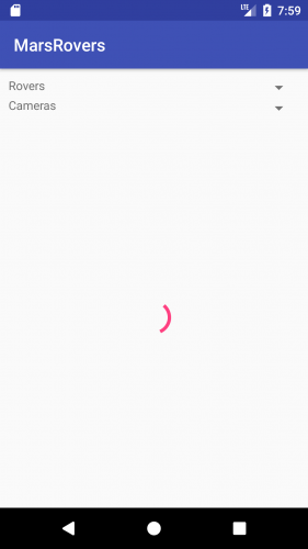
Now, run the app and you should see the following:

mars rover screenshot

ViewHolder

The ViewHolder class holds the inflated view, is created in a RecyclerView.Adapter in onCreateViewHolder and bound in onBindViewHolder.

Before RecyclerView, Android developers used ListView to achieve similar behavior. As ListView usage matured, developers started using the “view holder” pattern and Google then made ViewHolder a key part of the RecyclerView API.

You’ll be creating a special ViewHolder class that will allow you to handle text and image views without using findViewById. In this DefaultViewHolder class, you’ll start by going through all of the child views and putting them in a map so that you can easily retrieve the view later. See the starter project for the full DefaultViewHolder class.

Adapter Layouts

You need to create the two layouts that will be used in the adapter, one for the section headers, and one for the rows themselves. First, you’ll add the header style needed for the header item layout.

Header Style

Open the styles.xml file in the values resource folder and add the following style that will be used in the header_item.xml file:

<style name="header">
  <item name="android:textSize">16sp</item>
  <item name="android:textColor">@android:color/holo_red_dark</item>
</style>

You can use any color you’d like. To create the header, go to the res/layout folder. Right-click and choose New/Layout resource file. Name the file header_item.xml. You can leave the root element as suggested and then replace everything with the following:

<?xml version="1.0" encoding="utf-8"?>
<LinearLayout xmlns:android="http://schemas.android.com/apk/res/android"
  xmlns:tools="http://schemas.android.com/tools"
  android:layout_width="match_parent"
  android:layout_height="wrap_content"
  android:orientation="vertical"
  android:padding="10dp">

  <TextView
    android:id="@+id/header_text"
    style="@style/header"
    android:layout_width="match_parent"
    android:layout_height="wrap_content"
    tools:text="Front Hazard" />
</LinearLayout>

This is just a TextView for the header text.

Next, right-click on the layout folder and create a new layout named row_item.xml. Again, leave the root element and replace with:

<?xml version="1.0" encoding="utf-8"?>
<LinearLayout xmlns:android="http://schemas.android.com/apk/res/android"
  xmlns:tools="http://schemas.android.com/tools"
  android:layout_width="match_parent"
  android:layout_height="wrap_content"
  android:orientation="vertical">

  <ImageView
    android:id="@+id/camera_image"
    android:layout_width="match_parent"
    android:layout_height="80dp"
    android:adjustViewBounds="true"
    android:scaleType="fitXY" />

  <TextView
    android:id="@+id/date"
    android:layout_width="wrap_content"
    android:layout_height="wrap_content"
    tools:text="10/07/2017" />
</LinearLayout>

This has an ImageView for the mars photo and a TextView for the date of the image below it.

Data

You’ll be populating the RecyclerView.Adapter using data from the NASA site: https://api.nasa.gov/api.html#MarsPhotos.

An easy way to test an API is to use the Postman Chrome extension or the Postman app (https://www.getpostman.com/). Once you’ve installed it, take the url https://api.nasa.gov/mars-photos/api/v1/rovers/curiosity/photos?sol=1000&api_key= and add your key to the end.

Hit the “Send” button in Postman and you’ll see the returned JSON in the Response section. Notice how it returns an object that has 1 item named photos, which is an array of objects. Now, you’ll create models to hold the data that comes back.

In Android Studio, navigate to the com.raywenderlich.marsrovers package. Right click and select New/Package to create a new package named models.

Next, right-click on the models package and select New/Kotlin File/Class. Name the file Camera, choose Class as the “Kind” and replace the generated code with the following:

data class Camera(val id: Int, val name: String, val rover_id: Int, val full_name: String)

Notice that you are using the data keyword to have Kotlin create the getters and setters for you, and that the class doesn’t need a beginning or ending brace as there are no methods. The field names match the names of the fields in the JSON response returned from the NASA API endpoint. You could make the names more readable, but you’d have to add some annotations to do that. For now, just use the given names.

Next, right-click on the models package and create a new Kotlin class named Photo and replace with the following:

data class Photo(val id : Int, val img_src : String, val earth_date: String, val camera: Camera)

Create another Kotlin class named PhotoList. The PhotoList class just holds a list of photos and is the root element of the JSON data:

data class PhotoList(val photos: List<Photo>)

Finally, create a PhotoRow class that will be used to indicate that a row is either a photo or a header. This way, you can just have a list of PhotoRow objects and check which type to show based on the value of the RowType enum. Create a new Kotlin file called PhotoRow in the models package and add the following:

enum class RowType {
   PHOTO,
   HEADER
}

data class PhotoRow(var type: RowType, var photo: Photo?, var header: String?)

The type property will distinguish between photos and headers. The row will have either a photo or a header string. Both the photo and header variables are nullable.

Adapter

Your adapter will extend the RecyclerView.Adapter class and use DefaultViewHolder. Navigate to the com.raywenderlich.marsrovers.recyclerview package and add a new Kotlin class called PhotoAdapter.

The class will start out like so:

class PhotoAdapter(private var photoList: ArrayList<PhotoRow>) : RecyclerView.Adapter<DefaultViewHolder>() {

Along with the passed in list of photos, create two more variables at the beginning of the class:

private var filteredPhotos = ArrayList<PhotoRow>()
private var filtering = false

The filterPhotos list is used to hold photos for a specific camera, and the filtering flag will be true when the user is filtering.

There are three abstract methods of RecyclerView.Adapter that have to be implemented: getItemCount, onCreateViewHolder, and onBindViewHolder. You will also override the getItemViewType method to return different values for the header and photo row type.

getItemCount returns the number of photos available. If filtering is on, return the size from the filtered list:

override fun getItemCount(): Int {
 if (filtering) {
     return filteredPhotos.size
 }
 return photoList.size
}

onBindViewHolder is where you load the photo or set the header text.

override fun onBindViewHolder(holder: DefaultViewHolder, position: Int) {
  val photoRow : PhotoRow = if (filtering) {
    filteredPhotos[position]
  } else {
    photoList[position]
  }
  if (photoRow.type == RowType.PHOTO) {
    val photo = photoRow.photo
    Glide.with(holder.itemView.context)
        .load(photo?.img_src)
        .into(holder.getImage(R.id.camera_image))
    photo?.earth_date?.let { holder.setText(R.id.date, it) }
  } else {
    photoRow.header?.let { holder.setText(R.id.header_text, it) }
  }
}

You can see that you’re using Glide to load images into the ImageView. Glide seemed to work better for all of the Mars photos than Picasso, which was only able to load some of the images.

onCreateViewHolder is where you inflate the layout and return the ViewHolder:

override fun onCreateViewHolder(parent: ViewGroup, viewType: Int): DefaultViewHolder {
  val layoutInflater = LayoutInflater.from(parent.context)

  val inflatedView : View = when (viewType) {
    RowType.PHOTO.ordinal -> layoutInflater.inflate(R.layout.row_item, parent,false)
    else -> layoutInflater.inflate(R.layout.header_item, parent,false)
  }
  return DefaultViewHolder(inflatedView)
}

For the two methods onCreateViewHolder and onBindViewHolder, you need to distinguish between a header and photo row. You can do that by checking the PhotoRow’s type, as you’ll see in the next section.

Section Headers

To provide headers for rows, you just need to have different row types. This is done by letting the RecyclerView know what type to use for each row.

Override the getItemViewType method and return a different integer for each type. You will be returning two different types, one for the header and one for the photo. You can use the ordinal of the enum (so the returned values will be 0 and 1). Add the following method after onCreateViewHolder.

override fun getItemViewType(position: Int) =
  if (filtering) {
    filteredPhotos[position].type.ordinal
  } else {
    photoList[position].type.ordinal
  }

Both getItemCount and getItemViewType need to take into account the filtering flags to use either the original photoList or the filteredPhotos list.

In onCreateViewHolder, you load in a row_item layout for photos and a head_item layout for the header. The onBindViewHolder checks the type and binds the appropriate items to the ViewHolder.

Now run the app to make sure it builds. Since you haven’t added the adapter to the RecyclerView yet, you won’t see anything quite yet, only the spinning ProgressBar.

DiffUtil

DiffUtil is a utility class from the RecyclerView support library used to calculate the difference between two lists and create the operations that will morph one list into another. It will be used by the RecyclerView.Adapter to trigger the optimal data change notifications that are used to animate the RecyclerView‘s rows.

To use this method, you need to implement the DiffUtil.Callback. Add this to the end of the PhotoAdapter class:

class PhotoRowDiffCallback(private val newRows : List<PhotoRow>, private val oldRows : List<PhotoRow>) : DiffUtil.Callback() {
  override fun areItemsTheSame(oldItemPosition: Int, newItemPosition: Int): Boolean {
    val oldRow = oldRows[oldItemPosition]
    val newRow = newRows[newItemPosition]
    return oldRow.type == newRow.type
  }

  override fun getOldListSize(): Int = oldRows.size

  override fun getNewListSize(): Int = newRows.size

  override fun areContentsTheSame(oldItemPosition: Int, newItemPosition: Int): Boolean {
    val oldRow = oldRows[oldItemPosition]
    val newRow = newRows[newItemPosition]
    return oldRow == newRow
  }
}

This class checks the items to see if they are the same type or have the same values. The areItemsTheSame method just checks the row type but the areContentsTheSame checks to see if the rows are equal.

Additional Methods

To update the photo list, you need to pass in a new list, calculate the difference between the two lists and clear the filter. Add the following methods after getItemViewType in PhotoAdapter to support clearing the filter list, use DiffUtil to tell the Adapter how to update the photo views, and remove rows:

private fun clearFilter() {
    filtering = false
    filteredPhotos.clear()
  }

fun updatePhotos(photos : ArrayList<PhotoRow>) {
   DiffUtil.calculateDiff(PhotoRowDiffCallback(photos, photoList), false).dispatchUpdatesTo(this)
   photoList = photos
   clearFilter()
}

fun removeRow(row : Int) {
   if (filtering) {
       filteredPhotos.removeAt(row)
   } else {
       photoList.removeAt(row)
   }
   notifyItemRemoved(row)
}

Notice the notifyItemRemoved method. That method will allow animations to occur for the rows around the deleted row because it tells RecyclerView exactly how the data in the adapter has changed. It’s best not to use notifyDataSetChanged for this case, as that does not provide RecyclerView with details about exactly what has changed.

Retrofit

To get the data from NASA, you’ll be using the Retrofit and Moshi libraries. You’ll use Retrofit for downloading the data and Moshi for converting it from JSON to our models.

First, create a service interface. Create a new package named service and then right click to create a new Kotlin interface named NasaApi. Replace the code with the following:

interface NasaApi {
   @GET("mars-photos/api/v1/rovers/{rover}/photos?sol=1000&api_key=<key>")
   fun getPhotos(@Path("rover") rover: String) : Call<PhotoList>
}

Substitute your key from the NASA site for <key>. This sets up the method to get the list of Photos. The passed in rover string will be substitued for {rover}.

If you need to add an import for Call, be sure to use the one from the retrofit2 package.

Next, you’ll need to create the actual service. Your service should be a Singleton and in Kotlin, creating one is extremely easy.

Right click on the service package and select New/Kotlin File/Class, name it NasaPhotos, and change the Kind to Object. That’s it! You now have a Kotlin Singleton.

Create a variable named service that is used in the getPhotos method:

object NasaPhotos {
  private val service : NasaApi

And then add an init method. This will create the instance of Retrofit, set Moshi as the JSON converter, and finally create the service object:

init {
    val retrofit = Retrofit.Builder()
       .baseUrl("https://api.nasa.gov/")
       .addConverterFactory(MoshiConverterFactory.create())
       .build()
    service = retrofit.create(NasaApi::class.java)
}

Then, create a new method to make the call for the photos:

fun getPhotos(rover: String) : Call<PhotoList> = service.getPhotos(rover)

You’re almost there. You just need to setup the spinners and the RecyclerView adapter, which you’ll do next.

Updating the main UI

It’s time to update MainActivity to setup the spinners and load some photos!

Add a few variables to hold the current rover string and the spinner positions, at the top of MainActivity

private var currentRover = "curiosity"
private var currentRoverPosition = 0
private var currentCameraPosition = 0

Above the MainActivity class declaration add:

private const val TAG = "MarsRover"

The TAG will be used for logging errors.

Add the following below the onCreate method:

private fun setupSpinners() {
   setupRoverSpinner()
   setupCameraSpinner()
}

private fun setupCameraSpinner() {
   // Camera spinner
   val cameraStrings = resources.getStringArray(R.array.camera_values)
   val cameraAdapter = ArrayAdapter.createFromResource(this, R.array.camera_names, android.R.layout.simple_spinner_item)
   cameraAdapter.setDropDownViewResource(android.R.layout.simple_spinner_dropdown_item)
   cameras.adapter = cameraAdapter
   cameras.onItemSelectedListener = object : AdapterView.OnItemSelectedListener {
       override fun onNothingSelected(parent: AdapterView<*>) {
       }

       override fun onItemSelected(parent: AdapterView<*>, view: View, position: Int, id: Long) {
           currentCameraPosition = position
       }
   }
}

private fun setupRoverSpinner() {
   // Setup the spinners for selecting different rovers and cameras
   val roverStrings = resources.getStringArray(R.array.rovers)
   val adapter = ArrayAdapter.createFromResource(this, R.array.rovers, android.R.layout.simple_spinner_item)
   adapter.setDropDownViewResource(android.R.layout.simple_spinner_dropdown_item)
   rovers.adapter = adapter
   rovers.onItemSelectedListener = object : AdapterView.OnItemSelectedListener {
       override fun onNothingSelected(parent: AdapterView<*>) {
       }

       override fun onItemSelected(parent: AdapterView<*>, view: View, position: Int, id: Long) {
           if (currentRoverPosition != position) {
               currentRover = roverStrings[position].toLowerCase()
               loadPhotos()
           }
           currentRoverPosition = position
       }
   }
}

These setup the spinners to hold the corresponding string arrays.

At the end of the onCreate method, add the following two lines that will setup the spinners and load the photos:

setupSpinners()
loadPhotos()

Next, you’ll load and sort our photos. Add the following after setupRoverSpinner in the MainActivity:

private fun loadPhotos() {
    progress.visibility = View.VISIBLE
    recycler_view.visibility = View.GONE
    NasaPhotos.getPhotos(currentRover).enqueue(object : Callback<PhotoList> {
       override fun onFailure(call: Call<PhotoList>?, t: Throwable?) {
           Snackbar.make(recycler_view, R.string.api_error, Snackbar.LENGTH_LONG)
           Log.e(TAG, "Problems getting Photos with error: $t.msg")
       }

       override fun onResponse(call: Call<PhotoList>?, response: Response<PhotoList>?) {
           response?.let { photoResponse ->
               if (photoResponse.isSuccessful) {
                  val body = photoResponse.body()
                  body?.let {
                     Log.d(TAG, "Received ${body.photos.size} photos")
                     if (recycler_view.adapter == null) {
                        val adapter = PhotoAdapter(sortPhotos(body))
                        recycler_view.adapter = adapter
                     } else {
                        (recycler_view.adapter as PhotoAdapter).updatePhotos(sortPhotos(body))
                     }
                   }
                   recycler_view.scrollToPosition(0)
                   recycler_view.visibility = View.VISIBLE
                   progress.visibility = View.GONE
               }
           }
       }
   })
}

fun sortPhotos(photoList: PhotoList) : ArrayList<PhotoRow> {
   val map = HashMap<String, ArrayList<Photo>>()
   for (photo in photoList.photos) {
       var photos = map[photo.camera.full_name]
       if (photos == null) {
           photos = ArrayList()
           map[photo.camera.full_name] = photos
       }
       photos.add(photo)
   }
   val newPhotos = ArrayList<PhotoRow>()
   for ((key, value) in map) {
       newPhotos.add(PhotoRow(RowType.HEADER, null, key))
       value.mapTo(newPhotos) { PhotoRow(RowType.PHOTO, it, null) }
   }
   return newPhotos
}

You’ll have to import a few classes to get rid of the errors. Note that any of the imports that provide multiple options should use the ones in the retrofit2 package.

In the sortPhotos method, you put the photos into sections arranged by camera.

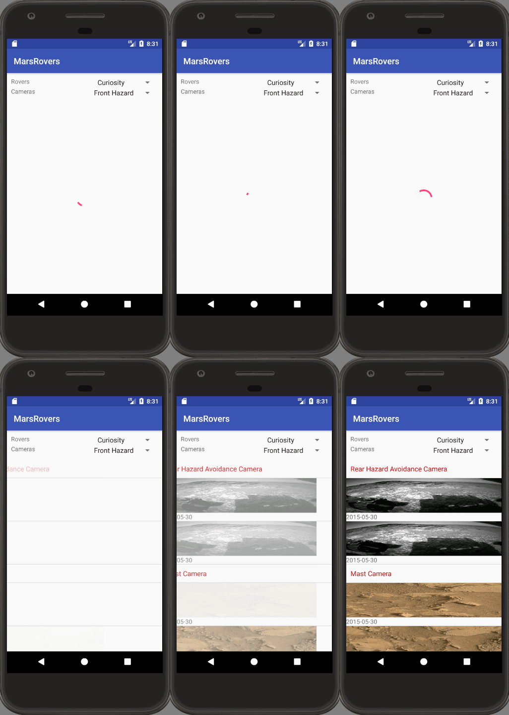
Now it’s time to try it out. Build and run the app, and within about 10 or 20 seconds, you should see something like:

mars rover screenshot

If you don’t see any images, make sure you have your personal key in the Retrofit @GET annotation.

You can choose different rovers from the spinner in the top right and different cameras from the spinner below the rover spinner but they won’t do anything until they are hooked up. Note also that not all rovers have images from all cameras.

Filtering

In order to filter the list, add the filterCamera method to PhotoAdapter below getItemViewType:

fun filterCamera(camera: String) {
   filtering = true
   val newPhotos = photoList.filter { photo -> photo.type == RowType.PHOTO && photo.photo?.camera?.name.equals(camera) } as ArrayList<PhotoRow>
   DiffUtil.calculateDiff(PhotoRowDiffCallback(newPhotos, photoList), false).dispatchUpdatesTo(this)
   filteredPhotos = newPhotos
}

Now go back to your MainActivity and hook up the camera filtering. Add the following code to the beginning of the OnItemSelectedListener.onItemSelected() in the setupCameraSpinner method:

if (recycler_view.adapter != null && currentCameraPosition != position) {
   (recycler_view.adapter as PhotoAdapter).filterCamera(cameraStrings[position])
}

You pass in the camera string to filter on and create a new list with just those photos. You use Kotlin’s filter function on the collection and return a list of photos and has the given camera value.

Now run the app and choose Opportunity as the new rover and you should see something like:

ItemDecorators

Unlike ListView, RecyclerView does not come with any built-in dividers. Instead, RecyclerView allows you to add your own decorators.

The RecyclerView library comes with a DividerItemDecoration that can be used to put dividers between your rows. You can add a divider with this one line, which you should add to onCreate() in MainActivity after the line: recycler_view.visibility = View.GONE:

recycler_view.addItemDecoration(DividerItemDecoration(this, DividerItemDecoration.VERTICAL))

You can see the divider after the photo date on the last photo in a section.

To create your own decorator, just subclass ItemDecoration and implement the onDraw and/or the onDrawOver methods.

Animations

RecyclerViews allow animations for each row and provides built-in animations for adding and removing rows.

To show an animation for adding a row, make sure you use notifyItemAdded(position) instead of calling notifyDataChanged(). This lets the view know that just one row has been added and can animate that addition.

For deleting, call notifyItemRemoved(position).

To animate the addition of each item, add the following method to PhotoAdapter:

private fun setAnimation(viewToAnimate: View) {
  if (viewToAnimate.animation == null) {
    val animation = AnimationUtils.loadAnimation(viewToAnimate.context, android.R.anim.slide_in_left)
    viewToAnimate.animation = animation
  }
}

This will provide an animation where the row slides in from the left.

Then add:

setAnimation(holder.itemView)

as the last line in onBindViewHolder. Now try running again.

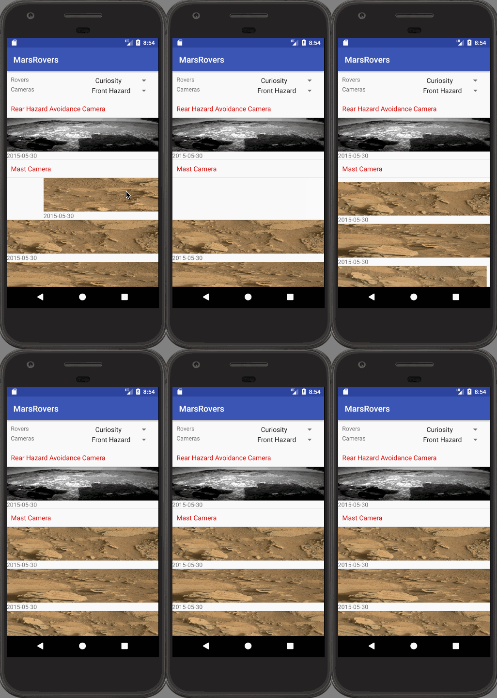
mars rover screenshot

The animation adds a nice dynamic effect to the presentation of the photos.

Swiping

Swiping is great way to let your user delete rows. You’re going to implement swiping in both the left and right direction to delete a row.

RecyclerView uses an ItemTouchHelper class along with a swipe callback to handle the movement. The callback is simple and you will just call your adapter’s removeRow method in the onSwiped callback.

Open MainActivity.kt and add the following at the bottom of the class:

class SwipeHandler(val adapter: PhotoAdapter, dragDirs : Int, swipeDirs : Int) : ItemTouchHelper.SimpleCallback(dragDirs, swipeDirs) {
  override fun onMove(recyclerView: RecyclerView?, viewHolder: RecyclerView.ViewHolder?, target: RecyclerView.ViewHolder?): Boolean {
    return false
  }

  override fun onSwiped(viewHolder: RecyclerView.ViewHolder, direction: Int) {
    adapter.removeRow(viewHolder.adapterPosition)
  }
}

In loadPhotos you will find the following in the onResponse method:

if (recycler_view.adapter == null) {
  val adapter = PhotoAdapter(sortPhotos(body))
  recycler_view.adapter = adapter

Add the following after setting the adapter value:

val touchHandler = ItemTouchHelper(SwipeHandler(adapter, 0, (ItemTouchHelper.LEFT or ItemTouchHelper.RIGHT)))
touchHandler.attachToRecyclerView(recycler_view)

Run the app and try swiping left or right to delete a row.

mars rover final screenshot

Awesome! You’re just deleting the row from the display in the RecyclerView. In another app you would likely delete the item from a database and/or make an API call to delete the corresponding item on a server.

Where to go from here

You’ve done a lot of work and now you know how to add animations, provide a swipe handler, add section headers, and use the DiffUtil class. Well done!

A great next step would be to eliminate the PhotoRow model class and DefaultViewHolder and get the project working with separate Header and Photo model objects and a dedicated ViewHolder for each.

The final project for this tutorial is available here. In the final project, be sure to remember to set the API key in NasaApi.kt.

If you need more information on RecyclerViews, you can check out the following Android developer documentation:

I hope you enjoyed this Intermediate RecyclerView tutorial, and if you have any questions or comments, please join the forum discussion below!

Go forward and make great animated RecyclerViews!

The post Intermediate Recyclerview Tutorial with Kotlin appeared first on Ray Wenderlich.

Screencast: What’s New in Foundation: Key Value Observing (KVO)

Unreal Engine 4 Particle Systems Tutorial

$
0
0

Unreal Engine 4 Particle Systems Tutorial

Particle systems are a key component to visual effects. They allow artists to easily create effects such as explosions, smoke and rain.

Unreal Engine 4 has a robust and easy-to-use system to create particle effects called Cascade. This system allows you to create modular effects and easily control particle behaviour.

In this tutorial, you will learn how to:

  • Create a particle system
  • Set the velocity and size of a particle
  • Adjust the particle spawn rate
  • Scale the particle’s size over its lifetime using curves
  • Set the particle color using Cascade
  • Activate and deactivate a particle system using Blueprints
  • Set particle colors using Blueprints
Note: This tutorial is part of an 8-part tutorial series on Unreal Engine:

Getting Started

Download the starter project and unzip it. Navigate to the project folder and open SpaceshipBattle.uproject.

Press Play to start the game. Hold left-click to shoot and use W, A, S and D to move around.

Unreal Engine 4 Particle Systems Tutorial

In this tutorial, you will create two particle effects. One for the ship’s thrusters and one for when a ship explodes. To create these, you will use particle systems.

What is a Particle System?

As its name suggests, a particle system is a system to create and manage particles. A particle is basically a point in space. Using particle systems, you can control the appearance and behaviour of the particle.

Particle systems consist of one or more components called emitters. These are responsible for spawning particles.

Unreal Engine 4 Particle Systems Tutorial

Emitters also have components called modules. Modules control specific properties of the particles spawned by the emitter. For example, the material and initial velocity of a particle. In the example below, two modules are used to give each particle a red circle material and random velocity.

Unreal Engine 4 Particle Systems Tutorial

You can also change a particle’s color over its lifetime. In this example, the particle’s color changes from red to blue:

Unreal Engine 4 Particle Systems Tutorial

Now that you know what a particle system is, it’s time to create one for the ship’s thrusters.

Creating a Particle System

Navigate to the ParticleSystems folder and click Add New\Particle System. Rename the particle system to PS_Thruster and then open it.

Cascade: The Particle System Editor

Cascade is composed of four main panels:

Unreal Engine 4 Particle Systems Tutorial

  1. Viewport: This panel will display a preview of your particle system. You can look around by holding right-click and moving your mouse. To move, hold right-click and use the WASD keys.
  2. Details: Any component (emitters, modules etc.) you select will have its properties displayed here. If nothing is selected, it will display the properties for the particle system.
  3. Emitters: This panel will show a list of emitters from left to right. Each emitter displays a list of its modules.
  4. Curve Editor: The Curve Editor allows you to visualize and adjust the values of a module’s curves. Not all module properties support curves.

Right now, the particle system is using the default particle material.

Unreal Engine 4 Particle Systems Tutorial

To start, you will replace the particle material with a circle material.

Applying a Material to Particles

Go to the Emitters panel and select the Required module.

Unreal Engine 4 Particle Systems Tutorial

The Required module contains necessary properties such as particle material and emitter duration. Every emitter must have a Required module.

To change the material, go to the Details panel and set Material to M_Particle. This will change the particle’s appearance to an orange circle.

Unreal Engine 4 Particle Systems Tutorial

Next, you will attach the particle system to the player’s ship.

Attaching the Particle System

Go back to the main editor and navigate to the Blueprints folder. Open BP_Player and then go to the Components panel.

To use a particle system, you can use a Particle System component. Create one and rename it to ThrusterParticles. Make sure you attach it to the Collision component.

Unreal Engine 4 Particle Systems Tutorial

To specify a particle system, go to the Details panel and locate the Particles section. Set Template to PS_Thruster.

Next, set the Location of ThrusterParticles to (-80, 0, 0). This will place it behind the ship.

Unreal Engine 4 Particle Systems Tutorial

Finally, set the Rotation to (0, 90, 0). This will orient the particle system so that the particles move away from the ship.

Unreal Engine 4 Particle Systems Tutorial

Click Compile and then go back to the main editor. Press Play to see the particle system in effect.

Unreal Engine 4 Particle Systems Tutorial

The particle system is working but the particles move a bit too slowly and are very small. You can fix this by setting the particle’s initial velocity and size.

Setting a Particle’s Velocity and Size

First, you will set the initial velocity of the particles. Open PS_Thruster and then select the Initial Velocity module. Afterwards, expand Start Velocity\Distribution.

By default, a particle’s initial velocity will range from (-10, -10, 50) to (10, 10, 100).

Unreal Engine 4 Particle Systems Tutorial

To move the particles away from the ship at a faster speed, all you need to do is increase the Z velocity. Set Min Z to 300 and Max Z to 400.

Unreal Engine 4 Particle Systems Tutorial

Here is a comparison between the original and new velocities:

Unreal Engine 4 Particle Systems Tutorial

Next, you will set the initial size of the particles.

Setting the Particle’s Size

Select the Initial Size module and then go to the Details panel. Afterwards, expand Start Size\Distribution.

Like the Initial Velocity module, Initial Size also has a minimum and maximum range. However, for this tutorial, you will set the size to be a constant value. To do this, set Distribution to Distribution Vector Constant.

Unreal Engine 4 Particle Systems Tutorial

Note: Distributions allow you to specify values that are constant, within a range or on a curve. You can also set values using Blueprints. To learn more, head over to the Distributions page in the Unreal Engine documentation.

Afterwards, set Constant to (70, 70, 70). Here is a size comparison:

Unreal Engine 4 Particle Systems Tutorial

Go back to the main editor and press Play.

Unreal Engine 4 Particle Systems Tutorial

The particles are looking better but they’re still spaced quite far apart. This is because the duration between particle spawning is too large. To fix this, you can increase the spawn rate.

Increasing the Particle Spawn Rate

To increase the spawn rate, you need to use the Spawn module. This module controls how fast the emitter will spawn particles. Along with Required, every emitter must have a Spawn module.

Open PS_Thruster and then select Spawn. Go to the Details panel and then expand the Spawn\Rate section.

Unreal Engine 4 Particle Systems Tutorial

Set Constant to 50. This will increase the spawn rate to 50 particles per second.

Unreal Engine 4 Particle Systems Tutorial

Go back to the main editor and press Play.

Unreal Engine 4 Particle Systems Tutorial

As you can see, it now looks more like a trail. To make the particles look more like thruster flames, you can shrink them over time.

Shrinking the Particles Over Time

Open PS_Thruster and then go to the Emitters panel.

To shrink the particles, you can use a Size By Life module. This module will apply a multiplier to the particle’s size over its lifetime. Create one by right-clicking an empty space in the emitter and selecting Size\Size By Life.

Unreal Engine 4 Particle Systems Tutorial

By default, this will have no visual effect on the particle’s size. This is because the multiplier is always set to 1. To shrink the particle, you need to adjust the module’s curve so that the size multiplier decreases over time. But first, what is a curve?

What is a Curve?

A curve is a collection of points. Each point has two things: a position and a value.

When you have two or more points, you form a line. Below is an example of a basic linear curve. Point A has a position and value of 0. Point B has a position of 2 and value of 1.

Unreal Engine 4 Particle Systems Tutorial

If you sample a linear curve at any position, it functions like a linear interpolation. For example, if you sampled the curve above at position 1, you would receive a value of 0.5.

Unreal Engine 4 Particle Systems Tutorial

If you create a curve that declines, the value you receive will gradually get smaller. This is the type of curve you want to use for the Size By Life module.

Unreal Engine 4 Particle Systems Tutorial

Now, you will create the curve above within Cascade.

Modifying a Module’s Curve

Select Size By Life and then go to the Details panel. Afterwards, expand Life Multiplier\Distribution\Constant Curve\Points. Here, you will see a list of points for the Life Multiplier curve.

Unreal Engine 4 Particle Systems Tutorial

In Val is the point’s position on the curve. For Size By Life, a value of 0 indicates the beginning of a particle’s life. A value of 1 indicates the end of a particle’s life.

To decrease the size multiplier over time, you need to decrease the Out Val of the second point. Set Out Val of point 1 to (0, 0, 0). This will decrease the particle’s size towards 0 over time.

Unreal Engine 4 Particle Systems Tutorial

You can visualize the Life Multiplier curve using the Curve Editor. To do this, click the graph icon on the Size By Life module.

Unreal Engine 4 Particle Systems Tutorial

This will add Life Multiplier to the Curve Editor. To fit the curve into view, click Fit in the Curve Editor.

Unreal Engine 4 Particle Systems Tutorial

As you can see, the size multiplier decreases from 1 to 0 over the particle’s lifetime.

Unreal Engine 4 Particle Systems Tutorial

Go back to the main editor and press Play

Unreal Engine 4 Particle Systems Tutorial

The particles now look more like flames! The final thing you will add to this particle system is color variation.

Adding Color Variations

To set a particle’s color using Cascade, you need to set up the particle material correctly. Navigate to the Materials folder and open M_Particle.

Unreal Engine 4 Particle Systems Tutorial

Currently, the color is set in the material. To use a color from the particle system, you need to use a ParticleColor node.

First, delete the node connected to Emissive Color. Next, add a ParticleColor node and connect it like so:

Unreal Engine 4 Particle Systems Tutorial

Solution Inside: Optional SelectShow>

Click Apply and then close M_Particle.

To set the particle’s color, you can use the Initial Color module.

The Initial Color Module

Open PS_Thruster and then add an Initial Color module. You can find it under the Color category.

Unreal Engine 4 Particle Systems Tutorial

To add color variations, you need to specify a range the color can be in. To do this, you can use distributions.

Select Initial Color and then go to the Details panel. Expand the Start Color section and change Distribution to Distribution Vector Uniform. This will allow you to specify a range for each color channel.

Unreal Engine 4 Particle Systems Tutorial

For this tutorial, the color should range from orange to red. To do this, set Max to (1.0, 0.0, 0.0) and Min to (1.0, 0.35, 0.0).

Unreal Engine 4 Particle Systems Tutorial

If you look at the Viewport, you’ll notice the color behaving strangely.

Unreal Engine 4 Particle Systems Tutorial

This is because the Color Over Life module is constantly updating the color to white. To fix this, select Color Over Life and press Delete. Your module list should now look like this:

Unreal Engine 4 Particle Systems Tutorial

Close PS_Thruster and then press Play in the main editor. Look at those thruster flames!

Unreal Engine 4 Particle Systems Tutorial

Next, you will learn how to toggle the particle system, depending on if the ship is moving.

Toggling the Particle System

To check if the ship is moving, you can check if the player is pressing any movement keys.

Open BP_Player and locate the Event Tick node. Add the following set up to the end of the node chain:

Unreal Engine 4 Particle Systems Tutorial

Let’s run through what this set up does:

  1. This checks the MoveUp and MoveRight axis mappings. If both return 0, that means the player isn’t pressing any movement keys.
  2. If Branch returns true (player isn’t pressing any movement keys), deactivate ThrusterParticles
  3. If Branch returns false (player is pressing a movement key), activate ThrusterParticles

Click Compile and then close BP_Player. Press Play and switch between moving and not moving to see the toggle.

Unreal Engine 4 Particle Systems Tutorial

Now it’s time for the fun part: creating an explosion particle system!

Creating an Explosion Effect

Instead of creating a new particle system, you will duplicate the thruster particles. Navigate to the ParticleSystems folder, right-click on PS_Thruster and select Duplicate. Rename it to PS_Explosion and then open it.

For an explosion, all the particles should spawn at the same time instead of one by one. This is known as burst-emitting.

Unreal Engine 4 Particle Systems Tutorial

Creating a Burst

First, you will need to set the spawn rate to zero because you don’t want to use the default spawning behaviour. Select the Spawn module and set Spawn\Rate\Distribution\Constant to 0.

Unreal Engine 4 Particle Systems Tutorial

Next, you need to tell the emitter you want to create a burst. Scroll down to the Burst section and add a new entry to the Burst List. You can do this by clicking the + icon.

Unreal Engine 4 Particle Systems Tutorial

Each entry will contain three fields:

  1. Count: How many particles to spawn. Set this to 20.
  2. Count Low: If greater than or equal to 0, the amount of particles spawned will range from Count Low to Count. Leave this at -1.
  3. Time: When to spawn the particles. A value of 0 indicates the beginning of the emitter’s lifetime. A value of 1 indicates the end of the emitter’s lifetime. Leave this at 0.0.
Note: You can find the emitter’s duration in the Required module. It is listed as Emitter Duration under the Duration section.

Unreal Engine 4 Particle Systems Tutorial

This means the emitter will spawn 20 particles at the beginning of its life.

Unreal Engine 4 Particle Systems Tutorial

To make it look like an explosion, you need to set the velocity so that the particles move outwards.

Moving the Particles Outwards

Since this is a top-down game, you only need to specify the X and Y velocities. Select the Initial Velocity module and expand Start Velocity\Distribution. Set Max to (1000, 1000, 0) and Min to (-1000, -1000, 0).

Unreal Engine 4 Particle Systems Tutorial

By specifying a range that goes from negative to positive, the particles will move outwards from the emitter.

Unreal Engine 4 Particle Systems Tutorial

Next, you need to set the amount of times the emitter should loop.

Setting the Emitter Loops

By default, emitters will loop indefinitely. This is great for effects such as fire and smoke but a burst should only play once. To fix this, you need to tell the emitter to only loop once.

Select the Required module and then locate the Duration section. Set Emitter Loops to 1.

Unreal Engine 4 Particle Systems Tutorial

Now, it’s time to play the explosion when an enemy dies!

Spawning Particles on Enemy Death

Go back to the main editor and navigate to the Blueprints folder. Open BP_Enemy and then locate the OnDeath event.

To spawn a particle system, you can use a Spawn Emitter at Location node. Create one and connect it to Destroy Actor.

Unreal Engine 4 Particle Systems Tutorial

Next, set Emitter Template to PS_Explosion.

Unreal Engine 4 Particle Systems Tutorial

Finally, create a GetActorLocation and connect it to the Location pin.

Unreal Engine 4 Particle Systems Tutorial

Now, when an enemy dies, it will spawn an instance of PS_Explosion at the enemy’s location.

Click Compile and then go back to the main editor. Press Play and start shooting some baddies.

Unreal Engine 4 Particle Systems Tutorial

Look at all those explosions! Next, you’ll add some extra spice to them by making them the same color as the enemy.

Changing the Explosion Color to Enemy Color

To use the enemy’s color, you need a way to receive that information from Blueprints. Luckily, Cascade has a distribution type that allows for this.

Open PS_Explosion and select the Initial Color module. Set Start Color\Distribution to Distribution Vector Particle Parameter.

Unreal Engine 4 Particle Systems Tutorial

This will give you a parameter that you can set using Blueprints. Set the Parameter Name to PrimaryColor

Unreal Engine 4 Particle Systems Tutorial

For the explosion, you will use both of the enemy’s colors. To use the second color, you will need another emitter. Right-click an empty space on the emitter and select Emitter\Duplicate and Share Emitter. This will duplicate the emitter.

Unreal Engine 4 Particle Systems Tutorial

You’ll notice that each module now has a + sign next to it. By using Duplicate and Share Emitter instead of Duplicate, you have linked the modules instead of copying them. Any changes you make in one module will also happen in the same module of the other emitter. This is useful if you want to change properties across all emitters such as size.

The only module you will need to change is Initial Color. However, if you make a change, both emitters will receive the change. In this case, you do not want the modules to be linked as they need individual parameter names. The easiest way to unlink them is to delete the duplicated Initial Color module and create a new one.

Unreal Engine 4 Particle Systems Tutorial

Note: As of writing, there are no built-in methods to unlink modules.

Select the new Initial Color and set Start Color\Distribution to Distribution Vector Particle Parameter. Next, set Parameter Name to SecondaryColor.

Unreal Engine 4 Particle Systems Tutorial

At this point, the particle system is complete. Close PS_Explosion.

Next, you need to set the parameters using Blueprints.

Setting Particle Parameters Using Blueprints

Open BP_Enemy and then add the highlighted nodes after Spawn Emitter at Location:

Unreal Engine 4 Particle Systems Tutorial

This will allow you to set two parameters within PS_Explosion.

Now, you need to set the correct parameter names. Set Parameter Name for the first Set Color Parameter to PrimaryColor. Set Parameter Name for the second Set Color Parameter to SecondaryColor

Unreal Engine 4 Particle Systems Tutorial

Finally, you need to provide the colors. To make things easier, the colors have already been stored in the variables PrimaryColor and SecondaryColor. Connect each variable to their respective nodes like so:

Unreal Engine 4 Particle Systems Tutorial

Here is what you should end up with:

Unreal Engine 4 Particle Systems Tutorial

Let’s go over the order of events:

  1. When an enemy dies, it will spawn an instance of PS_Explosion at its location
  2. The PrimaryColor parameter of PS_Explosion will be set
  3. The SecondaryColor parameter of PS_Explosion will be set

Click Compile and then close BP_Enemy. Press Play and start shooting enemies to see the particle mayhem!

Unreal Engine 4 Particle Systems Tutorial

Look at all those juicy particles. See if you can add an explosion when the player dies!

Solution Inside: Solution inside! SelectShow>

Where to Go From Here?

You can download the completed project here.

Would you believe that you’ve barely scratched the surface of Cascade? You’ve created some neat effects but there are still a lot more modules for you to try out. I would recommend learning more about TypeData modules. Using them, you can create effects such as trails for sword slashes, lightning and even raining cows!

If there’s a topic you’d like me to cover, let me know in the comments below!

The post Unreal Engine 4 Particle Systems Tutorial appeared first on Ray Wenderlich.


How to Create a Tower Defense Game in Unity – Part 1

$
0
0
Update note: This tutorial has been updated to Unity 2017.1 by Jeff Fisher. The original tutorial was written by Barbara Reichart.

blocks-twitter

Tower defense games are incredibly popular, and no wonder — few things are more satisfying than watching your defense obliterate evil invaders! In this two-part tutorial, you build a tower defense game with Unity!

You’ll learn how to…

  • Create waves of enemies
  • Make them follow waypoints
  • Build and upgrade towers and let them reduce your enemies to pixels

At the end, you’ll have a framework for this genre that you can expand upon!

Note: You need to know Unity basics, like how to add game assets and components, understand prefabs and know some basic C#. To learn those things I recommend completing the Unity tutorials by Sean Duffy or the Beginning C# with Unity series by Brian Moakley.

I’m using the OS X version of Unity, but this tutorial works on Windows too.

A View from the Ivory Tower

In this tutorial, you build a tower defense game, where enemies — little bugs — crawl towards a cookie that belongs to you and your minions, which are of course monsters! You can place and upgrade monsters at strategic points for a bit of gold.

The player must kill the bugs before they feast on your cookie. Each wave of enemies is successively harder to defeat. The game ends when you survive all waves (Victory!) or when five enemies reach the cookie. (Defeat!).

Here’s a screenshot of the finished game:

Monsters Unite! Protect your cookie!

Monsters Unite! Protect the cookie!

Getting Started

If you don’t already have Unity installed, download it from Unity’s website.

Also, download this starter project, unzip and open the TowerDefense-Part1-Starter project in Unity.

The starter project includes art and sound assets, along with prebuilt animations and a few helpful scripts. The scripts aren’t directly related to tower defense games, so they won’t be explained here. However, if you’d like to learn more about creating Unity 2D animations, check out this Unity 2D tutorial.

The project also contains prefabs you’ll later expand upon to create characters. Finally, the project includes a scene with its background and user interface set up.

Open GameScene, found in the folder Scenes, and set your Game view’s aspect ratio to 4:3 to ensure the labels line up properly with the background. You should see the following in the Game view:

Starter Project Screenshot

Credits:

  • The art for the project comes from a free art pack by Vicki Wenderlich! You can find more awesome graphics from her at gameartguppy.
  • The cool music is from BenSound who has some great soundtracks!
  • Thanks goes to Michael Jasper for the impactful camera shake.

Starter project – check!
Assets – check!
The first step towards world domination… ehm, I mean your tower defense game…is done!

X Marks the Spot: Placement

Monsters can only post up at spots marked with an x.

To add these to the scene, drag and drop Images\Objects\Openspot from the Project Browser into the Scene view. For now, position doesn’t matter.

With Openspot selected in the Hierarchy, click Add Component in the Inspector and select Box Collider 2D. Unity displays the box collider with a green line in the Scene view. You’ll use this collider to detect mouse clicks on that spot.

Unity automatically detects the proper size for the collider. How cool is that?

Unity automatically detects the proper size for the collider. How cool is that?

Following the same steps, add an Audio\Audio Source component to Openspot. Set the Audio Source’s AudioClip to tower_place, which you can find in the Audio folder, and deactivate Play On Awake.

You need to create 11 more spots. While it’s tempting to repeat all those steps, Unity has a great solution for that: Prefabs!

Drag and drop Openspot from the Hierarchy into the Prefabs folder in the Project Browser. Its name then turns blue in the Hierarchy to show that it’s connected to a prefab. Like this:

prefab

Now that you have a prefab, you can create as many copies as you need. Just drag and drop Openspot from the Prefabs folder in the Project Browser into the Scene view. Do this 11 times to make a total of 12 Openspot objects in the scene.

Now use the Inspector to set the positions of these 12 Openspot objects to the following coordinates:

  • (X:-5.2, Y:3.5, Z:0)
  • (X:-2.2, Y:3.5, Z:0)
  • (X:0.8, Y:3.5, Z:0)
  • (X:3.8, Y:3.5, Z:0)
  • (X:-3.8, Y:0.4, Z:0)
  • (X:-0.8, Y:0.4, Z:0)
  • (X:2.2, Y:0.4, Z:0)
  • (X:5.2, Y:0.4, Z:0)
  • (X:-5.2, Y:-3.0, Z:0)
  • (X:-2.2, Y:-3.0, Z:0)
  • (X:0.8, Y:-3.0, Z:0)
  • (X:3.8, Y:-3.0, Z:0)

When you’re done, your scene should look like this.

Spot positions for the tower defense game

Place Monsters

To make placing easier, the project’s Prefab folder contains a Monster prefab.

Monster prefab - Ready for use

Monster prefab – Ready for use

At this point, it consists of an empty game object with three different sprites and their shooting animations as their children.

Each sprite represents the monster at a different power level. The prefab also contains an Audio Source component, which you’ll trigger to play a sound whenever the monster shoots a laser.

You’ll now create a script that can place a Monster on an Openspot.

In the Project Browser, select Openspot in the Prefabs folder. In the Inspector, click Add Component, then choose New Script and name it PlaceMonster. Select C Sharp as the Language and click Create and Add. Because you added the script to the Openspot prefab all Openspots in your scene now also have the script attached. Neat!

Double click on the script to open it in your IDE. Then add these two variables:

public GameObject monsterPrefab;
private GameObject monster;

You’ll instantiate a copy of the object stored in monsterPrefab to create a monster, and store it in monster so you can manipulate it during the game.

One Monster Per Location

Add the following method to allow only one monster per location:

private bool CanPlaceMonster()
{
  return monster == null;
}

In CanPlaceMonster() you check whether the monster variable is still null. If so, it means there is currently no monster here and it’s okay to place one.

Now add the following code to actually place a monster when the player clicks this GameObject:

//1
void OnMouseUp()
{
  //2
  if (CanPlaceMonster())
  {
    //3
    monster = (GameObject)
      Instantiate(monsterPrefab, transform.position, Quaternion.identity);
    //4
    AudioSource audioSource = gameObject.GetComponent<AudioSource>();
    audioSource.PlayOneShot(audioSource.clip);

    // TODO: Deduct gold
  }
}

This code places a monster on mouse click or tap. So how does this work?

  1. Unity automatically calls OnMouseUp when a player taps a GameObject’s physics collider.
  2. When called, this method places a new monster if CanPlaceMonster() returns true.
  3. You create the monster with Instantiate, a method that creates an instance of a given prefab with the specified position and rotation. In this case, you copy monsterPrefab, give it the current GameObject’s position and no rotation, cast the result to a GameObject and store it in monster.
  4. Finally, you call PlayOneShot to play the sound effect attached to the object’s AudioSource component.

Now your PlaceMonster script can place a new monster, but you still have to specify the prefab.

Use The Right Prefab

Save the file and switch back to Unity.

To assign the monsterPrefab variable, first select Openspot in the Prefabs folder in the project browser.

In the Inspector, click on the circle to the right of the PlaceMonster (Script) component’s Monster Prefab field, and select Monster from the dialog that appears.

Assign Prefab

That’s it. Run the scene and build monsters on various x spots with a click or tap.

Success! You can build monsters. However they look like a weird mush because all child sprites of your monster are drawn. You’ll fix this next.

Success! You can build monsters. However they look like a weird mush because all child sprites of your monster are drawn. You’ll fix this next.

Level Up Those Monsters

In the image below, you see how your monsters look increasingly horrifying at higher levels.

It's so fluffy! But if you try to steal its cookie this monster can turn into a real killer.

It’s so fluffy! But if you try to steal its cookie, this monster can turn into a killer.

A script acts as the basis for implementing a leveling system for the monsters. It tracks how powerful the monster should be on each level, and of course, the current level of a monster.

Add this script now.

Select Prefabs/Monster in the Project Browser. Add a new C# script named MonsterData. Open the script in your IDE and add the following code above the MonsterData class.

[System.Serializable]
public class MonsterLevel
{
  public int cost;
  public GameObject visualization;
}

This creates MonsterLevel. It groups the cost (in gold, which you’ll support later) and the visual representation for a specific monster level.

You add [System.Serializable] at the top to make instances of the class editable from the inspector. This allows you to quickly change all values in the Level class — even while the game is running. It’s incredibly useful for balancing your game.

Define Monster Levels

In this case, you’ll store predefined MonsterLevel in a List<T>.

Why not simply use MonsterLevel[]? Well, you’ll need the index of a particular MonsterLevel object several times. While it’s not difficult to write code for that, you’ll use IndexOf(), which implements the functionality for Lists. No need to reinvent the wheel this time. :]

Reinventing the wheel is usually a bad idea. (from )

Reinventing the wheel is usually a bad idea (from Michael Vroegop)

At the top of MonsterData.cs, add the following using statement:

using System.Collections.Generic;

This gives you access to generic data structures, so you can use the List<T> class in your script.

Note: Generics are a powerful part of C#. They allow you to define type-safe data structures without committing to a type. This is practical for container classes like lists and sets. To learn more about generics, have a look at Introduction to C# Generics.

Now add the following variable to MonsterData to store a list of MonsterLevel:

public List<MonsterLevel> levels;

Using generics, you ensure the levels List can only ever contain MonsterLevel objects.

Save the file and switch to Unity to configure each stage.

Select Prefabs/Monster in the Project Browser. In the Inspector, you can now see a Levels field in the MonsterData (Script) component. Set its size to 3.

Screen Shot 2015-07-24 at 11.26.28 AM

Next, set the cost for each level to the following values:

  • Element 0: 200
  • Element 1: 110
  • Element 2: 120

Now assign the visualization field values.

Expand Prefabs/Monster in the project browser so that you can see its children. Drag and drop the child Monster0 to Element 0‘s visualization field.

Repeat to assign Monster1 to Element 1 and Monster2 to Element 2. See the following GIF that demonstrates this process:

assign-monsters2

When you select the Prefabs/Monster, the prefab should look like this:

Definition of the monsters’ levels in the inspector.

Definition of the monsters’ levels in the inspector.

Define the Current Level

Switch back to MonsterData.cs in your IDE, and add another variable to MonsterData.

private MonsterLevel currentLevel;

In the private variable currentLevel you’ll store the… wait for it … current level of the monster. I bet you did not see that one coming :]

Now set currentLevel and make it accessible to other scripts. Add the following to MonsterData, along with instance variable declarations:

//1
public MonsterLevel CurrentLevel
{
  //2
  get
  {
    return currentLevel;
  }
  //3
  set
  {
    currentLevel = value;
    int currentLevelIndex = levels.IndexOf(currentLevel);

    GameObject levelVisualization = levels[currentLevelIndex].visualization;
    for (int i = 0; i < levels.Count; i++)
    {
      if (levelVisualization != null)
      {
        if (i == currentLevelIndex)
        {
          levels[i].visualization.SetActive(true);
        }
        else
        {
          levels[i].visualization.SetActive(false);
        }
      }
    }
  }
}

Quite a bit of C# there, eh? Take it all it turn:

  1. Define a property for the private variable currentLevel. With a property defined, you can call just like any other variable: either as CurrentLevel (from inside the class) or as monster.CurrentLevel (from outside it). You can define custom behavior in a property's getter or setter method, and by supplying only a getter, a setter or both, you can control whether a property is read-only, write-only or read/write.
  2. In the getter, you return the value of currentLevel.
  3. In the setter, you assign the new value to currentLevel. Next you get the index of the current level. Finally you iterate over all the levels and set the visualization to active or inactive, depending on the currentLevelIndex. This is great because it means that whenever someone sets currentLevel, the sprite updates automatically. Properties sure do come handy!

Add the following implementation of OnEnable:

void OnEnable()
{
  CurrentLevel = levels[0];
}

This sets CurrentLevel upon placement, making sure that it shows only the correct sprite.

Note: It's important to initialize the property in OnEnable instead of OnStart, because you call the order methods when prefabs are instantiated.

OnEnable will be called immediately when you create the prefab (if the prefab was saved in an enabled state), but OnStart isn't called until after the object starts running as part of the scene.

You'll need to check this data before you place a monster, so you initialize it in OnEnable.

Save the file and switch to Unity. Run the project and place monsters; now they display the correct and lowest level sprites.

No more mushyness

Upgrade Those Monsters

Switch back to your IDE and add the following method to MonsterData:

public MonsterLevel GetNextLevel()
{
  int currentLevelIndex = levels.IndexOf (currentLevel);
  int maxLevelIndex = levels.Count - 1;
  if (currentLevelIndex < maxLevelIndex)
  {
    return levels[currentLevelIndex+1];
  }
  else
  {
    return null;
  }
}

In GetNextLevel you get the index of currentLevel and the index of the highest level provided the monster did not reach the maximal level to return the next level. Otherwise, return null.

You can use this method to figure out whether upgrading the monster is possible.

Add the following method to increase a monster's level:

public void IncreaseLevel()
{
  int currentLevelIndex = levels.IndexOf(currentLevel);
  if (currentLevelIndex < levels.Count - 1)
  {
    CurrentLevel = levels[currentLevelIndex + 1];
  }
}

Here you get the index of the current level, and then you make sure it’s not the maximum level by checking if it’s smaller than levels.Count - 1. If so, set CurrentLevel to the next level.

Test Upgrade Capability

Save the file and then switch to PlaceMonster.cs in your IDE and add this new method:

private bool CanUpgradeMonster()
{
  if (monster != null)
  {
    MonsterData monsterData = monster.GetComponent<MonsterData>();
    MonsterLevel nextLevel = monsterData.GetNextLevel();
    if (nextLevel != null)
    {
      return true;
    }
  }
  return false;
}

First check whether there is a monster that you can upgrade by checking the monster variable for null. If this is the case, you get the current level of the monster from its MonsterData.

Then you test whether a higher level is available, which is when GetNextLevel() doesn’t return null. If up-leveling is possible, you return true, otherwise, you return false.

Enable Upgrading With Gold

To enable the upgrade option, add an else if branch to OnMouseUp:

if (CanPlaceMonster())
{
  // Your code here stays the same as before
}
else if (CanUpgradeMonster())
{
  monster.GetComponent<MonsterData>().IncreaseLevel();
  AudioSource audioSource = gameObject.GetComponent<AudioSource>();
  audioSource.PlayOneShot(audioSource.clip);
  // TODO: Deduct gold
}

Check whether an upgrade is possible with CanUpgradeMonster(). If yes, you access the MonsterData component with GetComponent() and call IncreaseLevel(), which increases the level of the monster. Lastly, you trigger the monster's AudioSource.

Save the file and switch back to Unity. Run the game, place and upgrade as many monsters as you like...for now.

Upgrade all the monsters

All the monster upgrades

Pay Gold - Game Manager

Right now it’s possible to build and upgrade all the monsters immediately, but where's the challenge in that?

Let's drill down into the issue of the gold. The problem with keeping track of it is that you need to share information between different game objects.

The following image shows all the objects that want a piece of the action.

The highlighted game objects all need to know, how much gold the player owns.

The highlighted game objects all need to know, how much gold the player owns.

You'll use a shared object that's accessible to other objects to store this data.

Right-click in the Hierarchy and select Create Empty. Name the new game object GameManager.

Add a C# script named GameManagerBehavior to GameManager, then open the new script in your IDE. You'll display the player's total gold in a label, so add the following line to the top of the file:

using UnityEngine.UI;

This lets you access UI-specific classes like Text, which the project uses for the labels. Now add the following variable to the class:

public Text goldLabel;

This will store a reference to the Text component used to display how much gold the player owns.

Now that GameManager knows about the label, how can you ensure the amount of gold stored in your variable and the amount displayed on the label are in sync? You'll create a property.

Add the following code to GameManagerBehavior:

private int gold;
public int Gold {
  get
  {
    return gold;
  }
  set
  {
    gold = value;
    goldLabel.GetComponent<Text>().text = "GOLD: " + gold;
  }
}

Seem familiar? It’s similar to the CurrentLevel you defined in Monster. At first, you create a private variable, gold, to store the current gold total. Then you define a property named Gold -- creative, right? -- and implement a getter and setter.

The getter simply returns the value of gold . The setter is more interesting. In addition to setting the variable's value, it also sets the text field on goldLabel to display the new amount of gold.

How generous do you feel? Add the following line to Start() to give the player 1000 gold, or less if you feel miserly:

Gold = 1000;

Assign the Label Object to the Script

Save the file and switch to Unity.

In the Hierarchy, select GameManager. In the Inspector, click on the circle to the right of Gold Label. In the Select Text dialog, select the Scene tab and select GoldLabel.

Assign goldLabel

Run the scene and the label displays Gold: 1000.

1000 gold

Check the Player's "Wallet"

Open PlaceMonster.cs in your IDE, and add the following instance variable:

private GameManagerBehavior gameManager;

You'll use gameManager to access the GameManagerBehavior component of the scene's GameManager. To assign it, add the following to Start():

gameManager = GameObject.Find("GameManager").GetComponent<GameManagerBehavior>();

You get the GameObject named GameManager using GameObject.Find(), which returns the first game object it finds with the given name. Then, retrieve its GameManagerBehavior component and store it for later.

Note: You could have accomplished this by setting the field in Unity's editor, or by adding a static method to GameManager that returns a singleton instance from which you could get the GameManagerBehavior.

However, there's a dark horse method in the block above: Find, which is slower at runtime but convenient and ok to use sparingly.

Get the Money!

You don't yet deduct gold, so add this line twice inside OnMouseUp(), replacing each of the comments that read // TODO: Deduct gold:

gameManager.Gold -= monster.GetComponent<MonsterData>().CurrentLevel.cost;

Save the file and switch to Unity, upgrade some monsters and watch the Gold readout update. Now you deduct gold, but players can build monsters as long as there is space; they just get into debt.

Infinite credit

Infinite credit? Awesome! But you can't allow this. Monsters should only be placed when the player has enough gold.

Require Gold for Monsters

Switch to PlaceMonster.cs in your IDE, and replace the contents of CanPlaceMonster() with the following:

int cost = monsterPrefab.GetComponent<MonsterData>().levels[0].cost;
return monster == null && gameManager.Gold >= cost;

Retrieve the cost for placing the monster from levels in its MonsterData. You then check that monster is not null and that gameManager.Gold is greater than the cost.

Challenge: Add the check for whether a player has enough gold in CanUpgradeMonster() by yourself.

Solution Inside SelectShow>

Save and run the scene in Unity. Go ahead, just try to place unlimited monsters!

Limited gold.

Now you can only build a limited amount of monsters.

Tower Politics: Enemies, Waves and Waypoints

Time to "pave the road" for your enemies. Enemies appear at the first waypoint, move towards the next and repeat until they reach your cookie.

You’ll get the enemies marching by:

  1. Defining a road for the enemies to follow
  2. Moving the enemy along the road
  3. Rotating the enemy so it looks forward

Create a Road With Waypoints

Right-click in the Hierarchy and select Create Empty to make a new empty game object. Name it Road, and make sure it’s at position (0, 0, 0).

Now, right-click on Road in the hierarchy and create another empty game object as a child of Road. Name it Waypoint0 and set its position to (-12, 2, 0) -- this is where enemies start their assault.

Road - waypoint hierarchy

Create five more waypoints the same way with the following names and positions:

  • Waypoint1: (X:7, Y:2, Z:0)
  • Waypoint2: (X:7, Y:-1, Z:0)
  • Waypoint3: (X:-7.3, Y:-1, Z:0)
  • Waypoint4: (X:-7.3, Y:-4.5, Z:0)
  • Waypoint5: (X:7, Y:-4.5, Z:0)

The following screenshot highlights the waypoint locations and the resulting path.

Screen Shot 2015-07-24 at 12.09.11 PM

Spawn the Enemies

Now to make some enemies to follow the road. The Prefabs folder contains an Enemy prefab. Its position is (-20, 0, 0), so new instances will spawn off screen.

Otherwise, it's set up much like the Monster prefab, with an AudioSource and a child Sprite, and it’s a sprite so you can rotate it later without rotating the forthcoming health bar.

Move Monsters Down the Road

Add a new C# script named MoveEnemy to the Prefabs\Enemy prefab. Open the script in your IDE, and add the following variables:

[HideInInspector]
public GameObject[] waypoints;
private int currentWaypoint = 0;
private float lastWaypointSwitchTime;
public float speed = 1.0f;

waypoints stores a copy of the waypoints in an array, while [HideIninspector] above waypoints ensures you cannot accidentally change the field in the inspector, but you can still access it from other scripts.

currentWaypoint tracks which waypoint the enemy is currently walking away from, and lastWaypointSwitchTime stores the time when the enemy passed over it. Finally, you store the enemy's speed.

Add this line in Start():

lastWaypointSwitchTime = Time.time;

This initializes lastWaypointSwitchTime to the current time.

To make the enemy move along the path, add the following code to Update():

// 1
Vector3 startPosition = waypoints [currentWaypoint].transform.position;
Vector3 endPosition = waypoints [currentWaypoint + 1].transform.position;
// 2
float pathLength = Vector3.Distance (startPosition, endPosition);
float totalTimeForPath = pathLength / speed;
float currentTimeOnPath = Time.time - lastWaypointSwitchTime;
gameObject.transform.position = Vector2.Lerp (startPosition, endPosition, currentTimeOnPath / totalTimeForPath);
// 3
if (gameObject.transform.position.Equals(endPosition))
{
  if (currentWaypoint < waypoints.Length - 2)
  {
    // 3.a
    currentWaypoint++;
    lastWaypointSwitchTime = Time.time;
    // TODO: Rotate into move direction
  }
  else
  {
    // 3.b
    Destroy(gameObject);

    AudioSource audioSource = gameObject.GetComponent<AudioSource>();
    AudioSource.PlayClipAtPoint(audioSource.clip, transform.position);
    // TODO: deduct health
  }
}

Step by step:

  1. From the waypoints array, you retrieve the start and end position for the current path segment.
  2. Calculate the time needed for the whole distance with the formula time = distance / speed, then determine the current time on the path. Using Vector2.Lerp, you interpolate the current position of the enemy between the segment's start and end positions.
  3. Check whether the enemy has reached the endPosition. If yes, handle these two possible scenarios:
    1. The enemy is not yet at the last waypoint, so increase currentWaypoint and update lastWaypointSwitchTime. Later, you'll add code to rotate the enemy so it points in the direction it's moving, too.
    2. The enemy reached the last waypoint, so this destroys it and triggers a sound effect. Later you'll add code to decrease the player's health, too.

Save the file and switch to Unity.

Give the Enemies A Sense of Direction

In its current state, the enemies don’t know the order of the waypoints.

Select Road in the Hierarchy, and add a new C# script named SpawnEnemy. Then open it in your IDE, and add the following variable:

public GameObject[] waypoints;

You'll use waypoints to store references to the waypoint in the scene in the proper order.

Save the file and switch to Unity. Select Road in the Hierarchy and set the Size of the Waypoints array to 6.

Drag each of Road's children into the fields, putting Waypoint0 into Element 0, Waypoint1 into Element 1, and so on.

waypoints2

Now you have an array that contains neatly ordered waypoints so there’s a path – note that they never retreat; they will die trying to get a sugar fix.

certaindeath

Check That It All Works

Head to SpawnEnemy in your IDE, and add the following variable:

public GameObject testEnemyPrefab;

This keeps a reference to the Enemy prefab in testEnemyPrefab.

To create an enemy when the script starts, add the following code to Start():

Instantiate(testEnemyPrefab).GetComponent<MoveEnemy>().waypoints = waypoints;

This instantiates a new copy of the prefab stored in testEnemy and assigns it waypoints to follow.

Save the file and switch to Unity. Select Road in the Hierarchy and set its Test Enemy to the Enemy prefab.

Run the project to see the enemy follow the road.

BugFollowsRoadWithoutRotating

Did you notice they aren’t always looking where they're going? Funny! But you’re trying to be a professional here, yes? Continue with part two to learn how to get them to put their best faces forward.

Where To Go From Here?

You’ve gotten a lot done and are well on your way to having your very own tower defense game.

Players can build monsters, but not an unlimited amount, and there’s an enemy running towards your cookie. Players have gold and can also upgrade monsters.

Download the result here.

In part two, you’ll cover spawning massive waves of enemies and blowing them away. See you in Part Two!

Use the forums below to share your questions, notes, learnings, lightbulb moments and feedback. I look forward to talking with you!

The post How to Create a Tower Defense Game in Unity – Part 1 appeared first on Ray Wenderlich.

How to Create a Tower Defense Game in Unity – Part 2

$
0
0
Update note: This tutorial has been updated to Unity 2017.1 by Jeff Fisher. The original tutorial was written by Barbara Reichart.

blocks-twitter

Welcome to part two of How to Create a Tower Defense Game in Unity. You’re making a tower defense game in Unity, and at the end of part one, you could place and upgrade monsters. You also had one enemy attack the cookie.

However, the enemy had no idea which way to face! Also, it was a poor excuse for an attack. In this part, you’ll add enemy waves and arm your monsters so they can defend your precious cookie.

Getting Started

In Unity, open your completed project from the first part of this tutorial series, or if you’re just joining in now, download the starter project and open TowerDefense-Part2-Starter.

Open GameScene from the Scenes folder.

Rotate the Enemies

At the end of the last tutorial, the enemy followed the road, but appeared to have no idea which way to face.

Open MoveEnemy.cs in your IDE, and add the following method to fix this.

private void RotateIntoMoveDirection()
{
  //1
  Vector3 newStartPosition = waypoints [currentWaypoint].transform.position;
  Vector3 newEndPosition = waypoints [currentWaypoint + 1].transform.position;
  Vector3 newDirection = (newEndPosition - newStartPosition);
  //2
  float x = newDirection.x;
  float y = newDirection.y;
  float rotationAngle = Mathf.Atan2 (y, x) * 180 / Mathf.PI;
  //3
  GameObject sprite = gameObject.transform.Find("Sprite").gameObject;
  sprite.transform.rotation = Quaternion.AngleAxis(rotationAngle, Vector3.forward);
}

RotateIntoMoveDirection rotates the enemy so that it always looks forward, like so:

  1. It calculates the bug’s current movement direction by subtracting the current waypoint’s position from that of the next waypoint.
  2. It uses Mathf.Atan2 to determine the angle toward which newDirection points, in radians, assuming zero points to the right. Multiplying the result by 180 / Mathf.PI converts the angle to degrees.
  3. Finally, it retrieves the child named Sprite and rotates it rotationAngle degrees along the z-axis. Note that you rotate the child instead of the parent so the health bar — you’ll add it soon — remains horizontal.

In Update(), replace the comment // TODO: Rotate into move direction with the following call to RotateIntoMoveDirection:

RotateIntoMoveDirection();

Save the file and switch to Unity. Run the scene; now your monster knows where he’s going.

Your bug should follow the road (Here sped up by factor 20, so it's more fun to watch)

The bug now looks where it’s going.

One single enemy? Hardly impressive. Let the hordes come. And like in every tower defense game, hordes will come in waves!

Inform the Player

Before you set the hordes into motion, you need to let the player know about the coming onslaught. Also, why not display the current wave’s number at the top of the screen?

Several GameObjects need wave information, so you’ll add it to the GameManagerBehavior component on GameManager.

Open GameManagerBehavior.cs in your IDE and add these two variables:

public Text waveLabel;
public GameObject[] nextWaveLabels;

The waveLabel stores a reference to the wave readout at the top right corner of the screen. nextWaveLabels stores the two GameObjects that when combined, create an animation you’ll show at the start of a new wave, as shown below:

nextWaveAnimation

Save the file and switch to Unity. Select GameManager in the Hierarchy. Click on the small circle to the right of Wave Label, and in the Select Text dialog, select WaveLabel in the Scene tab.

Now set the Size of Next Wave Labels to 2. Then assign Element 0 to NextWaveBottomLabel and Element 1 to NextWaveTopLabel the same way as you set Wave Label.

This is what your Game Manager Behavior should look like

This is what your Game Manager Behavior should look like

If the player has lost the game, he shouldn’t see the next wave message. To handle this, switch back to GameManagerBehavior.cs in your IDE and add another variable:

public bool gameOver = false;

In gameOver you’ll store whether the player has lost the game.

Once again, you’ll use a property to keep the game’s elements in sync with the current wave. Add the following code to GameManagerBehavior:

private int wave;
public int Wave
{
  get
  {
    return wave;
  }
  set
  {
    wave = value;
    if (!gameOver)
    {
      for (int i = 0; i < nextWaveLabels.Length; i++)
      {
        nextWaveLabels[i].GetComponent<Animator>().SetTrigger("nextWave");
      }
    }
    waveLabel.text = "WAVE: " + (wave + 1);
  }
}

Creating the private variable, property and getter should be second nature by now. But again, the setter is a bit trickier.

You update wave with the new value.

Then you check that the game is not over. If so, you iterate over all labels in nextWaveLabels — those labels have an Animator component. To trigger the animation on the Animator you set the trigger nextWave.

Lastly, you set waveLabel‘s text to the value of wave + 1. Why the +1? – Normal human beings do not start counting at zero. Weird, I know :]

In Start(), set the value of this property:

Wave = 0;

You start counting at Wave number 0.

Save the file, then run the scene in Unity. The Wave readout properly starts at 1.

Internally you start counting with 0, but for the player everything starts with wave 1.

For the player everything starts with wave 1.

Waves: Spawn, Spawn, Spawn

It sounds obvious, but you need to be able to create more enemies to unleash the hordes — right now you can’t do that. Furthermore, you shouldn’t spawn the next wave once the current wave is obliterated — at least for now.

So, the games must be able to recognize whether there are enemies in the scene, and Tags are a good way to identify game objects.

Set Enemy Tags

Select the Enemy prefab in the Project Browser. At the top of the Inspector, click on the Tag dropdown and select Add Tag.

Create Tag

Create a Tag named Enemy.

create a new tag

Select the Enemy prefab. In the Inspector, set its Tag to Enemy.

Define Enemy Waves

Now you need to define a wave of enemies. Open SpawnEnemy.cs in your IDE, and add the following class implementation before SpawnEnemy:

[System.Serializable]
public class Wave
{
  public GameObject enemyPrefab;
  public float spawnInterval = 2;
  public int maxEnemies = 20;
}

Wave holds an enemyPrefab, the basis for instantiating all enemies in that wave, a spawnInterval, the time between enemies in the wave in seconds and the maxEnemies, which is the quantity of enemies spawning in that wave.

This class is Serializable, which means you can change the values in the Inspector.

Add the following variables to the SpawnEnemy class:

public Wave[] waves;
public int timeBetweenWaves = 5;

private GameManagerBehavior gameManager;

private float lastSpawnTime;
private int enemiesSpawned = 0;

This sets up some variables for spawning that are quite similar to how you moved the enemies along waypoints.
You’ll define the game’s various waves in waves, and track the number of enemies spawned and when you spawned them in enemiesSpawned and lastSpawnTime, respectively.

Players need breaks after all that killing, so set timeBetweenWaves to 5 seconds

Replace the contents of Start() with the following code.

lastSpawnTime = Time.time;
gameManager =
    GameObject.Find("GameManager").GetComponent<GameManagerBehavior>();

Here you set lastSpawnTime to the current time, which will be when the script starts as soon as the scene loads. Then you retrieve the GameManagerBehavior in the familiar way.

Add this to Update():

// 1
int currentWave = gameManager.Wave;
if (currentWave < waves.Length)
{
  // 2
  float timeInterval = Time.time - lastSpawnTime;
  float spawnInterval = waves[currentWave].spawnInterval;
  if (((enemiesSpawned == 0 && timeInterval > timeBetweenWaves) ||
       timeInterval > spawnInterval) &&
      enemiesSpawned < waves[currentWave].maxEnemies)
  {
    // 3
    lastSpawnTime = Time.time;
    GameObject newEnemy = (GameObject)
        Instantiate(waves[currentWave].enemyPrefab);
    newEnemy.GetComponent<MoveEnemy>().waypoints = waypoints;
    enemiesSpawned++;
  }
  // 4
  if (enemiesSpawned == waves[currentWave].maxEnemies &&
      GameObject.FindGameObjectWithTag("Enemy") == null)
  {
    gameManager.Wave++;
    gameManager.Gold = Mathf.RoundToInt(gameManager.Gold * 1.1f);
    enemiesSpawned = 0;
    lastSpawnTime = Time.time;
  }
  // 5
}
else
{
  gameManager.gameOver = true;
  GameObject gameOverText = GameObject.FindGameObjectWithTag ("GameWon");
  gameOverText.GetComponent<Animator>().SetBool("gameOver", true);
}

Go through this code step by step:

  1. Get the index of the current wave, and check if it’s the last one.
  2. If so, calculate how much time passed since the last enemy spawn and whether it’s time to spawn an enemy. Here you consider two cases. If it’s the first enemy in the wave, you check whether timeInterval is bigger than timeBetweenWaves. Otherwise, you check whether timeInterval is bigger than this wave’s spawnInterval. In either case, you make sure you haven’t spawned all the enemies for this wave.
  3. If necessary, spawn an enemy by instantiating a copy of enemyPrefab. You also increase the enemiesSpawned count.
  4. You check the number of enemies on screen. If there are none and it was the last enemy in the wave you spawn the next wave. You also give the player 10 percent of all gold left at the end of the wave.
  5. Upon beating the last wave this runs the game won animation.

Set Spawn Intervals

Save the file and switch to Unity. Select Road in the Hierarchy. In the Inspector, set the Size of Waves to 4.

For now, set Enemy Prefab to Enemy for all four elements. Set the Spawn Interval and Max Enemies fields as follows:

  • Element 0: Spawn Interval: 2.5, Max Enemies: 5
  • Element 1: Spawn Interval: 2, Max Enemies: 10
  • Element 2: Spawn Interval: 2, Max Enemies: 15
  • Element 3: Spawn Interval: 1, Max Enemies: 5

The final setup should look like the screenshot below.

Waves
Of course, you can play around with those settings to increase or decrease the carnage.
Run the game. Ah-ha! The bugs are marching toward your cookie!

bugs

Optional: Add Different Types of Enemies

No tower defense game is complete with only one type of enemy. Luckily, the Prefabs folder contains another option, Enemy2.

Select Prefabs\Enemy2 in Inspector and add the MoveEnemy script to it. Set its Speed to 3 and its Tag to Enemy. You can now use this speedy bug to keep the player on his toes!

Update Player Health – Killing Me Softly

Even though hordes of bugs storm towards the cookie, the player takes no damage. But no more. The player should take a hit when he lets the enemy encroach.

Open GameManagerBehavior.cs in your IDE, and add the following two variables:

public Text healthLabel;
public GameObject[] healthIndicator;

You’ll use healthLabel to access the player’s health readout, and healthIndicator to access the five little green cookie-crunching monsters — they simply represent player health in a more fun way than a standard health label.

Manage Health

Next, add a property to maintain the player’s health in GameManagerBehavior:

private int health;
public int Health
{
  get
  {
    return health;
  }
  set
  {
    // 1
    if (value < health)
    {
      Camera.main.GetComponent<CameraShake>().Shake();
    }
    // 2
    health = value;
    healthLabel.text = "HEALTH: " + health;
    // 3
    if (health <= 0 && !gameOver)
    {
      gameOver = true;
      GameObject gameOverText = GameObject.FindGameObjectWithTag("GameOver");
      gameOverText.GetComponent<Animator>().SetBool("gameOver", true);
    }
    // 4
    for (int i = 0; i < healthIndicator.Length; i++)
    {
      if (i < Health)
      {
        healthIndicator[i].SetActive(true);
      }
      else
      {
        healthIndicator[i].SetActive(false);
      }
    }
  }
}

This manages the player's health. Once again, the bulk of the code is in the setter:

  1. If you're reducing the player's health, use the CameraShake component to create a nice shake effect. This script is included with the project and not covered here.
  2. Update the private variable and the health label in the top left corner of the screen.
  3. If health drops to 0 and it's not yet game over, set gameOver to true and trigger the GameOver animation.
  4. Remove one of the monsters from the cookie. If it just disabled them, this bit could be written more simply, but it also supports re-enabling them when you add health.

Initialize Health in Start():

Health = 5;

You set Health to 5 when the scene starts playing.

With this property in place, you can now update the player's health whenever a bug reaches the cookie. Save this file and then switch to MoveEnemy.cs, still in your IDE.

Update Health

To update the player's health, find the comment in Update() that reads // TODO: deduct health and replace it with this code:

GameManagerBehavior gameManager =
    GameObject.Find("GameManager").GetComponent<GameManagerBehavior>();
gameManager.Health -= 1;

This gets the GameManagerBehavior and subtracts one from its Health.

Save the file and switch to Unity.

Select GameManager in the Hierarchy and set its Health Label to HealthLabel.

Expand Cookie in the Hierarchy and drag and drop its five HealthIndicator children into GameManager's Health Indicator array -- the health indicators are the tiny green monsters happily eating their cookie.

Play the scene and wait for the bugs to reach the cookie. Do nothing until you lose.

cookie-attack

Monster Wars: The Revenge of the Monsters

Monsters in place? Check. Enemies advancing? Check — and they look mean! Time to mow those suckers down!

This requires several things:

  • A health bar, so the player knows which enemies are strong and weak
  • Detection of enemies within the range of a monster
  • Decision points -- which enemy to fire upon
  • Lots of bullets

Enemy Health Bar

You'll use two images to implement the health bar, one for a dark background and a slightly smaller green bar you'll scale to match the enemy's health.

Drag Prefabs\Enemy into the scene from the Project Browser.

Then drag Images\Objects\HealthBarBackground onto Enemy in the Hierarchy to add it as a child.

In the Inspector, set the Position for HealthBarBackground to (0, 1, -4).

Next, select Images\Objects\HealthBar in the Project Browser and ensure its Pivot is set to Left. Then, add it as a child of Enemy in the Hierarchy and set its Position to (-0.63, 1, -5). Set its X Scale to 125.

Add a new C# script named HealthBar to the HealthBar game object. Later, you'll edit it to adjust length of the health bar.

With Enemy selected in the Hierarchy, make sure it's position is (20, 0, 0).

Click on Apply at the top of the Inspector to save all your changes as part of the prefab. Finally, delete Enemy from the Hierarchy.

Bug with healthbar

Now, repeat those steps to add the health bar to Prefabs\Enemy2.

Adjust Health Bar Length

Open HealthBar.cs in your IDE, and add the following variables:

public float maxHealth = 100;
public float currentHealth = 100;
private float originalScale;

maxHealth stores the enemy's maximal health points, and currentHealth tracks how much health remains. Lastly, originalScale remembers the health bar's original size.

Store the object's originalScale in Start():

originalScale = gameObject.transform.localScale.x;

You save the localScale's x value.

Set the health bar's scale by adding the following to Update():

Vector3 tmpScale = gameObject.transform.localScale;
tmpScale.x = currentHealth / maxHealth * originalScale;
gameObject.transform.localScale = tmpScale;

You copy localScale to a temporary variable because you cannot adjust only its x value. Then, calculate a new x scale based on the bug's current health, and set the temporary variable back on localScale.

Save the file and run the game in Unity. You'll see health bars above the enemies.

Resistance is futile! - Wait, what resistance?

While the game runs, expand one of the Enemy(Clone) objects in the Hierarchy and select its HealthBar child. Change its Current Health value and check for that health bar to change.

AdjustHealthbar

Track Enemies in Range

Now the monsters need to know which enemies to target. You have a bit of prework to do on the Monster and the Enemy before you implement.

Select Prefabs\Monster in the Project Browser and add a Circle Collider 2D component to it in the Inspector.

Set the collider's Radius to 2.5 -- this sets the monsters' firing range.

Check Is Trigger so that objects pass through the area rather than bump into it.

Finally, at the top of the Inspector, set Monster's Layer to Ignore Raycast. Click Yes, change children in the dialog. If you don't ignore raycasts, the collider reacts to click events. That is a problem because the Monsters block events meant for the Openspots below them.

Bildschirmfoto 2015-06-05 um 14.47.15

To allow detection of an enemy in the trigger area, you need to add a collider and rigid body to it, because Unity only sends trigger events if one of the colliders has a rigid body attached.

In the Project Browser, select Prefabs\Enemy. Add a Rigidbody 2D component with Body Type set to Kinematic. This means the body shouldn't be affected by physics.

Add a Circle Collider 2D with a Radius of 1. Repeat those steps for Prefabs\Enemy 2

The triggers are now set up, so monsters detect when an enemy is in range.

You need to prepare one more thing: A script that notifies monsters when an enemy is destroyed so they don't cause an exception by continuing to fire.

Create a new C# script named EnemyDestructionDelegate and add it to both the Enemy and Enemy2 prefabs.

Open EnemyDestructionDelegate.cs in your IDE, and add the following delegate declaration:

public delegate void EnemyDelegate (GameObject enemy);
public EnemyDelegate enemyDelegate;

Here you create a delegate, which is a container for a function that can be passed around like a variable.

Note: Use delegates when you want one game object to actively notify other game objects of changes. Learn more about delegates from the Unity documentation.

Add the following method:

void OnDestroy()
{
  if (enemyDelegate != null)
  {
    enemyDelegate(gameObject);
  }
}

Upon destruction of a game object, Unity calls this method automatically, and it checks whether the delegate is not null. In that case, you call it with the gameObject as a parameter. This lets all listeners that are registered as delegates know the enemy was destroyed.

Save the file and go back to Unity.

Give Monsters a License to Kill

And now the monsters can detect enemies in range. Add a new C# script to the Monster prefab and name it ShootEnemies.

Open ShootEnemies.cs in your IDE, and add the following using statement to get access to Generics.

using System.Collections.Generic;

Add a variable to keep track of all enemies within range:

public List<GameObject> enemiesInRange;

In enemiesInRange, you'll store all enemies that are in range.

Initialize the field in Start().

enemiesInRange = new List<GameObject>();

In the beginning, there are no enemies in range, so you create an empty list.

Fill the enemiesInRange list! Add this code to the script:

// 1
void OnEnemyDestroy(GameObject enemy)
{
  enemiesInRange.Remove (enemy);
}

void OnTriggerEnter2D (Collider2D other)
{
// 2
  if (other.gameObject.tag.Equals("Enemy"))
  {
    enemiesInRange.Add(other.gameObject);
    EnemyDestructionDelegate del =
        other.gameObject.GetComponent<EnemyDestructionDelegate>();
    del.enemyDelegate += OnEnemyDestroy;
  }
}
// 3
void OnTriggerExit2D (Collider2D other)
{
  if (other.gameObject.tag.Equals("Enemy"))
  {
    enemiesInRange.Remove(other.gameObject);
    EnemyDestructionDelegate del =
        other.gameObject.GetComponent<EnemyDestructionDelegate>();
    del.enemyDelegate -= OnEnemyDestroy;
  }
}
  1. In OnEnemyDestroy, you remove the enemy from enemiesInRange. When an enemy walks on the trigger around your monster OnTriggerEnter2D is called.
  2. You then add the enemy to the list of enemiesInRange and add OnEnemyDestroy to the EnemyDestructionDelegate. This makes sure that OnEnemyDestroy is called when the enemy is destroyed. You don't want monsters to waste ammo on dead enemies now -- do you?
  3. In OnTriggerExit2D you remove the enemy from the list and unregister your delegate. Now you know which enemies are in range.
  4. Save the file and then run the game in Unity. To test whether it works, place a monster, select it and watch the changes to the enemiesInRange list in the Inspector.

    Select a Target

    Now monsters know which enemy is in range. But what do they do when there are multiple in-range enemies?

    They attack the one closest to the cookie, of course!

    Open MoveEnemy.cs in your IDE, and add this new method to calculates this:

    public float DistanceToGoal()
    {
      float distance = 0;
      distance += Vector2.Distance(
          gameObject.transform.position,
          waypoints [currentWaypoint + 1].transform.position);
      for (int i = currentWaypoint + 1; i < waypoints.Length - 1; i++)
      {
        Vector3 startPosition = waypoints [i].transform.position;
        Vector3 endPosition = waypoints [i + 1].transform.position;
        distance += Vector2.Distance(startPosition, endPosition);
      }
      return distance;
    }
    

    This code calculates the length of road not yet traveled by the enemy. It does so using Distance, which calculates the difference between two Vector3 instances.

    You'll use this method later to figure out which target to attack. However, your monsters are unarmed and helpless, so fix that first.

    Save the file and go back to Unity to begin setting up your bullets.

    Give Monsters Bullets - Lots of Bullets!

    Drag and drop Images/Objects/Bullet1 from the Project Browser into the scene. Set z position to -2 -- x and y positions don't matter because you set them each time you instantiate a new bullet at run time.

    Add a new C# script named BulletBehavior, and add the following variables to it in your IDE:

    public float speed = 10;
    public int damage;
    public GameObject target;
    public Vector3 startPosition;
    public Vector3 targetPosition;
    
    private float distance;
    private float startTime;
    
    private GameManagerBehavior gameManager;
    

    speed determines how quickly bullets fly; damage is self-explanatory.

    The target, startPosition, and targetPosition determine the bullet's direction.

    distance and startTime track the bullet's current position. gameManager rewards players when they crush an enemy.

    Assign values to these variables in Start():

    startTime = Time.time;
    distance = Vector2.Distance (startPosition, targetPosition);
    GameObject gm = GameObject.Find("GameManager");
    gameManager = gm.GetComponent<GameManagerBehavior>();
    

    You set startTime to the current time and calculate the distance between the start and target positions. You also get the GameManagerBehavior as usual.

    Add the following code to Update() to control the bullet movement:

    // 1
    float timeInterval = Time.time - startTime;
    gameObject.transform.position = Vector3.Lerp(startPosition, targetPosition, timeInterval * speed / distance);
    
    // 2
    if (gameObject.transform.position.Equals(targetPosition))
    {
      if (target != null)
      {
        // 3
        Transform healthBarTransform = target.transform.Find("HealthBar");
        HealthBar healthBar =
            healthBarTransform.gameObject.GetComponent<HealthBar>();
        healthBar.currentHealth -= Mathf.Max(damage, 0);
        // 4
        if (healthBar.currentHealth <= 0)
        {
          Destroy(target);
          AudioSource audioSource = target.GetComponent<AudioSource>();
          AudioSource.PlayClipAtPoint(audioSource.clip, transform.position);
    
          gameManager.Gold += 50;
        }
      }
      Destroy(gameObject);
    }
    
    1. You calculate the new bullet position using Vector3.Lerp to interpolate between start and end positions.
    2. If the bullet reaches the targetPosition, you verify that target still exists.
    3. You retrieve the target's HealthBar component and reduce its health by the bullet's damage.
    4. If the health of the enemy falls to zero, you destroy it, play a sound effect and reward the player for marksmanship.

    Save the file and return to Unity.

    Get Bigger Bullets

    Wouldn't it be cool if your monster shot bigger bullets at higher levels? - Yes, yes, it would! Fortunately, this is easy to implement.

    Drag and drop the Bullet1 game object from the Hierarchy to the Project tab to create a prefab of the bullet. Remove the original object from the scene -- you don't need it anymore.

    Duplicate the Bullet1 prefab twice. Name the copies Bullet2 and Bullet3.

    Select Bullet2. In the Inspector, set the Sprite Renderer component's Sprite field to Images/Objects/Bullet2. This makes Bullet2 look a bit bigger than Bullet1.

    Repeat that procedure to set the Bullet3 prefab's sprite to Images/Objects/Bullet3.

    Next, set how much damage the bullets deliver in Bullet Behavior.

    Select the Bullet1 prefab in the Project tab. In Inspector you can see the Bullet Behavior (Script), and there you set the Damage to 10 for Bullet1, 15 for Bullet2, and 20 for Bullet3 -- or whatever makes you happy there.

    Note: I set the values so that at higher levels, the cost per damage is higher. This counteracts the fact that the upgrade allows the player to improve the monsters in the best spots.

    Bullet prefabs - size increases with level

    Bullet prefabs - size increases with level

    Leveling the Bullets

    Assign different bullets to different monster levels so stronger monsters shred enemies faster.

    Open MonsterData.cs in your IDE, and add these variables to MonsterLevel:

    public GameObject bullet;
    public float fireRate;
    

    These will set the bullet prefab and fire rate for each monster level. Save the file and head back to Unity to finish setting up your monsters.

    Select the Monster prefab in the Project Browser. In the Inspector, expand Levels in the Monster Data (Script) component. Set Fire Rate to 1 for each of the elements. Then set Bullet for Elements 0, 1 and 2 to Bullet1, Bullet2 and Bullet3, respectively.

    Your monster levels should be configured as shown below:

    MonsterData with bullets

    Bullets to kill your enemies? - Check! Open fire!

    Pew Pew - lasers ! (from Gisela Giardino)

    Pew Pew - lasers ! (from Gisela Giardino)

    Open Fire

    Open the ShootEnemies.cs in your IDE, and add some variables:

    private float lastShotTime;
    private MonsterData monsterData;
    

    As their names suggest, these variables keep track of when this monster last fired, as well the MonsterData structure that includes information about this monster's bullet type, fire rate, etc.

    Assign values to those fields in Start():

    lastShotTime = Time.time;
    monsterData = gameObject.GetComponentInChildren<MonsterData>();
    

    Here you set lastShotTime to the current time and get access to this object's MonsterData component.

    Add the following method to implement shooting:

    void Shoot(Collider2D target)
    {
      GameObject bulletPrefab = monsterData.CurrentLevel.bullet;
      // 1
      Vector3 startPosition = gameObject.transform.position;
      Vector3 targetPosition = target.transform.position;
      startPosition.z = bulletPrefab.transform.position.z;
      targetPosition.z = bulletPrefab.transform.position.z;
    
      // 2
      GameObject newBullet = (GameObject)Instantiate (bulletPrefab);
      newBullet.transform.position = startPosition;
      BulletBehavior bulletComp = newBullet.GetComponent<BulletBehavior>();
      bulletComp.target = target.gameObject;
      bulletComp.startPosition = startPosition;
      bulletComp.targetPosition = targetPosition;
    
      // 3
      Animator animator =
          monsterData.CurrentLevel.visualization.GetComponent<Animator>();
      animator.SetTrigger("fireShot");
      AudioSource audioSource = gameObject.GetComponent<AudioSource>();
      audioSource.PlayOneShot(audioSource.clip);
    }
    
    1. Get the start and target positions of the bullet. Set the z-Position to that of bulletPrefab. Earlier, you set the bullet prefab's z position value to make sure the bullet appears behind the monster firing it, but in front of the enemies.
    2. Instantiate a new bullet using the bulletPrefab for MonsterLevel. Assign the startPosition and targetPosition of the bullet.
    3. Make the game juicier: Run a shoot animation and play a laser sound whenever the monster shoots.

    Put it All Together

    Time to wire everything together. Determine the target and make your monster watch it.

    Still in ShootEnemies.cs, add this code to Update():

    GameObject target = null;
    // 1
    float minimalEnemyDistance = float.MaxValue;
    foreach (GameObject enemy in enemiesInRange)
    {
      float distanceToGoal = enemy.GetComponent<MoveEnemy>().DistanceToGoal();
      if (distanceToGoal < minimalEnemyDistance)
      {
        target = enemy;
        minimalEnemyDistance = distanceToGoal;
      }
    }
    // 2
    if (target != null)
    {
      if (Time.time - lastShotTime > monsterData.CurrentLevel.fireRate)
      {
        Shoot(target.GetComponent<Collider2D>());
        lastShotTime = Time.time;
      }
      // 3
      Vector3 direction = gameObject.transform.position - target.transform.position;
      gameObject.transform.rotation = Quaternion.AngleAxis(
          Mathf.Atan2 (direction.y, direction.x) * 180 / Mathf.PI,
          new Vector3 (0, 0, 1));
    }
    

    Go through this code step by step.

    1. Determine the target of the monster. Start with the maximum possible distance in the minimalEnemyDistance. Iterate over all enemies in range and make an enemy the new target if its distance to the cookie is smaller than the current minimum.
    2. Call Shoot if the time passed is greater than the fire rate of your monster and set lastShotTime to the current time.
    3. Calculate the rotation angle between the monster and its target. You set the rotation of the monster to this angle. Now it always faces the target.

    Save the file and play the game in Unity. Your monsters vigorously defend your cookie. You’re totally, completely DONE!

    Where to go From Here

    You can download the finished project here.

    Wow, so you really did a lot between both tutorials and you have a cool game to show for it.
    Here are a few ideas to build on what you've done:

  • More enemy types and monsters
  • Multiple enemy paths
  • Different levels

Each of these ideas requires minimal changes and can make your game addictive. If you created a new game from this tutorial, we'd love to play it -- so share the link and your brags in the comments.

You can find interesting thoughts on making a hit tower defense game in this interview.

Thank you for taking the time to work through these tutorials. I look forward to seeing your awesome concepts and killing lots of monsters.

The post How to Create a Tower Defense Game in Unity – Part 2 appeared first on Ray Wenderlich.

Screencast: What’s New in Foundation: Custom JSON Decoding

UISplitViewController Tutorial: Getting Started

$
0
0
Update note: This tutorial has been updated to iOS 11 and Swift 4 by Michael Katz. The original tutorial was written by Brad Johnson.

uisplitviewcontroller tutorialOn an app running on the iPad, it rarely makes sense to have a full-screen table view like you do so often on iPhone – there’s just too much space. To better use that space, UISplitViewController comes to the rescue.

The split view lets you carve up the screen into two sections and display a view controller on each side. It’s typically used to display navigation on the left hand side, and a detail view on the right hand side. Since iOS 8, the split view controller works on both iPad and iPhone.

In this UISplitViewController tutorial, you’ll make a universal app from scratch that makes use of a split view controller to display a list of monsters from Math Ninja, one of the games developed by the team here at Razeware. You’ll use a split view controller to handle the navigation and display, which will adapt to work on both iPhone and iPad.

catbot

This UISplitViewController tutorial focuses on split view controllers; you should already be familiar with the basics of Auto Layout and storyboards before continuing.

Getting Started

Create a new Project in Xcode, and choose the iOS\Application\Single View App template.

SwiftSplitView1

Name the project MathMonsters. Leave language as Swift. Uncheck all the checkboxes. Then click on Next to finish creating the project.

Although you could use the Master-Detail App template as a starting point, you are going to start from scratch with the Single View App template. This is so you can get a better understanding of exactly how the UISplitViewController works. This knowledge will be helpful as you continue to use UISplitViewController in future projects.

Open Main.storyboard.

Delete the initial View Controller that is placed there by default in the storyboard. Delete ViewController.swift.

Drag a Split View Controller into the empty storyboard:

This will add several elements to your storyboard:

  • A Split View Controller. This is the root view of your application – the split view that will contain the entire rest of the app.
  • A Navigation Controller. This represents the UINavigationController that will be the root view of your master view controller (ie, the left pane of the split view when on iPad or Landscape iPhone 8 Plus). If you look in the split view controller, you’ll see the navigation controller has a relationship segue of master view controller. This allows you to create an entire navigation hierarchy in the master view controller without needing to affect the detail view controller at all.
  • A View Controller. This will eventually display all the details of the monsters. If you look in the split view controller, you will see the view controller has a relationship segue of detail view controller:

  • A Table View Controller. This is the root view controller of the master UINavigationController. This will eventually display the list of monsters.
Note: You will notice that Xcode raises a warning about the table view’s prototype cell missing a reuse identifier. Don’t worry about it for now; you will fix it shortly.

Since you deleted the default initial view controller from the storyboard, you need to tell the storyboard that you want your split view controller to be the initial view controller.

Select the Split View Controller and open the Attributes inspector. Check the Is Initial View Controller option.

You will see an arrow to the left of the split view controller, which tells you it is the initial view controller of this storyboard.

Build and run the app on an iPad simulator, and rotate your simulator to landscape.

You should see an empty split view controller:

Now run it on an iPhone simulator (any of them except a plus-sized phone, which is large enough that it will act just like the iPad version) and you will see that it starts off showing the detail view in full screen. It will also allows you to tap the back button on the navigation bar to pop back to the master view controller:

On iPhones other than an iPhone Plus in landscape, a split view controller will act just like a traditional master-detail app with a navigation controller pushing and popping back and forth. This functionality is built-in and requires very little extra configuration from you, the developer. Hooray!

You’re going to want to have your own view controllers shown instead of these default ones, so let’s get started creating those.

Creating Custom View Controllers

The storyboard has the view controller hierarchy set up – split view controller with its master and detail view controllers. Now you’ll need to implement the code side of things to get some data to show up.

Go to File\New\File… and choose the iOS\Source\Cocoa Touch Class template. Name the class MasterViewController, make it a subclass of UITableViewController, make sure the Also create XIB file checkbox is unchecked, and Language is set to Swift. Click Next and then Create.

Open MasterViewController.swift.

Scroll down to numberOfSections(in:). Delete this method. This method is not needed when only ever one section is returned.

Next, find tableView(_:numberOfRowsInSection:) and replace the implementation with the following:

override func tableView(_ tableView: UITableView, numberOfRowsInSection section: Int) -> Int {
  return 10
}

Finally, uncomment tableView(_:cellForRowAt:) and replace its implementation with the following:

override func tableView(_ tableView: UITableView, cellForRowAt indexPath: IndexPath) -> UITableViewCell {
  let cell = tableView.dequeueReusableCell(withIdentifier: "Cell", for: indexPath)
  return cell
}

This way, you’ll just have 10 empty rows to look at when you test this thing out later.

Open Main.storyboard. Select the Root View Controller. Click on the Identity inspector. Change the class to MasterViewController.

In addition, you need to make sure the prototype cell in the table view is given a reuse identifier, or it will cause a crash when the storyboard tries to load.

Within the Master View Controller, select the Prototype Cell. Change the Identifier to Cell. Change the cell Style to Basic.

Now, you’ll create the view controller for the detail side.

Go to File\New\File… and choose the iOS\Source\Cocoa Touch Class template. Name the class DetailViewController, make it a subclass of UIViewController, and make sure the Also create XIB file checkbox is unchecked and the Language is set to Swift. Click Next and then Create.

Open Main.storyboard, and select the view controller in the View Controller Scene. Click on the Identity inspector. Change the Class to DetailViewController.

Then drag a label into the middle of the detail view controller. Pin the label to the horizontal and vertical centers of the container with Auto Layout.

SwiftSplitView9

Double-click the label to change its text to say Hello, World! so you will know it’s working when you test it out later.

Build and run. At this point you should see your custom view controllers.

On iPad:

On iPhone:

Making Your Model

The next thing you need to do is define a model for the data you want to display. You don’t want to complicate things while learning the basics of split view controllers, so you’re going with a simple model with no data persistence.

First, make a class representing the monsters you want to display. Go to File\New\File…, select the iOS\Source\Swift File template, and click Next. Name the file Monster and click Create.

You’re just going to create a simple class with some attribute properties about each monster you want to display, and a couple of methods for creating new monsters and accessing the image for the weapon each monster has.

Replace the contents of Monster.swift with the following:

import UIKit

enum Weapon {
  case blowgun, ninjaStar, fire, sword, smoke
}

class Monster {
  let name: String
  let description: String
  let iconName: String
  let weapon: Weapon

  init(name: String, description: String, iconName: String, weapon: Weapon) {
    self.name = name
    self.description = description
    self.iconName = iconName
    self.weapon = weapon
  }

  var weaponImage: UIImage {
    switch weapon {
    case .blowgun:
      return UIImage(named: "blowgun.png")!
    case .fire:
      return UIImage(named: "fire.png")!
    case .ninjaStar:
      return UIImage(named: "ninjastar.png")!
    case .smoke:
      return UIImage(named: "smoke.png")!
    case .sword:
      return UIImage(named: "sword.png")!
    }
  }

  var icon: UIImage? {
    return UIImage(named: iconName)
  }
}

This file defines an enumeration to track the different kinds of weapons, and then a class to hold the monster information. There’s a simple initializer to create Monster instances, and a convenience method to get an image corresponding to the monster’s weapon.

That’s it for defining the model – so next let’s hook it up to your master view!

Displaying the Monster List

Open up MasterViewController.swift and add a new property to the class:

let monsters = [
  Monster(name: "Cat-Bot", description: "MEE-OW",
          iconName: "meetcatbot", weapon: .sword),
  Monster(name: "Dog-Bot", description: "BOW-WOW",
          iconName: "meetdogbot", weapon: .blowgun),
  Monster(name: "Explode-Bot", description: "BOOM!",
          iconName: "meetexplodebot", weapon: .smoke),
  Monster(name: "Fire-Bot", description: "Will Make You Steamed",
          iconName: "meetfirebot", weapon: .ninjaStar),
  Monster(name: "Ice-Bot", description: "Has A Chilling Effect",
          iconName: "meeticebot", weapon: .fire),
  Monster(name: "Mini-Tomato-Bot", description: "Extremely Handsome",
          iconName: "meetminitomatobot", weapon: .ninjaStar)
]

This holds the array of monsters to populate the table view.

Find tableView(_:numberOfRowsInSection:) and replace the return statement with the following:

return monsters.count

This will return the number of monsters based on the size of the array.

Next, find tableView(_:cellForRowAtIndexPath:) and add the following code before the final return statement:

let monster = monsters[indexPath.row]
cell.textLabel?.text = monster.name

This will configure the cell based on the correct monster. That’s it for the table view, which will simply show each monster’s name.

Download and unzip this art pack. Drag the folder containing those images into Assets.xcassets in Xcode.

Build and run the app.

You should see the list of monster bots on the left hand side on landscape iPad:

On iPhone:

Remember that on a compact-width iPhone, you start one level deep already in the navigation stack on the detail screen. You can tap the back button to see the table view.

Displaying Bot Details

Now that the table view is showing the list of monsters, it’s time to get the detail view in order.

Open Main.storyboard, select Detail View Controller and delete the label you put down earlier.

Using the screenshot below as a guide, drag the following controls into the DetailViewController’s view:

SwiftSplitView14

  1. A 95×95 image view for displaying the monster’s image in the upper left hand corner.
  2. A label aligned with the top of the image view with font System Bold, size 30, and with the text “Monster Name”
  3. Two labels underneath, with font System, size 24. One label should be bottom aligned with the image view; the other label should be below the first label. They should have their left edges aligned, and titles “Description” and “Preferred Way To Kill”
  4. A 70×70 image view for displaying the weapon image, horizontally center aligned with the “Preferred way to Kill” label.

Need some more hints? Open the spoilers below for the set of constraints I used to make the layout.

Solution Inside SelectShow>

Getting Auto Layout to use the proper constraints is especially important since this app is universal, and Auto Layout is what ensures the layout adapts well to both iPad and iPhone.

Note: Auto Layout can be a slippery devil! I highly recommend you check out our Beginning Auto Layout tutorial series if you run into any trouble.

That’s it for Auto Layout for now. Next, you will need to hook these views up to some outlets.

Open DetailViewController.swift and add the following properties to the top of the class:

@IBOutlet weak var nameLabel: UILabel!
@IBOutlet weak var descriptionLabel: UILabel!
@IBOutlet weak var iconImageView: UIImageView!
@IBOutlet weak var weaponImageView: UIImageView!

var monster: Monster? {
  didSet {
    refreshUI()
  }
}

Here you added properties for the various UI elements you just added which need to dynamically change. You also added a property for the Monster object this view controller should display.

Next, add the following helper method to the class:

func refreshUI() {
  loadViewIfNeeded()
  nameLabel.text = monster?.name
  descriptionLabel.text = monster?.description
  iconImageView.image = monster?.icon
  weaponImageView.image = monster?.weaponImage
}

Whenever you switch the monster, you’ll want the UI to refresh itself and update the details displayed in the outlets. It’s possible that you’ll change monster and trigger the method even before the view has loaded, so you call loadViewIfNeeded() to guarantee that the view is loaded and its outlets are connected.

Now, go open up Main.storyboard. Right-click the Detail View Controller object from the Document Outline to display the list of outlets. Drag from the circle at the right of each item to the view to hook up the outlets.

SwiftSplitView17

Remember, the icon image view is the big image view in the top left, while the weapon image view is the smaller one underneath the “Preferred Way To Kill” label.

Go to to AppDelegate.swift and replace the implementation of application(_:didFinishLaunchingWithOptions:) with the following:

guard let splitViewController = window?.rootViewController as? UISplitViewController,
  let leftNavController = splitViewController.viewControllers.first as? UINavigationController,
  let masterViewController = leftNavController.topViewController as? MasterViewController,
  let detailViewController = splitViewController.viewControllers.last as? DetailViewController
  else { fatalError() }

let firstMonster = masterViewController.monsters.first
detailViewController.monster = firstMonster

return true

A split view controller has an array property viewControllers that has the master and detail view controllers inside. The master view controller in your case is actually a navigation controller, so you get the top view controller from that to get your MasterViewController instance. From there, you can set the current monster to the first one in the list.

Build and run the app, and if all goes well you should see some monster details on the right.

On iPad Landscape:

and iPhone:

Note that selecting a monster on the MasterViewController does nothing yet and you’re stuck with Cat-Bot forever. That’s what you’ll work on next!

Hooking Up The Master With the Detail

There are many different strategies for how to best communicate between these two view controllers. In the Master-Detail App template, the master view controller has a reference to the detail view controller. That means the master view controller can set a property on the detail view controller when a row gets selected.

That works fine for simple applications where you only ever have one view controller in the detail pane, but you’re going to follow the approach suggested in the UISplitViewController class reference for more complex apps and use a delegate.

Open MasterViewController.swift and add the following protocol definition above the MasterViewController class definition:

protocol MonsterSelectionDelegate: class {
  func monsterSelected(_ newMonster: Monster)
}

This defines a protocol with a single method, monsterSelected(_:). The detail view controller will implement this method, and the master view controller will message it when a monster is selected.

Next, update MasterViewController to add a property for an object conforming to the delegate protocol:

weak var delegate: MonsterSelectionDelegate?

Basically, this means that the delegate property is required to be an object that has monsterSelected(_:) implemented. That object will be responsible for handling what needs to happen within its view after the monster was selected.

Note: You need to mark the delegate as weak to avoid a retain cycle. To learn more about retain cycles in Swift, check out the Memory Management video in our Intermediate Swift video tutorial series.

Since you want DetailViewController to update when the monster is selected, you need to implement the delegate.

Open up DetailViewController.swift and add a class extension to the very end of the file:

extension DetailViewController: MonsterSelectionDelegate {
  func monsterSelected(_ newMonster: Monster) {
    monster = newMonster
  }
}

Class extensions are great for separating out delegate protocols and grouping the methods together. In this extension, you are saying DetailViewController conforms to MonsterSelectionDelegate and then you implement the one required method.

Now that the delegate method is ready, you need to call it from the master side.

Open MasterViewController.swift and add the following method:

override func tableView(_ tableView: UITableView, didSelectRowAt indexPath: IndexPath) {
  let selectedMonster = monsters[indexPath.row]
  delegate?.monsterSelected(selectedMonster)
}

Implementing tableView(_:didSelectRowAt:) means you’ll be notified whenever the user selects a row in the table view. All you need to do is notify the monster selection delegate of the new monster.

Finally, open AppDelegate.swift. In application(_:didFinishLaunchingWithOptions:), add the following code just before the final return statement:

masterViewController.delegate = detailViewController

That’s the final connection between the two view controllers.

Build and run the app on iPad, and you should now be able to select between the monsters like the following:

So far so good with split views! Except there’s one problem left – if you run it on iPhone, selecting monsters from the master table view does not show the detail view controller. You now need to add make a small modification to make sure that the split view works on iPhone, in addition to iPad.

Open up MasterViewController.swift. Find tableView(_:didSelectRowAt:) and add the following to the end of the method:

if let detailViewController = delegate as? DetailViewController {
  splitViewController?.showDetailViewController(detailViewController, sender: nil)
}

First, you need to make sure the delegate is set and that it is a DetailViewController instance as you expect. You then call showDetailViewController(_:sender:) on the split view controller and pass in the detail view controller. Every subclass of UIViewController has an inherited property splitViewController, which will refer to it’s containing view controller, if one exists.

This new code only changes the behavior of the app on iPhone, causing the navigation controller to push the detail controller onto the stack when you select a new monster. It does not alter the behavior of the iPad implementation, since on iPad the detail view controller is always visible.

After making this change, run it on iPhone and it should now behave properly. Adding just a few lines of code got you a fully functioning split view controller on both iPad and iPhone. Not bad!

Split View Controller in iPad Portrait

Run the app in iPad in portrait mode. At first it appears there is no way to get to the left menu, but try swiping from the left side of the screen. Pretty cool huh? Tap anywhere outside of the menu to hide it.

That built in swipe functionality is pretty cool, but what if you want to have a navigation bar up top with a button that will display the menu, similar to how it behaves on the iPhone? To do that, you will need to make a few more small modifications to the app.

First, open Main.storyboard and embed the Detail View Controller into a Navigation Controller. You can do this by selecting the Detail View Controller and then selecting Editor/Embed In/Navigation Controller.

Your storyboard will now look like this:

Now open MasterViewController.swift and find tableView(_:didSelectRowAt:). Change the if block with the call to showDetailViewController(_:sender:) to the following:

if let detailViewController = delegate as? DetailViewController,
  let detailNavigationController = detailViewController.navigationController {
  splitViewController?.showDetailViewController(detailNavigationController, sender: nil)
}

Instead of showing the detail view controller, you’re now showing the detail view controller’s navigation controller. The navigation controller’s root is the detail view controller anyway, so you’ll still see the same content as before, just wrapped in a navigation controller.

There are two final changes to make before you run the app.

First, in AppDelegate.swift update application(_:didFinishLaunchingWithOptions:) by replacing the single line initializing detailViewController with the following two lines:

let rightNavController = splitViewController.viewControllers.last as? UINavigationController,
let detailViewController = rightNavController.topViewController as? DetailViewController

Since the detail view controller is wrapped in a navigation controller, there are now two steps to access it.

Finally, add the following lines just before the final return statement:

detailViewController.navigationItem.leftItemsSupplementBackButton = true
detailViewController.navigationItem.leftBarButtonItem = splitViewController.displayModeButtonItem

This tells the detail view controller to replace its left navigation item with a button that will toggle the display mode of the split view controller. It won’t change anything when running on iPhone, but on iPad you will get a button in the top left to toggle the table view display. Run the app on iPad portrait and check it out:

Where To Go From Here?

Here’s an archive of the final project with all of the code you’ve developed so far.

For new apps, you’re likely just to use the Master-Detail template to save time, which gives you a split view controller to start. But now you’ve seen how to use UISplitViewController from the ground up and have a much better idea of how it works. Since you’ve seen how easy it is to get the master-detail pattern into your universal apps, go forth and apply what you’ve learned!

Check out our short video tutorial series on split view controllers if you’re interested in some more details on split view controllers across devices.

If you have any questions or comments, please join the forum discussion below!

The post UISplitViewController Tutorial: Getting Started appeared first on Ray Wenderlich.

The Swift Concurrency Manifesto Part 2, and Drag and Drop – Podcast S07 E06

$
0
0

In this episode Ben DiFrancesco from ScopeLift returns to join Dru and Janie to continue the concurrency discussion with a look at the Actor Model for the Swift Language, and then Dru takes a look at the new Drag and Drop functionality introduced for iOS 11.

This episode is sponsored by HelloSign API

[Subscribe in iTunes] [RSS Feed]

Interested in sponsoring a podcast episode? We sell ads via Syndicate Ads, check it out!

Episode Links

The Concurrency Manifesto

ARKit

Contact Us

Where To Go From Here?

We hope you enjoyed this episode of our podcast. Be sure to subscribe in iTunes to get notified when the next episode comes out.

We’d love to hear what you think about the podcast, and any suggestions on what you’d like to hear in future episodes. Feel free to drop a comment here, or email us anytime at podcast@raywenderlich.com.

The post The Swift Concurrency Manifesto Part 2, and Drag and Drop – Podcast S07 E06 appeared first on Ray Wenderlich.

Screencast: What’s New in Swift 4: Strings and Ranges

RWDevCon 2017 Inspiration Talk: New Tricks by James Dempsey

$
0
0
Note from Ray: At our recent RWDevCon tutorial conference, in addition to hands-on tutorials, we also had a number of “inspiration talks” – non-technical talks with the goal of giving you a new idea or some battle-won advice, and leaving you excited and energized.

We recorded these talks so that you can enjoy them even if you didn’t get to attend the conference. Here’s one of the inspiration talks from RWDevCon 2017: “New Tricks” by James Dempsey. I hope you enjoy it!

Transcript

We’re gonna talk about some new tricks today. That, obviously, comes from the old adage: you can’t teach an old dog new tricks.

We’ll get to the old dog part in a moment but, just so we’re all clear, what do I mean by a trick?

Really, I’m just talking about any skill, any capability, like: I can hook up a table view, or I can write a generic function in Swift. At this conference, you’ve been pretty much learning new tricks the entire time.

As I was thinking about this talk and looking at the dates, I realized that I’ve been doing this stuff for a while now. It kind of creeps up on you.

And I was thinking: it’s 2017. What was I doing in 1997? 20 years ago. It’s still surprising to me that I’m able to say I was doing anything for 20 years.

Well, I was working at a struggling technology company:

It’s hard to imagine an Apple that’s not like this behemoth. But things were tough at Apple in those days. Apple had just finished the purchase of a smaller struggling technology company, and that technology company had an operating system called OpenStep, which ended up being the underpinnings for Mac OS X and then later iOS.

At the time of that purchase, the first I ever heard about the development environment, and the first I ever heard about Objective-C, was from Steve Jobs. He talked about it—I believe it was part of the merger press conference and I’ve been looking for that footage because I know I’ve seen it, but I wasn’t able to find it. But he described Objective-C as taking this ubiquitous language C and then adding this powerful dynamic object-oriented layer on top of it using a syntax inspired by Smalltalk.

As somebody in the Apple community at that time, I was very excited about that. Couldn’t wait to get rolling. With the advent of Swift, we now know Objective-C has an oddball kind of syntax, but in that reality distortion from Steve Jobs, I was gung-ho about Objective-C and I still enjoy Objective-C.

I was so gung-ho to get rolling … I was in evangelism at the time and we had kind of a comparison lab where we had some Windows machines, and I commandeered one of them and got somebody from Next to install OpenStep so I could start writing for this platform that was going to be the future of the Mac.

This is pretty much the first Objective-C code I ever wrote. It’s from the currency converter and I was thrilled. I was learning lots of new tricks at the time.

And so over the last 20 years, I’ve been working with these frameworks. First in Objective-C doing foundation stuff, target action, these kinds of concepts. Objective-C, now in Swift, even a side trip into Java. Yes, back in the day, there was a bridge to access the frameworks through Java. And I was thinking in the past.

It also got me thinking about the future.

Thinking about my experiences in the last 20 years, I was also reflecting on how to handle the years to come. There’s another story I’d like to tell you. Something that really stuck with me through the years.

We’ll go halfway between. We’ll go back 10 years, to 2007. This is 10 years after the Next acquisition.

Just a little Mac history to set things up; there were two ways to write Mac apps on Mac OS X:

There was Cocoa, which was essentially those OpenStep frameworks brought over to Mac OS X, and there was Carbon, which is the original Mac APIs, modernized and brought over to write apps on Mac OS X.

At this time, the Mac was moving to 64 bit. So writing 64 bit apps was important, and at WWDC 2007, Apple announced that only Cocoa would be 64 bit. Essentially saying that Carbon in the long term was pretty much dead.

And so at this WWDC they had a session: Cocoa for Carbon Developers.

It wasn’t so much the session—I always like seeing the basics of something explained in different ways—it was the Q&A after the presentation that really stuck with me.

It was clear from the questions being asked and the comments being given that even after 10 years of Apple saying things like, “If you’re going to start a new project, we suggest you use Cocoa,” it became very clear that many of these folks had not given Cocoa a single look, even after an entire decade.

It kind of felt like I was in a pond that was shrinking and the fish were in the pond kind of flapping around a little bit and they may have waited too long to get out of the pond somehow.

That session made a very big impression on me; I realized I never want to be in that position. Especially in technology where, even 10 years in, you’re holding onto the past and you’re not looking forward to the future.

A few years ago, for somebody who at that point had been writing Objective-C code for 15 years, it was another moment where I felt a little bit like those Carbon developers. I’d been working in an environment for a while. I’m proficient in it. I’ve been writing apps in it for a while, but now here’s this new thing.

And I don’t need to move immediately. I can keep writing Objective-C, but I thought back to those Carbon developers, and I don’t want to be like that 10 years from now.

Obviously, I jumped on the Swift train and it’s been fun learning it year after year.

Learning New Tricks

What I’d like to talk about is that: can an old dog learn new tricks?

For me, as I’ve reflected back on the last 20 years, there are a couple of what I would call meta tricks.

They’re tricks that you can learn that hopefully make it easier to learn new tricks.

Learn Your Way

The first of those meta tricks I call “learn how you learn” because everybody learns in a different way and you’re certainly going to be learning new stuff in this environment forever.

Some people like books. Some people prefer watching video. Some people just jump into code and look at the documentation and start writing stuff and just do stuff by trial and error. Some people like working with other people to learn stuff. Some people prefer it alone. I’m guessing most of you enjoy tutorials.

Love What You Do, But …

Next thing I would say is love what you do, with a caveat: don’t get too attached.

We put a lot of ourselves into our work, and one thing I’ve learned over time is it’s a little bit dangerous to put way too much into your work, because things are going to change on you.

If you were at the game show last night, there were some WebObjects paraphernalia.

This was one of the technologies I cut my teeth on: doing dynamic web applications. It was always in Java when I wrote it, but we were using Foundation, so NSArrays and all that stuff. And then at a certain point, it kind of stopped being supported and it was time to move on.

I spent a lot of time, energy, effort in WebObjects, but … Keeping an eye out for when things seem to be trickling down is also a good time to start emotionally divesting a little bit, so that you’re not terribly disappointed.

Those Carbon developers were very, “it’s not just that we’re writing code. What we do is a very emotional business.” We claim to be very: “Oh, we’re engineers. We’re all logic and reason.” Then we look back at the last tech argument we had, and what percentage was logic and reason, and what percentage was like, “No. I just think this is correct”?

I worked on version one of Aperture and it was surprising to me when, years later, it was end of life, that it kind of hit me a little bit. More than I was expecting. I didn’t touch the code. I hadn’t worked on the team for years. It was this thing I worked on, and now it’s no longer a thing.

I think, for me, what I’ve found is that that is going to happen through your whole career. You’re going to work on a project that before it even sees light of day might get canceled at a company. You’re going to be working maybe at a startup where it goes along fine and then everything falls through and: “Oops. That’s not a product anymore.” Or just features that you work on maybe get cut at the last moment.

We pour a lot of ourselves into these things and that’s great. The one thing I would say is that if you pour yourself in, you can be very vulnerable to becoming angry and bitter.

I say that with little bit of humor, but it’s true. It’s much better to kind of pull back a little, to realize that the part of you that you put into that thing is very important, but also that there are things beyond your control that may cause that thing to disappear.

So, again, love what you do, but don’t get too attached.

To me, it’s this crazy balance where you’re trying to put your full heart and soul into something, but you also need to be a little bit emotionally prepared that it’ll go away. Take a little time to recognize that anything you’re working on might go away. That technology you love, that framework you love, that language you love might be a thing of the past at some point.

Passion

We often see folks say, “Do what you’re passionate about.”

Follow your passion. I think that has a good deal of merit to it, except you can’t always follow your passion, because sometimes other things happen.

Life happens. You have other considerations besides doing exactly that one thing that you’re truly passionate about. One thing I’ve come to observe over time is what might be more important is: be passionate about what you do, whatever that happens to be.

You can almost think of it like having a meta passion. If you have a passion about things like, “I like solving problems that people need solving,” then it doesn’t necessarily matter what thing you’re working on, because you have this meta passion that you’re just into solving these problems.

Or you’re into giving people a good experience, so whether you’re actually working on an app or working on a tutorial or working on a game show or what have you, you’re concerned about this thing that you’re passionate about where the exact details of what you’re doing might not matter so much.

That way, you can always be doing things in a passionate way, but if something gets pulled out from under you, like a project you’re working on or what have you that you have no control over, you can be proud of the passion you put into it, but also apply that passion to the next thing and not beat yourself up or feel really horrible.

For me, I joined the AppKit team and I was responsible for AppKit accessibility. Now, I did not join the AppKit team saying, “I’m very passionate about accessibility. That’s all that I want to work on.” It’s just that was the thing that needed to be done, so I dug in.

Solving problems and learning the accessibility APIs, how everything worked, was incredibly rewarding. I’m very proud of the work I did on accessibility and I’ve become passionate about accessibility, but it’s a case where there wasn’t a passion followed by action. It was more a case where the action and what needed to be done caused me to delve into it and become much more involved and passionate about something.

Know When to Go With the Flow

The next meta trick is: know when to go with the flow.

This was originally just called, “go with the flow,” and then I realized that wasn’t what I meant at all, because that meant everything’s fine at all times. But knowing when to go with the flow can be very helpful.

I’ve always loved this quotation from Thomas Jefferson. “In matters of style, swim with the current; in matters of principle, stand like a rock.”

As I was researching this talk on the Monticello site, it turns out that there’s no evidence that Thomas Jefferson ever said this, which then led me to think about another favorite presidential quote of mine:

Even though Thomas Jefferson may not have said it, I still like the gist. It’s saying that there are some things that are going to change. You might not enjoy the changes, but they’re going to happen. But there are some matters of principle you want to stand firm on.

Moving from iOS 6 to iOS 7, there was a giant change in user interfaces. A lot of work to be done to update your app to use the new human interface guidelines. That is something where you are not going to change that change in style. You’re not going to be the one app that maintains this skeuomorphic look and feel and everybody is so proud of you for holding out.

No. So let’s update our stuff for iOS 7.

Making your app stable and not crash and not be a security risk and behaving well and providing a good experience for your users: those are things where you should be standing on principle.

But every detail in the user interface, in the human interface guidelines … in part, it is matter of style. Clearly, people were able to use iOS devices and apps with the old design, and they’re able to use them with the new design. It is a bit stylistic in that sense.

Know when to let go. Know when to go with the flow.

One More Trick: Positivity

How many folks were at the conference last year? (Show of hands.) Last year I did a talk and I mentioned my dad, who had just had a major medical life event. He was on the road to recovery. A lot of folks have asked me about him and I just want to say: Dad is doing incredibly well. He’s now 91.

Whenever anybody asks him the secret of his longevity, he says, “I think the secret is I keep a positive outlook.”

He never said that in his eighties or in his seventies, though. I don’t know if he’s recently heard it somewhere else, but he is a terribly positive guy.

I think in a lot of ways the way to keep learning new tricks and the way to have the energy to let go of the old and embrace the new, even after you’ve been doing something for a long, long time, is a positive outlook.

It’s this outlook that says: yes, I have this knowledge base and some of it’s going away … but there’s this new thing coming along, and isn’t it exciting that I get to learn it?

I hope that some of those meta tricks will be handy for you. Thank you very much.

Note from Ray: If you enjoyed this talk, you should join us at the next RWDevCon! We’ve sold out in previous years, so don’t miss your chance.

The post RWDevCon 2017 Inspiration Talk: New Tricks by James Dempsey appeared first on Ray Wenderlich.


Dependency Injection in Android with Dagger 2 and Kotlin

$
0
0

Update Note: This Dagger 2 tutorial is now up to date with the latest version of Android Studio, version 3.0.1, and uses Kotlin for app development. Update by Dario Coletto. Original tutorial by Joe Howard.

Dagger-featureThe cry of “You must do dependency injection!” is heard throughout modern software development teams. With such an imposing name, Dependency Injection (or DI for short) can put a fright into any software developer.

It turns out that Dependency Injection is nowhere near as complex as its name implies. And it is a key tool for building software systems that are maintainable and testable. In the end, relying on dependency injection will simplify your code quite a bit and also allow for a clearer path to writing testable code.

In this tutorial, you’ll update an existing app named DroidWiki to use DI. The DroidWiki app is a simple wikipedia client for android, based on Dagger 2 and OkHttp 3. The Wikipedia API is based on MediaWiki, and you can find the documentation here. These API are public and there is no need to get API keys or other stuff. But you should definitely check out MediaWiki Etiquette.

Here’s a quick peek at the search result screen in DroidWiki:

DroidWiki app

Introduction

Before we begin, if you don’t know what Dependency Injection is, here’s some great news: you’re probably already using it without knowing it!

What is Dependency Injection?

First, what is a dependency? Any non-trivial software program is going to contain components that pass information and send message calls back and forth between one another.

For example, when using an Object Oriented Programming language (such as Java/Kotlin on Android), objects will call methods on other objects that they have references to. A dependency is when one of the objects depends on the concrete implementation of another object.

Practical example of Dependency Injection

Consider a practical example in Kotlin code. You can identify a dependency in your code whenever you instantiate an object within another. In such a case, you are responsible for creating and configuring the object that is being created. For example, consider the following class Parent:

class Parent {
    private val child = Child()
}

A Parent instance creates its child field when it’s instantiated. The Parent instance is dependent on the concrete implementation of Child and on configuring the child field to use it.

This presents a coupling or dependency of the Parent class on the Child class. If the setup of a Child object is complex, all that complexity will be reflected within the Parent class as well. You will need to edit Parent to configure a Child object.

If the Child class itself depends on a class C, which in turn depends on class D, then all that complexity will propagate throughout the code base and hence result in a tight coupling between the components of the application.

Dependency Injection is the term used to describe the technique of loosening the coupling just described. In the simple example above, only one tiny change is needed:

class Parent(private val child: Child)

Voilà — that’s dependency injection at its core!

Rather than creating the child object inside the Parent class, the child object is passed into or injected into Parent‘s constructor. The responsibility for configuring child is elsewhere, and the Parent class is a consumer of the Child class.

The Dependency Inversion Principle

Dependency injection is often discussed in conjunction with one of the five SOLID principles of Object-Oriented Design: the Dependency Inversion principle. For a great introduction to the SOLID principles, particularly on Android, check out this post from Realm on Dependency Inversion.

The gist of the Dependency Inversion principle is that it is important to depend on abstractions rather than concrete implementations.

In the simple example above, this means changing Child to a Kotlin interface rather than a Kotlin class. With this change, many different types of concrete Child type objects that adhere to the Child interface can be passed into the Parent constructor. This presents several key benefits:

  • Allows for the Parent class to be tested with various kinds of Child objects.
  • Mock Child objects can be used as needed in certain test scenarios.
  • Testing of Parent is independent of the implementation of Child.

How can Dagger 2 help with DI

Dagger 2 is the result of a collaboration between the team behind Guice (developed by Google) and Dagger (the predecessor of Dagger 2, created by Square).

They fixed a lot of problems from their previous work, and Dagger 2 is the faster framework for DI (since it works at compile time rather than at runtime with reflection).

Note: Dagger 2 is written in Java, but it works with Kotlin without any modification. However, the code generated by the annotation processor will be Java code (that is 100% interoperable with Kotlin).

The name “Dagger” is inspired in part by the nature of dependencies in software development. The web of dependencies that occur between objects such as Parent, Child, OtherClass, etc., create a structure called a Directed Acyclic Graph. Dagger 2 is used to simplify the creation of such graphs in your Java and Android projects.

Enough theory! Time to start writing some code.

Getting Started

Download the starter project here.

Open the starter app in Android Studio 3.0.1 or greater and if it prompts you to update your gradle version, go ahead and do so. Run the starter app in either an emulator or on a device, and you should see a screen like the following:

HomepageActivity

The app consists of three screens. The first one is just a splashscreen.

In the second one you’ll see an HTML version of the Wikipedia homepage, obtained through the WikiMedia API. The Toolbar at the top of the page contains a magnifier that, when tapped, will lead you to the third screen.

From there, you can type something to search on Wikipedia and press the search button to run a query. Results will be displayed as a list of CardViews inside a RecyclerView.

Examine the app project structure and existing classes. You’ll see that the app uses the Model-View-Presenter (MVP) pattern to structure the code. Besides Dagger 2, the app uses common Android libraries such as:

The subpackages in the main package are application, model, network, ui and utils. If you explore the ui package, you’ll see subpackages for the three screens. Except for the splashscreen, each other package has classes for the view and presenter classes for the screen.

DroidWiki Hierarchy Tree

By examining the app build.gradle file, you’ll also see that the app applies the plugin kotlin-android-extensions. It is used to implement view binding and kotlin-kapt for annotation processing.

MVP

In case you’re unfamiliar with the MVP pattern, there are many good online resources for getting started.

MVP is similar to other structural patterns for implementing separation of concerns. Examples are Model-View-Controller and Model-View-ViewModel. In MVP on Android, your activities and fragments typically act as the view objects. They do so by implementing a view interface and handling interaction of the app with the user.

The view passes on user actions to the presenter, which handles the business logic and interaction with data repositories, such as a server API or database. The model layer consists of the objects that make up the content of the app.

In the case of DroidWiki, the HomepageActivity class implements the HomepageView interface. HomepageActivity has a reference to a HomepagePresenter interface. This controls access to model objects of type Homepage

The use of OkHttp 3 is found in the WikiApi class in the network package. This class defines the interface to the WikiMedia API required by the app. There are two calls of type GET defined and the JSONObject will let you parse the obtained responses. The parsing will be executed in the HomepageResult and the SearchResult classes. And you will get a WikiHomepage object and a list of Entry objects.

Note: Since Kotlin doesn’t need you to write getters and setters, you can replace POJO classes with a data class. For more information, see the official kotlin data classes documentation.

Dependencies in DroidWiki

Open the HomepageActivity class in the ui.homepage package. In its onCreate() method, there are several calls to configure a HomepagePresenter:

private val presenter: HomepagePresenter = HomepagePresenterImpl()
...
presenter.setView(this)
presenter.loadHomepage()

Here, you create a concrete implementation of a HomepagePresenter when the activity is instantiated.

Open HomepagePresenterImpl.kt and take a look at loadHomepage(). Both an OkHttpClient object and a WikiApi object are created and configured in the loadHomepage() method. The same happens for the SearchActivity with an EntryPresenter and a list of EntryView.

This creation of dependencies couple the model, view, and presenter layers too tightly. Swapping in a mock presenter for the view is impossible as written without updating the view code. The code for creating the OkHttpClient and WikiApi objects is repeated between the two presenter implementations in the app: HomepagePresenterImpl and EntryPresenterImpl.

Finally, it’s time to start writing some code to remove code duplication and some coupling between layers!

Lets do this

Configure the Project With Dagger 2

Configuring Dagger with Kotlin is a little bit different from how you may have done with Java.
Dagger requires an annotation processor, and thus the main difference is which one you are going to use. In fact with Java you used the Groovy methods apt or the newer annotationProcessor, while with Kotlin you need to use kapt.

By default kapt is not enabled in Kotlin, and to enable it you must apply its plugin to your app build.gradle, so add the line apply plugin: 'kotlin-kapt':

apply plugin: 'com.android.application'
apply plugin: 'kotlin-android'
// Add this line to enable kapt
apply plugin: 'kotlin-kapt'
...

Then add these dependencies to actually “install” dagger

dependencies {
  ...
  implementation 'com.google.dagger:dagger:2.11'
  kapt 'com.google.dagger:dagger-compiler:2.11'
  provided 'javax.annotation:jsr250-api:1.0'
  ...
}

Here we’re using Dagger 2.11, you can check the latest version in the Maven repository.

Android Studio will prompt you to sync your gradle files on this change, so please go ahead and do so to ensure that you’re including Dagger correctly. Notice that you are including an annotation library from javax, because many of the features of Dagger are provided by Java annotations.

Dagger 2 public APIs

Dagger 2 can seem complex at the beginning, but it’s really not so hard. In fact, the complete public API of Dagger is composed by less than 30 lines of code. And from these lines you can remove a pair of interfaces that are rarely used (Lazy and MapKey), so the most used public APIs are composed of 3 annotations:

public @interface Component {
  Class<?> [] modules() default {};
  Class<?> [] dependencies() default {};
}
public @interface Module {
  Class<?> [] includes() default {};
}
public @interface Provides {}

Now let’s see how these annotations are used to bring dependency injection to your projects!

Module

The first annotation you’ll use is the @Module annotation. Start by creating a new package named dagger under the app main package, by right-clicking the main package and selecting New/Package:

New package

Next, create a new file in the dagger package. Right-click dagger and select New/Kotlin File/Class. Name the class AppModule.

New Kotlin Class

Add the following empty class to the new file:

@Module
class AppModule {
}

Here, you’ve created a class named AppModule and annotated it with the Dagger @Module annotation. Android Studio should automatically create any necessary import statements for you. But if not, hit option+return on Mac or Alt+Enter on PC to create them as needed.

The @Module annotation tells Dagger that the AppModule class will provide dependencies for a part of the application. It is normal to have multiple Dagger modules in a project, and it is typical for one of them to provide app-wide dependencies.

Add that capability now by inserting the following code within the body of the AppModule class:

@Module
class AppModule(private val app: Application) {
  @Provides
  @Singleton
  fun provideContext(): Context = app
}

You’ve added a private field to hold a reference to the app object, a constructor to configure app, and a provideContext() method that returns the app object. Notice that there are two more Dagger annotations on that method: @Provides and @Singleton.

@Provides and @Singleton

The @Provides annotation tells Dagger that the method provides a certain type of dependency, in this case, a Context object. When a part of the app requests that Dagger inject a Context, the @Provides annotation tells Dagger where to find it.

Note: The method names for the providers, such as provideContext(), are not important and can be named anything you like. Dagger only looks at the return type. Using provide as a prefix is a common convention.

The @Singleton annotation is not part of the Dagger API. It’s contained inside the javax package you added to your build.gradle at the beginning. It tells Dagger that there should only be a single instance of that dependency. So when generating the code Dagger will handle all the logic for you, and you won’t write all the boilerplate code to check if another instance of the object is already available.

Component

Now that you have a Dagger module that contains a dependency that can be injected, how do you use it?

That requires the use of another Dagger annotation, @Component. As you’ve done for the AppModule, create a new Kotlin file in the dagger package and name it AppComponent.

Add the following code to the file:

@Singleton
@Component(modules = [AppModule::class])
interface AppComponent

You’ve told Dagger that AppComponent is a singleton component interface for the app. The @Component annotation takes a list of modules as an input. You’re using the literal array syntax available in Kotlin, [AppModule::class].

The component is used to connect objects to their dependencies, typically by use of overridden inject() methods. In order to use the component, it must be accessible from the parts of the app that need injection. Typically, that will happen from the app Application subclass, as follows.

First, add the following field to WikiApplication:

lateinit var wikiComponent: AppComponent

Now, you must initialize AppComponent. Do so by adding the following method to WikiApplication:

private fun initDagger(app: WikiApplication): AppComponent =
      DaggerAppComponent.builder()
          .appModule(AppModule(app))
          .build()

You’ll likely notice an error called out by Android Studio on DaggerAppComponent. Click Make Module ‘app’ from the Android Studio Build menu. This will generate a new file, called DaggerAppComponent.java

Import the generated DaggerAppComponent to clear the compile errors. Ignore the deprecation warning on the appModule() method; that will be fixed shortly.

Finally, update onCreate() in WikiApplication to read as follows:

override fun onCreate() {
    super.onCreate()
    wikiComponent = initDagger(this)
  }

This initializes the wikiComponent field when the application first starts up.

Time for injection

Your first (dependency) injection

Add the following method declaration within the AppComponent interface:

fun inject(target: HomepageActivity)

Here, you’ve specified that the HomepageActivity class will require injection from AppComponent.

Create a new class in the dagger package and name it PresenterModule. Add the following code into PresenterModule:

@Module
class PresenterModule {
  @Provides
  @Singleton
  fun provideHomepagePresenter(): HomepagePresenter = HomepagePresenterImpl()
}

You’re specifying that a HomepagePresenter will be provided, and that the presenter returned will be the concrete implementation HomepagePresenterImpl.

Next, wire up PresenterModule with AppComponent by updating the @Component annotation in AppComponent to read:

@Component(modules = [AppModule::class, PresenterModule::class])

Update HomepageActivity

Finally, open up the HomepageActivity class in the ui.homepage package.

You need to update the presenter field with the following changes:

  • remove the private modifier (Dagger can’t inject private fields)
  • add the @Inject annotation
  • add the lateinit modifier
  • replace val with var
  • remove the initialization

When you’re done, the presenter declaration looks like this:

@Inject lateinit var presenter: HomepagePresenter

Again, the @Inject annotation is not part of Dagger; it belongs to javax annotations.

The @Inject annotation tells Dagger that you want it to do an injection of the presenter field.

Update onCreate() by adding the call to AppComponent.inject() as follows:

override fun onCreate(savedInstanceState: Bundle?) {
    super.onCreate(savedInstanceState)
    setContentView(R.layout.activity_homepage)

    (application as WikiApplication).wikiComponent.inject(this)
    ...
  }

You are getting the AppComponent from WikiApplication and asking it to inject all known dependencies into HomepageActivity. Since you annotated presenter with @Inject, Dagger will inject a concrete HomepagePresenter object into HomepageActivity.

Dagger knows that you defined provideHomepagePresenter() in the PresenterModule class, and uses it to create the injected HomepagePresenter object.

Build and run your app now. It should behave exactly as before, and you’ve avoided the exception. You’ve just finished your first dependency injection with Dagger 2!

The General Pattern

There is a general pattern that emerges based on the previous code changes. Think about the steps just taken to use Dagger dependency injection with HomepageActivity:

  • Add inject() in AppComponent with HomepageActivity argument.
  • Add provideHomepagePresenter() in PresenterModule.
  • Add @Inject annotation to HomepagePresenter presenter in HomepageActivity.
  • Add WikiApplication.wikiComponent.inject(this) in onCreate() in HomepageActivity.

If you consider HomepageActivity as the target class, and HomepagePresenter as the source interface to be injected, then the above steps can be generalized as follows for any target class requiring source interfaces to be injected:

  • Add inject() in AppComponent with Target class argument.
  • Add @Provides annotated method in PresenterModule for each source object to be injected.
  • Add @Inject annotation to each Source member variable in Target class.
  • Add WikiApplication.wikiComponent.inject(this) in onCreate() in Target class.

As a challenge, see if you can perform an injection of the EntryPresenter detail screen into SearchActivity. This will include removing the following line of code:

private val presenter: EntryPresenter = EntryPresenterImpl()

The steps are just the same as above for HomepageActivity. Use the pattern, and if you get stuck, check out the final project code at the end of this tutorial.

Injecting the Network Graph

In the app as written currently, both the list screen and detail screen presenters create their own network dependencies. In a typical app that uses Dagger 2 and OkHttp 3 together, OkHttp will be provided by dependency injection.

Here you will see some of the many advantages of using dependency injection and Dagger 2, including:

  • Eliminating code duplication.
  • Eliminating the need for dependency configuration.
  • Automatic construction of a dependency graph.

NetworkModule

Start by creating a new file in the dagger package, this time named NetworkModule, which starts off as follows:

@Module
class NetworkModule {
}

What you’re looking to do here is to inject a WikiApi object into the app’s presenter implementations, so that the presenters can call the API.

For example, if you look at the current HomepagePresenterImpl, you see that WikiApi depends on a OkHttpClient object, and if you need some complex setup for the HTTP client, you will need to configure the OkHttpClient every time (for example if you want to enable logging with a LoggingInterceptor).

Moreover the WikiApi requires 3 Strings that represents:

  • the protocol for the request (HTTP or HTTPS)
  • the language of Wikipedia you are querying.
  • the rest of the base URL for the Wikipedia API (wikipedia.org/w/api.php)

Simplifying API builder

For the sake of simplicity you’re going to merge all these 3 Strings in a single provider.

Dependency Diagram

Start by adding this method into NetworkModule along with a constant string:

companion object {
  private const val NAME_BASE_URL = "NAME_BASE_URL"
}

@Provides
@Named(NAME_BASE_URL)
fun provideBaseUrlString() = "${Const.PROTOCOL}://${Const.LANGUAGE}.${Const.BASE_URL}"

Here you can see the @Named annotation, that again, is not part of Dagger, but it’s provided by javax.

You are injecting a String object, and since String is such a common type to use in an Android app, you’ve taken advantage of the @Named annotation to specify a specific string to be provided. This same technique can be used for your own types if you need multiple variations injected.

Now that you have the String representing the base URL, add the following to the bottom of NetworkModule:

@Provides
@Singleton
fun provideHttpClient() = OkHttpClient()

@Provides
@Singleton
fun provideRequestBuilder(@Named(NAME_BASE_URL) baseUrl: String) =
    HttpUrl.parse(baseUrl)?.newBuilder()

@Provides
@Singleton
fun provideWikiApi(client: OkHttpClient, requestBuilder: HttpUrl.Builder?) = WikiApi(client, requestBuilder)

You’re providing an HTTP client, a request builder, and a WikiApi.

WikiModule

Next, create a new file in the dagger package called WikiModule, and add provide methods for the API:

@Module
class WikiModule {
  @Provides
  @Singleton
  fun provideHomepage(api: WikiApi) = Homepage(api)

  @Provides
  @Singleton
  fun provideWiki(api: WikiApi) = Wiki(api)
}

In the NetworkModule you’ve added the provides methods for an OkHttpClient object, an HttpUrl.Builder object, and a WikiApi object. Then in the WikiModule you’ve added the methods for a Homepage and Wiki objects, requesting dependencies from the previous methods.

This allows Dagger to construct a dependency graph, so that, for example, when an object asks for a Wiki object to be injected, Dagger will first provide a WikiApi and then OkHttpClient and HttpUrl.Builder objects starting from provideWiki(api: WikiApi).

Dagger will then continue walking up the graph to find a baseUrl for provideRequestBuilder(@Named(NAME_BASE_URL) baseUrl: String).

By using the @Singleton annotations, only one instance of the WikiApi and OkHttpClient objects will be created and shared between both activities in the app.

Add your NetworkModule and WikiModule to AppComponent by updating the @Component annotation to the following:

@Component(modules = [
  AppModule::class,
  PresenterModule::class,
  NetworkModule::class,
  WikiModule::class])

Update PresenterModule

Next, update the PresenterModule provide methods so that the Context is passed as a constructor argument:

@Provides
@Singleton
fun provideHomepagePresenter(homepage: Homepage): HomepagePresenter = HomepagePresenterImpl(homepage)

@Provides
@Singleton
fun provideEntryPresenter(wiki: Wiki): EntryPresenter = EntryPresenterImpl(wiki)

And of course update the HomepagePresenterImpl and EntryPresenterImpl constructors:

class HomepagePresenterImpl @Inject constructor(private val homepage: Homepage) : HomepagePresenter {
  ...
}
class EntryPresenterImpl @Inject constructor(private val wiki: Wiki) : EntryPresenter {
  ...
}

Homepage/Wiki constructors require a WikiApi parameter, but we don’t need to provide it anymore as Dagger will inject it since it’s present in its graph. At this point you can remove the initialization:

private val client: OkHttpClient = OkHttpClient()
private val api: WikiApi = WikiApi(client)
private val homepage: Homepage = Homepage(api)
private val client: OkHttpClient = OkHttpClient()
private val api: WikiApi = WikiApi(client)
private val wiki: Wiki = Wiki(api)

You’ve injected the WikiApi dependency into the presenters. This allowed you to remove the duplicated creation of the OkHttpClient and WikiApi objects.

Update WikiApi

As a last step, the WikiApi class needs a constructor with an injected parameter, so you must update it:

class WikiApi @Inject constructor(private val client: OkHttpClient, private val requestBuilder: HttpUrl.Builder?) {
...
}

Now you don’t need to create an HttpUrl.Builder each time anymore, so you can update the methods getHomepage()/search(query: String):

val urlBuilder = requestBuilder
      ?.addQueryParameter(...)
      ...

Now everything should be ready to go. Build and run the app, and bask in the glory of decoupled, injected code!

Where to Go From Here?

You can download the final project here.

A lot of developers asks themselves if all the changes you’ve applied to the DroidWiki app are useful or not. Especially since everything was already working before implementing dependency injection. The utility of dependency injection and a framework like Dagger 2 become most evident in real-world production apps, where the dependency graph can get very complex.

Dagger 2 and dependency injection become especially useful when implementing proper testing into your app, allowing mock implementations of back-end APIs and data repositories to be used in testing.

There’s much more to learn about in Dagger 2 and its usage, including:

  • Scopes
  • Subcomponents
  • Testing with Mockito

There are many great resources out there on the interwebs to dive into these topics and one I must suggest is a talk by Jake Wharton at DevOxx, where you can get some more information about the history of DI on Android, some theory and some nice examples. As you do, happy injecting!

If you have any questions or comments, please join the discussion below!

The post Dependency Injection in Android with Dagger 2 and Kotlin appeared first on Ray Wenderlich.

Screencast: What’s New in Swift 4: Dictionary Enhancements

Top 10 Libraries for iOS Developers

$
0
0
Update note: This tutorial has been updated by Kishin Manglani. The original tutorial was written by Marcelo Fabri.

It’s no secret that third-party iOS developer libraries can save precious time when you’re doing developing apps. The iOS open-source community is quite active, and we all know that leveraging libraries is a must when developing an app on your own. Each library offers different tools that you can use to enhance your next iPhone app, including working around some of the most obnoxious constraints of Swift and Objective-C.

Selection Criteria

Rating iOS developer libraries is a rather subjective proposition. What makes one library “better” than the next? When libraries solve such a vast range of problems and no two are alike, it’s difficult to make logical comparisons and rank them in order of best to worst.

Fortunately, CocoaPods, a popular Swift and Objective-C dependency manager, collects anonymous stats when users install packages. I scraped its statistics site to find out which open-source packages are most popular right now, rather than polling my colleagues or trying to rate them for myself, and below are the results!

1. AFNetworking

iOS developer librariesAFNetworking is an Objective-C networking library for iOS, macOS and tvOS. It is a robust library that has been around for many years. From basic networking to advanced features such as Network Reachability and SSL Pinning, AFNetworking has it all. It is one of the most popular iOS libraries of all time with almost 50 million downloads.

2. SDWebImage

SDWebImage is an asynchronous image downloader with caching. It has handy UIKit categories to do things such as set a UIImageView image to an URL. While networking has become a little bit easier in Cocoa over the years, the basic task of setting an image view to an image using an URL hasn’t improved much. SDWebImage helps ease a lot of pain, so that’s why it’s so popular with iOS app developers.

3. Alamofire

Alamofire is AFNetworking’s successor but is written in Swift. You might be wondering why there are two different networking libraries in the upper echelon of this list, but I assume it’s due to the fact that networking libraries are just extremely useful for iOS app development. The two libraries share a similar feature set, with the main difference being the language in which they are written.

If you are starting a brand new Swift project, my recommendation is to use Alamofire so that your core networking library is consistent with your own source code. Otherwise, both AFNetworking and Alamofire are great options.

4. MBProgressHUD

MBProgressHUD is another useful library that fills a big hole in UIKit. This popular iOS developer library provides a class that displays a heads-up display (HUD) with a spinner, text, or images to show loading, progress, success/failure, or any other alerts to the user. Since iOS has long lacked a native HUD component, I don’t need to tell you how helpful such features are!

5. Masonry

Masonry is a lightweight framework that makes wrestling with AutoLayout much less strenuous through simpler syntax. It provides its own chainable DSL that makes AutoLayout code more concise and readable. It also provides several helper methods for common layouts that will shorten over a dozen lines of code with AutoLayout to a single line. For example, if you want to set the edges of a UITableView to the edges of its superview, you can use this: make.edges.equalTo(self);

6. SwiftyJSON

SwiftyJSON improves your life when it comes to handling JSON in Swift. Parsing JSON with Swift can be tricky due to type casting issues that make it difficult to deserialize model object, amd it may require a bunch of nested if statements. SwiftyJSON makes all of it quite simple to do. It’s also the second-most popular Swift library.

7. SVProgressHUD

SVProgressHud is another HUD library for iOS and tvOS. The API is a bit simpler than MBProgressHUD because it creates a singleton, so you just need to call show and hide when using it. You can also customize the HUD with text, an image, or a progress indicator. Again, there is definitely a need for this when developing apps, and it is a useful alternative to MBProgressHUD.

8. MJRefresh

MJRefresh offers you an easy way to add pull-to-refresh functionality to a UITableView. Unfortunately, the standard UIRefreshControl disappoints when it comes to customization options, so MJRefresh is a great stand-in that allows you to add text, an animation or even a UIView. You can also add pull-to-refresh actions in a block or closure, making it even easier to implement than the native UIActivityIndicatorView.

9. CocoaLumberjack

CocoaLumberjack is a simple but powerful logging framework for all your logging needs. If you want to do more than NSLog or print, CocoaLumberjack can help. You can do remote logging, log to a local file, write to multiple loggers, and create different log levels. Ever had to reproduce an elusive bug, or needed to get a better grasp on some user behavior? CocoaLumberjack is very helpful in these cases.

10. Realm

Realm is an enticing, cross-platform alternative to Core Data when it comes to persistence. It’s easier to work with than Core Data, as well as faster, and you even get a data browser to explore Realm database files. In case you need another reason to love Realm, this popular library for iOS app development recently launched a platform to sync data between apps in real-time.

If you need to do any data persistence, I’d definitely recommend checking out Realm as an alternative to Core Data.

We even have a couple of Realm video tutorial series to help you get started with Realm!

Honorable Mentions

Only two out of the most popular iOS developer libraries are written in Swift! Hard to believe when you’re living, breathing, and eating Swift.
Here are a couple of Swift libraries that didn’t quite make the top 10, according to the data I pulled, but are worthy of your attention.

SnapKit

SnapKit is another iOS library that simplifies AutoLayout simpler, and is similar to Masonry (above). In fact, SnapKit is a successor of Masonry that happens to be written in Swift. The authors of the library recommend that if you are starting a Swift project go with SnapKit, but if you are using Objective-C then go with Masonry.

Kingfisher

Similar to SDWebImage above, Kingfisher is a library for downloading and caching images that is written purely in Swift. It includes extensions for UIImageView and UIButton, which makes it more obliging. You can also add a placeholder image that should show while the actual image is downloading.

Many of the leading iOS libraries continue to be written for Objective-C, but I’m seeing new Swift libraries emerging regularly. Almost daily at times. The trend is shifting toward Swift. You’re seeing so many Objective-C libraries on this list years after Swift’s release because they are tried and true and trusted in tens of thousands of apps.

As we close out 2017, these are the most popular libraries according to the number of installs.

You can pull the data for yourself from this link: http://metrics.cocoapods.org/api/v1/pods/Alamofire.

Just swap Alamofire with whatever library you want to query, and remember that it is case-sensitive.

You should have a good idea of the best libraries to make your iOS app development experience a little smoother. Think I missed a great library? Or want to talk about your experiences with these libraries? Let’s talk about it in the forums.

The post Top 10 Libraries for iOS Developers appeared first on Ray Wenderlich.
Screencast: What’s New in Swift 4: Objective-C Inference

How To Make A UIViewController Transition Animation Like in the Ping App

$
0
0
Update note: This tutorial has been updated to Xcode 9/Swift 4 by Luke Parham. The original tutorial was written by Rounak Jain.

Ping UIViewController Transition Animation

A while back, the makers of the anonymous social networking app Secret released an app called Ping, which allowed users to receive notifications about topics they were interested in.

One thing that stood out about Ping, aside from it’s unpredictable recommendations, was the circular transition between the main screen and the menu, as seen in the animation to the right.

Naturally, when you see something cool you want to see if you can figure out how they did it. Even if you’re some kind of nerd who doesn’t think that about every animation you see, you’ll get to learn a lot about view controller transition animations while exploring this animation.

In this tutorial, you’ll learn how to implement this cool animation in Swift using a UIViewController transition animation. In the process, you’ll learn about using shape layers, masking, the UIViewControllerAnimatedTransitioning protocol, the UIPercentDrivenInteractiveTransition class, and more.

Existing knowledge of view controller transition animations is useful, but not required for this tutorial. If you want an intro to the topic first, be sure to check out Custom UIViewController Transitions: Getting Started.

Strategizing

In Ping, the UIViewController transition animation happened when you went from one view controller to another.

In iOS, you can write custom transitions between view controllers by putting both view controllers inside a UINavigationController, and implementing iOS’s UIViewControllerAnimatedTransitioning protocol to animate the transition.

One thing to keep in mind before getting started is that you can implement these animations using any method you want, be it pop, UIView, UIKit Dynamics or the lower-level Core Animation APIs.

In this tutorial, you’ll be focusing on the standard UIView and Core Animation APIs.

Now that you know where the coding action happens, it’s time to think about how to actually implement the circle transition.

Just from looking, a good guess about the animation’s implementation goes something like:

  1. There’s a circle that originates from the button on the top right; it acts as a viewport into the view that’s appearing.
  2. The text of the view controller you’re leaving grows and animates offscreen to the left.
  3. The text of the view controller you’re moving to grows and fades in from the right; within the visible space of the expanding circle.

Now that you know vaguely what you’re going for, it’s time to get started.

Getting Started

To begin, download the starter app. If you build and run you’ll see an app that’s been created to mirror the simple elegance of text on a colored background. Go ahead and do so and tap that circular button a few times.

As you can see, you’ve got a boring old default push and pop animation on your hands. My mom always told me I could do anything if I put my mind to it so now I’m telling you, you can make this transition better!

Navigation Controller Delegates

UINavigationController instances have a delegate property that can be any object that implements the UINavigationControllerDelegate protocol.

The other four methods in this protocol have to do with reacting to view controllers being shown and specifying which orientations are supported, but there are two methods that allow you to specify objects that are responsible for implementing custom transitions.

Before you get too carried away, you’ll want to make a new class that can take care of being this delegate for your app.

With the starter app open and the Pong group selected, press ⌘+N to start adding a new file. Choose Cocoa Touch Class from the options and click Next. Name the new class TransitionCoordinator and make sure it’s set to Subclass of: NSObject and Language: Swift. Hit Next and then Create.

This class needs to adhere to the UINavigationControllerDelegate protocol. Change the class definition line to:

class TransitionCoordinator: NSObject, UINavigationControllerDelegate {

So far so good, next you’ll implement the only delegate method you care about at the moment. Add the following method to TransitionCoordinator:

func navigationController(_ navigationController: UINavigationController,
                          animationControllerFor operation: UINavigationControllerOperation,
                          from fromVC: UIViewController,
                          to toVC: UIViewController) -> UIViewControllerAnimatedTransitioning? {
  return nil
}

All this method needs to do is look at which view controller it’s moving from, along with the one it’s moving to and return an appropriate animation object for the pair.

At the moment, you’re just returning nil which is what’s been happening all along by default. When a navigation controller asks for an animation controller for a certain transition and receives nil, it ends up using the default push and pop transitions you saw earlier.

You’ll come back to this class to return a proper animation controller object in a little bit.

In AppDelegate.swift add the following just below the window property declaration:

let transitionCoordinator = TransitionCoordinator()

This initializes a TransitionCoordinator and keeps a strong reference to it.

Now find the line where you’re hiding the navigation bar:

nav.isNavigationBarHidden = true

After this line, assign the TransitionCoordinator to be the navigation controller’s delegate with the following:

nav.delegate = transitionCoordinator

Build and run to confirm it runs. You won’t see anything new happening yet since the delegate is returning a nil animation.

Yeah, I know it’s boring, I told you!

The UIViewControllerAnimatedTransitioning Protocol

The “animation object” the TransitionCoordinator will return is just something that conforms to UIViewControllerAnimatedTransitioning.

Objects that conform to this protocol have a simple job. They only really need to implement two methods. The first is a method that returns how long the transition will take in seconds. The second is a method that takes in a context object with all the information it needs to actually perform the animation.

A really common pattern is to create the animation object and assign it the UINavigationControllerOperation argument if your transition looks different between pushing and popping.

In this case, you don’t actually need to do it; the transition is the same whether you’re pushing or popping so if you write it generically, it will just work regardless of the direction you’re going.

Now that you know what you need, it’s time to write a new class. Press ⌘+N again, make another Cocoa Touch Class and this time, name it CircularTransition.

The first thing you need to do with your new class is have it conform to the UIViewControllerAnimatedTransitioning protocol. To do so, just add it after the NSObject inheritance declaration like so:

class CircularTransition: NSObject, UIViewControllerAnimatedTransitioning {

Per usual, you’ll immediately be told that your class doesn’t conform to this protocol. Well you just tell Xcode to be cool, cause that’s exactly what you’re about to do!

First, add the method that specifies how long our animation is going to take.

func transitionDuration(using transitionContext: UIViewControllerContextTransitioning?)
  -> TimeInterval {
  return 0.5
}

This is the first method UIKit will call on your transition object after it’s been provided by the navigation controller delegate. Here you’re just saying that this transition should take around half a second to complete.

Next, add an empty definition of the actual animation method that you’ll come back to later.

func animateTransition(using transitionContext: UIViewControllerContextTransitioning) {
  //make some magic happen

}

This is where you’ll receive a transition context object that will have all the information you’ll need to write your animation code.

excited?

Head back over to TransitionCoordinator.swift and replace the current nil return statement with something a little more useful:

return CircularTransition()

Here, you’re telling the navigation controller that you’re sick of that boring push and pop transition it keeps trying to use and you’ve got something better in mind. Internally, UIKit will take this UIViewControllerAnimatedTransitioning object and use it to drive the animations for all transitions that occur for this navigation controller from now on.

It is pretty awesome that this is open to you, but remember, with great power, comes a lot of work. So head back to CircularTransition.swift and brace yourself for the real work!

The CircleTransitionable Protocol

If you’ve ever tried writing one of these transitions, you’ve probably figured out that it’s really easy to write code that digs into internal view controller state and feels generally “smelly”. Instead, you’ll define exactly what the view controller needs to provide up front and let any view controller that wishes to animate this way provide access to these views.

Add the following protocol definition at the top of CircularTransition.swift, before the class definition:

protocol CircleTransitionable {
  var triggerButton: UIButton { get }
  var contentTextView: UITextView { get }
  var mainView: UIView { get }
}

This protocol defines the information you’ll need from each view controller in order to successfully animate things.

  1. The triggerButton will be the button the user tapped.
  2. The contentTextView will be the text view to animate on or offscreen.
  3. The mainView will be the main view to animate on or offscreen.

Next, go to ColoredViewController.swift and make it conform to your new protocol by replacing the definition with the following.

class ColoredViewController: UIViewController, CircleTransitionable {

Luckily, this view controller already defines both the triggerButton and contentTextView so it’s already close to ready. The last thing you’ll need to do is add a computed property for the mainView property. Add the following immediately after the definition of contentTextView:

var mainView: UIView {
  return view
}

Here, all you had to do was return the default view property of the view controller.

The project contains a BlackViewController and WhiteViewController that display the two views in the app. Both are subclasses of ColoredViewController so you’ve officially set up both classes to be transitionable. Congrats!

Animating the Old Text Away

At long last, it’s time to do some actual animating!

🎉🎉🎉🎉

Navigate back to CircularTransition.swift and add the following guard statement to animateTransition(transitionContext:).

guard let fromVC = transitionContext.viewController(forKey: .from) as? CircleTransitionable,
  let toVC = transitionContext.viewController(forKey: .to) as? CircleTransitionable,
  let snapshot = fromVC.mainView.snapshotView(afterScreenUpdates: false) else {
    transitionContext.completeTransition(false)
    return
}

Here you’re making sure you have access to all the major pieces of the puzzle. The transitionContext allows you to grab references to the view controllers you’re transitioning between. You cast them to CircleTransitionable so you can later access their main views and text views.

snapshotView(afterScreenUpdates:) returns a snapshotted bitmap of fromVC.

Snapshot views are a really useful way to quickly grab a disposable copy of a view for animations. You can’t animate individual subviews around, but if you just need to animate an entire hierarchy without having to put things back when you’re done then a snapshot is an ideal solution.

In the else clause of your guard you’re calling completeTransition() on the transitionContext. You pass false to tell UIKit that you didn’t complete the transition and that it shouldn’t move to the next view controller.

After the guard, grab a reference to the container view the context provides.

let containerView = transitionContext.containerView

This view is like your scratchpad for adding and removing views on the way to your final destination.

When you’re done animating, you’ll have done the following in containerView:

  1. Removed the fromVC‘s view from the container.
  2. Added the toVC‘s view to the destination with subviews configured as they should be on appearance.

Add the following at the bottom of animateTransition(transitionContext:):

containerView.addSubview(snapshot)

To animate the old text offscreen without messing up the actual text view’s frame, you’ll animate a the snapshot.

Next, remove the actual view you’re coming from since you won’t be needing it anymore.

fromVC.mainView.removeFromSuperview()

Finally, add the following animation method below animateTransition(transitionContext:).

func animateOldTextOffscreen(fromView: UIView) {
  // 1
  UIView.animate(withDuration: 0.25,
                 delay: 0.0,
                 options: [.curveEaseIn],
                 animations: {
    // 2
    fromView.center = CGPoint(x: fromView.center.x - 1300,
                              y: fromView.center.y + 1500)
    // 3
    fromView.transform = CGAffineTransform(scaleX: 5.0, y: 5.0)
  }, completion: nil)
}

This method is pretty straightforward:

  1. You define an animation that will take 0.25 seconds to complete and eases into its animation curve.
  2. You animate the view’s center down and to the left offscreen.
  3. The view is blown up by 5x so the text seems to grow along with the circle that you’ll animate later.

This causes the text to both grow and move offscreen at the same time. The magic numbers probably seem a bit arbitrary, but they came from playing around and seeing what felt best. Feel free to tweak them yourself and see if you can come up with something you like better.

Add the following to the bottom of animateTransition(transitionContext:):

animateOldTextOffscreen(fromView: snapshot)

You pass the snapshot to your new method to animate it offscreen.

Build and run to see your masterpiece so far.

OK, so it’s still not all that impressive, but this is how complex animations are done, one small building block at a time.

Note: There is still one warning in CircularTransition.swift. Don’t worry; you will fix it soon!

Fixing the Background

One annoying thing that’s immediately noticeable is that since the entire view is animating away, you’re seeing a black background behind it.

This black background is the containerView and what you really want is for it to look like just the text is animating away, not the entire background. To fix this, you’ll need to add a new background view that doesn’t get animated.

In CircularTransition.swift, go to animateTransition(using:). After you grab a reference to the containerView and before you add the snapshotView as a subview, add the following code:

let backgroundView = UIView()
backgroundView.frame = toVC.mainView.frame
backgroundView.backgroundColor = fromVC.mainView.backgroundColor

Here you’re creating the backgroundView, setting its frame to be full screen and its background color to match that of the backgroundView.

Then, add your new background as a subview of the containerView.

containerView.addSubview(backgroundView)

Build and run to see your improved animation.

Much better.

The Circular Mask Animation

Now that you’ve got the first chunk done, the next thing you need to do is the actual circular transition where the new view controller animates in from the button’s position.

Start by adding the following method to CircularTransition:

func animate(toView: UIView, fromTriggerButton triggerButton: UIButton) {

}

This will complete the circular transition – you’ll implement it shortly!

In animateTransition(using:), add the following after animateOldTextOffscreen(fromView:snapshot):

containerView.addSubview(toVC.mainView)
animate(toView: toVC.mainView, fromTriggerButton: fromVC.triggerButton)

This adds your final view to the containerView and will animate it – once you’ve implemented the animation!

Now you have the skeleton for the circular transition. However, the real keys to making this animation work are understanding the handy CAShapeLayer class along with the concept of layer masking.

CAShapeLayer

CAShapeLayers are a special class of CALayer that, instead of always rendering as a square, can have their shape defined by first defining a bezier path and then assigning that path to the layer’s path property.

In this case, you’ll define two bezier paths and animate between them.

Add the following logic to the method you added earlier, animate(toView:triggerButton:):

// 1
let rect = CGRect(x: triggerButton.frame.origin.x,
                  y: triggerButton.frame.origin.y,
                  width: triggerButton.frame.width,
                  height: triggerButton.frame.width)
// 2
let circleMaskPathInitial = UIBezierPath(ovalIn: rect)

This creates a bezier path that defines a small circular window into the content, starting at the location of the triggerButton.

You created a:

  1. rect similar to the button’s frame, but with an equal width and height.
  2. bezier path oval from the rect which results in a circle.

Next, create a circle representing the ending state of the animation. Since you’ll only be able to see content inside of the circle, you don’t want any edge of the circle to still be visible by the end of the animation. Add the following below the code you just added:

// 1
let fullHeight = toView.bounds.height
let extremePoint = CGPoint(x: triggerButton.center.x,
                           y: triggerButton.center.y - fullHeight)
// 2
let radius = sqrt((extremePoint.x*extremePoint.x) +
                  (extremePoint.y*extremePoint.y))
// 3
let circleMaskPathFinal = UIBezierPath(ovalIn: triggerButton.frame.insetBy(dx: -radius,
                                                                           dy: -radius))

Here’s what this does:

  1. Defines a point that’s the full screen’s height above the top of the screen.
  2. Calculates the radius of your new circle by using the Pythagorean Theorem: a² + b² = c².
  3. Creates your new bezier path by taking the current frame of the circle and “insetting” it by a negative amount in both directions, thus pushing it out to go fully beyond the bounds of the screen in both directions.

Now that you’ve got your bezier paths set up, it’s time to actually put them to work. Still in animate(toView:triggerButton:), add:

let maskLayer = CAShapeLayer()
maskLayer.path = circleMaskPathFinal.cgPath
toView.layer.mask = maskLayer

This creates a CAShapeLayer layer and sets its path to the circular bezier path. maskLayer is then used as a mask for the destination view.

But wait a second, how exactly do masks work?

CALayer Masking

In general, a mask with an alpha value of 1 shows the layer content underneath, while an alpha value of 0 hides content beneath. Anything in-between partially reveals the layer’s content. Here’s a diagram to explain this:

mask diagram

Basically, you can think of whatever shape you can see as being the shape that’ll be cut out so you can see things underneath. Everything else will end up being hidden. With these bezier paths, the pixels inside the circle have an alpha of 1.0 while the parts outside the bounds of the circle are clear, and therefore make it so you can’t see the masked view at those points.

Now that you’ve got all this set up, the only thing left to do is actually animate between the two circular masks. The tricky thing is, so far you’ve only done UIView animations, but those don’t work for CALayers.

Animations with Core Animation

In this situation, you’ve hit a point where the UIView animation abstraction can no longer help you and you need to drop back down a level.

This was bound to happen sooner or later, but don’t worry, the API is super straightforward. It’s also good to understand since UIView animations are really just CATransactions under the hood anyway.

In contrast to the closure based API of UIView animations, Core Animation animations use an object based approach. This too is an abstraction that breaks down into a CATransaction under the hood, which is actually true for pretty much any view-related thing you do.

Still in animate(toView:triggerButton:), create a CABasicAnimation object that will perform the animation.

let maskLayerAnimation = CABasicAnimation(keyPath: "path")

Here, you create an animation object and tell it that the property that will be animated is the path property. This means you’ll animate the rendered shape.

Next, set the from and to-values for this animation.

maskLayerAnimation.fromValue = circleMaskPathInitial.cgPath
maskLayerAnimation.toValue = circleMaskPathFinal.cgPath

Here, you’re using the two bezier paths you previously created to define the two states your layer should animate between.

The last thing you have to do to configure the animation is tell the object how long to run. Add the following line to do so:

maskLayerAnimation.duration = 0.15

In this case, the animation will run for 0.15 seconds.

Instead of using completion blocks like UIView animations, CAAnimations use a delegate with callbacks to signal completion. While you don’t technically require one for this animation, you’ll implement the delegate to better understand it.

Start by adding the following line:

maskLayerAnimation.delegate = self

This class is now the animation object’s delegate.

Go to the bottom of the file and add this class extension to conform to the CAAnimationDelegate protocol.

extension CircularTransition: CAAnimationDelegate {
  func animationDidStop(_ anim: CAAnimation, finished flag: Bool) {

  }
}

When this animation is complete, you can officially call this whole animation a success. In this callback you want to call completeTransition() on the context object you received at the beginning of the animation.

Unfortunately, this highlights one annoying thing about having to use this delegate callback. To get access to the context object you’ll have to save off a reference to it at the beginning of the main animation method.

First, go to the top of CircularTransition and add:

weak var context: UIViewControllerContextTransitioning?

Then, go to the line after the guard statement in animateTransition(transitionContext:) and save the incoming context for later.

context = transitionContext

Now, go back to animationDidStop(anim:finished:) in the extension and add the following line:

context?.completeTransition(true)

You’re now notifying the system when the animation completes successfully.

Now that you’ve got your animation object all set up, just add it to the maskLayer. Add the following line at the end of animate(toView:triggerButton:).

maskLayer.add(maskLayerAnimation, forKey: "path")

Once again you need to specify that you intend to animate the path of the maskLayer. Once you’ve added an animation to a layer, it will automatically start.

Build and run to see your almost completely finished transition!

The Finishing Touches

For the sake of completeness, you’ll add one more small animation to the transition. Instead of the circle just growing to reveal the destination view controller, you’ll also have the destination view’s text fade-in from the right.

Compared to the last animation, this one’s a breeze. Go to the bottom of the CircularTransition class definition and add the following method:

func animateToTextView(toTextView: UIView, fromTriggerButton: UIButton) {

}

Add the following lines to this new method:

let originalCenter = toTextView.center
toTextView.alpha = 0.0
toTextView.center = fromTriggerButton.center
toTextView.transform = CGAffineTransform(scaleX: 0.1, y: 0.1)

Here, you’re setting the starting state of toTextView. You set its alpha to 0, center it with the trigger button, and scale it to 1/10th its normal size.

Next, add the following UIView animation.

UIView.animate(withDuration: 0.25, delay: 0.1, options: [.curveEaseOut], animations: {
  toTextView.transform = CGAffineTransform(scaleX: 1.0, y: 1.0)
  toTextView.center = originalCenter
  toTextView.alpha = 1.0
}, completion: nil)

Here you’re just undoing everything you just did to animate your text view back to the center, to its full size with a quick fade in.

Finally, add the following call to the bottom of animateTransition(transitionContext:).

animateToTextView(toTextView: toVC.contentTextView, fromTriggerButton: fromVC.triggerButton)

You’re providing animateToTextView with the toVC text view and the fromVC button. Now, it’ll complete the text view animation alongside your other transition animations.

Build and run one final time to have a transition that closely mimics that of the original Ping app!

Where to Go From Here?

To download the completed Pong app, click here.

To see the official Apple documentation for UIViewController transition animation, check out Customizing the Transition Animations in the View Controller Programming Guide for iOS.

Hopefully you enjoyed this tutorial and feel a little more confident about trying to replicate other animations you’ve seen in the wild.

If you’re interested in learning more, feel free to check out our beginning and intermediate animation video courses as well as our full book, iOS Animations by Tutorials.

If you have questions, comments or would like to show off your own cool animations, please join the discussion below!

The post How To Make A UIViewController Transition Animation Like in the Ping App appeared first on Ray Wenderlich.

Viewing all 4374 articles
Browse latest View live