Quantcast
Channel: Kodeco | High quality programming tutorials: iOS, Android, Swift, Kotlin, Unity, and more
Viewing all 4374 articles
Browse latest View live

Advanced Apple Debugging & Reverse Engineering – Updated for Xcode 9 and iOS 11!

$
0
0

We’re excited to announce that Advanced Apple Debugging & Reverse Engineering has been updated for Xcode 9 and iOS 11 is available now!

Read on to see what the book is all about, how to take advantage of the discount and where you can get your copy!

What’s New in Advanced Apple Debugging & Reverse Engineering?

The v2.0 release of Advanced Apple Debugging and Reverse Engineering brings everything up to the iOS 11 and Xcode 9.1 level. Because this book is so low-level, it’s no surprise that recent updates in iOS 11 meant we had to rewrite a number of chapters. But hey, that’s what makes debugging and reverse engineering so much fun: always staying one step ahead!

Since those same updates actually blew most of one chapter out of the water (Chapter 16), we’ve completely rewritten that chapter to showcase some neat swizzling around UIDebuggingInformationOverlay, which requires some secret gestures to invoke. I kid you not.

Learn how to swizzle your way into obscure methods like UIDebuggingInformationOverlay. No goats were harmed in the making of this book, although Ray may have gotten a bit banged-up.

What’s In the Rest of the Book?

Here’s the complete listing of what’s contained in the book:

Section I: Beginning LLDB Commands

  1. Getting Started: In this chapter, you’re going to get acquainted with LLDB and investigate the process of introspecting and debugging a program. You’ll start off by introspecting a program you didn’t even write — Xcode!
  2. Help & Apropos: Just like any respectable developer tool, LLDB ships with a healthy amount of documentation. Knowing how to navigate through this documentation — including some of the more obscure command flags — is essential to mastering LLDB.
  3. Attaching with LLDB: Now that you’ve learned about the two most essential commands, help and apropos, it’s time to investigate how LLDB attaches itself to processes. You’ll learn all the different ways you can attach LLDB to processes using various options, as well as what happens behind the scenes when attaching to processes.
  4. Stopping in Code: Whether you’re using Swift, Objective-C, C++, C, or an entirely different language in your technology stack, you’ll need to learn how to create breakpoints. It’s easy to click on the side panel in Xcode to create a breakpoint using the GUI, but the LLDB console can give you much more control over breakpoints.
  5. Expression: Now that you’ve learned how to set breakpoints so the debugger will stop in your code, it’s time to get useful information out of whatever software you’re debugging. In this chapter you’ll learn about the expression command, which allows you to execute arbitrary code in the debugger.
  6. Thread, Frame & Stepping Around: You’ve learned how to create breakpoints, how to print and modify values, as well as how to execute code while paused in the debugger. But so far you’ve been left high and dry on how to move around in the debugger and inspect data beyond the immediate. In this chapter, you’ll learn how to move the debugger in and out of functions while LLDB is currently paused.
  7. Image: It’s time to explore one of the best tools for finding code of interest through the powers of LLDB. In this chapter, you’ll take a deep dive into the image command.
  8. Persisting & Customizing Commands: In this chapter, you’ll learn how to persist these choices through the .lldbinit file. By persisting your choices and making convenience commands for yourself, your debugging sessions will run much more smoothly and efficiently. This is also an important concept because from here on out, you’ll use the .lldbinit file on a regular basis.
  9. Regex Commands: In the previous chapter, you learned about the command alias command as well as how to persist commands through the lldbinit file. Unfortunately, command alias has some limitations. The LLDB command command regex acts much like command alias, except you can provide a regular expression for input which will be parsed and applied to the action part of the command.

Section II: Understanding Assembly

  1. Assembly Register Calling Convention: Now you’ve gained a basic understanding of how to maneuver around the debugger, it’s time to take a step down the executable Jenga tower and explore the 1s and 0s that make up your source code. This section will focus on the low-level aspects of debugging.
  2. Assembly & Memory: In this chapter, you’ll explore how a program executes. You’ll look at a special register used to tell the processor where it should read the next instruction from, as well as how different sizes and groupings of memory can produce very different results.
  3. Assembly and the Stack: What does being “passed on the stack” mean exactly? It’s time to take a deeper dive into what happens when a function is called from an assembly standpoint by exploring some “stack related” registers as well as the contents in the stack.

Learn how to reverse engineer code like a boss!

Section III: Low Level

  1. Hello, Ptrace: As alluded to in the introduction to this book, debugging is not entirely about just fixing stuff. Debugging is the process of gaining a better understanding of what’s happening behind the scenes. In this chapter, you’ll explore the foundation of debugging, namely, a system call responsible for a process attaching itself to another process: ptrace.
  2. Dynamic Frameworks: With dynamic frameworks comes a very interesting aspect of learning, debugging, and reverse engineering. Since you have the ability to load the framework at runtime, you can use LLDB to explore and execute code at runtime, which is great for spelunking in both public and private frameworks.
  3. Hooking & Executing Code with dlopen & dlsym: It’s time to learn about the complementary skills of developing with these frameworks. In this chapter, you’re going to learn about methods and strategies to “hook” into Swift and C code as well as execute methods you wouldn’t normally have access to.
  4. Exploring and Method Swizzling Objective-C Frameworks (New!): You’ll cap off this round of dynamic framework exploration by digging into Objective-C frameworks using the Objective-C runtime to hook and execute methods of interest.

Section IV: Custom LLDB Commands

  1. Hello Script Bridging: Next up in the tradeoff between convenience and complexity is LLDB’s script bridging. With script bridging, you can do nearly anything you like. Script bridging is a Python interface LLDB uses to help extend the debugger to accomplish your wildest debugging dreams.
  2. Debugging Script Bridging: You need a methodical way to figure out what went wrong in your LLDB script so you don’t pull your hair out. In this chapter, you’ll explore how to inspect your LLDB Python scripts using the Python pdb module, which is used for debugging Python scripts.
  3. Script Bridging Classes and Hierarchy: You’ve learned the essentials of working with LLDB’s Python module, as well as how to correct any errors using Python’s PDB debugging module. Now you’ll explore the main players within the lldb Python module for a good overview of the main parts. In this chapter, you’ll add some arguments to this script and deal with some annoying edge cases, such handling commands differently between Objective-C and Swift.
  4. Script Bridging with Options & Arguments: When you’re creating a custom debugging command, you’ll often want to slightly tweak functionality based upon options or arguments supplied to your command. A custom LLDB command that can do a job only one way is a boring one-trick pony. In this chapter, you’ll explore how to pass optional parameters (aka options) as well as arguments (parameters which are expected) to your custom command to alter functionality or logic in your custom LLDB scripts.
  5. Script Bridging with SBValue & Memory: So far, when evaluating JIT code (i.e. Objective-C, Swift, C, etc. code that’s executed through your Python script), you’ve used a small set of APIs to evaluate the code. It’s time to talk about a new class in the lldb Python module, SBValue, and how it can simplify the parsing of JIT code output.
  6. SB Examples, Improved Lookup: For the rest of the chapters in this section, you’ll focus on Python scripts. As alluded to in the previous chapter, the image lookup -rn command is on its way out. When you finish this chapter, you’ll have a new script named “lookup” which queries in a much cleaner way.
  7. SB Examples, Resymbolicating a Stripped ObjC Binary: When LLDB comes up against a stripped executable (an executable devoid of DWARF debugging information), LLDB won’t have the symbol information to give you the stack trace. Instead, LLDB will generate a synthetic name for a method it recognizes as a method, but doesn’t know what to call it. In this chapter, you’ll build an LLDB script that will resymbolicate stripped Objective-C functions in a stack trace.
  8. SB Examples, Malloc Logging: For the final chapter in this section, you’ll go through the same steps I myself took to understand how the MallocStackLogging environment variable is used to get the stack trace when an object is created. From there, you’ll create a custom LLDB command which gives you the stack trace of when an object was allocated or deallocated in memory — even after the stack trace is long gone from the debugger.

Section V: DTrace

  1. Hello, DTrace: You’ll explore a very small section of what DTrace is capable of doing by tracing Objective-C code in already compiled applications. Using DTrace to observe iOS frameworks (like UIKit) can give you an incredible insight into how the authors designed their code.
  2. Intermediate DTrace: This chapter will act as a grab-bag of more DTrace fundamentals, destructive actions (yay!), as well as how to use DTrace with Swift. In this chapter, you’ll learn additional ways DTrace can profile code, as well as how to augment existing code without laying a finger on the actual executable itself.
  3. DTrace vs objc_msgSend: In this chapter, you’ll use DTrace to hook objc_msgSend’s entry probe and pull out the class name along with the Objective-C selector for that class. By the end of this chapter, you’ll have LLDB generating a DTrace script which only generates tracing info for code implemented within the main executable that calls objc_msgSend.

Who Is this Book For?

This book is for intermediate to advanced developers who want to take their debugging and code exploration game to the next level.

The art of debugging code should really be studied by every developer. However, there will be some of you that will get more out of this book. This book is written for:

  • Developers who want to become better at debugging with LLDB
  • Developers who want to build complex debugging commands with LLDB
  • Developers who want to take a deeper dive into the internals of Swift and Objective-C
  • Developers who are interested in understanding what they can do to their program through reverse engineering
  • Developers who are interested in modern, proactive reverse engineering strategies
  • Developers who want to be confident in finding answers to questions they have about their computer or software

Introducing the Author

Derek Selander became interested with debugging when he started exploring how to make (the now somewhat obsolete) Xcode plugins and iOS tweaks on his jailbroken phone, both of which required exploring and augmenting programs with no source available. In his free time, he enjoys pickup soccer, guitar, and playing with his two doggies, Jake & Squid.

Free Debugging and Reverse Engineering Chapter this Week

To help celebrate the launch, we’re going to open up the book and share a free chapter with you this week! This will give you a chance to check out the book — we’re confident you’ll love it!

Now Available in ePub!

And as another exciting announcement, by popular request, Advanced Apple Debugging & Reverse Engineering is now available in ePub format. Take it on the go with you on your iPad, iPhone or other digital reader and enjoy all the mobile reading benefits that ePub has to offer!

Where to Go From Here?

Here’s how to get your hands on this new release:

  • If you’ve already bought the PDF edition of Advanced Apple Debugging & Reverse Engineering, you can log in to your account and download this update immediately.
  • If you haven’t yet bought the digital version of Advanced Apple Debugging & Reverse Engineering, you can pick up a copy on the raywenderlich.com store page.

To celebrate the release of the second version of the book, you can get the digital edition of the book for $49.99 for the next three days, so grab it while you can:

The Advanced Apple Debugging & Reverse Engineering team and I hope you enjoy the book — and we can’t wait to hear about your debugging and reverse engineering adventures!

The post Advanced Apple Debugging & Reverse Engineering – Updated for Xcode 9 and iOS 11! appeared first on Ray Wenderlich.


iOS 11 Screencast: NLP with NSLinguisticTagger

$
0
0

Natural Language Processing (NLP) describes the process through which computers attempt to understand human languages. iOS has supported complex NLP routines since iOS 5, but these have been reimplemented on top of Core ML in iOS 11. Discover some of the functionality built into iOS via the NSLinguisticTagger class in this iOS 11 screencast.

The post iOS 11 Screencast: NLP with NSLinguisticTagger appeared first on Ray Wenderlich.

Swizzling in iOS 11 with UIDebuggingInformationOverlay

$
0
0

This is an abridged chapter from our book Advanced Apple Debugging & Reverse Engineering, which has been completely updated for Xcode 9.1 and iOS 11. Enjoy!

In this tutorial, you’ll go after a series of private UIKit classes that help aid in visual debugging. The chief of these private classes, UIDebuggingInformationOverlay was introduced in iOS 9.0 and has received widespread attention in May 2017, thanks to an article http://ryanipete.com/blog/ios/swift/objective-c/uidebugginginformationoverlay/ highlighting these classes and usage.

Unfortunately, as of iOS 11, Apple caught wind of developers accessing this class (likely through the popularity of the above article) and has added several checks to ensure that only internal apps that link to UIKit have access to these private debugging classes.

You’ll explore UIDebuggingInformationOverlay and learn why this class fails to work in iOS 11, as well as explore avenues to get around these checks imposed by Apple by writing to specific areas in memory first through LLDB. Then, you’ll learn alternative tactics you can use to enable UIDebuggingInformationOverlay through Objective-C’s method swizzling.

I specifically require you to use an iOS 11 Simulator for this tutorial as Apple can impose new checks on these classes in the future where I have no intention to “up the ante” when they make this class harder to use or remove it from release UIKit builds altogether.

Between iOS 10 and 11

In iOS 9 & 10, setting up and displaying the overlay was rather trivial. In both these iOS versions, the following LLDB commands were all that was needed:

(lldb) po [UIDebuggingInformationOverlay prepareDebuggingOverlay]
(lldb) po [[UIDebuggingInformationOverlay overlay] toggleVisibility]

This would produce the following overlay:

If you have an iOS 10 Simulator on your computer, I’d recommend you attach to any iOS process and try the above LLDB commands out so you know what is expected.

Unfortunately, some things changed in iOS 11. Executing the exact same LLDB commands in iOS 11 will produce nothing.

To understand what’s happening, you need to explore the overridden methods UIDebuggingInformationOverlay contains and wade into the assembly.

Use LLDB to attach to any iOS 11.x Simulator process, this can MobileSafari, SpringBoard, or your own work. It doesn’t matter if it’s your own app or not, as you will be exploring assembly in the UIKit module.

For this example, I’ll launch the Photos application in the Simulator. Head on over to Terminal, then type the following:

(lldb) lldb -n MobileSlideShow

Once you’ve attached to any iOS Simulator process, use LLDB to search for any overridden methods by the UIDebuggingInformationOverlay class.

You can use the image lookup LLDB command:

(lldb) image lookup -rn UIDebuggingInformationOverlay

Or alternatively, you can use the methods command you create in Chapter 14 of the book, “Dynamic Frameworks”:

(lldb) methods UIDebuggingInformationOverlay

The following command would be equivalent to that:

(lldb) exp -lobjc -O -- [UIDebuggingInformationOverlay _shortMethodDescription]

Take note of the overridden init instance method found in the output of either command.

You’ll need to explore what this init is doing. You can follow along with LLDB’s disassemble command, but for visual clarity, I’ll use my own custom LLDB disassembler, dd, which outputs in color and is available here: https://github.com/DerekSelander/lldb.

Here’s the init method’s assembly in iOS 10. If you want to follow along in black & white in LLDB, type:

(lldb) disassemble -n "-[UIDebuggingInformationOverlay init]"

Again, this is showing the assembly of this method in iOS 10.

Colors (and dd‘s comments marked in green) make reading x64 assembly soooooooooooo much easier. In pseudo-Objective-C code, this translates to the following:

@implementation UIDebuggingInformationOverlay

- (instancetype)init {
  if (self = [super init]) {
    [self _setWindowControlsStatusBarOrientation:NO];
  }
  return self;
}

@end

Nice and simple for iOS 10. Let’s look at the same method for iOS 11:

This roughly translates to the following:


@implementation UIDebuggingInformationOverlay

- (instancetype)init {
  static BOOL overlayEnabled = NO;
  static dispatch_once_t onceToken;
  dispatch_once(&onceToken, ^{
    overlayEnabled = UIDebuggingOverlayIsEnabled();
  });
  if (!overlayEnabled) {
    return nil;
  }

  if (self = [super init]) {
    [self _setWindowControlsStatusBarOrientation:NO];
  }
  return self;
}

@end

There are checks enforced in iOS 11 thanks to UIDebuggingOverlayIsEnabled() to return nil if this code is not an internal Apple device.

You can verify these disappointing precautions yourself by typing the following in LLDB on a iOS 11 Simulator:

(lldb) po [UIDebuggingInformationOverlay new]

This is a shorthand way of alloc/init‘ing an UIDebuggingInformationOverlay. You’ll get nil.

With LLDB, disassemble the first 10 lines of assembly for -[UIDebuggingInformationOverlay init]:

(lldb) disassemble -n "-[UIDebuggingInformationOverlay init]" -c10

Your assembly won’t be color coded, but this is a small enough chunk to understand what’s going on.

Your output will look similar to:

UIKit`-[UIDebuggingInformationOverlay init]:
  0x10d80023e <+0>:  push   rbp
  0x10d80023f <+1>:  mov    rbp, rsp
  0x10d800242 <+4>:  push   r14
  0x10d800244 <+6>:  push   rbx
  0x10d800245 <+7>:  sub    rsp, 0x10
  0x10d800249 <+11>: mov    rbx, rdi
  0x10d80024c <+14>: cmp    qword ptr [rip + 0x9fae84], -0x1
    ; UIDebuggingOverlayIsEnabled.__overlayIsEnabled + 7

  0x10d800254 <+22>: jne    0x10d8002c0               ; <+130>
  0x10d800256 <+24>: cmp    byte ptr [rip + 0x9fae73], 0x0
    ; mainHandler.onceToken + 7

  0x10d80025d <+31>: je     0x10d8002a8               ; <+106>

Pay close attention to offset 14 and 22:

  0x10d80024c <+14>: cmp    qword ptr [rip + 0x9fae84], -0x1
    ; UIDebuggingOverlayIsEnabled.__overlayIsEnabled + 7

  0x10d800254 <+22>: jne    0x10d8002c0               ; <+130>

Thankfully, Apple includes the DWARF debugging information with their frameworks, so we can see what symbols they are using to access certain memory addresses.

Take note of the UIDebuggingOverlayIsEnabled.__overlayIsEnabled + 7 comment in the disassembly. I actually find it rather annoying that LLDB does this and would consider this a bug. Instead of correctly referencing a symbol in memory, LLDB will reference the previous value in its comments and add a + 7. The value at UIDebuggingOverlayIsEnabled.__overlayIsEnabled + 7 is what we want, but the comment is not helpful, because it has the name of the wrong symbol in its disassembly. This is why I often choose to use my dd command over LLDB’s, since I check for this off-by one error and replace it with my own comment.

But regardless of the incorrect name LLDB is choosing in its comments, this address is being compared to -1 (aka 0xffffffffffffffff in a 64-bit process) and jumps to a specific address if this address doesn’t contain -1. Oh… and now that we’re on the subject, dispatch_once_t variables start out as 0 (as they are likely static) and get set to -1 once a dispatch_once block completes (hint, hint).

Yes, this first check in memory is seeing if code should be executed in a dispatch_once block. You want the dispatch_once logic to be skipped, so you’ll set this value in memory to -1.

From the assembly above, you have two options to obtain the memory address of interest:

  1. You can combine the RIP instruction pointer with the offset to get the load address. In my assembly, I can see this address is located at [rip + 0x9fae84]. Remember, the RIP register will resolve to the next row of assembly since the program counter increments, then executes an instruction.

This means that [rip + 0x9fae84] will resolve to [0x10d800254 + 0x9fae84] in my case. This will then resolve to 0x000000010e1fb0d8, the memory address guarding the overlay from being initialized.

  1. You can use LLDB’s image lookup command with the verbose and symbol option to find the load address for UIDebuggingOverlayIsEnabled.__overlayIsEnabled.
(lldb) image lookup -vs UIDebuggingOverlayIsEnabled.__overlayIsEnabled

From the output, look for the range field for the end address. Again, this is due to LLDB not giving you the correct symbol. For my process, I got range = [0x000000010e1fb0d0-0x000000010e1fb0d8). This means the byte of interest for me is located at: 0x000000010e1fb0d8. If I wanted to know the symbol this address is actually referring to, I can type:

(lldb) image lookup -a 0x000000010e1fb0d8

Which will then output:

Address: UIKit[0x00000000015b00d8] (UIKit.__DATA.__bss + 24824)
Summary: UIKit`UIDebuggingOverlayIsEnabled.onceToken

This UIDebuggingOverlayIsEnabled.onceToken is the correct name of the symbol you want to go after.

Bypassing Checks by Changing Memory

We now know the exact bytes where this Boolean check occurs.

Let’s first see what value this has:

(lldb) x/gx 0x000000010e1fb0d8

This will dump out 8 bytes in hex located at 0x000000010e1fb0d8 (your address will be different). If you’ve executed the po [UIDebuggingInformationOverlay new] command earlier, you’ll see -1; if you haven’t, you’ll see 0.

Let’s change this. In LLDB type:

(lldb) mem write 0x000000010e1fb0d8 0xffffffffffffffff -s 8

The -s option specifies the amount of bytes to write to. If typing out 16 f’s is unappealing to you, there’s always alternatives to complete the same task. For example, the following would be equivalent:

(lldb) po *(long *)0x000000010e1fb0d0 = -1

You can of course verify your work be just examining the memory again.

(lldb) x/gx 0x000000010e1fb0d8

The output should be 0xffffffffffffffff now.

Your Turn

I just showed you how to knock out the initial check for UIDebuggingOverlayIsEnabled.onceToken to make the dispatch_once block think it has already run, but there’s one more check that will hinder your process.

Re-run the disassemble command you typed earlier:

(lldb) disassemble -n "-[UIDebuggingInformationOverlay init]" -c10

At the very bottom of output are these two lines:

0x10d800256 <+24>: cmp    byte ptr [rip + 0x9fae73], 0x0
    ; mainHandler.onceToken + 7
0x10d80025d <+31>: je     0x10d8002a8               ; <+106>

This mainHandler.onceToken is again, the wrong symbol; you care about the symbol immediately following it in memory. I want you to perform the same actions you did on UIDebuggingOverlayIsEnabled.__overlayIsEnabled, but instead apply it to the memory address pointed to by the mainHandler.onceToken symbol. Once you perform the RIP arithmetic, referencing mainHandler.onceToken, you’ll realize the correct symbol, UIDebuggingOverlayIsEnabled.__overlayIsEnabled, is the symbol you are after.

You first need to the find the location of mainHandler.onceToken in memory. You can either perform the RIP arithmetic from the above assembly or use image lookup -vs mainHandler.onceToken to find the end location. Once you found the memory address, write a -1 value into this memory address.

Verifying Your Work

Now that you’ve successfully written a -1 value to mainHandler.onceToken, it’s time to check your work to see if any changes you’ve made have bypassed the initialization checks.

In LLDB type:

(lldb) po [UIDebuggingInformationOverlay new]

Provided you correctly augmented the memory, you’ll be greeted with some more cheery output:

<UIDebuggingInformationOverlay: 0x7fb622107860; frame = (0 0; 768 1024); hidden = YES; gestureRecognizers = <NSArray: 0x60400005aac0>; layer = <UIWindowLayer: 0x6040000298a0>>

And while you’re at it, make sure the class method overlay returns a valid instance:

(lldb) po [UIDebuggingInformationOverlay overlay]

If you got nil for either of the above LLDB commands, make sure you have augmented the correct addresses in memory. If you’re absolutely sure you have augmented the correct addresses and you still get a nil return value, make sure you’re running either the iOS 11.0-11.1 Simulator as Apple could have added additional checks to prevent this from working in a version since this tutorial was written!

If all goes well, and you have a valid instance, let’s put this thing on the screen!

In LLDB, type:

(lldb) po [[UIDebuggingInformationOverlay overlay] toggleVisibility]

Then resume the process:

(lldb) continue

Alright… we got something on the screen, but it’s blank!?

Sidestepping Checks in prepareDebuggingOverlay

The UIDebuggingInformationOverlay is blank because we didn’t call the class method, +[UIDebuggingInformationOverlay prepareDebuggingOverlay]

Dumping the assembly for this method, we can see one concerning check immediately:

Offsets 14, 19, and 21. Call a function named _UIGetDebuggingOverlayEnabled test if AL (RAX‘s single byte cousin) is 0. If yes, jump to the end of this function. The logic in this function is gated by the return value of _UIGetDebuggingOverlayEnabled.

Since we are still using LLDB to build a POC, let’s set a breakpoint on this function, step out of _UIGetDebuggingOverlayEnabled, then augment the value stored in the AL register before the check in offset 19 occurs.

Create a breakpoint on _UIGetDebuggingOverlayEnabled:

(lldb) b _UIGetDebuggingOverlayEnabled

LLDB will indicate that it’s successfully created a breakpoint on the _UIGetDebuggingOverlayEnabled method.

Now, let’s execute the [UIDebuggingInformationOverlay prepareDebuggingOverlay] method, but have LLDB honor breakpoints. Type the following:

(lldb) exp -i0 -O -- [UIDebuggingInformationOverlay prepareDebuggingOverlay]

This uses the -i option that determines if LLDB should ignore breakpoints. You’re specifying 0 to say that LLDB shouldn’t ignore any breakpoints.

Provided all went well, execution will start in the prepareDebuggingOverlay method and call out to the _UIGetDebuggingOverlayEnabled where execution will stop.

Let’s just tell LLDB to resume execution until it steps out of this _UIGetDebuggingOverlayEnabled function:

(lldb) finish

Control flow will finish up in _UIGetDebuggingOverlayEnabled and we’ll be back in the prepareDebuggingOverlay method, right before the test of the AL register on offset 19:

UIKit`+[UIDebuggingInformationOverlay prepareDebuggingOverlay]:
    0x11191a312 <+0>:   push   rbp
    0x11191a313 <+1>:   mov    rbp, rsp
    0x11191a316 <+4>:   push   r15
    0x11191a318 <+6>:   push   r14
    0x11191a31a <+8>:   push   r13
    0x11191a31c <+10>:  push   r12
    0x11191a31e <+12>:  push   rbx
    0x11191a31f <+13>:  push   rax
    0x11191a320 <+14>:  call   0x11191b2bf
          ; _UIGetDebuggingOverlayEnabled

->  0x11191a325 <+19>:  test   al, al
    0x11191a327 <+21>:  je     0x11191a430               ; <+286>
    0x11191a32d <+27>:  lea    rax, [rip + 0x9fc19c]     ; UIApp

Through LLDB, print out the value in the AL register:

(lldb) p/x $al

Unless you work at a specific fruit company inside a fancy new “spaceship” campus, you’ll likely get 0x00.

Change this around to 0xff:

(lldb) po $al = 0xff

Let’s verify this worked by single instruction stepping:

(lldb) si

This will get you onto the following line:

 je     0x11191a430               ; <+286>

If AL was 0x0 at the time of the test assembly instruction, this will move you to offset 286. If AL wasn’t 0x0 at the time of the test instruction, you’ll keep on executing without the conditional jmp instruction.

Make sure this succeeded by performing one more instruction step.

(lldb) si

If you’re on offset 286, this has failed and you’ll need to repeat the process. However, if you find the instruction pointer has not conditionally jumped, then this has worked!

There’s nothing more you need to do now, so resume execution in LLDB:

(lldb) continue

So, what did the logic do exactly in +[UIDebuggingInformationOverlay prepareDebuggingOverlay]?

To help ease the visual burden, here is a rough translation of what the +[UIDebuggingInformationOverlay prepareDebuggingOverlay] method is doing:

+ (void)prepareDebuggingOverlay {
  if (_UIGetDebuggingOverlayEnabled()) {
    id handler = [UIDebuggingInformationOverlayInvokeGestureHandler mainHandler];
    UITapGestureRecognizer *tapGesture = [[UITapGestureRecognizer alloc] initWithTarget:handler action:@selector(_handleActivationGesture:)];
    [tapGesture setNumberOfTouchesRequired:2];
    [tapGesture setNumberOfTapsRequired:1];
    [tapGesture setDelegate:handler];

    UIView *statusBarWindow = [UIApp statusBarWindow];
    [statusBarWindow addGestureRecognizer:tapGesture];
  }
}

This is interesting: There is logic to handle a two finger tap on UIApp’s statusBarWindow. Once that happens, a method called _handleActivationGesture: will be executed on a UIDebuggingInformationOverlayInvokeGestureHandler singleton, mainHandler.

That makes you wonder what’s the logic in -[UIDebuggingInformationOverlayInvokeGestureHandler _handleActivationGesture:] is for?

A quick assembly dump using dd brings up an interesting area:

The UITapGestureRecognizer instance passed in by the RDI register, is getting the state compared to the value 0x3 (see offset 30). If it is 3, then control continues, while if it’s not 3, control jumps towards the end of the function.

A quick lookup in the header file for UIGestureRecognizer, tells us the state has the following enum values:

typedef NS_ENUM(NSInteger, UIGestureRecognizerState) {
    UIGestureRecognizerStatePossible,
    UIGestureRecognizerStateBegan,
    UIGestureRecognizerStateChanged,
    UIGestureRecognizerStateEnded,
    UIGestureRecognizerStateCancelled,
    UIGestureRecognizerStateFailed,
    UIGestureRecognizerStateRecognized = UIGestureRecognizerStateEnded
};

Counting from 0, we can see control will only execute the bulk of the code if the UITapGestureRecognizer‘s state is equal to UIGestureRecognizerStateEnded.

So what does this mean exactly? Not only did UIKit developers put restrictions on accessing the UIDebuggingInformationOverlay class (which you’ve already modified in memory), they’ve also added a “secret” UITapGestureRecognizer to the status bar window that executes the setup logic only when you complete a two finger tap on it.

How cool is that?

So, Recapping…

Before we try this thing out, let’s quickly recap what you did just in case you need to restart fresh:

You found the memory address of UIDebuggingOverlayIsEnabled.onceToken:

(lldb) image lookup -vs UIDebuggingOverlayIsEnabled.onceToken

And then set it to -1 via LLDB’s memory write or just casting the address to a long pointer and setting the value to -1 like so:

(lldb) po *(long *)0x000000010e1fb0d0 = -1

You also performed the same action for UIDebuggingOverlayIsEnabled.__overlayIsEnabled.

You then created a breakpoint on _UIGetDebuggingOverlayEnabled(), executed the +[UIDebuggingInformationOverlay prepareDebuggingOverlay] command and changed the return value that _UIGetDebuggingOverlayEnabled() produced so the rest of the method could continue to execute.

This was one of the many ways to bypass Apple’s new iOS 11 checks to prevent you from using these classes.

Trying This Out

Since you’re using the Simulator, this means you need to hold down Option on the keyboard to simulate two touches. Once you get the two touches parallel, hold down the Shift key to drag the tap circles around the screen. Position the tap circles on the status bar of your application, and then click.

You’ll be greeted with the fully functional UIDebuggingInformationOverlay!

Introducing Method Swizzling

Reflecting, how long did that take? In addition, we have to manually set this through LLDB everytime UIKit gets loaded into a process. Finding and setting these values in memory can definitely be done through a custom LLDB script, but there’s an elegant alternative using Objective-C’s method swizzling.

But before diving into how, let’s talk about the what.

Method swizzling is the process of dynamically changing what an Objective-C method does at runtime. Compiled code in the __TEXT section of a binary can’t be modified (well, it can with the proper entitlements that Apple will not give you, but we won’t get into that). However, when executing Objective-C code, objc_msgSend comes into play. In case you forgot, objc_msgSend will take an instance (or class), a Selector and a variable number of arguments and jump to the location of the function.

Method swizzling has many uses, but oftentimes people use this tactic to modify a parameter or return value. Alternatively, they can snoop and see when a function is executing code without searching for references in assembly. In fact, Apple even (precariously) uses method swizzling in it’s own codebase like KVO!

Since the internet is full of great references on method swizzling, I won’t start at square one (but if you want to, I’d say http://nshipster.com/method-swizzling/ has the clearest and cleanest discussion of it). Instead, we’ll start with the basic example, then quickly ramp up to something I haven’t seen anyone do with method swizzling: use it to jump into an offset of a method to avoid any unwanted checks!

Finally — Onto A Sample Project

Included in this tutorial is a sample project named Overlay, which you can download here. It’s quite minimal; it only has a UIButton smack in the middle that executes the expected logic to display the UIDebuggingInformationOverlay.

You’ll build an Objective-C NSObject category to perform the Objective-C swizzling on the code of interest as soon as the module loads, using the Objective-C-only load class method.

Build and run the project. Tap on the lovely UIButton. You’ll only get some angry output from stderr saying:

UIDebuggingInformationOverlay 'overlay' method returned nil

As you already know, this is because of the short-circuited overriden init method for UIDebuggingInformationOverlay.

Let’s knock out this easy swizzle first; open NSObject+UIDebuggingInformationOverlayInjector.m. Jump to Section 1, marked by a pragma. In this section, add the following Objective-C class:

//****************************************************/
#pragma mark - Section 1 - FakeWindowClass
//****************************************************/

@interface FakeWindowClass : UIWindow
@end

@implementation FakeWindowClass

- (instancetype)initSwizzled
{
  if (self= [super init]) {
    [self _setWindowControlsStatusBarOrientation:NO];
  }
  return self;
}

@end

For this part, you declared an Objective-C class named FakeWindowClass, which is a subclass of a UIWindow. Unfortunately, this code will not compile since _setWindowControlsStatusBarOrientation: is a private method.

Jump up to section 0 and forward declare this private method.

//****************************************************/
#pragma mark - Section 0 - Private Declarations
//****************************************************/

@interface NSObject()
- (void)_setWindowControlsStatusBarOrientation:(BOOL)orientation;
@end

This will quiet the compiler and let the code build. The UIDebuggingInformationOverlay‘s init method has checks to return nil. Since the init method was rather simple, you just completely sidestepped this logic and reimplemented it yourself and removed all the “bad stuff”!

Now, replace the code for UIDebuggingInformationOverlay‘s init with FakeWindowClass‘s initSwizzled method. Jump down to section 2 in NSObject‘s load method and replace the load method with the following:

+ (void)load
{
  static dispatch_once_t onceToken;
  dispatch_once(&onceToken, ^{
    Class cls = NSClassFromString(@"UIDebuggingInformationOverlay");
    NSAssert(cls, @"DBG Class is nil?");

    // Swizzle code here

    [FakeWindowClass swizzleOriginalSelector:@selector(init)
                         withSizzledSelector:@selector(initSwizzled)
                                    forClass:cls
                               isClassMethod:NO];
  });
}

Rerun and build the Overlay app with this new code. Tap on the UIButton to see what happens now that you’ve replaced the init to produce a valid instance.

UIDebuggingInformationOverlay now pops up without any content. Almost there!

The Final Push

You’re about to build the final snippet of code for the soon-to-be-replacement method of prepareDebuggingOverlay. prepareDebuggingOverlay had an initial check at the beginning of the method to see if _UIGetDebuggingOverlayEnabled() returned 0x0 or 0x1. If this method returned 0x0, then control jumped to the end of the function.

In order to get around this, you’ll you’ll “simulate” a call instruction by pushing a return address onto the stack, but instead of call‘ing, you’ll jmp into an offset past the _UIGetDebuggingOverlayEnabled check. That way, you can perform the function proglogue in your stack frame and directly skip the dreaded check in the beginning of prepareDebuggingOverlay.

In NSObject+UIDebuggingInformationOverlayInjector.m, Navigate down to Section 3 – prepareDebuggingOverlay, and add the following snippet of code:

+ (void)prepareDebuggingOverlaySwizzled {
  Class cls = NSClassFromString(@"UIDebuggingInformationOverlay");
  SEL sel = @selector(prepareDebuggingOverlaySwizzled);
  Method m = class_getClassMethod(cls, sel);
  IMP imp =  method_getImplementation(m); // 1

  void (*methodOffset) = (void *)((imp + (long)27)); // 2
  void *returnAddr = &&RETURNADDRESS; // 3

  // You'll add some assembly here in a sec
  RETURNADDRESS: ;  // 4
}

Let’s break this crazy witchcraft down:

  1. I want to get the starting address of the original prepareDebuggingOverlay. However, I know this will be swizzled code, so when this code executes, prepareDebuggingOverlaySwizzled will actually point to the real, prepareDebuggingOverlay starting address.
  2. I take the starting address of the original prepareDebuggingOverlay (given to me through the imp variable) and I offset the value in memory past the _UIGetDebuggingOverlayEnabled() check. I used LLDB to figure the exact offset by dumping the assembly and calculating the offset (disassemble -n "+[UIDebuggingInformationOverlay prepareDebuggingOverlay]"). This is insanely brittle as any new code or compiler changes from clang will likely break this. I strongly recommend you calculate this yourself in case this changes past iOS 11.1.1.
  3. Since you are faking a function call, you need an address to return to after this soon-to-be-executed function offset finishes. This is accomplished by getting the address of a declared label. Labels are a not often used feature by normal developers which allow you to jmp to different areas of a function. The use of labels in modern programming is considered bad practice as if/for/while loops can accomplish the same thing… but not for this crazy hack.
  4. This is the declaration of the label RETURNADDRESS. No, you do need that semicolon after the label as the C syntax for a label to have a statement immediately following it.

Time to cap this bad boy off with some sweet inline assembly! Right above the label RETURNADDRESS declaration, add the following inline assembly:

+ (void)prepareDebuggingOverlaySwizzled {
  Class cls = NSClassFromString(@"UIDebuggingInformationOverlay");
  SEL sel = @selector(prepareDebuggingOverlaySwizzled);
  Method m = class_getClassMethod(cls, sel);

  IMP imp =  method_getImplementation(m);
  void (*methodOffset) = (void *)((imp + (long)27));
  void *returnAddr = &&RETURNADDRESS;

  __asm__ __volatile__(     // 1
      "pushq  %0\n\t"       // 2
      "pushq  %%rbp\n\t"    // 3
      "movq   %%rsp, %%rbp\n\t"
      "pushq  %%r15\n\t"
      "pushq  %%r14\n\t"
      "pushq  %%r13\n\t"
      "pushq  %%r12\n\t"
      "pushq  %%rbx\n\t"
      "pushq  %%rax\n\t"
      "jmp  *%1\n\t"        // 4
      :
      : "r" (returnAddr), "r" (methodOffset)); // 5

  RETURNADDRESS: ;  // 5
}
  1. Don’t be scared, you’re about to write x86_64 assembly in AT&T format (Apple’s assembler is not a fan of Intel). That __volatile__ is there to hint to the compiler to not try and optimize this away.
  2. You can think of this sort of like C’s printf where the %0 will be replaced by the value supplied by the returnAddr. In x86, the return address is pushed onto the stack right before entering a function. As you know, returnAddr points to an executable address following this assembly. This is how we are faking an actual function call!
  3. The following assembly is copy pasted from the function prologue in the +[UIDebuggingInformationOverlay prepareDebuggingOverlay]. This lets us perform the setup of the function, but allows us to skip the dreaded check.
  4. Finally we are jumping to offset 27 of the prepareDebuggingOverlay after we have set up all the data and stack information we need to not crash. The jmp *%1 will get resolved to jmp‘ing to the value stored at methodOffset. Finally, what are those “r” strings? I won’t get too into the details of inline assembly as I think your head might explode with an information overload (think Scanners), but just know that this is telling the assembler that your assembly can use any register for reading these values.

Jump back up to section 2 where the swizzling is performed in the +load method and add the following line of code to the end of the method:

[self swizzleOriginalSelector:@selector(prepareDebuggingOverlay)
          withSizzledSelector:@selector(prepareDebuggingOverlaySwizzled)
                     forClass:cls
                isClassMethod:YES];

Build and run. Tap on the UIButton to execute the required code to setup the UIDebuggingInformationOverlay class, then perform the two-finger tap on the status bar.

Omagerd, can you believe that worked?

I am definitely a fan of the hidden status bar dual tap thing, but let’s say you wanted to bring this up solely from code. Here’s what you can do:

Open ViewController.swift. At the top of the file add:

import UIKit.UIGestureRecognizerSubclass

This will let you set the state of a UIGestureRecognizer (default headers allow only read-only access to the state variable).

Once that’s done, augment the code in overlayButtonTapped(_ sender: Any) to be the following:

@IBAction func overlayButtonTapped(_ sender: Any) {
  guard
    let cls = NSClassFromString("UIDebuggingInformationOverlay") as? UIWindow.Type else {
      print("UIDebuggingInformationOverlay class doesn't exist!")
      return
  }
  cls.perform(NSSelectorFromString("prepareDebuggingOverlay"))

  let tapGesture = UITapGestureRecognizer()
  tapGesture.state = .ended

  let handlerCls = NSClassFromString("UIDebuggingInformationOverlayInvokeGestureHandler") as! NSObject.Type
  let handler = handlerCls
    .perform(NSSelectorFromString("mainHandler"))
    .takeUnretainedValue()
  let _ = handler
    .perform(NSSelectorFromString("_handleActivationGesture:"),
             with: tapGesture)
}

Final build and run. Tap on the button and see what happens.

Boom.

Where to Go From Here?

You can download the final project from this tutorial here.

Crazy tutorial, eh? In this chapter, you spelunked into memory and changed dispatch_once_t tokens as well as Booleans in memory to build a POC UIDebuggingInformationOverlay that’s compatible with iOS 11 while getting around Apple’s newly introduced checks to prevent you from using this class.

Then you used Objective-C’s method swizzling to perform the same actions as well as hook into only a portion of the original method, bypassing several short-circuit checks.

This is why reverse engineering Objective-C is so much fun, because you can hook into methods that are quietly called in private code you don’t have the source for and make changes or monitor what it’s doing.

Still have energy after that brutal chapter? This swizzled code will not work on an ARM64 device. You’ll need to look at the assembly and perform an alternative action for that architecture likely through a preprocessor macro.

If you enjoyed what you learned in the tutorial, why not check out the complete Advanced Apple Debugging & Reverse Engineering book, available in our store?

Here’s a taste of what’s in the book:

One thing you can be sure of: after reading this book, you’ll have the tools and knowledge to answer even the most obscure question about your code — or even someone else’s.

Questions? Comments? Come join the forum discussion below!

The post Swizzling in iOS 11 with UIDebuggingInformationOverlay appeared first on Ray Wenderlich.

Introducing RWConnect at RWDevCon 2018!

$
0
0

Why do people go to conferences?

One reason is to learn new things – it’s one of the best ways to keep your skills up-to-date as an advanced developer.

However, after organizing & attending many conferences over the past 7 years, there’s one reason I hear more than any other: it’s all about the people.

After all, you can always watch the videos later, but a good conference brings together a diverse crowd of people with similar interests from all around the world.

This leads to making new friends, and new connections, that you never would have otherwise. I know tons of people who’ve met lifelong friends and business partners through conferences that have changed their life. I know I certainly have!

That’s why the theme of RWDevCon 2018 “connection”. In particular, the connections and friendships that we make with each other at the conference.

And to help us with this theme, I’m thrilled to introduce a brand new feature of RWDevCon: RWConnect!

What Is RWConnect?

RWConnect is a series of activities designed to help conference attendees get to know each other and have fun together throughout the conference. Here’s what’s inside:

1) RWConnect Open Spaces

Connect with other conference attendees on the topics you’re most passionate about!

In the afternoon on day 1, we’ll have small group round-table discussions on topics proposed and led by fellow attendees. This is a great way to share what you’ve learned, and to learn from others.

2) RWConnect Hackathon

In the evening of day 1, join your fellow attendees in coming up with ideas, testing your skills, and collaborating on a new project.

A hackathon is a perfect way to see just how much you can get accomplished in a short period of time. Code for as long or as little as you like – go all night if you wish!

3) RWConnect Family Fun Days

Want to bring your family with you to the conference?

Our volunteers are organizing some fun family activities for families to enjoy together in Washington D.C. while you are at the conference. Just meet in the lobby at 9:30AM sharp each day!

4) RWConnect Design Lab

Want to get some design assistance with your app?

Stop by our RWConnect Design Lab in the Edison Foyer, and talented UX/UI Designers Luis Abreu and Luke Freeman will be glad to review your apps and give suggestions!

5) RWConnect Board Game Zone

Do you like board games?

Stop by the Board Game Zone during day 1 and day 2 lunch, play some games led by our volunteers, and make some new friends!

6) RWConnect Trivia Night

RWDevCon 2017 James Dempsey Game Show

Join James Dempsey on Saturday night for the RWConnect Trivia Night!

Split into small teams to answer iOS, Swift, and Apple trivia questions to win “optional prizes” – which could be an amazing prize, or could be nil!

7) RWConnect Women’s Meetup

On Day 1 (Friday) during lunch, meet and greet with fellow women who code for an informal discussion! :]

8) RWConnect Opening & Closing Receptions

ReceptionMixed

Begin and end the conference with a bang with our opening and closing receptions, with great food, great drinks, and great folks!

What If I’m an Introvert?

I’m an introvert too, so I know what it’s like.

I’ve been to a lot of conferences where I go to a social event, and everyone is standing in their own little cliques with people they work with.

No-one makes an effort to say hi to new people, and and I end up feeling awkward and disconnected. It’s sad to say, but I often end up hiding in my hotel room!

Don’t worry – we have designed RWConnect to be introvert-friendly, by fostering a friendly and welcoming environment, and adding ways to socialize with fellow attendees in a more structured way. For example:

  • The RWConnect Board Game Zone is an excellent way to get started. You don’t need to know anyone; just come on over and our host Brian will assign you to a group and a volunteer will teach you all the rules. It’s a great way to meet people while having a lot of laughs and a lot of fun! :]
  • At the RWConnect Trivia Night, we split everyone into random groups, so everyone has a good excuse to meet new people. You’ll get to know your group as you work together to solve iOS & Apple trivia questions. So stop on by, look for the table with your number, and you have a built-in group to spend the evening with!
  • At the RWConnect Open Spaces, you can simply sign up for a topic you’re interested in and attend. If you feel like contributing to the discussion you can, but if you just want to listen that’s fine too!

I think you’ll find the general atmosphere at RWDevCon friendly and inclusive, and our goal is for you feel comfortable, welcome, and right at home! Here’s what some of our 2017 attendees had to say:

  • “I felt more at ease meeting everyone at this conference vs other tech conferences. The RWDevCon crew and attendees have made this conference a psychological safe environment for me.”
  • “It’s definitely not natural for me to go up to strangers and talk to them and I felt like the conference environment made it a lot easier for me to go out of my comfort zone.”
  • “I love meeting friends and this is the first conference that offered a very open and friendly environment where not all devs were just staring at their computers/phones and open to meet & talk.”
For the extroverts: It would be amazing if you could do me a favor and help out the introverts in the crowd. Please try your best to get outside of your normal groups, and say hi to random people – especially if you see anyone on their own. You never know – you might make a lifelong friend.

Where To Go From Here?

At RWDevCon 2018, you’ll meet a ton of friendly new people, and have a blast. Just like Mic Pringle! :]

Although attending a conference is all about the people, don’t forget we have an amazing schedule jam-packed with 18 advanced hands-on tutorials as well.

It’s going to be our best event ever, and we hope to see you there! Register today: our $100 off early bird discount ends soon.

The post Introducing RWConnect at RWDevCon 2018! appeared first on Ray Wenderlich.

Special Thanksgiving Episode – Podcast S07 E05

$
0
0

In this special (and short!) Thanksgiving episode, Janie and Dru chat about some of their favorite books on raywenderlich.com.

[Subscribe in iTunes] [RSS Feed]

Interested in sponsoring a podcast episode? We sell ads via Syndicate Ads, check it out!

Episode Links

Books

Contact Us

Where To Go From Here?

We hope you enjoyed this episode of our podcast. Be sure to subscribe in iTunes to get notified when the next episode comes out.

We’d love to hear what you think about the podcast, and any suggestions on what you’d like to hear in future episodes. Feel free to drop a comment here, or email us anytime at podcast@raywenderlich.com.

The post Special Thanksgiving Episode – Podcast S07 E05 appeared first on Ray Wenderlich.

Readers’ App Reviews – November 2017

$
0
0

With Thanksgiving around the corner, everyone is taking time to acknowledge what that they are most thankful for.

At raywenderlich.com, we are very thankful for our readers. Lets see what they have been up to!

I’m honored you are taking a quick break to see what the community has been building. Every month, readers like you release great apps built with a little help from our tutorials, books, and videos. I want to highlight a few today to give just a peek at what our fantastic readers are creating.

This month we have:

  • An AR Christmas Tree App
  • A coloring book app
  • A multiplication game
  • And of course, much more!

Keep reading to see the latest apps released by raywenderlich.com readers just like you.

Drums AR


This app is for all of the drummers who would like to carry around their drum set without all of the hastle of putting it up and taking it down.

Drums AR is a fantastic app for playing around on a virtual drumset. You just open up the AR camera on your phone, then the app scans the floor and inserts your very own drum set! You can rotate it around by swiping.

Once you have positioned it perfectly, you can lock it in place and begin jamming away by tapping on each drum. This app is great for playing around for a few minutes or for experimenting with different patterns that you may want to try out on a real drum set.

Download Drums AR and play around with it. See which one of your friends can come up with the coolest beat!

Colorgram : Adult coloring book


Everyone enjoys taking a simple, black and white drawing and bringing it to life with a variety of different colors. Colorgram is a great app that lets you do just that!

Colorgram is a very simple to use coloring book app. It has a large amount of different pictures that you can choose from and add your own color to. The app features different genres such as Famous Cities, Adorable Dogs, Zen Mandalas, and many more.

After choosing the category you like, just pick a picture and start coloring! There are many different colors to choose from. Just tap the color palette on the bottom of the screen, use the scroll wheel to select the primary color you wish to use.

Then, pick which shade of that color you like best and start tapping on the picture to fill it in with color. You can zoom in and out, rotate, and even watch a video playback of you coloring in the picture!

Colorgram is tons of fun and there are so many different drawings to colorize. This app will keep you entertained for a while, and after you’re finished you’ll have something that you created to show for it. Download it and see what you can create!

Trigonometry Calc


For some people, math is difficult. This is especially true whenever you are dealing with trigonometry. Thankfully the Trigonometry Calc is here to help!

Trigonometry Calc is an app that allows you to calculate the different sides and angles of a triangle by just inputting the missing sides and angles. This app is very useful for saving time on calculations that may take a few minutes to do by hand. If you’re looking for the length of side “a”, just put in the lengths for sides “b” and “c” and the Trigonometry Calc will give you your answer!

If you need these type of calculations quickly and easily, download the Trigonometry Calc and save yourself some time and effort!

Travel Hero – Benny & Bagelina


Every now and then, it is fun to go back to the classic style of 2D platformer games. Travel Hero is a great throwback to this style of game that we all know and love.

Travel Hero has you play as Benny the banana and your goal is to travel the world with your soul mate, Bagelina. This sounds like an easy task but there is one problem, Benny keeps getting lost. You must guide him back to Bagelina so that they will be safe and sound. There are many obstacles that you must overcome in order to reunite Benny and Bagelina such as dragons, zombies, and much more.

Can you help Benny stay with Bagelina and enjoy their trip around the world? Download the app and help keep them safe!

100 Day Selfie Challenge


We change very quickly, but not necessarily quickly enough to notice. If you’re looking for a way to record your ageing and see what has changed, the 100 Day Selfie Challenge has got you covered.

The 100 Day Selfie Challenge is an app where you take a selfie each day for… you guessed it, 100 days. At the end of the 100 days, it will compile all of your selfies into a video that you can share with your friends across many social media platforms.

I am currently on day 1 of my selfie challenge (see picture to the right). Now all I have to do is try to recreate this same face each day. :]

The 100 Day Selfie Challenge is a simple concept, but it is also a fun experiment that you can share with your friends.

Augmented Christmas Tree


Do you love the look of a big christmas tree set up in your house, but don’t like having to set it up? Well Augmented Christmas Tree may be the app you have been looking for!

Augmented Christmas Tree is a fun holiday app that displays a Christmas tree in your house using the AR camera on your phone. You can view the Christmas tree right in your home and tap on the presents to play Christmas sounds.

This app will definitely get you in the mood for some decorating. You could even use it to preview new spots to put up your real tree for this year if you are thinking about switching it up a bit.

Augmented Christmas Tree is a fun app for the holidays and a great example of the capabilities of augmented reality. Download it and get motivated for the Christmas season!

Multi&Pli


Multiplication tables are one of the most difficult things that young children have to learn in their first years of school. Multi&Pli aims to help them learn quicker by making it fun!

Multi&Pli is an app that lets you restore a wonderful land back to its original beauty after being destroyed by a mean monster. You must solve multiplication problems in order to recieve points that you can spend on restoring parts of the world.

The problems increase in difficulty as you repair more of the world. Even after you have completed one stage, you are still able to go back for some extra practice.

Multi&Pli is a fantastic app for learning multiplication tables. Download it today and try it out!

Where To Go From Here?

Each month, I really enjoy seeing what our community of readers comes up with. The apps you build are the reason we keep writing tutorials. Make sure you tell me about your next one, submit here.

If you saw an app you liked, hop to the App Store and leave a review! A good review always makes a dev’s day. And make sure you tell them you’re from raywenderlich.com; this is a community of makers.

If you’ve never made an app, this is the month! Check out our free tutorials to become an iOS star. What are you waiting for – I want to see your app next month.

The post Readers’ App Reviews – November 2017 appeared first on Ray Wenderlich.

Beginning Android Development with Kotlin, Part One: Installing Android Studio

$
0
0

Update Note: This Beginning Android Development tutorial is now up to date with the latest version of Android Studio, version 3.0, and uses Kotlin for app development. Update by Joe Howard. Original tutorial by Matt Luedke. Previous updates by Darryl Baylis, Megha Bambra, and Eunice Obugyei.

AndroidRW

Clearly there’s a demand for Android app development since there are over two billion monthly active users around the globe. To say that it’s an exciting platform and space to make apps for is an understatement.

Beginning Android Development

There aren’t any prerequisites for this tutorial, other than a willing mind and a Mac — you can certainly develop for Android on PC, but these instructions are tooled for Mac-based developers. The instructions are similar but slightly different on Windows and Linux.

You’ll learn how to set up all the tools needed to start you on your way to becoming an Android developer. Here’s what you’ll do in this beginning Android development tutorial:

  1. Download and install Android Studio 3.0.
  2. Set up testing for your app on devices and emulators.
  3. Create a simple “Hello World!” Android app that displays text on your device’s or emulator’s screen.
  4. Import a sample project into Android Studio.

Installing Android Studio

One of the most important parts of getting started with any new platform is setting up your environment, and this is no different with Android.

It’s important to take your time and follow each step methodically. Even if you follow the steps perfectly, you may have to troubleshoot a small issue or a few. Your system configuration or product versions can make for unexpected results.

Installing Java

With all of this in mind, let’s quickly check that you have the Java Development Kit (JDK) installed. Even if you’re planning on doing all of your Android development in Kotlin, you’ll still need Java installed on your development machine. To check, you’ll use trusty old Terminal.
Note: You’ll learn the essential steps for this tutorial in the next few paragraphs, but if you’d like to deepen your knowledge of the Terminal, you’ll find a good introductory tutorial about it in this post from Django Girls.

The Terminal

In a nutshell, using Terminal is kind of like looking under your car’s hood. It’s how you really get to know the machine face-to-face, without any complex graphical interface to interfere.

You can find the Terminal app quite easily on a Mac: open Spotlight by hitting command+spacebar and type terminal into the search at the top of the screen and select Terminal when it shows up.

Spotlight

Once you have Terminal open, type in java -version. You should see some output that mentions a version number, like below.

java version

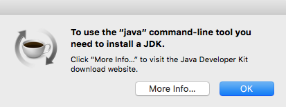
If that’s not what you see, then you don’t have the JDK installed. Terminal might tell you -bash: java: command not found, or it could say No Java runtime present, requesting install. and trigger a pop up that will lead you down the yellow brick road…to Oracle’s website.

Beginning Android development - Install Java

You can either click More Info… or head over to Oracle to download the JDK from Oracle.

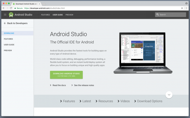
Install the JDK if needed, and once you’re done, head over to the Android Studio page and click the Download Android Studio button.

Android developer site

Getting Android Studio

Google constantly updates this page, so the version you see may very well be newer than the screenshot above. Once you click the Download Android Studio button, you’ll see a request to agree to the terms and conditions.

android-studio-terms-conditions

After reading these carefully (everybody takes the time to fully read these, right?) accept and click the blue button underneath titled Download Android Studio For Mac. Once the download is complete, you can install Android Studio just like how you install any other program.

The download link will redirect to a page that contains installation instructions for macOS, Windows or Linux. If the instructions don’t appear, then you can view them here.

Once installation wraps itself up, go ahead and launch Android Studio!

Android Studio banner

Setting up Android Studio

The setup wizard will greet you the first time it loads.

Setup Wizard

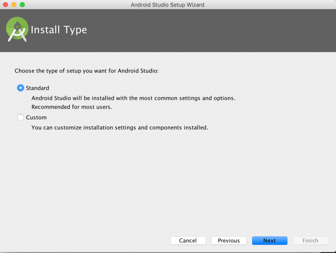
Click Next to move to the Install Type screen. This whole process will probably take several minutes.

Screen Shot 2015-11-08 at 8.09.21 PM

Check the box for Standard and click Next. You’re presented with a choice of UI Theme:

UI Theme Selection

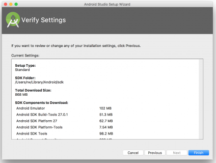
Pick a theme and click Next. On the Verify Settings window, you’ll have an opportunity to confirm your setup:

Verify Settings

Click Finish to start downloading the SDK components.

component installation

While downloading, you will likely be prompted for your admin password, in order to install HAXM, a tool from Intel that will greatly speed up Android Virtual Devices aka AVDs:

HAXM installation prompt

When the download is complete, click Finish.

installation complete

Android Studio Welcome Screen

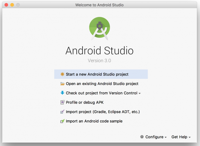
After a few minutes, you’ll have the welcome screen, which serves as your gateway to building all things Android.

welcome screen

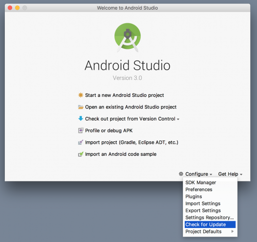
Even though you just downloaded Android Studio, it’s possible that it’s not the latest version. Select Configure/Check for Update at the bottom of the welcome screen to check whether any updates are available.

check for updates

If an update is available, a window like the screenshot below will appear. Click the Update and Restart button and let it do its thing.

update screen

The Android SDK Manager

Each version of Android has its own SDK (Software Development Kit) that enables you to create applications for the Android platform. Since you just went through the setup wizard, you’ll already have the latest version of the SDK available to you.

Installing a New SDK

It’s useful to know how to install additional versions of the SDK to help you develop for all supported versions of Android.

SDKs allow you to create Android Virtual Devices (AVDs) according to your personal configuration for the purpose of testing your app.

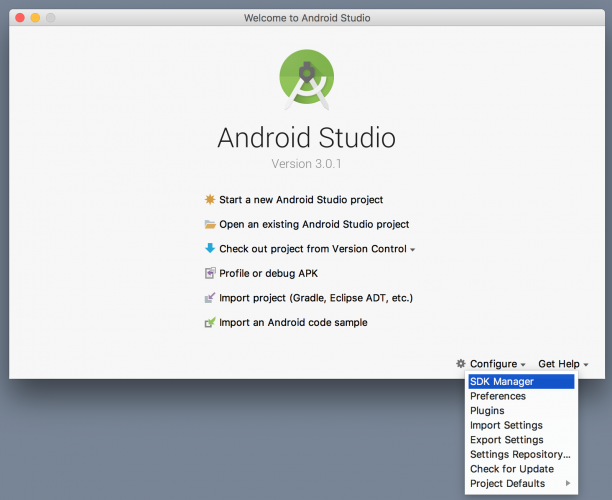
From the Android Studio welcome screen, select Configure/SDK Manager.

configure sdk manager

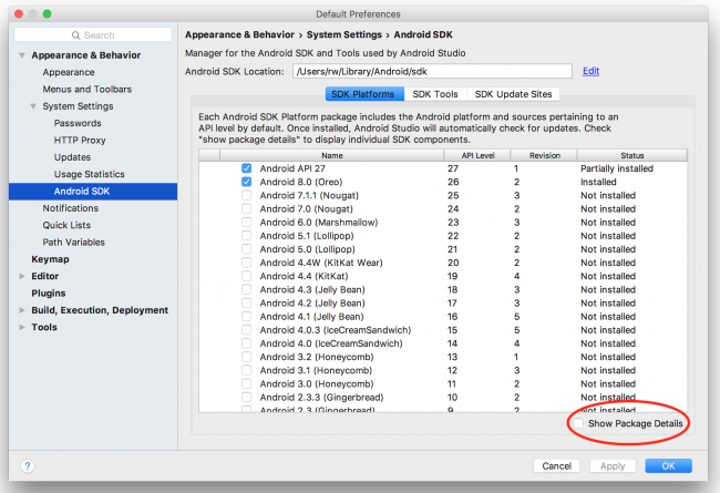
Once it launches, you’ll see a window like the one below:

Android Studio - SDK Platforms

SDK Platforms

The first tab of this window, SDK Platforms, lists the Android SDK platforms available for download.

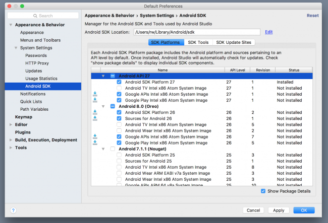
Enabling the Show Package Details option displays the individual SDK components, such as the platform itself and the sources pertaining to the API level like system image.

sdk platforms with details

Take note of the checkbox next to the SDK platform; it will be pre-selected if an update is available.

By default, the SDK Manager installs the latest packages and tools. Select the SDKs as shown in the screenshot above. If you wish to install other SDKs, just select them for installation.

SDK Tools

The SDK Tools tab lists developer tools and documentation along with the latest versions. Similar to the first tab, checking Show Package Details will display available versions of the SDK tools.

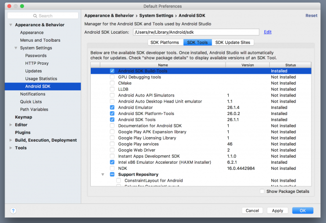
Three of the selected components in this list, for example, are Android SDK Build-Tools, Android SDK Tools and Android SDK Platform-Tools. Each contains components that are designed to assist in the development of Android and work across multiple SDKs. Go with the default selection on this tab.

sdk tools

SDK Update Sites

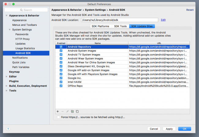
The SDK Update Sites tab displays the update sites for Android SDK tools and add-ons. You’re not limited to what’s listed under that tab. You can add other sites that host their own Android SDK add-ons, and then download them from those sites.

sdk update sites

For the purpose of setting up correctly, select the options that are checked in the screenshot above. Click Apply at the bottom if it’s active. You’ll see a confirmation dialog for the chosen packages; accept and continue. Click OK to close the window.

The confirmation dialog will disappear and a license agreement will popup.

Android Studio license agreement

Read through it, select the Accept checkbox and click Next. The SDK Manager will download and install the selected items. Once it’s done, click Finish. You’ll be directed back to the SDK Manager window where clicking OK will take you back to the Welcome to Android Studio screen.

This is where the fun begins!

Creating Your First Project

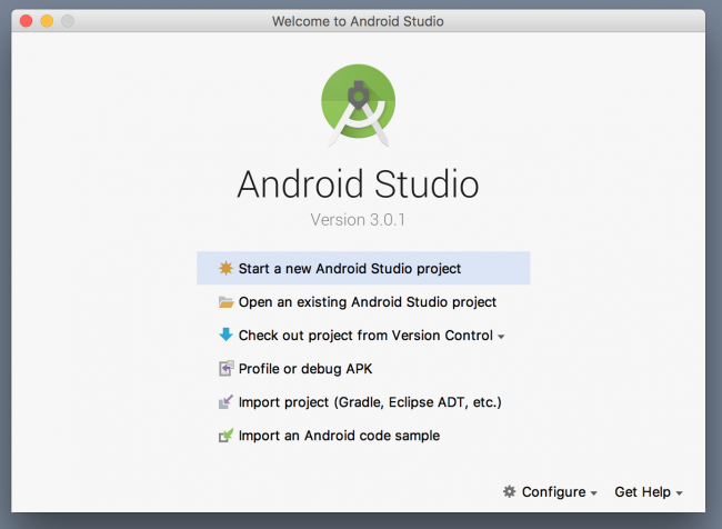
Android Studio has a nice little step-by-step tool to help you create your project. Click Start a new Android Studio Project from the Welcome to Android Studio screen:

 Start new project

Note: If you currently have an Android Studio project open and can’t see the welcome screen, select File\New Project from the menu to create a new project.

Identify Your Project

Android Studio will present you with a project creation screen:

configure project

Enter OMG Android in Application name as shown above. Feel free to put your own name in the Company domain text field. As you type, you’ll notice the Package name automatically changes to create a reverse domain style name per your entries.

The Package name is used to uniquely identify your app so that any work done on a device is always properly attributed to the source, thus preventing confusion between apps.

You can set the Project location to any location on your hard drive — keep the default if you don’t have a preference.

You should check the Include Kotlin support checkbox if you’re building a project using Kotlin. This will configure Kotlin in your project, and all template source files will be created in Kotlin.

Click Next at the bottom of the window.

Choose an SDK

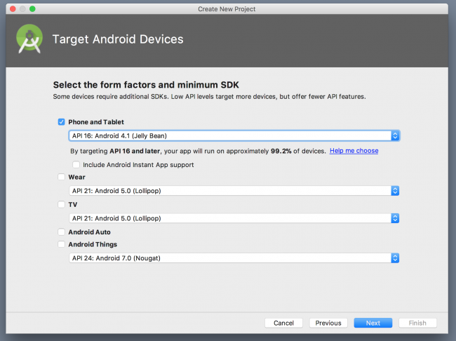
The next screen is the Target Android Devices window. This is where you select device types and operating systems to target.

The Minimum SDK drop-down menu sets the minimum version of Android requires to run your app. The newer the SDK, the more features you’ll have at your disposal; however, newer SDKs support fewer devices.

Selecting this value is simply a matter of balancing the capabilities you want and the devices you want to support. This is where developing for Android can get a little tricky.

If you really want to get into the details of what Minimum SDK version is best for your App, let Android Studio help you out.

As you change the Minimum SDK in the drop down menu, the percentage in the text underneath reflects what percentage of devices currently run that version of Android.

Click Help me choose underneath the drop down list to learn more about each SDK’s set of features.

API Version Distribution

For more on API versions statistics, check out the Android Dashboards, which are updated periodically.

For now, you just want an App that works on an Android Phone, and that is what you’ll see by default, alongside the default Minimum SDK. For this project, select SDK of API 16: Android 4.1 (Jelly Bean) and click Next.

target android devices

Set the Default Activity

The next step is to select your default Activity.

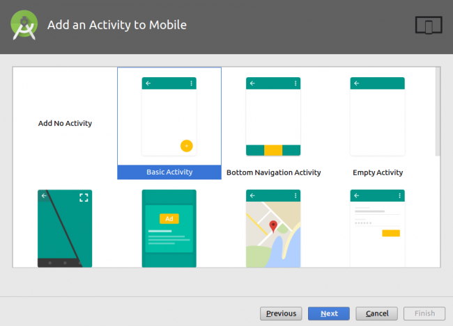
Beginning Android development - Add activity

Think of an Activity as a window within your app that displays content with which the user can interact. An Activity can take up the entire screen or it could be a simple pop-up.

Your options on this particular template range from a Basic Activity, which is a blank screen with an Action Bar and a Floating Button right up to an Activity with an embedded MapView.

You’ll make a lot of activities as you develop more apps, so get to know them and know them well.

Select the Basic Activity and click Next.

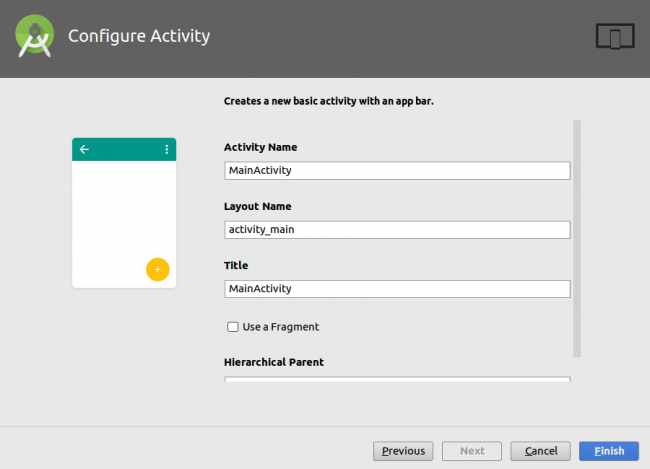
Configure Activity

To speed this part up a little bit you’ll use the pre-populated default values, but what is actually done with these values?

  • Activity Name: This gives your Activity a name to refer to in code. A .kt file will be created and will use the contents of this text field to give the Activity subclass a name, which will ultimately be the name you use to refer to this Activity in your code.
  • Layout Name: You’re going to define your Activity in Kotlin, but the layout it shows to the user is defined in a special sort of Android XML. You’ll learn how to read and edit those files shortly.

Click Finish.

Building the Project

Android Studio takes this as a cue to go do a bunch of behind-the-scenes operations and create your project. As it shoots out descriptions of what it’s doing, you may notice it says something like this:

project building

Here, you see your project name, which is familiar. But then there is this Gradle word as well.

The benefit of having a modern IDE like Android Studio is that it handles a lot for you. But, as you’re learning how to use the software, it’s good to have a general sense of what it does for you.

Gradle

Gradle is a build tool that’s easy to use, and if you investigate further, you’ll find it contains advanced options. It takes your Java or Kotlin code, XML layouts and the latest Android build tools to create the app package file, also known as an APK (Android Package Kit) file.

You can customize your configurations to have development or production versions of the app that behave differently. You can also add dependencies for third-party libraries.

After a brief moment, Android Studio will finish building your project. The project is pretty empty, of course, but it has everything it needs set up so that it can be launched on an Android device or emulator.

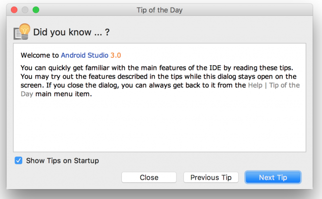
You’ll likely see a “Tip of the Day” presented by Android Studio:

Tip of the Day

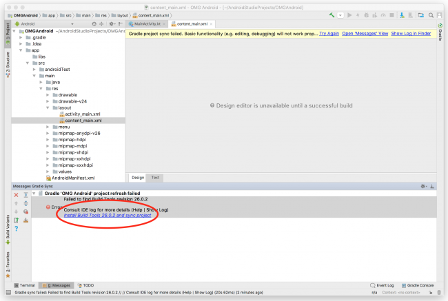
Depending on what version of the build tools you have installed, you may also see a build error in the Messages pane:

Messages pane

If so, just click the Install Build Tools X.Y.Z and sync project link. Android Studio will then re-build the project, and you’ll be at the Project screen:

android studio screen

Let’s take a brief look at the different parts of the project.

  • The manifests/AndroidManifest.xml file provides to the Android system important information required to run your app.
  • The res directory is your resource directory. Application resources such as images, XML layouts, styles, colors etc. are defined in this directory.
  • The res/layout directory is where all your UI (User Interface) will be designed. You will use Android XML to design your UI.
  • The res/menu directory is where you define the contents of your application’s menus.
  • The res/values directory is where you define the resources such as dimensions (res/values/dimens.xml), colors (res/values/colors.xml), strings (res/values/strings.xml), etc.

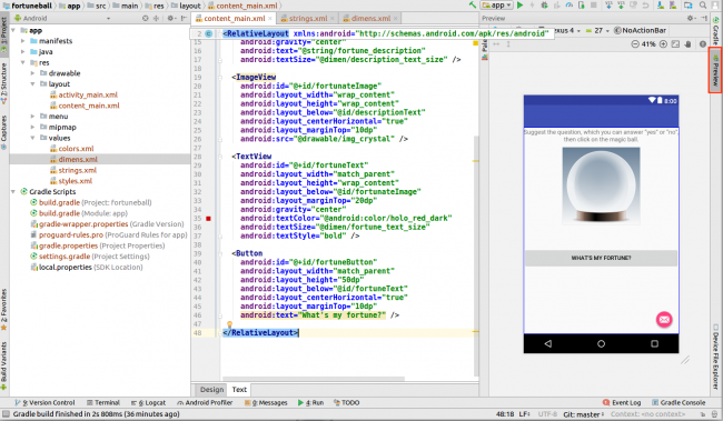
Open res/layout/activity_main.xml and click Text at the bottom of the screen.

This shows you the xml code for your main layout. It also shows a preview of how it will look like on a device on the right side of the screen.

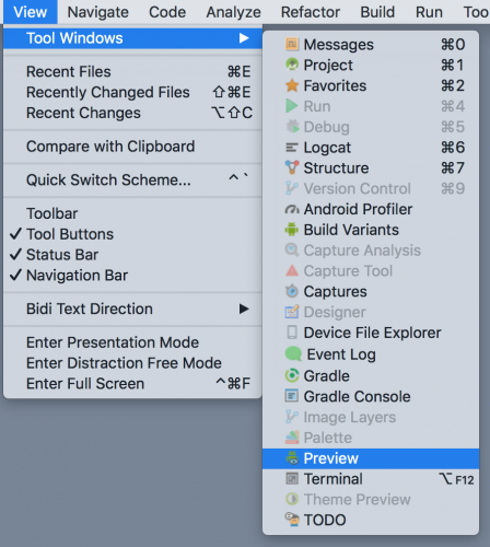
Note: If the Preview screen is not shown by default for you, open it by selecting View\Tool Windows\Preview from the menu

tool windows preview

Running on an Emulator

You’ve got Android Studio and you’ve created an app. So how do you run it?

Android Studio comes with the ability to set up a software-based Android device on your computer and run apps on it, browse websites, debug and everything you would expect from a simulator. This capability is known as the Android Emulator.

You can set up multiple emulators and set the screen size and platform version for each to whatever you like. Good thing, too. You’d need a whole room dedicated to storing devices for testing because there are so many out there — okay, maybe that’s an exaggeration, but you get the idea. :]

If you ran through the setup wizard earlier using the standard installation, then you’ll already have an emulator set up and ready for you.

Up until recently, your computer would have to emulate everything an Android device would try to do, right down to its hardware, which runs an ARM-based processor. Most computers make use of x86-based processors, meaning your computer has to translate each instruction to one that an ARM-based processor would understand and this takes a significant amount of time. To reduce this overhead, Android Studio has recently adopted the HAXM driver which is able to speed things up a bit.

You still have the option to create an emulator that is as close to an actual device as you can, but be aware that the initial load times can drag a bit and have put off many an Android developer from using emulators at all.

With all that being said…let’s set up an emulator anyway, because you do need to know how!

Creating an Emulator

Click the AVD Manager. It’s a button near the right side of the toolbar that shows an Android popping its head up next to a device with a purple display:

avd manager

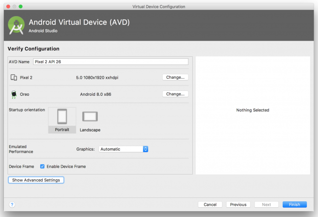
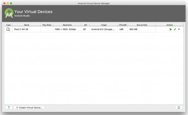
The AVD Manager will open to a screen with an option to create a new device:

avd manager 2

Virtual Device

Click the Create Virtual Device… button to start the process of creating a new virtual device.

The first step is to select the type of device. The Category section, on the left side of the screen, shows a list of the different device types you can emulate (TV, Wear, Phone, Tablet). Make sure the Phone option is selected. In the middle of the screen, there is a list of specific devices with their screen size, resolution and density. Take a moment to explore them.

select hardware

What you need now is just to emulate a phone-sized device, but if you wanted to emulate an Android Wear watch or an Android TV then you have options to do so here.

Select Pixel 2 in the list of devices available to you from the phone category and click Next.

Select Android Version

On the next screen, you have to select the version of Android the virtual device will run.

For this tutorial, select Oreo and make sure the one selected has the value x86 in the ABI column so the emulator runs as fast as possible on your x86 computer.

System Image

Note: If that version is not already downloaded, click on the Download link beside the release name to download before you continue.

Click Next once you’re done to advance to the final screen.

Verify Virtual Device

The last screen lets you confirm your choices and gives options to configure some other properties such as device name and startup orientation. Clicking the Show Advanced Settings button, shows you extra configurations you can change such as Camera, Network and Memory settings.

Verify Pixel 2

Use the defaults and click Finish.

verify configuration pixel

avd list

Close the AVD Manager to go back to Android Studio’s main view. Now that you’ve configured everything, click the Run button.

run app

Selecting a Device

A new window will appear, asking you to choose the device you wish to test your App on. You currently have no devices running, so select the Pixel 2 you just created and click OK.

select deployment target

Note: If you get an error that says This AVD’s configuration is missing a kernel file!!, check to make sure that you don’t have the ANDROID_SDK_ROOT environment variable set from a previous installation of the Android SDK. See this thread on Stack Overflow for more troubleshooting tips.

In the event that it doesn’t work the first time or takes several minutes for the emulator to fire up correctly, don’t worry, that’s not entirely unexpected. Stick with it. Once it’s ready, you should see something like this:

mobile ap

Whoa. You just made your first Android app.

The Emulator Toolbar

As you may have noticed, there’s a panel on the right side of the emulator. That is the emulator toolbar. The toolbar lets you perform various tasks such as taking screenshots, screen rotation, and volume control and also to perform extended functions such as simulating device location, phone calls, message sending, finger print, etc.

To access the extended functionalities, click the More () icon at the bottom of the toolbar.

extended controls

Running on a Device

android dev options

If you have an Android device you want to run your app on, follow the animated GIF on the right. It demonstrates how to enable developer mode on your device.

Here are the step-by-step instructions to enable Developer Mode on an Android device:

  1. Go to Settings on your device.
  2. Scroll all the way down and select About phone.
  3. Scroll to Build number and tap in multiple times. You’ll see a toast come up that states “You’re n steps away from becoming a developer”. Keep tapping and it will change to “You’re now a developer!” once it’s enabled.
  4. Go back to Settings screen and scroll all the way to the bottom. You’ll now see Developer Options enabled.
  5. Select Developer Options. Next, turn on the USB debugging switch under the Debugging section.
  6. Connect your device to your computer via USB.
  7. Your phone will prompt you to confirm this option via a dialog that states Allow USB debugging? — click OK.
  8. Next, the phone will ask you to register your computer’s RSA key fingerprint. If this is a trusted machine, then check the Always allow from this computer option.

Now that you’ve configured your device, click the Run button.

run app

Just like before, you’ll get a prompt from the Select Deployment Target dialog. The device should now appear in this dialog. Select it and click OK.

Ahh…isn’t it rewarding to see the app on your device? Go ahead and show it off to your friends. :]

Note: If the app is already running, you might not get the prompt. This is because of a new functionality in Android Studio know as Instant Run. We’ll talk about it in the next section of this tutorial. Close the emulator, go back and click the Run button again.

Instant Run

From version 2.0 of Android Studio, a new functionality was introduced called Instant Run. Instant Run allows you to push updates (code and resources) to a running app on a device or emulator without performing a full reinstall. By doing this, you are able to view your changes in a shorter time.

There are three kinds of changes you can make to your code: a hot swap, warm swap, or cold swap. Instant Run pushes updates by performing one of the following, depending on the kind of change you made:

  1. Hot Swap: This applies to method changes. Your app continues to run but uses a stub method with the changes performed the next time the relevant method is called. This is the fastest swap.
  2. Warm Swap: This swap applies to resource changes. With this, your the current activity will restart to update the changed resources.
  3. Cold Swap: With this, Instant run restarts the whole app even though it does not perform a re-install. This swap applies to structural code changes

Testing Instant Run

Go ahead and try out Instant Run.

To enable Instant Run, select Android Studio \ Preferences \ Build, Execution, Deployment \ Instant Run. Ensure that Enable Instant Run to hot swap code/resource changes on deploy is checked and that Restart activity on code changes is unchecked.

Instant Run

If your app is not yet running, launch it by clicking the Run button, and wait for it to launch.

When the app is running, the Apply Changes button on the right side of the Run becomes enabled.

Apply Changes

As your app is now running, clicking on the floating button, shows the message, Replace with your own action at the bottom of the screen.

Change that message to test out Instant Run.

Open MainActivity, in the onCreate() method, replace the text: Replace with your own action with Hello Instant Run.

Then click the Apply Changes. Now when you click the button, you will see the new message. This is an example of a hot swap.

Instant Run helps you code faster by significantly reducing the time it takes to update your app with code and resource changes.

Importing an Existing Project

During your Android app-making journey, you’ll find times where you need to import existing projects. The steps below will guide you through how to import a project:

  1. Download this project to use as your test subject.
  2. Once downloaded, unzip the contents and place them somewhere easy to get to.
  3. In Android Studio, go to File/New/Import Project….
  4. An open sheet will appear. Select the unzipped project from Step 1 and click Open.
  5. Import Project

  6. You’ll now see all the necessary files of the imported project in the project explorer.

Project Explorer

It’s build and run time! Click the Run button in the toolbar and select either the emulator or device you’ve already set up.

CardView Sample

Where To Go From Here?

You’ve covered a lot of ground in this beginning Android development tutorial: from downloading and installing Android Studio, through creating your first “Hello World!” app, to deploying it on a physical device!

Keep reading our other Android tutorials, which we’re continually updating to Kotlin and recent versions of Android Studio.

In the meantime, you can follow Android — like any language or framework, Android’s development community is a strong asset and supplier of endless reference. It’s never too soon or too late to start checking out Google’s I/O conference, Android Developers blog or Android Developer videos.

The Android robot is reproduced or modified from work created and shared by Google and used according to terms described in the Creative Commons 3.0 Attribution License.

I hope you enjoyed this Beginning Android Development tutorial — you’ve successfully installed Android Studio and are now ready to take on the world of Android development. If you have any questions or comments, please join the discussion in the comments below.

The post Beginning Android Development with Kotlin, Part One: Installing Android Studio appeared first on Ray Wenderlich.

The raywenderlich.com Thank-A-Thon!

$
0
0

Thanksgiving is upon us, and with it comes time to reflect on the things we’re thankful for this year.

Here at raywenderlich.com we wanted to take the chance to express our gratitude and appreciation to everyone and everything that makes being a part of this community great.

So welcome to our first annual “thank-a-thon”! We asked our team members to let us know (in one sentence) what they’re thankful for, and here’s what they came up with – along with some copious commentary from me!

Enjoy as we share our gratitude during the 2017 Thanksgiving holiday.

Tools & APIs

We begin showing gratitude to some of our favorite tools and APIs. We use them on a day-to-day basis and likely imagine the days when these weren’t available, particularly for young platforms like virtual reality.

“Thank You Virtual Reality Toolkit!” — by Gijs Bannenberg

“I would like to thank the team behind VRTK (Virtual Reality ToolKit) for enabling me to concentrate on the product and the content rather then on the coding fiddly bits.”

At raywenderlich.com, we’re huge fans of VR and AR, and think it’s here to stay. Given how young the platform is, tools like Virtual Reality Toolkit can certainly ease the process of getting things up and running.

If you’re spinning up a new project, chances are you are using Git or some form of source control to track your history and progress. You may even be using GUI Git apps like Tower or SourceTree, as Kyle shares:

“Thank You Git, GitHub, and SourceTree!” — by Kyle Gorlick

“I am thankful for Git (and GitHub and SourceTree). I can’t believe there was ever a time when I coded without source control.”

I too shudder to think that when I first started coding, I didn’t use source control. I would manually zip up my project folder in order to keep the history, or hit CMD+Z as much as macOS would allow. Thank goodness I found source control, and Git in particular!

Note: If you aren’t using Git yet, you should! You may find these courses helpful along the way: Beginning Git and Mastering Git.

What about communication, correspondence, interacting with coworkers, designers, clients? Slack has become a standard tool across many teams and companies, and Caroline in particular was super thankful for it this year:

“Thank You Slack!” — by Caroline Begbie

“I am thankful for Slack. All my favourite people live there. I’m also thankful for the actual people but there are too many to name.”

The team at raywenderlich.com relies on Slack, amongst other tools, for organization and communication across team members. With its support for many integrations, themes, and vast customization, it can be a stupendous tool for improving your workflow and keeping conversations in a single place (email does feel a bit dated now-a-days). It’s also a great way to stay connected with coworkers, friends, and people you care about.

Some fun of the discussions we have on Slack — and you’ve likely had them yourself on Facebook, Twitter, at events, etc, — involve the whole debacle of USB-A vs. USB-C ports and dongles.

But did you know you can wirelessly debug your iOS 11 apps on-device with Xcode 9? James is sure happy and thankful for this:

“Thank You Xcode 9 Wireless Debugging!” — by James Goodwill

“I am thankful Xcode 9’s Wireless Debugging. I can finally get stuff done when I forget my USB-C cable.”

I think we can all agree that wireless debugging in Xcode 9 is a godsend. No more cable shuffling, specially when using cables for which your computer has no ports. It’s not slow or tedious at all, and my experience has been that you don’t even need to reconnect a device if you quit Xcode.

But if you prefer working with Android, and Android Studio, there is a new language in town that is here to stay. Just ask Steve:

“Thank You Kotlin Android Support!” — by Steve Smith

“I am thankful that Google announced Kotlin as a first class language for Android – this allows me to not only continually learn and improve the quality of my code, but also brings Android and iOS development closer together.”

There is a lot of excitement around Kotlin this year motivated by Google announcing first-class support in Android. Given that JetBrains developed Android Studio and Kotlin, you can expect stupendous compatibility with existing development workflows.

And if you’re looking for Kotlin tutorials, you’re in the right place! We’re going big with our Kotlin tutorials for Android development and have even bigger plans for 2018.

Learning Resources

What fun would all these tools be if we had to learn them all on our own? Here are some great books and learning resources that our team is thankful for.

“Thank You Dive into SpriteKit!” — by Janie Clayton

“I’m thankful for Paul Hudson’s “Dive into SpriteKit” book for bringing choose your own adventure mechanics to game programming.”

Paul’s books are super cool. You should certainly check them out! It’s nice to see a variety of authors contributing to our community.

Another learning resource I think we’ve all come to rely on is StackOverflow.

“Thank You StackOverflow!” — by Eric A. Soto

“I’m thankful for StackOverflow and all of the developers that both ask great questions and also those that take time to provide quality answers! As a community, they make writing software so much better and more enjoyable.”

We’re probably all thankful for StackOverflow. Although you should be checking your platform’s documentation and avoiding the temptation to simply copy and paste the first solution you find, it’s highly likely that you can get help on StackOverflow. It’s almost certain that someone has already run into the same bug or problem and posted a solution.

Some users on StackOverflow are ninjas of debugging, and master of coming up with solutions to problems. So our editor Darren Ferguson convinced author Derek Selander to sit down, and teach the rest of us how to do it in his new book! :]

“Thank You Derek Selander!” — by Darren Ferguson

“I am thankful for the Advanced Debugging Book and for the author Derek Selander, whom without my pushing might never have written the book.”

We’ll certainly never forget Derek’s memorable announcement of his book at RWDevCon this year – pizza suit and all! :]

For learning in general, however, we’ve all likely used raywenderlich.com as a resource at one point or another in our careers. Even as members of the team we’re super thankful for the site and it’s continued support for topics beyond Apple, like Android, Unity, VR, and Kotlin.

“Thank You raywenderlich.com Team!” — by David Worsham

“Looking back on my iOS, macOS, tvOS education, I’m very thankful to the raywenderlich.com tutorial team for their great information and inspiration.”

People

The tools and APIs are great (thank you Git, wireless Xcode 9 debugging, and Kotlin!), learning resources are vast and aplenty, but people — yes, people like you — are what make it all come together.

Let’s see who some of our members are thankful for:

“Thank You Catterwauls!” — by Dru Freeman

“I am thankful for the Catterwauls. Their combination of knowledge, character, and wonderful partnership gave a wonderful first insight into the world of raywenderlich.com.”

You may know the Catterwauls from the video courses they’ve made on our site – such as their recent update to our Beginning iOS Animations course. They definitely exemplify the spirit our team strives for.

Speaking of which, Jessy has some special folks to thank as well:

“Thank You Subscribers!” — by Jessy Catterwaul

“I give thanks to each and every raywenderlich.com subscriber: your support allows our team to constantly improve upon the work that we do!”

Besides getting the opportunity to work on cool projects, probably the best perk of being a member of raywenderlich.com is the friendships and connections you make. Tammy Coron would like to give a shot out to two special friends she’s made on our team:

“Thank You Tim Mitra & Chris Language!” — by Tammy Coron

“I am thankful for Tim Mitra and Chris Language, for the connections we have made, and the friendships we’re building.”

You may know Tim for his podcast More Than Just Code, and you may know Chris from his book 3D Apple Games by Tutorials.

George Andrews would like to thank another especially giving member of our community:

“Thank You Daniel Steinberg!” — by George Andrews

“I am thankful for all of the learning and support received from Daniel Steinberg (@dimsumthinking) as I dove into iOS development for the first time years ago.”

Daniel is not only a fantastic author and speaker, but also a great person as well. Be sure to catch his The Game of Life talk coming next year at RWDevCon 2018.

Having a mentor, or great friend to talk to and grow personally, and professionally, is also something to truly be thankful for:

“Thank You Readers & Team!” — Marco Santarossa

“I’m thankful to Ennio Masi (@EnnioMa) for the long conversations about computer science and all his tips. He let me improve as a person and developer.”

Thank you!

Most importantly, what we’re most thankful for is you, yes YOU dear friend! Without your support, feedback, encouragement, and continued participation in this wonderful family we call raywenderlich.com, none of this would be possible.

You’re the reason we do what we do, and the fuel that keeps us motivated to create the best learning content possible. Ray’s quote sums up how we feel:

“Thank YOU!” — by Ray Wenderlich

“Thank you to all for the readers who have been supporting us for the past 7 years – it’s been amazing seeing this site grow from 1 person into a team of 150+ developers and authors from all around the world. Thank you for reading our site and making everything we do possible – I’m truly grateful!”

Wrap up

And thanks it for this year, folks. There were dozens and dozens of quotes from our team, we had to choose from a select few so as not to prevent you from the holiday festivities. :)

What about you, what are you thankful for? Leave us a comment below and do share with us. Again, we want to thank you. From the bottom of our hearts, we wish you a very Happy Thanksgiving!

The post The raywenderlich.com Thank-A-Thon! appeared first on Ray Wenderlich.


raywenderlich.com Black Friday Sale: 50% Off All Books

$
0
0

From today, November 24, until the end of Cyber Monday, November 27, we are offering not one, but two massive deals!

First, you can get get 50% off all digital edition books in our store.

Second, you can grab the entire bundle of our 12 best-selling books for just $199!

This is the biggest sale we’ve ever had, and is a great chance to get something you’ve had your eye on.

All of our books have recently been updated for iOS 11, Xcode 9, and Swift 4. The digital editions of our books also include free updates to future editions.

As an example, our book iOS Apprentice was first written for iOS 5, and is now in its sixth edition — and each update has been provided free to everyone who’s ever purchased the book. You can’t beat that value!

Featured Books for Black Friday and Cyber Monday

Note: During this sale, all of these books are now 50% off: only $27.49 each!

iOS Apprentice

This is our best-selling book for complete beginners to iOS development, with over 10,000 copies sold. Learn how to create four complete apps from scratch!

Swift Apprentice

If you want to learn Swift 4, there’s no better way. Takes you all the way from beginning to advanced topics, including generics, access control, error handling, pattern matching, and protocol-oriented-programming.

tvOS Apprentice

Want to make apps on the big screen? This book teaches you everything you need to know, including details on the two methods of making apps on tvOS: the traditional method using UIKit, and the new Client-Server method using TVML.

iOS 11 by Tutorials

This is a great book for intermediate to advanced developers who want to quickly learn the new APIs introduced in Xcode 9 and iOS 11. Covers ARKit, Core ML, Vision, drag & drop, and much more.

Advanced Apple Debugging & Reverse Engineering

Explore code through LLDB, Python and DTrace, to discover more about any program than you ever thought possible.

RxSwift

Learn how to use RxSwift to create complex, reactive applications on iOS. We’re actively updating this book to RxSwift 4.0 and the free update should be out shortly!

watchOS by Tutorials

The most comprehensive book on making apps for Apple Watch anywhere. Covers layout, tables, snapshots, notifications, background refresh, CloudKit, and much more.

Core Data by Tutorials

After you read this book, you’ll never fear Core Data again! Takes you from the basics all the way to advanced topics, and includes detailed coverage of the new NSPersistentContainer introduced in iOS 10.

iOS Animations by Tutorials

Learn from the master of iOS Animations himself – Marin Todorov – as you learn how to make delightful animations in your apps. Basic animations, layer animations, and view controller transition animations, oh my!

2D Apple Games by Tutorials

Learn how to make iOS, tvOS, watchOS, and macOS games using Swift 4 and SpriteKit. A great way to make games while leveraging your existing iOS development skills!

3D Apple Games by Tutorials

Learn how to make 3D games using Apple’s built in API: SceneKit. Through a series of mini-games and challenges, you will go from beginner to advanced and learn everything you need to make your own 3D game!

Unity Games by Tutorials

Learn how to make professional cross-platform games using Unity, a popular 2D and 3D game framework. Make 4 complete games: a twin-stick action game, a first-person shooter, a 2D platformer, and a tower defense game with VR support!

Save With our Black Friday 2017 Mega Bundle!

Just can’t decide, or want more than one book? Grab all 12 of our best-selling books for just $199.99!

Give your development career a boost with hands-on learning from our trusted authors. There’s simply no better investment you can make as an iOS developer.

Sale Details

Here are a few more details about our Black Friday – Cyber Monday sale:

  • How long will this sale last? This sale will run from today, November 24, until the end of Cyber Monday, November 27.
  • Can I “upgrade” to a bundle of books? Your best bet is to fill out your collection by buying any missing books individually; we can’t upgrade you to a bundle.
  • I recently bought a book. Can I apply this discount? No, this sale is for new purchases only. But this is a great chance to pick up any books you might not already have in your collection.
  • What about video subscriptions? This sale is for books only — but did you know that a 1-year subscription to our video courses gets you a special rate that works out to just $14.99/month?
  • I missed the deal! Can I get it after Cyber Monday? Oops! Sorry, but this is a special a Black Friday / Cyber Monday deal only and won’t be available after Cyber Monday. Be sure to sign up to raywenderlich.com weekly on the sidebar of our site to get notified of any sales in the future.

If you have any other questions, please contact us and we’ll do our best to help.

Where To Go From Here?

At raywenderlich.com we don’t often have sales, so this is a pretty rare opportunity. Be sure to take advantage of it while you can!

The team and I hope you enjoy our new lineup of books, and we hope it makes your learning fun and enjoyable.

Happy shopping! :]

The post raywenderlich.com Black Friday Sale: 50% Off All Books appeared first on Ray Wenderlich.

watchOS 4 Tutorial Part 1: Getting Started

$
0
0
Update Note: This tutorial has been updated to Swift 4/watchOS 4 by Audrey Tam. The original tutorial was written by Mic Pringle.

watchOS 4 tutorial

In this watchOS 4 Tutorial, you’ll build a simple but fully functional watchOS 4 app. Specifically, you will work on a Watch app for a fictional airline called Air Aber.

In the process, you’ll learn:

  • How to add a watchOS 4 target to an iOS app.
  • How to share data across the two targets.
  • How to add a watchOS 4 interface controller to the Storyboard, and lay out the interface objects.
  • How to create the WKInterfaceController subclass, and wire everything up.

Let’s get started! ┗(°0°)┛

Getting Started

Start by downloading the starter project for this tutorial.

Open it in Xcode, and build and run. You should see a blank white screen:

There’s not much to this project as it stands: it includes a few helper files you’ll need, and not much else. You’ll address that now!

Adding the WatchKit App

Select File\New\Target…. In the dialog that appears, choose watchOS\Application\WatchKit App, then click Next:

In the following screen, set Product Name to Watch, make sure Language is set to Swift, and uncheck any checkboxes that are checked. Click Finish:

You’ll be asked if you want to activate the watch scheme, which you do, so make sure to choose Activate:

Activate watchOS 4 Scheme

Congratulations, you’ve just created your first Watch app! It really is that easy.

You’ll notice this action actually created two targets, not one, and two corresponding groups in the Project navigator. This is because the code of a Watch app actually runs as an extension bundled within the Watch app, in much the same way Today extensions on iOS work.

Expand the Watch and Watch Extension groups in the Project navigator, and you’ll see that the storyboard is in the Watch group, and the classes created by the target template are in the Watch Extension group:

Here’s the pattern you’ll follow moving forward: any code you add must reside within the Watch Extension group, and be added to the Watch Extension target, whereas any assets or storyboards must be added to the Watch group.

A Little Housekeeping

Before continuing, you need to remove a couple of things added by the target template that you’re going to replace.

Right-click on InterfaceController.swift in the Project navigator, and choose Delete. When prompted, choose Move to Trash to make sure the file is actually removed from the project:

Next, open Interface.storyboard, select the only interface controller in there, and hit the delete key. This should leave you with an empty storyboard, or as I prefer to think of it, a blank canvas.

Sharing Data and Code

The starter project includes a JSON file containing all the Air Aber flight details, and a model class that represents that data. This is exactly the kind of thing that you should share amongst targets, since it’s highly likely the iOS app and the Watch app will use the same model class and data – you do remember DRY, right?

Expand the Shared group in the Project navigator, and select Flights.json. Next, find the Target Membership section in the File inspector, and check Watch Extension:

The file is now included in both the AirAber and Watch Extension targets.

Repeat the process for the other file in the Shared group, Flight.swift.

And with that done, you can finally begin building the flight details interface!

Building the Interface

Open Watch\Interface.storyboard, and drag an interface controller from the Object Library onto the storyboard canvas. With the interface controller selected, open the Attributes inspector, and set Identifier to Flight, and check Is Initial Controller. Uncheck Activity Indicator On Load:

Here, you’ve set the identifier so you can refer to the interface controller in code. Checking Is Initial Controller simply informs WatchKit this is the interface controller you want to display when the Watch app first launches. This interface doesn’t download any data, so it doesn’t need to display the activity indicator.

In order to simplify this tutorial, you will build your layout only for the 42mm watch. For your own apps, you’ll want to verify that they work properly on all watch sizes. At the bottom left of the storyboard pane, ensure that it says View as: Apple Watch 42mm.

view as 42mm watch

Watch app layout is completely different from iOS layout. The first thing you’ll notice: you can’t move or resize UI objects by dragging them around in the interface controller. When you drag an object onto the controller, it slots in under the previous objects, and the screen fills up pretty fast. To organize objects side-by-side, you use groups, which are a lot like stack views in iOS and macOS.

So first, drag a group from the Object Library onto the interface controller:

Group

Although it doesn’t look like much now, this group will eventually contain the Air Aber logo, flight number and route.

With the new group selected, head over to the Attributes inspector, and change Insets to Custom. Four text fields appear, where you can manually set the top, bottom, left and right insets of the group.

Change Top to 6:

Insets

This simply gives the layout group a little extra padding at the top.

Next, drag an image into the group. If your group shrank in response to changing the top inset (thanks Xcode!), drag the image into the document outline instead, making sure it’s a child of the group, rather than a sibling:

Image

Now you need an image to display. Download this logo image and drag it into your Watch\Assets.xcassets. This creates a new image set called Logo, with the actual image in the 2x slot:

You want to tint this image to Air Aber’s corporate color, so select the image, then in the Attributes inspector, set Render As to Template Image.

Template-Image

Re-open Watch\Interface.storyboard, and select the image. Using the Attributes inspector, make the following changes:

  • Set Image to Logo – if it doesn’t appear in the dropdown, simply type it in.
  • Set Tint to #FA114F (you can type this in the Color RGB Sliders panel).
  • Set Width to Fixed, with a value of 40.
  • Set Height to Fixed, with a value of 40.

The Attributes inspector should now look like the following:

Image-Attributes

Don’t worry if you can’t see the logo: it turns out Xcode doesn’t tint template images at design time! Trust me, it’ll be a vibrant pink when you build and run!

Next, drag another group into the existing group, making sure it appears to the right of the image, and use the Attributes inspector to change its Layout to Vertical. Also, change Spacing to Custom\0 and Width to Size to Fit Content.

Next, drag two labels into the new group. Because you set layout to vertical, the labels appear one above the other:

Top-Group-Labels

Select the upper label, and use the Attributes inspector to set Text to Flight 123 and Text Color to #FA114F (instead of typing this into the RGB panel again, you can select the pink color from Recently Used Colors in the Color menu).

Next, select the lower label, and set its Text to MEL to SFO. Your interface controller should now look like the following:

Top-Group-Complete

This text is simply placeholder text that’ll be replaced when you hook the interface up to its controller class.

Next, drag another group onto the interface controller, but this time make sure it’s a sibling of the very first group you added. If you can’t get the group positioned at the correct place in the hierarchy, use the document outline instead.

Sibling

With this new group selected, set its Layout to Vertical and Spacing to Custom\0.

Next, drag three labels into this new group:

Middle-Group-Labels

Check in the document outline to make sure all three labels are inside the group, not siblings of the group!

Select the top label, and use the Attributes inspector to change its Text to AA123 Boards.

Next, select the middle label, and change its Text to 15:06. Next, change Text Color to #FA114F and Font to System, with a Style of Regular and a Size of 54. Finally, change Height to Fixed, with a value of 44.

Select the bottom label, and change its Text to On time and Text Color to #04DE71.

Your interface controller should now look like the following:

Middle-Group-Complete

Now you only have to add one more group, before you create the outlets, and have this interface display some real data.

Drag a new group from the Object Library into the lower group, this time making sure it’s a child rather than a sibling, and that it’s positioned at the very bottom of the containing group. Next, add two labels to it. Your complete interface object hierarchy should now look like this:

Hierarchy

Use the Attributes inspector to set Text to Gate 1A for the left label. For the right label, set Text to Seat 64A, and set Horizontal Alignment to Right.

The completed interface should now look like the following:

Interface-Completed

Congratulations, you’ve finished laying out your very first Watch app interface! Now it’s time to populate it with some real data, and get it up and running in the simulator.

Creating the Controller

Right-click on the Watch Extension group in the Project navigator, and choose New File…. In the dialog that appears, select watchOS\Source\WatchKit Class, and click Next. Name the new class FlightInterfaceController, making sure it’s subclassing WKInterfaceController, and Language is set to Swift:

File-Options

Click Next, and then Create.

When the new file opens in the code editor, delete the three empty method stubs, so you’re left with only the import statements and the class definition.

Add the following outlets to the top of FlightInterfaceController:

@IBOutlet var flightLabel: WKInterfaceLabel!
@IBOutlet var routeLabel: WKInterfaceLabel!
@IBOutlet var boardingLabel: WKInterfaceLabel!
@IBOutlet var boardTimeLabel: WKInterfaceLabel!
@IBOutlet var statusLabel: WKInterfaceLabel!
@IBOutlet var gateLabel: WKInterfaceLabel!
@IBOutlet var seatLabel: WKInterfaceLabel!

Here, you’re simply adding an outlet for each of the labels you added to the interface earlier. You’ll hook them up in just a moment.

Next, add the following property and property observer below the outlets:

// 1
var flight: Flight? {
  // 2
  didSet {
    // 3
    guard let flight = flight else { return }
    // 4
    flightLabel.setText("Flight \(flight.shortNumber)")
    routeLabel.setText(flight.route)
    boardingLabel.setText("\(flight.number) Boards")
    boardTimeLabel.setText(flight.boardsAt)
    // 5
    if flight.onSchedule {
      statusLabel.setText("On Time")
    } else {
      statusLabel.setText("Delayed")
      statusLabel.setTextColor(.red)
    }
    gateLabel.setText("Gate \(flight.gate)")
    seatLabel.setText("Seat \(flight.seat)")
  }
}

Here’s the play-by-play of what’s happening:

  1. You declare an optional property of type Flight. This class is declared in Flight.swift, which is part of the shared code you added to the Watch Extension target earlier.
  2. You add a property observer that is triggered whenever the property is set.
  3. You make sure there’s an actual flight rather than nil in the optional property. You only want to proceed with configuring the labels when you know you have a valid instance of Flight.
  4. You configure the labels using the relevant properties of flight.
  5. If the flight is delayed, you change the text color of the label to red.

Now you need to set flight when the controller is first shown. Add the following below the declaration of flight:

override func awake(withContext context: Any?) {
  super.awake(withContext: context)

  flight = Flight.allFlights().first
}

In the next part of this series, you’ll change this implementation to use the context that’s passed to it, but for now, you simply load all the flights from the shared JSON file, then take the first one from the array.

Note: awake(withContext:) is called after the controller is loaded from the storyboard, and all its outlets are set up, so it’s a great place to set flight.

Now, there’s one final step before you can build and run, and that’s to connect the outlets.

Connecting the Outlets

Open Watch\Interface.storyboard, and select the interface controller. Using the Identity inspector, set Custom Class\Class to FlightInterfaceController.

Next, use your favorite method to connect the outlets according to the list below:

  • flightLabel: Flight 123
  • routeLabel: MEL to SFO
  • boardingLabel: AA123 Boards
  • boardTimeLabel: 15:06
  • statusLabel: On time
  • gateLabel: Gate 1A
  • seatLabel: Seat 64A

Connect-Outlets

Before you hit run, there’s just one more thing to do. The sample app you’re building throughout this tutorial has been designed for the 42mm Apple Watch, so you need to make sure you have the correct watch simulator set up, otherwise some things may look a little off. For a real world app, you’d want to make sure your interfaces work equally well across both sizes of watch, but that’s outside the scope of this tutorial.

Open the Watch scheme menu, and select one of the 42mm simulators:

Select-Scheme

Build and run. Once the simulator has finished loading, you should see your elaborate layout, with the logo tinted Air Aber pink. The Flight object generates random values for boarding time and seat number, so you’ll see different values there:

Final

Note: If you receive an error message stating the installation failed, then you can either try again with Xcode, or manually install the app in the watch simulator. To do this, open the Watch app in the iOS simulator, tap on AirAber, and then flick Show App on Apple Watch to On. Once that’s done, jump back to the watch simulator, tap the Digital Crown to navigate to the home screen, and then tap the AirAber icon to launch the app.

Congratulations! You’ve now finished implementing your very first WatchKit interface, and got it up and running in the watch simulator using real data — nice work. :]

Where To Go From Here?

Here is the finished example from this tutorial series so far.

In this exercise, you’ve learned how to add a Watch app to an existing iOS app, how to create an interface controller, and lay out a pretty complex interface using nested groups, and how to tie the whole thing together using a WKInterfaceController subclass. So, where to next?

Part 2 of this tutorial series, of course! In Part 2, you’ll learn all about tables and navigation in WatchKit.

If you have any questions or comments on this tutorial, please join the forum discussion below! :]

W2T@2xIf you enjoyed this tutorial series, you’d definitely enjoy our book watchOS by Tutorials.

The book goes into further detail on making watchOS apps and is written for intermediate iOS developers who already know the basics of iOS and Swift development but want to learn how to make Apple Watch apps for watchOS 4.

It’s been fully updated for Swift 4, watchOS 4 and Xcode 9 — get it on the raywenderlich.com store today!

The post watchOS 4 Tutorial Part 1: Getting Started appeared first on Ray Wenderlich.

watchOS 4 Tutorial Part 2: Tables

$
0
0
Update Note: This tutorial has been updated to Swift 4/watchOS 4 by Audrey Tam. The original tutorial was written by Mic Pringle.

watchOS 4 tutorialWelcome back to our watchOS 4 tutorial series!

In Part 1 of this series, you learned about the basics of watchOS 4 development by creating your first interface controller.

In this second part of the series, you’ll add a table to your app that displays a list of flights.

In the process, you’ll learn:

  • How to add a new interface controller, add a table to it, and build the prototype row.
  • How to create a subclass of WKInterfaceController to populate the table, configure the rows, and handle selection.
  • How to present an interface controller modally, and pass it data to present.

And with that, let’s get going! ┗(°0°)┛

Note: This tutorial picks up where we left things off in Part 1 of this series. You can either continue with the same project, or download it here, if you want to start fresh.

Getting Started

Open Watch\Interface.storyboard, and drag another interface controller from the Object Library onto the storyboard canvas, to the left of the existing Flight controller.

With the new interface controller selected, open the Attributes inspector, and make the following changes:

  • Set Identifier to Schedule.
  • Set Title to Air Aber.
  • Check Is Initial Controller.
  • Check Activity Indicator On Load is checked.

As with the Flight controller, you set the identifier so you can refer to this interface controller in code. This is the real initial controller for the Watch app, so you set its title, and check the box. This controller loads a table from some data source, so you display the activity indicator.

Now for the interface: drag a table from the Object Library onto the new interface controller:

Add-Table

Select the Table Row Controller in the document outline:

Table-Row-Controller

Use the Attributes inspector to set its Identifier to FlightRow. The identifier doubles as the row type when you’re informing the table which rows it should be instantiating, which is why it’s important that you set it.

Building the Row’s Interface

The table row is actually a group, so you can set it up with a layout as complex as you want.

Your first task is to make two changes to the default layout group. In the document outline, select the group inside the table row, then use the Attributes inspector to set Spacing to 6 and Height to Size To Fit Content.

Table rows have a standard, fixed height by default. However, most of the time you’ll want your rows to display all the interface objects you add to them, so it’s always worthwhile changing the Height attribute in this way.

Next, drag a separator from the Object Library into the table row’s group. You won’t be using it to actually separate anything, but just to add a little visual flair to your table row. With the separator selected, use the Attributes inspector to make the following changes:

  • Set Color to #FA114F (recently used color Air Aber pink).
  • Set Vertical Alignment to Center.
  • Set Height to Relative to Container.
  • Set Adjustment to –4.

The inspector should now look like the following:

Separator

The table row suddenly grows to fill the screen! But you’ll fix that now, as you layout the row.

Drag a group from the Object Library onto the table row, to the right of the separator. With the group still selected, change the following attributes in the Attributes inspector:

  • Set Layout to Vertical.
  • Set Spacing to 0.
  • Set Width to Size To Fit Content.

You’ve probably noticed that you’re often manipulating the Spacing attribute; this simply tightens up the space between each of the interface objects in the group, and makes things look a little sharper on the small screen.

Drag another group into the group you just added, and make the following changes:

  • Set Spacing to 4.
  • Set Height to Fixed, with a value of 32.

Now the table row is back to a reasonable height!

Next, add a label and an image to this new group. You’ll configure the label, then copy and update it, to display the origin and destination of each flight.

Now you need something to put in that image. Download this image, and add it to Watch\Assets.xcassets. This should create a new image set called Plane, with the actual image in the 2x slot:

You want to tint this image to Air Aber pink, so select the image, then use the Attributes inspector to set Render As to Template Image.

Re-open Watch\Interface.storyboard, and select the image in the document outline. Using the Attributes inspector, make the following changes:

  • Set Image to Plane.
  • Set Tint to #FA114F.
  • Set Horizontal and Vertical Alignment to Center.
  • Set Width to Fixed, with a value of 24.
  • Set Height to Fixed, with a value of 20.

Select the label, and set its Text to MEL. Next, change its Font to System, with a style of Semibold and a size of 20. Finally set its Vertical Alignment to Center.

Copy the label, then paste it on the right of the image. Change its text to SFO and its Horizontal Alignment to Right. Your table row should now look like the following:

Table-Row-Upper-Group

Note: When you paste the copy of the label, it might stubbornly stick to the left of the image, no matter where you position it in the document outline. But setting its horizontal alignment to right will move it into place.

The interface object hierarchy should now resemble the following:

Table-Row-Hierarchy-1

You’re almost done with the table row’s interface; you just need to add the flight number and status.

Drag another group from the Object Library onto the table row, making sure it’s a sibling of the group that contains the origin and destination labels:

Table-Row-Lower-Group

As you continue to build this interface, you’re seeing further examples of how you can use nested groups with mixed layouts to create complex layouts. Who needs Auto Layout?! ;]

Drag two labels into this new horizontal group. Use the Attributes inspector to make these changes to the left label:

  • Set Text to AA123.
  • Set Text Color to Light Gray Color.
  • Set Font to Caption 2.
  • Set Vertical Alignment to Bottom.

Next, make these changes to the right label:

  • Set Text to On time.
  • Set Text Color to #04DE71.
  • Set Font to Caption 2.
  • Set Horizontal Alignment to Right.
  • Set Vertical Alignment to Bottom.

With these final changes, the completed table row should look like this:

Table-Row-Complete

Now that the table is set up in Interface Builder, it’s time to populate it with some data.

Populating the Table

The first thing you need to do is create a subclass of WKInterfaceController to control the table.

Right-click on the Watch Extension group in the Project navigator, and choose New File…. In the dialog that appears, select watchOS\Source\WatchKit Class, and click Next. Name the new class ScheduleInterfaceController. Make sure it’s subclassing WKInterfaceController, and that Language is set to Swift:

File-Options

Click Next, and then Create.

When the new file opens in the code editor, delete the three empty method stubs, so you’re left with just the import statements and the class definition.

Re-open Watch\Interface.storyboard, and select the new interface controller. In the Identity inspector, change Custom Class\Class to ScheduleInterfaceController:

Custom-Class

With the interface controller still selected, open the assistant editor, and make sure it’s displaying ScheduleInterfaceController. Next, Control-drag from Table in the document outline to inside the class declaration of ScheduleInterfaceController, to create an outlet:

Table-Outlet

Name the outlet flightsTable, make sure the type is set to WKInterfaceTable, and click Connect.

Now you’ve set the custom class and created an outlet to the table, it’s finally time to populate the thing!

Close the assistant editor, open ScheduleInterfaceController.swift, and add the following, just below the outlet:

var flights = Flight.allFlights()

Here you’re simply adding a property that holds all the flight information as an array of Flight instances.

Next, add the following implementation of awake(withContext:):

override func awake(withContext context: Any?) {
  super.awake(withContext: context)
  flightsTable.setNumberOfRows(flights.count, withRowType: "FlightRow")
}

Here, you’re informing the table to create an instance of the row you just built in Interface Builder, for each flight in flights. The number of rows is equal to the size of the array, and the row type is the identifier you set in the storyboard.

Build and run. You’ll see a table populated with several rows, all with our Air Aber pink plane:

Identical-Rows.png

But hey! The title is dark gray, not Air Aber’s vibrant pink corporate color. You’ll fix that now.

Open Watch\Interface.storyboard, select the Air Aber interface controller. In the File inspector, change Global Tint to #FA114F.

Global-Tint

Build and run. That’s much better!

Title-Pink.png

But now, you’ll notice the rows all display the placeholder text you set in Interface Builder. You’ll fix this next, by adding a row controller to configure the labels for each row.

Adding a Row Controller

WatchKit tables are much simpler than iOS tables: no data source or delegates here! You just need to create a row controller class which, despite its name, is a subclass of NSObject.

Right-click on the Watch Extension group in the Project navigator and choose New File…. In the dialog that appears, select watchOS\Source\WatchKit Class, and click Next. Name the new class FlightRowController. Make sure it’s subclassing NSObjectnot WKInterfaceController! — and that Language is set to Swift:

File-Options-Row-Controller

Click Next, and then Create.

When the new file opens in the code editor, add the following to the top of the class:

@IBOutlet var separator: WKInterfaceSeparator!
@IBOutlet var originLabel: WKInterfaceLabel!
@IBOutlet var destinationLabel: WKInterfaceLabel!
@IBOutlet var flightNumberLabel: WKInterfaceLabel!
@IBOutlet var statusLabel: WKInterfaceLabel!
@IBOutlet var planeImage: WKInterfaceImage!

Here, you’re simply adding an outlet for each of the labels you added to the table row. You’ll connect them shortly.

Next, add the following property and property observer, just below the outlets:

// 1
var flight: Flight? {
  // 2
  didSet {
    // 3
    guard let flight = flight else { return }
    // 4
    originLabel.setText(flight.origin)
    destinationLabel.setText(flight.destination)
    flightNumberLabel.setText(flight.number)
    // 5
    if flight.onSchedule {
      statusLabel.setText("On Time")
    } else {
      statusLabel.setText("Delayed")
      statusLabel.setTextColor(.red)
    }
  }
}

Here’s the play-by-play of what’s happening:

  1. You declare an optional property of type Flight. Remember, this class is declared in Flight.swift which is part of the shared code you added to the Watch Extension in the previous tutorial.
  2. You add a property observer that is triggered whenever the property is set.
  3. You exit early if flight is nil: it’s an optional and you want to proceed with configuring the labels only when you know you have a valid instance of Flight.
  4. You configure the labels using the relevant properties of flight.
  5. If the flight is delayed, then you change the text color of the label to red, and update the text accordingly.

With the row controller set up, you now need to update the table row to use it.

Open Watch\Interface.storyboard, and select FlightRow in the document outline. Using the Identity inspector, set Custom Class\Class to FlightRowController.

In the document outline, open all the groups in FlightRow, then right-click on FlightRow to invoke the outlets and actions popup:

Outlets-Popup

You can drag this popup to the right, so you can see all the objects in FlightRow.

First, connect planeImage to the image in the table row and separator to the separator. Next, connect the remaining outlets according to the list below:

  • destinationLabel: SFO
  • flightNumberLabel: AA123
  • originLabel: MEL
  • statusLabel: On time

The final step is to update ScheduleInterfaceController, so it passes an instance of Flight to each row controller in the table.

Open ScheduleInterfaceController.swift, and add the following to the bottom of awakeWithContext(_:):

for index in 0..<flightsTable.numberOfRows {
  guard let controller = flightsTable.rowController(at: index) as? FlightRowController else { continue }

  controller.flight = flights[index]
}

Here, you’re iterating over each row in the table using a for loop, and asking the table for the row controller at the given index. If you successfully cast the controller, you’re handed back an instance of FlightRowController. Then you set controller.flight to the corresponding flight item in the flights array. This triggers the didSet observer in FlightRowController, and configures all the labels in the table row.

It’s time to see the fruits of your labor: build and run. You’ll see your table rows are now populated with the relevant flight details:

Populated-Rows.png

And now for the final part of this tutorial: when a user taps on a table row, ScheduleInterfaceController should pass the corresponding flight as the context to the flight details interface you created in the previous tutorial, then present it.

Responding to Row Selection

The first thing you need to do is override the WKInterfaceTable method that’s responsible for handling table row selection.

Add the following to ScheduleInterfaceController:

override func table(_ table: WKInterfaceTable, didSelectRowAt rowIndex: Int) {
  let flight = flights[rowIndex]
  presentController(withName: "Flight", context: flight)
}

Here, you retrieve the appropriate flight from flights, using the row index passed into this method. You then present the flight details interface, passing flight as the context. Remember the name you pass to presentController(withName:context:) is the identifier you set in the storyboard, in the previous tutorial.

Now, as promised in Part 1, you’ll update FlightInterfaceController, so it uses context to configure its interface.

Open FlightInterfaceController.swift, and find awake(withContext:). Find this statement:

flight = Flight.allFlights().first

And replace it with the following:

if let flight = context as? Flight {
  self.flight = flight
}

Here, you try to cast context to an instance of Flight. If it succeeds, you use it to set self.flight, which will in turn trigger the property observer, and configure the interface.

For the final time in this tutorial, build and run. Tap on a table row, and you’ll now see the flight details interface presented modally, displaying the details of the selected flight:

Final

Congratulations! You’ve now finished implementing your very first table, and have populated it using real data. Nice work!

Where to Go From Here?

Here is the finished example project from this tutorial series so far.

In this tutorial, you’ve learned how to add a table to an interface controller, build the table row interface, create a row controller, handle table row selection, present another interface controller, and even pass contexts. Phew! That’s a lot to cram into 20 minutes or so.

So, where to next? Part 3 of this tutorial, of course! There, you’ll learn all about animation in watchOS.

If you have any questions or comments on this tutorial, please join the forum discussion below! :]

W2T@2xIf you enjoyed this tutorial series, you'd definitely enjoy our book watchOS by Tutorials.

The book goes into further detail on making watchOS apps and is written for intermediate iOS developers who already know the basics of iOS and Swift development but want to learn how to make Apple Watch apps for watchOS 4.

It's been fully updated for Swift 4, watchOS 4 and Xcode 9 — get it on the raywenderlich.com store today!

The post watchOS 4 Tutorial Part 2: Tables appeared first on Ray Wenderlich.

watchOS 4 Tutorial Part 3: Animation

$
0
0
Update Note: This tutorial has been updated to Swift 4/watchOS 4 by Audrey Tam. The original tutorial was written by Mic Pringle.

watchOS 4 tutorialWelcome back to our watchOS 4 tutorial series!

In the first part of this series, you learned about the basics of watchOS 4 development by creating your first interface controller.

In the second part of the series, you learned how to add tables to your app.

In this third part of the series, you’ll learn how to use watchOS 4 animations by adding a new check-in interface to your app.

In the process, you’ll learn:

  • How to create image-based animations.
  • How to use the watchOS 4 animation API.

And with that, let’s get cracking! ┗(°0°)┛

Note: This tutorial picks up where we left things off in Part 2 of this series. You can either continue with the same project, or download it here, if you want to start fresh.

Getting Started

Open Watch\Interface.storyboard, and drag an interface controller from the Object Library onto the storyboard canvas. With the interface controller selected, open the Attributes inspector, and set Identifier to CheckIn. You do this so you can present the interface controller from within ScheduleInterfaceController.

Next, drag a group onto the new interface controller from the Object Library. Use the Attributes inspector to make the following changes:

  • Set Layout to Vertical.
  • Set Mode to Center.
  • Set the Horizontal Alignment to Center.
  • Set Height to Relative to Container.

Your interface controller should now look like this:

Background-Group

Next, you’ll build the same label-image-label group that you created for the table row.

Drag another group into the existing group, and make the following changes using the Attributes inspector:

  • Set Spacing to 4.
  • Set the Horizontal Alignment to Center.
  • Set Width to Size To Fit Content.
  • Set Height to Fixed, with a value of 30 (a little shorter than the table row).

Add a label and an image to this new layout group. You’ll configure the label, then copy and update it, to display the origin and destination of each flight.

Select the image, either in the storyboard or in the document outline. Using the Attributes inspector, make the following changes:

  • Set Image to Plane.
  • Set Tint to #FA114F (our pink, again!).
  • Set Vertical Alignment to Center.
  • Set Width to Fixed, with a value of 24.
  • Set Height to Fixed, with a value of 20.

As before, the image isn’t tinted, so you can’t see it against the black background of the interface controller. But you know it’s there.

Select the label, and set its Text to MEL. Next, change its Font to System, with a style of Semibold and a size of 20. Finally, set its Vertical alignment to Center, and check that its Width and Height are both Size To Fit Content.

Copy the label, then paste it next to the image. Change its text to SFO and its Horizontal Alignment to Right. Your interface controller should now look like the following:

Upper-Group-Complete

Now it’s time to add a huge check-in button!

Adding the Check-In Button

Drag a button from the Object Library onto the interface controller, making sure it’s positioned as a sibling of the group containing the origin and destination labels:

Button-Position

Buttons in WatchKit are incredibly flexible; you can use them with their stock appearance – the way the one you just added looks – or you can turn them into a layout group, and add other interface objects to customize their appearance. That’s exactly what you’re going to do here.

Select the button, and use the Attributes inspector to make the following changes:

  • Set Content to Group.
  • Set the Horizontal Alignment to Center.
  • Set the Vertical Alignment to Center.

Your interface controller should now look like this:

Button-Group

You may have noticed when you changed the Content attribute of the button, a new group appeared in the document outline:

Button-Embedded-Group

This is what you’re going to use as the background of your custom check-in button. Select this group, and use the Attributes inspector to make the following changes:

  • Set Color to #FA114F.
  • Set Radius to 39.
  • Set Width to Fixed, with a value of 78.
  • Set Height to Fixed, with a value of 78.

The interface controller should now look like this:

Round-Button

Your check-in button is really starting to take shape. The only thing missing is the label, so you’ll add that next.

Drag a label from the Object Library into the group belonging to the button, and then select it. Once again, make the following changes, using the Attributes inspector:

  • Set Text to Check In.
  • Set Font to System, with a style of Semibold and a size of 16.
  • Set the Horizontal Alignment to Center.
  • Set the Vertical Alignment to Center.

Your finished check-in interface controller should now look like this:

Check-In-Interface-Complete

With the interface complete, it’s now time to create a subclass of WKInterfaceController to manage this controller, and to update ScheduleInterfaceController to show it.

Creating the Controller

Right-click on the Watch Extension group in the Project navigator and choose New File…. In the dialog that appears, select watchOS\Source\WatchKit Class, and click Next. Name the new class CheckInInterfaceController, and make sure it’s subclassing WKInterfaceController, and that Language is set to Swift:

File-Options

Click Next, and then Create.

When the new file opens in the code editor, delete the three empty method stubs, so you’re left with just the import statements and the class definition.

Next, add the following to the top of the class:

@IBOutlet var backgroundGroup: WKInterfaceGroup!
@IBOutlet var originLabel: WKInterfaceLabel!
@IBOutlet var destinationLabel: WKInterfaceLabel!

Here, you’re simply adding outlets for the outer-most group and the two labels of the interface you just created. You’ll hook everything up soon.

Next, add the following just below the outlets:

var flight: Flight? {
  didSet {
    guard let flight = flight else { return }

    originLabel.setText(flight.origin)
    destinationLabel.setText(flight.destination)
  }
}

You know the score by now! Here, you’ve added an optional property of type Flight, which includes a property observer. When the observer is fired, you try to unwrap flight, and if successful, use flight to configure the two labels. This is all familiar territory now, right?

Now you just need to set flight when the controller is presented. Add the following to CheckInInterfaceController:

override func awake(withContext context: Any?) {
  super.awake(withContext: context)

  if let flight = context as? Flight {
    self.flight = flight
  }
}

Again, this should be super familiar by now. You try to unwrap and cast context to an instance of Flight. If that succeeds, you use it to set self.flight, which in turn, triggers the property observer configuring the interface.

Finally, add the following action just below awake(withContext:):

@IBAction func checkInButtonTapped() {
  // 1
  let duration = 0.35
  let delay = DispatchTime.now() + (duration + 0.15)
  // 2
  backgroundGroup.setBackgroundImageNamed("Progress")
  // 3
  backgroundGroup.startAnimatingWithImages(in: NSRange(location: 0, length: 10),
    duration: duration,
    repeatCount: 1)
  // 4
  DispatchQueue.main.asyncAfter(deadline: delay) { [weak self] in
    // 5
    self?.flight?.checkedIn = true
    self?.dismiss()
  }
}

Here’s the play-by-play of what’s happening:

  1. You create two constants: one for the duration of the animation and one for the delay after which the controller will be dismissed. Instead of being a Double, delay is an instance of DispatchTime, since you’ll be using it with Grand Central Dispatch.
  2. You load a sequence of images named Progress, and set them as the background image of backgroundGroup. Layout groups conform to WKImageAnimatable, which allows you to use them to play back animated image sequences.
  3. You begin playback of the image sequence. The range you supply covers the entire sequence, and a repeatCount of 1 means the animation will play just once.
  4. WatchKit doesn’t have completion handlers, so you use Grand Central Dispatch to execute the closure after the given delay.
  5. In the closure, you mark flight as checked-in, and then dismiss the controller.

Now you just need to add the images to the project, and hook up the outlets and single action.

Download this zip file, unzip the file, and drag the folder into your Watch\Assets.xcassets.

Make sure you drag the folder, not its contents. This should create a new group in the asset catalog called Progress, containing several image sets:

Progress-Image-Group

With the images in place, it’s time to set up the outlets and button action.

Open Watch\Interface.storyboard, and select your new interface controller. In the Identity inspector, change Custom Class\Class to CheckInInterfaceController:

Custom-Class

Next, in the document outline, right-click on CheckIn to invoke the outlets and actions popup. Connect backgroundGroup to the outer-most group in the interface controller:

Background-Group-Outlet

In the storyboard canvas, connect destinationLabel to the label containing SFO, and connect originLabel to the label containing MEL.

Next, connect checkInButtonTapped to the big, round, pink button:

Connect-Action-2

Before you build and run, the final change you need to make is to actually present this interface controller.

Presenting the Controller

Open ScheduleInterfaceController.swift, find table(_:didSelectRowAt:), and replace its contents with the following:

let flight = flights[rowIndex]
let controllers = ["Flight", "CheckIn"]
presentController(withNames: controllers, contexts: [flight, flight])

Here, you retrieve the appropriate flight from flights using rowIndex, create an array containing the identifiers of the two interface controllers you want to present, and then present them, passing flight as the context to both.

Build and run. Tap a flight, and you’ll see a pair of interface controllers are presented. Swipe left to reveal the check-in controller, then tap the button to trigger the animation and check-in:

Image-Animation

This looks great as-is, but it’d be even better if checked-in flights were highlighted on the schedule interface controller, as well. You’ll address that in the next, and final, section.

Highlighting the Flight

Open FlightRowController.swift, and add the following method to it:

func updateForCheckIn() {
  let color = UIColor(red: 90/255, green: 200/255, blue: 250/255, alpha: 1)
  planeImage.setTintColor(color)
  separator.setColor(color)
}

Here, you’re creating an instance of UIColor, then using it to set the tint color and color of planeImage and separator, respectively. This method will be called from within an animation closure, so the color change will animate nicely.

Next, open ScheduleInterfaceController.swift, and add the following property below flights:

var selectedIndex = 0

You’ll use this to remember which table row was selected when presenting the two interface controllers. Now you just need to set it when a table row is selected. Add the following just above the call to presentController(withNames:contexts:) in table(_:didSelectRowAt:):

selectedIndex = rowIndex

This sets selectedIndex to the index of the selected table row.

Finally, add the following to ScheduleInterfaceController, just below awake(withContext:):

override func didAppear() {
  super.didAppear()
  // 1
  guard flights[selectedIndex].checkedIn,
    let controller = flightsTable.rowController(at: selectedIndex) as? FlightRowController else {
      return
  }

  // 2
  animate(withDuration: 0.35) {
    // 3
    controller.updateForCheckIn()
  }
}

Here’s what’s happening in the code above:

  1. You check to see if the selected flight is checked-in. If so, you try to cast the row controller, at the corresponding index in the table, to an instance of FlightRowController.
  2. If that succeeds, you use the animation API on WKInterfaceController to execute the given closure, over a duration of 0.35 second.
  3. In the closure, you call the method you just added to FlightRowController, which changes the color of the plane image and separator of that table row, and provides users with some visual feedback that they’re now checked-in.

Build and run. Follow the same steps as before to check-in for a flight, and you’ll see that when you’re returned to the schedule interface controller, the colors of the plane image and separator on the corresponding table row crossfade to a new color:

Crossfade-Animation

Congratulations! You’ve now finished implementing your very first set of WatchKit animations.

Where to Go From Here?

Here is the finished example project from this tutorial series.

In this tutorial you’ve learned how to create two different kinds of WatchKit animation. The first, using an animated sequence of images, and the second, using the animation API on WKInterfaceController. You’re now suitably primed to add plenty of visual flair to your own watchOS 4 apps!

Sadly, this is where we end this tutorial series.

If you have any questions or comments on this tutorial, please join the forum discussion below! :]

W2T@2xIf you enjoyed this tutorial series, you’d definitely enjoy our book watchOS by Tutorials.

The book goes into further detail on making watchOS apps and is written for intermediate iOS developers who already know the basics of iOS and Swift development but want to learn how to make Apple Watch apps for watchOS 4.

It’s been fully updated for Swift 4, watchOS 4 and Xcode 8 — get it on the raywenderlich.com store today!

The post watchOS 4 Tutorial Part 3: Animation appeared first on Ray Wenderlich.

raywenderlich.com Cyber Monday Sale: Last Chance

$
0
0

If you missed last week’s Black Friday sale, don’t worry: the sale is still on until the end of today, Cyber Monday. So you have one last chance!

This year, we are offering not one, but two massive deals!

First, you can get get 50% off all digital edition books in our store.

Second, you can grab the entire bundle of our 12 best-selling books for just $199!

This is the biggest sale we’ve ever had, and is a great chance to get something you’ve had your eye on.

All of our books have recently been updated for iOS 11, Xcode 9, and Swift 4.

In case you missed it before, here’s what’s inside.

Featured Books for Black Friday and Cyber Monday

Note: During this sale, all of these books are now 50% off: only $27.49 each!

iOS Apprentice

This is our best-selling book for complete beginners to iOS development, with over 10,000 copies sold. Learn how to create four complete apps from scratch!

Swift Apprentice

If you want to learn Swift 4, there’s no better way. Takes you all the way from beginning to advanced topics, including generics, access control, error handling, pattern matching, and protocol-oriented-programming.

tvOS Apprentice

Want to make apps on the big screen? This book teaches you everything you need to know, including details on the two methods of making apps on tvOS: the traditional method using UIKit, and the new Client-Server method using TVML.

iOS 11 by Tutorials

This is a great book for intermediate to advanced developers who want to quickly learn the new APIs introduced in Xcode 9 and iOS 11. Covers ARKit, Core ML, Vision, drag & drop, and much more.

Advanced Apple Debugging & Reverse Engineering

Explore code through LLDB, Python and DTrace, to discover more about any program than you ever thought possible.

RxSwift

Learn how to use RxSwift to create complex, reactive applications on iOS. We’re actively updating this book to RxSwift 4.0 and the free update should be out shortly!

watchOS by Tutorials

The most comprehensive book on making apps for Apple Watch anywhere. Covers layout, tables, snapshots, notifications, background refresh, CloudKit, and much more.

Core Data by Tutorials

After you read this book, you’ll never fear Core Data again! Takes you from the basics all the way to advanced topics, and includes detailed coverage of the new NSPersistentContainer introduced in iOS 10.

iOS Animations by Tutorials

Learn from the master of iOS Animations himself – Marin Todorov – as you learn how to make delightful animations in your apps. Basic animations, layer animations, and view controller transition animations, oh my!

2D Apple Games by Tutorials

Learn how to make iOS, tvOS, watchOS, and macOS games using Swift 4 and SpriteKit. A great way to make games while leveraging your existing iOS development skills!

3D Apple Games by Tutorials

Learn how to make 3D games using Apple’s built in API: SceneKit. Through a series of mini-games and challenges, you will go from beginner to advanced and learn everything you need to make your own 3D game!

Unity Games by Tutorials

Learn how to make professional cross-platform games using Unity, a popular 2D and 3D game framework. Make 4 complete games: a twin-stick action game, a first-person shooter, a 2D platformer, and a tower defense game with VR support!

Save With our Black Friday 2017 Mega Bundle!

Just can’t decide, or want more than one book? Grab all 12 of our best-selling books for just $199.99!

Give your development career a boost with hands-on learning from our trusted authors. There’s simply no better investment you can make as an iOS developer.

Sale Details

Here are a few more details about our Black Friday – Cyber Monday sale:

  • How long will this sale last? This sale will run from November 24, until the end of today, Cyber Monday, November 27.
  • Do your books come with free updates? We do not guarantee that all our books will be updated every year. However we usually update most of them and for those we do update, the updates are provided for free to customers who have purchased earlier editions of the book.
  • Can I “upgrade” to a bundle of books? Your best bet is to fill out your collection by buying any missing books individually; we can’t upgrade you to a bundle.
  • I recently bought a book. Can I apply this discount? No, this sale is for new purchases only. But this is a great chance to pick up any books you might not already have in your collection.
  • What about video subscriptions? This sale is for books only — but did you know that a 1-year subscription to our video courses gets you a special rate that works out to just $14.99/month?
  • I missed the deal! Can I get it after Cyber Monday? Oops! Sorry, but this is a special a Black Friday / Cyber Monday deal only and won’t be available after Cyber Monday. Be sure to sign up to raywenderlich.com weekly on the sidebar of our site to get notified of any sales in the future.

If you have any other questions, please contact us and we’ll do our best to help.

Where To Go From Here?

At raywenderlich.com we don’t often have sales, so this is a pretty rare opportunity. Be sure to take advantage of it while you can!

The team and I hope you enjoy our new lineup of books, and we hope it makes your learning fun and enjoyable.

Happy shopping! :]

The post raywenderlich.com Cyber Monday Sale: Last Chance appeared first on Ray Wenderlich.

Updated Course: Networking with URLSession

$
0
0

Networking with URLSesson

Last week, we released an update to our Beginning Core Data course, to get you started saving data on-device. Today, I’m excited to announce an update to my Networking with URLSession course to help you manage data online!

This 13-video course will introduce you to URLSession, Apple’s networking API. You’ll learn when and how to use data, how to work with download and upload tasks (with or without a custom session delegate), and how the system manages background sessions. Additionally, you’ll keep your users’ data safe with authentication and App Transport Security, and pick up tips for networking architecture, testing, and metrics. This course is fully updated for iOS 11 and Swift 4.

Let’s have a look at what’s inside.

Introduction

  1. Introduction: Find out what’s covered in our video course Networking with URLSession.
  2. HTTP 101: Learn some HTTP basics to make the most of URLSession, and discover the easy way to create URL objects from Strings.
  3. URLSession: The URLSession API has many moving parts: learn about URLSessionConfigurations, URLSessionTasks and delegates, and how they fit together.
  4. URLSession Cookbook 1: Learn about REST and JSON, then create a URLSession data task that makes a GET request on a REST API, and parses the JSON URLResponse.
  5. URLSession Cookbook 2: Learn about URLRequest and HTTP headers, then create a URLSessionDataTask to POST to a REST API. Also build an Alamofire-inspired PostRouter to create URLRequests.
  6. Download & Upload Task

  7. Download & Upload Task: Learn about URLSessionDownloadTask and URLSessionUploadTask to save results to a file, or upload a data object or a file.
  8. Background Sessions: Download and upload tasks can run in a background session. Find out how the system handles this, and learn some advice and tips for long-running tasks.
  9. Authentication: Learn how to handle authentication and cookies.
  10. ATS: Learn what your app needs to do, to support Apple’s requirement for App Transport Security.
  11. OperationQueue: URLSession is an OperationQueue, and delegate and completion methods run on another OperationQueue: learn how to customize the delegate queue.
  12. Architecture

  13. Architecture: MVC shouldn’t mean Massive View Controller: learn some ways to move networking code out of the view controller, and how to wrap a session task in an Operation.
  14. Testing & Metrics: Writing unit tests is A Good Thing: learn how to test asynchronous network code. And find out how to access URLSessionTaskMetrics transaction data.
  15. Conclusion: Review what you’ve learned in this video course, and get a TODO list for discussions with your back-end server team.

Where To Go From Here?

Want to check out the course? You can watch the introduction video for free! Video 5, URLSession Cookbook 2, is also free to check out.

The rest of the course is for raywenderlich.com subscribers only. Here’s how you can get access:

  • If you are a raywenderlich.com subscriber: The entire course is complete and available today. You can check out the course here.
  • If you are not a subscriber yet: What are you waiting for? Subscribe now to get access to our updated Networking with URLSession course and our entire catalog of over 500 videos.

Stay tuned for more new and updated iOS 11 courses to come. I hope you enjoy the course! :]

The post Updated Course: Networking with URLSession appeared first on Ray Wenderlich.

RWDevCon 2018 Early Bird Discount Ends in 1 Week!

$
0
0

Heads up: the RWDevCon 2018 Early Bird Discount ends in 1 week!

We’ve got an amazing schedule of 18 advanced hands-on tutorials ready for you this year, along with a brand new feature called RWConnect to help you meet new people at the conference.

If you’ve been thinking of attending, now’s the time! Register here by next Tuesday Dec 5 to lock in the $100 off Early Bird discount:

The team and I look forward to meeting you in DC! :]

The post RWDevCon 2018 Early Bird Discount Ends in 1 Week! appeared first on Ray Wenderlich.


Beginning Android Development with Kotlin, Part Two: Using Android Studio

$
0
0

Update Note: This Beginning Android Development tutorial is now up to date with the latest version of Android Studio, version 3.0, and uses Kotlin for app development. Update by Joe Howard. Original tutorial by Matt Luedke. Previous updates by Megha Bambra and Brian Voong.

AndroidRW

Android Studio is an IntelliJ IDEA based IDE and is the official IDE for Android application development.

In this Android Studio tutorial, you’ll learn how to use the tools that every Android developer uses to create a simple fortune-telling app. You’ll learn to use some of Android Studio’s key features such as:

  • Navigating through different files in your project using the project explorer
  • Working with the AndroidManifest.xml file
  • Learning about the Gradle build system
  • Importing files into your project
  • Learning about the rich layout editor with dynamic layout previews
  • Using Logcat and the Android Monitor to debug your app

Note: This tutorial assumes that you’ve already installed Android Studio 3.0 or later and have set up an emulator or a device configured for testing. If you haven’t, please refer to our previous tutorial about installing Android Studio to get up and running in no time!

Getting Started with Android Studio

You’ll start by creating a brand new Android app that you’ll use to explore Android Studio and learn about its capabilities and interface.

For bonus points, you’ll also walk away as a bonafide fortune teller — or something to that effect. At least you’ll have a fun app to play around with!

Fire up Android Studio and in the Welcome to Android Studio window, select Start a new Android Studio project.

Welcome to Android Studio

In the Create Android Project window, set the Application name as Fortune Ball, enter a Company domain of your choosing, and select a convenient location to host your application in the Project location field. Also, make sure that Include Kotlin supportClick Next.

Create Android Project

Now you’re looking at the Target Android Devices window. Check the Phone and Tablet box and specify API 15 as the Minimum SDK. Click Next.

Target Android Devices

From the Add an Activity to Mobile window, select Basic Activity. Take a half minute here to look at all your options; this window gives you an overview of the layout template. In this case, it’ll be a blank activity with a toolbar at the top and a floating action button at the bottom. Click Next to proceed.

Add an Activity to Mobile

In the Configure Activity window, which is shown in the screenshot below, you’ll have the option to change Activity Name, Layout Name, Title and Hierarchical Parent. For the purposes of this tutorial, keep it simple and accept the default values by clicking Finish.

Configure Activity

Within a short amount of time (hopefully seconds!), you’ll land on a screen that looks similar to this:

First screen

Build and run your application and you should see a similar screen on your device or emulator. Note that the emulator acts like a device, so it will need time to boot and load.

First run Emulator

Voila. That’s an app! There’s not much to it, but it’s enough to dive into the next section.

Project and File Structure

For this portion of the tutorial, your focus will be on the highlighted section of the screenshot below. This window shows the project files of your application. By default, the files are filtered to show Android project files.

Project Tab

When you select the file dropdown menu as illustrated in the screenshot below, you’ll see several options to filter the files. The key filters here are Project and Android.

The Project filter will show you all the application modules — there is a minimum of one application module in every project.

Other types of modules include third-party library modules or other Android application modules (such as Android wear apps, Android TV, etc…). Each module has its own complete source sets, including a gradle file, resources and source files, e.g. Kotlin files.

Project Filter

Note: If you don’t see the project view open, you can click on the Project tab on the left side panel as indicated in the screenshot above.

The default filter is Android which groups files by specific types. You’ll see the following folders at the very top level:

  • manifests
  • java
  • res
  • Gradle Scripts
  • Android Filter

    Note that the source folder is named java even if you’re using Kotlin. You’ll take a deeper dive into each of these folders, starting with manifests, in the next section.

    Overview of AndroidManifest.xml

    Every Android application contains the AndroidManifest.xml file found in the manifests folder. This XML file informs your system of the app’s requirements and must be present in order for the Android system to build your app.

    Go to the app’s manifests folder and expand to select AndroidManifest.xml. Double click on the file to open.

    Android Minfest

    The manifest and application tags are required in the manifest file and must only appear once.

    In addition to the element name, each tag also defines a set of attributes. For example, some of the many attributes in the application tag are: android:icon, android:label and android:theme.

    Other common elements that can appear in the manifest include:

  • uses-permission: requests a special permission that must be granted to the application in order for it to operate correctly. For example, an app must request permission from the user in order to access the Internet—in this case you must specify the android.permission.INTERNET permission.
  • activity: declares an activity that implements part of the application’s visual user interface and logic. Every activity that your app uses must appear in the manifest—undeclared activities won’t be seen by the system and sadly, they’ll never run.
  • service: declares a service that you’re going to use to implement long-running background operations or a rich communications API that can be called by other applications. An example includes a network call to fetch data for your application. Unlike activities, services have no user interface.
  • receiver: declares a broadcast receiver that enables applications to receive intents broadcast by the system or by other applications, even when other components of the application are not running. One example of a broadcast receiver would be when the battery is low and you get a system notification within your app, allowing you to write logic to respond.
  • You can find a full list of tags allowed in the manifest file here on the Android Developer site.

    Configuring the Manifest

    You’re currently looking at an excellent example of a framework, but a terrible fortune teller; you’re here because you want to learn how to play around on Android. That’s rather convenient because the manifest needs some changes so you can look into the future.

    Under the activity tag for MainActivity, add the attribute android:screenOrientation="portrait" to restrict the screen to portrait mode only. If it’s absent, the screen will transform to landscape or portrait mode depending on the device’s orientation. After adding this attribute, your manifest file should look like the screenshot below:

    Screen Orientation

    Build and run the app. Rotate your phone or emulator. Notice that the screen doesn’t transform into landscape mode as you have restricted this capability in the manifest file.

    Overview of Gradle

    Let’s shift gears to Gradle. In a nutshell, it’s a build system that’s utilized by Android Studio. It takes the Android project and builds/compiles it into an installable Android Package Kit (APK) file that in turn can be installed on devices.

    As shown below, you can find the build.gradle file, located under Gradle scripts, in your project at two levels: module level and project level. Most of the time, you’ll edit the module level file.

    build.gradle

    Open up the build.gradle (Module:app) file. You’ll see the default gradle setup:

    apply plugin: 'com.android.application'
    
    apply plugin: 'kotlin-android'
    
    apply plugin: 'kotlin-android-extensions'
    
    android {
      compileSdkVersion 26
      defaultConfig {
        applicationId "com.raywenderlich.android.fortuneball"
        minSdkVersion 15
        targetSdkVersion 26
        versionCode 1
        versionName "1.0"
        testInstrumentationRunner "android.support.test.runner.AndroidJUnitRunner"
      }
      buildTypes {
        release {
          minifyEnabled false
          proguardFiles getDefaultProguardFile('proguard-android.txt'), 'proguard-rules.pro'
        }
      }
    }
    
    dependencies {
      implementation fileTree(dir: 'libs', include: ['*.jar'])
      implementation "org.jetbrains.kotlin:kotlin-stdlib-jre7:$kotlin_version"
      implementation 'com.android.support:appcompat-v7:26.1.0'
      implementation 'com.android.support.constraint:constraint-layout:1.0.2'
      implementation 'com.android.support:design:26.1.0'
      testImplementation 'junit:junit:4.12'
      androidTestImplementation 'com.android.support.test:runner:1.0.1'
      androidTestImplementation 'com.android.support.test.espresso:espresso-core:3.0.1'
    }
    

    Let’s step through the major components:

    • apply plugin: 'com.android.application' applies the Android plugin at the parent level and makes available the top level build tasks required to build an Android app.
    • apply plugin: 'kotlin-android' and apply plugin: 'kotlin-android-extensions' apply Kotlin related plugins that allow your app to use the Kotlin compiler and Android-specific Kotlin extensions
    • Next in the android{...} section, you get configuration options such as targetSdkVersion. The target SDK for your application should be kept at the latest API level (26 as we publish this tutorial). Another important component is the minSDKVersion which defines the minimum SDK version a device should have installed in order to run your application. For example, if your device’s SDK version was 14, then this app won’t be able to run on that device since here the minimum supported version is 15.
    • The last component is dependencies{...}. Important dependencies to note are implementation 'com.android.support:appcompat-v7:VERSION' and implementation 'com.android.support:design:VERSION'. They provide support and compatibility with the new features from the latest API to the older APIs.
    • The dependency implementation"org.jetbrains.kotlin:kotlin-stdlib-jre7:$kotlin_version" allows your code to use the Kotlin standard library.

    In addition to Android compatibility libraries, you can also add other third party libraries in the dependencies{...} component. You’ll add an animation library where you’ll be able to add some cool effects to user interface elements in your application. Find dependencies, and add the following two lines at the bottom:

    dependencies {
    
      ...
    
      implementation 'com.daimajia.easing:library:2.0@aar'
      implementation 'com.daimajia.androidanimations:library:2.2@aar'
    }
    

    Here you added two new third-party dependencies that will help you make FortuneBall shine. These libraries will be automatically downloaded and integrated by Android Studio.

    In fact, once you add these dependencies, Android Studio realizes that it needs to download them and tells you as much. Look for a bar across the top of the build.gradle file as shown the next screenshot. Click Sync Now to integrate these dependencies in your app.

    sync now

    Syncing takes couple of seconds. You can monitor the Gradle file update in the Messages tab in the bottom panel. Look for a success message in that panel as shown in the screenshot below.

    Messages

    Alright, that’s all the config you need to do to Gradle for now. The whole point of this was so that you’re setup to add some fancy animations to your application, which you’ll do in a bit.

    Importing files

    An important part of making an Android app involves integrating other resources such as images, custom fonts, sounds, videos etc. These resources have to be imported into Android Studio and must be placed in appropriate folders. This allows the Android operating system to pick the correct resource for your app.

    For Fortune Ball, you’ll be importing image assets and will place them in drawable folders. Drawable folders can hold images or custom XML drawables (i.e. you can draw shapes via XML code and use them in your app’s layouts).

    To get started, download the image assets here, then unzip the contents and save them where they can be easily accessed.

    Back in the project in Android Studio, switch the view from Android to Project. Open the res folder under app > src > main. Right click on the res folder, select New > Android resource directory.

    New resource directory

    You’ll get a window titled New Resource Directory. From the Resource type dropdown select the drawable option. In the Available qualifiers list, select Density and click the button highlighted in the screenshot below:

    Density qualifier

    In the subsequent window, select XX-High Density from the Density dropdown. Click OK.

    xx-hdpi

    Repeat the same process and create drawable-xhdpi, drawable-hdpi and drawable-mdpi folders by selecting X-High Density, High Density, and Medium Density, respectively, from the Density dropdown.

    Each drawable folder that has a density qualifier (i.e. xxhdpi, xhdpi, hdpi) houses images corresponding to that particular density or resolution. For example, the folder drawable-xhdpi contains images that are extra-high density, meaning an Android device with an extra-high resolution screen will pick images from this folder. This allows your app to look great on all Android devices, irrespective of the screen quality. To learn more about screen densities, check out the Android documentation.

    After creating all the drawable folders, go back to the unzipped contents in your file manager, and copy (cmd + C on Mac, Ctrl+C on PC) the image file img_crystral.png from each folder and paste (cmd + V, Ctrl+V on PC) it into the corresponding folder in Android Studio.

    Image file copy

    When you paste the files, you’ll be presented with the Copy window. Select OK.

    Copy
    You’ve just put the ball in Fortune Ball and know how to import things now. Looks like you just checked another feature off your to-learn list!

    XML View with Dynamic Layout Previews

    An incredibly important part of building an Android application is creating a layout that the users of the application interact with. In Android Studio, you do this task in the layout editor. Open up content_main.xml from res/layout. You’ll initially land on the Design tab of the layout editor. In this tab, you can drag user interface elements like buttons, text fields etc. in the editor.

    Design editor

    On the right hand side of the Design tab is the Text tab. Switching to this view allows you to edit the XML that makes up the layout directly.

    Text editor

    In both tabs, you’ll be able to preview the layout in the device as you build. Choose the Text tab to start building the layout for Fortune Ball.

    Before you start building the view, you need to define some values. Open up strings.xml under res/values and add the following:

    <string name="fortune_description">Suggest the question, which you can answer “yes” or “no”, then click on the magic ball.</string>
    

    strings.xml contains all the user-facing strings that appear in your app. Splitting the strings out into their own file makes internationalization a breeze, as you just provide a strings file for each language you wish to support. Although you might not want to translate your app right away, it’s considered a best-practice to use a strings file.

    Next, open dimens.xml under res/values and add the following:

    <dimen name="description_text_size">15sp</dimen>
    <dimen name="fortune_text_size">20sp</dimen>
    

    dimens.xml contains all the dimensions values such as margin spacing for your layouts, sizes of text etc. Again, it’s a good practice to keep the dimensions in this file so that they can be re-used in constructing layouts.

    Head back to content_main.xml and replace the entire contents of the file with the code below.

    <?xml version="1.0" encoding="utf-8"?>
    <RelativeLayout xmlns:android="http://schemas.android.com/apk/res/android"
      xmlns:app="http://schemas.android.com/apk/res-auto"
      xmlns:tools="http://schemas.android.com/tools"
      android:layout_width="match_parent"
      android:layout_height="match_parent"
      app:layout_behavior="@string/appbar_scrolling_view_behavior"
      tools:context=".MainActivity"
      tools:showIn="@layout/activity_main">
    
      <TextView
        android:id="@+id/descriptionText"
        android:layout_width="match_parent"
        android:layout_height="wrap_content"
        android:gravity="center"
        android:text="@string/fortune_description"
        android:textSize="@dimen/description_text_size" />
    
      <ImageView
        android:id="@+id/fortunateImage"
        android:layout_width="wrap_content"
        android:layout_height="wrap_content"
        android:layout_below="@id/descriptionText"
        android:layout_centerHorizontal="true"
        android:layout_marginTop="10dp"
        android:src="@drawable/img_crystal" />
    
      <TextView
        android:id="@+id/fortuneText"
        android:layout_width="match_parent"
        android:layout_height="wrap_content"
        android:layout_below="@id/fortunateImage"
        android:layout_marginTop="20dp"
        android:gravity="center"
        android:textColor="@android:color/holo_red_dark"
        android:textSize="@dimen/fortune_text_size"
        android:textStyle="bold" />
    
      <Button
        android:id="@+id/fortuneButton"
        android:layout_width="match_parent"
        android:layout_height="50dp"
        android:layout_below="@id/fortuneText"
        android:layout_centerHorizontal="true"
        android:layout_marginTop="10dp"
        android:text="What's my fortune?" />
    
    </RelativeLayout>
    

    This rather large chunk of XML creates the layout of FortuneBall. At the top level you’ve added a RelativeLayout, whose job it is to layout its contents. It is stretched to match the size of its parent (i.e. the full activity).

    Within the relative layout you added two pieces of text, an image and a button. These will appear within the container in the order that you added them, and their content is read from the strings.xml in the case of the text views, and from the drawable you added in the case of the image.

    As you’re updating content_main.xml, notice how the Preview window updates the UI:

    Preview

    Note: If you can’t see the preview window, then click on the Preview button on the right-hand side panel of the layout editor while you’re still in the Text tab.

    Build and run.

    Running app

    Congrats! You’ve designed your app’s layout. However, it’s only a pretty picture at this point — clicking on that button doesn’t do anything. Ready to play around with activities?

    Connecting Views with Activities

    You use the java files located in app / src / main / java to implement your app’s logic.

    Open MainActivity.kt and add these imports directly below the existing imports

    import java.util.Random
    import android.view.View
    import android.widget.Button
    import android.widget.ImageView
    import android.widget.TextView
    import android.support.v7.widget.Toolbar
    
    import com.daimajia.androidanimations.library.Techniques
    import com.daimajia.androidanimations.library.YoYo
    

    The first six imports indicate that you will be referencing the Random, View, Button, ImageView, TextView, and Toolbar classes in your code. The next two imports indicate that you will be using two classes from the libraries included in the build.gradle earlier for animations. Inside of MainActivity.kt add the following at the top of the MainActivity class:

    private var fortuneList = arrayOf("Don’t count on it", "Ask again later", "You may rely on it", "Without a doubt", "Outlook not so good", "It's decidedly so", "Signs point to yes", "Yes definitely", "Yes", "My sources say NO")
    
    private lateinit var fortuneText: TextView
    private lateinit var generateFortuneButton: Button
    private lateinit var fortuneBallImage: ImageView
    

    In this small chunk of code you’ve declared 4 member variables for the activity. The first is an array of strings that represent the possible fortunes, and the remaining three represent the UI elements you created in the layout.

    Next, replace the content of the onCreate() method with the following:

    // 1:
    super.onCreate(savedInstanceState)
    // 2:
    setContentView(R.layout.activity_main)
    val toolbar = findViewById<View>(R.id.toolbar) as Toolbar
    setSupportActionBar(toolbar)
    // 3:
    fortuneText = findViewById<View>(R.id.fortuneText) as TextView
    fortuneBallImage = findViewById<View>(R.id.fortunateImage) as ImageView
    generateFortuneButton = findViewById<View>(R.id.fortuneButton) as Button
    
    // 4:
    generateFortuneButton.setOnClickListener {
      // 5:
      val index = Random().nextInt(fortuneList.size)
      fortuneText.setText(fortuneList[index])
      // 6:
      YoYo.with(Techniques.Swing)
          .duration(500)
          .playOn(fortuneBallImage)
    }
    

    Taking the numbered sections one-by-one:

    1. Call the superclass implementation to ensure the activity is ready to go.
    2. Specify that the layout for this activity is provided by the layout you created before, and perform some preparation on the toolbar.
    3. Populate the values of the three member variables you created before for the views in the layout using the findViewById method. The id value is the same as the one you provided in the XML layout. (Note: since you are using Kotlin Android Extensions, you don’t really need the findViewById calls; see more here.)
    4. Add an OnClickListener to the button. This is a simple class that encapsulates the functionality you’d like to perform when the button is pressed.
    5. Find a random fortune from the fortuneList array, and update the fortune text to show it.
    6. Use the third-party animation library you added as a dependency to the gradle file to add a fun animation to the crystal ball image.

    OK—that wasn’t too bad right? Build and run, and hit the button to test out your fortune-telling powers.

    Running app

    Tidy Up

    You’re almost done. But before you start planning your release party, you have some clean up ahead, like getting rid of that floating button. Head to res / layout and open activity_main.xml.

    This layout file contains a reference to content_main.xml that you previously edited. It wraps the content with the default toolbar and floating action button. However, Fortune Ball doesn’t need a floating action button, so remove the following code block from this xml file:

    <android.support.design.widget.FloatingActionButton
      android:id="@+id/fab"
      android:layout_width="wrap_content"
      android:layout_height="wrap_content"
      android:layout_gravity="bottom|end"
      android:layout_margin="@dimen/fab_margin"
      app:srcCompat="@android:drawable/ic_dialog_email" />
    

    Build and run. You won’t be seeing that the floating button on the bottom right-hand corner around here anymore:

    Remove FAB button

    Ask a question, click or tap on What’s my fortune? and let your future unfold before your eyes!

    Logcat

    Android Studio provides a bunch of tools to help you look under the hood of your application. They can be accessed from the View / Tool Windows menu, or by clicking the tabs at the bottom of Android Studio:

    Tool tabs

    Let’s walk through one of them. Don’t worry; you don’t have to memorize all this and there won’t be a quiz. :]

    Click the Logcat tab:

    Logcat tab

    At the top you specify the device or emulator you want to monitor, and the “process” you are most interested in (you should select your app’s package name if it’s not already selected).

    The Logcat tab has camera and play buttons to enable taking screenshots or screen video recordings, respectively.

    Logcat gives you a detailed view into your device’s system messages with the ability to drill down into a specific application, or even use the search bar to filter out messages unless they contain specific text.

    Make sure you’ve selected Show only selected application in the top right, as shown in the screenshot earlier. Now, you will only see messages from your app, including those you write yourself. Oh, what? You’ve not added any messages for yourself?

    Head to MainActivity.kt and add the following to the list of imports

    import android.util.Log
    

    At the end of onCreate() in MainActivity add the following line:

    Log.v("FORTUNE APP TAG","onCreateCalled")
    

    The Log.v calls for two parameters — a tag and a message. In this case, you’ve defined the tag as "FORTUNE APP TAG" and the message as "onCreateCalled".

    Build and run the app so you can see this log message in the Logcat panel.

    Logcat log statement

    To filter the LogCat contents to just your message alone, type onCreateCalled into the search box above the console, like this:

    Filtered logcat

    Then remove your search text to see all the log messages again.

    Another very useful utility of logcat is the ability to see stacktrace or error messages from app crashes and exceptions. You’ll add a bug to your perfectly working app to see how that works.

    Go to MainActivity.kt and comment out the following line in onCreate():

    //fortuneText = findViewById<View>(R.id.fortuneText) as TextView
    

    Build and run the application. Once it launches click the What’s My Fortune? button on the screen. Oh no! It crashed.

    Sad face

    How would you go about fixing this if you hadn’t put the bug in on purpose? Logcat to the rescue!

    Head back to the Logcat panel — it’ll look something like this:

    That sure is a lot of red text, and it’s exactly where to go sniffing around for clues. You’re looking for an exception somewhere. In this case, it’s line 45 in the MainActivity.kt file. LogCat has even helpfully turned that link into a blue hyperlink, and if you click it you will be taken right to the problematic line!

    By commenting out fortuneText = findViewById(R.id.fortuneText) as TextView, you created a variable but didn’t assign it a value — hence the uninitialized property access exception.

    Go ahead and uncomment that code and build and run the application. This time there’s no crash!

    Logcat is a powerful tool that lets you debug your application errors and exceptions.

    Where to Go From Here?

    You can download the final project here.

    Practice makes perfect! You’ve learned your way around and can now create a project, play around with Gradle, import assets, set up layouts and do some testing.

    There’s a lot of cool stuff to learn about Android, and I suggest you start with these next steps:

    • Get familiar with Logcat and the filtering mechanism. Filter by different criteria.
    • There will be times where you’ll want to test your application’s robustness in different network environments. See the Android Emulator 2.0 section of our Android Studio 2 tour for more details.
    • This beginning Android development tutorial has just touched on some of the tools used to build out the layout and UI. To learn more, pour over the official Android documentation for UI.
    • Keep coming back to raywenderlich.com—- we’ve got some great Android content coming your way over the next days, weeks and months.
    • Talk to other developers. Make use of the forums below and ask your questions, share your findings and pick up tips.

    This is it folks! Give yourself a round of applause and stay tuned for more awesome tutorials from your Android team. :]

    The post Beginning Android Development with Kotlin, Part Two: Using Android Studio appeared first on Ray Wenderlich.

    RWDevCon 2017 Inspiration Talk: Silver Bullets and Hype by Roy Marmelstein

    $
    0
    0
    Note from Ray: At our recent RWDevCon tutorial conference, in addition to hands-on tutorials, we also had a number of “inspiration talks” – non-technical talks with the goal of giving you a new idea or some battle-won advice, and leaving you excited and energized.

    We recorded these talks so that you can enjoy them even if you didn’t get to attend the conference. Here’s one of the inspiration talks from RWDevCon 2017: “Silver Bullets and Hype” by Roy Marmelstein. I hope you enjoy it!

    Transcript

    Today we’ll be talking about silver bullets … like this one:

    The idea of the silver bullet has its origins in horror movies and horror literature; it’s the one tool that can kill all of the monsters. It can kill the werewolves and the vampires.

    When we talk about silver bullets in programming, we’re talking about the same kind of idea. Basically, it’s the quest to find a tool that can make our code better and bug-free and easy to maintain. I think this is something that we all do at some point in our career.

    The story should be familiar to most of you. You go online, you read a blog post that really inspires you, or you attend a conference that’s really cool and you go to all of these tutorials. Maybe one idea really grabs you and you get super excited.

    via GIPHY

    And on Monday you go back to your office, you talk to your team, you open up X-code and the first thing you want to do is implement this exciting new idea.

    And you do that, and over time you start realizing that maybe the idea was not the perfect solution for your app, and that your app has some special needs and special constraints.

    As time passes, basically you just create a technical debt for yourself. This ends in tears and you need to reflect and refactor. Basically, this keeps happening and I think it happens to senior developers and junior developers alike, so it’s not really a question of experience and I kept wondering why.

    Why Do We Seek Out Silver Bullets?

    The answer I came up with is that it’s about hype.

    We got into programming because we love technology, we want to make things and we want to live in the future, so it’s natural that we get excited by new solutions.

    When I’m talking about hype, I’m also talking about a trademarked idea of hype.

    Gothno, which is a research firm, has this Hype curve, which looks like this:

    It’s used for investors to assess the life cycle of technology adoption. All technologies start with a trigger, they reach a peak of inflated expectations, a trough of disillusionment and eventually a plateau of productivity. These are all great titles for them.

    If you think about desktop computing, that’s somewhere deep in the plateau of productivity; with self-driving cars, we’re in the peak of inflated expectations.

    I think this really applies to iOS technologies and frameworks and ideas as well. Basically, the point of this talk is trying to understand through experience and through shared stories how we can accelerate getting to that plateau of productivity because that journey is quite painful and expensive.

    I’m going to talk about three trendy ideas in Swift. I will explain a bit about what they are, though I know you’ve had a busy two days, so I’ll keep it very brief. Then I’ll try and see what we can learn from them.

    Protocol-Oriented Programming

    First up, we’re going to talk about protocol-oriented programming. In the past year I’ve attended a lot of conferences around Europe. Pretty much every one of them had a talk about protocol-oriented programming.

    The buzz words when we talk about these are composition over inheritance.

    As someone who grew up playing Legos, composition is something that we like, and the idea that we can build our classes by just putting things together is cool as a developer.

    It got popular after this talk at WWC in 2015 where we met Crusty.

    Apple really sold it as something that will really change the way we write code forever; it’s a great new paradigm for writing Swift code.

    It’s often explained with cars, but I wanted to do a quick RW Devcon explanation, so I’ll explain it with tutorials.


    You don’t need to look very deeply into this code, but if we wanted to do the object-oriented presentation of a tutorial, we can have a tutorial class with a couple of tutorial functions like writing and presenting and publishing. We have all the talks that we’ve had in this conference, like Mastering Git, and all the sub-classing, and the big tutorial superclass.

    The problem arises when you have books and we just want to pick the right function from the tutorial. Basically, object-oriented programming gets very monolithic, and it’s very hard to pick and mix functions and use them as we want.

    The big idea of protocol-oriented programming is that we just can break this down into protocols.

    With Swift, we can have default implementations of things and then we just describe the tutorials as something that’s writable or publishable and presentable.

    Then we can present books very easily, something that’s writable, an inspiration talk is something that’s presentable, we can even mock things up in a really nice way. This is super cool and it’s very useful but … it’s not a silver bullet.

    Why? I think basically it comes down to this idea that if you have a hammer, everything looks like a nail.

    Especially if it’s a hammer that you really enjoy using, you just want to use it again and again. I think we just went a bit overboard with this as a community.

    You’ll see a lot of popular blog posts saying that if you’re sub-classing you’re doing it wrong. On Github, if you search for “protocol-oriented”, there are almost 180 repositories and that this is one of their selling points in Swift that it’s protocol-oriented.

    Implementing the Trend

    Okay, it’s story time:

    After attending my first conference, there were so many exciting ideas. There was this one live-coding talk, which is a bit like a tutorial but less interactive, so you just watch someone do the work.

    What they did is just subtract away all the boiler plate that goes around writing a table view with adapters and with protocols and ended up with a very small bit of code to change the contents of the table view. I thought this was brilliant, I was so excited about it.

    I came back to work on Monday and I really wanted to implement this. At that time, we were working on a new view controller with a complex collection view, complex layout with updating logic. I thought, “Yeah, let’s do this”.

    On the surface, this was quite a successful experiment. We we’re able to copy that approach very quickly, ended up with very short code and it was really good … but flaws revealed themselves over time.

    When new people joined the company, no one really wanted to touch this class because they had no idea what was going on there. I couldn’t give them a good reason for why it did this apart from the fact that it’s cool. That became a bit of a problem. And I noticed was that the collection view was not reusable. I wasn’t trying to get composition and reusability out of it; I was just using it because I wanted to.

    This is something I noticed that a lot of people do with protocol: just using it to represent data that, again, you don’t want to compose or reuse, and this doesn’t give you that much over just using normal value types.

    Lessons

    The blue-background images will be technical learnings about the technologies, and then there’s a green screen afterwards about learnings in general.

    The technical lesson here is that protocol-oriented programming is fantastic for composable, reusable behavior and not so fantastic for describing data and doing things that you don’t want to compose and reuse.

    The big learning in general here is that you should really start simple.

    Don’t approach a problem because you have this new technology that you’re excited about, but actually try and solve it in the most simple way and then see if there’s actually a need for this. Really consider what you get out of using a technology; just the fact that it’s cool is not really a valid justification for using something.

    Functional Reactive Programming

    The second thing I want to talk about is functional reactive programming.

    We have two very popular frameworks: RX Swift and Reactive Cocoa. The buzz word here is that it’s declarative and everything is a stream.

    The dream that is sold to developers is that your app will just become a function of state. Again, this is something that’s very seductive, we like to look at our apps and it’s this complex set of cogs and machines moving each other and the idea of an app is just a river of operations and chains. It’s something that’s quite nice and you think you’ll have a less buggy app if you do this.

    When it works, it works quite well. Again, you don’t really need to look at this code, but doing e-mail validation with about two lines of code is something that will take a lot more to do in Swift, and so RX Swift can be quite nice.

    Another one of the selling points is that RX Swift is part of a family of RX frameworks; you have RX Java as well, and in theory, you could do the same kind of manipulations of events on Android and get some kind of a cross-platform benefit.

    Again, this is not really a silver bullet.

    More Story Time

    Another story: in the previous company, a CTO got super excited about RX and we had the problem where we had an Android app and it was hard to keep both apps on par and having the same behavior. And we had a few bugs that were very hard to replicate.

    The idea was that we would rewrite both apps and try to use RX pretty much from the data layer all the way to the UI and get something good out of that. Through the experience, you realize that there’s quite a steep learning curve to using RX.

    The basic concepts are easy to understand, but it takes time to really get good at it. Generally, talking to other developers, I think the consensus that it takes months until you start to think of problems as RX problems and problems of streams and events. There are about 25,000 results for functional programming on Amazon.

    A lot of people find this quite difficult, I guess. Then, once you do master it, you end up with code like this.

    Again, what you need to see here is that it’s quite complicated to read.

    It’s not only that you need to learn it and your team needs to learn it but everyone who will join your team will need to take this time to understand RX and will take time before they become useful members of your team.

    Another issue we had was with UIKit.

    UIKit is not really on board with this vision of declarative interface. RX has some tools: we have RX Cocoa and RX Status Source and they try to massage it into being declarative. But every once in a while, UIKit will have its little revenge.

    Generally, if you’re doing complex things with UI, it can become quite difficult and UIKit is a big source of pain.

    If you’ve ever used KVO, you’ll know this problem where you have these streams in your app and if you get a crash report, it’s really hard to see what actually happened and it’s really hard to debug.

    With RX it’s like that on steroids. This image is rendered by a tool for RX Java but I think it’s like a calculator app and it’s just showing you all of the streams that are happening.

    Even though there are tools for helping with that journey development, again, if you get stack traces from people out in the wild, it’s really hard to see what’s going on. Basically, for that experience, the result was that it was really hard. We didn’t get the parity with Android, that didn’t happen. We ended up with more bugs that were quite hard to debug and we had to do a bit of refactoring, scale back the level of RX usage in the app and stop slightly further down the stack.

    It was a great learning experience but it wasn’t a great experience from the product perspective and from the development perspective.

    Lessons

    My learnings here were that RX is really good for simplifying data flows, but if you have a lot of complexity in your app, especially in UI and you expect to onboard a lot of new people, it could become an issue.

    The general lesson here is that, even if you’re in a position to do it, you should not force new technologies on your teams, especially not with a broad mission like rewriting the entire app.

    Again, most things are not silver bullets, they have limitations; in order to discover the limitations, it’s better to start with smaller tasks.

    I think it’s really important to consider the future debt. I have a friend who worked on an app that went all-in on Reactive Cocoa and then changed their minds; it took them the best part of a year to remove Reactive Cocoa. So really try to consider if that’s something you’re willing to do before choosing to adopt a new technology.

    Swift

    The last thing that I want to talk about, which I guess is controversial for this kind of talk, is Swift itself.

    Everyone loves Swift, I love Swift. It was sold to us as Objective-C without the C, which is pretty cool.

    These are just a few of the things that I love about Swift; we have protocols and syntax and type safety, value types, it’s functional-ish. It’s a great language, it’s really fun to write, but I don’t think Swift is a silver bullet. I think it depends on your needs and the app that you’re working on.

    Even in 2017, I don’t think every app needs to be written in Swift, and Objective-C still has a place.

    Story Time: My Swift Experience

    I have quite a few Swift frameworks, and I got to work on two apps that use a lot of Swift, both full Swift and transitioning from Objective-C to Swift. I encountered a lot of issues in that process.

    The main one was compile times:

    This dictionary could take eight hours to compile. Type inference is a big problem in Swift. You won’t really get this in your real app, but the worst it got for us was it took about eight minutes to compile the app. It really kills motivation when every time you run it you have to go and make some coffee. That was a big problem for us.

    Another issue is basically having to do this ceremony each year where you have to convert your app every time there’s a new version of Swift. It’s nice that we have a converter, but it’s really not perfect. For me, the big issue is that the unit test broke as well. You can’t just trust that it works.

    Talking to other developers, on average it seems to take about two to three weeks to update. If you can’t really afford to do that, maybe that’s something that you should consider.

    The last issue is modularity, so if you’re working on an app with a lot of other people, it’s nice to keep things modular and break things into framework. I think there was a workshop about that as well. In Swift, that’s a bit difficult because we don’t have static libraries so everything needs to be dynamically linked.

    Apple says we should have a maximum of six, which is not very realistic. What you end up with is quite significant launch times and that could be a problem as well.

    Lessons

    My experience was that for new projects, especially for open source Swift, it’s amazing. It’s great to learn Swift and it’s really fun.

    I think it’s important to learn Swift now because you can influence the development and influence the future of iOS and the server, but consider the constraints of your project.

    If you have a project with a lot of legacy code and a lot of contributors and dependencies, I would personally hold back with Swift right now.

    The wider learning is to fully consider the constraints of your projects, even if it goes against the common beliefs in the industry right now.

    Wrapping Up

    The message of this talk is not that you should not try new things, and I think that should be quite explicit. We’re actually very fortunate to work in an industry where we get all these new ideas and we have all these new technologies coming in to solve our problems. We should stay excited and we should try them, but the message is more that:

    • We shouldn’t follow trends just because they’re trends.
    • We should not approach a new technology as a potential silver bullet.
    • We should know that all technologies have limitations.
    • We should try to figure out these limitations as quickly as possible and to focus on solving the specific problem in the app.

    I know this is quite easy to say but quite hard to do, so I have some suggestions about how to do that.

    I think, generally, hackdays and hackathons and side projects are great ways to experiment without the depth of doing it in your main app.

    For me, though, the real solution is more of these story times. As a community, we’re very good at sharing excitement about new things and sharing success stories, but we’re not so good about sharing lessons from mistakes and sharing limitations of things. We need to get better at that, because we get excited about the same things and the more we learn from each other, the shorter that time to the plateau of productivity is.

    I want to end on a really positive note and keep the excitement going: we should still stay excited about things and stay hungry and stay foolish.

    Just try to have a slightly more critical appreciation of things as you’re excited about them. Thank you!

    Note from Ray: If you enjoyed this talk, you should join us at the next RWDevCon! We’ve sold out in previous years, so don’t miss your chance.

    The post RWDevCon 2017 Inspiration Talk: Silver Bullets and Hype by Roy Marmelstein appeared first on Ray Wenderlich.

    iOS 11 Screencast: NLP with Core ML

    $
    0
    0

    Natural Language Processing (NLP) has benefited greatly over recent years through the development of machine learning techniques. Discover how the introduction of Core ML in iOS 11 makes NLP highly accessible with this screencast, in which you'll learn how to automatically classify movie reviews as positive or negative.

    The post iOS 11 Screencast: NLP with Core ML appeared first on Ray Wenderlich.

    Swift Algorithm Club: Swift Dijkstra’s Algorithm

    $
    0
    0

    Swift Algorithm Club: Swift Dijkstra's Algorithm

    The Swift Algorithm Club is an open source project to implement popular algorithms and data structures in Swift.

    Every month, the SAC team will feature a cool data structure or algorithm from the club in a tutorial on this site. If your want to learn more about algorithms and data structures, follow along with us!

    In this tutorial, you’ll learn how to implement a Swift Dijkstra’s Algorithm: an algorithm for finding the shortest path between nodes in a graph.

    This Swift implementation was first created by Taras Nikulin, and is now refactored for a tutorial format.

    This tutorial assumes you have read these three tutorials first (or have equivalent knowledge):

    Note: New to the Swift Algorithm Club? Check out your getting started post first.

    Getting Started

    Edsger W. Dijkstra developed an algorithm for finding the shortest path through a graph in 1956, and demonstrated its use by navigating a simplified map of the Netherlands. This became known as Dijkstra’s Algorithm, and you’ll learn how to implement it in Swift in this tutorial.

    In our previous tutorial on breadth-first search path-finding, our hero Wenderlink was exploring a maze of monsters and wonders, and needed to find a route from room to room from the entrance to a great treasure.

    In the tutorial, you implemented a Swift algorithm which found him a path. Better than that, because your search always explored the nearest rooms first, you knew that any route you found would also be the shortest possible route.

    However, you only knew this because the distance between any two rooms was always the same. If you only want to measure distance in rooms, then your algorithm finds the route which travels through the fewest number of rooms.

    In this tutorial, the devious dungeon creator has extended the corridors between rooms. Some corridors are short, and others are long.

    Now, if there are two routes to the treasure, it’s possible that the route through the fewest rooms is actually not the shortest.

    But really, that doesn’t change your approach very much. In the breadth-first search, you always explored the nearest rooms first. In Dijsktra’s Algorithm, you do the same, but you prioritise your search differently.

    Note: In this tutorial you are using distance to describe the quality you want to minimise, but if you want to use this algorithm in other contexts then other qualities work just as well.

    For example, in the context of dungeon exploration a ‘high distance’ could mean a task that takes a long time, or a corridor that contains many obstacles or enemies to defeat. What’s important is this quality is non-negative and that lower is better.

    How Dijkstra’s Algorithm Works

    Let’s walk through how Dijkstra’s Algorithm’s works by looking at this example.

    First your hero explores the entrance room, in case that’s where the treasure is.

    If it’s not there, he determines all the rooms which are connected to the entrance room, and prioritises them by distance, shortest first.

    He then explores the nearest room to the entrance for the treasure.

    If it’s not there, he determines all the rooms connected to that room, prioritises them by their distance from the entrance room, and adds them to the priority queue.

    The next nearest room to the entrance room gets explored in turn, with a few differences from other algorithms:

    • Unlike breadth-first search, it doesn’t have to be an unexplored room connected to the entrance.
    • Unlike depth-first search, it doesn’t have to be an unexplored room connected to the current location.
    • It’s simply the highest priority room in the search, as measured by its distance from the entrance room.

    The next nearest room gets explored. This time he finds an alternative corridor to a room already on his priority list. The alternative route is shorter than the route already prioritised, so you update the priority – meaning you’ll explore that room much sooner. If the alternative route was longer, though, you keep the original priority.

    You keep exploring until the treasure room becomes the highest priority room – via the shortest possible route from the entrance – or until you run out of rooms, determining that there is no treasure to be found.

    Swift Dijkstra’s Algorithm

    Start by downloading the starter playground here. The project contains a Swift 4 playground, including data structures from previous tutorials (updated for Swift 4).

    We’re going to extend the Graphable protocol from the Adjacency-List Graphs tutorial, so in your Playground file, type this:

    extension Graphable {
      // you'll write some code here soon!
    }

    Our strategy is actually going to be very similar to how you handled the Breadth-First Search, so let’s revise how you did that.

    A graph is a network of vertices and edges, but when we’re calculating the shortest path from one vertex to any other, not all of the edges will be part of that shortest path. So we’re going to create a tree, whose root vertex is where you start the path.

    Every vertex in the tree is a vertex which is reachable from the root vertex in the graph. Every edge in the tree is the last edge in the shortest path from the root vertex to the edge’s destination vertex. The edge’s source vertex will also have an entry in the tree, so to get the shortest path to any vertex, you just follow the edges back to the root. There’s always exactly one path, and it’s always the shortest path.

    For this you created an enum type Visit, to represent the direction back to the root vertex. (This already exists in the playground, so you don’t need to create it.)

    public enum Visit<Element: Hashable> {
      case source
      case edge(Edge<Element>)
    }

    There are two states for a Visit; either this vertex has an edge back to another vertex, and you keep going back, or it is the root vertex, and you stop.

    Our tree is going to take the form of a dictionary of type [Vertex : Visit]. Every Vertex in the tree has a Visit state to tell us where to go.

    Note: This is quite a fragile data structure, in this form! We’re making the enormous assumption that the tree is correctly structured. If there’s a Vertex in this tree, and the tree has an Edge for that Vertex, then we’re assuming that the edge’s destination is that Vertex, and the edge’s source is also in the tree. If we’re mistaken about this then the whole algorithm falls apart. So, we’re going to construct the tree very carefully.

    If you wanted to, of course, you could build a much more robust version of this data structure, perhaps with throws and try statements and so on to keep everything safe, but right now that would make this tutorial too long so we’re going to keep things simple. :]

    You’re going to need to ask your tree for information, so you’re going to write a function which takes a tree and a given destination vertex, and returns the path from the tree’s root to the destination.

    In the playground file, inside the protocol extension, type this:

    public func route(to destination: Vertex<Element>, in tree: [Vertex<Element> : Visit<Element>]) -> [Edge<Element>] { // 1
    
      var vertex = destination // 2
      var path : [Edge<Element>] = [] // 3
    
      while let visit = tree[vertex],
        case .edge(let edge) = visit { // 4
    
        path = [edge] + path
        vertex = edge.source // 5
      }
      return path // 6
    }
    

    Let’s review what you’ve just done.

    1. You wrote the function signature. As intended, this function takes a Vertex and [Vertex: Visit] dictionary tree and returns an array of Edges.
    2. You created a variable to represent the ‘current’ Vertex in the tree. Initially this is the destination vertex, but this will change.
    3. You created a variable to store the path of edges from the tree’s root to the destination. Initially this is an empty array.
    4. You created a while-loop to gather up the edges. The loop tests that there is a Visit entry in the tree for the ‘current’ Vertex, and that this entry takes the form of an edge. When this test fails, the loop ends.
    5. You added the edge to the beginning of the path, and set vertex to the edge’s source Vertex, moving one step closer to the root
    6. With the loop ended, you returned the array of edges from the function.

    So far, so good. Now, when you implemented Breadth-First Search, you could also use the count property of the edge array to tell us how long the path was, in terms of the number of rooms passed through. In Dijkstra’s algorithm you need to measure the distance differently.

    For this we’re going to use the weight quality of the edges. In the Adjacency List tutorial the weight is represented by a Double?, because some edges might be weight and some might not. you’ll be assuming that all edges which make up part of a route will be weighted.

    Under the route function you’ve written, type this:

    public func distance(to destination: Vertex<Element>, in tree: [Vertex<Element> : Visit<Element>]) -> Double { // 1
      let path = route(to: destination, in: tree) // 2
      let distances = path.flatMap{ $0.weight } // 3
      return distances.reduce(0.0, { $0 + $1 }) // 4
    }
    

    Let’s review what you’ve just done.

    1. As before, you’ve written the function signature. This function takes a Vertex and [Vertex: Visit] dictionary tree and returns the distance traversed on the path from tree source to destination as a Double.
    2. You call the route function you wrote earlier to get the list of edges in the path.
    3. You flatMap each edge into its weight. If an edge’s weight should somehow be nil, that edge is quietly ignored here.
    4. You reduced the array of distances to their total (assuming a path with no edges has 0.0 distance, and then adding the weight of each edge in the path in turn).

    So, if you can just generate a tree from the graph, you can generate the shortest path and determine its overall length. Let’s do that now!

    Generating the Tree

    After the distance function, type this:

    public func dijkstra(from source: Vertex<Element>, to destination: Vertex<Element>) -> [Edge<Element>]? {
      // you'll be writing code here
      return nil
    }
    

    This is your main ‘Dijkstra’ function. Given a source and destination Vertex, return the shortest path, if there is one.

    Immediately inside the function, add this line to create the Vertex : Visit tree:

    var visits : [Vertex<Element> : Visit<Element>] = [source: .source]
    

    You ‘pre-load’ this with the source vertex and the Visit.source state.

    Then you need to create a queue of vertices to explore. We’re going to be prioritising these vertices based on distance from the source vertex, so here’s where we’re going to use the Priority Queue data structure. Under the declaration of visits, add this:

    var priorityQueue = PriorityQueue<Vertex<Element>>(sort: { self.distance(to: $0, in: visits) < self.distance(to: $1, in: visits) })
    priorityQueue.enqueue(source)
    

    Here you've created a PriorityQueue which sorts vertices, initialised with a closure which uses the distance function you've written to sort the vertices by distance. Then you enqueued the source vertex as the first vertex to explore.

    Below that, type this to begin exploring the graph:

    while let visitedVertex = priorityQueue.dequeue() { // 1
      if visitedVertex == destination { // 2
        return route(to: destination, in: visits) // 3
      }
      // Code for goal state not reached
    }
    

    Here's what you've done:

    1. You dequeued the first element from the priority queue, and called it visitedVertex.
    2. You checked whether the visited vertex is the destination.
    3. If the visited vertex is the destination, you returned the route from the source vertex to the destination vertex, as determined from the visitstree.

    If the visited vertex isn't the destination vertex, we're going to explore the vertex and add its neighbours. Replace the 'Code for goal state not reached' comment with this:

    let neighbourEdges = edges(from: visitedVertex) ?? [] // 1
    for edge in neighbourEdges { // 2
      if let weight = edge.weight { // 3
        // Code for adding the neighbour vertex
      }
    }
    

    Let's review this code:

    1. You're getting the list of neighbouring edges for the visited vertex, or creating an empty list if there aren't any.
    2. You're iterating through that list of neighbouring edges. If there aren't any, there'll be no iterations here.
    3. You're testing if the neighbouring edge has a weight value. This will be important in a moment.

    There are two reasons to enqueue a neighbouring vertex. The first is that we've never encountered them before, and the second is that you have encountered them before but you have a shorter, higher-priority route for them. If we've encountered the vertex before but we've found a longer route to it than you have already, you want to ignore the new route.

    Because of these reasons, now that you have a weighted edge to a neighbouring vertex, there's a little bit of duplication here in deciding to enqueue that vertex. Replace the 'Code for adding the neighbour vertex' with this:

    if visits[edge.destination] != nil { // 1
      if distance(to: visitedVertex, in: visits) + weight < distance(to: edge.destination, in: visits) { // 2
        visits[edge.destination] = .edge(edge) // 3
        priorityQueue.enqueue(edge.destination) // 4
      }
    } else { // 1
      visits[edge.destination] = .edge(edge) // 3
      priorityQueue.enqueue(edge.destination) // 4
    }
    

    Let's review this code:

    1. You tested whether the visits tree already has an entry for the current vertex's neighbour. If there's no entry, you're going to enqueue this vertex.
    2. If there is an entry, you test if the distance to the current vertex, plus the weight, would be less than the distance the priority queue is already using to prioritise the neighbour.
    3. You created, or overrode, the entry in the visitstree for the neighbour. The tree will now use this entry to prioritise the vertex.
    4. You added the neighbour to the priority queue.

    And that's it! Congratulations - you've implemented Dijkstra's Algorithm in Swift.

    Testing it Out

    Now let's test it out. Add the following to the bottom of your Playground:

    let dungeon = AdjacencyList<String>()
    
    let entranceRoom = dungeon.createVertex(data: "Entrance")
    let spiderRoom = dungeon.createVertex(data: "Spider")
    let goblinRoom = dungeon.createVertex(data: "Goblin")
    let ratRoom = dungeon.createVertex(data: "Rat")
    let treasureRoom = dungeon.createVertex(data: "Treasure")
    
    dungeon.add(.undirected, from: entranceRoom, to: spiderRoom, weight: 11)
    dungeon.add(.undirected, from: spiderRoom, to: goblinRoom, weight: 11)
    dungeon.add(.undirected, from: goblinRoom, to: treasureRoom, weight: 11)
    dungeon.add(.undirected, from: entranceRoom, to: ratRoom, weight: 31)
    dungeon.add(.undirected, from: ratRoom, to: treasureRoom, weight: 12)
    
    dungeon.description
    
    
    if let edges = dungeon.dijkstra(from: entranceRoom, to: treasureRoom) {
      for edge in edges {
        print("\(edge.source) -> \(edge.destination)")
      }
    }
    

    You should see it print out the shortest path to the treasure thanks to Dijkstra's algorithm:

    Entrance -> Spider
    Spider -> Goblin
    Goblin -> Treasure
    

    There are some interesting implications of this code, particularly if compared to the Breadth-First Search implementation. In that algorithm you tried to reduce the work done by the algorithm by ensuring that a vertex could only be enqueued once.

    This was a simple effort because vertices never changed priority in that algorithm - if a vertex exists in the queue, then it is already at its nearest position to the source vertex as measured by number-of-vertices-distance, and will never get nearer.

    However, in Dijkstra's algorithm, shorter routes can be found during the exploration, so vertices often need to be prioritized higher in the queue. However, in this implementation, while enqueuing the vertex again does put it into the correct position in the priority queue, it does create a duplicate entry in the priority queue, and the duplicate entry can remain at it's higher-distance, lower-priority position in the queue.

    The same vertex can be dequeued several times. However, this doesn't create complications because the vertex's neighbors will have already been enqueued at their shortest distance, and won't be enqueued again.

    Where To Go From Here?

    I hope you enjoyed this tutorial on Dijkstra's Algorithm in Swift!

    You’ve extended the behavior of all Graphable data types, so you can search for a route from any vertex to any other vertex, and you can be sure it has the shortest distance.

    Here is a playground file with the above code. You can also find the original implementation and further discussion in the Swift Dijkstra's Algorithm section of the Swift Algorithm Club repository.

    This was just one of the many algorithms in the Swift Algorithm Club repository. If you're interested in more, check out the repo.

    It's in your best interest to know about algorithms and data structures - they're solutions to many real world problems, and are frequently asked as interview questions. Plus it's fun!

    So stay tuned for many more tutorials from the Swift Algorithm club in the future. In the meantime, if you have any questions on implementing Dijkstra's Algorithm in Swift, please join the forum discussion below!

    Note: The Swift Algorithm Club is always looking for more contributors. If you've got an interesting data structure, algorithm, or even an interview question to share, don't hesitate to contribute! To learn more about the contribution process, check out your Join the Swift Algorithm Club article.

    The post Swift Algorithm Club: Swift Dijkstra’s Algorithm appeared first on Ray Wenderlich.

    Honing Your Mobile Apps With Savvy User Research

    $
    0
    0

    Honing Your Apps With Savvy User Research

    You’ve spent months developing your app. You’ve managed to deal with the intricacies of MVC and emerged victorious with a clean, flexible and scalable architecture.

    On top of that, your app has some amazing features incorporating the newest iOS technologies that will definitely increase your user base. It’s as close to perfect as possible. It’s certain to be a hit!

    You release the app and wait for the flood of downloads.

    You wait a day, a week, and nothing seems to budge. You think, “it’s the users, they just don’t seem to get it!”

    What if it’s you? What if you don’t get your users?

    In this article you’ll learn what user research is and how it can help you improve your product and iOS app development skills. We’ll introduce and compare common user research methods, point out several tools you can use, and present real-world examples of how user research has informed new releases of the Rent the Runway iOS app.

    What is User Research and Why Should You Do It?

    To create a product that people love, you first have to figure out what problem you’re trying to solve. The problem has to come before the product. Before diving head-first into development, ask yourself:

    • What problem does this product actually solve?
    • Do people need this?
    • Does it work in a way that they can understand?
    • Will this benefit their day-to-day lives?

    Conducting user research can help you answer these questions in three ways:

    1. It will help you uncover and understand common problems.
    2. Once you’ve brainstormed some potential solutions, user research will help you validate how usable and desirable those solutions actually are.
    3. Continuous user research can save precious design and development time.

    User research has an extremely high return of investment. For example, you can discover around 85% of the usability issues of your product by testing your ideas with just five people.

    User research methods are traditionally divided into two categories: qualitative and quantitative. I find that separation a little confusing, because every research method has aspects of both qualitative and quantitative reasoning and analysis. Instead, I tend to think of the different user research methods in terms of active and passive.

    Active User Research Methods

    Active user research:

    • Is always initiated by the developer.
    • Requires your active involvement throughout the process.
    • One research session takes a finite and relatively short amount of time.
    • Results can be analyzed immediately.
    • Research usually happens outside of the app.

    Some examples of active user research are in-person user testing, online user testing, surveys & forms, and focus groups.

    In-Person User Testing

    In-person user testing means asking people to accomplish different tasks on your prototype and observing what they do and say.

    This type of user research includes anything from asking your friends to try out your app, to fully-fledged research scenarios that involve scripts, two-way mirrors, and gift cards. The more formal you are the more difficult and expensive to set up will be the test. However, it’s also the most dynamic and flexible method that lets you adapt on the fly.

    Your familiarity with the product makes you prone to intervene while the user is exploring your prototype. This can heavily bias the tester’s opinion and behavior, leading to useless results. It’s better if you come up with a list of questions you’d like answered, and hand them off to a coworker that will lead the session.

    Finding participants for in-person testing can be tricky, especially if you’re just starting out. If you have a well-established product, you can reach out to your existing customers, offer them a gift card, and they’ll come running. If you’re rolling solo, you can talk to people you meet in coffee shops. They’re normally eager to offer their opinion, and you might even make some friends in the process. :]

    Online User Testing

    When you lack the time and resources to test in-person, online user testing is the next best thing. Services like Loop11, UserTesting, Usability Hub and several others will facilitate your remote testing.

    Using these services, you can quickly reach a large number of users that fit specific criteria. For example, you can specify the demographics, habits and salary range of the people that you’d like to test your product. The users will go through your prototypes and tasks, and when the testing is over, you’ll end up with a lot of feedback!

    There’s a small downside to using these remote tools. On most sites, the users testing your product are rated for their performance. Such a rating incentivizes users to improve their testing skills, which ultimately influences their payout. At times this rating system can backfire, because testers are primed to be alert and vigilant and will potentially notice many more details than a user in-the-wild would. Unlike face-to-face testing at the coffee shop, it’s complicated to control the amount and level of feedback that you gather from online user testing and you might need to filter out some data before analysis.

    Surveys and Forms

    Surveys and forms let you gather a lot of data very quickly with minimal effort. This can be crucial when you’re just starting to build your product. Whether freeform or multiple choice, this type of research is best when your questions are broad and your product not yet defined in detail.

    Some popular survey tools are SurveyMonkey, TypeForm, SurveyGizmo and Google Forms.

    Tip: before you invest in a tool, make sure that you can export the data in a format you can work with. Research can quickly become a nightmare of data transformations if you don’t pay attention to formats.

    Focus Groups

    Focus groups are another great way to gather a general reaction to your product, as they can provide more granular feedback than online surveys, and are less expensive than in-person user interviews.

    While they can be effective they also suffer from some drawbacks. The most important is Groupthink, which can lead to a skewed perspective about your product based on the most vocal person or due to the general group tendency to conform to a common opinion.

    Active user research methods are very effective but sometimes they might be too expensive. No worries, you can resort to passive methods :]

    Passive User Research Methods

    Rather than specifically initiating a user research session, you can implement mechanisms in your app that automatically gather user data over time, or let users initiate feedback.

    Passive user research:

    • Is user-driven or user-initiated.
    • Requires data collection for a non-trivial amount of time across many users.
    • Is automated and doesn’t require your active participation.
    • Takes place in the app itself.

    Some examples of passive user research are pixel logging, experiments, and automated feedback mechanisms.

    Pixel Logging

    “Pixel logging,” “tracking pixels,” and “pixel tags” are terms describing the same concept: tracking the user’s actions across your product with the goal of uncovering roadblocks and understanding user behavior.

    This approach tracks almost every user action like button taps and pages visited on any app or website. Tracking can be as aggressive as logging also scroll and swipe actions, all posted to a remote tracking server for later analysis.

    Some use cases for pixel logging are:

    • Understanding long term trends and making predictions based on historical data.
    • Debugging broken experiences by tracking a funnel of actions that leads to a “wrong” state.
    • Identifying pain points and brainstorming solutions for issues in your app.

    There are platforms like Adjust, Amplitude, Braze, Branch, Google Analytics and others that make it easy to collect and analyze logs.

    Check out our post on Getting Started with Mobile Analytics to better understand which actions to track and how to analyze them.

    Remember that collecting and posting tons of analytics from your app can have a significant impact on your users’ data plans, so be mindful of what you collect and how often!

    Case Study: Navigation

    At Rent the Runway, we wanted to better understand the performance of our main navigation on the product listing page. Users tap the navigation bar to select a new category, and any applicable subcategories will appear underneath.

    We had reason to believe that our users had trouble finding this interaction and understanding how to use it well, so we “put a pixel on it.”

    After several weeks of data, our suspicions turned out to be correct! Users weren’t navigating through the main category switcher, but rather through the curated content links from the homepage. This gave us the incentive to dig deeper. Our research on this flow is still underway, as it turns out that navigation is a complex UX problem, especially when it comes to mobile and iOS app development.

    In the meantime, we added a few small changes that dramatically increased the usability of the navigation: a “Tap to change” label and the number of categories.

    While we are still collecting evidence about this we also started running some experiments.

    Experiments

    Experiments, the bread and butter of product development, are often referred to as A/B tests. The name is a bit misleading, because there can easily be more than two variants. The downside is that experiments significantly increase development time — by about 50% in our experience. This is due to the fact that you have to build two different versions of a feature, and you need to remove one of them when the test is over. Nevertheless, experiments are a great way to test different variations on user interfaces and interactions. The most important factors behind a successful experiment are a clear hypothesis and a clear vision of which data will prove or disprove that hypothesis.

    A recent study from Qubit analyzed over 6,700 e-commerce experiments to better understand what types of experiments make sense and are worth your while. Their research showed that to increase conversion, which is the path a user takes between landing on your site and making a purchase, the experiment categories that provide the biggest uplifts are:

    • Scarcity: Point out limited product quantities by saying “Only 2 left in your size!”
    • Social proof: Feature elements such as user reviews and “User who likes X also viewed Y” kind of recommendations
    • Urgency: Include a time limit and countdown timers on actions, such as “You have 22 minutes to redeem this offer.”
    • Abandonment: Persuade users to come back and complete the purchase of items already in the shopping cart.

    Some third party tools that can help you set up and analyze experiments are Apptimize, Flurry, Optimizely and Taplytics.

    If you’re interested in rolling your own testing platform, check out our Firebase Tutorial for iOS A/B Testing.

    Experiments can lead you to implement relevant improvements to your app, but there are also simpler and cheaper methods to spot issues in your product, like automated feedback.

    Automated Feedback Mechanisms

    User-initiated feedback is fairly straightforward to set up and every app should have at least:

    • A contact form: to enable users to contact you directly through the app.
    • An App Store review prompt: to ask users to review your app at appropriate times.

    These might seem like small features to include but, over time, this type of feedback can prove to be incredibly valuable in two ways:

    • Revealing trends about what users want improved in your app.
    • Diagnosing problems and help you nip them in the bud.

    For contact forms in particular, try capturing as much information as you can about the device, such as the app version number, iOS version and device model. This will help you, especially when you are debugging or figuring out a situation.

    Case Study: Automated Feedback

    At Rent the Runway, we receive around 20 feedback emails per day. We built a simple Google Script that collects and categorizes the messages in a spreadsheet.

    The image above is an excerpt of a very long list of user feedback about product reviews in the app. We used this feedback to improve our customer reviews feature. The small tweaks that we iteratively implemented accounted for a large increase in our customer satisfaction. Automated feedback was definitely worth in our specific case.

    Planning Your Research Approach

    There’s a user-research method fit for your situation, no matter which stage of product development you’re in. Here is a handy cheatsheet you can use to decide which method is best for your scenario.

    Each approach may be more suited to a specific case, but they all share a few common patterns, related to three phases: before, during and after the research.

    Before picking any approach, you should truly understand what your goals are, and to make those goals specific enough to warrant further research. Here’s an example:

    Bad: I want to know if my users like using the reviews feature in my app.
    Good: I want to understand how important product reviews are to my users, how they use them in their decision-making process, and how I can improve that process.

    After you’ve clarified your goals, it’s time for questions.

    Examples: Does the user know how to find reviews? What are her goals and motivations when looking at reviews? Are there pain points? How can I alleviate them?

    Questions go hand in hand with your hypothesis.

    Example: Product reviews are critical to understanding decision-making. By making reviews more accessible and easier to find, we will improve customer confidence in a given item and increase the likelihood of a purchase.

    The more specific you are in defining your hypothesis, the easier it will be to answer your questions and implement and effective improvement in your app.
    The next phase is deciding what data to collect to prove your hypothesis.

    Example: I want to know how many users go from the product page to the reviews page. I want to know how many reviews they look at, which reviews they read in detail, and how that correlates with their profiles. I also want to know whether the number of reviews has an impact the purchase of a product.

    Once you have questions, hypothesis and data collection in place, the final step is defining success. Without a way to measure success, you can’t determine the effectiveness of a feature in your application.

    Example: Adding a featured review below the product image should result in a 20% lift in the transition from the Product Page to the Reviews List. With all other elements equal, this should increase the Product Page to Purchase conversion rate by 5%, and in turn, increase overall conversion rates by 0.5%.

    In the case of active user research methods there are four additional aspects to consider:

    1. Prototypes: There are plenty of prototyping tools. A combo we successfully used at Rent the Runway is Sketch for creating mockups, and InVision to create interactions and deploy the prototype to an actual device. If you’re using an observation room, Reflector is a handy tool to watch the user’s screen.

      Before starting a test, go through the whole flow yourself. Take the happy path through your app, and then try to break it. This is especially important for online user testing, where you can’t help the user recover from a failed navigation path.

    2. Scripts: There’s no improvisation in experiments. A script forces you to present the tasks in the same way to every tester. The job of the script is to help you translate your goals into tasks and open-ended questions. If you’re conducting an online test, be as specific as possible. You won’t be able intervene in an online test, and any miscommunication will result in an unusable result. Practice the script with a couple of friends or coworkers to iron out any potential flaws!
    3. Recruit users: Brainstorm your target audience and figure out how to incentivize them. Social media can be a powerful tool, and gift cards can be a good motivator. If you have an established user base, reach out to the most engaged customers via email. As a last resort, you can ask your family and friends to give you some help.
    4. Consent forms: Most user tests require some sort of a consent form. Consider whether you need one, and look at some examples here for ideas on what consent you should collect from your testers.

    Once your plan is clear, it’s time to execute!

    Executing Your Research Plan

    If you’re conducting passive user research, watch your data closely for the first few days. It’s important to verify that pixels are tracked and data are stored correctly. After that, just sit back and relax until you collected enough evidence. How much evidence is enough? That highly depends on your hypothesis and type of experiment, but beware of calling the test results too early and making erroneous decisions by extrapolating conclusions from scant data.

    Managing In-Person Tests

    If you’re moderating an in-person user test, you need to be very engaged with your test subjects:

    • Make them feel comfortable: Introduce yourself and the test, let them understand they can stop at any time, and ask them some background questions about their day to help them relax.
    • Ease them into the flow with a scenario: As they relax, gently transition the casual chat into their first task with a scenario like: “Imagine you’re at home, browsing for clothes, and you stumble upon this …”
    • Ask open-ended questions: Never ask your subjects a question that can be answered with a simple “yes” or “no”. Instead, ask questions such as “How does this make you feel?”, “What do you expect to find?”, “Describe what you think will happen if …”
    • Listen: Don’t interrupt the user. The more they talk, the more data and evidence you will collect.
    • Record: With the subject’s consent, record the session so you can rewatch it. At the same time have an observer take notes, so that you can review the session later. Do not tempt fate and rely on your memory after the fact.

    Analyzing your Research Results

    Once you have collected enough data, it’s time to draw some conclusions, figure out the next steps, and do it all over again!

    Experiments

    If the experiment ran for an appropriate amount of time and one of options is the clear winner, give yourself a pat on the back and ship it!

    If the evidence is confused, don’t give up. Think about what could have gone wrong and verify it. Question your assumptions. Make sure that there’s nothing functionally wrong with the app, or with your test, and verify that the data is reliable. If the results are still inconclusive, shut down the experiment and move to the next one.

    In-Person Tests

    Gather all notes and recordings from you and other observers while the impressions are still fresh in your mind. Go through each task and each user to check how many subjects completed a task, find commonalities, and condense your findings.

    Your goal is to convert these findings into actionable results and propose further iterations. Don’t forget to send your test subjects a thank you note after their session. It makes a difference. :]

    Case Study: Results Analysis

    At Rent the Runway we recently ran a series of user tests and experiments to better understand how our customers use reviews in their decision-making process. Using automated feedback forms, pixel tracking and online user tests, we were able to identify several opportunities to improve the display of reviews, which also led to an increase of sales.

    The views involved in the tests were the product page, review list and review photos. In the product page we spotted the following issues:

    1. Limited amount of rating information exposed, users want to get more “at a glance”.
    2. The review picture UI was confusing, because users expected to be taken to a specific review, rather than a list.

    The review list suffered from the following:

    1. No sorting mechanisms. One of the biggest email complaints we got was: “Why can’t I sort the reviews?”

    Finally, the reviews photos had the following problems:

    1. Photo was too obscured by the textual information (even when very little), and users got annoyed by swiping up and down.
    2. Text was small, and the typography nearly illegible. Hard to catch it all in a glance.

    Users that paged through reviews converted at much higher rates than users who didn’t. Seeing how a dress fit others with similar proportions was a top factor in making the decision to buy. Our goal was therefore to make it easier for users to find reviews, and allow them to quickly find reviews posted by women with similar body size. These pain points and goals guided several iterations of improvements. In the end we settled on the following:

    1. Display a featured review in the last image with a call to action to read more reviews
    2. Highlight data about fit in the product page
    3. Introduce different criteria to sort reviews
    4. Improve the layout and text of reviews photos

    After implementing these changes we noticed an uplift in the conversion from product page to purchase via reviews, which ultimately led to more sales. See how powerful user research is?

    Where to Go From Here?

    In this article we have I discussed many techniques that you can adopt to guide your product development and usability testing! Here are the key takeaways:

    • User research should be a constant and consistent part of your product development process.
    • Define your goals clearly before starting any kind of test.
    • Every method has pros and cons, so choose the ones that make sense within your constraints.
    • If you are the developer of the app, don’t moderate user tests yourself.
    • Write very detailed scripts for online user testing to avoid miscommunication.
    • Ask open questions, and encourage users to think out loud. Don’t interrupt them.
    • Let experiments run for an appropriate amount of time before declaring the winner.
    • Add a rating prompt and contact form to your app to collect feedback

    If you have any comments or questions about this article, or testing in general, please join the discussion below!

    Additional Reading

    To learn more about active user research, the NNGroup has a fantastic collection of articles on research methods, and in particular user testing.

    An Introduction to In-App A/B Testing is an excellent starting point for A/B Testing, but before you run your first experiment read when not to run tests.

    Check out these great tips for moderating an in-person user test.

    To learn more about usability in general, Steve Krug’s Don’t Make Me Think or Rocket Surgey Made Easy, and Don Norman’s The Design of Everyday Things are key books.

    This article by WordStrem weighs the pros and cons of seven of the more popular survey tools. PCMagazine has an interesting chart showing the capabilities and limitations of many of these platforms to help you making the best choice for your needs.

    Solving complex UX problems is easier when you understand the basic patterns for mobile Navigation. That link will take you to an excellent primer on the matter.

    When you’re done with research and it’s time to start making some (re)design decision, check our article on UX Design Patterns for Mobile Apps. It’s a great starting point for the next iteration of your app!

    To learn more about translating your goals into tasks and open-ended questions for a script, read this article about turning user goals into tasks for usability testing.

    This excellent template by Steve Krug is a good starting point for a script.

    Learn how easy it is to call test results too early. A must-read if you regularly touch A/B tests.

    The post Honing Your Mobile Apps With Savvy User Research appeared first on Ray Wenderlich.

    Viewing all 4374 articles
    Browse latest View live


    <script src="https://jsc.adskeeper.com/r/s/rssing.com.1596347.js" async> </script>