Learn about how HTTP works, how requests and responses work and learn about the different methods and status codes.
The post Video Tutorial: Server Side Swift with Vapor Part 1: HTTP Basics appeared first on Ray Wenderlich.
Learn about how HTTP works, how requests and responses work and learn about the different methods and status codes.
The post Video Tutorial: Server Side Swift with Vapor Part 1: HTTP Basics appeared first on Ray Wenderlich.

Have you ever wanted to write your own back-end services, but didn’t know where to start? Do you love Swift and wish you could use it everywhere?
If so, my new course, Server Side Swift with Vapor, is for you!
In this 30-video course, you’ll use Vapor, a server-side Swift web framework, to create a complex application that you can talk to via an API and a website. Let’s have a look at what’s inside.
In part one, you’ll build your first Vapor application.

In the second part, you’ll learn to create data models with Fluent.

Use Leaf to create powerful templates and build a web application in this part of the course.

Try out different kinds of authentication in the final part of the course.


We’re writing a book about using Vapor 3 that goes beyond what’s covered in this course. We’ve only started, but we’ve opened up pre orders so that you can get a sweet discount on the book and be among the first to receive the early-access digital edition of the book when it’s ready!
Pre-Order the Server Side Swift with Vapor Book
Want to check out the course? You can watch the entire first part for free!
The rest of the course is for raywenderlich.com subscribers only. Here’s how you can get access:
Stay tuned for more new and updated courses to come. I hope you enjoy the course! :]
The post New Course: Server Side Swift with Vapor appeared first on Ray Wenderlich.

Ever since the design of iOS dramatically changed in iOS 7, blurs have played an important part in app design. When used appropriately, blurs can significantly improve the usability and appearance of your apps.
Let’s take a look at how Apple uses blurs at a system level. One of the most notable examples is in Control Center. The blurred background preserves the context of the action – Control Center is not its own app, but a panel shown above the active app.
Notification Center uses this effect as well, but rather than blurring the entire background, each Notification Center extension or notification has its own blurred background. Besides simply looking beautiful, this blur helps each element stand out just the right amount.

So how do you recreate these types of blurs in your own apps? Use the built-in UIVisualEffectView! In this UIVisualEffectView tutorial, you are going to learn everything you need to know to make your apps stand out using blurs.
Executing blurs in a tasteful – and efficient – manner takes a bit of finesse. In this section, you’ll learn about a common algorithm used to create a blurring effect.
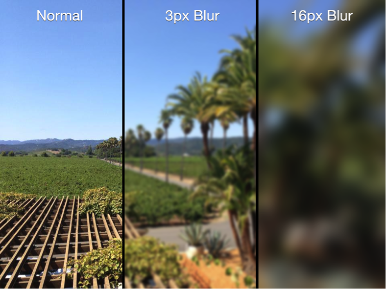
All blurs start with an image. To achieve a blur, you apply a blurring algorithm to each pixel in the image; the resulting image then contains an evenly blurred version of the original image. Blurring algorithms vary in style and complexity, but in this section we’ll examine a common algorithm known as Gaussian blur.
Blurring algorithms generally examine each pixel of an image and use the surrounding pixels to calculate new color values for that pixel. For example, consider the following theoretical image grid:

Each cell in the above grid represents an individual pixel, and each pixel has a value between 1 and 10. Consider the case where the algorithm is evaluating the center pixel. The algorithm averages the values of the surrounding pixels and inserts this averaged value into the center pixel, resulting in the following new pixel grid:

You then repeat this process for every pixel in the original image.
The sample algorithm above only examined one pixel in each direction to create the new averaged value. You can expand this blur radius even further to increase the amount of blurring in your image, as demonstrated in the image below:
3px and 16px Gaussian Blur applied to an image
Humans have a tendency to pay attention to elements that are in-focus and ignore those that aren’t. Believe it or not, this is a natural consequence of how our eyes work. Focusing on an object as it moves closer or further away from the eye is known as accommodation; it’s what helps you perceive the depth and distance of objects around you.
App designers exploit this fact and blur unimportant items on the screen to direct the user’s attention to the remaining non-blurred elements, as demonstrated in this screenshot of the popular Twitter client Tweetbot:

The user interface in the background is barely recognizable in the image above. This provides contextual awareness to the user about where they are in the navigational hierarchy. For instance, you’d expect to return to the blurred-out view in the background once you select one of the accounts displayed.
Follow the standard design approach to use blurs to direct a user’s attention to things that matter and you’ll seldom go wrong. See the Designing for iOS section of the iOS Human Interface Guidelines document found on Apple’s iOS developer center for more on this subject.
To learn how to implement blurring, you’ll add some blur effects to a brand new Brothers Grimm fairytale app – aptly named Grimm.
The app displays a library of fairytales to the user. When the user taps on a fairytale, the app presents the full story on screen. The user can customize the display font, text alignment, or even the color theme for daytime or nighttime reading.
Start by downloading the starter project, then open Grimm.xcodeproj in Xcode. Open Main.storyboard and take a look at the view controllers contained in the app as illustrated below:
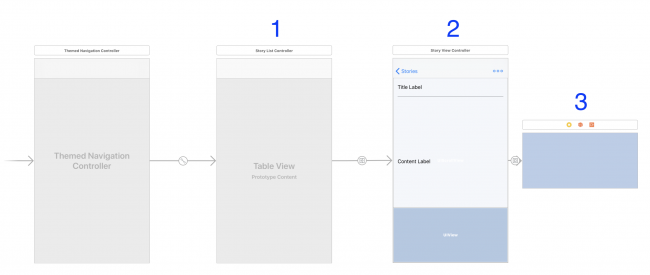
You can ignore the very first view controller in the image above as it’s simply the root navigation controller of the app. Taking each numbered view controller in turn, you’ll see the following:
StoryListController, which displays a list of all of the fairy tales in the database.StoryViewController, which displays the title and text of the selected fairy tale.OptionsController is contained within StoryViewController and displays the available font, text alignment, and color options. To display it, simply tap the top-right ellipses icon in the detail controller.Build and run. You’ll see the initial screen as shown below:

Have some fun exploring the app; select different stories, tap the ellipsis icon and swipe to different fonts and reading modes to understand how the user interface functions.
Once you have a handle on how the app behaves, head straight to the next section to learn how to apply blur effects to the app.
UIKit provides an entire suite of visual effects goodies. UIBlurEffect, a subclass of UIVisualEffect, is particularly relevant to your interests. UIBlurEffect provides the nice blurs you see in navigation bars, Notification Center, and Control Center – and you can use it in your apps as well.
In this project, you will use blur to make the OptionsController stand out on top of the story. Let’s jump right in!
Open OptionsController.swift and add the following code to the end of viewDidLoad:
// 1
view.backgroundColor = .clear
// 2
let blurEffect = UIBlurEffect(style: .light)
// 3
let blurView = UIVisualEffectView(effect: blurEffect)
// 4
blurView.translatesAutoresizingMaskIntoConstraints = false
view.insertSubview(blurView, at: 0)
Taking each numbered comment in turn:
UIVisualEffectView to actually blur the content, its superview must be transparent. To do this, you change the background color to be clear.UIBlurEffect with a UIBlurEffectStyle.light style. This defines what style of blur is used. The other available styles are .extraLight and .dark, .extraDark, regular, and prominent.UIVisualEffectView with the blur you just created. This class is a subclass of UIView; its sole purpose is to define and display complex visual effects.blurView — you’ll manually add constraints in just a moment — and add it at the bottom of the view stack. If you just added blurView on top of the view, it would end up blurring all of the controls underneath it instead!Now you need to ensure your blurView is laid out properly with the rest of the view.
Add the following code to the end of viewDidLoad:
NSLayoutConstraint.activate([
  blurView.heightAnchor.constraint(equalTo: view.heightAnchor),
  blurView.widthAnchor.constraint(equalTo: view.widthAnchor),
  ])
These constraints keep the frame of the blurView consistent with that of the OptionsController view.
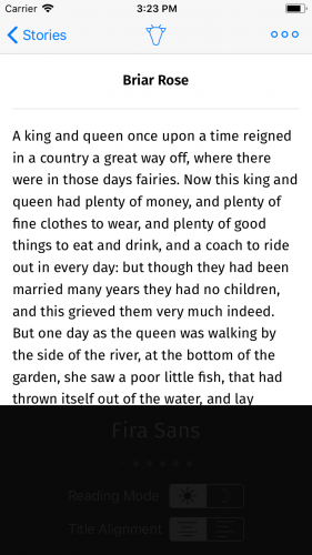
Build and run. Select a fairy tale, tap the ellipsis button, and then scroll the text. Behold as the blur updates in real-time.

You now have a dynamic blur effect in your app that was not only easy to implement but looks great too.
Blur effects are great – but as usual, Apple has taken it to the next level with UIVibrancyEffect, which when used in combination with UIVisualEffectView adjusts the colors of the content to make it feel more vivid.
The following image demonstrates how vibrancy makes your labels and icons pop off the screen, while at the same time blending with the background itself:

The left side of the image shows a normal label and button, while the right side shows a label and button with vibrancy applied.
UIVibrancyEffect must be added to the contentView of a UIVisualEffectView that has been set up and configured with a UIBlurEffect object; otherwise, there won’t be any blurs to apply a vibrancy effect to!Open OptionsController.swift and add the following code to the end of viewDidLoad:
// 1
let vibrancyEffect = UIVibrancyEffect(blurEffect: blurEffect)
// 2
let vibrancyView = UIVisualEffectView(effect: vibrancyEffect)
vibrancyView.translatesAutoresizingMaskIntoConstraints = false
// 3
vibrancyView.contentView.addSubview(optionsView)
// 4
blurView.contentView.addSubview(vibrancyView)
Taking each numbered comment in turn:
UIVibrancyEffect that uses the blurEffect you set up earlier. UIVibrancyEffect is another subclass of UIVisualEffect.UIVisualEffectView to contain the vibrancy effect. This process is exactly the same as creating a blur. Since you’re using Auto Layout, you make sure to disable auto-resizing translations here.optionsView as a subview of your vibrancy view’s contentView; this ensures the vibrancy effect will be applied to the view that contains all of the controls.contentView to complete the effect.Next, you need to set up the Auto Layout constraints for the vibrancy view so that it has the same dimensions as the blur view, and for the options view to be centered in the vibrancy view.
Add the following constraints at the end of viewDidLoad:
NSLayoutConstraint.activate([
  vibrancyView.heightAnchor.constraint(equalTo: blurView.contentView.heightAnchor),
  vibrancyView.widthAnchor.constraint(equalTo: blurView.contentView.widthAnchor),
  vibrancyView.centerXAnchor.constraint(equalTo: blurView.contentView.centerXAnchor),
  vibrancyView.centerYAnchor.constraint(equalTo: blurView.contentView.centerYAnchor)
  ])

NSLayoutConstraint.activate([
  optionsView.centerXAnchor.constraint(equalTo: vibrancyView.contentView.centerXAnchor),
  optionsView.centerYAnchor.constraint(equalTo: vibrancyView.contentView.centerYAnchor),
  ])
There’s one thing you have left to do before this will work. If you look at the beginning of viewDidLoad, you already added optionsView as a subview – and views can only have a single superview.
At the beginning of viewDidLoad, comment out the following code:
view.addSubview(optionsView)

NSLayoutConstraint.activate([
  view.centerXAnchor.constraint(equalTo: optionsView.centerXAnchor),
  view.centerYAnchor.constraint(equalTo: optionsView.centerYAnchor)
  ])
Build and run. Bring up the options view to see your new vibrancy effect in action:

Unless you have high-contrast vision, the vibrancy effect makes it really difficult to read the labels and controls. What’s going on?
Ah – the content behind the blur view is light and you’re applying a UIBlurEffectStyle.light effect. That’s counterproductive, to be sure.
Modify the line near the top of viewDidLoad that initializes the blurEffect:
let blurEffect = UIBlurEffect(style: .dark)
This changes the blur effect to add more contrast between the background and text.
Build and run. You’re now experiencing some true vibrancy:

When it comes to blurs, there is one last thing you need to consider: what if the user has blurs disabled?
In the simulator or on your device, open the Settings app and go to General\Accessibility\Increase Contrast, and enable Reduce Transparency. Go back to the app, and open the options view once again.
Well, that isn’t going to work at all! In this situation, going back to what you started out with is a better alternative.
Luckily, you can check if this accessibility setting is enabled using UIAccessibilityIsReduceTransparencyEnabled(). If you know that this setting is enabled, you can change the way your app looks and behaves.
Using the code you commented out before, add the following right before you set the view’s background color in viewDidLoad:
guard UIAccessibilityIsReduceTransparencyEnabled() == false else {
  view.addSubview(optionsView)

  NSLayoutConstraint.activate([
    view.centerXAnchor.constraint(equalTo: optionsView.centerXAnchor),
    view.centerYAnchor.constraint(equalTo: optionsView.centerYAnchor)
    ])

  return
}
This code checks to see if Reduce Transparency is enabled. If it is, you ignore all the code you just wrote and go back to the original layout without any blurring.
Build and run the app, and you’ll see that the options menu looks normal once again.
You can download the finished project here.
You’ve seen how images can be blurred, as well as how to create real-time blur effects using UIVisualEffectView. You can just as easily add advanced blur effects to your own app! There’s many more effects and options you could dive in to, and the best place to continue your exploration would be in Apple’s official UIVisualEffectView documentation.
UIVisualEffectViews update in real-time, so you can achieve all sorts of weird and wonderful things with these effects. While you might be tempted to go ahead and blur all the things, keep in mind what was discussed earlier in the tutorial regarding using these effects sparingly and only where appropriate. As is often the case, with blur and vibrancy, less is definitely more.
If you have any questions or comments about this UIVisualEffectView tutorial or visual effects in general, please join the forum discussion below!
The post UIVisualEffectView Tutorial: Getting Started appeared first on Ray Wenderlich.
In this video, you'll learn how to accept data in your Vapor applications and parse it with Codable.
The post Video Tutorial: Server Side Swift with Vapor Part 1: Accepting Data appeared first on Ray Wenderlich.

Android and the Android SDK have improved a great deal over the years. We’ve received major API upgrades and additions. The UI has changed completely throughout the versions. However, some aspects of the SDK are still challenging, and can leave us with quite a headache.
An example headache is the Android application lifecycle. More often than not it follows the Uncertainty Principle. When you’re not paying attention, it works just like you want it to. But when you’re relying on it, it tends to work its own way. :[
Another issue, which goes along tightly with the lifecycle, is app architecture. Even though Android architecture changes faces about as often as Arya Stark does, the same issues usually remain. Namely, data flow problems, persistence, and stability. But how do you tackle these without complicating your code base?
Believe it or not, you’re now finally able to build a stable architecture in Android. It only took 9 years! And you don’t have to hack, complicate things, or build it yourself! You can do this by using the awesome Android Architecture Components framework from Google.
In this tutorial, you’ll dive into the vast world of Android Architecture Components, model your use case, and build an app to back it all up. In doing so, you’ll learn:
Note: This Android Architecture Components overview assumes that you’re familiar with the basics of Android development and application structuring. If you’re new to Android, please check out our Beginner Android series and other Android tutorials.
In a little bit, you’ll download the starter project and dive into code. I know you’re hungry for some Kotlin, but you’ll understand the code and logic much better if you learn about the Android Architecture Components in theory first. :]
We’ll be covering Lifecycle, LiveData, and ViewModel, but leaving other Android Architecture Components such as Room for other tutorials.
Android Architecture Components encapsulate three major architectural aspects of app development. And they’ve made way for a new style of application structuring. Even more so, they address issues of stability, data persistence and flow in a very serious manner. With this in mind, we will likely see the quality of Android apps grow in the future like wildfire.
But enough talk: you’re due for an example! Let’s start off with one of the most important concepts, the Lifecycle.
You’ve more likely than not seen the lifecycle graph for activities and fragments. It’s a bit of a mess when you first look at it, isn’t it? Most bad things happen when we do something in the incorrect app state. If something like this popped into your head:
java.lang.IllegalStateException: Can not perform this action after onSaveInstanceState
then you know how frustrating it can be when you forget to unsubscribe a request. To make the Android world a little more crash-free, Google’s built Lifecycle.
It branches out to three concepts, Lifecycle LifecycleObserver, and LifecycleEvent. As a result, you can act on state changes from lifecycle you’re in by annotating methods. This means you can shoot out requests, and update the UI, knowing you’re in safe state.
You might say: “It seems pointless, why don’t I use onCreate or onStart to handle state?”. Well, the Android lifecycle is about as stable as a chair with two legs, so the callbacks don’t provide much safety. So for the most part you’re right, but in some cases callbacks aren’t either accessible or enough.
Have a look at the following example:
class MyLocationListener(private val lifecycle: Lifecycle) : LifecycleObserver {

  @OnLifecycleEvent(Lifecycle.Event.ON_START)
  fun start() {
    if (lifecycle.currentState.isAtLeast(Lifecycle.State.STARTED)) {
      // connect if not connected
    }
  }

  @OnLifecycleEvent(Lifecycle.Event.ON_STOP)
  fun stop() {
    // disconnect if connected
  }
}
Often we need user location updates. But if the user leaves our app, we should stop listening to save data and battery. In fact Lifecycle tells us when it’s safe to listen, and when it isn’t. Moreover, we don’t have to create custom listeners for onStart and onStop events.
To sum up, we’ve seen how this basic yet powerful concept can make our life easier. We’ve seen how easy it is to replace horrid listeners with a LifecycleObserver in our existing code. But we still haven’t addressed the issue of supplying data to the UI!
Continuing in the same spirit, look at another common scenario:
override fun onFailure(call: Call<BeersResponse>?, t: Throwable?) {
  view.hideLoading()
  view.showNoData()
  ...
}
This is a situation we often face, receiving an error from the backend. Of course, we need to handle errors, but how do we do this in a clean way?
In the case that we have a View that displays an error, it is crucial to have both show() and hide() methods for the error. Although this might seem OK, we’re adding methods to the View. Furthermore, the business logic layer shouldn’t know what the view can do and what happens on the UI.
Also, this makes you write a ton of boilerplate interfaces and method declarations for each screen. You know how painstaking that can be. But, once again, Architecture Components save the day. This time featuring LiveData!
What is LiveData made of? Other than sweets and magical essence, it’s basically just an Observable value that is also Lifecycle aware. Quite simple in it’s nature, yet very powerful. It is aware of the app state. So if you do go into background, but your response decides to arrive anyway, the data value is set, but not emitted. Once you’re back in the positive state of mind (read onStart) the data is sent, and the UI gets updated.
The main difference to the typical approach of requesting data from an API is that the UI subscribes to the data, and then knows what to do with it when it arrives. The business logic layer no longer imperatively says what to do.
Although it might seem that you’re moving logic from the business layer into the view, that’s not the case. In reality, all the view knows is that there is data to listen to. You’ll achieve it by subscribing this Lifecycle to a LiveData object.
Since our business logic doesn’t tell the UI what to do, we’ve achieved a nice separation of concerns. That will help us unit test our app. You’ll see how this separation is done later on in the sample project.
Luckily I’m not talking about fashion models, it’s not really my strong suit. The type of models we’ll be confronting are ViewModels!
In order to understand them we’ll go through an example in the sample project. For now, you need to know ViewModels are persistent throughout a Lifecycle scope. Meaning, if you create it in an Activity, as long as the Activity lives in the stack, so does the ViewModel. Knowing this, we can create a ViewModel in Activity scope, and use it in multiple Fragments, effectively sharing data between them.
Activities and fragments are owners of a Lifecycle, as they implement the LifecycleOwner interface. This means they can provide their instance of Lifecycle when asked.
Also, calling for ViewModel instances will always return the Lifecycle bound instance. They even persist through orientation changes! So, by combining LiveData with ViewModels, you have data persistence such as for the savedInstanceState. This will save you from tons of crashes!
You’ve survived my excruciatingly long introduction, way to go! :]
In order to show you the full extent of Android Architecture Components, we’ve created a sample project. Also, we’ve found a real life example to make each component as clear as possible. Shall we begin?
Start off by downloading the sample starter project here. Open the project in Android Studio 3.0.1 or greater and build and run to make sure all is well:

Let’s go over the project structure, which you can see is modular by package. The api and interaction packages are part of the model layer, the connection to backend. The di package contains, well – the dependency injection setup! The rest should be pretty self explanatory, with ui containing Android specific files and models containing our data classes. We’ve also added all of the needed dependencies to Gradle and separated them a bit for better understanding.
You’re using Retrofit for network requests, Glide for image loading, and Dagger for dependency injection.
The model classes look as follows:
data class Beer(val name: String = "",
                val style: BeerStyle = BeerStyle(),
                val labels: BeerLabels = BeerLabels())

data class BeerLabels(val large: String = "",
                      val medium: String = "")

data class BeerStyle(val name: String = "")

data class BeerResponse(@SerializedName("data") val beers: List<Beer>,
                        val currentPage: Int)
The labels contain your beer images so you can see what you drink. You’ll also display the beer name, and a style. The beer response models the beer data coming back from the API.
The ViewHolders to display the beers are also prepared for you in the starter project, and they’re fairly simple:
class BeerHolder(itemView: View) : RecyclerView.ViewHolder(itemView) {

  fun showBeer(beer: Beer): Unit = with(itemView) {
    beerStyle.text = beer.style.name
    beerName.text = beer.name

    val mediumImage = beer.labels.medium
    val largeImage = beer.labels.large

    // load whichever image exists
    Glide.with(itemView).load(if (largeImage.isNotBlank()) {
      largeImage
    } else {
      mediumImage
    }).into(beerImage)
  }
}
Since we’re using Kotlin Android Extensions, we don’t have to manually initialize Views using findViewById.
We’ve chosen the best sample app purpose we could: beer drinking! However, beers don’t magically appear in your hands (sadly). You must first create an application at the BreweryDB. Create a new account, if you haven’t got one already.

Go to the Developers page, and click “Start Developing Now”. Next, accept the license to sell your soul to the Beer Gods:

Finally, create an API key to use in your requests by clicking “Register A New App” and giving your app the name BottomsUp:

You should see your app now, with the API key:

It may take a day or two for BreweryDB to approve your app, so you’ll see a “Pending Activation” message on the app screen. Calls to the API won’t work until the app is approved.
Since our app is simple, you can store your new key at the end of AppConstants.kt:
const val API_KEY = "your-api-key"
If this were a production app, you’re advised you to keep the key in a safe environment.

While 42 may be the answer to what life is about, this app will be about a reactive, lifecycle aware structure. You’ve got a backend now, and most of the core setup, but you need to integrate the Architecture Components. With LiveData you will make the UI update on data changes. ViewModel will make the requests survive orientation changes. Additionally, you’ll safely execute requests in the proper app state thanks to Lifecycle.
You’ll start off by requesting beers from the backend API. Then you’ll supply the ViewModel‘s LiveData mini cooler with said beers. And last but not least, you’ll provide the view with a cold one from the ViewModel by letting it subscribe to LiveData changes.
Start by creating a viewmodel package in the app root. Then create a BeersViewModel class, which extends ViewModel, in the package:
class BeersViewModel : ViewModel() {
}
Your ViewModel needs a reference to the BreweryInteractor prepared in the starter project. Do this by adding a lazily computed value named interactor, at the top of the class, provided by the AppComponent from the application subclass App:
private val interactor by lazy { App.component.breweryInteractor() }
Next, you need to request beers from the interactor. For now, add a method getBeers() to request the first page of beers, and add a callback in your ViewModel just under the variable declarations:
fun getBeers() {
  interactor.getBeers(1, beersCallback())
}

private fun beersCallback() = object : Callback<BeerResponse> {
  override fun onFailure(call: Call<BeerResponse>?, t: Throwable?) {
  }

  override fun onResponse(call: Call<BeerResponse>?, response: Response<BeerResponse>?) {
  }
}
When prompted to import classes such as Code or Response, be sure to use the Retrofit2 classes.
Now you have everything a ViewModel needs, except for LiveData (which you’ll add below)! :]
One last thing you need to do before you move on to LiveData is add the ViewModel to the top of BeersActivity.kt:
private val viewModel by lazy { getViewModel<BeersViewModel>() }
The sample project comes with a few neat extension functions that help to tidy up your code. So instead of calling ViewModelProviders.of(target).get(viewModelClass), here you instead call getViewModel.
You might have noticed how your DI is currently done by lazy values. This is not necessarily the best approach, but Dagger and ViewModels don’t work together out of the box. In order to create a ViewModel with Dagger, you have to declare a custom Factory, which is done by using mapped binding or subcomponents.
For the purposes of simplicity though, the project will use lazy values. You can check out Google’s sample app on Architecture Components to see the subcomponent approach. :]
Everything moves and changes fast. The key is being able to react to changes. You’re now going to use LiveData to do so. LiveDatas. Instead of complicating your apps with Observable, you can use a LiveData structure. Simple as that. :]
You’re moving to the final task of our little tutorial – adding the data. Think about what data you need. When we first talked about components, we had an example with loading and error states. This is something our app should handle. In case of an error, we need to tell the UI that loading should stop, and an error should be shown.
Start off by adding two LiveData properties to the top of your ViewModel:
val errorData = MutableLiveData<Boolean>()
val loadingData = MutableLiveData<Boolean>()
Updating their values in onFailure, like so:
override fun onFailure(call: Call<BeerResponse>?, t: Throwable?) {
  loadingData.value = false
  errorData.value = true
}
For the rest of the data, you need one to hold the page value, because you have lazy loading in the sample project. In addition to that, you need one to hold the list of Beers. Add them right after the loading and error ones:
val pageData = MutableLiveData<Int>()
val beerData = MutableLiveData<List<Beer>>()
Update their value from the response
override fun onResponse(call: Call<BeerResponse>?, response: Response<BeerResponse>?) {
  loadingData.value = false //data has come, stop the loading
  errorData.value = false

  response?.body()?.run {
    updateData(this)
  }
}
Add the updateData method to the bottom of the view model:
private fun updateData(data: BeerResponse) {
  pageData.value = data.currentPage + 1 // increment the page
  beerData.value = data.beers
}
All that you need to do now is wire up the view, and you’ll be ready to serve some brewskies! :]
Add a BeerAdapter under the ViewModel declaration in BeersActivity:
private val adapter = BeersAdapter()
Replace the single TextView in activity_beers.xml with the following:
<android.support.v4.widget.SwipeRefreshLayout
  android:id="@+id/pullToRefresh"
  android:layout_width="0dp"
  android:layout_height="0dp"
  app:layout_constraintTop_toTopOf="parent"
  app:layout_constraintBottom_toBottomOf="parent"
  app:layout_constraintStart_toStartOf="parent"
  app:layout_constraintEnd_toEndOf="parent">

  <android.support.v7.widget.RecyclerView
    android:id="@+id/beersList"
    android:layout_width="match_parent"
    android:layout_height="match_parent"
    android:scrollbars="vertical" />

</android.support.v4.widget.SwipeRefreshLayout>

<TextView
  android:id="@+id/errorView"
  android:layout_width="wrap_content"
  android:layout_height="wrap_content"
  android:text="Error getting beers!"
  app:layout_constraintBottom_toBottomOf="parent"
  app:layout_constraintLeft_toLeftOf="parent"
  app:layout_constraintRight_toRightOf="parent"
  app:layout_constraintTop_toTopOf="parent" />
Add the following private helper methods into BeersActivity, which in turn initialize the UI, handle the loading state, and handle possible error conditions:
private fun initializeUi() {
  beersList.layoutManager = GridLayoutManager(this, 2)
  beersList.itemAnimator = DefaultItemAnimator()
  beersList.adapter = adapter
}

private fun showLoading(isLoading: Boolean) {
  pullToRefresh.isRefreshing = isLoading
}

private fun setErrorVisibility(shouldShow: Boolean) {
  errorView.visibility = if (shouldShow) View.VISIBLE else View.GONE
  beersList.visibility = if (!shouldShow) View.VISIBLE else View.GONE
}
Now, call the initializeUI() helper in onCreate(), and make a call to the view model to get beers:
override fun onCreate(savedInstanceState: Bundle?) {
  super.onCreate(savedInstanceState)
  setContentView(R.layout.activity_beers)

  initializeUi()

  // add subscriptions

  viewModel.getBeers() // request the data for the first time
}
But wait you’re missing something! Where are those subscriptions to the view model LiveData? Replace the “// add subscriptions” comment in onCreate with the following:
viewModel.errorData.subscribe(this, this::setErrorVisibility)
viewModel.loadingData.subscribe(this, this::showLoading)
viewModel.pageData.subscribe(this, adapter::clearIfNeeded)
viewModel.beerData.subscribe(this, adapter::addItems)
These subscriptions add callbacks to the data changes in your LiveData. I’ll walk you through them one-by-one:
The errorData callback is the setErrorVisibility method:
)
private fun setErrorVisibility(shouldShow: Boolean) {
  errorView.visibility = if (shouldShow) View.VISIBLE else View.GONE
  beersList.visibility = if (!shouldShow) View.VISIBLE else View.GONE
}
When the shouldShow argument is true, an error is displayed, and the list is hidden for the moment. On the other hand, if the argument is false, the error is removed, and the list is displayed.
Next, the loadingData callback in showLoading just displays the loading state on true events and hides it on false ones.
Finally, the page and beers data govern what you will display by making calls into the BeerAdapter:
fun clearIfNeeded(page: Int) {
  if (page == 1) {
    beers.clear()
  }
}

fun addItems(newBeers: List<Beer>) {
  beers.addAll(newBeers.filter { beer ->
    beer.labels.medium.isNotBlank() || beer.labels.large.isNotBlank()
  })
  notifyDataSetChanged()
}
In case the user pulls to refresh, and resets the page to 1, you will clear the data before adding newly received items. Adding items is the standard adapter procedure. To implement pull-to-refresh, first update the BeersViewModel to modify the getBeers method and add onRefresh:
BeersViewModel.kt
fun getBeers() {
  interactor.getBeers(pageData.value ?: 1, beersCallback())
}

fun onRefresh() {
  pageData.value = 1
  getBeers()
}
Now add the following call at the end of initializeUi in BeersActivity:
private fun initializeUi() {
  ...
  pullToRefresh.setOnRefreshListener(viewModel::onRefresh)
}
To conclude, you see the input is the data from your ViewModel, whereas the output is the resulting UI changes. Now you should have everything you need to get the long awaited beers! :]
Run the app to get some beers. Everything should be working as planned (fingers crossed):

The implementation of infinite scroll to load the subsequent pages is not the focus of this tutorial. However, just call viewModel.getBeers() when you want to load a new page. The page increment has already been taken care of.
You’ve used LiveData in this tutorial, but it’s quite the same as using Rx programming isn’t it? Well, not quite. While it follows the same core principle of the Observer pattern, LiveData has one huge advantage: it has a built in subscribe/unsubscribe system.
While Google encourages you to use whichever you prefer, they advise that by using Rx, you have to handle the unsubscribing yourself.
From what I’ve seen, Rx is very lightly used in most projects. So having a huge dependency just for passing data around from API requests is not my recommendation. Unless you’re doing Rx style operations like combining multiple requests, you’re better off with LiveData.
You can download the final project here.
There is a ton of materials on Android Architecture Components, since they’ve become one of the main things the Android community is actively researching and using. You can find a lot of articles out there, some of which are:
And of course be on the lookout for more of our tutorials on Android Architecture Components!
If you have any questions or comments, please join the discussion in the comments below.
The post Android Architecture Components: Getting Started appeared first on Ray Wenderlich.
Challenge time! You will be tasked with creating your own routes, using all the skills learned in the previous videos.
The post Video Tutorial: Server Side Swift with Vapor Part 1: Challenge: Create Your Own Routes appeared first on Ray Wenderlich.
Review what you have learned in this section and see what will be coming up in the next section of this video course.
The post Video Tutorial: Server Side Swift with Vapor Part 1: Conclusion appeared first on Ray Wenderlich.
Let's review what we are going to cover in this section and also learn about what Fluent is and how Async works and why it is important.
The post Video Tutorial: Server Side Swift with Vapor Part 2: Introduction appeared first on Ray Wenderlich.
In this video you will learn how to create models using Fluent, and how to configure your databases.
The post Video Tutorial: Server Side Swift with Vapor Part 2: Models And Fluent appeared first on Ray Wenderlich.
RWDevCon 2018 is sold out
This is just a quick update that RWDevCon 2018 is now sold out!
I am amazed and overjoyed by the enthusiastic response from the community for this conference – we are set to have ~265 attendees at the conference this year.
The team and I are hard at work on the conference – we’ll make this an event to remember!
If you didn’t manage to get a ticket:
For the attendees and sponsors of RWDevCon – thanks so much for being a part of the conference, and we can’t wait to see you in DC! :]
The post RWDevCon 2018 Sold Out appeared first on Ray Wenderlich.

The Model-View-Controller (“MVC”) design pattern is useful, but it doesn’t scale well. As projects grow in size and complexity, this limitation becomes more apparent. In this Coordinator tutorial, you’ll try a different approach: Coordinators.
If you’re unfamiliar with the term, don’t worry! It’s a simple architecture that doesn’t require any third party frameworks, and it’s easy to adopt in your existing MVC projects.
By the end of this Coordinator tutorial, you’ll be able to decide which approach works best for you when building your apps.
Note: If you’re not familiar with MVC, check out Design Patterns in iOS.
To kick things off, start by downloading the starter project, Kanji List.
Note: The kanji data used in this Coordinator tutorial was provided by Kanji Alive Public API
Kanji List is an app for learning Kanji (Chinese characters used in the Japanese language), and it’s currently using the MVC design pattern.
Let’s take a closer look at the functionality this app provides and how:

There’s also Kanji.swift, which holds the data models; and KanjiStorage.swift, which is a shared instance. It’s used to store parsed kanji data.
Pretty straightforward, huh?
At this point, you may be thinking, “The app works. What’s the problem?”

That’s a great question! Let’s take a look.
Open Main.storyboard.

OK, this looks fishy. The app has a segue from KanjiListViewController to KanjiDetailViewController; and also from KanjiDetailViewController to KanjiListViewController.
The reason is because of the app’s business logic:
If you think the problem is in the segues, you’re partially right.
Segues bind two UIViewControllers together, making those UIViewControllers very difficult to reuse.
Open KanjiListViewController.swift. Notice it has a property named kanjiList:
var kanjiList: [Kanji] = KanjiStorage.sharedStorage.allKanji() {
  didSet {
    kanjiListTableView?.reloadData()
  }
}
kanjiList is a datasource for KanjiListViewController, and its default is to display all of the kanji from the shared KanjiStorage.
There’s also a property named word. This property is a hack that allows you to reuse KanjiListViewController for both the first and third screens:
var word: String? {
  didSet {
    guard let word = word else {
      return
    }
    kanjiList = KanjiStorage.sharedStorage.kanjiForWord(word)
    title = word
  }
}
By setting word, you change both kanjiList and the title that’s displayed in the UINavigationBar:

Consider for a moment. KanjiListViewController knows the following things:
kanjiList.KanjiListViewController knows that it’s in a UINavigationController, and that it should change the title if a word is selected.
That seems pretty complicated for something as simple as a UIViewController displaying a list of items.
One way to fix this unnecessary complexity is to pass the list of kanji to the KanjiListViewController; but who should pass it?
You can create a UINavigationController subclass and inject the data into its child, but does this code belong in the UINavigationController‘s subclass? Shouldn’t UINavigationController be a simple container for UIViewControllers?
Another problematic place is prepare(for:sender:), which is located in KanjiDetailViewController.swift:
override func prepare(for segue: UIStoryboardSegue, sender: Any?) {
  super.prepare(for: segue, sender: sender)

  guard let listViewController = segue.destination as? KanjiListViewController else {
    return
  }

  listViewController.shouldOpenDetailsOnCellSelection = false
  listViewController.word = sender as? String
}
This code means that KanjiDetailViewController knows about the next UIViewController, which in this case is KanjiListViewController.
If you were to reuse KanjiDetailViewController, the code would quickly get out of hand, because this method would need to grow into a giant switch statement so it knew which view controller to push next. This is why the logic shouldn’t be inside of another view controller — it creates a strong connection between view controllers, making them have more responsibility than they should.
The Coordinator pattern is a potential solution to all of the problems mentioned above. This pattern was first introduced to the iOS community by Soroush Khanlou (@khanlou) in his blog and during his presentation at the NSSpain conference.
The idea of the Coordinator pattern is to create a separate entity — a Coordinator — which is responsible for the application’s flow. The Coordinator encapsulates a part of the application. The Coordinator knows nothing of its parent Coordinator, but it can start its child Coordinators.
Coordinators create, present and dismiss UIViewControllers while keeping the UIViewControllers separate and independent. Similar to how UIViewControllers manage UIViews, Coordinators manage UIViewControllers.
It’s time to dive into some coding!
First, create a Coordinator protocol. From the main menu, click File\New\File…. Then, select the iOS\Source\Swift File and name the new file Coordinator.swift. When you’re done, click Next and then Create.
Now, replace its contents with the following:
protocol Coordinator {
  func start()
}
Believe it or not, that’s it! All the Coordinator protocol needs is one start() function!

Because you want the Coordinator to handle the application’s flow, you need to provide a way, within the code, to create UIViewControllers. For this Coordinator tutorial, you’ll use .xib files instead of storyboards. With these files, you’ll be able to create UIViewControllers by calling the following:
UIViewController(nibName nibNameOrNil: String?, bundle nibBundleOrNil: Bundle?)
Note: The Coordinator pattern doesn’t require that you use .xib files. You can create UIViewControllers in code, and you can also instantiate them from storyboards, which you’ll see at the end of the Coordinator tutorial.
Add these .xib files to the project target by dragging and dropping them into the Project navigator in Xcode. Open KanjiDetailViewController.xib and KanjiDetailViewController.swift in the Assistant editor and make sure that all of the outlet connections are properly set. Do the same for KanjiListViewController.xib and KanjiListViewController.swift.
Note: In the File inspector, make sure that both .xib files are added to the target.

You need to replace Main.storyboard as the application starting point.
Right-click Main.storyboard, choose Delete then click Move to Trash.
Click on the KanjiList project in the File navigator and open the KanjiList target > General, and delete Main as the Main interface:

Now you need to create your own starting point.
It’s time to create the application coordinator. Click File\New\File… and select the iOS\Source\Swift file. Name the file ApplicationCoordinator.swift. Click Next, and then Create.
Replace its contents with the following:
import UIKit

class ApplicationCoordinator: Coordinator {
  let kanjiStorage: KanjiStorage //  1
  let window: UIWindow  // 2
  let rootViewController: UINavigationController  // 3

  init(window: UIWindow) { //4
    self.window = window
    kanjiStorage = KanjiStorage()
    rootViewController = UINavigationController()
    rootViewController.navigationBar.prefersLargeTitles = true

    // Code below is for testing purposes   // 5
    let emptyViewController = UIViewController()
    emptyViewController.view.backgroundColor = .cyan
    rootViewController.pushViewController(emptyViewController, animated: false)
  }

  func start() {  // 6
    window.rootViewController = rootViewController
    window.makeKeyAndVisible()
  }
}
Let’s take a closer look at the code:
ApplicationCoordinator will have kanjiStorage with data from JSON. Right now kanjiStorage is used as a shared instance, but you’ll use dependency injection instead.ApplicationCoordinator sets up its presentations in the app’s window, which will be passed to ApplicationCoordinator in its initializer.rootViewController is a UINavigationController.Coordinator to present, this code will allow you to test if the presentation is set up correctly.start() is where things kick off. Specifically, the window is presented with its rootViewController.All you need to do now is to call start() to create the ApplicationCoordinator.
Open AppDelegate.swift and replace its contents with this:
import UIKit

@UIApplicationMain
class AppDelegate: UIResponder, UIApplicationDelegate {
  var window: UIWindow?
  private var applicationCoordinator: ApplicationCoordinator?  // 1

  func application(_ application: UIApplication,
                   didFinishLaunchingWithOptions launchOptions:
                     [UIApplicationLaunchOptionsKey: Any]?) -> Bool {

    let window = UIWindow(frame: UIScreen.main.bounds)
    let applicationCoordinator = ApplicationCoordinator(window: window) // 2

    self.window = window
    self.applicationCoordinator = applicationCoordinator

    applicationCoordinator.start()  // 3
    return true
  }
}
Here’s what’s happening:
applicationCoordinator.applicationCoordinator with the window that you just created.applicationCoordinator‘s main presentation.Build and run the app. Now you should see the following screen:

Now it’s time to present the KanjiListViewController. For this you’ll create another Coordinator. The main tasks of this Coordinator are to present a list of kanji and, later, to start another Coordinator responsible for displaying KanjiDetailViewController.
Similar to before, create a new file AllKanjiListCoordinator.swift.
Replace its contents with the following code:
import UIKit

class AllKanjiListCoordinator: Coordinator {
  private let presenter: UINavigationController  // 1
  private let allKanjiList: [Kanji]  // 2
  private var kanjiListViewController: KanjiListViewController? // 3
  private let kanjiStorage: KanjiStorage // 4

  init(presenter: UINavigationController, kanjiStorage: KanjiStorage) {
    self.presenter = presenter
    self.kanjiStorage = kanjiStorage
    allKanjiList = kanjiStorage.allKanji()  // 5
  }

  func start() {
    let kanjiListViewController = KanjiListViewController(nibName: nil, bundle: nil) // 6
    kanjiListViewController.title = "Kanji list"
    kanjiListViewController.kanjiList = allKanjiList
    presenter.pushViewController(kanjiListViewController, animated: true)  // 7

    self.kanjiListViewController = kanjiListViewController
  }
}
Here’s the breakdown:
AllKanjiListCoordinator is a UINavigationController.AllKanjiListCoordinator presents a list of all kanji, it needs a property to access the list.KanjiListViewController that you’ll be presenting.KanjiStorage, which is passed to AllKanjiListCoordinator‘s initializer.UIViewController that you want to present.UIViewController to the presenter.Now you need to create and start AllKanjiListCoordinator. To do that, open ApplicationCoordinator.swift and add this property to the top of the file, right below where you declared the rootViewController:
let allKanjiListCoordinator: AllKanjiListCoordinator
Now, in init(window:), replace all of the code below // Code below is for testing purposes // 5 with this:
allKanjiListCoordinator = AllKanjiListCoordinator(presenter: rootViewController,
                                                  kanjiStorage: kanjiStorage)
Lastly, in start(), below this line:
window.rootViewController = rootViewController
add this:
allKanjiListCoordinator.start()
Build and run. Now it looks the same as it did before the refactor!

However, if you select a kanji, it will crash. This is because when a cell is selected in KanjiListViewController, a segue is performed, but that segue doesn’t exist.
You need to fix this! Instead of directly performing an action when the cell is selected, you’ll trigger a delegate callback. This removes the action logic from the UIViewController.
Open KanjiListViewController.swift and add this above the class declaration:
protocol KanjiListViewControllerDelegate: class {
  func kanjiListViewControllerDidSelectKanji(_ selectedKanji: Kanji)
}
Now, in KanjiListViewController, add a new property:
weak var delegate: KanjiListViewControllerDelegate?
Lastly, replace tableView(_:didSelectRowAt:) with this:
func tableView(_ tableView: UITableView, didSelectRowAt indexPath: IndexPath) {
  let kanji = kanjiList[indexPath.row]
  delegate?.kanjiListViewControllerDidSelectKanji(kanji)
  tableView.deselectRow(at: indexPath, animated: true)
}
Great! You just made KanjiListViewController simpler. It now has the single responsibility of displaying the list of kanji and notifying the delegate when someone selects an item. Nobody is listening yet, though.
Open AllKanjiListCoordinator.swift and add this to the end of the file, outside of AllKanjiListCoordinator:
// MARK: - KanjiListViewControllerDelegate
extension AllKanjiListCoordinator: KanjiListViewControllerDelegate {
  func kanjiListViewControllerDidSelectKanji(_ selectedKanji: Kanji) {

  }
}
This sets up AllKanjiListCoordinator so that it conforms to KanjiListViewControllerDelegate. Later you’ll add code inside kanjiListViewControllerDidSelectKanji(_:) that calls start() in DetailsCoordinator.
Lastly, add this code inside of start(), right below where you instantiate kanjiListViewController:
kanjiListViewController.delegate = self
Now build and run your app! Although it runs, the code inside kanjiListViewControllerDidSelectKanji is still empty, so nothing happens when you select a cell. Don’t worry; you’ll add this code shortly.
At this point, you might be wondering, “When do I need to create a separate coordinator?” There is no strict answer to this question. Coordinators are useful for a specific part of the application that might be presented from different places.
For displaying kanji details, you could create a new kanji details UIViewController inside of AllKanjiListCoordinator, and push it when the delegate callback is called. One good question to ask yourself is, “Should AllKanjiListCoordinator know about details related UIViewControllers?” The name suggests that it shouldn’t. Also, by creating a separate Coordinator for details, you’ll end up with an independent component that can display details for a kanji, without any additional dependencies on the app. This is powerful!
Suppose one day you want integrate Spotlight search. If you’ve put detail display into a separate Coordinator, it becomes simple to do: create a new DetailsCoordinator and call start().
The key takeaway is that Coordinators help create independent components that, together, build the app.
Now let’s create the KanjiDetailCoordinator.
Similar to before, add a new file named KanjiDetailCoordinator.swift and replace the contents with the following code:
import UIKit

class KanjiDetailCoordinator: Coordinator {
  private let presenter: UINavigationController  // 1
  private var kanjiDetailViewController: KanjiDetailViewController? // 2
  private var wordKanjiListViewController: KanjiListViewController? // 3
  private let kanjiStorage: KanjiStorage  // 4
  private let kanji: Kanji  // 5

  init(presenter: UINavigationController, // 6
       kanji: Kanji,
       kanjiStorage: KanjiStorage) {

    self.kanji = kanji
    self.presenter = presenter
    self.kanjiStorage = kanjiStorage
  }

  func start() {
    let kanjiDetailViewController = KanjiDetailViewController(nibName: nil, bundle: nil) // 7
    kanjiDetailViewController.title = "Kanji details"
    kanjiDetailViewController.selectedKanji = kanji

    presenter.pushViewController(kanjiDetailViewController, animated: true) // 8
    self.kanjiDetailViewController = kanjiDetailViewController
  }
}
There’s a lot going on here, so let’s break it down:
KanjiDetailCoordinator‘s presenter is a UINavigationController.KanjiDetailViewController, which you’re presenting in start().KanjiListViewController, which you’ll present when a user selects a word.KanjiStorage, which is passed to KanjiDetailViewController‘s initializer.UIViewController that you want to present.UIViewController that you just created.Now let’s create KanjiDetailCoordinator. Open AllKanjiListCoordinator.swift and add a new property below the kanjiStorage declaration:
private var kanjiDetailCoordinator: KanjiDetailCoordinator?
Next, replace the empty body of kanjiListViewControllerDidSelectKanji(_:) in the extension with this:
let kanjiDetailCoordinator = KanjiDetailCoordinator(presenter: presenter,
                                                    kanji: selectedKanji,
                                                    kanjiStorage: kanjiStorage)
kanjiDetailCoordinator.start()

self.kanjiDetailCoordinator = kanjiDetailCoordinator
With this function, you create and start KanjiDetailCoordinator when a user selects a kanji.
Build and run.

As you can see, you now have KanjiDetailViewController presented correctly when a user selects a cell on KanjiListViewController. However, if you select a word from the list on KanjiDetailViewController, your app will crash because, like before, you’re triggering a segue that no longer exists.
Time to fix this!
Open KanjiDetailViewController.swift. Just like with KanjiListViewController, add the delegate protocol above the class declaration:
protocol KanjiDetailViewControllerDelegate: class {
  func kanjiDetailViewControllerDidSelectWord(_ word: String)
}
Then, add the following property inside KanjiDetailViewController:
weak var delegate: KanjiDetailViewControllerDelegate?
To trigger the delegate, replace tableView(_:didSelectRowAt:) with this:
func tableView(_ tableView: UITableView, didSelectRowAt indexPath: IndexPath) {
  defer {
    tableView.deselectRow(at: indexPath, animated: true)
  }

  guard indexPath.section == 1,
    let word = selectedKanji?.examples[indexPath.row].word else {
      return
  }
  delegate?.kanjiDetailViewControllerDidSelectWord(word)
}
Excellent! Now the app won’t crash when you select a cell, but it still won’t open a list.
To fix this, open KanjiDetailCoordinator.swift, and add the following code at the bottom of the file — outside of KanjiDetailCoordinator — which confirms the delegate:
// MARK: - KanjiDetailViewControllerDelegate
extension KanjiDetailCoordinator: KanjiDetailViewControllerDelegate {
  func kanjiDetailViewControllerDidSelectWord(_ word: String) {
    let wordKanjiListViewController = KanjiListViewController(nibName: nil, bundle: nil)
    let kanjiForWord = kanjiStorage.kanjiForWord(word)
    wordKanjiListViewController.kanjiList = kanjiForWord
    wordKanjiListViewController.title = word

    presenter.pushViewController(wordKanjiListViewController, animated: true)
  }
}
Inside of start(), add this below where you instantiated KanjiDetailViewController:
kanjiDetailViewController.delegate = self
Build and run the project. The app should work the same way as it did before the refactoring.

There are still a few things you can change to make this even better.
First of all, in KanjiListViewController.swift and KanjiDetailViewController.swift remove the prepare(for:sender:) method. You remove this code, because it will never get triggered with this architecture.
Still in KanjiListViewController.swift, remove this variable:
var word: String? {
  didSet {
    guard let word = word else {
      return
    }
    kanjiList = KanjiStorage.sharedStorage.kanjiForWord(word)
    title = word
  }
}
This variable is also no longer used.
Now take a look at var shouldOpenDetailsOnCellSelection = true in KanjiListViewController.swift. This flag was used to specify whether or not the UIViewController will push KanjiDetailViewController. Since this logic is now not in the KanjiListViewController you need to make a small change.
Replace this:
var shouldOpenDetailsOnCellSelection = true
With this:
var cellAccessoryType = UITableViewCellAccessoryType.disclosureIndicator
And in tableView(_:cellForRowAt:) change this:
cell.accessoryType = shouldOpenDetailsOnCellSelection ? .disclosureIndicator : .none
To this:
cell.accessoryType = cellAccessoryType
This property allows you to set the specific accessory type for cells. The problem is now that when a word is selected, you display the kanji list with a disclosure indicator.

To fix that, open KanjiDetailCoordinator.swift and look for kanjiDetailViewControllerDidSelectWord(_:). After you instantiate wordKanjiListViewController, set its cell accessory type like this:
wordKanjiListViewController.cellAccessoryType = .none
wordKanjiListViewController‘s cellAccessoryType is set to .none, because the logic for setting this property is handled in KanjiDetailCoordinator. This saves wordKanjiListViewController from knowing too much about the application.
Now for the last improvement. Open KanjiStorage.swift and delete this static variable:
static let sharedStorage = KanjiStorage()
Deleting this static variable is not enough; it’s still in use in KanjiListViewController.swift, where you set it as the default value for kanjiList. Instead of giving kanjiList a default value of the entire KanjiStorage, display an empty list.
Change this line:
var kanjiList: [Kanji] = KanjiStorage.sharedStorage.allKanji()
To this:
var kanjiList: [Kanji] = []
Now you have a working app, with arguably cleaner and more flexible architecture, as well as no shared instances.

You can download the finished project here.
The Coordinator pattern might seem like an over-complication — and for a small project, it might be — but as soon as the application begins to grow, this pattern keeps the project straightforward and UIViewControllers independent. Coordinators are great, as they provide you with a clean architecture while requiring a relatively small number of changes to integrate with existing projects.
If you like storyboards, you can create a new file named Extensions.swift file and replace it with the following contents:
import UIKit

protocol StoryboardInstantiable: NSObjectProtocol {
  associatedtype MyType  // 1
  static var defaultFileName: String { get }  // 2
  static func instantiateViewController(_ bundle: Bundle?) -> MyType // 3
}

extension StoryboardInstantiable where Self: UIViewController {
  static var defaultFileName: String {
    return NSStringFromClass(Self.self).components(separatedBy: ".").last!
  }

  static func instantiateViewController(_ bundle: Bundle? = nil) -> Self {
    let fileName = defaultFileName
    let sb = UIStoryboard(name: fileName, bundle: bundle)
    return sb.instantiateInitialViewController() as! Self
  }
}
Here’s what’s going on:
defaultFileName, instantiates the first UIViewController from the Storyboard and returns it.In the code above, you also created the StoryboardInstantiable extension for UIViewController. With it, you can just conform any UIViewController to StoryboardInstantiable, and you will be able to instantiate it.
To instantiate the UIViewController, add this code to the bottom of the UIViewController‘s file:
extension MyViewController: StoryboardInstantiable {
}
Inside the UIViewController, add the following:
let viewController = MyViewController.instantiateViewController()
For example, if you wanted to use this code with KanjiDetailViewController, it would look like the following:
extension KanjiDetailViewController: StoryboardInstantiable {
}
class KanjiDetailViewController: UIViewController {
   let viewController = KanjiDetailViewController.instantiateViewController()
   // keep the other code within this class below
}
With great power comes great responsibility (and limitations). To use this extension, you need to create a separate storyboard for each UIViewController. The name of the storyboard must match the name of the UIViewController‘s class. This UIViewController must be set as the initial UIViewController for this storyboard.
As a homework exercise, feel free to switch from .xib files to this approach, and please share your thoughts in the comments section below.
This concludes the Coordinator tutorial. One of the best advantages the Coordinator architectural pattern provides is the ability to easily change the application flow (show login screen, show tutorial screen, etc.) As an exercise in testing this, play around with the project and try creating and presenting a login screen instead of a list.
If you want to learn more about the Coordinator pattern, check out the videos below. They have some great explanations:
Coordinators presentation at NSSpain by Soroush Khanlou
Boundaries in Practice by Ayaka Nonaka at try! Swift
MVVM with Coordinators & RxSwift – Łukasz Mróz
The coordinator pattern is one of many useful design patterns you can use in iOS development. To learn more about other patterns, check out our video series on iOS design patterns. Also check out the video tutorials on our site for in-depth explanations on other iOS topics.
As always, if you have any questions, feel free to ask in the comment section below. :]
The post Coordinator Tutorial for iOS: Getting Started appeared first on Ray Wenderlich.
Writing tests using XCTest alone can make it difficult to organize your tests and keep them readable and maintainable. Using a BDD testing framework helps solve these problems and makes it easier and more enjoyable to write tests.
The post Screencast: Testing Using a BDD Framework appeared first on Ray Wenderlich.
As you might know, this year we offering 5 student scholarships for RWDevCon 2018.
The 5 lucky students will win a free ticket to the conference and will get to attend our team-only pre-conference fun day!
Not only is this an amazing opportunity for students to learn a ton about Swift and iOS development, but it’s also the only way to get a ticket to the conference at the moment, because RWDevCon 2018 is sold out.
This post is a quick reminder that applications for RWDevCon 2018 student scholarships are due this Thursday, February 22 – so if you’re a student and haven’t applied yet, now’s the time!
Keep reading for a reminder about find out who’s eligible, how to apply, and who to thank for this great opportunity.
To be eligible to win, there are three requirements:
Applying is simple:
Applications are due in 2 weeks – February 22, 2018 – so apply now! :]
Last year’s student scholarship winners!
The RWDevCon 2018 scholarships are sponsored by 5 generous patrons of the iOS community, who bought a special ticket that included the cost of the student tickets.
I asked each of our patrons to write some advice for students studying programming. Here’s what they had to say:

“One thing I have discovered in my programming journey is that in order to make software that works well, you have to care, and be willing simply to do the hard work.
There’s lore in the brogramming world that says that it’s a virtue for an engineer to be arrogant and lazy. I have not found this to be true. Humility and a willingness to persevere are more effective in building things that are actually useful.
You have to embrace the fact that executing your vision means that most of your efforts will be spent handling errors and exceptional cases.
Sometimes it’s going to feel like you’re pushing a piano uphill. But the result is more than worth it. I love this work now, 27 years after I started, more than I ever have.”

“You’ll learn more working with others than in isolation. Learning from someone is great, but also try teaching someone what you’ve learned; whether the subject is programming, cooking, martial arts or anything, you’ll find that you truly understand a topic when you attempt to explain it to someone else, and hear their questions on what you are trying to convey. It’s also a great way to give back to the programming community.”

“Work on things you are passionate about and don’t forget to have fun. Do good things even when not required and you will go far.”

“The most amazing thing about the tech industry is that there is an abundance of opportunities. As long as we are willing to fail, learn from our failures and move onto the next thing, our path to a successful career is endless. Failing fast is the quickest way to finding out what works!”
If you, or a student you know, wants to take advantage of an amazing learning opportunity that will pay some major dividends in life, don’t miss this chance!
Just send us an email about why you’re interested in programming and why you’d like to attend RWDevCon. Please include proof that you are in a full-time educational program (a scanned ID or receipt is fine).
We wish the best of luck to all of the applicants, and we look forward to seeing you at RWDevCon 2018!
The post Reminder: RWDevCon Student Scholarship Applications Due Thursday appeared first on Ray Wenderlich.

Colors are beautiful! They’re all around us — even in our apps. But adding colors to your app can be difficult to manage; some may work together, while others may not. Even worse, if you select the wrong color combinations, your app’s visual elements may be difficult to see. That’s where Chameleon steps in!
Chameleon is a color management framework that makes it easy to add a splash of color to your app. In this tutorial, you’ll learn how to use Chameleon to do the following:
UIColorsThe starter project, HomeSplash, is an interior design app. You can paint things, like furniture, different colors to see how they’d look in your living room (ARKit integration still coming!). Use the Download Materials button at the top or bottom of this tutorial to download the starter project.
Once downloaded, open the starter project in Xcode using HomeSplash.xcworkspace, and give it a build and run. Tap one of the furniture items, and you’ll see the color picker. Select a color, and watch as it’s painted onto your living room set.

Take a look at the project and you’ll see that it consists of two view controllers:
It also includes a utility class that paints an image with a color using Core Image, ImagePainter.swift. You don’t need to worry about this class now.
I know what you’re thinking! For an app about color, it’s pretty bland at the moment. But don’t worry, you’re about to liven things up.
Here’s what you’ll be doing to spruce it up:
UIKit colors to the sparkly Chameleon color paletteOne look at Chameleon’s API and you’ll notice plenty of references to flat colors. This raises the question:
Flat colors, often referred to as solid colors, are generally regarded as colors with little to no gradient or changes in hue. They also have no transparency; their Alpha values are set to 1.0. In the context of Chameleon, whenever a method uses the term flat color, it’s referring to Chameleon’s Flat Color Palette.
The Flat Color Palette is a collection of 24 hand-picked colors in two shades, which gives you a total of 48 colors. When Chameleon talks about generating a flat color, it generates one from that palette.
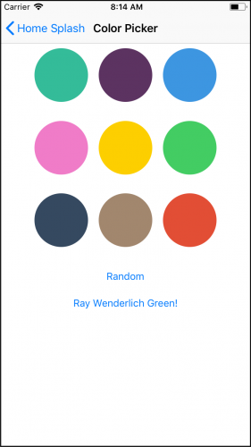
Open Main.storyboard and locate the Color Picker Scene.

Each of the different-colored squares represent the colors that the user can select. Right now, they’re the stock-standard UIKit colors. All of the colors are set in the storyboard, so if you want to play around with the different Flat Colors there, you need to add the Chameleon Storyboard Add-On.
Download the Chameleon Palette, which you can find on Chameleon’s GitHub page. This will allow you to access the Chameleon colors from Interface Builder.
Once downloaded, open it, and then run the Palette Installer.pkg.

You may get a security warning when running the Palette Installer. Read through the warning, and then allow the installation in your Mac’s Security and Privacy settings if you’re happy.

Choose Open Anyway and make your way through the installer.
Once the installation is complete, restart Xcode and open Main.storyboard.
In the Color Picker Scene, click on one of the Color Views and show the Attributes inspector.

Click on the dropdown next to the Background property, and select Other… from the list. You’ll be presented with a color picker.

Click on the Color Palettes tab (third from the left), and you’ll see the Color View’s color selected in the Apple Color Palette. This is the default color palette that you use when using the standard colors such as UIColor.green.
Open the Color Palette dropdown, and you’ll see there are quite a few more palettes from which to choose, including the newly-added Chameleon Color Palette. Select it to see all of the beautiful new crayons you just added to your color arsenal! :]

Select some of your favorite flat colors and apply them to the nine Color Views in the storyboard. Build and run the app, and you’ll see the colors you choose from the palette.
So many new colors at your disposal!
UIKit colors. They’re all declared as extensions on UIColor, with color names starting with flat:
let flatMint = UIColor.flatMint
let flatMintDark = UIColor.flatMintDark
The usual way to generate random colors is to pass random values to UIColor.init(red:green:blue:). Following this approach, it’s common to end up with a collection of colors that don’t fit well together.
With Chameleon, finding the perfect random color is easier because it’s a little less random. :] Take the following, for example:
// A random color from the Flat Color Palette
let randomFlatColor = UIColor.randomFlat

// A random color from the 24 light shades of the Flat Color Palette
let randomLightFlatColor = UIColor(randomFlatColorOf: .light)

// A random color from an array
let myFavoriteColors = [UIColor.red, UIColor.flatGreen, UIColor(white: 0.5, alpha: 1.0)]
let randomColorFromArray = UIColor(randomColorIn: myFavoriteColors)

// A random color from the Flat Color Palette except for those in the array
let reds = [UIColor.flatRed, UIColor.flatRedDark]
let random = UIColor(randomFlatColorExcludingColorsIn: reds)
You can see that most of the methods and properties return a color from the Flat Color Palette. The only exception is UIColor(randomColorIn:), which returns one of the colors passed into it.
Currently, the button titled “Random” in the color picker doesn’t actually do anything. However, with the help of Chameleon, that’s about to change!
Open ColorPickerViewController.swift and import Chameleon at the top of the file, like this:
import ChameleonFramework
Now, locate randomColorTapped(_:), and update the selected color to a random color by adding the following implementation:
let randomColor = UIColor.randomFlat
updateAndPop(color: randomColor)
This generates a random color from Chameleon’s palette. It then passes this color back to the initial view controller.
Build and run the app. Now, tap one of the furniture items to navigate to the color picker. Then, tap on the Random button. Cool! Your imaginary living room is now painted with the creativity of a random color generator. Huzzah!

You may have noticed the button, Ray Wenderlich Green, doesn’t work either. You’ll fix that next — because honestly, who doesn’t want their furniture to be Ray’s favorite shade of green, right? :]
The hex color code for Ray Wenderlich Green is #0B560E. But there’s no need to find a hex-to-RGB converter in order to use the standard UIColor initializer.
Inside ColorPickerViewController, locate rayWenderlichGreenTapped(_:), and add this bit of code:
let rayWenderlichGreen = UIColor(hexString: "0B560E")!
updateAndPop(color: rayWenderlichGreen)
This creates a UIColor straight from the hex string, which is then used to update the selected color.
Build and run the app, and marvel at what your living room will look like after you paint it Ray Wenderlich Green!

Whenever you’re working with more than one color, you want to make sure they work together. Let’s face it, the wrong combination of colors can lead to a UI that’s either too bland or too glaring. Luckily, for less artistic people such as myself, you can make use of color schemes.
A color scheme is a selection of colors that share a particular relationship. Chameleon can generate color schemes of three types:
Analogous colors are those that sit next to each other on a color wheel.
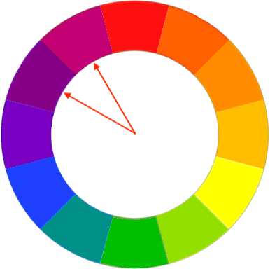
They live close to each other on the light spectrum. They also blend well together.
Complementary colors sit across from each other on a color wheel.

Their contrast makes for a striking UI.
Triadic colors are evenly spaced on a color wheel.

Use them to create a vivid, colorful design.
Open Main.storyboard and find the first view controller. It has a segmented control with the default First, Second, Third segment titles:

Click on the segmented control and select the Attributes inspector. Change the titles for each segment as follows:

Changing button titles is fun and all, but the functionality is unaffected. To change this, open ViewController.swift and start by importing Chameleon.
import ChameleonFramework
Next, add this property beneath selectedColor:
var selectedColorScheme = ColorScheme.analogous {
  didSet {
    paintImages()
  }
}
This defines a color scheme with the initial value of ColorScheme.analogous. Whenever the scheme updates, it calls paintImages().
Now, find the method stub for colorSchemeSelectionChanged(_:), and add the following code to update the selected scheme:
switch sender.selectedSegmentIndex {
case 0:
  selectedColorScheme = .analogous
case 1:
  selectedColorScheme = .complementary
case 2:
  selectedColorScheme = .triadic
default:
  return
}
The switch statement sets the selectedColorScheme based on the selected segment.
Great work! The selected scheme is updated, and now you can use it to paint the images.
paintImages() creates UIImages for the image views and paints them with the selected color. It’s time to change it so that it paints the images with colors from a color scheme. Update paintImages() to the following:
func paintImages() {
  let baseColor = selectedColor

  // 1
  let colorsFromScheme = ColorSchemeOf(selectedColorScheme,
                                       color: baseColor,
                                       isFlatScheme: false)

  // 2
  imageView.image = imagePainter.paint(image: UIImage(named: "sofa"),
                                       color: colorsFromScheme[1])
  imageView2.image = imagePainter.paint(image: UIImage(named: "armchair"),
                                        color: colorsFromScheme[2])
  imageView3.image = imagePainter.paint(image: UIImage(named: "bookshelf"),
                                        color: colorsFromScheme[3])
}
Here’s a closer look at what’s happening:
colorsFromScheme array and use it to paint the image. Index 2 is the selectedColor. You then use it to paint the center image.Build and run the app. Select your favorite color, and take a look at your new interior design abilities! :]

The variety of colors for the living room grew three-fold by introducing schemes. Now you’ll add even more possibilities by adding shades :]
In Main.storyboard, take a look at the Shade Stepper.

Its initial value is 0, and it can range from -100 to 100. It steps in values of 10s. You’ll use this value to shade the selected color by a certain percentage.
In ViewController.swift, find selectedColor, and create a new property below it:
var selectedColorWithShade: UIColor {

// 1
  let shadePercentage = CGFloat(abs(stepperValue / 100))

  if stepperValue >= 0 {
// 2
    return selectedColor.lighten(byPercentage: shadePercentage)!
  } else {
// 3
    return selectedColor.darken(byPercentage: shadePercentage)!
  }
}
Here’s what’s happening:
stepperValue holds the value of the stepper. Use its value to create a CGFloat between 0.0 and 1.0 representing the shade percentage.lighten(byPercentage:) to shade the color lighter.darken(byPercentage:) to shade the color darker.Now, back to paintImages() where all the magic happens. The first line of the method sets the color you’ll use to create the color scheme for the images.
let baseColor = selectedColor
Change this line to use the shaded color as the base color instead:
let baseColor = selectedColorWithShade
Great! Now build and run the app, and play around with the stepper. Now you can design a living room set for even the most pickiest of couch potatoes :]

The color picker has reached its final form! But the app itself is still looking rather dull. Luckily, Chameleon still has a few tricks up its sleeves.
In ViewController.swift find updateAppTheme(), which fires whenever you update selectedColor. Give the method the following implementation:
Chameleon.setGlobalThemeUsingPrimaryColor(selectedColor, with: .contrast)
And before you can say Voilà, you’ve updated the entire app’s theme!
Build and run the app. Now, select a new color, and see how this simple bit of code adds some liveliness to the app.

There are a few problems, though. For instance, the stock-standard UIButtons in the Color Picker don’t look so great with the new theming.
Fortunately, you can fix that with a bit of styling. In ColorPickerViewController.swift, locate styleButtons(). Add the following code to make the buttons a bit more pleasing to the eye:
buttons.forEach {
  $0.layer.cornerRadius = 10
  $0.contentEdgeInsets = UIEdgeInsets(top: 8, left: 8, bottom: 8, right: 8)
}
buttons is an IBOutletCollection that contains the offending Random and Ray Wenderlich Green buttons. styleButtons() rounds the borders of each button and applies an inset to give them some padding. Build and run to see the difference.

There’s another interesting thing to note with the global app theming. Were you wondering what .contrast does in the line of code you added to updateAppTheme()? That’s the UIContentStyle.
It can be one of three values:
UIContentStyle.contrastUIContentStyle.lightUIContentStyle.darkBuild and run the app, and select a dark color from the color picker. Take a look at the text color of the buttons in the color picker:

Now, select a light color.

UIContentStyle.contrast ensures that the text is always readable; you get white text on dark backgrounds, and black text on light backgrounds.
Setting the global app theme gets you most of the way to a snazzy app, but there’s still some work to do! Such as, the navigation bar is still white. It’d look much better if it matched the app’s theme. To do this, inside ViewController.swift you can update its tint color in updateAppTheme() by adding:
navigationController?.navigationBar.barTintColor = selectedColor
Do a build and run. Then select a few different colors.
Uh-oh! The navigation bar still isn’t correct. The title doesn’t update to contrast the bar’s tint color. The status bar also stays the same, making it difficult to read.

Thankfully, Chameleon can fix that too!
To fix this discrepancy between the colors of the back button and navigation title, ensure that the navigation bar title color contrasts the selectedColor. Add the following to the end of updateAppTheme():
let contrastingColor = UIColor(contrastingBlackOrWhiteColorOn:selectedColor,
                               isFlat: true)
navigationController?.navigationBar.titleTextAttributes = [.foregroundColor : contrastingColor]
Great! With that addition, updateAppTheme() should look like this.
func updateAppTheme() {
  Chameleon.setGlobalThemeUsingPrimaryColor(selectedColor, with: .contrast)
  navigationController?.navigationBar.barTintColor = selectedColor
  let contrastingColor = UIColor(contrastingBlackOrWhiteColorOn:selectedColor, isFlat: true)
  navigationController?.navigationBar.titleTextAttributes =
    [.foregroundColor : contrastingColor]
}
It’s time for another build and run. This time, the navigation bar’s text always updates to contrast the background.

Setting the global app theme like you did earlier with setGlobalThemeUsingPrimaryColor(_:with:) will update the status bar as well. So why isn’t it changing?
To fix the status bar, open Info.plist. Hover over Information Property List, and tap the plus button to add a new property. Enter View controller-based status bar appearance as the name, set the type to Boolean and the value to NO.

This is all you need to give Chameleon control over the status bar. Build and run the app, and you should see the navigation bar’s back button, title, and the status bar, all change as you switch colors.

You’ve applied global app theming and you did the extra work to keep the colors compatible with each other. Now, there’s one last change you can do to make the app stand out.
In ViewController.swift, find showColorPicker(_:), and add the following line before calling navigationController?.pushViewController:
colorPicker.view.backgroundColor = selectedColor
This will set the color picker’s background color to the last color you selected. Give it a build run, and take a look.

No, thanks! The selected color blends in with the buttons, the navigation bar, and the other colors. A gradient color would work better here. You can add some life to the empty part of the color picker while keeping the rest of it with a plain, white background.
Remove the line of code that you added to showColorPicker(_:) and replace it with this:
colorPicker.view.backgroundColor = UIColor(gradientStyle: .topToBottom,
                                           withFrame: colorPicker.view.frame,
                                           andColors: [.flatWhite, .flatWhite,
                                                       selectedColor])
This sets the background color to a top-to-bottom gradient. The top two-thirds is Chameleon’s flat white and the bottom one-third is the selected color. You pass colorPicker.view.frame for Chameleon to determine how to break up the different colors in the gradient.
You’re done! Build and run the app, and take a look at your finished product.

As you’ve seen, Chameleon lets you work with colors and theme your app with ease. You can download the completed version of the project using the Download Materials button at the top or bottom of this tutorial.
Don’t forget to take a look at the Chameleon Documentation to stay up-to-date with all the new features.
Do you want to learn more about Color Theory? Building the projects from our iOS Tutorials will help to develop an eye for UI design.
If you have any questions about this tutorial, or about Chameleon and color theory in general, we’d love to hear from you in the discussion forum below!
The post Chameleon on iOS: Getting Started appeared first on Ray Wenderlich.
Update Note: This tutorial is now up to date with the latest version of Android Studio version 3.0.1, and uses Kotlin for app development. Update by Joe Howard. Original tutorial by Odie Edo-Osagie.

How many times have you needed an app to display a group of related items in a list? How about all the time. :]
Displaying a specific list is essential to the function of almost any app that queries a set of data and returns a list of results, so many apps need to do this at one point or another. For instance, maybe you have a chat app that queries a certain social platform’s database to find your friends, and then want to display them in a list that lets you select which friends to connect with.
Any time you need to display a lot of data and make it easy to navigate, you’ve got a job for Android’s ListView, which handily creates scrollable lists.
In recent years, ListView has been supplanted by RecyclerView. Nevertheless, studying ListView still has it’s benefits:
By working through this tutorial, you’ll become familiar with ListView, and you’ll do so by creating a recipe list app. Specifically, you’ll learn:
You’re welcome to up your game in the kitchen by learning the recipes too, but maybe wait until you’ve built the app, okay?
Note: If you’re new to Android Development or Kotlin, it’s highly recommended that you start with Beginning Android Development with Kotlin to learn your way around the basic tools and concepts.
To kick things off, start by downloading the materials for this tutorial (you can find a link at the top or bottom of the page) and open Android Studio 3.0.1 or greater.
In the Welcome to Android Studio dialog, select Open an existing Android Studio project.

In the following dialog, select the top-level directory of the starter project AllTheRecipes-Starter and click OK.

Inside the imported project, you’ll find some assets and resources that you’ll use to create your app, such as strings, colors, XML layout files, and fonts. Additionally, there’s some boilerplate code modeling a Recipe and a bare bones MainActivity class.
Build and run. You should see something like this:

Are you ready to get cracking on this list thing? Awesome!
The first order of business is to add a ListView to MainActivity.
Open res/layout/activity_main.xml. As you may know, this is the file that describes the layout of MainActivity. Add a ListView to MainActivity by inserting the following code snippet inside the ConstraintLayout tag:
<ListView
  android:id="@+id/recipe_list_view"
  android:layout_width="0dp"
  android:layout_height="0dp"
  app:layout_constraintBottom_toBottomOf="parent"
  app:layout_constraintEnd_toEndOf="parent"
  app:layout_constraintStart_toStartOf="parent"
  app:layout_constraintTop_toTopOf="parent" />
Open MainActivity and add an instance variable for your ListView with the following line:
private lateinit var listView ListView
Add the following snippet below the existing code inside the onCreate method:
listView = findViewById<ListView>(R.id.recipe_list_view)
// 1
val recipeList = Recipe.getRecipesFromFile("recipes.json", this)
// 2
val listItems = arrayOfNulls<String>(recipeList.size)
// 3
for (i in 0 until recipeList.size) {
  val recipe = recipeList[i]
  listItems[i] = recipe.title
}
// 4
val adapter = ArrayAdapter(this, android.R.layout.simple_list_item_1, listItems)
listView.adapter = adapter
Here’s a breakdown of what’s happening in there:
Recipe objects from a JSON asset in the app. Notice that the starter project contains a Recipe class that models and stores the information about the recipes that will be displayed. ArrayAdapter takes in the current context, a layout file specifying what each row in the list should look like, and the data that will populate the list as arguments.Enough talk! Your ListView has all that it needs to function. Build and run the project. You should see something like this:

Your recipe app is starting to look functional, but not all that appetizing…yet.
In the previous section, you successfully built a list of recipe titles. It works, but it’s nothing to get excited about. What if you needed to show more than just the titles? More than just text? Maybe even add some screen-licking worthy thumbnails?
For these cases, the simple ArrayAdapter you just used won’t cut it. You’ll have to take matters into your own hands and write your own adapter. Well, you won’t actually write your own adapter, per se; you’ll simply extend a regular adapter and make some tweaks.
An adapter loads the information to be displayed from a data source, such as an array or database query, and creates a view for each item. Then it inserts the views into the ListView.
Adapters not only exist for ListViews, but for other kinds of views as well; ListView is a subclass of AdapterView, so you can populate it by binding it to an adapter.
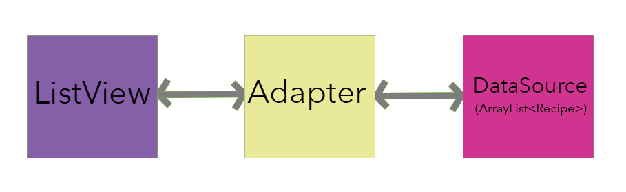
The adapter acts as the middle man between the ListView and data source, or its provider. It works kind of like this:
The ListView asks the adapter what it should display, and the adapter jumps into action:
In short, The ListView isn’t very smart, but when given the right inputs it does a fine job. It fully relies on the adapter to tell it what to display and how to display it.
Okay, now that you’ve dabbled in theory, you can get on with building your very own adapter.
Create a new class by right-clicking on the com.raywenderlich.alltherecipes package and selecting New > Kotlin File/Class. Name it RecipeAdapter and define it with the following:
class RecipeAdapter : BaseAdapter() {
}
You’ve made the skeleton of the adapter. It extends the BaseAdapter class, which requires several inherited methods you’ll implement after taking care of one more detail.
Update the RecipeAdapter class as follows:
class RecipeAdapter(private val context: Context,
                    private val dataSource: ArrayList<Recipe>) : BaseAdapter() {

  private val inflater: LayoutInflater
      = context.getSystemService(Context.LAYOUT_INFLATER_SERVICE) as LayoutInflater
}
In here, you’ve added the properties that will be associated with the adapter and defined a primary constructor for RecipeAdapter.
Your next step is to implement the adapter methods. Kick it off by placing the following code at the bottom of RecipeAdapter:
//1
override fun getCount(): Int {
  return dataSource.size
}

//2
override fun getItem(position: Int): Any {
  return dataSource[position]
}

//3
override fun getItemId(position: Int): Long {
  return position.toLong()
}

//4
override fun getView(position: Int, convertView: View?, parent: ViewGroup): View {
  // Get view for row item
  val rowView = inflater.inflate(R.layout.list_item_recipe, parent, false)

  return rowView
}
Here’s a step-by-step breakdown:
getCount() lets ListView know how many items to display, or in other words, it returns the size of your data source.getItem() returns an item to be placed in a given position from the data source, specifically, Recipe objects obtained from dataSource.getItemId() method that defines a unique ID for each row in the list. For simplicity, you just use the position of the item as its ID. getView() creates a view to be used as a row in the list. Here you define what information shows and where it sits within the ListView. You also inflate a custom view from the XML layout defined in res/layout/list_item_recipe.xml — more on this in the next section.You probably noticed that the starter project comes with the file res/layout/list_item_recipe.xml that describes how each row in the ListView should look and be laid out.
Below is an image that shows the layout of the row view and its elements:

Your task is to populate each element of the row view with the relevant recipe data, hence, you’ll define what text goes in the “title” element, the “subtitle” element and so on.
In the getView() method, add the following code snippet just before the return statement:
// Get title element
val titleTextView = rowView.findViewById(R.id.recipe_list_title) as TextView

// Get subtitle element
val subtitleTextView = rowView.findViewById(R.id.recipe_list_subtitle) as TextView

// Get detail element
val detailTextView = rowView.findViewById(R.id.recipe_list_detail) as TextView

// Get thumbnail element
val thumbnailImageView = rowView.findViewById(R.id.recipe_list_thumbnail) as ImageView
This obtains references to each of the elements (or subviews) of the row view, specifically the title, subtitle, detail and thumbnail.
Now that you’ve got the references sorted out, you need to populate each element with relevant data. To do this, add the following code snippet under the previous one but before the return statement:
// 1
val recipe = getItem(position) as Recipe

// 2
titleTextView.text = recipe.title
subtitleTextView.text = recipe.description
detailTextView.text = recipe.label

// 3
Picasso.with(context).load(recipe.imageUrl).placeholder(R.mipmap.ic_launcher).into(thumbnailImageView)
Here’s what you’re doing in the above snippet:
ImageView to handle slow loading of images.Now open up MainActivity so that you can get rid of the old adapter. In onCreate, replace everything below (but not including) this line:
val recipeList = Recipe.getRecipesFromFile("recipes.json", this)
With:
val adapter = RecipeAdapter(this, recipeList)
listView.adapter = adapter
You just replaced the rather simple ArrayAdapter with your own RecipeAdapter to make the list more informative.
Build and run and you should see something like this:

Now you’re cooking for real! Look at those recipes — thumbnails and descriptions sure make a big difference.
Now that you’ve got the functionality under wraps, it’s time to turn your attention to the finer things in life. In this case, your finer things are elements that make your app more snazzy, such as compelling colors and fancy fonts.
Start with the fonts. Look for some custom fonts under res/font. You’ll find three font files: josefinsans_bold.ttf, josefinsans_semibolditalic.ttf and quicksand_bold.otf.
Open RecipeAdapter.java and go to the getView() method. Just before the return statement, add the following:
val titleTypeFace = ResourcesCompat.getFont(context, R.font.josefinsans_bold)
titleTextView.typeface = titleTypeFace

val subtitleTypeFace = ResourcesCompat.getFont(context, R.font.josefinsans_semibolditalic)
subtitleTextView.typeface = subtitleTypeFace

val detailTypeFace = ResourcesCompat.getFont(context, R.font.quicksand_bold)
detailTextView.typeface = detailTypeFace
In here, you’re assigning a custom font to each of the text views in your rows’ layout. You access the font by creating a Typeface, which specifies the intrinsic style and typeface of the font, by using ResourcesCompat.getFont(). Next you set the typeface for the corresponding TextView to set the custom font.
Now build and run. Your result should look like this:

On to sprucing up the colors, which are defined in res/values/colors.xml. Open up RecipeAdapter and add the following below the inflater declaration:
companion object {
  private val LABEL_COLORS = hashMapOf(
      "Low-Carb" to R.color.colorLowCarb,
      "Low-Fat" to R.color.colorLowFat,
      "Low-Sodium" to R.color.colorLowSodium,
      "Medium-Carb" to R.color.colorMediumCarb,
      "Vegetarian" to R.color.colorVegetarian,
      "Balanced" to R.color.colorBalanced
  )
}
You’ve created a hash map that pairs a recipe detail label with the resource id of a color defined in colors.xml.
Now go to the getView() method, and add this line just above the return statement:
detailTextView.setTextColor(
    ContextCompat.getColor(context, LABEL_COLORS[recipe.label] ?: R.color.colorPrimary))
Working from the inside out:
recipe.label from the LABEL_COLORS hash map. getColor() is used inside of ContextCompat to retrieve the hex color associated with that resource id. detailTextView to the hex color. Build and run. Your app should look like this:

Now your list has function and style. What’s it missing now? Try tapping or long pressing it. There’s not much to thrill and delight the user.
What could you add here to make the user experience that much more satisfying? Well, when a user taps on a row, don’t you think it’d be nice to show the full recipe, complete with instructions?
You’ll make use of AdapterView.onItemClickListener and a brand spanking new activity to do this with elegance.
This activity will display when the user selects an item in the list.
Right-click on com.raywenderlich.alltherecipes then select New > Activity > EmptyActivity to bring up a dialog. Fill in the Activity Name with RecipeDetailActivity. Leave the automatically populated fields as-is. Check that your settings match these:

Click Finish.
Open res/layout/activity_recipe_detail.xml and add a WebView by inserting the following snippet inside the ConstraintLayout tag:
<WebView
  android:id="@+id/detail_web_view"
  android:layout_width="0dp"
  android:layout_height="0dp"
  app:layout_constraintBottom_toBottomOf="parent"
  app:layout_constraintEnd_toEndOf="parent"
  app:layout_constraintStart_toStartOf="parent"
  app:layout_constraintTop_toTopOf="parent" />
WebView will be used to load and display a webpage containing the selected recipe’s instructions.
Open up RecipeDetailActivity, and add a WebView reference as a property by adding the following line within the class definition:
private lateinit var webView: WebView
Add the following below the webView property declaration:
companion object {
  const val EXTRA_TITLE = "title"
  const val EXTRA_URL = "url"

  fun newIntent(context: Context, recipe: Recipe): Intent {
    val detailIntent = Intent(context, RecipeDetailActivity::class.java)

    detailIntent.putExtra(EXTRA_TITLE, recipe.title)
    detailIntent.putExtra(EXTRA_URL, recipe.instructionUrl)

    return detailIntent
  }
}
This adds a companion object method to return an Intent for starting the detail activity, and sets up title and url extras in the Intent.
Head back to MainActivity and add the following to the bottom of the onCreate method:
val context = this
listView.setOnItemClickListener { _, _, position, _ ->
  // 1
  val selectedRecipe = recipeList[position]

  // 2
  val detailIntent = RecipeDetailActivity.newIntent(context, selectedRecipe)

  // 3
  startActivity(detailIntent)
}
Note: Before you dive into the explanation, make sure you understand the four arguments that are provided by onItemClick; they work as follows:
You’re setting the OnItemClickListener object for the ListView, and inside doing the following:
RecipeDetailActivity to display more informationRecipeDetailActivity by passing the intent object you just created to the startActivity() method.Once again, open RecipeDetailActivity and add the following snippet at the bottom of the onCreate method:
// 1
val title = intent.extras.getString(EXTRA_TITLE)
val url = intent.extras.getString(EXTRA_URL)

// 2
setTitle(title)

// 3
webView = findViewById(R.id.detail_web_view)

// 4
webView.loadUrl(url)
You can see a few things happening here:
Intent passed from MainActivity by using the extras property.webView to the web view defined in the XML layout.loadUrl() with the corresponding recipe’s URL on the web view object.Build and run. When you click on the first item in the list, you should see something like this:

Whenever you scroll the ListView, its adapter’s getView() method is called in order to create a row and display it on screen.
Now, if you look in your getView() method, you’ll notice that each time this method is called, it performs a lookup for each of the row view’s elements by using a call to the findViewById() method.
These repeated calls can seriously harm the ListView’s performance, especially if your app is running on limited resources and/or you have a very large list. You can avoid this problem by using the View Holder Pattern.
To implement the ViewHolder pattern, open RecipeAdapter and add the following after the getView() method definition:
private class ViewHolder {
  lateinit var titleTextView: TextView
  lateinit var subtitleTextView: TextView
  lateinit var detailTextView: TextView
  lateinit var thumbnailImageView: ImageView
}
As you can see, you create a class to hold your exact set of component views for each row view. The ViewHolder class stores each of the row’s subviews, and in turn is stored inside the tag field of the layout.
This means you can immediately access the row’s subviews without the need to look them up repeatedly.
Now, in getView(), replace everything above (but NOT including) this line:
val recipe = getItem(position) as Recipe
With:
val view: View
val holder: ViewHolder

// 1
if (convertView == null) {

  // 2
  view = inflater.inflate(R.layout.list_item_recipe, parent, false)

  // 3
  holder = ViewHolder()
  holder.thumbnailImageView = view.findViewById(R.id.recipe_list_thumbnail) as ImageView
  holder.titleTextView = view.findViewById(R.id.recipe_list_title) as TextView
  holder.subtitleTextView = view.findViewById(R.id.recipe_list_subtitle) as TextView
  holder.detailTextView = view.findViewById(R.id.recipe_list_detail) as TextView

  // 4
  view.tag = holder
} else {
  // 5
  view = convertView
  holder = convertView.tag as ViewHolder
}

// 6
val titleTextView = holder.titleTextView
val subtitleTextView = holder.subtitleTextView
val detailTextView = holder.detailTextView
val thumbnailImageView = holder.thumbnailImageView
Here’s the play-by-play of what’s happening above.
findViewById() again.ViewHolder with subviews initialized by using findViewById().setTag() to set the tag property of the view that the holder belongs to.Finally, update the return statement of getView() with the line below.
return view
Build and run. If your app was running a bit slow on the last build, you should see it running smoother now. :]
You can download the completed project using the download button at the top or bottom of this tutorial.
When you develop for Android, AdapterViews are a common concept that you’ll run into over and over again.
If you want to know more about the inner workings of the ListView and performance details, check out this article on performance tips for Android ListViews.
There are other ways to create lists, such as subclassing a ListActivity and ListFragment. Both of these links take you to the official Android developer site so that you can learn more about how they work.
Both of these alternatives impose the restriction that the respective activity or fragment can only contain a ListView as its child view. Suppose you wanted an activity that had a ListView as well as some other views, it would be impossible with a ListActivity. The same goes for the ListFragment scenario.
And be sure to check out our RecyclerView and Intermediate RecyclerView tutorials to see the more modern way to show lists on Android. Unlike ListView, RecyclerView enforces the use of the ViewHolder pattern and is much more flexible in terms of layout and animation.
Feel free to share your feedback, findings or ask any questions in the comments below or in the forums. Talk to you soon!
The post Android ListView Tutorial with Kotlin appeared first on Ray Wenderlich.
In this video you will learn how to create models using Fluent, and how to configure your databases.
The post Video Tutorial: Server Side Swift with Vapor Part 2: Models And Fluent appeared first on Ray Wenderlich.
Learn how to create controllers to organize routes and how to save and retrieve models using Fluent.
The post Video Tutorial: Server Side Swift with Vapor Part 2: Controllers and CRUD appeared first on Ray Wenderlich.

Now that the year has begun, everyone has been hard at work on some cool new apps. Let’s check them out!
I’m honored you are taking a quick break to see what the community has been building. Every month, readers like you release great apps built with a little help from our tutorials, books, and videos.
Today, I’d like to highlight a few to give just a peek at what our fantastic readers are creating.
This month we have:
Keep reading to see the latest apps released by raywenderlich.com readers just like you.

If you are ever at a restaurant and have a hard time figuring out how much you should tip your server, Tip My Bill is here to lend you a hand.
Tip My Bill is an app that is designed to help you figure out how much you should tip. All you have to do is put in the amount you spent on food, drinks, and tax. Then, select what percentage tip you want to give and Tip My Bill will tell you how much to tip as well as what your total will be after tipping.
This is a quick and easy way to figure out your tip. Download Tip My Bill and be ready for the next time you go out to eat!

If you love brick breaker game as much as I do, then you will really enjoy Break the Bricks.
Break the Bricks is a block breaker game where you have to bounce a ball off of a platform so that it can travel up and break the line of bricks above you. This is a classic game, but Break the Bricks is filled with fun power-ups such as extra balls, speed increases, platform width increases, and many more.
I had a lot of fun playing Break the Bricks and I am sure you will too. Download it and give it a try!

Are you a fan of clocker games like Clicker Hero or Cookie Clicker, but think that they could use a little extra? Coiny Block thought so too, so they added a twist!
Coiny Block is similar to other clicker games except that there are obstacles that you must avoid while you are clicking.
This mechanic completely changes how enjoyable and engaging games like this are. Instead of just mindlessly clicking the same spot multiple times until you level up, you must pay attention to the objects on screen and dodge them while you are clicking. Otherwise, you will lose your lives and all that clicking will be for nothing!
Coiny Block is a simple game, but it is very fun! Download it and try it out!

Side scrollers have been a staple in video games since their beginnings, but Bouncy Ball NG helps to spice up the genre a bit more by adding one new mechanic.
In Bouncy Ball NG you control a ball that must move through a multitude of levels and collect green bricks. After you collect enough, a blue brick will appear somewhere in the level that will allow you to exit.
The difference between this and other games, however, is that your ball is constantly moving up and down and you must time the left and right motions correctly in order to move through the level. This is a very fun concept and a great take on a classic genre.
Download Bouncy Ball and play it for a few minutes, hours, weeks, its great!

Do you work on your own schedule or would like to schedule yourself in a more efficient way? Well, Work Hours Agent is here to help.
Work Hours Agent allows you to start and stop your work hour times. You can also pause and play the timer in the case of any breaks or disruptions you might experience during your work time. Then, after your work day is over if logs your times and keeps track of them. You can even print your times out in a PDF format if you need to.
Work Hours Agent is a great app for keeping up with your work times and might even help you win your overtime claims! Download it and try it out on your next work cycle.

If you have trouble keeping all of your tasks in order and making sure you have everything done for the day, then Orson Remind Me might be just what you need in order to fix this issue.
Orson Remind Me is a reminder app that gives you a new cat assistant named Orson! Orson will help to remind you of things you need to do in three different ways. The first is a little nudge, the second is a normal reminder, and the third will pester you multiple times to make sure that you do the task. Also, there is an achievement system that you can get rewards from for completing tasks on time.
Orson Remind Me is a simple and fun way to make sure that you are getting everything done! If you need more organization, download it and let Orson be your guide.

Crossword puzzles are always a fantastic way to pass time, have fun, and keep your brain engaged. Tiny Crossword Blitz is here to supply you with many great crossword puzzles to complete.
Tiny Crossword Blitz is a crossword puzzle app that is really easy to use. Just select your game type and drag in the letters from the bottom of the screen into the spot where you think they need to go. There are some handy buttons at the bottom for undoing a previous move, clearing the entire board, and giving you a hint if you are stuck.
Tiny Crossword Blitz has over three hundred levels for you to complete! So, you should download it and get started!
Each month, I really enjoy seeing what our community of readers comes up with. The apps you build are the reason we keep writing tutorials. Make sure you tell me about your next one, submit here.
If you saw an app you liked, hop to the App Store and leave a review! A good review always makes a dev’s day. And make sure you tell them you’re from raywenderlich.com; this is a community of makers.
If you’ve never made an app, this is the month! Check out our free tutorials to become an iOS star. What are you waiting for – I want to see your app next month.
The post Readers’ App Reviews – February 2018 appeared first on Ray Wenderlich.
Learn how to retrieve individual models in Fluent using parameters and learn how to update and delete models using Fluent.
The post Video Tutorial: Server Side Swift with Vapor Part 2: Finishing CRUD appeared first on Ray Wenderlich.
Now it's time to put all of your new knowledge to the test and create your own models and controllers.
The post Video Tutorial: Server Side Swift with Vapor Part 2: Challenge: Users And Categories appeared first on Ray Wenderlich.