Quantcast
Channel: Kodeco | High quality programming tutorials: iOS, Android, Swift, Kotlin, Unity, and more
Viewing all 4396 articles
Browse latest View live

AWS Pinpoint Tutorial for iOS: Getting Started

$
0
0

AWS Pinpoint Tutorial for iOS: Getting Started

Most developers will agree that mobile app analytics information can be invaluable. Knowing how long a user stays on a screen, which UI/UX experiments work best, or what users like to spend money on can help you make more informed decisions to improve your apps. If you’re not using an analytics tool or find your current tool lacking, you should consider introducing analytics into your development practices as soon as possible.

Amazon’s previously separate AWS mobile analytics tool has since been rolled into Amazon Pinpoint. This tutorial will help you get started with AWS Pinpoint app analytics for iOS.

If you’re curious about the general ins and outs of mobile analytics, you can read through the precursor to this tutorial here to get caught up: Getting Started with Mobile Analytics

You’ll need to have an AWS account for this tutorial. If you don’t have one yet, you can get started with an AWS account here; simply look for the Create A Free Account link.

AWS Pinpoint Tutorial

You will also need a credit card to set up your account as a safeguard. You will not get charged as long as you are within the free daily allotment of 100,000,000 analytics events.

Getting Started

Use the Download Materials button at the top or bottom of this tutorial to download the starter project.

This project builds upon the Beer Tracker app from a previous tutorial. The app lets users keep track of and rate their favorite beers. For this tutorial, you’ll add analytics to understand what users are actually doing when they are using your app.

Setting Up the AWS Account

Your first task is to cloud-enable your app so it can interact with AWS services. Once you have an active AWS account, head to the AWS Console.

Click on the Services dropdown. Then click on the Mobile Hub service. You’ll arrive at the following page:

Follow the steps below to cloud-enable your Beer Tracker app with AWS Mobile Hub service:

  1. Click Create. Set Your Project Name to Beer Tracker. Tick the Allow AWS Mobile Hub to administer resources on my behalf box. Click Next.
  2. Select iOS as the platform and then click Add. This will add AWS cloud services to your app.
  3. Click Download Cloud Config. You’ll use this cloud configuration file in your Xcode project. Then click Next.
  4. The starter project has integrated the AWS Mobile SDK for you. Simply click Done.

Once you have cloud-enabled your app, you should now see a screen that looks like this:

Integrating Pinpoint in Xcode

Open the starter project by selecting BeerTracker.xcworkspace. The app uses CocoaPods and has integrated the Pinpoint SDK into your project. Build and run the app, and take a look around.

Note: If you have any build issues, you may need to reinstall the pods. Navigate to your project’s directory in Terminal, and run pod install. You can learn more about getting started with CocoaPods here.

The Beer Tracker app allows users to record the following details about the beer they consume:

  • Name
  • Rating
  • Photo
  • Any notes about it

While this seems fairly straightforward, it may be unclear to you how much users actually interact with each of these features. Is it worthwhile to keep investing in your current UI? Would it make sense to give your app a new look and feel? Adding analytics may help you answer these questions, and more.

First, you’ll need to add the awsconfiguration.json file you downloaded earlier to the project. Drag the file to the Supporting Files group. Ensure that Copy items if needed and Add to targets are both selected. Click Finish. You should be able to see the file in the Supporting Files group:

This file contains all the information needed for the Pinpoint SDK to properly set up its connection to AWS. Open awsconfiguration.json and you’ll see information about the region, the Cognito PoolId, and the AppId used for your app.

Open AnalyticsManager.swift and you’ll see some existing code. Add the following method to AnalyticsManager:

func setupClient(withLaunchOptions launchOptions: [UIApplicationLaunchOptionsKey: Any]?) {
  pinpoint = AWSPinpoint(configuration:
    AWSPinpointConfiguration.defaultPinpointConfiguration(launchOptions: launchOptions))
}

Simply, this code sets up the pinpoint property to be used throughout the app.

Next, open AppDelegate.swift, and add the following right after the existing import:

import AWSPinpoint

Now replace application(_:didFinishLaunchingWithOptions:) with the following:

func application(_ application: UIApplication,
                 didFinishLaunchingWithOptions launchOptions: [UIApplicationLaunchOptionsKey: Any]?) -> Bool {
  // 1
  AWSDDLog.sharedInstance.logLevel = .verbose
  // 2
  AWSDDLog.add(AWSDDTTYLogger.sharedInstance)
  // 3
  AnalyticsManager.shared.setupClient(withLaunchOptions: launchOptions)
  return true
}

Here’s what you’ve added:

  1. You turned on the logging feature of the AWS SDK platform. By setting the log level to .verbose, you’ll see every log statement that is produced by Pinpoint or any other AWS services available.
  2. You set the AWSDDLog to print to your Xcode console. You’ll see this in action soon.
  3. You set up the AnalyticsManager using the code you added previously.

Build and run the app, open the debug area, and you should see the following in the console:

With that, you’re all set up to use the Pinpoint SDK.

Pinpoint Analytics Events

Pinpoint can track several different types of analytics events to help you understand what’s going on in your app:

  • Custom events
  • Monetization events
  • Authentication events
  • Session events

You’ll focus only on the first two types — Custom and Monetization events — in this tutorial. However, if you look into the documentation of the other two events, you’ll see that they aren’t too different from the ones covered here.

Adding Custom Events

The first thing you’ll track is the number of people adding a beer record in your app. To do this, you’ll need to create a custom event.

First, open AnalyticsManager.swift, and add the following method to AnalyticsManager:

func create(event: String) {
  guard let pinpoint = pinpoint else { return }
  // 1
  let event = pinpoint.analyticsClient.createEvent(withEventType: event)
  // 2
  pinpoint.analyticsClient.record(event)
}

Here’s what you’ve added:

  1. You’ve created an event with the provided event type. This is all you need to do to create a custom event.
  2. Here, you’ve recorded the event. Take notice that you haven’t actually uploaded the event to Pinpoint, just saved it for later. Pinpoint will save these events, even if the app is closed, to be uploaded later.

Open BeerDetailViewController.swift, and add the following to the end of viewDidLoad():

AnalyticsManager.shared.create(event: Event.visitedBeerDetailViewController)

Here, you call create(event:) with the Visited BeerDetailViewController event type.

Build and run. Before you navigate anywhere in the app, clear the console by clicking on the Trash icon in the lower right of the console. In the app, tap on the + button in the upper-right corner. Check the console, and you’ll see that a saveEvent log is added along with its event type.

Uploading and Analyzing Events

This data doesn’t do a lot of good just sitting on the user’s device. You need a way to time and upload that information to Pinpoint. You could upload each and every event when it occurs, but this would cause performance issues along with unnecessary network overhead. Events aren’t only stored in memory but are serialized and saved for future use as well. This means you can upload the events in batches.

Open AnalyticsManager.swift, and add the following method to AnalyticsManager:

func uploadEvents() {
  guard let pinpoint = pinpoint else { return }
  pinpoint.analyticsClient.submitEvents()
}

By calling submitEvents(), you’ve done all that’s required to submit any events awaiting upload.

Now, open BeerDetailViewController.swift. At the end of viewWillDisappear(_:), add the following:

AnalyticsManager.shared.uploadEvents()

Build and run. Be sure to clear the console before doing anything in the app. Once cleared, create a new beer, and go back to the main list. In the console, you should see something like the following:

If you go through the debug log, you’ll start to notice a lot of familiar-looking information. You’ll see your event name, and a lot of other available data. The last two lines in the console are important.

Assuming you have a working internet connection, the last line tells you the number of uploaded events, along with a response code of 202, which simply means Accepted. Since AWS requires some time to process the data that is sent, the 202 response lets you know that the data was properly received.

To see the uploaded events, head to the Pinpoint console. Open your app and select Analytics/Events. If you don’t see anything, don’t worry; AWS can take a few minutes to process the received data. Refresh every minute or so, until you see your processed data:

Select the Event dropdown, and you’ll see an option for Visited BeerDetailViewController. This is a custom event type that you’re tracking right now, but you’ll want to add more custom events in order to better understand your user’s behavior.

Adding More Custom Events

In BeerDetailViewController.swift, add the following to saveBeer(), right after the guard statement:

if detailBeer.name != name {
  AnalyticsManager.shared.create(event: Event.editedName)
}
if detailBeer.rating != ratingView.rating {
  AnalyticsManager.shared.create(event: Event.editedRating)
}
if detailBeer.note != notesView.text {
  AnalyticsManager.shared.create(event: Event.editedNotes)
}

In imagePickerController(_:didFinishPickingMediaWithInfo:), add the following at the end of the method:

AnalyticsManager.shared.create(event: Event.editedImage)

Here you’ve added events to be recorded in case the user changes any info on the beer object. With this information, you might be able to figure out what users find most valuable, or how often they make mistakes while using your app.

Adding Monetization Events

Another great feature of Pinpoint is the ability to look at a simple dashboard and see the amount of money your app is bringing in. Whether it’s through Apple’s in-app purchases or your own e-commerce platform, Pinpoint can take care of reporting the numbers for you.

On the initial screen of the app, you should see a Send Tip button in the top left corner of the screen. This is the app’s pseudo “in-app purchase” button.

Pressing the button only results in printing a log that says “Fake in-app purchase”. To begin logging your revenue, open AnalyticsManager.swift and add the following method:

func createMonetizationEvent(productId: String, price: Double, currency: String, quantity: Int) {
  guard let pinpoint = pinpoint else { return }
  let event = pinpoint.analyticsClient.createVirtualMonetizationEvent(withProductId: productId,
                                                                      withItemPrice: price,
                                                                      withQuantity: quantity,
                                                                      withCurrency: currency)
  pinpoint.analyticsClient.record(event)
  uploadEvents()
}

Here you’ve created a Virtual Monetization Event. The event takes in the following information:

  • Product ID: The unique identifier for your individual product.
  • Price: The price the user paid.
  • Quantity: The number of items purchased.
  • Currency: The currency that the user paid with.

Now open BeersTableViewController.swift, and replace sendTip(_:) with the following:

@IBAction func sendTip(_ sender: Any) {
  // Mock In-App Purchase
  AnalyticsManager.shared.createMonetizationEvent(productId: "Send Tip",
                                                  price: 0.99,
                                                  currency: "US",
                                                  quantity: 1)
}

This method creates a virtual purchase event with hardcoded values.

Build and run. Tap the Send Tip button a few times.

Navigate to your Pinpoint analytics dashboard, and head to Revenue tab. Remember, it can take a few minutes to see the results. When everything is processed, you should be able to see new revenue data like below:

For reference, Amazon does provide an easy method to track actual in-app purchases. Here is an example of a method that you can implement inside of AnalyticsManager.swift that would do just that:

func createInAppPurchaseEvent(transaction: SKPaymentTransaction, product: SKProduct) {
  guard let pinpoint = pinpoint else { return }
  let event = pinpoint.analyticsClient.createAppleMonetizationEvent(with: transaction, with: product)
  pinpoint.analyticsClient.record(event)
  uploadEvents()
}

Instead of having to provide all of the individual values, the SDK takes care of pulling out the proper in-app purchase data for you.

Adding Attributes and Metrics to Events

At times, you’ll probably want to provide more data for a custom event than just its name. Luckily with the Pinpoint SDK, you can add attributes and metrics onto an Event object.

Open AnalyticsManager.swift, delete create(event:), and add the following method:

func create(event: String, attributes: [String: String]? = nil, metrics: [String: NSNumber]? = nil) {
  guard let pinpoint = pinpoint else { return }
  
  let event = pinpoint.analyticsClient.createEvent(withEventType: event)
  
  // 1
  if let eventAttributes = attributes {
    for (key, attributeValue) in eventAttributes {
      event.addAttribute(attributeValue, forKey: key)
    }
  }
  
  // 2
  if let eventMetrics = metrics {
    for (key, metricValue) in eventMetrics {
      event.addMetric(metricValue, forKey: key)
    }
  }
  pinpoint.analyticsClient.record(event)
}

This new method does nearly the same thing as create(event:), but also adds the attributes and metrics. When creating events, it’s best to think of them as generic actions performed by a user. Attributes and metrics are the data that fine-tune the information about a specific event:

  1. Attributes: These are string values that can represent things such as titles of buttons pressed, or values entered into text fields.
  2. Metrics: These are number values that can represent things such as time taken to complete a task, the number of times a button was pressed, or any other quantitative value associated with your event.

When deciding on which events to track in your app, you’ll want to come up with a game plan. It’s not a good idea to create dynamic event names that contain information that would be better represented as an attribute or a metric. For example, if you want to know how long a user is spending on a particular screen, you wouldn’t want to add the time to the event title, like this:

DetailViewController Time Spent: 1 minute 27 seconds

If you did this, you’d find hundreds or even thousands of events in Pinpoint. The data would be next to impossible to sift through.

To see attributes and metrics in action, open BeerDetailViewController.swift, and add the following property:

var startTime: Date?

Next, in viewDidLoad(), add the following just after the call to super.viewDidLoad():

startTime = Date()

Here you have a property that is tracking the moment the screen is loaded. You’ll use this as a way to see how long the user is on the screen.

Next, replace viewWillDisappear(_:) with the following:

override func viewWillDisappear(_ animated: Bool) {
  super.viewWillDisappear(animated)
  if let startTime = startTime {
    // 1
    let endTime = Date()
    // 2
    let interval = NSNumber(value: endTime.timeIntervalSince(startTime))
    // 3
    AnalyticsManager.shared.create(event: Event.timeSpent, metrics: ["timeSpent": interval])
  }
  AnalyticsManager.shared.uploadEvents()
  saveBeer()
}

Here’s a breakdown of what you’ve added:

  1. Create an end date to compare against the start date.
  2. Gathere the time interval between the two dates.
  3. Create a new event, with a metrics dictionary, that contains the time interval.

Next, in saveBeer(), modify the following event creation:

AnalyticsManager.shared.create(event: Event.editedName)

…to this:

AnalyticsManager.shared.create(event: Event.editedName,
                               attributes: ["New Beer Name": name, "Old Beer Name": detailBeer.name])

Build and run, create a few beer records, and go back to edit their names.

Now you’ll be able to see what has changed once the users edit the names of their drinks. While it may not necessarily tell you “why”, it does provide you an insight into “what” is happening in your app. For example, did you leave Correction on for your text field? If so, and the user didn’t catch it, maybe the app improperly corrected the name of a foreign beer and the user had to spend time fixing it. In a situation like this, you’d have to analyze the data yourself to determine that.

Unfortunately, this data isn’t as easily accessible as plain event names. This is where Pinpoint’s simplicity ends. There are two ways you can view this information within AWS. The first is to set up a Kinesis Stream and roll out your own application. While this sounds fun, this would require more knowledge of the AWS platform than is available in this tutorial.

The second option is to view the Mobile Analytics console still available in AWS, which makes things quite easy.

Navigate back to your AWS console. Search for and click on Mobile Analytics under the Services dropdown. Once there, navigate to the Custom Events tab. You can then select Time Spent Editing Beer under Custom Event Name. Under Attributes and Metrics, select Metrics/timeSpent. You should now see a chart similar to the one below:

While you cannot see all the information found in Pinpoint, and there is some overlap of data, you can see all the information related to your custom events here.

Where to Go From Here?

You can download the completed version of the project using the Download Materials button at the top or bottom of this tutorial.

In this tutorial, you learned how to:

  • Set up an AWS account
  • Cloud enable an iOS App for AWS Mobile Hub
  • Integrate the Pinpoint SDK in Xcode
  • Send custom events
  • Send monetization events
  • View uploaded events within Pinpoint and AWS Mobile Analytics

If you have more questions about Pinpoint, you can read the Pinpoint documentation here.

If you have any questions or comments, please join in the forum discussion below!

The post AWS Pinpoint Tutorial for iOS: Getting Started appeared first on Ray Wenderlich.


Video Tutorial: Server Side Swift with Vapor Part 2: Parent-Child Relationships

GameplayKit and Localisation – Podcast S07 E11

$
0
0

In this episode Independent Creative Professional Tammy Coron returns with Dru and Janie to dive into GameplayKit and then Dru talks about the importance and tricks of localising your apps.

[Subscribe in iTunes] [RSS Feed]

This episode was sponsored by Rollbar.

Interested in sponsoring a podcast episode? We sell ads via Syndicate Ads, check it out!

Episode Links

GameplayKit

Localisation

Contact Us

Where To Go From Here?

We hope you enjoyed this episode of our podcast. Be sure to subscribe in iTunes to get notified when the next episode comes out.

We’d love to hear what you think about the podcast, and any suggestions on what you’d like to hear in future episodes. Feel free to drop a comment here, or email us anytime at podcast@raywenderlich.com.

The post GameplayKit and Localisation – Podcast S07 E11 appeared first on Ray Wenderlich.

Unreal Engine 4 Cel Shading Tutorial

$
0
0

Unreal Engine 4 Cel Shading Tutorial

Developing realistic-looking games is Unreal Engine 4 is easy due to physically based rendering. This model approximates how light interacts with materials, resulting in realistic images. However, if you want to develop a game with a stylized look, you need to explore other techniques.

One of the ways to achieve a stylized look is to use cel shading (also known as toon shading). This technique mimics the shading typically used in cartoons and anime. You can see examples of this in games such as Jet Set Radio, The Legend of Zelda: The Wind Waker and Gravity Rush.

In this tutorial, you will learn how to:

  • Create and use a post process material
  • Create a cel shader
  • Isolate the cel shader to specific meshes
  • Control the color bands using lookup tables
Note: This tutorial assumes you already know the basics of using Unreal Engine. If you are new to Unreal Engine, you should go through our 10-part Unreal Engine for Beginners tutorial series first.

Getting Started

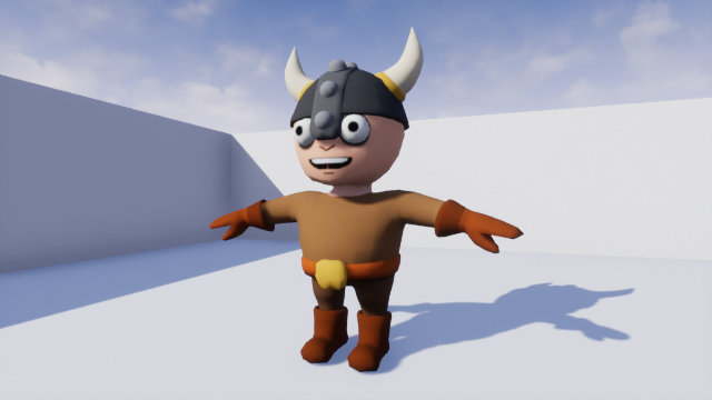
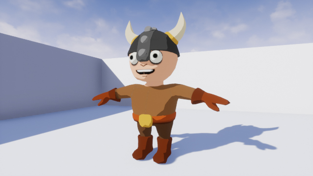
Download the starter project and unzip it. Navigate to the project folder and open CelShader.uproject. You will see the following scene:

unreal engine 4 cel shading

This is the character you will be cel shading. Before you start, you should know what cel shading is.

What is Cel Shading?

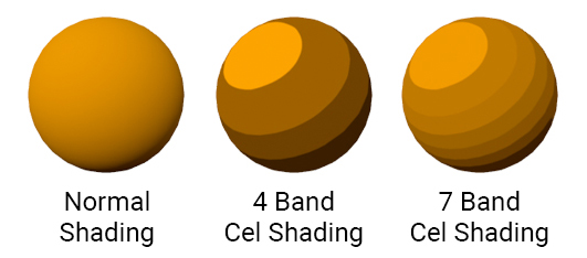
Cel shading is when you render something using multiple bands of color rather than a continuous gradient.

unreal engine 4 cel shading

Below is an example of cel shading in The Legend of Zelda: Breath of the Wild. Note that only the character has cel shading while the background does not.

unreal engine 4 cel shading

In this image, there are three bands. One for shadows, one for midtones and one for highlights.

A common misconception is that if something has outlines, it is cel shaded. An example of this is Borderlands. Although this game has a stylized look, it is not cel shaded. You can see this in the image below. Notice that the character’s shading does not utilize bands of color.

unreal engine 4 cel shading

Even though outlines are not cel shading, it is common to combine them together. This helps an image look like it was drawn or inked. You will see this a lot in anime-styled games such as Guilty Gear Xrd and Dragon Ball FighterZ.

unreal engine 4 cel shading

In the next section, you will learn how you can implement cel shading.

Cel Shading Method

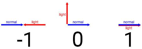
The most common method is to compare the surface direction (known as the normal) and the light direction. By calculating the dot product between the normal and light direction, you will get a value between -1 and 1.

A value of -1 means the surface and light are facing opposite directions. 0 means they are perpendicular to each other. 1 means they are facing the same direction.

unreal engine 4 cel shading

By thresholding the dot product, you can create multiple bands. For example, you can assign a darker color if the dot product is higher than -0.8. If the dot product is lower than -0.8, assign a light color. This will create a two band cel shader.

unreal engine 4 cel shading

The limitation with this method is that other lights cannot affect cel shaded objects. Also, objects can not cast shadows on cel shaded objects.

unreal engine 4 cel shading

To fix this, you need to use a different method. Instead of calculating the dot product, you calculate how lit a surface is. You can then use this value during thresholding instead of the dot product.

unreal engine 4 cel shading

Now that you know what a cel shader is and how it works, it’s time to create one.

Creating the Cel Shader

The cel shading in this tutorial is a post process effect. Post processing allows you to alter the image after the engine has finished rendering it. Common uses for post processing are depth of field, motion blur and bloom.

To create your own post process effect, you need to use a post process material. Navigate to the Materials folder and create a new Material. Rename it to PP_CelShader and then open it.

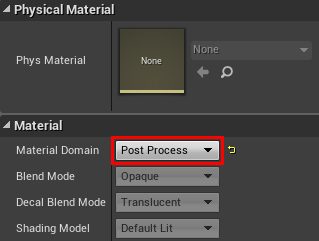
To convert a material to a post process material, you need to change its domain. Go to the Details panel and change Material Domain to Post Process.

unreal engine 4 cel shading

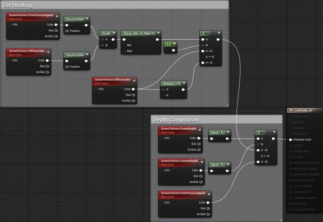
The first step in creating the cel shader is to calculate how lit each pixel is. We’ll call this the lighting buffer.

Calculating the Lighting Buffer

When Unreal renders an image to the screen, it stores passes to buffers. To calculate the lighting buffer, you will need to access two of these buffers:

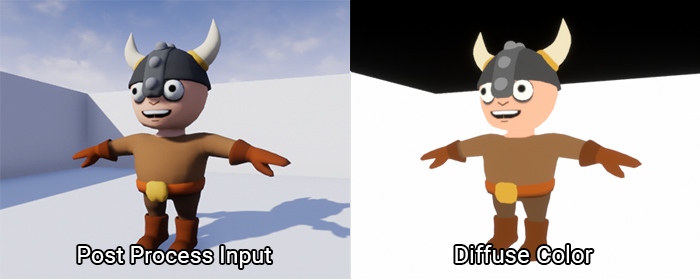
  1. Post Process Input: Once Unreal has performed lighting and post processing, it will store the image to this buffer. This is what Unreal will display to the player if you do not perform further post processing.
  2. Diffuse Color: This is the scene without any lighting and post processing. It will contain the diffuse colors of everything on-screen.

unreal engine 4 cel shading

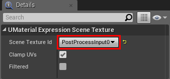
To access these buffers, you need to use the SceneTexture node. Create one and with it selected, go to the Details panel. To access the Post Process Input buffer, change Scene Texture Id to PostProcessInput0.

unreal engine 4 cel shading

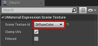
To access Diffuse Color, create another SceneTexture node. Change its Scene Texture Id to DiffuseColor.

unreal engine 4 cel shading

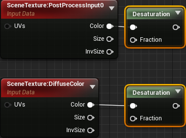
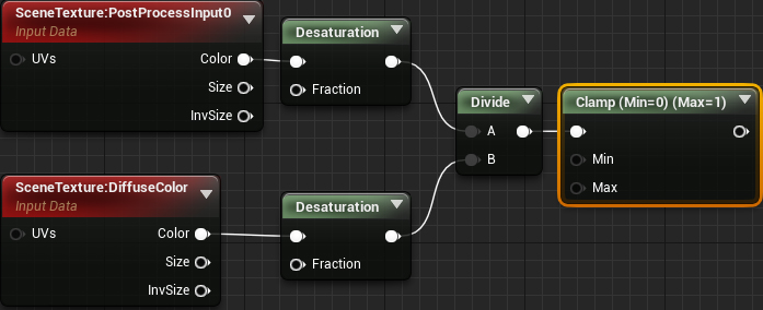
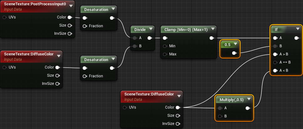
The lighting buffer should only contain grayscale values (which describe how lit something is). This means you do not need the color information from both buffers. To discard the color, connect the Color output of both SceneTexture nodes to a Desaturation. This will completely desaturate both buffers.

unreal engine 4 cel shading

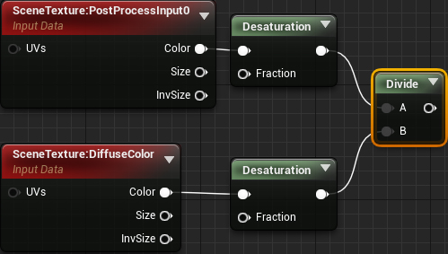
To calculate the lighting buffer, simply divide SceneTexture:PostProcessInput0 by SceneTexture:DiffuseColor. Order is important here!

unreal engine 4 cel shading

Afterwards, use a Clamp so the values stay within the 0 to 1 range. This makes it easier to perform thresholding since you know your possible values.

unreal engine 4 cel shading

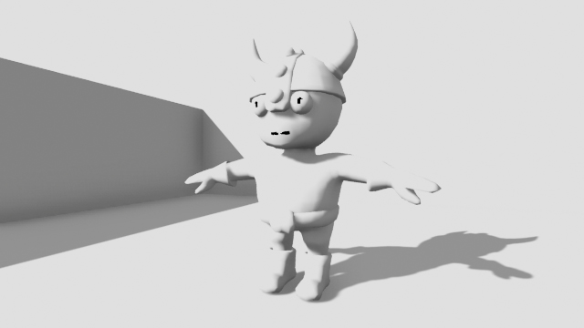
Here is a visualization of the lighting buffer:

unreal engine 4 cel shading

As you can see, the lit areas are closer to white and the unlit areas are closer to black.

Next, you will use the lighting buffer to create a threshold.

Creating a Threshold

For this cel shader, any pixel with a value greater than 0.5 will use the normal diffuse color. Pixels with a value less than 0.5 will use the diffuse color at half brightness.

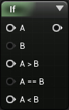
First, create an If node. This will let you compare two values. You can then specify different outputs depending on the comparison result.

unreal engine 4 cel shading

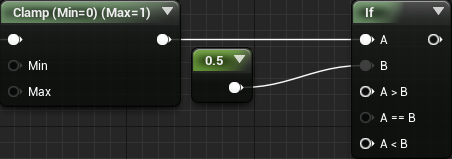
Next, connect the Clamp to the A input. Afterwards, create a Constant with a value of 0.5 and plug it into the B input.

unreal engine 4 cel shading

Note: You can change the value of the B input to change the threshold.

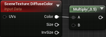
To get the colors, create a SceneTexture and set its Scene Texture Id to Diffuse Color. Afterwards, multiply Color by 0.5 to get the diffuse at half brightness.

unreal engine 4 cel shading

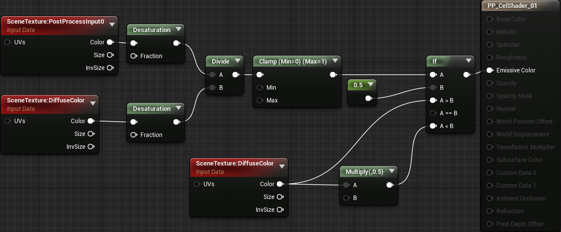
Finally, connect everything like so:

unreal engine 4 cel shading

Summary:

  1. Desaturation will convert Post Process Input and Diffuse Color to grayscale images
  2. Divide will divide Post Process Input by Diffuse Color. This will give you the lighting buffer.
  3. The Clamp will keep the values within the 0 to 1 range
  4. The If will output the normal diffuse color if the lighting value is greater than 0.5. If it is less than 0.5 it will output the diffuse color at half brightness.

Now that you have your cel shader, you need to apply it to the scene.

Using Post Process Materials

To use post process materials, you need to create a Post Process Volume. These are commonly used to control post process effects such as white balance, saturation and contrast.

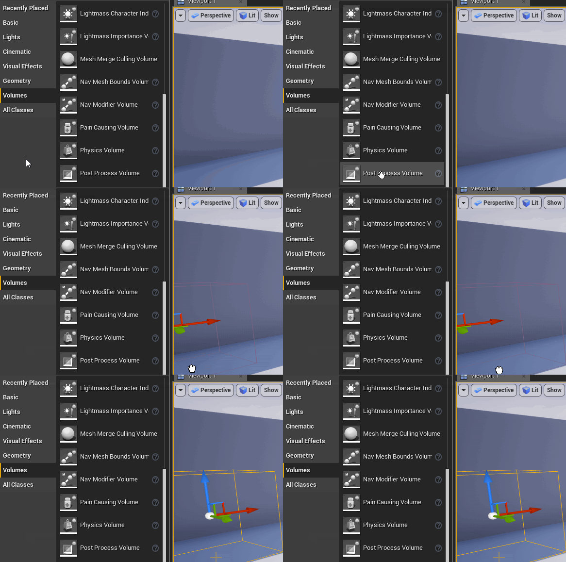
Click Apply and then go back to the main editor. To create a Post Process Volume, go to the Modes panel and select the Volumes category. Afterwards, drag a Post Process Volume into the Viewport to create one.

unreal engine 4 cel shading

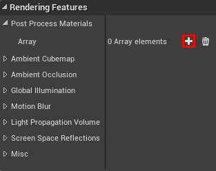
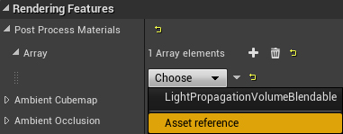
Now you need to tell the Post Process Volume to use the cel shader. With the Post Process Volume selected, go to the Details panel. Afterwards, locate Rendering Features\Post Process Materials and click the + icon. This will add a new entry to the array.

unreal engine 4 cel shading

Next, click the Choose drop-down and select Asset Reference.

unreal engine 4 cel shading

This will allow you to select a material. Click the None drop-down and select PP_CelShader.

unreal engine 4 cel shading

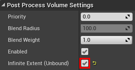
By default, Post Process Volumes will only take affect if you are inside of it. However, in this case, you want it to affect the entire world. To do this, scroll down to Post Process Volume Settings and enable Infinite Extent (Unbound).

unreal engine 4 cel shading

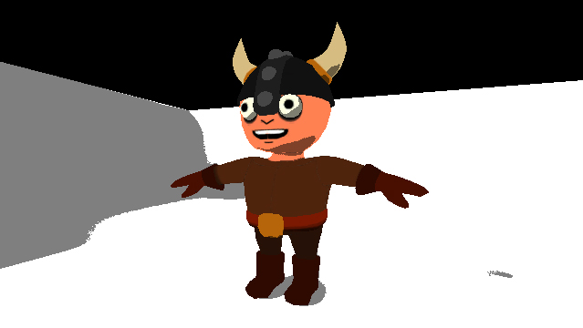
Now that the cel shader is being applied to the entire image, you will see this:

unreal engine 4 cel shading

"Hang on, that doesn’t look like the cel shader you showed earlier!"

The main reason it looks different is because the engine is applying the cel shader after tonemapping. To fix this, you need to tell the engine to apply the cel shader before tonemapping.

Applying Cel Shading Before Tonemapping

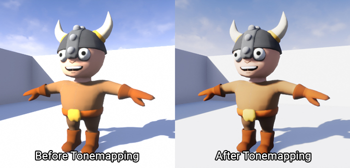
Before displaying an image to the player, Unreal performs a process called tonemapping. One of the reasons for tonemapping is to make the image look more natural. It does this by taking an input color and then uses a curve to shift it to a new value.

Here are two images, one before tonemapping and one after tonemapping:

unreal engine 4 cel shading

As you can see, the highlights before tonemapping are too bright. However, after tonemapping, the bright areas are softer.

While tonemapping is good for images you intend to display, you should not tonemap images you want to use for calculations. Because of the value shifting, you will be using values that aren’t what you expect.

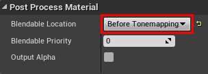
Open PP_CelShader and make sure you do not have anything selected. Afterwards, go to the Details panel and locate the Post Process Material section. Set Blendable Location to Before Tonemapping.

unreal engine 4 cel shading

Click Apply and then go back to the main editor. The colors are looking a lot better now!

unreal engine 4 cel shading

In the next section, you will learn how to only apply cel shading to specific objects.

Isolating the Cel Shader

To isolate post process effects, you need to use a feature called Custom Depth. Like Post Process Input and Diffuse Color, this is a buffer you can use in post process materials.

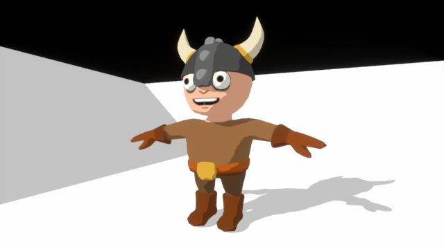
Before you learn what Custom Depth is, you should know what the Scene Depth buffer is. Scene Depth stores how far each pixel is from the camera. Here is a visualization of Scene Depth:

unreal engine 4 cel shading

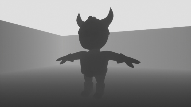
Custom Depth stores the same information but only for meshes you specify. Here is a visualization of it with the viking rendered to Custom Depth:

unreal engine 4 cel shading

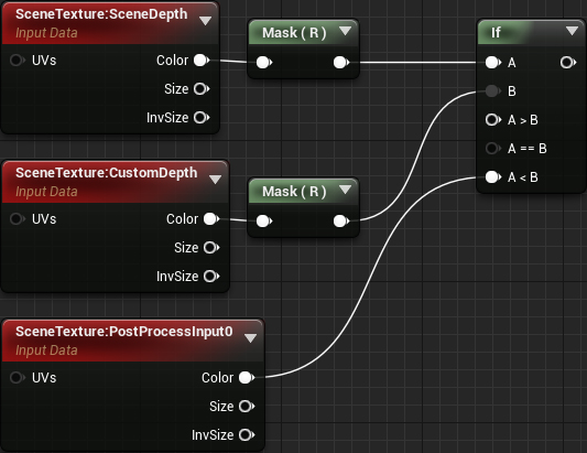
By comparing Scene Depth against Custom Depth, you can isolate effects. If Scene Depth is less than Custom Depth, use the normal image. If Scene Depth is greater than Custom Depth, use the cel shaded image.

The first step is to render the viking to Custom Depth.

Using Custom Depth

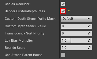
Go to the World Outliner and select SK_Viking. Afterwards, go to the Details panel and locate the Rendering section. Next, enable Render CustomDepth Pass.

unreal engine 4 cel shading

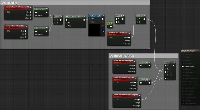
Next, you need to perform the depth comparison. Open PP_CelShader and create the following setup:

unreal engine 4 cel shading

Note: The Mask (R) nodes are Component Masks. These allow you to convert multi-channel data into scalars. The reason you need to mask Scene Depth and Custom Depth is because the If node only accepts scalars for the A and B inputs.

Afterwards, connect the output of the cel shading network to A > B. Finally connect the output of the If you just made into Emissive Color.

unreal engine 4 cel shading

Now, only meshes that rendered to Custom Depth will have cel shading.

Click Apply and then go back to the main editor. You will see that only the viking has cel shading now.

unreal engine 4 cel shading

The cel shader is working great but it’s a bit simple. What if you want to have more than two bands? What if you want to create a softer transition between bands? You can accomplish this by using lookup tables (LUT).

What is a Lookup Table?

When you were young, you learned what multiplication is. However, a young mind might not have been able to perform these calculations. Instead of calculating, you might have used a multiplication table to "look up" the answers.

unreal engine 4 cel shading

This is essentially what a LUT is. It is an array of values (usually precomputed) which you can access with inputs. In the case with the multiplication table, the inputs are the multiplier and multiplicand.

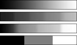
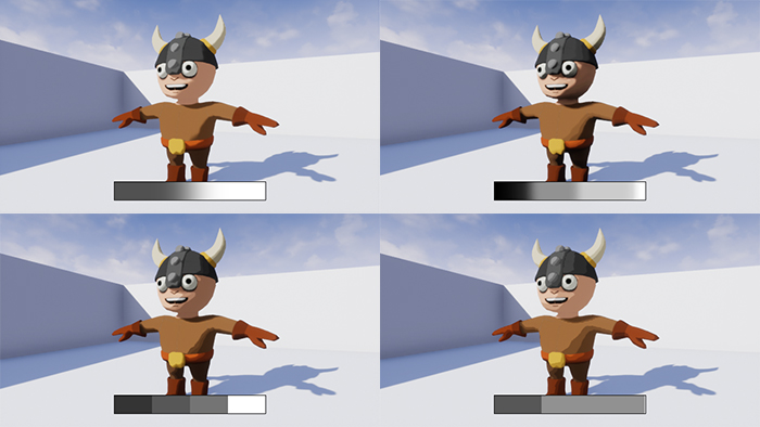
In the context of this cel shader, a LUT is a texture with some sort of gradient. Here are four examples of what a LUT could look like:

unreal engine 4 cel shading

Currently, the way you are calculating the shadow color is by multiplying the diffuse color by 0.5. Instead of multiplying by a constant 0.5, you will use a value from the LUT. By doing this, you can control the number of bands and their transitions. You can get an idea of how the shading would look by the appearance of the LUT.

Before you use a LUT, you need to change some of its texture settings.

Changing LUT Settings

Navigate to the Textures folder and open T_Lut_01. This is what the LUT looks like:

unreal engine 4 cel shading

The first setting you need to change is sRGB. When rendering, Unreal will convert any textures with sRGB enabled to linear color. Basically, this makes it easier for Unreal to perform rendering calculations.

The sRGB setting is good for textures which describe appearance. However, textures such as normal maps and LUTs hold values meant for math calculations. As such, Unreal should assume their values are already correct. By disabling sRGB, Unreal will not perform the conversion to linear color.

To do this, uncheck the sRGB checkbox. You can find this setting under the Texture section.

unreal engine 4 cel shading

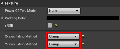
The next setting you need to change is how the texture tiles. Since you are not displaying this texture, there is no need to tile it. Furthermore, leaving tiling enabled will introduce issues when sampling from the edges. For example, if you were to sample a pixel from the left edge, it will try to blend to the right edge because of tiling.

To disable tiling, change X-axis Tiling Method to Clamp. Do the same for Y-axis Tiling Method.

unreal engine 4 cel shading

That’s all for the settings. Now you need to use the LUT in the post process material.

Using LUTs

Close T_Lut_01 and open PP_CelShader. First, delete the highlighted nodes:

unreal engine 4 cel shading

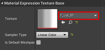
Next, create a Texture Sample and change its Texture to T_Lut_01. This LUT will create three bands with a soft transition.

unreal engine 4 cel shading

If you remember, LUTs take inputs to determine which value to output. In this case, you will use the lighting buffer as the input.

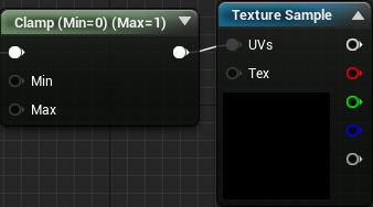
To do this, connect the Clamp to the UVs of the Texture Sample.

unreal engine 4 cel shading

This works because the lighting buffer and texture coordinates are in the range of 0 to 1. For example, if a pixel from the lighting buffer is 0.5, the LUT will output the pixel value from the middle of the texture.

Next, you need to multiply the diffuse color with the LUT. To do this, recreate the following setup:

unreal engine 4 cel shading

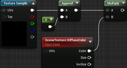
The reason for the Append is to convert the Texture Sample’s output to a four-channel vector. You need to do this because you cannot multiply a three-channel vector by a four-channel vector (SceneTexture).

Finally, connect everything like so:

unreal engine 4 cel shading

Now, instead of multiplying diffuse color by a constant, you are multiplying by a value from the LUT. This controls how many bands there are and their transitions (depending on the LUT). The lighting buffer determines which value the LUT will output.

Click Apply and then close PP_CelShader. The shading will now have three bands with a softer transition between bands.

unreal engine 4 cel shading

Below is a comparison of what alternative LUTs would look like. These LUTs are also included in the project.

unreal engine 4 cel shading

Where to Go From Here?

You can download the completed project here.

As you can see, post process materials are very powerful. They allow you to create a lot of realistic and stylized effects. If you’d like to learn more about post processing, check out the Post Process Effects documentation.

If there are any effects you’d like to me cover, let me know in the comments below!

The post Unreal Engine 4 Cel Shading Tutorial appeared first on Ray Wenderlich.

Video Tutorial: Server Side Swift with Vapor Part 2: Sibling Relationships

SpriteKit Animations and Texture Atlases in Swift

$
0
0
Update note: This tutorial has been updated for iOS 11, Xcode 9, and Swift 4.0 by Kevin Colligan. The original tutorial was written by Tony Dahbura.
Smoky says: Only you can start this bear!

Smoky says: Only you can start this bear!

In this SpriteKit tutorial, you’ll create an interactive animation of a walking bear and learn how to:

  • Create efficient animations with texture atlases.
  • Change the direction the bear faces based on where it’s moving.
  • Make your animated bear move in response to touch events.

This tutorial assumes you know the basics of SpriteKit. If not, you might want to start with the SpriteKit Swift 3 Tutorial for Beginners.

It’s time to get started.

Create the Swift Project

Start up Xcode, select File\New\Project…, choose the iOS\Game template and click Next.

Create project

Enter AnimatedBearSwift for the Product Name, Swift for Language, SpriteKit for Game Technology. Make sure the options for Integrate GameplayKit, Include Unit Tests, and Include UI Tests are unchecked and click Next:

Project options

Choose where to save your project, and click Create.

Now that your project is open, select one of the iPad simulators and build and run to check out the starter project. After a brief splash screen, you should see the following:

Hello World!

If you tap on the screen, you’ll see spinning geometric shapes which flare to life then fade from view. Pretty cool, but those won’t do for your bear.

You can download ready-to-animate art, courtesy of GameArtGuppy.com, by clicking the Download Materials button at the top or bottom of this tutorial. When you unzip the materials, you’ll find a folder named BearImages.atlas which contains eight numbered bear images.

Big bunch of bears

With the help of SpriteKit, you’ll cycle through these eight images to create the illusion of movement — kind of like an old-fashioned flip-book.

bear gif

You could create an animation by loading in each of these images individually. But there’s a better way: Use a texture atlas to make your animation more efficient.

Texture Atlases

If you’re new to texture atlases, you can think of them as one big mashup of all your smaller images. Rather than eight separate bear images, your texture atlas will be one big image along with a file that specifies the boundaries between each individual bear image.

SpriteKit is optimized to work with texture atlases. So using this approach can improve memory usage and rendering performance.

It’s also nearly effortless.

Just place your image files in a folder with a name that ends with .atlas — like the BearImages.atlas folder you downloaded. Xcode will notice the .atlas extension and automatically combine the images into a texture atlas for you at compile time.

Drag BearImages.atlas over your project and drop it under the AnimatedBearSwift folder in Xcode:

Import images

In the dialog box that appears, be sure that the Copy items if needed, Create groups and AnimatedBearSwift options are all checked, and click Finish:

Import images 2

If you expand the folder in Xcode it should look like this:

Import images 3

Before you start animating, get your Xcode template ready by completing a few small tasks.

First, click on AnimatedBearSwift in the Project navigator. Make sure that the AnimatedBearSwift target is selected. In the Deployment Info section, choose iPad for Devices and uncheck the Portrait and Upside Down options so only Landscape Left and Landscape Right are left checked, as shown below:

Choose iPad, landscape orientation and delete the GameScene.sks file

Next, find GameScene.sks in the project navigator and press Delete. Choose Move to Trash when prompted.

Be sure you’re deleting GameScene.sks, and not GameScene.swift. GameScene.sks is a scene editor which allows developers to visually lay out sprites and other components of a scene. For this tutorial, you’ll build your scene programmatically.

Similarly, delete Actions.sks as you also don’t need that for this tutorial.

With that out of the way, it’s time get that bear moving :] !

A Simple Animation

Start by plopping the bear in the middle of the screen and looping the animation, just to make sure things are working.

Open GameViewController.swift and replace the contents with the following:

import UIKit
import SpriteKit

class GameViewController: UIViewController {

  override func viewDidLoad() {
    super.viewDidLoad()
    if let view = view as? SKView {
      // Create the scene programmatically
      let scene = GameScene(size: view.bounds.size)
      scene.scaleMode = .resizeFill
      view.ignoresSiblingOrder = true
      view.showsFPS = true
      view.showsNodeCount = true
      view.presentScene(scene)
    }
  }
  
  override var prefersStatusBarHidden: Bool {
    return true
  }
}

This implementation has just what you need to start, so you won’t need the starter code generated by Xcode.

GameViewController is a subclass of UIViewController that has its root view set to an SKView, which is a view that contains a SpriteKit scene.

Here, you’ve overridden viewDidLoad() to create a new instance of GameScene on startup. You define the scene to have the same size as the view, set the scaleMode along with other basic properties and present the scene. For this tutorial, the rest of your code will be in GameScene.swift.

Note: You use optional binding — the if let view = view as? SKView bit — to make sure the view is the correct type before proceeding.

You’re also overriding the prefersStatusBarHidden getter to hide the status bar so that all the attention will be focused on the bear.

Switch over to GameScene.swift and replace the contents with the following:

import SpriteKit

class GameScene: SKScene {
  
  private var bear = SKSpriteNode()
  private var bearWalkingFrames: [SKTexture] = []
  
  override func didMove(to view: SKView) {
    backgroundColor = .blue
  }
}

At this point you’ve just removed all the project template code to create a nice blank slate (and defined a couple private variables you’ll need later). Build and run to make sure everything builds OK — you should see a blue screen.

Note: If you are running in the simulator, you may need to manually rotate the screen by selecting Hardware\Rotate Right.

Setting up the Texture Atlas

Add a new method, just after didMove(to:):

func buildBear() {
  let bearAnimatedAtlas = SKTextureAtlas(named: "BearImages")
  var walkFrames: [SKTexture] = []

  let numImages = bearAnimatedAtlas.textureNames.count
  for i in 1...numImages {
    let bearTextureName = "bear\(i)"
    walkFrames.append(bearAnimatedAtlas.textureNamed(bearTextureName))
  }
  bearWalkingFrames = walkFrames
}

First, you create an SKTextureAtlas from the bear images. walkFrames is an array of SKTexture objects and will store a texture for each frame of the bear animation.

You populate that array by looping through your images’ names (they are named with a convention of bear1.png -> bear8.png) and grabbing the corresponding texture.

Still in buildBear(), add the following right after bearWalkingFrames = walkFrames:

let firstFrameTexture = bearWalkingFrames[0]
bear = SKSpriteNode(texture: firstFrameTexture)
bear.position = CGPoint(x: frame.midX, y: frame.midY)
addChild(bear)

Here, you’re creating an SKSpriteNode using the first frame texture and positioning it in the center of the screen to set up the start of the animation.

Finally, you need to call the method. Add the following code to the end of didMove(to:)

buildBear()

If you were to build and run now, the bear still wouldn’t be moving. In order to do so, we need an SKAction. In the same file, add the following new method right after the buildBear() method:

func animateBear() {
  bear.run(SKAction.repeatForever(
    SKAction.animate(with: bearWalkingFrames,
                     timePerFrame: 0.1,
                     resize: false,
                     restore: true)),
    withKey:"walkingInPlaceBear")
}

This action will cause the animation to run with a 0.1 second wait-time for each frame. The "walkingInPlaceBear" key identifies this particular action with a name. That way, if you call this method again to restart the animation, it will simply replace the existing animation rather than create a new one.

The repeatForever action repeats whatever action it is provided forever, which results in the given animate action repeatedly animating through the textures in the texture atlas.

Now all you need to do is call this method to kick off the animation! Add the following line to the end of didMove(to:):

animateBear()

And that’s it! Build and run the project. You’ll see your bear happily strolling on the screen.

Does a bear walk on an iPad? Yes!

Changing Animation Facing Direction


Things are looking good, except you don’t want this bear meandering about on its own — that would be dangerous! It would be much better if you could control its direction by tapping the screen to tell it which way to go.

Still in GameScene.swift, add the following method to detect user touches:

override func touchesEnded(_ touches: Set<UITouch>, with event: UIEvent?) {
  let touch = touches.first!
  let location = touch.location(in: self)
  
  var multiplierForDirection: CGFloat
  if location.x < frame.midX {
    // walk left
    multiplierForDirection = 1.0
  } else {
    // walk right
    multiplierForDirection = -1.0
  } 
  
  bear.xScale = abs(bear.xScale) * multiplierForDirection
  animateBear()
}

SpriteKit calls touchesEnded(_:with:) when the user's finger lifts off the screen at the end of a tap.

In the method, you determine which side of the screen was tapped — left or right of center. You want the bear to face in the direction of the tap. You do this by making the node's xScale positive when the bear should face left (the bear walks to the left by default), and negative to flip the image when the bear should face right.

Finally, you call animateBear() to restart the animation each time you tap the screen.

Build and run the project, and you'll see your bear happily strolling on the screen as usual. Tap on the left and right sides of the screen to get the bear to change directions.

Bears have a fine sense of direction

Moving the Bear Around the Screen

Right now, it looks like the bear is walking in-place on a treadmill. The next step is to get him to meander to different places on the screen.

First, remove the call to animateBear() at the end of didMove(to:). You want the bear to start moving when the user taps the screen, not automatically.

Next, add this helper method to the class:

func bearMoveEnded() {
  bear.removeAllActions()
}

This will remove all actions and stop the animation. You'll call this later when the bear reaches the edge of the screen.

Before taking your bear out for a walk, clean-up touchesEnded(_:with:) by moving all bear-related code to its own method. Replace the entire method with:

override func touchesEnded(_ touches: Set<UITouch>, with event: UIEvent?) {
  let touch = touches.first!
  let location = touch.location(in: self)
  moveBear(location: location)
}

The code above records the touch location and sends it over to a new method, moveBear(location:). It also spawns a warning from Xcode because you haven't yet created this method. Add the following code right after animateBear():

func moveBear(location: CGPoint) {
  // 1
  var multiplierForDirection: CGFloat
  
  // 2
  let bearSpeed = frame.size.width / 3.0
  
  // 3
  let moveDifference = CGPoint(x: location.x - bear.position.x, y: location.y - bear.position.y)
  let distanceToMove = sqrt(moveDifference.x * moveDifference.x + moveDifference.y * moveDifference.y)
  
  // 4
  let moveDuration = distanceToMove / bearSpeed
  
  // 5
  if moveDifference.x < 0 {
    multiplierForDirection = 1.0
  } else {
    multiplierForDirection = -1.0
  }
  bear.xScale = abs(bear.xScale) * multiplierForDirection
}

Here's what's going on step-by-step:

  1. You declare multiplierDirection, a CGFloat variable you'll use to set the bear's direction, just as you did earlier in touchesEnded().
  2. You define the bearSpeed to be equal to the screen width divided by 3, so the bear will be able to travel the width of the scene in 3 seconds.
  3. You need to figure out how far the bear needs to move along both the x and y axes, by subtracting the bear's position from the touch location. You then calculate the distance the bear moves along a straight line (the hypotenuse of a triangle formed from the bear's current position and the tap point). For a full tutorial on the math of game programming, check out Trigonometry for Games.
  4. You calculate how long it should take the bear to move along this length, by dividing the length by the desired speed.
  5. Finally, you look to see if the bear is moving to the right or to the left by looking at the x axis of the move difference. If it's less than 0, he's moving to the left; otherwise, to the right. You use the same technique of creating a multiplier for the xScale to flip the sprite.

Now all that's left is to run the appropriate actions. That's another substantial chunk of code — add the following to the end of moveBear(location:):

// 1
if bear.action(forKey: "walkingInPlaceBear") == nil {
  // if legs are not moving, start them
  animateBear()
}

// 2
let moveAction = SKAction.move(to: location, duration:(TimeInterval(moveDuration)))

// 3
let doneAction = SKAction.run({ [weak self] in
  self?.bearMoveEnded()
})

// 4
let moveActionWithDone = SKAction.sequence([moveAction, doneAction])
bear.run(moveActionWithDone, withKey:"bearMoving")

Here's what's happening in this second half of moveBear(location:):

  1. Start the legs moving on your bear if he is not already moving his legs.
  2. Create a move action specifying where to move and how long it should take.
  3. Create a done action that will run a block to stop the animation.
  4. Combine these two actions into a sequence of actions, which means they will run in order sequentially — the first runs to completion, then the second runs. You have the bear sprite run this sequence with the key "bearMoving". As with the animation action, using a unique key here will ensure there is only one movement action running at a time.

Note: SpriteKit supports sequential and grouped actions. A sequential action means each specified action runs one after the other (sequentially). Sometimes you may want multiple actions to run at the same time. This can be accomplished by specifying a group action where all the actions specified run in parallel.

You also have the flexibility to set up a series of sequential actions that contain grouped actions and vice versa! For more details see the SKAction class in Apple's SpriteKit documentation.

That was a lot of code — but was it worth it? Build and run to see! Now you can tap the screen to move your bear around.

Your walking bear is now complete!

Where To Go From Here?

You can download the completed version of the project using the Download Materials button at the top or bottom of this tutorial.

For more animation fun, here are a few ideas to try out:

  1. What if you wanted the bear to moonwalk? Hint: Try building the array of images backwards!
  2. Try accelerating or slowing down the frame times in animateBear().
  3. Try animating multiple bears on the screen at the same time. Hint: Create multiple sprite nodes with actions.

At this point, you should know all you need to start adding animations to your projects using texture atlases. Have some fun and experiment by creating your own animations and seeing what you can do!

If you want to learn more about SpriteKit and Swift, you should check out our book 2D Apple Games by Tutorials. We'll teach you everything you need to know — physics, tile maps, particle systems and even making your own 2D game art.

In the meantime, if you have any questions or comments, please join the forum discussion below!

The post SpriteKit Animations and Texture Atlases in Swift appeared first on Ray Wenderlich.
Video Tutorial: Server Side Swift with Vapor Part 2: Fluent Queries

Android Custom View Tutorial

$
0
0

Android Custom View Tutorial


The Android platform has several View classes that cover many needs for a typical app. But sometimes these views don’t fit your needs and you need to build a custom view for reasons like:
  • Innovative UI design or animation
  • Different user interaction
  • Displaying different types of data
  • Some performance optimization
  • Reusability

In this tutorial, you will get a head start with Android custom views by learning how to make an emotional face view that can be set to happy or sad according to your user state, and through that you will see how to add new XML attributes to a custom view and how to draw some shapes and paths on the Android Canvas.

Prerequisites: This Android tutorial is all about custom views, so you need basic knowledge of Android programming and familiarity with Kotlin, Android Studio, and XML layouts.
If you’re completely new to Android, you might want to first check out Beginning Android Development Part One.

To follow along with this tutorial, you’ll need to use Android Studio 3.0.1 or later and Kotlin 1.2.21 or later.

Getting Started

To kick things off, start by downloading the materials for this tutorial (you can find a link at the top or bottom of the page) and then fire up Android Studio and import the starter project. It is (mostly) an empty project with some resources (colors, dimens and icon launcher).

Build and run the app, and you will see an empty screen like this:

Working with the Basic Widgets

Android has a set of basic widgets and the base class of any Android widget is the View class.
The following image shows a part of the basic widget hierarchy:

Basic Widget Hierarchy

You have two ways to create a new instance of an Android view and to set values for its attributes:

  1. From your XML files (layout files)
  2. From your Kotlin code

Working with Views in Kotlin

You can add a TextView to your layout from the Kotlin code. Open MainActivity and replace the setContentView(R.layout.activity_main) line in onCreate() with the following code:

// 1
val textView = TextView(this)
// 2
textView.text = "Hello Custom Views"
// 3
setContentView(textView)

Here, you:

  1. Create a TextView by using the constructor which needs the activity context.
  2. Set “Hello Custom Views” as the text of the TextView.
  3. Set the TextView as the content view of the activity.

Build and run. You will see the text “Hello Custom Views” on your screen like this:

Working with Views in XML

Now open up res/layout/activity_main.xml. To use one of the basic Android widgets like TextView, just drag it from the palette window on the left into the design editor and drop it to the top center of the layout, or switch to the XML text editor and add the following lines to the XML code inside the RelativeLayout:

<TextView
  android:id="@+id/textView"
  android:layout_width="wrap_content"
  android:layout_height="wrap_content"
  android:layout_alignParentTop="true"
  android:layout_centerHorizontal="true"
  android:text="Hello Custom Views"/>

You can change a lot of basic attributes from the View class in XML, such as id, layout_width, layout_height, alpha, visibility, elevation, padding, tag, etc.

To change an attribute, like the text of a TextView, just add the attribute name (android:text) and assign a value to it ("Hello Custom Views"), as in the last line of the previous snippet.

Reset onCreate() in MainActivity to use setContentView(R.layout.activity_main), and remove the code you added earlier. Build and run the project. You will see the text "Hello Custom Views" on your screen, like this:

Android Views

The Android View class is the basic building block of an Android user interface. A View occupies a rectangular area on the screen to draw itself and its children (for the case of a ViewGroup). Also, a View is responsible for user event handling.

ViewGroup is a subclass of the View class. ViewGroup is the base class for Android layouts, which are containers for a set of Views (or other ViewGroups), and define their own layout properties and also where each subview should draw itself.

Custom View and Custom ViewGroup

What is a custom View?

Sometimes you want to show a certain type of data and there is already a suitable view in the basic widget set. But if you want UI customization or a different user interaction, you may need to extend a widget.

Suppose that there were no Button widget in the basic widget set in the Android SDK and you want to make one. You would extend the TextView class to get all the capabilities related to the text like setting text, text color, text size, text style and so on. Then you will start your customization work, to give your new widget the look and feel of a button. this is what happens in the Android SDK the Button class extends the TextView class.

Or you could in theory extend the View class to start from scratch.

What is a custom ViewGroup?

Sometimes you want to group some views into one component to allow them to deal with each other easily through writing some specific code or business logic. You can call that a “compound view”. Compound views give you reusability and modularity.

For example, you may want to build an emotional face view with a sliding bar that the user can slide to the right to make the emotional face happier or slide to left to make it sadder. You may also want to show that state of happiness in a TextView.

You can group those views (ImageView, SeekBar, TextView) into one layout file, then create a new class that extends a layout (e.g. a LinearLayout or a RelativeLayout) and write your business logic in it.

Another reason for implementing a custom ViewGroup is if you want to make your custom ViewGroup align its children in a different and unique way. For example, laying out the children in a circle instead of linearly as in the LinearLayout.

How Android Draws Views

When an Android activity comes up into the foreground, Android asks it for its root view. The root view is the top parent of the layout hierarchy. Android then starts drawing the whole view hierarchy.

Android draws the hierarchy starting from the top parent, then its children, and if one of the children is also a ViewGroup, Android will draw its children before drawing the second child. So it’s a depth-first traversal.

Android draws the children of a ViewGroup according to the index of the child (its position in the XML file), so the view which you added first will be drawn first.

Android draws the layout hierarchy in three stages:

  1. Measuring stage: each view must measure itself.
  2. Layout stage: each ViewGroup finds the right position for its children on the screen by using the child size and also by following the layout rules.
  3. Drawing stage: after measuring and positioning all of the views, each view happily draws itself. :]

Creating a custom view

It’s finally time to start making a custom view yourself!

Start by creating a new Kotlin class and in the main app package and name it EmotionalFaceView. Make it inherit from the View class:

class EmotionalFaceView : View

Now if you hover on the word View you will get a message:
“This type has a constructor, and thus must be initialized here”

Android View Class Constructors

View has four constructors and you will need to override one of them at least to start your customization. Check out all of them to pick the suitable one for the tutorial:

  1. constructor(context: Context)
    To create a new View instance from Kotlin code, it needs the Activity context.
  2. constructor(context: Context, attrs: AttributeSet)
    To create a new View instance from XML.
  3. constructor(context: Context, attrs: AttributeSet, defStyleAttr: Int)
    To create a new view instance from XML with a style from theme attribute.
  4. constructor(context: Context, attrs: AttributeSet, defStyleAttr: Int, defStyleRes: Int)
    To create a new view instance from XML with a style from theme attribute and/or style resource.

Pick the second constructor to create your new instance from XML, you can override the constructor in the class body as:

constructor(context: Context, attrs: AttributeSet): super(context, attrs)

Or, make it the primary constructor using:

class EmotionalFaceView(context: Context, attrs: AttributeSet) : View(context, attrs)

Now you can add your custom view at the center of the layout and below the TextView, by adding the following lines to activity_main.xml

<!--Full path for the cusom view -->
<com.raywenderlich.emotionalface.EmotionalFaceView
   android:id="@+id/emotionalFaceView"
   android:layout_width="match_parent"
   android:layout_height="match_parent"
   android:layout_centerInParent="true"
   android:layout_below="@+id/textView" />

Congrats! You have created a custom view and you have added it to the layout! But it still has no your special customization.

Build and run the project, and as you expect there is no change in the UI, but don’t worry: you will start the fun part right now :]

Drawing on Canvas

Prepare your painting tools in EmotionalFaceView by declaring a Paint property for coloring and styling, and some colors:

// Paint object for coloring and styling
private val paint = Paint(Paint.ANTI_ALIAS_FLAG)
// Some colors for the face background, eyes and mouth.
private var faceColor = Color.YELLOW
private var eyesColor = Color.BLACK
private var mouthColor = Color.BLACK
private var borderColor = Color.BLACK
// Face border width in pixels
private var borderWidth = 4.0f
// View size in pixels
private var size = 320

Now start drawing by overriding the onDraw() method from the parent class. Android invokes onDraw() for you and pass a canvas for drawing:

override fun onDraw(canvas: Canvas) {
  // call the super method to keep any drawing from the parent side.
  super.onDraw(canvas)
}

Create three new methods for drawing the happy face. All of them have a Canvas object as a parameter. Call them from onDraw():

override fun onDraw(canvas: Canvas) {
  // call the super method to keep any drawing from the parent side.
  super.onDraw(canvas)

  drawFaceBackground(canvas)
  drawEyes(canvas)
  drawMouth(canvas)
}

private fun drawFaceBackground(canvas: Canvas) {
}

private fun drawEyes(canvas: Canvas) {
}

private fun drawMouth(canvas: Canvas) {
}

Draw the face background
Add the following code to drawFaceBackground():

 // 1
 paint.color = faceColor
 paint.style = Paint.Style.FILL

 // 2
 val radius = size / 2f

 // 3
 canvas.drawCircle(size / 2f, size / 2f, radius, paint)

 // 4
 paint.color = borderColor
 paint.style = Paint.Style.STROKE
 paint.strokeWidth = borderWidth

 // 5
 canvas.drawCircle(size / 2f, size / 2f, radius - borderWidth / 2f, paint)

Here you:

  1. Set the paint color to the faceColor and make it fill the drawing area.
  2. Calculate a radius for a circle which you want to draw as the face background.
  3. Draw the background circle with a center of (x,y), where x and y are equal to the half of size, and with the calculated radius.
  4. Change the paint color to the borderColor and make it just draw a border around the drawing area by setting the style to STROKE
  5. Draw a border with the same center but with a radius shorter than the previous radius by the borderWidth.

Build and run the app, and you should see a screen like this:

Draw the Eyes
Add the following code to drawEyes():

// 1
paint.color = eyesColor
paint.style = Paint.Style.FILL

// 2
 val leftEyeRect = RectF(size * 0.32f, size * 0.23f, size * 0.43f, size * 0.50f)

canvas.drawOval(leftEyeRect, paint)

// 3
val rightEyeRect = RectF(size * 0.57f, size * 0.23f, size * 0.68f, size * 0.50f)

canvas.drawOval(rightEyeRect, paint)

Here you:

  1. Set the paint color to the eyesColor and make it fill the drawing area.
  2. Create a RectF object with left, top, right and bottom using the following percentages of the size: (32%, 23%, 43%, 50%). Then you draw the left eye by drawing an oval with the created RectF. For more info about RectF, check the docs.
  3. Do the same as the last step but with the following percentages of the size: (57%, 23%, 68%, 50%)

Build and run the app, and you should see a screen like this:

Draw the mouth

To draw curved paths on a canvas you need to create a path object. Add the following property to the EmotionalFaceView class:

private val mouthPath = Path()

After creating the Path object, set the curving instructions for it by adding the following code to the drawMouth() :

// 1
mouthPath.moveTo(size * 0.22f, size * 0.7f)
// 2
mouthPath.quadTo(size * 0.50f, size * 0.80f, size * 0.78f, size * 0.70f)
// 3
mouthPath.quadTo(size * 0.50f, size * 0.90f, size * 0.22f, size * 0.70f)
// 4
paint.color = mouthColor
paint.style = Paint.Style.FILL
// 5
canvas.drawPath(mouthPath, paint)

Here you:

  1. Set the starting point of the path to (x0,y0) by using the moveTo() method where:
  • x0 is equal to 22% of the size.
  • y0 is equal to 70% of the size.
  • Draw a curved path from the starting point and through (x1,y1) that ends with (x2,y2) where:
    • x1 is equal to 50% of the size.
    • y1 is equal to 80% of the size.
    • x2 is equal to 78% of the size.
    • y2 is equal to 70% of the size.
  • Draw a curved path starting from the last end point (x2,y2) and through (x3,y3) and that ends with (x0,y0) where:
    • x3 is equal to 50% of the size.
    • y3 is equal to 90% of the size.
    • x0 is equal to 22% of the size.
    • y0 is equal to 70% of the size.
  • Set the paint color to the mouthColor and make it filling the drawing area.
  • Draw the path to the canvas.
  • Build and run the app, and you should see a screen like this:

    Responsive View

    Currently, your custom view has a fixed size, but you want it to be responsive and fit its parent. Also, you want the happy face to always be a circle, not an oval shape.

    Android measures the view width and heigh. You can get these values by using measuredWidth, measuredHeight.

    Override the onMeasure() method to provide an accurate and efficient measurement of the view contents:

    
    override fun onMeasure(widthMeasureSpec: Int, heightMeasureSpec: Int) {      super.onMeasure(widthMeasureSpec, heightMeasureSpec)
    
    }
    

    Add the following lines of code to onMeasure():

    // 1
    size = Math.min(measuredWidth, measuredHeight)
    // 2
    setMeasuredDimension(size, size)
    

    Here you:

    1. Calculate the smaller dimension of your view
    2. Use setMeasuredDimension(int, int) to store the measured width and measured height of the view, in this case making your view width and height equivalent.

    Build and run the app, and you should see a screen like this:

    Creating Custom XML Attributes

    To create a new XML attribute go to res/values and create new values resource file named attrs.xml. Add the following lines to the file:

    <!--1-->
    <declare-styleable name="EmotionalFaceView">
      <!--2-->
      <attr name="faceColor" format="color" />
      <attr name="eyesColor" format="color" />
      <attr name="mouthColor" format="color" />
      <attr name="borderColor" format="color" />
      <attr name="borderWidth" format="dimension" />
      <attr name="state" format="enum">
        <enum name="happy" value="0" />
        <enum name="sad" value="1" />
      </attr>
    </declare-styleable>
    

    Here you:

    1. Open the declare-styleable tag and set the name attribute to your custom view class name.
    2. Add new attributes with different names and set their format to a suitable format.

    Go to res/layout/activity_main.xml and add the following new views to the RelativeLayout:

    <com.raywenderlich.emotionalface.EmotionalFaceView
       android:id="@+id/happyButton"
       android:layout_width="@dimen/face_button_dimen"
       android:layout_height="@dimen/face_button_dimen"
       android:layout_alignParentLeft="true"
       android:layout_alignParentStart="true"
       app:borderColor="@color/white"
       app:eyesColor="@color/white"
       app:faceColor="@color/red"
       app:mouthColor="@color/white"
       app:state="happy" />
    
    <com.raywenderlich.emotionalface.EmotionalFaceView
       android:id="@+id/sadButton"
       android:layout_width="@dimen/face_button_dimen"
       android:layout_height="@dimen/face_button_dimen"
       android:layout_alignParentEnd="true"
       android:layout_alignParentRight="true"
       app:borderColor="@color/black"
       app:eyesColor="@color/black"
       app:faceColor="@color/light_grey"
       app:mouthColor="@color/black"
       app:state="sad" />
    

    You have added two EmotionalFaceView objects to the layout, and are using the new custom XML attributes. This proves the reusability concept for the custom view.

    The first view has a happy state and the second view has a sad state. You will use both of them later to act as buttons with different themes and different happiness states, and

    Build and run the app, and you should see a screen like this:

    As you can see, the new XML attributes have no effect yet on the EmotionalFaceView. In order to receive the values of the XML attributes and to use them in the EmotionalFaceView class, update all the lines of code setting up the properties above onDraw() to be:

    // 1
    companion object {
      private const val DEFAULT_FACE_COLOR = Color.YELLOW
      private const val DEFAULT_EYES_COLOR = Color.BLACK
      private const val DEFAULT_MOUTH_COLOR = Color.BLACK
      private const val DEFAULT_BORDER_COLOR = Color.BLACK
      private const val DEFAULT_BORDER_WIDTH = 4.0f
    
      const val HAPPY = 0L
      const val SAD = 1L
    }
    
    // 2
    private var faceColor = DEFAULT_FACE_COLOR
    private var eyesColor = DEFAULT_EYES_COLOR
    private var mouthColor = DEFAULT_MOUTH_COLOR
    private var borderColor = DEFAULT_BORDER_COLOR
    private var borderWidth = DEFAULT_BORDER_WIDTH
    
    private val paint = Paint()
    private val mouthPath = Path()
    private var size = 0
    
    // 3
    var happinessState = HAPPY
      set(state) {
        field = state
        // 4
        invalidate()
      }
    
    // 5
    init {
      paint.isAntiAlias = true
      setupAttributes(attrs)
    }
    
    private fun setupAttributes(attrs: AttributeSet?) {
      // 6
      // Obtain a typed array of attributes
      val typedArray = context.theme.obtainStyledAttributes(attrs, R.styleable.EmotionalFaceView,
          0, 0)
    
      // 7
      // Extract custom attributes into member variables
      happinessState = typedArray.getInt(R.styleable.EmotionalFaceView_state, HAPPY.toInt()).toLong()
      faceColor = typedArray.getColor(R.styleable.EmotionalFaceView_faceColor, DEFAULT_FACE_COLOR)
      eyesColor = typedArray.getColor(R.styleable.EmotionalFaceView_eyesColor, DEFAULT_EYES_COLOR)
      mouthColor = typedArray.getColor(R.styleable.EmotionalFaceView_mouthColor, DEFAULT_MOUTH_COLOR)
      borderColor = typedArray.getColor(R.styleable.EmotionalFaceView_borderColor,
          DEFAULT_BORDER_COLOR)
      borderWidth = typedArray.getDimension(R.styleable.EmotionalFaceView_borderWidth,
          DEFAULT_BORDER_WIDTH)
    
      // 8
      // TypedArray objects are shared and must be recycled.
      typedArray.recycle()
    }
    

    Here you:

    1. Add two constants, one for the HAPPY state and one for the SAD state.
    2. Setup default values of the XML attribute properties, in case a user of the custom view does not set one of them
    3. Add a new property called happinessState for the face happiness state.
    4. Call the invalidate() method in the set happinessState method. The invalidate() method makes Android redraw the view by calling onDraw().
    5. Call a new private setupAttributes() method from the init block.
    6. Obtain a typed array of the XML attributes
    7. Extract custom attributes into member variables
    8. Recycle the typedArray to make the data associated with it ready for garbage collection.

    Build and run the app, and you should see a screen like this:

    As you see in the previous screenshot, the happinessState still has no effect, and both of the EmotionalFaceView buttons are happy.

    At the beginning of the drawMouth() method, add the following line

    mouthPath.reset()
    

    This will reset the path and remove any old path before drawing a new path, to avoid drawing the mouth more than one time while Android calls the onDraw() method again and again.

    You want to make the face happy or sad, according to the state, in drawMouth(). Replace the mouthPath() drawing with the following lines of code:

    if (happinessState == HAPPY) {
     // 1
     mouthPath.quadTo(size * 0.5f, size * 0.80f, size * 0.78f, size * 0.7f)
     mouthPath.quadTo(size * 0.5f, size * 0.90f, size * 0.22f, size * 0.7f)
    } else {
     // 2
     mouthPath.quadTo(size * 0.5f, size * 0.50f, size * 0.78f, size * 0.7f)
     mouthPath.quadTo(size * 0.5f, size * 0.60f, size * 0.22f, size * 0.7f)
    }
    

    Here you:

    1. Draw a happy mouth path by using quadTo() method as you learned before.
    2. Draw a sad mouth path.

    The whole drawMouth() method will be like this

    private fun drawMouth(canvas: Canvas) {
    
      // Clear
      mouthPath.reset()
    
      mouthPath.moveTo(size * 0.22f, size * 0.7f)
    
      if (happinessState == HAPPY) {
        // Happy mouth path
        mouthPath.quadTo(size * 0.5f, size * 0.80f, size * 0.78f, size * 0.7f)
        mouthPath.quadTo(size * 0.5f, size * 0.90f, size * 0.22f, size * 0.7f)
      } else {
        // Sad mouth path
        mouthPath.quadTo(size * 0.5f, size * 0.50f, size * 0.78f, size * 0.7f)
        mouthPath.quadTo(size * 0.5f, size * 0.60f, size * 0.22f, size * 0.7f)
      }
    
      paint.color = mouthColor
      paint.style = Paint.Style.FILL
    
      // Draw mouth path
      canvas.drawPath(mouthPath, paint)
    }
    

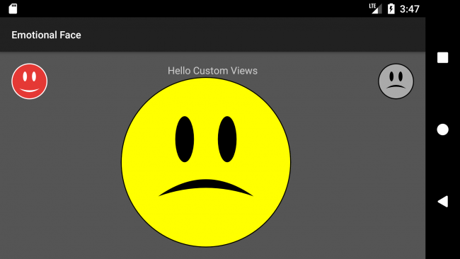
    Build and run the app, and you should see the top right button become a sad face, like the following screenshot:

    User Interaction

    You can let your user change the happiness state of the center emotional face view by clicking on the top left button to make it happy or by clicking on the top right button to make it sad. First, add the following line of code to the MainActivity import statements:

    import kotlinx.android.synthetic.main.activity_main.*
    

    Kotlin Android Extensions provide a handy way for view binding by importing all widgets in the layout in one go. This allows avoiding the use of findViewById(), which is a source of potential bugs and is hard to read and support.

    Now add the following click listeners to onCreate() in MainActivity:

    // 1
    happyButton.setOnClickListener({
       emotionalFaceView.happinessState = EmotionalFaceView.HAPPY
    })
    // 2
    sadButton.setOnClickListener({
       emotionalFaceView.happinessState = EmotionalFaceView.SAD
    })
    

    Here you:

    1. Set the emotionalFaceView‘s happinessState to HAPPY when the user clicks on the happy button.
    2. Set the emotionalFaceView‘s happinessState to SAD when the user clicks on the sad button.

    Build and run the app, and click on the both of buttons to change the happiness state:

    Saving View State

    You can save your view state in case there is any change in the device configuration, e.g., orientation, by overriding the onSaveInstanceState() and onRestoreInstanceState() methods.

    Add the following method overrides to EmotionalFaceView:

    override fun onSaveInstanceState(): Parcelable {
     // 1
     val bundle = Bundle()
     // 2
     bundle.putLong("happinessState", happinessState)
     // 3
     bundle.putParcelable("superState", super.onSaveInstanceState())
     return bundle
    }
    
    override fun onRestoreInstanceState(state: Parcelable) {
     // 4
     var viewState = state
     if (viewState is Bundle) {
       // 5
       happinessState = viewState.getLong("happinessState", HAPPY)
       // 6
       viewState = viewState.getParcelable("superState")
     }
     super.onRestoreInstanceState(viewState)
    }
    

    Here you:

    1. Create anew Bundle object to put your data into.
    2. Put the happiness state value into the bundle.
    3. Put the state coming from the superclass, in order to not lose any data saved by the superclass, then return the bundle.
    4. Check the type of the Parcelable to cast it to a Bundle object.
    5. Get the happinessState value.
    6. Get the superstate then pass it to the super method.

    Build and run the app, change the happiness state to sad, and change the orientation of your device. The center face should remain sad after device rotation:

    Where To Go From Here?

    Yes! You have created your own custom view :]

    You can download the completed project using the download button at the top or bottom of this tutorial.

    During this tutorial you:

    • Drew a circle, oval and a path on a canvas. You can learn more about custom drawing here.
    • Made the custom view responsive.
    • Created new XML attributes for the custom view.
    • Saved the view state.
    • Reused the custom view for different use cases.

    You can make your custom view even more interactive by detecting special gestures; check for more info here.

    Adding animation to your custom view can enhance the UX strongly. Check out Android Animation Tutorial with Kotlin.

    You can also learn more about drawable animation and Canvas and Drawables.

    Feel free to share your feedback or ask any questions in the comments below or in the forums. Thanks!

    The post Android Custom View Tutorial appeared first on Ray Wenderlich.
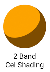

    Screencast: iOS Snapshot Test Case: Testing the UI

    Video Tutorial: Server Side Swift with Vapor Part 2: Persisting Data with MySQL

    Video Tutorial: Server Side Swift with Vapor Part 2: Conclusion

    Introduction To Unity: Particle Systems

    $
    0
    0
    Updated for Unity 2017.2 by Anthony Uccello. Original tutorial by Eric Van de Kerckhove.
    Make particle systems like these

    Make particles like these

    Particle systems are like salt; just a small amount can add extra “pizzazz” to whatever you’re cooking up. Modern games that don’t use particle systems in some manner can feel quite bland.

    Back in the old days, you needed the black arts of graphics programming to create even a single wisp of smoke. Thankfully, Unity makes creating particle systems quite simple with a modular, built-in particle system named Shuriken, which is easy to learn but lets you create complex effects.

    In this tutorial, you’ll learn the following:

    • How to add a new particle system in Unity.
    • What the most commonly used particle system modules do and how to use them.

    This tutorial has two main parts; in the first part, you’ll build the flames of a torch. In the second part, you’ll create a bomb explosion effect.

    Note: This tutorial assumes you understand the basics of working with Unity. If you are new to Unity, or need a refresher, please see our Introduction to Unity tutorial.

    Getting Started with Particle Systems

    Download the starter project for this tutorial and extract it to a convenient location. Note that you will need to use at least Unity 2017.2 to work with this project.

    Open up the Starter Project in Unity. The assets inside are sorted into several folders:

    • Materials: Holds the fire material.
    • Models: Contains the torch and bomb models and their materials.
    • Prefabs: Holds the bomb prefab.
    • Scenes: Contains the Torch and Bomb scenes.
    • Scripts: Holds the initial scripts.
    • Textures: Contains the texture for the fire material.

    Now that you’ve seen where everything is stored, you can start to learn how particle systems work in Unity.

    Adding a Particle System

    A particle system generally emits particles in random positions within a predefined space, which can have a shape like a sphere or a cone. The system determines the lifetime of the particle itself, and when that lifetime expires, the system destroys the particle.

    One nice thing about particle systems is that they are components that you can add to any GameObject in the scene. Want to have your sharks emit lasers from their eyes? Simply add a particle system to the shark eye GameObject, and your sharks will be unstoppable!

    Open up the Torch scene from your Project Window and run the scene:

    There’s not much going on at the moment. The torch hangs on the wall, but there’s no fire to be seen. You’ll need to add a particle system first.

    Stop running the scene and select TorchFireParticles inside the Hierarchy. Inside the Inspector, click the Add Component button. Search for Particle System and click to add it:

    Note: You might have noticed you didn’t add the particle system directly to the MedievalTorch GameObject. This is because the particles would be emitted from the middle of the torch, instead of from the fuel container at the top.

    Play your scene; you’ll see you have particles emitting already:

    Note: You might see pink particles instead of white, which seems to be a Unity bug with setting the default texture. If that’s the case, don’t worry: you will set the proper fire texture shortly. If you’d like to fix it now, click the Renderer section of the particle system, click the Dot next to the Material field and double-click Default-Particle in the window that pops up.

    When you select a GameObject with an attached particle system, you’ll notice a black dialog in the lower right hand corner of the scene view. This dialog lets you simulate or stop the particle system. Clicking Simulate activates your particle system and changes the button to a “Pause” button. To stop the simulation, click the “Stop” button.

    This dialog is useful for designing particle systems that run on a fixed timeline, such as explosions.

    A Closer Look at a Particle System

    Take a look at the Inspector. You’ll notice the particle system Component you added has several subsections:

    Each of these subsections is called a Module. These Modules contain the settings for the particle system. The Module expanded by default is known as the Main module:

    The Main module is the meat and bones of any particle system in Unity. The most common particle settings live here:

    • Duration: The length of time in seconds for the particle system to run. Leave this at the default value of 5.00.
    • Looping: Repeatedly emit particles until the particle system stops. The cycle restarts once the Duration time is reached. The fire needs to burn continuously, so leave this enabled.
      Left: on Right: off

      On & off

    • Prewarm: Only used when Looping is enabled. The Particle System will act as if it’s already completed a full cycle on start-up.
      On & off

      On & off

      For your fire effect, leave this disabled to make it look like the torch was just ignited.

    • Start Delay: The delay in seconds before the particle system starts emitting. Leave this at the default value of 0.
    • Start Lifetime: The initial lifetime in seconds for the particles. The particle is destroyed after this elapsed time.
      Top: 8 seconds Bottom: 3 seconds

      Top: 8 seconds
      Bottom: 3 seconds

      Set the lifetime to 4 seconds; this ensures the flame won’t be too tall.

    • Start Speed: The initial speed of the particles. The greater the speed of the particles, the more spread out they will be.
      Top: 2 Bottom: 10

      Top: 2
      Bottom: 10

      Set the speed to 0.75; this will make the fire effect slower and more dense.

    Note: As you modify the settings of the particle system, you’ll see a preview of it in the Game Window. Keep an eye on this preview while following along with the tutorial.

    Before continuing, run your scene to see the effect of your changes:

    You’ve set up the torch, but the fire effect still leaves a lot to be desired. Thankfully, the Main module has additional options to further refine the shape and behavior of your torch.

    More Main Module Properties

    Select the TorchFireParticles GameObject in the Hierarchy and scroll down to the particle system. Under the Main Module, take a look at the following properties:

    • Start Size: the initial size of the particles.
      Top: 0.2 Bottom: 1

      Top: 0.2
      Bottom: 1

      Set the size to 3; this is a manageable size that lets you see the individual particles more clearly.

    • Start Rotation: The initial rotation angle of the particles.
      Top: 0° Bottom: 45°

      Top: 0°
      Bottom: 45°

      Keep the rotation at ; the particles are round so you will hardly notice the difference.

    • Start Color: The initial color of the particles. Keep the color at the default value of pure white (255,255,255); you’ll color the fire via a texture.
    • Gravity Modifier: Scales the gravity value set in Unity’s Physics Manager window. If it’s set to 0, the gravity will be turned off.


      The image above is from a system with the gravity modifier set to 1, which makes the particles flow down like a waterfall. Leave the gravity in your system at 0; the particles will move upwards with the velocity you set in Start Speed.

    • Simulation Space: Moves particles in Local Space along with the particle system. While in World Space, particles move freely once emitted.
      Top: local space Bottom: world space

      Top: local space
      Bottom: world space

      Leave your simulation set to Local Space. The effect will only be visible once the particle system is moved.

    • Play On Awake: Starts emitting immediately when enabled. If this is turned off, you have to manually start the particle system via script or an animation system. Leave this setting on, as you want the fire to start when the scene starts playing.
    • Max Particles: The maximum number of particles the system may have alive at once. If you try to emit more particles than this, they won’t be emitted at all. This setting is primarily for performance reasons, and the default value of 1000 particles is more than enough in this case.

    Whew, that was quite a list! But as a result, you’ve learned how to add a particle system to your scene and how to customize it to your liking.

    Run your scene again to see the effect of your changes:

    It looks a bit more like fire every time, doesn’t it?

    It needs more particles though. To do that, you need to change the emission of the system.

    Introducing the Emission Module

    The Emission module handles the number and timing of emitted particles in the system to create anything from a continuous flow, to a sudden burst of particles, depending on your needs.

    While still in the particle system’s Inspector, click on the Emission module title:

    This opens up the Emission module:

    Rate over Time represents the number of particles emitted per second. Set Rate over Time to 15.

    Run your scene again; your particle system looks a little more like a burning flame now.

    Admittedly, it still looks like smoke. But here comes the biggest change in this tutorial so far: a custom texture!

    Adding a Custom Texture

    All particles have a particle material and a texture that defines how they look. There’s only so much you can do with the default texture. By changing the texture, you can create effects like magic stars, smoke and of course, fire.

    Changing the particle texture is quite easy. Up to this point, the particles have been drawn on the screen using the Default-Particle material, which is a particle material with a circular gradient texture:

    To change the material, select the TorchFireParticles GameObject inside the Hierarchy. Then find the the particle system component in the Inspector and open up the particle system’s Renderer module.

    Open the Materials folder in the Project View, and drag the FireMaterial Material to the Material property:

    Finally, run the scene to see your custom texture in use:

    Can you feel the heat? The flame’s a bit too wide though; to fix that, you’ll have to change the shape of the particle system.

    Changing the Particle System’s Shape

    The Shape module, as the name implies, controls the shape and the behavior of particles in that shape. You can choose from several different shapes; each has their own particular settings. This lets you create particles in a box, a sphere, or even in your own custom mesh!

    Expand the Shape module in the Inspector:

    The shape of your particle system is set to cone, which means particles emit from the base and move outwards at an angle:

    In the example above, the base is colored blue, the angle is green and the particles are red. Also notice that while you have the Shape Module expanded, you’re presented with a handy preview of the cone in the Scene view:

    Changing the Angle changes the size of the cone to make it wider or narrower. Set this to 7; you’ll get a nice tight flame that widens slightly as the particles rise.

    Changing the Radius changes the size of the base. The larger this value is, the more the particles will scatter as they emit. Set this value to 0.2; this ensures the flames will start inside the fuel holder of the torch.

    Run your scene and see how the shape of the flame has changed:

    That’s starting to look like a real flame! The finishing touch is to change the size of the particles over the course of their lifetime.

    Changing Size Over Lifetime

    With the Size over Lifetime module, you can create particles that grow or shrink during their lifetime, or even pulsate like fireflies in a forest.

    In your particle system’s module list, look for Size over Lifetime. It’s not enabled by default, so tick on the checkbox next to the module name to enable it:

    Expand the Size over Lifetime module by clicking on its name. This will display a dark gray background with a flat Curve running along the top:

    Click on the dark gray background to open the curves editor at the bottom of the Inspector. The horizontal axis depicts the lifetime of the particle, while the vertical axis depicts its size:

    You can move the keys at either end of the red line to edit the curve; you can also add additional keys by double-clicking anywhere on the curve. To delete keys, right-click on the key to remove and select Delete Key. You can also select one of the preset curves at the bottom:

    If you think about flames in the real world, they tend to shrink as the particles rise. To mimic this, select the third preset from the right to create a downward-facing slope:

    Run your scene to see your effect in all its fiery glory!

    Congratulations! You’ve learned how to set up a new particle system and bend it to your will to make a beautiful fire effect.

    In the next section, you’ll let your inner Michael Bay shine as you learn to create explosion effects!

    Building a Bomb (Effect)

    Making an exploding effect is quite simple in Unity. Once you know how to instantiate particles at will, you can use this effect for things such as car wheels sparking when they scrape the ground, or balloons that pop and shower confetti.

    Open up the Bomb scene from the Project Window and play the scene:

    There’s a floor at the bottom of the scene, but apart from that, there’s not much going on.

    To spawn bombs, drag the Bomb Prefab to the Bomb Emitter prefab slot:

    DragBombPrefabToEmitter

    Play the scene again to see your bombs appear:

    The emitter creates a new bomb every two seconds. To put a neat spin on things, you’ll add some rotational force to the bomb when it spawns.

    Open up the Bomb script inside the Scripts folder in your Project Window.

    Add the following code to Start():

    void Start()
    {
        float randomX = UnityEngine.Random.Range (10f, 100f);
        float randomY = UnityEngine.Random.Range (10f, 100f);
        float randomZ = UnityEngine.Random.Range (10f, 100f);
    
        Rigidbody bomb = GetComponent<Rigidbody> ();
        bomb.AddTorque (randomX, randomY, randomZ);
    }
    

    The first three lines generate random float values between 10 and 100 for the x, y and z axes. Next, you get a reference to the bomb’s Rigidbody component and apply torque to it. This causes the bomb to rotate in a random direction. Save your script changes, return to Unity and run the scene.

    The bombs now rotate nicely while they fall — but you were promised explosions!

    In the Hierarchy, press the Create button and select Create Empty. Click on the newly created GameObject and name it ExplosionParticles. Next, add a new particle system to the GameObject. If you’ve forgotten how to create a particle system, scroll on up for a refresher.

    With your particle system in place, drag the ExplosionParticles GameObject from the Hierarchy to the Prefabs folder in the Project Browser. After that’s done, delete the ExplosionParticles GameObject from the Project Hierchy.

    Next, select the Bomb Prefab inside the Prefabs folder and drag the ExplosionParticles Prefab to the Bomb‘s Explosion Particles Prefab slot like so:

    Now, a new Explosion Particles GameObject will spawn when a bomb touches the ground.

    Play your scene to see how the explosion looks. If you’re experiencing the pink textures bug, don’t worry, you’re about to change the texture.

    Very…uh…magical, but nothing near an explosion yet!

    As with the torch, you’ll be using the Fire material for the particle system.

    Select the ExplosionParticles Prefab in the Project Window, then expand the Renderer Module in the Inspector. Drag the FireMaterial from the Materials folder in the Project Window to the Material slot as shown below:

    To complete the effect, you’ll have to modify the following settings in the Main module:

    1. Set the Duration to 0.70.
    2. Looping should be disabled. The particles should emit just once.
    3. Set the Start Lifetime to 0.7.
    4. Set the Start Speed to 10.
    5. Set Start Size to 2.
    6. Set the Gravity Modifier to 1. This will make the particles drop slightly at the end.

    Run your bomb scene to see what you’ve built:

    Well, it’s kind of explod-ish, but you can definitely do better!

    Building the Explosion

    To improve the explosion, you’ll alter the properties of one of the particle system’s modules. Can you guess which module to alter? Here’s a hint — you’ve already used it.

    If you guessed the Emission module, give yourself a pat on the back!

    Expand the Emission Module. Rate is the number of particles spawned per second. For this explosion, you won’t want a steady flow of particles, but rather a sudden burst.

    Set the Rate over Time to 0. Now look beneath the Rate over Distance, and you’ll see a list of Bursts that’s empty by default:

    A Burst is a collection of particles emitted all at once at a particular point in time.

    Click on the + button at the bottom right to add a new Burst. You’ll see two fields: Time and Count:

    Leave the Time at 0, and set Count to 150. These settings will make the particle system emit 150 particles all at once at the start of the system.

    Play your scene; how do things look now?

    Now that looks more like an explosion! While this explosion looks better, the shape is still an awkward cone and the particles don’t fade out — they simply disappear. You’ll need to mold your explosion to give it that final touch.

    To get started, expand the Shape Module:

    You’ve already used this module for the torch’s fire shape, but there are several more shapes to choose from. Click on the dropdown box that says Cone to see all options available to you:

    Each shape affects the emitter in a different way. Each animation below shows the same emitter, with only the shape changed:

    Sphere

    HemiSphere

    Cone

    Box

    Mesh (Cube)

    Circle


    Edge

    You can get many different effects from the same system — simply by changing the shape! To create a realistic explosion, set the shape to Sphere.

    Run the scene and prepare to be blown away:

    Now that looks awesome!

    While the explosion looks good, there’s one small problem. The particles simply disappear. This is a jarring effect and doesn’t look natural at all. Rather than just disappear, the particles should fade over time to make the explosion fade away.

    Changing Color

    With the particle system open in the Inspector, click the checkbox next the Color over Lifetime module to enable it and expand it. You’ll be greeted by the word Color and what looks like a white block next to it. Click on the white block:

    Screen Shot 2015-10-30 at 2.16.41 PM

    This opens up the gradient editor:

    The color change over the lifetime of the particles is represented as a gradient bar. The starting color is on the far left, and the particles will transition to the color on the right side:

    The four white arrows at the edges are known as markers; click between two existing markers to add a new one. To remove a marker, drag it off the bar:

    The top markers handle the Alpha or opacity of the color, while the bottom markers manage the RGB (Red, Green, Blue) color values.

    Click on the rightmost alpha marker. The bottom of the Gradient editor now shows the current alpha value:

    Drag the slider all the way to 0. Now the particles will gradually fade away over the course of their lifetime.

    Run your scene once again to see the effect of your changes:

    That’s one hot explosion!

    Want extra credit? Return to the torch scene and configure the flame to use Size Over Lifetime Module to achieve a similar effect.

    Where to Go From Here?

    You can download the final project here.

    In this tutorial, you’ve learned how particle systems and its various modules work in Unity, and how to tweak them to get exactly the effect you want. Feel free to experiment with the different settings to see what other cool effects you can achieve.

    For more information on the Shuriken Particle System and its modules, take a look at Unity’s official documentation and their Particle System video. You can also learn more about scripting particle systems here.

    Did you know the Unity team has created a book? If not, check out Unity Games By Tutorials. The book will teach you to create four complete games from scratch:

    • A twin-stick shooter
    • A first-person shooter
    • A tower defense game (with VR support!)
    • A 2D platformer

    By the end of this book, you’ll be ready to make your own games for Windows, macOS, iOS, and more!

    This book is for complete beginners to Unity, as well as for those who’d like to bring their Unity skills to a professional level. The book assumes you have some prior programming experience (in any language).

    I hope you enjoyed this tutorial; if you have any comments or questions, please share them in the discussion below!

    The post Introduction To Unity: Particle Systems appeared first on Ray Wenderlich.
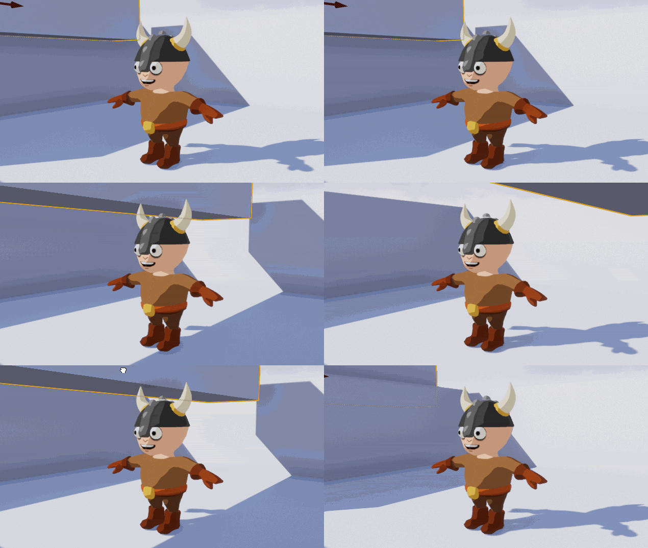
    Video Tutorial: Server Side Swift with Vapor Part 3: Introduction

    Video Tutorial: Server Side Swift with Vapor Part 3: Getting Started with Leaf

    Behavior-Driven Testing Tutorial for iOS with Quick & Nimble

    $
    0
    0

    Step in and start using Quick and Nimble!

    Writing beautiful, performant applications is one thing, but writing good tests that verify your application’s expected behavior is a much harder task. In this tutorial, you’ll examine one of the available approaches for testing applications, called behavior-driven testing, using two extremely popular frameworks named Quick and Nimble.

    You’ll learn about behavior-driven testing: what it is, why it’s an extremely powerful concept, and how easy it is to write maintainable and readable tests using Quick and Nimble.

    You’ll be writing tests for an amazingly simple and fun game called AppTacToe in which you play a game of Tic Tac Toe vs. the computer, portraying the iOS character playing against the evil Android player!

    Note: This tutorial assumes basic knowledge of Unit Testing and using XCTestCase.

    Even though you should be able to follow this tutorial without this prior knowledge, we do recommend checking out our iOS Unit Testing and UI Testing Tutorial if you want a refresher of the basics.

    Getting Started

    The best way to get started testing is to work on a real app, which in your case will be the beautiful AppTacToe game introduced earlier.

    Use the Download Materials button at the top or bottom of this tutorial to download the starter project, which already has Quick and Nimble bundled, and open AppTacToe.xcworkspace.

    Open Main.storyboard and examine the basic structure of the app. It contains two screens: the Board itself, where the game is played, and the Game Over screen, responsible for displaying the game’s result.

    Build and run the app, and play a quick game or two to get the hang of it.

    You’ll also see some useful logs printed to your console, portraying the game play and printing out the resulting board as the game ends.

    Note: Don’t worry if you notice a minor bug while playing the game; you’ll fix this as you work your way through this tutorial!

    Most of the app’s logic is contained in one of two files:

    • Components/Board.swift: This file provides the logical implementation of a Tic Tac Toe game. It has no UI associated with it.
    • ViewControllers/BoardViewController.swift: This is the main game screen. It uses the aforementioned Board class to play the game itself, and is solely responsible for drawing the state of the game on screen and handling user interaction with the game.

    What you really want to test in this case is the the logic of the game, so you’ll be writing tests for the Board class.

    What is Behavior-Driven Testing?

    An application is comprised of many pieces of code. In traditional unit tests, you test the ins-and-outs of every one of these pieces. You provide some inputs to some piece of code, and assert that it returns the result you expect.

    A downside of this approach is that it emphasizes testing the inner workings of your applications. This means you spend more time testing implementation details then actual business logic, which is the real meat of your product!

    Wouldn’t it be nice if you could simply verify your application behaves as expected, regardless of how it was implemented?

    Enter behavior-driven testing!

    Behavior Driven Tests vs. Unit Tests

    In behavior-driven testing (or BDT), your tests are based on user stories that describe some specific expected behavior of your application. Instead of testing implementation details, you’re actually testing what matters: does your app deliver your user stories correctly?

    This approach makes tests extremely readable and maintainable, and helps describe the behavior of logical portions in your application to other developers who might be lucky enough to go through your beautiful code one day.

    Some examples of user stories you might end up writing as part of the AppTacToe game might be:

    • Playing a single move should switch to other player.
    • Playing two moves should switch back to the first player.
    • Playing a winning move should switch to a Won state.
    • Playing a move leaving no remaining moves should switch to a Draw (Tie) state.

    Quick and Nimble’s role in Behavior-Driven Testing

    Tests written in a behavior-driven way are based on user stories, which are regular sentences, written in plain English. This makes them much easier to understand when compared to the usual unit tests you’re accustomed to writing.

    Quick and Nimble provide an extremely powerful syntax that let you write tests that read exactly like regular sentences, allowing you to easily and swiftly describe the behavior you wish to verify. Beneath the surface, they work exactly like regular XCTestCase(s).

    Quick itself provides most of the basic syntax and abilities related to writing tests in a behavior-driven way, while Nimble is its companion framework. It provides additional expressive matching and assertion abilities via Matchers, which you’ll learn about a bit later in this tutorial.

    The Anatomy of a Quick Test

    Break up one of the user stories into three clauses based on GWTGiven (the action/behavior you’re describing), When (the context of that action/behavior) and Then (what you expect to happen):

    • Given: User is playing.
    • When: It is a single move.
    • Then: The game should switch to other player.

    In Quick, you use three functions as the counterparts of each: describe, context and it.

    giphy

    Anatomy of a Quick test

    Your First Test

    In Quick, test suites are named Specs, and every test suite you create starts off with a class inheriting from QuickSpec in the same way you inherit from XCTestCase in non-Quick tests. The test suite includes a main method, spec(), that contains the entirety of your test cases.

    The starter project already contains an empty test suite. Open AppTacToeTests/BoardSpec.swift and take a look at the BoardSpec test spec, inheriting from QuickSpec and containing a single method, spec(), in which you’ll be writing test cases and expectations.

    Note: When you open the BoardSpec.swift file, you might see an error saying No such module 'Quick'. Worry not, as this is just a Xcode bug/glitch unrelated to your project. Your test code will compile and work with no issues whatsoever.

    Start by adding the following code inside spec():

    var board: Board! // 1
    
    beforeEach { // 2
      board = Board()
    }
    

    This code performs two actions:

    1. Defines a global board to be used across test cases.
    2. Resets that board to a new instance of Board before every test using Quick’s beforeEach closure.

    With some basic boilerplate out of the way, you can start writing your very first test!

    For the purposes of this app, the game will always start with Cross (e.g. X), and the opponent will be Nought (e.g. O).

    Let’s start with the first user story mentioned above: playing a single move should switch to nought.

    Add the following code immediately after the end of the beforeEach closure:

    describe("playing") { // 1
      context("a single move") { // 2
        it("should switch to nought") { // 3
          try! board.playRandom() // 4
          expect(board.state).to(equal(.playing(.nought))) // 5
        }
      }
    }
    

    Here’s what this does, line by line:

    1. describe() is used to define what action or behavior you’ll be testing.
    2. context() is used to define the specific context of the action you’ll be testing.
    3. it() is used to define the specific expected result for the test.
    4. You play a random move on the Board class using playRandom().
    5. You assert the board’s state has been changed to .playing(.nought). This step uses the equal() matcher from Nimble, which is one of many available functions you can use to assert a matching of specific conditions on an expected value.
    Note: You might have noticed the forced try call and implicitly unwrapped optional to define test globals. While this is usually frowned upon when writing regular code for apps, it is a relatively common practice when writing tests.

    Run your tests by either navigating in the menu bar to Product ▸ Test or by using the Command-U shortcut.

    You’ll see your very first test pass. Awesome!

    Your Test navigator will look like this:

    You can already notice a few interesting points by going through this code. First of all, it is extremely readable. Going through the lines of code, any person could relatively easily read it as a plain English sentence:

    “Playing a single move should switch to nought. Play a random move and expect the board’s state to equal nought playing.”

    You were also just introduced to your first usage of Nimble Matchers. Nimble uses these Matchers to let you express the expected outcome of your test in a very fluent, sentence-like way. equal() is just one of the matcher functions available in Nimble and, as you’ll see shortly, you can even create your own custom ones.

    Your Second Test

    The second user story — “playing two moves should switch back to cross” — sounds fairly close to the first.

    Add the following code right after the end of your previous context(), inside the closing curly brace of describe():

    context("two moves") { // 1
      it("should switch back to cross") {
        try! board.playRandom() // 2
        try! board.playRandom()
        expect(board.state) == .playing(.cross) // 3
      }
    }
    

    This test is similar to the last one, different in the fact you’re playing two moves instead of one.

    Here’s what it does:

    1. You define a new context() to establish the “two moves” context. You can have as many context()s and describe()s as you want, and they can even be contained within each other. Since you’re still testing gameplay, you added a context inside describe("playing").
    2. You play two consecutive random moves.
    3. You assert the board’s state is now .playing(.cross). Notice that this time you used the regular equality operator ==, instead of the .to(equal()) syntax you used earlier. Nimble’s equal() matcher provides its own operator overloads that let you choose your own flavor/preference.

    Arrange, Act & Assert

    The tests you’ve just written have been relatively simple and straightforward. You perform a single call on an empty Board, and assert the expected result. Usually, though, most scenarios are more complex, thus requiring a bit of extra work.

    The next two user stories are more complex:

    • Playing a winning move should switch to the won state.
    • Playing a move leaving no remaining moves should switch to the draw state.

    In both of these user stories, you need to play some moves on the board to get it into a state where you can test your assertion.

    These kind of tests are usually divided into three steps: Arrange, Act and Assert.

    Before you plan your tests, you must understand how the Tic Tac Toe board is implemented under the hood.

    The board is modeled as an Array consisting of 9 cells, addressed using indices 0 through 8.

    On each turn, a player plays a single move. To write a test for the winning user story, you’ll need to play both moves to bring the board to a state where the next move would be a winning move.

    Now that you understand how the board works, it’s time to write the winning test.

    Add the following code below your previous “two moves” context():

    context("a winning move") {
      it("should switch to won state") {
        // Arrange
        try! board.play(at: 0)
        try! board.play(at: 1)
        try! board.play(at: 3)
        try! board.play(at: 2)
    
        // Act
        try! board.play(at: 6)
    
        // Assert
        expect(board.state) == .won(.cross)
      }
    }
    

    Here’s what this does:

    • Arrange: You arrange the board to bring it to a state where the next move would be a winning move. You do this by playing the moves of both players at their turn; starting with X at 0, O at 1, X at 3 and finally O at 2.
    • Act: You play Cross (X) at position 6. In the board’s current state, playing at position 6 should cause a winning state.
    • Assert: You assert the board’s state to be equal to won by cross (e.g. .won(.cross))

    Run the test suite again by going to Product ▸ Test or using the Command + U shortcut.

    Something is wrong; you played all of the right moves, but the test failed unexpectedly.

    Add the following code immediately below the expect() code line to see what went wrong:

    print(board)
    

    By printing the board immediately after the assertion you will get better clarity of the situation:

    As you can see, the board should be in a winning state, but the test is still failing. Seems like you found a bug.

    Switch to the Project navigator and open Board.swift. Go to the isGameWon computed property on line 120.

    The code in this section tests for all possible winning positions across rows, columns and diagonals. But looking at the columns section, the code seems to only have 2 columns tested, and is actually missing one of the winning options. Whoops!

    Add the following line of code immediately below the // Columns comment:

    [0, 3, 6],

    Run your test suite again and bask in the glory of three green checkmarks!

    This kind of scenario would be much harder to detect with regular unit tests. Since you’re using behavior-driven testing, you actually tested a specific use case of the app and detected a fault. Fixing the underlying implementation fixed the tested behavior, resolving the issue your user story was experiencing.

    Note: While working on one specific test or a specific context of tests, you might not want to run all of your tests at once to enable you to focus specifically on working on one test.

    Fortunately, Quick provides an extremely easy way to do this. Simply add f (stands for focused) before any of the test function names – having it(), context() and describe() become fit(), fcontext() and fdescribe().

    For example, changing it("should switch to won state") to fit("should switch to won state"), will only run that specific test, skipping the rest of your test suite. Just don’t forget to remove it after you’re done, or only part of your tests will run!

    A Short Exercise

    Time for a challenge. You have one last user story you haven’t tested yet: “Playing a move leaving no remaining moves should switch to draw state”

    Using the previous examples, write a test to verify the board correctly detects a Draw state.

    Note: To get to a Draw state you can play the following positions sequentially: 0, 2, 1, 3, 4, 8, 6, 7.
    At this state, playing position 5 should result in your board being in a draw state.

    Also, matching the state with .draw might confuse Xcode. If that is the case, use the full expression: Board.State.draw.

    Tap the button below to see the full solution.

    Solution Inside: Test for Draw State SelectShow>

    Happy Path Isn’t The Only Path

    All of the tests you’ve written up until now have one thing in common: they describe the correct behavior of your app while following the happy path. You verified that when the player plays the correct moves, the board behaves correctly. But what about the not-so-happy path?

    When writing tests, you mustn’t forget the concept of expected errors. You, as a developer, should have the ability to confirm your board behaves correctly even when your player doesn’t (e.g. makes an illegal move).

    Consider the two final user stories for this tutorial:

    • Playing a move that was already played should throw an error.
    • Playing a move when the game is already won should throw an error.

    Nimble provides a handy matcher named throwError() you can use to verify this behavior.

    Start with verifying that an already played move can’t be played again.

    Add the following code right below the last context() you’ve added, while still inside the describe("playing") block:

    context("a move that was already played") {
      it("should throw an error") {
        try! board.play(at: 0) // 1
    
        // 2
        expect { try board.play(at: 0) }
          .to(throwError(Board.PlayError.alreadyPlayed))
      }
    }
    

    Here’s what this does:

    1. You play a move at position 0.
    2. You play a move at the same position, and expect it to throw Board.PlayerError.alreadyPlayed. When asserting error throwing, expect takes a closure, in which you can run the code that causes the error to be thrown.

    As you have come to expect from Quick tests, the assertion reads much like an English sentence: expect playing the board to throw error – already played.

    Run the test suite again by going to Product ▸ Test or using the Command + U shortcut.

    The last user story you’re going to cover today will be: Playing a move when the game is already won should throw an error.

    This test should feel relatively similar to the previous Arrange, Act and Assert tests: you’ll need to bring the board to a winning state, and then try to play another move while the board has already been won.

    Add the following code right below the last context() you added for the previous test:

    context("a move while the game was already won") {
      it("should throw an error") {
        // Arrange
        try! board.play(at: 0)
        try! board.play(at: 1)
        try! board.play(at: 3)
        try! board.play(at: 2)
        try! board.play(at: 6)
    
        // Act & Assert
        expect { try board.play(at: 7) }
          .to(throwError(Board.PlayError.noGame))
      }
    }
    

    Building on the knowledge you’ve gained in this tutorial, you should be feeling right at home with this test!

    You Arrange the board by playing five moves that cause the board to be in a winning state (e.g. .won(.cross)). You then Act & Assert by trying to play a move while the board was already in a winning state, and expect Board.PlayError.noGame to be thrown.

    Run your test suite one more time, and give yourself a pat on the back for all those great tests!

    Custom Matchers

    While writing your tests in this tutorial, you’ve already used several matchers built into Nimble: equal() (and its == operator overload), and .throwError().

    Sometimes, you want to create your very own matchers, either to encapsulate some complex form of matching, or to increase the readability of some of your existing tests.

    Consider how you might improve the readability of the “playing a winning move should switch to won state” user story mentioned earlier:

    expect(board.state) == .won(.cross)

    Reword this statement as an English sentence: expect board to be won by cross. Then the test can look like this:

    expect(board).to(beWon(by: .cross))

    Matchers in Nimble are nothing more than simple functions that return Predicate<T>, where the generic T is the type you compare against. In your case, T will be of type Board.

    In Project navigator, right click the AppTacToeTests folder and select New File. Select Swift File and click Next. Name your file Board+Nimble.swift. Confirm that you correctly set the file as a member of your AppTacToeTests target:

    Replace the default import Foundation with the following three imports:

    import Quick
    import Nimble
    @testable import AppTacToe
    

    This simply imports Quick and Nimble, and also imports your main target so you can use Board within your matcher.

    As mentioned earlier, a Matcher is a simple function returning a Predicate of type Board.

    Add the following base of your matcher below your imports:

    func beWon(by: Board.Mark) -> Predicate<Board> {
      return Predicate { expression in
        // Error! ...your custom predicate implementation goes here
      }
    }
    

    This code defines the beWon(by:) matcher that returns a Predicate<Board>, so it correctly matches against Board.

    Inside of your function, you return a new Predicate instance, passing it a closure with a single argument — expression — which is the value or expression you match against. The closure must return a PredicateResult.

    At this point you’ll see a build error, since you haven’t yet returned a result. You’ll fix that next.

    To generate a PredicateResult, you must consider the following cases:

    How the beWon(by:) matcher works

    Add the following code inside of your Predicate‘s closure, replacing the comment, // Error!:

    // 1
    guard let board = try expression.evaluate() else {
      return PredicateResult(status: .fail,
                             message: .fail("failed evaluating expression"))
    }
    
    // 2
    guard board.state == .won(by) else {
      return PredicateResult(status: .fail,
                             message: .expectedCustomValueTo("be Won by \(by)", "\(board.state)"))
    }
    
    // 3
    return PredicateResult(status: .matches,
                           message: .expectedTo("expectation fulfilled"))
    

    This predicate implementation might seem confusing at first, but it is quite simple if you take it step-by-step:

    1. You try to evaluate the expression passed to expect(). In this case, the expression is the board itself. If the evaluation fails, you return a failing PredicateResult with a proper message.
    2. You confirm the board’s state is equal to .won(by), where by is the argument passed to the Matcher function. If the state doesn’t match, you return a failing PredicateResult with an .expectedCustomValueTo message.
    3. Finally, if everything looks good and verified, you return a successful PredicateResult.

    That’s it! Open BoardSpec.swift and replace the following line:

    expect(board.state) == .won(.cross)
    

    With your new matcher:

    expect(board).to(beWon(by: .cross))
    

    Run your tests one final time by navigating to Product ▸ Test or using the Command-U shortcut. You should see all of your tests still pass, but this time with your brand new custom Matcher!

    Where To Go From Here?

    You can download the completed version of the project using the Download Materials button at the top or bottom of this tutorial.

    You now have the knowledge you need to start applying behavior-driven testing to your app.

    You’ve learned all about testing user stories, instead of testing implementation details, and how Quick helps achieve just that. You’ve also learned about Nimble matchers, and even written your very own matcher. Very exciting!

    To get started with Quick and Nimble in your own project, start off by following the Installation guide and choose the installation method that works for your project.

    When you have everything set up and you want to learn more about Quick, the best place to continue your reading is Quick’s Official Documentation. You might also want to read Nimble’s Readme to discover the vast number of available matchers and abilities it provides.

    In the meantime, if you have any questions or comments about this tutorial or behavior-driven tests in general, please join the forum discussion below!

    The post Behavior-Driven Testing Tutorial for iOS with Quick & Nimble appeared first on Ray Wenderlich.
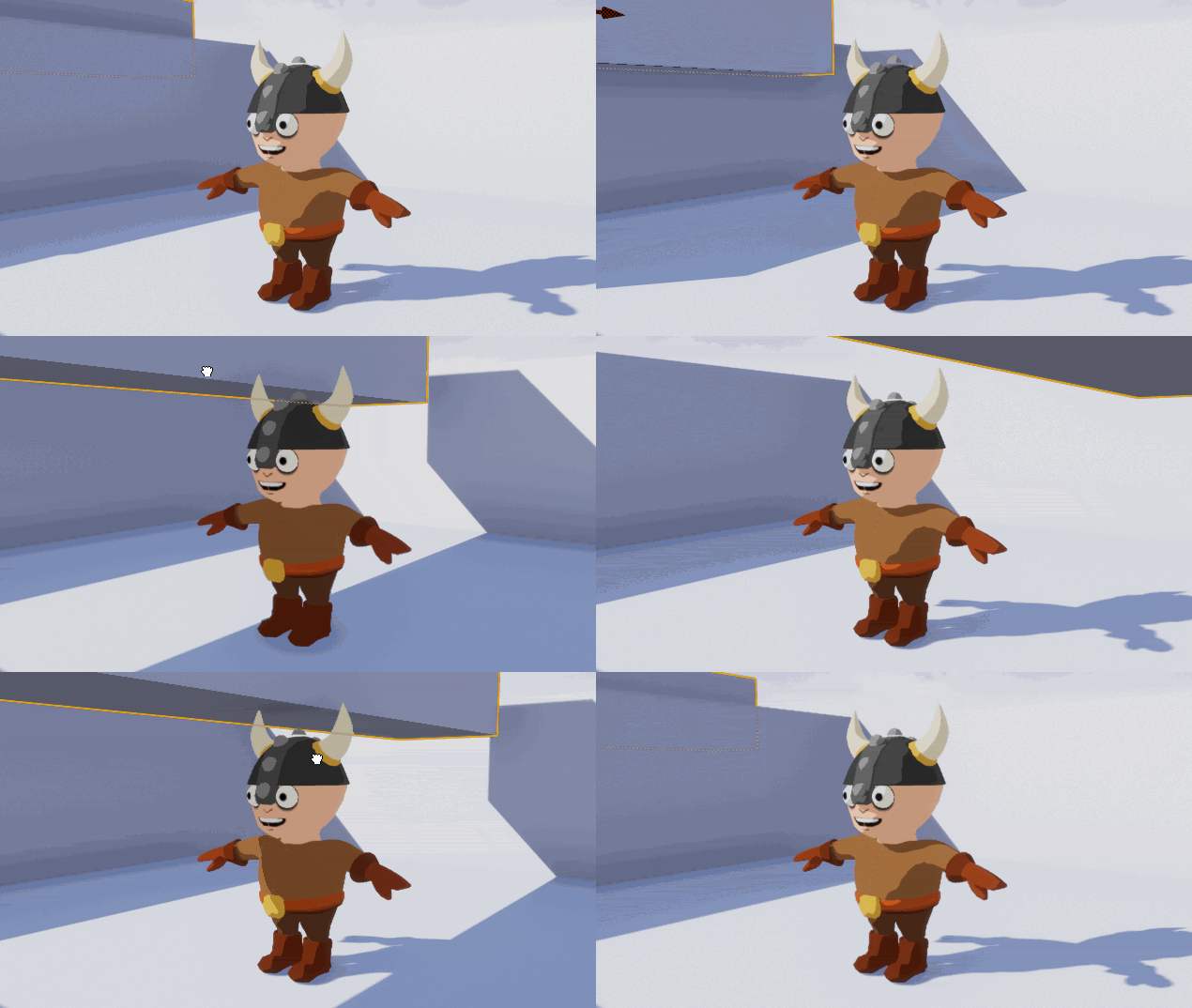

    Video Tutorial: Server Side Swift with Vapor Part 3: Powerful Templates

    Video Tutorial: Server Side Swift with Vapor Part 3: Embedding Templates

    Video Tutorial: Server Side Swift with Vapor Part 3: Beautifying Our App

    Video Tutorial: Server Side Swift with Vapor Part 3: Challenge: Users and Categories

    Video Tutorial: Server Side Swift with Vapor Part 3: Creating Acronyms

    Viewing all 4396 articles
    Browse latest View live


    <script src="https://jsc.adskeeper.com/r/s/rssing.com.1596347.js" async> </script>