Let's review what you will be learning in this video course, beginning with a brief history of RxSwift.
The post Video Tutorial: Beginning RxSwift Part 1: Introduction appeared first on Ray Wenderlich.
Let's review what you will be learning in this video course, beginning with a brief history of RxSwift.
The post Video Tutorial: Beginning RxSwift Part 1: Introduction appeared first on Ray Wenderlich.
Learn what are the goals of RxSwift, compare the pros and cons of learning and using RxSwift, and become familiar with the foundation of RxSwift: the observable.
The post Video Tutorial: Beginning RxSwift Part 1: Hello RxSwift appeared first on Ray Wenderlich.
See how to install RxSwift in an Xcode project using CocoaPods, and how to add a playground to a project.
The post Video Tutorial: Beginning RxSwift Part 1: Installing RxSwift appeared first on Ray Wenderlich.

Have you wanted to try using reactive programming in your iOS apps, but didn’t know where to start? Are you looking for a more streamlined way to write asynchronous code?
Today, we are releasing a brand new course for you: Beginning RxSwift. In this 39-video course, you’ll get started with reactive programming in Swift and iOS with RxSwift. You’ll learn about foundations of RxSwift like observables, subscribing, and more. You’ll also learn to use RxSwift in your iOS apps!
Take a look at what’s inside:
In part one, set up an Xcode project with RxSwift and get started using the foundation of RxSwift: the observable.

In part two, learn how to use filtering operators to filter data emitted by observables.

In part 3, learn to use transforming operators to manipulate and convert data that comes from an observable.

In the final part of the course, learn to use combining operators to merge data coming from multiple observables into one.

Want to check out the course? You can watch the first two videos for free!
The rest of the course is for raywenderlich.com subscribers only. Here’s how you can get access:
Stay tuned for more new and updated courses to come. I hope you enjoy the course! :]
The post New Course: Beginning RxSwift appeared first on Ray Wenderlich.
Go over several operators you can use to create observables from individual values and collections of values.
The post Video Tutorial: Beginning RxSwift Part 1: Creating Observables appeared first on Ray Wenderlich.
Learn how to subscribe to an observable, and how to manage memory by using dispose bags.
The post Video Tutorial: Beginning RxSwift Part 1: Subscribing to Observables Part 1 appeared first on Ray Wenderlich.
Continue learning how to subscribe to observables and see how to make an observable emit an error event to subscribers.
The post Video Tutorial: Beginning RxSwift Part 1: Subscribing to Observables Part 2 appeared first on Ray Wenderlich.
Get the lowdown on Alamofire!
Alamofire is a Swift-based HTTP networking library for iOS and macOS. It provides an elegant interface on top of Apple’s Foundation networking stack that simplifies a number of common networking tasks.
Alamofire provides chainable request/response methods, JSON parameter and response serialization, authentication, and many other features.
In this Alamofire tutorial, you’ll use Alamofire to perform basic networking tasks like uploading files and requesting data from a third-party RESTful API.
Alamofire’s elegance comes from the fact it was written from the ground up in Swift and does not inherit anything from its Objective-C counterpart, AFNetworking.
You should have a conceptual understanding of HTTP networking and some exposure to Apple’s networking classes such as URLSession.
While Alamofire does obscure some implementation details, it’s good to have some background knowledge if you ever need to troubleshoot your network requests.
Use the Download Materials button at the top or bottom of this tutorial to download the starter project.
The app for this Alamofire tutorial is named PhotoTagger. When complete, it will let you select an image from your library (or camera if you’re running on an actual device) and upload the image to a third-party service called Imagga. This service will perform some image recognition tasks to come up with a list of tags and primary colors for the image:

This project uses CocoaPods, so open it using the PhotoTagger.xcworkspace file.
Note:To learn more about CocoaPods, check out this tutorial by Joshua Greene, published right here on the site.
Build and run the project. You’ll see the following:

Click Select Photo and choose a photo. The background image will be replaced with the image you chose.
Open Main.storyboard and you’ll see the additional screens for displaying tags and colors have been added for you. All that remains is to upload the image and fetch the tags and colors.
Imagga is an image recognition Platform-as-a-Service that provides image tagging APIs for developers and businesses to build scalable, image-intensive cloud apps. You can play around with a demo of their auto-tagging service here.
You’ll need to create a free developer account with Imagga for this Alamofire tutorial. Imagga requires an authorization header in each HTTP request so only people with an account can use their services. Go to https://imagga.com/auth/signup/hacker and fill out the form. After you create your account, check out the dashboard:

Listed down in the Authorization section is a secret token you’ll use later. You’ll need to include this information with every HTTP request as a header.
Note: Make sure you copy the whole secret token, be sure to scroll over to the right and verify you copied everything.
You’ll be using Imagga’s content endpoint to upload the photos, tagging endpoint for the image recognition and colors endpoint for color identification. You can read all about the Imagga API at http://docs.imagga.com.
If you’re coming to this tutorial with very little experience in using third-party services over the Internet, you might be wondering what all those acronyms mean! :]
HTTP is the application protocol, or set of rules, web sites use to transfer data from the web server to your screen. You’ve seen HTTP (or HTTPS) listed in the front of every URL you type into a web browser. You might have heard of other application protocols, such as FTP, Telnet, and SSH. HTTP defines several request methods, or verbs, the client (your web browser or app) use to indicate the desired action:
REST, or REpresentational State Transfer, is a set of rules for designing consistent, easy-to-use and maintainable web APIs. REST has several architecture rules that enforce things such as not persisting states across requests, making requests cacheable, and providing uniform interfaces. This makes it easy for app developers like you to integrate the API into your app, without needing to track the state of data across requests.
JSON stands for JavaScript Object Notation. It provides a straightforward, human-readable and portable mechanism for transporting data between two systems. JSON has a limited number of data types: string, boolean, array, object/dictionary, null and number. There’s no distinction between integers and decimals.
There are a few native choices for converting your objects in memory to JSON and vice-versa: the good old JSONSerialization class and the newly-added JSONEncoder and JSONDecoder classes. In addition, there are numerous third party libraries that help with handling JSON. You’ll use one of them, SwiftyJSON in this tutorial.
The combination of HTTP, REST and JSON make up a good portion of the web services available to you as a developer. Trying to understand how every little piece works can be overwhelming. Libraries like Alamofire can help reduce the complexity of working with these services, and get you up and running faster than you could without their help.
Why do you need Alamofire at all? Apple already provides URLSession and other classes for downloading content via HTTP, so why complicate things with another third party library?
The short answer is Alamofire is based on URLSession, but it frees you from writing boilerplate code which makes writing networking code much easier. You can access data on the Internet with very little effort, and your code will be much cleaner and easier to read.
There are several major functions available with Alamofire:
Alamofire.upload: Upload files with multipart, stream, file or data methods.Alamofire.download: Download files or resume a download already in progress.Alamofire.request: Every other HTTP request not associated with file transfers.These Alamofire methods are global within Alamofire so you don’t have to instantiate a class to use them. There are underlying pieces to Alamofire that are classes and structs, like SessionManager, DataRequest, and DataResponse; however, you don’t need to fully understand the entire structure of Alamofire to start using it.
Here’s an example of the same networking operation with both Apple’s URLSession and Alamofire’s request function:
// With URLSession
public func fetchAllRooms(completion: @escaping ([RemoteRoom]?) -> Void) {
  guard let url = URL(string: "http://localhost:5984/rooms/_all_docs?include_docs=true") else {
    completion(nil)
    return
  }

  var urlRequest = URLRequest(url: url,
                              cachePolicy: .reloadIgnoringLocalAndRemoteCacheData,
                              timeoutInterval: 10.0 * 1000)
  urlRequest.httpMethod = "GET"
  urlRequest.addValue("application/json", forHTTPHeaderField: "Accept")

  let task = urlSession.dataTask(with: urlRequest)
  { (data, response, error) -> Void in
    guard error == nil else {
      print("Error while fetching remote rooms: \(String(describing: error)")
      completion(nil)
      return
    }

    guard let data = data,
      let json = try? JSONSerialization.jsonObject(with: data) as? [String: Any] else {
        print("Nil data received from fetchAllRooms service")
        completion(nil)
        return
    }

    guard let rows = json?["rows"] as? [[String: Any]] else {
      print("Malformed data received from fetchAllRooms service")
      completion(nil)
      return
    }

    let rooms = rows.flatMap { roomDict in return RemoteRoom(jsonData: roomDict) }
    completion(rooms)
  }

  task.resume()
}
Versus:
// With Alamofire
func fetchAllRooms(completion: @escaping ([RemoteRoom]?) -> Void) {
  guard let url = URL(string: "http://localhost:5984/rooms/_all_docs?include_docs=true") else {
    completion(nil)
    return
  }
  Alamofire.request(url,
                    method: .get,
                    parameters: ["include_docs": "true"])
  .validate()
  .responseJSON { response in
    guard response.result.isSuccess else {
      print("Error while fetching remote rooms: \(String(describing: response.result.error)")
      completion(nil)
      return
    }

    guard let value = response.result.value as? [String: Any],
      let rows = value["rows"] as? [[String: Any]] else {
        print("Malformed data received from fetchAllRooms service")
        completion(nil)
        return
    }

    let rooms = rows.flatMap { roomDict in return RemoteRoom(jsonData: roomDict) }
    completion(rooms)
  }
}
You can see the required setup for Alamofire is shorter and it’s much clearer what the function does. You deserialize the response with responseJSON(options:completionHandler:) and calling validate() to verify the response status code is in the default acceptable range between 200 and 299 simplifies error condition handling.
Now the theory is out of the way, it’s time to start using Alamofire.
Open ViewController.swift and add the following to the top, below import SwiftyJSON:
import Alamofire
This lets you use the functionality provided by the Alamofire module in your code, which you’ll be doing soon!
Next, go to imagePickerController(_:didFinishPickingMediaWithInfo:) and add the following to the end, right before the call to dismiss(animated:):
// 1
takePictureButton.isHidden = true
progressView.progress = 0.0
progressView.isHidden = false
activityIndicatorView.startAnimating()

upload(image: image,
       progressCompletion: { [weak self] percent in
        // 2
        self?.progressView.setProgress(percent, animated: true)
  },
       completion: { [weak self] tags, colors in
        // 3
        self?.takePictureButton.isHidden = false
        self?.progressView.isHidden = true
        self?.activityIndicatorView.stopAnimating()

        self?.tags = tags
        self?.colors = colors

        // 4
        self?.performSegue(withIdentifier: "ShowResults", sender: self)
})
Everything with Alamofire is asynchronous, which means you’ll update the UI in an asynchronous manner:
Next, find upload(image:progressCompletion:completion:) at the bottom of the file. It is currently only a method stub, so give it the following implementation:
func upload(image: UIImage,
            progressCompletion: @escaping (_ percent: Float) -> Void,
            completion: @escaping (_ tags: [String]?, _ colors: [PhotoColor]?) -> Void) {
  // 1
  guard let imageData = UIImageJPEGRepresentation(image, 0.5) else {
    print("Could not get JPEG representation of UIImage")
    return
  }

  // 2
  Alamofire.upload(multipartFormData: { multipartFormData in
    multipartFormData.append(imageData,
                             withName: "imagefile",
                             fileName: "image.jpg",
                             mimeType: "image/jpeg")
  },
                   to: "http://api.imagga.com/v1/content",
                   headers: ["Authorization": "Basic xxx"],
                   encodingCompletion: { encodingResult in
  })
}
Here’s what’s happening:
Data instance.imageData) into a MIME multipart request to send to the Imagga content endpoint.Basic xxx with the actual authorization header taken from the Imagga dashboard.Next, add the following to the encodingCompletion closure:
switch encodingResult {
case .success(let upload, _, _):
  upload.uploadProgress { progress in
    progressCompletion(Float(progress.fractionCompleted))
  }
  upload.validate()
  upload.responseJSON { response in
  }
case .failure(let encodingError):
  print(encodingError)
}
This chunk of code calls the Alamofire upload function and passes in a small calculation to update the progress bar as the file uploads. It then validates the response has a status code in the default acceptable range between 200 and 299.
Note: Prior to Alamofire 4 it was not guaranteed progress callbacks were called on the main queue. Beginning with Alamofire 4, the new progress callback API is always called on the main queue.
Next, add the following code to the upload.responseJSON closure:
// 1
guard response.result.isSuccess,
  let value = response.result.value else {
    print("Error while uploading file: \(String(describing: response.result.error))")
    completion(nil, nil)
    return
}

// 2
let firstFileID = JSON(value)["uploaded"][0]["id"].stringValue
print("Content uploaded with ID: \(firstFileID)")

//3
completion(nil, nil)
Here’s a step-by-step explanation of the above code:
firstFileID from the response.Note: Every response has a Result enum with a value and type. Using automatic validation, the result is considered a success when it returns a valid HTTP Code between 200 and 299 and the Content Type is of a valid type specified in the Accept HTTP header field.
You can perform manual validation by adding .validate options as shown below:
Alamofire.request("https://httpbin.org/get", parameters: ["foo": "bar"])
  .validate(statusCode: 200..<300)
  .validate(contentType: ["application/json"])
  .response { response in
  // response handling code
}
The UI won't show an error if you hit an error during the upload; it merely returns no tags or colors to the user. This isn't the best user experience, but it's fine for this tutorial.
Build and run your project; select an image and watch the progress bar change as the file uploads. You should see a note like the following in your console when the upload completes:

Congratulations, you've successfully uploaded a file over the Interwebs!

The next step after uploading the image to Imagga is to fetch the tags Imagga produces after it analyzes the photo.
Add the following method to the ViewController extension below upload(image:progress:completion:):
func downloadTags(contentID: String, completion: @escaping ([String]?) -> Void) {
  // 1
  Alamofire.request("http://api.imagga.com/v1/tagging",
                    parameters: ["content": contentID],
                    headers: ["Authorization": "Basic xxx"])
     // 2
    .responseJSON { response in
      guard response.result.isSuccess,
        let value = response.result.value else {
          print("Error while fetching tags: \(String(describing: response.result.error))")
          completion(nil)
          return
      }

      // 3
      let tags = JSON(value)["results"][0]["tags"].array?.map { json in
        json["tag"].stringValue
      }

      // 4
      completion(tags)
  }
}
Here's a step-by-step explanation of the above code:
content with the ID you received after the upload. Again, be sure to replace Basic xxx with your actual authorization header.tags array from the response. Iterate over each dictionary object in the tags array, retrieving the value associated with the tag key.tags received from the service.Next, go back to upload(image:progress:completion:) and replace the call to the completion handler in the success condition with the following:
self.downloadTags(contentID: firstFileID) { tags in
  completion(tags, nil)
}
This simply sends along the tags to the completion handler.
Build and run your project; select a photo and you should see something similar to the following appear:

Pretty slick! That Imagga is one smart API. :] Next, you'll fetch the colors of the image.
Add the following method to the ViewController extension below downloadTags(contentID:completion:):
func downloadColors(contentID: String, completion: @escaping ([PhotoColor]?) -> Void) {
  // 1.
  Alamofire.request("http://api.imagga.com/v1/colors",
                    parameters: ["content": contentID],
                    headers: ["Authorization": "Basic xxx"])
    .responseJSON { response in
      // 2
      guard response.result.isSuccess,
        let value = response.result.value else {
          print("Error while fetching colors: \(String(describing: response.result.error))")
          completion(nil)
          return
      }

      // 3
      let photoColors = JSON(value)["results"][0]["info"]["image_colors"].array?.map { json in
        PhotoColor(red: json["r"].intValue,
                   green: json["g"].intValue,
                   blue: json["b"].intValue,
                   colorName: json["closest_palette_color"].stringValue)
      }

      // 4
      completion(photoColors)
  }
}
Taking each numbered comment in turn:
content with the ID you received after the upload. Again, be sure to replace Basic xxx with your actual authorization header.image_colors array from the response. Iterate over each dictionary object in the image_colors array, and transform it into a PhotoColor object. This object pairs colors in the RGB format with the color name as a string.photoColors from the service.Finally, go back to upload(image:progress:completion:) and replace the call to downloadTags(contentID:) in the success condition with the following:
self.downloadTags(contentID: firstFileID) { tags in
  self.downloadColors(contentID: firstFileID) { colors in
    completion(tags, colors)
  }
}
This nests the operations of uploading the image, downloading tags and downloading colors.
Build and run your project again; this time, you should see the returned color tags when you select the Colors button:

This uses the RGB colors you mapped to PhotoColor structs to change the background color of the view. You've now successfully uploaded an image to Imagga and fetched data from two different endpoints. You've come a long way, but there's some room for improvement in how you're using Alamofire in PhotoTagger.
You probably noticed some repeated code in PhotoTagger. If Imagga released v2 of their API and deprecated v1, PhotoTagger would no longer function and you'd have to update the URL in each of the three methods. Similarly, if your authorization token changed you'd be updating it all over the place.
Alamofire provides a simple method to eliminate this code duplication and provide centralized configuration. The technique involves creating a struct conforming to URLRequestConvertible and updating your upload and request calls.
Create a new Swift file by clicking File\New\File... and selecting Swift file under iOS. Click Next, name the file ImaggaRouter.swift, select the Group PhotoTagger with the yellow folder icon and click Create.
Add the following to your new file:
import Alamofire

public enum ImaggaRouter: URLRequestConvertible {
  // 1
  enum Constants {
    static let baseURLPath = "http://api.imagga.com/v1"
    static let authenticationToken = "Basic xxx"
  }

  // 2
  case content
  case tags(String)
  case colors(String)

  // 3
  var method: HTTPMethod {
    switch self {
    case .content:
      return .post
    case .tags, .colors:
      return .get
    }
  }

  // 4
  var path: String {
    switch self {
    case .content:
      return "/content"
    case .tags:
      return "/tagging"
    case .colors:
      return "/colors"
    }
  }

  // 5
  var parameters: [String: Any] {
    switch self {
    case .tags(let contentID):
      return ["content": contentID]
    case .colors(let contentID):
      return ["content": contentID, "extract_object_colors": 0]
    default:
      return [:]
    }
  }

  // 6
  public func asURLRequest() throws -> URLRequest {
    let url = try Constants.baseURLPath.asURL()

    var request = URLRequest(url: url.appendingPathComponent(path))
    request.httpMethod = method.rawValue
    request.setValue(Constants.authenticationToken, forHTTPHeaderField: "Authorization")
    request.timeoutInterval = TimeInterval(10 * 1000)

    return try URLEncoding.default.encode(request, with: parameters)
  }
}
Here's a step-by-step explanation of the above code:
HTTP method for each api endpoint.path for each api endpoint.parameters for each api endpoint.URLRequest for the requested endpoint.Now all your boilerplate code is in single place, should you ever need to update it.
Go back to ViewController.swift and in upload(image:progress:completion:) replace:
Alamofire.upload(
  multipartFormData: { multipartFormData in
    multipartFormData.append(imageData,
                             withName: "imagefile",
                             fileName: "image.jpg",
                             mimeType: "image/jpeg")
  },
  to: "http://api.imagga.com/v1/content",
  headers: ["Authorization": "Basic xxx"],
with the following:
Alamofire.upload(multipartFormData: { multipartFormData in
  multipartFormData.append(imageData,
                           withName: "imagefile",
                           fileName: "image.jpg",
                           mimeType: "image/jpeg")
},
  with: ImaggaRouter.content,
Next replace the call for Alamofire.request in downloadTags(contentID:completion:) with:
Alamofire.request(ImaggaRouter.tags(contentID))
Finally, update the call to Alamofire.request in downloadColors(contentID:completion:) with:
Alamofire.request(ImaggaRouter.colors(contentID))
responseJSON handlers in place for both of the previous edits.Build and run for the final time; everything should function just as before, which means you've refactored everything without breaking your app. However, you don't have to go through your entire source code if anything on the Imagga integration ever changes: APIs, your authorization token, parameters, etc. Awesome job!
You can download the completed version of the project using the Download Materials button at the top or bottom of this tutorial. Don't forget to replace your authorization token as appropriate!
This tutorial covered the very basics. You can take a deeper dive by looking at the documentation on the Alamofire site at https://github.com/Alamofire/Alamofire.
Also, you can take some time to learn more about Apple's URLSession which Alamofire uses under the hood:
Please share any comments or questions about this tutorial in the forum discussion below!
The post Alamofire Tutorial: Getting Started appeared first on Ray Wenderlich.
 This is an excerpt taken from Chapter 10, “Model-View-ViewModel” of our book Design Patterns by Tutorials. Design patterns are incredibly useful, no matter which language or platform you develop for. Every developer should know how to implement them, and most importantly, when to apply them. That’s what you’re going to learn in this book. Enjoy!
Model-View-ViewModel (MVVM) is a structural design pattern that separates objects into three distinct groups:
UIView.

Does this pattern sound familiar? Yep, it’s very similar to Model-View-Controller (MVC). Note that the class diagram at the top of this page includes a view controller; view controllers do exist in MVVM, but their role is minimized.
Use this pattern when you need to transform models into another representation for a view. For example, you can use a view model to transform a Date into a date-formatted String, a Decimal into a currency-formatted String, or many other useful transformations.
This pattern compliments MVC especially well. Without view models, you’d likely put model-to-view transformation code in your view controller. However, view controllers are already doing quite a bit: handling viewDidLoad and other view lifecycle events, handling view callbacks via IBActions and several other tasks as well.
This leads what developers jokingly refer to as “MVC: Massive View Controller”.

How can you avoid overstuffing your view controllers? It’s easy – use other patterns besides MVC! MVVM is a great way to slim down massive view controllers that require several model-to-view transformations.
Open IntermediateDesignPatterns.xcworkspace in the starter directory, and then open the MVVM page.
For the example, you’ll make a “Pet View” as part of an app that adopts pets. Add the following after Code Example:
import PlaygroundSupport
import UIKit

// MARK: - Model
public class Pet {
  public enum Rarity {
    case common
    case uncommon
    case rare
    case veryRare
  }

  public let name: String
  public let birthday: Date
  public let rarity: Rarity
  public let image: UIImage

  public init(name: String,
              birthday: Date,
              rarity: Rarity,
              image: UIImage) {
    self.name = name
    self.birthday = birthday
    self.rarity = rarity
    self.image = image
  }
}
Here, you define a model named Pet. Every pet has a name, birthday, rarity and image. You need to show these properties on a view, but birthday and rarity aren’t directly displayable. They’ll need to be transformed by a view model first.
Next, add the following code to the end of your playground:
// MARK: - ViewModel
public class PetViewModel {

  // 1
  private let pet: Pet
  private let calendar: Calendar

  public init(pet: Pet) {
    self.pet = pet
    self.calendar = Calendar(identifier: .gregorian)
  }

  // 2
  public var name: String {
    return pet.name
  }

  public var image: UIImage {
    return pet.image
  }

  // 3
  public var ageText: String {
    let today = calendar.startOfDay(for: Date())
    let birthday = calendar.startOfDay(for: pet.birthday)
    let components = calendar.dateComponents([.year],
                                             from: birthday,
                                             to: today)
    let age = components.year!
    return "\(age) years old"
  }

  // 4
  public var adoptionFeeText: String {
    switch pet.rarity {
    case .common:
      return "$50.00"
    case .uncommon:
      return "$75.00"
    case .rare:
      return "$150.00"
    case .veryRare:
      return "$500.00"
    }
  }
}
Here’s what you did above:
pet and calendar, setting both within init(pet:).
name and image, where you return the pet’s name and image respectively. This is the simplest transformation you can perform: returning a value without modification. If you wanted to change the design to add a prefix to every pet’s name, you could easily do so by modifying name here.
ageText as another computed property, where you used calendar to calculate the difference in years between the start of today and the pet’s birthday and return this as a String followed by "years old". You’ll be able to display this value directly on a view without having to perform any other string formatting.
adoptionFeeText as a final computed property, where you determine the pet’s adoption cost based on its rarity. Again, you return this as a String so you can display it directly.
Now you need a UIView to display the pet’s information. Add the following code to the end of the playground:
// MARK: - View
public class PetView: UIView {
  public let imageView: UIImageView
  public let nameLabel: UILabel
  public let ageLabel: UILabel
  public let adoptionFeeLabel: UILabel

  public override init(frame: CGRect) {

    var childFrame = CGRect(x: 0, y: 16,
                            width: frame.width,
                            height: frame.height / 2)
    imageView = UIImageView(frame: childFrame)
    imageView.contentMode = .scaleAspectFit

    childFrame.origin.y += childFrame.height + 16
    childFrame.size.height = 30
    nameLabel = UILabel(frame: childFrame)
    nameLabel.textAlignment = .center

    childFrame.origin.y += childFrame.height
    ageLabel = UILabel(frame: childFrame)
    ageLabel.textAlignment = .center

    childFrame.origin.y += childFrame.height
    adoptionFeeLabel = UILabel(frame: childFrame)
    adoptionFeeLabel.textAlignment = .center

    super.init(frame: frame)

    backgroundColor = .white
    addSubview(imageView)
    addSubview(nameLabel)
    addSubview(ageLabel)
    addSubview(adoptionFeeLabel)
  }

  @available(*, unavailable)
  public required init?(coder: NSCoder) {
    fatalError("init?(coder:) is not supported")
  }
}
Here, you create a PetView with four subviews: an imageView to display the pet’s image and three other labels to display the pet’s name, age and adoption fee. You create and position each view within init(frame:). Lastly, you throw a fatalError within init?(coder:) to indicate it’s not supported.
You’re ready to put these classes into action! Add the following code to the end of the playground:
// MARK: - Example
// 1
let birthday = Date(timeIntervalSinceNow: (-2 * 86400 * 366))
let image = UIImage(named: "stuart")!
let stuart = Pet(name: "Stuart",
                 birthday: birthday,
                 rarity: .veryRare,
                 image: image)

// 2
let viewModel = PetViewModel(pet: stuart)

// 3
let frame = CGRect(x: 0, y: 0, width: 300, height: 420)
let view = PetView(frame: frame)

// 4
view.nameLabel.text = viewModel.name
view.imageView.image = viewModel.image
view.ageLabel.text = viewModel.ageText
view.adoptionFeeLabel.text = viewModel.adoptionFeeText

// 5
PlaygroundPage.current.liveView = view
Here’s what you did:
Pet named stuart.
viewModel using stuart.
view by passing a common frame size on iOS.
view using viewModel.
view to the PlaygroundPage.current.liveView, which tells the playground to render it within the standard Assistant editor.
To see this in action, select View ▸ Assistant Editor ▸ Show Assistant Editor to check out the rendered view.

What type of pet is Stuart exactly? He’s a cookie monster, of course! They’re very rare.
There’s one final improvement you can make to this example. Add the following extension right after the class closing curly brace for PetViewModel:
extension PetViewModel {
  public func configure(_ view: PetView) {
    view.nameLabel.text = name
    view.imageView.image = image
    view.ageLabel.text = ageText
    view.adoptionFeeLabel.text = adoptionFeeText
  }
}
You’ll use this method to configure the view using the view model instead of doing this inline.
Find the following code you entered previously:
// 4
view.nameLabel.text = viewModel.name
view.imageView.image = viewModel.image
view.ageLabel.text = viewModel.ageText
view.adoptionFeeLabel.text = viewModel.adoptionFeeText
and replace that code with the following:
viewModel.configure(view)
This is a neat way to put all of the view configuration logic into the view model. You may or may not want to do this in practice. If you’re only using the view model with one view, then it can be good to put the configure method into the view model. However, if you’re using the view model with more than one view, then you might find that putting all that logic in the view model clutters it. Having the configure code separately for each view may be simpler in that case.
Your output should be the same as before.
Hey Stuart, are you going to share that cookie? No? Aww, come on…!
MVVM works well if your app requires many model-to-view transformations. However, not every object will neatly fit into the categories of model, view or view model. Instead, you should use MVVM in combination with other design patterns.
Furthermore, MVVM may not be very useful when you first create your application. MVC may be a better starting point. As your app’s requirements change, you’ll likely need to choose different design patterns based on your changing requirements. It’s okay to introduce MVVM later in an app’s lifetime when you really need it.
Don’t be afraid of change — instead, plan ahead for it.
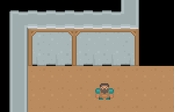
Throughout this section, you’ll add functionality to an app called Coffee Quest.
In the starter directory, open CoffeeQuest/CoffeeQuest.xcworkspace (not the .xcodeproj) in Xcode.
This app displays nearby coffee shops provided by Yelp. It uses CocoaPods to pull in YelpAPI, a helper library for searching Yelp. If you haven’t used CocoaPods before, that’s okay! Everything you need has been included for you in the starter project. The only thing you need to remember is to open CoffeeQuest.xcworkspace, instead of the CoffeeQuest.xcodeproj file.
Before you can run the app, you’ll first need to register for a Yelp API key.
Navigate to this URL in your web browser:
Create an account if you don’t have one, or sign in. Next, enter the following in the Create App form (or if you’ve created an app before, use your existing API Key):
Your form should look as follows:

Press Create New App to continue, and you should see a success message:

Copy your API key and return to CoffeeQuest.xcworkspace in Xcode.
Open APIKeys.swift from the File hierarchy, and paste your API key where indicated.
Build and run to see the app in action.

The simulator’s default location is set to San Francisco. Wow, there’s a lot of coffee shops in that city!
These map pins are kind of boring. Wouldn’t it be great if they showed which coffee shops were actually good?
Open MapPin.swift from the File hierarchy. MapPin takes a coordinate, title, and rating, then converts those into something a map view can display… does this sound familiar? Yes, it’s actually a view model!
First, you need to give this class a better name. Right click on MapPin at the top of the file and select Refactor ▸ Rename.

Enter BusinessMapViewModel for the new name and click Rename. This will rename both the class name and file name in the File hierarchy.
Next, select the Models group in the File hierarchy and press Enter to edit its name. Rename this to ViewModels.
Finally, click on the yellow CoffeeQuest group and select Sort by name. Ultimately, your File hierarchy should look like this:

BusinessMapViewModel needs a few more properties in order to show exciting map annotations, instead of the plain-vanilla pins provided by MapKit.
Still inside BusinessMapViewModel, add the following properties after the existing ones; ignore the resulting compiler errors for now:
public let image: UIImage
public let ratingDescription: String
You’ll use image instead of the default pin image, and you’ll display ratingDescription as a subtitle whenever the user taps the annotation.
Next, replace init(coordinate:name:rating:) with the following:
public init(coordinate: CLLocationCoordinate2D,
            name: String,
            rating: Double,
            image: UIImage) {
  self.coordinate = coordinate
  self.name = name
  self.rating = rating
  self.image = image
  self.ratingDescription = "\(rating) stars"
}
You accept image via this initializer and set ratingDescription from the rating.
Add the following computed property to the end of the MKAnnotation extension:
public var subtitle: String? {
  return ratingDescription
}
This tells the map to use ratingDescription as the subtitle shown on annotation callout when one is selected.
Now you can fix the compiler error. Open ViewController.swift from the File hierarchy and scroll down to the end of the file.
Replace addAnnotations() with the following:
private func addAnnotations() {
  for business in businesses {
    guard let yelpCoordinate =
      business.location.coordinate else {
        continue
    }

    let coordinate = CLLocationCoordinate2D(
      latitude: yelpCoordinate.latitude,
      longitude: yelpCoordinate.longitude)

    let name = business.name
    let rating = business.rating
    let image: UIImage

    // 1
    switch rating {
    case 0.0..<3.5:
      image = UIImage(named: "bad")!
    case 3.5..<4.0:
      image = UIImage(named: "meh")!
    case 4.0..<4.75:
      image = UIImage(named: "good")!
    case 4.75...5.0:
      image = UIImage(named: "great")!
    default:
      image = UIImage(named: "bad")!
    }

    let annotation = BusinessMapViewModel(
      coordinate: coordinate,
      name: name,
      rating: rating,
      image: image)
    mapView.addAnnotation(annotation)
  }
}
This method is similar to before, except now you’re switching on rating (see // 1) to determine which image to use. High-quality caffeine is like catnip for developers, so you label anything less than 3.5 stars as “bad”. You gotta have high standards, right? ;]
Build and run your app. It should now look... the same? What gives?
The map doesn’t know about image. Rather, you’re expected to override a delegate method to provide custom pin annotation images. That’s why it looks the same as before.
Add the following method right after addAnnotations():
public func mapView(_ mapView: MKMapView,
                    viewFor annotation: MKAnnotation)
                    -> MKAnnotationView? {
  guard let viewModel =
    annotation as? BusinessMapViewModel else {
      return nil
  }

  let identifier = "business"
  let annotationView: MKAnnotationView
  if let existingView = mapView.dequeueReusableAnnotationView(
    withIdentifier: identifier) {
    annotationView = existingView
  } else {
    annotationView = MKAnnotationView(
      annotation: viewModel,
      reuseIdentifier: identifier)
  }

  annotationView.image = viewModel.image
  annotationView.canShowCallout = true
  return annotationView
}
This simply creates an MKAnnotationView which shows the correct image for the given annotation, which is one of our BusinessMapViewModel objects.
Build and run, and you should see the custom images! Tap on one, and you’ll see the coffee shop’s name and rating.

It appears most San Francisco coffee shops are actually 4 stars or above, and you can find the very best shops at a glance.
You learned about the MVVM pattern in this chapter. This is a great pattern to help combat massive view controller syndrome and organize your model-to-view transformation code.
However, it doesn’t completely solve the massive view controller problem. Doesn’t it seem odd the view controller is switching on rating to create view models? What would happen if you wanted to introduce a new case, or even an entirely different view model? You’ll have to use another pattern to handle this: the Factory pattern.
If you enjoyed what you learned in this tutorial, why not check out the complete Design Patterns by Tutorials book, available on our store in early access?
Design patterns are incredibly useful, no matter what language or platform you develop for. Using the right pattern for the right job can save you time, create less maintenance work for your team and ultimately let you create more great things with less effort. Every developer should absolutely know about design patterns, and how and when to apply them. That's what you're going to learn in this book!
Move from the basic building blocks of patterns such as MVC, Delegate and Strategy, into more advanced patterns such as the Factory, Prototype and Multicast Delegate pattern, and finish off with some less-common but still incredibly useful patterns including Flyweight, Command and Chain of Responsibility.
And not only does Design Patterns by Tutorials cover each pattern in theory, but you’ll also work to incorporate each pattern in a real-world app that’s included with each chapter. Learn by doing, in the step-by-step fashion you’ve come to expect in the other books in our by Tutorials series.
To celebrate the launch of the book, it’s currently on sale as part of our Advanced Swift Spring Bundle for a massive 40% off. But don’t wait too long, as this deal is only on until Friday, April 27.
If you have any questions or comments on this tutorial, feel free to join the discussion in our forums at https://forums.raywenderlich.com/c/books/design-patterns!
The post Design Patterns by Tutorials: MVVM appeared first on Ray Wenderlich.

The most successful applications are often the simplest to use. This means that users want to see the information they need “at-a-glance” without unlocking their phone or launching the related app. On the Android platform you can achieve this in two different ways. The first, and most recent, is Android Wear, and you can learn more about in Getting Started with Android Wear with Kotlin. The second, the topic of this tutorial, is through the implementation of App Widgets. App Widgets have been available in the Android ecosystem since version Android 1.6 (Donut).
In this tutorial you’ll create an App Widget for a Coffee Log application that will allow you to control your daily usage of caffeine right from your home screen. :]
Note: Most developers love coffee, but we also know that health is very important, so I advise you to read the interesting article Health and Fitness for Developers
You’ll follow the typical process for Widget development and learn how to:
If you’re new to Android Development, I recommended that you read Beginning Android Development with Kotlin before you start, as well as Kotlin for Android.
For this tutorial you’ll also need Android Studio 3.1.2 or later.
The first thing you should do is to download the sample project for this tutorial using the download button at the top or bottom of the tutorial. The zip file contains Android Studio projects for the starter and final versions of the Coffee Log application.
Unzip the file in a folder of your choice, go to File/Open or choose “Open an existing Android Studio project” from the Welcome to Android Studio window, and select the build.gradle file in the root folder of the starter project.


Once the project finishes loading and performing a Gradle build, you can have a look at the file structure, which should be like this:

Now that you are in the project, take a look around, especially in MainActivity, where all the logging happens. CoffeeTypes is a simple enum class with all the coffee types and their caffeine quantity in grams, while the CoffeeLoggerPersistence class is managing persistence using SharedPreferences.
It’s time to start tracking our caffeine consumption! Build and run the app by going to the Build\Make Project or using the green “play” button from the toolbar. The app will appear in your emulator or device, looking like this:

The app allows you to see how many grams of coffee you drank so far today and select new drinks to update your consumption count. Each selection leads to an update of the total displayed.
To use the app to log your coffee consumption, you have to launch the full application. As always, we can do better. What about making your user’s life simpler with an App Widget like this one?

With a Widget, you can access the same information as the application, and display a powerful motivational quote, just by using your device home screen. As you can see the layout is different because the list is now a set of 3 buttons.
There’s a lot to cover to create an App Widegt, so let’s dig in!
As the Android documentation says, an App Widget is a component that can be embedded in other applications, typically the Home screen. Security and performance are very important, so the Android platform has defined a very clear protocol that describes how an App Widget communicates with its own app and interacts with the hosting one. This is why the developer has to provide a configuration file with the following information:
As you’ll see, the Android system uses this information in different stages of the Widget lifecycle. The layout information is useful when the Widget is running and interacting with the user. Resize, preview and screen space required are useful when the user decides to select the Widget and drag it into the Home screen.
As you’ve seen in the previous images, apps and Widgets have different UIs. This is because the available space is different, as well as the user interaction modes. For both apps and Widgets, you can define the layout using a resource file.
You have to remember that a Widget is running in a different application and so some restrictions are in place for security and performance reasons. This means that you can only use a subset of the standard components, with which you can then interact only using a specific object of type RemoteViews. In particular, you can use only:
Along with ViewStub, which allows a lazy inflation of a layout, you can only use the following containers:
Extensions of these classes are not allowed.
The check on these constraints is strong. Because of these restrinctions, a Widget layout has to be very simple and only use simple components like TextView, Button or ImageView.
The configuration file is the mechanism used to describe your Widget to the Android system. You can use this for setting the supported Widget sizes, telling the system whether the Widget is resizable or not, and providing an image to display when the user decides to add a Widget to their Home screen. You’ll see all of these when you insert your Widget for the first time.
The data the Widget displays must always be up to date without wasting system resources. This means that the UI should be updated only when the data changes, and this can happen for different reasons. If the user interacts with the Widget, you need a way to update the UI and then send the event to the main app. If something is happening in the main app, you need a way to tell the Widget to refresh.
The Android platform also provides a third way, an automatic refresh of the Widget at an interval that can be set using the configuration file. Performance limitations don’t allow an update frequency greater than 30 minutes.
In the case of Coffee Log, there are just three different type of coffees. But what if the user is not interested in Long coffee or they just want a different drink instead, or what if they want to simply change the quantity of grams. Or maybe the user wants to customise the background color of the Widget. As you’ll see, it’s possible to provide a configuration screen to allow all the needed customisation.
Enough theory, now you can start creating your Widget. Creating a Widget requires the definition of some code and configuration files according to the specification defined by the Android platform.
Android Studio makes this process very easy, through the usage of a simple wizard, which you can access by selecting New\Widget\App widget from the File menu. You’ll see the following window:

Add the following input to the window:
CoffeeLoggerWidgetHere you can also see how it’s possible to define whether the Widget is resizable and what its possible destinations are. A Widget is usually part of the Home screen, but it could also part of the Keyguard, which is the screen that appears when the phone is locked.
Select Finish, and Android Studio will create three files for you:
RemoteViews class and how to receive and manage events from the Widget itself.
Activity for the Widget.It’s important to note where all these files are in the project structure:

In particular, you see how the configuration file has been created as an XML resource file.
As you’ll see later, the wizard also made some changes to the app AndroidManifest.xml file.
In order to customize the UI for the Widget, open coffee_logger_widget.xml in the app\res\layout folder. The Android Studio wizard generated the following layout that you need to update:
<RelativeLayout xmlns:android="http://schemas.android.com/apk/res/android"
  android:layout_width="match_parent"
  android:layout_height="match_parent"
  android:background="#09C"
  android:padding="@dimen/widget_margin">

  <TextView
    android:id="@+id/appwidget_text"
    android:layout_width="wrap_content"
    android:layout_height="wrap_content"
    android:layout_centerHorizontal="true"
    android:layout_centerVertical="true"
    android:layout_margin="8dp"
    android:background="#09C"
    android:contentDescription="@string/appwidget_text"
    android:text="@string/appwidget_text"
    android:textColor="#ffffff"
    android:textSize="24sp"
    android:textStyle="bold|italic" />

</RelativeLayout>
Remove the TextView and replace the RelativeLayout with a LinearLayout. In Android Studio, you can do this by double-clicking on the old name and typing the new name in its place. After this change you should have this:
<LinearLayout xmlns:android="http://schemas.android.com/apk/res/android"
  android:layout_width="match_parent"
  android:layout_height="match_parent"
  android:background="#09C"
  android:padding="@dimen/widget_margin">
</LinearLayout>
Note: You’re going to use styles that are already defined in the sample project. They contain text sizes and colors, heights, widths, alignments, and other style values. If you are curious about them, check out styles.xml in the res/values folder.
Next, add three more attributes to the LinearLayout:
  ...
  android:id="@+id/widget_layout"
  android:orientation="vertical"
  android:gravity="center"
  ...
The android:orientation and android:gravity attributes give the LinearLayout information about how to align its content. Providing an id is also important in case we need to get a reference to the layout in the Kotlin code.
To achieve rounded corners, change the android:background attribute to @drawable/background, a drawable available in the starter project. Now the root element of the layout looks like this:
<LinearLayout xmlns:android="http://schemas.android.com/apk/res/android"
  android:id="@+id/widget_layout"
  android:layout_width="match_parent"
  android:layout_height="match_parent"
  android:background="@drawable/background"
  android:gravity="center"
  android:orientation="vertical"
  android:padding="@dimen/widget_margin">
</LinearLayout>
For the sake of aesthetics, the user interface should look good regardless of the Widget size. It’s best to have the Widget elements spread over the available space. There are many ways to achieve that, but you should go for the simplest which consists of adding some TextView components that will expand in the remaining space between the rest of the elements.
Here’s a schematic of the layout you’ll create:

The green pattern will be a TextView that expands vertically and the blue pattern will be a TextView that expands horizontally. Keep this schematic in mind as you build the layout to understand why you add each element.
Note:If you’re tempted to fill the empty spaces using a Space instead of TextView, remember that a Widget has some UI restrictions and that a Space is not one of the allowed components.
The first element in the LinearLayout is a vertical space that you can define by adding this code as the first child:
<TextView style="@style/WidgetButtonVerticalSpace" />
Now you can add the TextView components for the amout of coffee:
  <TextView
    android:id="@+id/appwidget_text"
    style="@style/WidgetTextView.Big" />

  <TextView
    style="@style/WidgetTextView"
    android:text="@string/grams" />
Then add another TextView for the next vertical space before the buttons:
<TextView style="@style/WidgetButtonVerticalSpace" />
Notice that the first text view needs to have an id because you will need to change the text later on from the Kotlin code. The second one is fixed text. You’re using the predefined styles on the text views.
Next, add a container for the buttons as a LinearLayout with horizontal orientation:
<LinearLayout
  android:layout_width="match_parent"
  android:layout_height="wrap_content"
  android:orientation="horizontal">

    <!-- Buttons go here -->

</LinearLayout>
Then a TextView for the quote after the last vertical space.
<TextView style="@style/WidgetButtonVerticalSpace" />

<TextView
   android:id="@+id/coffee_quote"
   style="@style/WidgetQuote" />
Now the green part of the layout is fnished and you have to deal with the blue part for the buttons following this schematic:

You’ve already created a container for them so you just need to start with a TextView that expands horizontally and will keep the first button at a distance from the left margin:
<TextView style="@style/WidgetButtonHorizontalSpace" />
Then you can add the first button for smallest coffee in the world:
<LinearLayout
  android:id="@+id/ristretto_button"
  style="@style/WidgetBeverageButton" >

  <ImageView
    style="@style/WidgetButtonImage"
    android:src="@drawable/ic_ristretto" />
  <TextView
    style="@style/WidgetButtonText"
    android:text="@string/ristretto_short" />

</LinearLayout>

<TextView style="@style/WidgetButtonHorizontalSpace" />
Each button has a LinearLayout that contains an ImageView and a TextView. After the button, you added another horizontally expanding TextView to help the buttons spread.
Add the next button for Espresso:
<LinearLayout
  android:id="@+id/espresso_button"
  style="@style/WidgetBeverageButton">

  <ImageView
    style="@style/WidgetButtonImage"
    android:src="@drawable/ic_espresso" />
  <TextView
    style="@style/WidgetButtonText"
    android:text="@string/espresso_short" />

</LinearLayout>

<TextView style="@style/WidgetButtonHorizontalSpace" />
And the final button for the Long:
<LinearLayout
  android:id="@+id/long_button"
  style="@style/WidgetBeverageButton" >

  <ImageView
    style="@style/WidgetButtonImage"
    android:src="@drawable/ic_long_coffee" />
  <TextView
    style="@style/WidgetButtonText"
    android:text="@string/long_coffee_short" />

</LinearLayout>

<TextView style="@style/WidgetButtonHorizontalSpace" />
Phew! That was long but you’re done with the layout for the widget. :]
The Widget you’ve created is beautiful, but it’s not doing anything quite yet. Build and run your app to make sure there’s no error in the XML. Just to be sure everything is fine, add the widget to the screen. If you’ve never added a widget to your Home screen before, here are the steps:
Your widget looks like this:

Notice how the autogenerated code populated the first TextView with “EXAMPLE”. Later in this tutorial, you will update it with the right number of coffee grams.
Now it’s time to add some interactivity to the Widget. When the user selects a button, you’ll have to open MainActivity, passing information about the selected coffee in order to update the total number of grams in today’s record.
Unfortunately, launching a simple Intent is not enough, because we have to remember that our Widget is running in an application that is different from ours and runs in another Android process. The Android platform has a solution for this called PendingIntent that is basically a way to ask another application to launch an Intent for you.
Open then the CoffeeLoggerWidget.kt file and add this utility function at the end of the companion object:
private fun getPendingIntent(context: Context, value: Int): PendingIntent {
  //1
  val intent = Intent(context, MainActivity::class.java)
  //2
  intent.action = Constants.ADD_COFFEE_INTENT
  //3
  intent.putExtra(Constants.GRAMS_EXTRA, value)
  //4
  return PendingIntent.getActivity(context, value, intent, 0)
}
This Kotlin function has the responsibility of creating a PendingIntent for a given coffee:
Intent to launch as usual using the destination class as argument; in your case it’s the MainActivity class.MainActivity can be launched in different ways, and you need something that identifies how much to vary the coffee content. To do this you use an action MainActivity can recognise.Intent the quantity to add. Remember, MainActivity doesn’t know what button was pressed on the Widget!PendingIntent and return it to the caller of the functionSince you now have the action prepared, attach them to the buttons. Go to the updateAppWidget() function in the companion object and add the following code just before its last instruction appWidgetManager.updateAppWidget(...):
views.setOnClickPendingIntent(R.id.ristretto_button,
    getPendingIntent(context, CoffeeTypes.RISTRETTO.grams))
views.setOnClickPendingIntent(R.id.espresso_button,
    getPendingIntent(context, CoffeeTypes.ESPRESSO.grams))
views.setOnClickPendingIntent(R.id.long_button,
    getPendingIntent(context, CoffeeTypes.LONG.grams))
It is worth noting that updateAppWidget() is a convenience method the Android Studio wizard created in order to encapsulate the update logic for a given Widget. Looking at the same Kotlin class, you see that it’s invoked in the onUpdate() method for each Widget that requires an update. This call also happens when the Widget appears in the hosting application for the first time.
override fun onUpdate(context: Context, appWidgetManager: AppWidgetManager, appWidgetIds: IntArray) {
  // There may be multiple widgets active, so update all of them
  for (appWidgetId in appWidgetIds) {
    updateAppWidget(context, appWidgetManager, appWidgetId)
  }
}
Now your code should look like this:
internal fun updateAppWidget(context: Context, appWidgetManager: AppWidgetManager,
                                 appWidgetId: Int) {
  //1
  val widgetText = context.getString(R.string.appwidget_text)
  //2
  val views = RemoteViews(context.packageName, R.layout.coffee_logger_widget)
  //3
  views.setTextViewText(R.id.appwidget_text, widgetText)
  //4
  views.setOnClickPendingIntent(R.id.ristretto_button,
      getPendingIntent(context, CoffeeTypes.RISTRETTO.grams))
  views.setOnClickPendingIntent(R.id.espresso_button,
      getPendingIntent(context, CoffeeTypes.ESPRESSO.grams))
  views.setOnClickPendingIntent(R.id.long_button,
      getPendingIntent(context, CoffeeTypes.LONG.grams))
  // 5
  appWidgetManager.updateAppWidget(appWidgetId, views)
}
Here’s what’s going on:
Context in order to access a string resource.RemoteViews class is created and given the widget’s layout id. A RemoteViews is basically a mirror image of what you’re going to display in the Widget.TextView with id R.id.appwidget_text. It’s very important to note that you can’t access the TextView directly and that only some operations are allowed using the RemoteViews; in this case you’re setting a text.RemoteViews instance, you register a PendingIntent to use when the user clicks on a each Widget button.RemoteViews to the specific instance of the Widget.Build and run now. You won’t see any difference in the widget, but clicking the Widget buttons will open the app with an updated value of grams. Great job!
Widgets should always display the lastest available information, and the update frequency depends on the specific type of data. A Weather Widget doesn’t need a very frequent update, unlike the score of a football match or the price of a specific stock.
You need a way to invoke the previous onUpdate() method at a specific time interval in order to create the new RemoteViews with the new data.
The following drawing gives you an idea of the process:

The problem is how to send the “I need a refresh!” message to the Widget.
When the update frequency you need is longer than 30 minutes, you don’t need to write any code and you can simply rely on the configuration file coffee_logger_widget_info.xml Android Studio generated in the res\xml folder.
<?xml version="1.0" encoding="utf-8"?>
<appwidget-provider xmlns:android="http://schemas.android.com/apk/res/android"
  android:initialKeyguardLayout="@layout/coffee_logger_widget"
  android:initialLayout="@layout/coffee_logger_widget"
  android:minHeight="110dp"
  android:minWidth="180dp"
  android:previewImage="@drawable/example_appwidget_preview"
  android:resizeMode="horizontal|vertical"
  android:updatePeriodMillis="86400000"
  android:widgetCategory="home_screen">
  </appwidget-provider>
The Widget refresh rate is the one defined in the attribute android:updatePeriodMillis. The default value is one day in milliseconds.
If you understand how the Android platform manages updates to your Widget, you can replicate the same thing at will. The Android Studio wizard created the CoffeeLoggerWidget class that extends AppWidgetProvider, but we didn’t realize that this was a particular implementation of a BroadcastReceiver.
You can see that by looking at the updates the wizard made to the AndroidManifest.xml file:
<?xml version="1.0" encoding="utf-8"?>
<manifest xmlns:android="http://schemas.android.com/apk/res/android"
    package="com.raywenderlich.android.coffeelogs">

  - - - -

  <receiver android:name=".CoffeeLoggerWidget">
    <intent-filter>
      <action android:name="android.appwidget.action.APPWIDGET_UPDATE" />
    </intent-filter>

    <meta-data
      android:name="android.appwidget.provider"
      android:resource="@xml/coffee_logger_widget_info" />
  </receiver>

  - - - -

</manifest>
Based on the specific Intent‘s action, the AppWidgetProvider dispatches the call to a different methods. Launching an Intent with the android.appwidget.action.APPWIDGET_UPDATE action results in the invocation of the onUpdate() function.
This is exactly what the Android system does at the interval set in the coffee_logger_widget_info.xml configuration file. This means that the updateAppWidget() function is the perfect place for the code to execute on every update.
So add the following line to the beginning of the function:
val coffeeLoggerPersistence = CoffeeLoggerPersistence(context)
and change widgetText to take the value from there:
val widgetText = coffeeLoggerPersistence.loadTitlePref().toString()
Good! Build and run and you’ll see that the widget is periodically updating the “grams” value. Seems like someone had a little too much coffee:

If your app needs to update the data in the Widget more frequently, you already have the solution: you can simply periodically launch the same Intent the Android system does. In the case of the Coffee Log application this happens every time the user selects a coffee in the app.
Open MainActivity and add the following code at the end of refreshTodayLabel:
// Send a broadcast so that the Operating system updates the widget
// 1
val man = AppWidgetManager.getInstance(this)
// 2
val ids = man.getAppWidgetIds(
    ComponentName(this, CoffeeLoggerWidget::class.java))
// 3
val updateIntent = Intent(AppWidgetManager.ACTION_APPWIDGET_UPDATE)
// 4
updateIntent.putExtra(AppWidgetManager.EXTRA_APPWIDGET_IDS, ids)
// 5
sendBroadcast(updateIntent)
Since this code has some new elements, let me walk you through it:
AppWidgetManager instance, which is responsible for all the installed Widgets.Intent with the android.appwidget.action.APPWIDGET_UPDATE action asking for an update.ids of the widgets you are sending the Intent to as extras of the Intent for the AppWidgetManager.EXTRA_APPWIDGET_IDS key.Build and run tha app to check that everytime you add some coffee, the widget also updates.
Not all the updates needed for Widgets are a consequence of an action from the user. Typical cases are data from a server through periodic polling and push notification events. In cases like these, the request has to come from a different component, which you usually implement as an Android Service.
Choose File\New\Service\Service and change the name to CoffeeQuotesService.

When you click Finish, Android studio generates a Kotlin file for you for the Service.
In CoffeeQuotesService, replace the current implementation of onBind() with:
return null
Change the return type of onBind to be the nullable IBinder?.
Then add this function, which is the one the Android system invokes at every launch of the service Service:
override fun onStartCommand(intent: Intent?, flags: Int, startId: Int): Int {
  val appWidgetManager = AppWidgetManager.getInstance(this)
  val allWidgetIds = intent?.getIntArrayExtra(AppWidgetManager.EXTRA_APPWIDGET_IDS)
  //1
  if (allWidgetIds != null) {
    //2
    for (appWidgetId in allWidgetIds) {
      //3
      CoffeeLoggerWidget.updateAppWidget(this, appWidgetManager, appWidgetId)
    }
  }
  return super.onStartCommand(intent, flags, startId)
}
You’ve seen the first two lines before. The others do the following:
allWidgetIds was in the Intent.allWidgetIds list.Now, you need to call this service instead of directly updating the widget. Open CoffeeLoggerWidget and replace the content of onUpdate() with the following in order to start the Service:
val intent = Intent(context.applicationContext, CoffeeQuotesService::class.java)
intent.putExtra(AppWidgetManager.EXTRA_APPWIDGET_IDS, appWidgetIds)
context.startService(intent)
This creates an Intent, puts the Widget ids in the intent, and starts the Service.
In the companion object, add the following function:
private fun getRandomQuote(context: Context): String {
  //1
  val quotes = context.resources.getStringArray(R.array.coffee_texts)
  //2
  val rand = Math.random() * quotes.size
  //3
  return quotes[rand.toInt()].toString()
}
This function generates a random coffee quote:
After you have the string, update the widget. In updateAppWidget() add this before the last call:
views.setTextViewText(R.id.coffee_quote, getRandomQuote(context))
That’s it. Every time the widget updates, you get a new quote!
People like to personalize the look and functionality of their Home screens, and Widgets are no exception. You have to take into account that a general purpose Widget won’t bring much value to a user. To make it personal you need to let the users set up preferences and configurations.
Earlier, when covering the configuration of a Widget, you learned that it can have a Configuration screen. This is an Activity that is automatically launched when the user adds a Widget on the home screen. Note that the preferences are set up per Widget because users can add more than one instance of a Widget. It’s better to think about saving this preferences with the id of the Widget.
In this project, the configuration screen could contain a coffee amount limit. If the user logs more coffee than the limit, the Widget will turn into a soft but alarming pink.
The preference screen for a Widget is an Activity. Choose New\Activity\Empty activity from the File menu and edit the fields to be
CoffeeLoggerWidgetConfigureActivityactivity_coffee_logger_widget_configure
Make sure the Launcher Activity checkbox is unchecked and the Source Language is Kotlin.
When you click Finish, Android Studio will generate the code for the new Activity and a template for the layout file, along with adding the registration of the Activity in the AndroidManifest.xml file.
Now create the layout for the configuration screen. Open activity_coffee_logger_widget_configure.xml and add the following:
<?xml version="1.0" encoding="utf-8"?>
<LinearLayout xmlns:android="http://schemas.android.com/apk/res/android"
  android:layout_width="match_parent"
  android:layout_height="wrap_content"
  android:orientation="vertical"
  android:padding="16dp">

  <TextView
    android:layout_width="match_parent"
    android:layout_height="wrap_content"
    android:layout_marginBottom="8dp"
    android:labelFor="@+id/appwidget_text"
    android:text="@string/coffee_amount_limit" />

  <EditText
    android:id="@id/appwidget_text"
    android:layout_width="match_parent"
    android:layout_height="wrap_content"
    android:inputType="number" />

  <Button
    android:id="@+id/add_button"
    android:layout_width="wrap_content"
    android:layout_height="wrap_content"
    android:layout_marginTop="8dp"
    android:text="@string/save_configuration" />
</LinearLayout>
The layout is nothing complicated: a TextView that represents a label to the EditText, and a Button for the user to save the preferences.
Open CoffeeLoggerWidgetConfigureActivity and add these fields above onCreate() (developers usually put fields at the beginning of the class):
private lateinit var appWidgetText: EditText
private var appWidgetId = AppWidgetManager.INVALID_APPWIDGET_ID
private val coffeeLoggerPersistence = CoffeeLoggerPersistence(this)
You will need to use these fields later to save the limit value for each widget.
In onCreate(), add the following code at the end:
//1
appWidgetText = findViewById(R.id.appwidget_text)
//2
val extras = intent.extras
//3
appWidgetId = extras.getInt(
    AppWidgetManager.EXTRA_APPWIDGET_ID, AppWidgetManager.INVALID_APPWIDGET_ID)
//4
setResult(Activity.RESULT_CANCELED)
Here’s what the code does:
EditText in the layout.Intent that launched the Activity.appWidgetId of the widget.Finally, you need to save the configuration when the user presses the “Save Configuration” button. Below onCreate(), declare the following OnClickListener implementation:
private var onClickListener: View.OnClickListener = View.OnClickListener {
  // 1
  val widgetText = appWidgetText.text.toString()
  // 2
  coffeeLoggerPersistence.saveLimitPref(widgetText.toInt(), appWidgetId)
  // 3
  val resultValue = Intent()
  resultValue.putExtra(AppWidgetManager.EXTRA_APPWIDGET_ID, appWidgetId)
  // 4
  setResult(RESULT_OK, resultValue)
  // 5
  finish()
}
Here you:
Intent to return to the caller of the Activity and add the id of the Widget you’re configuring.Intent that contains the widget id.Attach this listener to the button by adding the following line below setContentView() in onCreate():
findViewById<View>(R.id.add_button).setOnClickListener(onClickListener)
This is a chained instruction that finds the Button object and sets its listener.
It is a good idea to refresh the widget after the user saves the preferences. That’s because the limit might already be exceeded at the moment of adding a new widget. For this reason, write another method at the end of CoffeeLoggerWidgetConfigureActivity to trigger the refresh:
private fun updateWidget() {
  val appWidgetManager = AppWidgetManager.getInstance(this)
  CoffeeLoggerWidget.updateAppWidget(this, appWidgetManager, appWidgetId)
}
The function retrieves the AppWidgetManager and triggers an update to the corresponding widget. Call this function in the OnClickListener after saving the coffee limit to coffeeLoggerPersistence. It should be before creating the Intent:
updateWidget()
To launch the configuration screen whenever the user adds a widget, you need to add it to the widget configuration file. With this in mind, open coffee_logger_widget_info.xml and add the following attribute to appwidget-provider:
android:configure="com.raywenderlich.android.coffeelogs.CoffeeLoggerWidgetConfigureActivity"
Build and run, then go to the home screen. Long press the widget and drag it to the “Remove” area. Add another widget as before and check that the configuration screen appears. It should look like this:

Enter a value in the field like 10 and press “Save configuration” to add the widget.
To make the widget react to the limit, add this in CoffeeLoggerWidget inside updateAppWidget*(, before the last line:
// 1
val limit = coffeeLoggerPersistence.getLimitPref(appWidgetId)
// 2
val background = if (limit <= widgetText.toInt()) R.drawable.background_overlimit
    else R.drawable.background
// 3
views.setInt(R.id.widget_layout, "setBackgroundResource", background)
Step by step:
Finally, build and run. After the app opens log more coffees than the limit you set. Let's say your limit was 10: log three Espresso and go back to the home screen. As a result, your widget is now pink:

Some final advice before you start adventuring into the world of Widgets:
Congratulations, you've finished your App Widget! Download the final project using the button at the top or bottom of the tutorial.
You learned how to develop an App widget to track your coffee intake. In summary, some of your new skills are:
Service... and tie them all together. This is impressive!
You can learn more about App Widgets by checking out the official docs.
For a better understanding of Intents, have a look at the Android Intents Tutorial.
You can create a better user interface for your apps and widgets with more Material Design. Get a little knowledge boost from Android: An Introduction to Material Design.
If you have any questions or comments about Android App Widgets, please join the forum discussion below!
The post Android App Widgets Tutorial appeared first on Ray Wenderlich.
Get introduced to the do operator for performing side effects, and then use the do operator in an example from the previous video.
The post Video Tutorial: Beginning RxSwift Part 1: Challenge: Performing Side Effects appeared first on Ray Wenderlich.
Find out how Subjects can receive new elements and emit new events to subscribers at runtime.
The post Video Tutorial: Beginning RxSwift Part 1: Subjects and Variables Part 1 appeared first on Ray Wenderlich.
Continue learning about using Subjects and see how to use Variables for a similar purpose but with some added conveniences.
The post Video Tutorial: Beginning RxSwift Part 1: Subjects and Variables Part 2 appeared first on Ray Wenderlich.
HealthKit provides a nice set of API to interact with the heath data store on your iPhone - reading various types of data, writing health data you collect from your user, and even running statistics on that data to present summary information on screen.
The post Screencast: HealthKit Quick Start appeared first on Ray Wenderlich.
Put your new skills to work by creating a reactive algorithm to deal hands of blackjack.
The post Video Tutorial: Beginning RxSwift Part 1: Challenge: Create a Blackjack Card Dealer appeared first on Ray Wenderlich.
Get an overview of your first iOS project, Combinestagram, and then apply what you've learned so far to Rx-ify it.
The post Video Tutorial: Beginning RxSwift Part 1: Observables, Subjects, and Variables in Practice: Part 1 appeared first on Ray Wenderlich.
Continue incorporating use of RxSwift in Combinestagram and see how to create your own custom observable to save images to disk.
The post Video Tutorial: Beginning RxSwift Part 1: Observables, Subjects, and Variables in Practice: Part 2 appeared first on Ray Wenderlich.
Review what you learned in this section, and find out how you'll apply that knowledge throughout the rest of the course.
The post Video Tutorial: Beginning RxSwift Part 1: Conclusion appeared first on Ray Wenderlich.

The introduction of Unity’s 2D Tilemap System creates a great opportunity for aspiring indie developers and game studios around the world to save time prototyping and building out quality 2D games.
Without this system, you could spend days, possibly even weeks, programming your own tilemap system or customizing someone else’s to work for you. And that’s just the programming bit – what about a tilemap editor!?
The new system is free, built directly into the Unity editor and provides a plethora of features that we’ll cover in this tutorial.
In this tutorial, you’ll use a simple 2D tile-based game to learn:
Phew! That’s a massive list. Don’t be frightened though; you’ll see how easy these tools are to grasp once you get started.
A 2D tilemap-based video game is any game in which the levels or play areas consist of many small tile-based shapes that collectively form a grid of tiles. Sometimes, the distinction between each tile can be obvious but it might also be seamless and unrecognizable to players.
The collection of tiles available in the game are known as a tileset, and each tile will usually be a sprite that is a part of a spritesheet. If you want to brush up on spritesheets, here is a Unity tutorial that covers spritesheets.
Tiles are typically square, as you’ll see in this tutorial. But they also come in other shapes such as rectangles, parallelograms or hexagons. Games usually use a top-down or side view perspective, but tile-based games offer 2.5D as an option, too.
You may already be familiar with two well-known games that use a tilemapping system: Starbound and Terraria.


Download the project materials for this tutorial using the “Download Materials” linkj located at the top and bottom of this tutorial. Next, extract the .zip file to a convenient location.
Fire up the Unity editor and load the Rayzor-starter project from the extracted project materials package.
Here is what you’ll be working with in the project:

Open the Game scene from the Scenes folder.
Click the Play button in the editor to start the game. In the Game window, use your WASD or Arrow keys to move the hero.

The hero currently wanders the seemingly infinite camera background color #00000 darkness of the game, lost in eternity.
To remedy this, you’ll need 2D tile tools to build out interesting levels and game mechanics. Now, if only Unity offered this feature…
In the editor, click Window -> Tile Palette to open the 2D Tile Palette window.

This window is now one of your best friends whenever you work on a tilemap game in Unity.
Click Create New Palette and name it RoguelikeCave. Leave the grid and cell options as their defaults.

Click Create and, when prompted, choose to store the new palette in the project’s Assets\Palettes folder. Underneath this, create a new folder called RoguelikeCave.
You should now see the following folder structure in your project files:

In your Tile palette editor window, RoguelikeCave should be selected; at this point, you still won’t have any tiles:
How can an artist be expected to create masterpieces when there are no materials to paint with!
With the Tile Palette window still open, select the Sprites/roguelike-cave-pack project folder and then expand the roguelikeDungeon transparent.png asset. Next, highlight all the sprites in this spritesheet: select the first sprite, hold shift, and then select the last sprite.
Drag all the selected sprites into the RoguelikeCave Tile Palette window:
After you drop the sprites into the Tile Palette window, use the location prompt from Unity to select a location to store the tile assets.
Create a new folder called Tiles under Assets/Palettes/RoguelikeCave and choose this folder as the location:

Unity will generate a tile asset for every sprite you added from the spritesheet. Wait for this to complete, then resize your Tile Palette window and marvel at your shiny new tiles laid out neatly on the RoguelikeCave palette:

Repeat the above process of creating a tile palette using the Tile Palette window but, this time, name the new palette RoguelikeCustom.
Place the newly created palette in a new folder. Name the folder RoguelikeCustom and place it under the Assets/Palettes project folder.
This time, following the same steps as above, use the sprites from the Assets/Sprites/roguelike-custom/roguelike-normal-cutdown-sheet.png spritesheet to populate the tiles in your new palette. Create a folder called Tiles under your RoguelikeCustom palette folder and place your tile assets there:

Pat yourself on the back, as you are now knowledgeable in the fine art of tile palette creation!

Using the GameObject menu at the top of the Unity editor — or the Unity menu bar if you’re on MacOS — click 2D Object and then Tilemap to create a new Tilemap grid:

You should see a Grid GameObject added to your scene Hierarchy. Expand this and select the nested Tilemap GameObject.
Think of this Tilemap object as one layer — of potentially many — in your game. You can add more of these to build more Tilemap layers.
In the Inspector, you’ll see two components that Unity added automatically to this GameObject:

Tilemap component is used by the Unity engine to store sprites in a layout marked with a Grid component — in this case, the Grid GameObject. Don’t worry too much about the technicalities as Unity handles all the linking up of these components for you when you first created the Tilemap.Tilemap Renderer assigns a material to use for rendering the tiles on the Tilemap. It also allows you to set up sorting properties for this Tilemap layer.Rename the Tilemap GameObject to BaseLayer.
Switch to the Scene view in the editor.
With the Tile Palette window still open, make sure you have the RoguelikeCave palette selected, then select the brush tool (or press B). Select the sandy tile as shown below:

Using the Scene window, hover your mouse cursor over the grid near the player. The sand tile brush will snap to the grid.
Click and hold your left mouse button, and paint a rectangular area around your player. This will paint to your BaseLayer Tilemap layer:

Painting large areas can be tedious, so there is a Filled Box brush that you can use for larger section painting. In the Tile Palette window, click the square brush icon (or press U).
Return to the editor and paint an even larger rectangle around the player by clicking and holding your left mouse button at the top left corner and dragging down to the bottom right, then releasing your mouse button:

While you’ve added some color to your game, this sandy dungeon floor is boring. It’s time to add some death and decay!
Use the GameObject -> 2D Object -> Tilemap menu option to create a new Tilemap layer. This time, it will be the only object created in the Hierarchy because you already have a valid Grid. Rename this layer DungeonFloorDecoration:

Using the Tile Palette window, switch your Active Tilemap to the DungeonFloorDecoration layer:

Make sure you select the brush tool (B), then use the Scene window to paint down a number of random grunge-like items:

Disable and then re-enable the DungeonFloorDecoration GameObject in the Hierarchy to see how painting with the active Tilemap changed your DungeonFloorDecoration layer, ensuring that all newly painted tiles went onto this new layer:

Create a new Tilemap layer using the GameObject -> 2D Object -> Tilemap menu option again. Name it Collideable. You’ll use this next to create walls and boundaries.
Switch your Active Tilemap selection in the Tile Palette window to Collideable. Make sure your brush tool (B) is selected, then paint down the following tile pieces to establish a basic dungeon or mine-like wall around the play area you have so far. The red highlighted areas below are the new bits you’ll need to add:

Refer to the Tile Palette window screenshot below for an idea of where to find the tiles that you’ll need to select as you build. Don’t forget that you can use CTRL-Z or CMD-Z to undo, or erase with your current brush (hold Shift) if you want to undo mistakes:

Start the game in the editor and try to walk through a wall:
Who enabled noclip mode?
That’s not what you expected is it?
The problem is that you’ve just painted standard tiles and have not yet applied any magical Unity physics to the Tilemap layer.
With the Collideable GameObject selected, add a new component by pressing the Add Component button in the Inspector window; in the search box, type Tilemap Collider 2D:

This component was created especially for Unity 2D Tilemap games, and it cleverly applies a physics collider shape around all the tiles on the layer to which it is added with no other work required.
Start the game again, and try run through a wall this time. Access denied!

The collisions work well, and you might think this is good enough. But, right now, the colliders are not optimized effectively. Using the Scene view, zoom into a section of wall and look at the collider outlines:

Each tile has a collider placed around it. The middle sections of these walls don’t need these extra collider shapes.
With the Collideable GameObject still selected, add a Composite Collider 2D component. This will automatically add a RigidBody2D, too.
Set the RigidBody2D BodyType to Static and check the Used by Composite check box on the Tilemap Collider 2D component:

As soon as you do this, you’ll notice those unnecessary square collider shapes in the middle of your walls disappear:
This skeleton is giving you a double high five not only because he isn’t one of the piles of bones on the floor of your dungeon, but because you managed some sweet performance optimization, too.
Complete the walls by building them upward and closing them off at the top — about 16 tiles in length upward. Remember to keep the Collideable selected as your Active Tilemap in the Tile Palette window:

A section of dungeon is no challenge to our hero without a gauntlet run. You’ll now start to work on a chamber of death, complete with ornate ancient marble halls. At the end of this run will be the goal: a pile of gold.
To paint down these hallway floors, you’ll use a custom tile brush called a Rule Tile. As you saw at the beginning of this tutorial, custom tile scripts have been added to the project already from the Unity 2D Extras Github repository. One of these is the Rule Tile.
The Rule Tile allows you to set rules regarding which tiles get painted down depending on the other tiles adjacent to the tile you’re placing. Pretty smart!
Right-click the Prefabs project folder and choose Create -> Rule Tile (it should be near the top of the menu). Name the new item MarbleFloorRuleTile:

Select this new MarbleFloorRuleTile and use the Inspector to set the Default Sprite to roguelikeDungeon_transparent_335. Then, add a new Tiling Rule by clicking the + icon. Set this rule’s Sprite to roguelikeDungeon_transparent_339 and click all the external squares in the rule layout so that each one has a green arrow facing outwards, as illustrated below:

Using the box fill brush tool (B) in the Tile Palette window, and ensuring you’ve selected the BaseLayer Tilemap layer, paint down a plain section of marble. You’ll want this to cover all the currently empty floor space.
Take note that, when you do this, the layer covers the collideable wall tiles because the ordering of the layers has not yet been set. This is an easy fix by selecting the Collideable GameObject, and changing the Order in Layer on the Tilemap Renderer component to a higher value (5 should be fine):

Return to your Prefabs project folder and, with the Tile Palette window open= and the RoguelikeCave palette selected, drag and drop MarbleFloorRuleTile into an empty space in the palette:

Use the box fill brush and your new rule tile to paint down some ornate marble floor sections in the hallway:

Notice how your configured rule tile ensures that, once a tile is completely surrounded on all edges and corners, the tile becomes an ornately textured tile (the sprite you selected in the Tiling Rules editor).
No, you won’t be introducing Admiral Ackbar as a playable character. Instead, you’ll be creating a trap prefab tile brush that you can use to paint down spinning blade-firing traps!
Create a new empty GameObject in the Hierarchy and name it ShootingTrap. Create an empty child GameObject underneath ShootingTrap. Name it Sprite:

Select Sprite and add a Sprite Renderer component to it. Set the Sorting Layer to Player and the Order in Layer to 1 to ensure it renders above the other layers. Select the Sprite field, and choose roguelikeDungeon_transparent_180 as the sprite.
Now, rotate the Transform of the Sprite GameObject by -90 on the Z axis:
Next, switch back to the ShootingTrap GameObject and add a new component using the Inspector. In the search, look for Shooting Trap and attach that script.
This script is included with the project files you downloaded; essentially, it fires off a Coroutine every 2 seconds that instantiates a spinning saw blade prefab (or any prefab for that matter) at the trap’s current position.
Set the Item to Shoot Prefab on the Shooting Trap component to Projectile (a prefab found under /Assets/Prefabs):

Start the game again in the editor, and use the Scene view to locate your trap. It works!

Drag a copy of ShootingTrap from the Hierarchy into the /Assets/Prefabs project folder to create a prefab. Delete ShootingTrap from the Hierarchy.
You’ll use another custom tile brush script called PrefabBrush to create a brush that can paint down prefabs to your Tilemap layers.
Right-click the /Assets/Prefabs project folder and click Create -> Prefab Brush. Name the object PrefabBrush.
Use the Inspector to set the Prefabs Size to 1 on the PrefabBrush, and set Element 0 to ShootingTrap.

Create a new Tilemap layer called Traps under Grid and open the Tile Palette window.
Select the normal tile brush (B) and, at the bottom of the Tile Palette window, use the dropdown to select PrefabBrush. Make sure your Active Tilemap layer is set to Traps and use the Scene view to paint down a few custom trap prefabs along the left edge of your ornate hallway room.

Expand the Traps GameObject in the Hierarchy and play around with the Shoot Start Delay value on each ShootingTrap Gameobject using the Shooting Trap script in the Inspector for each one. Add an extra 0.25 to the value for every trap, e.g.:
Start the game and run the gauntlet if you dare…

The goal of this mini dungeon run is a pile of gold. Fame and fortune await those who can reach it before being chopped to pieces by the shooting saw blades.
Create a new Tilemap layer called Goal under the Grid GameObject. Select Goal and change the Tilemap Renderer Order in Layer to 2:

With the Tile Palette window still open, ensure the PrefabBrush is still selected. Change Element 0 to reference the Goal prefab under the /Assets/Prefabs project folder.
This is a prefab with a simple pile of gold as the sprite, a Box Collider 2D with Is Trigger mode enabled, an audio source (the goal sound effect), and a simple Goal.cs script that plays the goal audio and restarts the level when you enter the trigger area.
Use the standard tile brush to paint down a single goal prefab tile at the top of the ornate hallway room, after the spinning disc traps:

Run the game again and try to reach the goal. Once you run into this tile, the OnTriggerEnter2D() logic in Goal.cs will run, playing the goal sound effect and restarting the level.
Bet you can’t reach the goal on your first attempt without getting chopped up into lots of dwarf pieces!

This dungeon is a little too light and airy. You can add mood to it by switching your sprites to use a 2D sprite material that is able to be affected by lights.
Select the Player, the Goal, and all the ShootingTrap Sprite GameObjects and change their Sprite Renderer Material to use SpriteLightingMaterial:
This is a material with a Sprite/Diffuse shader attached. It allows sprites to be affected by lights in the scene.
Under the Grid GameObject, select the BaseLayer, DungeonFloorDecoration, Collideable, and Goal GameObjects, and use the Inspector to change their Tilemap Renderer Material to also use SpriteLightingMaterial.
Next, select Directional light under the Lights GameObject and change the Light Intensity down to 0.3.
Much moodier!

You’ll also now notice the Player is carrying a Point light — I mean, a Lantern around with him.
Now that the sprites in the game are using an appropriate material, Unity lights have an effect on the sprites around them.
Drag two copies of the FlickerLight prefab from the /Assets/Prefabs project folder into the Scene and place them under the Lights GameObject.
Set the first prefab’s position to (X:-11.25, Y:4, Z:-1.35), and the second prefab’s position to (X:2.75, Y:4, Z:-1.35).
Create a new Tilemap layer called WallsAndObjects and set the Tilemap Renderer Order in Layer to 15 using the Inspector. Don’t forget to also set the Material to use the SpriteLightingMaterial material.
Switch your tile palette brush back to Default Brush and the Active Tilemap to WallsAndObjects.
Use the brush tool (B) to paint down two ‘lantern light’ tiles underneath each new FlickerLight you positioned in the corners of the starting area:

See if you can spruce up the dungeon a little more. Use the WallsAndObjects Tilemap layer to create some bookshelves at the top of the dungeon hallway, using the other tile palette you created called RoguelikeCustom. Place down a piece of cracked wall or two, too.
Switch back over to the DungeonFloorDecoration Tilemap layer and add a few more bits and pieces to the marble hallway, like cracks on a few random tiles:

Congrats on finishing your mini dungeon gauntlet treasure run level! You should now have something that looks kind of like this:

If you missed a step, you can take a look at the final result of this tutorial by opening the Rayzor-final Unity project from the “Download Materials” link at the top and bottom of this tutorial.
In this tutorial, you’ve learned:
You covered a ton of ground in this tutorial but, as with everything, there’s always more to learn!
There are interesting custom tile brush scripts available that were not covered in this tutorial. Go read up on them and see if you can find a use case.
You can also take a look at creating animated tiles: here.
Otherwise, hop on to the forum below and tell us what you’re thinking of creating with the 2D Tilemap tools in Unity!
The post Introduction to the New Unity 2D Tilemap System appeared first on Ray Wenderlich.
 Hopefully, you’ve enjoyed a taste of our new advanced Swift books and tutorials over the last two weeks, from design patterns, to getting started with Realm Database, to exploring data structures and algorithms.
And the 40% discount on the bundled books is a really sweet deal, too!
As part of the celebration, we’re giving away a few Advanced Swift Spring Book Bundles to a few lucky readers. See below to find out who’s won — and how to get the discounted bundle before time runs out!
To enter the giveaway, we asked you to add a comment to the announcement post with the answer to the question:
We’ve randomly selected three winners, and each will receive a free copy of our Advanced Swift Spring Bundle digital editions.
The winners are:
1) rgottlieb
2) harte93
3) tom77w
Congratulations! We’ll be in touch soon to deliver your prizes.
Today, April 27, 2018, is the absolute last day to grab the 40% discount on our Advanced Swift Spring Bundle. It’s the final day for both the bundle and the discount, so if you want to level up your Swift learning, today is the day to do it!
Thanks to everyone who entered the giveaway, bought the books, read the tutorials, left comments in the forums, shared our posts on Twitter and sent us some great comments over the last two weeks. We truly appreciate you for making what we do possible.
The post Advanced Swift Spring Fling Giveaway Winners — and Last Day for Discount! appeared first on Ray Wenderlich.