Quantcast
Channel: Kodeco | High quality programming tutorials: iOS, Android, Swift, Kotlin, Unity, and more
Viewing all 4395 articles
Browse latest View live

Introduction to Android Jetpack

$
0
0

Introduction to Android Jetpack

Most Android apps now use the support libraries to help users add all kinds of updated widgets and to address compatibility issues across Android devices and OS versions. You’d be hard-pressed to find an Android app that doesn’t use something from them, and they’re included as a dependency in template projects made in Android Studio. Widgets as fundamental as RecyclerView are included in them.

The support libraries are great to use, but they have evolved quite a bit over the years and the names have become somewhat confusing. There are com.android.support:support-v4 and com.android.support:support-v13, for example. Looking at the names alone, do you know what classes are in them? The names are supposed to designate what version of Android they support, but, as they have evolved, the minimum version has increased to API Level 14.

Google has realized that this variety of ever-changing libraries is very confusing for new (and old) developers and has decided to start over. Consequently, it has created Android Jetpack as a way of both providing guidance and also as a recommended set of libraries and tools. Through Jetpack, Google provides components that form a recommended way to architect your app. Furthermore, Google hopes that Jetpack will eliminate boilerplate code and simplify complex tasks while still providing backwards compatibility.

Note: If you’re new to Android Development or Kotlin, it’s highly recommended that you start with Beginning Android Development with Kotlin to learn your way around the basic tools and concepts.

To help address version confusion, Google is also resetting all of the Jetpack-related libraries to version 1.0.0 and starting their package names with a base name of androidx. Moreover, each component will be in its own library, though it’s important to note that Google is still working on transitioning libraries to the new package names.

There are also a couple of other resources in Jetpack, including the Android KTX library, which makes it easier to use Kotlin with Android. And, finally, Android Studio 3.2 Canary 14+ now has a Migrate to AndroidX option to convert your existing code and libraries to androidx (but I would recommend you wait until they are out of alpha, since pretty substantial known issues exist in the Canary 14 and 15 conversions).

Jetpack is broken up into four main areas: Architecture, Foundation, Behavior and UI. Most of the items in Jetpack are a re-arrangement and categorization of existing libraries, but a few of the items are new. By the end of this article, you should have a good sense of Jetpack’s features and where to find more information on each of them.

Jetpack: Architecture

The Architecture area of Jetpack includes eight different libraries and tools that help you architect your app and manage the data used by and displayed in the app. Most of these are existing libraries. However, there are three new libraries: Navigation, Paging, and WorkManager. Beginning with the newest libraries:

Navigation

Navigating between activities and/or fragments has never been easy. Now, with the Navigation library and the navigation viewer built into Android Studio, you can visually design how your screens are connected to one another. Many people have noticed that this is similar to Storyboards in Apple’s Interface Builder for iOS app development.

Using Navigation, you visually connect one screen to another using “destinations”. You create a navigation graph that will have a starting destination that can have actions to go to other destinations. The great thing about this is that you can define animations in the visual editor. The library even handles deep linking into your app. Passing data between destinations can be done in a safe way with a new plugin called safeargs. You can define what arguments the Fragments in the navigation graph accept from within the navigation file itself.

Here is a screenshot of two fragments with an action between the two. You can set up your app to navigate to the second fragment from inside a button click listener in the first fragment.

Navigator

Note: As of this writing, the Navigation libraries do not work well with the androidx versions of the support libraries. They work sufficiently with the existing support libraries but not the new ones. Be sure to check the release notes on each version of Android Studio 3.2 to see when this has been addressed.

You can find more information about Navigation here: Navigation.

Paging

Have you ever had to deal with large amounts of related data? Maybe too much for you to download at once? The Paging library will help by providing ways to handle the paging of data in a RecyclerView.

The Paging library uses several key classes: PagedList, PagedListAdapter, and DataSource. PagedList is a list that loads data lazily from a DataSource, allowing the app to load data in chunks or pages. PagedListAdapter is a custom RecyclerView.Adapter that handles pages with a DiffUtil callback.

For the DataSource, you will use one of three different subclasses: PageKeyedDataSource, ItemKeyedDataSource, or PositionalDataSource.

You can find more information here: Paging.

WorkManager

Over the years, there have been several systems built into Android for handling background jobs or alarms. They differ on different versions of Android and you have to write a lot of code to handle the different versions of the OS.

WorkManager solves this problem and gives you one library for creating deferrable, asynchronous tasks and defining when they should run. You can define one-time jobs or repeating jobs.

You can find more information here: WorkManager.

Data Binding

This library has been around for awhile. Data Binding lets you bind your data to your layout in XML, so that, when you change your data in running code, the views defined by the layout are automatically updated. Moreover, when your UI changes, your data objects are updated.

You can find more information here: Data Binding.

Lifecycle

The Lifecycle library helps you listen for lifecycle events in other components besides an activities and fragments. This allows you to have lifecycle-aware logic in places other than just an Activity or Fragment. The library works by using annotations on methods so you get notified for the events that you are interested in.

You implement LifecycleObserver, annotate methods and add this observer to a lifecycle owner, which is usually an Activity or Fragment. The LifecycleObserver class can get the current lifecycle state by calling lifecycle.getCurrentState() and can use this information to avoid calling code when not in the correct state.

A LifecycleOwner is an object that has Android lifecycle events. The support library Activity and Fragment classes already implement the LifecycleOwner methods. A LifecycleOwner has a Lifecycle object that it can return to let the observer know what the current state is.

You can find more information here: Lifecycles.

LiveData

The LiveData library uses the Observer pattern for data but handles it in a lifecycle-aware manner. You get the benefits of automatic UI updates when data changes without calling UI elements when the UI is not in the correct state.

LiveData is the class that implements the observer pattern, holds that data, and notifies listeners when that data has changed.

You can find more information here: LiveData.

Room

If you have ever struggled working with the SQLite database in an Android app, you will appreciate what the Room library does for you. You create several simple classes that define your data and how to access them, and the Room library will do most of the rest. The only SQL code you have to write is for queries, which are usually pretty straightforward. And you gain compile-time checks of your SQL code when using Room.

There are three important classes you need to use with Room: Database (this contains your main entry point and holds a reference to the database object for the app), Entity (you create one for each table in the database), and DAO (this contains the methods for retrieving and managing the data).

You can find more information here: Room.

ViewModel

While the Room library persists your data in permanent storage, the ViewModel class allows you to hold onto data in device memory in a lifecycle-aware manner. One of the nice features of a ViewModel is that it can survive the re-construction of an Activity or Fragment over a configuration change such as a device rotation. The system will hold onto that ViewModel re-associate it with the Activity or Fragment. ViewModels are also where you can load data in the background and use LiveData to notify listeners that the data is ready.

You can find more information here: ViewModel.

Jetpack: Foundation

The Foundation area of Jetpack involves core system components, Kotlin extensions and Testing Libraries. This includes the AppCompat library, which you’ve probably been using for awhile, and the new Kotlin KTX extension library for easier development in Kotlin.

Testing is very important and has it’s own section to with frameworks to let you test your app, for both UI testing or unit testing.

Android app codebases are getting bigger and bigger, so you’ll want to visit the Multidex section of Foundation to see how to handle the 64K method limit.

You can find more information about what’s available in Foundation here: Foundation.

AppCompat

The AppCompat library in Jetpack Foundation consists of all of the components from the old v7 libraries. This includes:

  • AppCompat
  • Cardview
  • GridLayout
  • MediaRouter
  • Palette
  • RecyclerView
  • Renderscript
  • Preferences
  • Leanback
  • Vector Drawable
  • Design
  • Custom tabs
  • And even a few others…

You can find more information here: AppCompat.

Android KTX

Android KTX is the only new library in Foundation and is a set of Kotlin extensions designed to streamline the development of Android apps when using Kotlin.

There are several KTX modules that are linked to other libraries in Jetpack. For instance, if you are working with the Navigation library, then you could use:

  • android.arch.navigation:navigation-common-ktx
  • android.arch.navigation:navigation-fragment-ktx
  • android.arch.navigation:navigation-runtime-ktx
  • and android.arch.navigation:navigation-ui-ktx

SharedPreferences is an example of how using KTX can make your code simpler. Take a look at the Kotlin code below:

sharedPreferences.edit()
    .putBoolean("key", value)
    .apply()

Compare that with the KTX-based code:

sharedPreferences.edit {
    putBoolean("key", value)
}

The KTX code is streamlined a bit and removed the need to add apply().

And here’s a SQLite example without KTX:

db.beginTransaction()
try {
  // insert data
  db.setTransactionSuccessful()
} finally {
  db.endTransaction()
}

And the corresponding KTX version:

db.transaction {
    // insert data
}

KTX streamlines a SQLite transaction into a simple function call with a trailing lambda.

You can find more information here: Android KTX.

Test

The Test part of Foundation includes the Espresso UI testing framework and AndroidJUnitRunner for unit testing. Unit tests are for writing small tests on the logic within your code, usually at the level of individual methods. They should run fast and help you test a specific piece of logic. Espresso is used for the testing of UI elements.

You can find more information here: Testing.

Multidex

As you build out your app and include more and more libraries, your app can grow large enough that you need to use the Multidexing capabilities of Android. Once your app includes more than 65,536 methods across all classes, you will need to have the system split your .dex file (basically, a .zip file of classes) into multiple .dex files.

You can learn more about multidexing and how to use it here: Multidex.

Jetpack: Behavior

The Behavior area of Jetpack features libraries that help you interact with your user through the UI, including using video or sound. It includes many components such as media, notifications, permissions, downloading, sharing and the new Slices library.

You can find more information here: Behavior.

Notifications

Android Notifications have been around since the beginning but have changed over time. They have become more expressive and can contain buttons and images. Since Android 5.0 Lollipop, a notification called a heads-up notification can be displayed. You can even use notifications on Android Wear and TV for controlling media.

You can find more information here: Notifications.

Permissions

This part of the Behavior area showcases how to use and request permissions. Since Android 6.0 Marshmallow, permissions are now required to be requested and given before certain elements of a device’s components can be accessed, such as contacts, location and camera information. You declare permissions in the manifest, and you must deal with both cases of a user accepting or denying your permission request.

You can find more information here: Permissions.
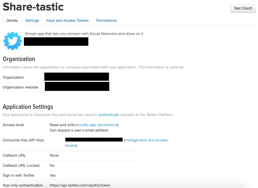
Sharing

The Sharing part of Behavior explains how to share content and the ShareActionProvider class and how to use it. You will can share information with other apps and receive information from other apps. You can create a share action, share files and use ContentProviders for sharing data.

You can find more information here: Sharing.

Media

The Behavior area of Jetpack includes the MediaPlayer and AudioManager classes. You can play media and sounds, use the MediaPlayer in a service, and control the device volume. Android supports various media formats. You can also use the ExoPlayer library, which Google uses for it’s own media players in apps such as YouTube.

You can find more information here: Media.

Download Manager

The DownloadManager service helps you download files in the background. Avoid dealing with connection problems, retrying and even system reboots by using the DownloadManager service. Since the DownloadManager is a system service, you can just start a download and listen for a broadcast event to handle the finished download. No need to worry about network issues or crashes.

You can find more information here: Download Manager.

Slices

The Slices library is new and lets you create UI templates to share your data through the system in rich, flexible layouts. One of the examples Google gave at Google I/O was a weather app that can show more data depending on the space it has to show. Currently, it is only used by the Google Search App but should extend to the Google Assistant.

You can make your app data available to these apps using Slices so that a user can find information from your app by using Google Search or the Assistant.

You can find more information here: Slices

Jetpack: UI

Most of the UI libraries in Jetpack are based on existing code. They include: animations, fragments, palettes, layouts, Emojis, Android Auto, Wear and TV. The EmojiCompat library is the newest of the libraries and gives you up-to-date emojis and the fonts needed to use them.

You can find more information about the UI area here: UI.

Animation

This part of Jetpack includes APIs for the different types of animations available on Android. The Jetpack site documentation covers the old as well as new ways to use animations. Vector graphics and vector animations are included as well.

There is also a physics-based animation system that includes spring and fling animations. You can setup transitions between activities as well as property and object animations. You can also set a layout to animate any updates you make to the layout.

You can find more information here: Animations.

Emoji

EmojiCompat handles emoji characters and uses downloadable font support. This allows your app to stay up to date with the latest emojis without depending on the Android OS. Whenever you update this library dependency, you will have the latest emojis. There is a concrete Span class called EmojiSpan that is used to create emojis in your text.

You can find more information here: Emoji.

Fragment

The Fragment support class has moved into this part of Jetpack. It includes the different kinds of fragments, such as: DialogFragment, ListFragment, and PreferenceFragmentCompat. An important part of a Fragment is the lifecycle, and the Fragment class included in Jetpack is well-integrated with the Lifecycle class in Jetpack: Architecture.

You can find more information here: Fragments.

Layout

A Layout defines the Views and ViewGroups in your app. In the Jetpack Layout documentation, you learn how to declare layouts in XML and in code. It also describes some of the more common layouts, such as LinearLayout, RelativeLayout and the newer ConstraintLayout. Moreover, you’ll pick up tips on more specific features like creating lists of items with RecyclerView, as well as the card layout CardView.

You can find more information here: Layouts.

Palette

The Palette library allows you to pick colors for themes and from images to make your UI’s match your images. You can also create a palette and choose different colors using the Palette.Builder class. Some of the types of colors produced are: Light Vibrant, Vibrant, Dark Vibrant, Light Muted, Muted and Dark Muted.

You can find more information here: Palettes.

TV

If you are building your app for Android TV, then the TV part of Jetpack is for you. You can control TV Hardware and controllers and create a navigation system that works for TVs. There is the leanback theme that is used for TV layouts and the Leanback library helps with TV controls. You can setup a D-pad controller to let users navigate the TV UI.

You can find more information here: TV.

Wear

Wear OS is the version of Android for wearable devices. You can create an app that plays media, controls your media from a watch, or create a standalone watch app or watch face.

You can find more information here: Wear.

Auto

Jetpack helps you develop apps for Android Auto — audible only, messaging, working with hardware and more. You can provide audio playback for the car as well as messaging. You can test Auto apps on the car screen using the Desktop Head Unit (DHU), which is a testing tool that allows you to test without the hardware.

You can find more information here: Auto.

Where to Go From Here?

As you can see, there is quite a lot included in Google’s new Android Jetpack package. All of the libraries you know and love can be found there, as well as several new ones.

In this article, you were introduced to the four main parts of Jetpack: Architecture, Foundation, UI and Behavior. Some of the new libraries, like the Navigation library, will change the way you write your apps, making it easier than ever. WorkManager solves a long standing problem of reliably running jobs at different times on different OS versions. Paging will help with larger data sets and let you use RecyclerViews and adapters with less code. The Android KTX library makes working in Kotlin even easier and will continue to evolve. Slices are new and, as you learn more, you should be able to make available more of your data outside of your app. With the Emoji library, you can have all of the latest and best emojis available.

Hopefully this post provided a good overview of what is available in Jetpack and will get you excited about using something new. The main Jetpack page is located here: Android Jetpack

If you would like more in-depth information on Jetpack Navigation, you can find a screencast here. We also have screencasts on LiveData, ViewModel, and Paging Library. Finally, you can find a short introduction to WorkManager in our Background Processing course here.

Let us know what part of Android Jetpack you are most looking forward to using in the discussion forum below!

The post Introduction to Android Jetpack appeared first on Ray Wenderlich.


Screencast: Basic Password Autofill

Android Background Processing Part 3: Services

$
0
0

Part three of our new Android Background Processing course is available today! In the final part of the course, you’ll take a look at the Android Service class. It’s a high-level Android component, available since API level 1, that lets you perform long-running actions that don’t require a user interface.

Learn about the different types of Services that are available, then try out an IntentService, learn to use a BroadcastReceiver, and play music while your app is in the background with a Foreground Service.

Part 3: Services

  1. Introduction: Get an introduction to the Android Service class and what you’ll learn about on Services in this part of the course.
  2. Android Services: Define Android Service-related terminology and see the various types of Services along with their typical uses.
  3. IntentService: Use an IntentService to run a potentially long-running task on a built-in background thread that completes when the task is done.
  4. Broadcast Receiver: See how to use a BroadcastReceiver to send local broadcasts from a background IntentService that are received by the main thread.
  5. Challenge: IntentService: Practice what you’ve learned about IntentService and BroadcastReceiver to download a data file and update the Photos screen when the download is complete.
  6. Foreground Service: See how to use a Foreground Service to allow your app to perform a long-running task like playing media when the rest of the app is in the background.
  7. Notifications: Learn how to use a notification to let your Foreground Service run on later versions of Android, including with a NotificationChannel on Android O and above.
  8. Conclusion: In this final episode, we’ll summarize this last part and the whole course, and then see an overview of Background Processing topics that were not covered.

Where To Go From Here?

Want to check out the course? You can watch the course Introduction, JobService, and BroadcastReceiver videos for free!

The rest of the course is for raywenderlich.com subscribers only. Here’s how you can get access:

  • If you are a raywenderlich.com subscriber: The entire course is ready for you today! You can check out the course here.
  • If you are not a subscriber yet: What are you waiting for? Subscribe now to get access to our new Android Background Processing course and our entire catalog of over 500 videos.

Stay tuned for more new and updated courses to come. I hope you enjoy the course! :]

The post Android Background Processing Part 3: Services appeared first on Ray Wenderlich.

UndoManager Tutorial: How to Implement With Swift Value Types

$
0
0
Note: This tutorial was built for Xcode 10 and iOS 12.
Undo made easy

Undo made easy

Nobody’s perfect. And once you implement UndoManager, your users don’t have to be either.

UndoManager provides a simple way to add undo/redo functionality to your apps. You may also be able to prevent the occasional flaw in your reasoning by keeping things more “local”.

In this tutorial, you’ll build an app called People Keeper to improve your local reasoning with Swift value types and learn how to use that improved local reasoning to achieve flawless undo/redo implementations.

Note: This tutorial assumes that you have an intermediate knowledge of iOS and Swift development. If you’re new to iOS development and/or Swift, check out our “Learn to Code iOS Apps with Swift Tutorial” series first.

Getting Started

Download the materials for this tutorial using the Download Materials link found at the top and bottom of this page. Build and run the starter app:

The starter app

The app is pre-populated with some folks you’ve supposedly encountered and wanted to remember. Click on Bob, Joan and/or Sam, and you’ll see that their physical features, likes and dislikes are specified in the cells below the preview.

Tapping Bob in PeopleListViewController (left) opens PersonDetailViewController (right). The screenshot series on the right shows PersonDetailViewController‘s scrolled page contents.

To understand the starter code, click through the project files and read the comments throughout. It’ll be your job in this tutorial to program the ability to add and edit your contacts.

Making Changes

What if Sam shaves his mustache or Joan starts wearing glasses? Or, during a particularly harsh winter, Bob decides that he dislikes everything including the weather? It’s useful to be able to update the people in People Keeper in real time.

Implementing selection behaviors

To start, if you choose a new feature or topic in PersonDetailViewController, the preview should update. To do this, at the bottom of the extension marked by UICollectionViewDelegate and UICollectionViewDataSource in PersonDetailViewController.swift, add:

override func collectionView(_ collectionView: UICollectionView,
                             didSelectItemAt indexPath: IndexPath) {
// 1
  switch Section(at: indexPath) {
// 2
  case .hairColor:
    person.face.hairColor = Person.HairColor.allCases[indexPath.row]
  case .hairLength:
    person.face.hairLength = Person.HairLength.allCases[indexPath.row]
  case .eyeColor:
    person.face.eyeColor = Person.EyeColor.allCases[indexPath.row]
// 3
  case .glasses:
    person.face.glasses = true
// 4
  case .facialHair:
    person.face.facialHair.insert(Person.FacialHair.allCases[indexPath.row])
// 5
  case .likes:
    person.likes.insert(Person.Topic.allCases[indexPath.row])
    person.dislikes.remove(Person.Topic.allCases[indexPath.row])
  case .dislikes:
    person.dislikes.insert(Person.Topic.allCases[indexPath.row])
    person.likes.remove(Person.Topic.allCases[indexPath.row])
  default:
    break
  }
// 6
  collectionView.reloadData()
}

Upon cell selection, the following happens:

  1. Using a switch statement, you execute the case that matches the enumeration value corresponding to the current section.
  2. If the user selects a hair color, set person‘s hair color to the Person.HairColor value at the selected row of the index path. If the user selects a hair length or eye color, set the hair length or eye color as well.
  3. When the user taps the glasses option, person‘s glasses Boolean becomes true.
  4. facialHair is a set since it can contain multiple items. When the user selects a facial hair style, insert it into the facial hair set.
  5. If the user selects a topic in the likes or dislikes section, add it to the likes or dislikes set respectively. Furthermore, a topic can’t be both liked and disliked, so if the user likes an item, deselect its cell in the dislike section and remove it from the dislike set and vice versa.
  6. Update the preview and selection UI by reloading the collection view.

Implementing deselection behaviors

Next, implement the deselection behaviors. Below the collectionView(_:didSelectItemAt:), add:

// 1
override func collectionView(_ collectionView: UICollectionView,
                             shouldDeselectItemAt indexPath: IndexPath) -> Bool {
  switch Section(at: indexPath) {
  case .facialHair, .glasses, .likes, .dislikes:
    return true
  default:
    return false
  }
}

override func collectionView(_ collectionView: UICollectionView,
                             didDeselectItemAt indexPath: IndexPath) {
    
  switch Section(at: indexPath) {
  // 2
  case .facialHair:
    person.face.facialHair.subtract([Person.FacialHair.allCases[indexPath.row]])
  case .likes:
    person.likes.subtract([Person.Topic.allCases[indexPath.row]])
  case .dislikes:
    person.dislikes.subtract([Person.Topic.allCases[indexPath.row]])
  case .glasses: // 3
    person.face.glasses = false
  default:
    break
  }
  collectionView.reloadData()
}

Here’s what you’re doing in each delegate method:

  1. Here, you specify that only the selected facial hair, glasses, likes and dislikes should be deselectable upon repeated tap. Deselection in any other section should only happen when the user selects another item in that same category.
  2. When the user deselects a facial hair style, likes or dislikes, you remove that deselected item from its respective set.
  3. When the user deselects the glasses feature, you set the glasses Boolean to false.

Build and run the app. You should now see the desired selection behaviors:

Previewing selections

You’ve now proven yourself a worthy commander of this powerful People Keeper technology. You’ve earned the right to wield your new weapon. On that day when a rival developer catches a glimpse of your People Keeper app, one powerful class will rise from the foundation to guard your states and protect against your evil competition…

SuperUndoManager

Introducing UndoManager

UndoManager is a general-purpose undo stack that is capable of simplifying your app’s state management. It can store whatever object or UI states that you’d like to track along with a closure, method or invocation capable of traversing back and forth through those states. Although it simplifies undo/redo when implemented properly, a lesser rival developer will likely implement UndoManager in a way that leads to fatal bugs. The two undo stacks that follow demonstrate a flawed example and a more successful example.

Undo stack example #1

People model and UndoManager stack

Undo Stack #1

Undo Stack #1 is a sequence of small steps that are each responsible for modifying the model and then the view to match. Though this strategy could work in theory, as the list of operations grows, errors become more likely because precisely matching each change in the model to each change in the view becomes increasingly difficult.

To understand why, here’s an exercise:

  1. What does the model look like after you pop the first undo operation off the stack?

    Solution Inside: Answer #1 SelectShow>
  2. And the second?

    Solution Inside: Answer #2 SelectShow>
  3. And the third?

    Solution Inside: Answer #3 SelectShow>

Whether or not you got those answers right, perhaps you can imagine how multiple insertions and deletions can complicate the index calculation of following insertions, deletions or updates. This undo stack is order-dependent and mistakes can cause inconsistencies between your data model and view. Does this error sound familiar?

NSInternalInconsistencyException

Model-view inconsistencies cause NSInternalInconsistencyExceptions.

Undo stack example #2

To avoid the error in Undo stack example #1, instead of recording data model and UI changes separately, record entire models:

Updated People model and UndoManager stack

Undo Stack #2

To undo an operation, you can replace the current model with a model on the undo stack. Undo Stacks #1 and #2 do the same thing, but #2 is order-independent and thus less error prone.

Undoing Detail View Changes

At the bottom of PersonDetailViewController.swift, insert:

// MARK: - Model & State Types

extension PersonDetailViewController {
// 1
  private func personDidChange(from fromPerson: Person) {
// 2
    collectionView?.reloadData() 
// 3
    undoManager.registerUndo(withTarget: self) { target in
      let currentFromPerson: Person = self.person
      self.person = fromPerson
      self.personDidChange(from: currentFromPerson)
    }
// 4
    // Update button UI 
    DispatchQueue.main.async {
      self.undoButton.isEnabled = self.undoManager.canUndo
      self.redoButton.isEnabled = self.undoManager.canRedo
    }
  }
}

Here’s what going on above:

  1. personDidChange(from:) takes the previous version of person as a parameter.
  2. Reloading the collection updates the preview and cell selections.
  3. undoManager registers an undo operation which, when invoked, sets self.person to the previous Person then calls personDidChange(from:) recursively. personDidChange(from:) updates the UI and registers the undo’s undo, i.e., it registers a redo path for the undone operation.
  4. If undoManager is capable of an undo — i.e., canUndo, enable the undo button — otherwise, disable it. It is the same for redo. While the code is running on the main thread, the undo manager doesn’t update its state until after this method returns. Using the DispatchQueue block allows the UI update to wait until this undo/redo operation completes.

Now, at the top of both collectionView(_:didSelectItemAt:) and collectionView(_:didDeselectItemAt:), add:

let fromPerson: Person = person

to retain an instance of the original person.

At the end of those same delegate methods, replace collectionView.reloadData() with:

personDidChange(from: fromPerson)

in order to register an undo that reverts to fromPerson. You removed collectionView?.reloadData() because that is already called in personDidChange(from:), so you don’t need to do it twice.

In undoTapped(), add:

undoManager.undo()

and in redoTapped(), add:

undoManager.redo()

to trigger undo and redo respectively.

Implementing shaking to undo/redo

Next, you’ll add the ability to shake the device running the app to initiate undo/redo. At the bottom of viewDidAppear(_:), add:

becomeFirstResponder()

at the bottom of viewWillDisappear(_:), add:

resignFirstResponder()

then below viewWillDisappear(_:), add:

override var canBecomeFirstResponder: Bool {
  return true
}

When the user shakes his or her device running the app to undo/redo, NSResponder goes up the responder chain looking for a next responder that returns an NSUndoManager object. When you set PersonDetailViewController as the first responder, its undoManager will respond to a shake gesture with the option to undo/redo.

Build and run your app. To test your changes, navigate to PersonDetailViewController, switch between a few different hair colors, and then tap or shake to undo/redo:

Adding Undo and Redo

Notice that tapping undo/redo doesn’t change the preview.

To debug, add the following within the top of the registerUndo(withTarget:handler:) closure:

print(fromPerson.face.hairColor)
print(self.person.face.hairColor)

Again, build and run your app. Try changing a person’s hair color a few times, undoing and redoing. Now, look at the debug console and you should see that, whenever you undo/redo, both print statements output only the final selected color. Is UndoManager dropping the ball already?

Not at all! The issue is elsewhere in the code.

Improving Local Reasoning

Local reasoning is the concept of being able to understand sections of code independent from context.

In this tutorial, for example, you’ve used closures, lazy initialization, protocol extensions and condensed code paths to make portions of your code understandable without venturing far outside their scopes – when viewing only “local” code, for example.

What does this have to do with the bug you’ve just encountered? You can fix the bug by improving your local reasoning. By understanding the difference between reference and value types, you’ll learn how to maintain better local control of your code.

Reference Types vs. Value Types

Reference and value are the two “type” categories in Swift. For types with reference semantics, such as a class, different references to the same instance share the same storage. Value types, however — such as structs, enums and tuples — each hold their own separate data.

To understand how this contributes to your current conundrum, answer the following questions using what you’ve just learned about reference vs. value type data storage:

  1. If Person is a class:
    var person = Person()
    person.face.hairColor = .blonde
    var anotherPerson = person
    anotherPerson.face.hairColor = .black
    
    person.face.hairColor == ??
    
    Solution Inside: person.face.hairColor == ?? SelectShow>
  2. If Person is a struct:
    var person = Person()
    person.face.hairColor = .blonde
    var anotherPerson = person
    anotherPerson.face.hairColor = .black
    
    person.face.hairColor == ??
    
    Solution Inside: person.face.hairColor == ?? SelectShow>

The reference semantics in question one hurts local reasoning because the value of the object can change underneath your control and no longer make sense without context.

So in Person.swift, change class Person { to:

struct Person {

so that Person now has value semantics with independent storage.

Build and run your app. Then, change a few features of a person, undoing and redoing to see what happens:

Fixed undo and redo

Undoing and redoing selections now works as expected.

Next, add the ability to undo/redo name updates. Return to PersonDetailViewController.swift and, within the UITextFieldDelegate extension, add:

func textFieldDidEndEditing(_ textField: UITextField) {
  if let text = textField.text {
    let fromPerson: Person = person
    person.name = text
    personDidChange(from: fromPerson)
  }
}

When the text field finishes editing, set person‘s new name to the field’s text and register an undo operation for that change.

Build and run. Now, change the name, change characteristics, undo, redo, etc. Mostly everything should work as planned but you may notice one small issue. If you select the name field then press return without making any edits, the undo button becomes active, indicating that an undo action was registered to undoManager even though nothing actually changed:

Undo with no actual changes

In order to fix this, you could compare the original and updated names, and register the undo only if those two values don’t match, but this is poor local reasoning — especially as person‘s property list grows, it’s easier to compare entire person objects instead of individual properties.

At top of personDidChange(from:), add:

if fromPerson == self.person { return }

Logically, it seems as if this line should compare the old and new person but there’s an error:

Binary operator '==' cannot be applied to operands of type 'Person' and 'Person!'

As it turns out, there’s no built-in way to compare Person objects since several of their properties are composed of custom types. You’ll have to define the comparison criteria on your own. Luckily, struct offers an easy way to do that.

Making Your Struct Equatable

Make your way over to Person.swift and make Person conform to Equatable by adding the following extension:

// MARK: - Equatable

extension Person: Equatable {
  static func ==(_ firstPerson: Person, _ secondPerson: Person) -> Bool {
    return firstPerson.name == secondPerson.name &&
      firstPerson.face == secondPerson.face &&
      firstPerson.likes == secondPerson.likes &&
      firstPerson.dislikes == secondPerson.dislikes
  }
}

Now, if two Person objects share the same name, face, likes and dislikes, they are “equal”; otherwise, they’re not.

Note: You can compare the Face and Topic custom objects within ==(_:_:) without making Face and Topic Equatable since each object is composed solely of Strings, which are inherently equatable objects in Swift.

Navigate back to PersonDetailViewController.swift. Build and run. The if fromPerson == self.person error should have disappeared. Now that you’ve finally gotten that line to work, you’ll soon delete it entirely. Using a diff instead will improve your local reasoning.

Creating Diffs

In programming, a “diff” compares two objects to determine how or whether they differ. By creating a diff value type, (1) the original object, (2) the updated object and (3) their comparison can all live within a single, “local” place.

Within the end of the Person struct in Person.swift, add:

// 1
struct Diff {
  let from: Person
  let to: Person
    
  fileprivate init(from: Person, to: Person) {
    self.from = from
    self.to = to
  }
// 2
  var hasChanges: Bool {
    return from != to
  }
}
// 3
func diffed(with other: Person) -> Diff {
  return Diff(from: self, to: other)
}

This code does the following:

  1. struct Diff holds both the original (from) and new (to) person values.
  2. If from and to are different, hasChanges is true; otherwise it’s false.
  3. diffed(with:) returns a Diff containing self’s Person (from) and the new person (to).

In PersonDetailViewController, replace the line private func personDidChange(from fromPerson: Person) { with:

private func personDidChange(diff: Person.Diff) {

It now takes the entire Diff and not just the “from” object as a parameter.

Then, replace if fromPerson == self.person { return } with:

guard diff.hasChanges else { return }

to use diff‘s hasChanges property.

Also remove the two print statements you added earlier.

Improving Code Proximity

Before replacing the now invalid calls to personDidChange(from:) with calls to personDidChange(diff:), take a look at collectionView(_:didSelectItemAt:) and collectionView(_:didDeselectItemAt:).

In each method, notice that the variable to hold the original person object is initialized at the top of the class, but not used until the bottom. You can improve local reasoning by moving the object creation and use closer together.

Above personDidChange(diff:), add a new method within its same extension:

// 1
private func modifyPerson(_ mutatePerson: (inout Person) -> Void) {
  // 2
  var person: Person = self.person
  // 3
  let oldPerson = person
  // 4
  mutatePerson(&person)
  // 5
  let personDiff = oldPerson.diffed(with: person)
  personDidChange(diff: personDiff)
}

Here’s what’s happening step by step:

  1. modifyPerson(_:) takes in a closure that receives a pointer to a Person object.
  2. var person holds a mutable copy of the class’s current Person.
  3. oldPerson holds a constant reference to the original person object.
  4. Execute the (inout Person) -> Void closure you created at modifyPerson(_:)‘s call site. The code in the closure will mutate the person variable.
  5. Then personDidChange(diff:) updates the UI and registers an undo operation capable of reverting to the fromPerson data model.

To invoke modifyPerson(_:), in collectionView(_:didSelectItemAt:), collectionView(_:didDeselectItemAt:), and textFieldDidEndEditing(_:) replace let fromPerson: Person = person with:

modifyPerson { person in

Replace personDidChange(from: fromPerson) with:

}

in order to condense the code using the modifyPerson(_:) closure.

Similarly, within undoManager‘s registerUndo closure, replace let currentFromPerson: Person = self.person with:

target.modifyPerson { person in

Replace self.personDidChange(from: fromPerson) with:

}

to simplify the code with a closure. This design approach centralizes our update code and thus preserves “locality of reasoning” for our UI.

Select all the code in the class, then navigate to Editor > Structure > Re-Indent to properly realign the new closures.

Then, in personDidChange(diff:), after guard diff.hasChanges else { return } and before collectionView?.reloadData() add:

person = diff.to

This sets the class’ person to the updated person.

Likewise, inside the target.modifyPerson { person in ... } closure replace self.person = fromPerson with:

person = diff.from

This restores the previous person when undoing.

Build and run. Check a person’s detail view and everything should work as expected. Your PersonDetailViewController code is complete!

Celebrating Undo and Redo

Now, tap the < PeopleKeeper back button. Uh-oh… Where did those changes go? You’ll have to pass those updates back to PeopleListViewController somehow.

Updating the People List

Within the top of the PersonDetailViewController class, add:

var personDidChange: ((Person) -> Void)?

Unlike the personDidChange(diff:) method, the personDidChange variable will hold a closure that receives the updated person.

At the end of viewWillDisappear(_:), add:

personDidChange?(person)

When the view disappears upon returning to the main screen, the updated person will return to the closure.

Now you’ll need to initialize that closure.

Back in PeopleListViewController, scroll to prepare(for:sender:). When transitioning to a selected person’s detail view, prepare(for:sender:) currently sends a person object to the destination controller. Similarly, you can add a closure to that same function to retrieve a person object from the destination controller.

At the end of prepare(for:sender:), add:

detailViewController?.personDidChange = { updatedPerson in
  // Placeholder: Update the Data Model and UI
}

This initializes detailViewController‘s personDidChange closure. You will eventually replace the placeholder comment with code to update the data model and UI; before that, there’s some setup to do.

Open PeopleModel.swift. At the end of class PeopleModel, but inside the class, add:

struct Diff {
// 1
  enum PeopleChange {
    case inserted(Person)
    case removed(Person)
    case updated(Person)
    case none
  }
// 2 
  let peopleChange: PeopleChange
  let from: PeopleModel
  let to: PeopleModel
    
  fileprivate init(peopleChange: PeopleChange, from: PeopleModel, to: PeopleModel) {
    self.peopleChange = peopleChange
    self.from = from
    self.to = to
  }
}

Here’s what this code does:

  1. Diff defines a PeopleChange enum, which indicates 1. Whether the change between from and to is an insertion, removal, update or nothing and 2. Which Person was inserted, deleted, or updated.
  2. Diff holds both the original and updated PeopleModels and the diff’s PeopleChange.

To help figure out which person was inserted, deleted or updated, add this function after the Diff struct:

// 1
func changedPerson(in other: PeopleModel) -> Person? {
// 2
  if people.count != other.people.count {
    let largerArray = other.people.count > people.count ? other.people : people
    let smallerArray = other.people == largerArray ? people : other.people
    return largerArray.first(where: { firstPerson -> Bool in
      !smallerArray.contains(where: { secondPerson -> Bool in
        firstPerson.tag == secondPerson.tag
      })
    })
// 3
  } else {
    return other.people.enumerated().compactMap({ index, person in
      if person != people[index] {
        return person
      }
      return nil
    }).first
  }
}

Here’s a breakdown of this code:

  1. changedPerson(in:) compares self’s current PeopleModel with the people model passed in as a parameter, then returns the inserted/deleted/updated Person if one exists.
  2. If one array is smaller/larger than the other, find the larger of the two arrays, then find the first element in the array not contained within the smaller array.
  3. If the arrays are the same size, then the change was an update as opposed to an insertion or deletion; in this case, you iterate through the enumerated new people array and find the person in the new array who doesn’t match the old one at the same index.

Below changedPerson(in:), add:

// 1
func diffed(with other: PeopleModel) -> Diff {
  var peopleChange: Diff.PeopleChange = .none
// 2
  if let changedPerson = changedPerson(in: other) {
    if other.people.count > people.count {
      peopleChange = .inserted(changedPerson)
    } else if other.people.count < people.count {
      peopleChange = .removed(changedPerson)
    } else {
      peopleChange = .updated(changedPerson)
    }
  }
//3
  return Diff(peopleChange: peopleChange, from: self, to: other)
}

Reviewing the above code:

  1. You initialize peopleChange to none to indicate no change. You will eventually return peopleChange from this method.
  2. If the new array is larger than the old array, changedPerson was inserted; if the new array is smaller, changedPerson was removed; if the new array is the same size as the old array, changedPerson was updated. In each case, use the person returned from changedPerson(in:) as changedPerson's parameter.
  3. You return the Diff with peopleChange, the original PeopleModel and the updated PeopleModel.

Now, at the bottom of PeopleListViewController.swift, add:

// MARK: - Model & State Types

extension PeopleListViewController {
// 1
  private func peopleModelDidChange(diff: PeopleModel.Diff) {
// 2
    switch diff.peopleChange {
    case .inserted(let person):
      if let index = diff.to.people.index(of: person) {
        tableView.insertRows(at: [IndexPath(item: index, section: 0)], with: .automatic)
      }
    case .removed(let person):
      if let index = diff.from.people.index(of: person) {
        tableView.deleteRows(at: [IndexPath(item: index, section: 0)], with: .automatic)
      }
    case .updated(let person):
      if let index = diff.to.people.index(of: person) {
        tableView.reloadRows(at: [IndexPath(item: index, section: 0)], with: .automatic)
      }
    default:
      return
    }
// 3
    peopleModel = diff.to
  }
}

Like personDidChange(diff:) in PersonDetailViewController, peopleModelDidChange(diff:) does the following:

  1. peopleModelDidChange(diff:) takes PeopleModel.Diff as a parameter, then it updates the UI based on the changes in the data model.
  2. If diff's peopleChange is an insertion, insert a table view row at the index of that insertion. If peopleChange is a deletion, delete the table view row at the index of that deletion. If peopleChange is an update, reload the updated row. Otherwise, if there was no change, exit the method without updating the model or UI.
  3. Set the class's peopleModel to the updated model.

Next, just as you added modifyPerson(_:) in PersonDetailViewController, add: modifyModel(_:) above peopleModelDidChange(diff:):

// 1
private func modifyModel(_ mutations: (inout PeopleModel) -> Void) {
// 2
  var peopleModel = self.peopleModel
// 3   
  let oldModel = peopleModel
// 4  
  mutations(&peopleModel)
// 5
  tableView.beginUpdates()
// 6
  let modelDiff = oldModel.diffed(with: peopleModel)
  peopleModelDidChange(diff: modelDiff)
// 7    
  tableView.endUpdates()
}

Here's what this code does step by step:

  1. modifyModel(_:) takes in a closure that accepts a pointer to a variable PeopleModel.
  2. var peopleModel holds a mutable copy of the class' peopleModel.
  3. oldModel holds a constant reference to the original model.
  4. Perform the mutations on the old model to produce the new model.
  5. Begin the series of tableView changes.
  6. peopleModelDidChange(diff:) executes the tableView insertion, deletion, or reload as determined by modelDiff peopleChange.
  7. End the table view updates.

Back in prepare(for:sender:), replace the placeholder comment with:

self.modifyModel { model in
  model.people[selectedIndex] = updatedPerson
}

to swap the person at the selected index with his or her updated version.

One final step. Replace class PeopleModel { with:

struct PeopleModel {

Build and run. Select a person's detail view, make some changes and then return to the people list. The changes now propagate:

Propagating changes

Next, you'll add the ability to delete and add people to your people table.

To process deletions, replace the placeholder comment in tableView(_:editActionsForRowAt:) with:

self.modifyModel { model in
  model.people.remove(at: indexPath.row)
}

to remove the person at the deleted index from both the data model and UI.

To handle insertions, add the following to addPersonTapped():

// 1
tagNumber += 1
// 2
let person = Person(name: "", face: (hairColor: .black, hairLength: .bald, eyeColor: .black, facialHair: [], glasses: false), likes: [], dislikes: [], tag: tagNumber)
// 3
modifyModel { model in
  model.people += [person]
}
// 4
tableView.selectRow(at: IndexPath(item: peopleModel.people.count - 1, section: 0), 
                    animated: true, scrollPosition: .bottom)
showPersonDetails(at: IndexPath(item: peopleModel.people.count - 1, section: 0))

Here, you do the following:

  1. The class variable tagNumber keeps track of the highest tag in the people model. As you add each new person, increment tagNumber by 1.
  2. A new person originally has no name, no likes nor dislikes, and a default face configuration. His or her tag value equals the current tagNumber.
  3. Add the new person to the end of the data model and update the UI.
  4. Select the row of the new item — i.e. the final row — and transition to that person's detail view so the user can set the details.

Build and run. Add people, update, etc. You should now be able to add and delete users from the people list and updates should propagate back and forth between controllers:

Add and delete users

You're not done yet — PeopleListViewController's undo and redo aren't functional. Time to code one last bit of counter-sabotage to protect your contact list!

Undoing People List Changes

At the end of peopleModelDidChange(diff:), add:

// 1
undoManager.registerUndo(withTarget: self) { target in
  // 2
  target.modifyModel { model in
    model = diff.from
  }
}
// 3
DispatchQueue.main.async {
  self.undoButton.isEnabled = self.undoManager.canUndo
  self.redoButton.isEnabled = self.undoManager.canRedo
}

Here, you:

  1. Register an undo operation capable of undoing data model and UI changes.
  2. Modify the people model by replacing the current model with the previous one.
  3. Enable/disable undoButton and redoButton appropriately.

In undoTapped(), add:

undoManager.undo()

and in redoTapped(), add:

undoManager.redo()

to trigger undo and redo respectively.

Last but not least, add shake to undo/redo to this controller. At the end of viewDidAppear(_:), add:

becomeFirstResponder()

At the end of viewWillDisappear(_:), add:

resignFirstResponder()

And beneath viewWillDisappear(_:), add:

override var canBecomeFirstResponder: Bool {
  return true
}

so that the controller can undo/redo in response to the shake gesture.

That's it! Build and run. You can edit, add, undo, redo, shake, etc.

You did it!

Where to Go From Here?

Download the final project using the Download Materials link at the bottom or top of this tutorial to see how it compares to your version.

To further explore the UndoManager API, try grouping undo features, naming undo actions, making undo operations discardable and using the various built-in notifications.

To further explore value types, try adding properties to Person and PeopleModel to make your app more robust.

And if you want to make your PeopleKeeper really work for you, add data persistence between app launches. See our "Updated Course: Saving Data in iOS" for more information.

Have any questions, comments or suggestions? Join in the forum discussion below!

The post UndoManager Tutorial: How to Implement With Swift Value Types appeared first on Ray Wenderlich.

New Course: Reproducing Popular iOS Controls

$
0
0

Have you ever had that moment when you were using an app and everything you touched just felt right? The app looked sleek, all the interactions were smooth, and the app as a whole was just a joy to use. If you’ve ever wanted to recreate that kind of experience in your own apps, we’re releasing a new course for your today: Reproducing Popular iOS Controls

In this 31-video course, you’ll learn how to use your existing iOS and Swift knowledge to re-create controls from four really cool apps including Snapchat, Robinhood, and even Apple’s own App Store and Maps apps!

Take a look at what’s inside:

Part 1: Snapchat

  1. Introduction: Have you ever used an app where everything you did and touched felt great? In this video, we look at the four great apps we’ll learn to build in this course.
  2. Snapchat Navigation Architecture: Snapchat is a design pioneer. This video teaches you about Snapchat’s groundbreaking scrolling navigation, and how to implement it.
  3. Scrolling Navigation: In this video you’ll learn how to implement Snapchat’s scrolling navigation by embedding your view controller navigation inside a scrollview.
  4. Interactive Interpolation and Normalization: Scrolling is a really useful vehicle for animations. In this video, find out how to use it with interactive interpolation and normalization.
  5. Challenge: Background Color Interpolation: In this challenge you’ll animate the background color for the left and right screens as the user scrolls.
  6. Lens Filters: This video explains how to build a control like the lens filters in Snapchat.
  7. Custom Lens Flow Layout: In this video you’ll learn how to create a custom flow layout.
  8. Stop and Snap: This video will teach you some nifty tricks for dealing with scrolling content.
  9. Challenge: Respond to Selection: In this challenge you’ll enhance the control by letting the user tap on a cell to select it.
  10. Conclusion: in this video we’ll review what we learned, what you can do to learn more, and what awaits in the next section.

Part 2: Robinhood

  1. Introduction: In this video you’ll learn about the next app we’re dissecting, Robinhood, and the three key UI component that you’ll learn to build.
  2. Newsfeed Control: First up is the newsfeed, and in this video we discuss that control and card-like UIs in general, then figure out how to build it.
  3. Card-Swipe Collection View Layout (Swipe-to-Remove): In this video you’ll learn how to create a custom UICollectionLayout that looks just like the Robinhood newsfeed.
  4. Animating a Card Stack: This video will teach you how to set up gestures and animations in a scalable way.
  5. Challenge: Number Indicator: In this challenge your task is to interactively animate the bottom cell that appears when the user swipes on the top one.
  6. Plotting Data: This video is all about data. We’ll learn when it makes sense to add a graph and how to plot one with UIBezierPaths.
  7. Interactive Graph: This video will teach you how to create an interactive graph that lets the user move through its data with their finger.
  8. Constraining the Timestamp: In this video you will be challenged to figure out a cool Auto Layout issue.
  9. The Ticker: In this video we’ll discuss the ticker control and see how to implement it.
  10. Showing the Data: This video will teach you how to hook up the interactive graph with the ticker and create a seamlessy scrolling price.
  11. Conclusion: in this video we’ll review what we learned, what you can do to learn more, and what awaits in the next section.

Part 3: App Store & Maps

  1. Introduction: In this video we’ll talk about two interesting Apple apps – the App Store and Maps, and how their custom presentations make them shine.
  2. App Store: Transitions: In this video you’ll learn about custom transitions, particularly as they pertain to the App Store app.
  3. App Store: Custom Modal Presentation Setup: In this video you’ll learn how to set up a scalable stage for the presentation transition.
  4. App Store: Custom Modal Presentation Animations: In this video you’ll implement the animations for the custom modal presentation as seen on the App Store app.
  5. Challenge: App Store Custom Modal Dismissal: In this challenge you’ll tackle the custom modal dismissal of the App Store app.
  6. App Store: Drag Down to Dismiss: In this video, we’ll discuss and implement another way to dismiss our modal and learn about view snapshots.
  7. Maps: Pull-Up Control: In this video you’ll learn about the pull-up control in Maps and why card UIs are so darn popular.
  8. Maps: Custom Presentation Controller: In this video you’ll learn how to implement a custom UIPresentationController.
  9. Challenge: Maps Scrolling to Control Points: In this challenge you’ll implement the half-way dragged anchor point for the draggable controller.
  10. Conclusion: in this video we’ll review what we learned and what you can do to learn more about the specific topics.

Where To Go From Here?

Want to check out the course? You can watch the course Introduction and Interactive Interpolation and Normalization for free!

The rest of the course is for raywenderlich.com subscribers only. Here’s how you can get access:

  • If you are a raywenderlich.com subscriber: The first part of the course is ready for you today! The rest of the course will be released next week. You can check out the course here.
  • If you are not a subscriber yet: What are you waiting for? Subscribe now to get access to our new Reproducing Popular iOS Controls course and our entire catalog of over 500 videos.

Stay tuned for more new and updated courses to come. I hope you enjoy the course! :]

The post New Course: Reproducing Popular iOS Controls appeared first on Ray Wenderlich.

Creating a Framework for iOS

$
0
0
Update note: This tutorial was updated to iOS 12, Xcode 10, and Swift 4.2 by Lorenzo Boaro. The original tutorial was written by Sam Davies.

Creating a Framework for iOS

Have you ever wanted to share a chunk of code between two or more of your apps, or wanted to share a part of your program with other developers?

Maybe you wanted to modularize your code in a manner similar to how the iOS SDK separates its API by functionality. Or perhaps you want to distribute your code in the same way as popular 3rd party libraries.

In this tutorial you’ll learn how to do all of the above with Frameworks!

Frameworks have three major purposes:

  • Code encapsulation.
  • Code modularity.
  • Code reuse.

You can share your framework with your other apps, team members, or the iOS community. When combined with Swift’s access control, frameworks help define strong, testable interfaces between code modules.

In Swift parlance, a module is a compiled group of code that is distributed together. A framework is one type of module, and an app is another example.

In this tutorial, you’ll extract the knob control developed in How To Make a Custom Control Tutorial: A Reusable Knob and learn the ins and outs of frameworks by:

  • Creating a new framework for the knob control.
  • Migrating the existing code.
  • Importing the whole thing back into the app.
  • Rendering your custom component on the fly in Interface Builder.
  • Packing it up as an uber-portable CocoaPod.
  • Bonus: Setting up a repository for your framework.

By the time you’re done, the app will behave exactly as it did before, but will use the portable framework you developed! :]

Getting Started

Use the Download Materials button at the top or bottom of this tutorial to download the projects and open the starter project in Xcode.

KnobShowcase is a simple application that demonstrates how to interact with a control like a circular slider, such as those found on a mixer.

Build and run to get an idea of how it works.

Showcase

The code for this control lives in two files:

  • Knob.swift has all the view logic.
  • ViewController.swift is responsible for creating the knob and interacting with it.

The knob control is pretty sweet. Wouldn’t it be nice to use it in a number of applications beyond this fun, but completely silly, app? Frameworks to the rescue!

Creating a Framework

Frameworks are self-contained, reusable chunks of code and resources that you can import into any number of apps and even share across iOS, tvOS, watchOS, and macOS apps.

If you’ve programmed in other languages, you may have heard of node modules, packages, gems or jars. Frameworks are the Xcode version of these. Some examples of common frameworks in the iOS SDK are Foundation, UIKit, AVFoundation and CloudKit.

Note: If you want to learn more about Frameworks, read What are Frameworks?.

Framework Set Up

In Xcode 6, Apple introduced the Cocoa Touch Framework template along with access control, so creating frameworks has never been easier. The first thing to do is to create the project for the framework.

  1. In Xcode, select File ▸ New ▸ Project….
  2. Choose iOS ▸ Framework & Library ▸ Cocoa Touch Framework.
  3. Cocoa Touch Framework selection dialog

  4. Click Next.
  5. Set the Product Name to KnobControl. Use your own Organization Name and Organization Identifier.

    Cocoa Touch Framework configuration dialog

  6. Click Next.
  7. In the file chooser, choose to create the project at the same level as the KnobShowcase root folder.

    Cocoa Touch Framework selection dialog

  8. Click Create.

Now you have a project (albeit a boring one) that creates a framework!

Add Code

Your current state is a framework without code, and that is about as appealing as straight chocolate without sugar. In this section, you’ll introduce code by adding the existing files to the framework.

From the KnobShowcase source directory, drag the Knob.swift file into the KnobControl project in Xcode. Make sure to check Copy items if needed so that the files actually copy into the new project instead of just adding a reference. Frameworks need their own code, not references, to be independent.

Moving Knob.swift file into the framework

Double-check that Knob.swift has Target Membership in KnobControl to make sure it appears in the final framework. You can verify this in the File inspector.

Target Membership

Build the framework project to make sure that you get Build Succeeded with no build warnings or errors.

If you read the How to Make a Custom Control tutorial, you may recall Knob.swift contains three different classes:

  • Knob: the actual custom control.
  • KnobRenderer: a private class that keeps track of the code associated with rendering the knob itself.
  • RotationGestureRecognizer: a private class that enables the interaction with the knob.

Your next task is to separate those components into different files. Start by moving KnobRenderer:

  1. Go to File ▸ New ▸ File… and select iOS ▸ Source ▸ Swift File.
  2. Click Next.
  3. On the next screen, specify the class name as KnobRenderer and choose the KnobControl ▸ KnobControl directory.
  4. Click Create.
  5. Open Knob.swift, cut (Command-X) the entire KnobRenderer class and paste it (Command-V) into KnobRenderer.swift just below the import Foundation statement.
  6. Remove the private modifier for KnobRenderer. When the code was all contained in Knob.swift this was fine, but now it must be accessible throughout the module with the default internal modifier.

Repeat steps 1 to 6 for the RotationGestureRecognizer class. In this case, when you perform the fifth step, make sure you also grab the import UIKit.UIGestureRecognizerSubclass statement, otherwise the compiler will complain during the build phase.

With your two new files created, Knob.swift now only contains the Knob class.

Note: Separating classes into their own files is not strictly necessary, but it’s a good practice in order to make your code organized. You don’t want to have a huge file that is hard to comprehend and maintain.

Add the Framework to the Project

Close the KnobControl project, and go back to the KnobShowcase project. Delete Knob.swift file. Select Move to Trash in the confirmation dialog.

Build the project, and you’ll see several predictable errors where Xcode complains about not knowing what the heck a Knob is. Well, you’ll actually see Use of undeclared type ‘Knob’ error message.

Adding the KnobControl framework project is the solution to these problems.

Embed Your Binary

Right-click on the root KnobShowcase node in the project navigator. Click Add Files to “KnobShowcase”. In the file chooser, navigate to and select KnobControl.xcodeproj. Click Add to add KnobControl.xcodeproj as a sub-project.

Note: It isn’t strictly necessary to add the framework project to the app project; you could just add the KnobControl.framework output.

However, combining the projects makes it easier to develop both the framework and app simultaneously. Any changes you make to the framework project are automatically propagated up to the app. It also makes it easier for Xcode to resolve the paths and know when to rebuild the project.

Build and run, and you’ll see that same compile error!

Even though the two projects are now together, KnobShowcase still doesn’t get KnobControl. It’s like they’re sitting in the same room, but KnobShowcase can’t see the new framework.

You’ll link the framework to the app’s target to fix this problem. First, expand the KnobControl project to see the Products folder, and then look for KnobControl.framework beneath it. This file is the output of the framework project that packages up the binary code, headers, resources and metadata.

Select the top level KnobShowcase node to open the project editor. Click the KnobShowcase target, and then go to the General tab.

Scroll down to the Embedded Binaries section. Drag KnobControl.framework from the Products folder of KnobControl.xcodeproj onto this section.

You just added an entry for the framework in both Embedded Binaries and Linked Frameworks and Binaries.

Now the app knows about the framework and where to find it, so that should be enough, right?

Build KnobShowcase project. More of the same errors.

Angry Razeface

Access Control

Your problem is that although the framework is part of the project, the project’s code doesn’t know about it — out of sight, out of mind.

Go to ViewController.swift, and add the following line to the list of imports at the top of the file.

import KnobControl

It’s critical, but this inclusion still won’t fix the build errors. This is because Swift uses access control to let you determine whether constructs are visible to other files or modules.

By default, Swift makes everything internal or visible only within its own module.

To restore functionality to the app, you have to update the access control on Knob class.

Although it’s a bit tedious, the process of updating access control improves modularity by hiding code not meant to appear outside the framework. You do this by leaving certain functions with no access modifier, or by explicitly declaring them internal.

Swift has five levels of access control. Use the following rules of thumb when creating your own frameworks:

  • Open and public: for code called by the app or other frameworks, e.g. a custom view.
  • Internal: for code used between functions and classes within the framework, e.g. custom layers in that view.
  • Fileprivate: for code used within a single file, e.g. a helper function that computes layout heights.
  • Private: for code used within an enclosing declaration, such as a single class block, and extensions of that declaration in the same file.

When Knob was part of the Showcase app, internal access wasn’t a problem. Now that it’s in a separate module, it must be made public for the app to use it. You’ll do that in the next section.

Note: If you want to learn more about the internals of access control and to understand the difference between open and public, take a look at Access Control Documentation.

Update the Code

Open Knob.swift inside of KnobShowcase. Make the class public by adding the public keyword to the class definition, like so:

public class Knob : UIControl {

Knob will now be visible to any app file that imports the KnobControl framework.

Now add the public keyword to:

  • The properties minimumValue, maximumValue, value, isContinuous, lineWidth,
    startAngle, endAngle, pointerLength and color. Note for value, the property will be public while the setter continues to be private.
  • Both init functions.
  • The methods setValue(_:animated:) and tintColorDidChange().
Note: You might wonder why you have to declare init method as public. Apple explains this and other finer points of access control in their Access Control Documentation.

Now build and run. The good news is that the errors are gone, and the bad news is that you’ve got a runtime crash like the following:

Oh no! What’s going on? Go straight to the next section to fix the crash :].

Update the Storyboard

When using storyboards, references to custom classes need to have both the class name and module set in the Identity inspector. At the time this storyboard was created, Knob was in the app’s module, but now it’s in the framework.

Update the storyboard by telling it where to find the custom view:

  1. Open Main.Storyboard in the KnobShowcase project.
  2. Select the Knob in the Document outline.
  3. In the Identity inspector, under Custom Class, change the Module to KnobControl as shown below.

Update the storyboard

Build and run. Now you should get your knob.

Congratulations! You now have a working stand-alone framework and an app that uses it!

Live Rendering in Interface Builder

One limitation of your framework is that you cannot customize the appearance of your custom control through Interface Builder (IB).

Open Main.storyboard. You’ll notice a blank rectangle instead of the knob. If you are not seeing these blue boxes, turn on Editor ▸ Canvas ▸ Show Bounds Rectangles.

In order to let users who import your framework change properties of the knob both programatically and visually, you need to rely on Live Views. Those are views which appear in IB as they will in the running app.

Open Knob.swift and insert the @IBDesignable annotation just in front of your Knob definition:

@IBDesignable public class Knob: UIControl {

This annotation instructs your project to enable live-rendering in IB.

Open Main.storyboard and you’ll see nothing has changed. You still have a blank rectangle.

Don’t worry! Apple provides a method, called prepareForInterfaceBuilder(), that is invoked only when rendering inside IB.

Scroll to the end of Knob.swift and add this code:

extension Knob {
  public override func prepareForInterfaceBuilder() {
    super.prepareForInterfaceBuilder()

    renderer.updateBounds(bounds)
  }
}

Here you are setting the bounds of the knob in order to make it visible.

Open Main.storyboard and make sure Editor ▸ Automatically Refresh Views is checked. Now the blank rectangle has been replaced by the knob you see every time you run the app :].

It’s good being able to see the knob, but what if you want to configure the appearance for its properties, like the color, the line width or the pointer length?

@IBInspectable comes to the rescue. If you annotate these properties, then IB will let you configure them in the attributes inspector.

Open Knob.swift and put @IBInspectable in front of the following properties: lineWidth, pointerLength and color.

Back in Main.storyboard select the knob control and view Attributes inspector. IB has created a new panel, titled Knob, showing the properties annotated with @IBInspectable.

Play with those fields and you’ll see the shape or the color of the control changing live. Cool!

Creating a CocoaPod

CocoaPods is a popular dependency manager for iOS projects. It’s a tool for managing and versioning dependencies. Similar to a framework, a CocoaPod, or pod for short, contains code and resources as well as metadata, dependencies, and setup for libraries. CocoaPods are built as frameworks that are included in the main app.

Anyone can contribute libraries and frameworks to the public repository, which is open to other iOS app developers. Almost all of the popular third-party frameworks, such as Alamofire, Charts or RxSwift, distribute their code as a pod.

Here’s why you should care: by making a framework into a pod, you give yourself a mechanism for distributing the code, resolving the dependencies, including and building the framework source, and easily sharing it with your organization or the wider development community.

If you’ve been following along, you’re good to proceed to the next section and create a CocoaPod. If you’re just jumping in, or having trouble, the downloaded material for this tutorial contains an Intermediate version of the project up to this stage.

Clean out the Project

Perform the following steps to remove the current link to KnobControl project from KnobShowcase.

  1. Select KnobControl.xcodeproj in the project navigator and delete it.
  2. Choose Remove Reference in the confirmation dialog, since you’ll need to keep the files on disk to create the pod.

Install CocoaPods

If you’ve never used CocoaPods before, you’ll need to follow a brief installation process before going any further. Go to the CocoaPods Installation Guide and come back here when you’re finished. Don’t worry, we’ll wait!

Create the Pod

Open Terminal and use cd to switch to the KnobControl root directory.

Run the following command:

pod spec create KnobControl

This creates the file KnobControl.podspec in the current directory. It’s a template that describes the pod and how to build it. Open it in your preferred text editor.

The template contains plenty of comment descriptions and suggestions for the commonly used settings.

  1. Replace the entire Spec Metadata section with:
    s.name         = "KnobControl"
    s.version      = "1.0.0"
    s.summary      = "A knob control like the UISlider, but in a circular form."
    s.description  = "The knob control is a completely customizable widget that can be used in any iOS app. It also plays a little victory fanfare."
    s.homepage     = "http://raywenderlich.com"
    

    Normally, the description would be a little more descriptive, and the homepage would point to a project page for the framework.

  2. Replace the Spec License section with the below code, as this iOS frameworks tutorial code uses an MIT License:
    s.license      = "MIT"
    
  3. You can keep the Author Metadata section as is, or set it with how you’d like to be credited and contacted.
  4. Replace the Platform Specifics section with the below code, because this is an iOS-only framework.:
    s.platform     = :ios, "12.0"
    
  5. Replace the Source Location with the below code. When you’re ready to share the pod, this will be a link to the GitHub repository and the commit tag for this version.
    s.source       = { :path => '.' }
    
  6. Replace the Source Code section with:
    s.source_files = "KnobControl"
    
  7. Add the following line above the one with end. This line helps the application project understand that this pod’s code was written for Swift 4.2.
    s.swift_version = "4.2" 
    
  8. Remove all the comments — the lines that start with #.

You now have a workable development Podspec.

Note: If you run pod spec lint to verify the Podspec in Terminal, it’ll show an error because the source was not set to a valid URL. If you push the project to GitHub and fix that link, it will pass. However, having the linter pass is not necessary for local pod development. The Publish the Pod section below covers this.

Use the Pod

At this point, you’ve got a pod ready to rock and roll. Test it out by implementing it in the KnobShowcase app.

Back in Terminal, navigate to the KnobShowcase directory, and then run the following command:

pod init

This steathily creates a new file named Podfile that lists all pods that the app uses, along with their versions and optional configuration information.

Open Podfile in a text editor. Replace its entire content as follows:

platform :ios, '12.0'

target 'KnobShowcase' do
  use_frameworks!

  pod 'KnobControl', :path => '../KnobControl'

end

# Workaround for Cocoapods issue #7606
post_install do |installer|
    installer.pods_project.build_configurations.each do |config|
        config.build_settings.delete('CODE_SIGNING_ALLOWED')
        config.build_settings.delete('CODE_SIGNING_REQUIRED')
    end
end

Save the file and run this in Terminal:

pod install 

With this command, you’re searching the CocoaPods repository and downloading any new or updated pods that match the Podfile criteria. It also resolves any dependencies, updates the Xcode project files so it knows how to build and link the pods, and performs any other required configuration.

Finally, it creates a KnobShowcase.xcworkspace file. Use this file to open the project from now on as it has references to both the app and any Pods.

Close the KnobShowcase and KnobControl projects if they are open, and then open KnobShowcase.xcworkspace.

Note: After running pod install you could receive few warnings as follows:

CocoaPods warnings

To fix them, select the KnobShowcase root node and then the KnobShowcase target. Switch to the Build Settings tab and in the search field look for ALWAYS_EMBED_SWIFT_STANDARD_LIBRARIES. Click on the pop-up for that build setting and select Other…. In the dialog replace the content with $(inherited).

Run pod install again. Now the warnings should disappear!

Check it Out

Build and run. Like magic, the app should work exactly as it did before. Pulling in the control was quick for two reasons:

  1. KnobControl was already a framework and you were already importing it.
  2. CocoaPods does the heavy lifting of building and packaging the framework; it also takes care of all the business around embedding and linking.

Pod Organization

Take a look at the Pods project, and you’ll notice two targets:

  • Pods-KnobShowcase: a pod project builds all the individual pods as their own framework, and then combines them into one single framework: Pods-KnobShowcase.
  • KnobControl: this replicates the same framework logic used for building it on its own.

Inside the project organizer, you’ll see several groups. KnobControl is under Development Pods. This is a development pod because you defined the pod with a :path link in the app’s Podfile. You can edit and develop this code side-by-side with the main app code.

Pods structure

Pods that come from a repository appear in a Pods directory and are listed in a Pods group. Any modifications you make are not pushed to the repository and are overwritten whenever you update the pods.

Hooray! You’ve now created and deployed a CocoaPod — and you’re probably thinking about what to pack into a pod first.

You’re welcome to stop here, congratulate yourself and move on to Where to Go From Here. But if you do, you’ll miss out on learning how to publish a pod where others can use it!

Publish the Pod

This section walks you through publishing your pod to GitHub and using it like a third party framework.

Create a Repository

If you don’t already have a GitHub account, create one.

Now create a new repository to host the pod. KnobControl is the obvious best fit for the name, but you can name it whatever you want. Select Swift as the .gitignore language and MIT as the license.

Create a new GitHub repository

Click Create repository. On the dashboard page that follows, click Clone or download and copy the HTTPS link. This will be the URL value that you are going to use in the following sections.

Clone the Repository

Go back to Terminal and create a new directory at the root of KnobShowcase. The following commands will create a repo directory and navigate to it:

mkdir repo
cd repo

From there, clone the GitHub repository. Replace URL below with the HTTPS link from the GitHub page.

git clone URL

This will set up a Git folder and copy the pre-created files. The cloning operation should look like this:

Cloning into 'KnobControl'...
remote: Counting objects: 4, done.
remote: Compressing objects: 100% (4/4), done.
remote: Total 4 (delta 0), reused 0 (delta 0), pack-reused 0
Unpacking objects: 100% (4/4), done.

Add the Code to the Repository

Next, copy the contents of the root KnobControl directory to the repo/KnobControl directory.

Open the copied version of KnobControl.podspec, and update the s.source line to:

s.source       = { :git => "URL", :tag => "1.0.0" }

Replacing URL with the link to your repository.

Make the Commitment

Now it gets real. In this step, you’ll commit and push the code to GitHub. Your little pod is about to enter the big kid’s pool.

Run the following commands in Terminal to commit those files to the repository and push them back to the server.

cd KnobControl/
git add .
git commit -m "Initial commit"
git push -u origin master

Visit the GitHub page and refresh it to see all the files.

GitHub repository files

Tag It

In KnobControl.podspec, you set the version as follows:

s.version      = "1.0.0"

You need to tag the repository so it matches. Run this command to set the tags:

git tag 1.0.0
git push --tags

Check your work by running:

pod spec lint

The response you’re looking for is KnobControl.podspec passed validation.

Note: If you get an error complaining that the iOS 12 simulator is not available, you need to make Xcode 10 your default Xcode using sudo xcode-select -p path-to-your-Xcode-10.

Update the Podfile

Look at Podfile in the KnobShowcase directory and you’ll recall the path points to a local pod:

pod 'KnobControl', :path => '../KnobControl'

Replace this line with:

pod 'KnobControl', :git => 'URL', :tag => '1.0.0'

Replace URL with your GitHub link and save when done. This tells KnobShowcase to use your published pod.

From Terminal, run this in the KnobShowcase directory:

pod update

Now the code will pull the framework from the GitHub repository, and it is no longer be a development pod!

Where to Go From Here?

In this iOS frameworks tutorial, you made a framework from scratch, imported it into your app, and even turned it into a CocoaPod. Nice work!

You can download the final project using the button at the top or bottom of the tutorial. It doesn’t include the published CocoaPod, as the steps to set up a GitHub repository depend on your personal account information.

Hats off to Sam Davies for developing the knob control. You might remember him from such videos as Introducing Custom Controls, where you can learn more about custom controls and custom frameworks.

The team here has put together a lot of tutorials about CocoaPods, and now that you’ve gone through a crash course, you’re ready to learn more. Here are a couple that you might like:

Spend some time at CocoaPods.org and be sure to check out how to submit to the public pod repository and the dozens of configuration flags.

What did you learn from this? Any lingering questions? Want to share something that happened along the way? Let’s talk about it in the forums. See you there!

The post Creating a Framework for iOS appeared first on Ray Wenderlich.

Social Network Integration on Android

$
0
0

Social Network Integration on Android

Many mobile apps require a user to create an account or to sign up for a service in order to use them. From a user’s point of view, this can be somewhat troublesome or annoying, and it’s not always the best user experience.

So how can you overcome this when building your app? To give users a seamless experience, you can give them the ability to sign in to your app with just a single tap of a button, using one of their social networking accounts, e.g., Facebook or Twitter.

In this tutorial, you’ll learn how to integrate a user’s Facebook and Twitter accounts into your Android app to allow them to log in and also share posts from your app into their social networking account.

Getting Started

Use the Download Materials link at the top or bottom of this tutorial to download and extract the Starter Project for this tutorial.

Next, open Android Studio 3.1.3 or later, and choose Open an existing Android Studio project from the welcome screen or File > Open form the menu. Open the folder root folder of the Sharetastic starter project.

You’ll be working on an app called Sharetastic, which allows a user to share a status update to Facebook or a tweet to Twitter.

Build and run the project and you’ll see the login screen for the app:

Starter project

As of now, the app does nothing. In this tutorial, you’ll go through it step-by-step and complete the social network integration.

Connecting With Facebook

To connect your app to Facebook, you’ll need an active Facebook account with which you’ll create an app to get a Facebook App ID.

Creating a Facebook App ID on Developers Portal & Setting Up

Go to the Facebook Developers Portal (log in with your Facebook account if needed).

On this page, you’ll see an option to Add a New App. Click the button and you’ll then need to create a Facebook App ID if you haven’t already:

Create Facebook App ID

Enter Sharetastic in the Display Name field and enter your email address in the Contact Email field, then click Create App ID. Facebook will prompt you with a captcha dialog; complete the request and click Submit.

Facebook will then direct you to another page:

Setup Facebook Login

Click on Set Up on the Facebook Login component. Then, from the new page containing the platform options, select Android.

You’ll then see the following page with the steps to build your Android project:

Steps to build

At this point, you will skip steps 1 and 2 because they have already been completed for you in the starter project. Even so, it’s good to know what they are:

Step 1 includes downloading the Facebook SDK, and Step 2 tells you how to import it into the project. Here, Gradle will be used to sync the Facebook SDK rather than manually downloading the SDK, which you can see in the app module build.gradle file:

implementation 'com.facebook.android:facebook-login:[4,5)'

In Step 3, you’ll add your Package name com.raywenderlich.sharetastic and default Activity name com.raywenderlich.sharetastic.MainActivity.

Facebook Step 3

Click on Save and then Continue (you may need to also confirm that your app is not yet in the Play Store).

For Step 4, you need to create a Development Key Hash and also a Release Key Hash if your app is live. A key hash is a 28-character-long string, which Facebook uses to verify the communication between your app and Facebook.

Key Hashes?

A key hash can be generated by typing the following command in the terminal:

For Mac and Linux:

keytool -exportcert -alias androiddebugkey -keystore ~/.android/debug.keystore | openssl sha1 -binary | openssl base64

For Windows:

Things are not that simple here. First, you need to have keytool from the JDK, Secondly, get the openssl library here.

keytool -exportcert -alias androiddebugkey -keystore "C:\Users\USERNAME\.android\debug.keystore" | "PATH_TO_OPENSSL_LIBRARY\bin\openssl" sha1 -binary | "PATH_TO_OPENSSL_LIBRARY\bin\openssl" base64

Finally, after generating your Key Hash, paste it in the section provided in the fourth step.

Paste key hash

Click Save then Continue.

For Step 5 on Single Sign On, if you’re working on a different app that is using notifications, you want want to set it to Yes, but, for now, leave it set to No and click on Save, then Next.

Single Sign On

Now, for Step 6, open up strings.xml in the app/res/values folder, and paste the following after updating the placeholders with the values provided by Facebook:

<string name="facebook_app_id">Your-App-ID</string>
<string name="fb_login_protocol_scheme">fbYour-App-ID</string>

Then, open AndroidManifest.xml and add the permission for accessing the Internet:

<uses-permission android:name="android.permission.INTERNET"/>

Additionally, under the application tag, paste the needed Facebook meta-data and activities:

    <meta-data android:name="com.facebook.sdk.ApplicationId" 
        android:value="@string/facebook_app_id"/>
    
    <activity android:name="com.facebook.FacebookActivity"
        android:configChanges=
                "keyboard|keyboardHidden|screenLayout|screenSize|orientation"
        android:label="@string/app_name" />
    <activity
        android:name="com.facebook.CustomTabActivity"
        android:exported="true">
        <intent-filter>
            <action android:name="android.intent.action.VIEW" />
            <category android:name="android.intent.category.DEFAULT" />
            <category android:name="android.intent.category.BROWSABLE" />
            <data android:scheme="@string/fb_login_protocol_scheme" />
        </intent-filter>
    </activity>

Finally, you’re done setting things up from the Facebook developer console! The remaining steps you’ll need to login are handled in the next section.

Now it’s time move on to writing some code.

Facebook setup complete

Log in With Facebook

Open up the main layout file activity_main.xml and add a Facebook login button below the TextView:

<com.facebook.login.widget.LoginButton
  android:id="@+id/facebookLoginButton"
  android:layout_width="wrap_content"
  android:layout_height="47dp"
  android:paddingBottom="15dp"
  android:paddingStart="10dp"
  android:paddingEnd="5dp"
  android:paddingTop="15dp"
  android:textSize="16sp"
  app:layout_constraintBottom_toBottomOf="parent"
  app:layout_constraintLeft_toLeftOf="parent" app:layout_constraintRight_toRightOf="parent"
  app:layout_constraintTop_toTopOf="parent"
  app:layout_constraintVertical_bias="0.58" />

In MainActivity, create the following constants at the top of the class:

val EMAIL = "email"
val PUBLIC_PROFILE = "public_profile"
val USER_PERMISSION = "user_friends"

Inside the empty method facebookSetup(), add the following code:

callbackManager = CallbackManager.Factory.create()
facebookLoginButton.setOnClickListener {
  facebookLoginButton.setReadPermissions(Arrays.asList(EMAIL, PUBLIC_PROFILE, USER_PERMISSION))
  facebookLoginButton.registerCallback(callbackManager, object : FacebookCallback<LoginResult> {
    override fun onSuccess(loginResult: LoginResult) {

    }

    override fun onCancel() {

    }

    override fun onError(exception: FacebookException) {
      Toast.makeText(context,exception.localizedMessage, Toast.LENGTH_SHORT).show()
    }
  })
}

This code first initializes the CallbackManager Facebook property that was declared but uninitialized in the starter project. It then adds a click listener for the Facebook login button. Inside the click listener, it provides the permissions needed to read the email, public profile and friends of the user. It also logs in the user by returning the AccessToken.

Then in onActivityResult(), pass the result onto the CallbackManager:

callbackManager.onActivityResult(requestCode, resultCode, data)

In the onSuccess of the callback, you’ll get the user’s profile by using Facebook’s Graph API. You’ll then send the user to the Share screen. First, we need to talk to the Graph API.

User Profile from the Graph API

You’ll now create a Kotlin object, whose sole purpose will be to contain the helper methods to connect to the Graph API.

Create an object called Helper in a new package com.raywenderlich.sharetastic.util.

Once created, write the method getFacebookUserProfileWithGraphApi() inside of it:

object Helper {

  fun getFacebookUserProfileWithGraphApi(context: Context) {

    if (AccessToken.getCurrentAccessToken() != null){
      val activity = context as Activity
      val request = GraphRequest.newMeRequest(
          AccessToken.getCurrentAccessToken()
      ) { jsonObject, _ ->
        val email = jsonObject?.get("email")?.toString() ?: ""
        val name = jsonObject.get("name").toString()
        val profileObjectImage = jsonObject?.getJSONObject("picture")?.getJSONObject("data")?.get("url").toString()

      }

      val parameters = Bundle()
      parameters.putString("fields", "id,name,link,picture.type(large), email")
      request.parameters = parameters
      request.executeAsync()
    }
  }
}

This method uses a call to GraphRequest.newMeRequest() to fetch the userid, name, picture and email of the user who is currently logged in.

To keep things clean, create a package com.raywenderlich.sharetastic.model and create a class in the package called UserModel to contain the user’s data after the Graph API returns the results.

Your UserModel class would look something like this:

class UserModel(val name: String, val userName: String, val profilePictureUrl: String, val socialNetwork: SocialNetwork) : Serializable

enum class SocialNetwork {
    Facebook, Twitter
}

I have created the enum class SocialNetwork in the same class; you could create a separate file for that if you wish. The enum class is only for identifying which social network account the user is currently logged in with.

Head back to Helper where you’ll now write the method that will help in sending the user to the Share screen.

fun startShareActivity(context: Context, user: UserModel) {
  val activity = context as Activity
  val intent = Intent(context, ShareActivity::class.java)
  intent.putExtra("user", user)
  activity.startActivity(intent)
  activity.finish()
}

This code takes the passed-in UserModel and sends it to the ShareActivity.

Go back to the method getFacebookUserProfileWithGraphApi() and after the line:

val profileObjectImage = jsonObject?.getJSONObject("picture")?.getJSONObject("data")?.get("url").toString() ?: ""

add the following:

val user = UserModel(name, email, profileObjectImage, SocialNetwork.Facebook)
startShareActivity(context, user)

These lines convert the user’s info to a UserModel and pass it into the method startShareActivity().

After completing that, go back to MainActivity. In the onSuccess inside of facebookSetup(), write:

Helper.getFacebookUserProfileWithGraphApi(context)

The user should only be sent to the Share screen when the user has a valid AccessToken, and this can happen only in the onSuccess block of code.

Additionally, you need to set up a few things in the ShareActivity.

Create a UserModel property in the class:

lateinit var user: UserModel

And inside onCreate(), add:

user = intent.extras.get("user") as UserModel
setData(user)

This piece of code is getting the passed in UserModel from the Intent method and passing the data to a new method setData().

The setData() method simply sets up the data in the UI, and includes conditionals that take slightly different actions depending on whether the logged in network is Facebook or Twitter.

fun setData(user: UserModel) {
  nameTextView.text = user.name
  userNameTextView.text =
      if (user.socialNetwork == SocialNetwork.Twitter)  "@${user.userName}"
      else user.userName
  connectedWithTextView.text = 
      if (user.socialNetwork == SocialNetwork.Twitter) "${connectedWithTextView.text} Twitter"
      else "${connectedWithTextView.text} Facebook"
  characterLimitTextView.visibility =
      if (user.socialNetwork == SocialNetwork.Twitter) View.VISIBLE
      else View.GONE
  postButton.text =
      if (user.socialNetwork == SocialNetwork.Twitter) "POST"
      else "CREATE POST"
  Picasso.with(this).load(user.profilePictureUrl).placeholder(R.drawable.ic_user).into(profileImageView)
  postEditText.visibility = View.GONE
}

Now, run your app then tap on Continue with Facebook. You’ll be asked to give your app the permission to access the information. After this step, you’ll be redirected to the following screen:

Successful login

You’ve successfully logged in!

Sharing on Facebook

It’s time to move on to posting a status to Facebook. For this, you need to change a few things.

Facebook recently changed its documentation and has removed the permission that was once required for the using the Graph API to share something on a user’s timeline. The alternative for that is now using the Facebook Share SDK.

Open the app build.gradle file, and add the following dependency in it:

implementation 'com.facebook.android:facebook-share:[4,5)'

Additionally, in your AndroiManifest.xml add the following line within the application tag:

<provider android:authorities="com.facebook.app.FacebookContentProvider{@string/facebook_app_id}"
  android:name="com.facebook.FacebookContentProvider"
  android:exported="true"/>

Now, open the ShareActivity class and write the method for posting status to Facebook:

fun postStatusToFacebook() {
  val builder = AlertDialog.Builder(this)
  builder.setTitle("Share Link")

  val input = EditText(this@ShareActivity)
  val lp = LinearLayout.LayoutParams(
      LinearLayout.LayoutParams.MATCH_PARENT,
      LinearLayout.LayoutParams.MATCH_PARENT)
  input.layoutParams = lp
  builder.setView(input)

  builder.setPositiveButton(android.R.string.ok) { dialog, p1 ->
    val link = input.text
    var isValid = true
    if (link.isBlank()) {
      isValid = false
    }

    if (isValid) {
      val content = ShareLinkContent.Builder()
          .setContentUrl(Uri.parse(link.toString()))
          .build()
      ShareDialog.show(this, content)
    }

    dialog.dismiss()
  }

  builder.setNegativeButton(android.R.string.cancel) { dialog, p1 ->
    dialog.cancel()
  }

  builder.show()
}

This code will present an alert dialog to allow the user to enter a link to share, and then show the user the Facebook share dialog. We’re not doing any validation on the link other than to check that it’s not blank; you’d want to do some validation to make sure it’s a valid URL.

In later versions of the Facebook Share SDK, including the one you’re using in Sharetastic, you must provide some type of content to share. Your options are links, photos, videos, and other multimedia. See the Facebook Share SDK documentation for more details.

Next, in the postButtonAction() method, inside the setOnClickListener, add a call to the new function:

postStatusToFacebook()

Build and run the app again. You’ll need to tap logout on the Facebook button and re-connect. In a production app, you’ll want to saved the logged in state of the user so that they don’t have to log in again.

Click on CREATE POST. Now, try posting something to Facebook:

Share link

Facebook dialog

After pressing POST, go and check the Facebook app.

Facebook app

Hurray! Your status is posted to Facebook.

Success

Logging Out of Facebook

Logging out is simply a one-line code, but, for logging out, you need to perform two additional tasks. You’ll now write a method in your ShareActivity that’ll do these tasks:

fun sendToMainActivity() {
  LoginManager.getInstance().logOut()
  finish()
  val intent = Intent(this, MainActivity::class.java)
  startActivity(intent)
}

Going over the above: the first line of code allows a user to log out of Facebook. The rest of the lines finish the current activity and take a user to MainActivity. Finally, call this method inside the onOptionsItemSelected like this:

R.id.action_logout -> {
  sendToMainActivity()
  return true
}

Once you tap the Logout button on top-right of the Share screen, you’ll be logged out from the app and taken to the Home screen.

Now, let’s connect the app with Twitter.

Connecting With Twitter

Like Facebook, you need a working Twitter account in order to integrate Twitter into your app, Twitter provides a Consumer Key and Consumer Secret for communication.

Creating a Twitter App on Developer Portal

Login to Twitter in a browser and head to Twitter’s Application Management Portal and click on Create New App.

Create new Twitter app

Complete the necessary fields with the appropriate information (you’ll need to use a unique name like Sharetastic + your initials, and you also must provide a Privacy Policy URL and Terms of Service URL in order to follow along, but these can be placeholders like example.com) then click Create your Twitter application.

You’ll be taken to the following page:

Details page


I had to name the app Share-tastic because Sharetastic wasn’t available. :]

Copy the Consumer Key and Consumer Secret from the Keys and Access Tokens tab and paste them into the strings.xml with the names Twitter_CONSUMER_KEY and Twitter_CONSUMER_SECRET, respectively.

Then click on the Permissions tab.

Permissions tab

If you want to get user’s email at the time of login, you have to check the option that says Request email addresses from users then click on Update Settings.

Setting Up

After finishing the creation of the app on the Twitter developer portal, you’ll now move on and add the Twitter Kit dependency.

Adding Twitter Kit Dependency

Note: This step can be skipped because it’s already done in the Starter Project

There are many dependencies provided by Twitter like Twitter Core, Tweet UI, Tweet Composer, and Twitter Mopub. For now, stick with Twitter Core because that’s the only dependency you need for this tutorial.

implementation 'com.twitter.sdk.android:twitter-core:3.1.1'

Paste the above dependency in the app build.gradle file and let the project sync.

Initializing Twitter Kit

Create a CustomApplication class extending from Application under a new package root. Override the onCreate() of the Application class as follows:

class CustomApplication : Application() {
  override fun onCreate() {
    super.onCreate()

    val config = TwitterConfig.Builder(this)
        .logger(DefaultLogger(Log.DEBUG))
        .twitterAuthConfig(TwitterAuthConfig(
            resources.getString(R.string.Twitter_CONSUMER_KEY),
            resources.getString(R.string.Twitter_CONSUMER_SECRET)))
        .debug(true)
        .build()
    Twitter.initialize(config)
  }
}

Then open AndroidManifest.xml and inside the tag application, paste the following snippet.

android:name=”com.raywenderlich.sharetastic.root.CustomApplication”

You are done setting up now and are ready to dive into writing some Twitter code!

Log in With Twitter

Add a Twitter login button to activity_main.xml:

<com.twitter.sdk.android.core.identity.TwitterLoginButton
  android:id="@+id/twitterLoginButton"
  android:layout_width="wrap_content"
  android:layout_height="wrap_content"
  app:layout_constraintBottom_toBottomOf="parent"
  app:layout_constraintLeft_toLeftOf="parent"
  app:layout_constraintRight_toRightOf="parent"
  app:layout_constraintTop_toBottomOf="@+id/facebookLoginButton"
  app:layout_constraintVertical_bias="0.1" />

Open MainActivity and inside the twitterSetup() method, add the following:

twitterLoginButton.callback = object : Callback<TwitterSession>() {
  override fun success(result: Result<TwitterSession>) {

  }

  override fun failure(exception: TwitterException) {
    Toast.makeText(context,exception.localizedMessage, Toast.LENGTH_SHORT).show()
  }
}

And in the onActivityResult() method, add the following line:

twitterLoginButton.onActivityResult(requestCode, resultCode, data)

Like the method you wrote that fetches the user info after Facebook’s login is complete, you need to write a similar method for Twitter that gets the user’s info at login.

Open the Helper file and write the following method:

fun getTwitterUserProfileWthTwitterCoreApi(
    context: Context, session: TwitterSession) {

  TwitterCore.getInstance().getApiClient(session).accountService
      .verifyCredentials(true, true, false)
      .enqueue(object : Callback<User>() {
        override fun success(result: Result<User>) {
          val name = result.data.name
          val userName = result.data.screenName
          val profileImageUrl = result.data.profileImageUrl.replace("_normal", "")
          val user = UserModel(name, userName, profileImageUrl, SocialNetwork.Twitter)
          startShareActivity(context, user)
        }

        override fun failure(exception: TwitterException) {
          Toast.makeText(context, exception.localizedMessage, Toast.LENGTH_SHORT).show()
        }
      })
}

You’re using TwitterCore to authenticate the user and then going to the share screen on a successful authentication.

Next, open MainActivity and in the success part of the twitterLoginButton callback, add:

Helper.getTwitterUserProfileWthTwitterCoreApi(context, result.data)

Now, build and run your project and tap on Log in with Twitter. You’ll need to be running Sharetastic on a device or emulator that has the Twitter app installed and in which you are logged in.

You’ll be shown a screen to accept connecting your Twitter account to Sharetastic, and after you allow it, you’ll successfully log in and be taken to the Share screen.

Twitter share screen

A Tweet for the Tweeps

Before posting a tweet, make the app a little more interactive by placing the Twitter’s character limit — i.e., 240 — and change the TextView count placed on the top right with respect to the number of characters written in the posting TextView.

Write a method onTextChangeListener inside ShareActivity:

fun onTextChangeListener() {
  postEditText.addTextChangedListener(object : TextWatcher {
    override fun afterTextChanged(s: Editable) {
      characterLimitTextView.text = "${s.length}/240"
    }

    override fun beforeTextChanged(s: CharSequence, start: Int,
                                   count: Int, after: Int) {
    }

    override fun onTextChanged(s: CharSequence, start: Int,
                               before: Int, count: Int) {
    }
  })
}

This code is handling the character count change logic at runtime.

Furthermore, change the setData() method of ShareActivity by replacing the line that sets the postEditText to be GONE with the following code:

if (user.socialNetwork == SocialNetwork.Twitter) {
  postEditText.filters = arrayOf<InputFilter>(InputFilter.LengthFilter(240))
  onTextChangeListener()
} else {
  postEditText.visibility = View.GONE
}

Here, a character limit is applied on the TextView to stop a user from writing more than 240 characters.

Now, move on to posting a tweet. For that, you’ll write another method:

fun postATweet(message: String) {
  val statusesService = TwitterCore.getInstance().apiClient.statusesService
  val context = this
  statusesService.update(message, null, null, null, null, null, null, null, null)
      .enqueue(object : Callback<Tweet>() {
        override fun success(result: Result<Tweet>) {
          Toast.makeText(context,R.string.tweet_posted,Toast.LENGTH_SHORT).show()
        }

        override  fun failure(exception: TwitterException) {
          Toast.makeText(context,exception.localizedMessage,Toast.LENGTH_SHORT).show()
        }
      })
  postEditText.setText("")
}

Finally, you need to tweak the postButtonAction() method a little bit:

fun postButtonAction() {
  postButton.setOnClickListener { view ->
    if (postEditText.text.toString().isBlank() && user.socialNetwork == SocialNetwork.Twitter) {
      Toast.makeText(this, R.string.cannot_be_empty, Toast.LENGTH_SHORT).show()
    } else if (user.socialNetwork == SocialNetwork.Facebook) {
      postStatusToFacebook()
    } else {
      postATweet(postEditText.text.toString())
    }
  }
}
 

Now the time has come in which you post your first tweet!

Build and run the app again. Like before, since you’re not saving the authenticated state of the user, you’ll need to login to Twitter again.

After logging in write, say, Hello Twitter from Sharetastic!

Share to Twitter

Then tap on POST and open the Twitter app.

Twitter appYou can finally see your tweet.

Feels Good

Feels good, doesn’t it?

Logging Out of Twitter

Like Facebook, logging out is pretty simple. All you have to do is change the method sendToMainActivity() in ShareActivity to the following:

if (user.socialNetwork == SocialNetwork.Facebook) {
  LoginManager.getInstance().logOut()
} else {
  TwitterCore.getInstance().sessionManager.clearActiveSession()
}
finish()
val intent = Intent(this, MainActivity::class.java)
startActivity(intent)

The only change here is that the Twitter session is being cleared.

Once you run the app again, you’ll be able to log out from Twitter as well. :]

Where to Go From Here?

The Final Project for this tutorial can be found in the Download Materials link at the top or bottom of this tutorial. If you try to build the final project, please be sure to add in your own Facebook and Twitter app ID’s and keys.

You now know how to authenticate a user into Facebook and Twitter, post content to each, and log a user out of each.

As was mentioned in the tutorial, in your app you’re going to want to persist the state of the logged in user, so that the user does not have to log in to Facebook or Twitter every time the app runs. Try saving the user state as a challenge, once you’ve worked your way through the tutorial. If the user is logged in, take them right to the share screen.

If you want to explore more about the Facebook SDK and TwitterKit, visit the resources below:

If you have any questions or comments, please let us know in the discussion below!

The post Social Network Integration on Android appeared first on Ray Wenderlich.

Screencast: Password Autofill by Domain

$
0
0

Password Autofill, once associated with a small server side file on your domain, can be used by iOS to suggest a previously saved username and password, making your login as simple as tapping the QuickType bar - no code changes required!

The post Screencast: Password Autofill by Domain appeared first on Ray Wenderlich.


Document-Based Apps Tutorial: Getting Started

$
0
0
Note: This tutorial requires at least Xcode 10, Swift 4.2, and iOS 12.

Files in Document-based Apps Tutorial for iOS 11

Introduction

It used to be the case that, if your app used documents, you needed to create your own document browser UI and logic. This was a lot of work. With iOS 11, that all changed. It’s no longer impossible to share documents from your app’s own sandbox with other apps on the same device. iOS 11 introduced both the Files app and a new public API called UIDocumentBrowserViewController that provides most of the functions that document-based apps use.

Document API ecosystem

UIDocumentBrowserViewController provides developers with several features:

  • A system UI that all users will be able to recognize and use.
  • No need to write your own UI and associated logic to deal with file management locally or on iCloud.
  • Simple sharing of documents globally across the user’s account.
  • Fewer bugs because you are writing less code.

And via UIDocument:

  • File locking and unlocking.
  • Conflict resolution.

In this tutorial, you will cover creating a simple UIDocument subclass implementation, using UIDocumentBrowserViewController in your document-based app. You will also use a Thumbnail Provider extension to create custom icons for your documents.

To do this tutorial, you will need:

Getting Started

The starter app, called Markup, can be found using the Download Materials link at the top or the bottom of this tutorial. The app is a simple tool that allows you to add text over the top of an image. It uses a Model-View-Controller pattern to decouple the data from the UI.

Open the Markup.xcodeproj file in the Markup-Starter folder. Select the Markup project in the Project navigator. You will see that there are two targets. The app Markup and a framework target MarkupFramework:

You’re using a framework here because later on you’ll be adding an app extension. The framework allows you to share code between the app and the extension.

Starter project structure

You don’t need to have an in-depth understanding of this app’s workings in order to do this tutorial; it’s bolted together with stock UIKit parts and modeling glue. Since there’s a lot of material to cover, the starter app contains a lot of stub files to help you get going — even if you don’t fully understand everything that’s there, you’ll still be learning a lot about the topic. Feel free to poke around the code later to see how it works.

Next, ensure that Markup is selected in the target selector. Choose the iPad Pro (10.5-inch) simulator:

select correct target

The app is universal and will work on any device if you want to try it later.

Build and run. You will see the following UI:

Choose any available image and add some random words to the title and description fields. They should render in the bottom half of the screen. You can export a JPEG image using the share button on the right of the screen above the rendering:

Populated UI

Archiving and De-archiving Data

Go to the Project navigator and open the folder Markup Framework/Model. Inside you will find two files:

  • MarkupDescription.swift provides a protocol for the data structure that describes the page: title, long description, image, color and rendering style.
  • ContentDescription.swift is a class that adopts the MarkupDescription protocol. It provides a concrete implementation that can be instantiated.

ContentDescription conforms to NSCoding. This means that you can use an NSKeyedArchiver to turn an instance into data, or you can use an NSKeyedUnarchiver to recover an instance from data. Why this is useful will become clear later in the tutorial.

Serialization Cycle

In this app, you use NSCoding instead of Codable because UIColor and UIImage don’t conform to Codable. The important thing, here, is that you can encode and decode Data.

Note: If you’re unfamiliar with serialization, you can learn more about the topic in these tutorials here and here.

Saving and Loading Your Composition

Build and run. Next, create something with an image, title and description.

Put the app into the background with the Hardware > Home menu item (or Command-Shift-H). You should see a message like this in the Xcode console (the path will be a little different, that’s fine):

save OK to file:///Users/yourname/.../Documents/Default.rwmarkup

If you want to see the code behind this, have a look at observeAppBackground() in MarkupViewController.

Stop the app. Build and run again. Your previous composition should appear in front of you, ready for editing.

Working With the Document Browser

At this stage, a user can save and edit exactly one file. If you want an App Store success, you’re going to need to do better.

In the section that follows, you’ll install and use a UIDocumentBrowserViewController to allow your customers the ability to work with any number of documents.

Creating a UIDocument Subclass

UIDocumentBrowserViewController works together with instances of UIDocument. UIDocument is what’s known as an abstract base class. This means that it can’t be instantiated by itself; you must subclass it and implement some functionality.

In this section, you’ll create that subclass and add the needed functionality.

Open the Markup/UIDocument Mechanics folder in the Project navigator. Open MarkupDocument.swift.

DocumentError defines some Error types for potential failure events. MarkupDocument is a subclass of UIDocument that contains stubs for the two methods that must be implemented in a valid UIDocument.

When you save or close the document, the UIDocument internals will call contents(forType:) to get the data that represents your document in order to save the data to the file system. When you open a document, UIDocument will call load(fromContents:ofType:) to supply you with the encoded data in the content parameter.

The contents passed into the method can be one of two things:

  1. Data for when your data is a binary blob. You’ll be using this format in this tutorial.
  2. A FileWrapper for when your document is a package. Packaged — a.k.a. bundled — documents are not in the scope of this tutorial, but it’s helpful to know about them.

It’s your job to decode the data object and provide it to your app.

You’ll add code for these two methods, now.

Encoding the Document

First, add this import to the top of the file below the import UIKit statement:

import MarkupFramework

Next, add these variables to the MarkupDocument class:

static let defaultTemplateName = BottomAlignedView.name
static let filenameExtension = "rwmarkup"

var markup: MarkupDescription = ContentDescription(template: defaultTemplateName) {
  didSet {
    updateChangeCount(.done)
  }
}

The two type properties are constants that you’ll use in more than one place.

The markup property uses valid content as its default value. Each time you set this property, you update the change count so that UIDocument knows to save itself at appropriate times.

Now, replace the body of contents(forType:) with the following code:

let data: Data
do {
  data = try NSKeyedArchiver.archivedData(withRootObject: markup, requiringSecureCoding: false)
} catch {
  throw DocumentError.archivingFailure
}
guard !data.isEmpty else {
  throw DocumentError.archivingFailure
}
return data

This code encodes the current contents of the markup property using NSKeyedArchiver and returns it to UIDocument for saving to the file system.

Decoding the Document

For the decoding half, add this code to the body of load(fromContents:ofType:):

// 1
guard let data = contents as? Data else {
  throw DocumentError.unrecognizedContent
}

// 2
let unarchiver: NSKeyedUnarchiver
do {
  unarchiver = try NSKeyedUnarchiver(forReadingFrom: data)
} catch {
  throw DocumentError.corruptDocument
}
unarchiver.requiresSecureCoding = false
let decodedContent = unarchiver.decodeObject(of: ContentDescription.self,
                                             forKey: NSKeyedArchiveRootObjectKey)
guard let content = decodedContent else {
  throw DocumentError.corruptDocument
}

// 3
markup = content

In this method, you do the following:

  1. Confirm that the contents are an instance of Data.
  2. Decode that data as a ContentDescription using NSKeyedUnarchiver.
  3. Store that object so that it is ready to use in the rest of the module.

That’s all you need to do to create a basic UIDocument subclass.

Build the project just to check that everything compiles.

Installing UIDocumentBrowserViewController

In this section, you’ll add code to present a UIDocumentBrowserViewController and connect its associated delegate UIDocumentBrowserViewControllerDelegate.

Open the folder Markup/Primary Views in Project navigator. Open RootViewController.swift.

Presenting a Container View Controller

DocumentBrowserViewController is a stub that is provided in the starter app project; it is limited to keep you focused on the tutorial content. It acts as a container for UIDocumentBrowserViewController.

First, add this variable to the RootViewController class:

lazy var documentBrowser: DocumentBrowserViewController = {
  return DocumentBrowserViewController()
}()

This will allow you to create a DocumentBrowserViewController when it’s needed.

Add this method to the main class of RootViewController:

func displayDocumentBrowser(inboundURL: URL? = nil, importIfNeeded: Bool = true) {
  if presentationContext == .launched {
    present(documentBrowser, animated: false)
  }
  presentationContext = .browsing
}

In this code, if this is the initial launch, you present the DocumentBrowserViewController modally.

Later in this tutorial, you will use the two parameters in the method to handle incoming URLs, but don’t worry about them right now.

Finally, find the method viewDidAppear(_:) and replace:

displayMarkupController(presenter: self)

with:

displayDocumentBrowser()

Build and run. You should see a green background appear:

Installed Document Browser VC

Success!

Configuring UIDocumentBrowserViewController

Now that you’ve pushed an empty modal view onto the screen, next you’ll learn how to display the built-in user interface for the document browser.

Open the folder Markup/UIDocument Mechanics in Project navigator. Open DocumentBrowserViewController.swift.

Add this code to the main class of DocumentBrowserViewController:

var browserDelegate = DocumentBrowserDelegate()
lazy var documentBrowser: UIDocumentBrowserViewController = {
  let browser = UIDocumentBrowserViewController()
  
  browser.allowsDocumentCreation = true
  browser.browserUserInterfaceStyle = .dark
  browser.view.tintColor = UIColor(named: "RazeGreen") ?? .white
  browser.delegate = browserDelegate
  
  return browser
}()

func installDocumentBrowser() {
  view.pinToInside(view: documentBrowser.view)
}

In viewDidLoad(), replace:

view.backgroundColor = UIColor(named: "RazeGreen")

with:

installDocumentBrowser()

In this code, you:

  • Create an instance of DocumentBrowserDelegate.
  • You then create an instance of UIDocumentBrowserViewController, configure it with some properties and assign the delegate.
  • Lastly, you install the view of UIDocumentBrowserViewController inside DocumentBrowserViewController in viewDidLoad().

The key properties you’ve set on the view controller are:

  • allowsDocumentCreation is true. You want to be able to create documents.
  • browserUserInterfaceStyle is .dark. Delete this to use the default .light style.
  • tintColor is RazeGreen from Colors.xcassets because who doesn’t like Razeware Green?

Build and run. You’ll now see the UIDocumentBrowserViewController on launch:

unconfigured UIDocumentBrowserVC

There are no locations available yet. You’ll fix that next.

Configuring Info.plist

You can’t use UIDocumentBrowserViewController just by instantiating it. You need to add some key-value pairs to your Info.plist. These values inform iOS about the file types your app supports.

Open Markup/Info.plist from the Project navigator. Then, open Markup/Resources/Template.plist in the assistant editor by holding down Alt and clicking on Template.plist.

Spliscreen plist configuration

In Template.plist, there are three key-value pairs to add to Info.plist:

  • UISupportsDocumentBrowser notifies iOS that you want to use UIDocumentBrowserViewController.
  • CFBundleDocumentTypes is an array of dictionaries that defines the properties of the documents that your app will support.
  • UTExportedTypeDeclarations is an array of dictionaries that exposes the document properties to other apps and services on the device.

It’s possible to set these up manually in the info section of your target properties.

Info tab project setup

In this tutorial, you will copy and paste them into your Info.plist.

Copy/paste plist values

Select each one in turn from Template.plist and copy it (Command-C). Then click inside Info.plist and paste (Command-V). Click the images above for larger versions if you want to see more detail.

Build and run. Now, something cool happens. Select On My iPad from the Locations list and there will be a folder named Markup with the app icon on it. Open that folder. The document Default that you created at the beginning of this tutorial is there waiting for you:

App directory

Directory contents

Your app gets its own folder in Files, a special icon, and a new document button, just from adding those lines to your Info.plist. Next, you’ll make it all work.

Responding to UIDocumentBrowserViewController Delegate Actions

Most stock view controllers in iOS use a delegate to perform customization rather than encouraging subclassing. UIDocumentBrowserViewController is no exception.

In this section, you’ll configure a UIDocumentBrowserViewControllerDelegate to create a new document and open an existing document.

Open the folder Markup/UIDocument Mechanics in Project navigator. Find DocumentBrowserDelegate.swift.

DocumentBrowserDelegate conforms to UIDocumentBrowserViewControllerDelegate. It provides empty implementations of four optional delegate methods:

  1. documentBrowser(_:didRequestDocumentCreationWithHandler:) is called when you select Create Document in the browser UI.
  2. documentBrowser(_:didPickDocumentURLs:) is called when you select an existing document in the browser.
  3. documentBrowser(_:didImportDocumentAt:toDestinationURL:) informs the delegate that a document has been imported into the file system.
  4. documentBrowser(_:failedToImportDocumentAt:error:) informs the delegate that an import action failed.

Creating Documents

The first thing you need to do to create a document is to create a template document in a temporary directory. The app cache directory is a good directory to use.

Add this extension to the end of DocumentBrowserDelegate.swift:

extension DocumentBrowserDelegate {
  
  static let newDocNumberKey = "newDocNumber"
  
  private func getDocumentName() -> String {
    let newDocNumber = UserDefaults.standard.integer(forKey: DocumentBrowserDelegate.newDocNumberKey)
    return "Untitled \(newDocNumber)"
  }
  
  private func incrementNameCount() {
    let newDocNumber = UserDefaults.standard.integer(forKey: DocumentBrowserDelegate.newDocNumberKey) + 1
    UserDefaults.standard.set(newDocNumber, forKey: DocumentBrowserDelegate.newDocNumberKey)
  }
  
  func createNewDocumentURL() -> URL {
    let docspath = UIApplication.cacheDirectory() //from starter project
    let newName = getDocumentName()
    let stuburl = docspath
      .appendingPathComponent(newName)
      .appendingPathExtension(MarkupDocument.filenameExtension)
    incrementNameCount()
    return stuburl
  }
  
}

This extension composes a URL in the app cache directory with a sequential name “Untitled 0, 1, …”. The current value of the trailing number is stored in UserDefaults.

Now, add the following code in the body of documentBrowser(_:didRequestDocumentCreationWithHandler:):

// 1
let cacheurl = createNewDocumentURL()
let newdoc = MarkupDocument(fileURL: cacheurl)

// 2
newdoc.save(to: cacheurl, for: .forCreating) { saveSuccess in
  
  // 3
  guard saveSuccess else {
    importHandler(nil, .none)
    return
  }
  
  // 4
  newdoc.close { closeSuccess in
    guard closeSuccess else {
      importHandler(nil, .none)
      return
    }
    
    importHandler(cacheurl, .move)
  }
}

In this code, you do the following:

  1. Create a cache URL and a new empty MarkupDocument at that location.
  2. Save the document to that cache URL location.
  3. If the save fails, you call the import handler with ImportMode.none to cancel the request.
  4. Close the document. Assuming that action succeeds, call the import handler with ImportMode.move and the cache URL you generated.

This method can be used to hook into a UI for setting up the new document (e.g., a template chooser) but, in all cases, the last action you must take is to call the importHandler closure, to let the system know you’ve finished.

Importing Documents

Once the import handler is called, the delegate will receive documentBrowser(_:didImportDocumentAt:toDestinationURL:) or documentBrowser(_:failedToImportDocumentAt:error:) in the failure case. You’ll set these up now.

Add this property to the top of DocumentBrowserDelegate:

var presentationHandler: ((URL?, Error?) -> Void)?

This is a closure that you’ll call to present the final URL.

Next, add this line to the body of documentBrowser(_:didImportDocumentAt:toDestinationURL:):

presentationHandler?(destinationURL, nil)

Here, you call the closure with the URL of the document.

Now, add this line to the body of documentBrowser(_:failedToImportDocumentAt:error:):

presentationHandler?(documentURL, error)

Here, you call the closure with the error that occurred.

Lastly, add this code to the body of documentBrowser(_:didPickDocumentURLs:):

guard let pickedurl = documentURLs.first else {
  return
}
presentationHandler?(pickedurl, nil)

You have now responded to the open and have created events called by UIDocumentBrowserViewController.

Build the project to check that everything is working and you can move on to opening the document.

Opening Documents

You have finished implementing DocumentBrowserDelegate. Open DocumentBrowserViewController.swift again.

First, add these properties to DocumentBrowserViewController:

var currentDocument: MarkupDocument?
var editingDocument = false

These properties track the active document and editing state.

Transitioning to the Markup Editor

Add this extension to DocumentBrowserViewController.swift:

extension DocumentBrowserViewController: MarkupViewControllerDelegate {
  
  // 1
  func displayMarkupController() {
    
    guard !editingDocument, let document = currentDocument else {
      return
    }
    
    editingDocument = true
    let controller = MarkupViewController.freshController(markup: document.markup, delegate: self)
    present(controller, animated: true)
  }
  
  // 2
  func closeMarkupController(completion: (() -> Void)? = nil) {
    
    let compositeClosure = {
      self.closeCurrentDocument()
      self.editingDocument = false
      completion?()
    }
    
    if editingDocument {
      dismiss(animated: true) {
        compositeClosure()
      }
    } else {
      compositeClosure()
    }
  }
  
  private func closeCurrentDocument()  {
    currentDocument?.close()
    currentDocument = nil
  }
  
  // 3
  func markupEditorDidFinishEditing(_ controller: MarkupViewController, markup: MarkupDescription) {
    currentDocument?.markup = markup
    closeMarkupController()
  }
   
  // 4
  func markupEditorDidUpdateContent(_ controller: MarkupViewController, markup: MarkupDescription) {
    currentDocument?.markup = markup
  }
  
}

In this extension, you provide methods to display and dismiss the MarkupViewController as well as the delegate methods for MarkupViewControllerDelegate:

  1. As long as you are not editing and there is a current document, present MarkupViewController modally.
  2. Dismiss the current MarkupViewController and clean up.
  3. When the document finishes editing you update the document then dismiss the MarkupViewController.
  4. When the content updates you update the document.

Opening a MarkupDocument From a URL

Next, add this extension to DocumentBrowserViewController.swift:

extension DocumentBrowserViewController {
  
  func openDocument(url: URL) {
    
    // 1
    guard isDocumentCurrentlyOpen(url: url) == false else {
      return
    }
    
    
    closeMarkupController {
      // 2
      let document = MarkupDocument(fileURL: url)
      document.open { openSuccess in
        guard openSuccess else {
          return
        }
        self.currentDocument = document
        self.displayMarkupController()
      }
    }
  }

  // 3
  private func isDocumentCurrentlyOpen(url: URL) -> Bool {
    if let document = currentDocument {
      if document.fileURL == url && document.documentState != .closed  {
        return true
      }
    }
    return false
  }
  
}

Here, you provide logic to open the document:

  1. Return if the document is already being edited.
  2. Open the new document and then open a MarkupViewController.
  3. Check if the document is already open by making a couple of logic checks. This is in a separate method to make the flow of the main method more obvious.

Supplying DocumentBrowserDelegate With a Presentation Closure

Next, add this code at the end of the method installDocumentBrowser():

browserDelegate.presentationHandler = { [weak self] url, error in
  
  guard error == nil else {
    //present error to user e.g UIAlertController
    return
  }
  
  if let url = url, let self = self {
    self.openDocument(url: url)
  }
}

In this code block, you give the DocumentBrowserDelegate instance a closure to use for presenting the document. If there is an error, you handle it “tutorial-style” by ignoring it (in a real app, you’d probably want to show the user a message). Otherwise, follow the path and open the document URL.

You use a weak reference in the closure capture list to avoid a retain cycle between DocumentBrowserViewController and DocumentBrowserDelegate.

You’ve now added code to open the document from the URL. You can also bring the MarkupViewController back into play.

You’re almost there. Just one small wiring change in MarkupViewController to be done.

Open MarkupViewController.swift in Markup/Primary Views and find viewDidLoad().

Delete these two lines:

observeAppBackground()
loadDocument()

and replace with this line:

loadCurrentContent()

You don’t need to observe the app going into the background any more, because UIDocument does that for you. And you don’t need to load a default document any more, because you now inject the MarkupDescription instance when you create the controller. You just need to get that content on the screen.

Build and run. Now, you have a fully fledged document UI system. You can create new documents or open existing ones.

completed uidocumentbrowserviewcontroller system

Allowing Other Apps to Open Documents

Along with UIDocumentBrowserViewController, iOS 11 introduced the Files app to allow you to browse the file system on your device. Files allows you to open documents from anywhere on the device’s file system.

In this section, you’ll give Markup the ability to handle open events from Files or any other app.

Setting Up the App Delegate

When a request comes through to open a Markup document from outside the app, you won’t be surprised to discover that UIApplication makes a call to a protocol method on the UIApplicationDelegate.

iOS sends the Markup app the inbound URL. You need to pass the URL down the control chain to the UIDocumentBrowser instance:

open in place url flow

Updating DocumentBrowserViewController

In this section, you’ll give the inbound URL to UIDocumentBrowserViewController for handling.

Open DocumentBrowserViewController.swift from Markup/UIDocument Mechanics and add this extension to the end of the file:

extension DocumentBrowserViewController {
  func openRemoteDocument(_ inboundURL: URL, importIfNeeded: Bool) {
    documentBrowser.revealDocument(at: inboundURL, importIfNeeded: importIfNeeded) { url, error in
      if let error = error {
        print("import did fail - should be communicated to user - \(error)")
      } else if let url = url {
        self.openDocument(url: url)
      }
    }
  }
}

This method takes the two arguments that you will pass along from AppDelegate by RootViewController and gives them to the UIDocumentBrowserViewController instance. Assuming the revealDocument(at:importIfNeeded:completion:) call is successful, the app opens the URL.

Updating RootViewController

Here, you’ll make a change to RootViewController so that it can handle the inbound URL from AppDelegate.

Open RootViewController.swift from Markup/Primary Views.

Add this extension in RootViewController.swift.

extension RootViewController {
  func openRemoteDocument(_ inboundURL: URL, importIfNeeded: Bool) {
    displayDocumentBrowser(inboundURL: inboundURL, importIfNeeded: importIfNeeded)
  }
}

The method openRemoteDocument(_:importIfNeeded:) forwards the parameters to displayDocumentBrowser .

Now, find displayDocumentBrowser(inboundURL:importIfNeeded:) in the main class.

Add the following code after the line presentationContext = .browsing:

if let inbound = inboundURL {
  documentBrowser.openRemoteDocument(inbound, importIfNeeded: importIfNeeded)
}

The parameters are passed along the chain to the DocumentBrowserViewController instance.

Updating AppDelegate

Open the folder Markup/Infrastructure and then open AppDelegate.swift.

The protocol method that you need to react to is application(_:open:options:).

This method is called after the call to application(_:didFinishLaunchingWithOptions:) in the event that an app launch is triggered.

Add this method to the body of the AppDelegate class:

func application(_ app: UIApplication, open inputURL: URL, 
                 options: [UIApplicationOpenURLOptionsKey : Any] = [:]) -> Bool {
  
  // 1
  guard inputURL.isFileURL else {
    return false
  }
  
  // 2
  guard let rootController = window?.rootViewController as? RootViewController else {
    return false
  }
  
  // 3
  rootController.openRemoteDocument(inputURL, importIfNeeded: true)
  return true
}

This method does the following:

  1. Checks if the URL is a file URL like file://foo/bar/mydoc.rwmarkup . You aren’t interested in HTTP URLs for this case.
  2. Gets the RootViewController instance.
  3. Sends the inbound URL and boolean down the chain to RootViewController.

Build and run. If you haven’t done so already, take the time to create at least two documents.

In the Simulator menu, choose Hardware > Home. Open the Files app. Try to open documents from the Markup folder. Go back and try opening a different document while another is open.

Well done! Your app is now a good citizen of the iOS file system.

Providing a Custom Document Icon

Right now, the documents that you create take their icon from the AppIcon asset. To see the contents of a document, you need to open it. What if you could provide a preview of the document content in the icon?

In this section, you’ll learn how to create a ThumbnailProvider extension.

Adding a ThumbnailProvider Extension Target

Select the Markup project in the Project navigator.

Click the + button in the target list:

Select iOS >Application Extension >Thumbnail Provider in the template list:

add thumbnail provider extension

Name the target MarkupThumbnail and click Finish to commit the changes:

configure the extension

You will see a prompt asking if you’d like to activate the new scheme. Click Cancel. For this tutorial, instead of testing the thumbnail by itself, you’ll check to see if it’s working by running the app.

Configuring a QLThumbnailProvider Subclass

In the Project navigator, open the new folder MarkupThumbnail that has appeared. Open ThumbnailProvider.swift.

The template code that Xcode provides is a subclass of QLThumbnailProvider with the one method that needs to be overridden already in place: provideThumbnail(for:_:).

iOS will make a call to that method with a QLFileThumbnailRequest. Your job is to call the handler closure with an instance of QLThumbnailReply:

Thumbnail generation cycle

QLThumbnailReply has three possible init methods. You’ll be using init(contextSize:currentContextDrawing:).

The currentContextDrawing parameter allows you to supply a drawing block. You use the drawing instructions like you would use in the draw(_:) method of UIView. You work in a UIKit-style coordinate system.

First, import MarkupFramework into the extension. Add this line just below import QuickLook:

import MarkupFramework

The need for sharing code with the extension is the reason you have the separate framework for the core model and drawing classes.

Delete everything that Xcode provided inside the body of provideThumbnail.

Insert this code into the body:

handler(QLThumbnailReply(contextSize: request.maximumSize, currentContextDrawing: { () -> Bool in
  
  var result = true
  do {
    // 1
    let data = try Data(contentsOf: request.fileURL)
    let unarchiver = try NSKeyedUnarchiver(forReadingFrom: data)
    unarchiver.requiresSecureCoding = false
    if let content = unarchiver.decodeObject(of: ContentDescription.self,
                                             forKey: NSKeyedArchiveRootObjectKey) {
      
      // 2
      let template = PluginViewFactory.plugin(named: content.template)
      
      // 3
      template.view.frame = CGRect(origin: .zero, size: request.maximumSize)
      template.update(content)
      
      // 4
      template.view.draw(template.view.bounds)
      
    } else {
      result = false
    }
  }
  catch {
    result = false
  }
  
  return result
}), nil)

Here’s what’s happening:

  1. The QLFileThumbnailRequest has added the URL to the file as a property. You use that URL to unarchive the ContentDescription object.
  2. You instantiate an instance of PluginView using the template information from the content.PluginView that was supplied by the starter project.
  3. PluginView has a UIView object that you then configure with the size information from the QLFileThumbnailRequest.
  4. You then call the draw(_:) method to draw the UIView right into the current drawing context.

That’s all you need to do from the drawing side.

Configuring the Info.plist

How does iOS know that this Thumbnail Provider should be used for Markup files? It gathers that information from the Info.plist in the extension.

Open MarkupThumbnail/Info.plist.

Next, expand NSExtension / NSExtensionAttributes / QLSupportedContentTypes:

extension plist configuration

Add one element to the QLSupportedContentTypes array.

Now, set that element as type String and value:

com.razeware.rwmarkup

The UTI, com.razeware.rwmarkup, is the same one that you used in CFBundleDocumentTypes and UTExportedTypeDeclarations in the main app. iOS now knows to use this QLThumbnailProvider for files with the extension rwmarkup.

Linking the Framework

The last thing to do is to link the MarkupFramework to the extension:

link framework target

  1. Expand the Products folder in the Project navigator.
  2. Select MarkupFramework.framework.
  3. Add a check to MarkupThumbnail in the Target Membership of the file inspector.

You may need to set your run target back to Markup after adding the Thumbnail Provider extension.

Build and run. Wait a few seconds for the extension to boot and do its work. The icons should turn into baby representations of the content:

browser thumbnails

Pretty cool, right?

Where to Go From Here?

Congratulations! You have built a document-based app using the system file browser. You can find a reference finished project via the Download Materials link at the top or bottom of this tutorial.

In this tutorial, you’ve learned how to:

  • Create a UIDocument subclass.
  • Configure file properties and UTI’s.
  • Interact with the system file browser component.
  • Handle interactions with other apps.
  • Supply a dynamically generated icon.

The advantage of this component is that everyone who uses this interface will recognize it as a file system. You can share these documents and put them on your iCloud drive for editing on any of your devices. If you’re upgrading an existing code base, and can drop iOS 10 support, now might be a good time to delete some code and replace it with this component.

Some areas for further research:

I look forward to hearing about your adventures with UIDocumentBrowserViewController and its friends in the forum below!

The post Document-Based Apps Tutorial: Getting Started appeared first on Ray Wenderlich.

Reproducing Popular iOS Controls Part 2: Robinhood

$
0
0

Part two of our new course, Reproducing Popular iOS Controls, is ready for you today! In this part of the course, you’ll study and recreate three UI elements of the Robinhood app:

  • Card-like newsfeed control
  • Animated ticker control
  • Interactive graph

Take a look at what’s inside:

Part 2: Robinhood

  1. Introduction: In this video you’ll learn about the next app we’re dissecting, Robinhood, and the three key UI component that you’ll learn to build.
  2. Newsfeed Control: First up is the newsfeed, and in this video we discuss that control and card-like UIs in general, then figure out how to build it.
  3. Card-Swipe Collection View Layout (Swipe-to-Remove): In this video you’ll learn how to create a custom UICollectionLayout that looks just like the Robinhood newsfeed.
  4. Animating a Card Stack: This video will teach you how to set up gestures and animations in a scalable way.
  5. Challenge: Number Indicator: In this challenge your task is to interactively animate the bottom cell that appears when the user swipes on the top one.
  6. Plotting Data: This video is all about data. We’ll learn when it makes sense to add a graph and how to plot one with UIBezierPaths.
  7. Interactive Graph: This video will teach you how to create an interactive graph that lets the user move through its data with their finger.
  8. Constraining the Timestamp: In this video you will be challenged to figure out a cool Auto Layout issue.
  9. The Ticker: In this video we’ll discuss the ticker control and see how to implement it.
  10. Showing the Data: This video will teach you how to hook up the interactive graph with the ticker and create a seamlessy scrolling price.
  11. Conclusion: In this video we’ll review what we learned, what you can do to learn more, and what awaits in the next section.

Where To Go From Here?

Want to check out the course? You can watch the course Introduction and Interactive Interpolation and Normalization for free!

The rest of the course is for raywenderlich.com subscribers only. Here’s how you can get access:

  • If you are a raywenderlich.com subscriber: The first two parts of the course are ready for you today! The rest of the course will be released later this week. You can check out the course here.
  • If you are not a subscriber yet: What are you waiting for? Subscribe now to get access to our new Reproducing Popular iOS Controls course and our entire catalog of over 500 videos.

Stay tuned for more new and updated courses to come. I hope you enjoy the course! :]

The post Reproducing Popular iOS Controls Part 2: Robinhood appeared first on Ray Wenderlich.

Open Call: Co-Author for Upcoming Machine Learning Book

$
0
0

Looking for a unique opportunity to get involved in our newest project?

For the past several months, two of the most experienced authors on the raywenderlich.com team have been working on a new book on Machine Learning:

Matthijs and Audrey have been making some great progress on the book, and we are looking to bring on one more author to help us take this book to the finish line. We are looking for someone with practical experience in machine learning topics such as:

  • Image to image transforms
  • Sequence prediction
  • Natural language processing
  • Sentiment analysis
  • Other aspects of machine learning you have experience with

Keep reading to find out the benefits of writing a book with raywenderlich.com, and how to apply!

Why Write a Book With raywenderlich.com?

We’ve created many books at raywenderlich.com over the years, and we have learned a lot about what it takes to create a high-quality, polished book.

There are plenty of reasons to write a book with us, but we’ll cover the top three that most authors ask about.

1) Work With an Awesome Team

Self-publishing is all the rage, but the key word there is “self” — as in, you’ll have to do everything your“self.” Self-editing. Self-designing. Self-typesetting. Self-management. Self-promotion. And everything else associated with a book, including customer support, creating art, store infrastructure and dealing with payment processors.

And the worst part of all is self-marketing. Even if you can handle all of the above, you need to build a sufficient audience of people whom know you and who want to buy your book. This can be quite challenging and time consuming if you’re going solo but, at raywenderlich.com, we’ve spent years building a loyal audience of readers.

At raywenderlich.com, our goal is to balance the creative freedom of writing a book with an established, proven process that makes sure your book will be polished, professional, and something you will be proud of. Here’s how the raywenderlich.com Book Team helps you out:

  • Feedback: We provide constructive and technical feedback on outlines, sample projects and chapters.
  • Artwork: We provide any cover art, internal art or other design assets if you need them.
  • Tech editing: Each of your chapters will have two rounds of tech editing from experienced technical editors, resulting in the highest possible quality.
  • Copyediting: We do line-by-line copyediting and proofreading of your manuscript.
  • Project management: We provide project management throughout the process to keep the project on track and on time.
  • Tools: We provide custom tools to write your chapters in Markdown, as well as generate the book in PDF, ePub and print formats.
  • Marketing: We help promote and market your book through our blog, newsletter, Twitter, Facebook and more.
  • Publication: We publish and sell your book through our online store and other channels.
  • Support: We handle customer support from readers, and provide book forums where customers can ask you questions and provide feedback.

Our goal is to be a “book publisher that doesn’t suck,” and to create an environment wherein talented developers and teachers can make a living by creating great books like this, or advance their own career by being recognized as an expert.

2) Become a Recognized Subject Matter Expert

Authoring a book with raywenderlich.com will add a lot of heft to your résumé. If you want to become known as a subject matter expert in a particular area, authoring a great book is a tried-and-true path. This will open doors for contracting work, conference talks, new jobs and more. You can think of a book as a business card, résumé and income stream all rolled into one!

The best part is that you don’t have to be an expert in your chosen field right now — all you need is solid experience as a developer and a willingness to dig deep and learn. At raywenderlich.com, our authors often become experts in their chosen subject by going through the process of writing a book.

3) Earn Some Money!

Many authors ask what they can expect financially from the first year of book sales — and if it’s worth the effort to release updated editions of the book.

The majority of traditional publishing agreements only give authors 10-15% of royalties, expecting authors to write for exposure and to increase credibility in their field, with royalties as a secondary concern.

At raywenderlich.com, we think you can enjoy a nice financial return on your books and build your credibility at the same time. We have an unusual approach in the industry in which we give 50% of net revenue back to the book authors (divided proportionally by authors, based on how many chapters each author contributes).

The chart below shows the average total book royalties paid out to authors during the first year of the book’s life. We’ve included the low and high values of the first year of author earnings as reference:

And this is only for the first year of your book’s life — it can be even more if you keep your book regularly updated, as we’re famous for doing on this site.

Note: Your results may vary! Past performance does not necessarily guarantee future results, as many factors influence book sales.

Do You Have What it Takes?

Writing a book not easy, and it definitely isn’t for everybody.

We’ve worked with a lot of book authors over the past 8 years, and here’s what it takes to be successful:

  • Do you know your subject well? Knowing your subject well is the most important part. Readers expect our authors to be extremely knowledgeable in their area, having learned from the “school of hard knocks.”
  • Are you in tune with industry news and trends? Do you frequently read articles, papers, or blogs related to your subject, and constantly keep your domain knowledge up-to-date? We expect our authors to be fully informed about the latest and greatest.
  • Can you make this a top priority in your life? Writing a book requires a lot of time, and will require sacrifices in your life, such as writing chapters after a tiring day of book, or having to miss out out on events for writing, and so on. Do you want to be an author badly enough to make those sacrifices?
  • Can you meet deadlines? We have hard deadlines to meet as a book author, and it’s critical that you stay on track for the success of the project. Are you the type of person who is good at meeting deadlines?
  • Are you a reliable communicator? If someone sends you an email, a Slack message, or a comment on Trello, can you be counted on to respond? We expect if we ask our authors a question that they get back within 1-2 business days without having to be chased.
  • Are you able to follow our guides? We have detailed guides on every aspect of the writing process, and expect our authors to follow them. Are you good at following guidelines and making a best effort to fit in with the rest of the team?

If this sounds like you, we think you’d make an amazing book author for our site. Keep reading to find out how to apply!

Where to Go From Here?

If you are interested in working on this project, please email me with answers to the following questions:

  • Why do you want to work on this project?
  • Please describe your experience with machine learning.
  • Please send links to any projects you have done involving machine learning.
  • Making a book on an advanced topic like this isn’t easy and will take a lot of time and energy. What adjustments can you make to your schedule to allow regular time to work on this project over the next 3-6 months, and are you sure you can commit to this workload?

Thanks all — and we look forward to creating an amazing book with one of you! :]

The post Open Call: Co-Author for Upcoming Machine Learning Book appeared first on Ray Wenderlich.

Screencast: Firebase for Android – Realtime Database

Basic UIView Animation Tutorial: Getting Started

$
0
0
Update note: Ehab Amer updated this tutorial for Xcode 10 and iOS 12. Bjørn Ruud wrote the original.

Basic UIView Animation with Swift Tutorial

One of the coolest things about iOS apps is how animated they are. Views can nimbly fly across the screen, gracefully fade in and out, cleverly rotate around and rescale, and much, much more! UIView animation is everywhere in iOS, and it’s a big part of what makes iOS apps so much fun.

Thoughtfully chosen animations look great, and they can really bring your own iOS app to life. Better still, they’re also a great way to draw a user’s attention any time new or additional information becomes available in your app.

But maybe the best part about UIView animation is that it’s incredibly easy to implement. All it takes is a few lines of code, and you’re up and running!

In this tutorial, you’ll get a chance to go hands-on with UIView animation! You’ll create a simple app with a picnic theme: You’ll use animation to open the picnic basket, animate an interloping bug that’s snuck into the basket, then take decisive action, so your tasty picnic goodies stay bug-free!

As you’re doing this, you’ll learn to use the basic UIView animation APIs and to chain animations together for even more satisfying effects.

So grab your picnic basket; it’s time to get started!

A view of Swift, loving a good picnic

Swift loves an animated picnic!

What UIView Animation Does For You

To help you appreciate how nice and easy native UIView animation is, first review some of the steps you’d need to take if iOS didn’t provide built-in animation tools and you wanted to animate a view moving across the screen on your own:

  • Schedule a method to be called in your app, once for every frame drawn.
  • Determine the number of frames your animation should run based on its duration and then, for each frame:
    • Calculate the new position of the view based on the view’s beginning and desired final destination, the time your animation will run, and how long it’s run so far.
    • Update the view’s position, either by directly setting it or by updating the AutoLayout constraints that determine its position.
  • When your animation has completed, or if it’s interrupted, clean up and make sure the final state of the view is correct.

That’s all possible to do, but you’d likely think hard before implementing even a simple animation this way. And homegrown animations like this would get more complex as you added animations of different types, durations, and delays. Your code would become more complicated still as animations interacted. You’d end up micro-managing animation implementation details rather than working on meaningful code.

A view of Swift doing the hard UIView animation work.

Let iOS sweat the animation details for you!

The great news is that UIView animations are extremely easy to use. Many view properties, such as a view’s frame (its size and position), its alpha (transparency), and its transform (scale, rotation, etc.), have built-in animation support. And best of all, instead of having to sweat all the frame-by-frame steps listed, using UIView animation, all you do is:

  1. Call one of the UIView animation methods and tell it how long your animation should run, along with some other simple parameters.
  2. Set up an animation block where you let UIKit know the final values of any properties you’d like to animate.
  3. There is no Step 3! :]

Once you’ve completed these 2 simple steps, UIView animation will manage all the fine details and complexities to deliver silky smooth animations on your behalf. Time to dive right in and see how to make this magic happen in code!

Getting Started

Use the Download Materials button at the top or bottom of this tutorial to download the starter project. Unzip the downloaded project, open the starter project, and take a look around: You’ll see that the starter project contains a view controller and a main storyboard pre-populated with the elements you’ll need. The outlets for each elements are already connected, so you can get right to work on the good stuff. You might also notice a sound file, which you’ll use for some extra fun at the end of this tutorial!

A view of the Picnic Starter Project Navigation

Picnic Starter Project

Open Main.storyboard, and check that the Document Outline is visible and expanded as shown below. If you don’t see this, either click the Show Document outline button, or choose Editor ▸ Show Document Outline to display it.

A view of the Document Outline for Main.storyboard

In the Document Outline, you’ll see the views you’ll be animating: The doors of your fancy picnic basket, a spiffy set of fabric napkins, a plate of tasty cheese, and a sneaky, picnic-crashing bug.

Build and run your app. After a moment, you’ll see the starter project showing your picnic basket with its lid closed:

A view of the Picnic app when first built.

Opening the Picnic Basket

Note: You’ll learn to animate objects both with and without Auto Layout constraints. The basket views have constraints anchoring them to their parent view, while the fabric views are directly positioned. If you’d like to learn more about how to use Auto Layout and constraints on your own, check out Auto Layout Tutorial: Getting Started.

You’re going to teach your picnic basket to open up in a nifty animated way. You’ll do this in two steps:

  1. Open up the picnic basket’s doors.
  2. Move aside the fabric napkins inside the picnic box. :]

Open ViewController.swift. After viewDidAppear(_:), add stubs for the methods you’ll use to perform these two steps:

func openBasket() {
  
}

func openNapkins() {
  
}

And then call both methods inside viewDidAppear(_:):

openBasket()
openNapkins()

Next, you’ll flesh out these methods, starting with the napkins. You’ll start here because it’s a bit simpler to animate views without constraints.

Open Main.storyboard and select the Basket Top and Basket Bottom views. Open the Attribute inspector and, in the Drawing section, tick the Hidden attribute checkbox. This will temporarily hide basket’s doors so they won’t block your view of the animating napkins.

A view showing the Hidden property check for the basket doors

Build and run your app once again. This time, you’ll see the fabric napkins inside the basket.

A view of the app with the picnic doors hidden, showing the fabric napkins

Now, open ViewController.swift again and add this code to openNapkins():

UIView.animate(withDuration: 1.0, delay: 1.2, options: .curveEaseOut, animations: {
  var fabricTopFrame = self.fabricTop.frame
  fabricTopFrame.origin.y -= fabricTopFrame.size.height
  
  var fabricBottomFrame = self.fabricBottom.frame
  fabricBottomFrame.origin.y += fabricBottomFrame.size.height
  
  self.fabricTop.frame = fabricTopFrame
  self.fabricBottom.frame = fabricBottomFrame
}, completion: { finished in
  print("Napkins opened!")
})

Here’s what this does:

  • animate(withDuration:delay:options:animations:completion:) defines an animation with a duration of 1 second, beginning after a delay of 1.2 seconds. You selected an “ease out” option, which produces an animation that progresses linearly through each frame until it approaches completion, at which point it slows down to give a more natural, less jarring effect. In other words, the napkins don’t “slam” open.
  • You use the animation block to specify which views and properties to animate. Notice that instead of having to deal with any details of how this animation will be rendered frame-by-frame, you simply declare the final value each animatable property will have when your animation is complete. Armed with these high-level instructions, UIView animation takes charge of all the low-level implementation details on your behalf: It handles all the frame-by-frame calculations, applies any easing, and even handles any interruptions that might occur. Hooray!
  • Finally, the completion block runs after the animation either completes naturally or is interrupted, giving you a chance to do any final clean up that might be needed. The completion block receives a boolean parameter, finished, that tells you whether the animation completed or not.

Before moving on, take a quick look at the different easing options UIView animation provides out of the box:

  • curveEaseInOut: Property changes are slow at the beginning and at the end of the animation.
  • curveEaseIn: Property changes are slow at the beginning of the animation only.
  • curveEaseOut: Property changes are slow at the end of the animation only.
  • curveLinear: Property changes are equal during the whole animation.

Build and run again:

A view of the picnic basket with the top napkins animated open.

Sweet! Now when your app launches, the napkins animate to reveal the yummy picnic goodies in your basket (well, that plus an unwanted buggy… for now).

An image of Ninja Swift, the master of easing effects

Well-chosen easing takes your animations to Ninja level.

Open the Flood Gates! (Er, I mean, the Picnic Gates)

Next, you’ll animate opening the picnic basket doors. Because the picnic basket’s doors have Auto Layout constraints anchoring them to their superview, you’ll use a different technique to animate them. Rather than setting the doors’ positions, you’ll change the constraints that hold the doors in place, then let UIKit animate this change for you. Here’s how this type of animation works:

Whenever UIKit needs to calculate the position of constrained views, it uses the view’s Auto Layout constraints to calculate 4 core values of the frame: origin.x, origin.y, size.width and size.height. When you add a leading constraint to a view in relation to its superview, its origin.x is set to equal the x position of its superview, plus the constraint constant (which defaults to 0) times the constraint multiplier (this defaults to 1).

Note: To learn more about Auto Layout and constraints, check out Auto Layout Tutorial: Getting Started.

There’s an important catch when animating constraints: If you only set new constraint values, UIView animation doesn’t update the view’s frame. After you update a constraint, you also must instruct either the view itself, or its superview, to reset its layout. This lets UIKit know that it should visually update the frame property of this view. Since you want to animate your constraint change, you need to place the instruction to reset the layout inside the animation block. It doesn’t actually matter whether you set the new constraint values inside or outside the animation block, so long as you put your layout reset instruction within this block.

Open Main.storyboard, select the Basket Top and Basket Bottom views, and uncheck the Hidden property you enabled earlier.

Now open ViewController.swift and replace openBasket() with the following:

func openBasket() {
  basketTopConstraint.constant -= basketTop.frame.size.height
  basketBottomConstraint.constant -= basketBottom.frame.size.height
  
  UIView.animate(withDuration: 0.7, delay: 1.0, options: .curveEaseOut, animations: {
    self.view.layoutIfNeeded()
  }, completion: { finished in
    print("Basket doors opened!")
  })
}

This is very similar to openNapkins() in how it works. The only difference is that it adjusts the Auto Layout contraints instead of the directly modifying the frames.

Build and run to see your animation.

A view of the basket doors and napkins opening at different rates and offsets.

Cool! Now the basket doors and the napkins both animate out, each with different phasing and offsets. Technically, you’ve just combined two different animation techniques, and UIView animation has made it all look smooth and effortless. By the way: If you’d animated the constrained basket doors by directly setting their position, they would indeed animate. But as soon as these views or their superview recalculated their layouts, their constraints would suddenly slam them back to their original positions. Animating the constraints instead ensures that once your doors open, they’ll stay that way.

How To Chain Animations

Your basket now opens nicely, but there’s a bug in your project — a literal one, instead of the code variety! You’ll soon e-squish this buggy (this is a humane tutorial, so no actual bugs get harmed). First, though, you’ll teach your bug to move back and forth, so it has a sporting chance. :]

Open ViewController.swift, and add these four methods to ViewController, right after openNapkins():

func moveBugLeft() {
  UIView.animate(withDuration: 1.0,
                 delay: 2.0,
                 options: [.curveEaseInOut , .allowUserInteraction],
                 animations: {
                  self.bug.center = CGPoint(x: 75, y: 200)
  },
                 completion: { finished in
                  print("Bug moved left!")
  })
}
  
func faceBugRight() {
  UIView.animate(withDuration: 1.0,
                 delay: 0.0,
                 options: [.curveEaseInOut , .allowUserInteraction],
                 animations: {
                  self.bug.transform = CGAffineTransform(rotationAngle: .pi)
  },
                 completion: { finished in
                  print("Bug faced right!")
  })
}

func moveBugRight() {
  UIView.animate(withDuration: 1.0,
                 delay: 2.0,
                 options: [.curveEaseInOut , .allowUserInteraction],
                 animations: {
                  self.bug.center = CGPoint(x: self.view.frame.width - 75, y: 250)
  },
                 completion: { finished in
                  print("Bug moved right!")
  })
}

func faceBugLeft() {
  UIView.animate(withDuration: 1.0,
                 delay: 0.0,
                 options: [.curveEaseInOut , .allowUserInteraction],
                 animations: {
                  self.bug.transform = CGAffineTransform(rotationAngle: 0.0)
  },
                 completion: { finished in
                  print("Bug faced left!")
  })
}

Each of these new methods is an animation step. When chained together, they make up the complete motion of the bug. Your bug starts out facing left, and the first step is to move it in that direction. Next, you’ll turn it around to face right, then move it back in that direction. Last, you’ll bring the buggy full circle, turning it back around to face left, as it did initially.

To chain these individual steps in a sequence, you’ll just call the next step you’d like to execute in the completion block of each step. It’s as simple as that.

In the completion block of moveBugLeft(), right after the print() statement, add:

self.faceBugRight()

Then, in the completion block of faceBugRight(), add:

self.moveBugRight()

Next, in the completion block of moveBugRight(), add:

self.faceBugLeft()

And last, to make the sequence a repeated one, in the completion block of faceBugLeft(), add:

self.moveBugLeft()

Great! Now you just need to set all this in motion. At the end of viewDidAppear(_:), add a call to trigger the first step in your “buggy” animation sequence. :]

moveBugLeft()

Build and run. You should see the bug moving from right to left in a repeating loop — exactly what you wanted (well, for the moment). Huzzah!

A view of the inside of the picnic basket with a bug on the plate

Bug Off, Bug!

The moment you’ve been waiting for has arrived: It’s time to squish that bug!

In ViewController.swift, add two new properties to ViewController, right after the @IBOutlet declarations:

var isBugDead = false
var tap: UITapGestureRecognizer!

Now, add this line of code at the top of each of the four bug animation methods you added in the previous section. Make sure to place this above each method’s call to animate(withDuration:delay:options:animations:completion:):

if isBugDead { return }

This makes sure that when you squish that bug, it will stop crawling around. Now it’s time to set up a UITapGestureRecognizer so you can do some serious power squashing. :]

Add the following method at the bottom of ViewController.swift

@objc func handleTap(_ gesture: UITapGestureRecognizer) {
  let tapLocation = gesture.location(in: bug.superview)
  if (bug.layer.presentation()?.frame.contains(tapLocation))! {
    print("Bug tapped!")
  } else {
    print("Bug not tapped!")
  }
}

Here’s what this code does:

When responding to a tap, you need to check whether the user actually tapped on your bug. Typically, you’d simply compare the tapLocation to the bug view’s frame. But here, you’re using the view’s presentation layer frame, bug.layer.presentation().frame, instead. What gives?

This is an important distinction and a very common source of confusion. UIView animation updates a view’s “presentation layer”, which represents what will be displayed on screen at any given moment. This contrasts with the view’s underlying frame itself, which does not change during animations. As your bug scoots back and forth, its underlying frame has already moved to its final position for that animation. All the in-between animation orientation and positioning details are handled in the presentation layer. This means that when you’re checking if a user has tapped on your bug, what you really want to know is whether that tap was within the presentation layer’s frame.

A view of Swift selecting an egg from several possibilities.

Now where is that picnic bug hiding?

OK! It’s time to get squishy! In ViewController.swift, find init(coder:), and immediately below the line super.init(coder: aDecoder) add:

tap = UITapGestureRecognizer(target: self, action: #selector(ViewController.handleTap(_:)))

This creates a gesture recognizer to detect your taps on the screen. Next, add this to the end of viewDidAppear(_:) to add the gesture recognizer to the view:

view.addGestureRecognizer(tap)

Build and run. Wait for the bug to start moving around and then tap on the screen. Depending on whether you tapped on the bug or not, you’ll either see “Bug tapped!” or “Bug not tapped!” in the Xcode console.

That’s good, but how about adding some squishy satisfaction. Locate handleTap() and add the following code inside its if block:

if isBugDead { return }
view.removeGestureRecognizer(tap)
isBugDead = true
UIView.animate(withDuration: 0.7, delay: 0.0, 
               options: [.curveEaseOut , .beginFromCurrentState], animations: {
  self.bug.transform = CGAffineTransform(scaleX: 1.25, y: 0.75)
}, completion: { finished in
  UIView.animate(withDuration: 2.0, delay: 2.0, options: [], animations: {
    self.bug.alpha = 0.0
  }, completion: { finished in
    self.bug.removeFromSuperview()
  })
})

Here’s what this does:

  • Once the bug is tapped, you first set isBugDead to true so the animation chain will stop.
  • Next, you remove the tap gesture recognizer from the view so that no more interaction can happen.
  • Then, you start a new chain of animations:
    • The bug gets flattened by applying a scale transform.
    • It fades to nothingness by setting its alpha to 0 after a delay.
    • Finally, you remove the bug from the superview.

Build and run: This time when you squish your bug, it gets well and truly squished!

A view of a very squashed bug!

Buggy be squished!

Gratuitous Sound Effect

To round things out, you’ll add a satisfying bug-squashing sound effect. It’s completely unnecessary but totally fun! You’ll use the sound file already in the project to do this.

Back in ViewController.swift, add the following at the top of the file:

import AVFoundation

Next, add a property to the class declaration to hold an audio player instance with your sound file:

let squishPlayer: AVAudioPlayer

Now, add the following in init(coder:), before super.init(coder: aDecoder), so that your AVAudioPlayer instance is set up before you initialize the view controller. Swift requires this in order to satisfy its initialization rules.

let squishURL = Bundle.main.url(forResource: "squish", withExtension: "caf")!
squishPlayer = try! AVAudioPlayer(contentsOf: squishURL)
squishPlayer.prepareToPlay()

Finally, add the following line to handleTap() after you set isBugDead to true:

squishPlayer.play()

This plays the sound at just the right moment. And that’s it! Build and run your code. Crank up the volume, tap on that bug, and bask in satisfaction as your bug squishes in glorious, gratuitously stereophonic sound!

Where to Go From Here?

You can download the completed version of the project using the Download Materials button at the top or bottom of this tutorial.

You can probably think of more animations to apply to this projec, based on what you’ve just learned. You might like to close the picnic basket after you’ve squashed the bug. Or you might prefer that the picnic basket doors and napkins don’t open once the app launches and open them instead with a tap. Give it a try!

Throughout this tutorial, you’ve used animate(withDuration:delay:options:animations:completion:). UIView animation also offers several more highly useful methods:

  1. animate(withDuration:animations:)
  2. animate(withDuration:animations:completion:)
  3. animateKeyframes(withDuration:delay:options:animations:completion:)
  4. performSystemAnimation(animation:onViews:options:animations:completion:)
  5. animate(withDuration:delay:usingSpringWithDamping:initialSpringVelocity:options:animations:completion)

The first two methods in this list are siblings of the animation method you used in this tutorial, minus the delay and options parameters. The third method provides keyframe-based animation, giving you the ability to orchestrate highly complex animation sequences with fine-grained control. The fourth method runs system-provided animations. The last method creates an animation using a spring-based motion curve. In other words, the animated view bounces back and forth around its destination as if it’s on a spring.

If you’d like to take a deeper dive into the full power of iOS animations, you might enjoy iOS Animations by Tutorials.

How do you use UIView animation or Core Animation in your projects? I’d love to hear from you in the forum discussion below!

The post Basic UIView Animation Tutorial: Getting Started appeared first on Ray Wenderlich.

Data Structures & Algorithms in Swift Full Release Now Available!

$
0
0

Hey, Swifties! The full release of our Data Structures & Algorithms in Swift book is now available!

The early access release of this book — complete with the theory of data structures and algorithms in Swift — debuted at our conference RWDevCon 2018. Since then, the team has been hard at work creating a robust catalogue of challenges — 18 chapters in all — to test what you’ve learned and grow your expertise. The book is structured with the theory chapters alternating with the challenge chapters to keep you on track to nail down the fundamental and more advanced concepts.

Why Do You Need This Book?

Understanding how data structures and algorithms work in code is crucial for creating efficient and scalable apps. Swift’s Standard Library has a small set of general purpose collection types, yet they don’t give you what you need for every case.

Moreover, you’ll find these concepts helpful for your professional and personal development as a developer.

When you interview for a software engineering position, chances are that you’ll be tested on data structures and algorithms. Having a strong foundation in data structures and algorithms is the “bar” for many companies with software engineering positions.

Knowing the strategies used by algorithms to solve tricky problems gives you ideas for improvements you can make to your own code. Knowing more data structures than just the standard array and dictionary also gives you a bigger collection of tools that you can use to build your own apps.

Here’s what’s contained in the full release of the book:

Section I: Introduction

  • Chapter 1: Why Learn Data Structures & Algorithms?: Data structures are a well-studied area, and the concepts are language agnostic; a data structure from C is functionally and conceptually identical to the same data structure in any other language, such as Swift. At the same time, the high-level expressiveness of Swift make it an ideal choice for learning these core concepts without sacrificing too much performance.
  • Chapter 2: Swift Standard Library: Before you dive into the rest of this book, you’ll first look at a few data structures that are baked into the Swift language. The Swift standard library refers to the framework that defines the core components of the Swift language. Inside, you’ll find a variety of tools and types to help build your Swift apps.

Section II: Elementary Data Structures

  • Chapter 3: Linked List: A linked list is a collection of values arranged in a linear unidirectional sequence. A linked list has several theoretical advantages over contiguous storage options such as the Swift Array, including constant time insertion and removal from the front of the list, and other reliable performance characteristics.
  • Chapter 5: Stacked Data Structure: The stack data structure is identical in concept to a physical stack of objects. When you add an item to a stack, you place it on top of the stack. When you remove an item from a stack, you always remove the topmost item. Stacks are useful, and also exceedingly simple. The main goal of building a stack is to enforce how you access your data.
  • Chapter 7: Queues: Lines are everywhere, whether you are lining up to buy tickets to your favorite movie, or waiting for a printer machine to print out your documents. These real-life scenarios mimic the queue data structure. Queues use first-in-first-out ordering, meaning the first element that was enqueued will be the first to get dequeued. Queues are handy when you need to maintain the order of your elements to process later.
  • Easy-to-understand examples show key concepts, such as trees!

Section III: Trees

  • Chapter 9: Trees: The tree is a data structure of profound importance. It is used to tackle many recurring challenges in software development, such as representing hierarchical relationships, managing sorted data, and facilitating fast lookup operations. There are many types of trees, and they come in various shapes and sizes.
  • Chapter 11: Binary Trees: In the previous chapter, you looked at a basic tree where each node can have many children. A binary tree is a tree where each node has at most two children, often referred to as the left and right children. Binary trees serve as the basis for many tree structures and algorithms. In this chapter, you’ll build a binary tree and learn about the three most important tree traversal algorithms.
  • Chapter 13: Binary Search Trees: A binary search tree facilitates fast lookup, addition, and removal operations. Each operation has an average time complexity of O(log n), which is considerably faster than linear data structures such as arrays and linked lists.
  • Chapter 15: AVL Trees: In the previous chapter, you learned about the O(log n) performance characteristics of the binary search tree. However, you also learned that unbalanced trees can deteriorate the performance of the tree, all the way down to O(n). In 1962, Georgy Adelson-Velsky and Evgenii Landis came up with the first self-balancing binary search tree: the AVL Tree.
  • Helpful visuals demonstrate how to organize and sort data!

  • Chapter 17: Tries: The trie (pronounced as “try”) is a tree that specializes in storing data that can be represented as a collection, such as English words. The benefits of a trie are best illustrated by looking at it in the context of prefix matching, which is what you’ll do in this chapter.
  • Chapter 19: Binary Search: Binary search is one of the most efficient searching algorithms with a time complexity of O(log n). This is comparable with searching for an element inside a balanced binary search tree. To perform a binary search, the collection must be able to perform index manipulation in constant time, and must be sorted.
  • Chapter 21: The Heap Data Structure: A heap is a complete binary tree, also known as a binary heap, that can be constructed using an array. Heaps come in two flavors: Max heaps and Min heaps. Have you seen the movie Toy Story, with the claw machine and the squeaky little green aliens? Imagine that the claw machine is operating on your heap structure, and will always pick the minimum or maximum value, depending on the flavor of heap.
  • Chapter 23: Priority Queue: Queues are simply lists that maintain the order of elements using first-in-first-out (FIFO) ordering. A priority queue is another version of a queue that, instead of using FIFO ordering, dequeues elements in priority order. A priority queue is especially useful when you need to identify the maximum or minimum value given a list of elements.

Section IV: Sorting Algorithms

  • Chapter 25: O(n²) Sorting Algorithms: O(n²) time complexity is not great performance, but the sorting algorithms in this category are easy to understand and useful in some scenarios. These algorithms are space efficient; they only require constant O(1) additional memory space. In this chapter, you’ll be looking at the bubble sort, selection sort, and insertion sort algorithms.us shapes and sizes.
  • Chapter 27: Merge Sort: In this chapter, you’ll look at a completely different model of sorting. So far, you’ve been relying on comparisons to determine the sorting order. Radix sort is a non-comparative algorithm for sorting integers in linear time. There are multiple implementations of radix sort that focus on different problems. To keep things simple, in this chapter you’ll focus on sorting base 10 integers while investigating the least significant digit (LSD) variant of radix sort.
  • Chapter 29: Radix Sort: A binary search tree facilitates fast lookup, addition, and removal operations. Each operation has an average time complexity of O(log n), which is considerably faster than linear data structures such as arrays and linked lists.
  • Chapter 31: Heapsort: Heapsort is another comparison-based algorithm that sorts an array in ascending order using a heap. This chapter builds on the heap concepts presented in Chapter 21, “The Heap Data Structure.” Heapsort takes advantage of a heap being, by definition, a partially sorted binary tree.
  • Chapter 33: Quicksort: Quicksort is another divide and conquer technique that introduces the concept of partitions and a pivot to implement high performance sorting. You‘ll see that while it is extremely fast for some datasets, for others it can be a bit slow.

Real-world examples help you apply the book’s concepts in a concrete and relevant way!

Section V: Graphs

  • Chapter 35: Graphs: What do social networks have in common with booking cheap flights around the world? You can represent both of these real-world models as graphs! A graph is a data structure that captures relationships between objects. It is made up of vertices connected by edges. In a weighted graph, every edge has a weight associated with it that represents the cost of using this edge. This lets you choose the cheapest or shortest path between two vertices.
  • Chapter 37: Breadth-First Search: In the previous chapter, you explored how graphs can be used to capture relationships between objects. Several algorithms exist to traverse or search through a graph’s vertices. One such algorithm is the breadth-first search algorithm, which can be used to solve a wide variety of problems, including generating a minimum spanning tree, finding potential paths between vertices, and finding the shortest path between two vertices.
  • Chapter 39: Depth-First Search: In the previous chapter, you looked at breadth-first search where you had to explore every neighbor of a vertex before going to the next level. In this chapter, you will look at depth-first search, which has applications for topological sorting, detecting cycles, path finding in maze puzzles, and finding connected components in a sparse graph.
  • Chapter 41: Dijkstra’s Algorithm: Have you ever used the Google or Apple Maps app to find the shortest or fastest from one place to another? Dijkstra’s algorithm is particularly useful in GPS networks to help find the shortest path between two places. Dijkstra’s algorithm is a greedy algorithm, which constructs a solution step-by-step, and picks the most optimal path at every step.
  • Chapter 43: Prim’s Algorithm: In previous chapters, you’ve looked at depth-first and breadth-first search algorithms. These algorithms form spanning trees. In this chapter, you will look at Prim’s algorithm, a greedy algorithm used to construct a minimum spanning tree. A minimum spanning tree is a spanning tree with weighted edges where the total weight of all edges is minimized. You’ll learn how to implement a greedy algorithm to construct a solution step-by-step, and pick the most optimal path at every step.

The book moves beyond fundamentals to more advanced concepts, such as Dijkstra’s Algorithm!

Data Structures and Algorithms in Swift will teach you how to implement the most popular and useful data structures, and when and why you should use one particular data structure or algorithm over another.

This set of basic data structures and algorithms will serve as an excellent foundation for building more complex and special-purpose constructs. And the high-level expressiveness of Swift makes it an ideal choice for learning these core concepts without sacrificing performance.

Get your own copy:

Questions about the book? Ask them in the comments below!

The post Data Structures & Algorithms in Swift Full Release Now Available! appeared first on Ray Wenderlich.

Android Slices: Getting Started

$
0
0

Android Slices with Kotlin: Getting Started

At Google I/O 2018, Google announced a new way to present UI templates that can display rich, dynamic and interactive content from your app within the Google Search app and, later, in other places such as the Google Assistant.

Those UI templates are called Slices. The templates are great for many reasons:

  • Slices can help users to get information or take instant action outside of an app screen.
  • Slices make your users re-engage with your app in a relevant context.
  • Slices are built into Android Jetpack and can extend all the way back to Android Kitkat API 19.

Slices are in beta release at the time of writing this tutorial, but you can get started developing with them today!

Getting Started

In this tutorial you are going to build a Slice template for a raywenderlich.com Bookstore app. The Slice will display some book covers with titles and prices, as well as a notification icon to enable or disable the app notification. Here’s what the end product will look like:

Finished Slice

Prerequisites: For this tutorial, you need basic knowledge of Android programming and familiarity with Kotlin and Android Studio. Knowledge of content providers and URIs is helpful but not required.

If you’re completely new to Android, you might want to first check out Beginning Android Development Part One. If you need to catch up on Kotlin, you can check out Kotlin for Android: An Introduction.

To follow along with this tutorial, you’ll need to use Android Studio 3.1.3 or later and Kotlin 1.2.30 or later.

Start by downloading the materials for this tutorial using the Download Materials button at the top or bottom of this page. Fire up Android Studio and import the starter project. For the most part, you will create your own classes. You will need to find AndroidManifest.xml to add code, so make sure you can locate that.

If you have not downloaded the SDK for Android API Level 28 previously, you’ll have to do that to run the app. If you already have Android API 28 set up, you can skip the following four steps and go right to building and running the app.

  1. Select Tools ▸ SDK Manager, or click the SDK Manager icon in toolbar.
  2. In the SDK Platforms tab, select Android API 28. You may need to select “Show Package Details” to see it.
    In the SDK Platforms tab, select Android 28.

    In the SDK Platforms tab, select Android SDK Platform 28.

  3. In the SDK Tools tab, select Android SDK Build-Tools 28-rc2 or higher. Again, you may need to select “Show Package Details.”
    In the SDK Tools tab, select Android SDK Build-Tools 28-rc2

    In the SDK Tools tab, select Android SDK Build-Tools 28-rc2

  4. Click OK to begin install.

Once the SDK is installed, build and run the app. It is a bookstore app, and it shows the available books on https://store.raywenderlich.com/.

Bookstore app

Slice Viewer

Android Teacher
Slices need a viewer or presenter to display their content.

The Google Search app is one of the suitable presenters to show your Slice template. When the user types a word in the search bar, the Slice you’ve created might present related information to the user’s search keyword.

For example, if the user types words such as “ride” or “ride car,” Slices from installed apps like Careem or Uber could show to let the user request a car even without opening the corresponding app; that full experience can be achieved by App Actions and Slices.

Displaying Your Slice With Slice Viewers

Bear in mind that presenters may make a light customization to your Slices to match their design requirements, e.g., font style, font size and/or colors. Icons in your Slice, for example, will be tinted with the accent color of the presenter app.

You will use a Slice Viewer app to display the Slice from your Bookstore app. The Slice Viewer app uses your slice Uri to view it on what’s called its surface, and on a first time request of your Slice, the user will be asked to grant a permission to the viewer.

Installing the Slice Viewer App

Install the SliceViewer.apk, which can be found in the downloaded materials for this tutorial, on a real device or emulator, then open the app. You can install the APK file by dragging and dropping the file onto the emulator if you’re using one or running adb install -r -t SliceViewer.apk from the terminal while in that directory. The Slice Viewer app looks like this:

Slice Viewer app

Creating the BookstoreSliceProvider Class

The starter project already includes the Slices core and builders libraries as dependencies in the app’s build.gradle file, so you can get started right away building your Slice:

implementation "androidx.slice:slice-core:1.0.0-beta01"
implementation "androidx.slice:slice-builders:1.0.0-beta01"

Create a new Kotlin class named BookstoreSliceProvider and make it inherit from the androidx.slice.SliceProvider class. Use the androidx option if available for any imports that you need to add for the rest of the tutorial.

import androidx.slice.SliceProvider

class BookstoreSliceProvider: SliceProvider() {

}

Implementing the SliceProvider Class

The SliceProvider class is your only way to expose your Slice to other apps, and it decides which Slice will be exposed to the viewer.

The SliceProvider class is a subclass of the ContentProvider class. Content providers are one of the primary building blocks of Android applications. They encapsulate data and provide it to applications through the single ContentResolver interface. You can use content providers if you need to share data between multiple apps. For example, Contacts data is used by multiple apps and is stored in a content provider. Learn more about content providers from here.

Add two methods to your BookstoreSliceProvider, along with a companion object. You’ll add the createBookstoreSlice() function shortly:

// 1
override fun onCreateSliceProvider(): Boolean {
 // 2
 return true
}

// 3
override fun onBindSlice(sliceUri: Uri): Slice? {
 //4
 val path = sliceUri.path
 when (path) {
 // 5
   "/$BOOKSTORE_PATH" -> return createBookstoreSlice(sliceUri)
 }
 // 6
 return null
}

companion object {
   // 7
  const val BOOKSTORE_PATH = "book_store"
}

Here, you:

  1. Implement onCreateSliceProvider() to initialize your Slice provider on startup. Do not put long running operations here or your app launch will be delayed, and the first Slice that binds with the viewer will be delayed, too.
  2. Return true if the provider was successfully loaded, false otherwise.
  3. Create your Slice inside the body of onBindSlice(). You should create and return your Slice as quickly as possible. If you want to make network requests or I/O operations, do so in the background to keep your Slice UI responsive. If your background operation is done and you want to update your Slice with the new data, call contentResolver.notifyChange(uri) with the Slice URI, and Android will invoke onBindSlice() for you.
  4. Get the path from the URI.
  5. Check if that path is the path of your Slice and return the bookstore Slice if true.
  6. Return null in case you have no Slice for this path.
  7. Create a String constant as a bookstore path.

Slice providers must be registered in the app Android manifest, so declare BookstoreSliceProvider in the AndroidManifest.xml file as a child of the application element.

<provider
  android:name=".BookstoreSliceProvider"
  android:authorities="com.raywenderlich.android.bookstore"
  android:exported="true"
  android:grantUriPermissions="true"/>

You’ve marked the Slice provider as exported so that it is made available to Slice viewers.

Creating the Bookstore Slice

Slices are list of rows that are constructed using a ListBuilder, a type of SliceBuilder.

Slice Builders

Slide Builders

At the time of writing of this tutorial, Android provides five different Slice builders to build different types of rows with different designs and functionalities: HeaderBuilder, RowBuilder, GridRowBuilder, RangeBuilder, and InputRangeBuilder.

To create your “bookstore Slice” design, you will use:

  • ListBuilder as the main builder of your Slice.
  • HeaderBuilder to set a header with title and subtitle.
  • GridRowBuilder to add a row of cells.
  • CellBuilder to add a cell; each cell has an image, title and text.

Add the createBookstoreSlice() method to BookstoreSliceProvider:

private fun createBookstoreSlice(sliceUri: Uri): Slice {
  // 1
  return ListBuilder(context, sliceUri, ListBuilder.INFINITY)
      // 2
      .setHeader {
        it.apply {
          // 3
          title = "Bookstore"
          // 4
          subtitle = "raywenderlich.com" // large mode
          summary = "raywenderlich.com" //small mode
          // 5
          primaryAction = createOpenBookStoreAction()
        }
      }
      // 6
      .build()
}

Also, add the createOpenBookStoreAction() method that returns a SliceAction for the action to take when a user interacts with your Slice:

private fun createOpenBookStoreAction(): SliceAction {
  val pIntent = BookstoreActivity.buildPendingIntent(context)
    return SliceAction(pIntent, createIcon(R.drawable.logo_raywenderlich),
        "Open  Book Store")
}

In the above, you:

  1. Construct a ListBuilder by passing a context object, the Slice Uri and the lifetime of the content in this Slice. For your case, pass ListBuilder.INFINITY for the lifetime to make the content live forever. ListBuilder is the first builder you need to use to start building a new Slice, and it allows you to add different types of rows that are displayed in a list.
  2. Set a HeaderBuilder to display a header as a first row in your Slice template. HeaderBuilder allows you to add title, subtitle, summary subtitle and/or primary action to the header.
  3. Set a title for the header
  4. Set a subtitle and summary for the header.
  5. Set the primaryAction for the header.
  6. Call the build() method to build your Slice.

Letting the Slice Viewer Show Your Slice

You neeed to set up a run configuration to show your Slice on the top of the viewer surface by launching the Slice Viewer app using your Slice URI.

Follow these steps to do this:

  1. In Android Studio, select Run ▸ Edit Configurations.
  2. In the top-left corner, click the Plus button and select Android App.
  3. Edit Configuration

  4. Enter Bookstore Slice in the Name field.
  5. Select your app module in the Module dropdown.
  6. Under Launch Options, select URL from the Launch dropdown.
  7. Enter your Slice URI in the URL field.
  8. slice-content://com.raywenderlich.android.bookstore/book_store

    Slice URI

  9. Click OK. Build and run using this configuration; you will see a screen like this:
  10. Slice Viewer

  11. Tap on the Slice Viewer item; you will see a screen like this:
  12. Slice View item

    Note: The Slice Viewer app can show your Slice if and only if it has permission to access your Slice URI.

  13. Tap on the ALLOW button to grant the permission, then you will see a screen like this:
  14. Granting permission

Using GridRowBuilder to Display Books

Add the following code to your ListBuilder right before .build() to add a row of cells:

//...
// 1
.addGridRow {
  it.apply {
    // 2
    val books = Bookstore.getBooks()
    for (book in books) {
      // 3
      addCell {
        it.apply {
          // 4
          addImage(createIcon(book.cover), ListBuilder.SMALL_IMAGE)
          // 5
          addTitleText(book.title)
          // 6
          addText(book.price)
          // 7
         contentIntent = BookstoreActivity.buildPendingIntent(context, book.url)
        }
      }
    }
  }
}
//...

Also add the createIcon() method to the class:

private fun createIcon(@DrawableRes resId: Int) = IconCompat.createWithResource(context, resId)

In the above, you:

  1. Add a new GridRowBuilder.
  2. Get the books list from the data store.
  3. For every book in the list, add a new cell to the row.
  4. Add the book cover as an image to the cell.
  5. Add the book title as titleText for the cell.
  6. Add the book price as text for the cell.
  7. Set the PendingIntent to be invoked by the primary action if the user taps on this cell in the row.

Build and run the Bookstore Slice configuration; you will see a screen like this:

Slice with grid

Adding a Notification Icon

You can add a notification icon to your Slice to let users enable or disable notifications from your Bookstore app.

Add this addAction() before .build(), and add the getToggleNotificationAction() to the class. You’ll create a the BookstoreSliceBroadcastReceiver in a moment.

...
// 1
.addAction(getToggleNotificationAction())
...
private fun getToggleNotificationAction(): SliceAction {
  // 2
  val pIntent = BookstoreSliceBroadcastReceiver.getToggleNotificationPendingIntent(context)
  // 3
  val iconResId = NotificationSettings.getIcon()
  // 4
  return SliceAction(pIntent, createIcon(iconResId), "Toggle Notification")
}

Here, you:

  1. Add a SliceAction to the ListBuilder.
  2. Get a pendingIntent from a broadcast receiver called BookstoreSliceBroadcastReceiver. This broadcast receiver handles broadcasts when the user taps on the notification icon in your remote Slice.
  3. Get the notification icon resource ID based on the notification state (enabled or disabled).
  4. Create and return a new SliceAction with three parameters (pIntent, actionIcon, actionTitle).

Note: To send and receive data from your remote Slice to your app, you need to create a BroadcastReceiver!

Create the BookstoreSliceBroadcastReceiver class:

class BookstoreSliceBroadcastReceiver : BroadcastReceiver() {
  // 1
  override fun onReceive(context: Context, intent: Intent) {
    // 2
    val action = intent.action
    // 3
    if (ACTION_TOGGLE_NOTIFICATION == action) {
      // 4
      NotificationSettings.toggleNotification()
      // 5
      val uri = Utility.getUri(context, BookstoreSliceProvider.BOOKSTORE_PATH)
      // 6
      context.contentResolver.notifyChange(uri, null)
    }
  }

  companion object {
    // 7
    const val ACTION_TOGGLE_NOTIFICATION = "com.raywenderlich.bookstore.ACTION_TOGGLE_NOTIFICATION"
    // 8
    fun getToggleNotificationPendingIntent(context: Context): PendingIntent {
      // 9
      val intent = Intent(context, BookstoreSliceBroadcastReceiver::class.java)
      // 10
      intent.action = ACTION_TOGGLE_NOTIFICATION
      // 11
      return PendingIntent.getBroadcast(context, 0, intent, FLAG_UPDATE_CURRENT)
    }
  }
}

Here, you:

  1. Implement onReceive() to receive broadcasts.
  2. Get the action of the received broadcast.
  3. Check if the action is equal to your ACTION_TOGGLE_NOTIFICATION.
  4. Toggle the notification state.
  5. Get the URI of the Bookstore Slice.
  6. Notify the URI to update all of the presented Slices.
  7. Create an action string constant to use with the toggle notification broadcast.
  8. Create a method to get a PendingIntent to toggle the notification.
  9. Create new intent for BookstoreSliceBroadcastReceiver.
  10. Set the intent action to ACTION_TOGGLE_NOTIFICATION.
  11. Return a broadcast PendingIntent with the intent you just created.

Next, declare BookstoreSliceBroadcastReceiver in the AndroidManifest.xml file as a child of the application element.

<receiver android:name=".BookstoreSliceBroadcastReceiver"/>

Build and run; you will see a screen like this:

Slice with icon

Try to enable the notifications by tapping on the notification icon in your Slice; doing so will broadcast the notification toggle action to the BookstoreSliceBroadcastReceiver.

Open the Bookstore app and notice that the notification icon in the floating button is updated, as seen below:

Updated notification icon

Setting the Accent Color

You can set an accent color to tint all of the tintable items within the ListBuilder such as:

  • The icon in the primary action, which will be displayed in the shortcut mode.
  • Any icons in your slice.
  • Widgets: Switch, SeekBar and ProgressBar.

Add the following line to your ListBuilder before .build():

.setAccentColor(ContextCompat.getColor(context, R.color.colorAccent))

Build and run again. Notice that the notification icon color is changed from the accent color of the Slice Viewer app to the accent color you have set:

Notification icon color

Display Modes

Slice viewers can display Slices in three display modes:

  • Large: The whole slice will be displayed.
  • Small: Only the header of the slice will be displayed.
  • Shortcut: Only the icon of the primary action of the header will be displayed.
  • You’ve aleady made your Slice compatible with the three modes by adding the following a summary to the Slice header within the apply block. The summary will be shown in the small mode instead of the subtitle.

    Note: If you have not set a header to your ListBuilder, the first row added to your ListBuilder is displayed instead.

    Build and run in the Slice Viewer app.

    Put your Slice in Small mode by tapping on the right-top icon in the Slice Viewer app and select small; you will see a screen like this:

    Small mode

    Put your Slice in the Shortcut mode by tapping on the right-top icon in the Slice Viewer app and select shortcut; you will see a screen like this:

    Shortcut mode

    And with that, you have finished your Slices tutorial!

    Congratulations

    Where to Go From Here?

    You can download the completed project using the Download Materials button at the top or bottom of this tutorial.

    Note: You’ll need to complete the instructions in the Slice viewer and Let the Slice viewer show your Slice sections to be able to run the final project.

    During this tutorial you learned how to:

    • Create a Slice for a bookstore app.
    • Show the Slice on the surface of the Slice Viewer app.
    • Make the Slice interactive by adding a notification icon to let the user enable or disable notification without opening the app.
    • Make the Slice compatible with the different display modes.
    • Update the Slice with new data.

    While you have learned how to incorporate Slices, note that, as of the writing this tutorial, the official Android documentation states: “Slices will start appearing soon for users, but you can start building today.”

    You may also find it helpful to learn about RangeBuilder, which you can read about here.

    And since Slices are a way to enhance App Actions, you may want to know more about App Actions, which you can learn about here.

    Feel free to share your feedback or ask any questions in the comments below or in the forums!

    The post Android Slices: Getting Started appeared first on Ray Wenderlich.


    Screencast: Coordinators

    $
    0
    0

    A coordinator design pattern, which makes heavy use of delegates and protocols, allows you to let your UIViewControllers do what they do best - display views!

    The post Screencast: Coordinators appeared first on Ray Wenderlich.

    Reproducing Popular iOS Controls Part 3: App Store & Maps

    $
    0
    0

    The third part of new course, Reproducing Popular iOS Controls, is ready today! In this final part, you’ll dig into controls from Apple’s own apps to recreate a custom view controller transition from the App Store and a custom presentation controller as seen in the Maps app.

    Take a look at what’s inside:

    Part 3: App Store & Maps

    1. Introduction: In this video we’ll talk about two interesting Apple apps – the App Store and Maps, and how their custom presentations make them shine.
    2. App Store: Transitions: In this video you’ll learn about custom transitions, particularly as they pertain to the App Store app.
    3. App Store: Custom Modal Presentation Setup: In this video you’ll learn how to set up a scalable stage for the presentation transition.
    4. App Store: Custom Modal Presentation Animations: In this video you’ll implement the animations for the custom modal presentation as seen on the App Store app.
    5. Challenge: App Store Custom Modal Dismissal: In this challenge you’ll tackle the custom modal dismissal of the App Store app.
    6. App Store: Drag Down to Dismiss: In this video, we’ll discuss and implement another way to dismiss our modal and learn about view snapshots.
    7. Maps: Pull-Up Control: In this video you’ll learn about the pull-up control in Maps and why card UIs are so darn popular.
    8. Maps: Custom Presentation Controller: In this video you’ll learn how to implement a custom UIPresentationController.
    9. Challenge: Maps Scrolling to Control Points: In this challenge you’ll implement the half-way dragged anchor point for the draggable controller.
    10. Conclusion: In this video we’ll review what we learned and what you can do to learn more about the specific topics.

    Where To Go From Here?

    Want to check out the course? You can watch the course Introduction, Interactive Interpolation and Normalization, and App Store: Drag Down to Dismiss for free!

    The rest of the course is for raywenderlich.com subscribers only. Here’s how you can get access:

    • If you are a raywenderlich.com subscriber: The entire course is ready for you today! You can check out the course here.
    • If you are not a subscriber yet: What are you waiting for? Subscribe now to get access to our new Reproducing Popular iOS Controls course and our entire catalog of over 500 videos.

    Stay tuned for more new and updated courses to come. I hope you enjoy the course! :]

    The post Reproducing Popular iOS Controls Part 3: App Store & Maps appeared first on Ray Wenderlich.

    Introduction to Unity Timeline

    $
    0
    0

    Introduction to Unity Timeline

    Developers often use cutscenes to tell parts of a game’s story and engage the player. Some games use specially pre-rendered animated scenes with higher detail models, while others use the actual in-game models. Using in-game models can be a great cost and time saver to you because you don’t need to make new models, rigs and animations just for cutscene story moments. And just because you’re repurposing your existing assets doesn’t mean that you need to skip the special effects or drama! Unity has a rich tool to help you make engaging cutscenes — the Unity Timeline!

    In this tutorial, you’ll learn about Timeline and how to make cutscenes with animations and camera changes.

    Getting Started

    Download the starter and final projects using the “Download Materials” link at the top or bottom of this tutorial.

    Open the Starter Project file and load the Main scene. This is your starting point. It features the hero standing on the tower looking out into the world:

    With your help, he will leap off of the tower, turn, walk towards the treasure chest and then kick open the chest. The camera will also take on new positions throughout these animations. Here is what the final scene will look like:

    What Exactly Is a Timeline?

    You will accomplish this tutorial using Unity Timeline — but what is a timeline? A timeline is a literal GameObject with a timeline component, which is editable in the Unity Timeline window that controls the animation keyframes and object life cycles. When you are making a cutscene with Unity Timeline, you are setting all the animation keys you will use, as well as determining when they need to fire. For this tutorial, you will also use AnimationController, which can be thought of as a super-set of animation keyframes.

    Whenever a character performs an animation, such as walking, every single vertex on the object that moves needs to have it’s path mapped out. You won’t be worrying about creating model and rig animations in this tutorial — it’s already done for you. But it’s helpful to know that, whether you are manually setting an animation keyframe or using an AnimationController animation, they are all basically the same thing: The position of objects at a given moment in time. A timeline is the conductor that coordinates all of these movements to create a scene. This will all make sense as you dive into using Unity Timeline.

    Before diving deeper, it’s helpful to get an overview of the Timeline window. See the image below and the corresponding numbered descriptions:

    1. Timeline Asset: This is a track that is linked to a GameObject that exists in the hierarchy. It will store keyframes associated with that GameObject in order to perform animations or determine whether the GameObject is active.
    2. Associated GameObject: This is the GameObject that the track is linked to.
    3. Frame: This is the current frame in the timeline that has been set. When you want to change animations, you will set the keyframes at the starting and ending frames.
    4. Track Group: As scenes grow, so will the number of tracks. By grouping tracks, you can keep your tracks organized.
    5. Record Button: When this is active, you can change the current frame and set the position and/or rotation of the GameObject in the scene, and it will record the changes.
    6. Curves Icon: Clicking this will open the Curves view to give you the finer details on the associated animation keyframes so that you can adjust them as needed.

    Don’t worry if that felt like a lot to take in at once — you’ll revisit the above during the tutorial. The most important thing to know, at this stage, is where the Timeline window is and that, by selecting the Timeline GameObject, you can access the Timeline window.

    Lights, Camera, ACTION!

    With the main scene loaded, press Play. You should see the hero idling on top of the tower:

    This is the default animation set in the Animation controller. This tutorial will leverage animations that have already been set up for you, and you won’t need to worry about the inner workings of models, animations or controllers. But if you want to learn about that process you can take a look at our Introduction to Unity Animation tutorial.

    Creating the Timeline GameObject

    The first step is to create the Timeline GameObject. Create an empty GameObject by right-clicking (Command-clicking on a Mac) the Hierarchy window and selecting Create Empty. This will add a GameObject to the scene and select it:

    With the GameObject still selected, open the Window menu and select Timeline. This opens the Timeline window. Click the Create button and it will open up a Save dialog box. Rename the file to Timeline and click Save:

    Rename the GameObject to Timeline by clicking it, pressing F2 and typing in Timeline:

    You’ve now created the Timeline GameObject that will coordinate all the animations and camera changes for the cutscene. Under the hood, Unity has saved an Asset file called Timeline.playable to disk. On the Timeline GameObject, Unity added the Playable Director and Animator components.

    The Playable Director component contains the Playable field that is bound to the Timeline asset that you’ve just saved. The Animator component that Unity added would, in theory, allow you to animate the Timeline GameObject, but you won’t be doing that, so you can just ignore this.

    Before moving on, you’ll want to drag the Timeline tab to the bottom of the screen. This will allow you to have the Scene and Timeline windows open at the same time:

    Select the Timeline GameObject and return to the Timeline window. Right now, there is an Animation Track for the Timeline GameObject. This won’t be needed, so you can select it and press Delete to remove it:

    Animating the Jump!

    You are now ready to animate. Expand the Hero GameObject to reveal the ModelGameObject. Select the Timeline GameObject. Drag the Model GameObject onto the Timeline window; this will prompt you to select a track so select Animation Track. Repeat this step for the Hero GameObject:

    Note: The reason you added both the Hero and Model GameObjects has to do with making sure animations will properly zero to local space. The Hero GameObject is a container for the Model GameObject, which allows the animations to play without interfering with the position from where they are playing. Whenever you need to move the hero, you will be animating the Hero GameObject. When the hero needs to animate — which it can do while moving, too — you will use the Model GameObject. Without this parent-child relationship, the animations that the Model will play would incorrectly override the Hero GameObject movement settings if you didn’t properly set it as a child.

    Recording Keyframes

    Since the Hero GameObject track represents the position of the hero, you need to set it’s position as a starting keyframe.

    Select the Hero track in the Timeline window and click the Record button (red circle) to begin recording. Select the Hero GameObject in the Hierarchy window and set the X Position to -1, then immediately set the X Position back to 0.

    Go back to the Timeline window and click the Record button on the Hero track to stop recording. This has now added a keyframe for the starting position of the hero:

    In this project, the hero was already in the position where he needed to begin. However, until you actually change the unit position, it won’t register as a keyframe while recording. So if you ever need to set a keyframe while recording for a position where the keyframe already is, just move it and move it back to register it.

    An easy way to do this is to set the X Position of the object to -1 of its current position, then set it back. You will use this trick a few times in this tutorial.

    Next, you will have the hero idle for 100 frames before he jumps off of the tower. Currently, you have only set the starting position of the hero, but you need to set the hero to the same position (i.e. the top of the tower) 100 frames later — otherwise, Unity will start interpolating a movement animation immediately.

    Just as before, select the Timeline GameObject — this time, however, you should click the frame box at the top and type in 100. This sets the keyframe to frame 100.

    Click the Record button on the Hero track. Select the Hero GameObject and, under Transform in the Inspector, set the X Position to -1, then immediately back to 0. Click the Record button once again to stop recording.

    Now you have setup the Hero starting keyframe and are in a good place to continue on with animations.

    Adding Animation Clips

    Setting Position Data

    First up, you’ll need to set your position data.

    Click the Timeline GameObject to select it. In the Timeline window add an Animation to the Model track by right-clicking (Command-clicking on a Mac) the Model track and selecting Add From Animation Clip. Now, select the Idle animation:

    Next, you’ll animate the hero to jump off of the tower, but you first need to move him up and over the railing, then down towards the ground.

    To do so, first select the Timeline window and then set the frame to 138. Click the Record button on the Hero track. Now, select the Hero GameObject. Under Transform in the Inspector, set the Y Position to 3.934 and the Z Position to 1.97.

    Return to the Timeline window and set the frame to 176. Select the Hero GameObject again and set the Y Position to 0 and the Z Position to 5.159. End recording by clicking the Record button:

    Save the scene and press Play to see your work!

    Adding Animations

    You’ve set the position data but not the animations to go with them. You’ll sort that out next.

    With the Timeline window selected, right-click (Command-click on a Mac) the Model track and click Add From Animation Clip, then select Jump. This should add a Jump animation right next to the Idle animation.

    Drag the right side of the Jump animation to set it to frame 176. Now, you’ll add another Animation Clip — only this time, you’ll add the Land animation (you don’t need to change it’s length; just add it):

    Save the scene, press Play and behold your work!

    Adding Cameras

    It’s a little hard to follow the action after the hero makes the jump off of the tower, so now would be a good time to start working with cameras.

    Using the Hierarchy window, rename MainCamera to Camera1. Select the Timeline GameObject. Drag Camera1 onto the Timeline window, which will prompt you to select a track; select Activation Track. Drag the Active bar for the Camera1 track so that it finishes at frame 157:

    Tip: You can set the current frame marker using the frame counter field in the Timeline Inspector. If you set the marker to the frame you want to drag a track to, the track will snap to the frame marker.

    The Activation Track is what determines whether a GameObject is active or not during a scene. Your main camera will now turn off after frame 157. Press Play and have a look:

    You will now add another camera — only you will position this camera overhead so that it can get a bird’s-eye view of the hero after he’s jumped over the tower railing.

    In the Hierarchy window, select Camera1, and duplicate it by pressing Control-D (Command-D on a Mac). Rename the duplicate to Camera2 and set it to be disabled.

    In this tutorial, you’ll use two more cameras, so make them now by following the same steps; rename them Camera3 and Camera4, respectively, and be sure to disable them. After you are done, all the Camera GameObjects, except Camera1, should be disabled. This is what your hierarchy should look like now:

    Now, you’ll position Camera2. Select Camera2 and below Transform in the Inspector, set its Y Position to 10.75 and its Z Position to 2.84. Set its X Rotation to 79.5:

    As with Camera1, select the Timeline window and drag Camera2 from the Hierarchy onto it; again, this will prompt you to choose a track so select the Activation Track. Now, slide the Active bar so that it begins right after the end of the Camera1 activation (frame 158). Drag the right side of the Active track for Camera2 so that it ends at frame 216.

    Save the scene, press Play and watch as your scene now has a camera cut!

    Time to Get Treasure!

    Facing the Treasure

    Now that your hero has landed on the ground, he should turn towards the treasure chest and start walking.

    Select the Timeline GameObject and set the frame to 202. Click the Record button on the Hero Track to begin recording.

    Select the Hero GameObject and beneath Transform in the Inspector, set the Y Rotation to -1, then immediately back to 0 to set a starting keyframe for the Hero GameObject’s rotation.

    With that complete, again select the Timeline GameObject and set the frame to 216. Again select the Hero GameObject and, beneath Transform in the Inspector, set the Y Rotation to -90.

    Note: Setting position and rotation keyframes occur independently of each other. Earlier, when you set the starting hero position, it never saved a keyframe for rotation, which is why you needed to set a new one here before setting the desired rotation to face the treasure.

    The hero should also be idling during this time, so add an Idle animation to the Model Animation Track, and have it last until frame 216:

    Now the the hero has landed safely and is looking at the treasure. It’s time to head over and open it!

    Tip: Your Timeline track is starting to get big, so if you need to zoom in or out you can scroll the mouse wheel up and down to zoom in and out, respectively. To pan left and right, click and hold the middle mouse button and slide your mouse left and right.

    Approaching the Treasure

    Select the Timeline GameObject and set the frame to 216. Click the Record button on the Hero track to begin recording.

    Select the Hero GameObject and beneath Transform in the Inspector, set the X Position to -1 then back to 0 to set its starting position keyframe. Then, on the Timeline, set the Hero track to frame 361.

    Return to the Hero GameObject and, beneath Transform in the Inspector, set the X Position to -6. Return to the Hero Track and end recording.

    Finally, add a Walk Animation to the Model using the same steps as above, and extend it to frame 361:

    You might notice that it looks as though the hero has walked past the treasure, but this seems to be an issue with the Timeline preview because, as you will see shortly, the hero will walk right up to the treasure and stop.

    Rather than just have the hero walk with Camera2 hogging all the action, you can now use Camera3 to do a behind-the-hero shot.

    To do this, beneath the Main menu in the Hierarchy window, select and drag Camera3 over the Model GameObject, which is beneath the Hero GameObject, to set it as a child.

    Set Camera3‘s position to (X:0, Y:2.06, Z:-2.5). Set it’s Rotation to (X:0, Y:0, Z:0). Your hierarchy should look like the following:

    With Camera3 childed to the GameObject Model, it will now follow along all the GameObject Model’s movement from behind. However, Camera3 still needs an activation track so that it is active at the right time.

    As you did with Camera1 and Camera2, drag the Camera3 GameObject onto the Timeline and select Activation Track. Set Camera3‘s start frame to Camera2’s end frame, and set Camera3‘s end frame to 361:

    Now, save the scene, press Play and see how things play out:

    Almost there! Now, the hero just needs to open the treasure by… kicking it, of course!

    Opening the Treasure

    For the final shot, you will use Camera4, setting it up as you did Camera1 and Camera2.

    Drag Camera4 on to the Timeline and add an Activation Track. Set Camera4‘s beginning frame to the end of Camera3’s Active phase, and extend it to frame 555. It should look like this:

    Add the Kick Animation. Right-click (Command-click on a Mac) the Model track. Select Add Animation From Clip and select Kick. Don’t edit it’s duration. Your Model track should now look like this:

    The treasure chest needs to open, so you’ll now add the animation for the lid of the chest. Setting this animation follows similar steps as the previous ones.

    Expand the ChestBottom GameObject in the Hierarchy window. Drag the ChestLid GameObject onto the Timeline and select Animation Track. In the Timeline, set the frame to 389. Now, select the ChestLid track. Click the Record button.

    Now that you’re recording, select the ChestLid GameObject in the Hierarchy window and set its X Position to -1, then back to 0 to set its initial position. In the Timeline window, set the frame to 555. Finally, beneath Transform in the Inspector, set the ChestLid Y Position to 6. Press the Record button again on the track to stop recording.

    This will animate the chest’s lid to fly through the wall.

    Now, it’s time to position Camera4 so that it’s over the chest when the lid flies up. Again, you’ll follow the same steps as the previous camera, so see if you can do it without every step laid out.

    Set the Position of Camera4 to (X:-9.00, Y:5.4, Z:5.18). Set Camera4’s Rotation to (X:90, Y:0, Z:0).

    As with the other added cameras, adding an animation will make the scene more exciting, and it will look good to zoom in as the chest is opened.

    Select the Timeline window. Drag the Camera4 GameObject onto it and create an Animation Track. Set the track to frame 389. Click the Camera4 track and then click the Record button. Select the Camera4 GameObject. Beneath Transform in the Inspector, set the X Position to 0, then back to -9.

    In the Timeline window, drag the Animation Track to frame 555.

    Finally, set Camera4‘s Y Position to 3.74:

    The full scene is now done. Press Play and have a look!

    Managing Complexity: Grouping Tracks

    This was a short animation with only a few actors, so it’s pretty easy to keep track of the GameObjects and various Tracks. But creating a more complex scene with many moving parts and actors can become very difficult to manage. This is why organization is absolutely critical. While your scene may look done (and it is, great job!), it’s a good idea to take a few minutes and organize it — your future self will always thank you for this.

    One way to organize your work is to group tracks. First, Right-click (Command-click on a Mac) under the tracks in the Timeline window and select Track Group. Click on Track Group and, in the Inspector, set the name to Activations:

    Repeat this process to create a Track Group called Animations. Your Timeline should now look like this:

    Now, drag and drop all of the tracks with Active sections into the Activations Group and all the others into the Animations Group. You can then open and close each group to allow for much easier readability and editing as needed:

    Remember to save your work. Lean back in that director’s chair and give yourself a pat on the back! You have completed your first Timeline.

    Where to Go From Here

    If you skipped through some parts of this tutorial, don’t forget you can download both the starter and final projects using the “Download Materials” link at the top or bottom of this tutorial.

    You’ve done great work and created a cutscene using model animation, camera changes and object lifecycle updates — yet there is still so much more to explore. One of the biggest things related to Timelines is custom scripting, wherein you tie in special animations with code that you want to execute along with it. You can learn more about custom scripts here. If you’re feeling bold, why not try adding a custom script to this scene after the treasure is opened?

    If you are interested in learning more about Unity animations in general, be sure to check out this great Introduction to Unity Animation.

    To learn more about creating 3D models and the Animation window, check out this massive series by Unity here.

    Last but not least, if you are interested in making games, you should consider getting our Unity Games By Tutorial book. It covers how to make four types of games from scratch and walks you through every step of the process.

    Be sure to post any questions you have below and feel free to join us in the forums.

    The post Introduction to Unity Timeline appeared first on Ray Wenderlich.

    Moya Tutorial for iOS: Getting Started

    $
    0
    0
    Note: This tutorial uses Xcode 10 and Swift 4.2. The libraries it depends upon are not yet updated for Swift 4.2 but can be used without issue. You’ll need to ignore the single warning telling you that Swift 4.2 conversion is available.
    Become a networking super-hero with Moya!

    Become a networking super hero with Moya!

    There are many moving pieces involved in crafting a beautiful and performant iOS app. One of the most important pieces, if not the most important for a modern app, is networking. As an iOS developer, you may structure your networking layer in many different ways — be it using URLSession or some third-party library.

    In this tutorial, you’ll learn about a third-party networking library named Moya, which aims to create a type-safe structure to your network services and requests.

    You might ask yourself, “What is this Moya? I already know and love Alamofire!” And if you don’t know and love it, now would be a great time to check out our awesome tutorial on this subject.

    Well, this is the great part: Moya actually uses Alamofire while providing a different approach to structuring your network layer. You’ll learn much more about the relation between Moya and Alamofire later in this tutorial.

    In this tutorial, you’ll build a neat little app called ComicCards in which you’ll use the Marvel API to show the user a list of comics released in a given week, along with their cover images and other interesting information. When a user selects a comic, your app will generate an image of a shareable card with the comic’s information and image, letting the user upload it to the Imgur service and share it:

    The finished ComicCards app!

    The finished ComicCards app!

    Woah — two different API services in one app? Don’t worry! It isn’t as hard as it sounds. Let’s get started!

    Note: This tutorial assumes basic knowledge of how HTTP APIs work, though you should be able to easily follow this tutorial even with minimal knowledge. But if you want to know more about HTTP APIs, either refer to the previously mentioned Alamofire tutorial, or refer to this interesting site for more information on REST API basics.

    Getting Started

    Use the Download Materials button at the top or bottom of this tutorial to download the ComicCards starter project, which already has Moya bundled. Open ComicCards.xcworkspace and not the project file — this is important.

    With the project open, check out Main.storyboard to get a general sense of the app structure:

    The ComicCards app consists of two different screens:

    • ComicsViewController: The view controller responsible for presenting the list of comics to the user.
    • CardViewController: The view controller responsible for creating the card for the selected comic and letting the user share the generated card.

    Build and run the project. You should see the following screen:

    Unsurprisingly, you’re presented with an error screen since you haven’t yet implemented the logic related to fetching the comics from the server and displaying them in your app. You’ll get to adding all of the required code very soon, but first you need to learn a bit about Moya.

    Moya: What Is It?

    What Is Moya?

    Moya is a networking library focused on encapsulating network requests in a type-safe way, typically by using enumerations (e.g., enum) to provide compile-time guarantees and confidence when working with your network layer, along with added discoverability.

    It was built by Ash Furrow and Orta Therox for Artsy’s Eidolon app and quickly gained popularity. Today, it’s entirely maintained by a passionate community of open-source contributors.

    How Is Moya Related to Alamofire?

    As mentioned in the introduction to this tutorial, Moya and Alamofire are tightly related simply by the fact that Moya doesn’t really do any networking by itself. It uses Alamofire’s battle-tested networking capabilities and simply provides additional abilities, types and concepts to further abstract Alamofire.

    Practically speaking, you are using Alamofire! Instead of using it directly, you use Moya, which uses Alamofire under the hood.

    Looking at the starter project’s Podfile.lock reveals just that — Alamofire is a dependency of Moya:

    Moya’s Building Blocks

    Moya introduces a few unique concepts and building blocks that you should be aware of before starting to write your code. It uses the following building blocks to let you describe your entire networking chain:

    Moya's Building Blocks

    Moya’s Building Blocks

    • Provider: Moya’s MoyaProvider will be the main object that you’ll create and use when interacting with any network service. It’s a generic object that takes a Moya Target upon initialization.
    • Target: A Moya target usually describes an entire API service; in this case, a Marvel target and an Imgur target. Each of these targets describe the service, its possible endpoints, and the information required by each endpoint to perform a request. You define a target by conforming to the TargetType protocol.
    • Endpoint: Moya uses the semi-internal Endpoint object to describe the basic pieces of information required to perform a network request, e.g., HTTP method, request body, headers and more. Moya’s MoyaProvider transforms every target to an Endpoint, which is eventually transformed into a raw URLRequest. Endpoints are highly customizable but are out of scope for this tutorial as you won’t need any custom mappings.

    Now that you have all of the basic theory out of the way, it’s time for you to write some code!

    Marvel API – The API of Heroes

    The Marvel API is the world’s largest comic API, created and maintained by Marvel itself.

    Start by creating a free account. Once you’re all set, go back to to the My Developer Account page where you’ll find your new public and private keys:

    Marvel API Keys

    Keep both keys handy; you’ll need them in a few minutes.

    Creating Your First Moya Target

    Go back to the ComicCards Xcode project. In your project navigator, right-click the ComicCards/Network folder and select New File… Create a new Swift file and name it Marvel.swift:

    After import Foundation, add the following code:

    import Moya
    
    public enum Marvel {
      // 1
      static private let publicKey = "YOUR PUBLIC KEY"
      static private let privateKey = "YOUR PRIVATE KEY"
    
      // 2
      case comics
    }
    

    You just created a very simple enumeration describing the API service that you’re going to use:

    1. These are your Marvel public and private keys. You store them alongside the definition of your service to make sure the keys are easily accessible as part of your service configuration. Make sure to replace the placeholders with the actual keys generated in the previous step.
    2. A single enumeration case named comics, which represents the only endpoint you’re going to hit in Marvel’s API — GET /v1/public/comics.

    Now that you have your basic enumeration configured, it’s time to actually make it a target by conforming to TargetType.

    Add the following code to the end of the file (after the closing curly bracket):

    extension Marvel: TargetType {
      // 1
      public var baseURL: URL {
        return URL(string: "https://gateway.marvel.com/v1/public")!
      }
    
      // 2
      public var path: String {
        switch self {
        case .comics: return "/comics"
        }
      }
    
      // 3
      public var method: Moya.Method {
        switch self {
        case .comics: return .get
        }
      }
    
      // 4
      public var sampleData: Data {
        return Data()
      }
    
      // 5
      public var task: Task {
        return .requestPlain // TODO
      }
    
      // 6
      public var headers: [String: String]? {
        return ["Content-Type": "application/json"]
      }
    
      // 7
      public var validationType: ValidationType {
        return .successCodes
      }
    }
    

    This might seem like a ton of code, but it’s all simply to conform to TargetType. Let’s break this down:

    1. Every target (e.g., a service) requires a base URL. Moya will use this to eventually build the correct Endpoint object.
    2. For every case of your target, you need to define the exact path you’ll want to hit, relative to the base URL. Since the comic’s API is at https://gateway.marvel.com/v1/public/comics, the value here is simply /comics.
    3. You need to provide the correct HTTP method for every case of your target. Here, .get is what you want.
    4. sampleData is used to provide a mocked/stubbed version of your API for testing. In your case, you might want to return a fake response with just one or two comics. When creating unit tests, Moya can return this “fake” response to you instead of reaching out to the network. As you won’t be doing unit tests for this tutorial, you return an empty Data object.
    5. task is probably the most important property of the bunch. You’re expected to return a Task enumeration case for every endpoint you want to use. There are many options for tasks you could use, e.g., plain request, data request, parameters request, upload request and many more. This is currently marked as “to do” since you’ll deal with this in the next section.
    6. headers is where you return the appropriate HTTP headers for every endpoint of your target. Since all the Marvel API endpoints return a JSON response, you can safely use a Content-Type: application/json header for all endpoints.
    7. validationType is used to provide your definition of a successful API request. There are many options available and, in your case, you’ll simply use .successCodes which means a request will be deemed successful if its HTTP code is between 200 and 299.
    Note: Notice that you’re using a switch statement in all of your properties even though you only have a single case (.comics). This is a general best practice, since your target might easily evolve and add more endpoints. Any new endpoint will require its own values for the different target properties.

    Wow, that was a lot of knowledge to take in! You should feel very proud given the fact that this is most of what you need to know to work with Moya in its most basic form!

    There’s only one thing missing in your new Marvel target — the “to do” left in the code, meaning the returned Task.

    Authorizing Requests in Marvel’s API

    The Marvel API uses a custom authorization scheme where you create a “hash” from a unique identifier (such as a timestamp), the private key and the public key, all concatenated together and hashed using MD5. You can read the full specification in the API reference under Authentication for Server-Side Applications.

    In Marvel.swift, replace task with the following:

    public var task: Task {
      let ts = "\(Date().timeIntervalSince1970)"
      // 1
      let hash = (ts + Marvel.privateKey + Marvel.publicKey).md5
      
      // 2
      let authParams = ["apikey": Marvel.publicKey, "ts": ts, "hash": hash]
      
      switch self {
      case .comics:
        // 3
        return .requestParameters(
          parameters: [
            "format": "comic",
            "formatType": "comic",
            "orderBy": "-onsaleDate",
            "dateDescriptor": "lastWeek",
            "limit": 50] + authParams,
          encoding: URLEncoding.default)
      }
    }
    

    Your task is ready! Here’s what that does:

    1. You create the required hash, as mentioned earlier, by concatenating your random timestamp, the private key and the public key, then hashing the entire string as MD5. You’re using an md5 helper property found in Helpers/String+MD5.swift.
    2. The authParams dictionary contains the required authorization parameters: apikey, ts and hash, which contain the public key, timestamp and hash, respectively.
    3. Instead of the .requestPlain task you had earlier, you switch to using a .requestParameters task type, which handles HTTP requests with parameters. You provide the task with several parameters indicating that you want up to 50 comics from a given week sorted by latest onsaleDate. You add the authParams you created earlier to the parameters dictionary so that they’re sent along with the rest of the request parameters.

    At this point, your new Marvel target is ready to go! Next, you’re going to update ComicsViewController to use it.

    Using Your Target

    Go to ComicsViewController.swift and add the following at the beginning of your view controller class:

    let provider = MoyaProvider<Marvel>()
    

    As mentioned earlier, the main class you’ll use to interact with your Moya targets is MoyaProvider, so you start by creating an instance of MoyaProvider that uses your new Marvel target.

    Next, inside your viewDidLoad(), replace:

    state = .error

    With:

    // 1
    state = .loading
    
    // 2
    provider.request(.comics) { [weak self] result in
      guard let self = self else { return }
    
      // 3
      switch result {
      case .success(let response):
        do {
          // 4
          print(try response.mapJSON())
        } catch {
          self.state = .error
        }
      case .failure:
        // 5
        self.state = .error
      }
    }
    

    The new code does the following:

    1. First, you set the view’s state to .loading.
    2. Use the provider to perform a request on the .comics endpoint. Notice that this is entirely type-safe, since .comics is an enum case. So, there’s no worry of mis-typing the wrong option; along with the added value of getting auto-completed cases for every endpoint of your target.
    3. The closure provides a result which can be either .success(Moya.Response) or .failure(Error).
    4. If the request succeeds, you use Moya’s mapJSON method to map the successful response to a JSON object and then print it to the console. If the conversion throws an exception, you change the view’s state to .error.
    5. If the returned result is a .failure, you set the view’s state to .error as well.

    Build and run the app. The Xcode debug console should show something similar to the following:

    {
        attributionHTML = "<a href=\"http://marvel.com\">Data provided by Marvel. \U00a9 2018 MARVEL</a>";
        attributionText = "Data provided by Marvel. \U00a9 2018 MARVEL";
        code = 200;
        copyright = "\U00a9 2018 MARVEL";
        data =     {
            count = 19;
            limit = 50;
            offset = 0;
            results =         (
                {comic object},
                {comic object},
                {comic object},
                ...
            )
    }
    

    Awesome work, you’ve got a valid JSON response from the backend using Moya and your new Marvel target!

    Note: It may take several seconds for result to appear in the debug console.

    The last step to complete this view controller is actually mapping the JSON response into proper Data Models — in your case, a pre-configured Comic struct.

    This is the perfect time to use a different Moya response mapper that maps a response on to a Decodable instead of raw JSON.

    You might’ve noticed the JSON response’s structure looks something like:

    data ->
      results -> 
          [ Array of Comics ]
    

    Meaning two levels of nesting (data, results) before getting to the objects themselves. The starter project already includes the proper Decodable object that takes care of decoding this.

    Replace the following:

    print(try response.mapJSON())
    

    With:

    self.state = .ready(try response.map(MarvelResponse<Comic>.self).data.results)
    

    Instead of mapping the object to a raw JSON response, you use a mapper that takes the MarvelResponse generic Decodable with a Comic struct. This will take care of parsing the two levels of nesting as well, which lets you access the array of comics by accessing data.results.

    You set the view’s state to .ready with its associated value being the array of Comic objects returned from the Decodable mapping.

    Build and run the project. You should see your first screen fully functional!

    On to the detail view then!

    When you tap on a comic, the starter project already has the code for showing a CardViewController and passing it the selected Comic to it. But, you might notice that tapping a comics only shows an empty card without any comic details. Let’s take care of that!

    Switch to CardViewController.swift and find the layoutCard(comic:) method. Inside the method, add:

    // 1
    lblTitle.text = comic.title
    lblDesc.text = comic.description ?? "Not available"
    
    // 2
    if comic.characters.items.isEmpty {
      lblChars.text = "No characters"
    } else {
      lblChars.text = comic.characters.items
                           .map { $0.name }
                           .joined(separator: ", ")
    }
    
    // 3
    lblDate.text = dateFormatter.string(from: comic.onsaleDate)
    
    // 4
    image.kf.setImage(with: comic.thumbnail.url)
    

    This code updates the screen with information from the provided Comic struct by:

    1. Setting the comic’s title and the comic’s description.
    2. Setting the list of characters for the comic, or, “No characters” if there are no characters.
    3. Setting the “on sale” date of the comic, using a pre-configured DateFormatter.
    4. Loading the comic’s image using Kingfisher — a great third-party library for loading web images.

    Build and run your app, and tap one of the comics in the list — you should see a beautiful information card:

    You have two more features to add: uploading your card to Imgur and letting the user delete the card.

    Imgur – Sharing With Friends!

    For this, you’ll create another Moya target named Imgur that will let you interact with two different endpoints for image handling: one for uploading and one for deleting.

    Similar to the Marvel API, you’ll need to sign up for a free account with Imgur.

    After that, you’ll need to create an Imgur Application. You may use any fake URL for the callback, as you won’t be using OAuth here. You can also simply choose **OAuth 2 authorization without a callback URL**.

    Registering a new Imgur application

    Registering a new Imgur application

    Once you submit the form, Imgur will present you with your new Imgur Client ID and Client secret. Save these for the next step.

    Creating the Imgur Target

    Right-click the ComicCards/Network folder and select New File… Then create a new Swift file and name it Imgur.swift.

    Add the following code to define the Imgur endpoints that you’ll implement and use:

    import UIKit
    import Moya
    
    public enum Imgur {
      // 1
      static private let clientId = "YOUR CLIENT ID"
    
      // 2
      case upload(UIImage)
      case delete(String)
    }
    

    Similar to the Marvel API, you:

    1. Store your Imgur Client ID in clientId. Make sure to replace this with the Client ID generated in the previous step (you don’t need the secret).
    2. Define the two endpoints that you’ll be using: upload, used to upload an image, and delete, which takes a hash for a previously uploaded image and deletes it from Imgur. These are represented in the Imgur API as POST /image and DELETE /image/{imageDeleteHash}.

    Next, you’ll conform to TargetType. Add the following code right below your new enum:

    extension Imgur: TargetType {
      // 1
      public var baseURL: URL {
        return URL(string: "https://api.imgur.com/3")!
      }
    
      // 2
      public var path: String {
        switch self {
        case .upload: return "/image"
        case .delete(let deletehash): return "/image/\(deletehash)"
        }
      }
    
      // 3
      public var method: Moya.Method {
        switch self {
        case .upload: return .post
        case .delete: return .delete
        }
      }
    
      // 4
      public var sampleData: Data {
        return Data()
      }
    
      // 5
      public var task: Task {
        switch self {
        case .upload(let image):
          let imageData = image.jpegData(compressionQuality: 1.0)!
    
          return .uploadMultipart([MultipartFormData(provider: .data(imageData),
                                                     name: "image",
                                                     fileName: "card.jpg",
                                                     mimeType: "image/jpg")])
        case .delete:
          return .requestPlain
        }
      }
    
      // 6
      public var headers: [String: String]? {
        return [
          "Authorization": "Client-ID \(Imgur.clientId)",
          "Content-Type": "application/json"
        ]
      }
    
      // 7
      public var validationType: ValidationType {
        return .successCodes
      }
    }
    

    This should look familiar to you by now. Let’s go through the seven protocol properties of the new Imgur target.

    1. The base URL for the Imgur API is set to https://api.imgur.com/3.
    2. You return the appropriate endpoint path based on the case. /image for .upload, and /image/{deletehash} for .delete.
    3. The method differs based on the case as well: .post for .upload and .delete for .delete.
    4. Just like before, you return an empty Data struct for sampleData.
    5. The task is where things get interesting. You return a different Task for every endpoint. The .delete case doesn’t require any parameters or content since it’s a simple DELETE request, but the .upload case needs some more work.

      To upload a file, you’ll use the .uploadMultipart task type, which takes an array of MultipartFormData structs. You then create an instance of MultipartFormData with the appropriate image data, field name, file name and image mime type.

    6. Like the Marvel API, the headers property returns a Content-Type: application/json header, and an additional header. The Imgur API uses Header authorization, so you’ll need to provide your Client ID in the header of every request, in the form of Authorization: Client-ID (YOUR CLIENT ID).
    7. The .validationType is the same as before — valid for any status codes between 200 and 299.

    Your Imgur target is done! This concludes the Moya-related code for the ComicCards app. Kudos to you!

    The final step is completing CardViewController to have it use your newly created Moya target.

    Wrapping Up CardViewController

    Go back to CardViewController.swift and add the following lines at the beginning of your CardViewController class, below the comic property:

    private let provider = MoyaProvider<Imgur>()
    private var uploadResult: UploadResult?
    

    Like before, you create a MoyaProvider instance, this time with the Imgur target. You also define uploadResult — an optional UploadResult property you’ll use to store the result of an upload, which you’ll need when deleting an image.

    You have two methods to implement: uploadCard() and deleteCard().

    At the end of uploadCard(), append the following code:

    // 1
    let card = snapCard()
    
    // 2
    provider.request(.upload(card),
      // 3
      callbackQueue: DispatchQueue.main,
      progress: { [weak self] progress in
        // 4
        self?.progressBar.setProgress(Float(progress.progress), animated: true)
      },
      completion: { [weak self] response in
        guard let self = self else { return }
        
        // 5
        UIView.animate(withDuration: 0.15) {
          self.viewUpload.alpha = 0.0
          self.btnShare.alpha = 0.0
        }
        
        // 6
        switch response {
        case .success(let result):
          do {
            let upload = try result.map(ImgurResponse<UploadResult>.self)
            
            self.uploadResult = upload.data
            self.btnDelete.alpha = 1.0
            
            self.presentShare(image: card, url: upload.data.link)
          } catch {
            self.presentError()
          }
        case .failure:
          self.presentError()
        }
    })
    

    This big chunk of code definitely needs some explanation, but worry not — most of it should be relatively familiar.

    1. You use a helper method called snapCard() to generate a UIImage from the presented card on screen.
    2. Like with the Marvel API, you use your provider to invoke the upload endpoint with an associated value of the card image.
    3. callbackQueue allows providing a queue on which you’ll receive upload progress updates in the next callback. You provide the main DispatchQueue to ensure progress updates happen on the main thread.
    4. You define a progress closure, which will be invoked as your image is uploaded to Imgur. This sets the progress bar’s progress and will be invoked on the main DispatchQueue provided in callbackQueue.
    5. When the request completes, you fade out the upload view and the share button.
    6. As before, you handle the success and failure options of the result. If successful, you try to map the response to an ImgurResponse and then store the mapped response in the instance property you defined before.

      You’ll use this property later when finishing up the deleteCard() method. After storing the upload result, you trigger the presentShare method which will present a proper share alert with the URL to the uploaded image, and the image itself. A failure will trigger the presentError() method.

    And for your final piece of code for the day: Add the following code inside deleteCard():

    // 1
    guard let uploadResult = uploadResult else { return }
    btnDelete.isEnabled = false
    
    // 2
    provider.request(.delete(uploadResult.deletehash)) { [weak self] response in
      guard let self = self else { return }
    
      let message: String
    
      // 3
      switch response {
      case .success:
        message = "Deleted successfully!"
        self.btnDelete.alpha = 0.0
      case .failure:
        message = "Failed deleting card! Try again later."
        self.btnDelete.isEnabled = true
      }
    
      let alert = UIAlertController(title: message, message: nil, preferredStyle: .alert)
      alert.addAction(UIAlertAction(title: "Done", style: .cancel))
    
      self.present(alert, animated: true, completion: nil)
    }
    

    This method is rather simple and works as follows:

    1. You make sure the uploadResult is available and disable the delete button so the user doesn’t tap it again.
    2. You use the Imgur provider to invoke the delete endpoint with the associated value of the upload result’s deletehash. This hash uniquely identifies the uploaded image.
    3. In case of a successful or failed deletion, you show an appropriate message.

    That is it! Build and run your app one final time. Select a comic and share your image to Imgur. After you’re done with it, you can tap the Delete from Imgur button to remove it.

    Note: Something you might notice is that you can only delete the uploaded image as long as you’re in the card view controller. As soon as you leave it, the view controller’s uploadResult will be cleared and the deletehash will be lost. Persisting the hash for any generated images over different sessions is a nice challenge you might want to tackle :].

    Taking Moya to the Next Level

    Moya is an extremely versatile networking library with too many additional features to fully cover in this tutorial, but they are definitely worth mentioning:

    1. Reactive Extensions: Moya provides and maintains two excellent reactive additions to Moya for RxSwift and ReactiveSwift, aptly named RxMoya and ReactiveMoya.
    2. Plugins: Moya lets you create pieces named Plugins, which you can use to modify requests and responses, or to perform side effects. The can be useful, for example, for logging requests and responses or automatically showing a network activity indicator when running network requests.
    3. Testing: As mentioned earlier, every TargetType has a sampleData property wherein you can provide a stubbed response for your endpoints. When creating a MoyaProvider, you can provide a stubClosure, which defines if you want Moya to return a stubbed response or a real one (the default). You can learn much more about this in Moya’s testing documentation.
    4. Harvey: Speaking of stubbing responses — some of the team behind Moya are developing a separate framework named Harvey for easy mocking of network responses. It is still in early development but I’d highly recommend following this project.
    Moya is a feature-packed networing library

    Moya is a feature-packed networing library

    Where to Go From Here?

    You can download the completed version of the project using the Download Materials button at the top or bottom of this tutorial. Don’t forget to set your Imgur Client ID and Marvel public and private keys in the project!

    In this tutorial, you’ve learned the basics of using Moya and then some! You have everything you need to take your networking layer to the next level.

    The best place to continue your exploration of Moya would be its official documentation page, which is very informative and dives into much more detail on every aspect of Moya, and even has a maintained Chinese translation.

    In the meantime, if you have any questions or comments about this tutorial or networking in general, please join the forum discussion below.

    The post Moya Tutorial for iOS: Getting Started appeared first on Ray Wenderlich.

    Updated Course: Your First iOS App

    $
    0
    0

    If you’re a beginner to iOS development (or if you know someone who is), our Your First iOS App course is the place to start. This epic 48-episode course is updated for iOS 12 and Xcode 10.

    In this course, you’ll pick up fundamental skills by creating a simple but fun iPhone game called Bull’s Eye. You’ll learn how to add controls like buttons and sliders to your app, how to access those controls from code, how to style your apps to make them look great, and even run the app on your own iPhone. Along the way, you’ll also learn the basics of programming in Swift.

    Take a look at what’s inside:

    Part 1: Basic Controls

    1. Introduction: Learn about the first app you’ll build – a simple but fun game called Bull’s Eye – and get a preview of all the things you’ll learn throughout this part.

    2. Challenge: Making a Programming To-Do List: Make a programming to-do list of all the things you’ll need to do to build the game. This helps build a good programming practice of gathering requirements first!

    3. Buttons and Actions: Learn how to add a button to the app and connect it to some Swift code that prints a message to the console.

    4. Alerts: Learn how to make the app display a popup alert when you tap a button.

    5. Solving Problems: Learn how to solve problems beginners frequently run into, such as what to do when your app crashes.

    6. Challenge: Connecting Actions: Practice connecting an action performed on a button – such as a tap – to some Swift code that you write.

    7. How Does an App Work: Learn how apps actually work under the hood, by learning about objects, messages, and events.

    8. Portrait vs. Landscape: Learn how to convert your app from portrait to landscape mode.

    9. Challenge: Basic Controls: Practice adding basic controls like sliders, buttons, and labels into your app by creating the basic layout for the Bull’s Eye game.

    10. Conclusion: Let’s review where you are with your programming to-do list, and discuss what’s next.

    Part 2: Outlets

    1. Introduction: Let’s review what you’ll be learning in this part, and why it’s important.

    2. Objects, Data and Methods: Learn the basics of object-oriented programming, so you can better understand the Swift code you are writing.

    3. Strings: Learn about a very important data type you’ll use in your iOS apps, which you can use to store a sequence of characters.

    4. Variables: Learn how to detect when the user moves the slider, and how to store the result in a variable.

    5. Challenge: Your First Bug: In this challenge, you’ll come across your first bug – and you’ll try and fix it.

    6. Connecting Outlets: Learn about one of the fundamental techniques in iOS development: connecting views like buttons or labels from your storyboard to outlets in your code.

    7. Writing Methods: Learn how to add multiple rounds into Bulls-Eye, and how to write your own methods along the way.

    8. Challenge: Connecting Outlets: Get some more practice connecting views from your storyboard to outlets that you can access from Swift code.

    9. Conclusion: Let’s review where you are with your programming to-do list, and discuss what’s next.

    Part 3: Coding Basics

    1. Introduction: Let’s review what you’ll be learning in this section, and why it’s important.

    2. Challenge: How to Calculate the Difference: See if you can figure out an algorithm to calculate the positive difference between the target value and the slider value.

    3. Calculating the Difference: Implement the algorithm you just designed to calculate the difference using Swift.

    4. Challenge: Calculating the Difference: Try improving the algorithm to calculate the difference so it is written in less lines of code.

    5. Variables vs. Constants: Finalize the difference algorithm and score calculation, and learn about an important Swift concept: the difference between variables and constants.

    6. Type Inference: Add the ability to track the user’s total score, and learn about something cool called Swift type inference along the way.

    7. Challenge: Showing the Score: Practice some coding basics by modifying Bull’s Eye to display the player’s total score.

    8. Challenge: Tracking Rounds: It’s time for an even bigger challenge: modifying Bull’s Eye to keep track and report the current round of the game.

    9. Adding Polish: Polish the app by telling the player how well they did each round.

    10. Challenge: Adding Polish: Get some final practice with coding basics by giving the user bonus points if they are very close to the target.

    11. Conclusion: Let’s review where you are with your programming to-do list, and discuss what’s next.

    Part 4: Coding Practice

    1. Introduction: Let’s review what you’ll be learning in this section, and why it’s important.

    2. Challenge: Local vs. Instance Variables: Try this challenge to make sure you understand the difference between local and instance variables, which is a common point of confusion for beginners to programming.

    3. Closures: Learn how to use an important construct in Swift called closures, which you often use to provide a block of code that is executed some time in the future.

    4. Challenge: Starting Over: Get some more coding practice by implementing the "Start Over" button in Bull’s Eye.

    5. Adding Extra Screens: Learn how to add multiple screens to your iOS apps, by adding an About screen into Bull’s Eye.

    6. Challenge: Adding Extra Screens: Practice adding multiple screens into your iOS apps, by adding an About the Author screen into Bull’s Eye.

    7. Conclusion: Let’s review where you are with your programming to-do list, and discuss what’s next.

    Part 5: Styling the App

    1. Introduction: Let’s review what you’ll be learning in this section, and why it’s important.

    2. Styling with Images and Labels: Learn how to add a background image to your app, and style labels.

    3. Challenge: Styling with Labels: In this challenge, you’ll style the rest of the labels in Bull’s Eye.

    4. Styling with Buttons and Sliders: Learn how to style buttons to use custom images, and style sliders to use custom thumb images.

    5. Challenge: Styling the About Screen: In this challenge, you’ll get practice with styling your apps by improving the look of the About screen.

    6. Web Views and Developer Documentation: Learn how to add web views into your apps to display web pages, and learn how to use Xcode’s developer documentation in your day-to-day development.

    7. Introduction to Auto Layout: Learn how to use Auto Layout, a core UIKit technology that makes it easy to support many different screen sizes.

    8. Challenge: Introduction to Auto Layout: In this challenge, you’ll get practice with auto layout by setting up Auto Layout on the About screen.

    9. App Icon and Display Name: Learn how to set up your app icon, and change the display name of your app.

    10. Running the App on your Device: Learn how to run your app on your own physical device so you can carry it around and show it off to your friends!

    11. Conclusion: Let’s review where you are with your programming to-do list, and discuss what’s next.

    Where To Go From Here?

    Want to check out the course? The entire course is free and ready for you today!

    Stay tuned for more new and updated courses to come. I hope you enjoy the course! :]

    The post Updated Course: Your First iOS App appeared first on Ray Wenderlich.

    Viewing all 4395 articles
    Browse latest View live


    <script src="https://jsc.adskeeper.com/r/s/rssing.com.1596347.js" async> </script>