Quantcast
Channel: Kodeco | High quality programming tutorials: iOS, Android, Swift, Kotlin, Unity, and more
Viewing all 4373 articles
Browse latest View live

iOS Animation Tutorial: Custom View Controller Presentation Transitions

$
0
0

Whether you’re presenting the camera view controller, the address book, or one of your own custom-designed modal screens, you call the same UIKit method every time: present(_:animated:completion:). This method “gives up” the current screen to another view controller.

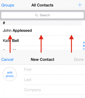
The default presentation animation simply slides the new view up to cover the current one. The illustration below shows a “New Contact” view controller sliding up over the list of contacts:

image001

In this tutorial, you’ll create your own custom presentation controller animations to replace the default one and liven up this tutorial’s project.

Getting Started

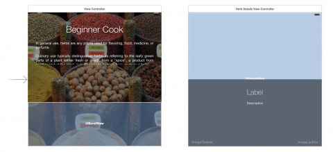
Download the starter project for this tutorial, an app called Beginner Cook. Select Main.storyboard to begin the tour:

image002

The first view controller (ViewController) contains the app’s title and main description as well as a scroll view at the bottom, which shows the list of available herbs.

The main view controller presents HerbDetailsViewController whenever the user taps one of the images in the list; this view controller sports a background, a title, a description and some buttons to credit the image owner.

There’s already enough code in ViewController.swift and HerbDetailsViewController.swift to support the basic application. Build and run the project to see how the app looks and feels:

image003

Tap on one of the herb images, and the details screen comes up via the standard vertical cover transition. That might be OK for your garden-variety app, but your herbs deserve better!

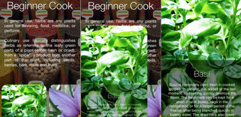
Your job is to add some custom presentation controller animations to your app to make it blossom! You’ll replace the current stock animation with one that expands the tapped herb image to a full-screen view like so:

image004

Roll up your sleeves, put your developer apron on and get ready for the inner workings of custom presentation controllers!

Behind the Scenes of Custom Transitions

UIKit lets you customize your view controller’s presentation via the delegate pattern; you simply make your main view controller (or another class you create specifically for that purpose) adopt UIViewControllerTransitioningDelegate.

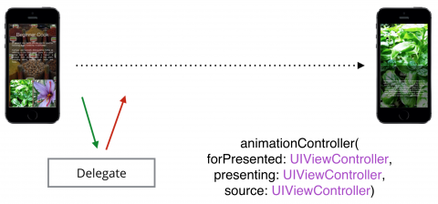
Every time you present a new view controller, UIKit asks its delegate whether or not it should use a custom transition. Here’s what the first step of the custom transitioning dance looks like:

image005

UIKit calls animationController(forPresented:presenting:source:) to see if a UIViewControllerAnimatedTransitioning is returned. If that method returns nil, UIKit uses the built-in transition. If UIKit receives a UIViewControllerAnimatedTransitioning object instead, then UIKit uses that object as the animation controller for the transition.

There are a few more steps in the dance before UIKit can use the custom animation controller:

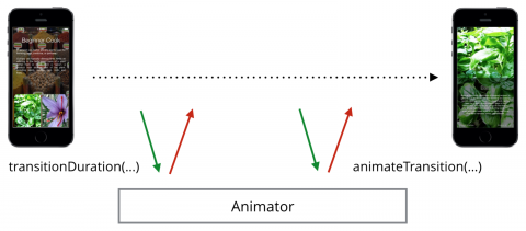
image006

UIKit first asks your animation controller (simply known as the animator) for the transition duration in seconds, then calls animateTransition(using:) on it. This is when your custom animation gets to take center stage.

In animateTransition(using:), you have access to both the current view controller on the screen as well as the new view controller to be presented. You can fade, scale, rotate and manipulate the existing view and the new view however you like.

Now that you’ve learned a bit about how custom presentation controllers work, you can start to create your own.

Implementing Transition Delegates

Since the delegate’s task is to manage the animator object that performs the actual animations, you’ll first have to create a stub for the animator class before you can write the delegate code.

From Xcode’s main menu select File\New\File… and choose the template iOS\Source\Cocoa Touch Class.

Set the new class name to PopAnimator, make sure Swift is selected, and make it a subclass of NSObject.

Open PopAnimator.swift and update the class definition to make it conform to the UIViewControllerAnimatedTransitioning protocol as follows:

class PopAnimator: NSObject, UIViewControllerAnimatedTransitioning {
 
}

You’ll see some complaints from Xcode since you haven’t implemented the required delegate methods yet, so you’ll stub those out next.

Add the following method to the class:

func transitionDuration(using transitionContext: UIViewControllerContextTransitioning?) -> TimeInterval {
  return 0
}

The 0 value above is just a placeholder value for the duration; you’ll replace this later with a real value as you work through the project.

Now add the following method stub to the class:

func animateTransition(using transitionContext: UIViewControllerContextTransitioning) {
 
}

The above stub will hold your animation code; adding it should have cleared the remaining errors in Xcode.

Now that you have the basic animator class, you can move on to implementing the delegate methods on the view controller side.

Open ViewController.swift and add the following extension to the end of the file:

extension ViewController: UIViewControllerTransitioningDelegate {
 
}

This code indicates the view controller conforms to the transitioning delegate protocol. You’ll add some methods here in a moment.

Find didTapImageView(_:) in the main body of the class. Near the bottom of that method you’ll see the code that presents the details view controller. herbDetails is the instance of the new view controller; you’ll need to set its transitioning delegate to the main controller.

Add the following code right before the last line of the method that calls present(...):

// ...
present(herbDetails, animated: true, completion: nil)
herbDetails.transitioningDelegate = self // Add this line

Now UIKit will ask ViewController for an animator object every time you present the details view controller on the screen. However, you still haven’t implemented any of the UIViewControllerTransitioningDelegate methods, so UIKit will still use the default transition.

The next step is to actually create your animator object and return it to UIKit when requested.

Add the following new property to ViewController:

let transition = PopAnimator()

This is the instance of PopAnimator that will drive your animated view controller transitions. You only need one instance of PopAnimator since you can continue to use the same object each time you present a view controller, as the transitions are the same every time.

Now add the first delegate method to the extension in ViewController:

func animationController(forPresented presented: UIViewController, presenting: UIViewController, source: UIViewController) -> UIViewControllerAnimatedTransitioning? {
  return transition
}

This method takes a few parameters that let you make an informed decision whether or not you want to return a custom animation. In this tutorial you’ll always return your single instance of PopAnimator since you have only one presentation transition.

You’ve already added the delegate method for presenting view controllers, but how will you deal with dismissing one?

Add the following delegate method to handle this:

func animationController(forDismissed dismissed: UIViewController) -> UIViewControllerAnimatedTransitioning? {
  return nil
}

The above method does essentially the same thing as the previous one: you check which view controller was dismissed and decide whether to return nil and use the default animation, or return a custom transition animator and use that instead. At the moment you return nil, as you aren’t going to implement the dismissal animation until later.

You finally have a custom animator to take care of your custom transitions. But does it work?

Build and run your project and tap one of the herb images:

image007

Nothing happens. Why? You have a custom animator to drive the transition, but… oh, wait, you haven’t added any code to the animator class! :] You’ll take care of that in the next section.

Creating your Transition Animator

Open PopAnimator.swift; this is where you’ll add the code to transition between the two view controllers.

First, add the following properties to this class:

let duration = 1.0
var presenting = true
var originFrame = CGRect.zero

You’ll use duration in several places, such as when you tell UIKit how long the transition will take and when you create the constituent animations.

You also define presenting to tell the animator class whether you are presenting or dismissing a view controller. You want to keep track of this because typically, you’ll run the animation forward to present and in reverse to dismiss.

Finally, you will use originFrame to store the original frame rect of the image the user taps — you will need that to animate from the original frame to a full screen image and vice versa. Keep an eye out for originFrame later on when you fetch the currently selected image and pass its frame to the animator instance.

Now you can move on to the UIViewControllerAnimatedTransitioning methods.

Replace the code inside transitionDuration() with the following:

return duration

Reusing the duration property lets you easily experiment with the transition animation. You can simply modify the value of the property to make the transition run faster or slower.

Setting your Transition’s Context

It’s time to add some magic to animateTransition. This method has one parameter of type UIViewControllerContextTransitioning, which gives you access to the parameters and view controllers of the transition.

Before you start working on the code itself, it’s important to understand what the animation context actually is.

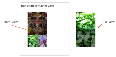
When the transition between the two view controllers begins, the existing view is added to a transition container view and the new view controller’s view is created but not yet visible, as illustrated below:

image008

Therefore your task is to add the new view to the transition container within animateTransition(), “animate in” its appearance, and “animate out” the old view if required.

By default, the old view is removed from the transition container when the transition animation is done:

image009

Before you get too many cooks in this kitchen, you’ll create a simple transition animation to see how it works before implementing a much cooler, albeit more complicated, transition.

Adding a Fade Transition

You’ll start with a simple fade transition to get a feel for custom transitions. Add the following code to animateTransition():

let containerView = transitionContext.containerView
 
let toView = transitionContext.view(forKey: .to)!

First, you get the container view where your animations will take place, and then you fetch the new view and store it in toView.

The transition context object has two very handy methods that give you access to the transition players:

  • view(forKey:): This lets you access the views of the “old” and “new” view controllers via the arguments UITransitionContextViewKey.from or UITransitionContextViewKey.to respectively.
  • viewController(forKey:): This lets you access the “old and “new” view controllers via the argumentsUITransitionContextViewControllerKey.from or UITransitionContextViewControllerKey.to respectively.

At this point, you have both the container view and the view to be presented. Next you need to add the view to be presented as a child to the container view and animate it in some way.

Add the following to animateTransition():

containerView.addSubview(toView)
toView.alpha = 0.0
UIView.animate(withDuration: duration, 
  animations: {
    toView.alpha = 1.0
  }, 
  completion: { _ in
    transitionContext.completeTransition(true)
  }
)

Note that you call completeTransition() on the transition context in the animation completion block; this tells UIKit that your transition animations are done and that UIKit is free to wrap up the view controller transition.

Build and run your project; tap one of the herbs in the list and you’ll see the herb overview fade in over the main view controller:

image010

The transition is acceptable and you’ve seen what to do in animateTransition — but you’re going to add something even better!

Adding a Pop Transition

You’re going to structure the code for the new transition slightly differently, so replace all the code in animateTransition() with the following:

let containerView = transitionContext.containerView
let toView = transitionContext.view(forKey: .to)!
let herbView = presenting ? toView : 
  transitionContext.view(forKey: .from)!

containerView is where your animations will live, while toView is the new view to present. If you’re presenting, herbView is just the toView; otherwise it will be fetched from the context. For both presenting and dismissing, herbView will always be the view that you animate.

When you present the details controller view, it will grow to take up the entire screen. When dismissed, it will shrink to the image’s original frame.

Add the following to animateTransition():

let initialFrame = presenting ? originFrame : herbView.frame
let finalFrame = presenting ? herbView.frame : originFrame
 
let xScaleFactor = presenting ?
 
  initialFrame.width / finalFrame.width :
  finalFrame.width / initialFrame.width
 
let yScaleFactor = presenting ?
 
  initialFrame.height / finalFrame.height :
  finalFrame.height / initialFrame.height

In the code above, you detect the initial and final animation frames and then calculate the scale factor you need to apply on each axis as you animate between each view.

Now you need to carefully position the new view so it appears exactly above the tapped image; this will make it look like the tapped image expands to fill the screen.

Add the following to animateTransition():

let scaleTransform = CGAffineTransform(scaleX: xScaleFactor, 
                                            y: yScaleFactor)
 
if presenting {
  herbView.transform = scaleTransform
  herbView.center = CGPoint(
    x: initialFrame.midX,
    y: initialFrame.midY)
  herbView.clipsToBounds = true
}

When presenting the new view, you set its scale and position so it exactly matches the size and location of the initial frame.

Now add the final bits of code to animateTransition():

containerView.addSubview(toView)
containerView.bringSubview(toFront: herbView)
 
UIView.animate(withDuration: duration, delay:0.0, 
  usingSpringWithDamping: 0.4, initialSpringVelocity: 0.0,
  animations: {
    herbView.transform = self.presenting ?
      CGAffineTransform.identity : scaleTransform
    herbView.center = CGPoint(x: finalFrame.midX, y: finalFrame.midY)
  }, 
  completion:{_ in
    transitionContext.completeTransition(true)
  }
)

This will first add toView to the container. Next, you need to make sure the herbView is on top since that’s the only view you’re animating. Remember that when dismissing, toView is the original view so in the first line, you’ll be adding it on top of everything else, and your animation will be hidden away unless you bring herbView to the front.

Then, you can kick off the animations. using a spring animation here will give it a bit of bounce.

Inside the animations expression, you change the transform and position of herbView. When presenting, you’re going from the small size at the bottom to the full screen so the target transform is just the identity transform. When dismissing, you animate it to scale down to match the original image size.

At this point, you’ve set the stage by positioning the new view controller over the tapped image, you’ve animated between the initial and final frames, and finally, you’ve called completeTransition() to hand things back to UIKit. It’s time to see your code in action!

Build and run your project; tap the first herb image to see your view controller transition in action:

image010

Well, it’s not perfect, but once you take care of a few rough edges your animation will be exactly what you wanted!

Currently your animation starts from the top-left corner; that’s because the default value of originFrame has the origin at (0, 0) – and you never set it to any other value.

Open ViewController.swift and add the following code to the top of animationController(forPresented:):

transition.originFrame = 
selectedImage!.superview!.convert(selectedImage!.frame, to: nil)
 
transition.presenting = true
selectedImage!.isHidden = true

This sets the originFrame of the transition to the frame of selectedImage, which is the image view you last tapped. Then you set presenting to true and hide the tapped image during the animation.

Build and run your project again; tap different herbs in the list and see how your transition looks for each:

image011

Adding a Dismiss Transition

All that’s left to do is dismiss the details controller. You’ve actually done most of the work in the animator already — the transition animation code does the logic juggling to set the proper initial and final frames, so you’re most of the way to playing the animation both forwards and backwards. Sweet! :]

Open ViewController.swift and replace the body of animationController(forDismissed:) with the following:

transition.presenting = false
return transition

This tells your animator object that you’re dismissing a view controller so the animation code will run in the correct direction.

Build and run the project to see the result. Tap on an herb and then tap anywhere on screen to dismiss it:

image012

The transition animation looks great, but notice the herb you picked has disappeared from the scroll view! You’ll need to make sure the tapped image re-appears when you dismiss the details screen.

Open PopAnimator.swift and add a new closure property to the class:

var dismissCompletion: (()->Void)?

This will let you pass in some code to run when the dismiss transition completes.

Next, find animateTransition() and add the following code to the completion handler in the call to animateWithDuration(), right before the call to completeTransition():

if !self.presenting {
  self.dismissCompletion?()
}

This code executes dismissCompletion once the dismiss animation has finished — which is the perfect spot to show the original image.

Open ViewController.swift and add the following code to viewDidLoad():

transition.dismissCompletion = {
  self.selectedImage!.isHidden = false
}

This code displays the original image to replace the herb details view controller once the transition animation completes.

Build and run your app to enjoy the transition animations both ways, now that the herbs aren’t getting lost along the way!

image013

Device Orientation Transition

Note: This section of the tutorial is optional; if you’re not interested in learning how to handle changes in device orientation in your view controllers, skip ahead directly to the challenges.

You can think of device orientation changes as a presentation transition from a view controller to itself, just at a different size.

viewWillTransition(to size:coordinator:), introduced in iOS 8, gives you a simple and straightforward way to handle device orientation changes. You don’t need to build separate portrait or landscape layouts; instead, you just need to react to the change to the view controller view’s size.

Open ViewController.swift and add the following stub for viewWillTransition(to:with:):

override func viewWillTransition(to size: CGSize, with coordinator: UIViewControllerTransitionCoordinator) {
  super.viewWillTransition(to: size, with: coordinator)
 
}

The first parameter (size) tells you what size your view controller is transitioning to. The second parameter (coordinator) is the transition coordinator object, which gives you access to a number of the transition’s properties.

All you need to do in this app is reduce the alpha of the app’s background image to improve the readability of the text when the device is in landscape mode.

Add the following code to viewWillTransitionToSize:

coordinator.animate(
  alongsideTransition: {context in
    self.bgImage.alpha = (size.width>size.height) ? 0.25 : 0.55
  }, 
  completion: nil
)

animate(alongsideTransition:) lets you specify your own custom animations to execute in parallel with the rotation animation that UIKit performs by default when you change the orientation.

Your animation closure will receive a transitioning context, just like the one you used when presenting a view controller. In this case, you don’t have “from” and “to” view controllers since they’re the same, but instead you can fetch properties such as the transition duration.

Inside the animation closure you check if the width of the target size is bigger than the height; if so, you reduce the alpha value of the background image to 0.25. This makes the background fade out when transitioning to landscape mode and fade in to 0.55 alpha when transitioning to portrait orientation.

Build and run your app; rotate the device (or press Cmd + left arrow if testing in the iPhone Simulator) to see your alpha animation in action:

image014

You can clearly see the background dim when you rotate the screen to a landscape mode. This makes the longer lines of text easier to read.

However if you tap on a herb image you will notice that animation is somewhat messy. This happens because the screen has a landscape orientation, but the images still have portrait dimensions. Therefore the transition between the original image and the image stretched to fill up the screen is not fluid.

Not to fear — you can use your new friend viewWillTransition(to:with:) to fix this problem too.

There is an instance method on ViewController called positionListItems() that sizes and positions the herb images. This method is called from viewDidLoad() when your app first starts.

Add a call to this method inside the animate(alongsideTransition:) animation block you added last, just after you set the alpha:

self.positionListItems()

This will animate the size and position of the herb images while the device rotates. As soon as the screen finishes re-orientating the herb images will also have resized:

image015

And since those images will now have a landscape layout also your transition animation will work just fine. Give it a try!

image016

Where to Go From Here?

You can grab the completed project from this tutorial here.

From here, you can do a lot more to polish this transition even further. For example, here are some ideas to develop:

  • Hide tapped images during transitions so it really looks like they grow to take up the full screen
  • Fade in and out each herb’s description text so the transition animation is smoother
  • Test and adjust the transition for landscape orientation

iAT@2xIf you want to learn more, check out our book iOS Animations by Tutorials. The book has been fully updated for Swift 3 and iOS 10. You’ll learn how to animate with springs, transitions, keyframe animations, CALayer animations, Auto Layout constraint animations, view controller transition animations, and more!

We hope you enjoyed this tutorial, and if you have any questions or comments, please join the forum discussion below!

The post iOS Animation Tutorial: Custom View Controller Presentation Transitions appeared first on Ray Wenderlich.
Background Modes Tutorial: Getting Started

$
0
0
Learn how to make your app do stuff even when it is no longer active.

Learn how to make your app do stuff even when it is no longer active.

Update note: This tutorial was updated to iOS 10 and Swift 3 by Chris Wagner. This marks the third revision; original post by Gustavo Ambrozio and second revision by Ray Fix.

Way back in 2010 with iOS 4, Apple introduced multitasking.

Developers and users alike are often confused as to what the iOS multitasking system allows. Apple has restrictions in place for the use of background operations in an effort to improve user experience and extend battery life. Your app is only allowed to keep running in the background in very specific cases. For example, these include playing audio, getting location updates, or fetching the latest content from a server.

If your task does not fall into these categories backgrounding may not be for you. You may even find yourself with an App Store rejection if you try to cheat the system by using background modes outside the realm of their purposes, so consider yourself warned! :]

Getting Started

Before digging into the project, here’s a quick overview of the basic background modes available in iOS. In Xcode 8, you can see the list by pulling up the Capabilities tab of your app target. It looks like this:

background modes

To get to the background modes capability list you (1) select the project from the Project Navigator, (2) select the app target, (3) select the Capabilities tab, and (4) turn the Background Modes switch on.

In this background modes tutorial you will investigate four ways of doing background processing.

  • Play audio: the app can continue playing and/or recording audio in the background.
  • Receive location updates: the app can continue to get callbacks as the device’s location changes.
  • Perform finite-length tasks: the generic “whatever” case, where the app can run arbitrary code for a limited amount of time.
  • Background Fetch: Get updates to the latest content scheduled by iOS.

If you are only interested in one or several of these modes, feel free to skip around!

To get started download the starter project. You’ll find the user interface and some of the logic that is not directly applicable to the topic has been provided for you.

Before you can run the project you must set your development team, as shown here:

background modes

Run the sample project to get a feel for it. There are 4 tabs; one to cover each mode:

background modes

Note: For the full effect, you should follow along on a real device. In my experience, if you forget a configuration setting, the app might appear to run fine in the background on the Simulator. However, when you switch to a real device, it doesn’t work at all.

Playing Audio

First up, background audio.

There are several ways to play audio on iOS and most of them require implementing callbacks to provide more audio data to play.

If you want to play audio from streaming data, you can start a network connection, and the connection callbacks provide continuous audio data.

When you activate the audio background mode, iOS will continue these callbacks even if your app is not the current active app. That’s right – the audio background mode is virtually automatic. You just have to activate it and provide the infrastructure to handle it appropriately.

In this section you’ll review the audio player in the app, verify that background mode is not working, enable the audio background capability, and demonstrate to yourself that it’s working.

Open AudioViewController.swift and take a look around.

The app makes use of an AVQueuePlayer to queue up songs and play them one after the other. The view controller is observing the player’s currentItem value to provide updates.

The starter project includes audio files from incompetech.com, a favorite royalty-free music website. With credit given, you can use the music for free. So, here you go: all songs are by Kevin MacLeod at incompetech.com. Thanks, Kevin!

When the app is in the active state, the music title label is shown and when in the app is in the background it will print the title to the console. The label text could still update while in the background, but the point here is just to demonstrate that your app continues to receive this callback when your app is in the background.

Note: Check out the Execution States for Apps to learn more about the active state and others.

Build and run, and you should see this:

background modes

Now hit Play and the music will start. Nice!

Test if backgrounding works. While running on an actual device hit the home button and the music will stop. Why? Well, there’s still a very crucial piece missing!

For most background modes (the “Whatever” mode is the exception) you need to enable the capability to indicate that the app wants to run code while in the background.

Back in Xcode, do the following:

  1. Click the project in the Project Navigator;
  2. Click TheBackgrounder target;
  3. Click on the Capabilities tab;
  4. Scroll down to Background Modes and turn the switch on;
  5. Check Audio, AirPlay and Picture in Picture.

background modes

Build and run again. Start the music and hit the home button, and this time you should still hear the music, even though the app is in the background.

You should also see the time updates in your Console output in Xcode, proof that your code is still working even though the app is in the background.

Wow, if you already have an audio player in place, playing audio in the background is easy! Well, that’s one mode down, if you’re following through the entire background modes tutorial – three to go!

Receiving Location Updates

When in location background mode, your app will still receive location delegate messages with the updated location of the user, even when the app is in the background. You can control the accuracy of these location updates and even change that accuracy while backgrounded.

The second tab is for location updates, so open LocationViewController.swift and take a look around. Similarly to the background audio example, the location background mode is very easy to get up and running with if you already have location features working!

In this controller you will find that CLLocationManager runs the show. To receive location information you create and configure a CLLocationManager instance. In this case the app monitors location when an on screen UISwitch is activated. As location updates are received the app draws pins on a map. When the app is in the background, you should see the log of location updates in your console output in Xcode.

An important line to note is the call to requestAlwaysAuthorization() on the CLLocationManager instance. This is a requirement since iOS 8, and brings up a dialog asking for permission to receive locations in the background.

Now that you’re familiar with Background Modes, you don’t need to make the same mistake as before! Check the box for Location updates to let iOS know that your app wants to continue receiving location updates while in the background.

background modes

In addition to checking this box, iOS 8 and above requires that you set a key in your Info.plist explaining to the user why background updates are needed. If you do not include this, location requests will silently fail.

  • Select the project in Xcode.
  • Select the Info tab for TheBackgrounder target.
  • Select an existing row.
  • Click on the + button to add a new key.
  • Add the key named Privacy – Location Always Usage Description.
  • Write a convincing description of why you need to receive location updates in the background.

background modes

Now build and run! Switch to the second tab and flip the switch to ON.

When you do this the first time, you will see the message that you put into your location privacy reason. Tap Allow and go for a walk outside or around your building (try not to get too distracted catching Pokemons). You should start seeing location updates, even on the Simulator.

background modes

After a while, you should see something like this:

background modes

If you background the app, you should see the app updating the location in your console log. Open the app again and you’ll see that the map has all the pins for the locations that were updated while the app was in the background.

If you’re using the Simulator, you can use it to simulate movement, too! Check out the Debug \ Location menu:

background modes

Try setting the location to Freeway Drive and then hit the home button. You should see the console logs printing out your progress as you simulate that drive down a California highway:

App is backgrounded. New location is %@ <+37.33500926,-122.03272188> +/- 5.00m (speed 7.74 mps / course 246.09) @ 9/5/16, 10:20:07 PM Mountain Standard Time

Easy peasy, right?! On to the third tab and the third background mode!

Performing Finite-Length Tasks… or, Whatever

The next background mode is officially called Executing a Finite-Length Task in the Background. What a mouthful. Whatever is a bit catchier!

Technically, this is not a background mode at all, as you don’t have to declare that your app uses this mode in Capabilities. Instead, it’s an API that lets you run arbitrary code for a finite amount of time when your app is in the background. Well… whatever!

In the past, this mode was often used to complete an upload or download and a generous (but not guaranteed) 10 minutes was provided to accomplish these tasks. But what if the connection was slow and the process still didn’t finish? It would leave your app in an odd state and you would have to add lots of error handling code to make things work sanely. Because of this, Apple introduced NSURLSession.

Although not a topic of this background modes tutorial, NSURLSession is robust in the face of backgrounding and even device reboots and accomplishes this in a power efficient way. If you are dealing with large downloads, check out our NSURLSession tutorial.

A still very valid use case of the Whatever background mode is to complete some long running task, such as rendering and writing a video to the camera roll.

background modes

But this is just one example. As the code you can run is arbitrary, you can use this API to do pretty much anything: perform lengthy calculations (as in this background modes tutorial), apply filters to images, render a complicated 3D mesh… whatever! Your imagination is the limit, as long as you keep in mind that you only get some time, not unlimited time.

How much time you get after your app gets backgrounded is determined by iOS. There are no guarantees on the time you’re granted, but you can always check backgroundTimeRemaining on UIApplication. This will tell you how much time you have left.

The general, observation-based consensus is that you get three minutes. Again, there are no guarantees and the API documentation doesn’t even give a ballpark number – so don’t rely on this number. You might get 5 minutes or 5 seconds, so your app needs to be prepared for… whatever!

Here’s a common task that every CS student should be familiar with: calculating numbers in the Fibonacci Sequence. The twist here is that you’ll calculate these numbers in the background!

Open WhateverViewController.swift and take a look at what’s there already. As it stands, this view will calculate Fibonacci numbers in sequence and display the result. If you were to suspend the app on an actual device, the calculations would stop and pickup where they were once the app was active again. Your task is to create a background task so that the calculation can keep running until iOS says, ‘No more!’.

You first need to add the following property to WhateverViewController.

var backgroundTask: UIBackgroundTaskIdentifier = UIBackgroundTaskInvalid

This property is used to identify the task request to run in the background.

Next add the following methods to WhateverViewController.

func registerBackgroundTask() {
  backgroundTask = UIApplication.shared.beginBackgroundTask { [weak self] in
    self?.endBackgroundTask()
  }
  assert(backgroundTask != UIBackgroundTaskInvalid)
}
 
func endBackgroundTask() {
  print("Background task ended.")
  UIApplication.shared.endBackgroundTask(backgroundTask)
  backgroundTask = UIBackgroundTaskInvalid
}

registerBackgroundTask() tells iOS that you need more time to complete whatever it is you’re doing in case the app is backgrounded. After this call, if your app is backgrounded it will still get CPU time until you call endBackgroundTask().

Well, almost. If you don’t call endBackgroundTask() after a period of time in the background, iOS will call the closure defined when you called beginBackgroundTask(expirationHandler:) to give you a chance to stop executing code. So it’s a very good idea to then call endBackgroundTask() to tell the OS that you’re done. If you don’t do this and continue to execute code after this block is called, your app will be terminated!

Now for the important part, you need to update didTapPlayPause(_:) to register the background task and end it. There are two comments in this method where you will add some code.

Call registerBackgroundTask() below the “register background task” comment.

// register background task
registerBackgroundTask()

registerBackgroundTask() is now called when calculations begin so you can continue calculating numbers in the background.

Now add the following block below the “end background task” comment.

// end background task
if backgroundTask != UIBackgroundTaskInvalid {
  endBackgroundTask()
}

Now when calculations are stopped by the user endBackgroundTask() is called to indicate to iOS that you don’t need any extra CPU time.

It is important that you call endBackgroundTask() for every time you call beginBackgroundTask(expirationHandler:). If you call beginBackgroundTaskWithExpirationHandler(_:) twice and only call endBackgroundTask() for one of the tasks, you’re still going to get CPU time until you call endBackgroundTask() a second time with the value of the second background task. This is also why you needed backgroundTask.

Now update the calculateNextNumber() method to behave differently based on the application’s state.

Replace the final line, resultsLabel.text = resultsMessage, in the method with the following:

switch UIApplication.shared.applicationState {
case .active:
  resultsLabel.text = resultsMessage
case .background:
  print("App is backgrounded. Next number = \(resultsMessage)")
  print("Background time remaining = \(UIApplication.shared.backgroundTimeRemaining) seconds")
case .inactive:
  break
}

The label will only be updated when the application is active. When the application is backgrounded a message will be printed to the console instead, stating what the new result is and how much background time is remaining.

Build and run, then switch to the third tab.

background modes

Tap Play and you should see the app calculating the values. Now hit the home button and watch the output in Xcode’s console. You should see the app still updating the numbers while the time remaining goes down.

In most cases, this time will start with 180 (180 seconds = 3 minutes) and go down to 5 seconds. If you wait for the time to expire when you reach 5 seconds (could be another value depending on your specific conditions), the expiration block will be invoked and your app should stop outputting anything. Then if you go back to the app, the timer should start firing again and the whole madness will continue.

There’s only one bug in this code. Suppose you background the app and wait until the allotted time expires. In this case, your app will call the expiration handler and invoke endBackgroundTask(), thus ending the need for background time.

If you then return to the app, the timer will continue to fire. But if you leave the app again, you’ll get no background time at all. Why? Because nowhere between the expiration and returning to the background did the app call beginBackgroundTaskWithExpirationHandler(_:).

How can you solve this? There are a number of ways to go about it and one of them is to use a state change notification.

You can see all the details on how to respond to state change in Apple’s documentation for App States for Apps.

Time to fix the bug. First, add a new method named reinstateBackgroundTask().

func reinstateBackgroundTask() {
  if updateTimer != nil && (backgroundTask == UIBackgroundTaskInvalid) {
    registerBackgroundTask()
  }
}

You only need to reinstate if there is a timer running and the background task is invalid. Breaking your code into smaller utility functions that do one thing is paying off. In this case you simply need to call registerBackgroundTask().

Now override viewDidLoad() and subscribe to UIApplicationDidBecomeActiveNotification by adding the following:

override func viewDidLoad() {
  super.viewDidLoad()
  NotificationCenter.default.addObserver(self, selector: #selector(reinstateBackgroundTask), name: NSNotification.Name.UIApplicationDidBecomeActive, object: nil)
}

This designates your new method reinstateBackgroundTask() to be called whenever the application becomes active.

Whenever you subscribe to a notification you should also think about where to unsubscribe. Use deinit to do this. Add the following:

deinit {
  NotificationCenter.default.removeObserver(self)
}

And there you have it, you can now do whatever you want, at least for as long as iOS says that it is okay.

On to the final topic for this background modes tutorial: Background Fetching.

Background Fetch

Background fetch is a mode introduced in iOS 7 that lets your app appear always up-to-date with the latest information while minimizing the impact on battery. Suppose, for example, you were implementing a news feed in your app. Prior to background fetch, you might do this by getting new data in viewWillAppear(_:).

The problem with this solution is that your user is looking at the old data for at least several seconds until the new data comes in. Wouldn’t it be better if right when they opened your app the new data was magically there? This is what background fetch gives you.

When enabled, the system uses usage patterns to determine when to best fire off a background fetch. For example, if your user opens the app at 9 AM each morning, it is likely that a background fetch will be scheduled sometime before that time. The system decides the best time to issue a background fetch and for this reason you should not use it to do critical updates.

In order to implement background fetch there are three things you must do:

  • Check the box Background fetch in the Background Modes of your app’s Capabilities.
  • Use setMinimumBackgroundFetchInterval(_:) to set a time interval appropriate for your app.
  • Implement application(_:performFetchWithCompletionHandler:) in your app delegate to handle the background fetch.

As the name implies, background fetch normally involves fetching information from an external source like a network service. For the purposes of this background modes tutorial, you won’t use the network but just fetch the current time. This simplification will let you understand everything required to perform a background fetch and test it without worrying about an external service.

In contrast to finite-length tasks, you only have seconds to operate when doing a background fetch – the consensus figure is a maximum of 30 seconds, but shorter is better. If you need to download large resources as part of the fetch, this is where you need to use NSURLSession‘s background transfer service.

Time to get started. First, open FetchViewController.swift and take a look at what this does, there’s not much to it.

The fetch(_:) method is a simplified replacement of what you might actually do to fetch some data from an external source (such as a JSON or XML RESTful service). Since it might take several seconds to fetch and parse the data, you pass a completion handler that gets called when the process is done. You will see why this is important a little later.

updateUI() formats the time and shows it. The guard statement around updateLabel is to ensure that the view has actually been loaded. time is an optional type so if it is not set, it shows the message “Not updated yet”.

When the view is first loaded (in viewDidLoad()) you don’t fetch, but go straight to updateUI() which means the message “Not yet updated” will appear first. Finally, when the Update button is tapped it performs a fetch and as a completion updates the UI.

The view controller is working. There’s nothing you need to do to it.

background modes

However, background fetching is not enabled.

The first step to enabling background fetching is to check Background fetch in the Capabilities tab of your app. By now this should be old hat. Go ahead and do this.

background modes

Next, open AppDelegate.swift add the following to application(_:didFinishLaunchingWithOptions:):

UIApplication.shared.setMinimumBackgroundFetchInterval(UIApplicationBackgroundFetchIntervalMinimum)

This requests background fetches by setting the minimum background fetch interval. The default interval is UIApplicationBackgroundFetchIntervalNever, which you might want to switch back to, if, for example, your user logs out and no longer needs updates. You can also set a specific interval in seconds. The system will wait at least that many seconds before issuing a background fetch.

Be careful not to set the value too small because it may chew through battery unnecessarily as well as hammer your server. In the end the exact timing of the fetch is up to the system but will wait at least this interval before performing it. Generally, UIApplicationBackgroundFetchIntervalMinimum is a good default value to use.

Finally, to enable background fetch you must implement application(_:performFetchWithCompletionHandler:). Add that now to AppDelegate:

// Support for background fetch
func application(_ application: UIApplication, performFetchWithCompletionHandler completionHandler: @escaping (UIBackgroundFetchResult) -> Void) {
  if let tabBarController = window?.rootViewController as? UITabBarController,
         let viewControllers = tabBarController.viewControllers
  {
    for viewController in viewControllers {
      if let fetchViewController = viewController as? FetchViewController {
        fetchViewController.fetch {
          fetchViewController.updateUI()
          completionHandler(.newData)
        }
      }
    }
  }
}

First you need to get the FetchViewContoller. Next, optionally cast since the rootViewController is not necessarily a UITabBarController in every app, although it is in this app so it will never fail.

Next, you loop though all of the view controllers in the tab bar controller and find the one that successfully casts to FetchViewController. In this app you know it is the last view controller so you could hard-code it, but looping makes it a little more robust in case you decide to add or remove a tab later.

Finally you call fetch(_:). When it completes, you update the UI and then call the completionHandler that was passed in as a parameter of the function. It is important that you call this completion handler at the end of the operation. You specify what happened during the fetch as the first parameter. Possible values are .newData, .noData, or .failed.

For simplicity, the tutorial always specifies .newData since getting the time will never fail and is always different than the last call. iOS can then use this value to better time the background fetches. The system knows at this point to take a snapshot of the app so it can present it in the card view of the app switcher. And that is all there is to it.

Note: Rather than passing the completion closure along, it can be tempting to save it away in a property variable and call that when your fetch completes. Don’t do this. If you get multiple calls to application(_:performFetchWithCompletionHandler:), the previous handler will get overwritten and never called. It is better to pass the handler through and call it as it will make this kind of programming error impossible.

Testing Background Fetch

One way to test background fetch is to sit around and wait for the system to decide to do it. That would require a lot of sitting. Fortunately, Xcode gives a way to simulate a background fetch. There are two scenarios that you need to test. One is when your app is in the background, and the other when your app is coming back from being suspended. The first way is the easiest and is just a menu selection.

  • Start the app on an actual device (not a simulator);
  • Go to the Fetch tab
  • Notice the message is “Not yet updated”
  • From the Debug menu in Xcode, select Simulate Background Fetch;
    background modes
  • The app will be sent to the background and Xcode’s debugger will trap. Instruct the debugger to continue
    background modes
  • Reopen the app
  • Notice that the time is updated!.

The other way you should test background fetch is to do it as a resume from suspension. There is a launch option that lets you launch your app directly into suspension. Since you might want to test this semi-often it is best to make a new Scheme with that option always set. Xcode makes this easy.

First select the Manage Schemes option.

background modes

background modes

Next, select the only scheme in the list, and then click on the gear icon and select Duplicate.

background modes

Lastly, rename your scheme to something reasonable, like, “Background Fetch” and check the checkbox to Launch due to a background fetch event.

background modes

Run your app with this scheme. You will notice that the app never actually opens but is launched into a suspended state. Now manually launch it and go to the Fetch tab. You should see that there is an updated time when you launched the app instead of “Not yet updated”.

Using background fetch effectively lets your users to seamlessly get the latest content.

Where to Go From Here?

You can download the fully finished sample project here.

If you want to read Apple’s documentation on what we covered here for background modes, the best place to start is in Background Execution. This documentation explains all background modes and has links to the appropriate section of the documentation for each one.

A particularly interesting section of this document is the one that talks about being a responsible background app. There are some details that might or might not relate to your app here that you should know before releasing an app that runs in the background.

Finally, be sure to check out NSURLSession if you plan on doing large network transfers in the background.

We hope you enjoyed this tutorial on background modes, and if you have any questions or comments, please join the forum discussion below!

The post Background Modes Tutorial: Getting Started appeared first on Ray Wenderlich.
RWDevCon 2016 Inspiration Talk – What’s Your Why by Jaimee Newberry

$
0
0

Note from Ray: At our recent RWDevCon tutorial conference, in addition to hands-on tutorials, we also had a number of “inspiration talks” – non-technical talks with the goal of giving you a new idea, some battle-won advice, and leaving you excited and energized.

We recorded these talks so that you can enjoy them, even if you didn’t get to attend the conference. Here’s the final inspiration talk from RWDevCon 2016: “What’s Your Why?” by Jaimee Newberry. I hope you enjoy!

Transcript

I want to tell you about this life changing phone call I had a few years ago. Before I do, I want to ask a couple questions.

How many of you love your work?

Yes! This is why I love speaking at these events: people are here to learn, sharpen their craft, and improve on work they love.

Has anybody ever seen any of my burnout talks before?

Okay, so a couple of you, that’s cool. I talk about burnout a lot, and in 2013 I hit burnout. Has anybody here felt burnout? All right, so it happens to us even when we love our work, right?

The Phone Call

Let me tell you about this phone call. In January of 2013 I was having a phone call with a friend of mine, and the phone call was me sharing my experience about an eight month ramp up to the worst burnout I’ve ever had in my life. It was triggered by the death of my dad in early 2012. Month after month this sort of built up.

Now, if you’ve seen my burnout talks before don’t get nervous, this isn’t the same materials, this is some things I’ve learned since working through burnout. (I had to make that disclaimer.)

Ring! Ring!

Ring! Ring!

I’m having this phone call with my friend and I’ll telling him, “Okay I’m coming up on a two week vacation, and I’m really just trying to figure stuff out.” My two week vacation wasn’t about going somewhere tropical, or getting away from work so much as figuring out if I was going to leave the only career I had ever known for the previous fifteen years. Burnout had been so bad that death actually seemed more appealing than designing another product.

I was in a pretty bad place, and I was having this conversation. The question that I asked, I was like, “Okay Stephan,” (my friend on this phone call), “I’ve got to figure out if leaving is right. That is what feels right, but I don’t know what’s next.”

Screen Shot 2016-06-26 at 7.51.21 PM

He says to me, and this is what made it a life changing phone call: “It’s not about what’s next, it’s about what’s important.”

He kind of continued on, he didn’t say it like it was this sage advice – it was just a casual thing for him to say.

I struck me. It was the most important message I had heard. I was hearing the right thing at the right time. It helped me put into perspective where I needed to be.

It wasn’t about what was next, it was about what was important.

Screen Shot 2016-06-26 at 7.51.31 PM

Figuring Our What’s Important

I thought about what was important. For three years after that phone call this started me on a journey of designing my life. Basically what I did is for that first year I spun the product design process towards myself.

Instead of designing products I decided to design my life as if my life were the product I was designing. I did quit my job, I had other things bringing in income, but I really put the focus on what was important.

In terms of what’s important, this was the first list that I made:

Screen Shot 2016-06-26 at 8.08.24 PM

As soon as I got off that call with Stephan I made this list, and this is the list that said, “Okay, right now, right here, at this moment, these are the things that are the most important thing to me in the world. More important than work, more important than money, these are the things that are important to me.”

I thought that was great, it walked me through the design process. The first thing that you try to do in the design process, or when you’re making products is to figure out, “Why?” What it is, what’s your reasoning, what’s the logic behind all of this?

I realized that I was doing something wrong and I didn’t realize that until a couple years later, about a year and a half later. This was my first list and I thought, “Okay, this is me right now, but this could change, this could be somewhat dynamic as life situations change and in situations, your needs change. I might need to update the list, and re-prioritize the list.”

What I realized about a year and a half in, things were going pretty well as I was working my way through burnout using the design process. My habit was to kind of review the list every three months or so and figure out if everything was still on track.

Where I Went Off Track

I reached a point about a year and a half in where my savings had dipped a little bit. I was like, “I need to replenish that, I’m going to put something financial at number one. That’s going to be my focus.” A couple weeks after I did that I got a three month engagement with a client that was killer money, but I was taking a step back from what I had been focused on.

I didn’t really realize until I got about two weeks into the project and I was like, “God I’m miserable all over again.” I haven’t recovered from burnout, even though I thought I had. I ended up compromising number four: doing things that I love. It took changing this list for me to realize that was wrong.

I always explore the parallels in how we create the kinds of products we make, and how we can apply those to our actual lives.

Screen Shot 2016-06-26 at 7.56.43 PM

There’s so many parallels there. In making that error I started to analyze things and go back to what had worked. At points in my life, and in my professional career of designing super awesome products I started to analyze, “Okay what was working? Where did I go wrong here?” What I realized is that breakdown occurs when clarity of vision is lacking.

Screen Shot 2016-06-26 at 7.58.19 PM

You have your goals, and this clarity of vision, but when you derail from that, that’s when things start to go wrong. Whether you’re making a product, or you’re designing your life the same thing applies.

I started to think, “Okay, all right, all right. Everything that I’ve ever done, my philosophy, the clarity of vision applies to every product I’ve ever made, or will make. It applies to every goal I’ve had, or will have. It also applies to who I am, and who I want to be.”

Then when I needed to reassess, okay, what product history do I have that went really well. What product would I really consider a success, and what was right about it? How do I analyze this so I can fix whatever is going wrong in my process here?

My Experience at Zappos

From 2009 to 2011 I worked at Zappos.com. And 2009 to 2010, the first part of the engagement of that two year engagement I was focused. I was a product manager for the website. My mission was to give the website an overhaul, a visual re-skin, look and feel.

Screen Shot 2016-06-26 at 8.08.35 PM

Immediately upon completing that, June of 2010, the mobile apps were my babies. The very first mobile apps for Zappos were my babies.

It came to me right after the iPad had come out. In June of 2010 I was approached with this project and we had decided that the iPad was the way to go, we didn’t have a mobile app at all in the space. Nothing: no iPhone or anything.

We decided to lead with iPad, and I consider this project a success because we went from never having touched an iPad to having an app in the app store when we submitted it, Apple called us to say, “Wow, good job.”

Then we repeated that process with iPhone in eight weeks. Again, we got a call from Apple. That was really cool. When I analyzed what happened there, why did that go right, what I was able to chalk it up to is I’d had that year with Zappos of working on the website where I really understood what Zappos was about.

I understood their core values, and I understood their business goals with absolute clarity so that when I got this project, I knew exactly what to do with that information to have this team make some awesome stuff.

Analyzing core values versus business goals, this is where I went a little wobbly on my own list of what’s important.

I quote this all the time if you’ve ever seen one of my product engagement talks. Aarron Walter wrote this book called, “Designing for Emotion.” He says, “Finding out who your customers are is only half the question. You also have to understand who you are.”

Screen Shot 2016-06-26 at 7.58.46 PM

I used to always internalize that way beyond the product realm. Zappos is a company that I feel like really gets this; they know who they are as a company. I’m kind of tapping into this, and analyzing okay, what went right? Core values: they know who they are.

Let’s look at this. Let’s look at their core values in 2009 when I was there.

Zappos.com Core Values

Zappos.com Core Values

This is what they were and these were established far before I got there in 2009. I went back, when I was writing this talk a couple months ago, I went back to see what their core values were now. That’s them now, they haven’t changed, not one word.

The core values remained the same, static.

Their business goals in 2009 looked more like this, doesn’t matter if you can read it or not, that’s not the important part. The important part is that the goals were defined by a really clear timeline, 2009 to 2013.

Zappos.com 2009 Business Goals

Zappos.com 2009 Business Goals

And they’re really specific sort of dynamic things, like a dollar amount, a vertical, really defined brackets of information that can change over time. They’re expected to change over time. But core values are static, foundational.

What I Realized From Looking at Zappos

That was really, really important for me to analyze and go, “Okay, now I was treating my core values as something a little more dynamic, a little more goal based. That was wrong, that was not the right way to approach it.”

Goals are important, but they’re not foundational.

Looking again at the core values of Zappos, when I analyze this stuff these are the core values that we used when we made those apps as design principles. Every decision, every feature, every function, every animation transition, even the raining cats, I can cross reference this list and say, “Yes, it supports one of these things. Everything we did aligned with these core values.”

When I flip that to the me side of things, I aim those questions at me, and all my life struggles and the things I was trying to work through.

Screen Shot 2016-06-26 at 7.59.30 PM

When I did that and I looked at my list in the context of core values up against Zappos core values, I realized I was in pretty good shape, but I did have one more goal: write more.

It’s something that I could have defined a little bit better with what does “more” mean, I could establish that. Really, this goal supports doing things I love. It supports contributing something positive to the world because that’s the angle I take on what I write. And it supports the idea “if it seems scary go for it” because putting things out publicly is terrifying for me.

This is a goal, and that was one thing that I needed to edit on my list. That was a more dynamic thing, that was a thing that can change with time and as I grow.

My core values needed to stay the same. And again, every action supports what’s important. In my case this was my life, and all of the choices that I was making as I worked through burnout, needed to align with my values there.

Screen Shot 2016-06-26 at 7.59.47 PM

And then there’s the financial piece, and you know, for other people maybe the financial piece is a core value. To me the financial piece actually supports being the best mom I can be so I can provide for my children and give them necessities and luxuries. To me the financial piece, it can change what defines it, just like my writing goal. It can change, but it supports the core values, it isn’t a core value for me.

If you’re force fitting stuff into that list it might be a sign that you’re doing it wrong. Basically though that comes down to your why.

What Do You Need to Take Positive Action?

Here’s my perspective on stuff like burnout. When you’re feeling off, when you’re feeling like the course isn’t aligned. It applies to products, and it applies to you on a day to day basis, your mental and physical health.

You lose track of where you are when clarity of vision is lost, when your core values are misaligned. When we fall off of those things, we lose the understanding behind the why.

The phone call that I talked about, the phone call that changed my life, it started this big wheel in motion for me. I don’t know that without that phone call I would have figured out that I had the tools already inside of me from my Marry Poppins bag of fifteen years of design experience. Every one of you has experience on making the products that you make. You have a bag of tools within you to design things, to develop things, to make things.

When you have clarity of vision about what you’re doing, you’re able to do a better job. When you don’t have clarity of vision you get frustrated, you don’t understand why you’re being asked to do something that doesn’t seem to make sense because you don’t have the big picture, the why behind it.

What’s Your Why?

What’s important uncovered the why for me. When we have the clarity of vision around the why we have the answers in front of us. Every single decision we make moving forward, goals change and the situations change, but again, that foundation has to remain the same.

Like we saw with the core values of Zappos, that example, the foundational principles can’t change. When we know why we can take positive action. I guess that’s where I end up.

You’ve got all these tools. Do you have the clarity of vision to stay aligned, to keep yourself going? What is your why?

About the Speaker: Jaimee Newberry brings industry leadership and experience gained from advising C-level and senior management teams at startups, agencies, and Fortune 500 companies to her role as COO at MartianCraft. Her insight, practices, and a personal ecology has proven to elevate the culture, processes and product quality of high-performance software design and development teams worldwide. Jaimee has worked with Audi, Apple, Barnes & Noble, Disney, McDonalds, Nintendo, Zappos, and more.

Note from Ray: If you enjoyed this talk, you should join us at RWDevCon 2017! We’ve sold out for the past two years, so don’t miss your chance.

The post RWDevCon 2016 Inspiration Talk – What’s Your Why by Jaimee Newberry appeared first on Ray Wenderlich.

Unity Games by Tutorials – 17 Chapters Now Available!

$
0
0

Unitygames-featureWe’re excited to tell you that the fourth and final early access release of Unity Games by Tutorials is out with a full 17 chapters and a brand new game: Runestrife!

This is a free update for those who have pre-ordered Unity Games by Tutorials.

If you haven’t pre-ordered Unity Games by Tutorials yet, read on to see how to get your copy!

What’s New in this Release?

We’ve added three new chapters that teach you how to build a great 3D tower defense-style game:

  • Chapter 18, Making a Tower Defense Game:: Learn how to use manager classes, create utility scripts to make your life easier, and make enemies spawn on a predetermined path.
    Learn how to create paths on your 3D tower defense map.

    Learn how to create paths on your 3D tower defense map.

  • Chapter 19, Making Towers: Carry on with your game; learn how to create waves of enemies, make towers that shoot projectiles, craft a UI that binds everything together, and create winning and losing logic.
    Add some action to your towers to fight off advancing waves of enemies!

    Add some action to your towers to fight off advancing waves of enemies!

  • Chapter 20, Virtual Reality: Make your game virtual-reality ready by transforming Runestrife into a VR game. Learn how to use the popular Oculus Rift and HTC Vive devices with Unity.
    Get up close and personal in virtual reality!

    Get up close and personal in virtual reality!

What is Unity?

Unity is a a professional game engine used to create games like City Skylines, Hearthstone, the Long Dark, and more.

Unity’s aim is to “democratize” game development, by providing a AAA-level engine to independent game developers in a way that is both affordable and accessible.

Here are our top 5 reasons why Unity is great:

  1. It’s free to use. If you’re an indie game developer, you can download and start using Unity for free, which is great when you’re just learning.
  2. It’s cross-platform. With Unity, you make your game once and you can build it for a variety of platforms, including Windows, macOS, Linux, iOS, and more.
  3. It has a visual editor. Unlike other game platforms where you have to type tons of code before you see anything on the screen, with Unity you can simply import an asset and drag and drop. This visual style of development is great for beginners and professionals alike, and makes game development fast and fun.
  4. Live debugging. With Unity you can click a button to preview your game instantly in the editor, and you can even modify game objects on the fly. For example, you can drag new enemies onto the level as you play it, tweak gameplay values and more, allowing for an iterative game design process.
  5. Unity is fun! You can think of Unity like a box of legos: the only limits are those of your own imagination.
Unity vs. Sprite Kit and Scene Kit: You might wonder which you should use: Unity, or one of the Apple game frameworks like Sprite Kit or Scene Kit.

Here’s our recommendation:

  • If you are an experienced iOS developer making a simple game and want to target iOS devices only, you may want to consider using one of Apple’s game frameworks. They are very easy to learn and leverage much of your existing iOS development experience.
  • If you want to target non-iOS devices, or if you want to make games at a professional level, you may want to consider using Unity. Unity is much more powerful than the Apple game frameworks, and does not lock you into the iOS ecosystem, and that’s well worth the increased learning curve.

What Is Unity Games by Tutorials?

Unity Games by Tutorials is for complete beginners to Unity, or for those who’d like to bring their Unity skills to a professional level. Its goal is to teach you everything you need to know to make your own Unity games – via hands-on experience.

In Unity Games by Tutorials, you’ll learn how to build four games:

  1. A twin-stick shooter
  2. A first-person shooter
  3. A tower defense game (with VR support!)
  4. A 2D platfomer

Here’s a sneak peek of what you can look forward to in the full release:

Section I: Hello, Unity!

This section covers everything you need to know to get started with Unity. You’ll learn your way around the UI, how to work with game assets and physics, and create a 3D twin-stick combat game: Bobblehead Wars.

Bobblehead Wars

Here’s what you’ll cover while saving the world from creepy-crawly aliens:

  • Chapter 1, Hello Unity: Learn how the Unity interface works and how to import assets into your project.
  • Chapter 2, GameObjects: Learn about GameObjects and Prefabs by adding and laying out the initial objects for Bobblehead Wars.
  • Chapter 3, Components: Learn how to use components to give your hero the ability to walk and blast away at the oncoming horde.
  • Chapter 4, Physics: Learn the basics of game physics by adding collision detection and giving the hero the ability to turn on a dime.
  • Chapter 5, GameManager and Pathfinding: Learn how to create the tools that spawn the aliens, and then make them chase after the hero.
  • Chapter 6, Animations: Learn how to add animations to the marine and the aliens. It’s time for some shooting and chomping!
  • Chapter 7, Sounds: Learn how to bring your game to life by adding background music and a variety of sound effects.
  • Chapter 8, Finishing Touches: Learn how to add a winning and losing condition, and wrap up the game with some classy touches.

Section II: First-Person Games

Now that you’re up to speed with Unity game development, you can move on to more complex game development topics, such as adding in-game UI elements, advanced camera techniques and using multiple weapons.

In this section, you’ll build a fast-paced first-person shooter: Robot Rampage.

Robot Rampage

Here’s a brief outline of what this section has in store:

  • Chapter 9, Making a First Person Shooter: Learn how to set up your FPS game, create the map, add the player and build some kick-ass weaponry for mowing down enemies.
  • Chapter 10, Adding Enemies: Learn how to create powerups, add enemies to your game, and create some damage mechanics for you and your robot nemeses.
  • Chapter 11, Unity UI: Learn how to add in-game UI, craft waves of robot enemies, add enhanced sound and music, and give your player the right weapon for the right job.

Section III: Unity 2D Games

3D games are undeniably awesome, but you just can’t beat a classic 2D platformer game.

In this section, you’ll build a game to test your reflexes as you help your hero battle his way to a well-deserved lunch in Super Soy Boy:

Super Soy Boy

Here’s the chapters and topics you’ll cover while helping Super Soy Boy avoid those terrifying buzzsaws:

  • Chapter 12, Beginning Unity 2D: Learn the 2D workflow in Unity and begin creating the building blocks for your 2D platformer game.
  • Chapter 13, More Unity 2D: Learn how to work with 2D physics, how to build levels with sprites and colliders, and how to work with raycasting, animation controllers, and more.
  • Chapter 14, Saving Data: Learn some great ways to store and retrieve player data for your games.

Section IV: Tower Defense

Combining strategy and action results in compelling games that are easy to pick up — and hard to put down.

In this section, you’ll create a 3D tower defense game — Runestrife — with such beautifully-rendered enemies it almost seems a shame to shoot them:

Runestrife

When you’re not busy defending your towers from advancing waves of enemies, here’s what you’ll learn:

  • Chapter 18, Making a Tower Defense Game: Learn how to build a title screen, create a map using 3D tiles, make enemies move around on a path, and make your life easier with utility scripts.
  • Chapter 19, Adding Towers: Learn how to create multiple waves of advancing enemies, make your towers shoot projectiles, add winning and losing game states, and craft a UI to bind everything together.
  • Chapter 20, Virtual Reality: Learn how to bring your game into the 21st century and make your game VR-compatible with the virtual reality hardware now available.
  • Chapter 21, Publishing your Game: Learn how to prepare your game for publication and how to make it available on the various online game portals.

The book also will also include a few bonus chapters beyond this – but our lips are sealed! :]

Where To Go From Here?

Here’s how to get your hands on this new release:

If you pre-order Unity Games by Tutorials now, you’ll receive an automatic $10 early access discount.

To take advantage of the special discount and get early access to the book, order your copy now.

The Unity team and I hope you enjoy the book, and we can’t wait to see your future games!

The post Unity Games by Tutorials – 17 Chapters Now Available! appeared first on Ray Wenderlich.
Screencast: Server Side Swift with Vapor: Templating with Leaf

iOS 10 by Tutorials: Now Complete and Available Today!

$
0
0

i10t-feature2Happy Wednesday — it’s time for another book launch as part of the iOS 10 Feast!

We’re excited to announce that iOS 10 by Tutorials is now complete and available today!

Don’t own iOS 10 by Tutorials yet? Read on to see how to get your copy!

What’s Inside iOS 10 By Tutorials

This release has all 14 chapters ready and is full of great stuff showcasing the new elements of iOS 10:

  • Chapter 1: What’s new in Swift 3 (NEW!): Swift 3 represents the biggest change to the language since it was first introduced. Read this chapter for a quick overview of what’s new!
// Swift 2 definition
prepareForSegue(segue: UIStoryboardSegue, sender: AnyObject?)
// Swift 2 calling code
viewController.prepareForSegue(segue, sender: something)
 
// Swift 3 definition
prepare(for segue: UIStoryboardSegue, sender: Any?)
// Swift 3 calling code
viewController.prepare(for: segue, sender: something)
  • Chapter 2: Xcode 8 Debugging Improvements: Learn about the powerful new debugging tools in Xcode 8, including the new Thread Sanitizer and Memory Graph Debugger.

malloc-example

  • Chapter 3: Xcode 8 Source Editor Extensions: Learn how to integrate your own text tools into the Xcode UI by creating a fun ASCII art extension.

successful-figlet-test

  • Chapter 4: Beginning Message Apps: Learn how to create your own sticker pack for Messages – with a custom user interface.

Custom Sticker Packs

  • Chapter 5: Intermediate Message Apps: Learn how to send custom, updatable messages, by creating a simple picture drawing and guessing game integrated into Messages.

Custom Message App

  • Chapter 6: SiriKit: Learn how to integrate Siri into your app and process voice commands as you build a Uber clone for hot air balloons.

CustomUI1

  • Chapter 7, Speech Recognition: Learn how to transcribe live or pre-recorded audio from over 50 languages and use that data in your app:

intro-teaser-image

  • Chapter 8: User Notifications: Learn how to use the new iOS 10 User Notifications framework, and create Notification Content extensions and Notification Service app extensions.

content-extension-presented

  • Chapter 9: UIView Property Animator: Learn about a new way of animating in iOS 10, which allows you to easily pause, reverse, and scrub through animations part-way through.

Animalation3

  • Chapter 10: Measurements and Units: Learn about some new Foundation classes that help you work with measurements and units in an easy and type-safe way.
let cycleRide = Measurement(value: 25, unit: UnitLength.kilometers)
let swim = Measurement(value: 3, unit: UnitLength.nauticalMiles)
let marathon = Measurement(value: 26, unit: UnitLength.miles)
    + Measurement(value: 385, unit: UnitLength.yards)
  • Chapter 11: What’s New with Core Data: Learn how the new convenience methods, classes, code generation and other new features in Core Data will make your life easier.
Learn about the new way to handle managed object contexts in Core Data.

Learn about the new way to handle managed object contexts in Core Data.

  • Chapter 12: What’s new with Photography (NEW!): Learn how to capture and edit live photos, and make use of other photography advancements.

LivePhotoCapture

  • Chapter 13: What’s New with Search: Learn how to tie your app into the Core Search Spotlight API and perform deep searches using your app, and how to surface your app to respond to location-based searches as well.

location-feature-preview

  • Chapter 14: Other iOS Topics (NEW!): Make your apps more responsive with prefetching, make custom interactions with 3D touch, and add haptic feedback to your apps.

preview-interaction-example

About the Authors

Of course, our book would be nothing without our team of experienced authors:

SamSam Davies is a strange mashup of developer, writer and trainer. By day you’ll find him recording videos for Razeware, writing tutorials, attending conferences and generally being a good guy. By night he’s likely to be out entertaining people, armed with his trombone and killer dance moves. He’d like it very much if you were to follow him on twitter at @iwantmyrealname.

JeffJeff Rames is an iOS developer at AirStrip Technologies, building software that helps save lives. Originally a mainframer, he found his passion in iOS development shortly after the SDK was released and has been doing it ever since. When not working, he’s spending time with his wife and daughters, watching rocket launches, or cooking with his pizza oven. Say hi to Jeff on Twitter at @jefframes.

RichRich Turton is an iOS developer for MartianCraft, prolific Stack Overflow participant and author of a development blog, Command Shift. When he’s not in front of a computer he is usually building Lego horse powered spaceships (don’t ask!) with his daughters.

Where to Go From Here?

iOS 10 by Tutorials is complete and available today. Here’s how you can get your hands on your copy:

  • If you’re a raywenderlich.com subscriber, good news — you get free access while you are subscribed! Just visit your My Loot page to download the book immediately.
  • If you haven’t subscribed to raywenderlich.com yet, you should subscribe! You will get access to the book, the screencasts, and access to our entire video tutorial library.
  • If you just want the book, you can buy the book separately. This includes permanent access to the book, including free updates, but no screencasts or videos.

Thanks again to all raywenderlich.com subscribers — you are what makes this site possible. We hope you enjoy the iOS 10 book and screencasts! :]

The post iOS 10 by Tutorials: Now Complete and Available Today! appeared first on Ray Wenderlich.
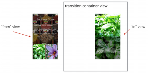
iMessage Apps, and Unity for iOS Developers – Podcast S06 E11

$
0
0
imessage apps

Is there a new gold rush afoot with iMessage apps? Hear the panel’s take in this episode!

Join Mic, Jake, and Gemma as they take a closer look at the brand new iMessage apps platform, before moving on to discuss Mic’s recent experience getting started with Unity and the realisation that iOS and Unity aren’t that different after all.

[Subscribe in iTunes] [RSS Feed]

Our Sponsor

Indeed Prime helps tech talent such as software engineers simplify their job search and land their dream job.

Candidates get immediate exposure to the best tech companies with just one simple application to Indeed Prime. Companies on Prime’s exclusive platform message candidates with salary and equity upfront.

The average software engineer gets 5 employer contacts and an average salary offer of $125,000. Indeed Prime is 100% free for candidates – no strings attached. And when you’re hired, Indeed Prime gives you a $2,000 bonus to say thanks for using Prime. But if you use indeed.com/ray, you’ll get a $5,000 bonus instead.

Sign up now at indeed.com/ray.

Interested in sponsoring a podcast episode? We sell ads via Syndicate Ads, check it out!

Show Notes

Contact Us

Where To Go From Here?

We hope you enjoyed this episode of our podcast. Be sure to subscribe in iTunes to get notified when the next episode comes out.

We’d love to hear what you think about the podcast, and any suggestions on what you’d like to hear in future episodes. Feel free to drop a comment here, or email us anytime at podcast@raywenderlich.com.

The post iMessage Apps, and Unity for iOS Developers – Podcast S06 E11 appeared first on Ray Wenderlich.
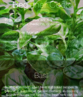
iOS 10 Screencast: Capturing Live Photos


Screencast: Beginning C# Part 16: Section Review Object Oriented Programming

How to Make a Waiting Game Like Farmville with SpriteKit and Swift

$
0
0
Update 10/28/16: Updated for Swift 3, iOS 10, and Xcode 8 by Kevin Colligan. Original tutorial by Barbara Reichart.
Kookie Kiosk is one sweet waiting game.

Kookie Kiosk is one sweet waiting game.

In this SpriteKit tutorial, you’ll learn how to make your very own waiting game — just like Farmville — with SpriteKit and Swift.

Popular “waiting games” like Clash of Clans and Farmville are played in short, frequent bursts, punctuated by periods of waiting — plant a crop in seconds, then check back at a later time to reap what you’ve sown.

While every game is different, most are built around the following basic concepts:

  • State machines
  • Timed events
  • Local notifications

With this SpriteKit tutorial, you’ll dive right into these concepts, as you continue to build out Kookie Kiosk – a simple waiting game where players vie for riches by buying and selling tasty treats. Yum!

Note: This tutorial assumes you have working knowledge of SpriteKit and Swift. If you’re new to SpriteKit, check out our SpriteKit Swift Tutorial for Beginners or our full book, 2D Apple Games by Tutorials. For an introduction to Swift, check out this beginner Swift tutorial here.

Getting Started

Download the template project, then open the KookieKiosk-Swift.xcproject project file with Xcode.

Build and run the app in the iPad Air 2 simulator:

This is what you should see when you run the template. What a mess!

This is what you should see when you run the template. What a mess!

Don’t worry — you’ll soon clean shop.

Take a quick look at the files in this project:

  • GameScene.swift: Contains the core logic for the game. It maintains a list of all items in the kiosk and how much money you have. At startup, all on-screen elements are added to GameScene. This class also loads and saves a .plist file containing important data about the items available in the kiosk. Finally, but most importantly, it responds to changes in the game state.
  • StockItem.swift: Represents a single item in the kiosk. It stores important properties of the item like type, flavor and amount. There’s also a few constants like the maximum amount the player can have of an item, the position on the screen, prices for restocking, selling the item and even the speed at which the item is stocked and sold. The class contains two helper methods which draw the price label and the timer while the item is stocking.
  • Customer.swift: Draws a customer on-screen and stores the item the customer wants to buy.
  • GameDelegate.swift: Defines methods that StockItem.swift will call to perform game logic.
  • Constants.swift: The enum ZPosition ensures game layers are drawn in the correct order. TimeScale controls game speed.
  • AppDelegate.swift: The only change to the default AppDelegate is a preload of two sound files.
  • GameViewController.swift: Loads the initial scene.

Implementing the State Machine

Kookie Kiosk players earn money by selling cookies and shakes. But they can’t sell something they don’t own (out-of-cookies exception), nor restock a loaded platter (cookie-overflow exception). Keep things running smoothly with a state machine to define states and transitions between those states. Kookie Kiosk’s state machine can be represented by the following diagram:

States of an item in the Kiosk and transitions between states

States of an item in the Kiosk and transitions between states

Each item can be in one of four states:

  1. Empty: This item is out-of-stock. Players can buy more by tapping the item.
  2. Stocking: Once the player buys more, the item will begin stocking.
  3. Stocked: Ready to sell.
  4. Selling: Once stocked, the player taps an item to start selling. When an item is sold out, it returns to Empty.

Here are images that correspond to each state:

Visualization of each state

Enough background — it’s time to code.

Add the following to the bottom of Constants.swift:

enum State: Int {
  case empty
  case stocking
  case stocked
  case selling
}

This defines an enum with a value for each of the four states.

Next, add the following property at the end of the list of properties in StockItem.swift:

var state: State

And add the following lines to init(stockItemData:stockItemConfiguration:gameDelegate:) just before super.init():

let stateAsObject: AnyObject? = stockItemData["state"]
let stateAsInt = stateAsObject as! Int
state = State(rawValue: stateAsInt)!

In the code above you retrieve the state from the dictionary stockItemData, which contains all information about the stock item loaded from gamedata.plist shown below:

StockItemData Plist

In the code above, you retrieve the value from stockItemData stored under the key “state” and then cast it to an Int. Then, you map the value of the Int to the corresponding value of the enum State and assign the result to the state.

Now that you can load the state of the item, make sure the state can be saved.

Add the following line to data() in StockItem.swift, right before the return statement:

data["state"] = state.rawValue

This line sets the value for the key “state” to the raw Int value of the state for the stock item.

That takes care of loading and storing the states. Next, you’ll add code for displaying the state changes.

Cleaning up the Interface

Add the following method to StockItem.swift:

func switchTo(state: State) {
  self.state = state
  switch state {
  case .empty:
    stockingTimer.isHidden = true
    sellButton.isHidden = true
    priceTag.isHidden = false
  case .stocking:
    stockingTimer.isHidden = false
    sellButton.isHidden = true
    priceTag.isHidden = true
  case .stocked:
    stockingTimer.isHidden = true
    sellButton.isHidden = false
    priceTag.isHidden = true
    progressBar.setProgress(percentage: 1)
  case .selling:
    stockingTimer.isHidden = true
    sellButton.isHidden = true
    priceTag.isHidden = true
  }
}

This method contains a switch statement that distinguishes between the four states of your stock item. For each state, it sets isHidden appropriately for the stocking timer, sell button and price tag.

For example, when the price tag is visible in the empty state; you hide the stocking timer and the sell button. The other states follows the same logic.

Add the following line to the end of init(stockItemData:stockItemConfiguration:gameDelegate:):

switchTo(state: state)

This will initialize the stock item to the state loaded from gamedata.plist.

Build and run your project. All stock items should now start off in the empty state. They should also now display their price tag, ready and waiting for the player to act:

Bringing order to the chaos is really satisfying!

Bringing order to the chaos is really satisfying!

Switching States

Add the following method to StockItem.swift:

override func touchesBegan(_ touches: Set<UITouch>, with event: UIEvent?) {
  switch state {
  case .empty:
    let bought = gameDelegate.updateMoney(by: -stockingPrice * maxAmount)
    if bought {
      switchTo(state: .stocking)
    } else {
      let playSound = SKAction.playSoundFileNamed("hit.wav", waitForCompletion: true)
      run(playSound)
 
      let rotateLeft = SKAction.rotate(byAngle: 0.2, duration: 0.1)
      let rotateRight = rotateLeft.reversed()
      let shakeAction = SKAction.sequence([rotateLeft, rotateRight])
      let repeatAction = SKAction.repeat(shakeAction, count: 3)
      priceTag.run(repeatAction)
    }
  case .stocked:
    switchTo(state: .selling)
  default:
    break
  }
}

This method operates on the two states that allow user interaction: empty and stocked.

When empty, you first attempt to update the player’s money through gameDelegate. If the player has enough money to make the purchase, you then call switchTo(state:) to change the item’s state to stocking. If the player is short on funds, you let the player know by playing a sound effect and shaking the price tag.

To handle stocked, you simply call switchTo(state:) with the selling state. There are no additional conditions that need to be met for this transition, and this puts the item in a state where it will update over time.

Updating States Over Time

To update an item over time, you’ll first need to know the last time the state changed to calculate how much time has passed and how far along the stocking or selling process should be.

Add the following property to StockItem.swift, right after the state property:

private var lastStateSwitchTime: CFAbsoluteTime

You’ll use CFAbsoluteTime to refer to a specific point in time. Even if the player restarts the game you still need to know exactly when that event happened in order to update stock properly.

Add the following line to init(stockItemData:stockItemConfiguration:gameDelegate:) just before super.init(), to load the time of the last state change:

lastStateSwitchTime = stockItemData["lastStateSwitchTime"] as AnyObject? as! CFAbsoluteTime

And add the following line to data(), right before the return statement:

data["lastStateSwitchTime"] = lastStateSwitchTime

This line adds an entry for the last state-switch time to the data dictionary stored in gamedata.plist.

Now you need to make sure that lastStateSwitchTime is assigned the proper value while the game is running.

Add the following line of code to the beginning of switchTo(state:):

if self.state != state {
  lastStateSwitchTime = CFAbsoluteTimeGetCurrent()
}

This ensures that you’ve actually changed states. If so, then update lastStateSwitchTime to the current time. You can always get the current time using the ever-helpful CFAbsoluteTimeGetCurrent().

Stocking Your Items

You can use the absolute time of the last state-switch to show some progress indicators to your player. Start by updating the countdown that shows the player how long they need to wait for a purchased item to complete stocking.

Add the following method to StockItem.swift:

func updateStockingTimerText() {
  let stockingTimeTotal = CFTimeInterval(Float(maxAmount) * stockingSpeed)
  let currentTime = CFAbsoluteTimeGetCurrent()
  let timePassed = currentTime - lastStateSwitchTime
  let stockingTimeLeft = stockingTimeTotal - timePassed
  stockingTimer.text = String(format: "%.0f", stockingTimeLeft)
}

In this method, you set the text of the stockingTimer to the time remaining until stocking is complete. To get this value, you first calculate the amount of time it takes to fully stock the item. You do so by multiplying stockingSpeed and the maximal amount of the stock item and then cast it to CFTimeInterval. Next, you store the current time in a temporary variable to calculate how much time has passed since the last state change.

The time to restock the item is now simply the total time minus the time that has passed to this point:

This time bar shows you the different intervals and absolute times you are using.

This time bar shows you the different intervals and absolute times you are using.

Finally, you set the text to the remaining time, so the user can see when the item will be fully stocked. Since you only want to display whole seconds to your player you use the format specifier %.0f, which tells Swift to display a float variable with zero digits after the decimal.

Add the following method to StockItem.swift to update the display of the item during stocking and selling:

func update() {
  let currentTimeAbsolute = CFAbsoluteTimeGetCurrent()
  let timePassed = currentTimeAbsolute - lastStateSwitchTime
  switch state {
  case .stocking:
    updateStockingTimerText()
    amount = min(Int(Float(timePassed) / stockingSpeed), maxAmount)
    if amount == maxAmount {
      switchTo(state: .stocked)
    }
  default:
    break
  }
}

First, calculate how much time has passed since the last state-switch. If the item’s current state is stocking, you call the helper method updateStockingTimerText().

Next, you update the item amount which is simply the time elapsed divided by the stocking speed. Of course, the player can never stock more items than maxAmount, so you use min to limit the amount to maxAmount. Finally, you check whether the new amount is equal to maxAmount. If so, then change the state to stocked.

The only thing left to do is call update() for every stock item.

Add the following method override in GameScene.swift at the bottom of GameScene class as follows:

override func update(_ currentTime: TimeInterval) {
  for stockItem in stockItems {
    stockItem.update()
  }
}

Build and run your project. Tap on a stock item and you’ll see the timer count down to zero. Then the item switches to the stocked state. That coin in front of the cookies indicates that they are ready to be sold.

Countdown

Selling Items

As soon as an item is fully stocked, players can start selling it. Add the following code to update() in StockItem.swift, inside the case statement right before the default case:

case .selling:
  let previousAmount = amount
  amount = maxAmount - min(maxAmount, Int(Float(timePassed) / sellingSpeed))
  let amountSold = previousAmount - amount
  if amountSold >= 1 {
    let _ = gameDelegate.updateMoney(by: sellingPrice * amountSold)
    progressBar.setProgress(percentage: Float(amount) / Float(maxAmount))
    if amount <= 0 {
      switchTo(state: .empty)
    }
  }

First, you store the current amount of the item in previousAmount. You then calculate the new amount by subtracting the quotient of timePassed and sellingSpeed from maxAmount. Again, you need to limit the number of items that can be sold to maxAmount. Now, the number of items sold is simply the difference between the previous amount and the new amount.

In order to limit the number of calls to progressBar and gameDelegate, you check whether at least one item has been sold since the last call to update. If so, notify gameDelegate about the change in the player’s funds, then set the progress bar to the value of the amount sold divided by the maximum amount available. This change in money will always be positive, so you can ignore the result of updateMoney(by:) here.

Finally, you check whether the stock item sold out by comparing the amount remaining to 0. When the item is sold out, set the state back to empty. Your state machine is now complete.

Build, run and buy some cookies! Click on the coin to start selling. You’ll see your cookies sell over time, fattening your wallet:

w00t I sold a cookie — I'm rich!

w00t I sold a cookie — I’m rich!

Introducing Customers

Many waiting games have events that trigger at random points. In Tiny Towers, specialists make the occasional appearance to dramatically boost progress. In Kookie Kiosk, your player will have to serve demanding customers who randomly appear.

Add the following property to GameScene.swift, right below the moneyLabel property:

var customer: Customer?

This stores the current customer using the Customer class already implemented in the starter project. For the moment you’ll only serve one customer at a time.

Now you need to handle the timing of your customers’ arrivals.

Add the following properties to GameScene.swift, right below the customer property:

var timeOfLastCustomer: CFAbsoluteTime = CFAbsoluteTimeGetCurrent()
var timeTillNextCustomer: CFTimeInterval!

Then add the following method:

func determineTimeTillNextCustomer() {
  timeTillNextCustomer = CFTimeInterval(Float((arc4random_uniform(UInt32(15)) + 15)) * TimeScale)
}

And call it at the bottom of didMove(to:):

determineTimeTillNextCustomer()

The time the last customer appeared will initially be the startup time of the app since no customers have appeared yet. You also store a time interval that indicates how many seconds it will take for the next customer to appear. For this, you use a random value between 15 and 30 seconds. You then multiply this interval by TimeScale so you can control the rate at which customers appear.

Add the following code to the end of update() in GameScene.swift:

// 1
let currentTimeAbsolute = CFAbsoluteTimeGetCurrent()
if customer == nil && currentTimeAbsolute - timeOfLastCustomer > timeTillNextCustomer {
  // 2
  var potentialWishes: [StockItem] = []
  for stockItem in stockItems {
    if stockItem.state == .selling || stockItem.state == .stocked {
      potentialWishes.append(stockItem)
    }
  }
  // 3
  if potentialWishes.count > 0 {
    let random = arc4random_uniform(UInt32(potentialWishes.count))
    let randomStockItem = potentialWishes[Int(random)]
    customer = Customer(type: randomStockItem.type, flavor: randomStockItem.flavor)
    customer!.position = CGPoint(x: frame.size.width + customer!.calculateAccumulatedFrame().size.width / 2, y: customer! .calculateAccumulatedFrame().size.height / 2)
    // 4
    let moveLeft = SKAction.move(by: CGVector(dx: -customer!.calculateAccumulatedFrame().size.width, dy: 0), duration: 1)
    customer?.run(moveLeft)
    addChild(customer!)
  }
}

This is a lot of code, but the logic is straightforward:

  1. First check how much time has passed since the last customer appeared. If it’s greater than the generated time interval, it’s time to spawn a new customer.
  2. Customer’s wishes are limited to the types and flavors of items currently in-stock and not sold out. Add all items that match this criteria to the list of potential wishes.
  3. Select a random index from the list of potential wishes, then create a new customer that wishes for the type and flavor of the randomly selected item.
  4. Finally, make the customer appear from the right border of the screen. Using a simple SKAction you move it from the outside of the screen just until it’s entirely on screen.

Build and run your app. When you have items available, a customer will appear randomly and place an order at your kiosk.

Serve me, serve me NOOOOOOW!

Serve me, serve me NOOOOOOW!

Next, you’ll add code to serve the customer.

Declare the following method in GameDelegate.swift:

func serveCustomerWithItemOfType(type: String, flavor: String)

This changes the protocol and every class conforming to it should now complain that they no longer conform to the protocol. You should see an error in Xcode stating that Type ‘GameScene’ does not conform to protocol ‘GameDelegate’.

To fix the error, implement the missing method inside the extension at the bottom of GameScene.swift as follows:

func serveCustomerWithItemOfType(type: String, flavor: String) {
  // 1
  if customer?.type == type && customer?.flavor == flavor {
    let _ = updateMoney(by: 50)
    let playSound = SKAction.playSoundFileNamed("coin.wav", waitForCompletion: true)
    run(playSound)
  } else {
    let playSound = SKAction.playSoundFileNamed("hit.wav", waitForCompletion: true)
    run(playSound)
  }
  if customer != nil {
    // 2
    let moveRight = SKAction.move(by: CGVector(dx: customer!.calculateAccumulatedFrame().size.width, dy: 0), duration: 1)
    customer!.run(moveRight, completion: {
      self.customer?.removeFromParent()
      self.customer = nil
    })
    // 3
    timeOfLastCustomer = CFAbsoluteTimeGetCurrent()
    determineTimeTillNextCustomer()
  }
}

Take a look at what happens here:

  1. First check if the type and the flavor of the item correspond to what the customer desires. If so, add $50 to the player’s funds and play a sound effect. Otherwise, play a sound effect indicating that you haven’t satisfied this customer’s wish. That sound will also play if there’s no customer at the current time.
  2. Next, remove the customer sprite using an instance of SKAction that moves the customer off to the right and off the screen. As soon as the customer sprite is off the screen, remove the sprite from the scene and set it to nil.
  3. As soon as the customer leaves the scene you also need to schedule the time when the next customer will arrive. Set the time of the last customer to the current time, and determine how long it will be until the next customer appears.

All that’s left to do is to call the new method from touchesBegan(_:with:) in StockItem.swift like so (add this inside the case statement right before the default case):

case .selling:
    gameDelegate.serveCustomerWithItemOfType(type: type, flavor: flavor)

To try this out, build and run and buy some cookies. When a customer arrives, tap the cookies once to start selling, and then again to give a cookie to the customer.

Serving your customers quickly is the key to success!

Serving your customers quickly is the key to success!

Sending User Notifications

Your game now looks and plays great, but eventually the player will leave the game. Enticing the player with a one-liner notification should lure them back to your game:

Receiving a notification

Receiving a notification

Players can see a list of missed notifications by pulling down the context menu from the top:

Hey you missed something!

Hey you missed something!

You can also update the badge icon:

Pick me!

Pick me!

Local vs. Remote Notifications

There are two different ways to inform players about background changes in an app: local notifications and remote notifications.

While both look and sound the same, there are major differences from the viewpoint of a developer:

  • Local Notifications are triggered directly on the device and are easy to implement.
  • Remote Notifications are triggered by a remote server, and are more complicated.

Local notifications will work just fine for Kookie Kiosk.

Asking for User Permission

The first step is to ask the player to authorize your app to use notifications. Open AppDelegate.swift and add the following to the import statements at the top of the file:

import UserNotifications

Then add the following to application(_:didFinishLaunchingWithOptions:):

UNUserNotificationCenter.current().requestAuthorization(options: [.alert, .sound, .badge]) { (granted, error) in
  if granted {
    print("notifications granted")
  } else {
    print(error?.localizedDescription)
  }
}

The UserNotifications framework is new in iOS 10, replacing previous platform-specific interfaces for local and remote notifications. Using UNUserNotificationCenter, you ask for permission to send an alert, play a sound and add a badge number to the Kookie Kiosk app icon. The print statements are just for debugging purposes.

Build and run, and you’ll see the following dialog:

NotificationPermission

Tap OK to allow notifications. (If you tap Don’t Allow, notifications will not appear).

Note that after the first run, this dialog won’t show up again. Instead, the app will use the value stored in the Settings app.

Scheduling Notifications

Since most of your notifications will be similar in structure, you’ll create a small helper method to schedule a notification.

Open GameScene.swift and add another import statement:

import UserNotifications

Then add the following method:

func scheduleNotificationWith(body: String, intervalInSeconds: TimeInterval, badgeNumber: Int) {
  // 1
  let localNotification = UNMutableNotificationContent()
 
  // 2
  localNotification.body = body
  localNotification.sound = UNNotificationSound.default()
  localNotification.badge = badgeNumber as NSNumber?
 
  // 3
  let trigger = UNTimeIntervalNotificationTrigger.init(timeInterval: intervalInSeconds, repeats: false)
  let request = UNNotificationRequest.init(identifier: body, content: localNotification, trigger: trigger)
 
  // 4
  let center = UNUserNotificationCenter.current()
  center.add(request)
}

The above method builds the notification from a message, a time interval, and the updated badge number as follows:

  1. First, you create an empty notification using UNMutableNotificationContent().
  2. Then, set the properties of your notification, which in this tutorial, means the body text, a sound alert and badge number. (You could also include a title, subtitle and media if so inclined.)
  3. Define a trigger for your notification based on the timeInterval.
  4. Finally, you can schedule the notification!

Calling your new scheduleNotificationWith(body:intervalInSeconds:badgeNumber:) method lets you easily schedule a single local notification. However, you’ll want to schedule a notification for the state change of every stock item.

For this, you’ll need two things: notification text and the time to show the notification.

Add the following method to StockItem.swift:

func notificationMessage() -> String? {
  switch state {
  case .selling:
    return String(format: "Your %@ %@ sold out! Remember to restock.", flavor, type)
  case .stocking:
    return String(format: "Your %@ %@ is now fully stocked and ready for sale.", flavor, type)
  default:
    return nil
  }
}

In the above method, you implement a switch on the state of the stock item. Then for each state you formulate a message that gives details about the current state and includes the flavor and type of the item.

Although there are four states in your app, only two of them — selling and stocking — are dependent on time. The other two states depend on user interaction, so they don’t need scheduled notifications.

Now add the following method to calculate the time until the next state-switch:

func notificationTime() -> TimeInterval {
  switch state {
  case .selling:
    return TimeInterval(sellingSpeed * Float(amount))
  case .stocking:
    let stockingTimeRequired = stockingSpeed * Float(maxAmount - amount)
    return TimeInterval(stockingTimeRequired)
  default:
    return -1
  }
}

In this method, you determine how long it takes to complete selling or stocking an item. You can now schedule a notification for every stock item.

Add the following method to GameScene.swift:

func scheduleNotifications() {
  let itemsSortedByNotificationTime = stockItems.sorted(by: { $0.notificationTime() < $1.notificationTime() })
  var count = 1
  for stockItem in itemsSortedByNotificationTime {
    let notificationMessage = stockItem.notificationMessage()
    if notificationMessage != nil {
      scheduleNotificationWith(body: notificationMessage!, intervalInSeconds: stockItem.notificationTime(), badgeNumber: count)
      count += 1
    }
  }
}

First, you sort the notifications by their notificationTime. Why is the order relevant? You can use it to manage the badge number, since this doesn’t happen automatically. Next you iterate over the list of stock items, and for each item you retrieve the appropriate notification message. If the message is not nil, then schedule the notification. With every notification you send, increase the count of the badge number accordingly.

This finishes off the method that schedules a notification for every stock item. You still need a way to call it when the app enters the background. There is only one tiny problem here: only the AppDelegate knows that your app is entering the background, and it doesn’t know about your GameScene.

A great solution for this problem is to use NotificationCenter, which provides you with a mechanism to broadcast information within your app.

Open AppDelegate.swift and add the following code to applicationDidEnterBackground(_:):

NotificationCenter.default.post(name: NSNotification.Name(rawValue: "scheduleNotifications"), object: nil)

This will broadcast out a notification through the NotificationCenter when your app enters the background state. All you need to do now is listen for this notification.

Open GameScene.swift and add the following code to the end of didMove(to:):

NotificationCenter.default.addObserver(self, selector: #selector(scheduleNotifications), name: NSNotification.Name(rawValue: "scheduleNotifications"), object: nil)

This registers the GameScene as an observer — you tell NotificationCenter to call scheduleNotifications() when an event with the name “scheduleNotifications” triggers.

Build and run, start making some cookies, and hit Command-L a couple times (if using the simulator) to go to the lock screen. When the cookies finish baking, you should see a notification appear on the screen:

lockScreen

You can swipe the notification to return to the app, and see your finished cookies!

AfterNotification

Resetting the App Badge

You’re nearly done — all that’s left to do is cancel all notifications and set the number of the badge to zero when the player resumes their game. You don’t want to pester the player with the same information twice.

Open AppDelegate.swift and add the following lines of code to applicationDidBecomeActive(_:):

let center = UNUserNotificationCenter.current()
center.removeAllPendingNotificationRequests()
UIApplication.shared.applicationIconBadgeNumber = 0

First, we need a reference to UNUserNotificationsCenter, then we can clear old notifications. The last line sets applicationIconBadgeNumber to zero.

And that’s it — your kiosk game is complete!

Where to Go From Here?

You can download the completed project for this tutorial here.

This game provides a great foundation for waiting games. It also scratches the surface of state machines and user notifications. For more on those topics, you can:

  • Dive into GameplayKit and GKStateMachine
  • Learn about the new User Notifications capabilities in iOS 10
  • Learn how to monetize your game with (clever) In-App Purchases

Or you can stick with what you already learned and add fun features to the game, such as:

  • Charge the player rent on the kiosk.
  • Add more types and flavors of tasty snacks…
  • … but have them spoil if they sit around too long before going on sale.
  • Add patience levels to your customers — leave them hanging for too long they’re liable to storm off and leave catty Yelp reviews! :[

If you have any questions or comments about this tutorial, please join the forum discussion below!

The post How to Make a Waiting Game Like Farmville with SpriteKit and Swift appeared first on Ray Wenderlich.

Integrating Unity Ads into Your Game

$
0
0

Unity AdsThe Unity Ads video ad service provided by Unity helps you engage and monetize your player base. Players need an in-game boost, they watch a video, and you get to reap the monetary rewards. It’s a win-win all around!

In this tutorial, you’ll learn the following as you integrate Unity Ads into your game:

  • How to sign up for and add the Unity Ads service.
  • How to display simple video ads in your game
  • How to design and display reward-linked video ads
  • How to leverage Unity Ads features such as filtering and device orientation

You’ll take an existing 2D Space Lander starter project and add in some Unity Ads. By the end, you’ll have a game that demonstrates how to reward players in-game for watching video ads.

Getting Started

Make sure you have the latest version of Unity; this tutorial was written for version 5.3.4. Download the starter project for this tutorial here. Extract and open the IntegratingUnityAdsStarter project in Unity. Don’t worry if you get a warning that the project was opened in an older version of Unity, simply click OK to upgrade.

Don’t worry if you see a script error. This will disappear once your project is set up for the ad service.

The Lander Scene

Open the Lander scene under the Scenes sub-folder. You should see the main game scene, all set up and waiting for you to apply the magic of Unity Ads.

UnityAds-start-scene-game-view

Unity Ads requires that the build platform to be set to either iOS or Android. To follow along with this tutorial, you need to switch the active build platform to one of those two platforms.

From the main menu:

  • Select File / Build Settings.
  • Select either iOS or Android.
  • Click Switch Platform.

The screenshot below shows Android as the build platform.

UnityAds-switch-active-platform

Switch your game view window to use a portrait aspect ratio, as this game is designed to run in portrait mode.

UnityAds-portrait-aspect

Note: This view menu is for Android. Developers for iOS will see a different menu and should pick an option with the word “Tall” in it.

Setup the Ads Service

Open the Services tab in the editor. You can usually find the tab above the Inspector panel. If not, select Window / Services from the main menu.

Here’s what you should see:

UnityAds-ServicesTab

Note: If you are not yet signed into your Unity account in the editor, you’ll need to do that first in order to add the Ads Service.

You’ll now link the project to your own Unity organization.

  • Click New Link.
  • Select your organization name in the drop-down.
  • Click Create.

Now to create a Unity Project ID for the game under your organization name.

  • Click the toggle on the top right to enable Unity Ads.
  • Ensure the slider is in the on position.
  • Choose the appropriate Designation for Apps Directed to Children option.
  • Click Save Changes.
Note: The game is intended for gamers over the age of 13, so the second option is appropriate here.

UnityAds-ToggleAdsOn

Expand the Advanced Settings section on the Unity Ads Services tab. Note the two game IDs created for your game. These are used when Unity Ads initializes within the game, and are specific to the mobile platform the game is running on.

UnityAds-WithAdvancedSettings

The Unity Ads Dashboard

In the Unity Editor Services window, click Go to Dashboard. This will open your web browser and sign you into your Unity Services dashboard. Where you end up depends on how long ago you created your account. You’ll either go to the Unity Ads or the Unity Services dashboard. If you end up on the services dashboard, just click the link for Unity Ads.

UnityAds-go-to-dashboard

You should see your project listed on your Unity Ads Dashboard page.

UnityAds-select-project

Initializing Unity Ads

You will be starting things off nice and easy. You’ll check that Unity Ads initialize and display debug information on game start up.

An AdManager.cs script already exists in the starter project. Navigate to the Scripts folder and load it into your code editor.

Add the following debug code to Start() in AdManager.cs:

Debug.Log("Unity Ads initialized: " + Advertisement.isInitialized);
Debug.Log("Unity Ads is supported: " + Advertisement.isSupported);
Debug.Log("Unity Ads test mode enabled: " + Advertisement.testMode);

This lets you check that the Ads service initializes properly. The debug info will display in the console when the game starts.

Save the script and run the game. You should see that the service initializes, there is support for ads and that test mode is enabled.

UnityAds-ad-logging

Adding Video Ads to your Game

What better way to get to the meat of Unity Ads than to tackle some code?

You will now design an ad manager class which will use the Singleton pattern to keep things simple. You will extend the AdManager class that is already in place to let you check that ads are ready. Then it will display the ads and issue rewards for players who finish watching the ad using callback methods.

The Game Over UI

Start the game and fly around until you crash into a rock. You’ll see the game over UI appear with some buttons that offer different ad options. You’ll hook these buttons up to some code in just a bit. For example, notice that the Watch a video ad button does nothing.

UnityAds-ad-crashed-screen

Time to make that button display a Unity video ad!

Open AdManager.cs in your code editor and add the following method to the class:

public void ShowStandardVideoAd() {
  ShowVideoAd();
}

This method returns void so that you can attach it to a button action. That button action will call ShowVideoAd() with no callback and no zone ID to play a standard video ad with the default ad callback handler.

Still working in AdManager.cs, add the following method to the class:

public void ShowVideoAd(Action<ShowResult> adCallBackAction = null, string zone = "") {
 
  StartCoroutine(WaitForAdEditor());
 
  if (string.IsNullOrEmpty(zone)) {
      zone = null;
  }
 
  var options = new ShowOptions();
 
  if (adCallBackAction == null) {
      options.resultCallback = DefaultAdCallBackHandler;
  } else {
      options.resultCallback = adCallBackAction;
  }
 
  if (Advertisement.IsReady(zone)) {
      Debug.Log("Showing ad for zone: " + zone);
      Advertisement.Show(zone, options);
  } else {
      Debug.LogWarning("Ad was not ready. Zone: " + zone);
  }
}

StartCoroutine is a trick to pause the game when running in the editor. It does this by setting the timescale to 0f. When running on an actual device, Unity Ads will pause the game for you, so this method will do nothing in the editor.

You then check to see if an empty string was passed in as the zone ID. If so, set zone is set to null, which causes Unity Ads to display a standard, non-rewarded video ad.

Next a check happens to see if a valid ad callback action was passed in or not. If so, you set the result callback handler to use the callback action you specified. Otherwise a default callback handler assignment takes place.

Finally you check that an ad was preloaded in the background and whether it is ready to play. If ready, the ad launches. The zone and options for callback handling are also passed in here. When the ad is finished playing, was skipped, or fails, a callback method executes depending on the circumstance.

Here’s the final method to add to AdManager.cs:

private void DefaultAdCallBackHandler(ShowResult result) {
  switch (result) {
    case ShowResult.Finished:
      Time.timeScale = 1f;
      break;
 
    case ShowResult.Failed:
      Time.timeScale = 1f;
      break;
 
    case ShowResult.Skipped:
      Time.timeScale = 1f;
      break;
  }
}

This switch statement is the default ad callback handler. It runs code based on whether the video ad displayed finished, failed, or was skipped.

Note: By default, a Unity Ads project creates two zone IDs: rewardedVideo, and video. The former generates a reward video, and the latter results in no reward video. If you don’t specify any zone ID when displaying an ad, then players will only see the standard video.

Wire up the Watch a Video Ad button

Open Lander.cs in your code editor and add the following to the bottom of Start():

watchVideoAdBtn.onClick.AddListener(AdManager.instance.ShowStandardVideoAd);

This will hook up the Watch a standard video ad button to display a standard Unity video ad. Give it a try in the editor and marvel at your simulated video ad that appears! :]

UnityAds-EditorAd

Note: Unity will only display a blue static image as a simulation in the Unity Editor. On an actual device under test mode, you’ll get a proper Unity video test ad. You can test skipping or watching it in full. When you disable test mode for release, live video ads from Unity Ads advertisers will appear.
Doge is very impressed with Unity's editor ad templates...

Doge is very impressed with Unity’s editor ed templates…

Designing Engaging Ads for Your Game

The key to designing a great ad experience for your game lies in how you integrate Unity Ads. First, ads should be enticing and rewarding for players.

Second, ads should do their best to keep people playing your game. There is no point in displaying a video ad when the player dies, or at the start/end of a level. This is tedious and frustrating to players. It will likely result in them deleting your game.

Ads should integrate into the gameplay experience you’ve crafted for the player. A simple example would be to offer the player consumable in-game items as a reward for watching an ad. Another example would be a second chance after failing (like offering a checkpoint restore). You could offer these rewards in your UI at a resting point or natural break in the gameplay, or as an offer from an in-game character in a dialogue sequence. Remember that forcing players to watch ads is almost certain to lead to uninstalls — videos should always be optional.

Note: You’ll only want to concern yourself with designing reward video ads. These yield a higher effective cost per thousand impressions, or eCPM. These types of videos create higher engagement from players by allowing them to opt-in.
Users will most likely delete a game that forces them to watch ads with no reward.

Users will most likely delete a game that forces them to watch ads with no reward.

Rewarding and Enticing the Player with Rewarded Ads

You now have the ability to show a standard video ad in-game, but with no reward attached. Offering your players a video ad to watch with no reward isn’t going to impress anyone! Nobody is going to watch a video just for the fun of it. Time to change that up and give players an incentive to watch video ads.

The game currently gives the player eight units of fuel to guide their lander down to the landing pad. Too much maneuvering will waste fuel, and players can run out of fuel on the way down. A simple incentive to watch a video ad would be to reward the player with more fuel for their next run after crashing.

Open AdManager.cs in your code editor and add the following method:

public void ShowRewardedFuelVideoAd() {
  ShowVideoAd(FuelRewardCallBack, "rewardedVideo");
}

This is a public method that returns void, which is required when attaching a method to a button.

A custom callback method is passed in that will reward the player. The zone ID is set to “rewardedVideo”. That tells Unity Ads that this video ad will be a rewarded ad.

Also add the following method to AdManager.cs:

private void FuelRewardCallBack(ShowResult showResult) {
 
  var fuelBtn = GameObject.Find("MoreFuelRewardAdBtn").GetComponent<Button>();
 
  switch (showResult) {
      case ShowResult.Finished:
          Debug.Log("Player finished watching the video ad and is being rewarded with extra fuel.");
          GameManager.instance.extraFuel = 10f;
          fuelBtn.transform.GetChild(0).GetComponent<Text>().text = "Fuel added (10 extra)";
          fuelBtn.enabled = false;
          break;
 
      case ShowResult.Skipped:
          Debug.Log("Player skipped watching the video ad, no reward.");
          fuelBtn.GetComponent<Button>();
          fuelBtn.transform.GetChild(0).GetComponent<Text>().text = "No fuel added - you skipped the ad";
          fuelBtn.enabled = false;
          break;
 
      case ShowResult.Failed:
          Debug.Log("video ad failed, no reward.");
          break;
  }
}

The code gets a reference to the button in the UI panel. That’s so that the button state and text will be set depending on the result of the video ad.

A switch statement process different actions. In this case, the action is based on whether the video ad gets watched to completion, is skipped, or fails. In the case of completion, extra fuel is added to the GameManager instance. When the player starts a new game, the extra fuel is added to the player’s fuel supply.

Open Lander.cs and add the following to the bottom of Start(), just after the other AddListener call you added for the standard video ad button earlier.

fuelRewardBtn.onClick.AddListener(AdManager.instance.ShowRewardedFuelVideoAd);

This will call ShowRewardedFuelVideoAd() on the AdManager instance when the player presses the fuel reward button.

Save your code, go back to Unity to try out the results.

Fly around, and either complete a landing, or crash somewhere. You’ll now be able to use the fuel reward button. Since you are in the editor, the test ad will appear. If you look in the console, you will see the debug message “Player finished watching the video ad and is being rewarded with extra fuel”.

If you test this on an actual iOS or Android device, you will see a real video ad play. The same code will be able to determine if you watched the ad to completion or skipped it. If you skipped it, or if the ad failed for some reason, then no fuel reward will be added, and the code for the ShowResult.Skipped switch statement section runs instead of ShowResult.Finished.

UnityAds-fuel-reward-added

If you run the app on a device, here is what the test ad experience will look like:

RW_Ads_1_Animated

Timing Ad Availability

You can expand the experience even further and add a timed delay to reward items. This can serve to ensure that players don’t get rewards too often. It can also ensure that they don’t request too many video ads. Unity’s ad service does have some limitations on the maximum amount of ads a single user will see every 24 hours.

Note: Users are limited by default to 25 ads per day (on a rolling 24-hour basis) per app. Users are also limited to seeing the same ad only once per hour.

Timed delay ads can ensure that a player won’t get “failed video” ads after reaching their daily limit. This will prevent players from seeing odd behavior in your game where they try to access a reward.

Wire up the Time-Delayed Present Reward Button

Open AdManager.cs and add the following method:

public bool IsAdWithZoneIdReady(string zoneId) {
  return Advertisement.IsReady(zoneId);
}

This will check if an ad is ready to display based on the zoneId string you pass to the method.

Open PresentAdReward.cs and add the following method:

private bool IsReady() {
  if (Time.time > remainingCooldown) {
    return AdManager.instance.IsAdWithZoneIdReady(zoneId);
  }
 
  return false;
}

This method calls the AdManager’s IsAdWithZoneIdReady() to see if a video ad is ready. This happens only if your timer has exceeded the remaining cool down time.

Next, add the following to show the video:

private void OpenReward() {
  AdManager.instance.ShowVideoAd(PresentRewardCallback, zoneId);
}

The method is wired to the Present Reward button in the UI. When the user clicks the button to watch a video, PresentRewardCallback will be passed the result.

Now add the code for the callback:

private void PresentRewardCallback(ShowResult result) {
  switch (result) {
    case ShowResult.Finished:
      Debug.Log("Player finished watching the video ad and is being rewarded with extra fuel.");
      GameManager.instance.extraFuel += rewardAmount;
 
      if (coolDown > 0f) {
          remainingCooldown = Time.time + coolDown;
      }
      break;
    case ShowResult.Skipped:
      Debug.Log("Player skipped watching the video ad, no reward.");
      break;
    case ShowResult.Failed:
      Debug.Log("video ad failed, no reward.");
      break;
  }
}

If the video ad plays to completion, then an amount of fuel gets rewarded to the player for their next run. This is customizable by setting the rewardAmount float value in the PresentAdReward script. A check happens to ensure that the cool down value is greater than zero. If it is, then the remaining cool down gets set to the current elapsed game time, plus the cool down value. This has the effect of resetting the count down timer for the reward back to 30 seconds so players will have to wait a further 30 seconds before they can use the reward again.

The skipped and failed cases log information to the console. They don’t reward the player if they skipped the video ad, or the ad failed to play.

To track the elapsed time for the reward cool down, add the following to the Update() method in PresentAdReward.cs

if (button) {
 
  button.interactable = IsReady();
 
  if (button.interactable) {
    cooldownText.text = "Reward ready! Touch to watch video and open";
  }
  else {
    cooldownText.text = "Next reward in: " + (int)(remainingCooldown - Time.time) + " seconds";
  }
}

The button’s interactable property is set to true or false based on whether a video ad is actually ready to play.

If the button is interactable, then the text below the button gets set to "Reward ready!". Otherwise, the current remaining time to wait for the reward displays.

Finally, hook OpenPresent() to the button by adding the following code to the bottom of Start() in the PresentAdReward.cs script:

button.onClick.AddListener(OpenReward);

Build and run the game, and crash into a rock to view the game over screen. You should now see a shiny reward present available for you to click on!

UnityAds-reward-ready

Tap or click on the present icon to view the video ad. Then receive your staggeringly large supply of 20 reward fuel! After closing the ad, you’ll notice that the reward won’t be available for 30 seconds and the count down timer displays instead.

UnityAds-reward-waiting

Remove your Test Button

Well done on making it this far! :]

Time for a little cleanup. You’ll now remove the button that lets players watch a video ad with no reward attached. Hooking this button up to the Unity Ads API was a useful learning exercise on using Unity Ads. But really, nobody will want to watch an ad without a reward.

Go to the Lander scene and remove the button as follows:

  • In the Hierachy: expand the Canvas GameObject.
  • Expand the GameOverPanel GameObject.
  • Expand the ButtonsPanel.
  • Right-Click the WatchVideoAdBtn GameObject.
  • Click Delete.

UnityAds-watch-video-ad-button

Open the Lander.cs script in your code editor, and remove the private field variable called watchVideoAdBtn from the top of the class.

Remove the following line from Start():

watchVideoAdBtn = GameObject.Find("WatchVideoAdBtn").GetComponent<Button>();

Then a little further down in the method find and remove this line:

watchVideoAdBtn.onClick.AddListener(AdManager.instance.ShowStandardVideoAd);

Save the Lander.cs script, go back to the Unity Editor, and run the game. After crashing (or landing), you’ll notice that the old button is now gone. You simply have the two buttons providing fuel rewards in return for watching video ads.

UnityAds-cleanup-complete

Here is what the timed ad reward experience looks like on an actual device:

RW_Unity_Ad_2

Switching Off Test Mode for Game Release

The last thing to do before releasing your game to the Apple or Android stores is to switch off ad test mode. There is a way to force test mode off through the Unity Ads Admin panel if you forget to disable test mode before releasing your game, but it’s best to do this before submitting your app.

Click the Services tab in the Unity Editor and click on Ads. Un-check Test Mode.

UnityAds-disable-test-mode

That is it! If you run your game on an actual device at this point, you will get live Unity Ads coming through.

Note: It is against Unity Ads’ TOS to view live ads on your own testing devices, so make sure you only disable test mode for an actual release build of your game.

Changing the Orientation of Your Video Ads

If you release your game as a portrait orientation app, video ads may play in landscape mode on the device. That requires players to tilt their device to the side to view the videos — that’s a little awkward. In that case, follow these steps to change the ads to match the orientation.

  • Login to your Ads portal.
  • Select your Unity Ads project.
  • Click on the link for the App Store you are targeting.
  • Select the Settings tab.
  • Toggle Video Orientation to on.
  • Click Save.

UnityAdsVidOrientation

Don’t be that developer who forces players to rotate their devices the other way around to view ads! :]

UnityAds-ad-orientation-ragecomic

Filtering Ads

In some cases you may wish to exclude certain ad categories from displaying to your players. Filtering out ads is a simple task thanks to the Unity Ads admin portal. Here is how you can define a set of filtered out categories:

  • Login to the Unity Ads portal.
  • Select your project.
  • Select a platform store<./li>
  • Click the Ad Filtering tab.
  • Select the categories you wish to exclude.
  • Click Save.

UnityAdFilters

Show Me the Money!

To view revenue and reports, login to your Unity Ads portal and click on your project name.

UnityAds-select-project

Click the Statistics tab which will show you your project overview. This table shows you revenue, eCPM, and Ad Starts for three intervals: Last 24 hours, last 7 days, and the last 30 days.

Note: eCPM is roughly how much money you will earn per 1000 ad impressions.

UnityAdStats

You can also export your Unity Ads raw data in CSV format on this page. Just below the Project Overview section is the area you can use to generate reports in CSV format.

UnityAdsCSV

To start receiving payments for your Unity Ads revenue, you’ll need to have earned at least $100.00 in ad revenue earnings. You’ll also need to fill out a few details on the Unity Ads dashboard, and generate an invoice to send to Unity.

Go to the main dashboard for Unity Ads, and click the Invoicing tab.

UnityAds-invoicing

You’ll need to provide some details here such as your VAT ID (if you have one), and address details. Fill these out, and click Save.

Once you have reached at least $100.00 in earnings you can generate an invoice addressed to Unity Ads.

Note: Unity Ads currently only pay out money by international wire transfer. You can’t receive money over PayPal at the moment like you do for Unity Asset Store payouts. Unity has a document that gives you specific instructions on how to invoice them. You can read that document here.

The very first time you invoice Unity Ads, you’ll also need to fill out a Wire Transfer Information form. This form is located here.

This does require a little bit of work up front, but once you’ve done it, the next time around is much easier! :]

Where to Go From here?

You can download the final project here. Before you can run it, you’ll need to re-link it to your own Unity Ads account.

If you have more questions about Unity Ads, there is an excellent FAQ website you can visit: https://unityads.unity3d.com/help/faq/monetization. This answers lots of common (and not so common!) questions on the platform.

There’s also some great Unity resources below on monetization and video ads:

If you have questions or comments on this tutorial, please join the forum discussion below!

The post Integrating Unity Ads into Your Game appeared first on Ray Wenderlich.
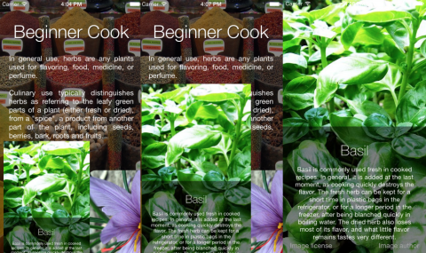
Readers’ App Reviews – October 2016

$
0
0

Review-2016-10-feature

Happy Halloween weekend! Today, I’m here to share some spookily-good apps with you. :]

I’ve tried out all the apps you sent to me, and I’ve selected a few to share with you. Every app submitted is from a fellow raywenderlich.com reader.

This month we have:

  • An app to help you learn a new language
  • Some sticker packs to liven up your iMessages
  • An app to free your wallet from all those reward cards
  • And of course, much more!

Keep reading to see the the latest apps released by raywenderlich.com readers like you.

Finish Something

FinishIt
Finish Something is a fun new drawing game where your only goal is finish drawings rather then start them.

Each level starts with a half finished drawing. They start easy with simple shapes and quickly progress to characters missing hair or famous landmarks missing structure. You do your best to draw in the missing sections including matching color in the later stages.

Take your time, get the details right. You aren’t judged on time but accuracy. When you’re satisfied with the drawing, see if you did a 3 star job. There are over 50 levels so far with many more to come.

KANJI JLPT N5

kanji
KANJI JLPT N5 will help you learn Japanese kanji and some words.

The app has a simple, clean interface focused on the language. Each kanji is accompanied by details including translations, videos of the stroke, words including the kanji, sounds, and pronunciations.

You can learn and practice your kanji through quizzes. There are a variety of quiz types like fill in the blank, find the antonym, play with numbers, and more. You can even setup custom quizzes if you’d like.

The main screen with all the kanji uses a color code as you go to let you know which ones you’re getting and which ones need a little extra practice.

If you are learning or want to learn Japanese, this app is a must have for you.

Tommy’s House

TommysHouse
Tommy’s House is fantastic sandbox for kids to explore and learn.

Tommy’s House has 5 rooms with over 1,000 objects to move, tap, slide, and explore. You can turn on and off the lights to see what its like in the dark. Or close the curtains and see what a lamp can do when its on. Cook a hamburger in the kitchen. Use a microscope in your room. There are no rules or time limits, kids a free to explore and have fun. There are also 5 mini games you can find like playing the piano you find in the room.

All the illustrations are beautiful and crisp. The controls couldn’t be more kid friendly with simple taps or real world drag and drop. There is nothing extra to buy and there are no ads. So its a safe app to leave just for kids. Or you can sit with them and explore together for even more fun.

Phamster

phamsters
Lets be honest, there are not enough animated hamsters in your life. Its an indisputable fact.

Phamster is a pack of hilarious, beautifully animated hamsters. These hamsters are not your average, boring, pet store hamsters. These are Phamsters! They dance, they blow kisses, they right tricycles.

Dare I say more? YES! There are Ninjasters, Ghosters, Vikingsters, Programsters, and so many more.

Download this sticker pack immediately and give everyone in your life what they’ve been waiting for.

BoomBar

Boombar
If you’re like me you’re tired of carrying around dozens of loyalty store cards just to get good deals while you’re out. BoomBar is here to help us.

BoomBar lets you scan your reward card barcodes and store them in the app. When you need one you can quickly pull it up and its barcode for easy scanning. It couldn’t be an easier solution to store unlimited reward cards right on your phone.

BoomBar has full support for your Apple Watch. You can even send a rewards card through iMessage with a new iMessage app for BoomBar. Great for when your friends or family want to borrow your reward card.

You can easily backup all your cards to iCloud as well so your hoard of barcodes is always safe.

Super Level Awesome Mask

SLAM
We all wanted to be a super hero when we were kids. Now we’re all one step closer!

Super Level Awesome Mask is a super fun sticker pack for iMessage that features masks of all sorts and shapes. Gladiator helmets, Alien war helmets, super hero masks, luchadors, and so much more. There are 60 masks ready to go.

Super Level Awesome Mask makes it so easy to slap a mask on yourself or a friend right within an iMessage chat. Just drag the mask up, pinch to zoom, and twist to rotate.

Logomatic

Logomatic
Logomatic will let you design your own logo and watermark photos quickly right on your iPhone.

Logomatic has over 100 icons and shapes that you can combine to create unique logos. Its easy to add text and warp shapes all with layer control.

Once you’ve designed your perfect logo, select just one photo or a whole batch. Select where you’d like the watermark to appear on the photos including scale and alpha. Just tap save and Logomatic will watermark all the photos at once and save them directly to your camera roll. It couldn’t be faster or easier.

Logomatic doesn’t monkey with your metadata leaving it exactly as it found it. It supports RAW, PNG, and JPG formats. You can import your logo if you already have one. Or your can export a logo made in the app for use elsewhere. Logomatic is your go to watermarking tool.

Fun +

FunPlus
Fun+ makes math addicting and dare I say… fun!

Fun+ is a simple puzzle game that relies on basic addition. You’ll see a grid of nine numbers. Those numbers make up three different simple addition equations. You need to select the numbers in order to create the equations successfully.

In many cases there are multiple equations that could work as the answer. But for some trickier levels, there are only 3 exact equations that work. Thank goodness it will let you restart a level.

Its simple, its fun, and its definitely addicting. Try swapping your Candy Crush addiction with Fun+ and you might find yourself doing simple math a little faster in your head. ;]

iMorseIM

morsecode
Morse Code doesn’t come up much in daily life for most of us. But that could finally be about to change. iMorseIM lets you send Morse Code messages across iMessage!

it couldn’t be simpler for you. Launch iMorseIM right within iMessage, type your message and iMorseIM will translate it to Morse Code and let you send it to your friends. If they know Morse Code they should be able to read it easily. If they don’t, they can download iMorseIM and use it to decode the message.

Where To Go From Here?

Each month, I really enjoy seeing what our community of readers comes up with. The apps you build are the reason we keep writing tutorials. Make sure you tell me about your next one, submit here.

If you saw an app your liked, hop to the App Store and leave a review! A good review always makes a dev’s day. And make sure you tell them you’re from raywenderlich.com; this is a community of makers.

If you’ve never made an app, this is the month! Check out our free tutorials to become an iOS star. What are you waiting for – I want to see your app next month.

The post Readers’ App Reviews – October 2016 appeared first on Ray Wenderlich.
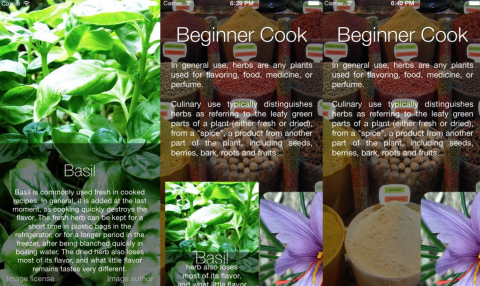
Firebase Tutorial: Real-time Chat

$
0
0

Firebase_Chat2-Wordpress-feature

It seems like every major app out there has a chat feature — and yours should be no different!

However, creating a chat tool can seem like a daunting task. There’s no native UIKit controls designed specifically for chat, and you’ll need a server to coordinate the messages and conversations between users.

Fortunately, there’s some great frameworks out there to help you: Firebase lets you synchronize real time data without writing a line of server code, while JSQMessagesViewController gives you a messaging UI that’s on par with the native Messages app.

In this Firebase tutorial, you’ll build RIC (Really Instant Chat) — an anonymous chat application. If you’ve used IRC or Slack, this sort of application should already be familiar to you.

Real time chat app

Along the way, you’ll learn how to do the following:

  • Set up the Firebase SDK and JSQMessagesViewController with CocoaPods.
  • Synchronize data in real time with the Firebase database.
  • Authenticate anonymously with Firebase.
  • Leverage JSQMessagesViewController for a complete chat UI.
  • Indicate when a user is typing.
  • Use Firebase Storage.

Getting Started

To get started with this Firebase tutorial, download the starter project here; at present, it contains a simple dummy login screen.

You’ll use CocoaPods to install both the Firebase SDK and JSQMessagesViewController. If you’re new to CocoaPods, check out our Cocoapods with Swift tutorial to get up and running.

Open Terminal at the project’s folder location. Open the Podfile at the project’s root folder and add the Firebase SDKs and JSQMessagesViewController as dependencies into the ChatChat target:

  pod 'Firebase/Storage'
  pod 'Firebase/Auth'
  pod 'Firebase/Database'
  pod 'JSQMessagesViewController'

Save the Podfile and run the following command to install your dependencies:

pod install

Once the packages have installed, open ChatChat.xcworkspace in Xcode. Before you can run the app, you’ll need to configure Firebase.

If you’re new to Firebase you’ll need to create an account. Don’t worry — this is easy and totally free.

Note: For a detailed walkthrough on setting up Firebase, see the Getting Started with Firebase tutorial.

Create a Firebase Account

Head to the Firebase signup site, create an account, and then create a new Firebase project.

Follow the instructions to add Firebase to an iOS app, copying the GoogleService-Info.plist config file to your project. This contains the configuration information needed for Firebase integration with your app.

Now build and run the app. You should see the following:

Login Screen

Enabling Anonymous Authentication

Firebase lets users log in through email or social accounts, but it can also authenticate users anonymously, giving you a unique identifier for a user without knowing any information about them.

To set up anonymous authentication, open the Firebase App Dashboard, select the Auth option on the left, click Sign-In Method, then select the Anonymous option, switch Enable so that it’s on, then click Save.

Enable anonymous auth

Just like that, you’ve enabled super secret stealth mode! Okay, so it’s really just anonymous authentication, but hey — it’s still cool. :]

Super secret stealth mode achieved

Logging In

Open LoginViewController.swift and add the following underneath import UIKit:

import Firebase

To log in to chat, the app will need to authenticate using the Firebase authentication service. Add the following code to loginDidTouch(_:):

if nameField?.text != "" { // 1
  FIRAuth.auth()?.signInAnonymously(completion: { (user, error) in // 2
    if let err = error { // 3
      print(err.localizedDescription)
      return
    }
 
    self.performSegue(withIdentifier: "LoginToChat", sender: nil) // 4
  })
}

Here’s what’s going on in the code above:

  1. First, you check to confirm the name field isn’t empty.
  2. Then you use the Firebase Auth API to sign in anonymously. This method takes a completion handler which is passed a user and, if necessary, an error.
  3. In the completion handler, check to see if you have an authentication error. If so, abort.
  4. Finally, if there wasn’t an error, trigger the segue to move to the ChannelListViewController.

Build and run your app, enter your name and hit Login anonymously.

Empty channel list

Creating the Channels List

Once the user logs in, they navigate to the ChannelListViewController, whose job it is to show the user a list of current channels and give them the option to create new channels. You’ll model this as a table view with two sections. The first section provides a form where the user can create a new channel, and the second section contains a list of all the known channels.

Channel list view

In this section you will learn how to:

  1. Save data to the Firebase database.
  2. Listen for new data being saved to the database.

To start, add the following to the top of ChannelListViewController.swift :

import Firebase
 
enum Section: Int {
  case createNewChannelSection = 0
  case currentChannelsSection
}

This is the same import statement as before followed by an enum to hold your different table view sections.

Next, inside the class, add the following:

// MARK: Properties
var senderDisplayName: String? // 1
var newChannelTextField: UITextField? // 2
private var channels: [Channel] = [] // 3

Here, you:

  1. Add a simple property to store the sender’s name.
  2. Add a text field, which you’ll use later for adding new Channels.
  3. Create an empty array of Channel objects to store your channels. This is a simple model class provided in the starter project that simply contains a name and an ID.

Next, you need to set up your UITableView to render the new channel from and a list of available channels. Add the following functions to ChannelListViewController.swift

// MARK: UITableViewDataSource
override func numberOfSections(in tableView: UITableView) -> Int {
  return 2 // 1
}
 
override func tableView(_ tableView: UITableView, numberOfRowsInSection section: Int) -> Int { // 2
  if let currentSection: Section = Section(rawValue: section) {
    switch currentSection {
    case .createNewChannelSection:
      return 1
    case .currentChannelsSection:
      return channels.count
    }
  } else {
    return 0
  }
}
 
// 3
override func tableView(_ tableView: UITableView, cellForRowAt indexPath: IndexPath) -> UITableViewCell {
  let reuseIdentifier = (indexPath as NSIndexPath).section == Section.createNewChannelSection.rawValue ? "NewChannel" : "ExistingChannel"
  let cell = tableView.dequeueReusableCell(withIdentifier: reuseIdentifier, for: indexPath)
 
  if (indexPath as NSIndexPath).section == Section.createNewChannelSection.rawValue {
    if let createNewChannelCell = cell as? CreateChannelCell {
      newChannelTextField = createNewChannelCell.newChannelNameField
    }
  } else if (indexPath as NSIndexPath).section == Section.currentChannelsSection.rawValue {
    cell.textLabel?.text = channels[(indexPath as NSIndexPath).row].name
  }
 
  return cell
}

This should be very familiar to anyone who’s used a UITableView before, but briefly you do the following:

  1. Set the number of sections. Remember, the first section will include a form for adding new channels, and the second section will show a list of channels.
  2. Set the number of rows for each section. This is always 1 for the first section, and the number of channels for the second section.
  3. Define what goes in each cell. For the first section, you store the text field from the cell in your newChannelTextField property. For the second section, you just set the cell’s text label as your channel name

To make sure this is all working, add the following code below the properties:

override func viewDidAppear(_ animated: Bool) {
  super.viewDidAppear(animated)
 
  channels.append(Channel(id: "1", name: "Channel1"))
  channels.append(Channel(id: "2", name: "Channel2"))
  channels.append(Channel(id: "3", name: "Channel3"))
  self.tableView.reloadData()
}

This just adds some dummy channels to the channels array.

Build and run your app; log in again and you should now see the form to create a new channel and the three dummy channels from above:

Dummy channels

Great! Now you need to make it work for real with Firebase. :]

Firebase Data Structure

Before you get going on the realtime data synchronization, take a moment and think about the data structure first.

The Firebase database is a NoSQL JSON data store. Essentially, everything in the Firebase database is a JSON object, and each key of this JSON object has its own URL.

Here’s a sample of how your data could look as a JSON object:

{
  "channels": {
    "name": "Channel 1"
    "messages": {
      "1": {
        "text": "Hey person!",
        "senderName": "Alice"
        "senderId": "foo"
      },
      "2": {
        "text": "Yo!",
        "senderName": "Bob"
        "senderId": "bar"
      }
    }
  }
}

The Firebase database favors a denormalized data structure, so it’s okay to include senderId for each message item. A denormalized data structure means you’ll duplicate a lot of data, but the upside is faster data retrieval. Tradeoffs — we haz them! :]

Realtime Channel Synchronization

To start off, remove the viewDidAppear(_:) code you added above, then add the following properties below the others:

private lazy var channelRef: FIRDatabaseReference = FIRDatabase.database().reference().child("channels")
private var channelRefHandle: FIRDatabaseHandle?

channelRef will be used to store a reference to the list of channels in the database; channelRefHandle will hold a handle to the reference so you can remove it later on.

Next you need to query the Firebase database and get a list of channels to show in your table view. Add the following:

// MARK: Firebase related methods
private func observeChannels() {
  // Use the observe method to listen for new
  // channels being written to the Firebase DB
  channelRefHandle = channelRef.observe(.childAdded, with: { (snapshot) -> Void in // 1
    let channelData = snapshot.value as! Dictionary<String, AnyObject> // 2
    let id = snapshot.key
    if let name = channelData["name"] as! String!, name.characters.count > 0 { // 3
      self.channels.append(Channel(id: id, name: name))
      self.tableView.reloadData()
    } else {
      print("Error! Could not decode channel data")
    }
  })
}

Here’s what’s going on:

  1. You call observe:with: on your channel reference, storing a handle to the reference. This calls the completion block every time a new channel is added to your database.
  2. The completion receives a FIRDataSnapshot (stored in snapshot), which contains the data and other helpful methods.
  3. You pull the data out of the snapshot and, if successful, create a Channel model and add it to your channels array.

Now add the following:

// MARK: View Lifecycle
override func viewDidLoad() {
  super.viewDidLoad()
  title = "RW RIC"
  observeChannels()
}
 
deinit {
  if let refHandle = channelRefHandle {
    channelRef.removeObserver(withHandle: refHandle)
  }
}

This calls your new observeChannels() method when the view controller loads. You also stop observing database changes when the view controller dies by checking if channelRefHandle is set and then calling removeObserver(withHandle:).

There’s just one more thing you need to do before you can see a list of channels pulled from Firebase: provide a way to create channels! The IBAction has already been set up for you in the storyboard, so just add the following code to your class:

// MARK :Actions 
@IBAction func createChannel(_ sender: AnyObject) {
  if let name = newChannelTextField?.text { // 1
    let newChannelRef = channelRef.childByAutoId() // 2
    let channelItem = [ // 3
      "name": name
    ]
    newChannelRef.setValue(channelItem) // 4
  }
}

Here’s the play-by-play:

  1. First check if you have a channel name in the text field.
  2. Create a new channel reference with a unique key using childByAutoId().
  3. Create a dictionary to hold the data for this channel. A [String: AnyObject] works as a JSON-like object.
  4. Finally, set the name on this new channel, which is saved to Firebase automatically!

Build and run your app and create some channels.

Create channels

Everything should be working as expected, but you’ve not yet added the code to visit one of your channels when tapped. Fix that with the following code:

// MARK: UITableViewDelegate
override func tableView(_ tableView: UITableView, didSelectRowAt indexPath: IndexPath) {
  if indexPath.section == Section.currentChannelsSection.rawValue {
    let channel = channels[(indexPath as NSIndexPath).row]
    self.performSegue(withIdentifier: "ShowChannel", sender: channel)
  }
}

The should be familiar to you. It just triggers the ShowChannel segue when the user taps a channel cell.

Creating the Chat Interface

JSQMessagesViewController is a souped-up UICollectionViewController that’s customized for chat, so you don’t have to create your own! :]

In this section of the tutorial you will focus on four things:

  1. Creating message data.
  2. Creating colored message bubbles.
  3. Removing avatar support.
  4. Changing the text color of a UICollectionViewCell.

Almost everything you’ll need to do requires that you override methods. JSQMessagesViewController adopts the JSQMessagesCollectionViewDataSource protocol, so you only need to override the default implementations.

Note: For more information on JSQMessagesCollectionViewDataSource, check out the Cocoa documentation here.

Open up ChatViewController.swift and add the following imports:

import Firebase
import JSQMessagesViewController

Change the subclass from UIViewController to JSQMessagesViewController:

final class ChatViewController: JSQMessagesViewController {

At the top of ChatViewController, define the following properties:

var channelRef: FIRDatabaseReference?
var channel: Channel? {
  didSet {
    title = channel?.name
  }
}

Now that ChatViewController extends JSQMessagesViewController, you’ll need to set initial values for senderId and senderDisplayName so the app can uniquely identify the sender of the messages — even if it doesn’t know specifically who that person is.

These need to be set when the view controller is first instantiated. The best place to do that is when the segue is about to happen. Back in ChannelListViewController.swift, add the following:

// MARK: Navigation
override func prepare(for segue: UIStoryboardSegue, sender: Any?) {
  super.prepare(for: segue, sender: sender)
 
  if let channel = sender as? Channel {
    let chatVc = segue.destination as! ChatViewController
 
    chatVc.senderDisplayName = senderDisplayName
    chatVc.channel = channel
    chatVc.channelRef = channelRef.child(channel.id)
  }
}

This sets up the properties on the ChatViewController that you just created before performing the segue.

The best place to get the senderDisplayName is when the user first enters their name when they log in.

In LoginViewController.swift, add the following method:

// MARK: Navigation
override func prepare(for segue: UIStoryboardSegue, sender: Any?) {
  super.prepare(for: segue, sender: sender)
  let navVc = segue.destination as! UINavigationController // 1
  let channelVc = navVc.viewControllers.first as! ChannelListViewController // 2
 
  channelVc.senderDisplayName = nameField?.text // 3
}

Here’s what you’re doing:

  1. Retrieve the destination view controller from segue and cast it to a UINavigationController.
  2. Cast the first view controller of the UINavigationController to a ChannelListViewController.
  3. Set the senderDisplayName in the ChannelListViewController to the name provided in the nameField by the user.

Back in ChatViewController.swift, add the following to the bottom of viewDidLoad():

self.senderId = FIRAuth.auth()?.currentUser?.uid

This sets the senderId based on the logged in Firebase user.

Build and run your app and navigate to a channel.

Empty Channel

By simply inheriting from JSQMessagesViewController you get a complete chat UI. Fancy chat UI win! :]

Fine chat app

Setting Up the Data Source and Delegate

Now that you’ve seen your new awesome chat UI, you probably want to start displaying messages. But before you do that, you have to take care of a few things.

To display messages, you need a data source to provide objects that conform to the JSQMessageData protocol, and you need to implement a number of delegate methods. You could create your own class that conforms to the JSQMessageData protocol, but you’ll use the built-in JSQMessage class that is already provided.

At the top of ChatViewController, add the following property:

var messages = [JSQMessage]()

messages is an array to store the various instances of JSQMessage in your app.

Now add the following:

override func collectionView(_ collectionView: JSQMessagesCollectionView!, messageDataForItemAt indexPath: IndexPath!) -> JSQMessageData! {
  return messages[indexPath.item]
}
 
override func collectionView(_ collectionView: UICollectionView, numberOfItemsInSection section: Int) -> Int {
  return messages.count
}

You’re probably no stranger to the two types of delegate methods above. The first is much like collectionView(_:cellForItemAtIndexPath:), but for message data. The second is the standard way to return the number of items in each section; in this case, the number of messages.

Message Bubble Colors

The messages displayed in the collection view are simply images with text overlaid. There are two types of messages: outgoing and incoming. Outgoing messages are displayed to the right and incoming messages on the left.

In ChatViewController, add the following methods to the UI and User Interaction section:

private func setupOutgoingBubble() -> JSQMessagesBubbleImage {
  let bubbleImageFactory = JSQMessagesBubbleImageFactory()
  return bubbleImageFactory!.outgoingMessagesBubbleImage(with: UIColor.jsq_messageBubbleBlue())
}
 
private func setupIncomingBubble() -> JSQMessagesBubbleImage {
  let bubbleImageFactory = JSQMessagesBubbleImageFactory()
  return bubbleImageFactory!.incomingMessagesBubbleImage(with: UIColor.jsq_messageBubbleLightGray())
}

Then add the following properties at the top:

lazy var outgoingBubbleImageView: JSQMessagesBubbleImage = self.setupOutgoingBubble()
lazy var incomingBubbleImageView: JSQMessagesBubbleImage = self.setupIncomingBubble()

JSQMessagesBubbleImageFactory has methods that create the images for the chat bubbles. There’s even a category provided by JSQMessagesViewController that creates the message bubble colors used in the native Messages app.

Using the methods outgoingMessagesBubbleImage(:with) and incomingMessagesBubbleImage(:with), you can create the images for outgoing and incoming messages respectively. And with that, you have the image views needed to create outgoing and incoming message bubbles!

Before you get too excited, you’ll need to implement the delegate methods for the message bubbles.

Setting the Bubble Images

To set the colored bubble image for each message, you’ll need to override a method of JSQMessagesCollectionViewDataSource, called collectionView(_:messageBubbleImageDataForItemAt:).

This asks the data source for the message bubble image data that corresponds to the message item at indexPath in the collectionView. This is exactly where you set the bubble’s image.

Add the following to ChatViewController:

override func collectionView(_ collectionView: JSQMessagesCollectionView!, messageBubbleImageDataForItemAt indexPath: IndexPath!) -> JSQMessageBubbleImageDataSource! {
  let message = messages[indexPath.item] // 1
  if message.senderId == senderId { // 2
    return outgoingBubbleImageView
  } else { // 3
    return incomingBubbleImageView
  }
}

Taking the above code step-by-step:

  1. Here you retrieve the message.
  2. If the message was sent by the local user, return the outgoing image view.
  3. Otherwise, return the incoming image view.

Removing the Avatars

JSQMessagesViewController provides support for avatars, but you don’t need (or want) avatars in your anonymous RIC app.

Add the following to ChatViewController:

override func collectionView(_ collectionView: JSQMessagesCollectionView!, avatarImageDataForItemAt indexPath: IndexPath!) -> JSQMessageAvatarImageDataSource! {
  return nil
}

To remove the avatar image, you simply return nil for each message’s avatar display.

Finally, in viewDidLoad(), add the following:

// No avatars
collectionView!.collectionViewLayout.incomingAvatarViewSize = CGSize.zero
collectionView!.collectionViewLayout.outgoingAvatarViewSize = CGSize.zero

This tells the layout to size each avatar at CGSize.zero, which is “no size”.

Check that your app builds and you can navigate to one of your channels;

Empty channel

Time to start the conversation and add a few messages!

Creating Messages

Create the following method in ChatViewController:

private func addMessage(withId id: String, name: String, text: String) {
  if let message = JSQMessage(senderId: id, displayName: name, text: text) {
    messages.append(message)
  }
}

This helper method creates a new JSQMessage and adds it to the data source.

Add a few hardcoded messages in viewDidAppear(_:) to see things in action:

// messages from someone else
addMessage(withId: "foo", name: "Mr.Bolt", text: "I am so fast!")
// messages sent from local sender
addMessage(withId: senderId, name: "Me", text: "I bet I can run faster than you!")
addMessage(withId: senderId, name: "Me", text: "I like to run!")
// animates the receiving of a new message on the view
finishReceivingMessage()

Build and run you app; you’ll see the messages appear in the conversation view:

Conversation View

Hm, the text is a bit hard to read on the incoming messages. It should probably be black.

Message Bubble Text

As you’ve realized by now, to do almost anything in JSQMessagesViewController, you just need to override a method. To set the text color, use the good old fashioned collectionView(_:cellForItemAt:).

Add the following method in ChatViewController:

override func collectionView(_ collectionView: UICollectionView, cellForItemAt indexPath: IndexPath) -> UICollectionViewCell {
  let cell = super.collectionView(collectionView, cellForItemAt: indexPath) as! JSQMessagesCollectionViewCell
  let message = messages[indexPath.item]
 
  if message.senderId == senderId {
    cell.textView?.textColor = UIColor.white
  } else {
    cell.textView?.textColor = UIColor.black
  }
  return cell
}

If the message is sent by the local user, the text color is white. If it’s not sent by the local user, the text is black.

Build and run; you should see incoming messages in black text:

Incoming messages

Boom — that’s one nice looking chat app! Time to make it work (for real) with Firebase.

Sending Messages

Add the following properties to ChatViewController.swift:

private lazy var messageRef: FIRDatabaseReference = self.channelRef!.child("messages")
private var newMessageRefHandle: FIRDatabaseHandle?

These should be familiar to you as they’re very similar to the channelRef and channelRefHandle properties you used in the ChannelListViewController.

Next, delete ChatViewController’s viewDidAppear(_:) to remove the stub test messages.

Then, override the following method to make the “Send” button save a message to the Firebase database.

override func didPressSend(_ button: UIButton!, withMessageText text: String!, senderId: String!, senderDisplayName: String!, date: Date!) {
  let itemRef = messageRef.childByAutoId() // 1
  let messageItem = [ // 2 
    "senderId": senderId!,
    "senderName": senderDisplayName!,
    "text": text!,
  ]
 
  itemRef.setValue(messageItem) // 3
 
  JSQSystemSoundPlayer.jsq_playMessageSentSound() // 4
 
  finishSendingMessage() // 5
}

Here’s what’s going on:

  1. Using childByAutoId(), you create a child reference with a unique key.
  2. Then you create a dictionary to represent the message.
  3. Next, you Save the value at the new child location.
  4. You then play the canonical “message sent” sound.
  5. Finally, complete the “send” action and reset the input toolbar to empty.

Build and run; open up your Firebase App Dashboard and click on the Data tab. Send a message in the app and you should see the messages appear in the dashboard in real time:

Sending a message

High five! You’re saving messages to the Firebase database like a pro. The messages don’t appear on the screen, but you’ll take care of that next.

Synchronizing the Data Source

Add the following to ChatViewController:

private func observeMessages() {
 messageRef = channelRef!.child("messages")
 // 1.
 let messageQuery = messageRef.queryLimited(toLast:25)
 
 // 2. We can use the observe method to listen for new
 // messages being written to the Firebase DB
 newMessageRefHandle = messageQuery.observe(.childAdded, with: { (snapshot) -> Void in
   // 3
   let messageData = snapshot.value as! Dictionary<String, String>
 
   if let id = messageData["senderId"] as String!, let name = messageData["senderName"] as String!, let text = messageData["text"] as String!, text.characters.count > 0 {
     // 4
     self.addMessage(withId: id, name: name, text: text)
 
     // 5
     self.finishReceivingMessage()
   } else {
     print("Error! Could not decode message data")
   }
 })
}

Taking each numbered comment in turn:

  1. Start by creating a query that limits the synchronization to the last 25 messages.
  2. Use the .ChildAdded event to observe for every child item that has been added, and will be added, at the messages location.
  3. Extract the messageData from the snapshot.
  4. Call addMessage(withId:name:text) to add the new message to the data source.
  5. Inform JSQMessagesViewController that a message has been received.

Next, call your new method in viewDidLoad():

observeMessages()

Build and run your app; you should see any messages sent earlier along with any new ones you enter:

Messages from firebase

Congrats! You have a real time chat app! Now it’s time to do some even fancier things, such as detecting when a user is typing.

Knowing When a User is Typing

One of the coolest features of the Messages app is seeing the “user is typing” indicator. When the little bubble pops up, you know another user is typing into the keyboard. This indicator is super-important, because it keeps us from sending those awkward “Are you still there?” messages.

There are many ways of detecting typing, but textViewDidChange(_:) is a great place to check. Add the following to the bottom of ChatViewController:

override func textViewDidChange(_ textView: UITextView) {
  super.textViewDidChange(textView)
  // If the text is not empty, the user is typing
  print(textView.text != "")
}

To determine whether the user is typing, you check the value of textView.text. If the value is anything other than the empty string, you know that the user has typed something.

Using Firebase, you can update the Firebase database when a user is typing. Then, in response to the database getting updated with this indication, you can display the “user is typing” indicator.

To do this, first add the following properties to ChatViewController:

private lazy var userIsTypingRef: FIRDatabaseReference =
  self.channelRef!.child("typingIndicator").child(self.senderId) // 1
private var localTyping = false // 2
var isTyping: Bool {
  get {
    return localTyping
  }
  set {
    // 3
    localTyping = newValue
    userIsTypingRef.setValue(newValue)
  }
}

Here’s what you need to know about these properties:

  1. Create a Firebase reference that tracks whether the local user is typing.
  2. Store whether the local user is typing in a private property.
  3. Use a computed property to update localTyping and userIsTypingRef each time it’s changed.

Now add the following:

private func observeTyping() {
  let typingIndicatorRef = channelRef!.child("typingIndicator")
  userIsTypingRef = typingIndicatorRef.child(senderId)
  userIsTypingRef.onDisconnectRemoveValue()
}

This method creates a child reference to your channel called typingIndicator, which is where you’ll update the typing status of the user. You don’t want this data to linger around after users have logged out, so you can delete it once the user has left using onDisconnectRemoveValue().

Add the following to call your new method:

override func viewDidAppear(_ animated: Bool) {
  super.viewDidAppear(animated)
  observeTyping()
}

Now replace the line print(textView.text != "") in textViewDidChange(_:) with this:

isTyping = textView.text != ""

This just sets isTyping whenever the user has typed something.

Finally, add the following at the end of didPressSend(_:withMessageText:senderId:senderDisplayName:date:):

isTyping = false

This resets the typing indicator when the Send button is pressed.

Build and run your app; pull up the Firebase App Dashboard to view the data. When you type a message, you should see the typingIndicator record update for the user:

Typing indicator

Wahoo! You now know when a user is typing! Now it’s time to work on displaying the indicator.

Querying for Typing Users

The “user is typing” indicator should display every time any user is typing, with the exception of the local user. You can safely assume that the local user knows when they’re typing. :]

Using a Firebase query, you can retrieve all of the users that are currently typing. Add the following property to ChatViewController:

private lazy var usersTypingQuery: FIRDatabaseQuery =
  self.channelRef!.child("typingIndicator").queryOrderedByValue().queryEqual(toValue: true)

This property holds an FIRDatabaseQuery, which is just like a Firebase reference, except that it’s ordered. You initialize the query by retrieving all users who are typing. This is basically saying, “Hey Firebase, go to the key /typingIndicator and get me all users for whom the value is true.”

Next, add the following to the bottom of observeTyping():

// 1
usersTypingQuery.observe(.value) { (data: FIRDataSnapshot) in
  // 2 You're the only one typing, don't show the indicator
  if data.childrenCount == 1 && self.isTyping {
    return
  }
 
  // 3 Are there others typing?
  self.showTypingIndicator = data.childrenCount > 0
  self.scrollToBottom(animated: true)
}

Here’s what’s going on:

  1. You observe for changes using .value; this will call the completion block anytime it changes.
  2. You need to see how many users are in the query. If the there’s just one user and that’s the local user, don’t display the indicator.
  3. At this point, if there are users, it’s safe to set the indicator. Call scrollToBottomAnimated(animated:) to ensure the indicator is displayed.

Before you build and run, grab a physical iOS device, as testing this situation takes two devices. Use the simulator for one user, and your device for the other.

Now, build and run your app on both the simulator and the device. When one user types you should see the indicator appear:

Multi-user typing indicator

So now you’ve got a typing indicator, but you’re still missing one big feature of modern messaging apps — sending images!

Sending Images

To send images, you’re going to follow mostly the same principle as sending text, with one key difference. Rather than storing the image data directly with the message, you’ll use Firebase Storage, which is better suited to storing large files like audio, video or images.

To start, you need to add the Photos import to ChatViewController.swift:

import Photos

Next, add the following property:

lazy var storageRef: FIRStorageReference = FIRStorage.storage().reference(forURL: "YOUR_URL_HERE")

This is a Firebase storage reference and is conceptually similar to the Firebase database references you’ve seen already, but for a storage object. Replace YOUR_URL_HERE with your Firebase app URL, which you can find by clicking Storage in your App Console.

Firebase console storage

Sending a photo message will require a little bit of smoke and mirrors. Saving a Photo to Firebase storage returns a URL, but this may take a couple of seconds — perhaps longer, if the network connection is poor. Rather than blocking the user interface during this time, which will make your app feel slow, you send the photo message with a fake URL and update the message once the photo has been saved.

Add the following property:

private let imageURLNotSetKey = "NOTSET"

and add this method:

func sendPhotoMessage() -> String? {
  let itemRef = messageRef.childByAutoId()
 
  let messageItem = [
    "photoURL": imageURLNotSetKey,
    "senderId": senderId!,
  ]
 
  itemRef.setValue(messageItem)
 
  JSQSystemSoundPlayer.jsq_playMessageSentSound()
 
  finishSendingMessage()
  return itemRef.key
}

This should look familiar to you: it’s very similar to the didPressSend(_:withMessageText:senderId:senderDisplayName:date:) method you implemented earlier.

Now, you need to be able to update the message once you get a Firebase Storage URL for the image. Add the following:

func setImageURL(_ url: String, forPhotoMessageWithKey key: String) {
  let itemRef = messageRef.child(key)
  itemRef.updateChildValues(["photoURL": url])
}

Next, you need to allow the user to select an image to send. Luckily JSQMessagesViewController already contains the UI for adding an image to your message, so you just need to implement the method that handles the click:

override func didPressAccessoryButton(_ sender: UIButton) {
  let picker = UIImagePickerController()
  picker.delegate = self
  if (UIImagePickerController.isSourceTypeAvailable(UIImagePickerControllerSourceType.camera)) {
    picker.sourceType = UIImagePickerControllerSourceType.camera
  } else {
    picker.sourceType = UIImagePickerControllerSourceType.photoLibrary
  }
 
  present(picker, animated: true, completion:nil)
}

Here you just present a camera if the device supports it, or the photo library if not.

Next, you need to implement the UIImagePickerControllerDelegate methods to handle when the user picks the image. Add the following to the bottom of the file (after the last closing brace):

// MARK: Image Picker Delegate
extension ChatViewController: UIImagePickerControllerDelegate, UINavigationControllerDelegate {
  func imagePickerController(_ picker: UIImagePickerController,
    didFinishPickingMediaWithInfo info: [String : Any]) {
 
    picker.dismiss(animated: true, completion:nil)
 
    // 1
    if let photoReferenceUrl = info[UIImagePickerControllerReferenceURL] as? URL {
      // Handle picking a Photo from the Photo Library
      // 2
      let assets = PHAsset.fetchAssets(withALAssetURLs: [photoReferenceUrl], options: nil)
      let asset = assets.firstObject
 
      // 3
      if let key = sendPhotoMessage() {
        // 4 
        asset?.requestContentEditingInput(with: nil, completionHandler: { (contentEditingInput, info) in
          let imageFileURL = contentEditingInput?.fullSizeImageURL
 
          // 5
          let path = "\(FIRAuth.auth()?.currentUser?.uid)/\(Int(Date.timeIntervalSinceReferenceDate * 1000))/\(photoReferenceUrl.lastPathComponent)"
 
          // 6
          self.storageRef.child(path).putFile(imageFileURL!, metadata: nil) { (metadata, error) in
            if let error = error {
              print("Error uploading photo: \(error.localizedDescription)")
              return
            }
            // 7
            self.setImageURL(self.storageRef.child((metadata?.path)!).description, forPhotoMessageWithKey: key)
          }
        })
      }
    } else {
      // Handle picking a Photo from the Camera - TODO
    }
  }
 
  func imagePickerControllerDidCancel(_ picker: UIImagePickerController) {
    picker.dismiss(animated: true, completion:nil)
  }
}

These two methods handle the cases when the user either selects an image or cancels the selection process. When selecting an image, the user can either get one from the photo library or take an image directly with their camera. Starting with choosing a photo from the library:

  1. First, check to see if a photo URL is present in the info dictionary. If so, you know you have a photo from the library.
  2. Next, pull the PHAsset from the photo URL
  3. You call sendPhotoMessage and receive the Firebase key.
  4. Get the file URL for the image.
  5. Create a unique path based on the user’s unique ID and the current time.
  6. And (finally!) save the image file to Firebase Storage
  7. Once the image has been saved, you call setImageURL() to update your photo message with the correct URL

Now add the code to handle a taken picture. Add the following immediately below the TODO you just added:

// 1
let image = info[UIImagePickerControllerOriginalImage] as! UIImage
// 2
if let key = sendPhotoMessage() {
  // 3
  let imageData = UIImageJPEGRepresentation(image, 1.0)
  // 4
  let imagePath = FIRAuth.auth()!.currentUser!.uid + "/\(Int(Date.timeIntervalSinceReferenceDate * 1000)).jpg"
  // 5
  let metadata = FIRStorageMetadata()
  metadata.contentType = "image/jpeg"
  // 6
  storageRef.child(imagePath).put(imageData!, metadata: metadata) { (metadata, error) in
    if let error = error {
      print("Error uploading photo: \(error)")
      return
    }
    // 7
    self.setImageURL(self.storageRef.child((metadata?.path)!).description, forPhotoMessageWithKey: key)
  }
}

Here’s what this does:

  1. First you grab the image from the info dictionary.
  2. Then call your sendPhotoMessage() method to save the fake image URL to Firebase.
  3. Next you get a JPEG representation of the photo, ready to be sent to Firebase storage.
  4. As before, create a unique URL based on the user’s unique id and the current time.
  5. Create a FIRStorageMetadata object and set the metadata to image/jpeg.
  6. Then save the photo to Firebase Storage
  7. Once the image has been saved, you call setImageURL() again.

Nearly there! You’ve now set up your app to save the image data to Firebase Storage and save the URL to the message data, but you’ve not yet updated the app to display those photos. Time to fix that.

Displaying the Images

First, add a property to ChatViewController:

private var photoMessageMap = [String: JSQPhotoMediaItem]()

This holds an array of JSQPhotoMediaItems.

Now, you need to create a sibling method to addMessage(withId:name:text:). Add the following:

private func addPhotoMessage(withId id: String, key: String, mediaItem: JSQPhotoMediaItem) {
  if let message = JSQMessage(senderId: id, displayName: "", media: mediaItem) {
    messages.append(message)
 
    if (mediaItem.image == nil) {
      photoMessageMap[key] = mediaItem
    }
 
    collectionView.reloadData()
  }
}

Here, you store the JSQPhotoMediaItem in your new property if the image key hasn’t yet been set. This allows you to retrieve it and update the message when the image is set later on.

You also need to be able to fetch the image data from Firebase Storage to display it in the UI. Add the following method:

private func fetchImageDataAtURL(_ photoURL: String, forMediaItem mediaItem: JSQPhotoMediaItem, clearsPhotoMessageMapOnSuccessForKey key: String?) {
  // 1
  let storageRef = FIRStorage.storage().reference(forURL: photoURL)
 
  // 2
  storageRef.data(withMaxSize: INT64_MAX){ (data, error) in
    if let error = error {
      print("Error downloading image data: \(error)")
      return
    }
 
    // 3
    storageRef.metadata(completion: { (metadata, metadataErr) in
      if let error = metadataErr {
        print("Error downloading metadata: \(error)")
        return
      }
 
      // 4
      if (metadata?.contentType == "image/gif") {
        mediaItem.image = UIImage.gifWithData(data!)
      } else {
        mediaItem.image = UIImage.init(data: data!)
      }
      self.collectionView.reloadData()
 
      // 5
      guard key != nil else {
        return
      }
      self.photoMessageMap.removeValue(forKey: key!)
    })
  }
}

Here, you:

  1. Get a reference to the stored image.
  2. Get the image data from the storage.
  3. Get the image metadata from the storage.
  4. If the metadata suggests that the image is a GIF you use a category on UIImage that was pulled in via the SwiftGifOrigin Cocapod. This is needed because UIImage doesn’t handle GIF images out of the box. Otherwise you just use UIImage in the normal fashion.
  5. Finally, you remove the key from your photoMessageMap now that you’ve fetched the image data.

Finally, you need to update observeMessages(). Within the if statement, but before the final else condition, add the following test:

else if let id = messageData["senderId"] as String!,
        let photoURL = messageData["photoURL"] as String! { // 1
  // 2
  if let mediaItem = JSQPhotoMediaItem(maskAsOutgoing: id == self.senderId) {
    // 3
    self.addPhotoMessage(withId: id, key: snapshot.key, mediaItem: mediaItem)
    // 4
    if photoURL.hasPrefix("gs://") {
      self.fetchImageDataAtURL(photoURL, forMediaItem: mediaItem, clearsPhotoMessageMapOnSuccessForKey: nil)
    }
  }
}

Going through this, line by line:

  1. First, check to see if you have a photoURL set.
  2. If so, create a new JSQPhotoMediaItem. This object encapsulates rich media in messages — exactly what you need here!
  3. With that media item, call addPhotoMessage
  4. Finally, check to make sure the photoURL contains the prefix for a Firebase Storage object. If so, fetch the image data.

There’s now just one final thing left to do. Can you guess what it is?

While you’re decoding photo messages, you’re only doing this if the image data is in the message when you first observe it. However, you also need to observe any updates to the message that occur later, like when you update the image URL after it’s been saved to storage.

Add the following property:

  private var updatedMessageRefHandle: FIRDatabaseHandle?

Now add the following to the bottom of observeMessages().

// We can also use the observer method to listen for
// changes to existing messages.
// We use this to be notified when a photo has been stored
// to the Firebase Storage, so we can update the message data
updatedMessageRefHandle = messageRef.observe(.childChanged, with: { (snapshot) in
  let key = snapshot.key
  let messageData = snapshot.value as! Dictionary<String, String> // 1
 
  if let photoURL = messageData["photoURL"] as String! { // 2
    // The photo has been updated.
    if let mediaItem = self.photoMessageMap[key] { // 3
      self.fetchImageDataAtURL(photoURL, forMediaItem: mediaItem, clearsPhotoMessageMapOnSuccessForKey: key) // 4
    }
  }
})

Here’s what this does:

  1. Grabs the message data dictionary from the Firebase snapshot.
  2. Checks to see if the dictionary has a photoURL key set.
  3. If so, pulls the JSQPhotoMediaItem out of the cache.
  4. Finally, fetches the image data and update the message with the image!

The very last thing you need to do is some housekeeping and clean things up when the ChatViewController disappears. Add the following method:

deinit {
  if let refHandle = newMessageRefHandle {
    messageRef.removeObserver(withHandle: refHandle)
  }
 
  if let refHandle = updatedMessageRefHandle {
    messageRef.removeObserver(withHandle: refHandle)
  }
}

Build and run the app; you should be able to tap on the little paperclip icon and send photo or image messages in your chat. Notice how the messages show a little waiting spinner — this is when your app is saving the photo data to Firebase Storage.

Send photos

Kaboom! You just made a big, bad, real time, user-typing-indicating, photo and GIF sending chat app. Go grab yourself your favorite beverage, you earned it!

Where to Go From Here?

You can download the completed project with all of the code you’ve developed in this Firebase tutorial.

You now know the basics of Firebase and JSQMessagesViewController, but there’s plenty more you can do, including one-to-one messaging, social authentication, and avatar display.

To take this app even further, you could take a look at the Firebase iOS documentation.

I hope you’ve enjoyed this Firebase tutorial; if you have any questions feel free to leave them in the non-anonymous yet avatar-enabled discussion below! :]

The post Firebase Tutorial: Real-time Chat appeared first on Ray Wenderlich.

Swift Algorithm Club: October Digest

$
0
0

SwiftAlgClub-Sept-Digest-feature

The Swift Algorithm Club is an open source project to implement popular algorithms and data structures in Swift.

We thought it would be useful to periodically give a status update with how things are going with the project.

October’s been a busy month, with many contributions in the form of Swift 3 updates and new algorithms. Thanks to our community of over 60 contributors, this project has been making steady progress.

I’d like to make a note of appreciation to one of the most active contributors Jaap Wijnen, who’s been doing quite a bit of migrating lately. Thanks Jaap!

The Great Swift 3 Migration

The migration from Swift 2.2 to Swift 3 continues. So far, 45 of the 72 algorithms have been migrated. Migration has generally been quite straightforward – it’s just the process of:

  • Making sure the playground compiles correctly
  • Making sure README.md file reflects the updated playground
  • Incorporate the new Swift API design guidelines in terms of naming of methods

Want to help out? It’s a great way to learn about algorithms and Swift 3 at the same time. If so, check out our Github issue and sign up!

Other News

In addition to the Swift 3 migration project, this month has also brought a new contribution to the project – The Haversine Distance. With that algorithm, you’ll be able to calculate the distance on a sphere between two points.

Note: New contributions are now accepted only if they are written in Swift 3. This allows us to keep our focus looking forward.

On another note, last week I released a tutorial on how to implement the Trie Data Structure in Swift 3. This is a neat data structure that is handy to store English language words – check it out!

Where To Go From Here?

The Swift Algorithm Club is always looking for new members. Whether you’re here to learn or here to contribute, we’re happy to have you around.

To learn more about the Swift Algorithm Club, check out our introductory article. We hope to see you at the club! :]

The post Swift Algorithm Club: October Digest appeared first on Ray Wenderlich.

Screencast: Server Side Swift with Vapor: Configuring a Database


How to Use NSTouchBar on macOS

$
0
0

After years of waiting and rumors, Apple finally released a set of new MacBook Pros. One of the new exciting things announced was the inclusion of a touch screen. Well… sort of.

The new Touch Bar replaces the traditional function keys found on all MacBooks in the past for a dynamic, multi-touch screen. And the best part is it’s fully open to developers, so you can use it to offer new ways to interact with your macOS applications.

If you’re a macOS developer, you’ll want to take full advantage of this new technology right away. In this tutorial, I’ll show you how you can use the new NSTouchBar API to easily create a dynamic touch bar for your macOS app.

Note: This tutorial requires Xcode version 8.1 or later. You will also need to ensure that you have macOS 10.12.1, build 16B2657 installed on your computer first. If you do not have this version, you will not be able to show the Touch Bar Simulator. To check, go to  > About This Mac, and click where you see 10.12.1. This will then show your build number.

About Mac

If you do not see 16B2657, you can download the update from Apple.

What is the Touch Bar?

As mentioned, the Touch Bar is a small touch screen that allows users to interact with apps (and their computer) in a whole new way.

Screen Shot 2016-10-31 at 12.44.31 PM

There are three default sections on the Touch Bar:

  • System Button: Depending on context, this will show a system level button, like Esc.
  • App Region: The default area provided for your app to show items.
  • Control Strip: This is a replacement of your familiar keys that you’d use to control screen brightness, volume, or music playback.

As with every new technology from Apple, there are a set of Human Interface Guidelines that you should follow when working with the Touch Bar. You should familiarize yourself with them here, as they are very important to maintaining a consistent pattern to your users.

Very briefly, here are a few sections of the guide that really stand out:

  • Don’t expose functionality just in the Touch Bar: This isn’t the place to keep things secret from users that haven’t upgraded their hardware yet. If you’re going to put it in the Touch Bar, make sure you can perform the action somewhere else in your app. Apple says that the Touch Bar can even be disabled, so don’t count on your users to always see it.
  • The Touch Pad is an extension of the Keyboard and Trackpad, not a display: Yes, it’s a screen, but it’s not a secondary display. Don’t distract the user with scrolling content or alerts.
  • Respond Immediately: When users tap a key on the keyboard, they expect immediate results. Similarly, when someone taps a virtual button on the touch bar, they also expect immediate results.

How Do I Support the Touch Bar?

To add support for the TouchBar in your apps, you use some new classes provided by Apple: NSTouchBar and NSTouchBarItem (and its subclasses).

Some of the NSTouchBarItem subclasses include features like:

  • Slider: Adjusts a value
  • Popover: Hide more functionality behind another item.
  • Color Picker: Pretty much says it all (a color picker if you didn’t catch it ;] ).
  • Custom: This is probably going to be your go-to item for a lot of things. It allows you to add simple labels, buttons, and all sorts of other controls.

You can customize your items quite a bit. From text size and color, to images, you can offer your users a modern approach to the keyboard that hasn’t been available before. Just remember the guidelines, and you should be good to go.

Getting Started

You’re probably ready to get started! To follow along, download this sample project here.

The application is a very simple Travel Log, that only does what is needed for the purposes of our tutorial. With the project open, go to Window > Show Touch Bar. You’ll now see the Touch Bar Simulator on your screen.

Initial Bar

Build and run the app, you’ll notice the Touch Bar is empty, aside from the System Button and Control Strip.

Starter App

First Bar

Before you can add anything to the Touch Bar, you’ll need to tell the system your application can customize the Touch Bar. Open AppDelegate.swift, and paste the following into applicationDidFinishLaunching(_:):

func applicationDidFinishLaunching(_ aNotification: Notification) {
  if #available(OSX 10.12.1, *) {
    NSApplication.shared().isAutomaticCustomizeTouchBarMenuItemEnabled = true
  }
}

This takes care of all the necessary validations and activation of your Touch Bar menu items for you. At the time of this writing the current version of Xcode does not have macOS 10.12.1 available as a deployment target, so you will need to place #available(OS X 10.12.1, *) around code or extensions dealing with the Touch Bar. Luckily, Xcode will give you a friendly error if you forget ;]

Open WindowController.swift, and look at makeTouchBar(). This method is checking if ViewController has a Touch Bar that can be returned. If so, it will send that Touch Bar to the Window, and be presented to the user. Right now, there is no Touch Bar being created, so nothing is shown.

Before you can go making your own touch bars, and touch bar items, you need to be aware that instances of these classes all require unique identifiers. Open TouchBarIdentifiers.swift to see how these have been created for this project. There are extensions for both NSTouchBarCustomizationIdentifier, and NSTouchBarItemIdentifier.

Go to ViewController.swift, and add the following at the end of the file, where the TouchBar Delegate is marked:

@available(OSX 10.12.1, *)
extension ViewController: NSTouchBarDelegate {
  override func makeTouchBar() -> NSTouchBar? {
    // 1
    let touchBar = NSTouchBar()
    touchBar.delegate = self
    // 2
    touchBar.customizationIdentifier = .travelBar
    // 3
    touchBar.defaultItemIdentifiers = [.infoLabelItem]
    // 4
    touchBar.customizationAllowedItemIdentifiers = [.infoLabelItem]
    return touchBar
  }
}

Here, you override makeTouchBar(), which is required for your view or window to create a touch bar. You also did the following:

  1. Create a new TouchBar and set the delegate.
  2. Set the customizationIdentifier. Remember, every TouchBar and TouchBarItem need to have unique identifiers.
  3. Set the Touch Bar’s default item identifiers. This tells the Touch Bar what items it will contain.
  4. Here, you set what order the items should be presented to the user.

You’re still not quite ready to see anything in your Touch Bar yet. You’ll need to tell the Touch Bar what the .infoLabelItem should look like. In the same extension, add the following:

func touchBar(_ touchBar: NSTouchBar, makeItemForIdentifier identifier: NSTouchBarItemIdentifier) -> NSTouchBarItem? {
    switch identifier {
    case NSTouchBarItemIdentifier.infoLabelItem:
      let customViewItem = NSCustomTouchBarItem(identifier: identifier)
      customViewItem.view = NSTextField(labelWithString: "\u{1F30E} \u{1F4D3}")
      return customViewItem
    default:
      return nil
    }
}

By implementing touchBar(_:makeItemForIdentifier:), you can customize your touch bar items anyway you’d like. Here, you’ve created a simple NSCustomTouchBarItem, and set its view to an NSTextField. Build and run your application, and you’ll now see the Touch Bar has a new item.

TouchBar FirstItem

Yay! You got a… label. That’s not super helpful, though. It’s time to add some controls.

touchbar_ragecomic

Text Fields and Scrubbers

In makeTouchBar(), change the defaultItemIdentifiers to the following:

touchBar.defaultItemIdentifiers = [.infoLabelItem, .flexibleSpace, .ratingLabel, .ratingScrubber]

This will allow the Touch Bar to show three new items: a label and a scrubber. You’ve also added a .flexibleSpace. This is a dynamically sized space put in the Touch Bar to keeps things grouped together nicely. You can also take advantage of .fixedSpaceSmall, and .fixedSpaceLarge for more static sized spacing.

You’ll still need to customize these items, just like the label you added. Add the following cases to the switch in touchBar(_:makeItemForIdentifier:):

case NSTouchBarItemIdentifier.ratingLabel:
  // 1
  let customViewItem = NSCustomTouchBarItem(identifier: identifier)
  customViewItem.view = NSTextField(labelWithString: "Rating")
  return customViewItem
case NSTouchBarItemIdentifier.ratingScrubber:
  // 2
  let scrubberItem = NSCustomTouchBarItem(identifier: identifier)
  let scrubber = NSScrubber()
  scrubber.scrubberLayout = NSScrubberFlowLayout()
  scrubber.register(NSScrubberTextItemView.self, forItemIdentifier: "RatingScrubberItemIdentifier")
  scrubber.mode = .fixed
  scrubber.selectionBackgroundStyle = .roundedBackground
  scrubber.delegate = self
  scrubber.dataSource = self
  scrubberItem.view = scrubber
  scrubber.bind("selectedIndex", to: self, withKeyPath: #keyPath(rating), options: nil)    
  return scrubberItem

Step by step:

  1. A new item was created to show a label for ratings.
  2. Here, a custom item is created to hold an NSScrubber. This is a new control introduced for the Touch Bar. They behave similar to a slider, but can be customized specifically for working in the bar. Since scrubbers require a delegate to handle events, all you need to do here is set the delegate, which ViewController already has implemented for you.

Build and run, and you’ll now see two new items in your Touch Bar. Notice that when you select an item from the scrubber, it will adjust the value in the app’s window.

Rating Items

Segmented Controls

Next, you’re going to add a segmented control to the application. Since this doesn’t work using the delegate pattern, you’ll get a chance to see how to set up a Target-Action within the Touch Bar. Back in makeTouchBar(), you’ll need to add the last three items to defaultItemIdentifiers:

touchBar.defaultItemIdentifiers = [.infoLabelItem, .flexibleSpace, .ratingLabel, .ratingScrubber, .flexibleSpace, .visitedLabelItem, .visitedItem, .visitSegmentedItem]

And add the last three cases to touchBar(_:makeItemForIdentifier:):

case NSTouchBarItemIdentifier.visitedLabelItem:
  // 1
  let customViewItem = NSCustomTouchBarItem(identifier: identifier)
  customViewItem.view = NSTextField(labelWithString: "Times Visited")
  return customViewItem
case NSTouchBarItemIdentifier.visitedItem:
  // 2
  let customViewItem = NSCustomTouchBarItem(identifier: identifier)
  customViewItem.view = NSTextField(labelWithString: "--")
  customViewItem.view.bind("value", to: self, withKeyPath: #keyPath(visited), options: nil)
  return customViewItem
case NSTouchBarItemIdentifier.visitSegmentedItem:
  // 3
  let customActionItem = NSCustomTouchBarItem(identifier: identifier)
  let segmentedControl = NSSegmentedControl(images: [NSImage(named: NSImageNameRemoveTemplate)!, NSImage(named: NSImageNameAddTemplate)!], trackingMode: .momentary, target: self, action: #selector(changevisitedAmount(_:)))
  segmentedControl.setWidth(40, forSegment: 0)
  segmentedControl.setWidth(40, forSegment: 1)
  customActionItem.view = segmentedControl
  return customActionItem

For each step:

  1. This creates a simple label, just like in previous steps.
  2. Here, you create another label, but you bind the value of the text to a property. Just like the scrubber, binding values to make updating Touch Bar items very easy.
  3. Finally, you create a segmented control to be displayed in a touch bar item. You can see that setting up a target and action is just the same as it always is.

Build and run, and you’ll see that you can interact with not only the scrubber, but the segmented control as well. Not only that, values changed in the Touch Bar are reflected in the window, and vice-versa.

Final Touch Bar

Colored Buttons

Finally, it would be nice to give the user a chance to save using the Touch Bar. Since this button has a different outcome from the others, you’ll take advantage of the new bezelColor property of NSButton to give it some color.

To do this, open TouchBarIdentifiers.swift, and in the NSTouchBarItemIdentifier extension, add the following to the end:

static let saveItem = NSTouchBarItemIdentifier("com.razeware.SaveItem")

This creates a new identifier from scratch, which will allow you to add a new button to the Touch Bar.

Go back to ViewController.swift, and add a new .flexSpace and .saveItem to the touch bar’s defaultItemIdentifiers:

touchBar.defaultItemIdentifiers = [.infoLabelItem, .flexibleSpace, .ratingLabel, .ratingScrubber, .flexibleSpace, .visitedLabelItem, .visitedItem, .visitSegmentedItem, .flexibleSpace, .saveItem]

You’re almost done – all you have left is to handle configuring the new item. In touchBar(_:makeItemForIdentifier:), add a final case before default:

case NSTouchBarItemIdentifier.saveItem:
  let saveItem = NSCustomTouchBarItem(identifier: identifier)
  let button = NSButton(title: "Save", target: self, action: #selector(save(_:)))
  button.bezelColor = NSColor(red:0.35, green:0.61, blue:0.35, alpha:1.00)
  saveItem.view = button
  return saveItem

Everything here should look pretty familiar to this point. All that is new is setting the bezelColor to a familiar green :].

Build and run, and you’ll see that you have a nice green button, and it has the same behavior as the Save button in the window.

Screen Shot 2016-10-31 at 5.33.58 PM (2)

Where To Go From Here?

You can download the final sample project here.

That’s it for learning the basics of the Touch Bar. It should be pretty clear Apple wanted to make this easy for you to get started to quickly make these features available to your users.

In this tutorial, you learned the following:

  1. How to setup your app to show a Touch Bar
  2. How to present static labels in a Touch Bar
  3. How to add dynamic labels in a Touch Bar using binding
  4. How to add controls to a Touch Bar, and handle their events

Don’t stop with these examples! There are plenty of exciting features to be found within NSTouchBar and NSTouchBarItem. Try adding a popover to your Touch Bar, or see how easy it is to format text in your app. You can also check out creating Touch Bars in Interface Builder.

If you have any questions, comments, or want to just want to rave (or complain) about the new MacBook Pro, please join the forum discussion below!

The post How to Use NSTouchBar on macOS appeared first on Ray Wenderlich.

Unity Games by Tutorials Now Complete: Plus Discount & Giveaway!

$
0
0

Happy Wednesday — it’s the final book release day of the iOS 10 Feast, and we’re thrilled to tell you that the our new book Unity Games by Tutorials is now 100% complete and is available today!

To celebrate, we’re giving away ten free PDF copies of the book, along with some sweet Unity and raywenderlich.com swag. Also, there’s only a few hours left for the book discount, so if you’re interested in the book, now’s the best time.

Read on for all the details, including how to enter the giveaway!

What’s Inside Unity Games by Tutorials?

The best way to understand the book is to check out the official trailer:

We think the games look pretty awesome, how about you? :]

Unity Games by Tutorials has 24 chapters and 613 pages that show you how to build four complete games from scratch in Unity. By the time you are done reading this book, you will know everything you need to create your own professional cross-platform games.

We’ve also included bonus sections on C# development, creating and animating models in Blender, adding virtual reality support for the Rift and Vive, and more!

Here’s the complete list of what’s in the book:

Section I: Hello, Unity!

This section covers everything you need to know to get started with Unity. You’ll learn your way around the UI, how to work with game assets and physics, and create a 3D twin-stick combat game: Bobblehead Wars.

Bobblehead Wars

Here’s what you’ll cover while saving the world from creepy-crawly aliens:

  • Chapter 1, Hello Unity: Learn how the Unity interface works and how to import assets into your project.
  • Chapter 2, GameObjects: Learn about GameObjects and Prefabs by adding and laying out the initial objects for Bobblehead Wars.
  • Chapter 3, Components: Learn how to use components to give your hero the ability to walk and blast away at the oncoming horde.
  • Chapter 4, Physics: Learn the basics of game physics by adding collision detection and giving the hero the ability to turn on a dime.
  • Chapter 5, GameManager and Pathfinding: Learn how to create the tools that spawn the aliens, and then make them chase after the hero.
  • Chapter 6, Animations: Learn how to add animations to the marine and the aliens. It’s time for some shooting and chomping!
  • Chapter 7, Sounds: Learn how to bring your game to life by adding background music and a variety of sound effects.
  • Chapter 8, Finishing Touches: Learn how to add a winning and losing condition, and wrap up the game with some classy touches.

Section II: First-Person Games

Now that you’re up to speed with Unity game development, you can move on to more complex game development topics, such as adding in-game UI elements, advanced camera techniques and using multiple weapons.

In this section, you’ll build a fast-paced first-person shooter: Robot Rampage.

Robot Rampage

  • Chapter 9, Making a First Person Shooter: Learn how to set up your FPS game, create the map, add the player and build some kick-ass weaponry for mowing down enemies.
  • Chapter 10, Adding Enemies: Learn how to create powerups, add enemies to your game, and create some damage mechanics for you and your robot nemeses.
  • Chapter 11, Unity UI: Learn how to add in-game UI, craft waves of robot enemies, add enhanced sound and music, and give your player the right weapon for the right job.

Section III: Unity 2D Games

3D games are undeniably awesome, but you just can’t beat a classic 2D platformer game.

In this section, you’ll build a game to test your reflexes as you help your hero battle his way to a well-deserved lunch in Super Soy Boy:

Super Soy Boy

Here’s the chapters and topics you’ll cover while helping Super Soy Boy avoid those terrifying buzzsaws:

  • Chapter 12, Beginning Unity 2D: Learn the 2D workflow in Unity and begin creating the building blocks for your 2D platformer game.
  • Chapter 13, More Unity 2D: Learn how to work with 2D physics, how to build levels with sprites and colliders, and how to work with raycasting, animation controllers, and more.
  • Chapter 14, Saving Data: Learn some great ways to store and retrieve player data for your games.

Section IV: Blender

In this section, you’ll learn how to use Blender — a free 3D modeling and animation tool — to create great-looking assets for your games.

Along the way, you will create a scorpion enemy from scratch, including modeling, texturing, and animating:

33-final-render-cropped

  • Chapter 15, Modeling with Blender: Learn the basics of Blender models as you create a 3D model completely from scratch.
  • Chapter 16, Texturing with Blender: Learn how to apply 2D textures and colors to your model, manage lighting and materials, and export your model to use in your game.
  • Chapter 17, Animating with Blender: Bring your models to life with realistic animation and effects.

Section V: Tower Defense

Combining strategy and action results in compelling games that are easy to pick up — and hard to put down.

In this section, you’ll create a 3D tower defense game — Runestrife — with such beautifully-rendered enemies it almost seems a shame to shoot them:

Runestrife

When you’re not busy defending your towers from advancing waves of enemies, here’s what you’ll learn:

  • Chapter 18, Making a Tower Defense Game: Learn how to build a title screen, create a map using 3D tiles, make enemies move around on a path, and make your life easier with utility scripts.
  • Chapter 19, Waves of Enemies: Learn how to create multiple waves of advancing enemies, make your towers shoot projectiles, add winning and losing game states, and craft a UI to bind everything together.
  • Chapter 20, Virtual Reality: Learn how to bring your game into the 21st century and make your game VR-compatible with the virtual reality hardware now available.
  • Chapter 21, Publishing your Game: Learn how to prepare your game for publication and how to make it available on the various online game portals.

Section VI: Appendices

New to programming in C#? Need a quick overview of the Unity API or the best code editor to use for your project? This section has you covered.

  • Chapter 22, C# Crash Course: If you already know a programming language, this chapter will get you quickly up to speed with the most important features of C#.
  • Chapter 23, Unity API: Learn about the various subsystems and major concepts of the Unity API to give you a deeper understanding of how Unity works.
  • Chapter 24, Code Editors: One thing to love about Unity is that you can use any code editor you like. Learn how to use two popular editors with Unity: MonoDevelop and Visual Studio.

About the Authors

Of course, this book would be nothing without our great team of passionate gamers and developers:

MikeMike Berg is a full-time game artist who is fortunate enough to work with many indie game developers from all over the world. When he’s not manipulating pixel colors, he loves to eat good food, spend time with his family, play games and be happy. You can check out his work at www.weheartgames.com.

SeanSean Duffy is a software engineer by day, and hobbyist game and tools developer by night. He loves working with Unity, and is also a Unity Asset Store developer with a special focus on 2D tools to help other game developers. Some of Sean’s more popular Unity Assets include his 2D Shooter Bullet and Weapon System and 2D Homing Missiles assets. You can find Sean on Twitter at @shogan85.

BrianBrian Moakley leads the Unity team at raywenderlich.com and also produces video tutorials on iOS, Unity, and various other topics. When not writing or coding, Brian enjoys story driven first person shooters, reading genre fiction, and epic board game sessions with friends.

EricEric Van de Kerckhove is a belgian hobbyist game dev and has been so for more than 10 years. He started with DarkBasic, RPG Maker, Game Maker & XNA and now he makes games using Unity. Eric also takes interest in 3D modelling, vector art and playing video games.

AnthonyAnthony Uccello is a hardcore gamer and has been playing games since the Atari. The only thing he loves more than playing games is making them with Unity. He has contributed to 2 published video games on both iOS and Android. Anthony is a Senior Consultant at Infusion and is working on his own dungeon-crawling-tactical-RPG video game during his off hours. AnthonyUccello.com

What is Unity?

Unity is a a professional game engine used to create games like City Skylines, Hearthstone, the Long Dark, and more.

Unity’s aim is to “democratize” game development, by providing a AAA-level engine to independent game developers in a way that is both affordable and accessible.

Here are our top 5 reasons why Unity is great:

  1. It’s free to use. If you’re an indie game developer, you can download and start using Unity for free, which is great when you’re just learning.
  2. It’s cross-platform. With Unity, you make your game once and you can build it for a variety of platforms, including Windows, macOS, Linux, iOS, and more.
  3. It has a visual editor. Unlike other game platforms where you have to type tons of code before you see anything on the screen, with Unity you can simply import an asset and drag and drop. This visual style of development is great for beginners and professionals alike, and makes game development fast and fun.
  4. Live debugging. With Unity you can click a button to preview your game instantly in the editor, and you can even modify game objects on the fly. For example, you can drag new enemies onto the level as you play it, tweak gameplay values and more, allowing for an iterative game design process.
  5. Unity is fun! You can think of Unity like a box of legos: the only limits are those of your own imagination.
Unity vs. Sprite Kit and Scene Kit: You might wonder which you should use: Unity, or one of the Apple game frameworks like Sprite Kit or Scene Kit.

Here’s our recommendation:

  • If you are an experienced iOS developer making a simple game and want to target iOS devices only, you may want to consider using one of Apple’s game frameworks. They are very easy to learn and leverage much of your existing iOS development experience.
  • If you want to target non-iOS devices, or if you want to make games at a professional level, you may want to consider using Unity. Unity is much more powerful than the Apple game frameworks, and does not lock you into the iOS ecosystem, and that’s well worth the increased learning curve.

Unity Games by Tutorials Giveaway

To celebrate the launch of this massive book, we’re giving away ten free PDF copies of Unity Games by Tutorials, along with some sweet Unity and raywenderlich.com swag:

IMG_2779

Each winner will receive a free PDF copy of Unity Games by Tutorials, a great-looking Unity hat and a raywenderlich.com magnet set.

To enter into the giveaway, simply leave a comment on this post answering the following question:

What game would you love to build in Unity?

We’ll announce the lucky winners on Friday in a special post on the site. Good luck to everyone!

Note: International giveaway winners will receive the PDF copy of Unity Games by Tutorials only. You must have a U.S. shipping address to receive the hat and magnet set.

Where to Go From Here?

Unity Games by Tutorials is currently available for a $10 off discount. And even better – you can also get an additional 10% off on this book — or anything else in our store — with the code IOS10FEAST.

The $10 off discount expires on Friday, so be sure to snag it while you still can!

Here’s how to get your hands on this book:

The Unity team and I hope you enjoy the book, and we can’t wait to see your future games!

The post Unity Games by Tutorials Now Complete: Plus Discount & Giveaway! appeared first on Ray Wenderlich.

iOS 10 Screencast: Editing Live Photos

27 Free iOS Tutorials Now Updated For Swift 3

$
0
0

Swift3Update-feature

On most other tutorial sites, after a tutorial is released, that’s it: no updates, no matter what! If the OS or IDE gets updated and breaks the tutorial, you’re on your own.

Not so at raywenderlich.com. We understand it’s extremely frustrating to go halfway through a tutorial and have it not work. We understand you have limited learning time, and if you trust us with it, we don’t want to let you down.

That’s why we give our tutorials 3 rounds of editing, we hold each tutorial to high quality standards and coding guidelines, and we try our best to keep them updated as often as we can.

As part of this effort, we are excited to announce that we have updated 27 free iOS tutorials to Swift 3! And even better – these updates are available today.

What’s New with Swift 3

First, a word about Swift 3.

Swift 3 represents some huge changes to iOS development. If you want an overview of what’s new, we have an article and some screencasts that may help:

  1. Article. What’s New in Swift 3 by Ben Morrow.
  2. Screencasts. Swift 3 in 3 Minutes by Sam Davies – plus API Design Guidelines, Foundation in Swift 3, and GCD & Core Graphics in Swift 3.

With any changes to the fundamental building block of iOS applications – the programming language, there will be a learning curve. And here at raywenderlich.com, we are here to help you!

Without further ado, let’s review the free updates.

Tutorials Updated For Swift 3

Background Modes Tutorial

  1. Background Modes Tutorial: Getting Started by Chris Wagner – Get your iOS Swift apps working with the most common background modes: audio playback, location updates, general tasks, and background fetch.

Document Provider Tutorial

  1. iOS Extensions: Document Provider Tutorial by Dave Krawczyk – Learn how to create a UIDocumentProvider extension that allows other apps to interact with your app’s documents.

Core Plot Tutorial

  1. Core Plot Tutorial: Getting Started by Attila Hegedüs – Learn how to plot your data on beautiful pie and scatter charts using Swift and the open source Core Plot framework.

UIActivityViewController Tutorial

  1. UIActivityViewController Tutorial: Sharing Data by Andy Pereira – Learn all about giving your users the ability to export their data, and share it with others.

CloudKit Tutorial

  1. CloudKit Tutorial: Getting Started by Ed Sasena – Learn how to add and query data in iCloud from your app, as well as how to manage that data using the CloudKit dashboard.

CloudKit JS Tutorial

  1. CloudKit JS Tutorial for iOS by Audrey Tam – Learn how to use CloudKit JS to create a web app to access the database of a CloudKit iOS app, making your app’s data available on the web.

Google Cardboard for iOS Tutorial

  1. Introduction to Google Cardboard for iOS by Lyndsey Scott – Dive into the world of virtual reality with Google Cardboard VR and learn how to use the iOS SDK to embark on a worldwide 360 vacation.

MetalKit Tutorial

  1. iOS Metal Tutorial with Swift Part 5: Switching to MetalKit by Andriy Kharchyshyn – Learn how to use MetalKit in this 5th part of our Metal tutorial series.

UICollectionView Tutorial

  1. UICollectionView Tutorial: Getting Started by Bradley Johnson – Learn how to leverage the superpowers of the only view capable of dethroning UITableView as the king of UIKit.

UICollectionView Tutorial

  1. UICollectionView Tutorial: Reusable Views, Selection, and Reordering by Bradley Johnson – Power up your collection view skills by learning about cell selection, cell reordering, and supplementary views.

Geofencing Tutorial

  1. Geofencing Tutorial with Core Location by Andy Pereira – Learn how to leverage the Region Monitoring API baked into Core Location to add geofencing to an app. Forgot your keys? Never again!

Firebase Tutorial

  1. Firebase Tutorial: Getting Started by Attila Hegedüs – Learn Firebase fundamentals including saving data, real-time sync, authentication, user status, and offline support.

CareKit Tutorial

  1. 2 Part CareKit Tutorial for iOS by Jeff Rames – Learn how easy it is to build an iOS app that helps users manage and understand their personal health.

watchOS 3 Tutorial

  1. watchOS 3 Tutorial Part 1: Getting Started by Audrey Tam – Learn how to create the user interface for a fictional airline called Air Aber.

watchOS 3 Tutorial

  1. watchOS 3 Tutorial Part 2: Tables by Audrey Tam – Learn how to add tables into your watchOS app.

watchOS 3 Tutorial

  1. watchOS 3 Tutorial Part 3: Animation by Audrey Tam – Learn how to add animations into your watchOS app.

Core Data Tutorial

  1. Getting Started with Core Data Tutorial by Pietro Rea – Learn the basics of building the data layer of your iOS app with this getting started with Core Data tutorial.

Lightweight Migrations

  1. Lightweight Migrations in Core Data Tutorial by Saul Mora – Learn how to use Core Data migrations in Swift to keep your data models up-to-date.

Managed Object Contexts

  1. Multiple Managed Object Contexts with Core Data Tutorial by Matthew Morey – Learn how to use multiple managed object contexts to improve the performance of your apps in this Core Data Tutorial in Swift.

UIPresentationController Tutorial

  1. UIPresentationController Tutorial: Getting Started by Ron Kliffer – Learn how to build custom view controller transitions and presentations with this UIPresentationController tutorial.

Firebase Tutorial

  1. Firebase Tutorial: Real-time Chat by Tom Elliott – Learn how to quickly build a real-time chat-enabled iOS app, written in Swift, that looks and behaves just like Messages with this Firebase tutorial.

Self-sizing table view cells tutorial

  1. Self-sizing Table View Cells by Bradley Johnson – Learn how to enable self-sizing table view cells, as well as how to make them resize on-demand, and support Dynamic Type.

iOS Frameworks Tutorial

  1. Creating and Distributing iOS Frameworks by Michael Katz – In this iOS frameworks tutorial, you’ll learn how to take advantage of native iOS frameworks to modularize, reuse, and redistribute your code.

Universal Links Tutorial

  1. Universal Links – Make the Connection by Owen Brown – Learn how to connect iOS app with your website using Universal Links, so users can tap a link and be sent directly to the corresponding content in your app.

In-App Purchases Tutorial

  1. In App Purchases Tutorial: Consumables by Nicholas Waynik – Consumables are one-shot items, such as ammo, or stickers. Find out how to add support for them in your app in this In App Purchases tutorial on consumables.

Auto Layout Tutorial

  1. Easier Auto Layout: Coding Constraints in iOS 9 by Caroline Begbie – iOS 9 made coding Auto Layout constraints far easier! Learn everything you need to know about layout guides and layout anchors in this Auto Layout tutorial.

rxSwift Tutorial

  1. Getting Started With RxSwift and RxCocoa by Ellen Shapiro – Learn how to use RxSwift and RxCocoa to write applications that can react to changes in your underlying data without you telling it to do so.

Where to Go From Here?

Even with all of these tutorials that use Swift 3, it’s only the beginning. You can be confident in knowing that all new tutorials written at raywenderlich.com will be Swift 3 compatible – at least until a new version of Swift is released, when we’ll update them again! :]

Thanks to all of the authors for updating their tutorials, and thanks to you for reading this site – stay tuned for more new Swift 3 tutorials each and every week.

As always, if there’s something you’d like to see a tutorial for, or if there’s an old favorite tutorial you’d like to see updated, please drop me a note! :]

The post 27 Free iOS Tutorials Now Updated For Swift 3 appeared first on Ray Wenderlich.

Unity Games by Tutorials Giveaway Winners – and Last Day For Discount!

$
0
0

On Wednesday, we launched the complete version of our newest book, Unity Games by Tutorials — a full 24 chapters and over 600 pages of Unity gaming goodness.

As part of the celebration, we held a surprise giveaway with ten free PDF copies of Unity Games by Tutorials, along with some sweet Unity and raywenderlich.com swag:

IMG_2779

Read on to see who the winners are — and how you can get the launch discount before it’s too late!

Giveaway Winners

Entry to the giveaway was simple, and asked that you answer one question:

What game would you love to build in Unity?

We were blown away at the responses — you all have amazing ideas for games!

There was a lot of gaming nostalgia in the comments: lots of people wanted to build clones of old Amiga or Atari games, or make games similar to Legend of Zelda, King’s Quest, or Baldur’s Gate. Ah, the memories. :]

Some commented they would build educational games for their children; others wanted to build the next great 2D platformer or even amazing VR and AR-enabled games. We’re overwhelmed by how creative and ambitious you all are!

We’ve randomly selected 10 winners from the comments, who each win a free PDF copy of Unity Games by Tutorials, and for those winners with a U.S. mailing address, a great-looking Unity hat and a raywenderlich.com magnet set.

The winners are below!

kevinkaye

“A match-3 tutorial, even porting your swift and objective-c Cookie Crunch game would be fantastic!” — kevinkaye

wahav

“I would make an outrun-metal slug-alex kid mix. Quite a challenge” — wahav

jtrimble

“I would love to re-create the Commodore 64 game EOS Earth Orbit Stations in Unity!” — jtrimble

stanleyoned

“I would love to make a game like the legend of zelda, zelda gives an awesome game experience and I would love to be able to some day build a game that gives an amazing user experience.” — stanleyoned

beoxs

“Right now I have about 25 – 30 ideas written down, but if i had to choose one to do today I would flip a coin for either an isometric cyberpunk stealth game (hacking is a mini-game) or a third-person Sci-Fi exploration story.” — beoxs

pcbookworm

“I’m thinking a Qix game in 3d.” — pcbookworm

brettb

“A game based on a long time Australian pastime that will be hilarious and a lot of fun. Currently in early iOS dev stage but I’d love to move it to Unity.” — brettb

resolf

“It would be nice for me to make a game called RESOLF in Unity! I think it develops your arithmetic and math skills joyfully” — resolf

fevangelista

“I’d love to build an AR treasure hunt game” — fevangelista

wolffen

“I’d make a semi-persistent 2D fantasy RPG, with a focus on loot and story.” — wolffen

Congratulations to all of the lucky winners, and thanks so much for being a part of the raywenderlich.com community! We will be in touch with you shortly to let you know how to collect your prizes.

Where To Go From Here?

If you haven’t checked out the trailer for Unity Games by Tutorials yet, click the video below to see what the book has in store for you:

And remember — today is your last chance for our special launch price of $10 off Unity Games by Tutorials. And you can also get an additional 10% off on this book — or anything else in our store — with the code IOS10FEAST.

The $10 off discount expires at the end of Friday, Nov 4, so be sure to snag it while you still can at the raywenderlich.com store!

Thanks again for all of your amazing ideas for new games. We truly hope you enjoy the book, and we wish you much success in your Unity journey!

The post Unity Games by Tutorials Giveaway Winners – and Last Day For Discount! appeared first on Ray Wenderlich.

Viewing all 4373 articles
Browse latest View live


<script src="https://jsc.adskeeper.com/r/s/rssing.com.1596347.js" async> </script>