Quantcast
Channel: Kodeco | High quality programming tutorials: iOS, Android, Swift, Kotlin, Unity, and more
Viewing all 4373 articles
Browse latest View live

Screencast: Server Side Swift with Vapor: Authentication with Turnstile


20 Best Practices for Mobile App Search

$
0
0

So, you made an awesome app that helps people with their day-to-day lives. Great! Perhaps it helps your users with directions, buy clothes, look at funny GIFs, or read the news — in essence, you created a service that provides users with a lot of great content.

The only thing users have to do after they download your app is find that content.

And while that sounds easy in theory, things aren’t always that smooth in practice. How often do you struggle to find what you’re searching for in an app, and in desperation, turn to Google for assistance?

It doesn’t have to be that way – and in this article I’ll show you how, by sharing 20 best practices for mobile app search design.

Along the way, I’ll provide plenty of screenshots of both good and bad examples of app search, to help you make your app search shine.

Successful Mobile App Search is like a Good Conversation

App search is great because it helps your users access all the content that you’re providing.

However, to successfully search, users need a fundamental understanding of your app and your products in order to know:

  • How to search
  • What to search for
  • What the query should be

To resolve this knowledge gap, a successful search interaction should be like a good conversation between you and your user that ultimately helps them find what they need.

You can think of a search as being broken down into three key components:

  1. Entering the query
  2. Showing no results (if no match was found)
  3. Showing results (if at least one result was found)

Let’s investigate each of these in term.

Entering the Query

Before the user can ever see any results, they have to type a query into some sort of search bar. The query then gets matched to the data in your database and the appropriate results returned.

Unfortunately, unless your app includes a powerful search engine, the results will likely be less than desirable and hard to digest.

Fear not, though! Best practices #1-8 will help you steer your user to the objects of their desire.

  1. Make Search Easily Discoverable: If your app relies heavily on search to drive user engagement, make sure that the search interaction is easy to find. This can mean either showing a persistent search bar on the top of the screen or placing an icon of a magnifying glass in a prominent spot like the Tab Bar or the Nav Bar.
  2. Medium displays a search icon on the Nav Bar

    Medium displays a search icon on the Nav Bar

    Tumblr puts the icon more prominently on the Tab Bar

    Tumblr puts the icon more prominently on the Tab Bar

  3. Make the Placeholder a Hint: Don’t use a generic placeholder in the search bar like “Search.” Instead, use something more descriptive that tells the user what kind of information they should be looking for. And if there are limits to your search, explain them here, so that the user knows what kinds of searches the app affords.

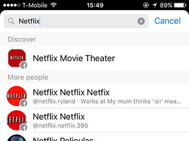
    Bad Example: Messenger
    Messenger simply says "Search" in the search box. This leads me to believe that anything goes

    Messenger simply says “Search” in the search box. This leads me to believe that anything goes

    But when I try to find a recent conversation I had about Netflix, I discover that the only thing I can search for are entities with which to start conversations

    But when I try to find a recent conversation I had about Netflix, I discover that the only thing I can search for are entities with which to start conversations

    Good Example: Robinhood
    Robinhood does a great job at letting you know what to search and expect results for – companies or financial products.

    Robinhood does a great job at letting you know what to search and expect results for – companies or financial products.

    Normally, you might need to look up a ticker symbol to find a company’s stock. But Robinhood does a great job at being approachable to novices here, despite its slightly daunting stock-trading theme.

    Normally, you might need to look up a ticker symbol to find a company’s stock. But Robinhood does a great job at being approachable to novices here, despite its slightly daunting stock-trading theme.

  4. Offer Suggestions: One of the worst mistakes you can make is showing an empty screen underneath the search bar when the user taps it. There’s a limited amount of real estate on a mobile screen, so don’t waste it with empty space.

    This is your chance to guide the user through your conversation. Use this space to offer the user some suggestions or curated content such as “Popular Searches”, “Favorites”, “Closest”, or “Top Rated”.

    Bad Example: Skillshare
    Skillshare's search functionality leaves much to be desired because it offers no suggestions on how to search. It, quite literally, leaves the user in the dark.

    Skillshare’s search functionality leaves much to be desired because it offers no suggestions on how to search. It, quite literally, leaves the user in the dark.

    Good Example: Pinterest
    Pinterest helps their users stay in "the know" by showing a list of popular searches.

    Pinterest helps their users stay in “the know” by showing a list of popular searches.

    The advantage of this pattern is that the user might not even need to perform the search query, but can instead choose from a selection of predefined content that you can guarantee will return relevant results.

  5. Auto-Complete: One of the more popular, and useful, design patterns is auto-complete or “Search within Search”. As the user types, the app suggests several other related queries that the user can select easily. It has one of the best benefits for mobile users: reduced typing time. It also allows you, as the creator of the app, to gently nudge the user in the direction you think would be best for them.

    Good Example: Cookpad
    Cookpad looks at the user's query and semi-dynamically provides more intricate and concrete searches for the user to tap on.

    Cookpad looks at the user’s query and semi-dynamically provides more intricate and concrete searches for the user to tap.

    Good Example: Lyft
    A location-services app would be almost useless if it didn't provide as-you-type suggestions like Lyft.

    A location-services app like Lyft would be almost useless if it didn’t provide as-you-type suggestions.

    Bad Example: iTrans NYC
    iTrans NYC requires the user to enter an almost complete address before figuring out what they want.

    iTrans NYC requires the user to enter a nearly-complete address before figuring out what they want.

  6. Search Within: A special kind of search that allows users to search within a category they’ve navigated into. Even though not many apps or businesses support this model, most users expect it. This type of search also helps prevent errors, because you’re guiding the user to search for something that will definitely yield results.

    Good Example: Spring
    As the users type, Spring lets them see what categories their query is available in and the number of results.

    As the users type, Spring lets them see what categories their query is available in and the number of results.

  7. Save Search History: Users appreciate when an app has an idea of what they were doing in a previous session – especially related to browsing. Imagine how frustrated you would be if a call or a notification interrupted you from finding that perfect butter knife, and you had to start all over again.

    Including such a section in your search flow increases the user’s trust in your product and encourages their willingness to explore. This can manifest itself in one of two ways: the app storing the user’s search automatically as they go, or the app allowing the user to proactively save the search.

    So-So Example: Evernote
    Evernote provides both options to remember the user's actions. It saves their recent history and let's them store searches for the future. While a user can appreciate the functionality to save their search, the interaction becomes more annoying than useful because of so many steps involved.

    Evernote provides both options to remember the user’s actions. It saves their recent history and lets them store searches for the future. While a user can appreciate the functionality to save their search, the interaction becomes more annoying than useful because of the number of steps involved.

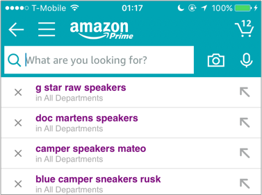
    So-So Example: Amazon
    Even though Amazon saves the user's searches, it's a little cumbersome to remove searches one by one.

    Even though Amazon saves the user’s searches, it’s a little cumbersome to remove searches one by one.

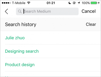
    Good Example: Medium
    Medium neatly stores the user's searches and provides a simple way to clear their history and decrease clutter.

    Medium neatly stores the user’s searches and provides a simple way to clear their history and decrease clutter.

  8. Offer Scoped Search: If your app has a whole lot of content that can be further broken into a number of categories, you might want to consider a scoped search, which helps users understand the “space” that they’re in — as long as the scope is shown prominently enough and can easily be changed.

    Good Example: ProductHunt
    As the user types, ProductHunt provides four clear, overarching content categories in which they can search.

    As the user types, ProductHunt provides four clear, overarching content categories in which they can search.

  9. Constrain Search: If your app is very specific about what type of content it offers, the best way to help the user find what they want is to constrain their search to a couple of different parameters. That way the app is as clear as possible about what it needs from the user, and the user can be as specific as they want to be in the boundaries of those constraints.

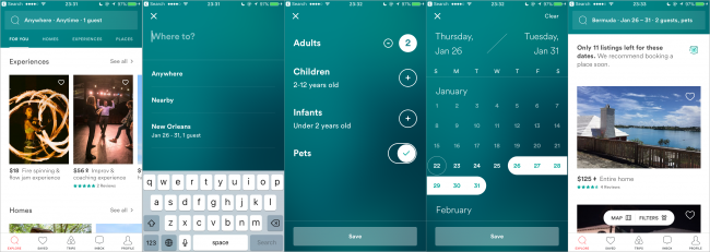
    Good Example: Airbnb
    Airbnb does a great  job at constrained search by letting users know what's important from the first screen - Location, Date and Number of Guests. These strong affordances leave no room for confusion.

    Airbnb does a great job at constrained search by letting users know what’s important from the first screen: Location, Date and Number of Guests. These strong affordances leave no room for confusion.

Note: As you’ve seen in some of these examples, the methods above don’t have to be used exclusively of each other, but can most definitely be used in parallel — it all depends on the type of products you have.

Showing No Results

After all this hard work both the user and the app have done, it’s time to reap the results!

Or not…

Netflix

Whenever you’re designing a new feature in your app, follow the usability principle of “Help users recognize, diagnose, and recover from errors”. Basically, think of the worst-case scenario first, and take steps to allow the user to recover.

The great thing about the no-results page, is that it offers a great opportunity for you to reconnect with your users and gain their trust through several mechanisms.

Best practices #9-13 have to do with how you can make the most out of no results at all.

  1. Communicate the Problem. Be transparent that something went wrong, and if possible let the user know what the issue is.

    Good Example: Etsy

    etsyNoResults

  2. Correct and Fix Misspellings. This is one of the main causes of no results screens, so it’s a good idea to try to detect and fix misspellings.

    Good Example: Google

    googleSearch

  3. Make Search Less Specific. Another of the main causes of no results screens is that the user is overly specific. To resolve this, try removing part(s) of the search query to make it into something you can match. If the user was searching in a category, you can allow them to view the entire category.
  4. Good Example: Amazon

    amazonSearchResults

  5. Fallback content. If there are still no results, you can provide curated content or popular searches as a fallback.
  6. Give Option to Login If Necessary. If they searched in a category that requires login, give them the option to login or signup.
  7. Good Example: Rent the Runway
    Rent the Runway let's anonymous users use the My Hearts category and helps them recover by letting them Sign Up or switch the category to Shop All.

    Rent the Runway lets anonymous users use the My Hearts category and helps them recover by letting them Sign Up or switch the category to Shop All.

Showing Results

If the user went down the happy path, they’ll have the results they were looking for. But beware, you can’t just dump all the results on the page and let the user figure it out.

Best practices #14-20 help your users have a sense of orientation and space with your search results.

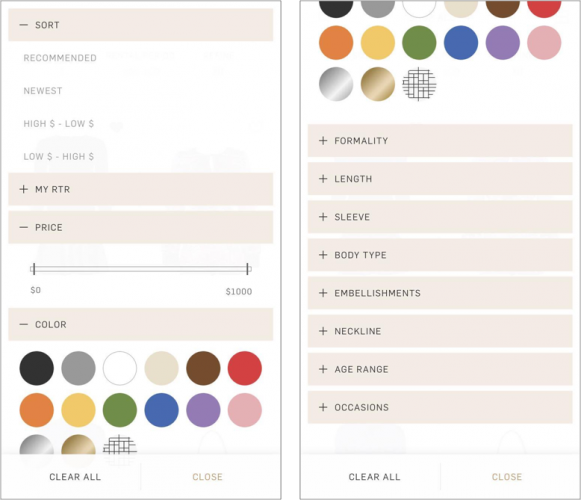
  1. Consider Your Default Sort: When you display your search results, give them a default logical order that can be easily seen and recognized. This can be either alphabetical, by price, by date or by distance. Sort the results in a way that will be most relevant to your customer and your product.

    Bad Example: Google
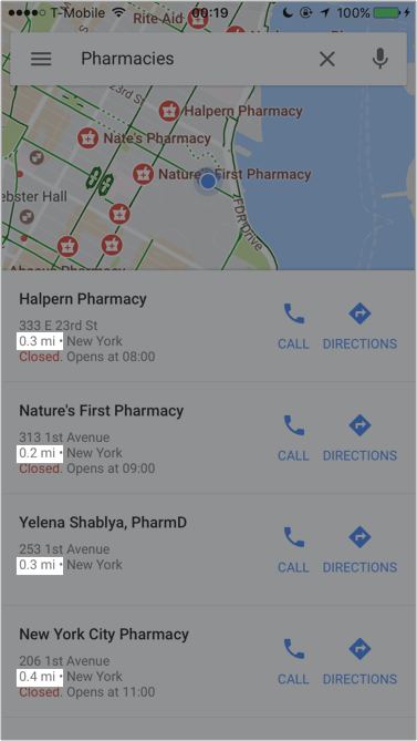
    Even though Google is generally awesome as far as searching goes, their default sort on Maps is a little confusing. Users expect the results to be sorted by distance, but the results say otherwise.

    Even though Google is generally awesome as far as searching goes, their default sort on Maps is a little confusing. Users expect the results to be sorted by distance, but the results say otherwise.

  2. Categorize Your Results: If your app requires search, that almost always means you have content that fits in with a certain category; in the case of apparel, that would be clothes, accessories, and shoes. You can do this by simply adding headers to your search results.

    Bad Example: Netflix

    NETFLIXW

    Good Example: Spotify

    SPOTIFY

  3. Offer Helpful View Options: Search results can be displayed in different modes: on a map, as a list, as a carousel or as thumbnails. Display them in the manner most appropriate for your context. Just because the results can be displayed in many different ways doesn’t mean they should be, especially when it requires multiple steps to change views.

    Bad Example: HomeDepot
    HomeDepot has three viewing options, but there's not much value added from one option to the other. It also requires two taps from the user to change, so the options are both redundant and cumbersome.

    HomeDepot has three viewing options, but there’s not much value added from one option to the other. It also requires two taps from the user to change, so the options are both redundant and cumbersome.

    Good Example: Airbnb
    AirBnB on the other hand let’s the user switch between a scannable map view option and a fast booking view. Both options provide different, relevant value and information to the user.

    Airbnb on the other hand lets the user switch between a scannable map view option and a fast booking view. Both options provide different, relevant value and information to the user.

  4. Prefer Infinite Scrolling to Pagination: Not many apps use paginated results screens. Nevertheless, it’s worth mentioning that you should favor the infinite scroll and lazy load pattern over a paginated results page. A Show More button also performs better than pagination.
  5. Show Search Progress: If the results don’t immediately pop up, the user might think something is wrong. Don’t just let them sit there! Instead show them a progress bar or HUD to tell them you’re still working on it.
  6. Show Number of Results: If you decide to categorize the search results, it’s a good idea to show how many products are in each category before the user commits to any one of them.

    Good Example: Booking.com
    As you type Booking.com groups results into logical categories and displays the number of results for each one.

    As you type, Booking.com groups results into logical categories and displays the number of results for each one.

  7. Highlight Keywords: Sometimes it’s hard to glance at results and understand how they pertain to the search query. You can help the user out by highlighting the search keywords.

    Good Example: Reminders

    reminders

Where to Go From Here?

Take a good, hard look at your app and see if some of the examples above could help your users have a better search experience. Are there any undesirable elements that some of the apps above share with your app? How could you change this?

App search is only one part of content discovery. Another huge part is filtering, and that’s what I’ll be covering in my next article.

In the meantime, if you have any questions, comments or app experiences to share, please do so below!

The post 20 Best Practices for Mobile App Search appeared first on Ray Wenderlich.

How To Make An App Like Pokemon Go

$
0
0

One of the most popular games on mobile today is Pokemon Go. It uses augmented reality to bring the game into the “real world” and gets the player doing something good for her health.

In this tutorial on how to make an app like Pokemon Go, you will create your own augmented reality monster-hunting game. The game has a map to show both your location and your enemies’ locations, a 3D SceneKit view to show a live preview of the back camera, and 3D models of enemies.

If you’re new to working with augmented reality, take the time to read through our introductory location-based augmented reality tutorial before you start. It’s not a full pre-requisite to this tutorial to show you how to make an app like Pokemon Go, but it contains lots of valuable information about math and augmented reality that won’t be covered here.

Getting Started

Download the starter project for this tutorial on how to make an app like Pokemon Go. The project contains two view controllers along with the folder art.scnassets, which contains all the 3D models and textures you’ll need.

ViewController.swift contains a UIViewController subclass you’ll use to show the AR part of the app. MapViewController will be used to show a map with your current location and some enemies around you. Basic things like constraints and outlets are already done for you, so you can concentrate on the important parts of this tutorial on how to make an app like Pokemon Go.

Adding Enemies To The Map

Before you can go out and fight enemies, you’ll need to know where they are. Create a new Swift file and name it ARItem.swift.

How to Make an app like Pokemon Go

Add the following code after the import Foundation line in ARItem.swift:

import CoreLocation
 
struct ARItem {
  let itemDescription: String
  let location: CLLocation
}

An ARItem has a description and a location so you know the kind of enemy — and where it’s lying in wait for you.

Open MapViewController.swift and add an import for CoreLocation along with a property to store your targets:

var targets = [ARItem]()

Now add the following method:

func setupLocations() {
  let firstTarget = ARItem(itemDescription: "wolf", location: CLLocation(latitude: 0, longitude: 0))
  targets.append(firstTarget)
 
  let secondTarget = ARItem(itemDescription: "wolf", location: CLLocation(latitude: 0, longitude: 0))
  targets.append(secondTarget)
 
  let thirdTarget = ARItem(itemDescription: "dragon", location: CLLocation(latitude: 0, longitude: 0))
  targets.append(thirdTarget)
}

Here you create three enemies with hard-coded locations and descriptions. You’ll have to replace the (0, 0) coordinates with something closer to your physical location.

There are many ways to find some locations. For example, you could create some random locations around your current position, use the PlacesLoader from our original Augmented Reality tutorial, or even use Xcode to fake your current position. However, you don’t want your random locations to be in your neighbor’s living room. Awkward.

To make things simple, you can use Google Maps. Open https://www.google.com/maps/ and search your current location. If you click on the map, a marker appears along with a small popup at the bottom.

Inside this popup you’ll see values for both latitude and longitude. I suggest that you create some hard-coded locations near you or on your the street, so you don’t have to call your neighbor telling him that you want to fight a dragon in his bedroom.

Choose three locations and replace the zeros from the code above with the values you found.

How to Make an app like Pokemon Go

Pin Enemies On The Map

Now that you have locations for your enemies, it’s time to show them on a MapView. Add a new Swift file and save it as MapAnnotation.swift. Inside the file add the following code:

import MapKit
 
class MapAnnotation: NSObject, MKAnnotation {
  //1
  let coordinate: CLLocationCoordinate2D
  let title: String?
  //2
  let item: ARItem
  //3
  init(location: CLLocationCoordinate2D, item: ARItem) {
    self.coordinate = location
    self.item = item
    self.title = item.itemDescription
 
    super.init()
  }
}

This creates a class MapAnnotation that implements the MKAnnotation protocol. In more detail:

  1. The protocol requires a variable coordinate and an optional title.
  2. Here you store the ARItem that belongs to the annotation.
  3. With the init method you can populate all variables.

Now head back to MapViewController.swift. Add the following to the bottom of setupLocations():

for item in targets {
  let annotation = MapAnnotation(location: item.location.coordinate, item: item)
  self.mapView.addAnnotation(annotation)
}

In this loop you iterate through all items inside the targets array and add an annotation for each target.

Now, at the end of viewDidLoad(), call setupLocations():

override func viewDidLoad() {
  super.viewDidLoad()
 
  mapView.userTrackingMode = MKUserTrackingMode.followWithHeading
  setupLocations()
}

Before you can use the location, you’ll have to ask for permission. Add the following new property to MapViewController:

let locationManager = CLLocationManager()

At the end of viewDidLoad(), add the code to ask for permissions if needed:

if CLLocationManager.authorizationStatus() == .notDetermined {
  locationManager.requestWhenInUseAuthorization()
}

Note: If you forget to add this permission request, the map view will fail to locate the user. Unfortunately there is no error message to tell your this. Therefore every time you work with location services and you can’t get the location, this will be a good starting point for searching for the source of the error.

Build and run your project; after a short time the map will zoom to your current position and show some red markers at your enemies’ locations.

How to Make an app like Pokemon Go

Adding Augmented Reality

Right now you have a nice app, but you still need to add the augmented reality bits. In the next few sections, you’ll add a live preview of the camera and add a simple cube as a placeholder for an enemy.

First you need to track the user location. Add the following property to MapViewController:

var userLocation: CLLocation?

Then add the following extension at the bottom:

extension MapViewController: MKMapViewDelegate {
  func mapView(_ mapView: MKMapView, didUpdate userLocation: MKUserLocation) {
    self.userLocation = userLocation.location
  }
}

You call this method each time MapView updates the location of the device; you simply store the location to use in another method.

Add the following delegate method to the extension:

func mapView(_ mapView: MKMapView, didSelect view: MKAnnotationView) {
  //1
  let coordinate = view.annotation!.coordinate
  //2
  if let userCoordinate = userLocation {
    //3
    if userCoordinate.distance(from: CLLocation(latitude: coordinate.latitude, longitude: coordinate.longitude)) < 50 {
      //4
      let storyboard = UIStoryboard(name: "Main", bundle: nil)
 
      if let viewController = storyboard.instantiateViewController(withIdentifier: "ARViewController") as? ViewController {
        // more code later
        //5
        if let mapAnnotation = view.annotation as? MapAnnotation {
          //6
          self.present(viewController, animated: true, completion: nil)
        }
      }
    }
  }
}

If a user taps an enemy that’s less than 50 meters away you’ll show the camera preview as follows:

  1. Here you get the coordinate of the selected annotation.
  2. Make sure the optional userLocation is populated.
  3. Make sure the tapped item is within range of the users location.
  4. Instantiate an instance of ARViewController from the storyboard.
  5. This line checks if the tapped annotation is a MapAnnotation.
  6. Finally, you present viewController.

Build and run the project and tap an annotation near your current location. You’ll see a white view appear:

How to Make an app like Pokemon Go

Adding the Camera Preview

Open ViewController.swift, and import AVFoundation after the import of SceneKit

import UIKit
import SceneKit
import AVFoundation
 
class ViewController: UIViewController {
...

and add the following properties to store an AVCaptureSession and an AVCaptureVideoPreviewLayer:

var cameraSession: AVCaptureSession?
var cameraLayer: AVCaptureVideoPreviewLayer?

You use a capture session to connect a video input, such as the camera, and an output, such as the preview layer.

Now add the following method:

func createCaptureSession() -> (session: AVCaptureSession?, error: NSError?) {
  //1
  var error: NSError?
  var captureSession: AVCaptureSession?
 
  //2
  let backVideoDevice = AVCaptureDevice.defaultDevice(withDeviceType: .builtInWideAngleCamera, mediaType: AVMediaTypeVideo, position: .back)
 
  //3
  if backVideoDevice != nil {
    var videoInput: AVCaptureDeviceInput!
    do {
      videoInput = try AVCaptureDeviceInput(device: backVideoDevice)
    } catch let error1 as NSError {
      error = error1
      videoInput = nil
    }
 
    //4
    if error == nil {
      captureSession = AVCaptureSession()
 
      //5
      if captureSession!.canAddInput(videoInput) {
        captureSession!.addInput(videoInput)
      } else {
        error = NSError(domain: "", code: 0, userInfo: ["description": "Error adding video input."])
      }
    } else {
      error = NSError(domain: "", code: 1, userInfo: ["description": "Error creating capture device input."])
    }
  } else {
    error = NSError(domain: "", code: 2, userInfo: ["description": "Back video device not found."])
  }
 
  //6
  return (session: captureSession, error: error)
}

Here’s what the method above does:

  1. Create some variables for the return value of the method.
  2. Get the rear camera of the device.
  3. If the camera exists, get it’s input.
  4. Create an instance of AVCaptureSession.
  5. Add the video device as an input.
  6. Return a tuple that contains either the captureSession or an error.

Now that you have the input from the camera, you can load it into your view:

func loadCamera() {
  //1
  let captureSessionResult = createCaptureSession()
 
  //2
  guard captureSessionResult.error == nil, let session = captureSessionResult.session else {
    print("Error creating capture session.")
    return
  }
 
  //3
  self.cameraSession = session
 
  //4
  if let cameraLayer = AVCaptureVideoPreviewLayer(session: self.cameraSession) {
    cameraLayer.videoGravity = AVLayerVideoGravityResizeAspectFill
    cameraLayer.frame = self.view.bounds
    //5
    self.view.layer.insertSublayer(cameraLayer, at: 0)
    self.cameraLayer = cameraLayer
  }
}

Taking the above method step-by-step:

  1. First, you call the method you created above to get a capture session.
  2. If there was an error, or captureSession is nil, you return. Bye-bye augmented reality.
  3. If everything was fine, you store the capture session in cameraSession.
  4. This line tries to create a video preview layer; if successful, it sets videoGravity and sets the frame of the layer to the views bounds. This gives you a fullscreen preview.
  5. Finally, you add the layer as a sublayer and store it in cameraLayer.

Now add the following to viewDidLoad():

  loadCamera()
  self.cameraSession?.startRunning()

Really just two things going on here: first you call all the glorious code you just wrote, then start grabbing frames from the camera. The frames are displayed automatically on the preview layer.

Build and run your project, then tap a location near you and enjoy the new camera preview:

How to Make an app like Pokemon Go

Adding a Cube

A preview is nice, but it’s not really augmented reality — yet. In this section, you’ll add a simple cube for an enemy and move it depending on the user’s location and heading.

This small game has two kind of enemies: wolves and dragons. Therefore, you need to know what kind of enemy you’re facing and where to display it.

Add the following property to ViewController (this will help you store information about the enemies in a bit):

var target: ARItem!

Now open MapViewController.swift, find mapView(_:, didSelect:) and change the last if statement to look like the following:

if let mapAnnotation = view.annotation as? MapAnnotation {
  //1
  viewController.target = mapAnnotation.item
 
  self.present(viewController, animated: true, completion: nil)
}
  • Before you present viewController you store a reference to the ARItem of the tapped annotation. So viewController knows what kind of enemy you’re facing.

Now ViewController has everything it needs to know about the target.

Open ARItem.swift and import SceneKit.

import Foundation
import SceneKit
 
struct ARItem {
...
}

Next, add the following property to store a SCNNode for an item:

var itemNode: SCNNode?

Be sure to define this property after the ARItem structure’s existing properties, since you will be relying on the implicit initializer to define arguments in the same order.

Now Xcode displays an error in MapViewController.swift. To fix that, open the file and scroll to setupLocations().

Change the lines Xcode marked with a red dot on the left of the editor pane.

How to Make an app like Pokemon Go
In each line, you’ll add the missing itemNode argument as a nil value.

As an example, change the line below:

let firstTarget = ARItem(itemDescription: "wolf", location: CLLocation(latitude: 50.5184, longitude: 8.3902))

…to the following:

let firstTarget = ARItem(itemDescription: "wolf", location: CLLocation(latitude: 50.5184, longitude: 8.3902), itemNode: nil)

You know the type of enemy to display, and what it’s position is, but you don’t yet know the direction of the device.

Open ViewController.swift and import CoreLocation, your imports should look like this now.

import UIKit
import SceneKit
import AVFoundation
import CoreLocation

Next, add the following properties:

//1
var locationManager = CLLocationManager()
var heading: Double = 0
var userLocation = CLLocation()
//2
let scene = SCNScene()
let cameraNode = SCNNode()
let targetNode = SCNNode(geometry: SCNBox(width: 1, height: 1, length: 1, chamferRadius: 0))

Here’s the play-by-play:

  1. You use a CLLocationManager to receive the heading the device is looking. Heading is measured in degrees from either true north or the magnetic north pole.
  2. This creates an empty SCNScene and SCNNode. targetNode is a SCNNode containing a cube.

Add the following to the bottom of viewDidLoad():

//1
self.locationManager.delegate = self
//2
self.locationManager.startUpdatingHeading()
 
//3
sceneView.scene = scene
cameraNode.camera = SCNCamera()
cameraNode.position = SCNVector3(x: 0, y: 0, z: 10)
scene.rootNode.addChildNode(cameraNode)

This is fairly straightforward code:

  1. This sets ViewController as the delegate for the CLLocationManager.
  2. After this call, you’ll have the heading information. By default, the delegate is informed when the heading changes more than 1 degree.
  3. This is some setup code for the SCNView. It creates an empty scene and adds a camera.

To adopt the CLLocationManagerDelegate protocol, add the following extension to ViewController

extension ViewController: CLLocationManagerDelegate {
  func locationManager(_ manager: CLLocationManager, didUpdateHeading newHeading: CLHeading) {
    //1
    self.heading = fmod(newHeading.trueHeading, 360.0)
    repositionTarget()
  }
}

CLLocationManager calls this delegate method each time new heading information is available. fmod is the modulo function for double values, and assures that heading is in the range of 0 to 359.

Now add repostionTarget() to ViewController.swift, but inside the normal implementation and not inside the CLLocationManagerDelegate extension:

func repositionTarget() {
  //1
  let heading = getHeadingForDirectionFromCoordinate(from: userLocation, to: target.location)
 
  //2
  let delta = heading - self.heading
 
  if delta < -15.0 {
    leftIndicator.isHidden = false
    rightIndicator.isHidden = true
  } else if delta > 15 {
    leftIndicator.isHidden = true
    rightIndicator.isHidden = false
  } else {
    leftIndicator.isHidden = true
    rightIndicator.isHidden = true
  }
 
  //3
  let distance = userLocation.distance(from: target.location)
 
  //4
  if let node = target.itemNode {
 
    //5
    if node.parent == nil {
      node.position = SCNVector3(x: Float(delta), y: 0, z: Float(-distance))
      scene.rootNode.addChildNode(node)
    } else {
      //6
      node.removeAllActions()
      node.runAction(SCNAction.move(to: SCNVector3(x: Float(delta), y: 0, z: Float(-distance)), duration: 0.2))
    }
  }
}

Here’s what each commented section does:

  1. You will implement this method in the next step, but this basically calculates the heading from the current location to the target.
  2. Then you calculate a delta value of the device’s current heading and the location’s heading. If the delta is less than -15, display the left indicator label. If it is greater than 15, display the right indicator label. If it’s between -15 and 15, hide both as the the enemy should be onscreen.
  3. Here you get the distance from the device’s position to the enemy.
  4. If the item has a node assigned…
  5. and the node has no parent, you set the position using the distance and add the node to the scene.
  6. Otherwise, you remove all actions and create a new action.

If you are familiar with SceneKit or SpriteKit the last line should be no problem. If not, here is a more detailed explanation.

SCNAction.move(to:, duration:) creates an action that moves a node to the given position in the given duration. runAction(_:) is a method of SCNNode and executes an action. You can also create groups and/or sequences of actions. Our book 3D Apple Games by Tutorials is a good resource for learning more.

Now to implement the missing method. Add the following methods to ViewController.swift:

func radiansToDegrees(_ radians: Double) -> Double {
  return (radians) * (180.0 / M_PI)
}
 
func degreesToRadians(_ degrees: Double) -> Double {
  return (degrees) * (M_PI / 180.0)
}
 
func getHeadingForDirectionFromCoordinate(from: CLLocation, to: CLLocation) -> Double {
  //1
  let fLat = degreesToRadians(from.coordinate.latitude)
  let fLng = degreesToRadians(from.coordinate.longitude)
  let tLat = degreesToRadians(to.coordinate.latitude)
  let tLng = degreesToRadians(to.coordinate.longitude)
 
  //2
  let degree = radiansToDegrees(atan2(sin(tLng-fLng)*cos(tLat), cos(fLat)*sin(tLat)-sin(fLat)*cos(tLat)*cos(tLng-fLng)))
 
  //3
  if degree >= 0 {
    return degree
  } else {
    return degree + 360
  }
}

radiansToDegrees(_:) and degreesToRadians(_:) are simply two helper methods to convert values between radians and degrees.

Here’s what’s going on in getHeadingForDirectionFromCoordinate(from:to:):

  1. First, you convert all values for latitude and longitude to radians.
  2. With these values, you calculate the heading and convert it back to degrees.
  3. If the value is negative, normalize it by adding 360 degrees. This is no problem, since -90 degrees is the same as 270 degree.

There are two small steps left before you can see your work in action.

First, you’ll need to pass the user’s location along to viewController. Open MapViewController.swift and find the last if statement inside mapView(_:, didSelect:) and add the following line right before you present the view controller;

viewController.userLocation = mapView.userLocation.location!

Now add the following method to ViewController.swift:

func setupTarget() {
  targetNode.name = "enemy"
  self.target.itemNode = targetNode
}

Here you simply give targetNode a name and assign it to the target. Now you can call this method at the end of viewDidLoad(), just after you add the camera node:

scene.rootNode.addChildNode(cameraNode)
setupTarget()

Build and run your project; watch your not-exactly-menacing cube move around:

How to Make an app like Pokemon Go

Polishing

Using primitives like cubes and spheres is an easy way to build your app without spending too much time mucking around with 3D models — but 3D models look _soo_ much nicer. In this section, you’ll add some polish to the game by adding 3D models for enemies and the ability to throw fireballs.

Open the art.scnassets folder to see two .dae files. These files contain the models for the enemies: one for a wolf, and one for a dragon.

The next step is to change setupTarget() inside ViewController.swift to load one of these models and assign it to the target’s itemNode property.

Replace the contents of setupTarget() with the following:

func setupTarget() {
  //1
  let scene = SCNScene(named: "art.scnassets/\(target.itemDescription).dae")
  //2
  let enemy = scene?.rootNode.childNode(withName: target.itemDescription, recursively: true)
  //3
  if target.itemDescription == "dragon" {
    enemy?.position = SCNVector3(x: 0, y: -15, z: 0)
  } else {
    enemy?.position = SCNVector3(x: 0, y: 0, z: 0)
  }
 
  //4
  let node = SCNNode()
  node.addChildNode(enemy!)
  node.name = "enemy"
  self.target.itemNode = node
}

Here’s what’s going on above:

  1. First you load the model into a scene. The target’s itemDescription has the same name as the .dae file.
  2. Next you traverse the scene to find a node with the name of itemDescription. There’s only one node with this name, which also happens to be the root node of the model.
  3. Then you adjust the position so that both models appear at the same place. If you get your models from the same designer, you might not need this step. However, I used models from two different designers: the wolf is from I found the wolf from 3dwarehouse.sketchup.com and the dragon from https://clara.io.
  4. Finally, you add the model to an empty node assign it to the itemNode property of the current target. This is small trick to make the touch handling in the next section a little easier.

Build and run your project; you’ll see a 3D model of a wolf that looks far more menacing than your lowly cube!

In fact, the wolf looks scary enough you might be tempted to run away, but as a brave hero retreat is not an option! Next you’ll add some fireballs so you can fight him off before you become lunch for a wolf pack.

The touch ended event is a good time to throw a fireball, so add the following method to ViewController.swift:

override func touchesEnded(_ touches: Set<UITouch>, with event: UIEvent?) {
  //1
  let touch = touches.first!
  let location = touch.location(in: sceneView)
 
  //2
  let hitResult = sceneView.hitTest(location, options: nil)
  //3
  let fireBall = SCNParticleSystem(named: "Fireball.scnp", inDirectory: nil)
  //4
  let emitterNode = SCNNode()
  emitterNode.position = SCNVector3(x: 0, y: -5, z: 10)
  emitterNode.addParticleSystem(fireBall!)
  scene.rootNode.addChildNode(emitterNode)
 
  //5
  if hitResult.first != nil {
    //6
    target.itemNode?.runAction(SCNAction.sequence([SCNAction.wait(duration: 0.5), SCNAction.removeFromParentNode(), SCNAction.hide()]))
    let moveAction = SCNAction.move(to: target.itemNode!.position, duration: 0.5)
      emitterNode.runAction(moveAction)
  } else {
    //7
    emitterNode.runAction(SCNAction.move(to: SCNVector3(x: 0, y: 0, z: -30), duration: 0.5))
  }
}

Here’s how the fireball logic works:

  1. You convert the touch to a coordinate inside the scene.
  2. hitTest(_, options:) sends a ray trace to the given position and returns an array of SCNHitTestResult for every node that is on the line of the ray trace.
  3. This loads the particle system for the fireball from a SceneKit particle file.
  4. You then load the particle system to an empty node and place it at the bottom, outside the screen. This makes it look like the fireball is coming from the player’s position.
  5. If you detect a hit…
  6. …you wait for a short period then remove the itemNode containing the enemy. You also move the emitter node to the enemy’s position at the same time.
  7. If you didn’t score a hit, the fireball simply moves to a fixed position.

Build and run your project, and make that wolf go up in flames!

How to Make an app like Pokemon Go

Finishing Touches

To finish your game, you’ll need to remove the enemy from the list, close the augmented reality view and go back to the map to find the next enemy.

Removing the enemy from the list must be done in MapViewController, since the list of enemies lives there. To do this, you will add a delegate protocol with only one method called when a target is hit.

Add the following protocol inside ViewController.swift, just above the class declaration:

protocol ARControllerDelegate {
  func viewController(controller: ViewController, tappedTarget: ARItem)
}

Also add the following property to ViewController:

var delegate: ARControllerDelegate?

The method in the delegate protocol tells the delegate that there was a hit; the delegate can then decide what to do next.

Still in ViewController.swift, find touchesEnded(_:with:) and change the block of code for the condition of the if statement as follows:

if hitResult.first != nil {
  target.itemNode?.runAction(SCNAction.sequence([SCNAction.wait(duration: 0.5), SCNAction.removeFromParentNode(), SCNAction.hide()]))
  //1
  let sequence = SCNAction.sequence(
    [SCNAction.move(to: target.itemNode!.position, duration: 0.5),
     //2
     SCNAction.wait(duration: 3.5),
     //3
     SCNAction.run({_ in
        self.delegate?.viewController(controller: self, tappedTarget: self.target)
      })])
   emitterNode.runAction(sequence)
} else {
  ...
}

Here’s what your changes mean:

  1. You change the action of the emitter node to a sequence, the move action stays the same.
  2. After the emitter moves, pause for 3.5 seconds.
  3. Then inform the delegate that a target was hit.

Open MapViewController.swift and add the following property to store the selected annotation:

var selectedAnnotation: MKAnnotation?

You’ll use this in a moment to remove it from the MapView.

Now find mapView(_:, didSelect:) and make the following changes to the conditional binding and block (i.e., the if let) which instantiates the ViewController:

if let viewController = storyboard.instantiateViewController(withIdentifier: "ARViewController") as? ViewController {
  //1
  viewController.delegate = self
 
  if let mapAnnotation = view.annotation as? MapAnnotation {
    viewController.target = mapAnnotation.item
    viewController.userLocation = mapView.userLocation.location!
 
    //2
    selectedAnnotation = view.annotation
    self.present(viewController, animated: true, completion: nil)
  }
}

Quite briefly:

  1. This sets the delegate of ViewController to MapViewController.
  2. Then you save the selected annotation.

Below the MKMapViewDelegate extension add the following:

extension MapViewController: ARControllerDelegate {
  func viewController(controller: ViewController, tappedTarget: ARItem) {
    //1
    self.dismiss(animated: true, completion: nil)
    //2
    let index = self.targets.index(where: {$0.itemDescription == tappedTarget.itemDescription})
    self.targets.remove(at: index!)
 
    if selectedAnnotation != nil {
      //3
      mapView.removeAnnotation(selectedAnnotation!)
    }
  }
}

Taking each commented section in turn:

  1. First you dismiss the augmented reality view.
  2. Then you remove the target from the target list.
  3. Finally you remove the annotation from the map.

Build and run to see your finished app:

How to Make an app like Pokemon Go

Where to Go From Here?

Here is the final project, with all code from above.

If you want to learn more about the parts that make this app possible, have a look at the following tutorials:

I hope you enjoyed this tutorial on how to make an app like Pokemon Go. If you have any comments or questions, please join the forum discussion below!

The post How To Make An App Like Pokemon Go appeared first on Ray Wenderlich.

New Course: Beginning iOS 10 Part 2 – Checklists

$
0
0

We’re happy to announce our 14th new course since WWDC is now available: Beginning iOS 10 Part 2: Checklists!

This course is for complete beginners to iOS development, and picks up where Beginning iOS 10 Part 1: Getting Started leaves off.

In this course, you’ll create your second iOS app: a multi-screen app that introduces you to core iOS development concepts like table views, MVC, navigation controllers, and more.

By the time you’re done these two courses, you’ll know enough to create your own basic iOS apps, and continue with the other courses on this site! Let’s take a look at what’s inside.

Video 1: Introduction. In this video, you’ll get a quick overview of what you’ll learn in this series, and take a tour of the app you’ll create: a simple checklists app.

Video 2: Table Views. In this video, you’ll learn the basics of table views and how to incorporate them into your app.

Video 3: Delegates and Data Sources. This will video will cover the process of adding data sources and delegates to your table views.

Video 4: MVC. This video introduces you to the MVC design pattern and how to refactor your app to use MVC.

Video 5: Adding and Deleting Items. This video introduces you to the process of adding and removing items from your table view.

Video 6: Show Segues. This video covers the basics of setting up show segue between two view controllers and a navigation controller.

Video 7: Text Fields. This video covers how to use text fields and what it means to be apart of the responder chain.

Video 8: Passing Data. In this video, you’ll learn how to pass data between view controllers by means of a segue.

Video 9: Saving Data. This video will cover the process of saving your app’s data to disk using the NSCoding protocol.

Video 10: Conclusion. This video reviews everything that was covered and gives you suggestions on where you can continue to develop iOS content.

Where To Go From Here?

Want to check out the course? You can watch the introduction for free!

The rest of the course is for raywenderlich.com subscribers only. Here’s how you can get access:

  • If you are a raywenderlich.com subscriber: The entire course is complete and available today. You can check out the first part here.
  • If you are not a subscriber yet: What are you waiting for? Subscribe now to get access to our new Beginning iOS 10 Part 2 course, and our entire catalog of over 500 videos.

There’s much more in store for raywenderlich.com subscribers – if you’re curious, you can check out our full schedule of upcoming courses.

I hope you enjoy our new course, and stay tuned for many more new Swift 3 courses and updates to come!

The post New Course: Beginning iOS 10 Part 2 – Checklists appeared first on Ray Wenderlich.

Swift Generics Tutorial: Getting Started

$
0
0
Swift Generics fit for a Queen or King

Swift Generics create elegant code, fit for a king or queen.

Update Note: This tutorial has been updated to Swift 3 by Gemma Barlow. The original tutorial was written by Mikael Konutgan.

Generic programming is a way to write functions and data types while making minimal assumptions about the type of data being used. Swift generics create code that does not get specific about underlying data types, allowing for elegant abstractions that produce cleaner code with fewer bugs – code fit for a king or queen. I certainly like my code being described as regal, don’t you?

You’ll find generics in use throughout Swift, which makes understanding them essential to a complete mastery of the language. An example of a generic you will have already encountered in Swift is the Optional type. You can have an optional of any data type you want, even those types you create yourself, of course. The Optional data type is made generic over the type of value it can contain.

In this tutorial, you’ll experiment in a Swift playground to learn:

  • What exactly generics are
  • Why they are useful
  • How to write generic functions and data structures
  • How to use type constraints
  • How to extend generic types
Note: This tutorial requires Xcode 8 and Swift 3.

Getting Started

Begin by creating a new playground. In Xcode, go to File\New\Playground…, name the playground Generics and select macOS as the platform. Click Next to choose where you’d like to save your new playground and finally, click Create.

As one of the few programmers residing in a kingdom far-far-away, you’ve been summoned to the royal castle to help the Queen with a matter of great importance. She has lost track of how many royal subjects she has and needs some assistance with her calculations.

She requests a function to be written that adds two integers. Add the following to your newly-created playground:

func addInts(x: Int, y: Int) -> Int {
  return x + y
}

addInts(x:y:) takes two Int values and returns their sum. You can give it a try by adding the following code to the playground:

let intSum = addInts(x: 1, y: 2)

This is a simple example that demonstrates Swift’s type safety. You can call this function with two integers, but not any other type.

The Queen is pleased, and immediately requests another add function be written – this time, adding Double values. Create a second function addDoubles(x:y:):

func addDoubles(x: Double, y: Double) -> Double {
  return x + y
}
 
let doubleSum = addDoubles(x: 1.0, y: 2.0)

The function signatures of addInts and addDoubles are different, but the function bodies are identical. Not only do you have two functions, but the code inside them is repeated. Generics can be used to reduce these two functions to one and remove the redundant code.

First however, you’ll look at a few other common occurrences of generic programming in everyday Swift.

Other Examples of Swift Generics

You may not have realized, but some of the most common structures you use, such as arrays, dictionaries and optionals, are generic types!

Arrays

Add the following to your playground:

let numbers = [1, 2, 3]
 
let firstNumber = numbers[0]

Here, you create a simple array of three numbers and then take the first number out of that array.

Now option-click, first on numbers and then on firstNumber. What do you see?

Tooltip displayed when option-click is made on 'numbers'
Tooltip displayed when option-click is made on 'firstNumber'

Because Swift has type inference, you don’t have to explicitly define the types of your constants, but they both have an exact type. numbers is an [Int] — that is, an array of integers — and firstNumber is an Int.

The Swift Array type is a generic type. Generic types require a type parameter in order to be fully specified. When you create an instance, you specify a type parameter, which gives the instance a concrete type. Thanks to type inference and also thanks to Swift’s type safety, the array numbers can only contain Int values. When you remove anything from that array, Swift — and more importantly you — both know it must be an Int.

You can better see the generic nature of Array by adding a slightly longer version of the same code to the playground:

var numbersAgain: Array<Int> = []
numbersAgain.append(1)
numbersAgain.append(2)
numbersAgain.append(3)
 
let firstNumberAgain = numbersAgain[0]

Check the types of numbersAgain and firstNumberAgain by option-clicking on them; the types will be exactly the same as the previous values. Here you specify the type of numbersAgain using explicit generic syntax, by putting Int in angle brackets after Array.

Try appending something else to the array, like a String:

numbersAgain.append("All hail Lord Farquaad")

You’ll get an error—something like, Cannot convert value of type ‘String’ to expected argument type ‘Int’. The compiler is telling you that you can’t add a string to an array of integers. As a method on the generic type Array, append is a so-called generic method. It knows the type of the containing array’s elements, and won’t let you add something of an incorrect type.

Delete the line causing the error. Next you’ll look at another example of generics in the standard library.

Dictionaries

Dictionaries are also generic types and result in type-safe data structures.

Create the following dictionary of magical kingdoms at the end of your playground, and then look up the country code for Freedonia:

let countryCodes = ["Arendelle": "AR", "Genovia": "GN", "Freedonia": "FD"]
let countryCode = countryCodes["Freedonia"]

Check the types of both declarations. You’ll see that countryCodes is a dictionary of String keys and String values—nothing else can ever be in this dictionary. The formal generic type is Dictionary.

Optionals

In the example above, note the type of countryCode is String?, which is shorthand for

Optional<String>

Do the < and > here – look familiar? Generics are all over the place!

Here the compiler enforces that you can only access the dictionary with string keys and you always get string values returned. An optional type is used to represent countryCode, because there might not be a value corresponding to the passed-in key. If we try to look up “The Emerald City”, for example, the value of countryCode would be nil, as it doesn’t exist in your dictionary of magical kingdoms.

Note: For a more detailed introduction to Optionals, check out the Beginning Swift 3 – Optionals video on this site.

Add the following to your playground to see the full explicit syntax for creating an optional string:

let optionalName = Optional<String>.some("Princess Moana")
if let name = optionalName {}

Check the type of name, which you’ll see is String.

Optional binding, that is, the if-let construct, is a generic transformation of sorts. It takes a generic value of type T? and gives you a generic value of type T. That means you can use if let with any concrete type.

It’s T time!

Now that you grasp of the basics of generics, you can learn about writing your own generic data structures and functions.

Writing a Generic Data Structure

A queue is a data structure kind of like a list or a stack, but one to which you can only add new values to the end (enqueue them) and only take values from the front (dequeue them). This concept might be familiar if you’ve ever used OperationQueue – perhaps whilst making networking requests.

The Queen, happy with your efforts earlier in the tutorial, would now like you to write functionality to help keep track of royal subjects waiting in line to speak with her.

Add the following struct declaration to the end of your playground:

struct Queue<Element> {
}

Queue is a generic type with a type argument, Element, in its generic argument clause. Another way to say this is, Queue is generic over type Element. For example, Queue<Int> and Queue<String> will become concrete types of their own at runtime, that can only enqueue and dequeue strings and integers, respectively.

Add the following property to the queue:

fileprivate var elements: [Element] = []

You’ll use this array to hold the elements, which you initialize as an empty array. Note that you can use Element as if it’s a real type, even though it’ll be filled in later. You mark it as fileprivate because you don’t want consumers of Queue to access elements. You want to force them to use methods to access the backing store. Also, using fileprivate instead of private will allow you to add an extension to Queue later.

Finally, implement the two main queue methods:

mutating func enqueue(newElement: Element) {
  elements.append(newElement)
}
 
mutating func dequeue() -> Element? {
  guard !elements.isEmpty else { return nil }
  return elements.remove(at: 0)
}

Again, the type parameter Element is available everywhere in the struct body, including inside methods. Making a type generic is like making every one of its methods implicitly generic over the same type. You’ve implemented a type-safe generic data structure, just like the ones in the standard library.

Play around with your new data structure for a bit at the bottom of the playground, enqueuing waiting subjects by adding their royal id to the queue:

var q = Queue<Int>()
 
q.enqueue(newElement: 4)
q.enqueue(newElement: 2)
 
q.dequeue()
q.dequeue()
q.dequeue()
q.dequeue()

Have some fun by intentionally making as many mistakes as you can to trigger the different error messages related to generics — for example, add a string to your queue. The more you know about these errors now, the easier it will be to recognize and deal with them in more complex projects.

Writing a Generic Function

The Queen has a lot of data to process, and the next piece of code she asks you to write will take a dictionary of keys and values, and convert it to a list.

Add the following function to the bottom of the playground:

func pairs<Key, Value>(from dictionary: [Key: Value]) -> [(Key, Value)] {
  return Array(dictionary)
}

Take a good look at the function declaration, parameter list and return type.

The function is generic over two types that you’ve named Key and Value. The only parameter is a dictionary with a key-value pair of type Key and Value. The return value is an array of tuples of the form—you guessed it — (Key, Value).

You can use pairs(from:) on any valid dictionary and it will work, thanks to generics:

let somePairs = pairs(from: ["minimum": 199, "maximum": 299])
// result is [("maximum", 299), ("minimum", 199)]
 
let morePairs = pairs(from: [1: "Swift", 2: "Generics", 3: "Rule"])
// result is [(2, "Generics"), (3, "Rule"), (1, "Swift")]

Of course, since you can’t control the order in which the dictionary items go into the array, you may see an order of tuple values in your playground more like “Generics”, “Rule”, “Swift”, and indeed, they kind of do! :]

At runtime, each possible Key and Value will act as a separate function, filling in the concrete types in the function declaration and body. The first call to pairs(from:) returns an array of (String, Int) tuples. The second call uses a flipped order of types in the tuple and returns an array of (Int, String) tuples.

You created a single function that can return different types with different calls. That is pretty rad. You can see how keeping your logic in one place can simplify your code. Instead of needing two different functions, you handled both calls with one function.

Now that you know the basics of creating and working with generic types and functions, it’s time to move on to some more advanced features. You’ve already seen how useful generics are to limit things by type, but you can add additional constraints as well as extend your generic types to make them even more useful.

Constraining a Generic Type

Wishing to analyze the ages of a small set of her most loyal subjects, the Queen requests a function to sort an array and find the middle value. Add the following function to your playground:

func mid<T>(array: [T]) -> T? {
  guard !array.isEmpty else { return nil }
  return array.sorted()[(array.count - 1) / 2]
}

You’ll get an error. The problem is that for sorted() to work, the elements of the array need to be Comparable. You need to somehow tell Swift that mid can take any array as long as the element type implements Comparable.

Change the function declaration to the following:

func mid<T: Comparable>(array: [T]) -> T? {
  guard !array.isEmpty else { return nil }
  return array.sorted()[(array.count - 1) / 2]
}

Here, you use the : syntax to add a type constraint to the generic type parameter T. You can now only call the function with an array of Comparable elements, so that sorted() will always work! Try out the constrained function by adding:

mid(array: [3, 5, 1, 2, 4]) // 3

Now that you know about type constraints, you can create a generic version of the add functions from the beginning of the playground – this will be much more elegant, and please the Queen greatly. Add the following protocol and extensions to your playground:

protocol Summable { static func +(lhs: Self, rhs: Self) -> Self }
extension Int: Summable {}
extension Double: Summable {}

First, you create a Summable protocol that says any type that conforms must have the addition operator + available. Then, you specify that the Int and Double types conform to it.

Now using a generic parameter T and a type constraint, you can create a generic function add:

func add<T: Summable>(x: T, y: T) -> T {
  return x + y
}

You’ve reduced your two functions (actually more, since you would have needed more for other Summable types) down to one and removed the redundant code. You can use the new function on both integers and doubles:

let addIntSum = add(x: 1, y: 2) // 3
let addDoubleSum = add(x: 1.0, y: 2.0) // 3

And you can also use it on other types, such as strings:

extension String: Summable {}
let addString = add(x: "Generics", y: " are Awesome!!! :]")

By adding other conforming types to Summable, your add(x:y:) function becomes more widely useful thanks to its generics-powered definition! Her Royal Highness awards you the kingdom’s highest honor for your efforts.

Extending a Generic Type

A Court Jester has been assisting the Queen by keeping watch over the waiting royal subjects, and letting the Queen know which subject is next, prior to officially greeting them. He peeks through the window of her sitting room to do so. We can model his behavior using an extension, applied to our generic Queue type from earlier in the tutorial.

Extend the Queue type and add the following method right below the Queue definition:

extension Queue {
  func peek() -> Element? {
    return elements.first
  }
}

peek returns the first element without dequeuing it. Extending a generic type is easy! The generic type parameter is visible just as in the original definition’s body. You can use your extension to peek into a queue:

q.enqueue(newElement: 5)
q.enqueue(newElement: 3)
q.peek() // 5

You’ll see the value 5 as the first element in the queue, but nothing has been dequeued and the queue has the same number of elements as before.

Royal Challenge: Extend the Queue type to implement a function isHomogeneous that checks if all elements of the queue are equal. You’ll need to add a type constraint in the Queue declaration to ensure its elements can be checked for equality to each other.

Solution Inside: Homogeneous queue SelectShow>

Subclassing a Generic Type

Swift has the ability to subclass generic classes, which can be useful in some cases, such as to create a concrete subclass of a generic class.

Add the following generic class to the playground:

class Box<T> {
  // Just a plain old box.
}

Here you define a Box class. The box can contain anything, and that’s why it’s a generic class. There are two ways you could subclass Box:

  1. You might want to extend what the box does and how it works but keep it generic, so you can still put anything in the box;
  2. You might want to have a specialized subclass that always knows what’s in it.

Swift allows both. Add this to your playground:

class Gift<T>: Box<T> {
  // By default, a gift box is wrapped with plain white paper
  func wrap() {
    print("Wrap with plain white paper.")
  }
}
 
class Rose {
  // Flower of choice for fairytale dramas
}
 
class ValentinesBox: Gift<Rose> {
  // A rose for your valentine
}
 
class Shoe {
  // Just regular footwear
}
 
class GlassSlipper: Shoe {
  // A single shoe, destined for a princess
}
 
class ShoeBox: Box<Shoe> {
  // A box that can contain shoes
}

You define two Box subclasses here: Gift and ShoeBox. Gift is a special kind of box, separated so that we may have different methods and properties defined on it, such as wrap(). However, it still has a generic on the type, meaning it could contain anything. Shoe and GlassSlipper, a very special type of shoe, have been declared, and can be placed within an instance of ShoeBox for delivery (or presentation to an appropriate suitor).


Declare instances of each class under the subclass declarations:

let box = Box<Rose>() // A regular box that can contain a rose
let gift = Gift<Rose>() // A gift box that can contain a rose
let shoeBox = ShoeBox()

Notice that the ShoeBox initializer doesn’t need to take the generic type parameter anymore, since it’s fixed in the declaration of ShoeBox.

Next, declare a new instance of the subclass ValentinesBox – a box containing a rose, a magical gift specifically for Valentine’s Day.

let valentines = ValentinesBox()

While a standard box is wrapped with white paper, you’d like your holiday gift to be a little fancier. Add the following method to ValentinesBox:

override func wrap() {
  print("Wrap with ♥♥♥ paper.")
}

Finally, compare the results of wrapping both of these types by adding the following code to your playground:

gift.wrap() // plain white paper
valentines.wrap() // ♥♥♥ paper

ValentinesBox, though constructed using generics, operates as a standard subclass with methods that may inherited and overridden from a superclass. How elegant.

Enumerations With Associated Values

A common “functional” error-handling idiom is to use a so-called result enum. This is a generic enum with two associated values: one for the actual result value, and one for the possible error.

This will allow you to write elegant error handling for a division method requested by the Queen – her final ask of you.

Add the following declaration to the end of your playground:

enum Result<Value> {
  case success(Value), failure(Error)
}

The main use case for such an enum is as a return value for a function with specific error information using the standard library Error type, kind of like a more general optional. Add the following to the end of your playground:

 
enum MathError: Error {
  case divisionByZero
}
 
func divide(_ x: Int, by y: Int) -> Result<Int> {
  guard y != 0 else {
    return .failure(MathError.divisionByZero)
  }
  return .success(x / y)
}

Here, you declare an error enumeration type and a function that divides two integers. If the division is legal, you return the resulting value in the .success case; otherwise you return a MathError.

Add the function above to your playground, and then try it out by adding the following:

let result1 = divide(42, by: 2) // .success(21)
let result2 = divide(42, by: 0) // .failure(MathError.divisionByZero)

The first result is a success case with a value of 21, and the second result is the failure case with the enumeration case .divisionByZero. Even though the enumeration has two generic parameters associated with it, you can see how the cases are defined to use just one or the other.

Where to Go From Here?

Here’s the downloadable final playground with all the code you’ve written in this tutorial.

Swift generics are at the core of many common language features, such as arrays and optionals. You’ve seen how to use them to build elegant, reusable code that will result in fewer bugs – code fit for royalty.

For more information, read through the Generics chapter and the Generic Parameters and Arguments language reference chapter of Apple’s guide, The Swift Programming Language. You’ll find more detailed information about generics in Swift, as well as some handy examples.

If you’re feeling especially excited, you may also like to read up on likely changes for generics in Swift 4 – Planned Future Features.

A good next topic, to build upon what you’ve learned in this tutorial, is Protocol Oriented Programming – see Introducing Protocol Oriented Programming by Niv Yahel for more details.

Generics in Swift are an integral feature that you’ll use everyday to write powerful and type-safe abstractions. Improve your commonly-used code by remembering to ask “Can I genericize this?”

If you have any questions, I’d love to hear from you in the forum discussion below! :]

The post Swift Generics Tutorial: Getting Started appeared first on Ray Wenderlich.

Screencast: Server Side Swift with Perfect: Getting Started

Metal Tutorial with Swift 3 Part 3: Adding Texture

$
0
0

Update: This tutorial has been updated for Xcode 8.2 and Swift 3.

Welcome back to our Swift 3 Metal tutorial series!

In the first part of the series, you learned how to get started with Metal and render a simple 2D triangle.

In the second part of the series, you learned how to set up a series of transformations to move from a triangle to a full 3D cube.

In this third part of the series, you’ll learn how to add a texture to the cube. As you work through this tutorial, you’ll learn:

  • How to reuse uniform buffers
  • How to apply textures to a 3D model
  • How to add touch input to your app
  • How to debug Metal

Dust off your guitars — it’s time to rock Metal!

Getting Started

Learn how add texture to a 3D cube with Metal!

Learn how add texture to a 3D cube with Metal!

First, download the starter project. It’s very similar to the app at the end of part two, but with a few modifications as explained below.

Previously, ViewController was a heavy lifter. Even though you’d refactored it, it still had more than one responsibility. Now ViewController is split into two classes:

  • MetalViewController: The base class that contains the generic Metal setup code.
  • MySceneViewController: A subclass that contains code specific to this app for creating and rendering the cube model.

The most important part to note is the new protocol MetalViewControllerDelegate:

protocol MetalViewControllerDelegate : class{
  func updateLogic(timeSinceLastUpdate: CFTimeInterval)
  func renderObjects(drawable: CAMetalDrawable)
}

This establishes callbacks from MetalViewController so that your app knows when to update logic and when to render.

In MySceneViewController, you set yourself as a delegate and then implement MetalViewControllerDelegate methods. This is where all the cube rendering and updating action happens.

Now that you’re up to speed on the changes from part two, it’s time to move forward and delve deeper into the world of Metal.

Reusing Uniform Buffers (optional)

Note: This next section is theory-driven and gives you more context about how Metal works under the hood. If you’re eager to move into the exercises, feel free to skip ahead to the “Texturing” section. But reading this will make you at least 70 percent smarter. ;-]

In the previous part of this series, you learned about allocating new uniform buffers for every new frame — and you also learned that it’s not very efficient.

So, the time has come to change your ways and make Metal sing, like an epic hair-band guitar solo. But every great solution starts with identifying the actual problem.

The Problem

In the render method in Node.swift, find:

let uniformBuffer = device.makeBuffer(length: MemoryLayout<Float>.size * Matrix4.numberOfElements() * 2, options: [])

Take a good look at this monster! This method is called 60 times per second, and you create a new buffer each time it’s called.

Since this is a performance issue, you’ll want to compare stats before and after optimization.

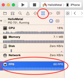
Build and run the app, open the Debug Navigator tab and select the FPS row.

Screen Shot 2015-01-08 at 4.35.43 PM

You should have numbers similar to these:

before

You’ll return to those numbers after optimization, so you may want to grab a screencap or simply jot down the stats before you move on.

The Solution

The solution is that instead of allocating a buffer each time, you’ll reuse a pool of buffers.

To keep your code clean, you’ll encapsulate all of the logic to create and reuse buffers into a helper class named BufferProvider.

You can visualize the class as follows:

bufferProvider_Diagram

BufferProvider will be responsible for creating a pool of buffers, and it will have a method to get the next available reusable buffer. This is kind of like UITableViewCell!

Now it’s time to dig in and make some magic happen. Create a new Swift class named BufferProvider, and make it a subclass of NSObject.

First import Metal at the top of the file:

import Metal

Now, add these properties to the class:

// 1
let inflightBuffersCount: Int
// 2
private var uniformsBuffers: [MTLBuffer]
// 3
private var avaliableBufferIndex: Int = 0

You’ll get some errors at the moment due to a missing initializer, but you’ll fix those shortly. For now, review each property you just added:

  1. An Int that will store the number of buffers stored by BufferProvider. In the diagram above, this equals 3.
  2. An array that will store the buffers themselves.
  3. The index of the next available buffer. In your case, it will change like this: 0 -> 1 -> 2 -> 0 -> 1 -> 2 -> 0 -> …

Now add the following initializer:

init(device:MTLDevice, inflightBuffersCount: Int, sizeOfUniformsBuffer: Int) {
 
  self.inflightBuffersCount = inflightBuffersCount
  uniformsBuffers = [MTLBuffer]()
 
  for _ in 0...inflightBuffersCount-1 {
    let uniformsBuffer = device.makeBuffer(length: sizeOfUniformsBuffer, options: [])
    uniformsBuffers.append(uniformsBuffer)
  }
}

Here you create a number of buffers, equal to the inflightBuffersCount parameter passed in to this initializer, and append them to the array.

Now add a method to fetch the next available buffer and copy some data into it:

func nextUniformsBuffer(projectionMatrix: Matrix4, modelViewMatrix: Matrix4) -> MTLBuffer {
 
  // 1
  let buffer = uniformsBuffers[avaliableBufferIndex]
 
  // 2
  let bufferPointer = buffer.contents()
 
  // 3
  memcpy(bufferPointer, modelViewMatrix.raw(), MemoryLayout<Float>.size * Matrix4.numberOfElements())
  memcpy(bufferPointer + MemoryLayout<Float>.size*Matrix4.numberOfElements(), projectionMatrix.raw(), MemoryLayout<Float>.size*Matrix4.numberOfElements())
 
  // 4
  avaliableBufferIndex += 1
  if avaliableBufferIndex == inflightBuffersCount{
    avaliableBufferIndex = 0
  }
 
  return buffer
}

Reviewing each section in turn:

  1. Fetch MTLBuffer from the uniformsBuffers array at avaliableBufferIndex index.
  2. Get void * pointer from MTLBuffer.
  3. Copy the passed-in matrices data into the buffer using memcpy.
  4. Increment avaliableBufferIndex.

You’re almost done: you just need to set up the rest of the code to use this.

To do this, open Node.swift, and add this new property:

var bufferProvider: BufferProvider

Find init and add this at the end of the method:

self.bufferProvider = BufferProvider(device: device, inflightBuffersCount: 3, sizeOfUniformsBuffer: MemoryLayout<Float>.size * Matrix4.numberOfElements() * 2)

Finally, inside render, replace this code:

let uniformBuffer = device.makeBuffer(length: MemoryLayout<Float>.size * Matrix4.numberOfElements() * 2, options: [])
let bufferPointer = uniformBuffer.contents()
memcpy(bufferPointer, nodeModelMatrix.raw(), MemoryLayout<Float>.size * Matrix4.numberOfElements())
memcpy(bufferPointer + MemoryLayout<Float>.size * Matrix4.numberOfElements(), projectionMatrix.raw(), MemoryLayout<Float>.size * Matrix4.numberOfElements())

With this far more elegant code:

let uniformBuffer = bufferProvider.nextUniformsBuffer(projectionMatrix: projectionMatrix, modelViewMatrix: nodeModelMatrix)

Build and run. Everything should work just as well as it did before you added bufferProvider:

IMG_3030

A Wild Race Condition Appears!

Things are running smoothly, but there is a problem that could cause you some major pain later.

Have a look at this graph (and the explanation below):

gifgif

Currently, the CPU gets the “next available buffer”, fills it with data, and then sends it to the GPU for processing.

But since there’s no guarantee about how long the GPU takes to render each frame, there could be a situation where you’re filling buffers on the CPU faster than the GPU can deal with them. In that case, you could find yourself in a scenario where you need a buffer on the CPU, even though it’s in use on the GPU.

On the graph above, the CPU wants to encode the third frame while the GPU draws the first frame, but its uniform buffer is still in use.

So how do you fix this?

The easiest way is to increase the number of buffers in the reuse pool so that it’s unlikely for the CPU to be ahead of the GPU. This would probably fix it, but wouldn’t be 100% safe.

Patience. That’s what you need to solve this problem like a real Metal ninja.

Like A Ninja

Like an undisciplined ninja, the CPU lacks patience, and that’s the problem. It’s good that the CPU can encode commands so quickly, but it wouldn’t hurt the CPU to wait a bit to avoid this racing condition.

feel like a ninja

Fortunately, it’s easy to “train” the CPU to wait when the buffer it wants is still in use.

For this task you’ll use semaphores, a low-level synchronization primitive. Basically, semaphores allow you to keep track of the count of limited resources are available, and block when no more resources are available.

Here’s how you’ll use a semaphore in this example:

  • Initialize with the number of buffers. You’ll be using the semaphore to keep track of how many buffers are currently in use on the GPU, so you’ll initialize the semaphore with the number of buffers that are available (3 to start in this case).
  • Wait before accessing a buffer. Every time you need to access a buffer, you’ll ask the semaphore to “wait”. If a buffer is available, you’ll continue running as usual (but decrement the count on the semaphore). If all buffers are in use, this will block the thread until one becomes available. This should be a very short wait in practice as the GPU is fast.
  • Signal when done with a buffer. When the GPU is done with a buffer, you will “signal” the semaphore to track that it’s available again.

Note: To learn more about semaphores, check out this great explanation.

This will make more sense in code than in prose. Go to BufferProvider.swift and add the following property:

var avaliableResourcesSemaphore: DispatchSemaphore

Now add this to the top of init:

avaliableResourcesSemaphore = DispatchSemaphore(value: inflightBuffersCount)

Here you create your semaphore with an initial count equal to the number of available buffers.

Now open Node.swift and add this at the top of render:

_ = bufferProvider.avaliableResourcesSemaphore.wait(timeout: DispatchTime.distantFuture)

This will make the CPU wait in case bufferProvider.avaliableResourcesSemaphore has no free resources.

Now you need to signal the semaphore when the resource becomes available.

While you’re still in render, find:

let commandBuffer = commandQueue.makeCommandBuffer()

And add this below:

commandBuffer.addCompletedHandler { (_) in
  self.bufferProvider.avaliableResourcesSemaphore.signal()
}

When the GPU finishes rendering, it executes a completion handler to signal the semaphore and bumps its count back up again.

Also in BufferProvider.swift, add this method:

deinit{
  for _ in 0...self.inflightBuffersCount{
    self.avaliableResourcesSemaphore.signal()
  }
}

deinit simply does a little cleanup before object deletion. Without this, your app would crash when the semaphore is waiting and you’d deleted BufferProvider.

Build and run. Everything should work as before — ninja style!

IMG_3030

Performance Results

You must be eager to see if there’s been any performance improvement. As you did before, open the Debug Navigator tab and select the FPS row.

after

These are my stats: the CPU Frame Time decreased from 1.7ms to 1.2ms. It looks like a small win, but the more objects you draw, the more value it gains. Please note that your actual results will depend on the device you’re using.

Texturing

Note: If you skipped the previous section, start with this version of the project.

So, what are textures? Simply put, textures are 2D images that are typically mapped to 3D models.

Think about some real life objects, such as a orange. How would the orange’s texture look in Metal? Probably something like this:

mandarines

If you wanted to render an orange, you’d first create a sphere-like 3D model, then you would use a texture similar to the one above, and Metal would map it.

Texture Coordinates

Contrary to the bottom-left origination of OpenGL, Metal’s textures originate in the top-left corner. Standards — aren’t they great?

Here’s a sneak peek of the texture you’ll use in this tutorial.

coords

With 3D graphics, it’s typical to see the texture coordinate axis marked with letter s for horizontal and t for vertical, just like the image above.

To differentiate between iOS device pixels and texture pixels, you’ll refer to texture pixels as texels.

Your texture has 512×512 texels. In this tutorial, you’ll use normalized coordinates, which means that coordinates within the texture are always within the range of 0->1. So therefore:

  • The top-left corner has the coordinates (0.0, 0.0)
  • The top-right corner has the coordinates (1.0, 0.0)
  • The bottom-left corner has the coordinates (0.0, 1.0)
  • The bottom-right corner has the coordinates (1.1, 1.1)

When you map this texture to your cube, normalized coordinates will be important to understand.

Using normalized coordinates isn’t mandatory, but it has some advantages. For example, say you want to switch texture with one that has the resolution of 256×256 texels. If you use normalized coordinates, it’ll “just work”, as long as the new texture maps correctly.

Using Textures in Metal

In Metal, an object that represents texture is any object that conforms to MTLTexture protocol. There are countless texture types in Metal, but for now all you need is a type called MTLTexture2D.

Another important protocol is MTLSamplerState. An object that conforms to this protocol basically instructs the GPU how to use the texture.

When you pass a texture, you’ll pass the sampler as well. When using multiple textures that need to be treated similarly, you use the same sampler.

Here is a small visual to help illustrate how you’ll work with textures:

texture_diagrm

For your convenience, the project file contains a special, handcrafted class named MetalTexture that holds all the code to create MTLTexture from the image file in bundle.

Note: I’m not going to delve into it here, but if you want to learn how to create MTLTexture, refer to this post on MetalByExample.com.

MetalTexture

Now that you understand how this will work, it’s time to bring this texture to life. Download and copy MetalTexture.swift to your project and open it.

There are two important methods in this file. The first is:

init(resourceName: String,ext: String, mipmaped:Bool)

Here you pass the name of the file and its extension, and you also indicate whether you want mipmaps.

But wait, what’s a mipmap?

When mipmaped is true, it generates an array of images instead of a single image when the texture loads, and each image in the array is two times smaller than the previous one. The GPU automatically selects the best mip level from which to read texels.

The other method to note is this:

func loadTexture(device: MTLDevice, commandQ: MTLCommandQueue, flip: Bool)

This method is called when MetalTexture actually creates MTLTexture. To create this object, you need a device object (similar to the way you use buffers). Also, you pass in MTLCommandQueue, which is used when mipmap levels are generated. Usually textures are loaded upside down, so this also has a flip param to deal with that.

Okay — it’s time to put it all together.

Open Node.swift, and add two new variables:

var texture: MTLTexture
lazy var samplerState: MTLSamplerState? = Node.defaultSampler(device: self.device)

For now, Node holds just one texture and one sampler.

Now add the following method to the end of the file:

class func defaultSampler(device: MTLDevice) -> MTLSamplerState {
  let sampler = MTLSamplerDescriptor()
  sampler.minFilter             = MTLSamplerMinMagFilter.nearest
  sampler.magFilter             = MTLSamplerMinMagFilter.nearest
  sampler.mipFilter             = MTLSamplerMipFilter.nearest
  sampler.maxAnisotropy         = 1
  sampler.sAddressMode          = MTLSamplerAddressMode.clampToEdge
  sampler.tAddressMode          = MTLSamplerAddressMode.clampToEdge
  sampler.rAddressMode          = MTLSamplerAddressMode.clampToEdge
  sampler.normalizedCoordinates = true
  sampler.lodMinClamp           = 0
  sampler.lodMaxClamp           = FLT_MAX
  return device.makeSamplerState(descriptor: sampler)
}

This method generates a simple texture sampler that basically holds a bunch of flags. Here you’ve enabled “nearest-neighbor” filtering, which is faster than “linear”, as well as “clamp to edge”, which instructs Metal how to deal with out-of-range values. You won’t have out-of range values in this tutorial, but it’s always smart to code defensively.

Find the following code in render:

renderEncoder.setRenderPipelineState(pipelineState)
renderEncoder.setVertexBuffer(vertexBuffer, offset: 0, at: 0)

And add this below it:

renderEncoder.setFragmentTexture(texture, at: 0)
if let samplerState = samplerState{
  renderEncoder.setFragmentSamplerState(samplerState, at: 0)
}

This simply passes the texture and sampler to the shaders. It’s similar to what you did with vertex and uniform buffers, except that now you pass them to a fragment shader because you want to map texels to fragments.

Now you need to modify init. Change its declaration so it matches this:

init(name: String, vertices: Array<Vertex>, device: MTLDevice, texture: MTLTexture) {

Now find this:

vertexCount = vertices.count

And add this just below it:

self.texture = texture

Each vertex needs to map to some coordinates on the texture. So open Vertex.swift and replace its contents with the following:

struct Vertex{
 
  var x,y,z: Float     // position data
  var r,g,b,a: Float   // color data
  var s,t: Float       // texture coordinates
 
  func floatBuffer() -> [Float] {
    return [x,y,z,r,g,b,a,s,t]
  }
 
};

This adds two floats that hold texture coordinates.

Now open Cube.swift, and change init so it looks like this:

init(device: MTLDevice, commandQ: MTLCommandQueue){
  // 1
 
  //Front
  let A = Vertex(x: -1.0, y:   1.0, z:   1.0, r:  1.0, g:  0.0, b:  0.0, a:  1.0, s: 0.25, t: 0.25)
  let B = Vertex(x: -1.0, y:  -1.0, z:   1.0, r:  0.0, g:  1.0, b:  0.0, a:  1.0, s: 0.25, t: 0.50)
  let C = Vertex(x:  1.0, y:  -1.0, z:   1.0, r:  0.0, g:  0.0, b:  1.0, a:  1.0, s: 0.50, t: 0.50)
  let D = Vertex(x:  1.0, y:   1.0, z:   1.0, r:  0.1, g:  0.6, b:  0.4, a:  1.0, s: 0.50, t: 0.25)
 
  //Left
  let E = Vertex(x: -1.0, y:   1.0, z:  -1.0, r:  1.0, g:  0.0, b:  0.0, a:  1.0, s: 0.00, t: 0.25)
  let F = Vertex(x: -1.0, y:  -1.0, z:  -1.0, r:  0.0, g:  1.0, b:  0.0, a:  1.0, s: 0.00, t: 0.50)
  let G = Vertex(x: -1.0, y:  -1.0, z:   1.0, r:  0.0, g:  0.0, b:  1.0, a:  1.0, s: 0.25, t: 0.50)
  let H = Vertex(x: -1.0, y:   1.0, z:   1.0, r:  0.1, g:  0.6, b:  0.4, a:  1.0, s: 0.25, t: 0.25)
 
  //Right
  let I = Vertex(x:  1.0, y:   1.0, z:   1.0, r:  1.0, g:  0.0, b:  0.0, a:  1.0, s: 0.50, t: 0.25)
  let J = Vertex(x:  1.0, y:  -1.0, z:   1.0, r:  0.0, g:  1.0, b:  0.0, a:  1.0, s: 0.50, t: 0.50)
  let K = Vertex(x:  1.0, y:  -1.0, z:  -1.0, r:  0.0, g:  0.0, b:  1.0, a:  1.0, s: 0.75, t: 0.50)
  let L = Vertex(x:  1.0, y:   1.0, z:  -1.0, r:  0.1, g:  0.6, b:  0.4, a:  1.0, s: 0.75, t: 0.25)
 
  //Top
  let M = Vertex(x: -1.0, y:   1.0, z:  -1.0, r:  1.0, g:  0.0, b:  0.0, a:  1.0, s: 0.25, t: 0.00)
  let N = Vertex(x: -1.0, y:   1.0, z:   1.0, r:  0.0, g:  1.0, b:  0.0, a:  1.0, s: 0.25, t: 0.25)
  let O = Vertex(x:  1.0, y:   1.0, z:   1.0, r:  0.0, g:  0.0, b:  1.0, a:  1.0, s: 0.50, t: 0.25)
  let P = Vertex(x:  1.0, y:   1.0, z:  -1.0, r:  0.1, g:  0.6, b:  0.4, a:  1.0, s: 0.50, t: 0.00)
 
  //Bot
  let Q = Vertex(x: -1.0, y:  -1.0, z:   1.0, r:  1.0, g:  0.0, b:  0.0, a:  1.0, s: 0.25, t: 0.50)
  let R = Vertex(x: -1.0, y:  -1.0, z:  -1.0, r:  0.0, g:  1.0, b:  0.0, a:  1.0, s: 0.25, t: 0.75)
  let S = Vertex(x:  1.0, y:  -1.0, z:  -1.0, r:  0.0, g:  0.0, b:  1.0, a:  1.0, s: 0.50, t: 0.75)
  let T = Vertex(x:  1.0, y:  -1.0, z:   1.0, r:  0.1, g:  0.6, b:  0.4, a:  1.0, s: 0.50, t: 0.50)
 
  //Back
  let U = Vertex(x:  1.0, y:   1.0, z:  -1.0, r:  1.0, g:  0.0, b:  0.0, a:  1.0, s: 0.75, t: 0.25)
  let V = Vertex(x:  1.0, y:  -1.0, z:  -1.0, r:  0.0, g:  1.0, b:  0.0, a:  1.0, s: 0.75, t: 0.50)
  let W = Vertex(x: -1.0, y:  -1.0, z:  -1.0, r:  0.0, g:  0.0, b:  1.0, a:  1.0, s: 1.00, t: 0.50)
  let X = Vertex(x: -1.0, y:   1.0, z:  -1.0, r:  0.1, g:  0.6, b:  0.4, a:  1.0, s: 1.00, t: 0.25)
 
  // 2
  let verticesArray:Array<Vertex> = [
    A,B,C ,A,C,D,   //Front
    E,F,G ,E,G,H,   //Left
    I,J,K ,I,K,L,   //Right
    M,N,O ,M,O,P,   //Top
    Q,R,S ,Q,S,T,   //Bot
    U,V,W ,U,W,X    //Back
  ]
 
  //3
  let texture = MetalTexture(resourceName: "cube", ext: "png", mipmaped: true)
  texture.loadTexture(device: device, commandQ: commandQ, flip: true)
 
  super.init(name: "Cube", vertices: verticesArray, device: device, texture: texture.texture)
}

Taking each numbered comment in turn:

  1. As you create each vertex, you also specify the texture coordinate for each vertex. To understand this better, study the following image, and make sure you understand the s and t values of each vertex.

    texture_coord

    Note that you also need to create vertices for each side of the cube individually, rather than reusing vertices. This is because the texture coordinates might not match up correctly otherwise. It’s okay if the process of adding extra vertices is a little confusing at this stage — your brain will grasp it soon enough.

  2. Here you form triangles, just as you did in part two of this tutorial series.
  3. You create and load the texture using the MetalTexture helper class.

Since you aren’t drawing triangles anymore, delete Triangle.swift

Handling Texture on the GPU

At this point, you’re done working on the CPU side of things, and it’s all GPU from here.

Add this image to your project.

Open Shaders.metal and replace the entire file with the following:

#include <metal_stdlib>
using namespace metal;
 
// 1
struct VertexIn{
  packed_float3 position;
  packed_float4 color;
  packed_float2 texCoord;
};
 
struct VertexOut{
  float4 position [[position]];
  float4 color;
  float2 texCoord;
};
 
struct Uniforms{
  float4x4 modelMatrix;
  float4x4 projectionMatrix;
};
 
vertex VertexOut basic_vertex(
                              const device VertexIn* vertex_array [[ buffer(0) ]],
                              const device Uniforms&  uniforms    [[ buffer(1) ]],
                              unsigned int vid [[ vertex_id ]]) {
 
  float4x4 mv_Matrix = uniforms.modelMatrix;
  float4x4 proj_Matrix = uniforms.projectionMatrix;
 
  VertexIn VertexIn = vertex_array[vid];
 
  VertexOut VertexOut;
  VertexOut.position = proj_Matrix * mv_Matrix * float4(VertexIn.position,1);
  VertexOut.color = VertexIn.color;
  // 2
  VertexOut.texCoord = VertexIn.texCoord;
 
  return VertexOut;
}
 
// 3
fragment float4 basic_fragment(VertexOut interpolated [[stage_in]],
                              texture2d<float>  tex2D     [[ texture(0) ]],
// 4
                              sampler           sampler2D [[ sampler(0) ]]) {
// 5
  float4 color = tex2D.sample(sampler2D, interpolated.texCoord);
  return color;
}

Here’s all the things you changed:

  1. The vertex structs now contain texture coordinates.
  2. You now pass texture coordinates from VertexIn to VertexOut.
  3. Here you receive the texture you passed in.
  4. Here you receive the sampler.
  5. You use sample() on the texture to get color for the specific texture coordinate from the texture by using rules specified in sampler.

Almost done! Open MySceneViewController.swift and replace this line:

objectToDraw = Cube(device: device)

With this:

objectToDraw = Cube(device: device, commandQ:commandQueue)

Build and run. Your cube should now be texturized!

IMG_3049

Colorizing a Texture (Optional)

At this point, you’re ignoring the cube’s color values and simply using color values from the texture. But what if you need to texturize the object’s color, instead of covering it up?

In the fragment shader, replace this line:

float4 color = tex2D.sample(sampler2D, interpolated.texCoord);

With:

float4 color =  interpolated.color * tex2D.sample(sampler2D, interpolated.texCoord);

You should get something like this:

IMG_3048

You did this just to see how you can combine colors inside the fragment shader. And yes, it’s as simple as doing a little multiplication.

But don’t continue until you revert that last change — because it really doesn’t look that good. :]

Adding User Input

All this texturing is cool, but it’s rather static. Wouldn’t it be cool if you could rotate the cube with your finger and see your beautiful texturing work from every angle?

You can use UIPanGestureRecognizer to detect user interactions.

Open MySceneViewController.swift, and add these two new properties:

let panSensivity:Float = 5.0
var lastPanLocation: CGPoint!

Now add two new methods:

//MARK: - Gesture related
// 1
func setupGestures(){
  let pan = UIPanGestureRecognizer(target: self, action: #selector(MySceneViewController.pan))
  self.view.addGestureRecognizer(pan)
}
 
// 2
func pan(panGesture: UIPanGestureRecognizer){
  if panGesture.state == UIGestureRecognizerState.changed {
    let pointInView = panGesture.location(in: self.view)
    // 3
    let xDelta = Float((lastPanLocation.x - pointInView.x)/self.view.bounds.width) * panSensivity
    let yDelta = Float((lastPanLocation.y - pointInView.y)/self.view.bounds.height) * panSensivity
    // 4
    objectToDraw.rotationY -= xDelta
    objectToDraw.rotationX -= yDelta
    lastPanLocation = pointInView
  } else if panGesture.state == UIGestureRecognizerState.began {
    lastPanLocation = panGesture.location(in: self.view)
  }
}

Here’s what’s going on in the code above:

  1. Create a pan gesture recognizer and add it to your view.
  2. Check if the touch moved.
  3. When the touch moves, calculate how much it moved using normalized coordinates. You also apply panSensivity to control rotation speed.
  4. Apply the changes to the cube by setting the rotation properties.

Now add the following to the end of viewDidLoad():

setupGestures()

Build and run.

Hmmm, the cube spins all by itself. Why is that? Think through what you just did and see if you can identify the problem here and how to solve it. Open the spoiler to check if your assumption is correct.

Solution Inside SelectShow>

Debugging Metal

Like any code, you’ll need to do a little debugging to make sure your work is free of errors. And if you look closely, you’ll notice that at some angles, the sides are a little “crispy”.

lupe

To fully understand the problem, you’ll need to debug. Fortunately, Metal comes with some stellar tools to help you.

While the app is running, press the Capture the GPU Frame button.

Screen Shot 2015-01-14 at 1.23.27 PM

Pressing the button will automatically pause the app on a breakpoint; Xcode will then collect all values and states of this single frame.

Xcode may put you into assistant mode, meaning that it splits your main area into two. You don’t need all that, so feel free to return to regular mode. Also, select All MTL Objects in the debug area as shown in the screenshot:

Screen Shot 2015-01-14 at 1.46.25 PM

In the left sidebar, select the final line (the commit) and at last, you have proof that you’re actually drawing in triangles, not squares!

In the debug area, find and open the Textures group.

Screen Shot 2015-01-14 at 1.54.18 PM

Why do you have two textures? You only passed in one, remember?

One texture is for the cube image, and the other is formed from the fragment shader and the one shown to the screen.

The weird part is this other texture has non-Retina resolution. Ah-ha! So the reason why your cube was a bit crispy is because the non-Retina texture stretched to fill the screen. You’ll fix this in a moment.

Fixing Drawable Texture Resizing

There is one more problem to debug and solve before you can officially declare your mastery of Metal. Run your app again and rotate the device into landscape mode.

IMG_3050

Not the best view, eh?

The problem here is that when the device rotates, its bounds change. However, the displayed texture dimensions don’t have any reason to change.

Fortunately, it’s pretty easy to fix. Open MetalViewController.swift and take a look at this setup code in viewDidLoad:

device = MTLCreateSystemDefaultDevice()
metalLayer = CAMetalLayer()
metalLayer.device = device
metalLayer.pixelFormat = .bgra8Unorm
metalLayer.framebufferOnly = true
metalLayer.frame = view.layer.frame
view.layer.addSublayer(metalLayer)

The important line is metalLayer.frame = view.layer.frame, which sets the layer frame just once. You just need to update it when the device rotates.

Override viewDidLayoutSubviews like so:

//1
override func viewDidLayoutSubviews() {
  super.viewDidLayoutSubviews()
 
  if let window = view.window {
    let scale = window.screen.nativeScale
    let layerSize = view.bounds.size
    //2
    view.contentScaleFactor = scale
    metalLayer.frame = CGRect(x: 0, y: 0, width: layerSize.width, height: layerSize.height)
    metalLayer.drawableSize = CGSize(width: layerSize.width * scale, height: layerSize.height * scale)
  }
}

Here’s what the code is doing:

  1. Gets the display nativeScale for the device (2 for iPhone 5s, 6 and iPads, 3 for iPhone 6 Plus)
  2. Applies the scale to increase the drawable texture size.

Now delete the following line in viewDidLoad:

metalLayer.frame = view.layer.frame

Build and run. Here is a classic before-and-after comparison.

compare

The difference is even more obvious when you’re on an iPhone 6+.

Now rotate to landscape — does it work?

IMG_3052

It’s rather flat now, but at least the background is a rich green and the edges look far better.

If you repeat the steps from the debug section, you’d see the texture’s dimensions are now correct. So, what’s the problem?

Think through what you just did and try to figure out what’s causing you pain. Then check the answer below to see if you figured it out — and how to solve it.

Solution Inside SelectShow>

Where To Go From Here?

Here is the final example project from this Swift 3 Metal Tutorial.

Nicely done! Take a moment to review what you’ve done in this tutorial.

  1. You created BufferProvider to cleverly reuse uniform buffers instead of creating new buffers every time.
  2. You added MetalTexture and loaded a MTLTexture with it.
  3. You modified the structure of Vertex so it stores corresponding texture coordinates from MTLTexture.
  4. You modified Cube so it contains 24 vertices, each with its own texture coordinates.
  5. You modified the shaders to receive texture coordinates of the fragments, and then you read the corresponding texel using sample().
  6. You added a cool rotation UI effect with UIPanGestureRecognizer.
  7. You debugged the Metal frame and identified why it rendered a subpar image.
  8. You resized a drawable texture in viewDidLayoutSubviews to fix the rotation issue and improve the image’s quality.

Here are some great resources to deepen your understanding of Metal:

You also might enjoy the Beginning Metal course on our site, where we explain these same concepts in video form, but with even more detail.

Thank you for joining me for this tour through Metal. As you can see, it’s a powerful technology that’s relatively easy to implement once you understand how it works.

If you have questions, comments or Metal discoveries to share, please leave them in the comments below!

The post Metal Tutorial with Swift 3 Part 3: Adding Texture appeared first on Ray Wenderlich.

Intermediate Debugging with Xcode 8

$
0
0
Learn some intermediate Xcode debugging techniques!

Learn some intermediate Xcode debugging techniques!

Update note: This tutorial has been updated to Xcode 8 and Swift 3 by George Andrews. The original tutorial was written by Brian Moakley.

The one constant in software development is bugs. Let’s face it, no one gets it right the first time. From fat fingers to incorrect assumptions, software development is like baking cakes in a roach motel – except that developers supply the critters!

Luckily, Xcode gives you a myriad of tools to keep the nasties at bay. There’s obviously the debugger you know and love, but there’s a lot more it can do for you than simply examine variables and step over code!

This is a tutorial for intermediate iOS developers, where you’ll get hands-on experience with some of the lesser-known but extremely useful debugging techniques, such as:

  • Getting rid of NSLog in favor of breakpoint logging
  • Using a build script to produce compiler warnings for comment TODOs and FIXMEs
  • Breaking on conditions with expressions
  • Dynamically modifying data with LLDB
  • And much more!

My own goal is to become a truly lazy developer. I’d rather do the heavy work up front so I can relax on the backend. Thankfully, Xcode values my martini time. It provides great tools so I don’t have to be glued to my computer all day and all night.

Let’s take a look at these tools. Pull up a bean bag chair. Crack open your favorite beverage. It is time to get lazy! :]

Note that this tutorial assumes you already know the basics about the Xcode debugger. If you are completely new to debugging with Xcode, check out this beginner debugging tutorial first.

Getting Started

I put together a sample app for this project. You can download it here.

The app is called Gift Lister, and tracks gifts you might want to buy for people. It’s like Gifts 2 HD which was awarded Most Visually Impressive Reader’s App by this site way back in 2012. Gift Lister is like Gifts 2 HD… but far, far worse.

For one thing, it’s filled with bugs. The developer (myself in a different shirt) was ambitious and tried to fix the app the old fashioned way…and yes, it’s still broken :]

This tutorial will walk you through fixing the app while being as lazy as possible.

Okay, it’s time to get started — but don’t feel like you have to rush. :]

Open up the project and take a look around the various files. You’ll notice the app is a simple front end to a basic Core Data persistent store.

Note: If you don’t know Core Data, don’t worry! Core Data is an object persistence framework which is a whole tutorial to itself. In this tutorial, you will not dive into the framework, nor will you interact with Core Data objects in any meaningful way, so you don’t need to know much about it. Just keep in mind that Core Data loads objects and saves them so you don’t have to.

Now that you’ve taken a look around, you can set up the debugger.

Setting up the Debugger Console

The first thing to do whenever you start a debugging session is to open the debugging console. Open it by clicking this button on the main toolbar:

Debug Console Button

While the button is nice and convenient, clicking it for every debug session will provide unnecessary wear and tear on your fingertip. :] Wouldn’t you prefer that Xcode do it for you?

To do so, open the Xcode preferences by clicking ⌘, or by going to the application menu and selecting Xcode\Preferences. Click the Behaviors button (the button with the gear over it).

Behaviors Dialog

Click the Running\Starts item on the left hand side of the dialog. You will see a bunch of options appear on the right hand side. On the right hand side, click the seventh checkbox and then select Variables & Console View on the last dropdown.

Do this for the Pauses and the Generates Output items, which are located just underneath the Starts item.

The Variables & Console View option tells the debugger to show the list of local variables, as well as the console output each time a debugger session starts. If you wanted to view just the console output, you would select Console View. Likewise, if you wanted to see just the variables, you would select the Variable View.

The Current Views option defaults to the last debugger view on your last debugger session. For example, if you closed Variables and opted to just the view the console, then only the console would open the next time the debugger was started.

Close the dialog, then build and run.

The debugger will now open each time you build and run your app – without having to go through the major bother of clicking that button. Although it only takes a second to do that, it adds up to minutes per week. And after all, you’re trying to be lazy! :]

The NSLog Jam

Before continuing, it’s important to review the definition of a breakpoint.

A breakpoint is a point of time in a program that allows you to perform actions on the running program. Sometimes, the program may pause at the designated point to allow you to inspect the program’s state and/or step through the code.

You can also run code, change variables, and even have the computer quote Shakespeare. You will be doing all these things later in the tutorial.

Note: This tutorial will be covering some of the advanced uses of breakpoints. If you are still wrapping your head around some of its basic uses such as stepping-in, stepping-out, and stepping-over, please read over the My App Crashed, Now What? tutorial.

Build and run the app. Then, try to add a new Friend to track gifts for. Not surprisingly, the app crashes when you try to add a new Friend. Let’s fix it up.

This is the result of your first attempt at running this app:

Stack Trace Goes Boom

Can you feel the hours ticking away?

This project needs a little sanity. Currently, you can’t see the source of the compile error. To find it, you need to add an exception breakpoint to track down the source of the error.

Switch to the breakpoint navigator as shown below:

Breakpoint Navigator

Then, click the plus sign at the bottom of the pane. From the menu, select Exception Breakpoint… .

Add Exception Breakpoint

You should now see this dialog:

Exception Breakpoint

The Exception field gives you the option of activating the breakpoint in Objective-C, C++, or All. Keep the default option of All.

The Break field in the dropdown allows you to pause execution depending on whether an error is thrown or caught. Keep it selected on thrown. If you’re actually making use of exception handling in your code, then select On Catch. For the purposes of this tutorial, leave it at On Throw.

You’ll cover the final two fields later in this tutorial. Click away to dismiss the dialog, then build and run.

This time the result is cleaner:

Take a look at the debugger console — it’s filled with log messages, and a lot of them appear unnecessary.

Logging is critical to debugging code. Log messages need to be actively pruned, or else the console will become littered with noise. Sifting through all that noise takes away from time on the golf course, so it’s important to remove it, otherwise you’ll waste more time on a problem than it deserves.

Open AppDelegate.swift and you should see a bunch of old messages in didFinishLaunchingWithOptions. Select them all and delete them.

Time to find the next set of log statements. Open up the search navigator, and look for in viewDidLoad.

Search Dialog

Click the search results and FriendSelectionViewController.swift will open to the line with the log statement.

Notice that this time the code uses print to create the log statement instead of NSLog. Generally, in Swift, you will use print to write to standard output, although you can use NSLog when needed.

It’s critical that the log message appears in the log; if you’re logging from multiple threads you don’t want to have to synchronize them yourself. Either approach can be used to display a message to the Console in a debug session.

At this point, the effort you’re putting into managing your log statements is starting to accumulate. It may not seem like a lot, but every minute adds up. By the end of a project cycle, those stray minutes can easily equate to hours.

Another disadvantage to hard-coding log statements is that each time you add one to the code base, you take a risk of injecting new bugs into your code. All it takes is a few keystrokes, a little autocomplete, then a small distraction – and your once-working app now has a bug.

It’s time to move those log statements out of the code to where they belong: breakpoints.

First, comment out both of the print statements. Next, add a breakpoint by left-clicking in the gutter beside each of the statements.

Your code window should look like this:

Logging Breakpoints

Control-click or right-click the first breakpoint and select Edit Breakpoint. From the dialog, click Add Action, then select Log Message from the Action dropdown. In the text field, type in viewDidLoad. The dialog should now look like the following:

viewDidLoad Breakpoint Dialog

Click away to dismiss the dialog, then build and run. You should now see in viewDidLoad in the console – but now it’s done with breakpoints instead of NSLog statements!

Note: Throughout this tutorial, you will be clicking build and run after each breakpoint modification, as this is easier to explain. The key point to remember: breakpoints are a runtime addition. You can add as many of them as you want during the execution of your program. This includes NSLog statements.

There is one major problem, though: the program stops at that breakpoint when you want it to continue, but changing that behavior is simple.

Control-click or right-click the breakpoint and select Edit Breakpoint. At the bottom of the dialog, click the Automatically continue after evaluating checkbox.

Now build and run again. This time it correctly logs the message…but it pauses on the second breakpoint.

Control-click or right-click the second breakpoint. Click Add Action, then select Log Message in the action dropdown, then type Loading friends…. At the bottom of the dialog, click the Automatically continue after evaluating checkbox.

Now build and run again. The app works great… until you try to add a Friend again and it crashes. You can’t have everything, it seems. :]

Believe it or not, you’re still doing too much work. Control-click or right-click the first breakpoint and replace in viewDidLoad with %B. Now run the app again. The console should look like this:

Console Log

%B prints out the name of the containing method. You can also use %H to print out the number of times the method is being touched. Simple expressions can also be included.

So you could write: %B has been touched %H times. The console will read: viewWillLoad() has been touched 1 times.

Build and run, try to add a Friend, and then let the program crash. If you hit the exception breakpoint you set up earlier, click continue so you can see the crash description. The stack trace reads:

*** Terminating app due to uncaught exception 'NSInvalidArgumentException', reason: '+entityForName: nil is not a legal NSManagedObjectContext parameter searching for entity name 'Friend''

Something is not working in Core Data.

Scanning the code, you see that the entity is created from the persistentContainer's viewContext. You have a hunch that persistentContainer is probably the cause of the problem.

Take a look further up in the Console view and you will find the stack trace also reads:

Failed to load model named GiftList
CoreData: error:  Failed to load model named GiftList
Could not fetch. Error Domain=Foundation._GenericObjCError Code=0 "(null)", [:]

The error message is informing you that CoreData failed to load a data model named “GiftList”. If you look at the data model provided in the project, you will find it is actually named “GiftLister.”

Take another look at the code in AppDelegate.swift.

In my haste, I made a typo when providing the name argument for the Core Data stack’s persistentContainer. Instead of naming it “GiftLister”, I named it “GiftList.”

Change the name argument from “GiftList” to “GiftLister.”

let container = NSPersistentContainer(name: "GiftLister")

Build and run. Now try to add a Friend. Hooray — the app is (kind of) working!

Gift Lister - now running!

Breakpoints and Expressions

So far so good, but you may have noticed that the breakpoint logging doesn’t show a timestamp of when the log message occurs, which can be useful for debugging purposes. The good news is that it’s easy to fix with breakpoint expressions!

Note: Date logging is indeed useful, but keep in mind it also makes the logging a bit slower as the system has to query all the date information. Keep that in mind if you ever find your logging calls lagging behind your application.

Let’s restore your log statements to their previous glory. Right-click or Control-click the second breakpoint in FriendSelectionViewController.swift. Click Edit Breakpoint. In the action, change from Log Message to Debugger Command and add the following to the text field:

expression NSLog("Loading friends...")

It should look like this:

Expression NSLog

The Debugger command will now evaluate an expression in real time.

Build and run. You should now see the following:

2012-12-20 08:57:39.942 GiftLister[1984:11603] Loading friends...

Being able to add NSLog messages with a breakpoint means you no longer have to stop the program just to log important data, so there’s little chance you’ll introduce new bugs because you aren’t touching the code — but best of all, there’s no last-minute scrambles to remove all your debug statements the night before release.

Now to disable logging in the app. It’s simply a matter of clicking the breakpoints button in the debugger view.

Disable Breakpoints Button

Click that button and then build and run. Your logs are now nice and clean. You can also turn off individual log calls in the breakpoint navigator.

The days of filling your codebase with commented-out log statements are now over! :]

MARKSs, TODOs, FIXMEs, oh my!

The next thing to do is to create some friends so you can keep a list of gift suggestions for them.

Build and run the app. When the app starts, press the Add a friend cell. The app loads another view controller with a name text field and a date picker. Enter a name and select a birthday, then press the OK button.

You’ll be returned back to the root controller with your new friend added to the table. Click Add a friend once again.

Enter the name of another friend, only this time select February 31st, 2010 for the birthday.

In a typical date picker, such a date would not be selectable. This is not the case with this amazing app! In a fit of delirium, I decided to be ambitious and use a regular picker, instead of the date picker. This meant I was forced to rewrite all of the date validation logic which, of course, created some new bugs.

Press the OK button. Tragically, the invalid date is recorded. It’s time to do a little debugging to see what is wrong.

Open AddFriendViewController.swift and add a breakpoint at the start of the method saveFriend.

Note: Finding methods in large files can take a lot of time. The long way is to manually scan each line until you stumble into it. The second way is to use the jump bar, then scroll through the list of method names. I actually prefer to do a search, although not in the search navigator, but in the jump bar itself. To do so, click on the jump bar then just start typing. Your method name should show up like it were in a regular search field.

Searching in the Jump Bar

In the simulator, press the Add a friend button, like your previous entry, and add an invalid date. Step down the method until you reach this line:

if name.hasText, isValidDateComposedOf(month: selectedMonth, day: selectedDay, year: selectedYear) {

Step into isValidDateComposedOf. The validation code failure is clear — there isn’t any! There’s just a comment promising to do it sometime in the future.

Comments are a nice way to describe the particular meaning of code chunks, but using them for task management is futile. Even on tiny projects, there are just too many items to juggle, and comment tasks will be forgotten.

The best way to prevent them from being lost is to really make them stand out. One way to make them stand out is to leave messages in the jump bar.

Open the jump bar. You should see something like this:

TODO Message

You can also write FIXME: or MARK:.

MARK:, TODO:, and FIXME: comments you add to your code will appear in the jump bar. In addition, if you add a hyphen to a MARK: comment after the colon (e.g. MARK: - UIPickerViewDataSource), the jump bar message will add a horizontal rule above the comment to make it even easier to read!

These statements don’t have the same emphasis as a compiler warning or error, but they at least have a greater visibility than a lone comment at the bottom of a method. It’s best to leave comments for, well, comments and keep a list of required tasks outside of the codebase.

Now, wouldn’t it be great if Xcode gave you a compiler warning whenever you have TODO: or FIXME: comments in your code? I thought so!

To do this, you’ll add a build script to the project that will search the code for all TODO: and FIXME: comments and then flag them as compiler warnings.

To add a build script, choose the project from the Project Navigator and select Build Phases. From here click on the + button to add a New Run Script Phase.

Add Run Script Phase

Next, add the following code to your build script:

TAGS="TODO:|FIXME:"
echo "searching ${SRCROOT} for ${TAGS}"
find "${SRCROOT}" \( -name "*.swift" \) -print0 | xargs -0 egrep --with-filename --line-number --only-matching "($TAGS).*\$" | perl -p -e "s/($TAGS)/ warning: \$1/"

Your Run Script code should look like this:

Run Script Code

Now build your project and show the issue navigator:

Shell Script Invocation Warning

The TODO: comment now shows up as a Shell Script Invocation Warning and you won’t be able to forget about it! :]

Variables View & Return Values

Now let’s take a quick look at a nice little feature included since Xcode 4.4.

Restart the app, keeping the breakpoint fixed in the empty validation method. Now, step out of the code. Look at the Variables view in the debugger. You should see this:

Variables view and Return Values

Displaying the return value is a feature that hasn’t received much attention, but it makes your life so much easier. Consider that the code was being called from here:

if name.hasText, isValidDateComposedOf(month: selectedMonth, day: selectedDay, year: selectedYear) {

The code that calls isValidDateComposedOf immediately uses the return value in an expression.

Before this was added to Xcode, you needed to break apart the line, then log out the value if you wanted to inspect return values. Now, you can simply step out of a method and see the return value right in the debugger.

Conditions for Successful Debugging

There are times when it’s necessary to change the state of your program at certain intervals. Sometimes these changes occur in the middle of large sequences of events, which makes normal debugging quite difficult. That’s where conditions come into play.

Now that you have some friends listed in the app, tap one of their names in the root view controller to bring up the gift interface. It’s just a simple grouped table that can be sorted on whether the gift can be purchased or not.

Press the add button on the navigation bar to add a new item. For the name, put shoes. For the price, put 88.00. Tap the OK button. The shoes should now appear in the gift table.

Now add the following items:

  • Candles / 1.99
  • Sleigh / 540.00
  • XBox / 299.99
  • iPad / 499.99

Yikes. You realized that you actually wanted to record a PS4 instead of an XBox. You could simply tap the cell to edit it, but for the sake of demonstration, you will edit it through the debugger.

Open up GiftListsViewController.swift and look for cellForRowAtIndexPath. Add a breakpoint on the line underneath the code that reads:

if (gift) {

Like so:

Gift Breakpoint

Now right-click or Control-click the breakpoint, and select Edit Breakpoint.

It’s time to add your condition. Think of this like a simple if statement. Add the following code:

gift.name == "Xbox"

Condition Breakpoint

Now, press the Bought segmented control button. The table reloads new data, but the breakpoint doesn’t trip.

Press the Saved segmented control button. This time everything should pause with the highlighted item selected in the debugger console.

In the debugger console, add the following:

expression gift.name = "PS4"

Now, press the Run button and the table will continue to load. The PS4 replaces the XBox in the gift results.

You can get the same results by setting the number of iterations. Control-click or right-click the break point, and select Edit Breakpoint. This time, remove the condition from its text field, and select the number 2. Click Done.

Ignore Stepper

Now press the Bought segmented control then the Saved segmented control. You should hit the same breakpoint.

To confirm that you are at the correct object, type:

(lldb) po gift

Now revert the object back to its previous state:

(lldb) expression gift.name = "Xbox"

The table should now reflect the update. Isn’t real-time editing just great?

Starting Up by Tearing Down

When developing data driven apps, it’s often important to wipe the data store clean. There are a number of ways of doing this, from reseting the iPhone simulator to locating the actual datastore on your computer and deleting it. Doing this over and over can be a bit tedious, so get a little lazy and have Xcode do it for you.

You’ll start by creating a shell script. A shell script is a list of commands that automate some actions of the operating system. To create a shell script, create a new file from the application menu. Click File\New\File or Command-N. From the category listings, select Other and then select Shell Script as the type.

Shell Script Dialog

For the name, put wipe-db.sh.

Shell Script Name

In order to wipe out the actual datastore, you need to use the remove command along with the full path to the data store (including the name for the current user). You could use Finder or Terminal to find the data store and then copy/paste its path into the shell script, but in Xcode 8, the name of the folder that contains the data store will continuously change each time you build and run the application.

To overcome this issue, you can use the whoami command to output the current user and the wildcard character * to provide for the changing folder names.

So enter the following into your script:

rm /Users/$(whoami)/Library/Developer/CoreSimulator/Devices/*/data/Containers/Data/Application/*/Library/Application\ Support/GiftLister.sqlite

Save the shell script and close it.

By default, shell scripts are read-only. You can use Terminal to set this script as executable.

If you don’t know where Terminal is located, you can find it in your Application folder inside of the Utilities folder.

Start Terminal and change your location to your home directory by entering the following:

 YourComputer$ cd ~

Now, list the contents of the directory by typing:

 YourComputer$ ls

You will have to navigate to the location of your project folder. If you placed it on your desktop, you would navigate to it by typing:

 YourComputer$ cd Desktop
YourComputer$ cd GiftLister

If you have to navigate up a directory, type the following:

 YourComputer$ cd ..

After a long crawl through Terminal, you should see all the project files. To make the shell script executable, type the following:

 YourComputer$ chmod a+x wipe-db.sh

chmod changes the permissions of a file. a+x allows the file to be executable for all users, groups, and others.

Wow… that was a lot. Take a breather. You deserve it. Sometimes being lazy takes a lot of work. :]

Close Terminal and return to Xcode. Open AppDelegate.swift.

Set a breakpoint on the first line of didFinishLaunchingWithOptions. Right-click or Control-click the breakpoint and select Edit Breakpoint. Add an action and select Shell Command. In the next dialog, click Choose and select the shell script you just created. Click the Automatically continue after evaluating checkbox, and click away.

Stop the simulator if it is running.

Now build and run; the database has been deleted.

The simulator tends to cache a lot of data, so I find the best thing to do is perform a clean build by selecting Clean from Xcode’s product menu, then build and run. Otherwise, you can run the app, stop it, then run it again. The cached data will be gone with a brand-spanking new database.

While it did take some bit of work to setup, clearing out the database can now be performed with the press of a button. When not in use, simply disable the breakpoint.

Note: You just created a shell script and wrote a simple Unix command to delete the file. You could just as easily have loaded a PHP file within the shell script to do the same thing. You could also launch a Java program, Python script, or any other program on the machine. The key point is that you don’t need to learn shell scripting to manipulate the underlying operating system through a breakpoint.

Bonus Material: Sounding Out Your Save Methods

At this point, you should have plenty of data in the app. It’s time to save it all.

With apps like this, saving should be done frequently so that nothing is lost. That’s not the case with this app. It only saves when the user exits the application.

If you aren’t already there, click Back on the navbar to return to the root view controller, then simulate a Home button press. You can do this from the Simulator’s menu by selecting Hardware\Home or by pressing Shift-Command-H.

Now stop the program from Xcode, and build and run. The tableview is empty. The app failed to save anything. Hm.

Open AppDelegate.swift. In applicationDidEnterBackground, you should see the problem at once in doLotsOfWork. The work isn’t being finished in time, so iOS is terminating your app before it finishes its cleanup. The result of this early termination is that saveData is not being called.

You’ll need to make sure that data is saved first. In applicationDidEnterBackground, move the saveContext call above doLotsOfWork call like so:

saveContext()
doLotsOfWork()

Now, add a breakpoint on the doLotsOfWork line. Right-click or Control-click the breakpoint and select Edit Breakpoint. Select a sound action and choose Submarine as the sound. When dealing with sound actions, I try to avoid system sounds, as I may easily overlook them.

Next, click the checkbox next to Automatically continue after evaluating.

Finally, click build and run.

Sound Breakpoint

When the app starts again, add a new user then press the Home button in the simulator. Just after the app closes, you should hear the submarine sound, indicating that the data has been saved.

Stop the app in Xcode, then press Run. You should see the data in all its glory.

Playing a sound is a good way to know if a certain code path has been reached without having to look through the logs. You can also provide your own custom sounds in case you want to play an explosion for a particularly bad crash.

To do so, just drop your sound files in this folder:

YOUR_HOME_DIRECTORY/Library/Sounds

You’ll have to restart Xcode before you can use them, but think of all the potential shenanigans. :]

Time for one last bit of fun. Find your first breakpoint in FriendSelectionViewController and Control-click or right-click the breakpoint. Click Edit Breakpoint from the menu. In the dialog, click the plus button; this lets you add multiple actions to a single breakpoint.

Select the Log Message action, only this time, type To be, or not to be. Select the Speak Message radio button, then click Done. The dialog should look like this:

Shakespeare Dialog

Now build and run and enjoy the performance!

Note: Novelty aside, this feature can be quite useful! Audio messages can be especially useful when debugging complicated networking code and the like.

Where to Go from Here?

You can download the finished project here.

As you can see, Xcode debugging tools have a lot of flexibility in meeting the day-to-day challenges you face in your development process. For example, LLDB provides the ability to dynamically inspect and update your code without having to worry about injecting any additional bugs.

Believe it or not, this is just the beginning. LLDB provides a host of other features such as custom variable summaries, dynamic breakpoints, and even custom scripting of the debugger through Python.

Granted, moving beyond NSLog() or debugging can be challenging, but at the end of the day, you’ll find your projects will be stronger for it. You will no longer have to worry about stripping all your debugging code on the eve of launch, nor will you have to write complex macros to provide a sane debugging environment. Xcode provides you all the tools so you can relax at the end of the day! :]

If you want to learn more, LLDB is a good place to start. A great place to begin with LLDB is Brian Moakley’s Video Tutorial: Using LLDB in iOS.

New features for LLDB were also highlighted in the WWDC 2016 session: Debugging Tips and Tricks.

If you have any questions or comments, feel free to join the discussion below!

The post Intermediate Debugging with Xcode 8 appeared first on Ray Wenderlich.


6 Best Practices for Mobile App Search Filtering

$
0
0

I recently wrote a post where I shared 20 best practices about app search design.

However, that is only one piece of the content discovery puzzle.

Another huge component is search filtering: the ability to allow users to narrow down a huge set of results through a series of filters.

In this article, I’ll share a few UX design patterns for implementing search filtering into your apps, and then share 6 best practices you can use to make a great app search filtering experience.

3 Search Filtering UX Design Patterns

As more and more apps specialize in what they offer, and the attempts to place a user in a concrete search paradigm increase, pure “search” is becoming less prevalent. The amount of pre-filtering and post-filtering is starting to have greater importance.

The rationale behind this change is: “Why force the user to do the heavy lifting of figuring out how to narrow content, when you can offer them some predefined options yourself?” This mentality is especially important when designing for mobile, where text-entry interactions are less desirable than other gestures like tapping or swiping.

Here are 3 common best design patterns you can use for showing filtering options:

  1. Filter Overlays/Panels: These filters appear on the screen of the results. They can be presented from the sides as a panel or drawer or as a modal overlay. Usually, when the user taps on a filter, the results change immediately.

    Good Example: TodayTix
    TodayTix uses a drawer panel to display filters and shows the results immediately.

    TodayTix uses a drawer panel to display filters and shows the results immediately.

  2. Fullscreen Filtering: These filters take up the whole screen of the results, and the user must dismiss them to see the results. While this design pattern is sometimes necessary to provide enough screen real estate and a more focused experience, it also takes the user out of the browsing context, which might not be the best idea.

    Good Example: Rent the Runway
    Because apparel has so many possible attributes, Rent the Runway uses the fullscreen pattern to show all the possible filtering options.

    Because apparel has so many possible attributes, Rent the Runway uses the fullscreen pattern to show all the possible filtering options.

  3. Filter Form: These filters are used in apps with a very large dataset that need more advanced filtering options.
  4. Good Example: Kayak
    Kayak uses a Filter Form to expose a great number of filtering options for booking a hotel room. It's a nice bonus that the results let the user know what they're missing out on by using so many filter.

    Kayak uses a Filter Form to expose a great number of filtering options for booking a hotel room. It’s a nice bonus that the results let the user know what they’re missing out on by using so many filter.

6 Search Filtering Best Practices

Here are a 6 rules to live by when creating your filtering options:

  1. Only Show Relevant Filters: Due to the small real-estate of the phone screen it is best to present only the filters relevant to the content being displayed. If there are no relevant filters, don’t display them at all.

    Good Example: Amazon
    Amazon is good at being content aware and providing filters specific to the product.

    Amazon is good at being content aware and providing filters specific to the product.

  2. Promote Important Filters: If your content affords many filters, make sure that you put emphasis on the the most important ones. Base these on what you think is important about your products and what your users find important. You can promote important filters by separating them from the rest in a different view, putting them on top of all the filters, or giving them a different color.

    Good Example: Foursquare
    Foursquare gives easy access most important filters at the top near the search bar, while hiding the rest of the filters under a Filters options.

    Foursquare gives easy access to the most important filters at the top near the search bar, while hiding the rest of the filters under a Filters options.

  3. Hide Less Important Filters: Hide less important filters under an option to expand them. This can both help users perform a more focused search by actively engaging only with the filters they want. And it can also help them easily scan what type of curation is available for the future.

    Good Example: Hotwire
    Hotwire prominently displays the most important considerations in choosing a hotel room, and hides the long lists of other options under an expand control.

    Hotwire prominently displays the most important considerations in choosing a hotel room, and hides the long lists of other options under an expand control.

  4. Keep Filters Visible and Easy To Change: As the user is browsing your content, they will most likely apply some filters…and then promptly forget about them. Make sure to keep the applied filters easy to find and easy to change.

    For example, you can show a number of applied filters next to the filter button, show a screen-wide bar for their applied filters, and allow users to turn off all filters at once.

    Good Examples: OpenTable and Events
    Both OpenTable and Events show the filters applied directly under the NavBar, where the user can hardly overlook them. Both offer an easy way to remove filters, but Events allows to remove them one-by-one as well. Events also makes changing important filters like Day and Time very easy and accessible.

    Both OpenTable and Events show the filters applied directly under the NavBar, where the user can hardly overlook them. Both offer an easy way to remove filters, but Events allows to remove them one-by-one as well. Events also makes changing important filters like Day and Time very easy and accessible.

  5. Keep the Number of Options Low: Who really needs an option to filter a price range between $10 and $20? No one. There’s no need to give users extremely nuanced options that take up valuable real-estate space.

    Bad Example: ShopStyle
    ShopStyle price filters take up an entire screen for no good reason.

    ShopStyle price filters take up an entire screen for no good reason.

    Good Example: Etsy
    Etsy provides a slider UI control that makes it easy to define a custom range and takes up very little space.

    Etsy provides a slider UI control that makes it easy to define a custom range and takes up very little space.

  6. Use Appropriate UI Controls: Different filters require different controls to be activated. Some could only be in an on or off state, some could be a range, some can be expressed in quantity, and some are part of a checklist. Make sure that the UI controls you use for your filters match the perceived affordances they offer. This touches on usability heuristic #2: Match between system and the real world.

    Good Example: Airbnb
    Airbnb uses sliders, toggles, checkboxes and counters to illustrate what kind of input each parameter is asking for.

    Airbnb uses sliders, toggles, checkboxes and counters to illustrate what kind of input each parameter is asking for.

Search vs. Filtering: Key Takeaways

The best search experiences involve some sort of filtering, and the best filtering experiences involve some sort of search.

Creating a good search experience is difficult because there’s no one way to do it best, but there are some general steps you can follow to get a good start:

  • Low-hanging fruit: Some search best practices apply to every app. Make the search controls obvious, design the no-results page first and offer suggestions before, during, and after the search.
  • Understand your product: Take a deep hard look at your inventory to figure out what the most important and unique features of your products are to you. Then think about how they help your users.
  • Listen to your users: When it comes to the more nuanced interactions and filtering options your best bet is to test with real users. On average, around 80% of your app’s problems will be discovered by only five users. And if you can’t get direct input from your users, look at the data on how they’re behaving already (in your app, or in similar ones) and act accordingly.
  • Be intentional: If you don’t need to use a search feature, don’t use it. Less is more here. Everything you add should be added because you know it’s necessary and not as an afterthought.
  • Don’t make a mobile site: If your app is a companion to a website, the reality is that you won’t be able to fit everything you have on the website in the app. Strip the search functionality to the most important and necessary functions. You can always add more later.

Where to Go From Here?

Take a good, hard look at your app and see if some of the examples above could help your users have a better search experience. Are there any undesirable elements that some of the apps above share with your app? How could you change this?

If you want to learn more about designing for content discovery, here are some great resources I recommend:

If you’re interested in really understanding your user behavior, I recommend taking a look at Kishin Manglani’s article on Getting Started with Mobile Analytics.

And if you’re interested in improving the overall user experience of your app, I recommend reading a couple articles from the Nielson Norman group.

If you have any questions, comments or app experiences to share, please do so below!

The post 6 Best Practices for Mobile App Search Filtering appeared first on Ray Wenderlich.
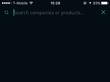
Parse Server Tutorial with iOS

$
0
0

Update 3/6/17: Updated for Swift 3, Xcode 8, and current state of Parse Server. Original tutorial by Marius Horga.

About a year ago, Parse, one of the most popular backend solutions for mobile apps, announced it was shutting down their hosted service and instead open sourcing their SKs.

Since that time, many developers have migrated their apps over to the open source Parse Server. The parse platform is quite active, with 143 contributors and ~13K stars on GitHub.

Even if you didn’t use Parse in the old days, the Parse Server is a nice easy-to-use option to set up a backend for your apps, since it’s open source and well maintained.

In this tutorial, we’ll show you how you can set up and host your very own Parse Server. Let’s dive in!

Note: This Parse server tutorial focuses on setting up the server itself, and not on the Parse SDK. We assumes you know the basics of developing iOS apps using the Parse SDK, and have worked through the Parse Tutorial: Getting Started with Web Backends.

If you haven’t gone through it, that’s fine, you can still read and make quite a bit of progress.

Getting Started

First, you need an existing iOS app that uses Parse so you can follow the steps in this Parse server tutorial. Feel free to use your own demo app, or download this Parse Starter project. It’s set up to work with Swift 3, iOS 10 and includes the latest Parse SDK (at the time of writing v1.14.2).

Build and run the project in Xcode to see the following:

parse server tutorial

About Parse Server & Prerequisites

In this Parse server tutorial, you’ll install your own Parse Server that can be maintained through the Parse SDK. It’s open source, thus (almost) guaranteeing it’ll never cease to exist. It can be hosted on all major web service providers, such as Heroku, Amazon AWS or Azure.

There are, however, a few features from Parse.com that have not been implemented on Parse Server, such as jobs, analytics and config. Moreover, with Parse Server, you do all of the work of installing and hosting the service either locally or in the cloud.

Parse made all the necessary tools available to help developers set up their server: an open source application server, Push Notification guide and a Parse Dashboard for local development.

Parse further recommends that you use mLab (formerly known as MongoLab) and Heroku to host the database and server, respectively.

The minimum requirements to install Parse Server are:

  • Homebrew, latest version
  • Node 4.3
  • MongoDB version 2.6.X or newer
  • Python 2.x
  • For deployment, Heroku Toolbelt

The MongoDB requirements for Parse Server are:

  • About 10 times the space you used with Parse, because it heavily compressed your content.
  • The failIndexKeyTooLong parameter must be set to false to accommodate indexed fields larger than 1024 bytes and collections larger than 1 million documents.
  • An SSL connection — although it’s not required, it’s strongly recommended.
  • For minimal latency, host your MongoDB servers in the US-East region.

Creating a New Database

Go to the mLab website and create an account if you don’t have one already, and then watch for the confirmation email that will let you activate your new account. Once activated, under MongoDB Deployments, click the Create New button:
mlab_create_new
Choose Amazon AWS, US East, Single-node and Sandbox — these are the recommended free options:
mlab_sandbox

Your database name can be anything, but for now, just use tutorial-app. Click on Create new MongoDB deployment and wait for your new database to be created.

Next, select tutorial-app and go to Users / Add database user. Enter a username and password then click Create. Save your Database URI somewhere that’s easy to reference, because you’ll need it several times throughout this Parse server tutorial. It should look similar to the one below, but your database ID will be unique:

mongodb://<dbuser>:<dbpassword>@ds017678.mlab.com:17678/tutorial-app

Install the Prerequisites

Open Terminal and run through the below steps to make sure the required support is in place.

Homebrew

If you don’t have Homebrew, enter this command:

$ /usr/bin/ruby -e "$(curl -fsSL https://raw.githubusercontent.com/Homebrew/install/master/install)"

If you already have Homebrew, make sure it’s up to date by entering this command:

$ brew update

MongoDM

Next, install MongoDB — this can take a few minutes:

$ brew install mongodb --with-openssl

Create a local MongoDB database by running the following:

$ mkdir -p /data/db

Make sure that the /data/db directory has the right permissions by running the following:

$ sudo chown -R `id -un` /data/db

To allow connections to your local MongoDB daemon, run the following:

$ mongod --config /usr/local/etc/mongod.conf

Now you just need to verify that you have the required MongoDB version: v2.6.X or newer. In a new Terminal window run the following:

$ mongo
MongoDB shell version v3.4.0
connecting to: mongodb://127.0.0.1:27017
MongoDB server version: 3.4.0

Press Control + C to quit MongoDB.

Python

It’s usually installed on all major OS versions, but check if you have it first:

$ python -V
Python 2.7.10

If you get a no, install Python by running this:

$ brew install python

Node

Install the latest version of Node:

$ brew install node

Confirm that you have the required version — v4.3 or newer:

$ node --version
V7.2.0

Installing the Parse Server

To make life a little easier for developers, Parse created a local version of its server and pushed it to GitHub. Make a clone of it on your system:

$ git clone https://github.com/ParsePlatform/parse-server-example.git Parse

Change the directory to the freshly cloned Parse directory:

$ cd Parse

Install Parse Server in this directory:

$ npm install

Start Parse Server:

$ npm run start

Check if it was successful by copying and pasting http://localhost:1337 into your browser:

parse server tutorial

Well, at least it dreams of being something. Rather progressive for a server, don’t you think? :]
Quit the server by pressing Control + C.

Next, in the root folder of the Parse project, open index.js and replace the default database string with your MongoDB database URI:

// Replace this
var databaseUri = process.env.DATABASE_URI || process.env.MONGOLAB_URI;
 
// With this
var databaseUri = 'mongodb://<dbuser>:<dbpassword>@ds017678.mlab.com:17678/tutorial-app';

This configures Parse Server to talk to your mLab database.

You also need to specify your Application ID. This is a unique ID that identifies your app. Sounds familliar? You’re right, it’s pretty much like your app’s Bundle Identifier. Copy your app’s bundle identifier and open index.js again:

// Replace this
appId: process.env.APP_ID || 'myAppId',
 
// With this, the value that actually represents your Application ID
appId: process.env.APP_ID || '<myAppId>',

Now that you’ve wired it up, you need to test if the Parse Server is talking to the remote database. First, start the server again by running:

$ npm run start

Next, in a new Terminal window, run the following command. Remember to insert your Application ID from the Parse.com dashboard:

$ curl -X GET \
-H "X-Parse-Application-Id: <myAppId>" \
-H "Content-Type: application/json" \
-d '{}' \
http://localhost:1337/parse/classes/WallPost

The server shouldn’t return any results for now, but that will change once you set up and run the iOS app.

{"results":[]}

You now have a functioning Parse Server.

parse server tutorial

Configure the iOS app

At last you get to dive back into the comfortable familiarity of Swift. The starter app doesn’t have the correct configuration to use Parse SDK with Parse Server.

Pull up the app in Xcode, open AppDelegate.swift and look for the line below in application(_:didFinishLaunchingWithOptions:):

let configuration = ParseClientConfiguration {
      $0.applicationId = "APPLICATION_ID"
      $0.server = "SERVER_URL"
    }
    Parse.initialize(with: configuration)

Replace it with the block below, substituting APPLICATION_ID with your app’s bundle identifier:

let configuration = ParseClientConfiguration {
  $0.applicationId = "com.razeware.ParseTutorial"
  $0.server = "http://localhost:1337/parse"
}
Parse.initialize(with: configuration)

The ParseClientConfiguration object represents the configuration the Parse SDK should use to connect with the server. It lets you create configuration variables for various connection parameters, including your Application ID, Server URL and so on.

This configuration object is passed to initialize(with:), which then sets up the Parse SDK before connecting to the server.

Build, run and log in. Tap the Upload button and choose an image from your phone or Simulator’s stock images.

Write a short comment and tap Send. To double-check that you’re writing to the “online” database, try these two sanity checks:

  1. Go to the WallPost collection on the mLab website and look for the image you just sent.
  2. Delete the app from your phone or Simulator. Then build and run, log in and check if you can retrieve the image and comment from the Mongo database.

parse server tutorial

If it’s there, you’re ready to move the Parse Server to Heroku’s web hosting service.

Deploy the Parse Server to Heroku

In order to manage Heroku apps from Terminal, you’ll need to download and install the Heroku Toolbelt from the Heroku website. It’s a command line interface tool for creating and managing Heroku apps.

Note: Heroku is also available in Homebrew, however, it’s a standalone version of the Heroku Toolbelt that doesn’t include all the required components.

If you don’t already have a Heroku account, please visit the Heroku sign up page and do the needful.

Next, authenticate against Heroku by running the following command inside the local Parse Server directory:

$ heroku login

The Heroku platform uses git for deploying applications. When you create an application on Heroku, it associates a new git remote, typically named heroku, with the local git repository for your application. Since the Parse project was cloned from GitHub, a local git repository exists. All you need to do is initialize Heroku, and push to its remote.

From the Parse project directory, create an application on Heroku and push your source code to the Heroku server:

$ heroku create
heroku-cli: Installing core plugins... done
Creating app... done, stack is cedar-14
https://intense-chamber-52549.herokuapp.com/ | https://git.heroku.com/intense-chamber-52549.git

Notice a Heroku service was created for you (in my case it was at: https://intense-chamber-52549.herokuapp.com).

Next, commit your changes, and push the local Parse Server to the newly created Heroku service with the following command:

$ git add .
$ git commit -m "Commit with my custom config"
$ git push heroku master

Paste the URL you made with the create command into a web browser and you should see the same message as before when you tested the server locally:

I dream of being a web site.

Now you need to test if that shiny new Heroku service still responds to GET requests. Remember to replace <myAppId> with your app’s Bundle Identifier, as well as your Heroku server URL:

$ curl -X GET \
-H "X-Parse-Application-Id: <myAppId>" \
-H "Content-Type: application/json" \
-d '{}' \
https://<your URL>.herokuapp.com/parse/classes/WallPost

This is a similar curl as before when you were executing against a local server. This command goes against the remote server.

You should see the JSON version of the wall post record you created inside the iOS app:

{
  "results": [
    {
      "objectId": "a8536MK9nC",
      "image": {
        "__type": "File",
        "name": "57eb6f36cd8bcce8141dc5ccca3072c0_image.bin",
        "url": "http:\/\/afternoon-harbor-27828.herokuapp.com\/parse\/files\/" \
          "jJ5Ds5h0eXWYhv7DGWYIrfLQTn2rjB0okakvo3LH\/57eb6f36cd8bcce8141dc5cc" \
          "ca3072c0_image.bin"
      },
      "user": {
        "__type": "Pointer",
        "className": "_User",
        "objectId": "SLPlVVfsvx"
      },
      "comment": "great pic!",
      "updatedAt": "2016-03-14T17:36:20.849Z",
      "createdAt": "2016-03-14T17:36:20.849Z"
    }
  ]
}

It works! You’ve just set up your Parse app and database to the cloud, and that’s an accomplishment!

Implement Basic Push Notifications

Note: If you’re setting up push notifications on iOS for the first time and want to go through all the steps outlined below, you’ll need to head to the Push Notifications Tutorial and work through it until you’ve generated and downloaded the certificate.

When initializing Parse Server, you need to set up an additional push configuration. Inside the Parse Server directory, open the index.js file and add the following code block after the serverURL line:

push: {
  ios: [
    {
      pfx: 'cert.p12',
      bundleId: 'com.example.ParseTutorial',
      production: false
    }
  ]
},

The certificate cert.p12 is the one you exported from the Push Notifications Tutorial (it may be named WenderCastPush.p12). The bundleId should be the one you previously created in the Push Notifications Tutorial. You also need to change the Bundle Identifier for the app as well to match in Xcode.

production should be false if you’re using a development certificate, and true if you’re using a production certificate.

Additionally, add a Master Key to index.js. You can use any arbitrary string, but keep it secret!:

// Replace this
masterKey: process.env.MASTER_KEY || '',
 
// With the value of your app's Master Key completed:
masterKey: process.env.MASTER_KEY || '<your app's Master Key>',

Your next step is to put the certificate inside the local Parse Server directory, so it can be sent to the Heroku service. After doing that, run these commands in Terminal:

$ git add .
$ git commit -m "added certificate"
$ git push heroku master

Switch back to Xcode, open AppDelegate.swift and find the application(_:didFinishLaunchingWithOptions:) method. Replace this:

$0.server = "http://localhost:1337/parse"

With this (using your Heroku URL):

$0.server = "https://afternoon-harbor-27828.herokuapp.com/parse"

Now you’ll register your app for remote push notifications.
Go to the top of AppDelegate and add the following line:

import UserNotifications

Add the following lines to the end of application(_: didFinishLaunchingWithOptions:):

//1
let userNotificationCenter = UNUserNotificationCenter.current()
userNotificationCenter.delegate = self
 
//2
userNotificationCenter.requestAuthorization(options: [.alert, .badge, .sound]) { accepted, error in
  guard accepted == true else {
    print("User declined remote notifications")
    return
  }
//3
  application.registerForRemoteNotifications()
}

Here’s a step-by-step explanation of the above code:

  1. Get the UNUserNotificationCenter singleton object, and assign self as the delegate
  2. Request notification authorization for types .alert, .badge and .sound.
  3. If user grants authorization, register the application for remote notifications

Next, you need to implement UNUserNotificationCenterDelegate. Add the following to the bottom of AppDelegate.swift:

extension AppDelegate: UNUserNotificationCenterDelegate {
 
  func userNotificationCenter(_ center: UNUserNotificationCenter,
                                willPresent notification: UNNotification,
                                withCompletionHandler completionHandler:
                                @escaping (UNNotificationPresentationOptions) -> Void) {
    PFPush.handle(notification.request.content.userInfo)
    completionHandler(.alert)
  }
}

When your app receives a remote notification from the APNs, this delegate method is called. Here you pass the notification’s userInfo for the Parse SDK to handle its presentation.

Finally, you need to store the device token. Add the following below application(_:didFinishLaunchingWithOptions:):

// 1
func application(_ application: UIApplication, didRegisterForRemoteNotificationsWithDeviceToken deviceToken: Data) {
  let installation = PFInstallation.current()
  installation?.setDeviceTokenFrom(deviceToken)
  installation?.saveInBackground()
 }
// 2
func application(_ application: UIApplication, didFailToRegisterForRemoteNotificationsWithError error: Error) {
  if (error as NSError).code == 3010 {
    print("Push notifications are not supported in the iOS Simulator.")
  } else {
    print("application:didFailToRegisterForRemoteNotificationsWithError: %@", error)
  }
}

Here’s an explanation of what you just added:

  1. This method is called once the app successfully registers with the APNs (Apple Push Notification service). The device will only act on notifications that have the specified deviceToken.
  2. When the APNs can’t complete device registration due to an error, this method gets called with error information, so your app can determine why registration failed.

Before you build and run, make sure Push Notifications is turned on it the target’s Capabilities tab. If it’s off, press the toggle to turn it on. You might see the following:

capabilities

If that is the case, press Fix Issue to let Xcode handle it for you.

Build and run the app on a device because push notifications aren’t supported in iOS Simulator. To test, run this command in Terminal — remember to replace the Application ID, Master Key and server URL:

curl -X POST \
-H "X-Parse-Application-Id: <YOUR_APP_ID>" \
-H "X-Parse-Master-Key: <YOUR_MASTER_KEY>" \
-H "Content-Type: application/json" \
-d '{
  "where": {
    "deviceType": "ios"
  },
  "data": {
    "alert": "Hello, Parse!"
  }
}' https://<YOUR_SERVER_URL>.herokuapp.com/parse/push

If all went well, you should get a notification on your screen as shown below:

parse server tutorial

Bonus: Parse Dashboard

Only a few days after releasing push notifications for the Parse Server, the team at Parse also opened up the very useful dashboard. It can be used locally or in the cloud.

To install it locally, you need to clone the GitHub repository on your machine. Enter this into Terminal:

$ git clone https://github.com/ParsePlatform/parse-dashboard.git
$ cd parse-dashboard
$ npm install

In the Parse-Dashboard subfolder, edit parse-dashboard-config.json. Add your IDs, keys, URLs and names as shown below:

{
  "apps": [
    {
      "serverURL": "https://afternoon-harbor-27828.herokuapp.com/parse",
      "appId": "APPLICATION_ID",
      "masterKey": "APPLICATION_MASTER",
      "appName": "Heroku.com Tutorial App"
    },
    {
      "serverURL": "http://localhost:1337/parse",
      "appId": "APPLICATION_ID",
      "masterKey": "APPLICATION_MASTER",
      "appName": "Local Tutorial App"
    }
  ]
}

Run this command in the Parse Dashboard directory from Terminal:

$ npm run dashboard

Next, copy and paste http://localhost:4040 into your browser, and you’ll see your app in the dashboard! For your apps on Parse.com, you currently have full run of the place, including the data browser, Parse config and API console. Your cloud code and logs as there too.

For apps on the Parse Server, only the data browser and API console are available.

dashboard_parse

Where to go From Here?

You can download the finished project here. You’ll need to replace the applicationId and the server url with your own to make it all work right.

To expand on what you’ve done in this Parse server tutorial, you could:

  • Explore Parse dashboard’s full potential by setting up a full version of the Parse Server.
  • Explore the extended capabilities of using a push adapter for other push providers that use the default APN.
  • Look into and compare other Parse alternatives such as Firebase or CloudKit, but beware that these alternatives lack some features covered in this Parse server tutorial.

Now you know that even without the full services of Parse.com, using the Parse SDK along with Parse Server is a great backend solution that could easily replace developing a backend on your own.

There’s certainly a lot to talk about though, so bring your thoughts, questions and findings to the forums and let’s make some magic happen. I look forward to connecting with you!

Parse.com is dead, long live the Parse Server!

The post Parse Server Tutorial with iOS appeared first on Ray Wenderlich.
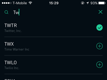
Updated Course: Custom Collection View Layout

$
0
0

We’re happy to announce that our 15th new course since WWDC is now available: Custom Collection View Layout!

In this 13-part course for intermediate to advanced iOS developers, you’ll learn how to customize the layout of collection views in iOS.

You’ll start with the basics, such as manipulating the default flow layout using a delegate, and by subclassing. Then you’ll move on to more advanced topics like creating a layout from scratch, changing layout attributes, and dynamic cell content.

Along the way, you’ll learn how to create a variety of commonly used layouts, such as a carousel style layout, a Pinterest-style layout, a layout with a stretchy header, and more.

This course is now fully up-to-date for iOS 10, Xcode 8, and Swift 3. Let’s take a look at what’s inside.

Video 1: Introduction. Get a quick overview of what’s inside this course, and why customizing collection view layout is useful.

Video 2: Flow Layout Basics. Learn the basics of how to effectively use UICollectionViewFlowLayout to create custom layouts using a delegate.

Video 3: Carousel Layout: Getting Started. You’ll begin creating a vertically scrolling carousel layout, where the featured cell is larger, then fades and shrinks as you scroll. Learn about subclassing UICollectionViewFlowLayout and overriding methods to achieve our results.

Video 4: Carousel Layout: Custom Cells. Learn how to enhance your layouts with custom cells. You’ll modify the storyboard, then subclass UICollectionViewCell, to create a custom cell that resembles a collectible playing card.

Video 5: Carousel Layout: Cell Snapping. Learn how to snap a “featured” cell to a specific scrolling location. You’ll override some methods to set a boundary that stops scrolling when a cell is in the center of the view.

Video 6: Stretchy Headers: Getting Started. Begin creating a vertical scrolling custom flow layout with a large section header at the top. When the user pulls down on the collection view, the header will stretch. Learn how to add and display headers in your custom layout.

Video 7: Stretchy Headers: Adding Depth. Learn how to modify the header so that when the user pulls down on the collection view, not only will the header stretch, but the foreground will scale up, while the background will scale down; giving the impression of depth.

Video 8: UICollectionViewLayout Basics. Learn the basics of UICollectionViewLayout, such as when to use it versus UICollectionViewFlowLayout, the key methods to provide your layouts behavior, and what’s going on under the hood.

Video 9: Mosaic Layout: Getting Started. You’ll begin creating a mosaic style, multicolumn layout, with cells of varying height. Learn how to define and implement a custom delegate protocol to calculate each cells height.

Video 10: Mosaic Layout: Layout Attributes. Learn about subclassing UICollectionViewLayoutAttributes to add a custom property that will store the image height for each item. You’ll also see how to override apply(_:) in the cell class, to use the new attribute.

Video 11: Mosaic Layout: Cell Content. You’ll finish up the Mosaic layout as you learn how to dynamically size each cell, independently, based on it’s content. See how to use the AVMakeRect() method to calculate an image height, and calculate a labels height based on it’s font and size.

Video 12: Multiple Collection View Layouts. Learn how you can use multiple custom layouts within the same app. You’ll see how to load and configure an additional layout, invalidate the old layout, and set the new layout to smoothly transition into view.

Video 13: Conclusion. Review what you’ve learned about creating custom collection view layouts, and where to go from here.

Where To Go From Here?

Want to check out the course? You can watch the introduction for free!

The rest of the course is for raywenderlich.com subscribers only. Here’s how you can get access:

  • If you are a raywenderlich.com subscriber: The entire course is complete and available today. You can check out the first part here.
  • If you are not a subscriber yet: What are you waiting for? Subscribe now to get access to our updated Custom Collection View Layout course, and our entire catalog of over 500 videos.

There’s much more in store for raywenderlich.com subscribers – if you’re curious, you can check out our full schedule of upcoming courses.

I hope you enjoy our new course, and stay tuned for many more new Swift 3 courses and updates to come!

The post Updated Course: Custom Collection View Layout appeared first on Ray Wenderlich.
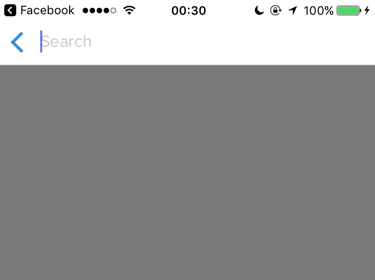
Android Studio Tutorial: An Introduction

$
0
0

Update 3/8/17: Updated for the latest version of Android Studio by Brian Voong. Original tutorial by Megha Bambra.

Android Studio is an IntelliJ IDEA based IDE and declared by Google as the official IDE for Android application development.

In this Android Studio tutorial, you’ll learn how to use the tools that every Android developer uses to create a simple fortune-telling app. You’ll learn to use some of Android Studio’s key features such as:

  • Navigating through different files in your project using the project explorer
  • Setting up the AndroidManifest.xml file
  • Learning about the Gradle build system
  • Importing files into your project
  • Learning about the rich layout editor with dynamic layout previews
  • Using Logcat and the Android Monitor to debug your app

Note: This tutorial assumes that you’ve already installed Android Studio and have set up an emulator or a device configured for testing. If you haven’t, please refer to our previous tutorial about installing Android Studio to get up and running in no time!

Getting Started with Android Studio

You’ll start by creating a brand new Android app that you’ll use to explore Android Studio and learn about its capabilities and interface.

For bonus points, you’ll also walk away as a bonafide fortune teller — or something to that effect. At least you’ll have a fun app to play around with!

Fire up Android Studio and in the Android Studio Setup Wizard window, select Start a new Android Studio project.

Android Studio New Project

In the Create New Project window, set the Application Name as Fortune Ball, enter a Company Domain of your choosing, and select a convenient location to host your application in the Project location field. Click Next.

Screen Shot 2015-11-15 at 11.55.05 PM

Now you’re looking at the Target Android Devices window. Check the Phone and Tablet box and specify API 15 as the Minimum SDK. Click Next.

Target Android Devices

From the Add an activity to Mobile window, select Basic Activity. Take a half minute here to look at all your options; this window gives you an overview of the layout template. In this case, it’ll be a blank activity with a toolbar at the top and a floating action button at the bottom. Click Next to proceed.

Screen Shot 2017-02-03 at 10.05.32 AM

In the Customize the Activity window, which is shown in the screenshot below, you’ll have the option to change Activity Name, Layout Name, Title and Menu Resource Name. For the purposes of this tutorial, keep it simple and accept the default values by clicking Finish.

Customize the Activity

Within a short amount of time (hopefully seconds!), you’ll land on a screen that looks similar to this:

content_main

Build and run your application and you should see a similar screen on your device or emulator. Note that the emulator acts like a device, so it will need time to boot and load.

Build and Run

Voila. That’s an app! There’s not much to it, but it’s enough to dive into the next section.

Project and File Structure

For this portion of the tutorial, your focus will be on the highlighted section of the screenshot below. This window shows the project files of your application. By default, the files are filtered to show Android project files.

Project tab

When you select the file dropdown menu as illustrated in the screenshot below, you’ll see several options to filter the files. The key filters here are Project and Android.

The Project filter will show you all the application modules — there is a minimum of one application module in every project.

Other types of modules include third-party library modules or other Android application modules (such as Android wear apps, Android TV, etc…). Each module has its own complete source sets, including a gradle file, resources and source files, e.g. java files.

Screen Shot 2015-11-16 at 1.30.25 AM

Note: If you don’t see the project view open, you can click on the Project tab on the left side panel as indicated in the screenshot above.

The default filter is Android which groups files by specific types. You’ll see the following folders at the very top level:

  • manifests
  • java
  • res
  • Gradle Scripts
  • Screen Shot 2015-11-16 at 10.37.04 PM

    You’ll take a deeper dive into each of these folders, starting with the manifests in the next section.

    Overview of the AndroidManifest.xml

    Every Android application contains the AndroidManifest.xml file found in the manifests folder. This XML file informs your system of the app’s requirements and must be present in order for the Android system to build your app.

    Go to the app’s manifests folder and expand to select AndroidManifest.xml. Double click on the file to open.

    Screen Shot 2015-11-16 at 11.31.53 PM

    The manifest and application tags are required in the manifest file and must only appear once.

    In addition to the element name, each tag also defines a set of attributes. For example, some of the many attributes in the application tag are: android:icon, android:label and android:theme.

    Other common elements that can appear in the manifest include:

  • uses-permission: requests a special permission that must be granted to the application in order for it to operate correctly. For example, an app must request permission from the user in order to access the Internet—in this case you must specify the android.permission.INTERNET permission.
  • activity: declares an activity that implements part of the application’s visual user interface and logic. Every activity that your app uses must appear in the manifest—undeclared activities won’t be seen by the system and sadly, they’ll never run.
  • service: declares a service that you’re going to use to implement long-running background operations or a rich communications API that can be called by other applications. An example includes a network call to fetch data for your application. Unlike activities, services have no user interface.
  • receiver: declares a broadcast receiver that enables applications to receive intents broadcast by the system or by other applications, even when other components of the application are not running. One example of a broadcast receiver would be when the battery is low and you get a system notification within your app, allowing you to write logic to respond.
  • You can find a full list of tags allowed in the manifest file here on the Android Developer site.

    Configuring the Manifest

    You’re currently looking at an excellent example of a framework, but a terrible fortune teller; you’re here because you want to learn how to play around on Android. That’s rather convenient because the manifest needs some changes so you can look into the future.

    Under activity, add the following attribute: android:screenOrientation="portrait". to restrict the screen to portrait mode only. If it’s absent, the screen will transform to landscape or portrait mode depending on the device’s orientation. After adding this attribute, your manifest file should look like the screenshot below:

    manifest

    Build and run the app. If you’re testing on your device, rotate your phone. Notice that the screen doesn’t transform into landscape mode as you have restricted this capability in the AndroidManifest file.

    Overview of Gradle

    Let’s shift gears to Gradle. In a nutshell, it’s a build system that’s utilized by Android Studio. It takes the Android project and builds/compiles it into an installable APK that in turn can be installed on devices.

    As shown below, you can find the build.gradle file, located under Gradle scripts, in your project at two levels: module level and project level. Most of the time, you’ll edit this file at the module level.

    gradle

    Open up the build.gradle (Module:app) file. You’ll see the default gradle setup:

    apply plugin: 'com.android.application'
     
    android {
        compileSdkVersion 25
        buildToolsVersion "25.0.2"
        defaultConfig {
            applicationId "com.raywenderlich.fortuneball"
            minSdkVersion 15
            targetSdkVersion 25
            versionCode 1
            versionName "1.0"
            testInstrumentationRunner "android.support.test.runner.AndroidJUnitRunner"
        }
        buildTypes {
            release {
                minifyEnabled false
                proguardFiles getDefaultProguardFile('proguard-android.txt'), 'proguard-rules.pro'
            }
        }
    }
     
    dependencies {
        compile fileTree(dir: 'libs', include: ['*.jar'])
        androidTestCompile('com.android.support.test.espresso:espresso-core:2.2.2', {
            exclude group: 'com.android.support', module: 'support-annotations'
        })
        compile 'com.android.support:appcompat-v7:25.1.0'
        compile 'com.android.support:design:25.1.0'
        testCompile 'junit:junit:4.12'
    }

    Let’s step through the major components:

  • apply plugin: 'com.android.application' applies the Android plugin at the parent level and makes available the top level build tasks required to build an Android app.
  • Next in the android{...} section, you get configuration options such as targetSdkVersion. The target SDK for your application should be kept at the latest API level (25 as we publish this tutorial). Another important component is the minSDKVersion which defines the minimum SDK version a device should have installed in order to run your application. For example, if your device’s SDK version was 14, then this app won’t be able to run on that device since here the minimum supported version is 15.
  • The last component is dependencies{...}. The important dependencies to note are compile 'com.android.support:appcompat-v7:VERSION' and compile 'com.android.support:design:VERSION'. They provide support and compatibility with the new features from the latest API to the older APIs.
  • In addition to Android compatibility libraries, you can also add other third party libraries in the dependencies{...} component. You’ll add an animation library where you’ll be able to add some cool effects to user interface elements in your application. Find dependencies, and add the following two lines at the bottom:

    dependencies {
     
      ...
     
      compile 'com.daimajia.easing:library:2.0@aar'
      compile 'com.daimajia.androidanimations:library:2.2@aar'
    }

    Here you added two new third-party dependencies that will help you make FortuneBall shine. These libraries will be automatically downloaded and integrated by Android Studio.

    In fact, once you add these dependencies, Android Studio realizes that it needs to download them and tells you as much. Look for a bar across the top of the build.gradle file as shown the next screenshot. Click Sync Now to integrate these dependencies in your app.

    sync

    Syncing takes couple of seconds. You can monitor the Gradle file update in the Messages tab in the bottom panel. Look for a success message in that panel as shown in the screenshot below.

    success

    Alright, that’s all the config you need to do to Gradle for now. The whole point of this was so that you’re setup to add some fancy animations to your application, which you’ll do in a bit.

    Importing files

    An important part of making an Android app involves integrating other resources such as images, custom fonts, sounds, videos etc. These resources have to be imported into Android Studio and must be placed in appropriate folders. This allows the Android operating system to pick the correct resource for your app.

    For Fortune Ball, you’ll be importing image assets and will place them in drawable folders. Drawable folders can hold images or custom XML drawables (i.e. you can draw shapes via XML code and use them in your app’s layouts).

    To get started, download the image assets here, then unzip the contents and save them where they can be easily accessed.

    Back in the project in Android Studio, switch the view from Android to Project. Open the res folder under app > src > main. Right click on the res folder, select New > Android resource directory.

    Screen Shot 2015-12-10 at 7.50.17 PM

    You’ll get a window titled New Resource Directory. From the Resource type dropdown select the drawable option. In the Available qualifiers list, select Density and click the button highlighted in the screenshot below:

    Screen Shot 2015-11-20 at 10.33.43 PM

    In the subsequent window, select XX-High Density from the Density dropdown. Click OK.

    create_drawable

    Repeat the same process and create drawable-xhdpi, drawable-hdpi and drawable-mdpi folders by selecting X-High, high, and medium density respectively from the Density dropdown.

    Each drawable folder that has a density qualifier (i.e. xxhdpi, xhdpi, hdpi) houses images corresponding to that particular density or resolution. For example, the folder drawable-xxhdpi contains the image that is extra high density, meaning an Android device with a high resolution screen will pick the image from this folder. This allows your app to look great on all Android devices, irrespective of the screen quality. To learn more about screen densities, check out the Android documentation.

    After creating all the drawable folders, go back to the unzipped contents in the finder, and copy (cmd + C) the image from each folder and paste (cmd + V) it into the corresponding folder in Android Studio.

    Screen Shot 2015-11-20 at 11.26.23 PM

    When you paste the files, you’ll be presented with the Copy window. Select OK.
    Screen Shot 2015-12-10 at 8.23.16 PM

    You’ve just put the ball in Fortune Ball and know how to import things now. Looks like you just checked another feature off your to-learn list!

    XML View with Dynamic Layout Previews

    An incredibly important part of building an Android application is creating a layout that the users of the application interact with. In Android Studio, you do this task in the layout editor. Open up content_main.xml from res/layout. You’ll initially land on the Design tab of the layout editor. In this tab, you can drag user interface elements like buttons, text fields etc. in the editor.

    XML Editor

    On the right hand side of the Design tab is the Text tab. Switching to this view allows you to edit the XML that makes up the layout directly.

    text_tab

    In both tabs, you’ll be able to preview the layout in the device as you build. Choose the Text tab to start building the layout for Fortune Ball.

    Before you start building the view, you need to define some values. Open up strings.xml under res/values and add the following:

    <string name="fortune_description">Suggest the question, which you can answer “yes” or “no”, then click on the magic ball.</string>

    strings.xml contains all the user-facing strings that appear in your app. Splitting the strings out into their own file makes internationalization a breeze, as you just provide a strings file for each language you wish to support. Although you might not want to translate your app right away, it’s considered a best-practice to use a strings file.

    Next, open dimens.xml under res/values and add the following:

    <dimen name="description_text_size">15sp</dimen>
    <dimen name="fortune_text_size">20sp</dimen>

    dimens.xml contains all the dimensions values such as margin spacing for your layouts, sizes of text etc. Again, it’s a good practice to keep the dimensions in this file so that they can be re-used in constructing layouts.

    Head back to content_main.xml and replace the entire contents of the file with the code below.

    <?xml version="1.0" encoding="utf-8"?>
    <RelativeLayout
      xmlns:android="http://schemas.android.com/apk/res/android"
      xmlns:tools="http://schemas.android.com/tools"
      xmlns:app="http://schemas.android.com/apk/res-auto"
      android:layout_width="match_parent"
      android:layout_height="match_parent"
      app:layout_behavior="@string/appbar_scrolling_view_behavior"
      tools:showIn="@layout/activity_main"
      tools:context=".MainActivity">
     
      <TextView
        android:id="@+id/descriptionText"
        android:layout_width="match_parent"
        android:layout_height="wrap_content"
        android:text="@string/fortune_description"
        android:gravity="center"
        android:textSize="@dimen/description_text_size"/>
     
      <ImageView
        android:layout_width="wrap_content"
        android:layout_height="wrap_content"
        android:id="@+id/fortunateImage"
        android:src="@drawable/img_crystal"
        android:layout_centerHorizontal="true"
        android:layout_below="@id/descriptionText"
        android:layout_marginTop="10dp"/>
     
      <TextView
        android:id="@+id/fortuneText"
        android:layout_width="match_parent"
        android:layout_height="wrap_content"
        android:layout_below="@id/fortunateImage"
        android:gravity="center"
        android:layout_marginTop="20dp"
        android:textSize="@dimen/fortune_text_size"
        android:textStyle="bold"
        android:textColor="@android:color/holo_red_dark"/>
     
      <Button
        android:id="@+id/fortuneButton"
        android:layout_width="match_parent"
        android:layout_height="50dp"
        android:layout_below="@id/fortuneText"
        android:text="What's my fortune?"
        android:layout_centerHorizontal="true"
        android:layout_marginTop="10dp"/>
     
    </RelativeLayout>

    This rather large chunk of XML creates the layout of FortuneBall. At the top level you’ve added a RelativeLayout, whose job it is to layout its contents. It is stretched to match the size of its parent (i.e. the full activity).

    Within the relative layout you added two pieces of text, an image and a button. These will appear within the container in the order that you added them, and their content is read from the strings.xml in the case of the text views, and from the drawable you added in the case of the image.

    As you’re updating content_main.xml, notice how the Preview window updates the UI:

    content_main updates

    Note: If you can’t see the preview window, then click on the Preview button on the right-hand side panel of the layout editor while you’re still in the Text tab.

    Build and run.

    device-2015-11-22-213951

    Congrats! You’ve designed your app’s layout. However, it’s only a pretty picture at this point — clicking on that button doesn’t do anything. Ready to play around with activities?

    Connecting Views with Activities

    You use the java files located in app / src / main / java to implement your app’s logic.

    Open MainActivity.java and add these imports directly below the existing imports

    import java.util.Random;
    import android.view.View;
    import android.widget.Button;
    import android.widget.ImageView;
    import android.widget.TextView;
     
    import com.daimajia.androidanimations.library.Techniques;
    import com.daimajia.androidanimations.library.YoYo;

    The first five imports indicate that you will be referencing the Random, View, Button, ImageView and TextView classes respectively in your code. The next two imports indicate that you will be using two classes from the libraries included in the build.gradle earlier for animations. Inside of MainActivity.java add the following inside the MainActivity class:

    String fortuneList[] = {"Don’t count on it","Ask again later","You may rely on it","Without a doubt","Outlook not so good","It's decidedly so","Signs point to yes","Yes definitely","Yes","My sources say NO"};
     
    TextView mFortuneText;
    Button mGenerateFortuneButton;
    ImageView mFortuneBallImage;

    In this small chunk of code you’ve declared 4 member variables for the activity. The first is an array of strings that represent the possible fortunes, and the remaining three represent the UI elements you created in the layout.

    Next, replace the content of the onCreate() method with the following:

    // 1:
    super.onCreate(savedInstanceState);
    // 2:
    setContentView(R.layout.activity_main);
    Toolbar toolbar = (Toolbar) findViewById(R.id.toolbar);
    setSupportActionBar(toolbar);
    // 3:
    mFortuneText = (TextView) findViewById(R.id.fortuneText);
    mFortuneBallImage = (ImageView) findViewById(R.id.fortunateImage);
    mGenerateFortuneButton = (Button) findViewById(R.id.fortuneButton);
     
    // 4:
    mGenerateFortuneButton.setOnClickListener(new View.OnClickListener() {
      @Override
      public void onClick(View view) {
        // 5:
        int index = new Random().nextInt(fortuneList.length);
        mFortuneText.setText(fortuneList[index]);
        // 6:
        YoYo.with(Techniques.Swing)
            .duration(500)
            .playOn(mFortuneBallImage);
      }
    });

    Taking the numbered sections one-by-one:

    1. Call the superclass implementation to ensure the activity is ready to go.
    2. Specify that the layout for this activity is provided by the layout you created before, and perform some preparation on the toolbar.
    3. Populate the values of the three member variables you created before for the views in the layout using the findViewById method. The id value is the same as the one you provided in the XML layout.
    4. Add an OnClickListener to the button. This is a simple class that encapsulates the functionality you’d like to perform when the button is pressed.
    5. Find a random fortune from the fortuneList array, and update the fortune text to show it.
    6. Use the third-party animation library you added as a dependency to the gradle file to add a fun animation to the crystal ball image.

    OK—that wasn’t too bad right? Build and run, and hit the button to test out your fortune-telling powers.

    fortuneball

    Tidy Up

    You’re almost done. But before you start planning your release party, you have some clean up ahead, like getting rid of that floating button. Head to res / layout and open activity_main.xml.

    This layout file contains a reference to content_main.xml that you previously edited. It wraps the content with the default toolbar and floating action button. However, Fortune Ball doesn’t need a floating action button, so remove the following code block from this xml file:

    <android.support.design.widget.FloatingActionButton
        android:id="@+id/fab"
        android:layout_width="wrap_content"
        android:layout_height="wrap_content"
        android:layout_gravity="bottom|end"
        android:layout_margin="@dimen/fab_margin"
        android:src="@android:drawable/ic_dialog_email"/>

    Build and run. You won’t be seeing that the floating button on the bottom right-hand corner around here anymore:

    device-2015-11-23-013050

    Ask a question, click or tap on What’s my fortune? and let your future unfold before your eyes!

    Android Monitor

    Android Studio provides a bunch of tools to help you look under the hood of your application. Take a look, by opening the Android Monitor tab on the bottom of your Android Studio window.

    android monitor tab

    Here, you find a wealth of helpful developer options. Let’s walk through a few of them. Don’t worry; you don’t have to memorize them all and there won’t be a quiz. :]

    android monitor

    Start at the top, where you specify the device or emulator you want to monitor, and the “process” you are most interested in (you should select your app’s package name if it’s not already selected).

    Continue by hovering over some of the buttons on the left, to reveal their tooltips.

    • The camera and play button in the top left enable taking screenshots or screen video recordings.
    • The magnifying glass reveals several more options, like analyzing your app’s memory usage.
    • The Layout Inspector gives a very cool visual interface to help you determine exactly why your app’s UI looks the way it does.

    Finally, there is LogCat, which gives you a detailed view into your device’s system messages with the ability to drill down into a specific application, or even use the search bar to filter out messages unless they contain specific text.

    Make sure you’ve selected Show only selected application in the top right, as shown in the screenshot earlier. Now, you will only see messages from your app, including those you write yourself. Oh, what? You’ve not added any messages for yourself?

    Head to MainActivity.java and add the following to the list of imports

    import android.util.Log;

    At the end of onCreate() in MainActivity.java add the following line:

    Log.v("FORTUNE APP TAG","onCreateCalled");

    The Log.v calls for two parameters — a tag and a message. In this case, you’ve defined the tag as "FORTUNE APP TAG" and the message as "onCreateCalled".

    Build and run the app so you can see this log message in the Logcat panel.

    To filter the LogCat contents to just your message alone, type onCreateCalled into the search box above the console, like this:

    logcat

    Then remove your search text to see all the log messages again.

    Another very useful utility of logcat is the ability to see stacktrace or error messages from app crashes and exceptions. You’ll add a bug to your perfectly working app to see how that works.

    Go to MainActivity.java and comment out the following line in onCreate():

    //mFortuneText = (TextView) findViewById(R.id.fortuneText);

    Build and run the application. Once it launches click the What’s My Fortune? button on the screen. Oh no! It crashed.

    Screen Shot 2015-11-23 at 11.45.20 AM

    How would you go about fixing this if you hadn’t put the bug in on purpose? Logcat to the rescue!

    Head back to the Logcat panel — it’ll look something like this:

    crash logcat

    That sure is a lot of red text, and it’s exactly where to go sniffing around for clues. You’re looking for an exception somewhere. In this case, it’s line 50 in the MainActivity.java file. LogCat has even helpfully turned that link into a blue hyperlink, and if you click it you will be taken right to the problematic line!

    By commenting out mFortuneText = (TextView) findViewById(R.id.fortuneText), you created a variable but didn’t assign it a value — hence the null pointer exception.

    Go ahead and uncomment that code and build and run the application. This time there’s no crash!

    Logcat is a powerful tool that lets you debug your application errors and exception.

    Where to Go From Here?

    You can download the final project here.

    Practice makes perfect! You’ve learned your way around and can now create a project, play around with Gradle, import assets, set up layouts and do some testing.

    There’s a lot of cool stuff to learn about Android, and I suggest you start with these next steps:

    • Get familiar with Logcat and the filtering mechanism. Filter by different criteria.
    • There will be times where you’ll want to test your application’s robustness in different network environments. See the Android Emulator 2.0 section of our Android Studio 2 tour for more details.
    • This beginning Android development tutorial has just touched on some of the tools used to build out the layout and UI. To learn more, pour over the official Android documentation for UI.
    • Keep coming back to raywenderlich.com—- we’ve got some great Android content coming your way over the next days, weeks and months.
    • Talk to other developers. Make use of the forums below and ask your questions, share your findings and pick up tips.

    This is it folks! Give yourself a round of applause and stay tuned for more awesome tutorials from your Android team. :]

    The post Android Studio Tutorial: An Introduction appeared first on Ray Wenderlich.

    Screencast: Server Side Swift with Perfect: Introduction to Perfect Assistant

    Metal Tutorial with Swift 3 Part 4: Lighting

    $
    0
    0

    Update: This tutorial has been updated for Xcode 8.2 and Swift 3.

    Learn how to add lighting into your Metal apps!

    Welcome back to our iOS Metal tutorial series!

    In the first part of the series, you learned how to get started with Metal and render a simple 2D triangle.

    In the second part of the series, you learned how to set up a series of transformations to move from a triangle to a full 3D cube.

    In the third part of the series, you learned how to add a texture to the cube.

    In this fourth part of the series, you’ll learn how to add some lighting to the cube. As you work through this tutorial, you’ll learn:

    • Some basic light concepts
    • Phong light model components
    • How to calculate light effect for each point in the scene, using shaders

    Getting Started

    Before you begin, you need to understand how lighting works.

    “Lighting” means applying light generated from light sources to rendered objects. That’s how the real world works; light sources (like the sun or lamps) produce light, and rays of these lights collide with the environment and illuminate it. Our eyes can then see this environment and we have a picture rendered on our eyes’ retinas.

    In the real world, you have multiple light sources. Those light sources work like this:

    source_of_light

    Rays are emitted in all directions from the light source.

    The same rule applies to our biggest light source – the sun. However, when you take into account the huge distance between the Sun and the Earth, it’s safe to treat the small percentage of rays emitted from the Sun that actually collide with Earth as parallel rays.

    parallel

    For this tutorial, you’ll use only one light source with parallel rays, just like those of the sun. This is called a directional light and is commonly used in 3D games.

    Phong Lighting Model

    There are various algorithms used to shade objects based on light sources, but one of the most popular is called the Phong lighting model.

    This model is popular for a good reason. Not only is it quite simple to implement and understand, but it’s also quite performant and looks great!

    The Phong lighting model consist of three components:

    32_a

    1. Ambient Lighting: Represents light that hits an object from all directions. You can think of this as light bouncing around a room.
    2. Diffuse Lighting: Represents light that is brighter or darker depending on the angle of an object to the light source. Of all three components, I’d argue this is the most important part for the visual effect.
    3. Specular Lighting: Represents light that causes a bright spot on the small area directly facing the light source. You can think of this as a bright spot on a shiny piece of metal.

    You will learn more about each of these components as you implement them in this tutorial.

    Project Setup

    It’s time to code! Start by downloading the starter project for this tutorial. It’s exactly where we finished in the previous tutorial.

    Run it on a Metal-compatible iOS device, just to be sure it works correctly. You should see the following:

    IMG_4274

    This represents a 3D cube. It looks great except all areas of the cube are evenly-lit, so it looks a bit flat. You’ll improve the image through the power of lighting!

    Ambient Lighting Overview

    Remember that ambient lighting highlights all surfaces in the scene by the same amount, no matter where the surface is located, which direction the surface is facing, or what the light direction is.

    To calculate ambient lighting, you need two parameters:

    1. Light color: Light can have different colors. For example, if a light is red, each object the light hits will be tinted red. For this tutorial, you will use a plain white color for the light. White light is a common choice, since white doesn’t tint the material of the object.
    2. Ambient intensity: This is a value that represents the strength of the light. The higher the value, the brighter the illumination of the scene.

    Once you have those parameters, you can calculate the ambient lighting as follows:

    Ambient color = Light color * Ambient intensity

    Time to give this a shot in code!

    Adding Ambient Lighting

    First, you need a structure to store light data.

    Creating a Light Structure

    Add a new Swift file to your project named Light.swift and replace its contents with the following:

    import Foundation
     
    struct Light {
     
      var color: (Float, Float, Float)  // 1
      var ambientIntensity: Float       // 2
     
      static func size() -> Int {       // 3
        return MemoryLayout<Float>.size * 4
      }
     
      func raw() -> [Float] {
        let raw = [color.0, color.1, color.2, ambientIntensity]   // 4
        return raw
      }
    }

    Reviewing things section-by-section:

    1. This is a property that stores the light color in red, green, and blue.
    2. This is a property that stores the intensity of the ambient effect.
    3. This is a convenience function to get size of the Light structure.
    4. This is a convenience function to convert the structure to an array of floats. You’ll use this and the size() function to send the light data to the GPU.

    This is similar to Vertex structure that you created in Part 2 of this series.

    Now open Node.swift and add the following constant to the class:

    let light = Light(color: (1.0,1.0,1.0), ambientIntensity: 0.2)

    This creates a white light with a low intensity (0.2).

    Passing the Light Data to the GPU

    Next you need to pass this light data to the GPU. You’ve already included the projection and model matrices in the uniform buffer; you’ll modify this to include the light data as well.

    To do this, open Node.swift, and replace the following line in init():

    self.bufferProvider = BufferProvider(device: device, inflightBuffersCount: 3, sizeOfUniformsBuffer: MemoryLayout<Float>.size * Matrix4.numberOfElements() * 2)

    …with this code:

    let sizeOfUniformsBuffer = MemoryLayout<Float>.size * Matrix4.numberOfElements() * 2 + Light.size()
    self.bufferProvider = BufferProvider(device: device, inflightBuffersCount: 3, sizeOfUniformsBuffer: sizeOfUniformsBuffer)

    Here you increase the size of uniform buffers so that you have room for the light data.

    Now in BufferProvider.swift change this method declaration:

    func nextUniformsBuffer(projectionMatrix: Matrix4, modelViewMatrix: Matrix4) -> MTLBuffer

    …to this:

    func nextUniformsBuffer(projectionMatrix: Matrix4, modelViewMatrix: Matrix4, light: Light) -> MTLBuffer

    Here you added an extra parameter for the light data. Now inside this same method, find these lines:

    memcpy(bufferPointer, modelViewMatrix.raw(), MemoryLayout<Float>.size * Matrix4.numberOfElements())
    memcpy(bufferPointer + MemoryLayout<Float>.size*Matrix4.numberOfElements(), projectionMatrix.raw(), MemoryLayout<Float>.size*Matrix4.numberOfElements())

    …and add this line just below:

    memcpy(bufferPointer + 2*MemoryLayout<Float>.size*Matrix4.numberOfElements(), light.raw(), Light.size())

    With this additional memcpy() call, you copy light data to the uniform buffer, just as you did with with the projection and model view matrices.

    Modifying the Shaders to Accept the Light Data

    Now that the data is being passed to the GPU, you need to modify your shader to use it. To do this, open Shaders.metal and add a new structure for the light data you pass just below the VertexOut structure:

    struct Light{
      packed_float3 color;
      float ambientIntensity;
    };

    Now modify the Uniforms structure to contain Light, as follows:

    struct Uniforms{
      float4x4 modelMatrix;
      float4x4 projectionMatrix;
      Light light;
    };

    At this point, you can access light data inside of the vertex shader. However, you also need this data in the fragment shader.

    To do this, change the fragment shader declaration to match this:

    fragment float4 basic_fragment(VertexOut interpolated [[stage_in]],
                                   const device Uniforms&  uniforms    [[ buffer(1) ]],
                                   texture2d<float>  tex2D     [[ texture(0) ]],
                                   sampler           sampler2D [[ sampler(0) ]])

    This adds the uniform data as the second parameter.

    Open Node.swift. Inside render(_:pipelineState:drawable:parentModelViewMatrix:projectionMatrix:clearColor:), find this line:

    renderEncoder.setVertexBuffer(uniformBuffer, offset: 0, at: 1)

    …and add this line directly underneath:

    renderEncoder.setFragmentBuffer(uniformBuffer, offset: 0, at: 1)

    By adding this code, you pass uniform buffer as a parameter not only to the vertex shader, but to the fragment shader as well.

    While you’re in this method, you’ll notice an error on this line:

    let uniformBuffer = bufferProvider.nextUniformsBuffer(projectionMatrix, modelViewMatrix: nodeModelMatrix)

    To fix this error, you need to pass the light data to the buffer provider. To do this, replace the above line with the following:

    let uniformBuffer = bufferProvider.nextUniformsBuffer(projectionMatrix: projectionMatrix, modelViewMatrix: nodeModelMatrix, light: light)

    Take a step back to make sure you understand what you’ve done so far. At this point, you’ve passed lighting data from the CPU to the GPU, and more specifically, to the fragment shader. This is very similar to how you passed matrices to the GPU in previous parts of this tutorial.

    Make sure you understand the flow, because you will pass some more data later in a similar fashion.

    Adding the Ambient Light Calculation

    Now return to the fragment shader in Shaders.metal. Add these lines to the top of the fragment shader:

    // Ambient
    Light light = uniforms.light;
    float4 ambientColor = float4(light.color * light.ambientIntensity, 1);

    This retrieves the light data from the uniforms and uses the values to calculate the ambientColor using the algorithm discussed earlier.

    Now that you have calculated ambientColor, replace the last line of the method as follows:

    return color * ambientColor;

    This multiplies the color of the material by the calculated ambient color.

    That’s it! Build and run the app and you’ll see the following:

    IMG_4275

    Left in the Dark

    Your scene looks terribly dark now. Is this really the way ambient light is supposed to work?

    Darkness

    Although it may seem strange, the answer is “Yes”!

    Another way of looking at it is that without any light, everything would be pitch black. By adding a small amount of ambient light, you have highlighted your objects slightly, as in the early pre-dawn light.

    But why hasn’t the background changed? The answer for that is simple: The vertex shader runs on all scene geometry, but the background is not geometry. In fact, it’s not even a background, it’s just a constant color which the GPU uses for places where nothing is drawn.

    The green color, despite being the quintessence of awesomeness, doesn’t quite cut it anymore.

    Find the following line in Node.swift inside render(_:pipelineState:drawable:parentModelViewMatrix:projectionMatrix:clearColor:):

    renderPassDescriptor.colorAttachments[0].clearColor = MTLClearColor(red: 0.0, green: 104.0/255.0, blue: 5.0/255.0, alpha: 1.0)

    …and replace it with the following:

    renderPassDescriptor.colorAttachments[0].clearColor = MTLClearColor(red: 0.0, green: 0.0, blue: 0.0, alpha: 1.0)

    Build and run, and you’ll see the following:

    IMG_4276

    Now it looks a lot less confusing!

    Diffuse Lighting Overview

    To calculate diffuse lighting, you need to know which direction each vertex faces. You do this by associating a normal with each vertex.

    Introducing Normals

    So what is a normal? It’s a vector perpendicular to the surface the vertex is a part of.

    Take a look at this picture to see what we’re talking about:

    38_a

    You will store the normal of each vertex in the Vertex structure, much like how you store texture coordinates or position values.

    Introducing Dot Products

    When you’re talking about normals, you can’t escape talking about the dot product of vectors.

    The dot product is a mathematical function between two vectors, such that:

    • When the vectors are parallel: The dot product is equal to 1.
    • When the vectors are opposite directions: The dot product of them is equal to -1.
    • When the angle between the vectors is 90°: The dot product is equal to 0.

    Screen Shot 2015-08-14 at 12.59.39 AM

    This will come in handy shortly.

    Introducing Diffuse Lighting

    Now that you have normals and you understand the dot product, you can turn your attention to implementing diffuse lighting.

    Remember that diffuse lighting is brighter if the normal of a vector is facing toward the light, and weaker the more the normal is tilted away from it.

    To calculate diffuse lighting, you need two parameters:

    1. Light color: You need the color of the light, similar to ambient lighting. In this tutorial, you’ll use the same color for all types of light (ambient, diffuse, and specular).
    2. Diffuse intensity: This is a value similar to ambient intensity; the bigger it is, the stronger the diffuse effect will be.
    3. Diffuse factor: This is the dot product of the light direction vector and vertex normal. The smaller the angle between those two vectors, the higher this value, and the stronger the diffuse lighting effect should be.

    You can calculate the diffuse lighting as follows:

    Diffuse Color = Light Color * Diffuse Intensity * Diffuse factor

    33_a

    In the image above, you can see the dot products of various points of the object; this represents the diffuse factor. The higher the diffuse factor, the brighter the diffuse light.

    With all that theory out of the way, it’s time to dive into the implementation!

    Adding Diffuse Lighting

    First things first; you need to add the normal data to Vertex.

    Adding Normal Data

    Open Vertex.swift and find these properties:

    var s,t: Float       // texture coordinates

    Below those properties, add the following properties:

    var nX,nY,nZ: Float  // normal

    Now modify func floatBuffer() to look like this:

    func floatBuffer() -> [Float] {
      return [x,y,z,r,g,b,a,s,t,nX,nY,nZ]
    }

    This adds the new normal properties to the buffer of floats.

    Now open Cube.swift and change the vertices to match those:

    //Front
    let A = Vertex(x: -1.0, y:   1.0, z:   1.0, r:  1.0, g:  0.0, b:  0.0, a:  1.0, s: 0.25, t: 0.25, nX: 0.0, nY: 0.0, nZ: 1.0)
    let B = Vertex(x: -1.0, y:  -1.0, z:   1.0, r:  0.0, g:  1.0, b:  0.0, a:  1.0, s: 0.25, t: 0.50, nX: 0.0, nY: 0.0, nZ: 1.0)
    let C = Vertex(x:  1.0, y:  -1.0, z:   1.0, r:  0.0, g:  0.0, b:  1.0, a:  1.0, s: 0.50, t: 0.50, nX: 0.0, nY: 0.0, nZ: 1.0)
    let D = Vertex(x:  1.0, y:   1.0, z:   1.0, r:  0.1, g:  0.6, b:  0.4, a:  1.0, s: 0.50, t: 0.25, nX: 0.0, nY: 0.0, nZ: 1.0)
     
    //Left
    let E = Vertex(x: -1.0, y:   1.0, z:  -1.0, r:  1.0, g:  0.0, b:  0.0, a:  1.0, s: 0.00, t: 0.25, nX: -1.0, nY: 0.0, nZ: 0.0)
    let F = Vertex(x: -1.0, y:  -1.0, z:  -1.0, r:  0.0, g:  1.0, b:  0.0, a:  1.0, s: 0.00, t: 0.50, nX: -1.0, nY: 0.0, nZ: 0.0)
    let G = Vertex(x: -1.0, y:  -1.0, z:   1.0, r:  0.0, g:  0.0, b:  1.0, a:  1.0, s: 0.25, t: 0.50, nX: -1.0, nY: 0.0, nZ: 0.0)
    let H = Vertex(x: -1.0, y:   1.0, z:   1.0, r:  0.1, g:  0.6, b:  0.4, a:  1.0, s: 0.25, t: 0.25, nX: -1.0, nY: 0.0, nZ: 0.0)
     
    //Right
    let I = Vertex(x:  1.0, y:   1.0, z:   1.0, r:  1.0, g:  0.0, b:  0.0, a:  1.0, s: 0.50, t: 0.25, nX: 1.0, nY: 0.0, nZ: 0.0)
    let J = Vertex(x:  1.0, y:  -1.0, z:   1.0, r:  0.0, g:  1.0, b:  0.0, a:  1.0, s: 0.50, t: 0.50, nX: 1.0, nY: 0.0, nZ: 0.0)
    let K = Vertex(x:  1.0, y:  -1.0, z:  -1.0, r:  0.0, g:  0.0, b:  1.0, a:  1.0, s: 0.75, t: 0.50, nX: 1.0, nY: 0.0, nZ: 0.0)
    let L = Vertex(x:  1.0, y:   1.0, z:  -1.0, r:  0.1, g:  0.6, b:  0.4, a:  1.0, s: 0.75, t: 0.25, nX: 1.0, nY: 0.0, nZ: 0.0)
     
    //Top
    let M = Vertex(x: -1.0, y:   1.0, z:  -1.0, r:  1.0, g:  0.0, b:  0.0, a:  1.0, s: 0.25, t: 0.00, nX: 0.0, nY: 1.0, nZ: 0.0)
    let N = Vertex(x: -1.0, y:   1.0, z:   1.0, r:  0.0, g:  1.0, b:  0.0, a:  1.0, s: 0.25, t: 0.25, nX: 0.0, nY: 1.0, nZ: 0.0)
    let O = Vertex(x:  1.0, y:   1.0, z:   1.0, r:  0.0, g:  0.0, b:  1.0, a:  1.0, s: 0.50, t: 0.25, nX: 0.0, nY: 1.0, nZ: 0.0)
    let P = Vertex(x:  1.0, y:   1.0, z:  -1.0, r:  0.1, g:  0.6, b:  0.4, a:  1.0, s: 0.50, t: 0.00, nX: 0.0, nY: 1.0, nZ: 0.0)
     
    //Bot
    let Q = Vertex(x: -1.0, y:  -1.0, z:   1.0, r:  1.0, g:  0.0, b:  0.0, a:  1.0, s: 0.25, t: 0.50, nX: 0.0, nY: -1.0, nZ: 0.0)
    let R = Vertex(x: -1.0, y:  -1.0, z:  -1.0, r:  0.0, g:  1.0, b:  0.0, a:  1.0, s: 0.25, t: 0.75, nX: 0.0, nY: -1.0, nZ: 0.0)
    let S = Vertex(x:  1.0, y:  -1.0, z:  -1.0, r:  0.0, g:  0.0, b:  1.0, a:  1.0, s: 0.50, t: 0.75, nX: 0.0, nY: -1.0, nZ: 0.0)
    let T = Vertex(x:  1.0, y:  -1.0, z:   1.0, r:  0.1, g:  0.6, b:  0.4, a:  1.0, s: 0.50, t: 0.50, nX: 0.0, nY: -1.0, nZ: 0.0)
     
    //Back
    let U = Vertex(x:  1.0, y:   1.0, z:  -1.0, r:  1.0, g:  0.0, b:  0.0, a:  1.0, s: 0.75, t: 0.25, nX: 0.0, nY: 0.0, nZ: -1.0)
    let V = Vertex(x:  1.0, y:  -1.0, z:  -1.0, r:  0.0, g:  1.0, b:  0.0, a:  1.0, s: 0.75, t: 0.50, nX: 0.0, nY: 0.0, nZ: -1.0)
    let W = Vertex(x: -1.0, y:  -1.0, z:  -1.0, r:  0.0, g:  0.0, b:  1.0, a:  1.0, s: 1.00, t: 0.50, nX: 0.0, nY: 0.0, nZ: -1.0)
    let X = Vertex(x: -1.0, y:   1.0, z:  -1.0, r:  0.1, g:  0.6, b:  0.4, a:  1.0, s: 1.00, t: 0.25, nX: 0.0, nY: 0.0, nZ: -1.0)

    This adds a normal to each vertex.

    If you don’t understand those normal values, try sketching a cube on a piece of paper. For each vertex, write its normal vertex value. You will get the same numbers as me!

    It makes sense that all vertices on the same face should have the same normal values.

    Build and run, and you’ll see the following:

    IMG_4277

    Woooooooooooow! If epic glitches like this aren’t a good reason to learn 3D graphics, then what is? :]

    Do you have any idea what went wrong?

    Passing the Normal Data to the GPU

    At this point your vertex structure includes normal data, but your shader isn’t expecting this data yet!

    Therefore, the shader reads position data for next vertex where normal data from the previous vertex is stored. That’s why you end up with this weird glitch.

    To fix this, open Shaders.metal. In VertexIn structure, add this below all the other components:

    packed_float3 normal;

    Build and run. Voilà — the cube looks just like expected.

    IMG_4278

    Adding Diffuse Lighting Data

    Right now, your Light structures don’t have all the data they need for diffuse lighting. You’ll have to add some.

    In Shaders.metal, add two new values to the bottom of the Light structure:

    packed_float3 direction;
    float diffuseIntensity;

    Now open Light.swift and add these properties below ambientIntensity:

    var direction: (Float, Float, Float)
    var diffuseIntensity: Float

    Also modify both methods to look like the following:

    static func size() -> Int {
      return MemoryLayout<Float>.size * 8
    }
     
    func raw() -> [Float] {
      let raw = [color.0, color.1, color.2, ambientIntensity, direction.0, direction.1, direction.2, diffuseIntensity]
      return raw
    }

    You’ve simply added two properties, used those properties when getting the raw float array and increased the size value.

    Next open Node.swift and modify the light constant to match this:

    let light = Light(color: (1.0,1.0,1.0), ambientIntensity: 0.2, direction: (0.0, 0.0, 1.0), diffuseIntensity: 0.8)

    The direction that you pass (0.0, 0.0, 1.0) is a vector perpendicular to the screen. This mean that the light is pointing in the same direction as the camera. You also set the diffuse intensity to a large amount (0.8), because this is meant to represent a strong light shining on the cube.

    Adding the Diffuse Lighting Calculation

    Now you can actually use the normal data. Right now you have normal data in the vertex shader, but you need the interpolated normal for each fragment. So you need to pass the normal data to VertexOut.

    To do this, open Shaders.metal and add the following below the other components inside VertexOut :

    float3 normal;

    In the vertex shader, find this line:

    VertexOut.texCoord = VertexIn.texCoord;

    …and add this immediately below:

    VertexOut.normal = (mv_Matrix * float4(VertexIn.normal, 0.0)).xyz;

    This way you will get the normal value for each fragment in a fragment shader.

    Now in the fragment shader, add this right after the ambient color part:

    //Diffuse
    float diffuseFactor = max(0.0,dot(interpolated.normal, light.direction)); // 1
    float4 diffuseColor = float4(light.color * light.diffuseIntensity * diffuseFactor ,1.0); // 2

    Taking each numbered comment in turn:

    1. Here you calculate the diffuse factor. There is some math involved here. From right to left:
      1. You take the dot product of the fragment normal and the light direction.
      2. As discussed previously, this will return values from -1 to 1, depending on the angle between the two normals.
      3. You need this value to be capped from 0 to 1, so you use max to normalize any negative values to 0.
    2. To get the diffuse color, you multiply the light color with the diffuse intensity and the diffuse factor. You also set alpha to 0 and make it a float4 value.

    You’re nearly done! Change the last line in the fragment shader from this:

    return color * ambientColor;

    …to this:

    return color * (ambientColor + diffuseColor);

    Build and run, and you’ll see the following:

    IMG_4279

    Looking good, eh? For an even better look, find this line in Node.swift:

    let light = Light(color: (1.0,1.0,1.0), ambientIntensity: 0.2, direction: (0.0, 0.0, 1.0), diffuseIntensity: 0.8)

    And change the ambient intensity to 0.1:

    let light = Light(color: (1.0,1.0,1.0), ambientIntensity: 0.1, direction: (0.0, 0.0, 1.0), diffuseIntensity: 0.8)

    Build and run again, and there will be less ambient light, making the diffuse effect more noticeable:

    IMG_4281

    As you can see, the more the face is pointed toward the light source, the brighter it becomes;

    LikeABoss

    Specular Lighting Overview

    Specular lighting is the third and final component of the Phong lighting model.

    Remember, you can think of this component as the one that exposes the shininess of objects. Think of a shiny metallic object under a bright light: you can see a small, shiny spot.

    You calculate the specular color in a similar way as the diffuse color:

    SpecularColor = LightColor * SpecularIntensity * SpecularFactor

    Just like diffuse and ambient intensity, you can modify the specular intensity to get the “perfect” look you’re going for.

    But what is the specular factor? Take a look at the following picture:

    37_a

    This illustration shows a light ray hitting a vertex. The vertex has a normal (n), and the light reflects off the vertex in a particular direction (r). The question is: how close is that reflection vector to the vector that points toward the camera?

    1. The more this reflected vector points towards the camera, the more shiny you want this point to be.
    2. The farther this vector is from the camera, the darker the fragment should become. Unlike diffuse lighting, you want this dropoff effect to happen fairly quickly, to get this cool metallic effect.

    To calculate the specular factor, you use your good old buddy, the dot product:

    SpecularFactor = - (r * eye)shininess

    After you get the dot product of the reflected vector and the eye vector, you raise it to a new value – “shininess”. Shininess is a material parameter. For example, wooden objects will have less “shininess” than metallic objects.

    Adding Specular Lighting

    First things first: open Light.swift and add two properties below the others:

    var shininess: Float
    var specularIntensity: Float
    Note: Shininess is not a parameter of light, it’s more like a parameter of the object material. But for the sake of this tutorial, you will keep it simple and pass it with the light data.

    As always, don’t forget to modify the methods to include the new values:

    static func size() -> Int {
      return MemoryLayout<Float>.size * 10
    }
     
    func raw() -> [Float] {
      let raw = [color.0, color.1, color.2, ambientIntensity, direction.0, direction.1, direction.2, diffuseIntensity, shininess, specularIntensity]
      return raw
    }

    In Node.swift, change the light constant value to this:

    let light = Light(color: (1.0,1.0,1.0), ambientIntensity: 0.1, direction: (0.0, 0.0, 1.0), diffuseIntensity: 0.8, shininess: 10, specularIntensity: 2)

    Now open Shaders.metal and add this to its Light structure:

    float shininess;
    float specularIntensity;

    Build and run…

    ragecomic

    Crash?! Time to dig in and figure out what went wrong.

    Byte Alignment

    The problem you faced is a bit complicated. In your Light structure, size returns MemoryLayout.size * 10 = 40 bytes.

    In Shaders.metal, your Light structure should also be 40 bytes, because that’s exactly the same structure. Right?

    Yes — but that’s not how the GPU works. The GPU operates with memory chunks 16 bytes in size..

    Replace the Light structure in Shaders.metal with this:

    struct Light{
      packed_float3 color;      // 0 - 2
      float ambientIntensity;          // 3
      packed_float3 direction;  // 4 - 6
      float diffuseIntensity;   // 7
      float shininess;          // 8
      float specularIntensity;  // 9
     
      /*
      _______________________
     |0 1 2 3|4 5 6 7|8 9    |
      -----------------------
     |       |       |       |
     | chunk0| chunk1| chunk2|
      */
    };

    Even though you have 10 floats, the GPU is still allocating memory for 12 floats — which gives you a mismatch error.

    To fix this crash, you need to increase the Light structure size to match those 3 chunks (12 floats).

    Open Light.swift and change size() to return 12 instead of 10:

    static func size() -> Int {
      return MemoryLayout<Float>.size * 12
    }

    Build and run. Everything should work as expected:

    IMG_4281

    Adding the Specular Lighting Calculation

    Now that you’re passing the data through, it’s time for the calculation itself.

    Open Shaders.metal, and add the following value to the VertexOut struct, right below position:

    float3 fragmentPosition;

    In the vertex shader, find this line:

    VertexOut.position = proj_Matrix * mv_Matrix * float4(VertexIn.position,1);

    …and add this line right below it:

    VertexOut.fragmentPosition = (mv_Matrix * float4(VertexIn.position,1)).xyz;

    This new “fragment position” value does just what it says: it’s a fragment position related to a camera. You’ll use this value to get the eye vector.

    Now add the following under the diffuse calculations in the fragment shader:

    //Specular
    float3 eye = normalize(interpolated.fragmentPosition); //1
    float3 reflection = reflect(light.direction, interpolated.normal); // 2
    float specularFactor = pow(max(0.0, dot(reflection, eye)), light.shininess); //3
    float4 specularColor = float4(light.color * light.specularIntensity * specularFactor ,1.0);//4

    This is the same algorithm you learned about earlier:

    1. Get the eye vector.
    2. Calculate the reflection vector of the light across the current fragment.
    3. Calculate the specular factor.
    4. Combine all the values above to get the specular color.

    Now with modify the return line in the fragment shader to match the following:

    return color * (ambientColor + diffuseColor + specularColor);

    Build and run.

    IMG_4282

    Enjoy your new shiny object!

    Where to Go From Here?

    Here is the final example project from this iOS Metal Tutorial.

    Nicely done! Take a moment to review what you’ve done in this tutorial:

    1. You created a Light structure to send with matrices in a uniform buffer to the GPU.
    2. You modified the BufferProvider class to handle Light data.
    3. You implemented ambient lighting, diffuse lighting, and specular lighting.
    4. You learned how the GPU handles memory, and fixed your crash.

    Go for a walk, take a nap or play around with your app a little — you totally deserve some rest! :]

    Don’t feel tired? Then feel free to check out some of these great resources:

    You also might enjoy the Beginning Metal course on our site, where we explain these same concepts in video form, but with even more detail.

    Thank you for joining me for this tour through Metal. As you can see, it’s a powerful technology that’s relatively easy to implement — once you understand how it works!

    If you have questions, comments or Metal discoveries to share, please leave them in the comments below!

    The post Metal Tutorial with Swift 3 Part 4: Lighting appeared first on Ray Wenderlich.
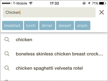
    Screencast: Beginning C# with Unity Part 25: Overriding


    Swift Algorithm Club: Swift Breadth First Search

    $
    0
    0

    The Swift Algorithm Club is an open source project to implement popular algorithms and data structures in Swift.

    Every month, the SAC team will feature a cool data structure or algorithm from the club in a tutorial on this site. If your want to learn more about algorithms and data structures, follow along with us!

    In this tutorial, you’ll walk through a classic of search and pathfinding algorithms, the breadth first search.

    This algorithm was first implemented by Breadth first search was first implemented by Chris Pilcher, and is now refactored for tutorial format.

    This tutorial assumes you have read our Swift Graphs with Adjacency Lists and Swift Queue tutorials, or have equivalent knowledge.

    Note: New to the Swift Algorithm Club? Check out our getting started post first.

    Getting Started

    In our tutorial on Swift Graphs with Adjacency Lists, we presented the idea of a graph as a way of expressing objects and the relationships between them. In a graph, each object is represented as a vertex, and each relationship is represented as an edge.

    For example, a maze could be represented by a graph. Every junction in the maze can be represented by a vertex, and every passageway between junctions could be represented by an edge.

    Breadth first search was discovered in the 1950’s by E. F. Moore, as an algorithm not just for finding a path through a maze, but for finding the shortest path through that maze. The idea behind breadth first search is simple:

    1. Explore every single location within a set number of moves of the origin.
    2. Then, incrementally increase that number until the destination is found.

    Let’s take a look at an example.

    An Example

    Assume you are at the entrance to a maze.

    The breadth first search algorithm works as follows:

    1. Search your current location. If this is the destination, stop searching.
    2. Search the neighbors of your location. If any of them are the destination, stop searching.
    3. Search all the neighbors of those locations. If any of them are the destination, stop searching.
    4. Eventually, if there is a route to the destination, you will find it, and always in the fewest number of moves from the origin. If you ever run out of locations to search, you know that the destination cannot be reached.

    Note: As far as the Breadth First Search algorithm is concerned, the shortest route means the fewest number of moves, from one location to the next.

    In our maze example, the Breadth First Search algorithm treats all the passageways between rooms in the maze as if they were the same length, even though this might not be true. Think of the shortest route as being the shortest list of directions through the maze, rather than the shortest distance

    We’ll explore path-finding algorithms for the shortest distance in future tutorials.

    Swift Breadth First Search

    Let’s see what the breadth first search algorithm looks like in Swift.

    Start by downloading the starter Playground for this tutorial, which has the data structures for a Swift adjacency list and Swift Queue included.

    Note: If you’re curious how the Swift adjacency list and Swift Queue data structures work, you can see the code with View\Navigators\Show Project Navigator. You can also learn how to build these step by step in our Swift Graphs with Adjacency Lists and Swift Queue tutorials.

    To recap, we defined a Graphable protocol which all graph data structures could conform to. We’re going to be extending that protocol, so we can add the breadth first search to all graphable types.

    Here’s what the Graphable protocol looks like at the moment:

    public protocol Graphable {
      associatedtype Element: Hashable
      var description: CustomStringConvertible { get }
     
      func createVertex(data: Element) -> Vertex<Element>
      func add(_ type: EdgeType, from source: Vertex<Element>, to destination: Vertex<Element>, weight: Double?)
      func weight(from source: Vertex<Element>, to destination: Vertex<Element>) -> Double?
      func edges(from source: Vertex<Element>) -> [Edge<Element>]?
    }

    At the top of your playground (right after import XCPlayground), let’s start by creating our extension:

    extension Graphable {
      public func breadthFirstSearch(from source: Vertex<Element>, to destination: Vertex<Element>)
      -> [Edge<Element>]? {
     
      }
    }

    Let’s review this function signature:

    • You’ve just declared a function which takes two vertices – the source, our starting point, and the destination, our goal – and returns a route in edges which will take you from the source to the destination.
    • If the route exists, you expect it to be sorted! The first edge in the route will start from the source vertex, and the last edge in the route will finish at the destination vertex. For every pair of adjacent edges in the route, the destination of the first edge will be the same vertex as the source of the second edge.
    • If the source is the destination, the route will be an empty array.
    • If the route doesn’t exist, the function should return nil.

    Breadth first search relies on visiting the vertices in the correct order. The first vertex to visit will always be the source. After that we’ll explore the source vertex’s neighbors, then their neighbors and so on. Every time we visit a vertex, we add its neighbors to the back of the queue.

    We’ve encountered Queues before, so here’s an excellent opportunity to use one!

    Update your function to this:

    public func breadthFirstSearch(from source: Vertex<Element>, to destination: Vertex<Element>)
     -> [Edge<Element>]? {
     
     var queue = Queue<Vertex<Element>>()
      queue.enqueue(source) // 1
     
      while let visitedVertex = queue.dequeue() { // 2
        if visitedVertex == destination { // 3
          return []
        }
        // TODO...
      }
      return nil // 4
     
    }

    Let’s review this section by section:

    1. This creates a queue for vertices, and enqueues the source vertex.
    2. This dequeues a vertex from the queue (as long as the queue isn’t empty) and calls it the visited vertex.

      In the first iteration, the visited vertex will be the source vertex and the queue will immediately be empty. However, if visiting the source vertex adds more vertices to the loop, the search will continue.

    3. This checks whether the visited vertex is the destination. If it is, the search ends immediately. For now you return an empty list, which is the same as saying the destination was found. Later you’ll compose a more detailed route.
    4. If the queue runs out of vertices, you return nil. This means the destination wasn’t found, and no route to it is possible.

    We now need to enqueue the visited vertex’s neighbors. Replace the TODO with the following code:

    let neighbourEdges = edges(from: visitedVertex) ?? [] // 1
    for edge in neighbourEdges {
      queue.enqueue(edge.destination)
    } // 2

    Let’s review this section by section:

    1. This uses the Graphable protocol’s edges(from:) function to get the array of edges from the visited vertex. Remember that the edges(from:) function returns an optional array of edges. This means if the array is empty, or nil, then there are no edges beginning with that vertex.

      Because, for the purposes of our search, the empty list and nil mean the same thing – no neighbors to add to the queue – we’ll nil-coalesce the optional array with the empty list to remove the optional.

    2. You can now safely use a for-loop with the list of edges, to enqueue each edge’s destination vertex.

    We’re not quite done here yet. There’s a subtle danger in this search algorithm! What problem would you run into if you ran the search algorithm on this example? Ignore the fact that the treasure room isn’t connected to the graph.

    Work out what happens every time we visit a vertex with pen and paper, if that helps.

    Solution Inside: What problem would you run into if you ran the search algorithm on this example? SelectShow>

    There are several ways to do this. Update your code to this:

    public func breadthFirstSearch(from source: Vertex<Element>, to destination: Vertex<Element>) -> [Edge<Element>]? {
      var queue = Queue<Vertex<Element>>()
      queue.enqueue(source)
      var enqueuedVertices = Set<Vertex<Element>>() // 1
     
      while let visitedVertex = queue.dequeue() {
        if visitedVertex == destination {
          return []
        }
       let neighbourEdges = edges(from: visitedVertex) ?? []
        for edge in neighbourEdges {
          if !enqueuedVertices.contains(edge.destination) { // 2
            enqueuedVertices.insert(visitedVertex) // 3
            queue.enqueue(edge.destination)
          }
        }
      }
      return nil
    }

    Let’s review what’s changed:

    1. This creates a set of vertices, to represent the list of vertices you’ve encountered so far. Remember that the Vertex type is Hashable, so we don’t need to do any more work than this to make a set of vertices.
    2. Whenever you examine a neighboring vertex, you first check to see if you’ve encountered it so far.
    3. If you haven’t encountered it before, you add it to both queues: the list of “vertices to process” (queue) and the list of “vertices encountered” (enqueuedVertices).

    This means the search is considerably safer. You now can’t visit more vertices than are in the graph to begin with, so the search must eventually terminate.

    Finding the Way Back

    You’re almost done!

    At this point, you know that if the destination can’t be found, you’ll return nil. But if you do find the destination, you need to find your way back. Unfortunately, every room you’ve visited, you’ve also dequeued, leaving no record of how you found the destination!

    To keep a record of your exploration, you’re going to replace your set of explored vertices with a dictionary, containing all your explored vertices and how you got there. Think of it as exploring a maze, and leaving a chalk arrow pointing towards all the rooms you explored – and when you come back to a room, following the directions the arrows are pointing from, to get back to the entrance.

    If we kept track of all the arrows we drew, for any room we’ve visited, we can just look up the edge we took to get to it. That edge will lead back to a room we visited earlier, and we can look up the edge we took to get there as well, and so on back to the beginning.

    Let’s try this out, starting by creating the following Visit enum type. You’ll have to create this outside the Graphable extension, because Swift 3 doesn’t allow nested generic types.

    enum Visit<Element: Hashable> {
      case source
      case edge(Edge<Element>)
    }

    We’re being clear and Swifty here. In our look-up table, every item in the first column was a Vertex, but not every item in the second column is an Edge; one Vertex will always be the source vertex. If not, something has gone badly wrong and we’ll never get out of the graph!

    Next modify your method as follows:

    public func breadthFirstSearch(from source: Vertex<Element>, to destination: Vertex<Element>) -> [Edge<Element>]? {
      var queue = Queue<Vertex<Element>>()
      queue.enqueue(source)
      var visits : [Vertex<Element> : Visit<Element>] = [source: .source] // 1
     
      while let visitedVertex = queue.dequeue() {
        // TODO: Replace this...
        if visitedVertex == destination {
         return []
        }
        let neighbourEdges = edges(from: visitedVertex) ?? []
        for edge in neighbourEdges {
          if visits[edge.destination] == nil { // 2
            queue.enqueue(edge.destination)
            visits[edge.destination] = .edge(edge) // 3
          }
        }
      }
      return nil
    }

    Let’s review what’s changed here:

    1. This creates a Dictionary of Vertex keys and Visit values, and initializes it with the source vertex as a ‘source’ visit.
    2. If the Dictionary has no entry for a vertex, then it hasn’t been enqueued yet.
    3. Whenever you enqueue a vertex, you don’t just put the vertex into a set, you record the edge you took to reach it.

    Finally, you can backtrack from the destination to the entrance! Update that if-statement with the TODO to this:

    if visitedVertex == destination {
      var vertex = destination // 1
      var route : [Edge<Element>] = [] // 2
     
      while let visit = visits[vertex],
        case .edge(let edge) = visit { // 3
     
        route = [edge] + route
        vertex = edge.source // 4
     
      }
      return route // 5
    }

    Let’s review this section by section:

    1. You created a new variable, to store each vertex which is part of the route.
    2. You also created a variable to store your route.
    3. You created a while-loop, which will continue as long as the visits Dictionary has an entry for the vertex, and as long as that entry is an edge. If the entry is a source, then the while-loop will end.
    4. You added that edge to the start of your route, and set the vertex to that edge’s source. You’re now one step closer to the beginning.
    5. The while-loop has ended, so your route must now be complete.

    That’s it! You can test this out by adding the following to the end of your playground:

    if let edges = dungeon.breadthFirstSearch(from: entranceRoom, to: treasureRoom) {
      for edge in edges {
        print("\(edge.source) -> \(edge.destination)")
      }
    }

    You should see the following print out in your console:

    Entrance -> Rat
    Rat -> Treasure
    

    Where To Go From Here?

    I hope you enjoyed this tutorial on the Swift breadth first search algorithm!

    You’ve extended the behavior of all Graphable data types, so you can search for a route from any vertex to any other vertex. Better still, you know it’s a route with the shortest number of steps.

    Here is a playground with the above code. You can also find the original implementation and further discussion in the breadth first search section of the Swift Algorithm Club repository.

    This was just one of the many algorithm clubs focused on the Swift Algorithm Club repository. If you’re interested in more, check out the repo.

    It’s in your best interest to know about algorithms and data structures – they’re solutions to many real world problems, and are frequently asked as interview questions. Plus it’s fun!

    So stay tuned for many more tutorials from the Swift Algorithm club in the future. In the meantime, if you have any questions on implementing trees in Swift, please join the forum discussion below!

    Note: The Swift Algorithm Club is always looking for more contributors. If you’ve got an interesting data structure, algorithm, or even an interview question to share, don’t hesitate to contribute! To learn more about the contribution process, check out our Join the Swift Algorithm Club article.

    The post Swift Algorithm Club: Swift Breadth First Search appeared first on Ray Wenderlich.
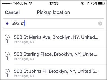
    iOS Unit Testing and UI Testing Tutorial

    $
    0
    0

    iOS Unit Testing - feature

    Make better apps by using iOS Unit Testing!

    Writing tests isn’t glamorous, but since tests can keep your sparkling app from turning into a bug-ridden piece of junk, it sure is necessary. If you’re reading this iOS Unit Testing and UI Testing tutorial, you already know you should write tests for your code and UI, but you’re not sure how to test in Xcode.

    Maybe you already have a “working” app but no tests set up for it, and you want to be able to test any changes when you extend the app. Maybe you have some tests written, but aren’t sure whether they’re the right tests. Or maybe you’re working on your app now and want to test as you go.

    This iOS Unit Testing and UI Testing tutorial shows how to use Xcode’s test navigator to test an app’s model and asynchronous methods, how to fake interactions with library or system objects by using stubs and mocks, how to test UI and performance, and how to use the code coverage tool. Along the way, you’ll pick up some of the vocabulary used by testing ninjas, and by the end of this tutorial you’ll be injecting dependencies into your System Under Test (SUT) with aplomb!

    Testing, Testing …

    What to Test?

    Before writing any tests, it’s important to start with the basics: what do you need to test? If your goal is to extend an existing app, you should first write tests for any component you plan to change.

    More generally, tests should cover:

    • Core functionality: model classes and methods, and their interactions with the controller
    • The most common UI workflows
    • Boundary conditions
    • Bug fixes

    First Things FIRST: Best Practices for Testing

    The acronym FIRST describes a concise set of criteria for effective unit tests. Those criteria are:

    • Fast: Tests should run quickly, so people won’t mind running them.
    • Independent/Isolated: Tests should not do setup or teardown for one another.
    • Repeatable: You should obtain the same results every time you run a test. External data providers and concurrency issues could cause intermittent failures.
    • Self-validating: Tests should be fully automated; the output should be either “pass” or “fail”, rather than a programmer’s interpretation of a log file.
    • Timely: Ideally, tests should be written just before you write the production code they test.

    Following the FIRST principles will keep your tests clear and helpful, instead of turning into roadblocks for your app.

    Getting Started

    Download, unzip, open and inspect the starter projects BullsEye and HalfTunes.

    BullsEye is based on a sample app in iOS Apprentice; I’ve extracted the game logic into a BullsEyeGame class and added an alternative game style.

    In the lower-right corner there’s a segmented control to let the user select the game style: either Slide, to move the slider to get as close as possible to the target value, or Type, to guess where the slider position is. The control’s action also stores the user’s game style choice as a user default.

    HalfTunes is the sample app from our NSURLSession Tutorial, updated to Swift 3. Users can query the iTunes API for songs, then download and play song snippets.

    Let’s start testing!

    Unit Testing in Xcode

    Creating a Unit Test Target

    The Xcode Test Navigator provides the easiest way to work with tests; you’ll use it to create test targets and run tests on your app.

    Open the BullsEye project and hit Command-5 to open its test navigator.

    Click the + button in the lower-left corner, then select New Unit Test Target… from the menu:

    iOS Unit Testing: Test Navigator

    Accept the default name BullsEyeTests. When the test bundle appears in the test navigator, click it to open it in the editor. If BullsEyeTests doesn’t appear automatically, trouble-shoot by clicking one of the other navigators, then returning to the test navigator.

    iOS Unit Testing: Template

    The template imports XCTest and defines a BullsEyeTests subclass of XCTestCase, with setup(), tearDown() and example test methods.

    There are three ways to run the test class:

    1. Product\Test or Command-U. This actually runs all test classes.
    2. Click the arrow button in the test navigator.
    3. Click the diamond button in the gutter.

    iOS Unit Testing: Running Tests

    You can also run an individual test method by clicking its diamond, either in the test navigator or in the gutter.

    Try the different ways to run the tests to get a feeling for how long it takes and what it looks like. The sample tests don’t do anything yet, so they’ll run really fast!

    When all the tests succeed, the diamonds will turn green and show check marks. Click the gray diamond at the end of testPerformanceExample() to open the Performance Result:

    iOS Unit Testing: Performance Results

    You don’t need testPerformanceExample(), so delete it.

    Using XCTAssert to Test Models

    First, you’ll use XCTAssert to test a core function of BullsEye’s model: does a BullsEyeGame object correctly calculate the score for a round?

    In BullsEyeTests.swift, add this line just below the import statement:

    @testable import BullsEye

    This gives the unit tests access to the classes and methods in BullsEye.

    At the top of the BullsEyeTests class, add this property:

    var gameUnderTest: BullsEyeGame!

    Create and start a new BullsEyeGame object in setup(), after the call to super:

    gameUnderTest = BullsEyeGame()
    gameUnderTest.startNewGame()

    This creates an SUT (System Under Test) object at the class level, so all the tests in this test class can access the SUT object’s properties and methods.

    Here, you also call the game’s startNewGame method, which creates a targetValue. Many of your tests will use targetValue, to test that the game calculates the score correctly.

    Before you forget, release your SUT object in tearDown(), before the call to super:

    gameUnderTest = nil
    Note: It’s good practice to create the SUT in setup() and release it in tearDown(), to ensure every test starts with a clean slate. For more discussion, check out Jon Reid’s post on the subject.

    Now you’re ready to write your first test!

    Replace testExample() with the following code:

    // XCTAssert to test model
    func testScoreIsComputed() {
      // 1. given
      let guess = gameUnderTest.targetValue + 5
     
      // 2. when
      _ = gameUnderTest.check(guess: guess)
     
      // 3. then
      XCTAssertEqual(gameUnderTest.scoreRound, 95, "Score computed from guess is wrong")
    }

    A test method’s name always begins with test, followed by a description of what it tests.

    It’s good practice to format the test into given, when and then sections:

    1. In the given section, set up any values needed: in this example, you create a guess value so you can specify how much it differs from targetValue.
    2. In the when section, execute the code being tested: call gameUnderTest.check(_:).
    3. In the then section, assert the result you expect (in this case, gameUnderTest.scoreRound is 100 – 5) with a message that prints if the test fails.

    Run the test by clicking the diamond icon in the gutter or in the test navigator. The app will build and run, and the diamond icon will change to a green checkmark!

    Note: To see a full list of XCTestAssertions, Command-click XCTAssertEqual in the code to open XCTestAssertions.h, or go to Apple’s Assertions Listed by Category.

    iOS Unit Testing givenWhenThen

    Note: The Given-When-Then structure of a test originated with Behavior Driven Development (BDD) as a client-friendly, low-jargon nomenclature. Alternative naming systems are Arrange-Act-Assert and Assemble-Activate-Assert.

    Debugging a Test

    There’s a bug built into BullsEyeGame on purpose, so now you’ll practice finding it. To see the bug in action, rename testScoreIsComputed to testScoreIsComputedWhenGuessGTTarget, then copy-paste-edit it to create testScoreIsComputedWhenGuessLTTarget.

    In this test, subtract 5 from targetValue in the given section. Leave everything else the same:

    func testScoreIsComputedWhenGuessLTTarget() {
      // 1. given
      let guess = gameUnderTest.targetValue - 5
     
      // 2. when
      _ = gameUnderTest.check(guess: guess)
     
      // 3. then
      XCTAssertEqual(gameUnderTest.scoreRound, 95, "Score computed from guess is wrong")
    }

    The difference between guess and targetValue is still 5, so the score should still be 95.

    In the breakpoint navigator, add a Test Failure Breakpoint; this will stop the test run when a test method posts a failure assertion.

    iOS Unit Testing: Adding a Test Failure Breakpoint

    Run your test: it should stop at the XCTAssertEqual line with a Test Failure.

    Inspect gameUnderTest and guess in the debug console:

    iOS Unit Testing: Viewing a Test Failure

    guess is targetValue - 5 but scoreRound is 105, not 95!

    To investigate further, use the normal debugging process: set a breakpoint at the when statement and also one in BullsEyeGame.swift, in check(_:), where it creates difference. Then run the test again, and step-over the let difference statement to inspect the value of difference in the app:

    iOS Unit Testing: Debug Console

    The problem is that difference is negative, so the score is 100 – (-5); the fix is to use the absolute value of difference. In check(_:), uncomment the correct line and delete the incorrect one.

    Remove the two breakpoints and run the test again to confirm that it now succeeds.

    Using XCTestExpectation to Test Asynchronous Operations

    Now that you’ve learned how to test models and debug test failures, let’s move on to using XCTestExpectation to test network operations.

    Open the HalfTunes project: it uses URLSession to query the iTunes API and download song samples. Suppose you want to modify it to use AlamoFire for network operations. To see if anything breaks, you should write tests for the network operations and run them before and after you change the code.

    URLSession methods are asynchronous: they return right away, but don’t really finish running until some time later. To test asynchronous methods, you use XCTestExpectation to make your test wait for the asynchronous operation to complete.

    Asynchronous tests are usually slow, so you should keep them separate from your faster unit tests.

    Select New Unit Test Target… from the + menu and name it HalfTunesSlowTests. Import the HalfTunes app just below the import statement:

    @testable import HalfTunes

    The tests in this class will all use the default session to send requests to Apple’s servers, so declare a sessionUnderTest object, create it in setup() and release it in tearDown():

    var sessionUnderTest: URLSession!
     
    override func setUp() {
      super.setUp()
      sessionUnderTest = URLSession(configuration: URLSessionConfiguration.default)
    }
     
    override func tearDown() {
      sessionUnderTest = nil
      super.tearDown()
    }

    Replace testExample() with your asynchronous test:

    // Asynchronous test: success fast, failure slow
    func testValidCallToiTunesGetsHTTPStatusCode200() {
      // given
      let url = URL(string: "https://itunes.apple.com/search?media=music&entity=song&term=abba")
      // 1
      let promise = expectation(description: "Status code: 200")
     
      // when
      let dataTask = sessionUnderTest.dataTask(with: url!) { data, response, error in
        // then
        if let error = error {
          XCTFail("Error: \(error.localizedDescription)")
          return
        } else if let statusCode = (response as? HTTPURLResponse)?.statusCode {
          if statusCode == 200 {
            // 2
            promise.fulfill()
          } else {
            XCTFail("Status code: \(statusCode)")
          }
        }
      }
      dataTask.resume()
      // 3
      waitForExpectations(timeout: 5, handler: nil)
    }

    This test checks to see that sending a valid query to iTunes returns a 200 status code. Most of the code is the same as what you’d write in the app, with these additional lines:

    1. expectation(_:) returns an XCTestExpectation object, which you store in promise. Other commonly used names for this object are expectation and future. The description parameter describes what you expect to happen.
    2. To match the description, you call promise.fulfill() in the success condition closure of the asynchronous method’s completion handler.
    3. waitForExpectations(_:handler:) keeps the test running until all expectations are fulfilled, or the timeout interval ends, whichever happens first.

    Run the test. If you’re connected to the internet, the test should take about a second to succeed after the app starts to load in the simulator.

    Fail Faster

    Failure hurts, but it doesn’t have to take forever. Here you’ll address how to quickly find out if your tests fail, saving time that could be better wasted on Facebook. :]

    To modify your test so the asynchronous operation fails, simply delete the ‘s’ from “itunes” in the URL:

    let url = URL(string: "https://itune.apple.com/search?media=music&entity=song&term=abba")

    Run the test: it fails, but it takes the full timeout interval! This is because its expectation is that the request succeeded, and that’s where you called promise.fulfill(). Since the request fails, the test finishes only when the timeout expires.

    You can make this test fail faster by changing its expectation: instead of waiting for the request to succeed, wait only until the asynchronous method’s completion handler is invoked. This happens as soon as the app receives a response — either OK or error — from the server, which fulfills the expectation. Your test can then check whether the request succeeded.

    To see how this works, you’ll create a new test. First, fix this test by undoing the change to url, then add the following test to your class:

    // Asynchronous test: faster fail
    func testCallToiTunesCompletes() {
      // given
      let url = URL(string: "https://itune.apple.com/search?media=music&entity=song&term=abba")
      // 1
      let promise = expectation(description: "Completion handler invoked")
      var statusCode: Int?
      var responseError: Error?
     
      // when
      let dataTask = sessionUnderTest.dataTask(with: url!) { data, response, error in
        statusCode = (response as? HTTPURLResponse)?.statusCode
        responseError = error
        // 2
        promise.fulfill()
      }
      dataTask.resume()
      // 3
      waitForExpectations(timeout: 5, handler: nil)
     
      // then
      XCTAssertNil(responseError)
      XCTAssertEqual(statusCode, 200)
    }

    The key thing here is that simply entering the completion handler fulfills the expectation, and this takes about a second to happen. If the request fails, the then assertions fail.

    Run the test: it should now take about a second to fail, and it fails because the request failed, not because the test run exceeded timeout.

    Fix the url, then run the test again to confirm that it now succeeds.

    Faking Objects and Interactions

    Asynchronous tests give you confidence that your code generates correct input to an asynchronous API. You might also want to test that your code works correctly when it receives input from a URLSession, or that it correctly updates UserDefaults or a CloudKit database.

    Most apps interact with system or library objects — objects you don’t control — and tests that interact with these objects can be slow and unrepeatable, violating two of the FIRST principles. Instead, you can fake the interactions by getting input from stubs or by updating mock objects.

    Employ fakery when your code has a dependency on a system or library object — create a fake object to play that part and inject this fake into your code. Dependency Injection by Jon Reid describes several ways to do this.

    fake

    Fake Input From Stub

    In this test, you’ll check that the app’s updateSearchResults(_:) method correctly parses data downloaded by the session by checking that searchResults.count is correct. The SUT is the view controller, and you’ll fake the session with stubs and some pre-downloaded data.

    Select New Unit Test Target… from the + menu and name it HalfTunesFakeTests. Import the HalfTunes app just below the import statement:

    @testable import HalfTunes

    Declare the SUT, create it in setup() and release it in tearDown():

    var controllerUnderTest: SearchViewController!
     
    override func setUp() {
      super.setUp()
      controllerUnderTest = UIStoryboard(name: "Main",
          bundle: nil).instantiateInitialViewController() as! SearchViewController!
    }
     
    override func tearDown() {
      controllerUnderTest = nil
      super.tearDown()
    }
    Note: The SUT is the view controller because HalfTunes has a massive view controller problem — all the work is done in SearchViewController.swift. Moving the networking code into separate modules would reduce this problem, and also make testing easier.

    Next, you’ll need some sample JSON data that your fake session will provide to your test. Just a few items will do, so to limit your download results in iTunes append &limit=3 to the URL string:

    https://itunes.apple.com/search?media=music&entity=song&term=abba&limit=3

    Copy this URL and paste it into a browser. This downloads a file named 1.txt or similar. Preview it to confirm it’s a JSON file, then rename it abbaData.json and add the file to the HalfTunesFakeTests group.

    The HalfTunes project contains the supporting file DHURLSessionMock.swift. This defines a simple protocol named DHURLSession, with methods (stubs) to create a data task with either a URL or a URLRequest. It also defines URLSessionMock which conforms to this protocol, with initializers that let you create a mock URLSession object with your choice of data, response and error.

    Set up the fake data and response, and create the fake session object, in setup() after the statement that creates the SUT:

    let testBundle = Bundle(for: type(of: self))
    let path = testBundle.path(forResource: "abbaData", ofType: "json")
    let data = try? Data(contentsOf: URL(fileURLWithPath: path!), options: .alwaysMapped)
     
    let url = URL(string: "https://itunes.apple.com/search?media=music&entity=song&term=abba")
    let urlResponse = HTTPURLResponse(url: url!, statusCode: 200, httpVersion: nil, headerFields: nil)
     
    let sessionMock = URLSessionMock(data: data, response: urlResponse, error: nil)

    At the end of setup(), inject the fake session into the app as a property of the SUT:

    controllerUnderTest.defaultSession = sessionMock
    Note: You’ll use the fake session directly in your test, but this shows you how to inject it so that your future tests can call SUT methods that use the view controller’s defaultSession property.

    Now you’re ready to write the test that checks whether calling updateSearchResults(_:) parses the fake data. Replace testExample() with the following:

    // Fake URLSession with DHURLSession protocol and stubs
    func test_UpdateSearchResults_ParsesData() {
      // given
      let promise = expectation(description: "Status code: 200")
     
      // when
      XCTAssertEqual(controllerUnderTest?.searchResults.count, 0, "searchResults should be empty before the data task runs")
      let url = URL(string: "https://itunes.apple.com/search?media=music&entity=song&term=abba")
      let dataTask = controllerUnderTest?.defaultSession.dataTask(with: url!) {
        data, response, error in
        // if HTTP request is successful, call updateSearchResults(_:) which parses the response data into Tracks
        if let error = error {
          print(error.localizedDescription)
        } else if let httpResponse = response as? HTTPURLResponse {
          if httpResponse.statusCode == 200 {
            promise.fulfill()
            self.controllerUnderTest?.updateSearchResults(data)
          }
        }
      }
      dataTask?.resume()
      waitForExpectations(timeout: 5, handler: nil)
     
      // then
      XCTAssertEqual(controllerUnderTest?.searchResults.count, 3, "Didn't parse 3 items from fake response")
    }

    You still have to write this as an asynchronous test because the stub is pretending to be an asynchronous method.

    The when assertion is that searchResults is empty before the data task runs — this should be true, because you created a completely new SUT in setup().

    The fake data contains the JSON for three Track objects, so the then assertion is that the view controller’s searchResults array contains three items.

    Run the test. It should succeed pretty quickly, because there isn’t any real network connection!

    Fake Update to Mock Object

    The previous test used a stub to provide input from a fake object. Next, you’ll use a mock object to test that your code correctly updates UserDefaults.

    Reopen the BullsEye project. The app has two game styles: the user either moves the slider to match the target value or guesses the target value from the slider position. A segmented control in the lower-right corner switches the game style and updates the gameStyle user default to match.

    Your next test will check that the app correctly updates the gameStyle user default.

    In the test navigator, click on New Unit Test Target… and name it BullsEyeMockTests. Add the following below the import statement:

    @testable import BullsEye
     
    class MockUserDefaults: UserDefaults {
      var gameStyleChanged = 0
      override func set(_ value: Int, forKey defaultName: String) {
        if defaultName == "gameStyle" {
          gameStyleChanged += 1
        }
      }
    }

    MockUserDefaults overrides the set(_:forKey:) method to increment the gameStyleChanged flag. Often you’ll see similar tests that set a Bool variable, but incrementing an Int gives you more flexibility — for example, your test could check that the method is called exactly once.

    Declare the SUT and the mock object in BullsEyeMockTests:

    var controllerUnderTest: ViewController!
    var mockUserDefaults: MockUserDefaults!

    In setup(), create the SUT and the mock object, then inject the mock object as a property of the SUT:

    controllerUnderTest = UIStoryboard(name: "Main", bundle: nil).instantiateInitialViewController() as! ViewController!
    mockUserDefaults = MockUserDefaults(suiteName: "testing")!
    controllerUnderTest.defaults = mockUserDefaults

    Release the SUT and the mock object in tearDown():

    controllerUnderTest = nil
    mockUserDefaults = nil

    Replace testExample() with this:

    // Mock to test interaction with UserDefaults
    func testGameStyleCanBeChanged() {
      // given
      let segmentedControl = UISegmentedControl()
     
      // when
      XCTAssertEqual(mockUserDefaults.gameStyleChanged, 0, "gameStyleChanged should be 0 before sendActions")
      segmentedControl.addTarget(controllerUnderTest,
          action: #selector(ViewController.chooseGameStyle(_:)), for: .valueChanged)
      segmentedControl.sendActions(for: .valueChanged)
     
      // then
      XCTAssertEqual(mockUserDefaults.gameStyleChanged, 1, "gameStyle user default wasn't changed")
    }

    The when assertion is that the gameStyleChanged flag is 0 before the test method “taps” the segmented control. So if the then assertion is also true, it means set(_:forKey:) was called exactly once.

    Run the test; it should succeed.

    UI Testing in Xcode

    Xcode 7 introduced UI testing, which lets you create a UI test by recording interactions with the UI. UI testing works by finding an app’s UI objects with queries, synthesizing events, then sending them to those objects. The API enables you to examine a UI object’s properties and state in order to compare them against the expected state.

    In the BullsEye project’s test navigator, add a new UI Test Target. Check that Target to be Tested is BullsEye, then accept the default name BullsEyeUITests.

    Add this property at the top of the BullsEyeUITests class:

    var app: XCUIApplication!

    In setup(), replace the statement XCUIApplication().launch() with the following:

    app = XCUIApplication()
    app.launch()

    Change the name of testExample() to testGameStyleSwitch().

    Open a new line in testGameStyleSwitch() and click the red Record button at the bottom of the editor window:

    iOS Unit Testing: Recording a UI Test

    When the app appears in the simulator, tap the Slide segment of the game style switch and the top label. Then click the Xcode Record button to stop the recording.

    You now have the following three lines in testGameStyleSwitch():

    let app = XCUIApplication()
    app.buttons["Slide"].tap()
    app.staticTexts["Get as close as you can to: "].tap()

    If there are any other statements, delete them.

    Line 1 duplicates the property you created in setup() and you don’t need to tap anything yet, so also delete the first line and the .tap() at the end of lines 2 and 3. Open the little menu next to ["Slide"] and select segmentedControls.buttons["Slide"].

    So what you have is:

    app.segmentedControls.buttons["Slide"]
    app.staticTexts["Get as close as you can to: "]

    Alter this to create a given section:

    // given
    let slideButton = app.segmentedControls.buttons["Slide"]
    let typeButton = app.segmentedControls.buttons["Type"]
    let slideLabel = app.staticTexts["Get as close as you can to: "]
    let typeLabel = app.staticTexts["Guess where the slider is: "]

    Now that you have names for the two buttons and the two possible top labels, add the following:

    // then
    if slideButton.isSelected {
      XCTAssertTrue(slideLabel.exists)
      XCTAssertFalse(typeLabel.exists)
     
      typeButton.tap()
      XCTAssertTrue(typeLabel.exists)
      XCTAssertFalse(slideLabel.exists)
    } else if typeButton.isSelected {
      XCTAssertTrue(typeLabel.exists)
      XCTAssertFalse(slideLabel.exists)
     
      slideButton.tap()
      XCTAssertTrue(slideLabel.exists)
      XCTAssertFalse(typeLabel.exists)
    }

    This checks to see whether the correct label exists when each button is selected or tapped. Run the test — all the assertions should succeed.

    Performance Testing

    From Apple’s documentation: A performance test takes a block of code that you want to evaluate and runs it ten times, collecting the average execution time and the standard deviation for the runs. The averaging of these individual measurements form a value for the test run that can then be compared against a baseline to evaluate success or failure.

    It’s very simple to write a performance test: you just put the code you want to measure into the closure of the measure() method.

    To see this in action, reopen the HalfTunes project and, in HalfTunesFakeTests, replace testPerformanceExample() with the following test:

    // Performance
    func test_StartDownload_Performance() {
      let track = Track(name: "Waterloo", artist: "ABBA",
          previewUrl: "http://a821.phobos.apple.com/us/r30/Music/d7/ba/ce/mzm.vsyjlsff.aac.p.m4a")
      measure {
        self.controllerUnderTest?.startDownload(track)
      }
    }

    Run the test, then click the icon that appears next to the end of the measure() closure to see the statistics.

    iOS Unit Testing: Viewing a Performance Result

    Click Set Baseline, then run the performance test again and view the result — it might be better or worse than the baseline. The Edit button lets you reset the baseline to this new result.

    Baselines are stored per device configuration, so you can have the same test executing on several different devices, and have each maintain a different baseline dependent upon the specific configuration’s processor speed, memory, etc.

    Anytime you make changes to an app that might impact the performance of the method being tested, run the performance test again to see how it compares to the baseline.

    Code Coverage

    The code coverage tool tells you what app code is actually being run by your tests, so you know what parts of the app code aren’t (yet) being tested.

    Note: Should you run performance tests while code coverage is enabled? Apple’s documentation says: Code coverage data collection incurs a performance penalty … affect[ing] execution of the code in a linear fashion so performance results remain comparable from test run to test run when it is enabled. However, you should consider whether to have code coverage enabled when you are critically evaluating the performance of routines in your tests.

    To enable code coverage, edit the scheme’s Test action and tick the Code Coverage box:

    iOS Unit Testing: Setting the Code Coverage Switch

    Run all your tests (Command-U), then open the reports navigator (Command-8). Select By Time, select the top item in that list, then select the Coverage tab:

    iOS Unit Testing: Code Coverage Report

    Click the disclosure triangle to see the list of functions in SearchViewController.swift:

    iOS Unit Testing: Code Coverage Report

    Mouse over the blue Coverage bar next to updateSearchResults(_:) to see that coverage is 71.88%.

    Click the arrow button for this function to open the source file, then locate the function. As you mouse over the coverage annotations in the right sidebar, sections of code highlight green or red:

    iOS Unit Testing: Good and Bad Code Coverage

    The coverage annotations show how many times a test hit each code section; sections that weren’t called are highlighted in red. As you’d expect, the for-loop ran 3 times, but nothing in the error paths was executed. To increase coverage of this function, you could duplicate abbaData.json, then edit it so it causes the different errors — for example, change "results" to "result" for a test that hits print("Results key not found in dictionary").

    100% Coverage?

    How hard should you strive for 100% code coverage? Google “100% unit test coverage”, and you’ll find a range of arguments for and against, along with debate over the very definition of “100% coverage”. Arguments-against say the last 10-15% isn’t worth the effort. Arguments-for say the last 10-15% is the most important, because it’s hard to test. Google “hard to unit test bad design” to find persuasive arguments that untestable code is a sign of deeper design problems. Further contemplation might lead to the conclusion that Test Driven Development is the way to go.

    Where to Go From Here?

    You now have some great tools to use in writing tests for your projects. I hope this iOS Unit Testing and UI Testing tutorial has given you the confidence to test all the things!

    You can find the completed projects in this zip file.

    Here are some resources for further study:

    If you have any questions or comments on this tutorial, please join the forum discussion below. :]

    The post iOS Unit Testing and UI Testing Tutorial appeared first on Ray Wenderlich.

    Updated Course: How To Make A Game Like Flappy Bird

    $
    0
    0

    Did you think 15 courses released since WWDC was a lot? Well, we’re not done yet. :]

    Today we’re happy to release yet another course: How To Make a Game Like Flappy Bird!

    In this course, you’ll learn how to make a simple iOS game called Flappy Felipe – a game about a tutorial team member who had a dream of becoming a cartoon bird.

    Specifically, you will learn how to use Apple’s built-in game framework, SpriteKit, which is a simple way to get started making games on iOS, and a powerful helper library called GameplayKit.

    In addition to learning how to implement the core gameplay, you’ll also learn how to finish the game into a publishable state, complete with tracking score, adding menus, saving data, and even making the game work on the Apple TV.

    Let’s take a look at what’s inside.

    Video 1: Introduction: Get an overview of what you’ll learn in the series, and learn the folklore behind the game! :]

    Video 2: Getting Started: Learn how to create a SpriteKit project and add the background.

    Video 3: Moving the Background: Learn how to move the ground from right to left to make it look like Felipe is flying through the air.

    Video 4: Adding the Player: Learn about GameplayKit by adding the star of the show, Felipe.

    Video 5: Spawning Obstacles: Learn more about GameplayKit by adding obstacles to the scene.

    Video 6: Physics Bodies and Collision Detection: Discover how to add physics bodies to your sprites.

    Video 7: Game States and State Machines: Learn how Game States and State Machines can help keep your code organized and easier to maintain.

    Video 8: Keeping Score: Learn how to add a simple method for keeping score.

    Video 9: Main Menu and Tutorial Screen: Learn more about Game States as you add a main menu and tutorial screen to Flappy Felipe.

    Video 10: Game Over: Discover the power of NSUserDefaults for storing and retrieving players’ scores.

    Video 11: Animation and Rotation: Learn about SKTextures and how to animate your sprites.

    Video 12: Finishing Touches: Add juice to your game to help set it apart from all the rest.

    Video 13: Making it Work on Apple TV: Learn how to port your existing iOS game to tvOS / Apple TV.

    Video 14: Conclusion: Take a look back at everything you learned in this course. We’ll also give you suggestions for where to go to next.

    Where To Go From Here?

    Want to check out the course? You can watch the introduction for free!

    The rest of the course is for raywenderlich.com subscribers only. Here’s how you can get access:

    • If you are a raywenderlich.com subscriber: The entire course is complete and available today. You can check out the first part here.
    • If you are not a subscriber yet: What are you waiting for? Subscribe now to get access to our updated How To Make a Game Like Flappy Felipe course, and our entire catalog of over 500 videos.

    There’s much more in store for raywenderlich.com subscribers – if you’re curious, you can check out our full schedule of upcoming courses.

    I hope you enjoy our new course, and stay tuned for many more new Swift 3 courses and updates to come!

    The post Updated Course: How To Make A Game Like Flappy Bird appeared first on Ray Wenderlich.

    Introduction to Unity 2D

    $
    0
    0

    Unity2D-feature

    Update 3/15/17: Updated for Unity 5.5.

    Unity is an extremely popular and versatile game engine that has a long list of supported platforms and devices to its credit. Although 3D gaming seems to be the latest craze, a large portion of mobile, console and desktop games are presented in 2D, so it’s important to understand the features Unity provides for building 2D games.

    In this tutorial, you’ll build a 2D space lander game and learn the following skills along the way:

    • How to work with sprites and the camera.
    • How to use Physics 2D components to handle collisions and gameplay.
    • How to set up 2D animation and states.
    • How to apply layer and sprite ordering.

    If you don’t already have Unity 5, download it from Unity’s website.

    Note: If you are new to Unity, you can read our Intro to Unity tutorial to get you up to speed.

    Getting Started

    Download the starter project for this tutorial, extract it, and open the LowGravityLander-Start project in Unity.

    Open the Lander-Start scene located in the Scenes folder of your Project window. You should see the following in the Game view:

    It's lonely out in space...

    It’s lonely out in space…

    The starter project is a functional 2D space lander game, but it has a few problems you’ll need to solve before you can truly call it finished.

    Ready for lift off (and a perilous journey down to the closest landing pad)? Time to get started!

    Note: 2D games in Unity, quite logically, use the 2D mode of the Unity Editor. You can choose 2D or 3D mode When you create a project from scratch:
    2D Mode
    This option has already been set in the starter project for you.

    Sprites in Unity

    Sprites are easy to work with in Unity thanks to a great 2D workflow and built-in editor.

    To add a sprite to your game, simply drag and drop it from your Project folder into your Scene view. To see for yourself how easy the process is, select the Scene view, then drag the playership sprite from the Sprites folder into your Scene view:

    Lander-create-new-sprite

    In the Hierarchy, click the playership GameObject Unity created for you and take a look at its details in the Inspector. Notice that Unity automatically attached a Sprite Renderer component, which contains your playership sprite, to the GameObject:

    sprite-inspector-unity2d

    That’s all it takes! The Sprite Renderer lets you display images as Sprites in both 2D and 3D scenes.

    Delete the playership GameObject from the Hierarchy.

    Sprite Modes

    Click on a sprite in the Assets / Sprites folder. In the Inspector there are three different modes in which you can use Sprites:

    sprite-mode-selection-unity2d

    • Single: A single-image Sprite.
    • Multiple: A sprite with multiple elements, such as animations or spritesheets with different parts for a character.
    • Polygon: A custom polygon shaped sprite, that you can create many different types of primitive shapes with. Examples: Triangle, Square, Pentagon, Hexagon, etc…

    A spriteheet is a single image that contains lots of smaller individual images like so:

    thruster-spritesheet

    The reason for using spritesheets is that every image you use in your game will take up one draw call. For a few dozen sprites, this isn’t a big deal but as your game grows in complexity and scope, this could be a potential issue.

    By using spritesheets, you are making just one draw call for lots of Sprites, thus giving your game a performance boost. Of course, organization of your spritesheets is just as important as using them, but that’s for another tutorial.

    Sprite Editing

    It’s convenient to pack multiple graphic elements into a single image for animations or objects that have lots of moving parts; Unity makes it easy to manage these spritesheets with a built-in 2D spritesheet editor.

    You’ll use two spritesheets in this game: one for the lander’s thruster animation and one for an explosion animation. Both of these animations consist of multiple frames, which you can edit and slice using the Sprite Editor.

    explosion-spritesheet.png has already been sliced and prepared into an animation for you, but the thruster-spritesheet.png still needs some attention. That’s your next task.

    Click thruster-spritesheet.png in the Sprites folder of the Project window. In the Inspector the Sprite Mode is already set to Multiple (if not, change it then click Apply).

    Next, click Sprite Editor:

    sprite-editor-thruster-spritesheet-unity2d

    A new window pops up to show the spritesheet automatically sliced into individual frames (the numbers were added for illustration and not part of the screenshot):

    IndividualFrames

    Click Slice in the upper left corner of the window, and notice that Automatic is the default slice operation:

    Lander-default-sprite-slice-settings

    Automatic means Unity will attempt to locate and slice your spritesheet on its own to the best of its ability. In this case, Automatic would work just fine, but you could also slice your spritesheet by cell size or by cell count.

    Selecting the cell size option lets you specify the size of each frame in your spritesheet using pixel dimensions.

    Click Grid by Cell Size under the Slice menu in the Sprite Editor:

    GridByCellSize

    Under Pixel Size, enter 9 for X and 32 for Y. Leave the other values at 0 and Pivot set to Center, then click Slice:

    Slice and dice!

    Slice and dice!

    Click Apply in the Sprite Editor window to apply the changes to your spritesheet:
    SpriteEditorApplyButton

    You’re done – you can close the close the Sprite Editor now. Your thruster spritesheet is now ready for use.

    Assigning Sprites to The Lander

    Right now, you can’t actually see the lander in your game. That’s because it doesn’t have any Sprite Renderer components attached. There won’t be any spectacular landings – or crashes! – if the lander isn’t visble on the screen.

    To fix that, click the Lander GameObject in the Hierarchy. In the Inspector, click Add Component, then type Sprite Renderer in the search text field. Finally, choose the Sprite Renderer component.

    Now that you’ve added a Sprite Renderer component, click the small circle icon next to the Sprite selector in the component properties and select the playership sprite:

    Lander-add-sprite-renderer-component-600px

    Set the Order in Layer to 1.

    Your next job is to assign the landing gear sprite.

    Click the LanderFeet GameObject located under the Lander GameObject, then click the small circle icon next to the Sprite selector in the Sprite Renderer component properties. Then choose the lander-feet sprite in the Select Sprite window like so:

    select-lander-feet-unity2d

    Click Play; you’ll be able to see your Lander in the Game view. Use the WASD or arrow keys to fly around the screen:

    Houston, we have liftoff!

    Houston, we have liftoff!

    The 2D Camera And Pixels Per Unit

    Unity 2D projects have an orthographic camera view by default. Generally you’ll want to stick with this in your 2D games instead of using the perspective camera view. You can learn more about the differences between Perspective and Orthographic over here.

    The image below shows the default camera configuration of your Lander project:

    Lander-default-camera-orthographic-settings

    As noted above, the Projection property is set to Orthographic.

    Select the playership sprite in the Project window and look at its Import Settings in the Inspector. The Pixels Per Unit property is currently set to the default value of 100:

    player-ship-sprite-pixels-per-unit-unity2d

    So…what does “100” mean in this case?

    A Word on Pixels Per Unit

    Units in Unity don’t necessarily correspond to actual pixels on the screen. Instead, you’d commonly size your objects relative to each other on some arbitrary scale such as 1 unit = 1 meter. For sprites, Unity uses Pixels Per Unit to determine their unscaled size in units.

    Consider a sprite imported from an image that’s 500 pixels wide. The table below shows how the width of GameObject on the x-axis would change as you render the sprite using different values for Pixels Per Units at different scales:

    Screen Shot 2015-10-18 at 8.00.36 PM

    Still not quite clear? The following scenario will help you think through what’s going on with the unit conversion:

    Think about a game that uses a static camera and displays the the backdrop sprite fullscreen, similar to the wallpaper on your computer desktop.

    backdrop.png is 2048 pixels tall, and has a default Pixel Per Unit ratio of 100. If you do the math, you’ll find the the backdrop GameObject in the Hierarchy will be 20.48 units tall.

    However, the orthographic camera’s Size property measures only half the height of the screen, so to fit the exact height of the backdrop GameObject to the screen in full view, you’d use an orthographic size of 10.24:

    ExplainPixelPerUnit

    You don’t need to change the camera in your project, however, as the current size of 5 works fine for the moving camera in your game.

    A Galaxy To Be Proud Of

    The Max Size property of the sprite’s Import Settings lets you define a maximum size for your sprite, measured in pixels. You can override this setting for each platform you’re planning to target.

    Zoom in to your scene view backdrop on the light blue galaxy. Note that it’s slightly blurry; when you import a sprite, the Max Size property defaults to 2048. Unity had to scale down your image to fit the default texture size, with a resulting loss of image quality.

    To clear up your image issues, select the backdrop sprite in the Project window, check Override for PC, Mac & Linux Standalone, and change Max Size to 4096. Click Apply, then wait for a few moments as Unity imports the backdrop of your Scene View once again. You’ll see the background suddenly become crisp and clear:

    max-size-change-to-4096

    Setting Max Size to 4096 lets Unity to use the full 4096 x 4096 texture instead so you can see the detail present in the original image.

    However, this fidelity comes at a cost. Check the Inspector’s Preview area shown below; the size of the background texture is now 4.0 MB, up from the previous 1.0 MB:

    texture-change-file-size-increase

    Increasing the size of the texture increased its memory footprint by a factor of 4.

    It is also worth mentioning that there are override settings for the other platforms that Unity supports building against. You can use these override settings if you plan to build your games for other platforms, and wish to set different size and format settings for different platforms.

    Note: 4096 x 4096 is a fairly large image file; try to avoid using this size when possible, especially for mobile games. This project uses a large image only as an example.

    Textures

    You can also change the Format of a texture as shown below:

    format-change-settings

    You might want to adjust the Format of some textures to improve their quality, or reduce their size, but this either increases the memory footprint of the image, or lowers the texture fidelity depending on which way you go. The best way to tweak these settings is to research how each one works, testing them out and comparing quality and size of the resulting texture.

    The Use Crunch Compression setting of 50% takes a long time to compress, but it gives you the smallest possible file size, and you can tune this even further.

    Set the backdrop Import Settings back to what they were before playing with the Format and Crunch Compression settings, then click Apply.

    final-backdrop-texture-settings

    When developing your own games, you’ll need to play with the Compression settings to find the combination that results in the smallest texture size that still gives you the quality you’re looking for.

    2D Colliders And Physics

    Unity lets you adjust the gravity for the Physics 2D system just as you can in 3D games. Unity’s default gravity settings for a new project are the same as Earth’s gravity, by definition, 9.80665 m/s2. But you’re landing your spaceship on the moon, not Earth, and the gravity on the moon is roughly 16.6% of Earth’s, or 1.62519 m/s2.

    Note: The gravity in your starter project was set to -1 to make it easy to fly around and test the game right away.

    To modify the gravity of your game, click Edit / Project Settings / Physics 2D and use the Physics2DSettings Inspector panel to change the Y value of Gravity from -1 to -1.62519:

    Lander-moon-gravity-Physics2D

    Click Play to run the game; fly around a bit and see how the gravity changes the motion of your ship:

    Lander-build-and-run-gravity-pulling-down

    One small step up of gravity, one giant leap required for our thruster power!

    One small step up of gravity, one giant leap required for thruster power!

    Colliding With Objects

    If you’ve already tried to navigate the Lander around the scene, you’ve likely collided with a rock or two. This is Unity’s 2D collision system at work.

    Every object that should interact with gravity and other physics objects requires a Collider 2D component and a Rigidbody 2D component.

    Select the Lander GameObject in the Hierarchy; you’ll see a Rigidbody 2D and Polygon Collider 2D Component are attached. Adding a Rigidbody 2D component to a sprite puts it under control of Unity’s 2D physics system.

    rb2d-and-polygon-collider2d-unity2d

    A Quick Lesson on Physics Components

    By itself, a Rigidbody 2D component means gravity will affect a sprite and that you can control the image from script using forces. But if you want your sprite to interact and collide with other objects, you’ll also need a Collider 2D component. Adding an appropriate collider component makes a sprite respond to collisions with other sprites.

    Polygon 2D Colliders are more performance-heavy than other simple colliders such as the Box or Circle Collider 2D components, but they make more precise physical interaction between objects possible. Always use the simplest collider shape you can get away with in your game to ensure you achieve the best possible performance.

    Colliding Polygons

    Explore the Collider on your spaceship by selecting the Lander GameObject in the Hierarchy and clicking Edit Collider on the Polygon 2D Collider:

    EditColliderButton

    Hover your mouse cursor over the collider edges in your scene view; handles appear to let you move the collider points around; you can also create or delete points to modify the shape of the collider:

    Editing a Polygon Collider 2D

    Leave the shape of the Lander collider as-is for now.

    Note: The code in the Lander.cs script attached to the Lander GameObject uses OnCollisionEnter2D to handle collisions with other objects in the game scene. If the magnitude of the collision force is above a certain threshold, the lander will be destroyed.

    Your landing pad also needs a collider; otherwise your spaceship would fall straight through when you tried to land!

    In the Hierarchy, double-click the LanderObjective GameObject to focus on the landing pad. In the Inspector, click Add Component and choose the Box Collider 2D component:

    Lander-box-collider-2D

    Unity adds a Box Collider 2D component to the LanderObjective GameObject and automatically sizes the collider to match the sprite size. Cool!

    Lander-box-collider-on-landing-platform

    There are a few other things to keep in mind regarding Rigidbody and 2D Collider components:

    • Change Rigidbodies to use the Kinematic body type when you want to move your physics bodies via a transform component instead of letting gravity affect them alone. To leave them under control of Unity’s gravity, use Dynamic. If they won’t be moving at all, set them to Static.
    • You can also modify mass, linear drag, angular drag and other physics properties on your Rigidbody components.
    • Colliders can be used in Trigger mode; they won’t physically collide with other physics objects, but instead they let your code react to an event using the OnTriggerEnter2D() available on all MonoBehaviour scripts.
    • To handle collision events in your script code, use OnCollisionEnter2D() which is available on all MonoBehaviour scripts.
    • You can assign optional Physics2D materials to your Colliders to control properties such as Bounciness or Friction.

    Note: You may not notice it when there’s only a few objects in a game, but when you have hundreds of objects onscreen, all involved in physics interactions, using simpler collider shapes will greatly improve the performance of your game.

    You may want to re-think your strategy of using Polygon Collider 2D components if you have lots of objects colliding!

    You may want to re-think your strategy of using Polygon Collider 2D components if you have lots of objects colliding!

    Lander Animation

    Your lander would not be complete without visible thrusters boosting out to counter gravity. Right now the thrusters work, but there is no visual feedback to tell you they’re firing.

    Unity Animation 101

    To assign animation to GameObjects in your scene, you attach an Animator component to the GameObject(s) you wish to animate. This Component requires a reference to an Animation Controller that defines which animation clips to use and how to control these clips, along with other “fancier” effects such as blending and transitioning of animations.

    An Animation Controller for Thrusters

    In the Hierarchy, expand the Lander GameObject to reveal four other nested GameObjects. Select the ThrusterMain GameObject; you’ll see it already has an Animator component attached, but it doesn’t reference an Animation Controller:

    Lander-animator-component-no-controller-reference

    With the ThrusterMain GameObject still selected, click the Animation editor tab. If you don’t see this tab in the editor’s main window, click the Window menu, then Animation:

    CreateAnimationWindow

    Click the Create button to create an Animation Clip:

    Lander-to-begin-animating

    Enter the name ThrusterAnim and place it in the AssetsAnimations folder.

    You should now see two new animation assets in the Animations folder of the Project window. ThrusterAnim is the animation clip that will hold the animation for the thruster effect, and ThrusterMain is the animation controller that will control the animation:

    Lander-animation-assets-created

    You should see an animation timeline in the Animation window at this point; this is where you can place and order the individual thruster sprite frames.

    Click Add Property and choose Sprite Renderer / Sprite as the type of property to animate:

    animation-add-property-unity2d

    Lander-sprite-property-to-animate

    Your editor should now look like the following image:

    Lander-SpriteAnimation-Timeline

    In the Project window, click the Sprites folder and expand the thruster-spritesheet.png sprite. Highlight the four sliced thruster sprites and drag them onto the ThrusterMain : Sprite timeline in the Animation editor.

    The sprite frames end up bunched together on the timeline; you can fix that yourself. Start with the rightmost sprite; click the sprite, drag it over to the right and space it five seconds (0:05) apart from its neighbor:

    Lander-assign-sprite-frames-to-animation

    Select the last frame and press Delete to remove it.

    DeleteLastFrame

    Click Record once in the Animation window to toggle off record mode for this clip; this prevents any accidental changes to the animation:

    press-record-unity2d

    Time to configure the animation controller.

    The Lander.cs script currently sets Animation Parameters to true or false, depending on whether or not the player is firing the thrusters. The animation controller will evaluate these parameters and allow certain states to be entered or exited.

    In the Project window, click the Animations sub-folder, then double click ThrusterMain.controller. This opens the Animator editor, where you’ll see the controller Unity automatically added for you when you created the animation clip on the ThrusterMain GameObject:

    Lander-Animator-start

    Right now, the thruster animation is running continuously. Logically, the thruster animation should only run if the player is currently firing the thruster.

    Right-click the grid area of the Animator editor, and click Create State / Empty:

    CreateStateEmpty

    Use the Inspector to name the new state NoThrust. This is the default state for the animation when there’s no player input:

    Lander-NoThrust-state

    From Entry, the animator should flow directly to NoThrust and stay there until a boolean parameter becomes true. For animation state changes to occur, you’ll need to add connections using transitions.

    Right-click the Entry state and choose Make Transition. Click the NoThrust state to add a transition arrow from Entry to NoThrust. Right-click NoThrust and click Set As Layer Default State. NoThrust should now appear orange as below:

    AnimatiionControllerMakeTransition

    The orange color indicates that the state will be the first state that will be run.

    Using the Animator editor, click + in the Parameters tab to create a new parameter type Bool. Name it ApplyingThrust:

    Lander-create-ApplyingThrust-Parameter

    Right-click NoThrust, click Make Transition, then click ThrusterAnim. This creates a transition that allows a state change between the two states. Now perform the same set of steps, but this time create a transition from ThrusterAnim to NoThrust:

    Lander-thruster-animation-state-hookup

    Click the NoThrust to ThrusterAnim transition line, then click + in the Inspector to add a Condition. This selects the only condition available – ApplyingThrust.

    Ensure true is selected in the drop down. This indicates ApplyingThrust must be true for the animation to move to the ThrusterAnim state.

    Lander-ApplyingThrust-Condition-true.png

    Now edit the transition line from ThrusterAnim to NoThrust to use the same ApplyingThrust condition, but this time you’re checking for the false condition:

    ApplyingThrustFalse

    Your finished animation controller should look like the following:

    Lander-finished-thruster-states

    You can tweak the animation playback speed in the Animator editor to suit. Click the ThrusterAnim state, and in the Inspector, change the Speed property to 1.5:

    Lander-ThrusterAnim-Speed

    The thruster animation should react quite quickly to reflect the hair-trigger reactions from the player to appear responsive. Click both transition lines (the ones between NoThrust and ThrusterAnim) and use the Inspector to change the Transition related settings to 0. Uncheck Has Exit Time and Fixed Duration as well:

    Lander-transition-settings-for-thruster

    Finally, you need to apply the same animation and controller to the left and right thrusters. Select ThrusterLeft and ThrusterRight from the Hierarchy, then drag and drop ThrusterMain.controller from the Animations folder in the Project window to the Animator component’s Controller property:

    DragThrusterControllers

    Click Play to run the game; try out your new thrusters out with the WASD or arrow keys:

    ThrustersPlay

    Houston, we have lift off! :]

    Sprite Sorting And Layers

    No 2D engine would be complete without sprite-sorting abilities. Unity lets you sort and order sprites using a system of Layers and Order in layers.

    Click Play in the Editor to run the game once again; use your worst piloting abilities to crash the lander into a nearby rock. Take a look at the Scene view in the Editor when the Restart button appears and notice how some of the rocks have disappeared behind the backdrop image:

    Lander-incorrect-ordering

    This happens because the rendering engine can’t decide the layering order of the sprites. All sprites, except for the ship, are currently set to use the Default sorting layer with a rendering order of 0.

    To fix this, you can use a system of Layers and Order in layers to separate sprites. Unity will render sprites on these layers in the defined order of the layers. For each individual layer, Unity will use the Sprite’s Order in Layer numbering on each sprite to determine in which order it should render each sprite.

    Click the Edit menu, then click Project Settings and choose Tags & Layers. Expand the Sorting Layers section.

    Click + to add three new layers:

    • Background
    • Rocks
    • Player

    Click and drag the handles next to each layer to ensure they’re ordered as listed above. The ordering of your layers here determines the rendering order in which Unity will render sprites on these layers:

    Lander-layer-ordering

    Click Backdrop in the Hierarchy; on the Sprite Renderer component, click the Sorting Layer drop down and choose Background from the list:

    background-sorting-later-unity2d

    Expand the Rocks GameObject and highlight all the child rock GameObjects. Use the Inspector to change the objects to use the Rocks Sorting Layer like so:

    rocks-sorting-layer-unity2d

    Since the rocks in your scene tend to overlap each other, they’re a good object to demonstrate how the Order in Layer property works for sprites on a specific Layer.

    If you didn’t give each rock in the Rocks layer separate ordering values, you would notice rocks randomly ‘popping’ over others during gameplay. This is because Unity won’t consistently render the rocks in the same order, since they all have an order in layer value of 0.

    Look for overlapping rocks and assign the ones in the front a higher Order in Layer value than the rocks behind them:

    Overlapping rocks ordering in layer

    Overlapping rocks ordering in layer

    Change the Sprite Renderer Sorting Layer properties for the Lander and its child GameObjects, and all Fuel GameObjects under Pickups to Player. This will ensure they are rendered in front of everything.

    There is one problem however. What about the sprites for the thruster animations (and the lander’s feet that normally hide behind the lander)? If we don’t set a specific Order in Layer number for these and for the Lander itself, we will see some odd rendering problems!

    Lander-order-in-layer-conflict-problems

    Change the Order in Layer property for the Lander itself to be 2. Select each Thruster child GameObject, as well as the LanderFeet GameObject, and set their Order in Layer values to 1.

    When the lander touches down on the landing pad, the pad sinks down a little to show that you’ve landed. The landing pad and rock sprites overlap each other, so for the effect to look right, you’ll have to order the landing pad behind the rock.

    Change the LanderObjective sprite to use the Rocks layer, and assign it an Order in Layer value of 0.
    Set the rock underneath the LanderObjective to use a Order in Layer value of 1:

    LanderObjectiveAndRockUnderneath

    Finally, click the Explosion prefab in the Prefabs folder and change its Sorting Layer to Player:

    set-explosion-prefab-sorting-layer-unity2d

    Click Play and test your piloting skills by picking up fuel supplies and touching down on the landing pad – just be careful not to apply too much thrust in any one direction so you avoid the rocks! :]

    FinishedLanding

    Where To Go From Here?

    You can download the completed project from this tutorial here.

    You’ve covered most of the important 2D design features of Unity, and you have a fun little gravity lander game to show for it!

    If you’d like to dive deeper into Unity’s 2D tools and features, you should definitely start by reading through the official Unity 2D game creation page.

    Hopefully you have enjoyed this tutorial – please join in the discussion using the Comments section below and post any feedback or questions you have. I look forward to chatting with you! :]

    The post Introduction to Unity 2D appeared first on Ray Wenderlich.

    Screencast: Server Side Swift with Perfect: Deploying with Perfect Assistant

    Viewing all 4373 articles
    Browse latest View live


    <script src="https://jsc.adskeeper.com/r/s/rssing.com.1596347.js" async> </script>