Quantcast
Channel: Kodeco | High quality programming tutorials: iOS, Android, Swift, Kotlin, Unity, and more
Viewing all 4374 articles
Browse latest View live

Video Tutorial: Beginning Firebase Part 21: Online User Count Challenge


Video Tutorial: Beginning Firebase Part 22: Conclusion

Carthage Tutorial: Getting Started

$
0
0
Update note: This tutorial was updated to iOS 11, Xcode 9, and Swift 4 by Lorenzo Boaro. The original tutorial was written by James Frost.
carthage tutorial

Learn how to use Carthage to manage your project’s dependencies.

Two great things about iOS development are the fantastic community, and the wide range of available third party libraries.

If you’ve coded on the platform for a while, chances are you’ve used at least one of these libraries. Whether it’s Alamofire, Locksmith, or Kingfisher, you already know the value of making use of someone else’s code because you’re not fond of reinventing the wheel.

Then there’s CocoaPods. If you’re not acquainted with this lovely tool, it’s a popular dependency manager that streamlines the process of integrating these sorts of libraries into your project.

It’s widely used in the iOS community, and even Google uses it to distribute their various iOS SDKs.

Alongside Swift 3.0, Apple has released its own tool called Swift Package Manager to share and distribute packages in Swift 3.0 and above. Apple defines it as:

The Swift Package Manager is a tool for managing the distribution of Swift code. It’s integrated with the Swift build system to automate the process of downloading, compiling, and linking dependencies.

While CocoaPods and Swift Package Manager are awesome, there are other options. Carthage is one such alternative; it’s a ruthlessly simple dependency manager for macOS and iOS, created by a group of developers from Github.

It was the first dependency manager to work with Swift; in fact, Carthage itself is written in Swift! It exclusively uses dynamic frameworks instead of static libraries – this is the only way to distribute Swift binaries that are supported by iOS 8 and up.

In this Carthage tutorial, you’ll learn and do the following:

  • Why and when to use a dependency manager, and what makes Carthage different
  • How to install Carthage
  • How to declare dependencies, installing and integrating them within a project
  • How to upgrade your dependencies to different versions
  • Build an app that provides definitions for search terms using the DuckDuckGo API

Note: This Carthage tutorial assumes that you have basic familiarity with iOS and Swift, that you’re familiar with Xcode and working with the command line.

If you need to brush up on any of these topics, check out some of our other written or video tutorials on this site.

Getting Started

First of all, download the starter project for this Carthage tutorial.

It includes the basic skeleton of DuckDuckDefine, a simple tool to look up definitions and images using the DuckDuckGo API. There’s just one problem: It doesn’t actually perform any searches yet!

Open DuckDuckDefine.xcodeproj in Xcode and have a quick look around to familiarize yourself. Note the two view controllers: SearchViewController provides a search bar for the user to perform a search, and DefinitionViewController displays the definition of a search term.

carthage tutorial

The brains of the operation are in DuckDuckGo.swift — or at least they will be by the time you’re finished! At the moment, performSearch(for:completion:) is a lazy, good-for-nothing block of code.

To make it perform a search and display the results, you’ll need to do two things:

  • Make a query using the DuckDuckGo API
  • Show an image for the retrieved word

There are a number of open source libraries that can help with these two tasks. Alamofire is a great Swift library which simplifies making web requests, and AlamofireImage makes dealing with images in Swift a more pleasant experience.

And guess what? You’ll use Carthage to add both of these dependencies to your project.

Dependency Management

To add Alamofire and AlamofireImage to your project, you could of course just visit their respective Github pages, download a zip file of the source and drop them into your project. So why bother with a tool like Carthage?

Dependency managers perform a number of handy functions:

  • They simplify and standardize the process of fetching third party code and incorporating it into your project. Without such a tool, this might be done by manually copying source code files, dropping in precompiled binaries, or using a mechanism like Git submodules.
  • They make it easier to update third party libraries in the future. Imagine having to visit each dependency’s GitHub page, download the source, and place it into your project every time there’s an update. Why would you do that to yourself?
  • They pick out appropriate and compatible versions of each dependency you use. For instance, if you’re manually adding dependencies, things can get tricky when they depend on one another or share another dependency.

carthage tutorial

Most dependency managers will construct a dependency graph of your project’s dependencies, and each of their sub-dependencies, and then determine the best version of each to use.

You could probably do the same manually, but at what cost? Your sanity?

Carthage vs CocoaPods

So how exactly is Carthage different from CocoaPods, and why would you use anything besides the most popular dependency manager for iOS?

Carthage’s developers felt that whilst CocoaPods is generally easy to use, simple it is not. The philosophy behind Carthage is that this tool should be ruthlessly simple.

CocoaPods adds complexity to both the app development and the library distribution processes:

  • Libraries must create, update and host Podspec files (or app developers must write their own if one doesn’t exist for a library that they wish to use).
  • When adding “pods” to a project, CocoaPods creates a new Xcode project with a target for each individual pod, as well as a containing workspace. Then you have to use the workspace and trust that the CocoaPods project works correctly. Talk about a lot of extra build settings to maintain.
  • CocoaPods’ Podspecs repository is centralized, which could be problematic if for some reason it were to disappear or become inaccessible.

carthage tutorial

The Carthage project’s aim is to provide a simpler tool than CocoaPods; one that’s easier to understand, easier to maintain and more flexible.

It achieves this in a number of ways:

  • Carthage doesn’t modify your Xcode project or force you to use a workspace.
  • There’s no need for Podspecs or a centralized repository for library authors to submit their pods to. If your project can be built as a framework, it can be used with Carthage. It leverages existing information straight from Git and Xcode.
  • Carthage doesn’t really do anything magic; you’re always in control. You manually add dependencies to your Xcode project and Carthage fetches and builds them.

Note: Carthage uses dynamic frameworks to achieve its simplicity. This means your project must support iOS 8 or later.

Carthage vs Swift Package Manager

How about the differences between Carthage and Swift Package Manager?

The main focus of the Swift Package Manager is to share Swift code in a developer-friendly way. Carthage’s focus is to share dynamic frameworks. Dynamic frameworks are a superset of Swift packages since they may contain Swift code, Objective-C code, non-code assets (e.g. images) or any combinations of the three.

Note: A package is a collection of Swift source files plus a manifest file.
The manifest file defines the package’s name and its content.

Installing Carthage

Now that you’ve got some background on things, that’s enough talk. It’s time to learn for yourself how ruthlessly simple Carthage is!

At the core of Carthage is a command line tool that assists with fetching and building dependencies.

There are two ways to install it: downloading and running a .pkg installer for the latest release, or using the Homebrew package manager. In the same way that Carthage helps install packages for your Cocoa development, Homebrew helps install useful Unix tools for MacOS.

For the purposes of this Carthage tutorial, you’ll use the .pkg installer. Download the latest release of Carthage from the list here. Select the most recent build, then under Downloads select Carthage.pkg.

Double-click Carthage.pkg to run the installer. Click Continue, select a location to install to, click Continue again, and finally click Install.

Note: When you attempt to run the installer, you may see a message stating “Carthage.pkg can’t be opened because it is from an unidentified developer.” If so, Control-click the installer and choose Open from the context menu.

And you’re done! To check that Carthage installed correctly, open Terminal and run the following command:

carthage version

If all has gone to plan, you’ll see the version number of Carthage that was installed.

Note: At the time of writing, the current version of Carthage was 0.23.

Next, you need to tell Carthage which libraries to install. This is done with a Cartfile.

carthage tutorial

Creating Your First Cartfile

A Cartfile is a simple text file that describes your project’s dependencies to Carthage, so it can determine what to install. Each line in a Cartfile states where to fetch a dependency from, the name of the dependency, and optionally, which version of the dependency to use. A Cartfile is the equivalent of a CocoaPods Podfile.

Navigate to the root directory of your project in Terminal (the directory that contains your .xcodeproj file) using the cd command:

cd ~/Path/To/Starter/Project

Create an empty Cartfile with the touch command:

touch Cartfile

And then open the file up in Xcode for editing:

open -a Xcode Cartfile

If you’re familiar with another text editor, like Vim, then feel free to use that instead. Don’t, however, use TextEdit to edit the file; with TextEdit it’s too easy to accidentally use so-called “smart quotes” instead of straight quotes, and they will confuse Carthage.

Add the following lines to the Cartfile and save it:

github "Alamofire/Alamofire" == 4.5
github "Alamofire/AlamofireImage" ~> 3.2

These two lines tell Carthage that your project requires Alamofire version 4.5, and the latest version of AlamofireImage that’s compatible with version 3.2.

The Cartfile Format

Cartfiles are written in a subset of OGDL: Ordered Graph Data Language. It sounds fancy, but it’s really quite simple. There are two key pieces of information on each line of a Cartfile:

  • Dependency origin: This tells Carthage where to fetch a dependency from. Carthage supports two types of origins:
    • github for Github-hosted projects (the clue’s in the name!). You specify a Github project in the Username/ProjectName format, just as you did with the Cartfile above.
    • git for generic Git repositories hosted elsewhere. The git keyword is followed by the path to the git repository, whether that’s a remote URL using git://, http://, or ssh://, or a local path to a git repository on your development machine.
  • Dependency Version: This is how you tell Carthage which version of a dependency you’d like to use. There are a number of options at your disposal, depending on how specific you want to be:
    • == 1.0 means “Use exactly version 1.0”
    • >= 1.0 means “Use version 1.0 or higher”
    • ~> 1.0 means “Use any version that’s compatible with 1.0″, essentially meaning any version up until the next major release.
      • If you specify ~> 1.7.5, then any version from 1.7.5 up to, but not including 2.0, is considered compatible.
      • Likewise, if you specify ~> 2.0 then Carthage will use a version 2.0 or later, but less than 3.0.
      • Compatibility is based on Semantic Versioning – for more information check out our tutorial on Using CocoaPods with Swift.
    • branch name / tag name / commit name means “Use this specific git branch / tag / commit”. For example, you could specify master, or a commit has like 5c8a74a.

If you don’t specify a version, then Carthage will just use the latest version that’s compatible with your other dependencies. You can see examples of each of these options in practice in Carthage’s README file.

Building Dependencies

So now you have a Cartfile, it’s time to put it to use and actually install some dependencies!

Note:This Carthage tutorial uses Swift 4, and at the time of this Carthage tutorial, Swift 4 is only available in Xcode 9. Ensure that your command line tools are configured to use Xcode 9. Run the following command from Terminal:
sudo xcode-select -s <path to Xcode 9 beta>/Xcode-beta.app/Contents/Developer

Be sure to replace path to Xcode 9 beta with your machine’s specific path to Xcode 9.

Close your Cartfile in Xcode and head back to Terminal. Run the following command:

carthage update --platform iOS

This instructs Carthage to clone the Git repositories that are specified in the Cartfile, and then build each dependency into a framework. You should see output that shows what happened, similar to this:

*** Fetching AlamofireImage
*** Fetching Alamofire
*** Checking out Alamofire at "4.5.0"
*** Checking out AlamofireImage at "3.2.0"
*** xcodebuild output can be found in /var/folders/cn/tknd724s0fv8pbdcbkg2sb6w0000gn/T/carthage-xcodebuild.no8ytB.log
*** Building scheme "Alamofire iOS" in Alamofire.xcworkspace
*** Building scheme "AlamofireImage iOS" in AlamofireImage.xcworkspace

The --platform iOS option ensures that frameworks are only built for iOS. If you don’t specify a platform, then by default Carthage will build frameworks for all platforms (often both Mac and iOS) supported by the library.

If you’d like to take a look at further options available, you can run carthage help update.

By default, Carthage will perform its checkouts and builds in a new directory named Carthage in the same location as your Cartfile. Open up this directory now by running:

open Carthage

You should see a Finder window pop up that contains two directories: Build and Checkouts. Take a moment to see what Carthage created for you.

carthage tutorial

Build Artifacts

If you’re familiar with CocoaPods, you know that it makes a number of changes to your Xcode project and binds it together with a special Pods project into an Xcode workspace.

Carthage is a little different. It simply checks out the code for your dependencies, builds it into binary frameworks, and then it’s up to you to integrate it into your project. It sounds like extra work, but it’s beneficial. It only takes a few steps and you’ll be more cognizant of the changes to your project as a result.

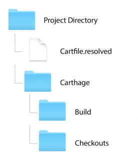
When you run carthage update, Carthage creates a couple of files and directories for you:

carthage tutorial

  • Cartfile.resolved: This file is created to serve as a companion to the Cartfile. It defines exactly which versions of your dependencies Carthage selected for installation. It’s strongly recommended to commit this file to your version control repository, because its presence ensures that other developers can get started quickly by using exactly the same versions of dependencies as you.
  • Carthage directory, containing two subdirectories:
    • Build: This contains the built framework for each dependency. These can be integrated into your project, which you’ll do shortly. Each framework is either built from source, or downloaded from the project’s “Releases” page on Github.
    • Checkouts: This is where Carthage checks out the source code for each dependency that’s ready to build into frameworks. Carthage maintains its own internal cache of dependency repositories, so it doesn’t have to clone the same source multiple times for different projects.

Whether you commit the Build and Checkouts directories to your version control repository is entirely up to you. It’s not required, but doing so means that anybody who clones your repository will always have the binaries and source for each dependency available.

Having this backup can be a useful insurance policy if, for example, Github is unavailable or a source repository is removed completely.

Don’t modify any code inside the Checkouts folder because its contents may be overwritten at any time by a future carthage update or carthage checkout command, and your hard work would be gone in the twinkling of an eye.

If modifications to your dependencies are a must do, you can run carthage update using the --use-submodules option.

With this option, Carthage adds each dependency in the Checkouts folder to your Git repository as a submodule, meaning you can change the dependencies’ source, and commit and push those changes elsewhere without fear of an overwrite.

Note: If other users need to use your project, and you haven’t committed the built frameworks with your code, then they will need to run carthage bootstrap after checking out your project.

The bootstrap command will download and build the exact versions of your dependencies that are specified in Cartfile.resolved.

carthage update, on the other hand, would update the project to use the newest compatible versions of each dependency, which may not be desirable.

Now, how about actually using these build artifacts you worked so hard to create?

Adding Frameworks to Your Project

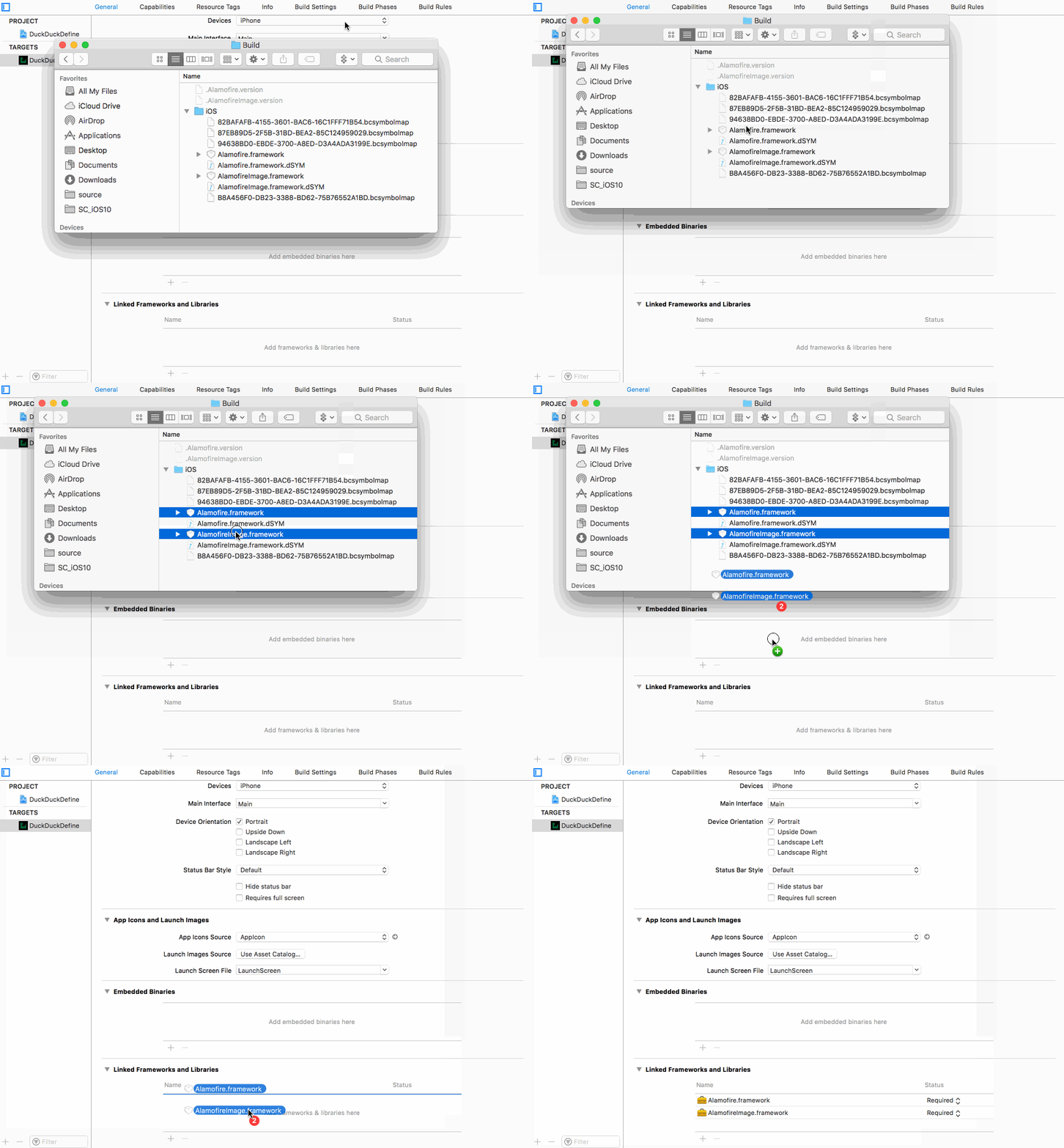
Back in Xcode, click the DuckDuckDefine project in the Project Navigator. Select the DuckDuckDefine target, choose the General tab at the top, and scroll down to the Linked Frameworks and Libraries section at the bottom.

In the Carthage Finder window, navigate into Build\iOS. Drag both Alamofire.framework and AlamofireImage.framework into the Linked Frameworks and Libraries section in Xcode:

carthage tutorial

This tells Xcode to link your app to these frameworks, allowing you to make use of them in your own code.

Next, switch over to Build Phases and add a new Run Script build phase by clicking the + in the top left of the editor. Add the following command:

/usr/local/bin/carthage copy-frameworks

Click the + under Input Files and add an entry for each framework:

$(SRCROOT)/Carthage/Build/iOS/Alamofire.framework
$(SRCROOT)/Carthage/Build/iOS/AlamofireImage.framework

The result should look like this:

carthage tutorial

Strictly speaking, this build phase isn’t required for your project to run. However, it’s a slick workaround for an App Store submission bug where apps with frameworks that contain binary images for the iOS simulator are automatically rejected.

The carthage copy-frameworks command strips out these extra architectures. w00t!

There won’t be anything new to see yet, but build and run the app to ensure everything’s still working as expected. When the app launches, you should see the search view controller.

OK, great. Things are looking good. Next, upgrading dependencies.

Upgrading Frameworks

I have a confession to make.

carthage tutorial

Remember when you created your Cartfile earlier, and I told you what versions of Alamofire and AlamofireImage to install? Well, you see, I gave you bad information. I told you to use an old version of Alamofire.

carthage tutorial

Don’t be mad though! It was done with the best of intentions. Look on this as an opportunity…yes, an opportunity to learn how to upgrade a dependency. It’s a gift, really.

carthage tutorial

Open up your Cartfile again. From your project’s directory in Terminal, run:

open -a Xcode Cartfile

Change the Alamofire line to:

github "Alamofire/Alamofire" ~> 4.5.0

As you saw earlier, this means to use any version of Alamofire that’s compatible with 4.5.0, so, any version up to but not including a future 5.0 version.

When adding dependencies with Carthage, it’s a good idea to consider compatibility and limit the version that you’re targeting. That way, you know the exact state of its API and functionality.

For example, version 5.0 of a dependency might include app-breaking API changes — you likely wouldn’t want to automatically upgrade to it if you built your project against 4.5.0.

Save and close the Cartfile, and return to the terminal. Perform another update:

carthage update --platform iOS

Carthage will look for newer versions of each of your dependencies, then check them out and build them if necessary. You should see it fetch the latest version of Alamofire.

Because your project already contains a reference to the built .framework for Alamofire, and Carthage rebuilds the new version in the same location on disk, you can sit back and let Carthage do the work; your project will automatically use the latest version of Alamofire!

Duck, Duck… GO!

Now that you’ve integrated Alamofire and AlamofireImage with the project, you can put them to use to perform some web searches. Are you ready?

In Xcode, open DuckDuckGo.swift. At the top of the file, add the import below:

import Alamofire

Next, replace the existing definition of performSearch(for:completion:) with this:

func performSearch(for term: String, completion: @escaping (Definition?) -> Void) {
  // 1
  let parameters: Parameters = ["q": term, "format": "json", "pretty": 1,
                                          "no_html": 1, "skip_disambig": 1]

  // 2
  Alamofire.request("https://api.duckduckgo.com", method: .get, parameters: parameters).responseData { response in
    // 3
    if response.result.isFailure {
      completion(nil)
      return
    }

    // 4
    guard let jsonData = response.result.value else {
      completion(nil)
      return
    }

    // 5
    let decoder = JSONDecoder()
    let definition = try? decoder.decode(Definition.self, from: jsonData)

    // 6
    if let definition = definition, definition.resultType == .article {
      completion(definition)
    } else {
      completion(nil)
    }
  }
}

There’s quite a bit here, so let’s break it down:

  1. First, you build up the list of parameters to send to DuckDuckGo. The most important two here are q: the search term itself, and format: which tells the web service to respond with JSON.
  2. Then you perform the request using Alamofire. This call makes a GET request to https://api.duckduckgo.com, using the parameter dictionary created above.
  3. Once the response comes back, check if the request failed. If so, exit early.
  4. Optionally bind the JSON response object to ensure it has a value.
  5. Next, use JSONDecoder to deserialize the Definition, which conforms to Codable.
  6. The DuckDuckGo API can return a range of different result types, but the one covered here is Article, which provides a simple definition of the search term. You filter fpr article then pass the retrieved definition to the completion handler.

Note: If you’re wondering why the skip_disambig parameter exists, it’s to tell DuckDuckGo not to return ‘disambiguation’ results.

Disambiguation results are like those pages you see on Wikipedia: did you mean Chris Evans the movie actor, Chris Evans the British TV personality, or Chris Evans the train robber?

skip_disambig means the API will just pick the most likely result and return it.

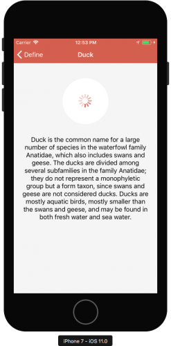
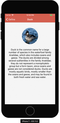
Build and run! Once the app starts, enter “Duck” in the search bar. If everything’s working correctly, you should see a definition on the next screen.

carthage tutorial

There’s one thing missing, however: a picture! It’s one thing being able to read what a duck is, but who reads anymore? Pictures are worth — okay, I’ll spare you the cliché — you know what I mean.

Anyways, who doesn’t like looking at pictures of ducks? Kittens are so last season, right?

Open DefinitionViewController.swift, and add import AlamofireImage just below the existing UIKit import at the top:

import AlamofireImage

Then, at the following code just below viewDidLoad() method:

override func viewDidAppear(_ animated: Bool) {
  super.viewDidAppear(animated)

  if let imageURL = definition.imageURL {
    imageView.af_setImage(withURL: imageURL, completion: { _ in
      self.activityIndicatorView.stopAnimating()
    })
  }
}

af_setImage is an extension on UIImageView provided by AlamofireImage. You call it to retrieve the image found in the definition imageURL. Once retrieved, the activity indicator’s animation is stopped.

Build and run, and perform your search again.

carthage tutorial

Quack quack!

Where To Go From Here?

You can download the complete project here. (Don’t forget to run carthage update --platform iOS to build the dependencies.)

Congratulations, you’ve learnt about the philosophy behind dependency management and behind Carthage itself, gained some experience using Carthage to add some dependencies to a project, and used those dependencies to make a useful app!

You also know how to update your dependencies for future releases.

If you want to learn more about Carthage, your first stop should be the Carthage README and the documentation on Build Artifacts.

Justin Spahr-Summers, one of the project’s founders, gave a smashing talk at Realm.io about Carthage, entitled “Ruthlessly Simple Dependency Management.”

Finally, if you’d like to learn more about Swift Package Manager be sure to read the official documentation. About CocoaPods, you can checkout our tutorial on How To Use CocoaPods With Swift. It also contains a great section on Semantic Versioning, which you saw in use in Cartfiles.

I hope you got a lot out of this Carthage tutorial. If you have any questions or comments, please join in the forum discussion below!

The post Carthage Tutorial: Getting Started appeared first on Ray Wenderlich.

Video Tutorial: Xcode Tips And Tricks Part 1: Introduction

Video Tutorial: Xcode Tips And Tricks Part 2: Keyboard Shortcuts

New Course: Xcode Tips and Tricks

$
0
0

Xcode Tips and Tricks

In June, Apple announced a lot of exciting and long-awaited updates to Xcode’s developer tools. To tide you over until Apple’s September event and the official release of Xcode 9, I’ve been working on a brand new course to help you supercharge your Xcode skills. Today, I’m happy to release Xcode Tips and Tricks, ready for Xcode 9 and iOS 11!

This 10-part course will cover everything from Breakpoints to Workspaces. You’ll discover a wealth of new information about Xcode, all while using relevant keyboard shortcuts to speed up everyday tasks.

Let’s take a look at what’s inside:

Video 1: Introduction (Free!)

This video will introduce you to the topics covered in the course and how they will improve your Xcode proficiency.

Video 1: Introduction

Video 2: Keyboard Shortcuts

Being able to navigate your project with keyboard shortcuts is your best road to proficiency in Xcode. In this video you’ll learn the most-used shortcuts.

Video 2: Keyboard Shortcuts

Video 3: Preferences and Editing

Learn how to refactor code, use Markdown for README files and create custom file headers.

Video 3: Preferences and Editing

Video 4: Workspaces and Frameworks

Find out how to manage project dependencies with workspaces. You’ll also create a reusable framework for a checkbox control.

Video 4: Workspaces and Frameworks

Video 5: Schemes and Targets

Manage building your projects using schemes, configurations and targets. You’ll create a lite version of the sample app in a new target.

Video 5: Schemes and Targets

Video 6: Storyboards and Visual Debugging (Free!)

Learn how to control complex storyboards with storyboard references. You’ll also debug the sample app using the visual debugger.

Video 6: Storyboards and Visual Debugging

Video 7: Breakpoints

Go beyond debugging basics using breakpoints. Find out how to use exception breakpoints to your advantage.

Video 7: Breakpoints

Video 8: Code Snippets

Create a library of code snippets which you can use for general coding or for giving presentations. You’ll also complete a fun quiz using code snippets.

Video 8: Code Snippets

Video 9: Behaviors

Set up your perfect coding environment using behaviors and tabs. Learn how to create a script to open a Terminal window at the project folder.

Video 9: Behaviors

Video 10: Conclusion

Review what you learned in the course and discover where you can learn more.

Video 10: Conclusion

Where To Go From Here?

Want to check out the course? You can watch two of the videos for free:

  • Video 1: Introduction is available today.
  • Video 6: Storyboards and Visual Debugging will be released next week.

The rest of the course is for raywenderlich.com subscribers only. Here’s how you can get access:

  • If you are a raywenderlich.com subscriber: You can access the first two parts of Xcode Tips and Tricks. today, and the rest will be coming out over the next two weeks.
  • If you are not a subscriber yet: What are you waiting for? Subscribe now to get access to our new Xcode Tips and Tricks course and our entire catalog of over 500 videos.

There’s much more in store for raywenderlich.com subscribers – if you’re curious, you can check out our full schedule of upcoming courses.

I hope you enjoy our new course, and stay tuned for many more new courses and updates to come! :]

The post New Course: Xcode Tips and Tricks appeared first on Ray Wenderlich.

The Return of the Podcast – Podcast S07 E00

$
0
0
3d tools

Meet the new podcast team in this episode!

It’s been almost a year, but the raywenderlich.com podcast is back!

In this inaugural episode in season 7, meet your new hosts: Dru and Janie.

[Subscribe in iTunes] [RSS Feed]

Interested in sponsoring a podcast episode? We sell ads via Syndicate Ads, check it out!

Contact Us

Where To Go From Here?

We hope you enjoyed this episode of our podcast. Be sure to subscribe in iTunes to get notified when the next episode comes out.

We’d love to hear what you think about the podcast, and any suggestions on what you’d like to hear in future episodes. Feel free to drop a comment here, or email us anytime at podcast@raywenderlich.com.

The post The Return of the Podcast – Podcast S07 E00 appeared first on Ray Wenderlich.

Core Graphics Tutorial Part 1: Getting Started

$
0
0
Update note: This tutorial has been updated to iOS 11, Swift 4, and Xcode 9 by Andrew Kharchyshyn. The original tutorial was written by Caroline Begbie.

Imagine you’ve finished your app and it works just fine, but the interface lacks style. You could draw several sizes of all your custom control images in Photoshop and hope that Apple doesn’t come out with a @4x retina screen… or, you could think ahead and use Core Graphics to create one image in code that scales crisply for any device size.

Core Graphics is Apple’s vector drawing framework – it’s a big, powerful API and there’s a lot to learn. But never fear – this three-part series will ease you into it by starting out simple, and by the end you’ll be able to create stunning graphics ready to use in your apps.

This is a brand new series, with a modern approach to teaching Core Graphics. The series also covers cool features like @IBDesignable and @IBInspectable that make learning Core Graphics fun and easy.

So grab your favorite beverage, it’s time to begin!

Introducing Flo – One glass at a time

You’ll be creating a complete app to track your drinking habits.

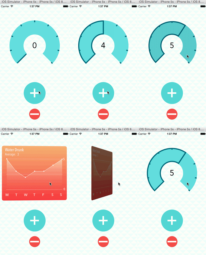
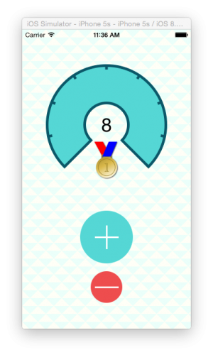
Specifically, it makes it easy to track how much water you drink. “They” tell us that drinking eight glasses of water a day is healthy, but it’s easy to lose track after a few glasses. This is where Flo comes in; every time you polish off a refreshing glass of water, tap the counter. You’ll also see a graph of your previous seven days’ consumption.

1-CompletedApp

In the first part of this series, you’ll create three controls using UIKit’s drawing methods.

Then in part two, you’ll have a deeper look at Core Graphics contexts and draw the graph.

In part three, you’ll create a patterned background and award yourself a homemade Core Graphics medal. :]

Getting Started

Your first task is to create your very own Flo app. There is no download to get you going, because you’ll learn more if you build it from the ground up.

Create a new project (File\New\Project…), select the template iOS\Application\Single View App and click Next.

Fill out the project options. Set the Product Name to Flo, the Language to Swift, and click Next.

On the final screen, uncheck Create Git repository and click Create.

You now have a starter project with a storyboard and a view controller.

Custom Drawing on Views

There are three steps for custom drawings:

  1. Create a UIView subclass.
  2. Override draw(_:) and add some Core Graphics drawing code.
  3. There is no step 3 – that’s it! :]

You’ll try this out by making a custom-drawn plus button, like this:

1-AddButtonFinal

Create a new file (File\New\File…), choose iOS\Source\Cocoa Touch Class, click Next. In this screen, name the new class PushButton, make it a subclass of UIButton, and ensure the language is Swift. Click Next and then Create.

UIButton is a subclass of UIView, so all methods in UIView, such as draw(_:), are also available in UIButton.

In Main.storyboard, drag a UIButton into the view controller’s view, and select the button in the Document Outline.

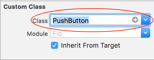
In the Identity Inspector, change the class to use your own PushButton.

Auto Layout Constraints

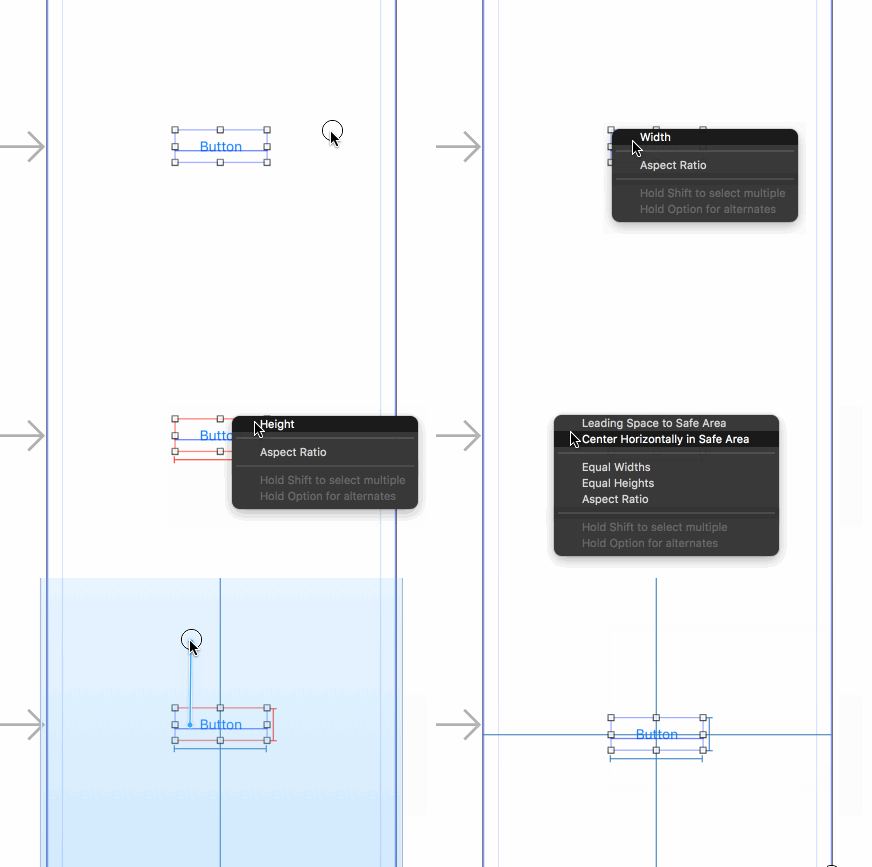
Now you’ll set up the Auto Layout constraints (text instructions follow):

  1. With the button selected, Control-drag from the center of the button slightly left (still within the button), and choose Width from the popup menu.
  2. Similarly, with the button selected, control-drag from the center of the button slightly up (still within the button), and choose Height from the popup menu.
  3. Control-drag left from inside the button to outside the button, and choose Center Vertically in Safe Area.
  4. Finally control-drag up from inside the button to outside the button and choose Center Horizontally in Safe Area.

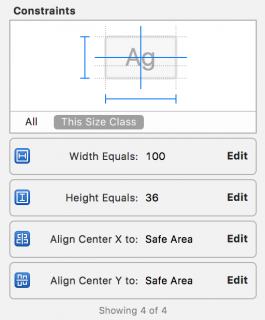
This will create the four required Auto Layout constraints; you can now see them in the Size Inspector:

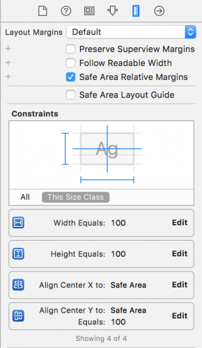
Click Edit on the Align center Y constraint, and set its constant to be 100. This will shift the vertical position of the button from the center to 100 points below the center. Change the Width and Height constraint constants to be equal to 100 too. The final constraints should look like this:

The constraints inspector showing width and height constraints with a constant of 100, a center Y constraint with a constant of 100, and a center X constraint.

In the Attributes Inspector, remove the default title “Button”.

1-RemoveTitle2

You can build and run at this point if you’d like, but right now you’ll just see a blank screen. It’s time to fix that up!

Drawing the Button

Recall the button you’re trying to make is circular:

1-AddButtonFinal

To draw a shape in Core Graphics, you define a path that tells Core Graphics the line to trace (like two straight lines for the plus) or the line to fill (like the circle which should be filled here). If you’re familiar with Illustrator or the vector shapes in Photoshop, then you’ll easily understand paths.

There are three fundamentals to know about paths:

  • A path can be stroked and filled.
  • A stroke outlines the path in the current stroke color.
  • A fill will fill up a closed path with the current fill color.

One easy way to create a Core Graphics path is through a handy class called UIBezierPath. This lets you easily create paths with a user-friendly API, whether you want to create paths based on lines, curves, rectangles, or a series of connected points.

Try using UIBezierPath to create a path, and then fill it with a green color. To do this, open PushButton.swift and add this method:

override func draw(_ rect: CGRect) {
  let path = UIBezierPath(ovalIn: rect)
  UIColor.green.setFill()
  path.fill()
}

First, you create an oval-shaped UIBezierPath that is the size of the rectangle passed to it. In this case, it’ll be the size of the 100×100 button you defined in the storyboard, so the “oval” will actually be a circle.

Paths themselves don’t draw anything. You can define paths without an available drawing context. To draw the path, you set a fill color on the current context (more on this below), and then fill the path.

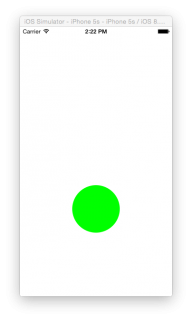
Build and run the application, and you’ll see the green circle.

1-SimGreenButton2

So far, you’ve discovered how easy it is to make custom-shaped views. You’ve done this by creating a UIButton subclass, overriding draw(_:) and adding the UIButton to your storyboard.

Behind the Scenes in Core Graphics

Each UIView has a graphics context, and all drawing for the view renders into this context before being transferred to the device’s hardware.

iOS updates the context by calling draw(_:) whenever the view needs to be updated. This happens when:

  • The view is new to the screen.
  • Other views on top of it are moved.
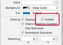
  • The view’s hidden property is changed.
  • Your app explicitly calls the setNeedsDisplay() or setNeedsDisplayInRect() methods on the view.

Note: Any drawing done in draw(_:) goes into the view’s graphics context. Be aware that if you start drawing outside of draw(_:), as you’ll do in the final part of this tutorial, you’ll have to create your own graphics context.

You haven’t used Core Graphics yet in this tutorial because UIKit has wrappers around many of the Core Graphics functions. A UIBezierPath, for example, is a wrapper for a CGMutablePath, which is the lower-level Core Graphics API.

Note: Never call draw(_:) directly. If your view is not being updated, then call setNeedsDisplay() on the view.

setNeedsDisplay() does not itself call draw(_:), but it flags the view as ‘dirty’, triggering a redraw using draw(_:) on the next screen update cycle. Even if you call setNeedsDisplay() five times in the same method you’ll only ever actually call draw(_:) once.

@IBDesignable – Interactive Drawing

Creating code to draw a path and then running the app to see what it looks like can be about as exciting as watching paint dry, but you’ve got options. Live Rendering allows views to draw themselves more accurately in a storyboard, by running their draw(_:) methods. What’s more, the storyboard will immediately update to changes in draw(_:). All you need is a single attribute!

Still in PushButton.swift, just before the class declaration, add:

@IBDesignable

This is all that is needed to enable Live Rendering. Go back to Main.storyboard and notice that now, your button is shown as a green circle, just like when you build and run.

Now set up your screen so that you have the storyboard and the code side-by-side.

Do this by selecting PushButton.swift to show the code, then at the top right, click the Assistant Editor — the icon that looks like two intertwined rings. The storyboard should then show on the right-hand pane. If it doesn’t, you’ll have to choose the storyboard in the breadcrumb trail at the top of the pane:

1-Breadcrumbs

Close the document outline at the left of the storyboard to free up some room. Do this either by dragging the edge of the document outline pane or clicking the button at the bottom of the storyboard:

1-DocumentOutline

When you’re all done, your screen should look like this:

In PushButton‘s draw(_:), change

UIColor.green.setFill()

to

UIColor.blue.setFill()

and you’ll (nearly) immediately see the change in the storyboard. Pretty cool!

Now you’ll create the lines for the plus sign.

Drawing Into the Context

Core Graphics uses a “painter’s model”. When you draw into a context, it’s almost like making a painting. You lay down a path and fill it, and then lay down another path on top and fill it. You can’t change the pixels that have been laid down, but you can “paint” over them.

This image from Apple’s documentation describes how this works. Just as it is when you’re painting on a canvas, the order in which you draw is critical.

1-PaintersModel

Your plus sign is going on top of the blue circle, so first you code the blue circle and then the plus sign.

You could draw two rectangles for the plus sign, but it’s easier to draw a path and then stroke it with the desired thickness.

Add this struct and these constants inside of PushButton:

private struct Constants {
  static let plusLineWidth: CGFloat = 3.0
  static let plusButtonScale: CGFloat = 0.6
  static let halfPointShift: CGFloat = 0.5
}

private var halfWidth: CGFloat {
  return bounds.width / 2
}

private var halfHeight: CGFloat {
  return bounds.height / 2
}

Now add this code at the end of the draw(_:) method to draw the horizontal dash of the plus sign:

//set up the width and height variables
//for the horizontal stroke
let plusWidth: CGFloat = min(bounds.width, bounds.height) * Constants.plusButtonScale
let halfPlusWidth = plusWidth / 2

//create the path
let plusPath = UIBezierPath()

//set the path's line width to the height of the stroke
plusPath.lineWidth = Constants.plusLineWidth

//move the initial point of the path
//to the start of the horizontal stroke
plusPath.move(to: CGPoint(
  x: halfWidth - halfPlusWidth,
  y: halfHeight))

//add a point to the path at the end of the stroke
plusPath.addLine(to: CGPoint(
  x: halfWidth + halfPlusWidth,
  y: halfHeight))

//set the stroke color
UIColor.white.setStroke()

//draw the stroke
plusPath.stroke()

In this block, you set up a UIBezierPath, give it a start position (left side of the circle) and draw to the end position (right side of the circle). Then you stroke the path outline in white. At this point, you should see this in the Storyboard:

In your storyboard, you’ll now have a blue circle with a dash in the middle of it:

Dash

Note: Remember that a path simply consists of points. Here’s an easy way to grasp the concept: when creating the path imagine that you have a pen in hand. Put two dots on a page, then place the pen at the starting point, and then draw a line to the next point by drawing a line.

That’s essentially what you do with the above code by using move(to:) and addLine(to:).

Now run the application on either an iPad 2 or an iPhone 6 Plus simulator, and you’ll notice the dash is not as crisp as it should be. It has a pale blue line encircling it.

1-PixelledLine

Points and Pixels

Back in the days of the very first iPhones, points and pixels occupied the same space and were the same size, making them essentially the same thing. When retina iPhones came into existence, suddenly there were four times the pixels on the screen for the same number of points.

Similarly, the iPhone 6 Plus has once again increased the amount of pixels for the same points.

Note: The following is conceptual – the actual hardware pixels may differ. For example, after rendering 3x, the iPhone 6 Plus downsamples to display the full image on the screen. To learn more about iPhone 6 Plus downsampling, check out this great post.

Here’s a grid of 12×12 pixels, where points are shown in gray and white. The first (iPad 2) is a direct mapping of points to pixels. The second (iPhone 6) is a 2x retina screen, where there are 4 pixels to a point, and the third (iPhone 6 Plus) is a 3x retina screen, where there are 9 pixels to a point.

1-Pixels

The line you’ve just drawn is 3 points high. Lines stroke from the center of the path, so 1.5 points will draw on either side of the center line of the path.

This picture shows drawing a 3-point line on each of the devices. You can see that the iPad 2 and the iPhone 6 Plus result in the line being drawn across half a pixel — which of course can’t be done. So, iOS anti-aliases the half-filled pixels with a color half way between the two colors, and the line looks fuzzy.

1-PixelLineDemonstrated

In reality, the iPhone 6 Plus has so many pixels, that you probably won’t notice the fuzziness, although you should check this for your own app on the device. But if you’re developing for non-retina screens like the iPad 2 or iPad mini, you should do anything you can to avoid anti-aliasing.

If you have oddly sized straight lines, you’ll need to position them at plus or minus 0.5 points to prevent anti-aliasing. If you look at the diagrams above, you’ll see that a half point on the iPad 2 will move the line up half a pixel, on the iPhone 6, up one whole pixel, and on the iPhone 6 Plus, up one and a half pixels.

In draw(_:), replace the move(to:) and addLine(to:) code lines with:

//move the initial point of the path
//to the start of the horizontal stroke
plusPath.move(to: CGPoint(
  x: halfWidth - halfPlusWidth + Constants.halfPointShift,
  y: halfHeight + Constants.halfPointShift))

//add a point to the path at the end of the stroke
plusPath.addLine(to: CGPoint(
  x: halfWidth + halfPlusWidth + Constants.halfPointShift,
  y: halfHeight + Constants.halfPointShift))

iOS will now render the lines sharply on all three devices because you’re now shifting the path by half a point.

Note: For pixel perfect lines, you can draw and fill a UIBezierPath(rect:) instead of a line, and use the view’s contentScaleFactor to calculate the width and height of the rectangle. Unlike strokes that draw outwards from the center of the path, fills only draw inside the path.

Add the vertical stroke of the plus just after the previous two lines of code, and before setting the stroke color in draw(_:). I bet you can figure out how to do this on your own, since you’ve already drawn a horizontal stroke:

Solution Inside: Solution SelectShow>

You should now see the live rendering of the plus button in your storyboard. This completes the drawing for the plus button.

1-FinishedPlus

@IBInspectable – Custom Storyboard Properties

So you know that frantic moment when you tap a button more than needed, just to make sure it registers? Well, you need to provide a way for the user to reverse such overzealous tapping — you need a minus button.

A minus button is identical to the plus button except that it has no vertical bar and sports a different color. You’ll use the same PushButton class for the minus button, and declare what sort of button it is and its color when you add it to your storyboard.

@IBInspectable is an attribute you can add to a property that makes it readable by Interface Builder. This means that you will be able to configure the color for the button in your storyboard instead of in code.

At the top of the PushButton class, add these two properties:

@IBInspectable var fillColor: UIColor = UIColor.green
@IBInspectable var isAddButton: Bool = true

Change the fill color code at the top of draw(_:) from

UIColor.blue.setFill()

to:

fillColor.setFill()

The button will turn green in your storyboard view.

Surround the vertical line code in draw(_:) with an if statement:

//Vertical Line

if isAddButton {
  //vertical line code move(to:) and addLine(to:)
}
//existing code
//set the stroke color
UIColor.white.setStroke()
plusPath.stroke()

This makes it so you only draw the vertical line if isAddButton is set – this way the button can be either a plus or a minus button.

The completed PushButton looks like this:

import UIKit

@IBDesignable
class PushButton: UIButton {

  private struct Constants {
    static let plusLineWidth: CGFloat = 3.0
    static let plusButtonScale: CGFloat = 0.6
    static let halfPointShift: CGFloat = 0.5
  }

  private var halfWidth: CGFloat {
    return bounds.width / 2
  }

  private var halfHeight: CGFloat {
    return bounds.height / 2
  }

  @IBInspectable var fillColor: UIColor = UIColor.green
  @IBInspectable var isAddButton: Bool = true

  override func draw(_ rect: CGRect) {
    let path = UIBezierPath(ovalIn: rect)
    fillColor.setFill()
    path.fill()

    //set up the width and height variables
    //for the horizontal stroke
    let plusWidth: CGFloat = min(bounds.width, bounds.height) * Constants.plusButtonScale
    let halfPlusWidth = plusWidth / 2

    //create the path
    let plusPath = UIBezierPath()

    //set the path's line width to the height of the stroke
    plusPath.lineWidth = Constants.plusLineWidth

    //move the initial point of the path
    //to the start of the horizontal stroke
    plusPath.move(to: CGPoint(
            x: halfWidth - halfPlusWidth + Constants.halfPointShift,
            y: halfHeight + Constants.halfPointShift))

    //add a point to the path at the end of the stroke
    plusPath.addLine(to: CGPoint(
            x: halfWidth + halfPlusWidth + Constants.halfPointShift,
            y: halfHeight + Constants.halfPointShift))

    if isAddButton {
      //move the initial point of the path
      //to the start of the horizontal stroke
      plusPath.move(to: CGPoint(
        x: halfWidth - halfPlusWidth + Constants.halfPointShift,
        y: halfHeight + Constants.halfPointShift))

      //add a point to the path at the end of the stroke
      plusPath.addLine(to: CGPoint(
        x: halfWidth + halfPlusWidth + Constants.halfPointShift,
        y: halfHeight + Constants.halfPointShift))
    }

    //set the stroke color
    UIColor.white.setStroke()
    plusPath.stroke()
  }
}

In your storyboard, select the push button view. The two properties you declared with @IBInspectable appear at the top of the Attributes Inspector:

1-InspectableFillColor

Change Fill Color to RGB(87, 218, 213), and change the Is Add Button to off. Change the color by going to Fill Color\Other…\Color Sliders and entering the values in each input field next to the colors, so it looks like this:

The changes will take place immediately in the storyboard:

1-InspectableMinusButton

Pretty cool, eh? Now change Is Add Button back to on to return the button to a plus button.

A Second Button

Add a new UIButton to the storyboard and select it. Change its class to PushButton as you did it with previous one:

The green plus button will be drawn under your old plus button.

In the Attributes Inspector, change Fill Color to RGB(238, 77, 77) and change Is Add Button to off.

Remove the default title Button.

1-MinusButtonColor

Add the Auto Layout constraints for the new view similarly to how you did before:

  • With the button selected, Control-drag from the center of the button slightly to the left (still within the button), and choose Width from the popup menu.
  • Similarly, with the button selected, Control-drag from the center of the button slightly up (still within the button), and choose Height from the popup menu.
  • Control-drag left from inside the button to outside the button and choose Center Horizontally in Safe Area.
  • Control-drag up from the bottom button to the top button, and choose Vertical Spacing.

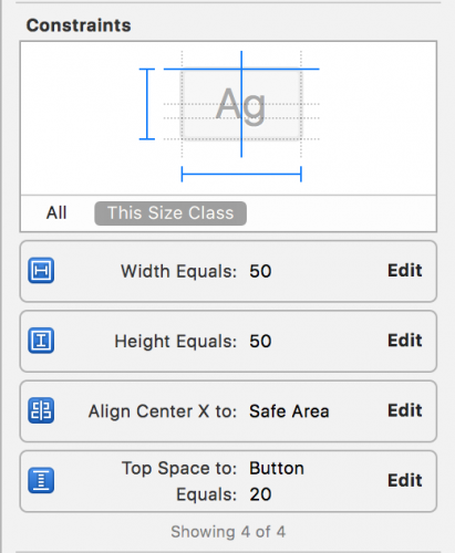
After you add the constraints, edit their constant values in the Size Inspector to match these:

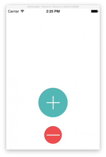
Build and run the application. You now have a reusable customizable view that you can add to any app. It’s also crisp and sharp on any size device. Here it is on the iPhone 4S.

1-SimPushButtons

Arcs with UIBezierPath

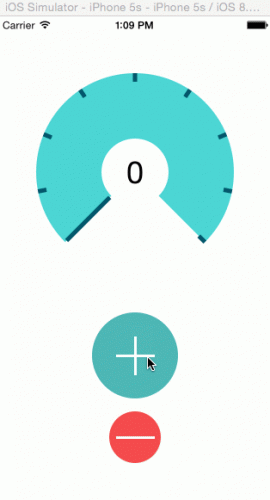
The next customized view you’ll create is this one:

1-CompletedCounterView

This looks like a filled shape, but the arc is actually just a fat stroked path. The outlines are another stroked path consisting of two arcs.

Create a new file, File\New\File…, choose Cocoa Touch Class, and name the new class CounterView. Make it a subclass of UIView, and ensure the language is Swift. Click Next, and then click Create.

Replace the code with:

import UIKit

@IBDesignable class CounterView: UIView {

  private struct Constants {
    static let numberOfGlasses = 8
    static let lineWidth: CGFloat = 5.0
    static let arcWidth: CGFloat = 76

    static var halfOfLineWidth: CGFloat {
      return lineWidth / 2
    }
  }

  @IBInspectable var counter: Int = 5
  @IBInspectable var outlineColor: UIColor = UIColor.blue
  @IBInspectable var counterColor: UIColor = UIColor.orange

  override func draw(_ rect: CGRect) {

  }
}

Here you also create a struct with constants. Those constants will be used when drawing, the odd one out – numberOfGlasses – is the target number of glasses to drink per day. When this figure is reached, the counter will be at its maximum.

You also create three @IBInspectable properties that you can update in the storyboard. The variable counter keeps track of the number of glasses consumed, and it’s an @IBDesignable property as it is useful to have the ability to change it in the storyboard, especially for testing the counter view.

Go to Main.storyboard and add a UIView above the plus PushButton. Add the Auto Layout constraints for the new view similarly to how you did before:

  1. With the view selected, Control-drag from the center of the button slightly left (still within the view), and choose Width from the popup menu.
  2. Similarly, with the view selected, Control-drag from the center of the button slightly up (still within the view), and choose Height from the popup menu.
  3. Control-drag left from inside the view to outside the view and choose Center Horizontally in Safe Area.
  4. Control-drag down from the view to the top button, and choose Vertical Spacing.

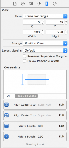
Edit the constraint constants in the Size Inspector to look like this:

In the Identity Inspector, change the class of the UIView to CounterView. Any drawing that you code in draw(_:) will now show up in the view (but you’ve not added any yet!).

Impromptu Math Lesson

We interrupt this tutorial for a brief, and hopefully un-terrifying look back at high school level math. As Douglas Adams would say – Don’t Panic! :]

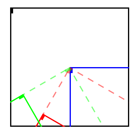
Drawing in the context is based on this unit circle. A unit circle is a circle with a radius of 1.0.

1-FloUnitCircle

The red arrow shows where your arc will start and end, drawing in a clockwise direction. You’ll draw an arc from the position 3π / 4 radians — that’s the equivalent of 135º, clockwise to π / 4 radians – that’s 45º.

Radians are generally used in programming instead of degrees, and it’s useful to be able to think in radians so that you don’t have to convert to degrees every time you want to work with circles. Later on you’ll need to figure out the arc length, which is when radians will come into play.

An arc’s length in a unit circle (where the radius is 1.0) is the same as the angle’s measurement in radians. For example, looking at the diagram above, the length of the arc from 0º to 90º is π/2. To calculate the length of the arc in a real situation, take the unit circle arc length and multiply it by the actual radius.

To calculate the length of the red arrow above, you would simply need to calculate the number of radians it spans:

          2π – end of arrow (3π/4) + point of arrow (π/4) = 3π/2

In degrees that would be:

          360º – 135º + 45º = 270º

Back to Drawing Arcs

In CounterView.swift, add this code to draw(_:) to draw the arc:

// 1
let center = CGPoint(x: bounds.width / 2, y: bounds.height / 2)

// 2
let radius: CGFloat = max(bounds.width, bounds.height)

// 3
let startAngle: CGFloat = 3 * .pi / 4
let endAngle: CGFloat = .pi / 4

// 4
let path = UIBezierPath(arcCenter: center,
                           radius: radius/2 - Constants.arcWidth/2,
                       startAngle: startAngle,
                         endAngle: endAngle,
                        clockwise: true)

// 5
path.lineWidth = Constants.arcWidth
counterColor.setStroke()
path.stroke()

The following explains what each section does:

  1. Define the center point of the view where you’ll rotate the arc around.
  2. Calculate the radius based on the max dimension of the view.
  3. Define the start and end angles for the arc.
  4. Create a path based on the center point, radius, and angles you just defined.
  5. Set the line width and color before finally stroking the path.

Imagine drawing this with a compass — you’d put the point of the compass in the center, open the arm to the radius you need, load it with a thick pen and spin it to draw your arc.

In this code, center is the point of the compass, radius is the width that the compass is open (minus half the width of the pen) and the arc width is the width of the pen.

Note: When you’re drawing arcs, this is generally all you need to know, but if you want to dive further into drawing arcs, then Ray’s (older) Core Graphics Tutorial on Arcs and Paths will help.

In the storyboard and when you run your application, this is what you’ll see:

1-SimArcStroke

Outlining the Arc

When the user indicates they’ve enjoyed a glass of water, an outline on the counter shows the progress towards the goal of eight glasses.

This outline will consist of two arcs, one outer and one inner, and two lines connecting them.

In CounterView.swift , add this code to the end of draw(_:):

//Draw the outline

//1 - first calculate the difference between the two angles
//ensuring it is positive
let angleDifference: CGFloat = 2 * .pi - startAngle + endAngle
//then calculate the arc for each single glass
let arcLengthPerGlass = angleDifference / CGFloat(Constants.numberOfGlasses)
//then multiply out by the actual glasses drunk
let outlineEndAngle = arcLengthPerGlass * CGFloat(counter) + startAngle

//2 - draw the outer arc
let outlinePath = UIBezierPath(arcCenter: center,
                                  radius: bounds.width/2 - Constants.halfOfLineWidth,
                              startAngle: startAngle,
                                endAngle: outlineEndAngle,
                               clockwise: true)

//3 - draw the inner arc
outlinePath.addArc(withCenter: center,
                       radius: bounds.width/2 - Constants.arcWidth + Constants.halfOfLineWidth,
                   startAngle: outlineEndAngle,
                     endAngle: startAngle,
                    clockwise: false)

//4 - close the path
outlinePath.close()

outlineColor.setStroke()
outlinePath.lineWidth = Constants.lineWidth
outlinePath.stroke()

A few things to go through here:

  1. outlineEndAngle is the angle where the arc should end, calculated using the current counter value.
  2. outlinePath is the outer arc. The radius is given to UIBezierPath() to calculate the actual length of the arc, as this arc is not a unit circle.
  3. Adds an inner arc to the first arc. This has the same angles but draws in reverse (clockwise is set to false). Also, this draws a line between the inner and outer arc automatically.
  4. Closing the path automatically draws a line at the other end of the arc.

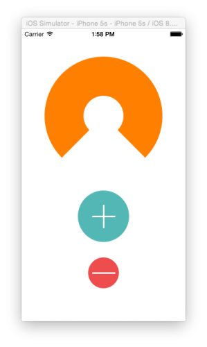
With the counter property in CounterView.swift set to 5, your CounterView should now look like this in the storyboard:

1-ArcOutline

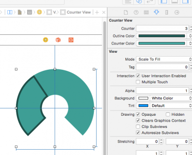
Open Main.storyboard, select the CounterView and in the Attributes Inspector, change the Counter property to check out your drawing code. You’ll find that it is completely interactive. Try adjusting the counter to be more than eight and less than zero. You’ll fix that up later on.

Change the Counter Color to RGB(87, 218, 213), and change the Outline Color to RGB(34, 110, 100).

1-CounterView

Making it All Work

Congrats! You have the controls; all you have to do is wire them up so the plus button increments the counter and the minus button decrements the counter.

In Main.storyboard, drag a UILabel to the center of the Counter View, and make sure it is a subview of the Counter View. It will look like this in the document outline:

Add constraints to center the label both vertically and horizontally. In the end, the label should have constraints that look like this:

In the Attributes Inspector, change Alignment to center, font size to 36 and the default label title to 8.

1-LabelAttributes

Go to ViewController.swift and add these properties to the top of the class:

//Counter outlets
@IBOutlet weak var counterView: CounterView!
@IBOutlet weak var counterLabel: UILabel!

Still in ViewController.swift, add this method to the end of the class:

@IBAction func pushButtonPressed(_ button: PushButton) {
  if button.isAddButton {
    counterView.counter += 1
  } else {
    if counterView.counter > 0 {
      counterView.counter -= 1
    }
  }
  counterLabel.text = String(counterView.counter)
}

Here you increment or decrement the counter depending on the button’s isAddButton property, make sure the counter doesn’t drop below zero — nobody can drink negative water. :] You also update the counter value in the label.

Also add this code to the end of viewDidLoad() to ensure that the initial value of the counterLabel will be updated:

counterLabel.text = String(counterView.counter)

In Main.storyboard, connect the CounterView outlet and UILabel outlet. Connect the method to the Touch Up Inside event of the two PushButtons.

1-ConnectingOutlets2

Run the application and see if your buttons update the counter label. They should.

But wait, why isn’t the counter view updating?

Think way back to the beginning of this tutorial, and how you only call draw(_:) when other views on top of it are moved, or its hidden property is changed, or the view is new to the screen, or your app calls the setNeedsDisplay() or setNeedsDisplayInRect() methods on the view.

However, the Counter View needs to be updated whenever the counter property is updated, otherwise the user will think your app is busted.

Go to CounterView.swift and change the counter property declaration to:

@IBInspectable var counter: Int = 5 {
  didSet {
    if counter <=  Constants.numberOfGlasses {
      //the view needs to be refreshed
      setNeedsDisplay()
    }
  }
}

This code makes it so that the view refreshes only when the counter is less than or equal to the user's targeted glasses, as the outline only goes up to 8.

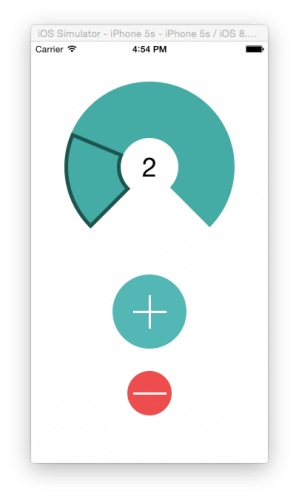
Run your app again. Everything should now be working properly.

1-Part1Finished

Where to Go From Here?

You've covered basic drawing in this tutorial, and you should now be able to change the shape of views in your UIs. But wait - there’s more! In Part 2 of this tutorial , you’ll explore Core Graphics contexts in more depth and create a graph of your water consumption over time.

You can download the project with all the code up to this point.

If you have any questions or comments please join the forum discussion below.

The post Core Graphics Tutorial Part 1: Getting Started appeared first on Ray Wenderlich.


Core Graphics Tutorial Part 2: Gradients and Contexts

$
0
0
Update note: This tutorial has been updated to iOS 11, Swift 4, and Xcode 9 by Andrew Kharchyshyn. The original tutorial was written by Caroline Begbie.

Welcome back to our modern Core Graphics with Swift tutorial series!

In the first part of the tutorial series, you learned about drawing lines and arcs with Core Graphics, and using Xcode’s interactive storyboard features.

In this second part, you’ll delve further into Core Graphics, learning about drawing gradients and manipulating CGContexts with transformations.

Core Graphics

You’re now going to leave the comfortable world of UIKit and enter the underworld of Core Graphics.

This image from Apple describes the relevant frameworks conceptually:

UIKit is the top layer, and it’s also the most approachable. You’ve used UIBezierPath, which is a UIKit wrapper of the Core Graphics CGPath.

The Core Graphics framework is based on the Quartz advanced drawing engine. It provides low-level, lightweight 2D rendering. You can use this framework to handle path-based drawing, transformations, color management, and lots more.

One thing to know about lower layer Core Graphics objects and functions is that they always have the prefix CG, so they are easy to recognize.

Getting Started

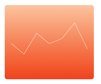
By the time you’ve got to the end of this tutorial, you’ll have created a graph view that looks like this:

2-ResultGraphView

Before drawing on the graph view, you’ll set it up in the storyboard and create the code that animates the transition to show the graph view.

The complete view hierarchy will look like this:

2-ViewHierarchy

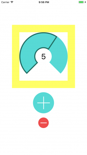
First, download the starter project. It’s pretty much where you left off in the previous part. The only difference is that in Main.storyboard, CounterView is inside of another view (with a yellow background). Build and run, and this is what you will see:

Go to File\New\File…, choose the iOS\Source\Cocoa Touch Class template and click Next. Enter the name GraphView as the class name, choose the subclass UIView and set the language to Swift. Click Next then Create.

Now in Main.storyboard click the name of the yellow view in the Document Outline slowly twice to rename it, and call it Container View. Drag a new UIView from the object library to inside of Container View, below the Counter View.

Change the class of the new view to GraphView in the Identity Inspector. The only thing left is to add constraints for the new GraphView, similar to how you did it in the previous part of the tutorial:

  • With the GraphView selected, Control-drag from the center slightly left (still within the view), and choose Width from the popup menu.
  • Similarly, with the GraphView selected, Control-drag from the center slightly up (still within the view), and choose Height from the popup menu.
  • Control-drag left from inside the view to outside the view and choose Center Horizontally in Container.
  • Control-drag up from inside the view to outside the view, and choose Center Vertically in Container.

Edit the constraint constants in the Size Inspector to match these:

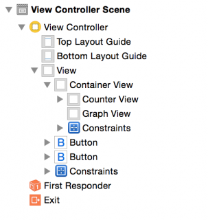
Your Document Outline should look like this:

Flo2-Outline

The reason you need a Container View is to make an animated transition between the Counter View and the Graph View.

Go to ViewController.swift and add property outlets for the Container and Graph Views:

@IBOutlet weak var containerView: UIView!
@IBOutlet weak var graphView: GraphView!

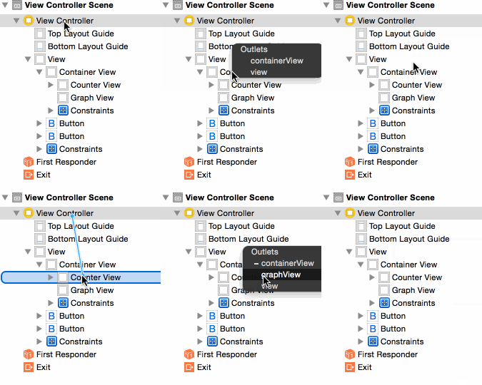
This creates an outlet for the container view and graph view. Now hook them up to the views you created in the storyboard.

Go back to Main.storyboard and hook up the Graph View and the Container View to the outlets:

Flo2-ConnectGraphViewOutlet

Seting up the Animated Transition

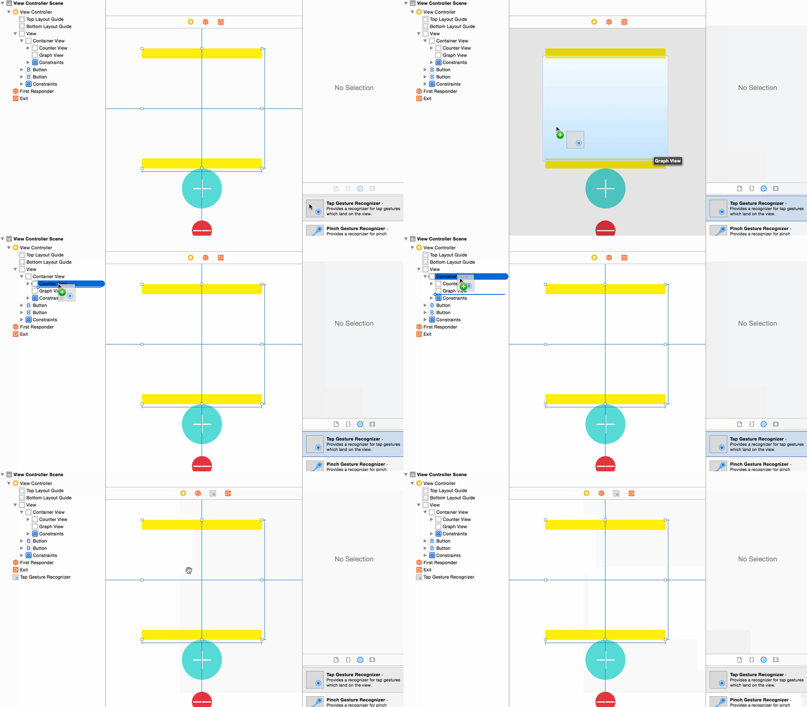
Still in Main.storyboard, drag a Tap Gesture Recognizer from the Object Library to the Container View in the Document Outline:

Flo2-AddTapGesture

Go to ViewController.swift and add this property to the top of the class:

var isGraphViewShowing = false

This simply marks whether the graph view is currently displayed.

Now add the tap method to do the transition:

@IBAction func counterViewTap(_ gesture: UITapGestureRecognizer?) {
  if (isGraphViewShowing) {
    //hide Graph
    UIView.transition(from: graphView,
                      to: counterView,
                      duration: 1.0,
                      options: [.transitionFlipFromLeft, .showHideTransitionViews],
                      completion:nil)
  } else {
    //show Graph
    UIView.transition(from: counterView,
                      to: graphView,
                      duration: 1.0,
                      options: [.transitionFlipFromRight, .showHideTransitionViews],
                      completion: nil)
  }
  isGraphViewShowing = !isGraphViewShowing
}

UIView.transition(from:to:duration:options:completion:) performs a horizontal flip transition. Other transitions are cross dissolve, vertical flip and curl up or down. The transition uses .showHideTransitionViews constant, which means you don’t have to remove the view to prevent it from being shown once it is “hidden” in the transition.

Add this code at the end of pushButtonPressed(_:):

if isGraphViewShowing {
  counterViewTap(nil)
}

If the user presses the plus button while the graph is showing, the display will swing back to show the counter.

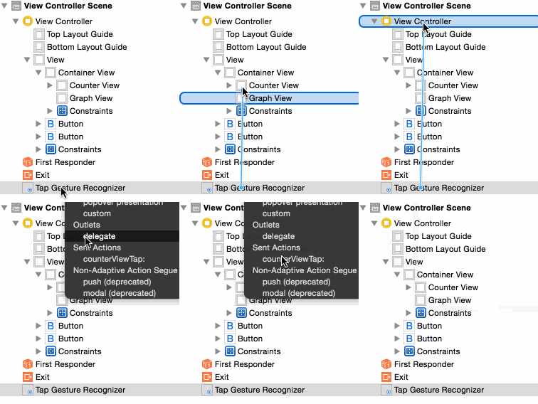
Lastly, to get this transition working, go back to Main.storyboard and hook up your tap gesture to the newly added counterViewTap(gesture:) method:

Flo2-TapGestureConnection

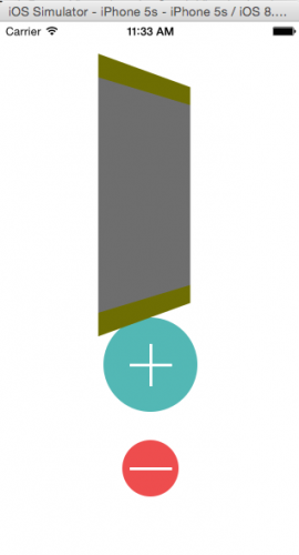
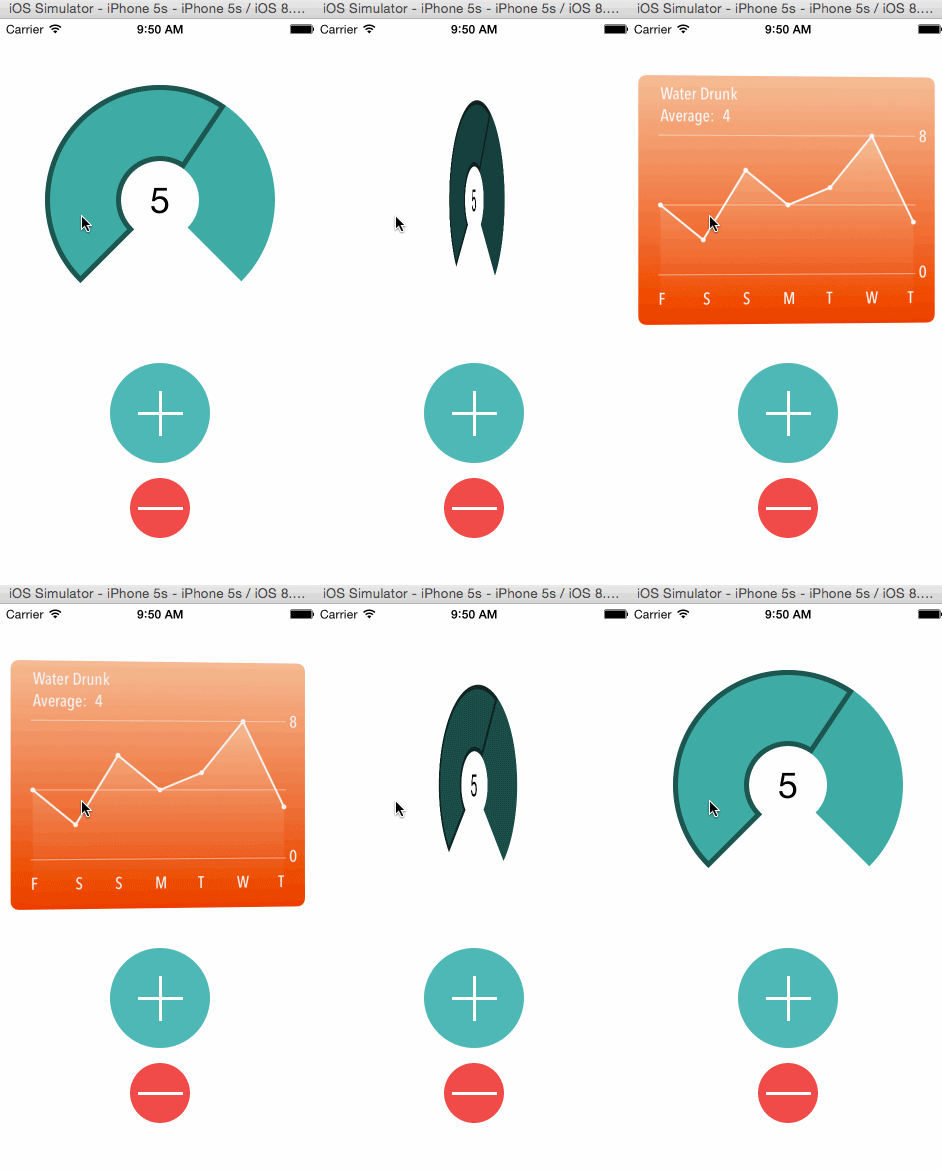
Build and run the application. Currently you’ll see the graph view when you start the app. Later on, you’ll set the graph view hidden, so the counter view will appear first. Tap it, and you’ll see the transition flipping.

2-ViewTransition

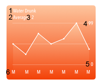
Analysis of the Graph View

2-AnalysisGraphView

Remember the Painter’s Model from Part 1? It explained that drawing with Core Graphics is done from the back of an image to the front, so you need an order in mind before you code. For Flo’s graph, that would be:

  1. Gradient background view
  2. Clipped gradient under the graph
  3. The graph line
  4. The circles for the graph points
  5. Horizontal graph lines
  6. The graph labels

Drawing a Gradient

You’ll now draw a gradient in the Graph View.

Go to GraphView.swift and replace the code with:

import UIKit

@IBDesignable class GraphView: UIView {

  // 1
  @IBInspectable var startColor: UIColor = .red
  @IBInspectable var endColor: UIColor = .green

    override func draw(_ rect: CGRect) {

      // 2
      let context = UIGraphicsGetCurrentContext()!
      let colors = [startColor.cgColor, endColor.cgColor]

      // 3
      let colorSpace = CGColorSpaceCreateDeviceRGB()

      // 4
      let colorLocations: [CGFloat] = [0.0, 1.0]

      // 5
      let gradient = CGGradient(colorsSpace: colorSpace,
                                     colors: colors as CFArray,
                                  locations: colorLocations)!

      // 6
      let startPoint = CGPoint.zero
      let endPoint = CGPoint(x: 0, y: bounds.height)
      context.drawLinearGradient(gradient,
                          start: startPoint,
                            end: endPoint,
                        options: [])
    }
}

There are a few things to go over here:

  1. You set up the start and end colors for the gradient as @IBInspectable properties, so that you’ll be able to change them in the storyboard.
  2. CG drawing functions need to know the context in which they will draw, so you use the UIKit method UIGraphicsGetCurrentContext() to obtain the current context. That’s the one that draw(_:) draws into.
  3. All contexts have a color space. This could be CMYK or grayscale, but here you’re using the RGB color space.
  4. The color stops describe where the colors in the gradient change over. In this example, you only have two colors, red going to green, but you could have an array of three stops, and have red going to blue going to green. The stops are between 0 and 1, where 0.33 is a third of the way through the gradient.
  5. Create the actual gradient, defining the color space, colors and color stops.
  6. Finally, you draw the gradient. CGContextDrawLinearGradient() takes the following parameters:
    • The CGContext in which to draw
    • The CGGradient with color space, colors and stops
    • The start point
    • The end point
    • Option flags to extend the gradient

The gradient will fill the entire rect of draw(_:).

Set up Xcode so that you have a side-by-side view of your code and the storyboard using the Assistant Editor (Show Assistant Editor…\Counterparts\Main.storyboard), and you’ll see the gradient appear on the Graph View.

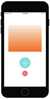
2-InitialGradient

In the storyboard, select the Graph View. Then in the Attributes Inspector, change Start Color to RGB(250, 233, 222), and End Color to RGB(252, 79, 8) (click the color, then Other\Color Sliders):

2-FirstGradient

Now for some clean up duty. In Main.storyboard, select each view in turn, except for the main ViewController view, and set the Background Color to Clear Color. You don’t need the yellow color any more, and the push button views should have a transparent background too.

Build and run the application, and you’ll notice the graph looks a lot nicer, or at least the background of it. :]

Clipping Areas

When you used the gradient just now, you filled the whole of the view’s context area. However, you can create paths to use as clipping areas instead of being used for drawing. Clipping areas allow you to define the area you want to be filled in, instead of the whole context.

Go to GraphView.swift.

First, add these constants at the top of GraphView, which we will use for drawing later:

private struct Constants {
  static let cornerRadiusSize = CGSize(width: 8.0, height: 8.0)
  static let margin: CGFloat = 20.0
  static let topBorder: CGFloat = 60
  static let bottomBorder: CGFloat = 50
  static let colorAlpha: CGFloat = 0.3
  static let circleDiameter: CGFloat = 5.0
}

Now add this code to the top of draw(_:):

let path = UIBezierPath(roundedRect: rect,
                  byRoundingCorners: .allCorners,
                        cornerRadii: Constants.cornerRadiusSize)
path.addClip()

This will create a clipping area that constrains the gradient. You’ll use this same trick shortly to draw a second gradient under the graph line.

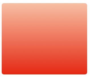
Build and run the application and see that your graph view has nice, rounded corners:

2-RoundedCorners2

Note: Drawing static views with Core Graphics is generally quick enough, but if your views move around or need frequent redrawing, you should use Core Animation layers. Core Animation is optimized so that the GPU, not the CPU, handles most of the processing. In contrast, the CPU processes view drawing performed by Core Graphics in draw(_:).

Instead of using a clipping path, you can create rounded corners using the cornerRadius property of a CALayer, but you should optimize for your situation. For a good lesson on this concept, check out Custom Control Tutorial for iOS and Swift: A Reusable Knob by Mikael Konutgan and Sam Davies, where you’ll use Core Animation to create a custom control.

Tricky Calculations for Graph Points

Now you’ll take a short break from drawing to make the graph. You’ll plot 7 points; the x-axis will be the ‘Day of the Week’ and the y-axis will be the ‘Number of Glasses Drunk’.

First, set up sample data for the week.

Still in GraphView.swift, at the top of the class, add this property:

//Weekly sample data
var graphPoints = [4, 2, 6, 4, 5, 8, 3]

This holds sample data that represents seven days. Ignore the warning you get about changing this to a let value, as we’ll need it to be a var later on.

Add this code to the top of the draw(_:):

let width = rect.width
let height = rect.height

And add this code to the end of draw(_:):

//calculate the x point

let margin = Constants.margin
let graphWidth = width - margin * 2 - 4
let columnXPoint = { (column: Int) -> CGFloat in
  //Calculate the gap between points
  let spacing = graphWidth / CGFloat(self.graphPoints.count - 1)
  return CGFloat(column) * spacing + margin + 2
}

The x-axis points consist of 7 equally spaced points. The code above is a closure expression. It could have been added as a function, but for small calculations like this, you can keep them inline.

columnXPoint takes a column as a parameter, and returns a value where the point should be on the x-axis.

Add the code to calculate the y-axis points to the end of draw(_:):

// calculate the y point

let topBorder = Constants.topBorder
let bottomBorder = Constants.bottomBorder
let graphHeight = height - topBorder - bottomBorder
let maxValue = graphPoints.max()!
let columnYPoint = { (graphPoint: Int) -> CGFloat in
  let y = CGFloat(graphPoint) / CGFloat(maxValue) * graphHeight
  return graphHeight + topBorder - y // Flip the graph
}

columnYPoint is also a closure expression that takes the value from the array for the day of the week as its parameter. It returns the y position, between 0 and the greatest number of glasses drunk.

Because the origin in Core Graphics is in the top-left corner and you draw a graph from an origin point in the bottom-left corner, columnYPoint adjusts its return value so that the graph is oriented as you would expect.

Continue by adding line drawing code to the end of draw(_:):

// draw the line graph

UIColor.white.setFill()
UIColor.white.setStroke()

// set up the points line
let graphPath = UIBezierPath()

// go to start of line
graphPath.move(to: CGPoint(x: columnXPoint(0), y: columnYPoint(graphPoints[0])))

// add points for each item in the graphPoints array
// at the correct (x, y) for the point
for i in 1..<graphPoints.count {
  let nextPoint = CGPoint(x: columnXPoint(i), y: columnYPoint(graphPoints[i]))
  graphPath.addLine(to: nextPoint)
}

graphPath.stroke()

In this block, you create the path for the graph. The UIBezierPath is built up from the x and y points for each element in graphPoints.

The Graph View in the storyboard should now look like this:

2-FirstGraphLine

Now that you verified the line draws correctly, remove this from the end of draw(_:):

graphPath.stroke()

That was just so that you could check out the line in the storyboard and verify that the calculations are correct.

A Gradient Graph

You're now going to create a gradient underneath this path by using the path as a clipping path.

First set up the clipping path at the end of draw(_:):

//Create the clipping path for the graph gradient

//1 - save the state of the context (commented out for now)
//context.saveGState()

//2 - make a copy of the path
let clippingPath = graphPath.copy() as! UIBezierPath

//3 - add lines to the copied path to complete the clip area
clippingPath.addLine(to: CGPoint(x: columnXPoint(graphPoints.count - 1), y:height))
clippingPath.addLine(to: CGPoint(x:columnXPoint(0), y:height))
clippingPath.close()

//4 - add the clipping path to the context
clippingPath.addClip()

//5 - check clipping path - temporary code
UIColor.green.setFill()
let rectPath = UIBezierPath(rect: rect)
rectPath.fill()
//end temporary code

A section-by-section breakdown of the above code:

  1. context.saveGState() is commented out for now -- you’ll come back to this in a moment once you understand what it does.
  2. Copy the plotted path to a new path that defines the area to fill with a gradient.
  3. Complete the area with the corner points and close the path. This adds the bottom-right and bottom-left points of the graph.
  4. Add the clipping path to the context. When the context is filled, only the clipped path is actually filled.
  5. Fill the context. Remember that rect is the area of the context that was passed to draw(_:).

Your Graph View in the storyboard should now look like this:

2-GraphClipping

Next, you'll replace that lovely green with a gradient you create from the colors used for the background gradient.

Remove the temporary code with the green color fill from the end of draw(_:), and add this code instead:

let highestYPoint = columnYPoint(maxValue)
let graphStartPoint = CGPoint(x: margin, y: highestYPoint)
let graphEndPoint = CGPoint(x: margin, y: bounds.height)

context.drawLinearGradient(gradient, start: graphStartPoint, end: graphEndPoint, options: [])
//context.restoreGState()

In this block, you find the highest number of glasses drunk and use that as the starting point of the gradient.

You can’t fill the whole rect the same way you did with the green color. The gradient would fill from the top of the context instead of from the top of the graph, and the desired gradient wouldn’t show up.

Take note of the commented out context.restoreGState() -- you’ll remove the comments after you draw the circles for the plot points.

At the end of draw(_:), add this:

//draw the line on top of the clipped gradient
graphPath.lineWidth = 2.0
graphPath.stroke()

This code draws the original path.

Your graph is really taking shape now:

2-SecondGraphLine

Drawing the Data Points

At the end of draw(_:), add the following:

//Draw the circles on top of the graph stroke
for i in 0..<graphPoints.count {
  var point = CGPoint(x: columnXPoint(i), y: columnYPoint(graphPoints[i]))
  point.x -= Constants.circleDiameter / 2
  point.y -= Constants.circleDiameter / 2

  let circle = UIBezierPath(ovalIn: CGRect(origin: point, size: CGSize(width: Constants.circleDiameter, height: Constants.circleDiameter)))
  circle.fill()
}

This code draws the plot points and is nothing new. It fills a circle path for each of the elements in the array at the calculated x and y points.

2-GraphWithFlatCircles

Hmmm…but what's showing up in the storyboard are not nice, round circle points! What's going on?

Context States

Graphics contexts can save states. When you set many context properties, such as fill color, transformation matrix, color space or clip region, you're actually setting them for the current graphics state.

You can save a state by using context.saveGState(), which pushes a copy of the current graphics state onto the state stack. You can also make changes to context properties, but when you call context.restoreGState(), the original state is taken off the stack and the context properties revert. That's why you're seeing the weird issue with your points.

Still in GraphView.swift, in draw(_:), uncomment the context.saveGState() that takes place before creating the clipping path, and uncomment the context.restoreGState() that takes place after the clipping path has been used.

By doing this, you:

  1. Push the original graphics state onto the stack with context.saveGState().
  2. Add the clipping path to a new graphics state.
  3. Draw the gradient within the clipping path.
  4. Restore the original graphics state with context.restoreGState(). This was the state before you added the clipping path.

Your graph line and circles should be much clearer now:

2-GraphWithCircles

At the end of draw(_:), add the code to draw the three horizontal lines:

//Draw horizontal graph lines on the top of everything
let linePath = UIBezierPath()

//top line
linePath.move(to: CGPoint(x: margin, y: topBorder))
linePath.addLine(to: CGPoint(x: width - margin, y: topBorder))

//center line
linePath.move(to: CGPoint(x: margin, y: graphHeight/2 + topBorder))
linePath.addLine(to: CGPoint(x: width - margin, y: graphHeight/2 + topBorder))

//bottom line
linePath.move(to: CGPoint(x: margin, y:height - bottomBorder))
linePath.addLine(to: CGPoint(x:  width - margin, y: height - bottomBorder))
let color = UIColor(white: 1.0, alpha: Constants.colorAlpha)
color.setStroke()

linePath.lineWidth = 1.0
linePath.stroke()

Nothing in this code is new. All you're doing is moving to a point and drawing a horizontal line.

2-GraphWithAxisLines

Adding the Graph Labels

Now you'll add the labels to make the graph user-friendly.

Go to ViewController.swift and add these outlet properties:

//Label outlets
@IBOutlet weak var averageWaterDrunk: UILabel!
@IBOutlet weak var maxLabel: UILabel!
@IBOutlet weak var stackView: UIStackView!

This adds outlets for the two labels that you want to dynamically change text for (the average water drunk label, the max water drunk label), and for a StackView with day names labels.

Now go to Main.storyboard and add the following views as subviews of the Graph View:

2-LabelledGraph

  1. UILabel with text "Water Drunk"
  2. UILabel with text "Average: "
  3. UILabel with text "2", next to the average label
  4. UILabel with text "99", right aligned next to the top of the graph
  5. UILabel with text "0", right aligned to the bottom of the graph
  6. A horizontal StackView with labels for each day of a week -- the text for each will be changed in code. Center aligned.

Shift-select all the labels, and then change the fonts to custom Avenir Next Condensed, Medium style.

If you have any trouble setting up those labels, check out the final project from the end of this tutorial.

Connect averageWaterDrunk, maxLabel and stackView to the corresponding views in Main.storyboard. Control-drag from View Controller to the correct label and choose the outlet from the pop up:

Now that you've finished setting up the graph view, in Main.storyboard select the Graph View and check Hidden so the graph doesn't appear when the app first runs.

2-GraphHidden

Go to ViewController.swift and add this method to set up the labels:

func setupGraphDisplay() {

  let maxDayIndex = stackView.arrangedSubviews.count - 1

  //  1 - replace last day with today's actual data
  graphView.graphPoints[graphView.graphPoints.count - 1] = counterView.counter
  //2 - indicate that the graph needs to be redrawn
  graphView.setNeedsDisplay()
  maxLabel.text = "\(graphView.graphPoints.max()!)"

  //  3 - calculate average from graphPoints
  let average = graphView.graphPoints.reduce(0, +) / graphView.graphPoints.count
  averageWaterDrunk.text = "\(average)"

  // 4 - setup date formatter and calendar
  let today = Date()
  let calendar = Calendar.current

  let formatter = DateFormatter()
  formatter.setLocalizedDateFormatFromTemplate("EEEEE")

  // 5 - set up the day name labels with correct days
  for i in 0...maxDayIndex {
    if let date = calendar.date(byAdding: .day, value: -i, to: today),
      let label = stackView.arrangedSubviews[maxDayIndex - i] as? UILabel {
      label.text = formatter.string(from: date)
    }
  }
}

This looks a little burly, but it's required to set up the calendar and retrieve the current day of the week. Take it in sections:

  1. You set today’s data as the last item in the graph’s data array. In the final project, which you can download at the end of Part 3, you'll expand on this by replacing it with 60 days of sample data, and you'll include a method that splits out the last x number of days from an array, but that is beyond the scope of this session. :]
  2. Redraws the graph in case there are any changes to today’s data.
  3. Here you use Swift’s reduce to calculate the average glasses drunk for the week; it's a very useful method to sum up all the elements in an array.
  4. Note: This Swift Functional Programming Tutorial explains functional programming in some depth.

  5. This section sets up DateFormatter in a way that it will get first letter of the name of a day.
  6. This loop goes through all labels inside of stackView and we set text for each label from date formatter.

Still in ViewController.swift, call this new method from counterViewTap(_:). In the else part of the conditional, where the comment says show graph, add this code:

setupGraphDisplay()

Run the application, and click the counter. Hurrah! The graph swings into view in all its glory!

2-GraphFinished

Mastering the Matrix

Your app is looking really sharp! The counter view you created in part one could be improved though, like by adding markings to indicate each glass to be drunk:

2-Result

Now that you've had a bit of practice with CG functions, you'll use them to rotate and translate the drawing context.

Notice that these markers radiate from the center:

2-LinesExpanded

As well as drawing into a context, you have the option to manipulate the context by rotating, scaling and translating the context’s transformation matrix.

At first, this can seem confusing, but after you work through these exercises, it'll make more sense. The order of the transformations is important, so first I’ll outline what you'll be doing with diagrams.

The following diagram is the result of rotating the context and then drawing a rectangle in the center of the context.

2-RotatedContext

The black rectangle is drawn before rotating the context, then the green one, then the red one. Two things to notice:

  1. The context is rotated at the top left (0,0)
  2. The rectangle is still being drawn in the center of the context, but after the context has been rotated.

When you're drawing the counter view’s markers, you'll translate the context first, then you'll rotate it.

2-RotatedTranslatedContext

In this diagram, the rectangle marker is at the very top left of the context. The blue lines outline the translated context, then the context rotates (red dashed line) and is translated again.

When the red rectangle marker is finally drawn into the context, it'll appear in the view at an angle.

After the context is rotated and translated to draw the red marker, it needs to be reset to the center so that the context can be rotated and translated again to draw the green marker.

Just as you saved the context state with the clipping path in the Graph View, you'll save and restore the state with the transformation matrix each time you draw the marker.

Go to CounterView.swift and add this code to the end of draw(_:) to add the markers to the counter:

//Counter View markers
let context = UIGraphicsGetCurrentContext()!

//1 - save original state
context.saveGState()
outlineColor.setFill()

let markerWidth: CGFloat = 5.0
let markerSize: CGFloat = 10.0

//2 - the marker rectangle positioned at the top left
let markerPath = UIBezierPath(rect: CGRect(x: -markerWidth / 2, y: 0, width: markerWidth, height: markerSize))

//3 - move top left of context to the previous center position
context.translateBy(x: rect.width / 2, y: rect.height / 2)

for i in 1...Constants.numberOfGlasses {
  //4 - save the centred context
  context.saveGState()
  //5 - calculate the rotation angle
  let angle = arcLengthPerGlass * CGFloat(i) + startAngle - .pi / 2
  //rotate and translate
  context.rotate(by: angle)
  context.translateBy(x: 0, y: rect.height / 2 - markerSize)

  //6 - fill the marker rectangle
  markerPath.fill()
  //7 - restore the centred context for the next rotate
  context.restoreGState()
}

//8 - restore the original state in case of more painting
context.restoreGState()

Here's what you've just done:

  1. Before manipulating the context’s matrix, you save the original state of the matrix.
  2. Define the position and shape of the path -- but you're not drawing it yet.
  3. Move the context so that rotation happens around the context’s original center. (Blue lines in the previous diagram.)
  4. For each mark, you first save the centered context state.
  5. Using the individual angle previously calculated, you determine the angle for each marker and rotate and translate the context.
  6. Draw the marker rectangle at the top left of the rotated and translated context.
  7. Restore the centered context’s state.
  8. Restore the original state of the context that had no rotations or translations.

Whew! Nice job hanging in there for that. Now build and run the application, and admire Flo's beautiful and informative UI:

2-FinalPart2

Where to Go to From Here?

Here is Flo, complete with all of the code you’ve developed so far.

At this point, you've learned how to draw paths, gradients and how to change the context's transformation matrix.

In the third and final part of this Core Graphics tutorial, you'll create a patterned background and draw a vector medal image.

If you have any questions or comments, please join the discussion below!

The post Core Graphics Tutorial Part 2: Gradients and Contexts appeared first on Ray Wenderlich.

Core Graphics Tutorial Part 3: Patterns and Playgrounds

$
0
0
Update note: This tutorial has been updated to iOS 11, Swift 4, and Xcode 9 by Andrew Kharchyshyn. The original tutorial was written by Caroline Begbie.

Welcome back to the third and final part of the Core Graphics tutorial series! Flo, your water drinking tracking app, is ready for its final evolution, which you’ll make happen with Core Graphics.

In part one, you drew three custom-shaped controls with UIKit. Then in the part two, you created a graph view to show the user’s water consumption over a week, and you explored transforming the context transformation matrix (CTM).

In this third and final part of our Core Graphics tutorial, you’ll take Flo to its final form. Specifically, you’ll:

  • Create a repeating pattern for the background.
  • Draw a medal from start to finish to award the users for successfully drinking eight glasses of water a day.

If you don’t have it already, download a copy of the Flo project from the second part of this series.

Background Repeating Pattern

Your mission in this section is to use UIKit’s pattern methods to create this background pattern:

3-FinalBackground

Note: If you need to optimize for speed, then work through Core Graphics Tutorial: Patterns which demonstrates a basic way to create patterns with Objective-C and Core Graphics. For most purposes, like when the background is only drawn once, UIKit’s easier wrapper methods should be acceptable.

Go to File\New\File… and select the iOS iOS\Source\Cocoa Touch Class template to create a class named BackgroundView with a subclass of UIView. Click Next and then Create.

Go to Main.storyboard, select the main view of ViewController, and change the class to BackgroundView in the Identity Inspector.

Set up BackgroundView.swift and Main.storyboard so they are side-by-side, using the Assistant Editor.

Replace the code in BackgroundView.swift with:

import UIKit

@IBDesignable
class BackgroundView: UIView {

  //1
  @IBInspectable var lightColor: UIColor = UIColor.orange
  @IBInspectable var darkColor: UIColor = UIColor.yellow
  @IBInspectable var patternSize: CGFloat = 200

  override func draw(_ rect: CGRect) {
    //2
    let context = UIGraphicsGetCurrentContext()!

    //3
    context.setFillColor(darkColor.cgColor)

    //4
    context.fill(rect)
  }
}

The background view of your storyboard should now be yellow. More detail on the above code:

  1. lightColor and darkColor have @IBInspectable attributes so it’s easier to configure background colors later on. You’re using orange and yellow as temporary colors, just so you can see what’s happening. patternSize controls the size of the repeating pattern. It’s initially set to large, again so it’s easy to see what’s happening.
  2. UIGraphicsGetCurrentContext() gives you the view’s context and is also where draw(_ rect:) draws.
  3. Use the Core Graphics method setFillColor() to set the current fill color of the context. Notice that you need to use CGColor, a property of darkColor when using Core Graphics.
  4. Instead of setting up a rectangular path, fill() fills the entire context with the current fill color.

You’re now going to draw these three orange triangles using UIBezierPath(). The numbers correspond to the points in the following code:

3-GridPattern

Still in BackgroundView.swift, add this code to the end of draw(_ rect:):

let drawSize = CGSize(width: patternSize, height: patternSize)

//insert code here

let trianglePath = UIBezierPath()
//1
trianglePath.move(to: CGPoint(x: drawSize.width/2, y: 0))
//2
trianglePath.addLine(to: CGPoint(x: 0, y: drawSize.height/2))
//3
trianglePath.addLine(to: CGPoint(x: drawSize.width, y: drawSize.height/2))

//4
trianglePath.move(to: CGPoint(x: 0,y: drawSize.height/2))
//5
trianglePath.addLine(to: CGPoint(x: drawSize.width/2, y: drawSize.height))
//6
trianglePath.addLine(to: CGPoint(x: 0, y: drawSize.height))

//7
trianglePath.move(to: CGPoint(x: drawSize.width, y: drawSize.height/2))
//8
trianglePath.addLine(to: CGPoint(x: drawSize.width/2, y: drawSize.height))
//9
trianglePath.addLine(to: CGPoint(x: drawSize.width, y: drawSize.height))

lightColor.setFill()
trianglePath.fill()

Notice how you use one path to draw three triangles. move(to:) is just like lifting your pen from the paper when you’re drawing and moving it to a new spot.

Your storyboard should now have an orange and yellow image at the top left of your background view.

So far, you’ve drawn directly into the view’s drawing context. To be able to repeat this pattern, you need to create an image outside of the context, and then use that image as a pattern in the context.

Find the following. It’s close to the top of draw(_ rect:), but after the initial context calls:

let drawSize = CGSize(width: patternSize, height: patternSize)

Add the following code where it conveniently says Insert code here:

UIGraphicsBeginImageContextWithOptions(drawSize, true, 0.0)
let drawingContext = UIGraphicsGetCurrentContext()!

//set the fill color for the new context
darkColor.setFill()
drawingContext.fill(CGRect(x: 0, y: 0, width: drawSize.width, height: drawSize.height))

Hey! Those orange triangles disappeared from the storyboard. Where’d they go?

UIGraphicsBeginImageContextWithOptions() creates a new context and sets it as the current drawing context, so you’re now drawing into this new context. The parameters of this method are:

  • The size of the context.
  • Whether the context is opaque — if you need transparency, then this needs to be false.
  • The scale of the context. If you’re drawing to a retina screen, this should be 2.0, and if to an iPhone 6 Plus, it should be 3.0. However, this uses 0.0, which ensures the correct scale for the device is automatically applied.

Then you used UIGraphicsGetCurrentContext() to get a reference to this new context.

You then filled the new context with yellow. You could have let the original background show through by setting the context opacity to false, but it’s faster to draw opaque contexts than it is to draw transparent, and that’s argument enough to go opaque.

Add this code to the end of draw(_ rect:):

let image = UIGraphicsGetImageFromCurrentImageContext()!
UIGraphicsEndImageContext()

This extracts a UIImage from the current context. When you end the current context with UIGraphicsEndImageContext(), the drawing context reverts to the view’s context, so any further drawing in draw(_ rect:) happens in the view.

To draw the image as a repeated pattern, add this code to the end of draw(_ rect:):

UIColor(patternImage: image).setFill()
context.fill(rect)

This creates a new UIColor by using an image as a color instead of a solid color.

Build and run the app. You should now have a rather bright background for your app.

3-BoldBackground2

Go to Main.storyboard, select the background view, and in the Attributes Inspector change the @IBInspectable values to the following:

  • Light Color: RGB(255, 255, 242)
  • Dark Color: RGB(223, 255, 247)
  • Pattern Size: 30

3-BackgroundColors2

Experiment a little more with drawing background patterns. See if you can get a polka dot pattern as a background instead of the triangles.

And of course, you can substitute your own non-vector images as repeating patterns.

Drawing Images

In the final stretch of this tutorial, you’ll make a medal to handsomely reward users for drinking enough water. This medal will appear when the counter reaches the target of eight glasses.

3-MedalFinal

I know that’s certainly not a museum-worthy piece of art, so please know that I won’t be offended if you improve it, or even take it to the next level by drawing a trophy instead of a medal.

Instead of using @IBDesignable, you’ll draw it in a Swift Playground, and then copy the code to a UIImageView subclass. Though interactive storyboards are often useful, they have limitations; they only draw simple code, and storyboards often time out when you create complex designs.

In this particular case, you only need to draw the image once when the user drinks eight glasses of water. If the user never reaches the target, there’s no need to make a medal.

Once drawn, it also doesn’t need to be redrawn with draw(_ rect:) and setNeedsDisplay().

Time to put the brush to the canvas. You’ll build up the medal view using a Swift playground, and then copy the code into the Flo project when you’ve finished.

Go to File\New\Playground…. Choose the Blank template, click Next, name the playground MedalDrawing and then click Create.

In the new playground window, replace the playground code with:

import UIKit

let size = CGSize(width: 120, height: 200)

UIGraphicsBeginImageContextWithOptions(size, false, 0.0)
let context = UIGraphicsGetCurrentContext()!


//This code must always be at the end of the playground
let image = UIGraphicsGetImageFromCurrentImageContext()
UIGraphicsEndImageContext()

This creates a drawing context, just as you did for the patterned image.

Take note of these last two lines; you always need them at the bottom of the playground so you can preview the image in the playground.

Next, in the gray results column click the square button to the right of this code:

let image = UIGraphicsGetImageFromCurrentImageContext()

This will place a preview image underneath the code. The image will update with every change that you make to the code.

It’s often best to do a sketch to wrap your head around the order you’ll need to draw the elements — look at the “masterpiece” I made while conceptualizing this tutorial:

3-Sketch

This is the order in which to draw the medal:

  1. The back ribbon (red)
  2. The medallion (gold gradient)
  3. The clasp (dark gold)
  4. The front ribbon (blue)
  5. The number 1 (dark gold)

Remember to keep the last two lines of the playground (where you extract the image from the context at the very end), and add this drawing code to the playground before those lines:

First, set up the non-standard colors you need.

//Gold colors
let darkGoldColor = UIColor(red: 0.6, green: 0.5, blue: 0.15, alpha: 1.0)
let midGoldColor = UIColor(red: 0.86, green: 0.73, blue: 0.3, alpha: 1.0)
let lightGoldColor = UIColor(red: 1.0, green: 0.98, blue: 0.9, alpha: 1.0)

This should all look familiar by now. Notice that the colors appear in the right margin of the playground as you declare them.

Add the drawing code for the red part of the ribbon:

//Lower Ribbon
let lowerRibbonPath = UIBezierPath()
lowerRibbonPath.move(to: CGPoint(x: 0, y: 0))
lowerRibbonPath.addLine(to: CGPoint(x: 40, y: 0))
lowerRibbonPath.addLine(to: CGPoint(x: 78, y: 70))
lowerRibbonPath.addLine(to: CGPoint(x: 38, y: 70))
lowerRibbonPath.close()
UIColor.red.setFill()
lowerRibbonPath.fill()

Nothing too new here, just creating a path and filling it. You should see the red path appear in the right hand pane.

Add the code for the clasp:

//Clasp
let claspPath = UIBezierPath(roundedRect: CGRect(x: 36, y: 62, width: 43, height: 20), cornerRadius: 5)
claspPath.lineWidth = 5
darkGoldColor.setStroke()
claspPath.stroke()

Here you make use of UIBezierPath(roundedRect:) with rounded corners by using the cornerRadius parameter. The clasp should draw in the right pane.

Add the code for the medallion:

//Medallion
let medallionPath = UIBezierPath(ovalIn: CGRect(x: 8, y: 72, width: 100, height: 100))
//context.saveGState()
//medallionPath.addClip()

let colors = [darkGoldColor.cgColor, midGoldColor.cgColor, lightGoldColor.cgColor] as CFArray
let gradient = CGGradient(colorsSpace: CGColorSpaceCreateDeviceRGB(), colors: colors, locations: [0, 0.51, 1])!
context.drawLinearGradient(gradient, start: CGPoint(x: 40, y: 40), end: CGPoint(x: 40, y: 162), options: [])
//context.restoreGState()

Notice the commented out the lines. These are here to temporarily show how the gradient is drawn:

3-SquareGradient

To put the gradient on an angle, so that it goes from top-left to bottom-right, change the end x coordinate of the gradient. Alter the drawLinearGradient() code to:

context.drawLinearGradient(gradient, start: CGPoint(x: 40, y: 40), end: CGPoint(x: 100, y: 160), options: [])

3-SkewedGradient

Now uncomment those three lines in the medallion drawing code to create a clipping path to constrain the gradient within the medallion’s circle.

Just as you did when drawing the graph in Part 2 of this series, you save the context’s drawing state before adding the clipping path and restore it after the gradient is drawn so that the context is no longer clipped.

3-ClippedGradient

To draw the solid internal line of the medal, use the medallion’s circle path, but scale it before drawing. Instead of transforming the whole context, you’ll just apply the transform to one path.

Add this code after the medallion drawing code:

//Create a transform
//Scale it, and translate it right and down
var transform = CGAffineTransform(scaleX: 0.8, y: 0.8)
transform = transform.translatedBy(x: 15, y: 30)
medallionPath.lineWidth = 2.0

//apply the transform to the path
medallionPath.apply(transform)
medallionPath.stroke()

3-MedalOutline

This scales the path down to 80 percent of its original size, and then translates the path to keep it centered within the gradient view.

Add the upper ribbon drawing code after the internal line code:

//Upper Ribbon
let upperRibbonPath = UIBezierPath()
upperRibbonPath.move(to: CGPoint(x: 68, y: 0))
upperRibbonPath.addLine(to: CGPoint(x: 108, y: 0))
upperRibbonPath.addLine(to: CGPoint(x: 78, y: 70))
upperRibbonPath.addLine(to: CGPoint(x: 38, y: 70))
upperRibbonPath.close()

UIColor.blue.setFill()
upperRibbonPath.fill()

This is very similar to the code you added for the lower ribbon: making a bezier path and filling it.

3-UpperRibbon

The last step is to draw the number one on the medal. Add this code after the upper ribbon code:

//Number One

//Must be NSString to be able to use draw(in:)
let numberOne = "1" as NSString
let numberOneRect = CGRect(x: 47, y: 100, width: 50, height: 50)
let font = UIFont(name: "Academy Engraved LET", size: 60)!
let numberOneAttributes = [
  NSAttributedStringKey.font: font,
  NSAttributedStringKey.foregroundColor: darkGoldColor
]
numberOne.draw(in: numberOneRect, withAttributes: numberOneAttributes)

Here you define a NSString with text attributes, and draw it into the drawing context using draw(_in:).

3-NumberOne

Looking good!

You’re getting close, but it’s looking a little two-dimensional. It would be nice to have some drop shadows.

Shadows

To create a shadow, you need three elements: color, offset (distance and direction of the shadow) and blur.

At the top of the playground, after defining the gold colors but just before the //Lower Ribbon line, insert this shadow code:

//Add Shadow
let shadow: UIColor = UIColor.black.withAlphaComponent(0.80)
let shadowOffset = CGSize(width: 2.0, height: 2.0)
let shadowBlurRadius: CGFloat = 5

context.setShadow(offset: shadowOffset, blur: shadowBlurRadius, color: shadow.cgColor)

That makes a shadow, but the result is probably not what you pictured. Why is that?

3-MessyShadows

When you draw an object into the context, this code creates a shadow for each object.

3-IndividualShadows

Ah-ha! Your medal comprises five objects. No wonder it looks a little fuzzy.

Fortunately, it’s pretty easy to fix. Simply group drawing objects with a transparency layer, and you’ll only draw one shadow for the whole group.

3-GroupedShadow

Add the code to make the group after the shadow code. Start with this:

context.beginTransparencyLayer(auxiliaryInfo: nil)

When you begin a group you also need to end it, so add this next block at the end of the playground, but before the point where you retrieve the final image:

context.endTransparencyLayer()

Now you’ll have a completed medal image with clean, tidy shadows:

3-MedalFinal

That completes the playground code, and you have a medal to show for it!

Adding the Medal Image to an Image View

Now that you’ve got the code in place to draw a medal (which looks fabulous, by the way), you’ll need to render it into a UIImageView in the main Flo project.

Switch back to the Flo project and create a new file for the image view.

Click File\New\File… and choose the Cocoa Touch Class template. Click Next , and name the class MedalView. Make it a subclass of UIImageView, then click Next, then click Create.

Go to Main.storyboard and add a UIImageView as a subview of Counter View. Select the UIImageView, and in the Identity Inspector change the class to MedalView.

3-MedalViewClass

In the Size Inspector, give the Image View the coordinates X=76, Y=147, Width=80, and Height=80:

In the Attributes Inspector, change the Content Mode to Aspect Fit, so that the image automatically resizes to fit the view.

Go to MedalView.swift and add a method to create the medal:

func createMedalImage() -> UIImage {
  println("creating Medal Image")

}

This creates a log so that you know when the image is being created.

Switch back to your MedalDrawing playground, and copy the entire code except for the initial import UIKit.

Go back to MedalView.swift and paste the playground code into createMedalImage().

At the end of createMedalImage(), add:

return image!

That should squash the compile error.

At the top of the class, add a property to hold the medal image:

lazy var medalImage: UIImage = self.createMedalImage()

The lazy declaration modifier means that the medal image code, which is computationally intensive, only draws when necessary. Hence, if the user never records drinking eight glasses, the medal drawing code will never run.

Add a method to show the medal:

func showMedal(show: Bool) {
  image = (show == true) ? medalImage : nil
}

Go to ViewController.swift and add an outlet at the top of the class:

@IBOutlet weak var medalView: MedalView!

Go to Main.storyboard and connect the new MedalView to this outlet.

Go back to ViewController.swift and add this method to the class:

func checkTotal() {
  if counterView.counter >= 8 {
    medalView.showMedal(show: true)
  } else {
    medalView.showMedal(show: false)
  }
}

This shows the medal if you drink enough water for the day.

Call this method at both the end of viewDidLoad() and pushButtonPressed(_:):

checkTotal()

Build and run the application. It should look like this:

3-CompletedApp

In the debug console, you’ll see the creating Medal Image log only outputs when the counter reaches eight and displays the medal, since medalImage uses a lazy declaration.

Where to Go From Here?

You’ve come a long way in this epic Core Graphics tutorial series. You’ve mastered the basics of Core Graphics: drawing paths, creating patterns and gradients, and transforming the context. To top it all off, you learned how to put it all together in a useful app.

Download the complete version of Flo right here. This version also includes extra sample data and radial gradients to give the buttons a nice UI touch so they respond when pressed.

I hope you enjoyed making Flo, and that you’re now able to make some stunning UIs using nothing but Core Graphics and UIKit! If you have any questions, comments, or you want to hash out how to draw a trophy instead of a medal, please join the forum discussion below.

The post Core Graphics Tutorial Part 3: Patterns and Playgrounds appeared first on Ray Wenderlich.

Getting Started with ARCore with Kotlin

$
0
0

Getting Started with ARCore with Kotlin

Did Vikings have cannons in reality? I’m not entirely sure, but there’s no reason Vikings can’t have cannons in Augmented Reality! :]

At WWDC 2017, Apple announced ARKit, its foray into the world of AR development. Not to be outdone, just last week Google announced ARCore, extracted from the Tango indoor mapping project. Tango requires using particular devices that have a depth sensor, whereas ARCore will (eventually) be available on most Android devices.

The race to explore this new domain is on, with demo projects coming fast and furious. You can check out some of the ARCore demos at the AR Experiments site.

ARCore apps can be built using OpenGL, Unity, and Unreal. In this tutorial, you’ll get started by building on top of a modified version of the OpenGL sample app provided by Google, working entirely in Kotlin! And all within the comfort of Android Studio! :]

If you’re just getting started with Kotlin, please check out Kotlin For Android: An Introduction.

ARCore does not work with the Android Emulator. As of this writing, you’ll need a Samsung Galaxy S8 or Google Pixel/Pixel XL to fully follow along, ideally running Android Nougat (7.0) or later. If you don’t have either of those devices, hopefully you’ll still get a feel for working with the ARCore SDK.

Ready to explore this brave new (augmented) world? Let’s go!

Getting Started

Begin by downloading the starter project here. Open up the starter project in Android Studio 3.0 Beta 4 or later.

NOTE: When you open the project, if you see the following window, then be sure NOT to choose “Update” and instead choose “Remind me tomorrow” or “Don’t remind me again for this project”, because the project may have trouble building if you switch to the 3.0.0-beta4 plugin due to a DexArchiveMergerException in Android Studio 3.0 Beta 4.

You may also have luck if you’re using Android Studio 2.3.3 with the Kotlin plugin. :]

Next, make sure to enable developer options on your device, and enable USB debugging. Before running the starter project, you’ll also need to download and install the ARCore Service provided by Google.

The ARCore Service can be installed using the following adb command:

$ adb install -r -d arcore-preview.apk

Check out the adb documentation if you need more info.

Now you can hit Run/Run ‘app’ or hit Ctrl-R, and the starter up should be up and running.

You’ll first get prompted to provide camera permissions, and on approving, you’ll see a radio group at the top, which you’ll use later to select the type of object to insert into the scene.

You’ll see a snackbar at the bottom indicating “Searching for surfaces…”. You may also see a few points highlighted, which are points being tracked.

Aiming the device at a flat surface, a plane will be detected:

Once the first plane is detected, the snackbar disappears and the plane is highlighted on the screen. Note that light-colored planes may have trouble being detected.

At this point, the starter app doesn’t do a whole lot, but time to check out some it’s code to get your bearings! Especially before you setup a viking with a cannon!

The ARCode SDK

The starter app has the 3D models we’ll be using in the main/assets folder in the Project view of Android Studio. There are models for a viking, a cannon, and a target. The 3D model files were created in Blender using the instructions in How To Export Blender Models to OpenGL ES: Part 1/3.

Inside of res/raw, there are OpenGL shaders, all from the Google ARCore sample app.

You’ll see a package in the starter app named rendering, which contains some OpenGL renderers and utilities from the Google ARCore sample app. There’s also a class named PlaneAttachment that has been converted to Kotlin and that uses the ARCore SDK.

Planes, Anchors, and Poses

The PlaneAttachment class is constructed using a Plane and an Anchor, and can be used to construct a Pose. All three are from the ARCore SDK.

A Plane describes a real-world planar surface. An Anchor descibes a fixed location and orientation in space. A Pose describes a coordinate transformation from one system to another, from an object’s local frame to the world coordinate frame.

You can read more about each in the official documentation.

So, PlaneAttachment let’s you attach an anchor to a plane, and retrieve the corresponding pose, which is used by ARCore as you move about the anchor point.

ARCore Session

The starter app includes an ARCore Session object in MainActivity. The session describes the entire AR state, and you’ll use it to attach anchors to planes when the user taps the screen.

In setupSession(), called from onCreate(...), the starter app checks that the device supports ARCore. If not, a Toast is displayed and the activity finishes.

Assuming you have a supported device, it’s time to setup some objects to render in the scene!

Adding Objects

Open up MainActivity, and add the following properties

private val vikingObject = ObjectRenderer()
private val cannonObject = ObjectRenderer()
private val targetObject = ObjectRenderer()

Each is defined as an ObjectRenderer from the ARCore sample app.

Also, add three PlaneAttachment properties just below the objects:

private var vikingAttachment: PlaneAttachment? = null
private var cannonAttachment: PlaneAttachment? = null
private var targetAttachment: PlaneAttachment? = null

These are Kotlin nullables initialized as null, and will be created later when the user taps the screen.

You need to setup the objects, which you’ll do in onSurfaceCreated(...). Find the existing try-catch block in that function add the following try-catch above it:

// Prepare the other rendering objects.
try {
  vikingObject.createOnGlThread(this, "viking.obj", "viking.png")
  vikingObject.setMaterialProperties(0.0f, 3.5f, 1.0f, 6.0f)
  cannonObject.createOnGlThread(this, "cannon.obj", "cannon.png")
  cannonObject.setMaterialProperties(0.0f, 3.5f, 1.0f, 6.0f)
  targetObject.createOnGlThread(this, "target.obj", "target.png")
  targetObject.setMaterialProperties(0.0f, 3.5f, 1.0f, 6.0f)
} catch (e: IOException) {
  Log.e(TAG, "Failed to read obj file")
}

You’re using the 3D model files provided in the starter app to setup each of the three objects, as well as setting some material properties on each.

Attaching Anchors to the Session

Find handleTaps(...) in MainActivity. Add the following inside the innermost if statement, just above the comment before the break statement:

when (mode) {
  Mode.VIKING -> vikingAttachment = addSessionAnchorFromAttachment(vikingAttachment, hit)
  Mode.CANNON -> cannonAttachment = addSessionAnchorFromAttachment(cannonAttachment, hit)
  Mode.TARGET -> targetAttachment = addSessionAnchorFromAttachment(targetAttachment, hit)
}

The value of mode is controlled by the radio buttons at the top of the screen. Mode is a Kotlin enum class that also includes a scale factor float value for each mode. The scale factor is used to tune the size of the corresponding 3D model in the scene.

In the when statement, for each mode, you’re setting a new value for the corresponding PlaneAttachment, using the old attachment and the hit value for the tap, which is an ARCore PlaneHitResult defining the intersection of the 3D ray for the tap and a plane.

You now need to add addSessionAnchorFromAttachment(...):

private fun addSessionAnchorFromAttachment(
  previousAttachment: PlaneAttachment?, hit: PlaneHitResult): PlaneAttachment {
  previousAttachment?.let {
    session.removeAnchors(Arrays.asList(previousAttachment.anchor))
  }
  return PlaneAttachment(hit.plane, session.addAnchor(hit.hitPose))
}

If the previousAttachment is not null, you’re first removing its anchor from the session, then adding in the new anchor to the session and returning a new value for the PlaneAttachment, based on the PlaneHitResult plane and an anchor from the PlaneHitResult pose.

You’re almost ready to see your viking do some target practice! :]

Drawing the Objects

The last step you need to do is draw the objects on the screen. You’re creating plane attachments when the user taps, but now you need to draw the objects as part of the screen rendering.

Look for the onDrawFrame(...) function. Add the following calls to the bottom of the try block:

drawObject(vikingObject, vikingAttachment, Mode.VIKING.scaleFactor,
  projectionMatrix, viewMatrix, lightIntensity)
drawObject(cannonObject, cannonAttachment, Mode.CANNON.scaleFactor,
  projectionMatrix, viewMatrix, lightIntensity)
drawObject(targetObject, targetAttachment, Mode.TARGET.scaleFactor,
  projectionMatrix, viewMatrix, lightIntensity)

You’re calling the pre-existing drawObject(...) helper function, which takes the object, its corresponding attachment, its corresponding scale factor, as well as matrices and values needed for OpenGL to draw the object that are computed using these starter app helpers:

private fun computeProjectionMatrix(): FloatArray {
  val projectionMatrix = FloatArray(16)
  session.getProjectionMatrix(projectionMatrix, 0, 0.1f, 100.0f)
  return projectionMatrix
}

private fun computeViewMatrix(frame: Frame): FloatArray {
  val viewMatrix = FloatArray(16)
  frame.getViewMatrix(viewMatrix, 0)
  return viewMatrix
}

private fun computeLightIntensity(frame: Frame) = frame.lightEstimate.pixelIntensity

The projectionMatrix is calculated from the ARCore Session. The viewMatrix is calculated from the ARCore Frame, which describes the AR state at a particular point in time. The lightIntensity is also determined from the frame.

Go ahead and run the app. Select a radio button at the top to select an object mode. Then find a plane with your camera and tap to place an object. Once you’ve placed all of the objects, if you rotate your phone, you’ll see a scene like this:

You can move around the scene and watch as your Viking prepares to fire. There’s no stopping your Viking now! :]

Where to go from here?

You’ve just scratched the surface of using ARCore with OpenGL in Android Studio. For more information, check out the ARCore API page and the ARCore Overview.

The final app for this tutorial can be downloaded here.

You can also use ARCore with Unity and ARCore with Unreal. Since a good portion of the development with ARCore will likely rely on Unity, I highly recommended you also take a look at our Unity content.

In addition to Android, ARCore targets the web, and you can find more info here. Finally, some cool demos made with ARCore (primarily with Unity) can be found at the Google experiments site.

I hope you enjoyed this brief intro to ARCore with Kotlin! Stay tuned for more! :]

The post Getting Started with ARCore with Kotlin appeared first on Ray Wenderlich.

Video Tutorial: Xcode Tips And Tricks Part 3: Preferences and Editing

RWDevCon 2018: Time to Vote!

$
0
0

RWDevCon-feature

At RWDevCon, we make tutorials based on what the attendees vote for. That way, we cover what you want to learn about!

Two weeks ago, we put out a call for suggestions for what tutorials. Huge thanks to all of the attendees who submitted your ideas!

Here are a few of the ideas that folks submitted:

  • Advanced RxSwift
  • Auto Layout Best Practices
  • Clean Architecture on iOS
  • Codable
  • Core Animation Under the Hood
  • Drag n Drop
  • Reconstructing Popular/Creative UI Interactions
  • Swift and Kotlin Side-by-Side
  • TDD with Swift
  • …and over 50 other ideas!

Today, we are moving on to the next phase, where attendees get to vote on these suggestions, to help choose what tutorials we make for the conference.

Here’s how you can cast your vote:

  • If you bought a RWDevCon 2018 ticket, check your email: I sent you a link with the vote.
  • If you don’t have a RWDevCon 2018 ticket yet, now’s the time! If you grab your ticket by end of day tomorrow I’ll send you a link to the vote.

We can’t wait to see what topics we cover this year!

The post RWDevCon 2018: Time to Vote! appeared first on Ray Wenderlich.

Video Tutorial: Xcode Tips And Tricks Part 4: Workspaces and Frameworks

UX Design Patterns for Mobile Apps: Which and Why

$
0
0

UX design patterns for mobile appsDevelopers and designers don’t always get along. We spend days working on something and then hear “That’s not possible, change your design” or “we’ve changed our minds — change your code”. But fortunately, designers and developers do agree that what matters in the end is shipping a useful app that is enjoyable to use.

The apps we create aren’t completely unique. For example, Uber, YouTube, and Slack solve three very distinct problems: getting from A to B, video access and creation, and communication.

Along with their differences, these widely used mobile apps also have similarities. Consider that they all face the recurring (and boring) problem that is authentication, and they do it by using the recurring solution that is the log-in form.

Solutions for recurring problems like this are known as UX design patterns. UX design patterns offer three main advantages:

  1. Cost savings: You can reuse and adapt solutions rather than start from scratch.
  2. Reduced risk: Patterns emerge after a solution has been tried and tested by many, making it more likely to result in a good outcome with fewer bugs than usual.
  3. Familiarity: Patterns enable a shared vocabulary between designers and developers and reduce barriers between groups in the organization.

UX Design patterns can be composed of smaller, more specific patterns, such as a password visibility toggle that reduces mistakes from not being able to see what you’ve already typed.

Which UX Design Patterns

In this article, we’ll skip basics such as lists, search or log-in forms. Instead, we’ll focus on these five advanced UX design patterns for mobile app UX — speed, security, and comfort:

  1. Skeleton Views
  2. 2-Step Authentication
  3. Accelerator
  4. One-Handed Usage
  5. Intelligence

Each UX design pattern is described in detail below, with tips on how and when to use it, along with some real-world examples of each.

Skeleton Views

UX design patterns for mobile apps Skeletons-Facebook_Slack_YouTube_Instagram_Foursquare_Deliveroo

The Skeleton view makes your app feel faster.

My experience is that users are more time-sensitive than you think. Research by Google suggests even delays as small as 200ms push users away. This is why Google has invested heavily into making content appear faster with a fast web browser, and numerous other technologies such as AMP, HTTP2, and many other initiatives.

Instagram, now with 700 million users, understood very early that speed matters. To drive engagement, it made posting and other common actions in its app appear to happen instantly for the user.

When To Use It

Skeleton views should be used whenever network or processing speed limitations prevent your app from responding immediately to user choices.

Do not assume everyone has a fast network connection or a fast processor in their phone. At the same time, creating a skeleton view for every single view and screen is unnecessary if the view doesn’t depend on the network, or if it’s not accessed daily by most of your customers.

A skeleton view can be used to replace a launch screen. Facebook does this on its web, Android, and iOS apps. It’s the first thing you see when you launch the app.

You can also provide a skeleton view for specific items in a list, grid, or any other view. This is particularly relevant if you’re doing partial data loading, such as when you’re loading just the bytes you don’t have already cached.

Instagram loads likes for a post and a few of the post’s comments when that post is displayed in the timeline, but it only loads the full comment thread once you tap to see the details of that post. Interestingly enough, it doesn’t yet provide a skeleton view for the comment thread or timeline posts like Facebook does.

Tips

When I first started adding skeleton views to the apps I design, I had to ask myself: Which views should have a skeleton equivalent? How tall should the skeleton of a text label be? Which shade of grey should I use? How do I transition from skeleton to the loaded view? How should I animate the skeleton views?

As you likely have similar questions, I’ve included the answers in the form of a video and list of tips below.

UX design patterns Skeleton-on-White-and-Dark

Some tips on creating skeletons:

  • The skeleton views use a subtle grey for placeholders.
  • Use a subtle transparent-white-transparent gradient, animated left-to-right on all placeholders.
  • Images/Icons simply become grey frames.
  • Text becomes a slightly rounded rectangle with a height matching the lowercase x character of the font used in it.
  • States have no skeleton, e.g. tab bar selected state.
  • The layout is simplified with conditional and smaller icons or details removed. For example, Foursquare only displays skeleton views for title and description of a search result, not the visit count detail or optional last visited time text.
  • Prioritize frequently accessed screens that depend on network or processing speed to be displayed
  • Create skeleton views for elements such as images and lists so they can be reused throughout the app, instead of creating a skeleton for the screen itself.

Two-Step Authentication

Enter phone number, receive code, done!

Two-step authentication improves the security of user accounts.

The problem with the traditional username and password UX design pattern is that passwords aren’t changed often, they’re shared between services, and password managers are often required to handle hundreds of service-specific passwords.

Two-step works by generating a temporary One-Time Password (OTP) remotely on the server when the user starts the log in process, and sharing that temporary OTP with the user via SMS or Email. The user then types the temporary OTP, completing the log in process and causing the password to expire. See the tips below for ways to avoid the typing step.

The temporary nature of OTP and their delivery methods means that users don’t need to create or remember passwords, nor they can share them between services.

When To Use It

For most services, Two-Step offers a balance between security and convenience.

Two-Step is the primary authentication method for mobile apps such as WhatsApp, with 1.2 billion monthly users. Others such as Facebook, Google, Dropbox, and Apple offer Two-Step as a fallback for Two-Factor Authentication.

Without going into much detail, the drawback of Two-Step is that SMS and email, with some effort, can be compromised. Two-Factor is a stronger but harder to use alternative. Two-Factor is stronger because it doesn’t rely on SMS or email.

Instead, codes are generated locally within an app or dedicated hardware as the second factor, the first being the username or email. This makes it harder to access the OTP for both attacker and user.

The bottom line is this: While not perfect, Two-Step is an improvement over username and password authentication. Most users will make the claim “as a user, I don’t want to install an app so I can register or log in to my account” — despite what you may have read in other (fantasy) user stories.

Also note: as Two-Step requires an SMS or Email sender, you may have to weight OTP distribution costs based on how many users you’ve got.

Tips

You can make Two-Step even safer for your customers by pairing it with Delayed Registration, Magic Links, and Android’s SMS Access.

UX Design patterns for mobile apps_Foursquare

Delayed Registration means the first thing your users see isn’t a form or an onboarding flow. Foursquare is an example of this. You’re allowed to browse freely without an account, but certain actions and screens promote registration and log in (see the image above).

The advantage is that users are more likely to register after they’ve tested your app and understand how it’s valuable to them.

UX Design patterns for mobile apps_delayed registration

During this period, it’s likely the user has provided a phone number or email while ordering or booking a cab, so you can even prefill the Two-Step registration form for an even simpler registration flow.

UX Design patterns for mobile apps_Review Merge

One tricky bit is merging data created by the user during their usage as a guest. What happens when the address provided during a guest booking is different from what is in the account they then log into?

My recommendation is to adopt a save-everything approach.

For properties that may contain multiple values, save all existing values; for single-value properties, the best you can do is display a review screen where the user can pick the desired version. Optionally, you may simply override older values with the latest ones provided by the user.

UX Design patterns for mobile apps_Slack magic link

Magic Links: Apps like Slack generate what they call “Magic Links”, which is a fancy name for a URL containing the One-Time Password. When followed, this URL opens the app, which can then read the OTP from the URL itself instead of relying on the user to manually type it in. You can implement your own Magic Links with App Links (Android) or Universal Links (iOS), and send them via SMS or email.

SMS Access: On Android O, you can add a new method to automatically retrieve One-Time Passwords sent via SMS, saving the user from manual inputting and allowing your app full SMS access.

This was the method I chose for a previous client, as it offers by far the best experience on Android (or any other platform) as it takes literally seconds for a user to log in or register.

In one case, my client went from a 12-field form down to a 2-second registration process. Consequently, conversion rates for registration went way, way up.

Ensuring account access: Although unlikely, users may change phone numbers or lose access to email.

Always remember to collect multiple contact details to use as a backup contact method for sending OTP codes. This is mainly a non-issue, as the longer the user uses your service, the more likely it is for a backup method to be in place.

Immediately after registration, you may not have a backup contact method, but there’s also no data to lose in the newly-created user account.

Tips

  • To increase the likelihood users don’t loose access to their account, ensure you gather alternative contact methods.
  • Be mindful of places where users naturally provide their contact method, and prompt for authentication when they’re not mid-task, such as when they’re waiting for their order to be completed.
  • Use Android O’s new SMS Retriever API to retrieve the authentication code without burdening the user. Full SMS access might work on older Android versions. Consider using Magic Links as detailed above.
  • Copy matters! Place the authentication code at the very beginning of your message so people can see it in the system notification preview. Use Chunking to make it easier to read by splitting the 6-digit code in two 3-digit parts.

Accelerator

Accelerators are hidden shortcuts that allow users to perform actions or view content more efficiently.

Because they’re hidden, Accelerators should never be the only alternative, but instead complement slower ways of using your app.

UX Design patterns for mobile apps_Instagram accelerators

This single Instagram screen contains five hidden accelerators:

  1. Tapping the status bar instantly takes you to the top, faster than scrolling.
  2. 3D Touch on the author (or long-press on Android) displays an account summary with name, post/follower/following count, and the top six photos. While a simple tap would display the same information, 3D Touch shows it as fast as tapping, unlike long-press, and exposes the three most used actions. More importantly, it allows for instant dismissal by releasing the finger. This is valuable for those who peek into multiple photos or accounts in a short space of time (as seen in the above video).
  3. Swiping left/right lets you create a story/direct message, which is easier than tapping the icons on the hard-to-reach top area of the screen.
  4. Long-pressing the tab bar plus button invokes post from your Photo Library, which is one less step compared to tapping the plus icon, waiting for the animation to finish, and then tapping library.
  5. Long-pressing the tab bar account button displays the account picker. This is easier than tapping account, tapping settings, and scrolling down past all settings.

The takeaway is that all these shortcuts are hiding in plain sight, facilitating or doubling functionality without adding extra buttons to this screen.

When To Use It

Use Accelerators when you want your app to serve the majority of your users who need an obvious but slower interface, as well as serve advanced users who are willing to learn shortcuts to get things done more quickly — without compromising the experience for either of these groups.

In a content app such as Instagram, the majority of users will skim through the timeline, and you’ll want to promote content interaction by making it obvious and dead-easy to use. A smaller group will post content more often, grow their follower base, and have multiple accounts. In this case, Instagram has filled its consumption interface with shortcuts for the creators, as seen above.

Even when all your users are part of the advanced group, accelerators are still a better option than alternatives such as customizable interfaces that, while powerful, burden everyone with thinking about the right settings. This also makes your app more complex to use and maintain.

On authoring apps such as Final Cut Pro, or code editors such as Xcode or Android Studio, the majority of users are familiar with accelerators such as keyboard shortcuts, and rely heavily on them to get work done. Without keyboard shortcuts, giving emphasis to this piece of text would’ve taken me more than a simple Command+B. As a developer, searching the project navigator and clicking the file I want to edit would be a distraction compared to Shift+Cmd+O (Quick Open) or Ctrl+Tab.

Tips

  • Accelerators should not be the only way to access a feature or content in your app.
  • Use analytics and talk to customers to determine what content and features should be made more accessible through accelerators
  • Educate your users, as accelerators are usually invisible to your users. Show them where the accelerators are, how they work, and what users get out of them.
  • Consider all available triggers for your accelerators:
    • Tap
    • Double-tap
    • Long-press
    • 3D Touch (Peek & Pop, Quick Actions)
    • Swipe Navigation (swiping between screens, dismiss by swiping upwards)
    • Swipe Actions (swiping on list items)
  • Look for common accelerators on Android and iOS. Users are more likely to know them and expect them to work on your app as well. For instance, swipe actions are now part of many iOS and Android apps. Apps like Mail and Gmail let users swipe left on an email to reveal archive, toggle unread, or other common actions.
  • Use long-press only when 3D Touch isn’t available, such as on Android or older iOS devices. Long-press adds a 1-second delay and is more likely to be triggered accidentally compared to 3D Touch.
  • When using an accelerator, people aren’t looking for the full content or all possible actions. Pick a goal such as searching for a specific venue on a map so you can get directions to it, and instead of showing all photos/reviews/full address, show only one photo, overall rating, and the distance. Narrow down the possible actions to getting directions, calling, sharing, viewing the website or seeing full details.

One-Handed Usage

One-handed usage makes your app easier to use on larger screens as well as on regular-sized devices where you only have one hand available. To allow for one-handed usage, navigation and primary actions must be possible without repositioning the holding hand or use a second one.

In the video above, Apple Music is used as an example of an app where playback, browsing, and functions like Add to Queue can be performed without reaching beyond the bottom area of the screen. Notice how Edit (library shortcuts), User Account, Add (to library) and other secondary, less-used actions are nearer the top of the screen and thus can be put out of easy reach.

Android and iOS already provide components such as bottom/tab bars, floating action button and swipe navigation, but it’s up to you to use them in a way that makes your app easy to use.

Built-in behaviors like iOS’s swipe navigation or Android’s back button are designed with one-handed usage in mind. But it’s up to you to use built-in components like the bottom/tab/tool bar, floating action button, bottom sheet or snack bar, to make your app easy to use with one hand.

When To Use It

With enough effort, any app is usable with one hand. What one-handed usage aims for is effortlessness, as opposed to balancing your phone in your hand while trying to beat the world record for the longest thumb just so you can book a cab while holding your luggage at the airport.

If you’re not designing a desktop or tablet app, one-handed usage should always be on your mind. It doesn’t mean that every single thing in your app should be usable with one hand, but the main actions should be within easy reach.

UX Design patterns for mobile apps_Lyft-Redesign-for-One-Handed-Usage

The above screenshots show the Lyft app before and after it was redesigned for one-handed usage. When ordering a Lyft, users primarily need to select the service type and pickup location. Notice how in the redesign these actions are within the easy and average comfort zones, but account and free rides remain out of reach as they’re less-frequently used secondary actions.

Tips

  • Exhaust the possibilities of system-provided user interface components first, such as tab bars, bottom sheets, floating action buttons, swipe navigation and swipe-to-refresh, before creating custom solutions users may not be familiar with and ones that you’ll have to spend time creating and maintaining.
  • On every screen, think about what has and what doesn’t have to be reachable. Make sure you don’t clutter the bottom of the screen with unrelated or too many features that are unrelated to the goal the user is trying to achieve or doesn’t use often.
  • Keep in mind that techniques such as double-tapping or swiping up/down to zoom in/out and edge-gestures lack discoverability. Therefore, you’ll have to educate your users about them during the on-boarding process.
  • Use icons on the navigation bar to also display state, such as adding a red dot to the Direct Messages icon to inform about unread messages.
  • Educate users about adjacent screens. For instance, Instagram shows Stories and Direct Messages buttons on the navigation bar, which is also accessible by swiping left or right anywhere on the screen.

Intelligence

UX Design patterns for mobile apps_Intelligence

“A computer should never ask the user for any information that it can auto-detect, copy or deduce.” — Eric Raymond

Eric’s right: Computers can access and understand large amounts of data, and use that data to make predictions or act on our behalf.

Users expect your app to have some basic intelligence, they’ll use it more and rate it higher.

When To Use It

Basic intelligence doesn’t require you to be a machine learning specialist. Something as simple as setting an input field type enables the OS to offer its own intelligence in the form of password suggestions or credential autofill. A good example is the Android O Autofill from the 1Password blog.

UX Design patterns for mobile apps_App-Content-Indexing

With a little bit more code, you can let the OS understand content in your app and present that content in a context that makes sense for the user. In the example above, Apple Maps shows a venue I’ve looked at recently on Foursquare, making it easy to get directions.

You can also be smart about using sensor data to present relevant suggestions for a given moment. Uber avoids suggesting you get a ride home when you’re already there. Instead, they display recent destinations that exclude your current location.

The Awareness API is built-in to Android. Recently, I’ve used it to offer driving directions, if the user is driving, or walking directions when the user is on foot. It also supports other forms of intelligence based on time, location, place, activity, weather, beacons, headphone status, or a combination or multiple characteristics.

UX Design patterns for mobile apps_Card.io

The Card.io Uber integration for automatically adding a credit card was what allowed me to signup to Uber and quickly get out of a dodgy neighborhood at night the first time I visited San Francisco. Instead of typing in the 12-digit card number, name, and expiry date in the street at night, I simply pointed it at the card and moments later I’m counting the seconds until my driver arrives.

UX Design patterns for mobile apps_ASOS visual search

Users of ASOS, a UK online retailer, were finding it difficult to find the right product in a catalog of thousands of products, even with advanced search and filtering. What ASOS did was relatively simple: they trained a basic image recognition algorithm with images from their catalog, and allowed users to upload arbitrary images so they could be matched with similar products in their catalog.

UX Design patterns for mobile apps_NLP-Tokenization-Example

Natural language processing is an interesting way to add intelligence to your app. In the past, I’ve used it to present people with trivia and products related to the content they were reading and watching.

Back then, I had to partner with a machine learning specialist company, later acquired by Microsoft. Fun fact: the app wasn’t able to understand that when Big Bird says “C is for Chair”, he wasn’t talking about an “Electric Chair”. Nowadays, natural language processing is built right into Android and iOS. It probably still doesn’t know it’s inappropriate to show electric chairs to kids, but the technology itself has become a commodity.

Another interesting example shown at WWDC 2017 involved using NLP to group content from multiple social networks into themes. Searching “hiking” photos given a search term of “hike”, “hiked”, “hiker”, or any other variation.

Tips

  • You don’t need a machine learning model to suggest event locations. Simply look at similarly-named events and their location. Move up to machine learning only when necessary.
  • Give the user an opportunity to review and accept suggestions.
  • Explore and understand available sensors, such as camera, GPS and others, along with available data sources, such as the Photo Library, Contacts, SMS, Apple Pay, Android Pay, and Autofill.
  • When accessing data sources, use a just-in-time approach when the user accesses the feature, or use pre-permission dialogs to set things up ahead of time.
  • Research available technologies. Android and iOS make it easy to add general intelligence and Machine Learning to your app.

Summary

You’ve covered five advanced UX design patterns to address users’ needs for speed, security, and comfort:

  1. Speed matters when it comes to retaining users. Skeleton Views make your app appear faster and are used by Facebook, Slack, others.
  2. The convenience of 2-Step Authentication increases registration metrics and account security.
  3. Advanced users can count on Accelerators to get more done in less time.
  4. For when you’re out-and-about, One-Handed Usage is crucial.
  5. Finally, our apps must use Intelligence to make our lives simpler and stand out against competitors.

As a good next step, keep an eye on how users use your app. Talk to them and understand their problems in a deep and meaningful way. Prioritize those problems by looking at how often they occur and how many people experience them. Focus on frequent problems, experienced by the majority.

Once you understand the problem, then turn to UX design patterns and Apple’s and Google’s design guidelines to see if there is a feature that would solve those problem and make users’ lives simpler. If you manage to solve their problem and improve their experience, you’ll see a related boost in app ratings — and app revenue!

Do you have any UX design patterns you’d add to this list? Let me know in the comments!

The post UX Design Patterns for Mobile Apps: Which and Why appeared first on Ray Wenderlich.


Video Tutorial: Xcode Tips And Tricks Part 5: Schemes and Targets

CALayer Tutorial for iOS: Getting Started

$
0
0

LayersScreenshot

Update note: This tutorial has been updated to iOS 11, Swift 4, and Xcode 9 by Michael Ciurus. The original tutorial was written by Scott Gardner.

As you probably know, everything you see in an iOS app is a view. There’s button views, table views, slider views, and even parent views that contain other views.

But what you might not know is that each view in iOS is backed by another class called a layer – a CALayer to be specific.

In this article, you’ll learn what a CALayer is and how it works. You’ll also see 10 examples of using CALayers for cool effects, like shapes, gradients, and even particle systems.

This article assumes you’re familiar with the basics of iOS app development and Swift, including constructing your UI with storyboards.

Note: If you’re not quite there, no worries. You’ll be happy to know we have quite a few tutorials and books on the subject, such as Learn to Code iOS Apps with Swift and The iOS Apprentice.

How does CALayer relate to UIView?

UIView takes care of many things including layout or handling touch events. It’s interesting to notice that it doesn’t directly take care of the drawing or animations, UIKit delegates that task to its brother: CoreAnimation. UIView is in fact just a wrapper over CALayer. When you set bounds on a UIView, the view simply sets bounds on its backing CALayer. If you call layoutIfNeeded on a UIView, the call gets forwarded to the root CALayer. Each UIView has one root CALayer, which can contain sublayers.

CALayer vs UIView

Getting Started

The easiest way to understand what layers are is to see them in action. You’ll start with a simple starter project to play around with layers. Download this simple project which is just a single view app with a view inserted in the center.

Replace the contents of ViewController.swift with the following:

import UIKit

class ViewController: UIViewController {

  @IBOutlet weak var viewForLayer: UIView!

  var layer: CALayer {
    return viewForLayer.layer
  }

  override func viewDidLoad() {
    super.viewDidLoad()
    setUpLayer()
  }

  func setUpLayer() {
    layer.backgroundColor = UIColor.blue.cgColor
    layer.borderWidth = 100.0
    layer.borderColor = UIColor.red.cgColor
    layer.shadowOpacity = 0.7
    layer.shadowRadius = 10.0
  }

  @IBAction func tapGestureRecognized(_ sender: Any) {

  }

  @IBAction func pinchGestureRecognized(_ sender: Any) {

  }

}

As mentioned earlier, every view in iOS has a layer associated with it, and you can retrieve that layer with .layer. The first thing this code does is create a computed property called layer to access the viewForLayer‘s layer.

The code also calls setUpLayer() to set a few properties on the layer: a shadow, a blue background color, and a huge red border. You’ll learn more about setUpLayer() in a moment, but first, build and run to the iOS Simulator and check out your customized layer:

CALayerPlayground-1

Pretty cool effect with just a few lines of code, eh? And again – since every view is backed by a layer, you can do this kind of thing for any view in your app.

Basic CALayer Properties

CALayer has several properties that let you customize its appearance. Think back to what you’ve already done:

  • Changed the layer’s background color from its default of no background color to blue.
  • Given it a border by changing its border width from the default 0 to 100.
  • Changed its color from the default black to red.
  • And, lastly, given it a shadow by changing its shadow opacity from default zero (transparent) to 0.7. This alone would cause a shadow to display, and you took it a step further by increasing its shadow radius from its default value of 3 to 10.

These are just a few of the properties you can set on CALayer. You’ll try two more. Add these lines to the bottom of setUpLayer():

layer.contents = UIImage(named: "star")?.cgImage
layer.contentsGravity = kCAGravityCenter

The contents property on a CALayer allows you to set the layer’s content to an image, so you set it to an image named “star” here. The image has been shipped with the starter project.

Build and run and take a moment to appreciate your stunning piece of art:

CALayerPlayground-2

Notice how the star is centered – this is because you set the contentsGravity property to kCAGravityCenter. As you might expect, you can also change the gravity to top, top-right, right, bottom-right, bottom, bottom-left, left and top-left.

Changing the Layer’s Appearance

The starter project contains connected tap and pinch gesture recognizers.

Change tapGestureRecognized(_:) to look like this:

@IBAction func tapGestureRecognized(_ sender: UITapGestureRecognizer) {
  layer.shadowOpacity = layer.shadowOpacity == 0.7 ? 0.0 : 0.7
}

This tells the viewForLayer layer to toggle its layer’s shadow opacity between 0.7 and 0 when the view recognizes a tap.

The view, you say? Well, yes. You could override CALayer‘s hitTest(_:) to do the same thing, and actually you’ll see that approach later in this article. But hit testing is all a layer can do because it cannot react to recognized gestures. That’s why you set up the tap gesture recognizer on the view.

Now change pinchGestureRecognized(_:) to look like this:

@IBAction func pinchGestureRecognized(_ sender: UIPinchGestureRecognizer) {
  let offset: CGFloat = sender.scale < 1 ? 5.0 : -5.0
  let oldFrame = layer.frame
  let oldOrigin = oldFrame.origin
  let newOrigin = CGPoint(x: oldOrigin.x + offset, y: oldOrigin.y + offset)
  let newSize = CGSize(width: oldFrame.width + (offset * -2.0), height: oldFrame.height + (offset * -2.0))
  let newFrame = CGRect(origin: newOrigin, size: newSize)
  if newFrame.width >= 100.0 && newFrame.width <= 300.0 {
    layer.borderWidth -= offset
    layer.cornerRadius += (offset / 2.0)
    layer.frame = newFrame
  }
}

Here you're creating a positive or negative offset based on the user's pinch, and then adjusting the size of the layer's frame, width of its border and the border's corner radius.

A layer's corner radius is 0 by default, meaning it's a standard rectangle with 90-degree corners. Increasing the radius creates rounded corners. Want to turn a square layer into a circle? Set its corner radius to half of its width.

Note that adjusting the corner radius doesn't clip the layer's contents (the star image) unless the layer's masksToBounds property is set to true.

Build and run, and try tapping on and pinching your view in and out:

CALayerPlayground-3

Hey, with a little more polish you could have yourself a pretty nifty avatar maker! :]

The Great CALayer Tour

CALayer has more than just a few properties and methods to tinker with, as well as several subclasses that have unique properties and methods.

What better way to get an overview of all this great API than by taking a guided tour, raywenderlich.com-style?

For the rest of this article, you will need the following:

This is a handy app that includes examples of 10 different types of CALayers, which you'll learn about in this article. Here's a sneak peak of some juicy examples:

Layer Player screenshots

As you go through each example below, I recommend you play around with it in the CALayer app, and look at the source code provided. You don't need to actually code anything for the rest of this article, so just sit back, read, and relax :]

Example #1: CALayer

You've already seen an example of using CALayer, and setting a few of the properties.

There are a few things that weren't mentioned about CALayers yet:

  • Layers can have sublayers. Just like views can have subviews, layers can have sublayers. You can use this for some cool effects!
  • Layer properties are animated. When you change the property of a layer, it is animated over time by default. You can also customize this animation behavior to your own timing.
  • Layers are lightweight. Layers are lighter-weight than views, and therefore they help you achieve better performance.
  • Layers have tons of useful properties. You've seen a few already, but let's take a look at a few more!

You'll take a tour of the full list of CALayer properties - some you haven't seen yet, and are quite handy!

let layer = CALayer()
layer.frame = someView.bounds

layer.contents = UIImage(named: "star")?.cgImage
layer.contentsGravity = kCAGravityCenter

As previously seen, this creates a CALayer instance and sets it to the bounds of someView. Then sets an image as the layer's contents and centers it within the layer. Notice that the underlying Quartz image data (CGImage) is assigned.

layer.magnificationFilter = kCAFilterLinear
layer.isGeometryFlipped = false

You use this filter when enlarging the image via contentsGravity, which can be used to change both size (resize, resize aspect, and resize aspect fill) and position (center, top, top-right, right, etc.).

The previous changes are not animated, and if isGeometryFlipped is not set to true, the positional geometry and shadow will be upside-down. Continuing on:

layer.backgroundColor = UIColor(red: 11/255.0, green: 86/255.0, blue: 14/255.0, alpha: 1.0).cgColor
layer.opacity = 1.0
layer.isHidden = false
layer.masksToBounds = false

You set the background color to Ray's favorite shade of green :] That makes the layer opaque and visible. At the same time, you tell the layer to not mask its contents, which means that if its size is smaller than its contents (the star image), the image will not be clipped.

layer.cornerRadius = 100.0
layer.borderWidth = 12.0
layer.borderColor = UIColor.white.cgColor

The layer's corner radius is set to half the width of the layer to create visuals of a circle with a border; notice that layer colors are assigned as the Quartz color references (CGColor).

layer.shadowOpacity = 0.75
layer.shadowOffset = CGSize(width: 0, height: 3)
layer.shadowRadius = 3.0
someView.layer.addSublayer(layer)

You create a shadow and set shouldRasterize to true (discussed below), and then add the layer to the view hierarchy.

Here's the result:

CALayer

CALayer has two additional properties that can improve performance: shouldRasterize and drawsAsynchronously.

shouldRasterize is false by default, and when set to true it can improve performance because a layer's contents only need to be rendered once. It's perfect for objects that are animated around the screen but don't change in appearance.

drawsAsynchronously is sort of the opposite of shouldRasterize. It's also false by default. Set it to true to improve performance when a layer's contents must be repeatedly redrawn, such as when you work with an emitter layer that continuously renders animated particles. (See the CAEmitterLayer example later.)

A Word of Caution: Consider the implications before setting either shouldRasterize or drawsAsynchronously. Compare the performance between true and false so you know if activating these features actually improves performance. When misused, performance is likely to take a nosedive.

Now shift your attention briefly to Layer Player. It includes controls to manipulate many of CALayer's properties:

CALayer properties

Play around with the various controls - it's a great way to get a feel of what you can do with CALayer!

Note: Layers are not part of the responder chain so they won't directly react to touches or gestures like views can, as you saw in the CALayerPlayground example.

However, you can hit test them, as you'll see in the example code for CATransformLayer. You can also add custom animations to layers, which you'll see when you get to CAReplicatorLayer.

Example #2: CAScrollLayer

CAScrollLayer displays a portion of a scrollable layer. It's fairly basic and cannot directly respond to user touches or even check the bounds of the scrollable layer, but it does cool things like preventing scrolling beyond the bounds ad infinitum! :]

UIScrollView doesn't use a CAScrollLayer to do its work, instead it directly changes its layer's bounds.

What you can do with a CAScrollLayer is to set its scrolling mode to horizontal and/or vertical, and programmatically tell it to scroll to a specific point or area:

// 1
var scrollingViewLayer: CAScrollLayer {
  return scrollingView.layer as! CAScrollLayer
}

override func viewDidLoad() {
  super.viewDidLoad()
  // 2
  scrollingViewLayer.scrollMode = kCAScrollBoth
}

@IBAction func panRecognized(_ sender: UIPanGestureRecognizer) {
  var newPoint = scrollingView.bounds.origin
  newPoint.x -= sender.translation(in: scrollingView).x
  newPoint.y -= sender.translation(in: scrollingView).y
  sender.setTranslation(CGPoint.zero, in: scrollingView)
  // 3
  scrollingViewLayer.scroll(to: newPoint)

  if sender.state == .ended {
    UIView.animate(withDuration: 0.3, delay: 0, options: [], animations: {
        self.scrollingViewLayer.scroll(to: CGPoint.zero)
    })
  }
}

In the above code:

  1. A computed property is used to return the underlying CAScrollLayer layer of the scrollingView.
  2. Scrolling is initially set to both horizontal and vertical.
  3. When a pan is recognized, a new point is created and the scrolling layer scrolls to that point inside a UIView animation. Note that scroll(to:) doesn't animate automatically.

Layer Player demonstrates a CAScrollLayer that houses an image view with an image that's larger than the scrolling view's bounds. When you run the above code and pan the view, this would be the result:

CAScrollLayer

Layer Player includes two controls to lock scrolling horizontally and vertically.

Here are some rules of thumb for when to use (or not to use) CAScrollLayer:

  • If you want something lightweight and only need to programmatically scroll, consider using CAScrollLayer.
  • If you want the user to be able to scroll, you're probably better off with UIScrollView. To learn more, check out our 18-part video tutorial series on this.
  • If you are scrolling a very large image, consider using CATiledLayer (more below).

Example #3: CATextLayer

CATextLayer provides simple but fast rendering of plain text or attributed strings. Unlike UILabel, a CATextLayer cannot have an assigned UIFont, only a CTFontRef or CGFontRef.

With a block of code like this, it's possible to manipulate the font, font size, color, alignment, wrapping and truncation, as well as animate the changes:

// 1
let textLayer = CATextLayer()
textLayer.frame = someView.bounds

// 2
let string = String(
  repeating: "Lorem ipsum dolor sit amet, consectetur adipiscing elit. Fusce auctor arcu quis velit
             congue dictum. ",
  count: 20
)

textLayer.string = string

// 3
textLayer.font = CTFontCreateWithName(fontName, fontSize, nil)

// 4
textLayer.foregroundColor = UIColor.darkGray.cgColor
textLayer.isWrapped = true
textLayer.alignmentMode = kCAAlignmentLeft
textLayer.contentsScale = UIScreen.main.scale
someView.layer.addSublayer(textLayer)

Explanation of the above code:

  1. Creates a CATextLayer instance and sets its to someView's bounds.
  2. Creates a string of repeated text and assigns it to the text layer.
  3. Creates a font and assigns it to the text layer.
  4. Sets the text layer to wrap and left-align, (you have the option of setting it to natural, right, center and justified) and matches its contentsScale to the screen, and then adds the layer to the view hierarchy.

All layer classes, not just CATextLayer, render at a scale factor of 1 by default. When attached to views, layers automatically have their contentsScale set to the appropriate scale factor for the current screen. You need to set the contentsScale explicitly for layers you create manually, or else their scale factor will be 1 and you'll have pixelation on retina displays.

If added to a square-shaped UIView, the created text layer would look like this:

CATextLayer

Truncation is a setting you can play with, and it's nice when you'd like to represent clipped text with an ellipsis. Truncation defaults to none and can be set to start, end and middle:

CATextLayer-MiddleTruncation.png

CATextLayer-StartTruncation.png

CATextLayer-EndTruncation

Layer Player has controls to change many of CATextLayer's properties:

CATextLayer properties

Example #4: AVPlayerLayer

AVPlayerLayer adds a sweet layer of goodness to AVFoundation. It holds an AVPlayer to play AV media files (AVPlayerItems). Here's an example of creating an AVPlayerLayer:

var player: AVPlayer!

override func viewDidLoad() {
  super.viewDidLoad()

  // 1
  let playerLayer = AVPlayerLayer()
  playerLayer.frame = someView.bounds

  // 2
  let url = Bundle.main.url(forResource: "someVideo", withExtension: "m4v")
  player = AVPlayer(url: url!)

  // 3
  player.actionAtItemEnd = .none
  playerLayer.player = player
  someView.layer.addSublayer(playerLayer)

  // 4
  NotificationCenter.default.addObserver(self,
                                         selector: #selector(playerDidReachEnd),
                                         name: .AVPlayerItemDidPlayToEndTime,
                                         object: player.currentItem)
}

deinit {
  NotificationCenter.default.removeObserver(self)
}

A breakdown of the above code:

  1. Creates a new player layer and sets its frame.
  2. Creates a player with an AV asset.
  3. Tells the player to do nothing when it finishes playing; additional options include pausing or advancing to the next asset, if applicable.
  4. Registers for AVPlayer's notification when it finishes playing an asset (and remove the controller as an observer in deinit).

Next, when the play button is tapped, it toggles controls to play the AV asset and set the button's title.

@IBAction func playButtonTapped(sender: UIButton) {
  if playButton.titleLabel?.text == "Play" {
    player.play()
    playButton.setTitle("Pause", for: .normal)
  } else {
    player.pause()
    playButton.setTitle("Play", for: .normal)
  }
}

Then move the playback cursor to the beginning when the player has reached the end.

@objc func playerDidReachEnd(notification: NSNotification) {
  let playerItem = notification.object as! AVPlayerItem
  playerItem.seek(to: kCMTimeZero, completionHandler: nil)
}

Note this is just a simple example to get you started. In a real project, it would generally not be advisable to pivot on a button's title text.

The AVPlayerLayer and its AVPlayer created above would be visually represented by the first frame of the AVPlayerItem instance, like this:

AVPlayerItem

AVPlayerLayer has a couple additional properties:

  • videoGravity sets the resizing behavior of the video display.
  • isReadyForDisplay checks if the video is ready for display.

AVPlayer, on the other hand, has quite a few additional properties and methods. One to note is rate, which is the playback rate from 0 to 1. Zero means to pause, and 1 means the video plays at regular speed (1x).

However, setting rate also instructs playback to commence at that rate. In other words, calling pause() and setting rate to 0 does the same thing, as calling play() and setting rate to 1.

So what about fast forward, slow motion or playing in reverse? AVPlayer has you covered. Setting rate to anything higher than 1 is equivalent to asking the player to commence playback at that number times regular speed, for instance, setting rate to 2 means double-speed.

As you might assume, setting rate to a negative number instructs playback to commence at that number times regular speed in reverse.

Before playback occurs at any rate other than regular speed (forward), however, the appropriate variable is checked on the AVPlayerItem to verify that it can be played back at that rate:

  • canPlayFastForward for any number higher than 1
  • canPlaySlowForward for any number between 0 and up to, but not including, 1
  • canPlayReverse for -1
  • canPlaySlowReverse for any number between -1 and up to, but not including, 0
  • canPlayFastReverse for any number lower than -1

Most videos can typically play at various forward speeds, but it's less typical that they can play in reverse. Layer Player also includes playback controls:

AVPlayerLayer properties

Example #5: CAGradientLayer

CAGradientLayer makes it easy to blend two or more colors together, making it especially well suited to backgrounds. To configure it, you assign an array of CGColors, as well as a startPoint and an endPoint to specify where the gradient layer should begin and end.

Bear in mind, startPoint and endPoint are not explicit points. Rather, they are defined in the unit coordinate space and then mapped to the layer's bounds when drawn. In other words, an x value of 1 means the point is at the right edge of the layer, and a y value of 1 means the point is at the bottom edge of the layer.

CAGradientLayer has a type property, although kCAGradientLayerAxial is the only option, and it transitions through each color in the array linearly.

This means that if you draw a line (A) between startPoint and endPoint, the gradations would occur along an imaginary line (B) that is perpendicular to A, and all points along B would be the same color:

AxialGradientLayerType

Alternatively, you can control the locations property with an array of values between 0 and 1 that specify relative stops where the gradient layer should use the next color in the colors array.

If left unspecified the stop locations default to evenly spaced. If locations is set, though, its count must match colors count, or else undesirable things will happen :[

Here's an example of how to create a gradient layer:

func cgColor(red: CGFloat, green: CGFloat, blue: CGFloat) -> CGColor {
  return UIColor(red: red/255.0, green: green/255.0, blue: blue/255.0, alpha: 1.0).cgColor
}

let gradientLayer = CAGradientLayer()
gradientLayer.frame = someView.bounds
gradientLayer.colors = [cgColor(red: 209.0, green: 0.0, blue: 0.0),
                        cgColor(red: 255.0, green: 102.0, blue: 34.0),
                        cgColor(red: 255.0, green: 218.0, blue: 33.0),
                        cgColor(red: 51.0, green: 221.0, blue: 0.0),
                        cgColor(red: 17.0, green: 51.0, blue: 204.0),
                        cgColor(red: 34.0, green: 0.0, blue: 102.0),
                        cgColor(red: 51.0, green: 0.0, blue: 68.0)]

gradientLayer.startPoint = CGPoint(x: 0, y: 0)
gradientLayer.endPoint = CGPoint(x: 0, y: 1)
someView.layer.addSublayer(gradientLayer)

In the above code, you create a gradient layer, match its frame to the bounds of someView, assign an array of colors, set start and end points, and add the gradient layer to the view hierarchy. Here's what it would look like:

CAGradientLayer

So colorful! Next, you'll program a butterfly that comes fluttering out of the app to tickle your nose. :]

Layer Player provides you controls to change start and end points, colors and locations:

AVPlayerLayer controls

Example #6: CAReplicatorLayer

CAReplicatorLayer duplicates a layer a specified number of times, which allows you to create some cool effects.

Each layer copy can have its own color and positioning changes, and its drawing can be delayed to give an animation effect to the overall replicator layer. Depth can also be preserved to give the replicator layer a 3D effect. Here's an example:

First, create an instance of CAReplicatorLayer and set its frame to someView's bounds.

let replicatorLayer = CAReplicatorLayer()
replicatorLayer.frame = someView.bounds

Next, set the replicator layer's number of copies (instanceCount) and drawing delay. Also set the replicator layer to be 2D (preservesDepth = false) and its instance color to white.

replicatorLayer.instanceCount = 30
replicatorLayer.instanceDelay = CFTimeInterval(1 / 30.0)
replicatorLayer.preservesDepth = false
replicatorLayer.instanceColor = UIColor.white.cgColor

Then, add red/green/blue offsets to the color values of each successive replicated instance.

replicatorLayer.instanceRedOffset = 0.0
replicatorLayer.instanceGreenOffset = -0.5
replicatorLayer.instanceBlueOffset = -0.5
replicatorLayer.instanceAlphaOffset = 0.0

Each defaults to 0, and that effectively preserves color value across all instances. However, in this case, the instance color was originally set to white, meaning red, green and blue are 1.0 already. Hence, setting red to 0 and the green and blue offset values to a negative number allows red to be the prominent color. Similarly, add the alpha offset to the alpha of each successive replicated instance.

After that, create a transform to rotate each successive instance around a circle.

let angle = Float(Double.pi * 2.0) / 30
replicatorLayer.instanceTransform = CATransform3DMakeRotation(CGFloat(angle), 0.0, 0.0, 1.0)
someView.layer.addSublayer(replicatorLayer)

Then create an instance layer for the replicator layer to use and set its frame so the first instance will be drawn at center x and at the top of someView's bounds. Also, set the instance's color and add the instance layer to the replicator layer.

let instanceLayer = CALayer()
let layerWidth: CGFloat = 10.0
let midX = someView.bounds.midX - layerWidth / 2.0
instanceLayer.frame = CGRect(x: midX, y: 0.0, width: layerWidth, height: layerWidth * 3.0)
instanceLayer.backgroundColor = UIColor.white.cgColor
replicatorLayer.addSublayer(instanceLayer)

Now, make a fade animation to animate opacity from 1 (opaque) to 0 (transparent).

let fadeAnimation = CABasicAnimation(keyPath: "opacity")
fadeAnimation.fromValue = 1.0
fadeAnimation.toValue = 0.0
fadeAnimation.duration = 1
fadeAnimation.repeatCount = Float.greatestFiniteMagnitude

And, finally, set the instance layer's opacity to 0 so that it's transparent until each instance is drawn and its color and alpha values are set.

instanceLayer.opacity = 0.0
instanceLayer.add(fadeAnimation, forKey: "FadeAnimation")

And here's what that code would get you:

CAReplicatorLayer

Layer Player includes controls to manipulate most of these properties:

CAReplicatorLayer properties

Example #7: CATiledLayer

CATiledLayer asynchronously draws layer content in tiles. This is great for very large images or other sets of content where you are only looking at small bits at a time, because you can start seeing your content without having to load it all into memory.

There are a couple of ways to handle the drawing. One is to override UIView and use a CATiledLayer to repeatedly draw tiles to fill up view's background, like this:

The view controller shows a TiledBackgroundView:

import UIKit

class ViewController: UIViewController {

  @IBOutlet weak var tiledBackgroundView: TiledBackgroundView!

}

The overriden TiledBackgroundView view is defined like so:

import UIKit

class TiledBackgroundView: UIView {

  let sideLength: CGFloat = 50.0

  // 1
  override class var layerClass: AnyClass {
    return CATiledLayer.self
  }

  // 2
  required init?(coder aDecoder: NSCoder) {
    super.init(coder: aDecoder)
    srand48(Int(Date().timeIntervalSince1970))
    let layer = self.layer as! CATiledLayer
    let scale = UIScreen.main.scale
    layer.contentsScale = scale
    layer.tileSize = CGSize(width: sideLength * scale, height: sideLength * scale)
  }

  // 3
  override func draw(_ rect: CGRect) {
    let context = UIGraphicsGetCurrentContext()
    let red = CGFloat(drand48())
    let green = CGFloat(drand48())
    let blue = CGFloat(drand48())
    context?.setFillColor(red: red, green: green, blue: blue, alpha: 1.0)
    context?.fill(rect)
  }

}

Here's what's happening in the above code:

  1. layerClass is overridden so the layer for this view is created as an instance of CATiledLayer.
  2. Seeds the rand48() function that will be used to generate random colors in draw(_:). Then scales the contents of the layer (cast as a CATiledLayer) to match the screen's scale and its tile size set.
  3. Overrides draw(_:) to fill the view with tiled layers with random colors.

Ultimately, the above code draws a 6x6 grid of randomly colored square tiles, like this:

CATiledLayer

Layer Player expands upon this usage by also drawing a path on top of the tiled layer background:

CATiltedLayer properties

CATiledLayer – Levels of detail

The star in the above screenshot becomes blurry as you zoom in on the view:

CATiledLayerZoomedBlurry

This blurriness is the result of levels of detail maintained by the layer. CATiledLayer has two properties, levelsOfDetail and levelsOfDetailBias.

levelsOfDetail, as its name aptly applies, is the number of levels of detail maintained by the layer. It defaults to 1, and each incremental level caches at half the resolution of the previous level. The maximum levelsOfDetail value for a layer is that on which its bottom-most level of detail has at least one pixel.

levelsOfDetailBias, on the other hand, is the number of magnified levels of detail cached by this layer. It defaults to 0, meaning no additional magnified levels will be cached, and each incremental level will be cached at double the preceding level's resolution.

For example, increasing the levelsOfDetailBias to 5 for the blurry tiled layer above would result in caching levels magnified at 2x, 4x, 8x, 16x and 32x, and the zoomed in layer would look like this:

CATiledLayerZoomed

Pretty cool, eh? But wait, there's more!

CATiledLayer – Asynchronous drawing

CATiledLayer has another useful purpose: asynchronously drawing tiles of a very large image, for example, within a scroll view.

You have to provide the tiles and logic to tell the tiled layer which tiles to grab as the user scrolls around, but the performance gain here is remarkable.

Layer Player includes a UIImage extension in a file named UIImage+TileCutter.swift. Fellow iOS colleague Nick Lockwood adapted this code for his Terminal app, which he provided in his excellent book, iOS Core Animation: Advanced Techniques.

Its job is to slice and dice the source image into square tiles of the specified size, named according to the column and row location of each tile; for example, windingRoad_6_2.png for the tile at column 7, row 3 (zero-indexed):

windingRoad

With those tiles in place, a custom UIView subclass can be created to draw those tile layers:

import UIKit
// 1
let sideLength: CGFloat = 640.0
let fileName = "windingRoad"

class TilingViewForImage: UIView {

  let cachesPath = NSSearchPathForDirectoriesInDomains(.cachesDirectory, .userDomainMask, true)[0] as String

  // 2
  override class var layerClass : AnyClass {
    return CATiledLayer.self
  }

  // 3
  required init?(coder aDecoder: NSCoder) {
    super.init(coder: aDecoder)
    guard let layer = self.layer as? CATiledLayer else { return nil }
    layer.tileSize = CGSize(width: sideLength, height: sideLength)
  }

The above code:

  1. Creates properties for the length of the tile side, base image filename, and the path to the caches directory where the TileCutter extension saves tiles.
  2. Overrides layerClass to return CATiledLayer.
  3. Implements init(coder:), in the view's layer, casts it as a tiled layer and sets its tile size. Note that it is not necessary to match contentsScale to the screen scale, because you're working with the backing layer of the view directly.

Next, override draw(_:) to draw each tile according to its column and row position.

  override func draw(_ rect: CGRect) {
    let firstColumn = Int(rect.minX / sideLength)
    let lastColumn = Int(rect.maxX / sideLength)
    let firstRow = Int(rect.minY / sideLength)
    let lastRow = Int(rect.maxY / sideLength)

    for row in firstRow...lastRow {
      for column in firstColumn...lastColumn {
        guard let tile = imageForTile(atColumn: column, row: row) else {
          continue
        }
        let x = sideLength * CGFloat(column)
        let y = sideLength * CGFloat(row)
        let point = CGPoint(x: x, y: y)
        let size = CGSize(width: sideLength, height: sideLength)
        var tileRect = CGRect(origin: point, size: size)
        tileRect = bounds.intersection(tileRect)
        tile.draw(in: tileRect)
      }
    }
  }

  func imageForTile(atColumn column: Int, row: Int) -> UIImage? {
    let filePath = "\(cachesPath)/\(fileName)_\(column)_\(row)"
    return UIImage(contentsOfFile: filePath)
  }

}

Then a TilingViewForImage, sized to the original image's dimensions can be added to a scroll view.

And voilà, you have buttery smooth scrolling of a large image (5120 x 3200 in the case of Layer Player), thanks to CATiledLayer:

CATiledImageLayer

As you can see in the above animation, though, there is noticeable blockiness when fast-scrolling as individual tiles are drawn. Minimize this behavior by using smaller tiles (the tiles used in the above example were cut to 640 x 640) and by creating a custom CATiledLayer subclass and overriding fadeDuration() to return 0:

class TiledLayer: CATiledLayer {

  override class func fadeDuration() -> CFTimeInterval {
    return 0.0
  }

}

Example #8: CAShapeLayer

CAShapeLayer makes use of scalable vector paths to draw, and it's much faster than using images. Another part of the win here is that you'll no longer need to provide images at regular, @2x and @3x sizes. w00t!

Additionally, you have a variety of properties at your disposal to customize line thickness, color, dashing, how lines join other lines, and if that area should be filled and with what color, and more. Here's an example:

First, create the color, path, and shape layer.

import UIKit

class ViewController: UIViewController {

  @IBOutlet weak var someView: UIView!

  let rwColor = UIColor(red: 11/255.0, green: 86/255.0, blue: 14/255.0, alpha: 1.0)
  let rwPath = UIBezierPath()
  let rwLayer = CAShapeLayer()

Next, draw the shape layer's path. You do this by drawing from point to point using methods like move(to:) or addLine(to:).

  func setUpRWPath() {
    rwPath.move(to: CGPoint(x: 0.22, y: 124.79))
    rwPath.addLine(to: CGPoint(x: 0.22, y: 249.57))
    rwPath.addLine(to:CGPoint(x: 124.89, y: 249.57))
    rwPath.addLine(to:CGPoint(x: 249.57, y: 249.57))
    rwPath.addLine(to:CGPoint(x: 249.57, y: 143.79))
    rwPath.addCurve(to:CGPoint(x: 249.37, y: 38.25),
                    controlPoint1: CGPoint(x: 249.57, y: 85.64),
                    controlPoint2: CGPoint(x: 249.47, y: 38.15))
    rwPath.addCurve(to:CGPoint(x: 206.47, y: 112.47),
                    controlPoint1: CGPoint(x: 249.27, y: 38.35),
                    controlPoint2: CGPoint(x: 229.94, y: 71.76))
    rwPath.addCurve(to:CGPoint(x: 163.46, y: 186.84),
                    controlPoint1: CGPoint(x: 182.99, y: 153.19),
                    controlPoint2: CGPoint(x: 163.61, y: 186.65))
    rwPath.addCurve(to:CGPoint(x: 146.17, y: 156.99),
                    controlPoint1: CGPoint(x: 163.27, y: 187.03),
                    controlPoint2: CGPoint(x: 155.48, y: 173.59))
    rwPath.addCurve(to:CGPoint(x: 128.79, y: 127.08),
                    controlPoint1: CGPoint(x: 136.82, y: 140.43),
                    controlPoint2: CGPoint(x: 129.03, y: 126.94))
    rwPath.addCurve(to:CGPoint(x: 109.31, y: 157.77),
                    controlPoint1: CGPoint(x: 128.59, y: 127.18),
                    controlPoint2: CGPoint(x: 119.83, y: 141.01))
    rwPath.addCurve(to:CGPoint(x: 89.83, y: 187.86),
                    controlPoint1: CGPoint(x: 98.79, y: 174.52),
                    controlPoint2: CGPoint(x: 90.02, y: 188.06))
    rwPath.addCurve(to:CGPoint(x: 56.52, y: 108.28),
                    controlPoint1: CGPoint(x: 89.24, y: 187.23),
                    controlPoint2: CGPoint(x: 56.56, y: 109.11))
    rwPath.addCurve(to:CGPoint(x: 64.02, y: 102.25),
                    controlPoint1: CGPoint(x: 56.47, y: 107.75),
                    controlPoint2: CGPoint(x: 59.24, y: 105.56))
    rwPath.addCurve(to:CGPoint(x: 101.42, y: 67.57),
                    controlPoint1: CGPoint(x: 81.99, y: 89.78),
                    controlPoint2: CGPoint(x: 93.92, y: 78.72))
    rwPath.addCurve(to:CGPoint(x: 108.38, y: 30.65),
                    controlPoint1: CGPoint(x: 110.28, y: 54.47),
                    controlPoint2: CGPoint(x: 113.01, y: 39.96))
    rwPath.addCurve(to:CGPoint(x: 10.35, y: 0.41),
                    controlPoint1: CGPoint(x: 99.66, y: 13.17),
                    controlPoint2: CGPoint(x: 64.11, y: 2.16))
    rwPath.addLine(to:CGPoint(x: 0.22, y: 0.07))
    rwPath.addLine(to:CGPoint(x: 0.22, y: 124.79))
    rwPath.close()
  }

If writing this sort of boilerplate drawing code is not your cup of tea, check out PaintCode; it generates the code for you by letting you draw using intuitive visual controls or import existing vector (SVG) or Photoshop (PSD) files.

Then, set up the shape layer:

  func setUpRWLayer() {
    rwLayer.path = rwPath.cgPath
    rwLayer.fillColor = rwColor.cgColor
    rwLayer.fillRule = kCAFillRuleNonZero
    rwLayer.lineCap = kCALineCapButt
    rwLayer.lineDashPattern = nil
    rwLayer.lineDashPhase = 0.0
    rwLayer.lineJoin = kCALineJoinMiter
    rwLayer.lineWidth = 1.0
    rwLayer.miterLimit = 10.0
    rwLayer.strokeColor = rwColor.cgColor
  }

Set its path to the path drawn above, its fill color to the color created in step 1, and set the fill rule explicitly to the default value of non-zero.

  • The only other option is even-odd, and for this shape that has no intersecting paths the fill rule makes little difference.
  • The non-zero rule counts left-to-right paths as +1 and right-to-left paths as -1; it adds up all values for paths and if the total is greater than 0, it fills the shape(s) formed by the paths.
  • Essentially, non-zero fills all points inside the shape.
  • The even-odd rule counts the total number of path crossings that form a shape and if the count is odd, that shape is filled. This is definitely a case when a picture is worth a thousand words.
  • The number of path crossings in the even-odd diagram that form the pentagon shape is even, so the pentagon is not filled, whereas the number path crossings that form each triangle is odd, so the triangles are filled.
    CAShapeLayerFillRules

Finally, call the path drawing and layer set up code, and then it add the layer to the view hierarchy.

  override func viewDidLoad() {
    super.viewDidLoad()

    setUpRWPath()
    setUpRWLayer()
    someView.layer.addSublayer(rwLayer)
  }

}

This code draws the raywenderlich.com logo:

RayWenderlichLogo

And in case you're curious to know what this drawing looks like in PaintCode:

PaintCodeRayWenderlichLogo

Layer Player includes controls to manipulate many of CAShapeLayer's properties:

CAShapeLayer properties

Note: You may notice that we're skipping over the next demo in the Layer Player app. This is because CAEAGLLayer is effectively obsoleted by CAMetalLayer, which debuted with iOS 8 alongside the Metal framework. You can find a great tutorial covering CAMetalLayer here.

Example #9: CATransformLayer

CATransformLayer does not flatten its sublayer hierarchy like other layer classes, so it's handy for drawing 3D structures. It's actually a container for its sublayers, and each sublayer can have its own transforms and opacity changes, however, it ignores changes to other rendered layer properties such as border width and color.

You cannot directly hit test a transform layer because it doesn't have a 2D coordinate space to map a touch point to, however, it's possible to hit test individual sublayers. Here's an example:

First create properties for the side length, colors for each side of the cube, and a transform layer.

import UIKit

class ViewController: UIViewController {

  @IBOutlet weak var someView: UIView!

  let sideLength = CGFloat(160.0)
  let redColor = UIColor.red
  let orangeColor = UIColor.orange
  let yellowColor = UIColor.yellow
  let greenColor = UIColor.green
  let blueColor = UIColor.blue
  let purpleColor = UIColor.purple
  let transformLayer = CATransformLayer()

Create some helper code to create each side layer of a cube with the specified color, and to convert degrees to radians. Why radians? Simply because I find it more intuitive to work with degrees than radians. :]

  func sideLayer(color: UIColor) -> CALayer {
    let layer = CALayer()
    layer.frame = CGRect(origin: CGPoint.zero, size: CGSize(width: sideLength, height: sideLength))
    layer.position = CGPoint(x: someView.bounds.midX, y: someView.bounds.midY)
    layer.backgroundColor = color.cgColor
    return layer
  }

  func degreesToRadians(_ degrees: Double) -> CGFloat {
    return CGFloat(degrees * .pi / 180.0)
  }

Then build a cube by creating, rotating and then adding each side to the transform layer. Then set the transform layer's z axis anchor point, rotate the cube and add the cube to the view hierarchy.

  func setUpTransformLayer() {
    var layer = sideLayer(color: redColor)
    transformLayer.addSublayer(layer)

    layer = sideLayer(color: orangeColor)
    var transform = CATransform3DMakeTranslation(sideLength / 2.0, 0.0, sideLength / -2.0)
    transform = CATransform3DRotate(transform, degreesToRadians(90.0), 0.0, 1.0, 0.0)
    layer.transform = transform
    transformLayer.addSublayer(layer)

    layer = sideLayer(color: yellowColor)
    layer.transform = CATransform3DMakeTranslation(0.0, 0.0, -sideLength)
    transformLayer.addSublayer(layer)

    layer = sideLayer(color: greenColor)
    transform = CATransform3DMakeTranslation(sideLength / -2.0, 0.0, sideLength / -2.0)
    transform = CATransform3DRotate(transform, degreesToRadians(90.0), 0.0, 1.0, 0.0)
    layer.transform = transform
    transformLayer.addSublayer(layer)

    layer = sideLayer(color: blueColor)
    transform = CATransform3DMakeTranslation(0.0, sideLength / -2.0, sideLength / -2.0)
    transform = CATransform3DRotate(transform, degreesToRadians(90.0), 1.0, 0.0, 0.0)
    layer.transform = transform
    transformLayer.addSublayer(layer)

    layer = sideLayer(color: purpleColor)
    transform = CATransform3DMakeTranslation(0.0, sideLength / 2.0, sideLength / -2.0)
    transform = CATransform3DRotate(transform, degreesToRadians(90.0), 1.0, 0.0, 0.0)
    layer.transform = transform
    transformLayer.addSublayer(layer)

    transformLayer.anchorPointZ = sideLength / -2.0
    rotate(xOffset: 16.0, yOffset: 16.0)
  }

Next write a function that applies a rotation based on specified x and y offsets. Notice that the code sets the transform to sublayerTransform, and that applies to the sublayers of the transform layer.

  func rotate(xOffset: Double, yOffset: Double) {
    let totalOffset = sqrt(xOffset * xOffset + yOffset * yOffset)
    let totalRotation = CGFloat(totalOffset * .pi / 180.0)
    let xRotationalFactor = CGFloat(totalOffset) / totalRotation
    let yRotationalFactor = CGFloat(totalOffset) / totalRotation
    let currentTransform = CATransform3DTranslate(transformLayer.sublayerTransform, 0.0, 0.0, 0.0)
    let x = xRotationalFactor * currentTransform.m12 - yRotationalFactor * currentTransform.m11
    let y = xRotationalFactor * currentTransform.m22 - yRotationalFactor * currentTransform.m21
    let z = xRotationalFactor * currentTransform.m32 - yRotationalFactor * currentTransform.m31
    let rotation = CATransform3DRotate(transformLayer.sublayerTransform, totalRotation, x, y, z)
    transformLayer.sublayerTransform = rotation
  }

Then observe touches and cycle through the sublayers of the transform layer. Hit test each one and break out as soon as a hit is detected, since there are no benefits to hit testing remaining layers.

  override func touchesBegan(_ touches: Set<UITouch>, with event: UIEvent?) {
    guard let location = touches.first?.location(in: someView) else {
      return
    }
    for layer in transformLayer.sublayers! where layer.hitTest(location) != nil {
      print("Transform layer tapped!")
      break
    }
  }

Finally, set up the transform layer and add it to the view hierarchy.

  override func viewDidLoad() {
    super.viewDidLoad()

    setUpTransformLayer()
    someView.layer.addSublayer(transformLayer)
  }
}

Note: So what's with all those currentTransform.m##s? I'm glad you asked, sort of :]. These are CATransform3D properties that represent elements of a matrix that comprises a rectangular array of rows and columns.

To learn more about matrix transformations like those used in this example, check out 3DTransformFun project by fellow tutorial team member Rich Turton and Enter The Matrix project by Mark Pospesel.

Running the above code with someView being a 250 x 250 view results in this:

CATransformLayer

Now, try something: tap anywhere on the cube and "Transform layer tapped!" will print to the console.

Layer Player includes switches to toggle the opacity of each sublayer, and the TrackBall utility from Bill Dudney, ported to Swift, which makes it easy to apply 3D transforms based on user gestures:

CATransformLayer properties

Example #10: CAEmitterLayer

CAEmitterLayer renders animated particles that are instances of CAEmitterCell. Both CAEmitterLayer and CAEmitterCell have properties to change rendering rate, size, shape, color, velocity, lifetime and more. Here's an example:

import UIKit

class ViewController: UIViewController {

  // 1
  let emitterLayer = CAEmitterLayer()
  let emitterCell = CAEmitterCell()

  // 2
  func setUpEmitterLayer() {
    emitterLayer.frame = view.bounds
    emitterLayer.seed = UInt32(Date().timeIntervalSince1970)
    emitterLayer.renderMode = kCAEmitterLayerAdditive
    emitterLayer.drawsAsynchronously = true
    setEmitterPosition()
  }
}

The above code prepares emitterLayer:

  1. Creates an emitter layer and cell.
  2. Sets up the emitter layer by doing the following:
    • Provides a seed for the layer's random number generator that in turn randomizes certain properties of the layer's emitter cells, such as velocity. This is further explained in the next comment.
    • Renders emitter cells above the layer's background color and border in an order specified by renderMode.
    • Sets drawsAsynchronously to true, which may improve performance because the emitter layer must continuously redraw its emitter cells.
    • Next, the emitter position is set via a helper method. This is a good case study for how setting drawsAsynchronously to true has a positive effect on performance and smoothness of animation.

Finally, explaining the missing methods that setup CAEmitterCell in ViewController:

Next, set up the emitter cell:.

func setUpEmitterCell() {
  emitterCell.contents = UIImage(named: "smallStar")?.cgImage

  emitterCell.velocity = 50.0
  emitterCell.velocityRange = 500.0

  emitterCell.color = UIColor.black.cgColor
  emitterCell.redRange = 1.0
  emitterCell.greenRange = 1.0
  emitterCell.blueRange = 1.0
  emitterCell.alphaRange = 0.0
  emitterCell.redSpeed = 0.0
  emitterCell.greenSpeed = 0.0
  emitterCell.blueSpeed = 0.0
  emitterCell.alphaSpeed = -0.5

  let zeroDegreesInRadians = degreesToRadians(0.0)
  emitterCell.spin = degreesToRadians(130.0)
  emitterCell.spinRange = zeroDegreesInRadians
  emitterCell.emissionRange = degreesToRadians(360.0)

  emitterCell.lifetime = 1.0
  emitterCell.birthRate = 250.0
  emitterCell.xAcceleration = -800.0
  emitterCell.yAcceleration = 1000.0
}

There's a lot of preparation in this method:

  • It sets up the emitter cell by setting its contents to an image (this image is available in the Layer Player project).
  • Then it specifies an initial velocity and max variance (velocityRange); the emitter layer uses the aforementioned seed to create a random number generator that randomizes values within the range (initial value +/- the range value). This randomization happens for any properties ending in Range.
  • The color is set to black to allow the variance (discussed below) to vary from the default of white, because white results in overly bright particles.
  • A series of color ranges are set next, using the same randomization as for velocityRange, this time to specify the range of variance to each color. Speed values dictate how quickly each color can change over the lifetime of the cell.
  • Next, block three specifies how to distribute the cells around a full circular cone. More detail: It sets the emitter cell's spinning velocity and emission range. Furthermore, emission range determines how emitter cells are distributed around a cone that is defined by the emissionRange specified in radians.
  • Sets the cell's lifetime to 1 second. This property's default value is 0, so if you don't explicitly set this, your cells never appear! Same goes for birthRate (per second); the default is 0, so this must be set to some positive number in order for cells to appear.
  • Lastly, cell x and y acceleration are set; these values affect the visual angle to which the particles emit.

Next, there are helper methods to convert degrees to radians and to set the emitter cell position to the midpoint of the view.

func setEmitterPosition() {
  emitterLayer.emitterPosition = CGPoint(x: view.bounds.midX, y: view.bounds.midY)
}

func degreesToRadians(_ degrees: Double) -> CGFloat {
  return CGFloat(degrees * Double.pi / 180.0)
}

Then set up the emitter layer and cell, and add that cell to the layer, and the layer to the view hierarchy.

override func viewDidLoad() {
  super.viewDidLoad()

  setUpEmitterLayer()
  setUpEmitterCell()
  emitterLayer.emitterCells = [emitterCell]
  view.layer.addSublayer(emitterLayer)
}

Finally, override traitCollectionDidChange(_:):

override func traitCollectionDidChange(_ previousTraitCollection: UITraitCollection?) {
  setEmitterPosition()
}

This method provides a way to handle changes to the current trait collection, such as when the device is rotated. Not familiar with trait collections? Check out Section 1 of iOS 8 by Tutorials and you'll become a master of them :]

Here's the outcome of running the above code:

CAEmitterLayer

Layer Player includes controls to adjust all of the above-mentioned properties, and several more:

CAEmitterLayer properties

Where To Go From Here?

Congratulations! You have completed the great CALayer Tour, and have seen 10 examples of how to use CALayer and its many subclasses. You can download the LayerPlayer project here, and you can download the completed first project here.

But don't stop here! Open up a new project or work with one of your existing ones, and see how you can utilize layers to achieve better performance or do new things to wow your users, and yourself! :]

As always, if you have any questions or comments about this article or working with layers, join in on the discussion below!

The post CALayer Tutorial for iOS: Getting Started appeared first on Ray Wenderlich.

An iOS 11 Surprise Coming Tomorrow!

$
0
0

Hey everyone! We have a surprise coming for you tomorrow to coincide with the release of iOS 11.

It’s been an interesting few months for iOS developers, hasn’t it? Since WWDC 2017, speculation has run amok about what’s coming at the Apple Special Event tomorrow.

From leaks of iPhone 8 prototypes (or is it iPhone X?) with the the infamous “notch” at the top of the screen, to rumors of Face ID login, to 4K Apple TVs, to animated emoji, to murmurs about LTE-enabled Apple Watches, there’s been a lot of speculation in the Apple ecosystem about what Apple has in store for us.

Well, tomorrow you’ll get a double treat.

In addition to watching the Apple Special Event tomorrow, you can check back here to see what we’ve been working on behind the scenes and help us celebrate the launch of iOS 11!

Think you know what we have in store? Feel free to make your guesses in the comments!

The post An iOS 11 Surprise Coming Tomorrow! appeared first on Ray Wenderlich.
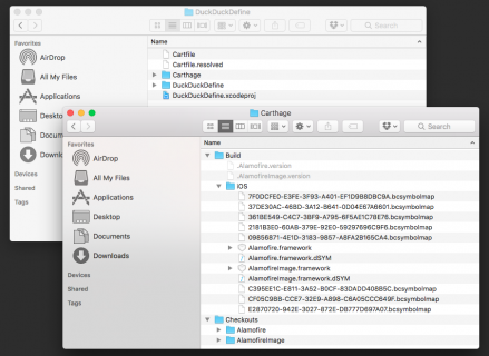
Video Tutorial: Xcode Tips And Tricks Part 6: Storyboards and Visual Debugging

Video Tutorial: Xcode Tips And Tricks Part 7: Breakpoints

Viewing all 4374 articles
Browse latest View live


<script src="https://jsc.adskeeper.com/r/s/rssing.com.1596347.js" async> </script>