Quantcast
Channel: Kodeco | High quality programming tutorials: iOS, Android, Swift, Kotlin, Unity, and more
Viewing all 4374 articles
Browse latest View live

New Course: Programming in Swift 4

$
0
0

As part of our iOS 11 Launch Party, we are releasing a ton of new and updated courses for raywenderlich.com subscribers.

Today we are happy to release our second new course: Programming in Swift 4!

This course is designed as a follow-up to the Your First Swift 4 & iOS 11 App course that we released last week. Basically watch that first, and watch this second.

In Programming in Swift 4, you switch gears from app development, and take a deep dive into the Swift 4 programming language itself. You learn about core Swift programming concepts like variables, loops, optionals, and classes through hands-on tutorials using Swift Playgrounds.

This epic 57-video course is a complete overhaul of our previous Beginning and Intermediate Swift courses. This time, we take things slower and go into more depth, so you’ve got a solid baseline of Swift 4 knowledge before you proceed into more advanced courses on our site.

If you’re a beginner to programming in Swift 4, or programming in general (or if you know someone who is), this is the place to start. Let’s take a look at what’s inside.

Section 1: Core Concepts

In this section, you will build up a basic library of Swift Core Concepts, including working with Playgrounds and using simple datatypes like tuples and booleans.

This section contains 9 videos:

  1. Introduction: Let’s review what you’ll be learning in this section, and why it’s important.
  2. Swift Playgrounds: Learn how to create your first Swift playground, and see how useful it can be to learn Swift, and use in day-to-day development.
  3. Comments: Learn the various ways to add comments to your Swift code – a useful way to document your work or add notes for future reference.
  4. Tuples: Learn the group related data together into a single unit, through the power of a Swift type called Tuples.
  5. Challenge: Tuples: Practice using tuples on your own, through a hands-on challenge.
  6. Booleans: Learn how to use a Swift type called Booleans, which represent true or false values.
  7. Challenge: Booleans: Practice using booleans on your own, through a hands-on challenge.
  8. Scope: Learn what the concept of scope means in Swift, and how it applies to if statements.
  9. Conclusion: Let’s review where you are with your Swift core concepts, and discuss what’s next.

Section 2: Flow Control

In this section, you will learn how to control the flow of execution in your apps, using while loops, for loops, and switch statements.

This section contains 8 videos:

  1. Introduction: Let’s review what you’ll be learning in this section, and why it’s important.
  2. While Loops: Learn how to make Swift repeat your code multiple times with while loops, repeat while loops, and break statements.
  3. Challenge: While Loops: Practice using while loops on your own, through a hands-on challenge.
  4. For Loops: Learn how to use for loops in Swift, along with ranges, continue, and labeled statements.
  5. Challenge: For Loops: Practice using for loops on your own, through a hands-on challenge.
  6. Switch Statements: Learn how to use switch statements in Swift, including some of its more powerful features.
  7. Challenge: Switch Statements: Practice using switch statements on your own, through a hands-on challenge.
  8. Conclusion: Let’s review what you learned in this section, and discuss what’s next.

Section 3: Functions and Optionals

In this section, you will learn how to decompose the logic of your programs into functions, and we’ll demystify one area of Swift that can sometimes be confusing for beginners: optionals.

This section contains 9 videos:

  1. Introduction: Let’s review what you’ll be learning in this section, and why it’s important.
  2. Introduction to Functions: Learn how to write your own functions in Swift, and see for yourself how Swift makes them easy to use.
  3. Challenge: Introduction to Functions: Practice writing functions on your own, through a hands-on challenge.
  4. More Functions: Learn some more advanced features of functions, such as overloading, inout parameters, and functions as variables.
  5. Introduction to Optionals: Learn about one of the most important aspects of Swift development – optionals – through a fun analogy.
  6. Challenge: Introduction to Optionals: Practice using optionals on your own, through a hands-on challenge.
  7. More Optionals: Learn how to unwrap optionals, force unwrap optionals, use optional binding, and use the guard statement.
  8. Challenge: More Optionals: Practice working with optionals on your own, through a hands-on challenge.
  9. Conclusion: Let’s review where you are with your Swift core concepts, and discuss what’s next.

Section 4: Collections

In almost every Swift program you write, you’ll be dealing with collections of data. In this section, you’ll learn about three types of collections in Swift, and their performance differences.

This section contains 12 videos:

  1. Introduction: Let’s review what you’ll be learning in this section, and why it’s important.
  2. Arrays: Learn how to use arrays in Swift to store an ordered list of values.
  3. Challenge: Arrays: Practice using arrays on your own, through a hands-on challenge.
  4. Dictionaries: Learn how to use dictionaries in Swift to store an unordered collection of pairs.
  5. Challenge: Dictionaries: Practice using dictionaries on your own, through a hands-on challenge.
  6. Sets: Learn how to use Sets in Swift to store an unordered collection of unique values.
  7. Closures: Learn how to create closures in Swift – which you can think of as a method without a name.
  8. Closures and Collections: Learn how you can use closures to sort collections, filter collections, run calculations on elements within a collection, and more.
  9. Challenge: Closures: Practice using closures on your own, through a hands-on challenge.
  10. Which Collection To Use?: Learn which collection you should use in a given situation.
  11. Strings: Learn how a string works in Swift, along with some useful things you can do with strings – and why strings are collections too.
  12. Conclusion: Let’s review what you learned in this section, and discuss what’s next.

Section 5: Structures

Next you’ll start learning about creating named types in Swift, starting with one of the most simple options: structures.

This section contains 10 videos:

  1. Introduction: Let’s review what you’ll be learning in this section, and why it’s important.
  2. Structures: Learn how to group data and functionality together in Swift, using a value type called structures.
  3. Challenge: Structures: Practice using structures on your own, through a hands-on challenge.
  4. Protocols: Learn how to make your types conform to protocols in Swift, which you can think of as a to-do list for your types.
  5. Properties: Learn how to add two types of properties to your types: stored properties, and computed properties.
  6. Challenge: Properties: Practice creating properties on your own, through a hands-on challenge.
  7. Computed Properties vs. Methods: Learn when it’s best to use computed properties, and when it’s best to use methods.
  8. Methods: Take a deep dive into methods, including writing initializers, mutating methods, extensions, and more.
  9. Challenge: Methods: Practice writing methods on your own, through a hands-on challenge.
  10. Conclusion: Let’s review what you learned in this section, and discuss what’s next.

Section 6: Classes

Finally, you’ll see how much of what you just learned about structures applies to classes as well, and you’ll learn what the differences are and which to use when.

This section contains 9 videos:

  1. Introduction: Let’s review what you’ll be learning in this section, and why it’s important.
  2. Classes vs Structures: Learn about the differences between classes and structures in Swift, and when you should use which.
  3. Challenge: Classes vs. Structures: Practice working with classes and understanding when to use them vs. structures, through a hands-on challenge.
  4. Inheritance: Learn how you can inherit functionality from another class in Swift.
  5. Initializers: Learn how to create your own class initializers, including two-phase initialization, and required vs. convenience initializers.
  6. Challenge: Initializers: Practice creating your own class initializers, through a hands-on challenge.
  7. When Should You Subclass?: Learn when you should subclass, and when you shouldn’t.
  8. Memory Management: Learn how Swift manages memory under the hood, how you can tell when an object is deinitialized, and how you can avoid a nasty memory leak in your apps.
  9. Conclusion: Let’s review where you’re at with your Swift core concepts, and discuss what’s next.

Where To Go From Here?

Want to check out the course? You can watch the first four parts for free!

The rest of the course is for raywenderlich.com subscribers only. Here’s how you can get access:

  • If you are a raywenderlich.com subscriber: The entire 57-part course is complete and available today. You can check out the entire course here.
  • If you are not a subscriber yet: What are you waiting for? Subscribe now to get access to our new Xcode Tips and Tricks course and our entire catalog of over 500 videos.

This is just the beginning of the iOS 11 Launch Party, so stay tuned for many more new and updated courses to come. I hope you enjoy our new course! :]

The post New Course: Programming in Swift 4 appeared first on Ray Wenderlich.


3D Apple Games by Tutorials Updated for Swift 4 and iOS 11

$
0
0

Happy Wednesday – it’s another iOS 11 Launch Party book release!

In 3D Apple Games by Tutorials, you’ll learn how to make 3D games in Swift, using Apple’s built-in game framework: SceneKit. You’ll learn how to make games similar to Fruit Ninja, Breakout, Marble Madness, and Crossy Road.

To celebrate the book launch, this week we’ll be posting a free chapter to give you a taste of what’s in the book.

Keep reading to watch a video trailer for the book, learn how to enter the iOS 11 Launch party giveaway, and how to get your launch discount!

This will be a free update for existing 3D Apple Games by Tutorials PDF customers — our way to say “thanks” to our readers for their support.

Don’t own 3D Apple Games by Tutorials yet? Read on to see how you can get a copy!

What is 3D Apple Games by Tutorials?

The trailer below gives you a good, fast overview of what the book’s about:

You’d be forgiven for thinking that making 3D games is far more complicated than creating a classic 2D game. 3D games have a reputation for being notoriously difficult to program, usually involving a lot of complicated math.

However, that is no longer the case, thanks to the advent of SceneKit. The simplicity of SceneKit lets beginners create simple and stylish games in a short amount of time. Yet it’s also powerful enough to satisfy the needs of advanced developers who want to create the next FPS killer.

  • Why SceneKit? Apple’s built-in framework for making 3D games is easy to learn, especially if you already have some SpriteKit and Swift experience.
  • Why Swift? Swift is an easy language to get started with, especially if you are a beginner to Apple development. In addition, we believe Swift is the way of the future for Apple development, so take this as an opportunity to develop your Swift skills early!
  • Why 3D? As awesome as 2D games may be, 3D games have a greater appeal in the look and feel department. Creating modern artwork such as popular voxel-style graphics is easier than ever. With SceneKit, even the programming is far less complicated than ever before, and you don’t need an advanced math or physics degree!

With 3D games and SceneKit, you’re making great choices!

Don’t worry — you can jump right into any chapter in the book, because we’ll always have a starter project waiting for you!

What’s Inside 3D Apple Games by Tutorials?

3D Apple Games by Tutorials is 24 chapters and 473 pages – yeah, it’s pretty huge.

Let’s take a look at what’s ahead.

Section I: Hello, SceneKit!

This section covers the basics of making 3D games with SceneKit. You’ll look at the most important techniques used in almost every 3D SceneKit game created, and by the end of this section you’ll know enough to make your very own little 3D game: Geometry Fighter.

This is a Fruit Ninja style game, with colorful geometric shapes thrown up into the air for your pure destructive indulgence. Seek out your inner Darth Vader and use the force to destroy the colorful shapes with a single touch of death! :]

00_ScreenShot

  • Chapter 1, Scenes: Start off by creating your very first SceneKit game project, and get to know the basics.
  • Chapter 2, Nodes: Learn how to use nodes, primitive geometry shapes and cameras to construct a basic 3D scene from the ground up.
  • Chapter 3, Physics: Unleash the power of the built-in physics engine, and learn how to add basic physics to the elements in your game.
  • Chapter 4, Render Loop: Learn all about the render loop within SceneKit, and how you can leverage it to update the elements in your game.
  • Chapter 5, Particle Systems: Create massive explosions for your game, by learning how to create and use the 3D particle system.

Section II: The SceneKit Editor

Xcode include a variety of standard built-in tools; in this section, you’ll take an in-depth look at them. These tools will make building your 3D games with SceneKit easier, faster and even more fun.

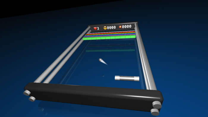
Throughout this section you’ll be making a game called Breaker, which is based on Breakout, but it adds a nice new 3D look and feel. Keep your paddle and ball close by, so you can go bust up some bricks! :]

06_ScreenShot

  • Chapter 6, SceneKit Editor: Get a hands-on introduction on how to use Xcode’s awesome built-in SceneKit Editor.
  • Chapter 7, Cameras: Learn about the different types of cameras SceneKit has to offer.
  • Chapter 8, Lights: Learn all about the different types of lights, and how to properly set them up for your game.
  • Chapter 9, Geometric Shapes: Get your hands dirty and construct the entire game scene with just using the built-in SceneKit primitive shapes.
  • Chapter 10, Basic Collision Detection: Add physics to your game and learn how to handle basic collision detection.

Section III: Intermediate SceneKit

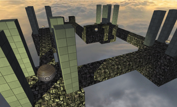
In this section you will create stunning a make belief world, with a shiny wooden relic awaits brave warriors with exceptional balancing skills to guide it through a maze high up in the sky. The game is called Marble Maze, and is somewhat based on the Labyrinth-styled games with a twist.

11_Screenshot

  • Chapter 11, Materials: Learn about the different lighting models and the various material types supported by SceneKit.
  • Chapter 12, Reference Nodes: Learn how to start using reference nodes in your game.
  • Chapter 13, Shadows: Learn how to use and configure the darker element of light, known as shadows.
  • Chapter 14, Intermediate Collision Detection: Learn all about bit masks and how to make use of them for more intermediate collision detection scenarios.
  • Chapter 15, Motion Control: Add motion control to your game, and learn how to use the motion data to move the elements in your game.

Section IV: Other Platforms

In this section, you’ll learn how to leverage your iOS knowledge to build games for the other Apple Platforms: macOS, tvOS and watchOS.

  • Chapter 16, macOS Games: You’ll take a complete iOS game and add a target for macOS. Along the way, you’ll learn some of the differences between the platforms, such as windows and mouse and keyboard events.
  • Chapter 17, tvOS Games: Building from Chapter 18, you’ll add another target for tvOS. You’ll learn concepts such as Focus and parallax icons, Top Shelf and working with the Apple TV Remote.
  • Chapter 18, watchOS Games: Lastly, you’ll add a target for watchOS, and you’ll learn about gestures, the Digital Crown and Haptic Feedback. You’ll also discover some of the design considerations when working with a small device.

Section V: Advanced SceneKit

“The SceneKit Force is quite strong within you, young apprentice.” (Read in a deep, heavy, asthmatic breathing voice. :] )

In this section, you’ll learn few more advanced techniques, as well as apply all the skills you’ve learned up to this point, to creating an awesome little voxel style game. By the end of this section, you’ll know enough to take on the big Hipster Whales out there with your very own game: Mr. Pig.

16_Screenshot

This is a Crossy Road style game with stunning voxel graphics, a catchy tune and some cool sound effects.

The premise: Mr. Pig is out-and-about scouting for lost coins in a nearby park while waiting for his late afternoon tea to heat up on the stove. Unfortunately, some big bad wolf decided to build a massive mall nearby, resulting in a very busy highway straight through his lovely park.

Mr. Pig better watch his step, or he’ll end up as pulled pork in the road. :] Our hero can carry quite a few coins with him, but to score, he has to deposit them at his little house.

No need to get your tail in a twist or ham it up — we’ll walk you through every step of building the game!

  • Chapter 19, Transitions: Create multiple scenes and learn how to transition from one to the other.
  • Chapter 20, Advanced Reference Nodes: Start building more complex scenes by leveraging the power of reference nodes to make scene-building child’s play.
  • Chapter 21, Actions: Learn how to add basic animation to the elements in your game by using Xcode’s built-in action editor.
  • Chapter 22, Advanced Collision Detection: Learn how to use more advanced collision techniques to solve certain scenarios.
  • Chapter 23, Audio: Harness SceneKit’s built-in sound capabilities to play music, sound effects and ambient sounds.

Section VI: 3D Game Art

We’ve also included a bonus chapter, all about creating your own voxel-style art, à la Mr. Pig!

MagicaVoxelExport00

  • Chapter 24, 3D Art for Programmers: Learn how to build your own 3D voxel art made famous by Crossy Road and other retro-styled games, and how to export it for use in your SceneKit games.

About the Author

This book would be nothing without our experienced author at the helm:

Chris-LanguageChris Language is a seasoned coder with 20+ years of experience. He has fond memories of his childhood and his Commodore 64; more recently he started adding more good memories of life with all his iOS devices. By day, he fights for survival in the corporate jungle of Johannesburg, South Africa. By night he fights demons, dragons and angry little potty-mouth kids online. For relaxation he codes. You can find him on Twitter at @ChrisLanguage. Forever Coder, Artist, Musician, Gamer and Dreamer.

Free 3D Games Chapter This Week

To help celebrate the launch, we’re going to open up the book and share a free chapter with you this week! This will give you a chance to check out some of the great stuff in the book. Stay tuned!

Now Available in ePub!

And as another exciting announcement, by popular request, 3D Apple Games by Tutorials is now available in ePub format. Take it on the go with you on your iPad, iPhone or other digital reader and enjoy all the mobile reading benefits that ePub has to offer!

Where To Go From Here?

3D Apple Games by Tutorials is now 100% complete, fully updated for Swift 4, iOS 11 and Xcode 9 — and available today.

  • If you’ve already bought 3D Apple Games by Tutorials PDF, you can download the new book immediately on your our online store.
  • If you don’t have 3D Apple Games by Tutorials yet, you can grab your own copy in our store.

And to help sweeten the deal, the digital edition of the book is on sale for $49.99! But don’t wait — this sale price is only available for a limited time.

Speaking of sweet deals, be sure to check out the great prizes we’re giving away this year with the iOS 11 Launch Party, including over $9,000 in giveaways!

To enter, simply retweet this post using the #ios11launchparty hashtag by using the button below:


We hope you enjoy this free update, and stay tuned for more book releases and updates coming soon!

The post 3D Apple Games by Tutorials Updated for Swift 4 and iOS 11 appeared first on Ray Wenderlich.

MagicaVoxel 3D Art Tutorial

$
0
0

This is an abridged chapter from our book 3D Apple Games by Tutorials, which has been completely updated for Swift 4 and iOS 11. This tutorial is presented as part of our iOS 11 Launch Party — enjoy!

Since the dawn of time, humans have embraced their inner creativity. From the primitive cave paintings of ancient hominids, to the majesty and grace of such masterpieces as Leonardo da Vinci’s “Mona Lisa”, art has constantly evolved with time. You stand at the dawn of a new era, where the modern programmer will gift the world with programmer art! Grog and Leonardo would have been proud. :]

Prototyping apps, especially games, requires graphics — lots of graphics. Proper graphics take a very long time to create, and time is something most coders just don’t have. Programmer art is a nice compromise; you create a rough concept of the required art and use it as a placeholder until you can get around to making (or paying for) some decent game art.

Getting Started

Voxel graphics are a super easy and extremely fast way to create 3D content, and have become extremely popular for this reason. Out of the many tools available, MagicaVoxel is one of the best. Why? Because it’s free! Oh, and it’s pretty darn awesome too. :]

Note: Grab yourself a copy of MagicaVoxel at https://ephtracy.github.io and install it before you continue. It’s only a single download and runs on both macOS and Windows. Be sure to thank @ephtracy on Twitter for such an amazing free product.

Once installed, you’ll be greeted by a very interesting and unique UI. This is clearly a program created by a programmer, for programmers. Fear not, there is definitely some method to this madness; once you get the hang of it, you’ll fall in love with it.

You’ll notice that the UI is divided into expandable columns. Here’s what you’ll see from left to right:

  • Color Palette: The left-most column is your color palette. Here you can pick and choose from a whole spectrum of colors. You can even pick your very own custom color right at the bottom.
  • Brush: This is the second column, right next to the Color Palette. Here you can pick your brush mode. You can choose from modes like V (Voxel), F (Face), B (Box), L (Line), C (Center) and P (Pattern). You can also choose an action to Attach, Erase, Paint or Move voxels using the current brush.
  • View Options: You can find this section just below the Brush section in the same column. Here you can quickly toggle various display options like DG (Display Ground), SW (Display Shadow), BG (Display Background), Grid (Display Grid), Edge (Display Edges) and Frame (Display Frame).
  • Editor: This middle section is where you’ll edit all your voxel creations. You can navigate through this area with your mouse.

    Rotate by holding the right-mouse button down while dragging, Zoom by rolling the mouse wheel up or down, and perform the selected Action by clicking the left-mouse button on the scene.

    Set the Name of your voxel creation at the top of the editor. You can also set the Dimensions of your voxel creation; this model has the dimensions 20 21 20 noted at the top-right side of the editor.

  • Edit Options: The second last column on the right contains a set of common, useful operations that you might want to perform on your voxel creation. Zero empties the model, Fill fills the model with same color, Full sets the model to full volume. There are also operations to Rotate, Flip and Loop your model around an axis.
  • File Options: The very last column is where you can Load, Save, Save As, Duplicate and even Delete voxel models and patterns.
  • Export Options: You’ll find this section right at the bottom of the right-most column. These are all the available export options MagicaVoxel has to offer.
Note: Feel free to play around a bit first. Don’t be afraid, you won’t break anything. Review the above sections again in more detail to get a good feel for the entire UI before you continue with the next section. There is also an excellent video tutorial on their site.

Creating a Voxel Model

Time to get those clean hands dirty and build something spectacular: a handsome little Mr. Pig!

In this section you will follow precise instructions to build your own Mr. Pig. The process is quite similar to how you’d dissect a poor little frog in Biology class — only in reverse. :]

Note: The following workflow covers most of the basic techniques used to build voxel models using MagicaVoxel. Follow the steps carefully, and take particular notice of how you configure the brush in each step.

Creating a New Model

Start off by creating a blank slate for yourself.

Select New under File Options to create a new model. Set the voxel model dimensions to 9 9 9, then click Zero under the Editor Options to clear out the entire model.

Name the model MrPig at the top of the editor and press Enter when you’re done. Select Save when prompted:

Note: Your model will also now be available on the right-hand side, under the File Options.

Creating the Base

You’ll start by creating the base of Mr. Pig’s body.

Select a nice light piggy-pink color from the color palette on the left.

Set the brush by pressing B to go into Box Mode, then press T to select Attach.

Hover to position (x: 1, y: 7, z: -1). Left-click and hold the mouse button while dragging to (x: 7, y: 7, z: -1). Release once you’re there to create a one voxel-high base.

Extruding the Base

Change the brush by pressing F to go into Face Mode, and make sure Attach is still selected.

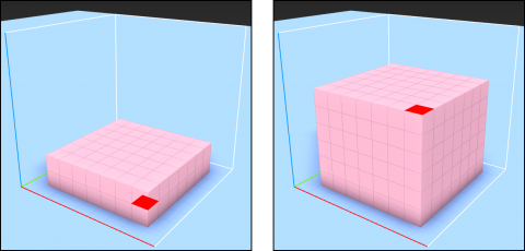
Left-click the top face of the base layer to extrude it one voxel upwards. Repeat this until the base box is 6 voxels high:

You can toggle Grid in View Options to help see the dimensions more clearly.

Creating the Head

Now to create the section that houses the most important part of Mr. Pig — his brains! It’s also important to point out that the accuracy of a voxel pig’s anatomy is never to be questioned. :]

Change the brush back to Box Mode by pressing B, again making sure that Attach is selected.

Start off at position (x: 2, y: 6, z: 5). Left-click and drag to (x: 6, y: 4, z: 5):

Creating the Snout

Now to construct the second most important part of Mr. Pig — his snout!

Select a dark pink color from the color palette on the left.

Using the same brush settings from the previous step, create a box from (x: 2, y: 1, z: 3) to (x: 6, y: 1, z: 1):

Carving out Nostrils and Eyes

How on earth will Mr. Pig sniff out those lovely hidden truffles without actual nostrils in his snout?

Change the brush to Voxel Mode by pressing V. Then press R to select Erase.

Erase two nostrils in his snout, using the image below as a reference:

Separate his big eyes too while you’re at it:

Creating the Tail

Time to play Pin-the-Tail-on-the-Piggy. :] Make sure you still have the same dark pink color selected as before.

Rotate the pig 180 degrees around the y-axis to expose the pig’s hind-side.

While still in Voxel Mode, press T to select Attach and build a little spiral tail starting at (x: 4, y: 7, z: 2) so that it resembles this image:

Once done, rotate that pig 180 degrees around the y-axis again so that you can finish up his front-side.

Adding Ears

Mr. Pig needs to listen for oncoming traffic; you’ll give your pig the gift of hearing with some ear flaps.

Use the same dark pink color and brush settings as before.

Press 1 to turn on mirroring along the x-axis. You will notice the mirror X button will turn on. Whatever you do now on one side will automatically mirror to the other side.

Start building one ear, voxel by voxel, and you’ll see the other ear built at the same time. Reference these images to get a sense of where to start and where to end:

Adding Legs

What do you call a pig without legs? Ground pork! :] Right now, Mr. Pig sits on the bottom of the bounding box, so you need to move him upwards to make room for his little legs. You can either go into Move Mode and drag your model one voxel upwards or hold down the Command key and drag one voxel upwards to get the same effect.

Now, rotate the pig upwards so that his belly is exposed. With the same color and brush settings, make sure mirroring is still turned on along the x-axis. Start building the hind legs first, then the front legs. Again, use the images as your reference:

Finishing Touches

You’re almost done; all that’s left is to color in the missing bits and pieces.

To do that, go into Paint Mode by pressing G.

Select a white color from the palette on the left and click on the voxels that form the white of Mr. Pig’s eyes. Once you’re done, select a black color and paint in the pupils:

Next, angle the pig so that he directly faces you.

Paint in his dark ears and dark nostrils like so:

Excellent! You’ve completed your first voxel model. To top it off, you’ve also learned quite a few useful tips and tricks along the way.

Exporting the Voxel Model

Now that you’ve created some awesome voxel art, you’re probably eager to use it in your game! Unfortunately, SceneKit doesn’t directly support MagicaVoxel’s native file format .vox. Luckily, there’s a way to save your bacon, and that is to export your voxel model in the more commonly used .obj format.

The .obj file format, is an open-standard geometry definition developed by Wavefront Technologies and supported by many 3D authoring tools.

Exporting a voxel model from MagicaVoxel is as easy as falling off a hog. Er — log. :]

Exporting a Voxel Model As An .obj

Mr. Pig needs a nemesis — enter Mr. Wolf!

Note: There’s a special surprise waiting for you under the resources folder. In there you’ll find a MrWolf.vox file, which you’ll use to explore exporting .vox files to .obj. Copy MrWolf.vox to Applications/MagicaVoxel/vox, then open up the model in MagicaVoxel.

Once you’ve got Mr. Wolf loaded, you can take a look at the steps to export him in a useful format.

To export any voxel model from MagicaVoxel as an .obj, simply click obj under the Export section at the bottom right:

If you don’t see the option listed, simply click Export to expand the menu.

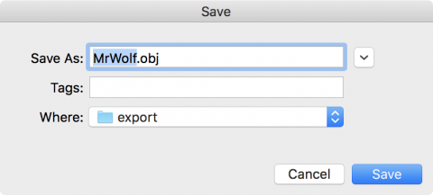
Supply a file name and destination for the files to be exported. For now, leave everything at their default and click Save.

Excellent — you’re all done. Yup, it’s that simple!

You’ll find your exported files under Applications/MagicaVoxel/export/. You can also find a copy of these in the resources folder of your project for your convenience.

MagicalVoxel exports three distinct files as part of your model:

  • MrWolf.mtl: This is the material library file that contains definitions for colors, textures and a reflection map.
  • MrWolf.obj: This is the Wavefront .obj file that contains the geometry information for your voxel model.
  • MrWolf.png: This is your voxel model’s diffuse texture map, which contains all the colors used in your model.

Where to Go From Here?

You can download the finished version of these models here.

You accomplished a lot in this tutorial:

  • MagicaVoxel: You now know how easy it is to create your very own stunning voxel graphics.
  • Exporting: You learned how to export your voxel models into a commonly used .obj format. Now you can use your voxel models with any available 3D authoring tool out there.

Creating art for your game has never been easier than with voxel graphics. Programmer art using voxel graphics can be a great time-saver, but it might also expose your hidden talent for fun and funky game art!

Now that you’ve got mad voxel skills, nothing is going to stop you from creating your very own mega-hit voxel styled game!

If you enjoyed what you learned in this tutorial, why not check out the complete 3D Apple Games by Tutorials book, available on our store?

The trailer below gives you a good, fast overview of what the book’s about:

Here’s an overview of what’s in the book:

  • Section I: Hello, SceneKit!: This section covers the basics of making 3D games with SceneKit. You’ll look at the most important techniques used in almost every 3D SceneKit game created, and by the end of this section you’ll know enough to make your very own little 3D game: Geometry Fighter. This is a Fruit Ninja style game, with colorful geometric shapes thrown up into the air for your pure destructive indulgence. Seek out your inner Darth Vader and use the force to destroy the colorful shapes with a single touch of death!
  • Section II: The SceneKit Editor: Xcode include a variety of standard built-in tools; in this section, you’ll take an in-depth look at them. These tools will make building your 3D games with SceneKit easier, faster and even more fun. Throughout this section you’ll be making a game called Breaker, which is based on Breakout, but it adds a nice new 3D look and feel. Keep your paddle and ball close by, so you can go bust up some bricks!
  • Section III: Intermediate SceneKit: In this section you will create stunning a make belief world, with a shiny wooden relic awaits brave warriors with exceptional balancing skills to guide it through a maze high up in the sky. The game is called Marble Maze, and is somewhat based on the Labyrinth-styled games with a twist.
  • Section IV: Other Platforms: In this section, you’ll learn how to leverage your iOS knowledge to build games for the other Apple Platforms: macOS, tvOS and watchOS.
  • Section V: Advanced SceneKit: “The SceneKit Force is quite strong within you, young apprentice.” (Read in a deep, heavy, asthmatic breathing voice. :] ) In this section, you’ll learn few more advanced techniques, as well as apply all the skills you’ve learned up to this point, to creating an awesome little voxel style game. By the end of this section, you’ll know enough to take on the big Hipster Whales out there with your very own game: Mr. Pig. This is a Crossy Road style game with stunning voxel graphics, a catchy tune and some cool sound effects. No need to get your tail in a twist or ham it up — we’ll walk you through every step of building the game!
  • Section VI: 3D Game Art: We’ve also included a bonus chapter, all about creating your own voxel-style art, à la Mr. Pig!

By the end of this book, you’ll have some great hands-on experience with how to build exciting, good-looking games using Swift and SceneKit!

And to help sweeten the deal, the digital edition of the book is on sale for $49.99! But don’t wait — this sale price is only available for a limited time.

Speaking of sweet deals, be sure to check out the great prizes we’re giving away this year with the iOS 11 Launch Party, including over $9,000 in giveaways!

To enter, simply retweet this post using the #ios11launchparty hashtag by using the button below:


We hope you enjoy this update to one of our most-loved books. Stay tuned for more book releases and updates coming soon!

The post MagicaVoxel 3D Art Tutorial appeared first on Ray Wenderlich.

Why I Love ARKit for Apple iOS 11

$
0
0

Why I Love ARKit for Apple iOS 11

With every new release of iOS, Apple seems to introduce at least one new library or technology that generates extra excitement among developers. A new technology like GPS or a gyroscope can make new types of apps possible. And to be honest, sometimes it’s because the new tech just looks like a whole lot of fun!

ARKit is one of those technologies that’s fun, but also opens up many new avenues for iOS app development. Since ARKit was announced, the buzz about augmented reality has only continued to build.

Maybe you’ve heard of augmented reality, but aren’t sure what it means. Or maybe you’re interested in augmented reality but not sure how ARKit can help you as a developer. In this article, we’ll examine what ARKit brings to the table and what you can do with it.

What is Augmented Reality?

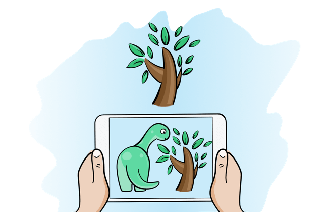
Augmented reality, at its core, is the process of combining virtual objects with the real world. It’s not the same as virtual reality, which completely replaces the real world with a simulated one. Where virtual reality blocks out the real world, augmented reality seeks to enhance reality.

An augmented reality app superimposes 2D or 3D objects on the live camera view of the device. The result is an illusion that places these virtual objects in the real world, and gives the user extra information about the world that is not normally present, or invisible to the unaided eye.

Augmented Reality Before ARKit for Apple iOS 11

Augmented reality is a not a new technology; in fact, it’s existed in many forms before Apple came along and provided an SDK for iOS app development.

As an example, the heads up display (HUD) in some aircraft aids pilots by displaying important flight information on the cockpit window. That way, the pilot can see the information without looking away from the view. Similar technologies exist in vehicles to show speed and other pieces of data on the windshield.

Simple airplane HUD ARKit

Scenic look-offs usually have signs that identify key points of interest visible from the overlook. These signs provide extra context and information or metadata about the view, such as the height of peaks in the distance.

Even your Monday night football games uses a form of augmented reality: the current status, score, and time remaining in the game display on top of the video feed, along with stats about the star players in the game. Announcers will often use virtual pens to draw on top of replays when describing what worked, or went wrong, during a play.

The Current State of AR Apps

ARKit is an exciting new library for iOS app development, but augmented reality apps have been on Apple devices for years. Early iOS devices lacked some of the sensors needed to make augmented reality work well, such as a compass and gyroscope. As these sensors arrived, augmented reality apps began to appear on the App Store.

Pokémon Go

Pokémon Go

You would have had to try quite hard to avoid hearing about Pokémon Go during the summer of 2016, as it seemed to be the game that everyone was playing. Pokémon Go combines Nintendo’s second most popular video game franchise with an augmented reality interface. For many, it served as an introduction to augmented reality gaming on their phone.

PeakFinder Earth

PeakFinder Earth shows the names of nearby mountains as you view them through your phone. It also overlays a panoramic drawing — along with the paths of the sun and moon — on top of the view. It’s basically an augmented reality version of the scenic overlook sign I mentioned earlier.

Sky View

The first augmented reality app I remember using on the iPhone was the stargazing app Sky View. Identifying what’s in the sky above from a paper map while standing outside at night can be difficult. When looking through your phone and seeing the night sky labeled, identifying becomes a simple process.

Gymaholic

I use Gymaholic regularly to track my weight training routines. When adapting a new exercise, learning the proper form is important to reduce chances of injury and get the most from the workout. While many apps will show an exercise, Gymaholic can work with your Apple Watch or a sheet of paper printed with a target to display the exercise in question in augmented reality. Unlike a standard video or diagram, I can move and shift around the 3D-animated exerciser and view the exercise from any angle to ensure I understand the proper technique.

Ink Hunter

Getting a tattoo is a personal and somewhat permanent decision. Before committing to a tattoo, why not use your phone to see how it will look? Ink Hunter lets you do that. The app will allow you to search for tattoo designs and then see what it would look like on your skin.

Sun in ARKit Apple iOS 11

PhotoPills

I enjoy photography, and I especially enjoy taking photos of landscapes. The time of day, season of the year and even your location on the planet often makes the difference between a nice photo and a great one. PhotoPills provides several tools to help you plan your photo shoot: it will overlay the path and location of the Sun, Moon, and Milky Way at any time, past or future, based on your location. Seeing how the sun will move through the sky for a given season and location makes planning the perfect photo easier.

Augmented Reality in iOS Before ARKit

Someone looking befuddled looking at a math problem, ARKit Apple iOS 11 app development

To no one’s surprise, building augmented reality libraries is a complex problem. I once wrote an iPhone app to overlay a text description of nearby points of interest onto the view from the device’s camera. This simple augmented reality app required finding the current location of the device. It then needed to determine where the device is pointing in space. From the location, the app could determine nearby points of interest. From the orientation it could determine which points are actually in view. The app then had to combine these elements to display text at the correct point on the display.

It took a lot of math to combine all these items together to a the result for the screen. In the case of that app, most of the calculations were 3D calculations that involved matrix manipulations and linear algebra. More complex augmented reality apps may also need computer vision algorithms to detect surfaces, map points on the display back to virtual objects, and calculate lighting effects.

So make no mistake, although augmented reality was possible before ARKit, it wasn’t always easy.

Other Augmented Reality Libraries

ARKit for Apple iOS 11 isn’t the first library created for augmented reality apps. Once iOS devices became capable of augmented reality, open source libraries weren’t far behind. The iphonearkit project on Github dates to 2009 when the iPhone 3GS was state-of-the-art. Our Augmented Reality iOS tutorial focuses on location-based AR and uses the HDAugmentedReality project.

The popular OpenCV project handles many computer vision aspects helpful in augmented reality. A tutorial on this site shows you how to make an augmented reality target shooter. It demonstrates this library’s capabilities.

Authors of open-source projects generally develop libraries for the author’s specific need. Most libraries support a specific usage and type of augmented reality application, and are seldom updated to take advantage of new iOS abilities and devices. They hide the complex calculations from the developer, but also make assumptions about how apps built on top of those libraries will work. If you find one that fits your need, it’s great. But for many apps, the right library doesn’t exist.

There are commercial libraries that help create augmented reality apps. These commercial libraries offer better support, but can have costs that are prohibitive for a single developer or small team. They’re often general purpose libraries written in C, C++, or other languages. This crossing of languages adds complexity, increases the learning curve for a library, and can cause integration headaches for developers not familiar with bridging libraries in other languages.

What ARKit Does

What makes ARKit special is that it reflects Apple at its best — it just works!

Drawing of mock AR iOS 11 app. Something like looking through phone at a 3d model

With ARKit, the creation of augmented reality apps no longer requires a custom engine or finding the perfect library. Apple built the engine to work on all existing devices with at least an A9 processor that run iOS 11. That covers the iPhone 6s or later, including the iPhone SE, all iPad Pros, and the 2017 iPad.

ARKit uses a process called visual-inertial odometry to build the correspondence between the real and virtual in your app. It combines the motion sensors in the device with analysis of the scene gathered through the device’s camera and produces a high-precision model of the device’s position and motion within the world for you. As a result, it recognizes notable features in the scene image, tracks differences in the positions of those features, and compares that information with motion sensing data during movement.

So ARKit doesn’t only determine that you’re pointing your phone to the east. It also analyzes and tries to understand the scene to the east. ARKit can find real-world surfaces that correspond to points in the camera image. It can detect flat surfaces (though not vertical ones) and provide information on the position and size of these surfaces. Your app can place virtual objects on and interact with these points and surfaces.

The tight integration with iOS means that you, as a developer, can leverage skills you’ve already gained in your years of iOS app development. You can build virtual objects using SceneKit and SpriteKit, or you can use Metal to develop a virtual scene with near complete control of the visual elements.

What can you do with ARKit?

Now that you understand a bit more about augmented reality you may be wondering, “What is this actually useful for?”

ARKit saw general release to the public in late September as part of the release of Apple’s iOS 11. In the months between, developers have already explored the technology and produced demos for inspiration. While ARKit is mere weeks old, developers have been considering how to use it for months. There seems to be a new ARKit demo on Twitter every day, and I’ve tried to highlight some of the best ones below.

Objects in World

The first demo I saw for ARKit used augmented reality to measure a physical space viewed through the phone. The ability to translate distances on a screen to distances in the real world provides a foundation for apps that need to place objects accurately onto a view.

Developers have expanded on this with apps that allow a user to determine a room’s dimensions and layout by moving a phone around the room. Other demos measure the distance between objects or along paths by drawing lines on a screen with a finger.

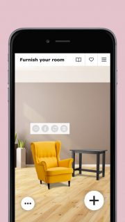
Ikea demonstrated an app allowing customers to preview furniture in a room before heading to the store. It’s a lot better to learn that a couch won’t fit in your room before you’ve had it delivered. Design and home decor companies likely will add similar abilities to their apps. This will make online shopping for these items feel a little less risky.

Games and Fun

Games in particular seem a natural fit for this functionality. It’s not a coincidence that both WWDC and the Apple iPhone launch events demonstrated augmented reality games. I expect game developers will embrace ARKit, as games are a good fit for new visual technologies. Even just having a glimpse at the demos during the Apple event, you can tell there’s something enticing about playing a game in augmented reality. The ability to move around and interact with a game as though it’s truly happening in the real world opens up a whole new category of gaming.

I suspect early games will likely resemble Pokémon Go, or the games demoed at Apple events like The Machines. In time, games that push the limits of augmented reality should arrive, and it’s likely that the most captivating games haven’t even been made public yet.

I’m most intrigued by the idea of games that bring people into a shared virtual environment. Instead of looking at a representation of a board on the screen, an augmented reality games can show the board on the desk in front of you. You could see avatars of other players around the board with you, much as if you were sitting in a room together. This would take the mildly-connected experience of multiplayer and make it much more immersive. The concept could also would work for card games, role playing games, and other shared game experiences.

Education

Augmented reality has a lot of potential to revolutionize education at many levels. Apps that take an abstract or large scale concept and place it in front of someone’s eyes can be a powerful tool to help students understand new topics and concepts. As an example, ARSolarPlay shrinks the solar system to fit in the room with you. It’s one thing for a student to hear about the solar system. It’s another for a student to see it before them in the classroom and move around between the planets.

Beyond the classroom, historical locations and places can now augment their experience with AR apps. Instead of giving visitors a simple pamphlet at a historic site, each visitor’s phone could become their key to understanding the past. Points of interest could now provide relevant visual and auditory information when you visit a particular important location.

Today, you can merely read about a battle that took place in a field in front of you. With an augmented reality app, visitors could listen to narration while watching a virtual re-enactment of the battle. Or maybe you could watch a virtual recreation of a volcano eruption as you stand on the edge of the crater!

Mapping and Location

ARKit Apple iOS 11

Current navigational apps simply tell you to turn left at the next intersection. An augmented reality app could draw the path for you, showing the turn around the corner. A hiking application can show you the fork to take for the desired trail, or lead you back to the trail when lost. For an example, check out the ARKit-CoreLocation library, which demonstrates combining augmented reality with the GPS data.

A businesses could help customers better navigate their stores with an app. Hospitals and universities in particular often have decades worth of remodels and additions that make finding certain rooms or floors rather difficult. Imagine an app that would lay out the path to a doctor’s office or waiting room or area right on your phone screen.

If you’ve ever become separated from friends at a concert, festival, or other event spread over a large and crowded space, imagine how useful a version of Find My Friends could be that shows you where your group is, and what path to take to get back to them.

Some Weakness of ARKit for iOS 11

As excited as I am about the potential of augmented reality on iOS, there are still a number of hurdles to realizing some of the full benefits of augmented reality in every area of your life.

Virtual object falling off a wall ARKit iOS 11

The biggest hurdle I’ve run into with ARKit is its inability to detect vertical planes. ARKit can place your virtual object onto a table, but not hang it on the wall. It also doesn’t handle complex surfaces very well, such as such as curved walls or other non-flat surfaces.

The computer vision analysis that provides much of the “magic” of ARKit needs quite clear images to do its job. A dim room with few details may not work well in AR, so that haunted house app idea you had for Hallowe’en might just have to wait for later updates to ARKit.

I’ve also found that surfaces without texture or much contrast take longer to track, and once recognized, don’t track as well as textured surfaces with high contrast. This includes bare white walls, along with plain or simply-textured floors. These surfaces need users to move the camera around more to give the library enough data to process. The library though, does provide feedback in these cases that you can return to the user.

There are also concerns about how augmented reality apps will affect the battery life. An augmented reality app will be using the camera, displaying complex graphics on the screen, and performing complex calculations — all simultaneously, which can be a drain on the battery. Augmented reality should take a lesson learned from early GPS apps: a reputation for hurting battery lie can hurt adoption of a fantastic technology.

Since many users skirmish with their battery life daily (raises hand), power consumption is a barrier to broad adoption. Fortunately, power banks and portable chargers are cheap.

Where to go from here?

Augmented reality isn’t a new technology, but ARKit simplifies it enough that you can look forward to an exciting new wave of apps in the months to come.

Virtual reality has been “the next big thing” in technology for decades, but hasn’t fully arrived for a variety of reasons. Augmented reality feels… different. Naturally, not all apps will be winners. But there will also be amazing ones. Life-changing ones, even. The arrival of real apps using ARKit to solve real-world problems (let’s face it — it’s all about real-world entertainment, ) is just beginning.

If you’re excited to get started, Apple’s documentation provides a good reference and overview of the library. And as usual, we have some great tutorials and products to get you started:

  • The book iOS 11 by Tutorials , available on our online store, contains a chapter introducing ARKit and shows you how to create an interior design app in augmented reality.
  • 2D Games by Tutorials, also available on our store, has a ton of great projects in SceneKit and includes a bonus chapter on creating a game in ARKit.
  • We also have several screencasts screencasts on ARKit for our video subscribers.

I’m excited to see what new places you take augmented reality in the years to come! Have a favorite AR app, or an idea you want to share? Come join the discussion below!

The post Why I Love ARKit for Apple iOS 11 appeared first on Ray Wenderlich.

tvOS Apprentice Updated for Swift 4 and tvOS 11

$
0
0

Happy Monday – it’s book release day during the iOS 11 Launch Party!

This Monday’s book release is the tvOS Apprentice, Third Edition.

The tvOS Apprentice teaches you everything you need to know to develop great apps for the Apple TV – whether you’re a seasoned iOS pro, or a web developer looking to leverage your skills to a new platform.

The book team has been working hard to bring this book fully up to date for Swift 4 and tvOS 11.

This will be a free update for existing tvOS Apprentice PDF customers — our way to say “thanks” to our readers for their support!

Don’t own the tvOS Apprentice yet? Read on to see how you can get a copy!

What is the tvOS Apprentice?

The book covers both of the ways you can make tvOS apps:

  • TVML apps: The first way to make apps is via TVML and TVJS – a new markup language and programming language created specifically for tvOS apps. Web developers will rejoice, and even native iOS developers will discover this is quite powerful, and can save a lot of development time.
  • Traditional apps: The second way to make apps is the traditional approach – coding apps in Swift or Objective-C, using frameworks from iOS like UIKit, AVFoundation, StoreKit, and more. iOS developers will discover this leverages your existing expertise and code, and allows you to make a fully custom user interface.

This book is a whopping 27 chapters and 536 pages, covering all aspects of tvOS development from beginner to advanced. Here’s what’s inside.

Section I: Architecture

TVMLDiagram2

This section contains just one chapter, designed to give you a birds-eye view of how tvOS works and help you decide what to read next.

  1. Chapter 1, Architecture: The architecture chapter is the introduction to the technology behind Apple TV apps. This chapter will be your guide to help you decide your path through the rest of the book.

Section II: TVML Apps

22_playback

This section covers the basics for creating an app via the TVML approach. From the basics of Hello World through a real world example, by the end of this section you’ll know everything you need to create client / server apps for Apple TV.

  1. Chapter 2, Hello, TVML: Shows you how to set up a basic Hello World app using TVML and Javascript.
  2. Chapter 3, Beginning TVML: You’ll use basic TVML templates to manipulate the UI in a simple application.
  3. Chapter 4, Intermediate TVML: Building off of chapter 3, you’ll learn more complicated interfaces and templates.
  4. Chapter 5, TVJS: Start working in Javascript and learn to manipulate the TVML DOM.
  5. Chapter 6, Exploiting Native Functionality from TVML: Learn how to take advantage of native libraries and integrate them with your TVML app.

Section III: Traditional Apps

HeaderView

This section covers the basics for creating apps via the traditional approach. You’ll learn the new libraries created for Apple TV, and how the ported libraries from iOS can be used.

  1. Chapter 7, Hello, Traditional App: Learn how to set up a basic “Hello World” app using native libraries in Swift.
  2. Chapter 8, Basic Controls: Learn the basic controls your users can use to interact with your apps.
  3. Chapter 9, Stack Views: Stack Views are the backbone to the layout of your app – learn how to use them here.
  4. Chapter 10, Collection Views: See how easy it is to display a list of items in an engaging layout.
  5. Chapter 11, Navigation: Learn how to set up different forms of screen to screen navigation.
  6. Chapter 12, Focus: Apple TV uses a whole new Focus paradigm to show the user what control is currently selected – learn how this works and what it means for your apps.
  7. Chapter 13, Animation: Get ready to add some delightful animation to your tvOS apps.

Section IV: Advanced Frameworks

shuffle

This section covers some of the more advanced frameworks you’ll need for many TV app use cases. Whether you took the TVML approach or the Traditional approach, these frameworks will be important to understand to make your app stand out.

  1. Chapter 14, User Input and the Controller: Learn how your app can interact with the new Apple TV remote.
  2. Chapter 15, Beginning Video Playback: One of the most common requirements for Apple TV apps will be to play video – learn how to do that here.
  3. Chapter 16, Advanced Video Playback: Learn about some of the more advanced topics in playing videos.
  4. Chapter 17, On Demand Resources: Learn how to use Apple’s easy to use storage system, so your app can download assets on the fly.
  5. Chapter 18, Beginning CloudKit: Learn how to use CloudKit on tvOS to store your app’s data.
  6. Chapter 19, Advanced CloudKit: Go further in depth with CloudKit with user specific storage and error handling.
  7. Chapter 20, In App Purchase: Monetize your app by allowing users to purchase digital goods.
  8. (New!) Chapter 21, Photos Framework: Integrate with the user’s Photo Library and Videos.
  9. (New!) Chapter 22, Multipeer Connectivity: Enable your Apple TV to communicate with other pieces of Apple hardware.
  10. Chapter 23, Native UI in TVML Apps: Learn how to augment the TVML-to-UIKit engine to create custom resources, TVML tags, and styling properties.

Section V: Design

layersMixup

This chapter covers new design concepts introduced in tvOS. For your app to stand apart from the rest, you’ll need to understand these new design concepts well.

  1. Chapter 24, tvOS Design: Learn how to design your apps to fit in well with the tvOS ecosystem.
  2. Chapter 25, Creating Layered Images: Shows how to create a new kind of image specifically for the TV.
  3. Chapter 26, The Top Shelf: The Top Shelf is a new design concept that allows your app to show off specific content – learn how to use this in your apps.

Bonus Chapter

And that’s not all – on top of the above, we have a bonus chapter for you!

  1. Chapter 27, Javascript Crash Course: Developing TVML apps for tvOS requires some Javascript knowledge. If you’re new to Javascript, check here for a quick crash course.

About the Authors

Of course, our book would be nothing without our team of experienced and dedicated authors:

ChristineAChristine Abernathy is a Developer Advocate on the Open Source team at Facebook, with previous Developer Advocacy roles with Parse and Facebook Platform. Christine has a passion for developers and mobile technologies. Prior to Facebook, Christine headed up engineering at Mshift, a mobile banking software provider, delivering Android, iOS and mobile browser-based products.

Jawwad Ahmad is an author and a technical editor of this book. Jawwad is a freelance iOS Developer that dove into Swift head first and has not looked back. He enjoys mentoring and teaching and was the original founder of the NYC iOS Study Group Meetup and later on the Atlanta iOS Study Group Meetup. He’s worked for companies as large as The New York Times, and as small as GateGuru, a 6 person startup.

Chris Belanger is the Book Team Lead and Lead Editor for raywenderlich.com. He was a developer for nearly 20 years in various fields from e-health to aerial surveillance to industrial controls. If there are words to wrangle or a paragraph to ponder, he‘s on the case. When he kicks back, you can usually find Chris with guitar in hand, looking for the nearest beach. Twitter: @crispytwit.

EricCEric Cerney is an author of this book. Eric is an iOS Software Engineer in San Francisco. After being acquired by Capital One, he likes to spend his days at work hanging out with Samuel L. Jackson and asking everyone “What’s in your wallet?”. Lately, his main focuses have been on Swift, gaining a deeper knowledge of programming languages at the core, and of course, the Apple TV. You can find him hiding in the shadows on Twitter at @ecerney.

JoshGJoshua Greene is an author of this book. Joshua is a passionate iOS developer who loves creating elegant apps. When he’s not slinging code, he enjoys martial arts, Netflix, and spending time with his wonderful wife and daughter. You can reach him on Twitter at @jrg_developer.

MichaelKMichael Katz is an author of this book. Michael envisions a world where mobile apps always work, respect users’ privacy, and integrate well with their users’ life. When not coding, he can be found with his family playing board games, brewing, gardening, and watching the Yankees.

KelvinLKelvin Lau is an author of this book. Kelvin is a physicist turned Swift iOS Developer. While he’s currently entrenched with iOS development, he often reminisces of his aspirations to be part of the efforts in space exploration. Outside of programming work, he’s an aspiring entrepreneur and musician.

Adrian Strahan is an author and a technical editor of this book. Adrian is a freelance iOS developer, Product Owner and Scrum Master. He’s worked with iOS since 2010 and specializes in mobile- and web-based application development. He lives in the South West of England and spends what little spare time he has building with Lego.

Free tvOS Chapters this Week

To help celebrate the launch, we’re going to open up the book and share three free chapters with you this week! This will give you a chance to check out the book — we’re confident you’ll love it! :]

Now Available in ePub!

And as another exciting announcement, by popular request, tvOS Apprentice is now available in ePub format. Take it on the go with you on your iPad, iPhone or other digital reader and enjoy all the mobile reading benefits that ePub has to offer!

Where To Go From Here?

The tvOS Apprentice, Third Edition is now 100% complete, fully updated for Swift 4 and tvOS 11 and available today.

And to help sweeten the deal, the digital edition of the book is on sale for $49.99! But don’t wait — this sale price is only available for a limited time.

Speaking of sweet deals, be sure to check out the great prizes we’re giving away this year with the iOS 11 Launch Party, including over $9,000 in giveaways!

To enter, simply retweet this post using the #ios11launchparty hashtag by using the button below:


We hope you enjoy this free update, and stay tuned for more book releases and updates coming soon!

The post tvOS Apprentice Updated for Swift 4 and tvOS 11 appeared first on Ray Wenderlich.

Swift Algorithm Club: September 2017 Digest

$
0
0

SwiftAlgClub-Sept-Digest-feature

The Swift Algorithm Club is a popular open source project to implement popular algorithms and data structures in Swift, with over 14,000 stars on GitHub.

We periodically give status updates with how things are going with the project. This month, we report on our progress with the Swift 4 update.

Swift 4 Migration – Finished!

I’m happy to announce the Swift Algorithm Club community has successfully merged all 88 articles over to Swift 4!

It made me so happy to see the community working together like this. A big thanks to everyone involved!

4 New Submissions

In addition to the Swift 4 update, this month we’re happy to announce 4 new submissions to the Swift Algorithm Club project!

1) Minimum Spanning Tree

This month, Vincent Ngo wrote a tutorial on implementing Prim’s Algorithm in Swift. This is a useful algorithm to compute the optimal path from point A to point B in a graph.

2) The Egg Drop Problem

The egg drop problem is a popular interview question brought in by Google. Given a couple of very durable eggs, find out which floor will make them crack if you drop the in a building.

Thanks to Arkalyk Akash, the Swift Algorithm Club now includes the Egg Drop Problem in Swift. We hope you enjoy!

3) Splay Trees

Splay trees are a special type of self-balancing binary search tree that adjusts itself based on recently accessed values. Every find, insert, and remove operation causes a node to be splayed to the root of the tree.

Want to keep track of the most recently used objects? The splay tree is here for you.

Thanks to Babara Martina, the Swift Algorithm Club now includes a Swift Splay Tree. We hope you enjoy!

4) Multiset

Also known as a Bag, the Multiset is a Set that also keeps tracks of the number of times that an element has been inserted. Inserting a value that already exists in the set increments the count of that particular value.

Thanks to Simon Whitaker, the Swift Algorithm Club now includes a Swift Multiset. We hope you enjoy!

Where To Go From Here?

The Swift Algorithm Club is always looking for new members. Whether you’re here to learn or here to contribute, we’re happy to have you around.

To learn more about the SAC, check out our introductory article. We hope to see you at the club! :]

The post Swift Algorithm Club: September 2017 Digest appeared first on Ray Wenderlich.

tvOS Tutorial: Using TVML Templates

$
0
0

This is an abridged chapter from our book tvOS Apprentice, which has been completely updated for Swift 4 and tvOS 11. This tutorial is presented as part of our iOS 11 Launch Party — enjoy!

In this tutorial, you’ll learn how to use the plethora of TVML templates that Apple has provided to make some stunning interfaces. You’ll use these templates to build a comprehensive screen for RWDevCon 2015 videos, which will include a wide range of information about the video and display it in an appealing and recognizable manner.

Getting Started

You can download the starter project for this tutorial here.

The sample app for this tutorial is wenderTV; it lets you browse and watch raywenderlich.com video content on your Apple TV, so you can enjoy a vast quantity of knowledge – and bad jokes – from the comfort of your sofa. Right now, wenderTV is quite empty.

wenderTV includes a lot of resources you’ll use during this tutorial; we’ve also reorganized some of the code to make it easier to understand.

Build and run the wenderTV starter project from Xcode; you’ll notice the screen is completely blank. This is because there aren’t any TVML documents in wenderTV yet. Before you can turn your attention to creating some TVML documents, you have a little housekeeping to do.

Note: Although you can use Xcode to write all the code you need for a TVML-based app, it can be quite a painful experience. Xcode is good for editing Swift or Objective-C, but has only rudimentary support for XML and JavaScript. It’s definitely worth using Xcode when you need to, and then switching to a more capable editor such as Sublime Text, Atom, Visual Studio Code or MacVim to work with TVML documents and JavaScript files.

Loading Scripts

The project for wenderTV already has ResourceLoaderJS split out into its own file, so you need to discover how to import it into main.js.

TVJS provides the evaluateScripts() function which takes an array of URLs of JavaScript files and a callback. The function reads each URL in turn, attempts to parse it and adds any contained functions and object definitions to the context’s global object. Finally, it invokes the supplied callback with a Boolean denoting success or failure.

The AppDelegate contains code that provides the JavaScript application with a list of URLs to the required JavaScript files as part of the launch options object. Open main.js and add the following code to the App.onLaunch() function:

// 1:
evaluateScripts(options.initialJSDependencies,
  function(success){
    if (success) {
      // 2:
      resourceLoader =
        new ResourceLoaderJS(NativeResourceLoader.create());
      var initialDoc = loadInitialDocument(resourceLoader);
      navigationDocument.pushDocument(initialDoc);
    } else {
      // 3:
      var alert = _createAlert("Evaluate Scripts Error",
        "Error attempting to evaluate the external JS files.");
      navigationDocument.presentModal(alert);

      throw ("Playback Example: unable to evaluate scripts.");
    }
  });

Taking this new function body step-by-step:

  1. The options object is prepared in Swift and then passed to the JavaScript app in the app delegate, while the initialJSDependencies property is an array of URLs for the different JavaScript files that need to be loaded as the app starts. evaluateScript() performs this action and then invokes the callback indicating whether it was successful.
  2. If the JavaScript sources evaluated successfully, create a ResourceLoaderJS object before using it to load the initial document and then pushing this TVML document onto the navigation stack. loadInitialDocument() is currently a stub method you’ll populate in a bit.
  3. If the JavaScript files failed to load, there is nothing more that the app can do. Therefore it uses _createAlert(), defined at the bottom of main.js to build and present an alert document and then throw an error.

Add the following to loadInitialDocument():

return resourceLoader.getDocument("video.tvml");

This uses the resource loader to get the TVML file from the app’s resource bundle and return it as a DOM object.

Next up, you’ll need to create the file your app is trying to load: video.tvml.

Head into Xcode, and right-click on the layouts group in the project navigator. Select New File…:

Navigate to tvOS\Other\Empty and hit Next. Name the file video.tvml and ensure that the wenderTV target is checked:

Open the new file in either your favorite XML editor (or Xcode, if you insist) and add the following lines:

<?xml version="1.0" encoding="UTF-8" ?>
<document>
  <productTemplate>
  </productTemplate>
</document>

This defines a simple TVML document using a new type of template: productTemplate.

Build and run the app to see how things look so far:

Hmm. The screen is still blank. Although you’ve created the file and provided the template, you haven’t provided any content. You’ll fix that shortly, but first you need to cover a bit of background on TVML templates.

TVML Templates

A TVML document is just an XML (eXtentible Markup Language) document with a specific schema defined by Apple. If you’ve used HTML in the past, XML will look familiar. HTML isn’t actually XML (despite some failed efforts with XHTML), but the syntax and structure is fairly similar.

Since TVML documents are XML they should start with the following line:

<?xml version="1.0" encoding="UTF-8" ?>

This is known as the XML prologue; it notes this file is an XML document and which character encoding it uses.

The TVML document has a root element, which is a single element at the top level of the document and the parent (or ancestor) of all other elements. The element has a single direct descendant, which can be one of 18 possible template tags.

A template tag specifies the top-level layout tvOS should use to render the document on screen. In addition to specifying the appearance onscreen, template tags also convey some semantic information about the content they contain. Templates might look similar, but have entirely different purposes.

TVML templates can be divided into the following categories:

  • Informational: Shows a small amount of information to the user, and optionally requests input from the user. It’s not designed for browsable content. Includes alertTemplate and loadingTemplate.
  • Data Entry: The user experience of entering data on TVs is pretty horrendous, and Apple TV is no different. However, there are a few templates for requesting data from the user, including searchTemplate and ratingTemplate.
  • Single Item: Displays information or content about a single product or item, such as a film or episode in a TV series. Includes productTemplate, oneupTemplate, compilationTemplate and showcaseTemplate.
  • Collections: Displays a collection of products, such as a TV series, a genre of films or tracks on an album. Includes stackTemplate, listTemplate and productBundle.
  • Other: Includes menuBarTemplate, which hosts a set of other templates, and divTemplate, which is a completely clean slate upon which you draw.
Note: Rather than go into detail here about each and every template, the Apple reference is a great resource for getting the low-down on the different templates, their capabilities and layouts: apple.co/1PJuOAV.

The Product Template

The first document you’ll create uses , which is designed to display all information relating to a specific product — in this case, a video.

Open video.tvml and add the following code between the tags:

<banner>
  <infoList>
    <info>
      <header>
        <title>Presenter</title>
      </header>
      <text>Ray Wenderlich</text>
    </info>
    <info>
      <header>
        <title>Tags</title>
      </header>
      <text>development</text>
      <text>teams</text>
      <text>business</text>
    </info>
  </infoList>
</banner>

This code snippet introduces a lot of new element types. Taking them one-by-one:

  • <banner>: Displays content across the top of a page.
  • <infoList>: Displays a list of elements, arranged in a vertical list.
  • <info>: Acts as a container forthis s the content to appear as an item in an or an .
  • <header>: Serves as a description of the content of the section in which it resides.
  • <title>: Contains the text of a short title.
  • <text>: Displays text.

Build and run the app to see what your new TVML looks like:

This page represents a video, but it currently lacks a title. Time to change that.

Add the following inside the <banner> tags, just after the closing tag:

<stack>
  <title>Teamwork</title>
  <row>
    <text>17m 54s</text>
    <text>Inspiration</text>
    <text>2015</text>
    <badge src="resource://nr" />is
    <badge src="resource://cc" />
    <badge src="resource://hd" />
  </row>
</stack>

This section introduces more TVML elements:

  • <stack>: Stacks lay out their content vertically down the screen in a manner similar to . There’s a wider range of tags that can be in a Stack.
  • <row&gt: A row is like a stack, but with a horizontal orientation instead of vertical.
  • <badge&gt: Badges display a small inline image. The URL is provided by the src attribute.

Notice that the URL of the two badge images begin with resource://. This is a special URL scheme that points to images that exist within tvOS itself. These images include common action icons, such as “play”, rating images for different countries and video information such as HD.

Note: For a full list of the resource images available within tvOS, check out Apple’s documentation at apple.co/1T930o9.

Build and run again to see how the page is shaping up:

It’s starting to look good, but there’s still a long way to go. Before continuing with the template coding, you first need to consider the separation of the data and the view.

Data Injection

As your video document currently stands, all the data is hard-coded. To show information about a different video, you’d have to create a whole new page. If you wanted to reformat the video page once you’ve created all the pages, you’d have to go back through and edit every single one of them.

A much better approach is to use a templating engine, where you build the video page as a template and specify where the data should be injected. At runtime, the template engine takes the page template along with the data and generates the TVML page for tvOS to display.

Note: The word “template” is now being used for two different purposes: TVML templates are the layouts provided by tvOS that render your documents on the screen, whereas a templating engine uses template documents combined with data to generate complete TVML documents. Don’t worry too much about the distinction; it’ll be much more clear once you’ve used them both.

Mustache.js is a popular simple templating engine for JavaScript. You might recognize the templating syntax which is based around curly-braces:

{{property-name}}

The Mustache.js library is already part of wenderTV, but you need to build the mechanisms to use it. This presents you with several tasks to accomplish:

  • The data is stored as JSON files in the app bundle. The JavaScript app needs the ability to request them.
  • When a document is loaded, it now requires data, and this should be combined with the document string using Mustache.js.
  • Images that are present in the app bundle need their complete URL substituted.
  • The video document should be updated to turn it into a templated document.

You’ll address each of these in order.

Note: As of tvOS 11, TVML supports the concept of prototypes in TVML that leverage data binding to link data elements to the TVML. This reduces code redundancy and improves performance when paginating large content sets, such as a huge list of YouTube videos in a grid view format.

However, prototyping is only available at the <section> level, while you’re using it in this tutorial for much more, such as in the <header> section of your TVML. You’ll continue to use Mustache.js as a templating engine for this section of the book, but if you end up having to handle large content sets in your tvOS apps, read up on prototyping and data binding at apple.co/2utDXXm.

Reading JSON From the App Bundle

Open ResourceLoader.js and add the following method to ResourceLoaderJS:

getJSON(name) {
  var jsonString = this.nativeResourceLoader
    .loadBundleResource(name);
  var json = JSON.parse(jsonString);
  return json;
}

This function uses the native resource loader to pull the JSON file from the app bundle before parsing it into a JavaScript object.

Note: It would be relatively simple to replace this functionality with a method that calls a remote server for data instead of finding static data inside the app bundle. The rest of this templating approach would continue to work as it stands.

Injecting Data Into the Document String

Now that you can obtain the data for a given page, you need to combine it with the document template itself. Update getDocument() in ResourceLoaderJS to match the following:

getDocument(name, data) {
  data = data || {};
  var docString = this.nativeResourceLoader
    .loadBundleResource(name);
  var rendered = Mustache.render(docString, data);
  return this.domParser.parseFromString(rendered,
    "application/xml");
}

Here you’ve added an additional data argument to the method and used render on Mustache to convert the template and data to a completed document. As before, you use a DOMParser to convert the document string to a DOM object.

Resolving Image URLs

For simplicity’s sake, your sample data stores images as the names of files in the app bundle, which need to be converted to URLs before you can display them. The utility functions to do this are already in the resource loader, so you just need to call them. You’ll do this at the same time as you update the initial document loading to use the templating engine.

Open main.js and update loadInitialDocument() to match the following:

function loadInitialDocument(resourceLoader) {
  var data = resourceLoader.getJSON("teamwork.json");
  data["images"] = resourceLoader
    .convertNamesToURLs(data["images"]);
  data = resourceLoader
    .recursivelyConvertFieldsToURLs(data, "image");
  data["sharedImages"] = _sharedImageResources(resourceLoader);
  return resourceLoader.getDocument("video.tvml", data);
}

First, you load the data using the new getJSON() method. Then you use the utility functions to perform the image name-to-URL conversion. These convert three different image name sources:

  • Each value in the images object on the data array.
  • Every value associated with a key of image anywhere within the JSON data structure.
  • A set of shared images that are useful for all documents in wenderTV.

That takes care of the plumbing underneath; you’re ready to use this powerful new functionality.

Using the Mustache.js Templates

Open teamwork.json and take a look at the data you’ll use to populate the video page. There’s quite a lot of data, but it’s a standard JSON object and fairly easy to understand. You should spot some fields such as title, presenter and duration that you’ve already hard-coded into video.tvml. You’re now going to swap these out.

Open video.tvml and find the title tag that contains Ray Wenderlich. Replace the name with {{presenter}}, so that the first section now looks like this:

<info>
  <header>
    <title>Presenter</title>
  </header>
  <text>{{presenter}}</text>
</info>

The syntax for Mustache.js is really simple; it will replace {{presenter}} with the value of presenter in the data object supplied to it.

Now that you’ve got the hang of that, you can replace the following content with the respective template tags:

  • Teamwork{{title}}
  • 17m 54s{{duration}}
  • Inspiration{{category}}
  • 2015{{year}}
  • resource://nrresource://{{rating}}

Build and run; you shouldn’t see any difference, which is exactly what you want. The page is now data-driven, and even better, you didn’t break anything. Bonus! :]

There are still some parts of the template you haven’t touched: closed-captions, HD and tags. These use some slightly more advanced parts of the Mustache.js templating engine.

Template Sections

Remove the three tags in the Tags section and add the following in their place:

{{#tags}}
  <text>{{.}}</text>
{{/tags}}

This new syntax defines a template section. Look at teamwork.json and you’ll see that tags is an array of strings. The Mustache.js syntax here loops through the array, with {{.}} rendering the content of the current index.

Finally, you need to handle the two Boolean badges. Replace the cc and hd badges with the following:

{{#closed-captions}}
  <badge src="resource://cc" />
{{/closed-captions}}
{{#hd}}
  <badge src="resource://hd" />
{{/hd}}

Once again you’re using sections, but this time they’re structured like an if statement. If the specified property exists and has a true value, then render this section; otherwise, ignore it.

Build and run again; check out your newly templated video page.

To confirm that the data injection is actually working, open main.js and change the data file loaded in loadInitialDocument() from teamwork.json to identity.json. Build and run again to see the data change.

You can now see details of Vicki’s talk on identity — sweet!

on

Filling out the TVML Template

The video page is still looking a little barren. It’s time to double-down on adding some content.

Open video.tvml and add the following inside the <stack>, just below the existing <row>:

<description allowsZooming="true"
  moreLabel="more">{{description}}</description>
<text>{{language}}</text>
<row>
  <buttonLockup type="play">
    <badge src="resource://button-play" />
    <title>Play</title>
  </buttonLockup>
  <buttonLockup type="buy">
    <text>$9.99</text>
    <title>Buy</title>
  </buttonLockup>
</row>

Once again, this introduces some new TVML elements:

  • <description>: Displays a larger amount of text that’s used to describe content. If the text is too long for the display area then a label will be displayed with a title defined by the moreLabel attribute.
  • &ltbuttonLockup>: A lockup is a class of element that joins its children together as a single element. A button lockup can contain text and a badge and will appear as a button.

Remember that these elements are all contained within a <stack>, so they’ll appear on top of each other.

Before checking your work, you need to add one more element to the top banner. Add the following line immediately after the </stack> closing tag:

<heroImg src="{{images.hero}}" />

A heroImg element is a large image that defines the content of this document. It appears inside the <banner> and tvOS uses it to define the blurred page background.

Build and run to see the completed top banner:

It’s starting to look really cool – But wait! You may now have noticed that the text color has changed from black to white. How did that happen?

tvOS has decided that because the background image you specified is darker than a certain threshold, it needed to increase the contrast of your text, so it changed the default text color.

Update the <productTemplate> tag to match the following:

<productTemplate theme="light">

Build and run to see the difference:

The visual effect on the background has changed along with the foreground font colors. You can change the theme attribute to dark if you wish to force the previous look if you prefer it.

Note: The default behavior has changed since the previous version of tvOS, so you may need to explicitly define the theme to get the effect you’re used to. Also, please don’t get this behavior confused with the new dark mode introduced by Apple in tvOS 10. That will be covered in more detail later in the book.

Adding Shelves

The remainder of the productTemplate is made up of “shelves”. A shelf is a horizontal section of the page with content elements scrolling on and off the screen.

Add the following below the closing </banner> tag, towards the bottom of video.tvml:

<shelf>
  <header>
    <title>You might also like</title>
  </header>
  <section>
    {{#recommendations}}
      <lockup>
        <img src="{{image}}" width="402" height="226" />
        <title>{{title}}</title>
      </lockup>
    {{/recommendations}}
  </section>
</shelf>

This shelf displays a set of other videos that the user might enjoy as defined in the recommendations property of the data model. Each recommendation has an image and a title, each of which you use in the code above.

There are two other elements introduced in this code segment:

  • <section>: Defines a set of related content that should all be laid out together. A section can contain a title and multiple lockup elements.
  • <lockup>: You saw <buttonLockup> before; lockup is a more general type of lockup. It provides layout for an image, a title, a badge and a description.

Now add another shelf below the one you just created:

<shelf>
  <header>
    <title>Production</title>
  </header>
  <section>
    {{#people}}
      <monogramLockup>
        <monogram firstName="{{firstname}}"
          lastName="{{lastname}}"/>
        <title>{{firstname}} {{lastname}}</title>
        <subtitle>{{role}}</subtitle>
      </monogramLockup>
    {{/people}}
   </section>
</shelf>

This shelf displays a list of people associated with the production; it’s stored in the people property in the data model.

This introduces the and elements, which let you represent a person when an avatar isn’t available. Like the other lockup elements, a monogram lockup simply locks its content together.

A monogram has firstName and lastName attributes, from which it generates a monogram (initials) and places it in a large circle.

Build and run to see how your shelves are taking shape. You will have to scroll down to reveal the lower shelf:

Take a look at the description for the “Identity” talk. Notice that the more label has appeared, because there is too much text to display in the available space. Navigate to the label and you’ll see you can focus on the description and press select to trigger an action. This action doesn’t currently do anything, but wouldn’t it be nice if it would display the full text?

Time for another TVML template.

Handling Text Overflow

The descriptive alert template provides space for an extended area of text and buttons. It sounds ideal for this purpose. You’ll use this template and a spot of JavaScript to wire it up.

In the Xcode project, right-click on the layouts group and select New File…. Choose tvOS\Other\Empty and name the file expandedDetailText.tvml.

Open the new file and add the following:

<?xml version="1.0" encoding="UTF-8" ?>
<document>
  <descriptiveAlertTemplate>
    <title>{{title}}</title>
    <description>{{text}}</description>
    <button action="dismiss">
      <text>Dismiss</text>
    </button>
  </descriptiveAlertTemplate>
</document>

This should be quite straightforward to understand. There’s the usual XML prologue, the tag and some elements you’ve used before. Notice that the button tag has an action attribute; this is a user-defined attribute that’s not part of the TVML specification.

You can define any attributes that you want (provided they don’t clash with existing attributes) and then read them from your JavaScript app. You’ll write some code to handle this dismiss action in just a bit.

Open video.tvml and find the tag. Update the element to match the following:

<description allowsZooming="true"
  moreLabel="more"
  action="showOverflow"
  title="{{title}}">{{description}}</description>

You’ve added two new attributes: action and title. You’ll use both of these in the event handler to create the expanded detail text document.

Event Handling

Now that the document templates are ready to go you can turn your attention to the JavaScript that wires everything up.

Open main.js and add the following function:

function _handleEvent(event) {
  // 1:
  var sender = event.target;
  var action = sender.getAttribute("action");
  // 2:
  switch(action) {
    case "showOverflow":
      // 3:
      var data = {
        text: sender.textContent,
        title: sender.getAttribute("title")
      };
      // 4:
      var expandedText = resourceLoader
        .getDocument("expandedDetailText.tvml", data);
      expandedText.addEventListener("select", _handleEvent);
      navigationDocument.presentModal(expandedText);
      break;
    case "dismiss":
      // 5:
      navigationDocument.dismissModal();
      break;
  }
}

Taking this piece-by-piece:

  1. The target property of the event argument represents the DOM object that fired the event. getAttribute() of a DOM object will return the value for the specified attribute. Here you’re using it to find the value of the action attribute you added above.
  2. Switch on the action attribute to invoke the appropriate code.
  3. If the action is showOverflow, then you have a description field with too much content. Construct an object with the data required by the expanded detail text document. Once again you’re using getAttribute() along with textContent, which returns the content of the tag itself.
  4. Load the expandedDetailText.tvml document in the usual way, add an event listener and use presentModal() on NavigationDocument to display the new document on top of the current document.
  1. If the action is set to dismiss, use dismissModal() on NavigationDocument to perform the dismissal.

Now that you’ve created this event handler, you need to wire it up to the initial document. Add the following line to App.onLaunch, just after you call loadInitialDocument():

initialDoc.addEventListener("select", _handleEvent);

This registers _handleEvent as a listener for the select event, and uses event bubbling to handle all events triggered within the document.

Build and run the app, navigate down to the over-full description and hit the select button. You’ll see your new expanded detail text page:

You can use the dismiss button to return to the video screen.

Viewer Ratings

In the final part of this tutorial, you’ll add a new ratings section to the video page and let the user select a rating using a new template.

Open video.tvml and add the following new shelf underneath the Production shelf:

<shelf>
  <header>
    <title>What other people thought</title>
  </header>
  <section>
    {{#ratings-reviews}}
      <ratingCard action="addRating">
        {{#rw-ratings}}
          <title>{{out-of-five}} / 5</title>
          <ratingBadge value="{{badge-value}}"></ratingBadge>
          <description>Mean of {{count}} ratings.</description>
        {{/rw-ratings}}
      </ratingCard>
      {{#reviews}}
        <reviewCard>
          <title>{{title}}</title>
          <description>{{description}}</description>
          <text>{{name}} {{date}}</text>
        </reviewCard>
      {{/reviews}}
    {{/ratings-reviews}}
  </section>
</shelf>

By now, you’ll recognize most of the TVML elements, but there are still a few new ones:

  • <ratingCard>: Displays a small card suitable for showing the ratings of a product.
  • <ratingBadge>: A specialized badge for showing a star-rating. The value attribute should be a value between 0 and 1, which will be converted to a proportion of five stars.
  • <reviewCard>: A card for displaying user or critic reviews.

Notice that the element has the custom action attribute again. You’ll use this later to display the rating page.

Build and run to see what the new shelf looks like:

When the user selects the rating card, you want to let them choose a rating for the current video. This is exactly what the ratings TVML template is for.

Collecting Ratings

In Xcode, right-click on the layouts group and select New File…. Choose tvOS\Other\Empty and name the file videoRating.tvml.

Open the new file and add the following:

<?xml version="1.0" encoding="UTF-8" ?>
<document>
  <ratingTemplate>
    <title>{{title}}</title>
    <ratingBadge />
  </ratingTemplate>
</document>

This new file uses the which simply displays and collects ratings. It contains a <title> and a <ratingBadge>, both of which you’ve already seen.

The template is ready; you just need to display it. Open main.js and add the following case to the switch statement in _handleEvent():

case "addRating":
  var ratingDoc = resourceLoader.getDocument("videoRating.tvml",
    {title: "Rate Video"});
  navigationDocument.presentModal(ratingDoc);
  break;

These few lines load the new document you created and provide the title to the templating engine. It then displays the document modally.

Build and run, navigate to the rating card and hit select to see the new ratings page:

Now that is one swell-looking – and extensible – interface.

Where to Go From Here?

You can download the final project from this tutorial here.

In this tutorial you’ve created a great-looking TVML app and used three of the built-in templates along with a vast array of TVML-specific elements. You also integrated a JavaScript templating engine to separate the UI from the data. Adopting great development techniques right from the start is a win in anyone’s book.

You can check out Apple’s documentation (apple.co/1PJuOAV) for specifics about the templates and elements covered in this tutorial.

If you enjoyed what you learned in this tutorial, why not check out the complete tvOS Apprentice book, available in our store?

Here’s a taste of what’s in the book:

Section I: Architecture

This section is designed to give you a birds-eye view of how tvOS works and help you decide what to read next.

Section II: TVML Apps

This section covers the basics for creating an app via the TVML approach. From the basics of Hello World through a real world example, by the end of this section you’ll know everything you need to create client / server apps for Apple TV.

Section III: Traditional Apps

This section covers the basics for creating apps via the traditional approach. You’ll learn the new libraries created for Apple TV, and how the ported libraries from iOS can be used.

Section IV: Advanced Frameworks

This section covers some of the more advanced frameworks you’ll need for many TV app use cases. Whether you took the TVML approach or the Traditional approach, these frameworks will be important to understand to make your app stand out.

Section V: Design

This section covers design concepts important for tvOS. For your app to stand apart from the rest, you’ll need to understand these design concepts well.

Bonus Chapter

And that’s not all — on top of the above, we have a bonus chapter for you that gives you a crash course in JavaScript!

By the end of this book, you’ll have some great hands-on experience with building exciting, good-looking apps for the Apple TV!

And to help sweeten the deal, the digital edition of the book is on sale for $49.99! But don’t wait — this sale price is only available for a limited time.

Speaking of sweet deals, be sure to check out the great prizes we’re giving away this year with the iOS 11 Launch Party, including over $9,000 in giveaways!

To enter, simply retweet this post using the #ios11launchparty hashtag by using the button below:


We hope you enjoy this update, and stay tuned for more book releases and updates!

The post tvOS Tutorial: Using TVML Templates appeared first on Ray Wenderlich.

New Course: Your Second Swift 4 & iOS 11 App

$
0
0

Your Second Swift 4 & iOS 11 App

As part of our iOS 11 Launch Party, we are releasing a ton of new and updated courses for raywenderlich.com subscribers.

It’s time for our third new course: Your Second Swift 4 & iOS 11 App!

This course is an excellent way to continue learning after you’ve completed the Your First Swift 4 & iOS 11 App and Programming in Swift courses that we released over the past two weeks.

In this epic 44-video course, you’ll get back into app development and put your new Swift skills to work. You’ll build what many iOS developers consider a rite of passage: a To Do app!

This is a complete overhaul of our Beginning iOS: Checklists course. If you’re ready to continue your journey to learn iOS development, this course is for you! Let’s see what’s inside.

Section 1: Table Views

In this section, you’ll get started with one of the most common views in iOS: the Table View.

Section 1: Table Views

This section contains 11 videos:

  1. Introduction: In this video, you’ll get an overview of what you are building and you’ll be introduced to a very important view in iOS: the Table View.
  2. App Design: This video will provide you an overview of the checklist To Do app.
  3. Table Views: Table views are a critical component in iOS for displaying information. You’ll get started by adding your first one.
  4. Challenge: Add a Label: Now that you have a cell in play, your challenge is to add a label to it.
  5. Table View Cells: Everyone loves recycling. Even table view cells! In this video, you’ll learn to recycle by the way of reuse identifiers.
  6. Protocols: Protocols are a means of defining similar behavior to unrelated objects. In this video, you’ll learn to create them.
  7. Challenge: Add More Rows: So far, your app is only showing one row. Your challenge is to have it display five of them.
  8. Adding Cell Content: Cells can also contain iOS controls, but you’ll need to update the content of them. In this video, you’ll learn how to access the controls.
  9. Challenge: Add More Content: Your challenge is to provide custom text to a cell based on the index path of the row.
  10. Table View Delegates: Table views can respond to a variety of events by means of delegates. In this video, you’ll learn how to create your own delegate.
  11. Conclusion: With your introduction to table views complete, it’s time to move on to greener pastures – MVC.

Section 2: MVC

In this section, you’ll learn what design patterns are, and implement one of the most popular ones in iOS development: Model View Controller.

Section 2: MVC

This section contains 9 videos:

  1. Introduction: Design patterns provide solutions to common problems. MVC is a popular design pattern for organizing your code, and this video will introduce it to you.
  2. Model View Controller: This video covers the basics of model view controller and how it applies to the app that you are building.
  3. MVC First Attempt: In this video, you’ll take a first stab at implementing MVC into your app.
  4. Remove Duplication: Code duplication is the bane of every app developer. In this challenge, your job is to get rid of it.
  5. Classes and MVC: One good practice is to keep your model objects out of your view controller. You’ll do that in this video by creating your own model class.
  6. Incorporating Arrays: Your app is going to contain lots of checklist items. Arrays make for a great structure for keeping them grouped together.
  7. Challenge: Add More Items: In this challenge, you’ll be adding more checklist items to your To Do app.
  8. Refactoring: As your app grows in size and complexity, you’ll want to keep it organized. In this video, you’ll learn what it means to refactor your code.
  9. Conclusion: With your app refactored to conform to the MVC design pattern, you’ll get an overview of the task of the next section. That is, adding and deleting checklist items.

Section 3: Adding & Deleting Items

In this section, you’ll make your checklist app more functional by allowing users to add and delete items. Learn about navigating between multiple screens, static cells, and the responder chain.

Section 3: Adding and Deleting Items

This section contains 12 videos:

  1. Introduction: So far your, users of your checklist app can’t add or delete items. In this video, you’ll get an overview on how that will be accomplished.
  2. Navigation Controllers: Navigation controllers are a means to display lots of view controllers in your app and you’ll learn how to use them.
  3. Challenge: Add a Bar Button: Navigation bars can take buttons for you to add interactivity. In your challenge, you’ll add one to your app.
  4. Creating New Checklist Items: Now’s the time to add new checkklist items! This video will walk you through the process.
  5. Challenge: Checked by Default: When a new checklist item is added, your challenge is to make the checklist items to be checked by default.
  6. Swipe to Delete: Table views provide swipe to delete functionality, but it’s up to you to do the actual delete action. In this video, you’ll learn how to do that.
  7. Adding a New Screen: So far, this app only has one screeen. You’ll take it to the next level by adding a new screen.
  8. Static Cells: Prototype cells allow you to customize your cells at run time, whereas static cells, you customize them at build time. You’ll add a static cell in this video.
  9. Challenge: A Text Field: In this challenge, you’ll add a text field to your static table view cell.
  10. Textfields & Responder Chain: Understanding the responder chain is critical for working with text fields. You’ll the responder chain to work in this video.
  11. Control Events: There are times when you need to respond to special kinds of events. These are called control events and you’ll learn about them in this video.
  12. Conclusion: This video wraps up the process of adding items to your To Do app.

Section 4: Editing Items

In this last section, you’ll finish up your app by allowing users to edit items on their list. Learn about delegates, segues, and Xcode’s refactoring tools.

Section 4: Editing Items

This section contains 12 videos:

  1. Introduction: When you add items, you’ll ultimately need to edit them. This video will give you an overview of what this means.
  2. Delegates: Delegates allow you to respond to events not just in controls but in other view controllers.
  3. Segues: Segues are relationships between view controllers and can also pass information between them. This video will cover the basics of them.
  4. Challenge: Edit View Controller Checklist: Making the edit view controller takes some work. Your challenge will be to come up with a task list to make it happen.
  5. Detail Disclosure Indicator: This video covers the use of the detail disclosure indicator and why it is necessary for the To Do app.
  6. Challenge: 2nd Segue: Why have one segue, when you can have two? Your task is to create a second segue for editing.
  7. Passing Data in Segues: Segues allow you to gain access to view controllers and then how to pass data to them. In this video, you’ll learn how to do that.
  8. Challenge: Dismissing the Edit Controller : Your challenge is to answer a simple question about your app behavior.
  9. NSObject: Often times, you can save time and subclass NSObject to gain additional behavior to your objects.
  10. Xcode Refactoring: You’ll often spend time refactoring your code and Xcode provides a few tools to do this.
  11. Challenge: Refactor Protocol: Your challenge is to refactor a protocol by way of Xcode’s refactor tools.
  12. Conclusion: This video wraps up work on the To Do list app and it will show you where to go.

Where To Go From Here?

Want to check out the course? You can watch the first three parts for free!

The rest of the course is for raywenderlich.com subscribers only. Here’s how you can get access:

  • If you are a raywenderlich.com subscriber: The entire 44-part course is complete and available today. You can check out the entire course here.
  • If you are not a subscriber yet: What are you waiting for? Subscribe now to get access to our new Your Second Swift 4 and iOS 11 App course and our entire catalog of over 500 videos.

This is just the beginning of the iOS 11 Launch Party, so stay tuned for many more new and updated courses to come. I hope you enjoy our new course! :]

The post New Course: Your Second Swift 4 & iOS 11 App appeared first on Ray Wenderlich.


The Concurrency Manifesto and ARKit – Podcast S07 E02

$
0
0

In this episode Ben DiFrancesco from ScopeLift joins Dru and Janie to discuss Chris Lattner’s efforts to add concurrency to the Swift Language and then Janie explains what you need to know to use ARKit.

[Subscribe in iTunes] [RSS Feed]

Interested in sponsoring a podcast episode? We sell ads via Syndicate Ads, check it out!

Episode Links

The Concurrency Manifesto

ARKit

Contact Us

Where To Go From Here?

We hope you enjoyed this episode of our podcast. Be sure to subscribe in iTunes to get notified when the next episode comes out.

We’d love to hear what you think about the podcast, and any suggestions on what you’d like to hear in future episodes. Feel free to drop a comment here, or email us anytime at podcast@raywenderlich.com.

The post The Concurrency Manifesto and ARKit – Podcast S07 E02 appeared first on Ray Wenderlich.

On-Demand Resources in tvOS Tutorial

$
0
0

This is an abridged chapter from our book tvOS Apprentice, which has been completely updated for Swift 4 and tvOS 11. This tutorial is presented as part of our iOS 11 Launch Party — enjoy!

Have you ever run into the situation in which you’ve run out of space on your iOS device? I’m pretty sure that all of us have at some point or another. So you go into your iPhone storage settings, determine which apps are taking up the most space and hit delete for a few of the largest apps that you haven’t used in a while.

As an app developer, you’d rather your app not stand out for taking up the most disk space!

Apple introduced On-Demand Resources (ODR) as a way to manage the size of your apps. The idea behind ODR is that your app only retrieves the resources it needs when they’re required. If the app needs additional resources, it downloads them on-demand.

There are two main reasons to take advantage of ODR in your apps:

  1. Faster initial download: The faster the user can download the app, the faster they can start falling in love with it.
  2. Smaller app size: When storage is limited, the biggest apps are usually the first ones that users will delete. You want to keep your app’s storage footprint well under the radar!

Time to size things up — and dive right into adding ODR to an existing app.

Getting Started

Download the starter project for this tutorial here.

This tutorial will be using the project named RWHomeTheater, which lets you pick from a collection of remarkable, entertaining, enthralling videos that range from a cow eating grass to water boiling. The app has 14 videos, which take up nearly 200 MB.

Download the videos for the tutorial here: http://bit.ly/tvos-videos.

Now that you have these files on your computer, you need to copy them into the directory alongside starter, starter-tags, and final.

Your directory should now look like this:

Open RWHomeTheater and run the app in tvOS Simulator; you’ll see the lack of a Play All option in the app. All classes and collection view cells for Play All have been removed from the project.

In Xcode, open Main.storyboard and zoom in on the top-right of the RW Home Theater Scene. There’s a Progress View that’s hidden by default; later on, you’ll use this to show the user the status of their downloads.

NSBundleResourceRequest and Tags

To work with ODR, you’ll need a basic understanding of Bundles and how they handle files.

A Bundle represents a group of files on the device. In the case of ODR, these files will include resources such as videos, images, sounds, 3D models and shaders; the main exception is that you can’t include Swift, Objective-C or C++ source code in ODRs.

Most of the time, you’ll use Bundle.main as your main bundle. By default, all the resources downloaded in your app are included in the main bundle.

Think of the main bundle as a big box that holds all of your app’s “stuff”.

However, when you use ODR, the resources you download aren’t in the main bundle; instead, they’re in a separate bundle that contains all the resources of a given tag. The OS only downloads a tag’s resources when needed.

When you request a tag, the OS downloads all resources for that tag and stores it in a Bundle. Then, instead of using the main bundle to find the resource, you simply look inside this alternative bundle.

You request a tag using an instance of NSBundleResourceRequest. This resource request takes strings that represent the tags as parameters and lets you know when your resources are available. Once the resource has been loaded, you can use the resource request’s bundle property to access the files in the bundle.

Once you’re done with an NSBundleResourceRequest, you can call endAccessingResources() on the request and let it deallocate. This lets the system know you’re done with the resources and that it can delete them if necessary.

Now that you understand the foundations of ODR, you can get started on coding!

Adding Tags

In the project navigator, expand the videos group and the Animals subgroup under the Resources folder and select cows_eating_grass.mp4:

Show the File Inspector using the Utilities menu. Notice the section named On Demand Resource Tags:

To add a tag to a file, you simply type the name of the tag in this text box and press Enter.

In order to make things easier to discern from code, you’ll add the video’s name as its tag.

Be careful — if you don’t name the tag exactly the same as the video, then ODR won’t work properly.

For cows_eating_grass.mp4, add “cows_eating_grass” to the On Demand Resource Tags text field and press Enter:

Select the project in the project navigator, select the target, and go into the Resource Tags tab; you’ll see the Resource Tags menu.

The app has a tag named “cows_eating_grass” with a single associated file:

Next up — adding the tags for every single video file. Oh, come on, it’ll be fun! :]

If you don’t want to go through the laborious task of adding these tags — good news! You can simply open the project from this tutorial’s folder named starter – tags.

Once you’ve added all of the tags, whichever way you chose to do it, the Resource Tags menu should look like the following (with Prefetched selected):

Build and run your app; when the app loads, open the debug navigator in Xcode and select Disk. This will show you the status of all tags in the app:

The app won’t work at the moment since you haven’t downloaded the files to the Apple TV yet: every tag says “Not Downloaded”. Time to fix that problem!

Resource Utility Class

In order to keep all your ODR code organized, you’ll create a class to manage your on-demand resources. Select File\New\File…, then choose tvOS\Source\Swift File, and select Next. Name your file ResourceManager.swift and make sure that the RWHomeTheater group is selected in the Group dropdown, then click Create.

Add the following class declaration to the file:

class ResourceManager {
  static let shared = ResourceManager()
}

This code creates a new class named ResourceManager and creates a class variable for a shared instance.

Now, add the following code to the class:

// 1
func requestVideoWith(tag: String,
  onSuccess: @escaping () -> Void,
  onFailure: @escaping (Error) -> Void)
  -> NSBundleResourceRequest {

  // 2
  let videoRequest = NSBundleResourceRequest(tags: [tag])
  videoRequest.loadingPriority
    = NSBundleResourceRequestLoadingPriorityUrgent

  // 3
  videoRequest.beginAccessingResources { error in
    OperationQueue.main.addOperation {
      if let error = error {
        onFailure(error)
      } else {
        onSuccess()
      }
    }
  }
  // 4
  return videoRequest
}

There’s a lot of new stuff going on here, so taking it piece by piece:

  1. Create a method to easily request a new video in your app. This method takes the tag name as a parameter, as well as two closures: one to call if the download succeeds, and one to call if the download fails.
  1. Instantiate a new NSBundleResourceRequest with the given tag. By setting loadingPriority of the request to NSBundleResourceRequestLoadingPriorityUrgent, the system knows that the user is waiting for the content to load and that it should download it as soon as possible.
  2. To start loading the resources, call beginAccessingResources. The completion handler is called on a background thread, so you add an operation to the main queue to respond to the download’s result. If there is an error, the onFailure closure is called; otherwise, onSuccess is called.
  3. Return the bundle request so that the requester can access the bundle’s contents after the download finishes.

Before you can add this to the project, you need to make a small change to the video struct. Open Video.swift and find the current declaration of videoURL:

var videoURL: URL {
  return Bundle.main.url(forResource: videoName,
    withExtension: "mp4")!
}

Replace that declaration with the following:

var videoURL: URL!

Also, change the implementation of videoFrom(dictionary:) to match the following:

static func videoFrom(dictionary: [String: String]) -> Video {
  let previewImageName = dictionary["previewImageName"]!
  let title = dictionary["videoTitle"]!
  let videoName = dictionary["videoName"]!
  return Video(previewImageName: previewImageName,
    title: title, videoName: videoName, videoURL: nil)
}

In the original code, videoURL pointed to a location in the main bundle for the file. However, since you’re now using ODR, the resource is now in a different bundle. You’ll set the video’s URL once the video is loaded — and once you know where the video is located.

Requesting Tags on Selection

Open VideoListViewController.swift and add the following property to VideoListViewController:

var currentVideoResourceRequest: NSBundleResourceRequest?

This property will store the NSBundleResourceRequest for the most recently requested video. Next, you’ll need to request this video when the user selects one of the videos in the collection view. Find didSelectVideoAt(_:) and replace its implementation with the following:

func didSelectVideoAt(_ indexPath: IndexPath) {
  // 1
  currentVideoResourceRequest?.progress.cancel()
  // 2
  guard var video = collectionViewDataSource
      .videoFor(indexPath: indexPath),
    let videoCategory = collectionViewDataSource
      .videoCategoryFor(indexPath: indexPath) else {
    return
  }
  // 3
  currentVideoResourceRequest = ResourceManager.shared
    .requestVideoWith(tag: video.videoName,
      onSuccess: { [weak self] in

      },
      onFailure: { [weak self] error in

      }
  )
}

The code breaks down as follows:

  1. If there’s a video request in progress, cancel that resource request and let the new video request take priority.
  2. This is the same code from the old version of didSelectVideoAt(_:); it’s how you find the video and category of the selected cell.
  3. Set currentVideoResourceRequest equal to a new NSBundleResourceRequest created by ResourceManager. The resource tag passed as a parameter is the name of the video; this is why you followed that strict naming scheme earlier.

The next step is to handle the failure case. Add the following method to the VideoListViewController extension:

func handleDownloadingError(_ error: NSError) {
  switch error.code{
  case NSBundleOnDemandResourceOutOfSpaceError:
    let message = "You don't have enough storage left to download this resource."
    let alert = UIAlertController(title: "Not Enough Space",
      message: message,
      preferredStyle: .alert)
    alert.addAction(UIAlertAction(title: "OK",
      style: .cancel, handler: nil))
    present(alert, animated: true, completion: nil)
  case NSBundleOnDemandResourceExceededMaximumSizeError:
    assert(false, "The bundle resource was too large.")
  case NSBundleOnDemandResourceInvalidTagError:
    assert(false, "The requested tag(s) (\(currentVideoResourceRequest?.tags ?? [""])) does not exist.")
  default:
    assert(false, error.description)
  }
}

handleDownloadingError(_:) handles all the possible errors from a resource request.

The main three error cases occur when either the device is out of storage, the resource is too large, or you’ve requested an invalid tag. If the device is out of storage, you alert the user of the problem. You’ll need to catch the other two issues before you deploy your app; at that point, it’s too late to make changes. So that they don’t go unnoticed in your testing phase (you are testing, right?), you crash the app with an error message.

The default assertion catches any other errors that could occur, such as network loss.

Note: Before releasing your app, you’ll probably want to handle these errors in a more user-friendly way.

Now, call your new method in the onFailure(_:) closure:

self?.handleDownloadingError(error as NSError)

In the onSuccess closure, add the following code to handle the successful download:

guard let currentVideoResourceRequest =
  self?.currentVideoResourceRequest else { return }
video.videoURL = currentVideoResourceRequest.bundle
  .url(forResource: video.videoName, withExtension: "mp4")
let viewController = PlayVideoViewController
  .instanceWith(video: video, videoCategory: videoCategory)
self?.navigationController?.pushViewController(viewController,
  animated: true)

Here you set the URL of the selected video to the downloaded resource within the requested bundle. Then, you present a new instance of PlayVideoViewController with the video as a parameter.

Run your app; select a video to play and you’ll notice there’s a bit of a delay before the video starts. This is because the video is being downloaded from the server — or in this case, from your computer.

To check that your app is using the on-demand bundle, open the debug navigator and select Disk; the Status column of your chosen video will now show “In Use”.

If you press Menu on your remote, you’ll notice the tag still shows as “In Use”. That’s not quite right, is it? The resource should change to “Downloaded” since you’re no longer using the resource. You’ll fix this in the next section.

Purging Content

Responsible management of your resources includes releasing them when you’re done. This involves two steps:

  1. Call endAccessingResources() on the NSBundleResourceRequest.
  2. Let the resource request deallocate.

The best time to let ODR know you no longer need the video is once the user’s finished watching the video. This happens when you dismiss PlayVideoViewController and VideoListViewController reappears on-screen.

Add the following method to VideoListViewController.swift:

override func viewWillAppear(_ animated: Bool) {
  super.viewWillAppear(animated)

  currentVideoResourceRequest?.endAccessingResources()
  currentVideoResourceRequest = nil
}

This code first checks that VideoListViewController reappears once you’ve dismissed a different view controller from the navigation stack. It then calls endAccessingResources() on the resource request and sets the property to nil, which lets the resource request deallocate.

Build and run your app; watch the Resource Tags menu as you play a video, then press Menu to go back. The Resource Tags menu now shows the requested resource as “Downloaded”. Perfect! You won’t delete the resource until the system needs the space. As long as the device has room, the resources will remain in storage.

Progress Reporting

At present, the user has no way to see the progress of the download. Is the video almost completely downloaded? Or is it not downloading at all?

In order to indicate the progress of the download, you’ll use a progress bar to observe the progress of the NSBundleResourceRequest.

Back in VideoListViewController.swift, add the following line to the beginning of didSelectVideoAt(_:):

progressView.isHidden = false

At the beginning of both the onSuccess and onFailure closures, add the following line — which does the exact opposite as the previous line:

self?.progressView.isHidden = true

This code shows the progress bar when the download begins, and hides it when the download ends.

Key-Value Observing

To connect the progress bar with the NSBundleResourceRequest, you need to use Key-Value Observing.

Open ResourceManager.swift and add the following to the top of the file, above the class declaration:

let progressObservingContext: UnsafeMutableRawPointer? = nil

Next, you need to change requestVideoWith(tag:onSuccess:onFailure:) to accept the progress observer as a parameter.

Replace the declaration of requestVideoWith(tag:onSuccess:onFailure:) with the following:

func requestVideoWith(tag: String,
  progressObserver: NSObject?,
  onSuccess: @escaping () -> Void,
  onFailure: @escaping (Error) -> Void) -> NSBundleResourceRequest {

This method now has a new progressObserver parameter that will make it easier to use KVO with your custom view controller and progress bar.

Within this method, add the following code before the return statement:

if let progressObserver = progressObserver {
  videoRequest.progress.addObserver(progressObserver,
    forKeyPath: "fractionCompleted",
    options: [.new, .initial],
    context: progressObservingContext)
}

Here, you add the argument as an observer to the request’s progress.

Just like you added the observer before the resource was loaded, you’ll need to remove the observer once it’s loaded. Add the code below to the beginning of the OperationQueue.main.addOperation block:

if let progressObserver = progressObserver {
  videoRequest.progress.removeObserver(progressObserver,
    forKeyPath: "fractionCompleted")
}

Xcode will respond with an error in VideoListViewController; this is because you changed the method signature of requestVideoWith(tag:onSuccess:onFailure) to requestVideoWith(tag:progressObserver:onSuccess:onFailure).

Open VideoListViewController.swift and change the line with the error to the following:

currentVideoResourceRequest = ResourceManager.shared
  .requestVideoWith(tag: video.videoName,
                    progressObserver: self,
    onSuccess: { [weak self] in
      ...
    },
    onFailure: { [weak self] error in
      ...
    }
)

The only change here is that you added the progressObserver parameter and passed self as the observer.

In order to respond to changes as the download progresses, you’ll need to implement observeValue(forKeyPath:of:change:context:) in the view controller — your observer.

Add the following method to VideoListViewController:

override func observeValue(forKeyPath keyPath: String?,
    of object: Any?,
    change: [NSKeyValueChangeKey : Any]?,
    context: UnsafeMutableRawPointer?) {

  if context == progressObservingContext
    && keyPath == "fractionCompleted" {

      OperationQueue.main.addOperation {
        self.progressView.progress
          = Float((object as! Progress).fractionCompleted)
      }
  }
}

When the value of the download’s progress changes, you reflect this change in the progress bar on the main thread.

Build and run your app; select a video to watch and you’ll see the progress bar at the top-right corner of the screen. Once the progress bar has filled, it will disappear and the video will play:

Anticipating User Action

The biggest challenge with ODR is delivering resources in a timely fashion. You can’t read your user’s mind, but you can preemptively download resources related to the selected video to make it look like you read their mind! :]

Once again, you’ll use tags, but instead of using the video name as the tag, you’ll use the video category. When the user selects a video, you’ll download all files in that category, as the user is likely to watch other videos in that category.

Select cows_eating_grass.mp4 and go to the Inspector where the resource’s tags are located. In the tags field, add Animals. The Inspector should now look like this:

Perform the same action for each file’s respective category name. Here’s a quick tip, if you hold down the Command key and select multiple videos, you can add the same tag to multiple videos at the same time. When you’re done, you should have two Animal tags, four City Life tags, three Food tags, and five Nature tags in the Resource Tags menu.

Note: Be sure to use City Life since that is the category name, and not the name of the folder the video is in which is City.

Your Resource Tags menu should look like this:

Just as you used ResourceManager to help create the video resource request, you’re going to write a method to help create this category resource request.

Add the following method to ResourceManager:

func requestCategoryWith(tag: String)
    -> NSBundleResourceRequest {
  let currentCategoryBundleRequest
    = NSBundleResourceRequest(tags: [tag])
  currentCategoryBundleRequest.loadingPriority = 0.5
  currentCategoryBundleRequest
    .beginAccessingResources { error in }
  return currentCategoryBundleRequest
}

There are two particularly interesting parts of this method: the loading priority and the completion handler.

The loading priority was chosen arbitrarily. When you request the individual video, you set the priority to NSBundleResourceRequestLoadingPriorityUrgent. If you don’t use this constant, the priority must be between 0.0 and 1.0.

Note: These values are only important within your app, so you don’t need to consider other apps that may be downloading content at the same time. Since there aren’t a lot of concurrent downloads in this app, the loading priority could have been any number in this range.

You’ll notice the completion handler is empty. There’s no immediate action to take once the download completes; it’s purely a preemptive gesture.

Open VideoListViewController.swift and add these two properties to the class:

var selectedIndexPath: IndexPath?
var currentCategoryResourceRequest: NSBundleResourceRequest?

selectedIndexPath helps you track the last video selected. currentCategoryResourceRequest makes it easy to control the deallocation of the request, just as you did before with currentVideoResourceRequest.

Add the following line to the beginning of didSelectVideoAt(_:):

selectedIndexPath = indexPath

This simply stores the most recent selection in selectedIndexPath.

At the end of didSelectVideoAt(_:), add the following code to use your ResourceManager:

currentCategoryResourceRequest?.endAccessingResources()
currentCategoryResourceRequest = ResourceManager
  .shared.requestCategoryWith(tag: videoCategory.name)

If there’s a category resource request in progress, you call endAccessingResources() so that the system knows you don’t need those resources anymore. You then pass in the name of the new video category as the tag. The video category name in this method matches the tags added to all the videos.

Finally, add the following code to the bottom of viewWillAppear(_:):

if let selectedIndexPath = selectedIndexPath,
  selectedIndexPath.item + 1 == collectionView
    .numberOfItems(inSection: selectedIndexPath.section) {

  currentCategoryResourceRequest?.endAccessingResources()
  currentCategoryResourceRequest = nil
}

This code checks if the most recent video was the last one in the category. If so, you alert the resource request that you’re done using it so it can be deallocated.

Build and run your app. When you select a video in a category for the first time, it will take a bit of time to load. When you select the next video in the category, it will load almost instantly because the app downloaded it in anticipation of your actions.

Different Types of Tags

In ODR, there are three types of resource tags:

  1. Initial Install Tags: These resources are downloaded with the rest of the app, but can be purged when no longer needed.

    One possible use of initial install tags is for resources that you need during the app introduction.

  2. Prefetch Tag Order: These resources are downloaded in the order that they are arranged after the app finishes downloading.
  3. Download On Demand: This is the same type you’ve been using all along in this tutorial; they’re only downloaded when you request them.

Select the project’s target and open the Resource Tags interface. There’s one section for each of the three types of resource tags.

Currently, only the Download On Demand section has tags, as tags are added automatically to this category.

When the user first downloads the app, they’re most likely to watch the first video they see.

In the case of RWHomeTheater, the first video is cows_eating_grass.mp4, and the tag for that video is, unsurprisingly, cows_eating_grass.

To make this video available to the user as soon as possible after the app download has completed, you’ll need to make cows_eating_grass a prefetched tag.

In the Resource Tags menu, drag the cows_eating_grass tag into the Prefetch Tag Order category.

Your menu should now look like this:

Currently, there is no way to test the initial install or prefetched tags in tvOS Simulator. Make sure to use TestFlight Beta Testing to test these changes in your app.

Where to Go From Here?

You now know everything you need to bring On-Demand Resources into your tvOS apps. ODR lets you create large, resource-intensive apps while keeping your initial download as small as possible.

To learn more about best practices for working with On-Demand Resources, check out the On-Demand Resources Guide (http://apple.co/1Ol7VSC).

If you enjoyed what you learned in this tutorial, why not check out the complete tvOS Apprentice book, available in our store?

Here’s a taste of what’s in the book:

Section I: Architecture

This section is designed to give you a birds-eye view of how tvOS works and help you decide what to read next.

Section II: TVML Apps

This section covers the basics for creating an app via the TVML approach. From the basics of Hello World through a real world example, by the end of this section you’ll know everything you need to create client / server apps for Apple TV.

Section III: Traditional Apps

This section covers the basics for creating apps via the traditional approach. You’ll learn the new libraries created for Apple TV, and how the ported libraries from iOS can be used.

Section IV: Advanced Frameworks

This section covers some of the more advanced frameworks you’ll need for many TV app use cases. Whether you took the TVML approach or the Traditional approach, these frameworks will be important to understand to make your app stand out.

Section V: Design

This section covers design concepts important for tvOS. For your app to stand apart from the rest, you’ll need to understand these design concepts well.

Bonus Chapter

And that’s not all — on top of the above, we have a bonus chapter for you that gives you a crash course in JavaScript!

By the end of this book, you’ll have some great hands-on experience with building exciting, good-looking apps for the Apple TV.

And to help sweeten the deal, the digital edition of the book is on sale for $49.99! But don’t wait — this sale price is only available for a limited time.

Speaking of sweet deals, be sure to check out the great prizes we’re giving away this year with the iOS 11 Launch Party, including over $9,000 in giveaways!

To enter, simply retweet this post using the #ios11launchparty hashtag by using the button below:


We hope you enjoy this update, and stay tuned for more book releases and updates!

The post On-Demand Resources in tvOS Tutorial appeared first on Ray Wenderlich.

Android RecyclerView Tutorial with Kotlin

$
0
0

Update note: This tutorial has been updated to Kotlin, Android 26 (Oreo) and Android Studio 3.0 by Rod Biresch. The original tutorial was written by Darryl Bayliss.

RecyclerView-feature
Recycling is one of those things that is good for the planet, and it’s a common sense way to make sure we don’t find ourselves buried in our own rubbish or without sufficient resources in the future.

A few Android engineers thought about the benefits of recycling and realized that an OS can also run more efficiently if it recycles. The result of this inspiration was millions of eco-Warriors and recycling enthusiasts rejoicing when the RecyclerView widget was introduced into Android Lollipop — or something like that. :]

There was even more celebration when Google announced a support library to make this clean, green, recycling machine backwards compatible all the way to Android Eclair (2.2), which was released back in 2010!

In this tutorial, you’re going to experience the power of RecyclerView in action and learn:

  • The purpose of a RecyclerView
  • The components that make up a RecyclerView
  • How to change the layout of a RecyclerView
  • How to add some nice animations to your RecyclerView

You’re also going to blast off into outer space with the sample app Galacticon. You’ll use it to build out a feed of daily astronomy photos from a public NASA API.

Prerequisites: You should have a working knowledge of developing for Android with Kotlin before working through this tutorial. If you need a refresher, take a look at some of our introductory tutorials! Also, you will need Android Studio 3.0 or greater.

Heading to Cape Canaveral: Getting Started

Download the starter project and open it up in Android Studio. There isn’t much to it yet, nor is the almighty RecyclerView anywhere to be seen.

Click the Run app button at the top and you’ll see something that resembles outer space in all the wrong ways:

It’s empty, but that’s ok. You wouldn’t learn much if all the work was done for you! Before you can add that amazing astrophotography from NASA, you’ll need to do some set up work.

Obtaining The (API) Keys to the Shuttle

You’ll use the Astronomy Picture of the Day API, one of the most popular web services provided by NASA. To ensure it doesn’t fall victim to unsolicited traffic, the service requires you to have an API key to use it in an application.

Fortunately, getting a key is as simple as putting your name and email address into api.nasa.gov and copying the API key that appears on the screen or the email sent to you.

Once you’ve acquired your API key, copy it and open the strings.xml file in your project. Paste your API key into the api_key string resource, replacing INSERT API KEY HERE:

4. API_KEY paste

Space Oddity: Learning About RecyclerView

You’re about to blast off into outer space to explore the vastness of RecyclerViews, but no competent commander heads into the unknown without preparation. You have questions, and you need answers before you go any further. Consider this section as your mission brief.

A RecyclerView can be thought of as a combination of a ListView and a GridView. However, there are extra features that separate your code into maintainable components even as they enforce memory-efficient design patterns.

But how could it be better than the tried and tested ListView and GridView you’re used to? Could it be some kind of alien technology? The answers, as always, are in the details.

Why You Need RecyclerView

Imagine you’re creating a ListView where the custom items you want to show are quite complicated. You take time to lovingly create a row layout for these items, and then use that layout inside your adapter.

Inside your getView() method, you inflate your new item layout. You then reference every view within by using the unique ids you provided in your XML to customize and add some view logic. Once finished, you pass that view to the ListView, ready to be drawn on the screen. All is well…or is it?

The truth is that ListViews and GridViews only do half the job of achieving true memory efficiency. They recycle the item layout, but don’t keep references to the layout children, forcing you to call findViewById() for every child of your item layout every time you call getView().

All this calling around can become very processor-intensive, especially for complicated layouts. Furthermore, the situation can cause your ListView scrolling to become jerky or non-responsive as it frantically tries to grab references to the views you need.

ListView-

Android engineers initially provided a solution to this problem on the Android Developers site with smooth scrolling, via the power of the View Holder pattern.

When you use this pattern, you create a class that becomes an in-memory reference to all the views needed to fill your layout. The benefit is you set the references once and reuse them, effectively working around the performance hit that comes with repeatedly calling findViewById().

viewholder_new_larger

The problem is that it’s an optional pattern for a ListView or GridView. If you’re unaware of this detail, then you may wonder why your precious ListViews and GridViews are so slow.

First Contact: RecyclerView and Layouts

The arrival of the RecyclerView changed everything. It still uses an Adapter to act as a data source; however, you have to create ViewHolders to keep references in memory.

When you need a new view, it either creates a new ViewHolder object to inflate the layout and hold those references, or it recycles one from the existing stack.

Now you know why it’s called a RecyclerView!

Another perk of using RecyclerViews is that they come with default animations that you don’t have to create or add yourself — they just work.

Thanks to the requirement for a ViewHolder, the RecyclerView knows exactly which animation to apply to which item. Best of all, it just does it as required. You can even create your own animations and apply them as needed.

The last and most interesting component of a RecyclerView is its LayoutManager. This object positions the RecyclerView’s items and tells it when to recycle items that have transitioned off-screen.

Layout Managers come in three default flavors:

  • LinearLayoutManager positions your items to look like a standard ListView
  • GridLayoutManager positions your items in a grid format similar to a GridView
  • StaggeredGridLayoutManager positions your items in a staggered grid format.

You can also create your own LayoutManagers to use with a RecyclerView if you want an extra bit of customization.

Hopefully that answers all your questions, commander. Now, onto the mission!

Preparing for Launch: Creating the RecyclerView

To create the RecyclerView, you’ll break the work into four parts:

  1. Declare the RecyclerView in an activity layout and reference it in your activity Kotlin file.
  2. Create a custom item XML layout for your RecyclerView to use for its items.
  3. Create the view holder for your view items, hook up the data source of the RecyclerView and handle the view logic by creating a RecyclerView Adapter.
  4. Attach the adapter to the RecyclerView.

Step one should be familiar. Open up the activity_main.xml layout file, and add the following as a child of the LinearLayout:

<android.support.v7.widget.RecyclerView
  android:id="@+id/recyclerView"
  android:layout_width="match_parent"
  android:layout_height="match_parent"
  android:scrollbars="vertical"/>

Here you’re setting up the layout and telling the RecyclerView to match its parent.

Note: You’re using the v7 support library for backwards compatibility with older devices. The starter project already adds the RecyclerView Support Library as a dependency in your app’s build.gradle file. If you want more information on how to do it yourself, check out the Android developer website.

Open MainActivity.kt and declare the following property at the top of the class:

private lateinit var linearLayoutManager: LinearLayoutManager

In onCreate(), add the following lines after setContentView:

linearLayoutManager = LinearLayoutManager(this)
recyclerView.layoutManager = linearLayoutManager

Android Studio should prompt you to import kotlinx.android.synthetic.main.activity_main.* for recyclerView. You may wonder how do we have a reference to recyclerView without first finding the view, i.e. findViewById()? The project has been configured to use Kotlin Android Extensions plugin. This plugin enables the ability to import views in a layout as “synthetic” properties.

import kotlinx.android.synthetic.main.activity_main.*

The recyclerView is now an extension property for Activity, and it has the same type as declared in activity_main.xml. The plugin removes a lot of boilerplate code and reduces the risk of potential bugs.

Phase one of ignition is complete! You’ve declared and allocated memory for two parts of the puzzle that RecyclerViews need to work: The RecyclerView and its Layout Manager.

Ignition Phase 2: Laying out the RecyclerView Items

Phase two of ignition involves creating a custom layout for the item you want your RecyclerView to use. It works exactly the same as it does when you create a custom layout for a ListView or Gridview.

Head over to your layout folder and create a new layout with the name recyclerview_item_row and set the root element as a LinearLayout. In your new layout, add the following XML elements as children of your LinearLayout:

<ImageView
    android:id="@+id/itemImage"
    android:layout_width="wrap_content"
    android:layout_height="wrap_content"
    android:layout_gravity="center"
    android:layout_marginTop="8dp"
    android:layout_weight="3"
    android:adjustViewBounds="true" />

<TextView
    android:id="@+id/itemDate"
    android:layout_width="wrap_content"
    android:layout_height="wrap_content"
    android:layout_gravity="top|start"
    android:layout_marginTop="8dp"
    android:layout_weight="1"
    tools:text="Some date" />

<TextView
    android:id="@+id/itemDescription"
    android:layout_width="wrap_content"
    android:layout_height="wrap_content"
    android:layout_gravity="center|start"
    android:layout_weight="1"
    android:ellipsize="end"
    android:maxLines="5" />

No rocket science here: You declared a few views as children of your layout, and can now use them in your adapter.

Adapters: Rocket Fuel for Your RecyclerView

Right-click on the com.raywenderlich.galacticon folder, select New \ Kotlin File/Class, and name it RecyclerAdapter and select Class for Kind. At the top of the file below the package declaration, import the support library’s version of RecyclerView:

import android.support.v7.widget.RecyclerView

Make the class extend RecyclerView.Adapter so it looks like the following:

class RecyclerAdapter : RecyclerView.Adapter<RecyclerAdapter.PhotoHolder>()  {
}

Android Studio will detect that you’re extending a class that has required methods and will underline your class declaration with a red squiggle.

To resolve this, click on the line of code to insert your cursor, then press Option + Return (or Alt + Enter on a PC) to bring up a context menu. Select Implement Methods:

5

Confirm you want to implement the suggested methods by clicking OK:

These methods are the driving force behind your RecyclerView adapter. Note how there is still a compiler error for the moment– this is because your adapter and the required methods are actually defined using your ViewHolder class, PhotoHolder, which doesn’t exist just yet. You’ll get to define your ViewHolder and see what each required method does shortly, so just hang tight, Commander!

As with every adapter, you need to provide the corresponding view a means of populating items and deciding how many items there should be.

Item clicks were previously managed by a ListView’s or GridView’s onItemClickListener. A RecyclerView doesn’t provide methods like this because it has one focus: ensuring the items inside are positioned properly and managed efficiently.

The job of listening for actions is now the responsibility of the RecyclerView item and its children. This may seem like more overhead, but in return, you get fine-grained control over how your item’s children can act.

At the top of your RecyclerAdapter class, add a variable photos to hold your photos in the primary constructor:

class RecyclerAdapter(private val photos: ArrayList<Photo>) RecyclerView.Adapter<RecyclerAdapter.PhotoHolder>() {

Nice job, Commander! Your adapter now knows where to look for data. Soon you’ll have an ArrayList of photos filled with the finest astrophotography!

Next, you’ll populate the stubbed methods that were added by Android Studio.

The first method, getItemCount(), is pretty simple and should be familiar from your work with ListViews or GridViews.

The adapter will work out how many items to display. In this case, you want the adapter to show every photo you’ve downloaded from NASA’s API. To do that, add update getItemCount() to the following:

override fun getItemCount() = photos.size

Next, you’re going to exploit the ViewHolder pattern to make an object that holds all your view references.

Velcro For All: Keeping Hold Of Your Views

To create a PhotoHolder for your view references, you’ll create a nested class in your adapter. You’ll add it here rather than in a separate class because its behavior is tightly coupled with the adapter. First, import synthetic properties for the recycler view item so you can reference the view properties:

import kotlinx.android.synthetic.main.recyclerview_item_row.view.*

Add the following code at the bottom of the RecyclerAdapter class:

//1
class PhotoHolder(v: View) : RecyclerView.ViewHolder(v), View.OnClickListener {
  //2
  private var view: View = v
  private var photo: Photo? = null

  //3
  init {
    v.setOnClickListener(this)
  }

  //4
  override fun onClick(v: View) {
    Log.d("RecyclerView", "CLICK!")
  }

  companion object {
    //5
    private val PHOTO_KEY = "PHOTO"
  }
}

So what did you do here?

  1. Made the class extend RecyclerView.ViewHolder, allowing it to be used as a ViewHolder for the adapter.
  2. Added a reference to the lifecycle of the object to allow the ViewHolder to hang on to your View, so it can access the ImageView and TextView as an extension property. Kotlin Android Extensions plugin adds in hidden caching functions and fields so that views are not constantly queried.
  3. Initialized the View.OnClickListener.
  4. Implemented the required method for View.OnClickListener since ViewHolders are responsible for their own event handling.
  5. Added a key for easier reference to the particular item being used to launch your RecyclerView.

You should still have a compiler errors with onBindViewHolder and onCreateViewHolder methods. Change the holder: ? argument on onBindViewHolder to have a type RecyclerAdapter.PhotoHolder.

override fun onBindViewHolder(holder: RecyclerAdapter.PhotoHolder, position: Int) {
    TODO("not implemented") //To change body of created functions use File | Settings | File Templates.
}

Then add a RecyclerAdapter.PhotoHolder return type to the onCreateViewHolder method and remove the safe call operator (i.e. ?) of the parent argument type.

override fun onCreateViewHolder(parent: ViewGroup, viewType: Int): RecyclerAdapter.PhotoHolder {
    TODO("not implemented") //To change body of created functions use File | Settings | File Templates.
 }

You should now be able to build and run the app again, but it’ll look about the same because you haven’t told the RecyclerView how to associate the PhotoHolder with a view.

Assembling The Pieces

Sometimes there are no ViewHolders available. In this scenario, RecylerView will ask onCreateViewHolder() from RecyclerAdapter to make a new one. You’ll use the item layout — PhotoHolder — to create a view for the ViewHolder.

The inflate code could simply be added to onCreateViewHolder(). However, this is a nice opportunity to show a really cool Kotlin feature called Extensions.

First, add a new Kotlin file named Extensions.kt to the project and then add the following new extension function to the new file:

fun ViewGroup.inflate(@LayoutRes layoutRes: Int, attachToRoot: Boolean = false): View {
    return LayoutInflater.from(context).inflate(layoutRes, this, attachToRoot)
}

Replace the TODO("not implemented") line between the curly braces in onCreateViewHolder() with the following:

val inflatedView = parent.inflate(R.layout.recyclerview_item_row, false)
return PhotoHolder(inflatedView)

Here you inflate the view from its layout and pass it in to a PhotoHolder. The parent.inflate(R.layout.recyclerview_item_row, false) method will execute the new ViewGroup.inflate(...) extension function to inflate the layout.

And with that, you’ve made it so the object holds onto those references while it’s recycled, but there are still more pieces to put together before you can launch your rocketship.

Start a new activity by replacing the log in ViewHolder’s onClick with this code:

val context = itemView.context
val showPhotoIntent = Intent(context, PhotoActivity::class.java)
showPhotoIntent.putExtra(PHOTO_KEY, photo)
context.startActivity(showPhotoIntent)

This grabs the current context of your item view and creates an intent to show a new activity on the screen, passing the photo object you want to show. Passing the context object into the intent allows the app to know what activity it is leaving.

Next thing to do is to add this method inside PhotoHolder:

fun bindPhoto(photo: Photo) {
  this.photo = photo
  Picasso.with(view.context).load(photo.url).into(view.itemImage)
  view.itemDate.text = photo.humanDate
  view.itemDescription.text = photo.explanation
}

This binds the photo to the PhotoHolder, giving your item the data it needs to work out what it should show.

It also adds the suggested Picasso import, which is a library that makes it significantly simpler to get images from a given URL.

The last piece of the PhotoHolder assembly will tell it how to show the right photo at the right moment. It’s the RecyclerAdapter’s onBindViewHolder, and it lets you know a new item will be available on screen and the holder needs some data.

Add the following code inside the onBindViewHolder() method:

val itemPhoto = photos[position]
holder.bindPhoto(itemPhoto)

Here you’re passing in a copy of your ViewHolder and the position where the item will show in your RecyclerView, and calling bindPhoto(...).

And that’s all you needed to do here on the assembly — just use the position where your ViewHolder will appear to grab the photo out of your list, and then pass it to your ViewHolder.

Step three of your ignition check protocol is complete!

Countdown And Liftoff: Hooking up the Adapter And RecyclerView

This is the moment you’ve been waiting for, the final stage before blast off! All you need to do is hook your adapter up to your RecyclerView and make sure it retrieves photos when it’s created so you can explore space — in pictures.

Open MainActivity.kt, and add this property at the top:

private lateinit var adapter: RecyclerAdapter

Next, underneath the assignment of recyclerView.layoutManager, add the following:

adapter = RecyclerAdapter(photosList)
recyclerView.adapter = adapter

Here you’re creating the adapter, passing in the constructors it needs and setting it as the adapter for your RecyclerView.

Although the adapter is connected, there’s one more thing to do to make sure you don’t have an empty screen.

In onStart(), underneath the call to super, add this code:

if (photosList.size == 0) {
  requestPhoto()
}

This adds a check to see if your list is empty, and if yes, it requests a photo.

Next, in receivedNewPhoto(), update the method so it looks like the following:

override fun receivedNewPhoto(newPhoto: Photo) {
  runOnUiThread {
    photosList.add(newPhoto)
    adapter.notifyItemInserted(photosList.size)
  }
}

Here you are informing the recycler adapter that an item was added after the list of photos was updated.

Now you’re ready to commence the ignition sequence, er…I mean run the app.

Run the app, load up the emulator and before long, Galacticon should look something like this:

7. RecyclerView Working

That’s not all. Tap on the photo, and you should be greeted with a new activity that brings that item into focus:

8. Focus Activity

But that’s still not all! Try rotating your device or emulator (function + control + F11/F12) and you’ll see the image in full screen glory!

9. Landscape focus

Depending on the size of the image and your device screen it may look a little distorted, but don’t worry about that.

Congratulations! You have a working RecyclerView and can take your journey amongst the stars.

Taking A Spacewalk: Adding Scrolling support

If you head back to MainActivity on your device and try to scroll down, you’ll notice something is amiss — your RecyclerView isn’t retrieving any new photos.

10. Scrolling Not Working

Your RecyclerView is doing exactly as it’s told by showing the contents of photosList. The problem is that the app will only retrieve one photo when you load the app. It has no idea when or how to grab more photos.

So next, you’ll retrieve the number of the photos and the last visible photo index while scrolling. Then you’ll check to see if the last photo is visible and if there are no photos already on request. If these are both true, then your app goes and downloads more pretty photos!

This patch will require a spacewalk, so break out your spacesuit and get ready for a zero gravity experience.

In MainActivity.kt, add this property with custom accessor below to MainActivity:

private val lastVisibleItemPosition: Int
  get() = linearLayoutManager.findLastVisibleItemPosition()

This uses your RecyclerView’s LinearLayoutManager to get the index of the last visible item on the screen.

Next, you add a method that inserts an onScrollListener to your RecyclerView, so it can get a callback when the user scrolls:

private fun setRecyclerViewScrollListener() {
  recyclerView.addOnScrollListener(object : RecyclerView.OnScrollListener() {
    override fun onScrollStateChanged(recyclerView: RecyclerView?, newState: Int) {
      super.onScrollStateChanged(recyclerView, newState)
      val totalItemCount = recyclerView!!.layoutManager.itemCount
      if (!imageRequester.isLoadingData && totalItemCount == lastVisibleItemPosition + 1) {
        requestPhoto()
      }
    }
  })
}

This function gives the RecyclerView a scroll listener that is triggered by scrolling. During scrolling, the listener retrieves the count of the items in its LayoutManager and calculates the last visible photo index. Once done, it compares these numbers (incrementing the index by 1 because the index begins at 0 while the count begins at 1). If they match and there are no photos already on request, then you request a new photo.

Finally, hook everything to the RecyclerView by calling this method from onCreate, just beneath where you set your RecyclerView Adapter:

setRecyclerViewScrollListener()

Hop back in the ship (build and run the app again). Scroll down and you should see quite an improvement!

11. Scrolling Update

Excellent work, your RecyclerView now updates to show the latest photo requested by your app. The great thing is that receivedNewPhoto() handles most of the work because you told it to notify your adapter about new items.

That earns an intergalactic thumbs up for upcycling code!

Layout Changes

Now that your RecyclerView is up and running, it’s time to trick out your spaceship.

Wouldn’t it be cool if your RecyclerView could change its layout? Good news: RecyclerView’s item positioning is separated into a layout manager.

Add a property for a GridLayoutManager to the top of MainActivity.kt:

private lateinit var gridLayoutManager: GridLayoutManager

Note that GridLayoutManager is a built-in layout manager, but it could just as easily be custom.

In onCreate(), initialize the LayoutManager below the existing Linear Layout Manager:

gridLayoutManager = GridLayoutManager(this, 2)

Just like you did with the previous LayoutManager, you pass in the context the manager will appear in, but unlike the former, it takes an integer parameter. In this case, you’re setting the number of columns the grid will have.

Add this method to MainActivity:

private fun changeLayoutManager() {
  if (recyclerView.layoutManager == linearLayoutManager) {
    //1
    recyclerView.layoutManager = gridLayoutManager
    //2
    if (photosList.size == 1) {
      requestPhoto()
    }
  } else {
    //3
    recyclerView.layoutManager = linearLayoutManager
  }
}

This code checks to see what LayoutManager your RecyclerView is using, and then:

  1. If it’s using the LinearLayoutManager, it swaps in the GridLayoutManager
  2. It requests a new photo if your grid layout only has one photo to show
  3. If it’s using the GridLayoutManager, it swaps in the LinearLayoutManager

Next, you need to make some changes to lastVisibleItemPosition to help it handle the new LayoutManager. Make it look like the following:

private val lastVisibleItemPosition: Int
  get() = if (recyclerView.layoutManager == linearLayoutManager) {
      linearLayoutManager.findLastVisibleItemPosition()
    } else {
      gridLayoutManager.findLastVisibleItemPosition()
    }

Here you ask the RecyclerView to tell you what its LayoutManager is, then you ask that LayoutManager to tell you the position of the last visible item.

To use the grid layout, make use of the Options menu button that is already available in the app. Add the following code underneath onStart():

override fun onOptionsItemSelected(item: MenuItem): Boolean {
  if (item.itemId == R.id.action_change_recycler_manager) {
    changeLayoutManager()
    return true
  }
  return super.onOptionsItemSelected(item)
}

This checks the ID of the item tapped in the menu, then works out what to do about it. In this case, there should only be one ID that will match up, effectively telling the app to go away and rearrange the RecyclerView’s LayoutManager.

And just like that, you’re ready to go! Load up the app and tap the button at the top right of the screen, and you’ll begin to see the stars shift:

12. Grid Layout

Star Killer

Sometimes you’ll see things you just don’t like the look of, perhaps a galaxy far, far away that has fallen to the dark side or a planet that is prime for destruction. How could you go about killing it with a swipe?

Luckily, Android engineers have provided a useful class named ItemTouchHelper that gives you easy swipe behavior. Creating and attaching this to a RecyclerView requires just a few lines of code.

In MainActivity.kt, underneath setRecyclerViewScrollListener() add the following method:

private fun setRecyclerViewItemTouchListener() {

  //1
  val itemTouchCallback = object : ItemTouchHelper.SimpleCallback(0, ItemTouchHelper.LEFT or ItemTouchHelper.RIGHT) {
    override fun onMove(recyclerView: RecyclerView, viewHolder: RecyclerView.ViewHolder, viewHolder1: RecyclerView.ViewHolder): Boolean {
      //2
      return false
    }

    override fun onSwiped(viewHolder: RecyclerView.ViewHolder, swipeDir: Int) {
      //3
      val position = viewHolder.adapterPosition
      photosList.removeAt(position)
      recyclerView.adapter.notifyItemRemoved(position)
    }
  }

  //4
  val itemTouchHelper = ItemTouchHelper(itemTouchCallback)
  itemTouchHelper.attachToRecyclerView(recyclerView)
}

Let’s go through this step by step:

  1. You create the callback and tell it what events to listen for. It takes two parameters, one for drag directions and one for swipe directions, but you’re only interested in swipe, so you pass 0 to inform the callback not to respond to drag events.
  2. You return false in onMove because you don’t want to perform any special behavior here.
  3. onSwiped is called when you swipe an item in the direction specified in the ItemTouchHelper. Here, you request the viewHolder parameter passed for the position of the item view, then you remove that item from your list of photos. Finally, you inform the RecyclerView adapter that an item has been removed at a specific position.
  4. You initialize the ItemTouchHelper with the callback behavior you defined, and then attach it to the RecyclerView.

Add the method to the activity’s onCreate(), underneath setRecyclerViewScrollListener():

setRecyclerViewItemTouchListener()

This will attach the ItemTouchListener to the RecyclerView using the code you just wrote.

Run the app once more and swipe across one of your items, you should see it begin to move. If you swipe the item far enough, you should see it animate and vanish. If other items are visible, then they will reorganize themselves to cover the hole. How cool is that?

13 Swipe Away Item

Where To Go From Here?

Nice job! You’ve been on quite an adventure, but now it’s time to head back to Earth and think about what you’ve learned.

  • You’ve created a RecyclerView and all the components it needs, such as a LayoutManager, an Adapter and a ViewHolder.
  • You’ve updated and removed items from an Adapter.
  • You’ve added some cool features like changing layouts and adding swipe functionality.

Above all, you’ve experienced how separation of components — a key attribute of RecyclerViews — provides so much functionality with such ease. If you want your collections to be flexible and provide some excitement, then look no further than the all-powerful RecyclerView.

The final project for this tutorial is available here.

If you want to learn more about RecyclerViews then check out the Android documentation to see what it can do. Take a look at the support library for RecyclerViews to learn how to use it on older devices. If you want to make them fit with the material design spec then check out the list component design specification.

Join us in the forums to discuss this tutorial and your findings as you work with RecylerViews!

Until next time, space traveler!

The post Android RecyclerView Tutorial with Kotlin appeared first on Ray Wenderlich.

tvOS Top Shelf Tutorial: Static and Interactive

$
0
0

This is an abridged chapter from our book tvOS Apprentice, which has been completely updated for Swift 4 and tvOS 11. This tutorial is presented as part of our iOS 11 Launch Party — enjoy!

A true Apple TV enthusiast can be identified by the plethora of installed apps on their Apple TV. But among the numerous apps installed to your user’s Apple TV are five apps that hold an elevated standing. The user explicitly chooses these apps to reside in a place of privilege on their Apple TV screen: the top shelf.

This space gives you, the developer, an opportunity to showcase what your app’s all about. Think of the top shelf as a billboard to show exceptional content from your app. When one of the top shelf apps in the top row gains focus, the entire top half of your user’s TV populates with one or more banners to charm your users:

A good top shelf is visually appetizing, while a great top shelf is visually appetizing and functionally appealing. In this tutorial, you’ll learn how to master the top shelf, and give your future tvOS blockbuster app a decisive edge over other apps in the marketplace!

Getting Started

Start by downloading the starter project for this tutorial. Build and run your app, and you’ll see the following:

Imagine it’s the year 2340, and that the Apple TV and Swift are so popular they’re still in use despite over 300 years of technological advancement. The project in this tutorial is a news app that showcases the latest news in the galaxy. Like other news apps, there are a variety of topics sectioned into their own tabs. At launch, the app shows the user the top news from every category, and subsequent tabs showcase all the news attributed with the topic:

Press Command+Shift+H to bring your tvOS simulator back to the home page. You’ll begin by putting your news app into your top row of apps to expose it in the top shelf.

Bring up the tvOS simulator controller by pressing Command+Shift+R. Navigate to your news app by holding the Option key in your keyboard while making swipe motions with your mouse indicator on top of the tvOS simulator controller.

Once you’ve brought the focus to your news app, click and hold on the touch area until the app icon starts wiggling. Bring the app to the highest row of apps and tap on the tvOS controller. Your app should now reveal its top shelf when you bring it in focus. Right now, it will appear as a blank canvas:

That wouldn’t win over any galactic news fans, in any universe! A good logo and good branding go a long way; in the case of the Apple TV, that extends beyond the app icon. In fact, Apple enforces this: you must provide a top shelf image before you can export your app to production servers.

Adding a Static Image

Later in this tutorial, you’ll learn how to create an interactive top shelf, but it’s baby steps for now. You’ll start by implementing the minimum acceptable top shelf: a high quality 1920 x 720 .png image relevant to your app.

Open the resources folder from this tutorial’s resources and locate StaticTopShelf.png. Drag and drop this image into your Assets.xcassets folder in the Top Shelf Image compartment. For simplicity, you’ll just add the @1x image resolution:

Ensure your app is still within the top row of apps, then build and run your project. Press Command+Shift+H to return to the home screen, then navigate to your app and you should see your top shelf image in all its glory:

Note: You’ll also need to provide a wide version of the the top shelf image before uploading a build for distribution, which has the dimensions 2320px x 720px.

Right now, your top shelf consists of a single banner that acts as a symbol for your app. While that’s great and all, the usability of the top shelf extends far beyond being a “second app icon”. In the following section, you’ll learn how to develop for the interactive top shelf.

An Interactive Top Shelf

There are currently two different interactive top shelf layouts: the sectioned top shelf, and the inset top shelf.

Sectioned Top Shelf

The sectioned top shelf is, as its name implies, a top shelf where the content is divided into sections. If you’ve worked with table and collection views before, this layout should look familiar to you:

The sectioned top shelf is perfect for displaying information that makes sense when it’s grouped together; this makes it a great choice to showcase the top news articles for each news topic. In general, if the purpose of your app is to feed information to the user as quickly as possible, the sectioned layout is a great choice.

Inset Top Shelf

The inset top shelf is great for displaying the overarching themes of your app, particularly if your app is a game. Each item is given the full width of the screen to showcase the features in store for your users.

Both layouts let the user scroll and browse through the your content — and they’re surprisingly easy to implement.

Setting Up the Interactive Top Shelf

The process of setting up an interactive top shelf is relatively straightforward. In technical terms, you’ll add a target — a TV Services Extension — and configure the ServiceProvider to use one of the two layouts.

On the top bar, select File\New\Target…:

For the template, choose TV Services Extension located within the tvOS section and select Next:

Name the extension TopShelf and select Finish:

At this point, you may be presented with the following dialog:

Select Activate. If you didn’t get that dialog you may activate the scheme manually by clicking on NewsApp in the schemes list and selecting TopShelf. This lets the simulator test your extension. With that bit of setup done, you’re ready to begin writing code. Hurrah!

TVTopShelfProvider

When you create the new TV Services Extension target, Xcode automatically generates the new target accompanied by a new file named ServiceProvider.swift. This file contains the ServiceProvider class, which is where you’ll define the interface for your interactive top shelf.

The topShelfStyle computed variable defines the type of top shelf you’d like to present to the user: either the sectioned layout, or the inset layout. In this tutorial, you’ll use the sectioned layout.

Linking Up the Sectioned Layout

In ServiceProvider.swift, make sure the topShelfStyle variable is returning .sectioned (it should be returning .sectioned by default):

var topShelfStyle: TVTopShelfContentStyle {
  return .sectioned
}

Modifying the return value for this computed variable lets the app define an inset or sectioned layout.

The topShelfItems computed variable, as the name implies, will define the UI elements in the top shelf for a given layout.

Modify the topShelfItems computed variable as follows:

var topShelfItems: [TVContentItem] {
  // 1
  let breakingNewsIdentifier = TVContentIdentifier(identifier:
    "Breaking News", container: nil)!
  let breakingNewsSection = TVContentItem(contentIdentifier:
    breakingNewsIdentifier)!
  breakingNewsSection.title = "Breaking News"

  // 2
  let martianRiotIdentifier = TVContentIdentifier(identifier:
    "Martian Riot", container: nil)!
  let martianRiotItem = TVContentItem(contentIdentifier:
    martianRiotIdentifier)!

  // 3
  breakingNewsSection.topShelfItems = [martianRiotItem]

  return [breakingNewsSection]
}

Here’s what you are doing above:

  1. First you define a section where your “Breaking News” items will reside.
  2. Next you define a single item for your section.
  3. Finally you set the topSelfItems property of the breakingNewsSection to an array that contains the item.

To test your top shelf, you can use the schema generated for you when you created the TV Services Extension. Beside the run/stop button on the top-left corner of Xcode, ensure you have the TopShelf schema selected:

Build and run your app; choose Top Shelf from the “Choose an app to run:” dialog and press Run:

You should see a single cell with a section title above it:

Okay, that takes care of the section title. Now you’ll need an image to go along with it.

Drag sectionedMartians.png from this tutorial’s resources and drop it into your project in the Top Shelf group. Make sure Copy items if needed is checked, and the target is set to TopShelf.

With the asset safely in your project, change to ServiceProvider.swift.

Add the following code just below the line that initializes martianRiotItem:

let martianURL = Bundle.main.url(forResource:
  "sectionedMartians", withExtension: "png")
martianRiotItem.setImageURL(martianURL,
  forTraits: .userInterfaceStyleLight)

This tells TVContentItem to look inside your project files to find the image.

Build and run your app; you should see a nice image accompanying your top shelf item in the breaking news category:

Look out, the Martians are rioting! :]

Adding More News Items

A comet in the Milky Way is misbehaving, and an asteroid is traveling at the speed of light, breaking all laws of physics! While these two pieces of news are super-exciting, they don’t quite belong in the “Breaking News” category. You’ll create a new category to house these two pieces of news.

Drag and drop comet.png and asteroid.png from the project resources to the Top Shelf group, making sure Copy items if needed is checked and the target set to TopShelf.

In the topShelfItems computed property, add the following before the return statement:

// 1
let milkyWayNewsIdentifier = TVContentIdentifier(identifier:
  "Milky Way News", container: nil)!
let milkyWaySection = TVContentItem(contentIdentifier:
  milkyWayNewsIdentifier)!
milkyWaySection.title = "Milky Way"

// 2
let cometIdentifier = TVContentIdentifier(identifier:
  "An odd comet", container: nil)!
let cometItem = TVContentItem(contentIdentifier:
  cometIdentifier)!
let cometURL = Bundle.main.url(forResource:
  "comet", withExtension: "png")
cometItem.setImageURL(cometURL, forTraits:
  .userInterfaceStyleLight)

// 3
let asteroidIdentifier = TVContentIdentifier(identifier:
  "Asteroid Light Speed", container: nil)!
let asteroidItem = TVContentItem(contentIdentifier:
  asteroidIdentifier)!
let asteroidURL = Bundle.main.url(forResource:
  "asteroid", withExtension: "png")
asteroidItem.setImageURL(asteroidURL,
  forTraits: .userInterfaceStyleLight)

// 4
milkyWaySection.topShelfItems = [cometItem, asteroidItem]

Take some time to admire the beauty of what you’ve written:

  1. You create a new TVContentItem intended as a new section; hence, you also give it a title.
  2. You then create cometItem with the intention of adding it to milkyWaySection.
  3. You also create asteroidItem to add to milkyWaySection as well.
  4. Finally, you made cometItem and asteroidItem part of the milkyWaySection by adding them to its topShelfItems property.

You’ve created a new section and placed two items inside. Now you need to add this section next to the “Breaking News” section. Update the return statement to return both the breakingNewsSection and the milkyWaySection:

return [breakingNewsSection, milkyWaySection]

Build and run your app; select any top shelf item:

Hmm — nothing happens! Well, the sections look good, but you haven’t yet provided the code to handle events. You’ll do that in the next section.

Adding User Interaction

You have a visually appealing top shelf, so your next step is to make it functional. A top-of-the-line top shelf provides shortcuts to the advertised content, so you’ll need to find a way for the app to recognize that a user has tapped on a given top shelf item. Unfortunately, you can’t use IBAction event handling here.

So what can you do? How does event handling work for the top shelf?

Event Handling

AppDelegate.swift will call application(_:open:options) when a user selects anything in the top shelf — provided that the item has a non-nil displayURL or playURL. The top shelf can listen to two events on the remote: a press on the touch screen, and a press on the play button.

You’ll start by adding a new value to your app’s Info.plist file. Make sure you’ve opened the plist that’s part of your NewsApp target, not your TopShelf target. Right-click and select Add Row:

Name the row URL types. As you’re typing, Xcode may help you out by offering you an autocomplete. Expand the row you’ve just added and you should see another row named Item 0. Expand that as well. Click the + button next to Item 0 to add another row within the Item 0 dictionary. Name it URL Schemes:

Your new rows should look like this:

Set the value of Item 0 of URL Schemes to newsapp, and URL identifier to NewsApp URL. Your finalized plist entry should look like this:

Hooking Up the AppDelegate

You haven’t provided TVContentItems with either of these properties yet — that’s your next job.

Adding the URLs

For your news app, you’ll only supply displayURL. Open ServiceProvider.swift and add the following private method to the bottom of the class:

private func urlFor(identifier: String) -> URL {
  var components = URLComponents()
  components.scheme = "newsapp"
  components.queryItems = [URLQueryItem(name: "identifier",
                                        value: identifier)]

  return components.url!
}

You’ll use this private helper method to generate a URL for displayURL. Your top shelf has three items, so there are three corresponding displayURL properties you must fill in.

Inside the topShelfItems computed variable, find where you’ve declared martianRiotItem. Below that, add the following line:

martianRiotItem.displayURL = urlFor(identifier: "martianRiot")

Similarly, find cometItem and asteroidItem and add the following code below the points where you instantiate each of those objects:

cometItem.displayURL = urlFor(identifier: "comet")

asteroidItem.displayURL = urlFor(identifier: "asteroid")

Build and run your app; navigate to your app’s top shelf, select any item, and lo and behold, your app launches!

Right now, your app launches to its initial view controller when any of the top shelf items are selected. What you really want is the items to act as a shortcut to their respective categories. It’s these shortcuts that provide a pleasurable — and convenient — user experience.

Differentiating Between Items

Open AppDelegate.swift and add the following:

func application(_ app: UIApplication, open url: URL,
    options: [UIApplicationOpenURLOptionsKey: Any] = [:])
    -> Bool {
  print(url)
  return true
}

This method will be called whenever your user selects a top shelf item with a displayURL, passed in as an argument to the method.

Before you can build and run, you’ll have to switch back to the NewsApp scheme:

Build and run your app; once the app launches press Command+Shift+H to bring your tvOS simulator back to the home screen. Navigate to your top shelf and select the Martian Riot news item. You should see the following output in your console:

newsapp:?identifier=martianRiot

Next, navigate back to your top shelf and select the Comet item. This time, your console should show the following:

newsapp:?identifier=comet

Hey! Those are the identifiers you’ve added to the displayURL property earlier! Now you have a distinguishing feature you can rely on.

For this app, you’ll simply bring the user to the associated tab related to the theme of the content. You currently have four tabs in your app. You’ll define their indexes using a few variables.

Add the following variables to AppDelegate.swift, right below the var window: UIWindow? statement:

let newsTab = 0
let martianTab = 1
let earthTab = 2
let milkyWayTab = 3

Next, update application(_:open:options:) to the following:

func application(_ app: UIApplication, open url: URL,
    options: [UIApplicationOpenURLOptionsKey: Any] = [:])
    -> Bool {
  guard let initialViewController = window?.rootViewController
    as? UITabBarController else { return false }

  let urlString = url.absoluteString
  switch urlString {
  case "newsapp:?identifier=martianRiot":
    initialViewController.selectedIndex = martianTab
  case "newsapp:?identifier=comet",
       "newsapp:?identifier=asteroid":
    initialViewController.selectedIndex = milkyWayTab
  default:
    return false
  }
  return true
}

Here, you’ve set out the code to handle the select event for each of the three items. For the Martian Riot news item, you’ve directed the user to the news tab for Mars. For the Comet and Asteroid news items, you’ve directed the user to the Milky Way tab.

Build and run your app; select any of the news category items to ensure you’re launched into the proper spot in your app. You’re ready to assume your spot as the biggest galactic news mogul this side of Saturn! :]

Where to Go From Here?

You can download the finished project from this tutorial here.

You’ve covered a lot of ground in this tutorial. You’ve learned all about the top shelf and the two layouts associated with it. Although you’ve only worked through the sectioned layout, you’ll be glad to know that using the inset layout involves almost all the same steps you’ve gone through here.

If you enjoyed what you learned in this tutorial, why not check out the complete tvOS Apprentice book, available in our store?

Here’s a taste of what’s in the book:

Section I: Architecture

This section is designed to give you a birds-eye view of how tvOS works and help you decide what to read next.

Section II: TVML Apps

This section covers the basics for creating an app via the TVML approach. From the basics of Hello World through a real world example, by the end of this section you’ll know everything you need to create client / server apps for Apple TV.

Section III: Traditional Apps

This section covers the basics for creating apps via the traditional approach. You’ll learn the new libraries created for Apple TV, and how the ported libraries from iOS can be used.

Section IV: Advanced Frameworks

This section covers some of the more advanced frameworks you’ll need for many TV app use cases. Whether you took the TVML approach or the Traditional approach, these frameworks will be important to understand to make your app stand out.

Section V: Design

This section covers design concepts important for tvOS. For your app to stand apart from the rest, you’ll need to understand these design concepts well.

Bonus Chapter

And that’s not all — on top of the above, we have a bonus chapter for you that gives you a crash course in JavaScript!

By the end of this book, you’ll have some great hands-on experience with building exciting, good-looking apps for the Apple TV!

And to help sweeten the deal, the digital edition of the book is on sale for $49.99! But don’t wait — this sale price is only available for a limited time.

Speaking of sweet deals, be sure to check out the great prizes we’re giving away this year with the iOS 11 Launch Party, including over $9,000 in giveaways!

To enter, simply retweet this post using the #ios11launchparty hashtag by using the button below:


We hope you enjoy this update, and stay tuned for more book releases and updates!

The post tvOS Top Shelf Tutorial: Static and Interactive appeared first on Ray Wenderlich.

RWDevCon 2018: List of Topics Sneak Peek!

$
0
0

RWDevCon-feature

One of the unique things at RWDevCon 2018 is that we choose the tutorial topics by popular vote (while picking a few extra topics that we think are cool).

We recently had a call for suggestions and then a tutorial vote – and I know a lot of folks have been wondering which topics won.

Well, today I am happy to give you a sneak peek of the results! Note that the full schedule and session descriptions will come soon.

We are offering 18 tutorials across 3 tracks this year:

  1. Auto Layout Best Practices
  2. App Development Workflow (everything but the code)
  3. Xcode Tips & Tricks
  4. Swift 4 Serialization
  5. Creating a Living Style Guide for Your App
  6. Android for iOS Developers
  7. Clean Architecture on iOS
  8. Clean Architecture on Android
  9. Refactoring Legacy Codebases to Clean Architecture
  10. Creating a Streaming Video Player App
  11. Getting Started with ARKit
  12. Architecting Modules
  13. Improving App Quality with Test Driven Development
  14. Creating Custom Views
  15. Integrating Metal Shaders with SceneKit
  16. Using RxSwift and Redux to build Modular Unidirectional Apps
  17. Advanced WKWebView
  18. The Art of the Chart

This is addition to the 4 optional pre-conference workshops covering:

  1. Machine Learning in iOS
  2. Swift Algorithms
  3. Practical Instruments
  4. ARKit in Depth

Plus, we have 5 inspiration talks, the awesome opening reception, the conference party, the board game playing, the classic “special surprise” at the end, and a brand new secret conference feature that we’ll be announcing soon :]

Tickets are selling fast, so if you are interested in any of these topics be sure to register now.

The team and I look forward to seeing some of you next April for some awesome hands-on tutorials! :]

The post RWDevCon 2018: List of Topics Sneak Peek! appeared first on Ray Wenderlich.

iOS Animations by Tutorials Updated for Swift 4 and iOS 11

$
0
0

Happy Monday – it’s another iOS 11 Launch Party book release!

It’s hard to believe that we’re already on the Fourth Edition of our classic book iOS Animations by Tutorials — fully updated for Swift 4, iOS 11 and Xcode 9.

iOS Animations by Tutorials teaches you everything you need to know to create delightful animations in your iOS apps and create fun and engaging user experiences.

This will be a free update for existing iOS Animations by Tutorials PDF customers — our way to say “thanks” to our readers for their support.

Don’t own iOS Animations by Tutorials yet? Read on to see how you can get a copy!

What is iOS Animations by Tutorials?

This book is for iOS developers who already know the basics of iOS and Swift 4, and want to dive deep into animations.

iOS Animations by Tutorials is 27 chapters and 414 pages — and covers an amazing range of animation techniques.

Here’s a quick look at what’s inside iOS Animations by Tutorials:

  • Chapter 1, Getting Started with View Animations: You’ll learn how to move, scale and fade views. You’ll create a number of different animations to get comfortable with Swift and the basic UIKit APIs.
  • Chapter 2, Springs: You’ll build on the concepts of linear animation and create more eye-catching effects using spring-driven animations. Boiiing! :]
  • image004

  • Chapter 3, Transitions: You’ll learn about several class methods in UIKit that help you animate views in or out of the screen. These one-line API calls make transition effects easy to achieve.
  • Chapter 4, View Animations in Practice: This chapter teaches you how to combine techniques you’ve already learned in creative ways to build up even cooler animations.
  • Chapter 5, Keyframe Animations: You’ll use keyframe animations to unlock the ultimate achievement of an impressive UI: creating elaborate animation sequences built from a number of distinct stages.
  • image003

  • Chapter 6, Introduction to Auto Layout: This is a crash course on Auto Layout in case you’re not familiar with it already; you’ll need this for the next chapter.
  • Chapter 7, Animating Constraints: Once you’ve worked through the project in Chapter 6, you’ll add a number of animations to it and put your newfound knowledge to good use.
  • Chapter 8, Getting Started with Layer Animations: You’ll start with the simplest layer animations, but also learn about debugging animations gone wrong.
  • Chapter 9, Animation Keys and Delegates: Here you gain more control over the currently running animations and use delegate methods to react to animation events.
  • Chapter 10, Groups and Advanced Timing: In this chapter you combine a number of simple animations and run them together as a group.
  • Chapter 11, Layer Springs: Take a tour of the shiny new CASpringAnimation class, which allows you to easily create layer spring animations.
  • Chapter 12, Keyframe Animations: Here you’ll learn about layer keyframe animations, which are powerful and slightly different than view keyframe animations.
  • Chapter 13, Shapes and Masks: Draw shapes on the screen via CAShapeLayer and animate its special path property.
  • image008

  • Chapter 14, Gradient Animations: Learn how to use CAGradientLayer to help you draw and animate gradients.
  • Chapter 15, Stroke and Path Animations: Here you will draw shapes interactively and work with some powerful features of keyframe animations.
  • Chapter 16, Replicating Animations: Learn about the little known but powerful CAReplicatorLayer class.
  • Chapter 17, Custom Presentation Controller & Device Orientation Animations: Learn how to present view controllers via custom animated transitions.
  • Chapter 18, UINavigationController Custom Transition Animations: You’ll build upon your skills with presenting view controllers and develop a really neat reveal transition for a navigation controller app.
  • Chapter 19, Interactive UINavigationController Transitions: Learn how to make the reveal transition interactive: the user will be able to scrub back and forth through the animated transition!
  • Chapter 20, Getting Started with UIViewPropertyAnimator: Learn how to create basic view animations and keyframe animations. You’ll look into using custom timing that goes beyond the built-in easing curves.
  • Chapter 21, Intermediate Animations with UIViewPropertyAnimator: In this chapter you are going to learn about using animators with Auto Layout. Further, you will learn how to reverse animations or make additive animations for smoother changes along the way.
  • Chapter 22, Interactive Animations with UIViewPropertyAnimator: Learn how to drive your animations interactively based on the user’s input. For extra fun you’ll look into both basic and keyframe animations interactivity.
  • Chapter 23, UIViewPropertyAnimator View Controller Transitions: Create custom View Controller transitions using a UIViewPropertyAnimator to drive the transition animations. You will create both static and interactive transitions.
  • Chapter 24, Simple 3D Animations: Learn how to set up your layers in 3D space, how to choose the distance from the camera to your layer, and how to create animations in your 3D scene.
  • image005

  • Chapter 25, Intermediate 3D Animations: Go further into 3D space and learn about some of the more advanced ways to create 3D Animations.
  • Chapter 26, Particle Emitters: Learn how to use UIKit’s built-in particle emitters to create a fun snowfall effect.
  • Chapter 27, Frame Animations with UIImageView: Learn how to sequence multiple images together into a flipbook-style animation.

About the Author

Of course, our book would be nothing without our animated author and long-time team member, Marin:

MarinMarin Todorov is one of the founding members of the raywenderlich.com tutorial team. He is an independent iOS consultant and publisher, and also has a background in web and desktop development. Besides crafting code, Marin also enjoys blogging, writing books and speaking at conferences. He happily open sources code.

Free iOS Animation Chapters this Week

To help celebrate the launch, we’re going to open up the book and share some free chapters with you this week. This will give you a chance to check out the book — we’re confident you’ll love it!

Now Available in ePub!

And as another exciting announcement, by popular request, iOS Animations by Tutorials is now available in ePub format. Take it on the go with you on your iPad, iPhone or other digital reader and enjoy all the mobile reading benefits that ePub has to offer!

Where To Go From Here?

iOS Animations by Tutorials, Fourth Edition is now 100% complete, fully updated for Swift 4 and tvOS 11 and available today.

  • If you’ve already bought the iOS Animations by Tutorials PDF, you can download the new book immediately on the store page for the book.
  • If you don’t have iOS Animations by Tutorials yet, you can grab your own copy in our online store.

And to help sweeten the deal, the digital edition of the book is on sale for $49.99! But don’t wait — this sale price is only available for a limited time.

Speaking of sweet deals, be sure to check out the great prizes we’re giving away this year with the iOS 11 Launch Party, including over $9,000 in giveaways!

To enter, simply retweet this post using the #ios11launchparty hashtag by using the button below:


We hope you enjoy this free update, and stay tuned for more book releases and updates coming soon!

The post iOS Animations by Tutorials Updated for Swift 4 and iOS 11 appeared first on Ray Wenderlich.

iOS Animation Tutorial: Getting Started

$
0
0

This is an abridged chapter from our book iOS Animations by Tutorials, which has been completely updated for Swift 4 and iOS 11. This tutorial is presented as part of our iOS 11 Launch Party — enjoy!

Animation is a critical part of your iOS user interfaces. Animation draws the user’s attention toward things that change, and adds a ton of fun and polish to your apps UI.

Even more importantly, in an era of “flat design”, animation is one of the key ways to make your app stand apart from others.

In this tutorial, you’ll learn how to use UIView animation to do the following:

  • Set the stage for a cool animation.
  • Create move and fade animations.
  • Adjust the animation easing.
  • Reverse and repeat animations.

There’s a fair bit of material to get through, but I promise it will be a lot of fun. Are you up for the challenge?

Your First Animation

Download and open the starter project for this tutorial. Build and run your project in Xcode; you’ll see the login screen of a fictional airline app like so:

The app doesn’t do much right now; it just shows a login form with a title, two text fields, and a big friendly button at the bottom.

There’s also a nice background picture and four clouds. The clouds are already connected to outlet variables in the code named cloud1 through cloud4.

Open ViewController.swift and have a look inside. At the top of the file you’ll see all the connected outlets and class variables. Further down, there’s a bit of code in viewDidLoad() which initializes some of the UI. The project is ready for you to jump in and shake things up a bit!

Enough with the introductions — you’re undoubtedly ready to try out some code!

Your first task is to animate the form elements onto the screen when the user opens the application. Since the form is now visible when the app starts, you’ll have to move it off of the screen just before your view controller makes an appearance.

Add the following code to viewWillAppear():

heading.center.x  -= view.bounds.width
username.center.x -= view.bounds.width
password.center.x -= view.bounds.width

This places each of the form elements outside the visible bounds of the screen, like so:

Since the code above executes before the view controller appears, it will look like those text fields were never there in the first place.

Build and run your project to make sure your fields truly appear offscreen just as you had planned:

Perfect — now you can animate those form elements back to their original locations via a delightful animation.

Add the following code to the end of viewDidAppear():

UIView.animate(withDuration: 0.5) {
  self.heading.center.x += self.view.bounds.width
}

To animate the title into view you call the UIView class method animate(withDuration:animations:). The animation starts immediately and animates over half a second; you set the duration via the first method parameter in the code.

It’s as easy as that; all the changes you make to the view in the animations closure will be animated by UIKit.

Build and run your project; you should see the title slide neatly into place like so:

That sets the stage for you to animate in the rest of the form elements.

Since animate(withDuration:animations:) is a class method, you aren’t limited to animating just one specific view; in fact you can animate as many views as you want in your animations closure.

Add the following line to the animations closure:

self.username.center.x += self.view.bounds.width

Build and run your project again; watch as the username field slides into place:

Seeing both views animate together is quite cool, but you probably noticed that animating the two views over the same distance and with the same duration looks a bit stiff. Only kill-bots move with such absolute synchronization!

Wouldn’t it be cool if each of the elements moved independently of the others, possibly with a little bit of delay in between the animations?

First remove the line you just added that animates username:

self.username.center.x += self.view.bounds.width

Then add the following code to the bottom of viewDidAppear():

UIView.animate(withDuration: 0.5, delay: 0.3, options: [],
  animations: {
    self.username.center.x += self.view.bounds.width
  },
  completion: nil
)

The class method you use this time looks familiar, but it has a few more parameters to let you customize your animation:

  • withDuration: The duration of the animation.
  • delay: The amount of seconds UIKit will wait before it starts the animation.
  • options: Lets you customize a number of aspects about your animation. You’ll learn more about this parameter later on, but for now you can pass an empty array [] to mean “no special options”.
  • animations: The closure expression to provide your animations.
  • completion: A code closure to execute when the animation completes. This parameter often comes in handy when you want to perform some final cleanup tasks or chain animations one after the other.

In the code you added above you set delay to 0.3 to make the animation start just a hair later than the title animation.

Build and run your project; how does the combined animation look now?

Ah — that looks much better. Now all you need to do is animate in the password field.

Add the following code to the bottom of viewDidAppear():

UIView.animate(withDuration: 0.5, delay: 0.4, options: [],
  animations: {
    self.password.center.x += self.view.bounds.width
  },
  completion: nil
)

Here you’ve mostly mimicked the animation of the username field, just with a slightly longer delay.

Build and run your project again to see the complete animation sequence:

That’s all you need to do to animate views across the screen with a UIKit animation!

That’s just the start of it — you’ll be learning a few more awesome animation techniques in the remainder of this tutorial!

Animatable Properties

Now that you’ve seen how easy animations can be, you’re probably keen to learn how else you can animate your views.

This section will give you an overview of the animatable properties of a UIView, and then guide you through exploring these animations in your project.

Not all view properties can be animated, but all view animations, from the simplest to the most complex, can be built by animating the subset of properties on a view that do lend themselves to animation, as outlined in the section below.

Position and Size

You can animate a view’s position and frame in order to make it grow, shrink, or move around as you did in the previous section. Here are the properties you can use to modify a view’s position and size:

  • bounds: Animate this property to reposition the view’s content within the view’s frame.
  • frame: Animate this property to move and/or scale the view.
  • center: Animate this property when you want to move the view to a new location on screen.

Don’t forget that in Swift, several UIKit properties such as size and center are mutable . This means you can move a view vertically by changing center.y or you can shrink a view by decreasing frame.size.width.

Appearance

You can change the appearance of the view’s content by either tinting its background or making the view fully or semi-transparent.

  • backgroundColor: Change this property of a view to have UIKit gradually change the background color over time.
  • alpha: Change this property to create fade-in and fade-out effects.

Transformation

Transforms modify views in much the same way as above, since you can also adjust size and position.

  • transform: Modify this property within an animation block to animate the rotation, scale, and/or position of a view.

These are affine transformations under the hood, which are much more powerful and allow you to describe the scale factor or rotation angle rather than needing to provide a specific bounds or center point.

These look like pretty basic building blocks, but you’ll be surprised at the complex animation effects you’re about to encounter!

Animation Options

Looking back to your animation code, you were always passing [] in to the options parameter. options lets you customize how UIKit creates your animation. You’ve only adjusted the duration and delay of your animations, but you can have a lot more control over your animation parameters than just that.

Below is a list of options declared in the UIViewAnimationOptions set type that you can combine in different ways for use in your animations.

Repeating

You’ll first take a look at the following two animation options:

  • .repeat: Include this option to makes your animation loop forever.
  • .autoreverse: Include this option only in conjunction with .repeat; this option repeatedly plays your animation forward, then in reverse.

Modify the code that animates the password field viewDidAppear() to use the .repeat option as follows:

UIView.animate(withDuration: 0.5, delay: 0.4,
  options: .repeat,
  animations: {
    self.password.center.x += self.view.bounds.width
  },
  completion: nil
)

Build and run your project to see the effect of your change:

The form title and username field fly in and settle down in the center of the screen, but the password field keeps animating forever from its position offscreen.

Modify the same code you changed above to use both .repeat and .autoreverse in the options parameter as follows:

UIView.animate(withDuration: 0.5, delay: 0.4,
  options: [.repeat, .autoreverse],
  animations: {
    self.password.center.x += self.view.bounds.width
  },
  completion: nil
)

Note how if you want to enable more than one option you need to use the set syntax and list all options separated with a comma and enclose the list in square brackets.

Note: If you only need a single option, Swift allows you to omit the square brackets as a convenience. However, you can still include them in case you add more options in the future. That means [] for no options, [.repeat] for a single option, and [.repeat, .autorepeat] for multiple options.

Build and run your project again; this time the password field just can’t make up its mind about staying on the screen!

Animation Easing

In real life things don’t just suddenly start or stop moving. Physical objects like cars or trains slowly accelerate until they reach their target speed, and unless they hit a brick wall, they gradually slow down until they come to a complete stop at their final destination.

The image below illustrates this concept in detail:

To make your animations look more realistic, you can apply the same effect of building momentum at the beginning and slowing down before the end, known in general terms as ease-in and ease-out.

You can choose from four different easing options:

  • .curveLinear: This option applies no acceleration or deceleration to the animation.
  • .curveEaseIn: This option applies acceleration to the start of your animation.
  • .curveEaseOut: This option applies deceleration to the end of your animation.
  • .curveEaseInOut: This option applies acceleration to the start of your animation and applies deceleration to the end of your animation.

To better understand how these options add visual impact to your animation, you’ll try a few of the options in your project.

Modify the animation code for your password field once again with a new option as follows:

UIView.animate(withDuration: 0.5, delay: 0.4,
  options: [.repeat, .autoreverse, .curveEaseOut],
  animations: {
    self.password.center.x += self.view.bounds.width
  },
  completion: nil
)

Build and run your project; notice how smoothly the field decelerates until it reaches its rightmost position, before returning to the left side of the screen:

This looks much more natural since that’s how you expect things to move in the real world.

Now try the opposite. Ease-in the animation when the field is still outside of the screen by modifying the same code as above to change the .curveEaseOut option to .curveEaseIn as follows:

UIView.animate(withDuration: 0.5, delay: 0.4,
  options: [.repeat, .autoreverse, .curveEaseIn],
  animations: {
    self.password.center.x += self.view.bounds.width
  },
  completion: nil
)

Build and run your project; observe how the field jumps back from its rightmost position with robotic vigor. This looks unnatural and isn’t as visually pleasing as the previous animation.

Finally give .curveEaseInOut a try. It combines the two options you already know into one very natural looking easing. .curveEaseInOut is also the default easing function UIKit applies to your animations.

You’ve seen how the various animation options affect your project and how to make movements look smooth and natural.

Before you move on, change the options on the piece of code you’ve been playing with back to []:

UIView.animate(withDuration: 0.5, delay: 0.4, options: [],
  animations: {
    self.password.center.x += self.view.bounds.width
  },
  completion: nil
)

Where to Go From Here?

You can download the final project from this tutorial here.

Now that you know how basic animations work, you’re ready to tackle some more dazzling animation techniques.

Animating views from point A to point B? Pshaw — that’s so easy!

If you enjoyed what you learned in this tutorial, why not check out the complete iOS Animations by Tutorials book, available in our store?

Here’s a taste of what’s in the book:

Section I: View Animations: The first section of the book covers view animations in UIKit. View animations are the simplest type of animations in iOS, but still very powerful; you can easily animate almost any view element and change things such as its size, position and color.

Section II: Auto Layout: Auto Layout is becoming more common in apps, and there are some special techniques to animate views that are sized and positioned with auto layout constraints. This section provides a crash course in Auto Layout and then covers the
animation techniques that play nicely with Auto Layout.

Section III: Layer Animations: Views on iOS are backed by layers, which offer a lower-level interface to the visual content of your apps. When you need more flexibility or performance, you can use layer animations rather than view animations. In this section, you’ll learn about layers and the Core Animation API.

Section IV: View Controller Transitions: Animating views and layers is impressive, but you can dial it up to 11 and animate entire view controllers! In this section, you’ll learn the techniques for transitioning between view controllers, as well as transitioning between changes in device orientations, all in the same view controller.

Section V: 3D Animations In this section, you’ll move beyond two dimensions and learn about 3D animations and effects with CATransform3D. Although Core Animation isn’t a true 3D framework, it lets you position things in 3D-space and set perspective – which leads to some very slick and impressive effects!

Section VI: Animations with UIViewPropertyAnimator: UIViewPropertyAnimator, introduced in iOS 10, helps developers create interactive, interruptible view animations. Since all APIs in UIKit just wrap that lower level functionality, there won’t be many surprises for you when looking at UIViewPropertyAnimator. This class does make certain types of view animations a little easier to create, so it is definitely worth looking into.

Section VII: Further types of animations: There are two more animation techniques that are part of Core Animation and UIKit, but don’t really fit into Sections I and III. In this section, you’ll get an impressive snowy effect working with particle emitters, and then learn about flipbook-style frame animation with UIImageView.

And to help sweeten the deal, the digital edition of the book is on sale for $49.99! But don’t wait — this sale price is only available for a limited time.

Speaking of sweet deals, be sure to check out the great prizes we’re giving away this year with the iOS 11 Launch Party, including over $9,000 in giveaways!

To enter, simply retweet this post using the #ios11launchparty hashtag by using the button below:


We hope you enjoy this update, and stay tuned for more book releases and updates!

The post iOS Animation Tutorial: Getting Started appeared first on Ray Wenderlich.


Updated Course: Saving Data in iOS

$
0
0

Saving Data in iOS

As part of our iOS 11 Launch Party, we are releasing a ton of new and updated courses for raywenderlich.com subscribers.

It’s time for course number four: Saving Data in iOS!

This course is a great next step to take after completing Your Second Swift 4 & iOS 11 App, which was released last week.

In this 20-video course, you’ll take a tour of several different ways to save data in iOS, including the popular JSON and Property List formats.

This time around, we reimagined our previous Saving Data in iOS course, and we’re taking a more beginner-friendly approach, aided by the power of Swift 4’s brand new Codable protocol. Let’s have a look at what’s inside.

Section 1: Files & Data

Get an introduction to saving, loading, and converting data in iOS.

Section 1: Files & Data

This section contains 10 videos:

  1. Introduction: What is Data, and what does it mean to save it? Find out this action-packed introductory video!
  2. Document Directory URL: The user’s document folder is a great place to store data. Where is it located? The File Manager knows!
  3. Paths: Find out what the difference is between a URL and a path, and learn how to create your own useful URLs.
  4. Challenge: URLs: Combine the two ways you’ve learned to create URLs. Stick around to the end for a handy tip!
  5. Data: Save some data! Some Foundation Data! When you’ve got an array of bytes, you can store them with a Data.
  6. String: Convert back and forth from bytes, Data instances, and Strings. They’re all easily interchangeable as long as your data bytes represent Strings using the encoding you expect.
  7. Challenge: String Data: Practice your saving and loading, after converting from String to Data.
  8. Copying Image Data: Images contain a whole lot of data. Let’s practice saving it to locations that are more suitable for your app’s needs.
  9. Challenge: Loading Image Data: Write a method to make it easy to retrieve the PNGs that you’ve saved in your document directory.
  10. Conclusion: Quickly review what core concepts should feel solid by this point. We’ll go over what they’ll prepare you for, in the next section.

Section 2: JSON & Property Lists

In this section, learn about the new Codable protocol and how to use it in conjunction with JSON and Property Lists.

Section 2: JSON & Property Lists

This section contains 10 videos:

  1. Introduction: If the previous section was handy for you, this one probably will be as well! This introductory video will let you know how we’ll be building on what you learned there.
  2. Codable Types: Create your own Codable type, suitable for use with JSON and Property Lists.
  3. JSON: Learn what JSON is, so you’ll know what to expect when you use it to save your Encodable types.
  4. JSON Demo: Now you can save an instance of your type, using JSON. Let’s see how the JSON representation differs from Swift, before we load it back.
  5. Challenge: JSON Arrays: Create a Codable array, and see if you can save and load it the same way you can with individual instances.
  6. Codable Hierarchies: You’re sure to build up complex hierarchies of structs, classes, and enums, in your coding journey. Codable’s got you covered!
  7. Challenge: Property Lists: Let’s get a taste of working with Property Lists before we dive into what they’re made of, in the next video. If you’ve become comfortable working with JSON, you should be prepared to work with two new Property List types.
  8. Property List Anatomy: Learn what makes up a Property List. Employ your knowledge of JSON to be able to understand how the formats differ.
  9. Comparing Property Lists and JSON: Examine the files you stored in the Property List challenge. Also, learn about a few encoding options and how they affect what you can save.
  10. Conclusion: Review everything you’ve learned in this section, and find out where your data saving journey might yet take you!

Where To Go From Here?

Want to check out the course? You can watch three of the videos for free:

The rest of the course is for raywenderlich.com subscribers only. Here’s how you can get access:

  • If you are a raywenderlich.com subscriber: The entire 20-part course is complete and available today. You can check out the course here.
  • If you are not a subscriber yet: What are you waiting for? Subscribe now to get access to our updated Saving Data in iOS course and our entire catalog of over 500 videos.

We’ve still got more planned for the iOS 11 Launch Party, so stay tuned for more new and updated courses to come. I hope you enjoy our course! :]

The post Updated Course: Saving Data in iOS appeared first on Ray Wenderlich.

iOS Animation Tutorial: Custom View Controller Presentation Transitions

$
0
0

This is an abridged chapter from our book iOS Animations by Tutorials, which has been completely updated for Swift 4 and iOS 11. This tutorial is presented as part of our iOS 11 Launch Party — enjoy!

Whether you’re presenting the camera view controller, the address book, or one of your own custom-designed modal screens, you call the same UIKit method every time: present(_:animated:completion:). This method “gives up” the current screen to another view controller.

The default presentation animation simply slides the new view up to cover the current one. The illustration below shows a “New Contact” view controller sliding up over the list of contacts:

In this tutorial, you’ll create your own custom presentation controller animations to replace the default one and liven up this tutorial’s project.

Getting Started

Download the starter project for this tutorial here, an app called Beginner Cook. Open the project and select Main.storyboard to begin the tour:

The first view controller (ViewController) contains the app’s title and main description as well as a scroll view at the bottom, which shows the list of available herbs.

The main view controller presents HerbDetailsViewController whenever the user taps one of the images in the list; this view controller sports a background, a title, a description and some buttons to credit the image owner.

There’s already enough code in ViewController.swift and HerbDetailsViewController.swift to support the basic application. Build and run the project to see how the app looks and feels:

Tap on one of the herb images, and the details screen comes up via the standard vertical cover transition. That might be OK for your garden-variety app, but your herbs deserve better!

Your job is to add some custom presentation controller animations to your app to make it blossom! You’ll replace the current stock animation with one that expands the tapped herb image to a full-screen view like so:

Roll up your sleeves, put your developer apron on and get ready for the inner workings of custom presentation controllers!

Behind the Scenes of Custom Transitions

UIKit lets you customize your view controller’s presentation via the delegate pattern; you simply make your main view controller (or another class you create specifically for that purpose) adopt UIViewControllerTransitioningDelegate.

Every time you present a new view controller, UIKit asks its delegate whether or not it should use a custom transition. Here’s what the first step of the custom transitioning dance looks like:

UIKit calls animationController(forPresented:presenting:source:) to see if a UIViewControllerAnimatedTransitioning is returned. If that method returns nil, UIKit uses the built-in transition. If UIKit receives a UIViewControllerAnimatedTransitioning object instead, then UIKit uses that object as the animation controller for the transition.

There are a few more steps in the dance before UIKit can use the custom animation controller:

UIKit first asks your animation controller (simply known as the animator) for the transition duration in seconds, then calls animateTransition(using:) on it. This is when your custom animation gets to take center stage.

In animateTransition(using:), you have access to both the current view controller on the screen as well as the new view controller to be presented. You can fade, scale, rotate and manipulate the existing view and the new view however you like.

Now that you’ve learned a bit about how custom presentation controllers work, you can start to create your own.

Implementing Transition Delegates

Since the delegate’s task is to manage the animator object that performs the actual animations, you’ll first have to create a stub for the animator class before you can write the delegate code.

From Xcode’s main menu select File\New\File… and choose the template iOS\Source\Cocoa Touch Class.

Set the new class name to PopAnimator, make sure Swift is selected, and make it a subclass of NSObject.

Open PopAnimator.swift and update the class definition to make it conform to the UIViewControllerAnimatedTransitioning protocol as follows:

class PopAnimator: NSObject, UIViewControllerAnimatedTransitioning {

}

You’ll see some complaints from Xcode since you haven’t implemented the required delegate methods yet, so you’ll stub those out next.

Add the following method to the class:

func transitionDuration(using transitionContext: UIViewControllerContextTransitioning?) -> TimeInterval {
  return 0
}

The 0 value above is just a placeholder value for the duration; you’ll replace this later with a real value as you work through the project.

Now add the following method stub to the class:

func animateTransition(using transitionContext: UIViewControllerContextTransitioning) {

}

The above stub will hold your animation code; adding it should have cleared the remaining errors in Xcode.

Now that you have the basic animator class, you can move on to implementing the delegate methods on the view controller side.

Open ViewController.swift and add the following extension to the end of the file:

extension ViewController: UIViewControllerTransitioningDelegate {

}

This code indicates the view controller conforms to the transitioning delegate protocol. You’ll add some methods here in a moment.

Find didTapImageView(_:) in the main body of the class. Near the bottom of that method you’ll see the code that presents the details view controller. herbDetails is the instance of the new view controller; you’ll need to set its transitioning delegate to the main controller.

Add the following code right before the line where you call present(...) to present the details view controller:

// ...
herbDetails.transitioningDelegate = self // <-- Add this line
present(herbDetails, animated: true, completion: nil)

Now UIKit will ask ViewController for an animator object every time you present the details view controller on the screen. However, you still haven’t implemented any of the UIViewControllerTransitioningDelegate methods, so UIKit will still use the default transition.

The next step is to actually create your animator object and return it to UIKit when requested. Add the following new property to ViewController:

let transition = PopAnimator()

This is the instance of PopAnimator that will drive your animated view controller transitions. You only need one instance of PopAnimator since you can continue to use the same object each time you present a view controller, as the transitions are the same every time.

Now add the first delegate method to the extension in ViewController:

func animationController(forPresented presented: UIViewController, presenting: UIViewController, source: UIViewController) -> UIViewControllerAnimatedTransitioning? {
  return transition
}

This method takes a few parameters that let you make an informed decision whether or not you want to return a custom animation. In this tutorial you’ll always return your single instance of PopAnimator since you have only one presentation transition.

You’ve already added the delegate method for presenting view controllers, but how will you deal with dismissing one?

Add the following delegate method to handle this:

func animationController(forDismissed dismissed: UIViewController) -> UIViewControllerAnimatedTransitioning? {
  return nil
}

The above method does essentially the same thing as the previous one: you check which view controller was dismissed and decide whether to return nil and use the default animation, or return a custom transition animator and use that instead. At the moment you return nil, as you aren’t going to implement the dismissal animation until later.

You finally have a custom animator to take care of your custom transitions. But does it work?

Build and run your project and tap one of the herb images:

Nothing happens. Why? You have a custom animator to drive the transition, but... oh, wait, you haven’t added any code to the animator class! You’ll take care of that in the next section.

Creating your Transition Animator

Open PopAnimator.swift; this is where you’ll add the code to transition between the two view controllers.

First, add the following properties to this class:

let duration = 1.0
var presenting = true
var originFrame = CGRect.zero

You’ll use duration in several places, such as when you tell UIKit how long the transition will take and when you create the constituent animations.

You also define presenting to tell the animator class whether you are presenting or dismissing a view controller. You want to keep track of this because typically, you’ll run the animation forward to present and in reverse to dismiss.

Finally, you will use originFrame to store the original frame rect of the image the user taps — you will need that to animate from the original frame to a full screen image and vice versa. Keep an eye out for originFrame later on when you fetch the currently selected image and pass its frame to the animator instance.

Now you can move on to the UIViewControllerAnimatedTransitioning methods.

Replace the code inside transitionDuration() with the following:

return duration

Reusing the duration property lets you easily experiment with the transition animation. You can simply modify the value of the property to make the transition run faster or slower.

Setting your Transition’s Context

It’s time to add some magic to animateTransition. This method has one parameter of type UIViewControllerContextTransitioning, which gives you access to the parameters and view controllers of the transition.

Before you start working on the code itself, it’s important to understand what the animation context actually is.

When the transition between the two view controllers begins, the existing view is added to a transition container view and the new view controller’s view is created but not yet visible, as illustrated below:

Therefore your task is to add the new view to the transition container within animateTransition(), “animate in” its appearance, and “animate out” the old view if required.

By default, the old view is removed from the transition container when the transition animation is done.

Before you get too many cooks in this kitchen, you’ll create a simple transition animation to see how it works before implementing a much cooler, albeit more complicated, transition.

Adding a Fade Transition

You’ll start with a simple fade transition to get a feel for custom transitions. Add the following code to animateTransition():

let containerView = transitionContext.containerView

let toView = transitionContext.view(forKey: .to)!

First, you get the container view where your animations will take place, and then you fetch the new view and store it in toView.

The transition context object has two very handy methods that give you access to the transition players:

  • view(forKey:): This lets you access the views of the “old” and “new” view controllers via the arguments UITransitionContextViewKey.from or UITransitionContextViewKey.to respectively.
  • viewController(forKey:): This lets you access the “old and “new” view controllers via the arguments UITransitionContextViewControllerKey.from or UITransitionContextViewControllerKey.to respectively.

At this point, you have both the container view and the view to be presented. Next you need to add the view to be presented as a child to the container view and animate it in some way.

Add the following to animateTransition():

containerView.addSubview(toView)
toView.alpha = 0.0
UIView.animate(withDuration: duration,
  animations: {
    toView.alpha = 1.0
  },
  completion: { _ in
    transitionContext.completeTransition(true)
  }
)

Note that you call completeTransition() on the transition context in the animation completion block; this tells UIKit that your transition animations are done and that UIKit is free to wrap up the view controller transition.

Build and run your project; tap one of the herbs in the list and you’ll see the herb overview fade in over the main view controller:

The transition is acceptable and you’ve seen what to do in animateTransition — but you’re going to add something even better!

Adding a Pop Transition

You’re going to structure the code for the new transition slightly differently, so replace all the code in animateTransition() with the following:

let containerView = transitionContext.containerView
let toView = transitionContext.view(forKey: .to)!
let herbView = presenting ? toView :
  transitionContext.view(forKey: .from)!

containerView is where your animations will live, while toView is the new view to present. If you’re presenting, herbView is just the toView; otherwise it will be fetched from the context. For both presenting and dismissing, herbView will always be the view that you animate. When you present the details controller view, it will grow to take up the entire screen. When dismissed, it will shrink to the image’s original frame.

Add the following to animateTransition():

let initialFrame = presenting ? originFrame : herbView.frame
let finalFrame = presenting ? herbView.frame : originFrame

let xScaleFactor = presenting ?

  initialFrame.width / finalFrame.width :
  finalFrame.width / initialFrame.width

let yScaleFactor = presenting ?

  initialFrame.height / finalFrame.height :
  finalFrame.height / initialFrame.height

In the code above, you detect the initial and final animation frames and then calculate the scale factor you need to apply on each axis as you animate between each view.

Now you need to carefully position the new view so it appears exactly above the tapped image; this will make it look like the tapped image expands to fill the screen.

Add the following to animateTransition():

let scaleTransform = CGAffineTransform(scaleX: xScaleFactor,
                                            y: yScaleFactor)

if presenting {
  herbView.transform = scaleTransform
  herbView.center = CGPoint(
    x: initialFrame.midX,
    y: initialFrame.midY)
  herbView.clipsToBounds = true
}

When presenting the new view, you set its scale and position so it exactly matches the size and location of the initial frame.

Now add the final bits of code to animateTransition():

containerView.addSubview(toView)
containerView.bringSubview(toFront: herbView)

UIView.animate(withDuration: duration, delay:0.0,
  usingSpringWithDamping: 0.4, initialSpringVelocity: 0.0,
  animations: {
    herbView.transform = self.presenting ?
      CGAffineTransform.identity : scaleTransform
    herbView.center = CGPoint(x: finalFrame.midX, y: finalFrame.midY)
  },
  completion: { _ in
    transitionContext.completeTransition(true)
  }
)

This will first add toView to the container. Next, you need to make sure the herbView is on top since that’s the only view you’re animating. Remember that when dismissing, toView is the original view so in the first line, you’ll be adding it on top of everything else, and your animation will be hidden away unless you bring herbView to the front.

Then, you can kick off the animations. Using a spring animation here will give it a bit of bounce.

Inside the animations expression, you change the transform and position of herbView. When presenting, you’re going from the small size at the bottom to the full screen so the target transform is just the identity transform. When dismissing, you animate it to scale down to match the original image size.

At this point, you’ve set the stage by positioning the new view controller over the tapped image, you’ve animated between the initial and final frames, and finally, you’ve called completeTransition() to hand things back to UIKit. It’s time to see your code in action!

Build and run your project; tap the first herb image to see your view controller transition in action.

Well, it’s not perfect, but once you take care of a few rough edges your animation will be exactly what you wanted!

Currently your animation starts from the top-left corner; that’s because the default value of originFrame has the origin at (0, 0) – and you never set it to any other value.

Open ViewController.swift and add the following code to the top of animationController(forPresented:):

transition.originFrame =
selectedImage!.superview!.convert(selectedImage!.frame, to: nil)

transition.presenting = true
selectedImage!.isHidden = true

This sets the originFrame of the transition to the frame of selectedImage, which is the image view you last tapped. Then you set presenting to true and hide the tapped image during the animation.

Build and run your project again; tap different herbs in the list and see how your transition looks for each.

Adding a Dismiss Transition

All that’s left to do is dismiss the details controller. You’ve actually done most of the work in the animator already — the transition animation code does the logic juggling to set the proper initial and final frames, so you’re most of the way to playing the animation both forwards and backwards. Sweet!

Open ViewController.swift and replace the body of animationController(forDismissed:) with the following:

transition.presenting = false
return transition

This tells your animator object that you’re dismissing a view controller so the animation code will run in the correct direction.

Build and run the project to see the result. Tap on an herb and then tap anywhere on screen to dismiss it.

The transition animation looks great, but notice the herb you picked has disappeared from the scroll view! You’ll need to make sure the tapped image re-appears when you dismiss the details screen.

Open PopAnimator.swift and add a new closure property to the class:

var dismissCompletion: (()->Void)?

This will let you pass in some code to run when the dismiss transition completes.

Next, find animateTransition() and add the following code to the completion handler in the call to animateWithDuration(...), right before the call to completeTransition():

if !self.presenting {
  self.dismissCompletion?()
}

This code executes dismissCompletion once the dismiss animation has finished — which is the perfect spot to show the original image.

Open ViewController.swift and add the following code to viewDidLoad():

transition.dismissCompletion = {
  self.selectedImage!.isHidden = false
}

This code displays the original image to replace the herb details view controller once the transition animation completes.

Build and run your app to enjoy the transition animations both ways, now that the herbs aren’t getting lost along the way!

Device Orientation Transition

You can think of device orientation changes as a presentation transition from a view controller to itself, just at a different size.

viewWillTransition(to size:coordinator:), introduced in iOS 8, gives you a simple and straightforward way to handle device orientation changes. You don’t need to build separate portrait or landscape layouts; instead, you just need to react to the change to the view controller view’s size.

Open ViewController.swift and add the following stub for viewWillTransition(to:with:):

override func viewWillTransition(to size: CGSize, with coordinator: UIViewControllerTransitionCoordinator) {
  super.viewWillTransition(to: size, with: coordinator)

}

The first parameter (size) tells you what size your view controller is transitioning to. The second parameter (coordinator) is the transition coordinator object, which gives you access to a number of the transition’s properties.

All you need to do in this app is reduce the alpha of the app’s background image to improve the readability of the text when the device is in landscape mode.

Add the following code to viewWillTransitionToSize:

coordinator.animate(
  alongsideTransition: { context in
    self.bgImage.alpha = (size.width>size.height) ? 0.25 : 0.55
  },
  completion: nil
)

animate(alongsideTransition:) lets you specify your own custom animations to execute in parallel with the rotation animation that UIKit performs by default when you change the orientation.

Your animation closure will receive a transitioning context, just like the one you used when presenting a view controller. In this case, you don’t have “from” and “to” view controllers since they’re the same, but instead you can fetch properties such as the transition duration.

Inside the animation closure you check if the width of the target size is bigger than the height; if so, you reduce the alpha value of the background image to 0.25. This makes the background fade out when transitioning to landscape mode and fade in to 0.55 alpha when transitioning to portrait orientation.

Build and run your app; rotate the device (or press Cmd + left arrow if testing in the iPhone Simulator) to see your alpha animation in action.

You can clearly see the background dim when you rotate the screen to a landscape mode. This makes the longer lines of text easier to read.

However if you tap on a herb image you will notice that animation is somewhat messy.

This happens because the screen has a landscape orientation, but the images still have portrait dimensions. Therefore the transition between the original image and the image stretched to fill up the screen is not fluid.

Not to fear — you can use your new friend viewWillTransition(to:with:) to fix this problem too.

There is an instance method on ViewController called positionListItems() that sizes and positions the herb images. This method is called from viewDidLoad() when your app first starts.

Add a call to this method inside the animate(alongsideTransition:) animation block you added last, just after you set the alpha:

self.positionListItems()

This will animate the size and position of the herb images while the device rotates. As soon as the screen finishes re-orientating the herb images will also have resized:

And since those images will now have a landscape layout also your transition animation will work just fine. Give it a try!

Where to Go From Here?

You can download the completed project from this tutorial here.

If you enjoyed what you learned in this tutorial, why not check out the complete iOS Animations by Tutorials book, available in our store?

Here’s a taste of what’s in the book:

Section I: View Animations: The first section of the book covers view animations in UIKit. View animations are the simplest type of animations in iOS, but still very powerful; you can easily animate almost any view element and change things such as its size, position and color.

Section II: Auto Layout: Auto Layout is becoming more common in apps, and there are some special techniques to animate views that are sized and positioned with auto layout constraints. This section provides a crash course in Auto Layout and then covers the
animation techniques that play nicely with Auto Layout.

Section III: Layer Animations: Views on iOS are backed by layers, which offer a lower-level interface to the visual content of your apps. When you need more flexibility or performance, you can use layer animations rather than view animations. In this section, you’ll learn about layers and the Core Animation API.

Section IV: View Controller Transitions: Animating views and layers is impressive, but you can dial it up to 11 and animate entire view controllers! In this section, you’ll learn the techniques for transitioning between view controllers, as well as transitioning between changes in device orientations, all in the same view controller.

Section V: 3D Animations In this section, you’ll move beyond two dimensions and learn about 3D animations and effects with CATransform3D. Although Core Animation isn’t a true 3D framework, it lets you position things in 3D-space and set perspective – which leads to some very slick and impressive effects!

Section VI: Animations with UIViewPropertyAnimator: UIViewPropertyAnimator, introduced in iOS 10, helps developers create interactive, interruptible view animations. Since all APIs in UIKit just wrap that lower level functionality, there won’t be many surprises for you when looking at UIViewPropertyAnimator. This class does make certain types of view animations a little easier to create, so it is definitely worth looking into.

Section VII: Further types of animations: There are two more animation techniques that are part of Core Animation and UIKit, but don’t really fit into Sections I and III. In this section, you’ll get an impressive snowy effect working with particle emitters, and then learn about flipbook-style frame animation with UIImageView.

And to help sweeten the deal, the digital edition of the book is on sale for $49.99! But don’t wait — this sale price is only available for a limited time.

Speaking of sweet deals, be sure to check out the great prizes we’re giving away this year with the iOS 11 Launch Party, including over $9,000 in giveaways!

To enter, simply retweet this post using the #ios11launchparty hashtag by using the button below:


We hope you enjoy this update, and stay tuned for more book releases and updates!

The post iOS Animation Tutorial: Custom View Controller Presentation Transitions appeared first on Ray Wenderlich.

Android Fragments Tutorial: An Introduction with Kotlin

$
0
0
Update note: This tutorial has been updated to Kotlin and Android Studio 3.0 by Lance Gleason. The original tutorial was written by Huyen Tue Dao.

Fragments-featureIn modern Android app development, fragments are tools commonly used when composing UI layouts. In this tutorial you will dig into the fundamental concepts of Android Fragments while creating an app that displays the Rage Comics.

fragment | noun | /’frag-mənt/
an isolated or incomplete part of something

A fragment is an Android component that holds part of the behavior and/or UI of an activity. As the name would suggest, fragments are not independent entities, but are tied to a single activity.

In many ways, they have functionality similar to that of activities.

Imagine for a moment that you’re an activity. You have a lot to do, so you might employ a few minions to run around and do your laundry and taxes in exchange for lodging and food. That’s kind of like the relationship between activities and fragments.

In the same way that you don’t actually need an army of little helpers to do your bidding, you don’t have to use fragments. However, if you do use them and use them well, they can provide:

  • Modularity: Dividing complex activity code across fragments for better organization and maintenance.
  • Reusability: Placing behavior or UI parts into fragments that can be shared across multiple activities.
  • Adaptability: Representing sections of a UI as different fragments and utilizing different layouts depending on screen orientation and size.

android_fragments_d001_why_fragments

In this tutorial, you will build a mini-encyclopedia of Rage Comics. The app will display a list of Rage Comics arranged in a grid. When a Rage Comic is selected, information about it will be displayed. In this tutorial you will learn:

  • How to create and add fragments to an activity.
  • How to let your fragments send information to an activity.
  • How to add and replace fragments by using transactions.

Note: This tutorial assumes you’re comfortable the basics of Android programming and understand what the activity lifecycle means. A few points to keep in mind:

Now, lets dig in!

Getting Started With Android Fragments

Download the starter project, unzip and start Android Studio 3.0 Beta 2 or later.

In the Welcome to Android Studio dialog, select Import project (Eclipse ADT, Gradle, etc.).

Android Studio Welcome Screen

Choose the top-level directory of the starter project, and click OK.

Select project to import

If you see a message to update the project’s Gradle plugin since you’re using a later version of Android Studio, then go ahead and choose “Update”.

Check out the project for the All the Rages app, and you’ll find some resource files; strings.xml, activity_main.xml, and drawable and layout files. There are also some boilerplate layouts for your fragments, non-fragment code that you’ll need, and a fragment class that you’ll use later to write your own.

The MainActivity will host all of your wee fragments, and RageComicListFragment contains code to display a list of the Rage Comic content so that you can focus on fragments.

Build and run the project. You’ll see that it’s pretty quiet in there.
Running the starter app

You’ll fix that…

android_fragments_005_app_soon

Android Fragment Lifecycle

Like an activity, a fragment has a lifecycle with events that occur when the fragment’s status changes. For instance, an event happens when the fragment becomes visible and active, or when the fragment becomes unused and is removed. Also like an activity, you can add code and behaviors to callbacks for these events.

Here’s a fragment lifecycle diagram from the official Android Developer documentation.android_fragments_d002_fragment_lifecycle

android_fragments_006_fragment_lifecycle_hmm

The following lifecycle events come into play when you add a fragment:

  • onAttach: When the fragment attaches to its host activity.
  • onCreate: When a new fragment instance initializes, which always happens after it attaches to the host — fragments are a bit like viruses.
  • onCreateView: When a fragment creates its portion of the view hierarchy, which is added to its activity’s view hierarchy.
  • onActivityCreated: When the fragment’s activity has finished its own onCreate event.
  • onStart: When the fragment is visible; a fragment starts only after its activity starts and often starts immediately after its activity does.
  • onResume: When the fragment is visible and interactable; a fragment resumes only after its activity resumes and often resumes immediately after the activity does.

But wait, the fragment isn’t done! These lifecycle events happen when you remove a fragment:

  • onPause: When the fragment is no longer interactable; this occurs when either the fragment is about to be removed or replaced or when the fragment’s activity pauses.
  • onStop: When the fragment is no longer visible; this occurs either after the fragment is about to be removed or replaced or when the fragment’s activity stops.
  • onDestroyView: When the view and related resources created in onCreateView are removed from the activity’s view hierarchy and destroyed.
  • onDestroy: When the fragment does its final clean up.
  • onDetach: When the fragment is detached from its activity.

As you can see, the fragment’s lifecycle is intertwined with the activity’s lifecycle. But it has extra events that are particular to the fragment’s view hierarchy, state and attachment to its activity.

The v4 Support Library

In Android, when using fragments, there are two alternative fragment implementations you can use. One type is the fragment that is provided by the platform version. A platform version corresponds to the version of Android that a user is running. For example, a device running Android 6.0 (SDK Version 23) would be running platform version 23 of the library.

The second type is a support library fragment. When you include a support library, it is added to your project in the same manner as any third-party library. This has two benefits when developing applications for multiple versions of Android.

First, it ensures that you have consistency in your code and functionality across different devices and platform versions. This means that bugs, and fixes, will be more consistent across different versions of Android using these libraries.

Second, when new features are added to the latest version of Android, the Android team will often back-port these features via the support library in order for developers to use on older versions of Android.

Which Library Should Be Used?

If you are writing an application that will be targeting multiple versions of Android on multiple devices, you should use support libraries for Fragments. You should also use the support library for any other functionality in your application when available. This is considered a best practice by most senior Android developers and the Core Android team. The only time you might want to use a platform library is if you are, in fact, doing very specialized development for an app that is only targeting one version of Android.

To put it another way: odds are that you will want to use support libraries if and when they are available. With fragments, that means you’ll want to use the v4 support library.

Creating a Fragment

Eventually, All the Rages will show a list of Rage Comics on launch, and tapping on any of the items will display details about that particular comic. To start, you’ll work backwards and first create the detail page.

Open the starter project in Android Studio and find fragment_rage_comic_details.xml under app -> res -> layout; this XML file lays out the comic detail display. It also displays one of the drawable resources and the associated string resources.

Fragment details preview

Select Android Studio’s Project tab and locate the RageComicDetailsFragment file. This class will be responsible for displaying details for a selected comic.

In RageComicDetailsFragment.kt, the code now looks like what is shown below:

import android.os.Bundle
import android.support.v4.app.Fragment
import android.view.LayoutInflater
import android.view.View
import android.view.ViewGroup

//1
class RageComicDetailsFragment : Fragment() {

  //2
  companion object {

    fun newInstance(): RageComicDetailsFragment {
      return RageComicDetailsFragment()
    }
  }

  //3
  override fun onCreateView(inflater: LayoutInflater?, container: ViewGroup?,
                            savedInstanceState: Bundle?): View? {
    return inflater?.inflate(R.layout.fragment_rage_comic_details, container, false)
  }

}

This is what this code does:

  1. Declares RageComicDetailsFragment as a subclass of Fragment.
  2. Provides a method for creating new instances of the fragment, a factory method.
  3. Creates the view hierarchy controlled by the fragment.

Activities use setContentView() to specify the XML file that defines their layouts, but fragments create their view hierarchy in onCreateView(). Here you called LayoutInflater.inflate to create the hierarchy of RageComicDetailsFragment.

The third parameter of inflate specifies whether the inflated fragment should be added to the container. The container is the parent view that will hold the fragment’s view hierarchy. You should always set this to false: the FragmentManager will take care of adding the fragment to the container.

There’s a new kid in town here: FragmentManager. Each activity has a FragmentManager that manages its fragments. It also provides an interface for you to access, add and remove those fragments.

You’ll notice that while RageComicDetailsFragment has a factory instance method, newInstance(), it does not have any constructors.

Wait, why do you need a factory method but not a constructor?

First, because you did not define any constructors, the compiler automatically generates an empty, default constructor that takes no arguments. This is all that you should have for a fragment: no other constructors.

Second, you probably know that Android may destroy and later re-create an activity and all its associated fragments when the app goes into the background. When the activity comes back, its FragmentManager starts re-creating fragments by using the empty default constructor. If it cannot find one, you get an exception.

For this reason, it is best practice to never specify any non-empty constructors, and in fact, the easiest thing to do is to specify none as you just did.

What if you need to pass information or data to a Fragment? Hang on, you’ll get the answer to that later!

Adding a Fragment

Here’s where you get to add a fragment using the simplest approach — adding it to the activity’s XML layout.

To do this, open activity_main.xml, select the Text tab and add the following inside of the root FrameLayout:

<fragment
  android:id="@+id/details_fragment"
  class="com.raywenderlich.alltherages.RageComicDetailsFragment"
  android:layout_width="match_parent"
  android:layout_height="match_parent"/>

In this step, you’re placing a <fragment> tag inside of the activity layout and specifying the type of fragment the class attribute should inflate. The view ID of the <fragment> is required by the FragmentManager.

Build and run. You will see the fragment:

The details fragment in its full glory

Adding a Fragment Dynamically

First, open activity_main.xml again and remove the <fragment> you just inserted. (Embrace the Zen of deleting code!) You’ll replace it with the list of Rage Comics.

Open RageComicListFragment.kt, which has all the list code. You can see that the RageComicListFragment has no explicit constructors and a newInstance().

The list code in RageComicListFragment depends on some resources. You have to ensure that the fragment has a valid reference to a Context for accessing those resources. That’s where onAttach() comes into play.

Open RageComicListFragment.kt, and add these imports directly below the existing imports:

import android.os.Bundle
import android.support.v7.widget.GridLayoutManager

The GridLayoutManager, helps in positioning items in the Rage Comic list. The other import is for standard fragment overrides.

Inside of RageComicListFragment.kt, add the following two methods above the definition of the RageComicAdapter:

  override fun onAttach(context: Context?) {
    super.onAttach(context)

    // Get rage face names and descriptions.
    val resources = context!!.resources
    names = resources.getStringArray(R.array.names)
    descriptions = resources.getStringArray(R.array.descriptions)
    urls = resources.getStringArray(R.array.urls)

    // Get rage face images.
    val typedArray = resources.obtainTypedArray(R.array.images)
    val imageCount = names.size
    imageResIds = IntArray(imageCount)
    for (i in 0..imageCount - 1) {
      imageResIds[i] = typedArray.getResourceId(i, 0)
    }
    typedArray.recycle()
  }

  override fun onCreateView(inflater: LayoutInflater?, container: ViewGroup?,
                            savedInstanceState: Bundle?): View? {

    val view: View = inflater!!.inflate(R.layout.fragment_rage_comic_list, container,
        false)
    val activity = activity
    val recyclerView = view.findViewById<RecyclerView>(R.id.recycler_view) as RecyclerView
    recyclerView.layoutManager = GridLayoutManager(activity, 2)
    recyclerView.adapter = RageComicAdapter(activity)
    return view
  }

onAttach() contains code that accesses the resources you need via the Context to which the fragment is attached. Because the code is in onAttach(), you can rest assured that the fragment has a valid Context.

In onCreateView(), you inflate the view hierarchy of RageComicListFragment, which contains a RecyclerView, and perform some setup.

If you have to inspect a fragment’s view, onCreateView() is a good place to start because it is where the view is generated.

Next open MainActivity.kt and replace onCreate() with the following:

 override fun onCreate(savedInstanceState: Bundle?) {
    super.onCreate(savedInstanceState)
    setContentView(R.layout.activity_main)

    if (savedInstanceState == null) {
      supportFragmentManager
              .beginTransaction()
              .add(R.id.root_layout, RageComicListFragment.newInstance(), "rageComicList")
              .commit()
    }
  }

At this point, you get RageComicListFragment into MainActivity. You ask your new friend, FragmentManager, to add it.

First, you grab the FragmentManager by referencing supportFragmentManager, as opposed to fragmentManager since you are using support fragments.

Then, you ask that FragmentManager to start a new transaction by calling beginTransaction() — you probably figured that out yourself. Next, you specify the add operation that you want by calling add and passing in:

  • The view ID of a container for the fragment’s view hierarchy in the activity’s layout. If you take a look at activity_main.xml, you’ll find @+id/root_layout.
  • The fragment instance to be added.
  • A string that acts as a tag/identifier for the fragment instance. This allows the FragmentManager to later retrieve the fragment for you.

Finally, you ask the FragmentManager to execute the transaction by calling commit().

And with that, the fragment is added!

Build, run and you’ll see a Rage-filled list once the app launches:

The list of Rage Comics. Woo!

FragmentManager helped achieve this awesomeness through FragmentTransactions, which are basically fragment operations such as add, remove, etc.

In the code above, an if block contains the code that displays the fragment and checks that the activity doesn’t have saved state. When an activity is saved, all of its active fragments are also saved. If you don’t perform this check, this could happen:

android_fragments_d003_fragments_too_many

And you may feel like this:

android_fragments_014_y_u_no_have

The lesson: Always keep in mind how the saved state affects your fragments.

Data Binding

While poking around the project you may have noticed a few things:

  • A file called DataBindingAdapters.
  • A reference to dataBinding in the app module build.gradle:
    dataBinding {
      enabled = true
    }
    
  • A data section in the recycler_item_rage_comic.xml layout file.
    <layout xmlns:android="http://schemas.android.com/apk/res/android">
    
      <data>
    
        <variable
          name="comic"
          type="com.raywenderlich.alltherages.Comic" />
     </data>
    
      ...
    </layout>
    
  • A Comic data class.

If you haven’t used data binding before you may be like…

Let’s take a quick walkthrough.

Normally, if you want to set the value of properties in your layout, you’d use something like the following in your fragments and activities:

programmer.name = "a purr programmer"
view.findViewById<TextView>(R.id.name).setText(programmer.name)

The problem with that is that if you change the value of name for programmer, you would need to do a subsequent setText to the TextView in order to update the item. Imagine having a tool where you could bind a variable from your fragments and activities to your view and allow for changes to the variable to automatically update in the View. That is what data binding does for you.

Looking at our All The Rages app, the enabled=true in the build.gradle enables data binding in the application. Your data class contains data that we want to use in our fragment and display in our view. The data field contains variables consisting of name and type options that specify the type and name of the variable being bound. This data is used in the view using {@} notation. For example, the following would set a text field to the value held by the name field of the comic variable:

tools:text="@{comic.name}"

Now that you have your view set up, you need to access your view and bind the variables to it. This is where the data binding magic comes in! Whenever a view has a data field, the framework automatically generates a binding object. The name of the object is derived by converting the snake case name of the view into camel case and adding binding to the name. For example, a view called recycler_item_rage_comic.xml would have a corresponding binding called RecyclerItemRageComicBinding.

override fun onCreateViewHolder(viewGroup: ViewGroup, viewType: Int): ViewHolder {
  //1
  val recyclerItemRageComicBinding = RecyclerItemRageComicBinding.inflate(layoutInflater,
    viewGroup, false)
  //2
  val comic = Comic(imageRmesIds[position], names[position], descriptions[position],
    urls[position])
  recyclerItemRageComicBinding.comic = comic

You can then inflate the view via the inflater method on the binding object and set properties via standard property access mechanisms.

Data binding follows a Model-View-ViewModel (MVVM) pattern. MVVM consists of three components:

  • A View: The layout file.
  • A Model: The data class
  • A View Model/Binder: The auto-generated binding files.

For further reading on the MVVM, and other design patterns, refer to the tutorial: Common Design Patterns for Android. You’ll see more on data biding later on.

Communicating with the Activity

Even though fragments are attached to an activity, they don’t necessarily all talk to one another without some further “encouragement” from you.

For All the Rages, you’ll need RageComicListFragment to let MainActivity know when the user has made a selection so that RageComicDetailsFragment can display the selection.

To start, open RageComicListFragment.kt and add the following Kotlin interface at the bottom of the class:

interface OnRageComicSelected {
  fun onRageComicSelected(comic: Comic)
}

This defines a listener interface for the activity to listen to the fragment. The activity will implement this interface, and the fragment will invoke the onRageComicSelected() when an item is selected, passing the selection to the activity.

Add this new field below the existing ones in RageComicListFragment:

private lateinit var listener: OnRageComicSelected

This field is a reference to the fragment’s listener, which will be the activity.

In onAttach(), add the following just below super.onAttach(context):

if (context is OnRageComicSelected) {
  listener = context
} else {
  throw ClassCastException(context.toString() + " must implement OnRageComicSelected.")
}

This initializes the listener reference. You wait until onAttach() to ensure that the fragment actually attached itself. Then you verify that the activity implements the OnRageComicSelected interface via instanceof.

If it doesn’t, it throws an exception, since you can’t proceed. If it does, you then set the activity as the listener for RageComicListFragment.

In the onBindViewHolder() method in RageComicAdapter, add this code to the bottom. (Okay, I lied a little; the RageComicAdapter doesn’t have everything you need!)

viewHolder.itemView.setOnClickListener { listener.onRageComicSelected(comic) }

This adds a View.OnClickListener to each Rage Comic so that it invokes the callback on the listener (the activity) to pass along the selection.

Open MainActivity.kt and update the class definition to following:

class MainActivity : AppCompatActivity(), RageComicListFragment.OnRageComicSelected {

You will get an error asking you to make MainActivity abstract or implement the abstract method OnRageComicSelected(comic: Comic). Don’t fret just yet, you’ll resolve it soon.

This code specifies that MainActivity is an implementation of the OnRageComicSelected interface.

For now, you’ll just show a toast to verify that the code works. Add the following import below the existing imports so that you can use toasts:

import android.widget.Toast

Then add the following method below onCreate():

override fun onRageComicSelected(comic: Comic) {
  Toast.makeText(this, "Hey, you selected " + comic.name + "!",
      Toast.LENGTH_SHORT).show()
}

The error is gone! Build and run. Once the app launches, click one of the Rage Comics. You should see a toast message naming the clicked item:

You selected Neil deGrasse Tyson!

Now you’ve got the activity and its fragments talking. You’re like a master digital diplomat!

Fragment Arguments and Transactions

Currently, RageComicDetailsFragment displays a static Drawable and set of Strings, but let’s say you want it to display the user’s selection.

First, replace the entire view in fragment_rage_comic_details.xml with:

<layout xmlns:android="http://schemas.android.com/apk/res/android">

    <data>

        <variable
            name="comic"
            type="com.raywenderlich.alltherages.Comic" />
    </data>

    <ScrollView xmlns:tools="http://schemas.android.com/tools"
        android:layout_width="match_parent"
        android:layout_height="match_parent"
        android:fillViewport="true"
        tools:ignore="RtlHardcoded">

        <LinearLayout
            android:layout_width="match_parent"
            android:layout_height="wrap_content"
            android:gravity="center"
            android:orientation="vertical">

            <TextView
                android:id="@+id/name"
                style="@style/TextAppearance.AppCompat.Title"
                android:layout_width="wrap_content"
                android:layout_height="wrap_content"
                android:layout_marginBottom="0dp"
                android:layout_marginTop="@dimen/rage_comic_name_margin_top"
                android:text="@{comic.name}" />

            <ImageView
                android:id="@+id/comic_image"
                android:layout_width="wrap_content"
                android:layout_height="@dimen/rage_comic_image_size"
                android:layout_marginBottom="@dimen/rage_comic_image_margin_vertical"
                android:layout_marginTop="@dimen/rage_comic_image_margin_vertical"
                android:adjustViewBounds="true"
                android:contentDescription="@null"
                android:scaleType="centerCrop"
                imageResource="@{comic.imageResId}" />

            <TextView
                android:id="@+id/description"
                style="@style/TextAppearance.AppCompat.Body1"
                android:layout_width="match_parent"
                android:layout_height="match_parent"
                android:layout_marginBottom="@dimen/rage_comic_description_margin_bottom"
                android:layout_marginLeft="@dimen/rage_comic_description_margin_left"
                android:layout_marginRight="@dimen/rage_comic_description_margin_right"
                android:layout_marginTop="0dp"
                android:autoLink="web"
                android:text="@{comic.text}" />

        </LinearLayout>

    </ScrollView>
</layout>

At the top you’ll see that we’ve added a variable for our Comic. The text for name and description is bound to the variables of the same name in the Comic object.

Binding Adapters

On the ImageView for the comic image you’ll notice the following tag:

imageResource="@{comic.imageResId}"

This corresponds to a binding adapter that we’ve created in the DataBindingAdapters.kt file.

  @BindingAdapter("android:src")
  fun setImageResoruce(imageView: ImageView, resource: Int) {
    imageView.setImageResource(resource)
  }

A binding adapter allows us to perform actions on an element which are not supported by default data binding. In your case you are storing a resource integer for the image to be displayed, but data binding does not provide a default way to display an image from an ID. To fix that, you have a BindingAdapter that takes a reference to the object that it was invoked from, along with a parameter. It uses that to call setImageResource on the imageView that displays the image for the comic.

Now that your view is set up, add the following import to the top of RageComicDetailsFragment.kt:

import java.io.Serializable

Replace newInstance() with the code shown below:

private const val COMIC = "comic"

fun newInstance(comic: Comic): RageComicDetailsFragment {
  val args = Bundle()
  args.putSerializable(COMIC, comic as Serializable)
  val fragment = RageComicDetailsFragment()
  fragment.arguments = args
  return fragment
}

A fragment can take initialization parameters through its arguments, which you access via the arguments property. The arguments are actually a Bundle that stores them as key-value pairs, just like the Bundle in Activity.onSaveInstanceState.

You create and populate the arguments’ Bundle, set the arguments, and when you need the values later, you reference arguments property to retrieve them.

As you learned earlier, when a fragment is re-created, the default empty constructor is used — no parameters for you.

Because the fragment can recall initial parameters from its persisted arguments, you can utilize them in the re-creation. The above code also stores information about the selected Rage Comic in the RageComicDetailsFragment arguments.

Add the following import to the top of RageComicDetailsFragment.kt:

import com.raywenderlich.alltherages.databinding.FragmentRageComicDetailsBinding

Now, replace the contents of onCreateView() with the following:

val fragmentRageComicDetailsBinding = FragmentRageComicDetailsBinding.inflate(inflater!!,
    container, false)

val comic = arguments.getSerializable(COMIC) as Comic
fragmentRageComicDetailsBinding.comic = comic
comic.text = String.format(getString(R.string.description_format), comic.description, comic.url)
return fragmentRageComicDetailsBinding.root

Since you want to dynamically populate the UI of the RageComicDetailsFragment with the selection, you grab the reference to the FragmentRageComicDetailsBinding in the fragment view in onCreateView. Next, you bind the view comic with the Comic that you’ve passed to RageComicDetailsFragment.

Finally, you need to create and display a RageComicDetailsFragment when a user clicks an item, instead of just showing a toast. Open MainActivity and replace the logic inside onRageComicSelected with:

val detailsFragment =
    RageComicDetailsFragment.newInstance(comic)
supportFragmentManager.beginTransaction()
    .replace(R.id.root_layout, detailsFragment, "rageComicDetails")
    .addToBackStack(null)
    .commit()

You’ll find that this code is similar to your first transaction which added the list to MainActivity, but there are also some notable differences.

  • You create a fragment instance that included some nifty parameters.
  • You call replace(), instead of add, which removes the fragment currently in the container and then adds the new Fragment.
  • You call another new friend: the addToBackStack() of FragmentTransaction. Fragments have a back stack, or history, just like Activities.

The fragment back stack is not independent of the activity back stack. Think of it as an extra stack of history on top of that of the host activity.

Fragments and back stack

When you navigate between activities, each one gets placed on the activity back stack. Whenever you commit a FragmentTransaction, you have the option to add that transaction to the back stack.

So, what does addToBackStack() do? It adds the replace() to the back stack so that when the user hits the device’s back button it undoes the transaction. In this case, hitting the back button sends the user back to the full list.

The add() transaction for the list omits calling addToBackStack(). This means that the transaction is part of the same history entry as the entire activity. If the user hits the back button from the list, it backs the user out of the app.

Now, build and run and you should see details about each Rage when you tap on them:

Yay! Actual details on Neil deGrasse Tyson

With that your done! You now have a All The Rages app that displays details about the comics.

Where To Go From Here?

You can download the final project here.

There is a lot more to learn and do with fragments. Like any kind of tool or feature, consider whether fragments fit your app’s needs, and if they do, try to follow best practices and conventions.

To take your skills to the next level, here are some additional things to explore:

  • Using fragments within a ViewPager. Many apps, including the Play Store, utilize a swipeable, tabbed content structure via ViewPagers.
  • Using a more powerful, advantageous DialogFragment instead of a plain vanilla dialog or AlertDialog.
  • Playing with how fragments interact with other parts of an Activity, like the app bar.
  • Creating adaptive UIs with fragments. In fact, you should run through Adaptive UI in Android Tutorial.
  • Using fragments as part of the implementation of a high-level behavioral architecture. You can take a look at Common Design Patterns for Android as a good starting point to get the architecture ball rolling.

We hope that you’ve enjoyed this Introduction to Android Fragments tutorial, and if you have any questions or comments, please join the forum discussion below!

The post Android Fragments Tutorial: An Introduction with Kotlin appeared first on Ray Wenderlich.

raywenderlich.com Goes Kotlin (and needs tech editors!)

$
0
0

raywenderlich.com Goes Kotlin

According to Realm’s recent developer survey, 2018 will be the year of Kotlin.

Here at raywenderlich.com we agree – so today we’re happy to announce that raywenderlich.com has gone Kotlin!

  • Here on out, all Android tutorials on raywenderlich.com will be in Kotlin.
  • We’re now posting at least one Android tutorial a week.
  • We’re porting our entire library of 25+ Android tutorials to Kotlin.
  • We’re also moving into more intermediate and advanced Android topics, such as app testing and architecture.

With this increased Android + Kotlin coverage on our site, we could use a little help. So we’re looking for a few more tech editors to help us keep our Android + Kotlin content first rate!

Check out these recent updates and new tutorials that the Android team has posted using Kotlin, and read below on reasons to join our team and how to apply.

The Great Kotlin Update Progress

We’re making good progress on “Great Kotlin Update”: our project to update our entire collection of Android tutorials to Kotlin.

Here’s what we’ve ported to Kotlin so far:

Android RecyclerView Tutorial with Kotlin

  1. Android RecyclerView Tutorial with Kotlin by Rod Biresch – Learn how to display datasets of large or unknown size in this Android RecyclerView tutorial using Kotlin!

Reactive Programming with RxAndroid in Kotlin: An Introduction

  1. Reactive Programming with RxAndroid in Kotlin: An Introduction by Irina Galata – Learn about how Reactive programming is a whole new paradigm using RxJava and RxAndroid in Android with Kotlin.

Getting Started with ARCore with Kotlin

  1. Getting Started with ARCore with Kotlin by Joe Howard – In this Android tutorial, you’ll get started with ARCore and interact with the ARCore SDK using Kotlin and OpenGL in Android Studio.

Android: An Introduction to Material Design with Kotlin

  1. Android: An Introduction to Material Design with Kotlin by Joe Howard – In this tutorial you’ll learn how to integrate Material Design into an existing app and create delightful interactions using the Android animation APIs.

Common Design Patterns for Android with Kotlin

  1. Common Design Patterns for Android with Kotlin by Joe Howard – Discover how to make your Android code cleaner and easier to understand with these common design patterns for Android apps.

Introduction to Android Activities with Kotlin

  1. Introduction to Android Activities with Kotlin by Joe Howard – Learn about one of the most important concepts within Android apps with this Introduction to Android Activities tutorial.

Kotlin For Android: An Introduction

  1. Kotlin For Android: An Introduction by Eunice Obugyei – See how Kotlin For Android makes developing Android apps far more enjoyable. Learn how simple it really is by creating your very own book searching app.

Looking for Android + Kotlin Tech Editors

As you can see, we’ve done a lot already, but this is just the beginning – at least 50 Android + Kotlin tutorials are coming in the next year.

So we could use your help tech editing future Android + Kotlin tutorials!

Here are the top reasons to join the team to help us tech edit our Android tutorials:

  1. It’s a learning experience. By following along with a tutorial and checking it for technical accuracy, you may just learn a few concepts as you go. It’s also a great way to get up to speed if you’re new Kotlin while getting paid!
  2. Great foot in the door. We don’t recruit that often for the team; we only have calls for applicants like this a couple times a year. This is a great way to get your foot in the door on our site.
  3. Become part of the community. You’ll be joining our community of writers and editors. Team members get access to opportunities not available to anyone else, such as joining our private Slack channel, contributing to our books and products, working on team projects, and much more.
  4. Personal Exposure. This site gets a lot of traffic, which means your work will be read, commented on, tweeted out, and generate feedback. You can be sure that a lot of people will notice and enjoy your hard work!
  5. Money! You will be paid for each tutorial that you tech edit – including the tryout tech edit, if you pass! We offer the highest rates in the industry.
  6. Special Opportunities. Members of the team get access to special opportunities such as contributing to our books and products, speaking at our conference, being a guest on our podcast, working on team projects and much more.
  7. Free Stuff! And as a final bonus, by joining the team you’ll get a lot of free stuff! You’ll get a free copy of all of the products we sell on the site — over $1,000 in value!

Requirements and How to Apply

Here are the requirements:

  • You must be an experienced Android developer. (If you’re still new to Kotlin it’s OK.)
  • You should have strong English reading and writing skills.
  • This is an informal, part-time position – you’d be tech editing a tutorial every 1-2 months. We do expect that when you are assigned a tutorial, that you complete the tech edit within 1 week.

To apply, send me an e-mail. Be sure to include the following information:

  • Please tell me a little bit about yourself and your experience with Android development.
  • Do you have any Kotlin experience? If not, please describe your interest in Kotlin.
  • What is the best app or game you’ve ever worked on for Android? [Please include link]
  • Please link to any examples of technical writing or editing that you’ve done in the past.
  • Please include links to: your GitHub account and your Twitter account.

If your application looks promising, we’ll send you a tryout to gauge your tech editing skills.

If you pass the tryout, you’re in!

What Are You Waiting For?

If this opportunity interests you, go on and send me an e-mail! I look forward to working on some great tutorials with you. :]

The post raywenderlich.com Goes Kotlin (and needs tech editors!) appeared first on Ray Wenderlich.

Creator of Streaks and Full-Time Indie iOS Dev: A Top Dev Interview With Quentin Zervaas

$
0
0

Creator of Streaks app, Quentin Zervaas

Welcome to another installment of our Top App Dev Interview series!

Each interview in this series focuses on a successful mobile app or developer and the path they took to get where they are today. Today’s special guest is Quentin Zervaas.

Quentin is one of the few indie developers still left standing in our community. He’s also an Apple Design Award winner, which is something we all aspire to. So, we’re really keen to hear how he’s found success as a full-time indie iOS app developer.

Quentin is the Founder and creator of the Streaks app and is a hot developer in Australia running CocoaHeads Adelaide.

Indie Developer

Going full-time indie developer can be a struggle for many developers. Can you tell me how you became successful as a full-time indie developer?

It is hard. I’ve actually been self-employed for most of my professional career. It actually began while I was doing some freelancing out of hours, then the company I was working for shut down. I didn’t actively make the decision to quit a full-time steady income, so I can imagine that would be extremely difficult for most people.

To become successful is really just a matter of persistence: you keep trying things, many will fail, eventually, some things succeed. These things won’t last forever either, then it’s on to the next thing.

The best piece of advice somebody gave me while I was working on something that was going quite well: “This won’t be your last business”. He was right.

You should always be on the lookout for new opportunities. Starting new things doesn’t necessarily mean abandoning current things. You’ll know when the time is right. I have a bunch of prototype apps I build – ideas or potential businesses I explore while working on my main apps. Most of them go nowhere. It’s just a matter of trying and failing.

Can you tell me what a typical day looks like for you?

  • 6:30: Wake up
  • 6:30 – 7:00: Read Twitter / Email / Hacker News
  • 7:00: Drive to the office
  • 7:30 – 5:00: Jump between lots of different projects. Mostly depending on what is pressing or what I’m motivated to work on. This changes often though, depending on what comes up.

In the evening I try to detach from it all, but this doesn’t really work – I often keep an eye on emails & Twitter. Which is maybe a bit sad, but I like it!

I work in an office away from home. I’ve worked from home in the past, but I personally don’t really like it, as it’s hard to detach yourself from “non-work”. I wake up pretty early, mainly to beat traffic.

Quentin’s current workspace.

What I’m working on really changes depending on the time of year. For instance, right now I’m getting my app updates ready for iOS 11 and adding new features using new iOS 11 features. This results in a lot of coding, a lot of uploading builds to TestFlight, handling feedback from testers.

Since I try and translate my apps into as many languages as possible, I spend a lot of time managing the translations and localisations in the app. This involves dealing with translation services, testing in foreign languages, all that kind of stuff.

On that note your app supports many languages. Can you tell me how you localized the app and how you thoroughly tested this?

I use a service called I Can Localize to actually translate the text. You can pretty much just upload your Localizable.strings file, it’ll import all of the strings, then assign them to translators. Once complete, you can download a separate Localizable.string file for each language. I have a workflow where I can automate downloading and merging the translations back into my projects.

Quentin uses Fastlane to automate his screenshot process.

I highly recommend translating apps as much as possible. One of the great things about doing so is that it forces you to think about the structure and design of your app early on. For me, adding a new sentence to 25 languages can be quite expensive, so my first thought would be “is there an easier way to explain this”, such as making the functionality more obvious, or using an image instead of text to explain things.

The translation service provides a review service, since some strings may not make sense in a given context. For this, I upload screenshots.

The best thing you can do to test your translations is to use the iOS UI testing along with Fastlane’s Snapshot. Once set up, I can generate a screenshot for every screen, device, and language and then review them myself for layout issues, or upload them for the translators to review. If you have 20 screens, 5 devices (e.g. iPhone X, 8 Plus, 8, SE, iPad), 25 languages, this could be thousands of screenshots, so you need to automate this. Plus you can generate your iTunes Connect screenshots, then automate their upload with Fastlane’s Deliver.

What tools do you use for your day to day business?

  • XcodeBuild your iOS / watchOS / tvOS apps
  • Visual Studio EditorGeneral purpose text editor
  • Photoshop/SketchI do most of my graphics editing here, but there are things I’m unable to do well. For example, I find foreign language support (such as Arabic or Thai) is really difficult to do, or even things like using SVG files.
  • TweetbotWe get a ton of a customer feedback and interaction for our apps on Twitter
  • FastMailThis is a great email service if you’re trying to avoid Gmail
  • I Can Localize/Google TranslateExcellent translation service
  • PhpStormFor building web sites / APIs / backend services
  • FastlaneTools like Snapshot and Deliver are huge time savers for building screenshots and interacting with iTunes Connect.
  • CocoaPodsExternal open-source libraries that easily integrate with your Xcode projects

Streaks

I am such a fan of the Streaks app. Can you tell me the story and how it all began?

I realized there were a few specific things I needed to do each and every day in running my business. I wanted a repeating todo list just for a handful of tasks. I was kind of inspired by the activity graph on GitHub and wanted to make it kind of work like that. In other words, the more often you did something, the better it would look.

One of the huge advantages app developers have over anybody else who “has an app idea” is that we can build it. I build a ton of prototypes for things I think may be useful. With Streaks, I built the prototype, and it was useful, so incrementally improved it, until we realized there was a product and then refined the vision further and turned it into a real app.

Quentin is always creating prototypes!

You recently won an Apple design award. Can you explain the design process for the Streaks app?

One of the key things in the front of mind with Streaks is restraint. Does that new feature really need to be added? The second thing is simplicity: is there an easier way to achieve this? Is there a clearer way to explain this to the user?

Also, since it’s available in 25+ languages, sometimes you really need to think about how to explain something with as few words as possible, since some of those long German words just won’t fit no matter how hard you try.

Streaks is a very successful app. What advice do you have for fellow app developers?

I heard something recently about what they do at Amazon (I’m not sure if this is true, but I like the idea of it). Before a new product is released, the product manager needs to write a press release explaining why the project ultimately failed.

It forces you to think about and face head-on whatever the biggest problem is with the project. If it’s insurmountable, that’s a pretty good indicator to move on to the next thing. It’s one step ahead of “fail fast”!

As far as specifics go: make your app available to as many people in your target audience as possible. Translate your apps into as many relevant languages as possible. Test for accessibility (VoiceOver). Build an Apple Watch app.

Try and use as many new SDKs and APIs as possible. One of the things that will help Indies on the App Store more than most other things is being featured by Apple. Give them a reason to feature you!

I think it’s successful because;

  • It works
  • It looks nice
  • It feels good to use.

The number of times I’ve found myself running up and the down the hallway at 11 pm just because I have to get a few hundred more steps to complete my Streaks!

Also, people love to customize things. Since you can create any task, we wanted a ton of images to choose from and also dark themes are popular now since people use their devices while in bed at night, so we added dark themes.

Streaks is a really personal app for everybody who uses it since it’s about forming their own habits, so we wanted to let people make it their own.

Streaks is a paid app, can you explain the thought process for a paid app model versus a subscription model or an in-app purchase model?

I try to price apps based on how I want to buy other apps. I like the idea of pay once, get the full app. There are obviously problems with this model, as it can be hard to build a sustainable income.

For Streaks though, neither IAPs nor subscriptions felt right. We also didn’t want it to be too cheap; users will give something much more of a chance if they’ve invested money into it. If Streaks was free, people wouldn’t be as successful with it since they likely wouldn’t try as hard.

Focus

As well as building Streaks, you also currently run the CocoaHeads Adelaide. Why did you decide to run a CocoaHeads chapter, and how do you manage to find time contributing alongside running as an indie developer?

I’m based in Adelaide, Australia – there are a number of app developers based here, but there’s no regular meet up. There have been a few attempts in the past, so figured it was time to make something more regular.

It’s a fairly small group currently, and they’re all supportive and reliable with attendance and spreading the word, so the biggest challenge each time is finding a speaker. Not a lot of time is required currently, but hopefully, it will grow in the next year and then perhaps ask me again! :]

How do you manage the wearing of multiple hats, for example, Product Owner, Developer, Tester, Marketeer?

You just need to know what you’re capable of. If you’re not, get somebody who is capable. Also, there’s a ton of online services to help with things. I used to roll everything myself (for example, server monitoring). Now it’s a much better use of time to spend a few dollars on a third-party service.

For example, I use I Can Localize for translations rather than trying to translate everything myself (or retaining my own translators), I use GitHub to host git repositories. I could run my own server with Gitlab and do it that way, but that’s a distraction. I could write my own server monitoring code, but I use a service that specializes in it. Sometimes it’s fine to not reinvent the wheel.

Procrastination is a real problem for many indie developers. How do you avoid this?

At the start of each week (and each day) I try to get a sense of what I need to achieve. If I’m really overwhelmed or have a ton of things to do, I’ll plan the day ahead, allocating blocks of time to specific projects. Without doing this you can easily spend all of your days on the one thing that really excites you, rather than that other thing you really need to get done.

I normally run over on the allocated chunks of time, but then I readjust them, but it seems to work.

Don’t get distracted by the fun of starting new projects: try to actually ship stuff. This can be pretty hard, so do it in manageable chunks. Your version 1 doesn’t need all the bells and whistles. Maybe just 1 bell and 1 whistle to begin with ;]

Even if the project fails and doesn’t go anywhere, you will have learned something for the next thing.

Where To Go From Here?

And that concludes our Top App Dev Interview with Quentin Zervaas. A huge thanks to Quentin for sharing his journey with the iOS community :]

We hope you enjoyed reading about Quentin’s story at being an iOS indie app developer. In the end, a keen eye to detail and believing in your product seems to be key to Quentin’s success.

Quentin’s eye for detail on making sure the app is as clear to understand for all languages is really important to be a worldwide success and to be recognized from Apple with an Apple Design Award. We hope you can take some advice from Quentin in your development.

If you are an app developer with a hit app or game in the top 100 in the App store, we’d love to hear from you. Please drop us a line anytime. If you have a request for any particular developer you’d like to hear from, please join the discussion in the forum below!

The post Creator of Streaks and Full-Time Indie iOS Dev: A Top Dev Interview With Quentin Zervaas appeared first on Ray Wenderlich.

Viewing all 4374 articles
Browse latest View live


<script src="https://jsc.adskeeper.com/r/s/rssing.com.1596347.js" async> </script>