Quantcast
Channel: Kodeco | High quality programming tutorials: iOS, Android, Swift, Kotlin, Unity, and more
Viewing all 4374 articles
Browse latest View live

Updated Course: Scroll View School

$
0
0

Scroll View School

Last week, we released an update to our Beginning Collection Views course. Today, we’re excited to share Scroll View School with you, updated for Swift 4 and iOS 11!

In this 34-video course, you’ll learn various aspects of implementing scroll views from manipulating frames and bounds to facing Auto Layout challenges. You’ll also explore some cool use cases for scroll views, like paging controls and custom pull to refresh solutions!

Let’s have a look at what’s inside.

Part 1: Beginning Scroll Views

In this first part, you’ll learn the basics of scroll views, including how to set the content size and solve Auto Layout challenges.

Part 1: Beginning Scroll Views

This section contains 12 videos:

  1. Introduction: Scroll views are used everywhere in iOS. In this video, you’ll learn where they are used and why they are important to learn.
  2. Frames and Bounds: Every view has a frame and has bounds. This video introduces these concepts and how they relate to scroll views.
  3. DIY Scroll View: By writing a little code, you can write your own Do-It-Yourself custom scroll view.
  4. Challenge: Update Frame and Bounds: In this challenge, you’ll see how frames and bounds work by altering these properties. Your job is to write the code.
  5. Your First Scroll View: Now that you have an idea of how a scroll view works, you’ll be introduced to using the UIScrollView that is included with iOS.
  6. Challenge: Set Content Size: Setting the content size determines the scrolling size of scroll view. In this video, you’ll learn how to set it.
  7. Zooming: Pinch to zoom is a great way to increase or decrease the size of a view. In this video, you’ll learn how to implement it.
  8. Centering Content: This video will show you the process of centering the content by way of adding padding.
  9. Auto Layout: Learn how to setup constraints in your scroll views in order to layout your views.
  10. Challenge: Auto Layout in a Scroll View: In this challenge, create a simply layout in a scroll view, using constraints.
  11. Stack Views: Stacks Views are great to create layouts, but can be a pain when dealing with Auto Layout. This video will walk you through the issues.
  12. Conclusion: This wraps up the section on beginning scroll views. In this video, you’ll get a glimpse at the next section.

Part 2: Intermediate Scroll Views

Dig into more advanced scroll topics such as nesting scroll views, content insets, and paging controls!

Part 2: Intermediate Scroll Views

This section contains 11 videos:

  1. Introduction: This video provides an overview of some of the topics that will be covered in this part of the course.
  2. Embedding Layouts Often times, you’ll need to embed existing layouts into a scroll view. This video will show you how to do it.
  3. Nesting Scroll Views: Sometimes you’ll need to embed a scroll view inside of a scroll view. This video shows how to do it without any issues.
  4. Content Insets: Content insets are where you can add padding to a scroll view. This video will show you how.
  5. Challenge: Adding Scroll View Insets: Now that you understand insets, this challenge will have you add them to a scroll view.
  6. Keyboard Insets When a keyboard appears, it’s helpful to adjust a scroll view to account for the size of it. This is done by way of insets which you’ll learn here.
  7. Challenge: Adding Keyboard Insets: Your challenge is to add some keyboard insets to the sample project.
  8. Paging Scroll Views: Scroll views can be used to layout view controllers next to each other. This allows you to add paging to your app.
  9. Paging Control A paging control shows the user where they are located in a series of pages. You’ll learn how to use this control in this video.
  10. Challenge: Adding a Paging Control: Your challenge is to add a paging control to the sample app.
  11. Conclusion: This video concludes this section and gives a brief overview of the next and final section.

Part 3: Scroll View Recipes

In the final part, learn how to implement some useful applications of scroll views like slide out navigation bars and custom refresh controls.

Part 3: Scroll View Recipes

This section contains 11 videos:

  1. Introduction: This video introduces the final section of the course.
  2. Slide Out Sidebar: This video covers the theory behind the slide out navigation bar that you’ll construct in this section.
  3. Challenge: Scroll View Offset: Your challenge is to add an offset to the scroll view so that the proper view controller is displayed.
  4. Fixing Slide Out Issues: This video will fix the remaining issues with the slide out navigation bar.
  5. Refresh Control: iOS comes with a pull to refresh control right out of the box. This video will show you how to use it.
  6. Challenge: Add Refresh Control: Now you know how to use a refresh control, your challenge is to add it to the sample app.
  7. Custom Refresh Control: While the stock pull to refresh is nice, a custom pull to refresh is pretty awesome. In the remaining videos, you’ll learn how to make a cool-looking pull to refresh using scroll views.
  8. Parallax Scrolling: The custom pull to refresh has many different image elements. With a bit of code, this video will show you how to add a parallax effect.
  9. Locking Scroll Views: When a user pulls down on the refresh view, a nice effect is to lock it into place. This video will show you how.
  10. Finishing Touches: This video adds some polish to the pull to refresh and even makes Super Cat fly.
  11. Conclusion: This final video reviews everything that was covered in this series.

Where To Go From Here?

Want to check out the course? You can watch the first three videos for free! The rest of the course is for raywenderlich.com subscribers only. Here’s how you can get access:

  • If you are a raywenderlich.com subscriber: The entire 34-part course is complete and available today. You can check out the course here.
  • If you are not a subscriber yet: What are you waiting for? Subscribe now to get access to our updated Scroll View School course and our entire catalog of over 500 videos.

Stay tuned for more new and updated iOS 11 courses to come. I hope you enjoy our course! :]

The post Updated Course: Scroll View School appeared first on Ray Wenderlich.


Custom UIViewController Transitions: Getting Started

$
0
0
Update note: This tutorial has been updated to iOS 11 and Swift 4 by Richard Critz. The original tutorial was written by József Vesza.

Time to master the transitioning API

iOS delivers some nice view controller transitions — push, pop, cover vertically — for free but it’s great fun to make your own. Custom UIViewController transitions can significantly enhance your users’ experiences and set your app apart from the rest of the pack. If you’ve avoided making your own custom transitions because the process seems too daunting, you’ll find that it’s not nearly as difficult as you might expect.

In this tutorial, you’ll add some custom UIViewController transitions to a small guessing game app. By the time you’ve finished, you’ll have learned:

  • How the transitioning API is structured.
  • How to present and dismiss view controllers using custom transitions.
  • How to build interactive transitions.
Note: The transitions shown in this tutorial make use of UIView animations, so you’ll need a basic working knowledge of them. If you need help, check out our tutorial on iOS Animation for a quick introduction to the topic.

Getting Started

Download the starter project. Build and run the project; you’ll see the following guessing game:

starter

The app presents several cards in a page view controller. Each card shows a description of a pet and tapping a card reveals which pet it describes.

Your job is to guess the pet! Is it a cat, dog or fish? Play with the app and see how well you do.

cuddly cat

The navigation logic is already in place but the app currently feels quite bland. You’re going to spice it up with custom transitions.

Exploring the Transitioning API

The transitioning API is a collection of protocols. This allows you to make the best implementation choice for your app: use existing objects or create purpose-built objects to manage your transitions. By the end of this section, you’ll understand the responsibilities of each protocol and the connections between them. The diagram below shows you the main components of the API:

custom UIViewController transitions API

The Pieces of the Puzzle

Although the diagram looks complex, it will feel quite straightforward once you understand how the various parts work together.

Transitioning Delegate

Every view controller can have a transitioningDelegate, an object that conforms to UIViewControllerTransitioningDelegate.

Whenever you present or dismiss a view controller, UIKit asks its transitioning delegate for an animation controller to use. To replace a default animation with your own custom animation, you must implement a transitioning delegate and have it return the appropriate animation controller.

Animation Controller

The animation controller returned by the transitioning delegate is an object that implements UIViewControllerAnimatedTransitioning. It does the “heavy lifting” of implementing the animated transition.

Transitioning Context

The transitioning context object implements UIViewControllerContextTransitioning and plays a vital role in the transitioning process: it encapsulates information about the views and view controllers involved in the transition.

As you can see in the diagram, you don’t implement this protocol yourself. UIKit creates and configures the transitioning context for you and passes it to your animation controller each time a transition occurs.

The Transitioning Process

Here are the steps involved in a presentation transition:

  1. You trigger the transition, either programmatically or via a segue.
  2. UIKit asks the “to” view controller (the view controller to be shown) for its transitioning delegate. If it doesn’t have one, UIKIt uses the standard, built-in transition.
  3. UIKit then asks the transitioning delegate for an animation controller via animationController(forPresented:presenting:source:). If this returns nil, the transition will use the default animation.
  4. UIKit constructs the transitioning context.
  5. UIKit asks the animation controller for the duration of its animation by calling transitionDuration(using:).
  6. UIKit invokes animateTransition(using:) on the the animation controller to perform the animation for the transition.
  7. Finally, the animation controller calls completeTransition(_:) on the transitioning context to indicate that the animation is complete.

The steps for a dismissing transition are nearly identical. In this case, UIKit asks the “from” view controller (the one being dismissed) for its transitioning delegate. The transitioning delegate vends the appropriate animation controller via animationController(forDismissed:).

Creating a Custom Presentation Transition

Time to put your new-found knowledge into practice! Your goal is to implement the following animation:

  • When the user taps a card, it flips to reveal the second view scaled down to the size of the card.
  • Following the flip, the view scales to fill the whole screen.

Creating the Animator

You’ll start by creating the animation controller.

From the menu, select File\New\File…, choose iOS\Source\Cocoa Touch Class, and click Next. Name the file FlipPresentAnimationController, make it a subclass of NSObject and set the language to Swift. Click Next and set the Group to Animation Controllers. Click Create.

Animation controllers must conform to UIViewControllerAnimatedTransitioning. Open FlipPresentAnimationController.swift and update the class declaration accordingly.

class FlipPresentAnimationController: NSObject, UIViewControllerAnimatedTransitioning {

}

Xcode will raise an error complaining that FlipPresentAnimationController does not conform to UIViewControllerAnimatedTransitioning. Click Fix to add the necessary stub routines.

use the fix-it to add stubs

You’re going to use the frame of the tapped card as a starting point for the animation. Inside the body of the class, add the following code to store this information.

private let originFrame: CGRect

init(originFrame: CGRect) {
  self.originFrame = originFrame
}

Next, you must fill in the code for the two stubs you added. Update transitionDuration(using:) as follows:

func transitionDuration(using transitionContext: UIViewControllerContextTransitioning?) -> TimeInterval {
  return 2.0
}

As the name suggests, this method specifies the duration of your transition. Setting it to two seconds will prove useful during development as it leaves enough time to observe the animation.

Add the following to animateTransition(using:):

// 1
guard let fromVC = transitionContext.viewController(forKey: .from),
  let toVC = transitionContext.viewController(forKey: .to),
  let snapshot = toVC.view.snapshotView(afterScreenUpdates: true)
  else {
    return
}

// 2
let containerView = transitionContext.containerView
let finalFrame = transitionContext.finalFrame(for: toVC)

// 3
snapshot.frame = originFrame
snapshot.layer.cornerRadius = CardViewController.cardCornerRadius
snapshot.layer.masksToBounds = true

Here’s what this does:

  1. Extract a reference to both the view controller being replaced and the one being presented. Make a snapshot of what the screen will look like after the transition.
  2. UIKit encapsulates the entire transition inside a container view to simplify managing both the view hierarchy and the animations. Get a reference to the container view and determine what the final frame of the new view will be.
  3. Configure the snapshot’s frame and drawing so that it exactly matches and covers the card in the “from” view.

Continue adding to the body of animateTransition(using:).

// 1
containerView.addSubview(toVC.view)
containerView.addSubview(snapshot)
toVC.view.isHidden = true

// 2
AnimationHelper.perspectiveTransform(for: containerView)
snapshot.layer.transform = AnimationHelper.yRotation(.pi / 2)
// 3
let duration = transitionDuration(using: transitionContext)

The container view, as created by UIKit, contains only the “from” view. You must add any other views that will participate in the transition. It’s important to remember that addSubview(_:) puts the new view in front of all others in the view hierarchy so the order in which you add subviews matters.

  1. Add the new “to” view to the view hierarchy and hide it. Place the snapshot in front of it.
  2. Set up the beginning state of the animation by rotating the snapshot 90˚ around its y-axis. This causes it to be edge-on to the viewer and, therefore, not visible when the animation begins.
  3. Get the duration of the animation.
Note: AnimationHelper is a small utility class responsible for adding perspective and rotation transforms to your views. Feel free to have a look at the implementation. If you’re curious about the magic of perspectiveTransform(for:), try commenting out the call after you finish the tutorial.

You now have everything set up; time to animate! Complete the method by adding the following.

// 1
UIView.animateKeyframes(
  withDuration: duration,
  delay: 0,
  options: .calculationModeCubic,
  animations: {
    // 2
    UIView.addKeyframe(withRelativeStartTime: 0.0, relativeDuration: 1/3) {
      fromVC.view.layer.transform = AnimationHelper.yRotation(-.pi / 2)
    }

    // 3
    UIView.addKeyframe(withRelativeStartTime: 1/3, relativeDuration: 1/3) {
      snapshot.layer.transform = AnimationHelper.yRotation(0.0)
    }

    // 4
    UIView.addKeyframe(withRelativeStartTime: 2/3, relativeDuration: 1/3) {
      snapshot.frame = finalFrame
      snapshot.layer.cornerRadius = 0
    }
},
  // 5
  completion: { _ in
    toVC.view.isHidden = false
    snapshot.removeFromSuperview()
    fromVC.view.layer.transform = CATransform3DIdentity
    transitionContext.completeTransition(!transitionContext.transitionWasCancelled)
})

Here’s the play-by-play of your animation:

  1. You use a standard UIView keyframe animation. The duration of the animation must exactly match the length of the transition.
  2. Start by rotating the “from” view 90˚ around its y-axis to hide it from view.
  3. Next, reveal the snapshot by rotating it back from its edge-on state that you set up above.
  4. Set the frame of the snapshot to fill the screen.
  5. The snapshot now exactly matches the “to” view so it’s finally safe to reveal the real “to” view. Remove the snapshot from the view hierarchy since it’s no longer needed. Next, restore the “from” view to its original state; otherwise, it would be hidden when transitioning back. Calling completeTransition(_:) informs UIKit that the animation is complete. It will ensure the final state is consistent and remove the “from” view from the container.

Your animation controller is now ready to use!

Wiring Up the Animator

UIKit expects a transitioning delegate to vend the animation controller for a transition. To do this, you must first provide an object which conforms to UIViewControllerTransitioningDelegate. In this example, CardViewController will act as the transitioning delegate.

Open CardViewController.swift and add the following extension at the bottom of the file.

extension CardViewController: UIViewControllerTransitioningDelegate {
  func animationController(forPresented presented: UIViewController,
                           presenting: UIViewController,
                           source: UIViewController)
    -> UIViewControllerAnimatedTransitioning? {
    return FlipPresentAnimationController(originFrame: cardView.frame)
  }
}

Here you return an instance of your custom animation controller, initialized with the frame of the current card.

The final step is to mark CardViewController as the transitioning delegate. View controllers have a transitioningDelegate property, which UIKit will query to see if it should use a custom transition.

Add the following to the end of prepare(for:sender:) just below the card assignment:

destinationViewController.transitioningDelegate = self

It’s important to note that it is the view controller being presented that is asked for a transitioning delegate, not the view controller doing the presenting!

Build and run your project. Tap on a card and you should see the following:

frontflip-slow

And there you have it — your first custom transition!

cool!

Dismissing the View Controller

You have a great presentation transition but that’s only half the job. You’re still using the default dismissal transition. Time to fix that!

From the menu, select File\New\File…, choose iOS\Source\Cocoa Touch Class, and click Next. Name the file FlipDismissAnimationController, make it a subclass of NSObject and set the language to Swift. Click Next and set the Group to Animation Controllers. Click Create.

Replace the class definition with the following.

class FlipDismissAnimationController: NSObject, UIViewControllerAnimatedTransitioning {

  private let destinationFrame: CGRect

  init(destinationFrame: CGRect) {
    self.destinationFrame = destinationFrame
  }

  func transitionDuration(using transitionContext: UIViewControllerContextTransitioning?) -> TimeInterval {
    return 0.6
  }

  func animateTransition(using transitionContext: UIViewControllerContextTransitioning) {

  }
}

This animation controller’s job is to reverse the presenting animation so that the UI feels symmetric. To do this it must:

  • Shrink the displayed view to the size of the card; destinationFrame holds this value.
  • Flip the view around to reveal the original card.

Add the following lines to animateTransition(using:).

// 1
guard let fromVC = transitionContext.viewController(forKey: .from),
  let toVC = transitionContext.viewController(forKey: .to),
  let snapshot = fromVC.view.snapshotView(afterScreenUpdates: false)
  else {
    return
}

snapshot.layer.cornerRadius = CardViewController.cardCornerRadius
snapshot.layer.masksToBounds = true

// 2
let containerView = transitionContext.containerView
containerView.insertSubview(toVC.view, at: 0)
containerView.addSubview(snapshot)
fromVC.view.isHidden = true

// 3
AnimationHelper.perspectiveTransform(for: containerView)
toVC.view.layer.transform = AnimationHelper.yRotation(-.pi / 2)
let duration = transitionDuration(using: transitionContext)

This should all look familiar. Here are the important differences:

  1. This time it’s the “from” view you must manipulate so you take a snapshot of that.
  2. Again, the ordering of layers is important. From back to front, they must be in the order: “to” view, “from” view, snapshot view. While it may not seem important in this particular transition, it is vital in others, particularly if the transition can be cancelled.
  3. Rotate the “to” view to be edge-on so that it isn’t immediately revealed when you rotate the snapshot.

All that’s needed now is the actual animation itself. Add the following code to the end of animateTransition(using:).

UIView.animateKeyframes(
  withDuration: duration,
  delay: 0,
  options: .calculationModeCubic,
  animations: {
    // 1
    UIView.addKeyframe(withRelativeStartTime: 0.0, relativeDuration: 1/3) {
      snapshot.frame = self.destinationFrame
    }

    UIView.addKeyframe(withRelativeStartTime: 1/3, relativeDuration: 1/3) {
      snapshot.layer.transform = AnimationHelper.yRotation(.pi / 2)
    }

    UIView.addKeyframe(withRelativeStartTime: 2/3, relativeDuration: 1/3) {
      toVC.view.layer.transform = AnimationHelper.yRotation(0.0)
    }
},
  // 2
  completion: { _ in
    fromVC.view.isHidden = false
    snapshot.removeFromSuperview()
    if transitionContext.transitionWasCancelled {
      toVC.view.removeFromSuperview()
    }
    transitionContext.completeTransition(!transitionContext.transitionWasCancelled)
})

This is exactly the inverse of the presenting animation.

  1. First, scale the snapshot view down, then hide it by rotating it 90˚. Next, reveal the “to” view by rotating it back from its edge-on position.
  2. Clean up your changes to the view hierarchy by removing the snapshot and restoring the state of the “from” view. If the transition was cancelled — it isn’t yet possible for this transition, but you will make it possible shortly — it’s important to remove everything you added to the view hierarchy before declaring the transition complete.

Remember that it’s up to the transitioning delegate to vend this animation controller when the pet picture is dismissed. Open CardViewController.swift and add the following method to the UIViewControllerTransitioningDelegate extension.

func animationController(forDismissed dismissed: UIViewController)
  -> UIViewControllerAnimatedTransitioning? {
  guard let _ = dismissed as? RevealViewController else {
    return nil
  }
  return FlipDismissAnimationController(destinationFrame: cardView.frame)
}

This ensures that the view controller being dismissed is of the expected type and then creates the animation controller giving it the correct frame for the card it will reveal.

It’s no longer necessary to have the presentation animation run slowly. Open FlipPresentAnimationController.swift and change the duration from 2.0 to 0.6 so that it matches your new dismissal animation.

func transitionDuration(using transitionContext: UIViewControllerContextTransitioning?) -> TimeInterval {
  return 0.6
}

Build and run. Play with the app to see your fancy new animated transitions.

flip-ready

Making It Interactive

Your custom animations look really sharp. But, you can improve your app even further by adding user interaction to the dismissal transition. The Settings app in iOS has a great example of an interactive transition animation:

settings

Your task in this section is to navigate back to the card’s face-down state with a swipe from the left edge of the screen. The progress of the transition will follow the user’s finger.

How Interactive Transitions Work

An interaction controller responds either to touch events or programmatic input by speeding up, slowing down, or even reversing the progress of a transition. In order to enable interactive transitions, the transitioning delegate must provide an interaction controller. This can be any object that implements UIViewControllerInteractiveTransitioning.

You’ve already made the transition animation. The interaction controller will manage this animation in response to gestures rather than letting it play like a video. Apple provides the ready-made UIPercentDrivenInteractiveTransition class, which is a concrete interaction controller implementation. You’ll use this class to make your transition interactive.

From the menu, select File\New\File…, choose iOS\Source\Cocoa Touch Class, and click Next. Name the file SwipeInteractionController, make it a subclass of UIPercentDrivenInteractiveTransition and set the language to Swift. Click Next and set the Group to Interaction Controllers. Click Create.

Add the following to the class.

var interactionInProgress = false

private var shouldCompleteTransition = false
private weak var viewController: UIViewController!

init(viewController: UIViewController) {
  super.init()
  self.viewController = viewController
  prepareGestureRecognizer(in: viewController.view)
}

These declarations are fairly straightforward.

  • interactionInProgress, as the name suggests, indicates whether an interaction is already happening.
  • shouldCompleteTransition will be used internally to control the transition. You’ll see how shortly.
  • viewController is a reference to the view controller to which this interaction controller is attached.

Next, set up the gesture recognizer by adding the following method to the class.

private func prepareGestureRecognizer(in view: UIView) {
  let gesture = UIScreenEdgePanGestureRecognizer(target: self,
                                                 action: #selector(handleGesture(_:)))
  gesture.edges = .left
  view.addGestureRecognizer(gesture)
}

The gesture recognizer is configured to trigger when the user swipes from the left edge of the screen and is added to the view.

The final piece of the interaction controller is handleGesture(_:). Add that to the class now.

@objc func handleGesture(_ gestureRecognizer: UIScreenEdgePanGestureRecognizer) {
  // 1
  let translation = gestureRecognizer.translation(in: gestureRecognizer.view!.superview!)
  var progress = (translation.x / 200)
  progress = CGFloat(fminf(fmaxf(Float(progress), 0.0), 1.0))

  switch gestureRecognizer.state {

  // 2
  case .began:
    interactionInProgress = true
    viewController.dismiss(animated: true, completion: nil)

  // 3
  case .changed:
    shouldCompleteTransition = progress > 0.5
    update(progress)

  // 4
  case .cancelled:
    interactionInProgress = false
    cancel()

  // 5
  case .ended:
    interactionInProgress = false
    if shouldCompleteTransition {
      finish()
    } else {
      cancel()
    }
  default:
    break
  }
}

Here’s the play-by-play:

  1. You start by declaring local variables to track the progress of the swipe. You fetch the translation in the view and calculate the progress. A swipe of 200 or more points will be considered enough to complete the transition.
  2. When the gesture starts, you set interactionInProgress to true and trigger the dismissal of the view controller.
  3. While the gesture is moving, you continuously call update(_:). This is a method on UIPercentDrivenInteractiveTransition which moves the transition along by the percentage amount you pass in.
  4. If the gesture is cancelled, you update interactionInProgress and roll back the transition.
  5. Once the gesture has ended, you use the current progress of the transition to decide whether to cancel() it or finish() it for the user.

Now, you must add the plumbing to actually create your SwipeInteractionController. Open RevealViewController.swift and add the following property.

var swipeInteractionController: SwipeInteractionController?

Next, add the following to the end of viewDidLoad().

swipeInteractionController = SwipeInteractionController(viewController: self)

When the picture view of the pet card is displayed, an interaction controller is created and connected to it.

Open FlipDismissAnimationController.swift and add the following property after the declaration for destinationFrame.

let interactionController: SwipeInteractionController?

Replace init(destinationFrame:) with:

init(destinationFrame: CGRect, interactionController: SwipeInteractionController?) {
  self.destinationFrame = destinationFrame
  self.interactionController = interactionController
}

The animation controller needs a reference to the interaction controller so it can partner with it.

Open CardViewController.swift and replace animationController(forDismissed:) with:

func animationController(forDismissed dismissed: UIViewController)
  -> UIViewControllerAnimatedTransitioning? {
  guard let revealVC = dismissed as? RevealViewController else {
    return nil
  }
  return FlipDismissAnimationController(destinationFrame: cardView.frame,
                                        interactionController: revealVC.swipeInteractionController)
}

This simply updates the creation of FlipDismissAnimationController to match the new initializer.

Finally, UIKit queries the transitioning delegate for an interaction controller by calling interactionControllerForDismissal(using:). Add the following method at the end of the UIViewControllerTransitioningDelegate extension.

func interactionControllerForDismissal(using animator: UIViewControllerAnimatedTransitioning)
  -> UIViewControllerInteractiveTransitioning? {
  guard let animator = animator as? FlipDismissAnimationController,
    let interactionController = animator.interactionController,
    interactionController.interactionInProgress
    else {
      return nil
  }
  return interactionController
}

This checks first that the animation controller involved is a FlipDismissAnimationController. If so, it gets a reference to the associated interaction controller and verifies that a user interaction is in progress. If any of these conditions are not met, it returns nil so that the transition will proceed without interactivity. Otherwise, it hands the interaction controller back to UIKit so that it can manage the transition.

Build and run. Tap a card, then swipe from the left edge of the screen to see the final result.

interactive

Congratulations! You’ve created a interesting and engaging interactive transition!

ready for blast off

Where to Go From Here?

You can download the completed project for this tutorial here.

To learn more about the kinds of animations you can do, check out Chapter 17, “Presentation Controller & Orientation Animations” in iOS Animations by Tutorials.

This tutorial focuses on modal presentation and dismissal transitions. It’s important to point out that custom UIViewController transitions can also be used when using container view controllers:

  • When using a navigation controller, vending the animation controllers is the responsibility of its delegate, which is an object conforming to UINavigationControllerDelegate. The delegate can provide an animation controller in navigationController(_:animationControllerFor:from:to:).
  • A tab bar controller relies on an object implementing UITabBarControllerDelegate to return the animation controller in tabBarController(_:animationControllerForTransitionFrom:to:).

I hope you enjoyed this tutorial. If you have any questions or comments, please join the forum discussion below!

The post Custom UIViewController Transitions: Getting Started appeared first on Ray Wenderlich.

ViewPager Tutorial: Getting Started in Kotlin

$
0
0

The ViewPager is a useful layout manager that helps you integrate horizontal swipe navigation in your app. It is a common way of creating slideshows, onboarding screens or tab views. Making use of the swipe gesture to navigate between ViewPager pages allows you to save screen space and create more minimal interfaces.

In this tutorial, you’ll become familiar with the ViewPager by modifying an existing app to make the UI more enjoyable. Along the way, you’ll also learn:

  • How the ViewPager works
  • How to keep it memory-efficient
  • How to add some nice features to your ViewPager

Note: This tutorial assumes you have previous experience with developing for Android in Kotlin. If you are unfamiliar with the language have a look at this tutorial. If you’re beginning with Android, check out some of our Getting Started and other Android tutorials.

Getting Started

Download the starter project and open it by starting Android Studio and selecting Open an existing Android Studio project:

Open an existing Android Studio project

Navigate to the sample project directory and click Open.

select the project

Take a look at the existing code before going on with the tutorial. Inside the assets directory, there is a JSON file containing some information about the top 5 most popular Android related movies ever made. :]

You can find the helper methods used to read the JSON data inside MovieHelper.kt. The Picasso library helps to easily download and display the images on the screen.

This tutorial uses fragments. If you are not familiar with fragments have a look at this tutorial

Build and Run the project.

Running Starter Project

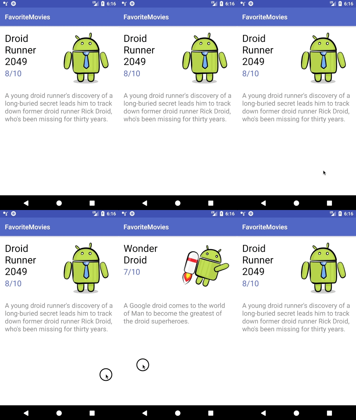
The app consists of a few pages, each displaying some information about a movie. I bet the first thing you tried to do was swipe left to check out next movie! Or was it just me? For now, you can not-so-gracefully navigate between pages using the Previous and Next buttons at the bottom of the screen.

Introducing the ViewPager

Adding a ViewPager to the UI will allow the users to move forward or backward through the movies by swiping across the screen. You don’t have to deal with the slide animation and the swipe gesture detection, so the implementation is easier than you might think.

You’ll divide the ViewPager implementation into three parts:

  • Adding the ViewPager
  • Creating an Adapter for the ViewPager
  • Wiring up the ViewPager and the Adapter

Preparing the ViewPager

For step one, open MainActivity.kt and remove everything inside onCreate(), below this line:

val movies = MovieHelper.getMoviesFromJson("movies.json", this)

Remove the replaceFragment() method from the bottom of the class as well.

Now open activity_main.xml and replace everything inside the RelativeLayout with the following:

<android.support.v4.view.ViewPager
    android:id="@+id/viewPager"
    android:layout_height="match_parent"
    android:layout_width="match_parent" />

Here you created the ViewPager view, which is now the only child of the RelativeLayout. Here’s how the xml file should look:

<RelativeLayout xmlns:android="http://schemas.android.com/apk/res/android"
                xmlns:tools="http://schemas.android.com/tools"
                android:layout_height="match_parent"
                android:layout_width="match_parent"
                tools:context="com.raywenderlich.favoritemovies.MainActivity">

  <android.support.v4.view.ViewPager
      android:id="@+id/viewPager"
      android:layout_height="match_parent"
      android:layout_width="match_parent" />

</RelativeLayout>

ViewPager is only available through the Android Support Library. The Android Support Library is actually a set of libraries that provide backward compatible implementations of widgets and other standard Android functionality. These libraries provide a common API that often allow the use of newer Android SDK features on devices that only support lower API levels. You should familiarize yourself with the Support Library and Support Library Packages.

Go back to MainActivity.kt and first import the ViewPager to be able to use it with this line:

import android.support.v4.view.ViewPager

Now you can add the following line at the top of the class to declare the ViewPager:

private lateinit var viewPager: ViewPager

Note: Use the keyword lateinit to avoid making the view nullable if you want to initialize it later. Read more about lateinit and other Kotlin modifiers here.

Add this line at the bottom of the onCreate() method to link your ViewPager reference to the xml view you created previously:

viewPager = findViewById(R.id.viewPager)

Implementing the PagerAdapter

Step one completed! You now have a ViewPager that doesn’t do anything particularly interesting without an Adapter that tells it what to display. If you run the app now you won’t be able to see any movies:

Empty Screen

The ViewPager usually displays the “pages” using fragment instances, but it can also work with simple views such as ImageView if you want to display static content. In this project, you will display multiple things on each page. Fragments are here to help you.

You will connect your Fragment instances with the ViewPager using a PagerAdapter, which is an object that sits between the ViewPager and the data set containing the information you want the ViewPager to display (in this case the movies array). The PagerAdapter will create each Fragment, add the corresponding movie data to it and return it to the ViewPager.

PagerAdapter is an abstract class, so you will have an instance of one of its subclasses (FragmentPagerAdapter and FragmentStatePagerAdapter) rather than an instance of the PagerAdapter itself.

FragmentPagerAdapter or FragmentStatePagerAdapter?

There are two types of standard PagerAdapters that manage the lifecycle of each fragment: FragmentPagerAdapter and FragmentStatePagerAdapter. Both of them work well with fragments, but they are better suited for different scenarios:

  • The FragmentPagerAdapter stores the fragments in memory as long as the user can navigate between them. When a fragment is not visible, the PagerAdapter will detach it, but not destroy it, so the fragment instance remains alive in the FragmentManager. It will release it from memory only when the Activity shuts down. This can make the transition between pages fast and smooth, but it could cause memory issues in your app if you need many fragments.
  • The FragmentStatePagerAdapter makes sure to destroy all the fragments the user does not see and only keep their saved states in the FragmentManager, hence the name. When the user navigates back to a fragment, it will restore it using the saved state. This PagerAdapter requires much less memory, but the process of switching between pages can be slower.

It’s time to decide. Your list of movies has only five items, so the FragmentPagerAdapter might work after all. But what if you get bored after this tutorial and watch all Harry Potter movies? You’ll have to add 8 more items to the JSON file. What if you then decide to add your favorite TV series as well? That array can become pretty large. In this case, the FragmentStatePagerAdapter works better.

Creating a Custom FragmentStatePagerAdapter

In the project navigator pane, right-click on com.raywenderlich.favoritemovies and select New -> Kotlin File/Class. Name it MoviesPagerAdapter and select Class for Kind. Hit OK.

new Kotlin file

Replace the contents of this file with the following:

package com.raywenderlich.favoritemovies

import android.support.v4.app.Fragment
import android.support.v4.app.FragmentManager
import android.support.v4.app.FragmentStatePagerAdapter

// 1
class MoviesPagerAdapter(fragmentManager: FragmentManager, private val movies: ArrayList<Movie>) :
    FragmentStatePagerAdapter(fragmentManager) {

  // 2  
  override fun getItem(position: Int): Fragment {
    return MovieFragment.newInstance(movies[position])
  }

  // 3  
  override fun getCount(): Int {
    return movies.size
  }
}

Let’s go over this step-by-step.

  1. Your new class extends FragmentStatePagerAdapter. The constructor of the superclass requires a FragmentManager, thus your custom PagerAdapter needs it as well. You also need to provide the list of movies as a parameter.
  2. Return the fragment associated with the object located at the specified position.
  3. Return the number of objects in the array.

When the ViewPager needs to display a fragment, it initiates a chat with the PagerAdapter. First, the ViewPager asks the PagerAdapter how many movies are in the array by calling getCount(). Then it will call getItem(int position) whenever a new page is about to be visible. Within this method, the PagerAdapter creates a new fragment that displays the information about the movie at the correct position in the array. 

Connecting the PagerAdapter and the ViewPager

Open MainActivity.kt and add the following line at the top to declare your MoviesPagerAdapter:

private lateinit var pagerAdapter: MoviesPagerAdapter

Next add the following inside onCreate(), beneath the existing code:

pagerAdapter = MoviesPagerAdapter(supportFragmentManager, movies)
viewPager.adapter = pagerAdapter

This initializes your MoviesPagerAdapter and connects it to the ViewPager

Note: supportFragmentManager is equivalent to the getSupportFragmentManager() method you would use in Java and viewPager.adapter = pagerAdapter is the same as viewPager.setAdapter(pagerAdapter). Read more about getters and setters in Kotlin here.

Build and run. The app should behave like the original version, but you can now navigate between movies by swiping rather than pressing buttons :].

Swiping ViewPager

Note: Using the FragmentStatePagerAdapter saves you from having to deal with saving the current page across a runtime configuration change, like rotating the device. The state of the Activity is usually lost in those situations and you would have to save it in the Bundle object passed as a parameter in onCreate(savedInstanceState: Bundle?). Luckily, the PagerAdapter you used does all the work for you. You can read more about the savedInstanceState object and the Activity lifecycle here.

Endless Scrolling

A nice feature you often see is being able to swipe continuously between pages in a circular manner. That is going to the last page when swiping right on the first one and going to the first one when swiping left on the last. For example, swiping between 3 pages would look like this: 

Page1 -> Page2 -> Page3 -> Page1 -> Page2

Page2 <- Page1 <- Page3 <- Page2 <- Page1

The FragmentStatePagerAdapter will stop creating new fragments when the current index reaches the number of objects returned by getCount(), so you need to change the method to return a fairly large number that the users are not very likely to reach by continuously swiping in the same direction. That way the PagerAdapter will keep creating pages until the page index reaches the value returned by getCount().

Open MoviesPagerAdapter.kt and create a new constant representing the large number by adding this line at the top of the file above the class definition:

private const val MAX_VALUE = 200

Now replace the return movies.size line inside getCount() with this:

return movies.size * MAX_VALUE

By multiplying the length of the array with MAX_VALUE, the swipe limit will grow proportionally to the number of movies in your list. This way you don’t have to worry about getCount() returning a number that is less than the number of movies as your movie list grows.

The only problem you now have is inside the Adapter’s getItem(position: Int) method. Since getCount() now returns a number larger than the size of the list, the ViewPager will try to access the movie at an index greater than the array size when the user swipes past the last movie.

Replace the code inside getItem(position: Int) with this line:

return MovieFragment.newInstance(movies[position % movies.size])

This will ensure that the ViewPager doesn’t request the element at an index larger than movies.size because the remainder after you divide the position by movies.size will always be greater than or equal to 0 and less than movies.size.

Right now the infinite scrolling works only when the user navigates forward through the array (swipes left). That is because, when your app starts, the ViewPager displays the movie at index 0. To fix this issue, open MainActivity.kt and add the following line inside onCreate() below the line where you connect the PageAdapter to the ViewPager

viewPager.currentItem = pagerAdapter.count / 2

This tells the ViewPager to display the movie found in the middle of the array. The user has now plenty of swiping to do in either direction before they reach an end. To ensure that the movie displayed at the beginning will still be the first one in your list, set MAX_VALUE to be an even number (in this case 200 works fine). This way, after you divide pagerAdapter.count by 2, pagerAdapter.count % movies.size = 0 (which is the first index that the ViewPager asks for when the app starts).

Build and run. You should now be able to swipe left and right a decent amount of times and the movies will start again from the beginning after you reach the last one and from the end when you reach the first one.

Endless scroll

Adding Tabs

A TabLayout is a nice feature that makes it easy to explore and switch between pages. The TabLayout contains a tab for each page, which usually displays the page title. The user can tap on a tab to navigate directly to the desired page or can use a swipe gesture over the TabLayout to switch between pages.

If you try to add a TabLayout to your ViewPager you won’t be able to see any tabs because the layout will be automatically populated with as many tabs as the FragmentStatePagerAdapter tells it by calling the getCount() method, which now returns a pretty large number. Trying to fit that many tabs on your screen will make them really narrow.

Luckily, there is a third party library called RecyclerTabLayout that solves this problem. The library uses the RecyclerView in its implementation. You can learn more about the mysterious RecyclerView from this tutorial. To install the library, open up build.grade (Module: app) and add the following line inside dependencies:

implementation 'com.nshmura:recyclertablayout:1.5.0'

The recyclertablayout library uses an old version of the Android Support Libraries, so you’ll need to add the following to make the Gradle sync happy:

implementation 'com.android.support:recyclerview-v7:26.1.0'

Tap Sync Now on the yellow pop-up and wait until Android Studio installs the library.

Open activity_main.xml and paste the following snippet above the ViewPager:

<com.nshmura.recyclertablayout.RecyclerTabLayout
    android:id="@+id/recyclerTabLayout"
    android:layout_height="@dimen/tabs_height"
    android:layout_width="match_parent" />

Now add the following property to your ViewPager to align it below the RecyclerTabLayout:

android:layout_below="@id/recyclerTabLayout"

Your whole layout file should now look like this:

<RelativeLayout xmlns:android="http://schemas.android.com/apk/res/android"
                xmlns:tools="http://schemas.android.com/tools"
                android:layout_height="match_parent"
                android:layout_width="match_parent"
                tools:context="com.raywenderlich.favoritemovies.MainActivity">

  <com.nshmura.recyclertablayout.RecyclerTabLayout
      android:id="@+id/recyclerTabLayout"
      android:layout_height="@dimen/tabs_height"
      android:layout_width="match_parent" />

  <android.support.v4.view.ViewPager
      android:id="@+id/viewPager"
      android:layout_below="@id/recyclerTabLayout"
      android:layout_height="match_parent"
      android:layout_width="match_parent" />

</RelativeLayout>

Open MainActivity.kt and import RecyclerTabLayout at the top of the file, like this:

import com.nshmura.recyclertablayout.RecyclerTabLayout

Now add the following at the top of the class to declare a RecyclerTabLayout instance:

private lateinit var recyclerTabLayout: RecyclerTabLayout

Add this block of code inside onCreate(), above the line where you set viewPager.currentItem:

recyclerTabLayout = findViewById(R.id.recyclerTabLayout)
recyclerTabLayout.setUpWithViewPager(viewPager)

The first line connects your RecyclerTabLayout instance to the xml view and the second one links the RecyclerTabLayout to your ViewPager.

The last thing you have to do is let the RecyclerTabLayout know what titles to display on the Tabs. Open MoviesPagerAdapter.kt and add the following method inside the class:

override fun getPageTitle(position: Int): CharSequence {
  return movies[position % movies.size].title
}

This method tells the TabLayout what to write on the tab placed at a particular position. It returns the title of the movie that corresponds with the fragment created inside getItem(position: Int).

Run the app. You should be able to see the tabs changing as you swipe through the pages. Try tapping on a tab and see how the ViewPager will scroll automatically to the corresponding movie :].

Tabs

Where to Go From Here?

You can download the final project for this tutorial here.

Nice job! You’ve modified an app and gave it a nicer UI with the help of ViewPager. You’ve also added a pretty cool TabLayout and implemented the endless scroll. In addition, you learned about the PagerAdapter and had to choose which of the FragmentPagerAdapter and FragmentStatePagerAdapter is best for you application. 

If you want to read more about the ViewPager have a look at the documentation. You can try and customize the transition animation with the help of PageTransformer. Check out this tutorial for that.

Bonus challenge: You can implement dot indicators for your pages as seen in many onboarding flows. Here you can find a nice way of creating dot indicators. Note that this solution won’t work with your final ViewPager from this tutorial as it needs PagerAdapter‘s getCount() method to return the exact number of pages. You can try implementing the indicators instead of the endless scroll. This time try using the default TabLayout instead of the third party library. You can download the solution here.

Feel free to join the forum discussion below if you have any comments or questions! :]

The post ViewPager Tutorial: Getting Started in Kotlin appeared first on Ray Wenderlich.

Open Call for Book Authors: Vapor, Kotlin, Unity VR, and More

$
0
0

Writing a book can be one of the most rewarding experiences of your life.

The first book I ever worked on was Learning Cocos2D, which I co-wrote with Rod Strougo back in 2011.

I still look back on that experience with a sense of accomplishment and pride, and I think I always will. There’s something incredibly fulfilling about completing a large project like this, doing it well, and seeing the difference it makes in other people’s lives.

If you’ve ever dreamed of writing your own book, we have a unique opportunity for you. We are currently recruiting lead authors for these upcoming books:

  • Server Side Swift with Vapor: We’re looking for a lead author for Server Side Swift with Vapor, focusing primarily on folks who want to create back-ends for mobile apps, with no prior web development experience.
  • Intermediate Kotlin: We are looking for an author to cover intermediate topics in the Kotlin language (focusing on the core language itself, not developing Android apps). We already have an author who will be covering the beginning topics.
  • Unity VR and AR Games by Tutorials: A guide for experienced Unity developers on making VR and AR games in Unity for devices such as the Vive, Rift, Hololens, iOS/Android. We already have 1 Beginning AR author, 1 Advanced AR author, and 1 Advanced VR author, so are looking for a lead author focused on the Beginning VR side.
  • Your book idea here! Although those are the books we are definitely recruiting for, perhaps you have an idea for a book we haven’t thought of. We’re always looking for advanced developers with a passion for making a great book, and we’d love to hear your ideas!

Keep reading to find out why you should write a book with us, what’s involved, and how to apply! :]

Why Write a Book with Us?

As I’ve mentioned, being a book author is a rewarding and often life-changing experience.

There are plenty more reasons to write a book with us beyond that, but here we’ll cover the top 3 that most authors ask about.

1) Work With an Awesome Team

Self-publishing is all the rage, but the key word there is “self” — as in, you’ll have to do everything your “self”. Self-editing. Self-designing. Self-typesetting. Self-management. Self-promotion. And everything else associated with a book, including customer support, creating art, store infrastructure and dealing with payment processors.

And the worst part of all is self-marketing. Even if you can handle all of the above, you need to build a sufficient audience of people who know you and want to buy your book! This can be quite challenging and time consuming if you’re going solo.

You could work with a traditional publisher, which definitely helps with some of the work involved in getting a book to market. But in our experience, the amount of support you get from traditional publishers varies widely, and most of the work involved in polishing and marketing your book falls on you.

At raywenderlich.com, we think of our books as a coordinated team project, and we’re fully invested in making your book a success. Here are the top 15 ways the raywenderlich.com Book Team helps you out:

  1. Book process. We have tons of experience creating books with a distributed team, and can guide you through a proven step-by-step process.
  2. Market analysis. We research the market to make sure that there’s sufficient demand for the topic you’re writing about to make it worth pursuing.
  3. Outline feedback. We provide constructive and technical feedback while you develop your outline.
  4. Sample project feedback. We help ensure your projects in the book are both fun and instructional.
  5. Design assistance. We help provide any cover art, internal art, or other design assets if you need them.
  6. Writing feedback. We help you build your writing skillset through continuous feedback on your manuscript.
  7. Tech editing. Our tech editors provide technical editing of the entire manuscript.
  8. Copyediting. Our editors copyediting and proofreading of your manuscript.
  9. Quality checks. Finally, our final pass editor performs quality checks to ensure all parts of the book are as polished as possible.
  10. Writing tools. We have developed custom authoring tools that allow you to write and preview your book in Markdown!
  11. Publishing. We publish your book to PDF, ePub, and print format.
  12. Audience building. We release tutorials and videos every day to build a strong audience of developers interested in your book, before it’s even released.
  13. Marketing. We market your book through our blog, newsletter, Twitter, Facebook, paid advertising, and more.
  14. Selling. We sell your book through our online store and other channels.
  15. Customer Support. We handle customer support for readers, and set up a book forum where customers can ask questions and provide feedback.

We’ve made a ton of books over the years and have learned a lot along the way, so you get to benefit. :]

2) Become a Recognized Subject Matter Expert

Authoring a book with raywenderlich.com will add a lot of heft to your resume. If you want to become known as a subject matter expert in a particular area, authoring a great book is a tried-and-true path. This will open doors for contracting work, conference talks, new jobs, and more. You can think of a book as a business card, résumé, and income stream all rolled into one!

The best part is that you don’t have to be an expert in your chosen field right now — all you need is solid experience as a developer and a willingness to dig deep and learn. At raywenderlich.com, our authors often become experts in their chosen subject by going through the process of writing a book. Check out the case study below to learn more.

Case Study: Marin Todorov and iOS Animations by Tutorials

Long-time team member Marin Todorov had some experience creating animations he needed for day-to-day development, so he created a video course about animation, learning how to create great animations as he built the series.

Marin took this experience and turned it into the successful book iOS Animations by Tutorials. Since then, he has spoken at many conferences around the world on his work, and is now known as the expert on iOS animations (and more!).

3) Earn Some Money!

Many authors ask what they can expect financially from the first year of book sales — and if it’s worth the effort to release updated editions of the book. The majority of traditional publishing agreements only give authors 10-15% of royalties, expecting authors to write for exposure and to increase credibility in their field, with royalties as a secondary concern.

At raywenderlich.com, we think you can enjoy a nice financial return on your books and build your credibility at the same time. We have an unusual approach in the industry, where we give 50% of net revenue back to the book authors. We take the proceeds from each book, subtract any internal production and affiliate costs, and then give you exactly half of what’s left.

The authors’ share of royalties is divided proportionally between all authors on the book, depending on how many chapters each author contributes. If you are the sole author, you get the whole 50%. If you have a co-author and you write 4 chapters out of 10 in a book, and your co-author writes the other 6, you get 20% and your co-author gets 30%.

The chart below shows the average total book royalties paid out to authors during the first year of the book’s life. We’ve included the low and high values of the first year of author earnings as reference:

Note: Your results may vary! Past performance does not necessarily guarantee future results, as many factors influence book sales such as choice of topic, market timing and promotion. However, if you are selected as an author, we will work closely with you to discuss how we can work together to maximize book sales.

Plus – to make it easier to work on the book, we’ll send up to $8K in royalty advances before the book launches (you get all of it if you are a solo author, less otherwise). This can help you cover unpaid leave from your day job, give you time to ignore other client work, cover if you need to pay for childcare in the evenings, get grocery delivery or cleaning services, or so on.

What’s Involved

So you’re ready to become an author — great! Let’s talk about what you can expect.

If you haven’t written a book before, there are two important things you should know:

  1. Writing a book is a lot of work. Do not plan to write a book if you’ve just had a baby, are working 80+ hours a week on your startup, or like to spend your days off relaxing with a margarita.

    There’s a reason that the dedication page of almost every book thanks family members, spouses and other significant people — because driving the book to completion almost always means you’ll be neglecting a lot of your life outside your job and your book.

    In the beginning part of your book process (see below), you will even need to work full-time on the book project, so you will need to take some time off your regular work schedule for this.

    The #1 mistake we see is authors not willing to make the sacrifices necessary to get a book project complete. So please be aware of what you’re getting into before applying.

  2. You must meet your deadlines. Your teammates on the book team can’t get their work done on time if you, the author, don’t get your work to them on time. We almost always have a fixed launch date that must be met, so you must be able to avoid procrastination and reliably meet deadlines.

Book Writing Phases

There are four phases to write a book for our site:

  1. Phase 1: Make Video Course Materials. As the lead author on a book, your first step is to make some materials for a video course on the subject, which form the basis for the first several chapters of the book. This is a smaller project than writing the entire book with a quicker timeframe, so it’s a great first step and a “quick win” for positive momentum.

    And best of all, this is a paid contracting job of $3K+ (in addition to the book advances and royalties you’ll get later!) – so you basically get paid to do the research for the book! You can then repurpose the sample projects and scripts that you develop for the video course in the book, saving a ton time. Also, students can give you feedback on the course, and what they’d like to see in the final book, giving you valuable feedback and establishing yourself as a subject matter expert.

    Note that you are only required to make the written materials – someone from our team can record the actual videos and demos. But if you’d like to record the videos and demos too, you’re welcome to fly into our video studio and do so! :]

    This phase requires you to work full-time on this project, and will take 3-4 weeks.

  2. Phase 2: Write Book Plan. Once you’re done with the video course materials, it’s time to turn to the book itself, and the first step is creating a book plan. We’ll give you a template to fill in, and you’ll answer questions like “What chapters will the book have?”, “What will the book schedule look like?” and “How many co-authors do you want (if any)?” Then, we will review and revise your book plan, recruit the rest of your book team, and get the project ready for kickoff.

    This phase is light – it will take some work to put together the book plan, but then you’ll mostly be waiting for comments/revisions and for us to recruit the rest of the team. It will take 3-4 weeks.

  3. Phase 3: Writing Phase. Once the book plan is finalized, we’ll have an official kickoff for the book, and you can begin writing! The timing for this varies based on the number of chapters in the book, and the amount of time you can commit to the writing and revision process:

    • If you have a day job: If you’re writing your book on your nights, weekends or days off, we’ve found authors can usually write 1 chapter every 2 weeks.
    • If you are writing your book full-time: If you’ve taken a sabbatical from your day job or put contracting on hold so you can write full-time, we’ve found authors can write around 2 chapters every week.

    As you submit chapters, they will go through at least three rounds of editing to polish them to the high quality style we are known for.

  4. Phase 4: Marketing Plan, Book Launch, and Beyond!. Once all chapters are in, we will work with you to develop a marketing plan for your book, and then later on we will have the official book launch. At this point it’s time to pop some champagne and celebrate! :]

How To Apply

Writing a book can be a lot of work, but nothing beats the feeling of holding that first copy of the book in your hands — with your name on the front cover!

We’d love for you to be part of our ever-expanding book family here at raywenderlich.com.

Ready to get started? Just send an email to ray@razeware.com with the answers to the following questions:

  • Which book would you like to be the lead author for?
  • Why do you want to work on this book?
  • What experience do you have working on the technology behind this book? Please link to any relevant apps or projects.
  • Can you commit to working full-time for phase 1 (make video course materials)? Please explain how you will make time for this.
  • How much time can you commit per week to working on phase 3 (writing phase)? Please explain how you will make time for this.
  • Are you the type of person who can avoid procrastination and reliably meet deadlines? If so, what specific techniques do you use to stay on track?
  • Have you read any raywenderlich.com books, or watched any raywenderlich.com courses? If so, which ones?

We’re excited at the prospect of making the next great raywenderlich.com book with you!

The post Open Call for Book Authors: Vapor, Kotlin, Unity VR, and More appeared first on Ray Wenderlich.

Google Material Design Tutorial for iOS: Getting Started

$
0
0

Upon reading the title of this tutorial, you may be wondering how the terms “Google Material Design” and “iOS” ended up alongside each other. After all, Material Design is widely known for being the face of Google, and particularly on Android.

It turns out however, that Google has a much broader vision for Material Design that extends across many platforms, including iOS. Google has even gone as far as open-sourcing the components they’ve used to build Material Design-powered apps on iOS.

In this tutorial, you’ll get a primer on Material Design and build a simple app that displays articles from a number of different news sources via the newsapi.org API.

Using Google Material Design Components for iOS, you will beautify the app with a flexible header, standard material colors, typography, sliding tabs, and cards with ink.

Getting Started

Download the starter project for News Ink, and take a look around to familiarize yourself.

You may notice that the project is using CocoaPods. In your Terminal, navigate to the project’s root folder and run pod install.

Note: If you’re not familiar with CocoaPods we have a good introductory tutorial you can read to get familiar with the dependency manager.

Before you start working with the app, you’ll need to obtain a free newsapi.org key by signing up at https://newsapi.org/register.

Once you’ve got your key, open NewsClient.swift and insert your key in the Constants struct like so:

static let apiKey = "REPLACE_WITH_NEWSAPIORG_KEY"

Then build and run.

There’s nothing terribly interesting yet: just a basic list of articles with photo and basic information. You can tap on an item in the list to go to a web view of the full article, but that’s about it.

Before diving into some code, it’s worth learning a little about Material Design.

Material Design

Google introduced Material Design in 2014, and it’s quickly become the UI/UX standard across all of Google’s web and mobile products. The Google Material Design Guidelines is a great place to start, and I’d recommend having a quick read through before you go any further.

But why is Material Design a good idea, and more importantly, why would you want to use it for an iOS app? After all, Apple has its own UI/UX guidelines in the form of the Human Interface Guidelines.

The answer lies in how we use the devices around us. From mobile phones, to tablets, to desktop PCs, to the television; our daily lives are now a journey from one screen to the next. A single interface design that feels the same across all screens and devices makes for a smooth user experience and greatly reduces the cognitive load of jumping from one device to the next.

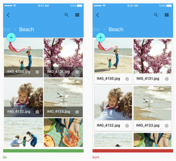
An example of dos and don’ts from Google’s Material Design Guidelines.

Using a metaphor that humans are already familiar with — material, in this case, paper — makes approaching each new screen somewhat easier. Moreover, when the design guidelines are extremely opinionated, specific, and supported by actual UI components at the platform level, apps built using those design guidelines easily fall in line with each other.

There’s nothing in the Material specification about only applying to Google’s platforms. All of the benefits of a unified design system are as relevant on iOS as they are on any other platform. If you compare Apple’s Human Interface Guidelines to Google’s Material Design Guidelines, you’ll notice that the Material spec is much deeper and more opinionated. In contrast, Apple’s guidelines are not nearly as prescriptive, particularly when it comes to visual aspects such as typography, color and layouts.

Google is so committed to making Material Design a cross platform standard that it’s created a Platform Adaptation guide that walks you through implementing Material in a way that feels at home on any platform.

That was a lot of info up front! Rest assured, none of it was… immaterial. Now you’re going to have some fun working with the Google Material Components for iOS.

Material Design in Practice on iOS

When you’re done with this section, your app will open with a large header, including a full-bleed photo background and large word mark text. As you scroll, the photo will move and fade out, while the word mark label shrinks until the entire header magically morphs into a more traditional navigation bar.

To start, there’s no navigation bar, title, or anything else to tell the user which app they’re using. You’ll fix that that by introducing an app bar with flexible header, hero image, and fluid scroll effects.

Adding an App Bar

The first, and probably coolest Material Design component you’ll add is an App Bar. In this case, you’ll get a lot of bang for your buck, since the App Bar combines three components in one: Flexible Header, Header Stack View, and Navigation Bar. Each of these components is powerful on its own, but as you will see, when combined, you get something really special.

Open HeroHeaderView.swift. To keep things clean, you’re going to build a UIView subclass that contains all the subviews that make up the flexible header, as well as the logic for how those subviews change in relation to the scroll position.

First add the following struct inside the HeroHeaderView class:

struct Constants {
  static let statusBarHeight: CGFloat = UIApplication.shared.statusBarFrame.height
  static let minHeight: CGFloat = 44 + statusBarHeight
  static let maxHeight: CGFloat = 400.0
}

Here you add a number of constants that will be useful as you build out the header view.

statusBarHeight represents the height of the status bar and minHeight and maxHeight represent the minimum (fully collapsed) and maximum (fully expanded) height of the header.

Now add the following properties to HomeHeaderView:

// MARK: Properties

let imageView: UIImageView = {
  let imageView = UIImageView(image: #imageLiteral(resourceName: "img-hero"))
  imageView.contentMode = .scaleAspectFill
  imageView.clipsToBounds = true
  return imageView
}()

let titleLabel: UILabel = {
  let label = UILabel()
  label.text = NSLocalizedString("News Ink", comment: "")
  label.textAlignment = .center
  label.textColor = .white
  label.shadowOffset = CGSize(width: 1, height: 1)
  label.shadowColor = .darkGray
  return label
}()

Nothing too complicated here; you add a UIImageView to house the header’s background and a UILabel that represents the app title word mark.

Next, add the following code to initialize HomeHeaderView, add the subviews, and specify the layout:

// MARK: Init

// 1
init() {
  super.init(frame: .zero)
  autoresizingMask = [.flexibleWidth, .flexibleHeight]
  clipsToBounds = true
  configureView()
}

// 2
required init?(coder aDecoder: NSCoder) {
  fatalError("init(coder:) has not been implemented")
}

// MARK: View

// 3
func configureView() {
  backgroundColor = .darkGray
  addSubview(imageView)
  addSubview(titleLabel)
}

// 4
override func layoutSubviews() {
  super.layoutSubviews()
  imageView.frame = bounds
  titleLabel.frame = CGRect(
    x: 0,
    y: Constants.statusBarHeight,
    width: frame.width,
    height: frame.height - Constants.statusBarHeight)
}

There’s a bit more going on here:

  1. Here you add some basic initialization code that sets a resizing mask, configures clipping mode, then calls the configureView method to, well, configure the view. The MDCAppBar and its cohorts don’t support Auto Layout, so for this section of the tutorial, it’s frame math or bust.
  2. This view is only intended for use via code, so here you prevent it from being loaded via XIB or Storyboards.
  3. To configure the view, you set the background color to .darkGray. As the view collapses, the background image will become transparent, leaving this dark gray color to serve as the navigation bar color. You also added the background image and label as subviews.
  4. The layout code here does two things. First, it assures that the background image fills the frame of the header view. Second, it also fills the label to the header frame, but accounts for the status bar height so that the label is vertically centered between the lower edge of the status bar and the bottom edge of the header frame.

Now that you have the basic header view with subviews in place, it’s time to configure the App Bar and use your header view as the content.

Open ArticlesViewController.swift and import the Material Components by adding the following import statement at the top of the file, below the existing imports:

import MaterialComponents

Now add the following property declarations above the existing properties:

let appBar = MDCAppBar()
let heroHeaderView = HeroHeaderView()

You have a property for the App Bar (an instance of MDCAppBar) and one for the HeroHeaderView you created in previous steps.

Next, add the following method to the ArticlesViewController extension marked as // MARK: UI Configuration:

func configureAppBar() {
  // 1
  self.addChildViewController(appBar.headerViewController)

   // 2
  appBar.navigationBar.backgroundColor = .clear
  appBar.navigationBar.title = nil

   // 3
  let headerView = appBar.headerViewController.headerView
  headerView.backgroundColor = .clear
  headerView.maximumHeight = HeroHeaderView.Constants.maxHeight
  headerView.minimumHeight = HeroHeaderView.Constants.minHeight

   // 4
  heroHeaderView.frame = headerView.bounds
  headerView.insertSubview(heroHeaderView, at: 0)

   // 5
  headerView.trackingScrollView = self.collectionView

   // 6
  appBar.addSubviewsToParent()
}

There’s quite a lot going on here, so let’s break it down:

  1. To start, you add the app bar’s header view controller as a child view controller of the ArticlesViewController. This is required so that the header view controller can receive standard UIViewController events.
  2. Next, you configure the background color of the app bar to be clear, since you’ll be relying on the hero header view subclass to provide the color. You also set the titleView property to nil because the hero header view also provides a custom title.
  3. Now you configure the app bar’s flexible header view, first by setting it’s background to .clear, again because your hero header view subclass will handle the background. Then you set the min and max heights to the values you defined in the HeroHeaderView.Constants struct. When the collection view is at scroll position zero (e.g. the top), the app bar will be at max height. As you scroll the content, the app bar will collapse until it reaches min height, where it will stay until the collection view is scrolled back towards the top.
  4. Here you set up the initial frame of the hero header view to match the app bar’s header view, then insert it as the bottom-most subview of the header view. This effectively sets the hero header view as the primary content of the app bar’s flexible header view.
  5. Next, you set the header view’s trackingScrollView to the collection view. The flexible header needs to know which UIScrollView subclass to use for tracking scroll events so that it can adjust its size, position, and adjust its subviews as the user scrolls.
  6. Finally, you call addSubviewsToParent on the app bar as required by MDCAppBar in order to add a few of its views to your view controller’s view.

Now invoke configureAppBar() by adding it to viewDidLoad(), right after calling super.viewDidLoad():

override func viewDidLoad() {
  super.viewDidLoad()
  configureAppBar()
  configureCollectionView()
  refreshContent()
}

Build and run, and you should see the following:

Sweet, the header is there! But there are a few problems.

Flexible header height

First, the title logo’s font is small, and as a result, looks awful. Try scrolling the collection view, and you’ll also notice that the flexible header doesn’t seem so flexible yet.

Both of these problems are tied to the fact that there is still some configuration needed to fully wire up the app bar to the collection view’s scroll events.

It turns out that simply setting the flexible header’s trackingScrollView is not enough. You also have to explicitly inform it of scroll events by passing them via the UIScrollViewDelegate methods.

Add the following to the same UI Configuration extension on ArticlesViewController, below where you added configureAppBar():

// MARK: UIScrollViewDelegate

override func scrollViewDidScroll(_ scrollView: UIScrollView) {
  let headerView = appBar.headerViewController.headerView
  if scrollView == headerView.trackingScrollView {
    headerView.trackingScrollDidScroll()
  }
}

override func scrollViewDidEndDecelerating(_ scrollView: UIScrollView) {
  let headerView = appBar.headerViewController.headerView
  if scrollView == headerView.trackingScrollView {
    headerView.trackingScrollDidEndDecelerating()
  }
}

override func scrollViewDidEndDragging(_ scrollView: UIScrollView, willDecelerate decelerate: Bool) {
  let headerView = appBar.headerViewController.headerView
  if scrollView == headerView.trackingScrollView {
    headerView.trackingScrollDidEndDraggingWillDecelerate(decelerate)
  }
}

override func scrollViewWillEndDragging(_ scrollView: UIScrollView, withVelocity velocity: CGPoint,
                                        targetContentOffset: UnsafeMutablePointer<CGPoint>) {
  let headerView = appBar.headerViewController.headerView
  if scrollView == headerView.trackingScrollView {
    headerView.trackingScrollWillEndDragging(withVelocity: velocity,
                                             targetContentOffset: targetContentOffset)
  }
}

In each of these methods, you check if the scroll view is the one you care about (e.g. the header view’s trackingScrollView), and if it is, pass along the event.

Build and run, and you should now see that the header’s height has become flexible.

Adding more effectst

Now that the flexible header is appropriately tied to the collection view’s scrolling, it’s time to have your HeroHeaderView respond to header scroll position changes in order to create some neat effects.

Open HeroHeaderView.swift once more, and add the following method to HeroHeaderView:

func update(withScrollPhasePercentage scrollPhasePercentage: CGFloat) {
  // 1
  let imageAlpha = min(scrollPhasePercentage.scaled(from: 0...0.8, to: 0...1), 1.0)
  imageView.alpha = imageAlpha

  // 2
  let fontSize = scrollPhasePercentage.scaled(from: 0...1, to: 22.0...60.0)
  let font = UIFont(name: "CourierNewPS-BoldMT", size: fontSize)
  titleLabel.font = font
}

This is a short, but very important method.

To start, the method takes a scrollPhase value as its only parameter. The scroll phase is a number from 0.0 to 1.0, where 0.0 is when the flexible header is at minimum height, and 1.0 represents, you guessed it, the header at maximum height.

Through the use of a scaled utility extension in the starter project, the scroll phase is mapped to values appropriate for each of the two header components:

  1. By mapping 0...0.8 to 0...1, the alpha of the background goes from 0 when the header is completely collapsed, to 1.0 once the phase hits 0.8 as it is expanded. This prevents the image from fading away as soon as the user starts scrolling the content.
  2. You map the font size range for the title logo as 22.0...60.0. This means that the title logo will start at font size 60.0 when the header is fully expanded, then shrink as it is collapsed.

To connect the method you just added, open ArticlesViewController.swift once more and add the following extension:

// MARK: MDCFlexibleHeaderViewLayoutDelegate
extension ArticlesViewController: MDCFlexibleHeaderViewLayoutDelegate {

  public func flexibleHeaderViewController(_ flexibleHeaderViewController: MDCFlexibleHeaderViewController,
    flexibleHeaderViewFrameDidChange flexibleHeaderView: MDCFlexibleHeaderView) {
    heroHeaderView.update(withScrollPhasePercentage: flexibleHeaderView.scrollPhasePercentage)
  }
}

This passes the header scroll phase event straight to your hero header view by invoking the method you just added to HeroHeaderView.

Last but not least, add the following line to configureAppBar() in order to wire up the header layout delegate:

appBar.headerViewController.layoutDelegate = self

Build and run, and you should see the following:

As you scroll, the header should collapse, fading the background image and shrinking the title logo. The flexible header even applies its own effects to stretch its content if you pull down when the collection view is at the top most content offset.

Next up, you’ll add a Material-style scrolling tab bar to let you choose from different news sources.

Adding a Tab Bar

Being able to see a single list of news articles from CNN is already making this app feel pretty useful, but wouldn’t it be even better if you could choose from a bunch of different news sources? Material Design includes just the right component for presenting such a list: the tab bar.

“But wait!” you cry, “iOS already has its own tab bar component!”

Indeed it does, but in Material Design the tab bar can function both as a bottom-style bar with icons and titles (much like the iOS tab bar), or as part of a flexible header, where tabs appear as a horizontally scrolling list of titles.

The second mode is more suited to a list where you might not know the number of values until runtime, and the titles are dynamic to the extent that you wouldn’t be able to provide a unique icon for each. It sounds like this fits the bill perfectly for your news sources navigation.

Open ArticlesViewController.swift and add the following property for the tab bar:

let tabBar = MDCTabBar()

You’re going to add the tab bar as the app bar’s “bottom bar”, which means it will stick to the bottom of the flexible header so that it’s always visible, regardless whether the header is expanded or collapsed. To do this, add the following method right below configureAppBar():

func configureTabBar() {
  // 1
  tabBar.itemAppearance = .titles
  // 2
  tabBar.items = NewsSource.allValues.enumerated().map { index, source in
    return UITabBarItem(title: source.title, image: nil, tag: index)
  }
  // 3
  tabBar.selectedItem = tabBar.items[0]
  // 4
  tabBar.delegate = self
  // 5
  appBar.headerStackView.bottomBar = tabBar
}

This doesn’t look too complicated:

  1. First, you set the item appearance to .titles. This causes the tab bar items to only show titles, without icons.
  2. Here you map all of the news sources, represented by the NewsSource enum, into instances of UITabBarItem. Just as in a UITabBar, this is how the individual tabs are defined. You set the tab on the tab bar item as the index of the news source in the list. This is so that later, when you handle the tab bar selection, you’ll know which news source to select for a given tab.
  3. Next, you set the selected item to the first item in the list. This will set the first news source as the selected news source when the app first starts.
  4. You simply set the tab bar’s delegate to self. You’ll implement this delegate in the next section.
  5. Finally, set the tab bar as the header stack view’s bottom bar to make it “stick” to the bottom of the flexible header.

At this point the tab bar can be configured, but you need to actually call this method first. Find viewDidLoad() and call this new method right below configureAppBar():

configureTabBar()

The bar is now configured, but it still won’t do much because you haven’t implemented the delegate methods yet. Implement its delegate by adding the following extension:

// MARK: MDCTabBarDelegate
extension ArticlesViewController: MDCTabBarDelegate {

  func tabBar(_ tabBar: MDCTabBar, didSelect item: UITabBarItem) {
    refreshContent()
  }
}

This code refreshes the content every time the selected tab changes. This won’t do much unless you update refreshContent() to take the selected tab into account.

Change refreshContent() to look like the following:

func refreshContent() {
  guard inProgressTask == nil else {
    inProgressTask?.cancel()
    inProgressTask = nil
    return
  }

  guard let selectedItem = tabBar.selectedItem else {
    return
  }

  let source = NewsSource.allValues[selectedItem.tag]

  inProgressTask = apiClient.articles(forSource: source) { [weak self] (articles, error) in
    self?.inProgressTask = nil
    if let articles = articles {
      self?.articles = articles
      self?.collectionView?.reloadData()
    } else {
      self?.showError()
    }
  }
}

The above code looks similar to that in the starter project — with one key difference. Instead of hard-coding the news source to .cnn, you obtain the selected tab bar item via tabBar.selectedItem. You then grab the corresponding news source enum via the tab bar item’s tag — remember, you set it to the news source index above. Finally, you pass that news source to the API client method that fetches the articles.

You’re almost there! There’s one more thing to do before achieving tab bar nirvana.

When you configured the app bar, you set the absolute minimum and maximum heights. Without changing anything, you haven’t provided any extra room for the tab bar when the app bar is in the collapsed state. Build and run right now, and you’ll see something like the following when you scroll down into the content:

This would look much snazzier if the app bar allotted space for both the title and the tab bar.

Open HeroHeaderView.swift and change the Constants enum to the following:

struct Constants {
  static let statusBarHeight: CGFloat = UIApplication.shared.statusBarFrame.height
  static let tabBarHeight: CGFloat = 48.0
  static let minHeight: CGFloat = 44 + statusBarHeight + tabBarHeight
  static let maxHeight: CGFloat = 400.0
}

Here you add a new constant for tabBarHeight and then add it to the minHeight constant. This will make sure there is enough room for both the title and the tab bar when in the collapsed state.

Finally, there’s one last problem to contend with. Since you added a new component to the flexible header, the title will no longer look centered vertically. You can resolve this by changing layoutSubviews() in HeroHeaderView.swift to the following:

override func layoutSubviews() {
  super.layoutSubviews()
  imageView.frame = bounds
  titleLabel.frame = CGRect(
    x: 0,
    y: Constants.statusBarHeight,
    width: frame.width,
    height: frame.height - Constants.statusBarHeight - Constants.tabBarHeight)
}

The only difference is that you’re now subtracting Constants.tabBarHeight when calculating the title label’s height.

This centers the title label vertically between the status bar at the top and the tab bar at the bottom. It’ll look much nicer and will prevent one of those pesky UX designers from throwing a brick through your window while you sleep.

Build and run, and you can now choose from a number of news sources, all while expanding or collapsing the header to your heart’s content.

Now that you’ve done a number on the header and navigation, it’s time to give the content a magnificent material makeover.

Adding Article Cards

One of the core tenets of Material Design is the idea of using material as a metaphor. Cards are an excellent implementation of this metaphor, and are used to group content, indicate hierarchy or structure, and denote interactivity, all through the use of varying levels of elevation and movement.

The individual news items in your app are rather dull. But you’re about to change that and turn each news item into a card with a ripple touch effect.

Open ArticleCell.swift and add the familiar import statement to pull in Material Components:

import MaterialComponents

To give the cell a shadow, add the following code to the bottom of ArticleCell:

override class var layerClass: AnyClass {
  return MDCShadowLayer.self
}

var shadowLayer: MDCShadowLayer? {
  return self.layer as? MDCShadowLayer
}

Here you override the UIView class var layerClass in order to force the view’s backing layer to be of type MDCShadowLayer.

This layer lets you set a shadow elevation and will then render a nice-looking shadow. You then expose a convenience variable named shadowLayer so it’s easier to access the shadow layer for configuration purposes.

Now that the shadow layer is in place, add the following code to awakeFromNib():

// 1
shadowLayer?.elevation = MDCShadowElevationCardResting

 // 2
layer.shouldRasterize = true
layer.rasterizationScale = UIScreen.main.scale

 // 3
clipsToBounds = false
imageView.clipsToBounds = true

Taking each commented section in turn:

  1. First, you set the shadow layer’s elevation to MDCShadowElevationCardResting. This is the standard elevation for a card in the “resting” state. There are other elevations that correspond to various types of components and interactions.
  2. Next, you configure the rasterization mode for the view’s layer in order to improve scrolling performance.
  3. Finally, you set clipsToBounds to false on the cell so the shadow can escape the bounds of the cell, and set the clipsToBounds to true for the image view. Because you’re using the .scaleAspectFill mode, this will ensure the image content stays confined to the view.

Build and run once again. You should now see a classy shadow surrounding each piece of content, giving it a very defined card look.

Your app is now looking decidedly more Material. Those cards almost scream “please tap me”, but alas, when you do so, nothing happens to indicate your tap before you’re ushered away to the article detail.

Ripple effect on tap

Material Design has a universal method of indicating interactivity, through the use of an “ink” component that causes a very subtle ripple to occur whenever something is tapped or clicked on.

Let’s pour some ink onto these cards. Add a variable for an MDCInkTouchController to ArticleCell like so:

var inkTouchController: MDCInkTouchController?

The ink touch controller manages an underlying ink view and deals with handling input. The only other thing to do is initialize the ink touch controller and add it to the view.

Add the following code to awakeFromNib():

inkTouchController = MDCInkTouchController(view: self)
inkTouchController?.addInkView()

The ink touch controller maintains a weak reference to the view, so don’t worry about causing a retain cycle here.

Build and run, then tap on a card to see ink in action.

And that’s it! You’ve have yourself a fully armed and operational Material Design news app.

Where to Go From Here?

You can download the finished project here.

The Material Design spec is extremely broad, and the iOS library includes many components that are beyond the scope of this tutorial. If you like what you’ve seen in this tutorial, you’re encouraged to give it a read.

Moreover, you can find a complete list of all iOS material design components here. They all include very complete documentation and are a great place to start if you want to incorporate more aspects of Material Design into your next iOS app.

If you have any comments or questions about this tutorial, please join the forum discussion below!

Updated Course: Beginning iOS Animations

$
0
0

Beginning iOS Animations

Last week, we released an update to our Scroll View School course. Today, we’re excited to share Beginning iOS Animations with you, updated for Swift 4 and iOS 11!

This 28-video course will get you started animating views in iOS. You’ll start off animating views via Auto Layout constraints, and then learn how to animate view properties directly. By the end of the course, you’ll even learn how to build a custom view controller transition.

Let’s take a look at what’s inside:

Part 1: Animating Constraints

In this first part, you’ll begin animating views via their Auto Layout constraints. Learn how to add springs to your animations and how to use the view transitions built into UIKit.

Part 1: Animating Constraints

This section contains 11 videos:

  1. Introduction: Find out what animation is and how it can help your apps in this introductory video!
  2. Animating Constraint Constants: Animate the constant property of an Auto Layout constraint as you create your first view animation for the Packing List app.
  3. Challenge: Animate Position with Constraints: Try animating another constraint on your own, and get a sneak peek at animating view properties directly.
  4. Animating Dynamically Created Views: Learn how to animate the constraints of views you create dynamically and constrain entirely in code.
  5. Challenge: Animate a View Offscreen: In this challenge, animate constraint constants to move a view offscreen. Try using the delay parameter to start the animation after a short wait.
  6. Animating Constraint Multipliers: Learn the differences between animating constants and multipliers, then try animating a multiplier using a search and replace approach.
  7. Challenge: Toggle Constraints: Try your hand at another way to animate constraint multipliers: toggling between two constraints with IBOutlets.
  8. Adding Springs: It’s time to add a little fun to your animations! Learn how to make spring-driven animations and customize their effects.
  9. Using View Transitions: Learn to use view transitions; a set of predefined view animations that can help you quickly add and remove views with style.
  10. Challenge: Triggering View Transitions: In this challenge, have another try at using view transitions and explore the different ways to trigger them.
  11. Conclusion: Review what you’ve learned in this section, and find out what’s next in your animation journey.

Part 2: Animating View Properties

In this part, you’ll start animating views directly, learn to use a view’s transform property, and create complex keyframe animations.

Part 2: Animating View Properties

This section contains 9 videos:

  1. Introduction: What’s the difference between animating constraints and animating view properties? Find out in this video!
  2. Animating View Properties Build an animation to cross-fade between two views using three different view properties and some new techniques.
  3. Challenge: Create a Fade Animation: Try adding another animation using a view property. This time, use alpha to fade a single view in and out.
  4. Animating Transform Properties: Learn how to scale, translate, and rotate views with the powerful, but sometimes confounding, transform property.
  5. Challenge: Add Variety: In this challenge add variation to your last animation to slide labels to and from different directions.
  6. Concatenating Transforms Experiment with combining changes in multiple transform properties to create complex animations, and find out how they can go wrong.
  7. Animating with Keyframes: Create a complex animation that encompasses multiple properties and multiple steps with a keyframe animation.
  8. Challenge: Practice Keyframes: In this challenge, solidify your keyframe animation skills by adding one more keyframe animation to your project.
  9. Conclusion: Review what you’ve learned in this part, and prepare to take your animation skills to the next level.

Part 3: View Controller Transitions

In the final part, use all of the animation skills you’ve learned to build a custom view controller transition.

Part 3: View Controller Transitions

This section contains 8 videos:

  1. Introduction: Learn about view controller transitions and why you should consider customizing them with unique animations in your apps.
  2. Setting up the Animator: Take a tour of the Beginning Cook app and set it all up for custom view controller transition animations.
  3. Challenge: Plan the Presentation Animation: Now that you have several view animations under your belt, try to plan out the steps needed to build the presentation animation.
  4. Presentation Animation: Follow through on your plan from the previous challenge to create a custom presentation animation.
  5. Challenge: Plan the Dismiss Animation: In this challenge, plan the steps required to take the presentation animation you’ve completed, and run it in reverse as a dismiss animation.
  6. Dismiss Animation: Take your plan for the dismiss animation and put it into action to create a completey customized view controller transition animation.
  7. Adding Polish: Wrap up your custom view controller transition with a few final steps to make the animation really shine.
  8. Conclusion: Review what you’ve learned in this part of the course, and find out what more there is to learn about animating in iOS.

Where To Go From Here?

Want to check out the course? You can watch the first two videos for free! The rest of the course is for raywenderlich.com subscribers only. Here’s how you can get access:

  • If you are a raywenderlich.com subscriber: The entire 34-part course is complete and available today. You can check out the course here.
  • If you are not a subscriber yet: What are you waiting for? Subscribe now to get access to our updated Beginning iOS Animations course and our entire catalog of over 500 videos.

Stay tuned for more new and updated iOS 11 courses to come. I hope you enjoy our course! :]

The post Updated Course: Beginning iOS Animations appeared first on Ray Wenderlich.

iOS 11 Launch Party Giveaway Winners – and Last Day for Discount!

$
0
0

Our whirlwind celebration of the iOS 11 Launch Party has officially drawn to a close!

We’ve had great fun showcasing all our new books and the great teams behind them, as well as sharing a pile of free chapters with you. We hope you found something useful or interesting along the way!

But there’s just one thing left to take care of: our giveaway of over $9,000 in prizes! Anyone who tweeted during the iOS 11 Launch party with the #ios11launchparty hashtag was automatically entered into our draw.

To recap, here’s what was up for grabs this year:

The Grand Prize for the iOS 11 Launch Party consists of the following package:

  • A complete set of all our books in PDF form — an $840 value!
  • A complete set of all our books in print form — an $840 value!
  • A one-year subscription to all of our video courses — a $179 value!

That’s over $1,800 in value for the Grand Prize!

The secondary prize packages include the following:

  • Two readers will win a complete set of all our books in PDF form ($840 value).
  • Two readers will win a complete set of all our books in print form of books ($840 value).
  • Two readers will win a one-year subscription to our video courses ($179 value).

And if that weren’t enough, we offered up a host of other bonus prizes to give away:

  • 11 readers will win a PDF copy of iOS 11 by Tutorials
  • 3 readers will win a PDF copy of Swift Apprentice, Third Edition
  • 3 readers will win a PDF copy of iOS Apprentice, Sixth Edition
  • 3 readers will win a PDF copy of 2D Apple Games by Tutorials, Second Edition
  • 3 readers will win a PDF copy of 3D Apple Games by Tutorials, Second Edition
  • 3 readers will win a PDF copy of tvOS Apprentice, Third Edition
  • 3 readers will win a PDF copy of iOS Animations by Tutorials, Fourth Edition
  • 3 readers will win a PDF copy of Core Data by Tutorials
  • 3 readers will win a PDF copy of watchOS by Tutorials, Third Edition
  • 3 readers will win a PDF copy of Advanced Apple Debugging, Second Edition
  • 3 readers will win a print copy of iOS 11 by Tutorials
  • 3 readers will win a print copy of Swift Apprentice, Third Edition
  • 3 readers will win a print copy of iOS Apprentice, Sixth Edition
  • 3 readers will win a print copy of 2D Apple Games by Tutorials, Second Edition
  • 3 readers will win a print copy of 3D Apple Games by Tutorials, Second Edition
  • 3 readers will win a print copy of tvOS Apprentice, Third Edition
  • 3 readers will win a print copy of iOS Animations by Tutorials, Fourth Edition
  • 3 readers will win a print copy of Core Data by Tutorials
  • 3 readers will win a print copy of watchOS by Tutorials, Third Edition
  • 3 readers will win a print copy of Advanced Apple Debugging, Second Edition
  • 10 readers will win an official raywenderlich.com T-shirt and stickers

Whew! That’s a serious collection of loot to be won. Ready to see who the winners are? Read on…

And the Grand Prize Winner Is…

Jeremiah Jessel (@JCubedApps) on Twitter!

Congratulations! We’ll be in touch shortly to arrange delivery of your iOS 11 Launch Party prize package.

Secondary Prize Winners

If you didn’t snag the grand prize, don’t worry — we still have some sweet secondary prizes to announce!

The two winners of a complete set of our books in digital format are:

The two winners of a complete set of our books in print format are:

The two winners of a one-year subscription to our video course are:

Individual Prize Winners

Just some of the seriously great books in store for the winners! Geeky deliveryman not included.

And if you still didn’t win the grand prize or the secondary prizes, there’s a pile of individual prizes to announce!

The 11 readers who won a PDF copy of iOS 11 by Tutorials are:

The 3 readers who won a PDF copy of Swift Apprentice, Third Edition are:

The 3 readers who won a PDF copy of iOS Apprentice, Sixth Edition are:

The 3 readers who won a PDF copy of 2D Apple Games by Tutorials, Second Edition are:

The 3 readers who won a PDF copy of 3D Apple Games by Tutorials, Second Edition are:

The 3 readers who won a PDF copy of tvOS Apprentice, Third Edition are:

The 3 readers who won a PDF copy of iOS Animations by Tutorials, Fourth Edition are:

The 3 readers who won a PDF copy of Core Data by Tutorials are:

The 3 readers who won a PDF copy of watchOS by Tutorials, Third Edition are:

The 3 readers who won a PDF copy of Advanced Apple Debugging, Second Edition are:

The 3 readers who won a print copy of iOS 11 by Tutorials are:

The 3 readers who won a print copy of Swift Apprentice, Third Edition are:

The 3 readers who won a print copy of iOS Apprentice, Sixth Edition are:

The 3 readers who won a print copy of 2D Apple Games by Tutorials, Second Edition are:

The 3 readers who won a print copy of 3D Apple Games by Tutorials, Second Edition are:

The 3 readers who won a print copy of tvOS Apprentice, Third Edition are:

The 3 readers who won a print copy of iOS Animations by Tutorials, Fourth Edition are:

The 3 readers who won a print copy of Core Data by Tutorials are:

The readers who won a print copy of watchOS by Tutorials, Third Edition are:

The 3 readers who won a print copy of Advanced Apple Debugging, Second Edition are:

The 10 readers who won an official raywenderlich.com T-shirt and stickers are:

Thanks everyone for entering! We’ll be in touch soon via Twitter to let you know how to claim your prizes.

Last Day for the iOS 11 Launch Party Discount!

And that concludes the iOS 11 Launch Party! We hope you enjoyed everything we released this year to celebrate the launch of iOS 11.

Congratulations to all the prize winners, and a super-big “thank-you” to all our readers who supported us during the feast, by purchasing our books, signing up for video courses, trying out our new Udemy course, grabbing tickets to RWDevCon, or even simply retweeting our content!

And don’t forget, today is the last day to grab our iOS 11 books on sale! Don’t miss out.

Thanks again to all of our book teams and video teams for supporting us this year in the iOS 11 Launch Party — and especially to you, our readers, who are the reason why we do what we do. See you next year!

The post iOS 11 Launch Party Giveaway Winners – and Last Day for Discount! appeared first on Ray Wenderlich.

Image Depth Maps Tutorial for iOS: Getting Started

$
0
0

Let’s be honest. We, the human race, will eventually create robots that will take over the world, right? One thing that will be super important to our eventual robot masters will be good depth perception. Without it, how will they know if it’s really a human or just a cardboard cutout of a human that they have imprisoned? One way in which they can possibly do this, is by using depth maps.

But before robots can do this, they will first need to be programmed that way, and that’s where you come in! In this tutorial, you will learn about the APIs Apple provides for image depth maps. You will:

  • Learn how the iPhone generates depth information.
  • Read depth data from images.
  • Combine this depth data with filters to create neat effects.

So what are you waiting for? Your iPhone wants to start seeing in 3D!

Getting Started

Before you begin, you need to make sure you are running Xcode 9 or later. Additionally, I highly recommend running this tutorial on a device directly. This means you need an iPhone running iOS 11 or later. As of this writing, the simulator is excruciatingly slow.

Download and explore the starter project. The bundled images include depth information to use with the tutorial.

If you prefer and you have a dual camera iPhone, you can take your own images to use with this tutorial. To take pictures that include depth data, the iPhone needs to be running iOS 11 or later. And don’t forget to use Portrait mode in the Camera app.

You will see three warnings in the starter project. Don’t worry about them as you will fix them during the course of the tutorial.

Build and run the project. You should see this:

Tapping on the image cycles to the next one. If you add your own pictures, you need to follow the naming convention test##.jpg. The numbers start at 00 and increment sequentially.

In this tutorial, you will fill in the functionality of the Depth, Mask, and Filtered segments.

If you look through the starter project, you will also see some code that only runs in the simulator. It turns out, when it comes to depth data, the device and the simulator behave differently. This is to handle that situation. Just ignore it.

Reading Depth Data

The most important class for depth data is AVDepthData.

Different image formats store the depth data slightly differently. In HEICs, it’s stored as metadata. But in JPGs, it’s stored as a second image within the JPG.

You generally use AVDepthData to extract this auxiliary data from an image, so that’s the first step. Open DepthReader.swift and add the following method to DepthReader:

func depthDataMap() -> CVPixelBuffer? {

  // 1
  guard let fileURL = Bundle.main.url(forResource: name, withExtension: ext) as CFURL? else {
    return nil
  }

  // 2
  guard let source = CGImageSourceCreateWithURL(fileURL, nil) else {
    return nil
  }

  // 3
  guard let auxDataInfo = CGImageSourceCopyAuxiliaryDataInfoAtIndex(source, 0,
      kCGImageAuxiliaryDataTypeDisparity) as? [AnyHashable : Any] else {
    return nil
  }

  // 4
  var depthData: AVDepthData

  do {
    // 5
    depthData = try AVDepthData(fromDictionaryRepresentation: auxDataInfo)

  } catch {
    return nil
  }

  // 6
  if depthData.depthDataType != kCVPixelFormatType_DisparityFloat32 {
    depthData = depthData.converting(toDepthDataType: kCVPixelFormatType_DisparityFloat32)
  }

  // 7
  return depthData.depthDataMap
}

OK, that was quite a bit of code, but here’s what you did:

  1. First, you get a URL for an image file and safely type cast it to a CFURL.
  2. You then create a CGImageSource from this file.
  3. From the image source at index 0, you copy the disparity data (more on what that means later, but you can think of it as depth data for now) from its auxiliary data. The index is 0 because there is only one image in the image source. iOS knows how to extract the data from JPGs and HEIC files alike, but unfortunately this doesn’t work in the simulator.
  4. You prepare a property for the depth data. As previously mentioned, you use AVDepthData to extract the auxiliary data from an image.
  5. You create an AVDepthData entity from the auxiliary data you read in.
  6. You ensure the depth data is the the format you need: 32-bit floating point disparity information.
  7. Finally, you return this depth data map.

Now before you can run this, you need to update DepthImageViewController.swift.

Find loadCurrent(image:withExtension:) and add the follow lines of code to the beginning:

// 1
let depthReader = DepthReader(name: name, ext: ext)

// 2
let depthDataMap = depthReader.depthDataMap()

// 3
depthDataMap?.normalize()

// 4
let ciImage = CIImage(cvPixelBuffer: depthDataMap)
depthDataMapImage = UIImage(ciImage: ciImage)

With this code:

  1. You create a DepthReader entity using the current image.
  2. Using your new depthDataMap method, you read the depth data into a CVPixelBuffer.
  3. You then normalize the depth data using a provided extension to CVPixelBuffer. This makes sure all the pixels are between 0.0 and 1.0, where 0.0 are the furthest pixels and 1.0 are the nearest pixels.
  4. You then convert the depth data to a CIImage and then a UIImage and save it to a property.

If you’re interested in how the normalize method works, take a look in CVPixelBufferExtension.swift. It loops through every value in the 2D array and keeps track of the minimum and maximum values seen. It then loops through all the values again and uses the min and max values to calculate a new value that is between 0.0 and 1.0.

Build and run the project and tap on the Depth segment of the segmented control at the bottom.

Awesome! Remember when you normalized the depth data? This is the visual representation of that. The whiter the pixel, the closer it is, the darker the pixel, the further away it is.

Great job!

How Does the iPhone Do This?

In a nutshell, the iPhone’s dual cameras are imitating stereoscopic vision.

Try this. Hold your index finger closely in front of your nose and pointing upward. Close your left eye. Without moving your finger or head, simultaneously open your left eye and close your right eye.

Now quickly switch back and forth closing one eye and opening the other. Pay attention to the relative location of your finger to objects in the background. See how your finger seems to make large jumps left and right compared to objects further away?

The closer an object is to your eyes, the larger the change in its relative position compared to the background. Does this sound familiar? It’s a parallax effect!

The iPhone’s dual cameras are like its eyes, looking at two images taken at a slight offset from one another. It corresponds features in the two images and calculates how many pixels they have moved. This change in pixels is called disparity.

Depth vs Disparity

So far, we’ve mostly used the term depth data, but in your code, you requested kCGImageAuxiliaryDataTypeDisparity data. What gives? Depth and disparity are essentially inversely proportional.

The further away an object is, the larger the depth. But distance between the pixels of these objects get closer and approach zero. If you played around with the starter project you might have noticed a slider at the bottom of the screen that is visible when selecting the Mask and Filter segments.

You’re going to use this slider, along with the depth data, to make a mask for the image at a certain depth. Then you’ll use this mask to filter the original image and create some neat effects!

Creating a Mask

Open up DepthImageFilters.swift and find createMask(for:withFocus:andScale:). Then add the following code to the top of it:

let s1 = MaskParams.slope
let s2 = -MaskParams.slope
let filterWidth =  2 / MaskParams.slope + MaskParams.width
let b1 = -s1 * (focus - filterWidth / 2)
let b2 = -s2 * (focus + filterWidth / 2)

These constants are going to define how we want to convert the depth data into an image mask.

Think of the depth data map as the following function:

The pixel value of your depth map image is equal to the normalized disparity. Remember, that a pixel value of 1.0 is white and a disparity value of 1.0 is the closest to the camera. On the other side of the scale, a pixel value of 0.0 is black and a disparity value of 0.0 is furthest from the camera.

When you create a mask from the depth data, you’re going to change this function to be something much more interesting.

Using a slope of 4.0, a width of 0.1, and 0.75 as the focal point, createMask(for:withFocus:andScale:) will use the following function when you’re done with it:

This means that the whitest pixels (value 1.0) will be those with a disparity of 0.75 ± 0.05 (focal point ± width / 2). The pixels will then quickly fade to black for disparity values above and below this range. The larger the slope, the faster they will fade to black.

After the constants add this line:

let mask0 = depthImage
  .applyingFilter("CIColorMatrix", parameters: [
    "inputRVector": CIVector(x: s1, y: 0, z: 0, w: 0),
    "inputGVector": CIVector(x: 0, y: s1, z: 0, w: 0),
    "inputBVector": CIVector(x: 0, y: 0, z: s1, w: 0),
    "inputBiasVector": CIVector(x: b1, y: b1, z: b1, w: 0)])
  .applyingFilter("CIColorClamp")

This filter multiplies all the pixels by the slope s1. Since the mask is greyscale, you need to make sure that all color channels have the same value. After using CIColorClamp to clamp the values to be between 0.0 and 1.0, this filter will apply the following function:

The larger s1 is, the steeper the slope of the line will be. The constant b1 moves the line left or right.

To take care of the other side of the mask function, add the following:

let mask1 = depthImage
  .applyingFilter("CIColorMatrix", parameters: [
    "inputRVector": CIVector(x: s2, y: 0, z: 0, w: 0),
    "inputGVector": CIVector(x: 0, y: s2, z: 0, w: 0),
    "inputBVector": CIVector(x: 0, y: 0, z: s2, w: 0),
    "inputBiasVector": CIVector(x: b2, y: b2, z: b2, w: 0)])
  .applyingFilter("CIColorClamp")

Since the slope s2 is negative, the filter applies the following function:

Now, put the two masks together:

let combinedMask = mask0.applyingFilter("CIDarkenBlendMode", parameters: ["inputBackgroundImage" : mask1])

let mask = combinedMask.applyingFilter("CIBicubicScaleTransform", parameters: ["inputScale": scale])

You combine the masks by using the CIDarkenBlendMode filter, which chooses the lower of the two values of the input masks.

Then you scale the mask to match the image size.

Finally, replace the return line with:

return mask

Build and run your project. Tap on the Mask segment and play with the slider.

WARNING: If you’re running in the simulator, this will be unbearably slow. If you would like to see this improved, please duplicate this open radar on bugreport.apple.com.

You should see something like this:

Your First Depth-Inspired Filter

Next, you’re going to create a filter that somewhat mimics a spotlight. The “spotlight” will shine on objects at a chosen depth and fade to black from there.

And because you already put in the hard work reading in the depth data and creating the mask, it’s going to be super simple.

Open DepthImageFilters.swift and add the following:

func spotlightHighlight(image: CIImage, mask: CIImage, orientation: UIImageOrientation = .up) -> UIImage? {

  // 1
  let output = image.applyingFilter("CIBlendWithMask", parameters: ["inputMaskImage": mask])

  // 2
  guard let cgImage = context.createCGImage(output, from: output.extent) else {
    return nil
  }

  // 3
  return UIImage(cgImage: cgImage, scale: 1.0, orientation: orientation)
}

Here’s what you did in these three lines:

  1. You used the CIBlendWithMask filter and passed in the mask you created in the previous section. The filter essentially sets the alpha value of a pixel to the corresponding mask pixel value. So when the mask pixel value is 1.0, the image pixel is completely opaque and when the mask pixel value is 0.0, the image pixel is completely transparent. Since the UIView behind the UIImageView has a black color, black is what you see coming from behind the image.
  2. You create a CGImage using the CIContext for efficiency
  3. You then create a UIImage and return it.

To see this filter in action, you first need to tell DepthImageViewController to call this method when appropriate.

Open DepthImageViewController.swift and go to updateImageView. Inside the .filtered case of the main switch statement, you’ll find a nested switch statement for the selectedFilter.

Replace the code for the .spotlight case to be:

finalImage = depthFilters?.spotlightHighlight(image: filterImage, mask: mask, orientation: orientation)

Build and run your project! Tap the Filtered segment and ensure that you select Spotlight at the top. Play with the slider. You should see something like this:

Congratulations! You’ve written your first depth-inspired image filter.

But you’re just getting warmed up. You want to write another one, right? I thought so!

Color Highlight Filter

Open DepthImageFilters.swift and below spotlightHighlight(image:mask:orientation:) you just wrote, add the following new method:

func colorHighlight(image: CIImage, mask: CIImage, orientation: UIImageOrientation = .up) -> UIImage? {

  let greyscale = image.applyingFilter("CIPhotoEffectMono")
  let output = image.applyingFilter("CIBlendWithMask", parameters: ["inputBackgroundImage" : greyscale,
                                                                    "inputMaskImage": mask])

  guard let cgImage = context.createCGImage(output, from: output.extent) else {
    return nil
  }

  return UIImage(cgImage: cgImage, scale: 1.0, orientation: orientation)
}

This should look familiar. It’s almost exactly the same as the spotlightHighlight(image:mask:orientation:) filter you just wrote. The one difference is that this time you set the background image to be a greyscale version of the original image.

This filter will show full color at the focal point based on the slider position and fade to grey from there.

Open DepthImageViewController.swift and in the same switch statement for selectedFilter, replace the code for the .color case to with:

finalImage = depthFilters?.colorHighlight(image: filterImage, mask: mask, orientation: orientation)

This calls your new filter method and displays the result.

Build and run to see the magic:

Don’t you hate it when you take a picture only to discover later that the camera focused on the wrong object? What if you could change the focus after the fact?

That’s exactly the depth-inspired filter you’ll be writing next!

Change the Focal Length

Under your colorHightlight(image:mask:orientation:) method in DepthImageFilters.swift, add:

func blur(image: CIImage, mask: CIImage, orientation: UIImageOrientation = .up) -> UIImage? {

  // 1
  let invertedMask = mask.applyingFilter("CIColorInvert")

  // 2
  let output = image.applyingFilter("CIMaskedVariableBlur", parameters: ["inputMask" : invertedMask,
                                                                         "inputRadius": 15.0])

  // 3
  guard let cgImage = context.createCGImage(output, from: output.extent) else {
    return nil
  }

  // 4
  return UIImage(cgImage: cgImage, scale: 1.0, orientation: orientation)
}

This filter is a little different than the other two.

  1. First, you invert the mask.
  2. Then you apply the CIMaskedVariableBlur filter, which is new with iOS 11. This filter will blur using a radius equal to the inputRadius * mask pixel value. So when the mask pixel value is 1.0, the blur is at its max, which is why you needed to invert the mask first.
  3. Once again, you generate a CGImage using the CIContext for efficiency…
  4. …and use it to create a UIImage and return it.

Note: If you have performance issues, you can try to decrease the inputRadius. Gaussian blurs are computationally expensive and the bigger the blur radius, the more computations need to occur.

Before you can run, you need to once again update the selectedFilter switch statement. To use your shiny new method, change the code under the .blur case to be:

finalImage = depthFilters?.blur(image: filterImage, mask: mask, orientation: orientation)

Build and run:

It’s… so… beautiful!

Its so beautiful

More About AVDepthData

You remember how you had to scale the mask in createMask(for:withFocus:andScale:)? The reason is that the depth data captured by the iPhone is a lower resolution than the sensor resolution. It’s closer to 0.5 megapixels vs the 12 megapixels the camera can take.

Another important thing to know is the data can be filtered or unfiltered. Unfiltered data may have holes represented by NaN (Not a Number — a possible value in floating point data types). If the phone can’t correlate two pixels or if something obscures just one of the cameras, it will result in these NaN values for disparity.

Pixels with a value of NaN will be displayed as black. Since multiplying by NaN is always going to be NaN, these black pixels will propagate to your final image. They will literally look like holes in the image.

As this can be a pain to deal with, Apple gives you filtered data, when available, to fill in these gaps and smooth out the data.

If you’re unsure, you should always check the isDepthDataFiltered property to find out if you’re dealing with filtered or unfiltered data.

Where to Go From Here?

You can download the final project from this tutorial here.

There are tons more Core Image filters available. Check here for a complete list. Many of these filters could create interesting effects when combined with depth data.

Additionally, you can capture depth data with video, too! Think of the possibilities.

I hope you had fun building some of these image filters. If you have any questions or comments, please join the forum discussion below!

The post Image Depth Maps Tutorial for iOS: Getting Started appeared first on Ray Wenderlich.


Android SDK Versions Tutorial with Kotlin

$
0
0
Update Note: This tutorial has been updated to Kotlin by Eric Crawford. The original tutorial was
written by Eunice Obugyei.

Android sdk versions

Ever since the first release of Android, the range of supported devices has grown to represent a wide array of phones, smart watches and more. Everything necessary to start developing Android
applications for those devices falls under one specification called the Android SDK (software development kit). New SDK versions are released with each new version of Android, and that is our focus for this tutorial.

These new sdk versions take advantage of the increased processing power available on the latest devices to provide great new features. Awesome, right? The flip side, of course, is that Android developers face the challenge of making sure an application will work on a range of devices running different versions of the Android SDK.

Luckily, there are some best practice guidelines and tools to help get the work done without compromising on UX or deadlines.

In this Android SDK Versions tutorial you’ll learn about:

  • Android SDK versions and API Levels
  • Android Support Libraries and their importance
  • How to use the Android Support Library to make an app backward-compatible
  • How to use the CardView Support Library

To put theory into practice, you’ll play with a simple application called Continents. Continents gives short descriptions of the continents in the world.

Note: This Android SDK Versions tutorial assumes you are already familiar with the basics of Android development and Kotlin. If you are completely new to Android development, read Beginning Android Development and our other Android and Kotlin tutorials to familiarize yourself with the basics.
Note: This tutorial requires Android Studio 3.0 Beta 4 or later.

Getting Started

Download the starter project for this tutorial and extract the downloaded zip file to get the project.

Select Open an existing Android Studio project from the Quick Start menu to open the starter project:

If you are on a windows machine you can also select File \ Open. Navigate to and select the starter project folder.

If you are prompted to install (or update to) a new version of the Android build tools, or are prompted to update your Gradle plugin version, please do so.

Build and run the project on the emulator or device to make sure it compiles and runs correctly.

Emulating Different SDK Versions

We want to try running the sample app on different Android versions. But it’s unlikely anyone has an Android device for every single API Level of the SDK. So first, let’s learn how to set up emulators with different SDK versions.

To set up an emulator, locate the AVD (Android Virtual Device) Manager on the Android Studio Toolbar.

Creating A Virtual Device

If the Toolbar is not showing, select View \ Toolbar to show it. You can also select select Tools \ Android \ AVD Manager to open the AVD Manager.

Click the Create a virtual device button. That will open the Select Hardware section of the Virtual Device Configuration window.

Select a device of your choice and click Next. That opens the System Image section, which currently shows recommended system images.

The x86 Images tab will list all the x86 emulator images. The Other Images tab will show both ARM and x86 emulator images.

Note: It is recommended to always use x86 images. These will run the fastest on most pc and mac computers

Downloading A System Image

To download a system image that you do not already have installed, click the Download link by the release name.

Notice that the Android platform currently has fifteen major versions of the SDK . Starting with Android 1.5, major versions of the SDK have been developed under a confectionery-themed code name. Google has managed to choose these code names in an alphabetical order. They haven’t run out of names of sweets yet :]

Each version (minor or major) of the Android SDK has an integer value that uniquely identifies it. This unique identifier is referred to as the API Level. The higher the API Level, the later the version. For developers, API Level is important because it is what determines the range of devices an app can run on.

Let’s look at an example, the Android 8.0 release. We can see that:

  • It is the most recent version of the Android SDK
  • Its version number is 8.0
  • Its code name is Oreo
  • It has an API Level of 26

For this tutorial, we will need at least two emulators, one with API Level 15 and another one with API Level 26.

Going back to the System Image screen in Android Studio, click the Download button for each of the SDK versions you will need for this tutorial that you have not already downloaded (Level 15 and Level 26). Then select the system image for Level 26 and click Next.

On the next screen, click Finish.

Repeat the same steps to setup an emulator with API level 15. You may choose one with API level 16 instead if you are unable to download one with API level 15.

First Run

Try running the sample app on the emulator running API Level 26:

First Run

It all looks great, right? But if you were to try and run the app on a device with API Level lower than 26 it wouldn’t run. This is because the app only runs on devices that run Android API Level 26 and upwards, which isn’t great for older devices. Later, you’ll learn how to extend the app’s support from Android API Level 26 to as low as Android API Level 14.

SDK Versions and API Levels

As mentioned earlier, the API Level is a unique integer that identifies a specific version of the Android SDK. Let’s look at how to specify API Levels in Android Studio to compile and release an application.

Open build.gradle for the app module:

build.gradle

Here we can see three important attributes:

  • minSdkVersion is the minimum API Level with which the app is compatible. The Android system will prevent a user from installing the application if the system’s API Level is lower than the value specified in this attribute. Android requires the minSdkVersion attribute to always be set.
  • targetSdkVersion is the API Level that the application targets. This attribute informs the system that you have tested against the target version. The targetSdkVersion defaults to the minSdkVersion if not specified.
  • compileSdkVersion specifies the API Level to compile the application against.

These attributes can be adjusted in the app modules build.gradle file.

Note on SDK previews: It’s important to know that when you set the compileSdkVersion to a preview release of the Android framework, Android Studio will force the minSdkVersion and targetSdkVersion to equal the exact same string as compileSdkVersion. This policy is necessary to prevent situations where you might upload your app to the Google Play Store. As a result, you can only run applications where compileSdkVersion is set to a preview release on emulators with that exact same preview and you won’t be able to run it on older devices.

Backward Compatibility

The Android SDK is by default forward compatible but not backward compatible — this means that an application that is built with and supports a minimum SDK version of 3.0 can be installed on any device running Android versions 3.0 and upwards. But not on devices running Android versions below 3.0.

Since the Android SDK is not backward compatible, you should choose the minimum SDK carefully. This means striking a balance between supporting a wide range of devices and designing an app that implements useful features in later SDK versions.

For example, when Android 3.0 was released in 2011, the Action Bar was unleashed on the Android Community. Since the Action Bar was only supported in Android 3.0 and later, using it in an app meant choosing either a cool user interface or supporting devices that ran older versions of the SDK. Sometimes you can’t have your honeycomb and eat it too :[

Or can you? To help with the Action Bar issue, the Android Support Library introduced a backward-compatible version in the v7-appcompat support library. So it would allow developers to support older versions of the SDK and still use the latest Action Bar APIs in their apps. Sweet! Honeycomb for everyone!

Let’s take a deeper look at what the Support Library does and how it works.

Note on picking minimum sdk version: Google provides a Dashboard that breaks down the user
distribution percentage per api level. You can use this to help target a good percentage of users.

Android Support Libraries

A wide range of components make up what is referred to as the “Support Library” or “Support Libraries,” and they can be categorized in two groups:

  • The AppCompat library: The intention here is to make sure all (or most) of the framework APIs for the latest API Level have been backported to earlier versions and can be found in this single library. The first version of AppCompat was released at Google I/O 2013.

    The goal of this first release was to allow developers to backport the ActionBar to devices running IceScreamSandwich level. This gave API parity to the framework across as many API Levels as possible. Since then, the AppCompat library has continued to evolve. And with Android L the support library is now at the point where the API is equivalent to the framework itself — the first time that has ever happened :]

  • Others: The rest of the libraries that make up the Support Library essentially provide new functionality with the same consideration for backward compatibility (palette, gridview, gridlayout, recycler view, material design widgets).

When you break these up into independent libraries, you can pick and choose the ones you need in your project. It’s important to note that each support library is backward-compatible to a specific API Level. And they are usually named based on which API Level they are backward-compatible to. For example, v7-appcompat provides backward compatibility to API Level 7.

You can find the full list of components that fall under the Support Library in the Android documentation.

Note: Support Library minimum sdk change: Beginning with Support Library release 26.0.0, Google has changed the minimum supported level to Api 14. This means that your minimum sdk version cannot be set below Api level 14 when using version 26.0.0+ of the Support Library.

How to Use an Android Support Library

Time to see an Android support library in action! Open MainActivity.kt. As you may have noticed in the onCreate() method, the app uses a Toolbar (which is part of the material design patterns) instead of an Action Bar.

The Toolbar was added in API 21 (Android Lollipop) as a flexible widget that can be used anywhere in layouts, be animated and change in size, unlike the Action Bar.

Thanks to AppCompat, that feature has been back-ported all the way to API 14, which is code-named Ice Cream Sandwich (are you hungry yet?). You’re going to use the v7-appcompat support library to extend your app’s compatibility to a minSdkVersion of 15.

Update Build File

First add google() to the Maven repositories in your project-level build.gradle file, if it’s not already there:

repositories {
    jcenter()
    google()
}

Now, open build.gradle for the app module and add the following to the dependencies section:

implementation "com.android.support:appcompat-v7:26.0.1"

By adding this, you’re declaring the appcompat-v7 support library as a dependency for your application. You can ignore the warning to use a newer version of the Support library. Though you may update, it’s recommended you stick to the one in this tutorial.

Next, change the minSdkVersion attribute to 15.

minSdkVersion 15

Here you’re declaring that the app should be able to run on devices with Android SDK version 4.0.4. Now try running your application on an emulator running API Level 15. You should see the following exceptions in the logcat:

The important line to look for is:

Caused by: java.lang.ClassNotFoundException: android.widget.Toolbar

The ClassNotFoundException error indicates that there is no such class in the SDK version you’re running the app against. Indeed, it’s only available in API Level 21, while you’re currently running API Level 15.

Update For Backward Compatibility

You’re going to update the code to use the backward-compatible version of Toolbar. In MainActivity.kt, and update the android.widget.Toolbar import statement to match the following:

import android.support.v7.widget.Toolbar

This replaces the SDK import with one from the AppCompat library.

Next import the AppCompatActivity from the AppCompat library:

import android.support.v7.app.AppCompatActivity

Next update the MainActivity class definition line so that it inherits from AppCompatActivity:

class MainActivity : AppCompatActivity(), ContinentSelectedListener

Once again, you’re replacing a class from the latest SDKs with one that exists in the support library.

You now need to work through the class and replace some method calls with their support library equivalents:

  • Find the call to setActionBar(toolbar) at the end of the onCreate() method body and update it to setSupportActionBar(toolbar).
  • Find the calls to actionBar? in onContinentSelected(), goToContinentList(), and onBackPressed() and replace both of them with supportActionBar?.
  • Replace the calls to fragmentManager() in onContinentSelected() and goToContinentList() with supportFragmentManager().

Update Fragment Classes

Open DescriptionFragment.kt and MainFragment.kt, find the following line:

import android.app.Fragment

and update to match the following:

import android.support.v4.app.Fragment

Here you’re using the support version of the Fragment class instead of the one in the main SDK. The latter can only be used in apps with a minSdkVersion of 14 and above.

Note: AppCompat v7 depends on the v4 Support Library. That’s why you can also use all the APIs in the android.support.v4.app package.

So far you’ve replaced all the main API calls with corresponding methods from the support library. Next you will need to update your layout files to use the Support Library.

In the res / layout folder, open toolbar_custom.xml and do the following:

  • Change android.widget.Toolbar to android.support.v7.widget.Toolbar
  • Change ?android:attr/actionBarSize to ?attr/actionBarSize

Again, all this does is change the package name from android to v7-appcompat.

Now that all of the compile-time errors have been checked and fixed, try to run the app again. You will now get the following run-time error:

java.lang.RuntimeException: Unable to start activity ComponentInfo{com.raywenderlich.continents/com.raywenderlich.continents.MainActivity}: java.lang.IllegalStateException: You need to use a Theme.AppCompat theme (or descendant) with this activity.

Update Styles

The error message is pretty self-explanatory, but why do you need to use the AppCompat theme? A feature from the Lollipop release of AppCompat is the different approach to theming. One of the interesting things about this is the capability to get an L-friendly version of your app on prior versions. If an app uses the framework version of everything (Activity instead of AppCompatActivity for example), it would only get the material theme on phones with the L release. Devices with prior releases would get the default theme for those releases. The goal of the AppCompat theming feature is to have a consistent experience across all devices.

In the res\values folder, open styles.xml, and change android:Theme.Black.NoTitleBar to Theme.AppCompat.NoActionBar.

Now build and run. You can test the app on an API 15 device or emulator as well.

Well done! The sample app is now backward compatible. Ice cream sandwich and lollipops and jelly beans for everyone!

Let’s throw in some cards to make the detail screen look nicer.

How to Use the Card View Support Library

Open build.gradle for the app module and add the following to the dependencies section:

implementation "com.android.support:cardview-v7:26.0.1"

Adding this declares the v7-cardview support library as a dependency for the application.

Open the fragment_description.xml file and place the ImageView in a CardView:

<android.support.v7.widget.CardView
    android:id="@+id/card_view"
    android:layout_width="match_parent"
    android:layout_height="0dp"
    android:layout_gravity="center"
    android:layout_weight="1"
    card_view:cardBackgroundColor="#316130"
    card_view:cardElevation="20dp">
    <ImageView
      android:id="@+id/continentImage"
      android:layout_width="match_parent"
      android:layout_height="match_parent"
      android:contentDescription="@string/continent_image_description"
      android:paddingBottom="@dimen/activity_vertical_margin"
      android:src="@drawable/africa" />
</android.support.v7.widget.CardView>

Notice that when using widgets from the Support Library, some XML attributes (cardBackgroundColor and cardElevation for the CardView) are not prefixed with “android.” That’s because they come from the Support Library API as opposed to the Android framework. Hit option+return (or Alt+Enter on PC) if you need to setup the card_view namespace in the xml file.

Now, build and run the project:

Cool, you’ve added this new-style cardview to your app and using the compatibility library it works from modern versions of Android, right back to ancient API-level 15.

Did You Say Material Design?

You’ve successfully used the AppCompat theming to give the app the Android Lollipop look and feel across a wide range of SDK versions. In addition to these elements, the Material Design specification includes many more patterns and widgets not contained in AppCompat. This is where the Design Library comes into play. It provides widgets such as navigation drawers, floating action buttons, snackbars and tabs. Let’s include it in the project and add a floating action button.

In build.gradle add the following in the dependencies section:

implementation "com.android.support:design:26.0.1"

Next add the following XML element above the closing tag for FrameLayout in fragment_description.xml:

<android.support.design.widget.FloatingActionButton
    android:id="@+id/search_button"
    android:layout_width="wrap_content"
    android:layout_height="wrap_content"
    android:layout_gravity="bottom|end"
    android:layout_margin="16dp"
    android:src="@drawable/ic_search_white_18dp" />

Build and run. You will see the floating button as expected.

fab-button

Backport All the Things?

Some features in the latest releases of the SDK are just too complex to backport. Ultimately, it’s your call to strike the right balance between performance and usability. If you find yourself wanting to use an unavailable framework API, you can check for the API Level at run-time.

For the following snippet from MainActivity, import the classes from the base package instead of the Support Library package. Then in the onContinentSelected, add the following after the description fragment is instantiated but before the fragment transaction:

if (Build.VERSION.SDK_INT >= Build.VERSION_CODES.N) {
  descriptionFragment.enterTransition = Fade()
  mainFragment?.exitTransition = Fade()
  descriptionFragment.exitTransition = Slide(Gravity.BOTTOM)
  mainFragment?.reenterTransition = Fade()
  descriptionFragment.allowReturnTransitionOverlap = true
}

Build and run on both emulators. You should see no animations on the emulator running API Level 15, but notice the fade in and slide out on the emulators running API Level 25 and above:

side-by-side

Where To Go From Here?

Congratulations! Finally you’ve learned about Android SDK versions and their sweet code names. You made an API Level 26 application backward-compatible to API Level 15, and used the cardview and design library to add additional components. You might also have a sugar craving :]

Blame Android.

Blame Android.

The final project for this Android SDK Versions tutorial can be downloaded here.

If you are interested in Android SDK version history, check out this wikipedia page or the versions page on the Android developer site. You can also read further about the minSdkVersion and targetSdkVersion attributes from the manifest page on the developer site. Finally, check out the developer pages on Support libraries and its feature list.

We hope you enjoyed this Android SDK Versions tutorial, and if you have any questions or comments, please join the forum discussion below!

The post Android SDK Versions Tutorial with Kotlin appeared first on Ray Wenderlich.

Make a 2D Grappling Hook Game in Unity – Part 2

$
0
0
Note: This tutorial is intended for an intermediate to advanced audience, and won’t cover things such as adding components, creating new GameObjects scripts or the syntax of C#. If you need to level up your Unity skills, work through our tutorials on Getting Started with Unity and Introduction to Unity Scripting first.

How to Make a 2D Grappling Hook Game in Unity - Part 2

Welcome to the second and final part of this two-part series on how to make a 2D grappling hook game in Unity!

In Part 1 of this series, you learned how to hook up a fairly nifty grappling hook with a rope wrapping mechanic. However, you were left wanting for more. The rope could wrap around objects in the level, but didn’t unravel when you swung back past them again.

By the end of this tutorial, you’ll be unwrapping that rope like a professional!

Getting Started

In Unity, open your completed project from Part 1 in this tutorial series, or download the starter project for this part of the series and open 2DGrapplingHook-Part2-Starter. As with Part 1, you should be using Unity 2017.1 or newer.

Open the Game scene under the Scenes project folder in the editor.

Run the Game scene and try your grappling hook on the rocks above you, then swing around so that the rope wraps over a couple of edges on the rocks.

When swinging back again, you’ll notice that the points on the rocks where the rope had previously wrapped around don’t unwrap again.

Think about the point at which the rope should unwrap. To make this easier, it might be best to think about the case where you have the rope wrapping over edges.

If the slug swings to the right while grappled to a rock above, the rope will wrap at the threshold where it passes the 180 degree point with the edge the slug is currently grappled to, as indicated by the circled green point in the image below.

When the slug swings back around again in the other direction, the rope should unwrap at that same point again (the point highlighted in red below):

Unwrapping Logic

To calculate when to unwrap the rope from points it has wrapped around, you’ll need to employ the use of some geometry mathematics. Specifically, you’ll need to use angle comparison to work out when the rope should unwrap.

Thinking about this problem can be a little daunting. Math can invoke feelings of terror and despair even in those with the strongest of fortitude.

Luckily, Unity has some excellent math helper functions that should make your life a little bit easier.

Open RopeSystem in your IDE, and create a new method named HandleRopeUnwrap().

private void HandleRopeUnwrap()
{

}

Locate Update() and add a call to your shiny new method at the very end.

HandleRopeUnwrap();

Right now, HandleRopeUnwrap() doesn’t do anything, but you now have a handle on the logic that deals with this whole unwrapping business.

You may recall from part 1 of this series that you stored rope wrap positions in a collection named ropePositions, which is a List collection. Every time the rope wraps around an edge, you store the position of that wrap point in this collection.

In order to keep things more efficient, you won’t worry about running any of the logic in HandleRopeUnwrap() if this collection’s count of stored positions is 1 or less.

In other words, when the slug is grappled to a starting point, and its rope has not wrapped around any edges yet, the ropePositions count will be 1, and you won’t worry about handling unwrapping logic.

Add this simple return statement at the top of HandleRopeUnwrap() to save precious CPU cycles for these cases, as this method is being called from Update() many times a second.

if (ropePositions.Count <= 1)
{
    return;
}

Adding Extra Variables

Below this newly added check, you'll want some measurements and references to the various angles required to do the bulk of the unwrap logic. Add the following code to HandleRopeUnwrap():

// Hinge = next point up from the player position
// Anchor = next point up from the Hinge
// Hinge Angle = Angle between anchor and hinge
// Player Angle = Angle between anchor and player

// 1
var anchorIndex = ropePositions.Count - 2;
// 2
var hingeIndex = ropePositions.Count - 1;
// 3
var anchorPosition = ropePositions[anchorIndex];
// 4
var hingePosition = ropePositions[hingeIndex];
// 5
var hingeDir = hingePosition - anchorPosition;
// 6
var hingeAngle = Vector2.Angle(anchorPosition, hingeDir);
// 7
var playerDir = playerPosition - anchorPosition;
// 8
var playerAngle = Vector2.Angle(anchorPosition, playerDir);

That's a lot of variables, so here is some explanation around each one, along with a handy illustration that will help you match up each one to its purpose.

  1. anchorIndex is the index in the ropePositions collection two positions from the end of the collection. You can look at this as two positions in the rope back from the slug's position. In the image below, this happens to be the grappling hook's first hook point into the terrain. As the ropePositions collection fills with more wrap points, this point will always be the wrap point two positions away from the slug.
  2. hingeIndex is the index in the collection where the current hinge point is stored; in other words, the position where the rope is currently wrapping around a point closest to the 'slug' end of the rope. It’s always one position away from the slug, which is why you use ropePositions.Count - 1.
  3. anchorPosition is calculated by referencing the anchorIndex location in the ropePositions collection, and is simply a Vector2 value of that position.
  4. hingePosition is calculated by referencing the hingeIndex location in the ropePositions collection, and is simply a Vector2 value of that position.
  5. hingeDir a vector that points from the anchorPosition to the hingePosition. It is used in the next variable to work out an angle.
  6. hingeAngle is where the ever useful Vector2.Angle() helper function is used to calculate the angle between anchorPosition and the hinge point.
  7. playerDir is the vector that points from anchorPosition to the current position of the slug (playerPosition)
  8. playerAngle is then calculated by getting the angle between the anchor point and the player (slug).

These variables are all being calculated by looking at positions stored as Vector2 values in the ropePositions collection, and comparing these positions to other positions, or the current position of the player (slug).

The two important variables you now have stored for comparison are hingeAngle and playerAngle.

The value stored in hingeAngle should stay static, as it is always a fixed angle between the point two 'rope bends' away from the slug, and the current 'rope bend' closest to the slug which doesn't move until it unwraps or a new wrap point is added after this.

The playerAngle value is what changes while the slug is swinging. By comparing this angle to the hingeAngle, as well as whether the slug was last left or right of this angle, you can determine if the current wrap point closest to the slug should unwrap or not.

In part 1 of this tutorial, you stored wrap positions in a Dictionary collection named wrapPointsLookup. Each time you stored a wrap point, you added it to the dictionary with the position as the key, and 0 as the value. That 0 value was pretty mysterious though right?

This value is what you'll use to store the slug's position, relative to its angle to the hinge point (the current closest wrap point to the slug).

You'll set this to a value of -1 when the slug's angle (playerAngle) is less than the hinge's angle (hingeAngle), and a value of 1, when playerAngle is greater than hingeAngle.

By storing this in the dictionary, every time you check playerAngle against hingeAngle, you'll be able to tell if the slug has just passed the threshold at which the rope should unwrap.

Another way to put this is if the slug's angle has just been checked, and is less than the hinge's angle, but the last time it was stored in the wrap point dictionary it was marked with a value indicating it was on the other side of this angle, then the point should be immediately unwrapped!

Unwrapping

Take a look at this annotated screen capture where our friendly slug has anchored to a rock, then swung upward, wrapping the grappling hook rope around a rock edge on its way up.

You'll notice that at the apex of its swing, where the slug is a solid color, its current closest wrap point (where the white dot is) would be saved in the wrapPointsLookup dictionary with a value of 1.

On its way down, as playerAngle becomes less than hingeAngle (those two dotted green lines) as illustrated by the blue arrow, a check will be made, and if the wrap point's last (current) value was 1, then the point should be unwrapped.

You'll now code that logic in. But before you do that, create a placeholder for the method that will do the unwrapping first. Then the logic you're about to add won’t cause an error after you create it.

Add a new method UnwrapRopePosition(anchorIndex, hingeIndex) by adding the following lines:

private void UnwrapRopePosition(int anchorIndex, int hingeIndex)
{

}

After you've done that, return to HandleRopeUnwrap(). Just below the newly added variables, add the following logic which will handle the two cases, where playerAngle is less than hingeAngle, or playerAngle is greater than hingeAngle:

if (playerAngle < hingeAngle)
{
    // 1
    if (wrapPointsLookup[hingePosition] == 1)
    {
        UnwrapRopePosition(anchorIndex, hingeIndex);
        return;
    }

    // 2
    wrapPointsLookup[hingePosition] = -1;
}
else
{
    // 3
    if (wrapPointsLookup[hingePosition] == -1)
    {
        UnwrapRopePosition(anchorIndex, hingeIndex);
        return;
    }

    // 4
    wrapPointsLookup[hingePosition] = 1;
}

This code should align with the explanation of the logic above for the first case (where playerAngle < hingeAngle), but also handles the other case (where playerAngle > hingeAngle).

  1. If the current closest wrap point to the slug has a value of 1 at the point where playerAngle < hingeAngle then unwrap that point, and return so that the rest of the method is not handled.
  2. Otherwise, if the wrap point was not last marked with a value of 1, but playerAngle is less than the hingeAngle, the value is set to -1 instead.
  3. If the current closest wrap point to the slug has a value of -1 at the point where playerAngle > hingeAngle, unwrap the point and return.
  4. Otherwise, set the wrap point dictionary entry value at the hinge position to 1.

This code will now ensure that the wrapPointsLookup dictionary is always updated to ensure the current wrap point (closest to the slug) is always up to date with the slug's current angle relative to the wrap point.

Remember that -1 is when the slug's angle is less than the hinge angle (relative to the anchor position), and that 1 is when the slug's angle is greater than the hinge angle.

Now complete UnwrapRopePosition() in the RopeSystem script with the code that will actually do the unwrap by moving the anchored position and resetting the rope's DistanceJoint2D distance value to the new distance. Add the following lines to the placeholder you created earlier:

    // 1
    var newAnchorPosition = ropePositions[anchorIndex];
    wrapPointsLookup.Remove(ropePositions[hingeIndex]);
    ropePositions.RemoveAt(hingeIndex);

    // 2
    ropeHingeAnchorRb.transform.position = newAnchorPosition;
    distanceSet = false;

    // Set new rope distance joint distance for anchor position if not yet set.
    if (distanceSet)
    {
        return;
    }
    ropeJoint.distance = Vector2.Distance(transform.position, newAnchorPosition);
    distanceSet = true;
  1. The current anchor index (the second rope position away from the slug) becomes the new hinge position and the old hinge position is removed (the one that was previously closest to the slug that we are now 'unwrapping'). The newAnchorPosition variable is set to the anchorIndex value in the rope positions list. This will be used to position the updated anchor position next.
  2. The rope hinge RigidBody2D (which is what the rope's DistanceJoint2D is attached to) has its position changed here to the new anchor position. This allows the seamless continued movement of the slug on his rope as he is connected to the DistanceJoint2D, and this joint should allow him to continue swinging based off the new position he is anchored to — in other words, the next point down the rope from his position.
  3. Next, the distance joint's distance value needs to be updated to account for the sudden change in distance of the slug to the new anchor point. A quick check against the distanceSet flag ensures that this is done, if not already done, and the distance is set based on calculated the distance between the slug and the new anchor position.

Save your script and return to the editor. Run the game again, and marvel at the rope unwrapping from edges as the slug passes each wrap point threshold!

Although the logic is complete, add one small bit of housekeeping code to HandleRopeUnwrap() just before the check of playerAngle against hingeAngle (if (playerAngle < hingeAngle)).

if (!wrapPointsLookup.ContainsKey(hingePosition))
{
    Debug.LogError("We were not tracking hingePosition (" + hingePosition + ") in the look up dictionary.");
    return;
}

This shouldn't really ever happen, as you're already resetting and detaching the grappling hook if it wraps around an edge twice, but it doesn't hurt to bail out of this method if this does happen with a simple return statement and an error message to the console.

Plus it makes you feel rather dapper when you handle edge cases like this; and furthermore, you get a custom error message indicating you've done something you shouldn't have.

Where to Go From Here?

Here's a link to the completed project for this second and final part of the tutorial.

Congratulations on completing this tutorial series! Things got pretty complex with all the angle and position comparisons, but you persevered and now have great grappling hook and rope system that can wrap and unwrap objects in your game like nobody's business.

Did you know the Unity team has created a book? If not, check out Unity Games By Tutorials. The book will teach you to create four complete games from scratch:

  • A twin-stick shooter
  • A first-person shooter
  • A tower defense game (with VR support!)
  • A 2D platformer

By the end of this book, you’ll be ready to make your own games for Windows, macOS, iOS, and more!

This book is for complete beginners to Unity, as well as for those who’d like to bring their Unity skills to a professional level. The book assumes you have some prior programming experience (in any language).

If you have any questions or comments on this tutorial or tutorial series as a whole, please join the discussion below!

The post Make a 2D Grappling Hook Game in Unity – Part 2 appeared first on Ray Wenderlich.

NSIncrementalStore Tutorial for iOS: Getting Started

$
0
0

NSIncrementalStore Tutorial for iOS: Getting Started

Working with large amounts of data and loading it to memory can be an expensive and time-consuming operation. Wouldn’t it be great if you could bring into memory just the data your app needs to operate?

NSIncrementalStore gives you exactly that. It’s a persistent store in Core Data that allows you to read and write just the content you actually need, little by little.

In this NSIncrementalStore tutorial, you’ll take a Core Data app that uses an atomic (“regular”) persistent store and change it to use NSIncrementalStore instead.

The starter project is suspiciously similar to the finished project from the Getting Started with Core Data tutorial. So, if you feel like your Core Data expertise needs freshening up, you’re more than welcome to check out that tutorial before proceeding!

Getting Started

Download the starter project for this NSIncrementalStore tutorial from here.

Unzip it, and build and run the starter project, where you’ll see a table view with no content. The header has two buttons: Refresh on the left and Add on the right.

The Refresh button will add a random number of new “terrible” bugs to the list, while the Add button will let you add a single bug with custom text.

Terminating and relaunching the app will save the current state of bugs, since you don’t want to lose them before you know they’ve been resolved.

This is all good and well for cases when your users have a small number of bugs. But some of your users have a huge number of bugs in their apps. Loading all bugs into memory could for that reason cause your app to slow down and, in the worst case, run out of memory.

Therefore, you’ll need to upgrade the current version of the app to use NSIncrementalStore to load the huge lists of bugs little by little. Not to mention the fact that this will help prepare the app for its next version, which will have a database in the cloud instead of the local one you’re currently using. See, with a cloud-based database you would also need to retrieve bugs little by little as to not consume a lot of mobile data.

This sounds great, but before you dive into the code you should probably get a little familiar with NSIncrementalStore first.

What is NSIncrementalStore?

Core Data is divided into several layers:

This NSIncrementalStore tutorial focuses on the bottom layer: the persistent store. NSIncrementalStore is in charge of the implementation of the persistence mechanism, while the Core Data framework takes care of the managed objects in memory.

Incremental stores must perform three tasks:

  • Handle metadata the persistent store coordinator uses to manage your store.
  • Handle fetch and save requests sent by a managed object context.
  • Provide missing data when requested by a managed object.

All of these will be covered in the next sections of this NSIncrementalStore tutorial. In the meantime, what’s important for you to understand, as you’re getting into the code, is that you’ll only be changing the bottom layer of Core Data as seen in the illustration above. You won’t be changing anything in BugSquasherViewController.swift. The save/load actions will remain unchanged as far as the app is concerned – which is the whole beauty of this architecture.

Curious to learn how this is done? Time to dive right in!

Setting Up an Incremental Store

First, create a new class for your custom NSIncrementalStore. Start by creating a new file using File\New\File\Swift File. Name the new file BugSquasherIncrementalStore.swift.

Next, add the following class definition to BugSquasherIncrementalStore.swift:

import CoreData
class BugSquasherIncrementalStore : NSIncrementalStore {
  var bugsDB: [String] = []

  class var storeType: String {
    return String(describing: BugSquasherIncrementalStore.self)
  }
}

Your new custom class inherits from NSIncrementalStore, which is an abstract subclass of NSPersistentStore.

At this point, the implementation includes:

  • An array of bugs, represented as Strings. Since this NSIncrementalStore tutorial focuses on the main concepts of NSIncrementalStore, and not on specific underlying store implementation, the “database” is going to be extremely basic: an array of Bug objects being saved to and loaded from a file. This is the array that will hold your bugs.
  • A class variable with a string representing your new custom class. This will be used to let the persistent store coordinator know about your new custom class.

If you build and run the app now, everything will still behave exactly the same as before. You need to register your NSIncrementalStore with Core Data in order to use it in your app.

In BugSquasherAppDelegate.swift, add this line to application:didFinishLaunchingWithOptions:

let storeType = containerName + "." + BugSquasherIncrementalStore.storeType
NSPersistentStoreCoordinator.registerStoreClass(BugSquasherIncrementalStore.self, forStoreType: storeType)

This will ensure that registration happens before you attempt to add your custom incremental store to your persistent store coordinator. The persistent store coordinator creates instances of your class as needed based on the store type you provide it with.

Now you’re ready to use this store by enabling the store type on the persistent container. Still in BugSquasherAppDelegate.swift, add the following code right after initializing container inside the persistentContainer scope:

var bugSquasherStoreDescription = NSPersistentStoreDescription()
bugSquasherStoreDescription.type = container.name + "." + BugSquasherIncrementalStore.storeType
container.persistentStoreDescriptions = [bugSquasherStoreDescription]

All you do in this code block is let the container know that it needs to use your new custom class as a persistent store when relevant. Since this is the only persistent store you provide it with, this will be the one used whenever the managed object context will attempt to load or save an object.

When your persistent store coordinator creates an instance of your custom incremental store, it needs to perform basic validation and setup.

To do this, open BugSquasherIncrementalStore.swift and add the following method:

override func loadMetadata() throws {
  // 1
  let uuid = "Bugs Database"
  self.metadata = [NSStoreTypeKey: BugSquasherIncrementalStore.storeType,
                   NSStoreUUIDKey: uuid]
  // 2
  if let dir = FileManager.default.urls(for: .documentDirectory,
                                        in: .userDomainMask).first {
    let path = dir.appendingPathComponent("bugs.txt")
    let loadedArray = NSMutableArray(contentsOf: path)

    if loadedArray != nil {
      bugsDB = loadedArray as! [String]
    }
  }
}

Your loadMetadata: implementation needs to include the following:

  1. Creating the store object’s metadata dictionary, with (at least) these two key-value pairs:
    • NSStoreUUIDKey: A unique identifier for the store at the given URL. It must be uniquely and reproducibly derivable, such that multiple instances of your store return the same UUID.
    • NSStoreTypeKey: The string identifier you used to register the store with the persistent store coordinator.
  2. Loading metadata from the backing data store if it already exists. For the purposes of this NSIncrementalStore tutorial, you load the content saved to a text file on disk into memory so that you can continue working with the in-memory representation of the bugs data in bugsDB.

The last thing to do so you can run the app without crashing is to satisfy Core Data in loading and saving data from the underlying persistent store.

In BugSquasherIncrementalStore.swift, add the following function implementation:

override func execute(_ request: NSPersistentStoreRequest,
                      with context: NSManagedObjectContext?) throws -> Any {
  return []
}

This is still just a skeleton. You’ll add the actual fetching and saving in the next couple of sections.

Build and run your app. Your table view should now contain no content, no matter how many bugs you had there from playing around with your starter project. This makes sense, since the method in charge of fetching and loading data currently doesn’t do much. Time to fix, and then load, some bugs!

Fetching Data

Now that you have everything set up, you can start implementing the fetch and save logic. You’ll start with fetching, even though there will be nothing to fetch until you actually save something. But first, a new definition:

Faults: Fetching a faulted object allows for increased flexibility as it postpones materialization of property values until they’re actually needed. When a property is accessed using the valueForKey: method, Core Data checks if the object is faulted. If so, it fetches the value from storage to the context, which fulfills the fault and returns the requested value. There’s more on the methods involved in this process in the upcoming sections.

Both fetch and save requests from the managed object context result in the persistent store coordinator invoking your persistent store’s execute(_:with:) method.

In most cases, fetch requests will result in an array of NSManagedObject instances. The properties of these objects will be faults and will only be fetched as needed (more on that later). Let’s start with the simplest fetch request: returning an array of every managed object of a single entity type – Bug.

In execute(_:with:) add the following above the return statement:

// 1
if request.requestType == .fetchRequestType {
  // 2
  let fetchRequest = request as! NSFetchRequest<NSManagedObject>
  if fetchRequest.resultType == NSFetchRequestResultType() {
    // 3
    var fetchedObjects = [NSManagedObject]()

    if bugsDB.count > 0 {
      for currentBugID in 1...bugsDB.count {
        // 4
        let objectID = self.newObjectID(for: fetchRequest.entity!,
                                        referenceObject: currentBugID)
        let curObject = context?.object(with: objectID)
        fetchedObjects.append(curObject!)
      }
    }
    return fetchedObjects
  }

  return []
}

This is what’s happening:

  1. Make sure this is a fetch request first, otherwise you still just return an empty array.
  2. Check the request and result types to verify they indeed match a fetch request, and not, for example, a save request.
  3. Then you get all of the bugs from storage. To remind you, the “storage” you use in this case, for simplicity, is the bugsDB array that’s re-loaded from file on every app launch.
  4. Use the entity of the fetch request and the bug ID to fetch the object from the managed object context and add it to the fetched objects that will be returned. In order to understand the internal logic of the for loop, you need to take a slight detour…

Managed Object IDs

You need to be able to translate between the unique identifiers in your backing data store and the NSManagedObjectID instances you use to identify objects in memory. You will usually want to use a primary key (of type NSString or NSNumber) in your data store for this purpose.

NSIncrementalStore provides two methods for this purpose:

  • newObjectIDForEntity:referenceObject: creates a managed object ID for a given reference object.
  • referenceObjectForObjectID: retrieves reference object for a given managed object ID.

In the for loop above, you create a new managed object ID that the managed object context can use to look up the actual object. You then add this object to fetchedObjects and return that to the caller.

If you build and run your app, you’ll see not much has changed. You can still create new bugs by using either the Add or Refresh buttons, but when you terminate and relaunch the app, the content is no longer there. This makes sense, since you haven’t implemented the save logic yet. You’ll do that next.

Saving Data

When your managed object context receives a save request, it informs the persistent store coordinator, which in turn invokes the incremental store’s executeRequest:withContext:error: with a save request.

This request holds three sets of objects:

  • insertedObjects
  • updatedObject
  • deletedObjects

This NSIncrementalStore tutorial will only cover new objects. But you should know that this is the place to handle update and delete requests as well, once you have a slightly more complex backing data store.

In order to save bugs, add the following method to BugSquasherIncrementalStore.swift:

func saveBugs() {
  if let dir = FileManager.default.urls(for: .documentDirectory,
                                        in: .userDomainMask).first {
    let path = dir.appendingPathComponent("bugs.txt")
    (bugsDB as NSArray).write(to: path, atomically: true)
  }
}

This method saves the local array to disk. It’s important to stress that this is an oversimplified approach to a database. In a real life situation, you may be using a SQL database, you may be using a distant database and communicate with it via web services, or other persistent stores. The interface remains unchanged, but the underlying backing data store implementation depends on your specific app’s needs.

Next, add this block of code to executeRequest:withContext:error:, as the else section matching if request.requestType == .fetchRequestType:

else if request.requestType == .saveRequestType {
  // 1
  let saveRequest = request as! NSSaveChangesRequest

  // 2
  if saveRequest.insertedObjects != nil {
    for bug in saveRequest.insertedObjects! {
      bugsDB.append((bug as! Bug).title)
    }
  }

  self.saveBugs()

  return [AnyObject]()
}

This is fairly straightforward:

  1. Ensure this is indeed a save request.
  2. Check whether there are any inserted objects. If so, each one of the new Bug objects is added to the bugsDB array. Once the array is up-to-date, you call saveBugs, which ensures that the array is saved to disk. After saving the new objects to your backing data store, you return an empty array to signify success.

Permanent Object IDs

When new objects are created, they’re assigned a temporary object ID. When the context is saved, your incremental store is asked to provide a permanent object ID for each of the new objects. In this simplified implementation, you’ll create a newObjectID based on the new object’s bugID field and return that as the permanent ID.

To do this, add the following method to BugSquasherIncrementalStore:

override func obtainPermanentIDs(for array: [NSManagedObject]) throws -> [NSManagedObjectID] {
  var objectIDs = [NSManagedObjectID]()
  for managedObject in array {
    let objectID = self.newObjectID(for: managedObject.entity,
                                    referenceObject: managedObject.value(forKey: "bugID")!)
    objectIDs.append(objectID)
  }

  return objectIDs
}

Almost there! There’s just one more method you need to implement that will bring it all together and allow you to build and run your app.

First, add a new property to represent the current bug ID to BugSquasherIncrementalStore:

var currentBugID = 0

Then, add this code to BugSquasherIncrementalStore:

override func newValuesForObject(with objectID: NSManagedObjectID,
                                 with context: NSManagedObjectContext) throws -> NSIncrementalStoreNode {

  let values = ["title": bugsDB[currentBugID],"bugID": currentBugID] as [String : Any]
  let node = NSIncrementalStoreNode(objectID: objectID, withValues: values,
                                    version: UInt64(0.1))

  currentBugID += 1

  return node
}

newValuesForObject(with:with:) is called when the values for the faulted fetched objects are needed. When these values are accessed, this method will be called and asked to provide values for the fields that weren’t needed until now. This is done to allow for faster, more efficient loading.

In this method, based on the objectID received as parameter, you create a new NSIncrementalStoreNode with matching title and bug ID values.

Note: Since this NSIncrementalStore tutorial focuses on NSIncrementalStore concepts, and not a specific backing data store implementation, this method implementation is extremely simplified. It assumes that the fetch logic happens on all objects in the order in which they’re saved in the bugsDB array.

In your real-world apps, this implementation can be more complex and tailor-made to your app’s needs. For the purposes of this NSIncrementalStore tutorial, this simplified version should help you understand all the moving pieces.

Build and run your app. Add a few new bug entries, then terminate and relaunch the app. Your bugs should now persist between different app sessions.

You’ve replaced the underlying layer of Core Data with your own custom implementation of NSIncrementalStore and lived to brag about it. Pretty cool, right?

Next you’ll cover some more advanced topics that will be of interest as you work on more complex apps.

Working With Web Services

Now that your fetch and save requests are running customized logic you defined, you can be flexible with your datastore instead of accessing a local SQLite database directly. One popular use case for this newly-found freedom is making network requests to fetch and update remote objects.

If, tomorrow morning, you woke up and decided to upgrade this app to use a remote database on your server, you’d simply need to change the implementation of the fetch and load requests. Your app doesn’t even need to know that the underlying database implementation has changed.

Working with a remote database introduces several new challenges:

  • Since you’ll be relying on remote objects, you need to make sure to consider latency. If you’re used to making requests on the main thread, you’ll need to reconsider your approach. Since network calls shouldn’t be made on the main thread, as it blocks the UI, your Core Data code now needs to move to a background thread. Working with Core Data on multiple threads introduces additional challenges.
  • Make sure your app can handle poor or non-existent network availability.

To help you with these, you can use the Instruments app to test your app thoroughly in multiple use cases and network conditions to ensure your custom incremental data store meets your needs.

Best Practices And Gotchas

Someone wise once said that “with great power comes great responsibility.”

Incremental stores give you the tools you need to work with large complex data stores. This section will introduce you to some best practices to maximize the performance and efficiency of your custom incremental stores.

Caching

Use caching in a way that best matches your app’s characteristics and needs. Some rules of thumb:

  • Prefetch and cache values for fetch requests if your backing store can efficiently return complete (unfaulted) objects in a single request.
  • Batch request objects if one large request is faster than multiple smaller requests, instead of creating an individual request each time a fault is fired on an object. This is usually true when working with remote databases.
  • Write the cache to disk if the availability of your backing store is unreliable or if requests are slow. That way, you’ll be able to immediately respond to requests and update the data later by posting a notification for the UI to refetch when the updated data is available.

Relationships

The Saving Data section of this NSIncrementalStore tutorial mentioned the newValuesForObjectWithID:withContext:error: function for retrieving values of properties for faulted fetched objects. This method is used for “to-one” relationship faults.

If your data model contains “to-many” relationships, you’ll need to use newValuesForRelationship:forObjectWithID:withContext:error: for fulfilling faults. You can use the relationship’s name property to identify the relevant relationship, and fetch the relevant unique identifiers from your backing store.

Optimistic Locking and Memory Conflicts

Core data offers a mechanism to detect in-memory conflicts and when another client has made changes to the backing store. This mechanism is called optimistic locking.

Resolving In-Memory Conflicts: When working with multiple contexts on multiple threads, changes are only merged when the contexts are saved to the store, depending on the provided merge policy.

To facilitate the persistent store coordinator’s in-memory locking mechanism, your incremental store needs to store a number for each record and increment it every time that record is saved.

Resolving In-Storage Conflicts: Your custom incremental store is responsible for detecting conflicts in the backing data, due to changes made by another client.

To resolve these issues, you should use the NSMergeConflict class (reference).

Where To Go From Here?

You can download the completed project for this tutorial here.

For additional information, I recommend checking out Apple’s official Incremental Store Programming Guide.

Also, If you enjoyed this NSIncrementalStore tutorial, you’ll definitely enjoy our book Core Data by Tutorials.

The book covers additional aspects of Core Data and is written for intermediate iOS developers who already know the basics of iOS and Swift development but want to learn how to leverage Core Data to persist data in their apps.

I hope you enjoyed this tutorial. If you have any questions or comments, please join the forum discussion below!

The post NSIncrementalStore Tutorial for iOS: Getting Started appeared first on Ray Wenderlich.

Swift-ObjC API Exchange and NSTouchBar – Podcast S07 E04

$
0
0

In this episode Keith Moon a contract iOS Developer from London joins Janie and Dru to discuss designing interfaces that work seamlessly with Swift and Objective-C. Then Dru takes a dive back into Mac programming to look at NSTouchBar.

[Subscribe in iTunes] [RSS Feed]

Interested in sponsoring a podcast episode? We sell ads via Syndicate Ads, check it out!

Episode Links

Swift/ObjC API Practices

NSTouchBar

Contact Us

Where To Go From Here?

We hope you enjoyed this episode of our podcast. Be sure to subscribe in iTunes to get notified when the next episode comes out.

We’d love to hear what you think about the podcast, and any suggestions on what you’d like to hear in future episodes. Feel free to drop a comment here, or email us anytime at podcast@raywenderlich.com.

The post Swift-ObjC API Exchange and NSTouchBar – Podcast S07 E04 appeared first on Ray Wenderlich.

Updated Course: Beginning Core Data

$
0
0

Beginning Core Data

A few weeks ago, we released an update to our Saving Data in iOS course. If you’re ready to dig into a more powerful tool to save data on device, this update to Beginning Core Data is for you!

In this 20-video course, you’ll get up and running with Core Data: an object persisting framework used in iOS. It’s not just a powerful way to save data, but a powerful framework used to build your apps. This course is fully updated for Swift 4 and iOS 11!

Let’s have a look at what’s inside.

Part 1

In this first part, you’ll get started with Core Data. Learn how to build managed objects, add attributes to them, and how to filter and sort those objects.

Part 1

This section contains 10 videos:

  1. Introduction: What is Core Data? What does it bring to the table? This introduction will give you an overview of this powerful framework.
  2. Getting Started: Core Data is composed of a variety of components. In this tutorial, you’ll learn about the various pieces that make up Core Data.
  3. Managed Objects: Managed objects are what you use to construct your Core Data objects. In this video, you’ll get started by making one.
  4. Challenge: Adding Another Attribute: With our entity in place, it’s time to add some additional attributes to it. Your challenge is to do this.
  5. Attribute Types: As you start to build your objects, you’ll need to both get them and then to sort them. This video will walk you through the process.
  6. Binary Data: Core Data allows you to save binary data to your data store. This video shows you how to work with binary data.
  7. Filtering: With a few lines of code, you can easily filter your Core Data objects. This video walks you through the process.
  8. Sorting: In this video, you’ll learn how to sort your objects by the way of sort descriptors.
  9. Challenge: Fixing Sorting Issues: While we implemented filtering and sorting, unfortunately, things aren’t working as expected. Your challenge is to fix it.
  10. Conclusion: This video concludes the first section but gives an overview of what will be covered in the next one.

Part 2

In part 2, you’ll learn how to respond to changes in your data. You’ll also build on your Core Data model by adding another entity and introducing relationships.

This section contains 10 videos:

  1. Introduction: This video provides an overview of what will be covered in the section section.
  2. Fetched Results Controller By combining a fetch request with a controller, you get a lot of power in an easy to use object.
  3. Displaying Data by Section: This video covers the process of ordering your objects by section.
  4. Challenge: Adding More Entities: In your first challenge of the section, you’ll add another entity.
  5. Relationships: This video explores relationships that you can establish between objects.
  6. Relationships in Code Once you define a relationship in your model, you’ll need to access it in code. This video will show you how.
  7. Delete Rules: This video covers the various deletion rules that you can use.
  8. Challenge: Delete Pets: In your final challenge, you’ll write the code to delete the pet objects.
  9. Fetched Results Controller Delegate The fetched results controller can inform you when your data changes. In this video, you’ll learn how to respond to such changes.
  10. Conclusion: This video concludes the course, but suggests alternatives to using Core Data.

Where To Go From Here?

Want to check out the course? You can watch the introduction video for free! Video 6, Binary Data, is also free to check out.

The rest of the course is for raywenderlich.com subscribers only. Here’s how you can get access:

  • If you are a raywenderlich.com subscriber: The entire course is complete and available today. You can check out the course here.
  • If you are not a subscriber yet: What are you waiting for? Subscribe now to get access to our updated Beginning Core Data course and our entire catalog of over 500 videos.

Stay tuned for more new and updated iOS 11 courses to come. I hope you enjoy the course! :]

The post Updated Course: Beginning Core Data appeared first on Ray Wenderlich.

RWDevCon 2018 Schedule Now Available!

$
0
0

2018 marks the fourth year for our iOS conference that’s focused on hands-on, high quality tutorials: RWDevCon.

We polled our attendees a few months ago, asking what they wanted to experience. We’ve received the votes, tallied them up and picked the most popular topics to feature at the conference.

Today, we are happy to announce that the schedule for RWDevCon 2018 is now available! The conference has 18 tutorials across three simultaneous tracks, so you can definitely find something to fit your interests.

In addition to the usual conference sessions and workshops, you’ll enjoy some great inspiration speakers, a few parties, lots of board games, open spaces, a hackathon, and even a game show! :]

Let’s take a quick peek at what’s coming your way this April.

Pre-Conference Workshops

The day before the conference begins, you can choose to take part in four optional, half-day pre-conference workshops designed for people who want to get an early start and dive deep into some cool and advanced topics.

Swift Collection Protocols Workshop — Kelvin Lau & Vincent Ngo

Take a stroll down an alleyway of the Swift standard library. In this workshop, you’ll learn about the Swift collection protocols which powers much of the standard library.

You’ll walk away with advanced knowledge and techniques that will augment your daily Swift development and impress your interviewers.

Machine Learning Workshop — Patrick Kwete & Audrey Tam

With Apple’s new CoreML and Vision frameworks, you can now add machine learning AI to your apps. In this hands-on workshop, you’ll learn what machine learning actually is, how to train a model, and integrate it into an app.

Practical Instruments Workshop — Luke Parham

Have you been working with iOS for a few years now, but always been a little bit too nervous to jump into Instruments and try to track down some problems in your app? Maybe I’m way off, and you’re simply new to the game and really interested in trying to improve your app’s performance.

Either way, by the end of this workshop you’ll have a good feel for how to use Instruments to dive deep into what’s happening while your app is working and see exactly where the bottlenecks are.

ARKit Workshop — Joey Devilla

If you watched that stunning augmented reality (AR) demonstration at WWDC 2017 and thought “I’d like to make apps like that someday,” “someday” starts at this workshop.

You’ll learn about the features of Apple’s ARKit augmented reality framework, harness data from the camera and your users’ motions, present information and draw images over real-world scenes, and make the world your View Controller!

Tutorial Sessions

The “main course” of the conference is our menu of 18 hands-on tutorials. This is where you’ll learn by doing!

1: Living Style Guides — Ellen Shapiro

Learn how to make and manage a Living Style Guide for your application, which can show all of the building blocks for your application both in and out of context.

With a Living Style Guide, you always have a quick way to view the building blocks of your application, the ability to build out new views quickly and consistently, and the power to make changes in one place which are reflected throughout your whole app.

2: Swift 4 Serialization — Ray Fix

Swift 4 introduced the Codable API and compiler support for simplifying how serialization is done and for supporting all Swift types including value types such as enums and structs.

This session will cover strategies for using Codable to build models for real world RESTful JSON APIs. But that’s not all. Once your models are Codable, you can leverage this machinery to go beyond JSON. Find out how in this session.

3: Architecting Modules — Mike Katz

Modularity in code goes hand-in-hand with readability, testablity, reusability, scalability, and reliability, along with many other ilities.

This session covers how to make modules, figure out what code goes in a module, and then how to use those modules for maximum success. You’ll learn best practices in code encapsulation and reuse, learn some programming buzz words, and level up your Xcode skills.

4: Cloning Netflix: Surely it Can’t be That Hard — Sam Davies

Netflix remains the leader in the binge-watching, evening-wasting habits of modern TV viewers. How hard could it be to copy this model?

Quite hard, as it turns out. In this session, you’ll learn how to solve challenges unique to the architecture and construction of video streaming apps. You’ll discover some interesting iOS features you weren’t aware of before, and how to use these in your own apps.

5: Auto Layout Best Practices — Gemma Barlow

Auto Layout takes effort to learn, and can be notoriously painful to do so. But once you have the basics, how can you become efficient at applying, editing and debugging constraints?

In this session we will examine some best practices for Auto Layout, looking at examples via Interface Builder and in code. The session will focus primarily on Auto Layout for iOS.

6: Clean Architecture on iOS — Anthony Lockett

Architecture is the design of functional, safe, sustainable and aesthetically pleasing software. There are many ways to architect your applications like the common MVC, MVP and MVVM patterns.

This session will get you comfortable with clean architecture and show you how to transform a basic application built using MVC to a clean architecture using VIPER that is scalable.

7: Android for iOS Developers — Christine Abernathy

Learn the fundamentals of Android development through this tutorial. You’ll build an app from scratch that walks you through Android layout, resources, list views, navigation, networking and material design.

Along the way, I’ll compare and contrast the concepts with those found in building iOS apps.

8: The Art of the Chart — Rich Turton

When you’re asked to include charts or graphs in an app, don’t panic and reach for a third-party library.

In this session you’ll learn how to make your own fancy-looking data visualisations, with animations and color effects as a bonus!

9: Spring Cleaning Your App — Alex Curran

Have you ever run into a legacy app with a Massive View Controller or other architectural problems?

In this session, you’ll learn how to give legacy apps a spring cleaning. You’ll learn how to iteratively split apart code, add testing, and prevent problems from happening again.

10: Improving App Quality with Test Driven Development — Andy Obusek

Automated testing tools for iOS have come a long way since the initial release of the iPhone SDK. Learn how to improve your app’s quality by using TDD to build both the model and user interface layers of an application.

You’ll learn what TDD is, how it can be used in unit tests to verify simple model objects, code that uses a remote API, and user interface code. Plus: some tricks for writing tests easier!

11: Advanced WKWebView — Eric Soto

In this session, you will learn how to use WKWebView to embed HTML that looks seamless with iOS native controls. This can save a lot of time by not having to build storyboards (or UI) for substantial areas of your apps, and you can even repurpose the same content in Android.

Learn how to structure CSS/fonts, intercept hyperlink taps, integrate Javascript with Swift, and more!

12: Clean Architecture on Android — Joe Howard

In the past few years, a number of examples of Clean Architecture on Android have been presented within the Android community.

This session will discuss some of the history and theory behind Clean Architecture, show an example app use case from the “outside-in”, and then demonstrate the development of a new app use case from the “inside-out”.

13: Getting Started with ARKit — Joey Devilla

If you watched that stunning augmented reality (AR) demonstration at WWDC 2017 and thought “I’d like to make apps like that someday,” “someday” starts at this workshop.

You’ll learn about the features of Apple’s ARKit augmented reality framework, harness data from the camera and your users’ motions, present information and draw images over real-world scenes, and make the world your View Controller!

14: Custom Views — Lea Marolt Sonnenschein

Learn three different ways of creating and manipulating custom views. First, learn how to supercharge your IB through code and create unique views using storyboards. Next, dive into creating flexible and reusable views. Finally, bring it all together with some CoreGraphics and CoreAnimation pizazz!

15: App Development Workflow — Namrata Bandekar

Building an iOS app is easy. Building a successful one however needs more effort.

This session will focus on automating your builds, using continuous integration to test and deploy them, and finally integrating analytics and tracking once your app is released to prepare for the next iteration. You will walk away with a toolset for building an efficient app development workflow.

16: Integrating Metal Shaders with SceneKit — Janie Clayton

Metal is a low level framework that allows you to control your code down to the bit level. However, many common operations don’t require you to get down to that level because they are handled by Core Image and SceneKit.

This session will show you what operations you get with SceneKit and how you can go deeper with Metal when you need to without losing the convenience of SceneKit.

17: Xcode Tips & Tricks — Jawwad Ahmad

As an iOS developer, the most important tool you use is Xcode. Learn how to supercharge your efficiency with various tips and tricks.

18: Advanced Unidirectional Architecture — Rene Cacheaux

In this tutorial we will combine all the cutting edge architecture design techniques such as reactive programming, dependency injection, protocol oriented programming, unidirectional dataflow, use cases, and more in order to master the art of designing codebases that can easily change over time.

Learn what causes code to change, how to minimize the effort to deal with those changes, and how to apply this in your own apps (such as switching from RxSwift to ReactiveSwift, from Core Data to Realm, or from one view implementation to another!)

Inspiration Talks

There’s more than just tutorials—we also have several inspiration talks that will fill you with new ideas and energy.

Keynote Speech: The Red Thread of Fate — Tammy Coron

Throughout our lives and our careers, people come and go. In some cases, it’s nothing more than a quick interaction. But sometimes, it turns out to be more than that. Sometimes, we connect on a deeper level and amazing things begin to happen.

In this talk, discover the power of making connections. And find out how even the smallest interaction can lead to some pretty big life-changing events.

The Game of Life — Daniel Steinberg

We have a ton of tools at our disposal when we program – Functional Programming, Protocol Oriented Programming, Object Oriented Programming, and Design Patterns. We have a tenaciousness to spend most of our lives on things that don’t work.

Some of us also have a superpower: We remember to step back from our app and look at it from the user’s point of view. In this talk we apply our tools, tenaciousness, and superpower to the game of life.

Lessons from the App Store — Phillip Shoemaker

Developers have referred to the App Store Review process as a black box, one that cannot be understood. In this talk, I’ll share the lessons we learned from the inside of the App Store, and how we managed to help change the world, one app at a time.

Embracing the Different — Dru Freeman

Dru Freeman has spent 30 years surviving in the tech industry – from small startups to major corporations, through tech booms and economic blasts.

In this inspiration talk, Dru will share how to last 30 years in an ever changing ever “Youth’ening” field; and how to understand, leverage, and embrace our differences. Weird is okay; we are all weird in our own ways!

Inspiration Talk TBD — Cate Huston

Cate has spent her career working on mobile and documenting everything she learns using WordPress. Now she combines the two as Automattic’s mobile lead.

We’re not sure what Cate will talk about yet – but we do know it will be incredible!

Inspiration Talk TBD — James Dempsey

For the third year in a row, James Dempsey and the Breakpoints are back! :D

As usual, James will be running an amazing conference party for us with music and games – including a cool interactive trivia night! He’ll also dazzle us with a cool inspiration talk, which is still TBD :]

Where to Go From Here?

You can download the full schedule here:

The team and I are really excited about RWDevCon 2018. We know you’ll come away from this conference with a ton of new ideas, a fresh, inspired outlook on your career, and some great new connections with amazing people!

But that’s not all! This year’s conference includes a brand new feature — RWConnect — designed to foster connections with other conference attendees. Stay tuned for more details about that next week!

And even more great news: for a limited time you can get $100 off your RWDevCon ticket, but don’t wait — this discount ends in two weeks. We’d hate for you to miss out on this great deal.

We’re can’t wait to meet you all in April!

The post RWDevCon 2018 Schedule Now Available! appeared first on Ray Wenderlich.

Tesseract OCR Tutorial for iOS

$
0
0
Update note: This tutorial has been updated to Swift 4, iOS 11, and Xcode 9 by Lyndsey Scott. The original tutorial was written by Lyndsey Scott.

Recognize anyone!

You’ve undoubtedly seen OCR before… It’s used to process everything from scanned documents, to handwritten scribbles, to the Word Lens technology in Google’s Translate app. And today you’ll learn to use it in your very own iPhone app with the help of Tesseract! Pretty neat, huh?

So… what is it?

Optical Character Recognition (OCR) is the process of extracting digital text from images. Once extracted, a user may then use the text for document editing, free-text searches, compression, etc.

In this tutorial, you’ll use OCR to woo your true heart’s desire. You’ll create an app called Love In A Snap using Tesseract, an open-source OCR engine maintained by Google. With Love In A Snap, you can take a picture of a love poem and “make it your own” by replacing the name of the original poet’s muse with the object of your affection. Brilliant! Get ready to impress.

tesseract ocr love

U + OCR = LUV

Getting Started

Download the starter package here and extract it to a convenient location.

The archive contains the following folders:

  • LoveInASnap: The Xcode starter project.
  • Images: Images of a love poem.
  • tessdata: The Tesseract language data.

Open LoveInASnap\LoveinASnap.xcodeproj, build, run, tap around, and get a feel for the UI. The current app does very little, but you’ll notice the view shifts up and down when selecting and deselecting the text fields. It does this to prevent the keyboard from blocking necessary text fields, buttons, etc.

Starter Code

Open ViewController.swift to check out the starter code. You’ll notice a few @IBOutlets and @IBAction functions that link the view controller to its pre-made Main.storyboard interface. Within most of those @IBActions, view.endEditing(true) resigns the keyboard. It’s omitted in sharePoem(_:) since the share button will never be visible while the keyboard is visible.

After those @IBAction functions, you’ll see performImageRecognition(_:). This is where Tesseract will eventually perform its image recognition.

Below that are two functions which shift the view up and down:

func moveViewUp() {
  if topMarginConstraint.constant != originalTopMargin {
    return
  }
  topMarginConstraint.constant -= 135
  UIView.animate(withDuration: 0.3) {
    self.view.layoutIfNeeded()
  }
}

func moveViewDown() {
  if topMarginConstraint.constant == originalTopMargin {
    return
  }
  topMarginConstraint.constant = originalTopMargin
  UIView.animate(withDuration: 0.3) {
    self.view.layoutIfNeeded()
  }
}

moveViewUp animates the view controller’s view’s top constraint up when the keyboard shows. moveViewDown animates the view controller’s view’s top constraint back down when the keyboard hides.

Within the storyboard, the UITextFields’ delegates were set to ViewController. Take a look at the methods in the UITextFieldDelegate extension:

// MARK: - UITextFieldDelegate
extension ViewController: UITextFieldDelegate {
  func textFieldDidBeginEditing(_ textField: UITextField) {
    moveViewUp()
  }

  func textFieldDidEndEditing(_ textField: UITextField) {
    moveViewDown()
  }
}

When a user begins editing a text field, call moveViewUp. When a user finishes editing a text field, call moveViewDown.

Although important to the app’s UX, the above functions are the least relevant to this tutorial. Since they’re pre-coded, we can get into the fun coding nitty-gritty right away.

Tesseract Limitations

Tesseract OCR is quite powerful, but does have the following limitations:

  • Unlike some OCR engines (like those used by the U.S. Postal Service to sort mail), Tesseract is unable to recognize handwriting. In fact, it’s limited to about 64 fonts in total.
  • Tesseract’s performance can improve with image pre-processing. You may need to scale images, increase color contrast, and horizontally-align the text for optimal results.
  • Finally, Tesseract OCR only works on Linux, Windows, and Mac OS X.

Wait… What?

Uh oh…Linux, Windows, and Mac OS X… How are you going to use this in iOS? Luckily, there’s an Objective-C wrapper for Tesseract OCR written by gali8 which you can use in Swift and iOS.

Phew! :]

Installing Tesseract

As described in Joshua Greene’s great tutorial, How to Use CocoaPods with Swift, you can install CocoaPods and the Tesseract framework using the following steps.

To install CocoaPods, open Terminal and execute the following command:

sudo gem install cocoapods

Enter your computer’s password when requested.

To install Tesseract in the project, navigate to the LoveInASnap starter project folder using the cd command. For example, if the starter folder is on your desktop, enter:

cd ~/Desktop/OCR_Tutorial_Resources/LoveInASnap

Next, create a Podfile for your project in this location by running:

pod init

Next, open the Podfile using a text editor and replace all of its current text with the following:

use_frameworks!
platform :ios, '11.0'

target 'LoveInASnap' do
  use_frameworks!
  pod 'TesseractOCRiOS'
end

This tells CocoaPods that you want to include the TesseractOCRiOS framework as a dependency for your project. Finally, save and close Podfile, then in Terminal, within the same directory to which you navigated earlier, type the following:

pod install

That’s it! As the log output states, “Please close any current Xcode sessions and use ‘LoveInASnap.xcworkspace’ for this project from now on.” Close LoveinASnap.xcodeproj and open OCR_Tutorial_Resources\LoveInASnap\LoveinASnap.xcworkspace in Xcode.

Preparing Xcode for Tesseract

Drag tessdata, i.e. Tesseract language data, from the Finder to the Supporting Files group in the Xcode project navigator. Make sure Copy items if needed is checked, the Added Folders option is set to Create folder references, and LoveInASnap is checked before selecting Finish.

Note: Make sure tessdata is placed in the Copy Bundle Resources under Build Phases otherwise you’ll receive a cryptic error when running stating the TESSDATA_PREFIX environment variable is not set to the parent directory of your tessdata directory.

Back in the project navigator, click the LoveInASnap project file. In the Targets section, click LoveInASnap, go to the General tab, and scroll down to Linked Frameworks and Libraries.

There should be only one file here: Pods_LoveInASnap.framework, i.e. the pods you just added. Click the + button below the table then add libstdc++.dylib, CoreImage.framework, and TesseractOCR.framework to your project.

Add libstdc++.dylib, CoreImage.framework, and TesseractOCR.framework

After you’ve done this, your Linked Frameworks and Libraries section should look something like this:

Linked libraries end result

Almost there! A few small steps before you can dive into the code…

Wipe away those happy tears, Champ!

In the LoveInASnap target’s Build Settings tab, find C++ Standard Library and make sure it’s set to Compiler Default. Then find Enable Bitcode and set it to No.

Similarly, back in the left-hand project navigator, select the Pods project and go to the TesseractOCRiOS target’s Build Settings, find C++ Standard Library and make sure it’s set to Compiler Default. Then find Enable Bitcode and set it to No.

That’s it! Build and run your project to make sure everything compiles. You’ll see warnings in the left-hand issue navigator, but don’t worry too much about them.

All good? Now you can get started with the fun stuff!

Creating the Image Picker

Open ViewController.swift and add the following extension at the bottom under your class definition:

// 1
// MARK: - UINavigationControllerDelegate
extension ViewController: UINavigationControllerDelegate {
}

// MARK: - UIImagePickerControllerDelegate
extension ViewController: UIImagePickerControllerDelegate {
  func presentImagePicker() {
    // 2
    let imagePickerActionSheet = UIAlertController(title: "Snap/Upload Image",
                                                   message: nil, preferredStyle: .actionSheet)
    // 3
    if UIImagePickerController.isSourceTypeAvailable(.camera) {
      let cameraButton = UIAlertAction(title: "Take Photo",
                                       style: .default) { (alert) -> Void in
                                        let imagePicker = UIImagePickerController()
                                        imagePicker.delegate = self
                                        imagePicker.sourceType = .camera
                                        self.present(imagePicker, animated: true)
      }
      imagePickerActionSheet.addAction(cameraButton)
    }
    // Insert here
  }
}

Here’s what’s going on in more detail:

  1. Set ViewController as the delegate for UINavigationControllerDelegate and UIImagePickerController, since it must conform to both when using a UIImagePickerController.
  2. Inside presentImagePicker(), create a UIAlertController action sheet to present a set of capture options to the user.
  3. If the device has a camera, add a Take Photo button to imagePickerActionSheet. Take Photo creates and presents an instance of UIImagePickerController with a sourceType of .camera.

To finish off this function, replace // Insert here with:

// 1
let libraryButton = UIAlertAction(title: "Choose Existing",
  style: .default) { (alert) -> Void in
    let imagePicker = UIImagePickerController()
    imagePicker.delegate = self
    imagePicker.sourceType = .photoLibrary
    self.present(imagePicker, animated: true)
}
imagePickerActionSheet.addAction(libraryButton)
// 2
let cancelButton = UIAlertAction(title: "Cancel", style: .cancel)
imagePickerActionSheet.addAction(cancelButton)
// 3
present(imagePickerActionSheet, animated: true)

Here you do the following:

  1. Add a Choose Existing button to imagePickerActionSheet. Choose Existing creates and presents an instance of UIImagePickerController with a sourceType of .photoLibrary.
  2. Add a cancel button to imagePickerActionSheet.
  3. Present your instance of UIAlertController.

Finally find takePhoto(_:) and add the following:

presentImagePicker()

This makes sure to present the image picker when you tap Snap/Upload Image.

If you’re using your device, build, run and try to take a picture. Chances are your app will crash. That’s because the app hasn’t asked for permission to access your camera; so you’ll add the relevant permission requests next.

Request Permission to Access Images

In the project navigator, navigate to LoveInASnap‘s Info.plist located in Supporting Files. Hover over the Information Property List header and tap + to add Privacy – Photo Library Usage Description and Privacy – Camera Usage Description keys to the table. Set their values to the text you’d like to display to the user alongside the app’s photo library usage and camera usage requests.

Build and run your project, tap Snap/Upload Image and you should see your new UIAlertController like so:

Note: If you’re using the simulator, there’s no physical camera available so you won’t see the Take Photo option.

If you tap Take Photo and grant the app permission to access the camera if prompted, you should now be able to take a picture. If you tap Choose Existing and grant the app permission to access the photo library if prompted, you should now be able to select an image.

Choose an image though, and your app will currently do nothing with it. You’ll need to do some more prep before Tesseract is ready to process it.

As mentioned in the list of Tesseract’s limitations, images must be within certain size constraints for optimal OCR results. If an image is too big or too small, Tesseract may return bad results or even crash the entire program with an EXC_BAD_ACCESS error.

So you’ll need to create a method to resize the image without altering its aspect ratio.

Scaling Images to Preserve Aspect Ratio

The aspect ratio of an image is the proportional relationship between its width and height. Therefore, to reduce the size of the original image without affecting the aspect ratio, you must keep the width to height ratio constant.

When you know both the height and width of the original image, and you know either the desired height or width of the final image, you can rearrange the aspect ratio equation as follows:

So height2 = Height1/Width1 * width2 and, conversely, width2 = Width1/Height1 * height2. You’ll use these formulas to maintain the image’s aspect ratio in your scaling method.

Open ViewController.swift and add the following helper method within a UIImage extension at the bottom of the file:

// MARK: - UIImage extension
extension UIImage {
  func scaleImage(_ maxDimension: CGFloat) -> UIImage? {

    var scaledSize = CGSize(width: maxDimension, height: maxDimension)

    if size.width > size.height {
      let scaleFactor = size.height / size.width
      scaledSize.height = scaledSize.width * scaleFactor
    } else {
      let scaleFactor = size.width / size.height
      scaledSize.width = scaledSize.height * scaleFactor
    }

    UIGraphicsBeginImageContext(scaledSize)
    draw(in: CGRect(origin: .zero, size: scaledSize))
    let scaledImage = UIGraphicsGetImageFromCurrentImageContext()
    UIGraphicsEndImageContext()

    return scaledImage
  }
}

In scaleImage(_:), take the height or width of the image — whichever is greater — and set that dimension equal to the maxDimension argument. Next, to maintain the image’s aspect ratio, scale the other dimension accordingly. Next, redraw the original image into the new frame. Finally, return the scaled image back to the calling function.

Whew! </math>

Now you’ll need to create a way to find out which image the user selected.

Fetching the Image

Within the UIImagePickerControllerDelegate extension, add the following below presentImagePicker():

// 1
func imagePickerController(_ picker: UIImagePickerController,
  didFinishPickingMediaWithInfo info: [String : Any]) {
  // 2
  if let selectedPhoto = info[UIImagePickerControllerOriginalImage] as? UIImage,
    let scaledImage = selectedPhoto.scaleImage(640) {
    // 3
    activityIndicator.startAnimating()
    // 4
    dismiss(animated: true, completion: {
      self.performImageRecognition(scaledImage)
    })
  }
}

Here’s what’s happening:

  1. imagePickerController(_:didFinishPickingMediaWithInfo:) is a UIImagePickerControllerDelegate function. When the user selects an image, this method returns the image information in an info dictionary object.
  2. Unwrap the image contained within theinfo dictionary with the key UIImagePickerControllerOriginalImage. Then resize that image so that its width and height are less than 640. (640 points since it returned the best results through our trial and error experimentation.) Unwrap that scaled image as well.
  3. Start animating the activity indicator to show that Tesseract is at work.
  4. Dismiss the UIImagePicker and pass the image to performImageRecognition for processing.

Build, run, tap Snap/Upload Image and select any image from your camera roll. The activity indicator should now appear and animate indefinitely.

Don’t let it hypnotize you! There’s still more coding to do.

You’ve now triggered the activity indicator, but how about the activity it’s supposed to indicate? Without further ado (…drumroll please…) you can finally start using Tesseract OCR!

Using Tesseract OCR

Open ViewController.swift and immediately below import UIKit, add the following:

import TesseractOCR

This will import the Tesseract framework allowing objects within the file to utilize it.

Next, add the following code to the top of performImageRecognition(_:):

// 1
if let tesseract = G8Tesseract(language: "eng+fra") {
  // 2
  tesseract.engineMode = .tesseractCubeCombined
  // 3
  tesseract.pageSegmentationMode = .auto
  // 4
  tesseract.image = image.g8_blackAndWhite()
  // 5
  tesseract.recognize()
  // 6
  textView.text = tesseract.recognizedText
}
// 7
activityIndicator.stopAnimating()

This is where the OCR magic happens! Here’s a detailed look at each part of the code:

  1. Initialize a new G8Tesseract object with eng+fra, i.e. the English and French data. The sample poem you’ll be using for this tutorial contains a bit of French (Très romantique!), so adding the French data will help Tesseract recognize French vocabulary and output accented characters.
  2. There are three OCR engine modes: .tesseractOnly is the fastest, but least accurate. .cubeOnly, is slower but more accurate since it uses more artificial intelligence. .tesseractCubeCombined runs both .tesseractOnly and .cubeOnly; and thus it’s the slowest mode of the three. For this tutorial, you’ll use .tesseractCubeCombined since it’s the most accurate.
  3. Tesseract assumes by default that it’s processing a uniform block of text. Since your sample poem has paragraph breaks though, it’s not uniform. Set pageSegmentationMode to .auto so Tesseract can automatically recognize paragraph breaks.
  4. The more contrast there is between the text and the background, the better the results. Use Tesseract’s built-in g8_blackAndWhite filter to desaturate, increase the contrast, and reduce the exposure of tesseract‘s image.
  5. Perform the optical character recognition.
  6. Put the recognized text into textView.
  7. Remove the activity indicator to signal that OCR is complete.

Now it’s time to test this first batch of code and see what happens!

Processing Your First Image

Here’s the sample image for this tutorial as found in OCR_Tutorial_Resources\Images\Lenore.png:

Lenore

Lenore.png contains an image of a love poem addressed to a “Lenore”, but with a few edits, it’s sure to capture the attention of the one you desire! :]

If you’re running the app from a device with a camera, you could snap a picture of the poem to perform the OCR. But for the sake of this tutorial, add the image to your device’s camera roll so you can upload it from there. This way, you can avoid lighting inconsistencies, skewed text, flawed printing, etc.

Note: If you’re using a simulator, drag and drop the image file onto the simulated device to add it to your camera roll.

Build and run your app. Select Snap/Upload Image then select Choose Existing. Allow the app to access your photos if prompted, then choose the sample image from your photo library.

And… Voila! The deciphered text should appear in the text view after a few seconds.

OCR Complete!

But if the apple of your eye isn’t named “Lenore”, he or she may not appreciate this poem as is. And considering “Lenore” appears quite often in the text, customizing the poem to your tootsie’s liking is going to take a bit of work…

What’s that, you say? Yes, you COULD add a function to find and replace these words. Brilliant idea! The next section shows you how to do just that.

Finding and Replacing Text

Now the OCR engine has turned the image into text, you can treat it as you would any other string.

As you’ll recall, ViewController.swift already contains a swapText function triggered by the app’s swap button. How convenient. :]

Find swapText(_:), and add the following code below view.endEditing(true):

// 1
guard let text = textView.text,
  let findText = findTextField.text,
  let replaceText = replaceTextField.text else {
    return
}

// 2
textView.text =
  text.replacingOccurrences(of: findText, with: replaceText)
// 3
findTextField.text = nil
replaceTextField.text = nil

The above code is pretty straightforward, but take a moment to walk through it step-by-step:

  1. Only execute the swap code if textView, findTextField, and replaceTextField aren’t nil.
  2. Within the text view, replace all occurances of findTextField‘s text with replaceTextField‘s text.
  3. Erase the values in findTextField and replaceTextField once the replacements are complete.

Build and run your app, upload the sample image again and let Tesseract do its thing. Once the text appears, enter Lenore in the Find this… field and enter your true love’s name in the Replace with… field. (Note that find and replace are case-sensitive.) Tap the swap button to complete the switch-a-roo.

Presto chango — you’ve created a love poem custom-tailored to your sweetheart.

Swap other words as desired to add your own artistic flare.

Bravo! Such artistic creativity and bravery shouldn’t live on your device alone. You’ll need some way to share your masterpiece with the world.

Sharing The Final Result

To make your poem shareable, add the following within sharePoem():

// 1
if textView.text.isEmpty {
  return
}
// 2
let activityViewController = UIActivityViewController(activityItems:
  [textView.text], applicationActivities: nil)
// 3
let excludeActivities:[UIActivityType] = [
  .assignToContact,
  .saveToCameraRoll,
  .addToReadingList,
  .postToFlickr,
  .postToVimeo]
activityViewController.excludedActivityTypes = excludeActivities
// 4
present(activityViewController, animated: true)

Taking each numbered comment in turn:

  1. If textView is empty, don’t share anything.
  2. Otherwise, initialize a new UIActivityViewController with the text view’s text.
  3. UIActivityViewController has a long list of built-in activity types. Here you’ve excluded the ones that are irrelevant in this context.
  4. Present your UIActivityViewController to allow the user to share their creation in the manner they wish.
  5. Once more, build and run the app. Upload and process the sample image. Find and replace text as desired. Then when you’re happy with your poem, tap the envelope to view your share options and send your ode via whatever channel you see fit.

    That’s it! Your Love In A Snap app is complete — and sure to win over the heart of the one you adore.

    Or if you’re anything like me, you’ll replace Lenore’s name with your own, send that poem to your inbox through a burner account, stay in alone, have a glass of wine, get a bit bleary-eyed, then pretend that email you received is from the Queen of England for an especially classy and sophisticated evening full of romance, comfort, mystery, and intrigue… But maybe that’s just me…

    Where to Go From Here?

    Download the final version of the project here.

    You can find the iOS wrapper for Tesseract on GitHub at https://github.com/gali8/Tesseract-OCR-iOS. You can download more language data from Google’s Tesseract OCR site. (Use language data versions 3.02 or higher to guarantee compatibility with the current framework.)

    Examples of potentially problematic image inputs that can be corrected for improved results. Source: Google's Tesseract OCR site

    Examples of potentially problematic image inputs you can correct for improved results. Source: Google’s Tesseract OCR site

    As you further explore OCR, remember: “Garbage In, Garbage Out”. The easiest way to improve the quality of the output is to improve the quality of the input, for example:

  • Add image pre-processing.
  • Run your image through multiple filters then compare the results to determine the most accurate output.
  • Create your own artificial intelligence logic, such as neural networks.
  • Use Tesseract’s own training tools to help your program learn from its errors and improve its success rate over time.

Chances are you’ll get the best results by combining strategies, so try different approaches and see what works best.

As always, if you have comments or questions on this tutorial, Tesseract, or OCR strategies, feel free to join the discussion below!

The post Tesseract OCR Tutorial for iOS appeared first on Ray Wenderlich.


Android Intents Tutorial with Kotlin

$
0
0

Update note: This tutorial has been updated to Kotlin, Android 26 (Oreo), and Android Studio 3.0 by Steven Smith. The original tutorial was written by Darryl Bayliss. Previous update by Artem Kholodnyi.

android_intents_title_image

People don’t wander around the world aimlessly; most of everything they do – from watching TV, to shopping, to coding the next killer app – has some sort of purpose, or intent, behind it.

Android works in much the same way. Before an app can perform an action, it needs to know what that actions purpose, or intent, is in-order to carry out that action properly.

It turns out humans and Android aren’t so different after all. :]

In this intents tutorial, you are going to harness the power of Intents to create your very own meme generator. Along the way, you’ll learn the following:

  • What an Intent is and what its wider role is within Android.
  • How you can use an Intent to create and retrieve content from other apps for use in your own.
  • How to receive or respond to an Intent sent by another app.

If you’re new to Android Development, it’s highly recommended that you work through Beginning Android Development and Kotlin for Android to get a grip on the basic tools and concepts. You’ll also need Android Studio 3.0 or later.

Get your best meme face ready. This tutorial is about to increase your Android Developer Level to over 9000!!! :]

Getting Started

Begin by downloading the starter project for this tutorial.

Inside, you will find the XML Layouts and associated Activities containing some boilerplate code for the app, along with a helper class to resize Bitmaps, and some resources such as Drawables and Strings that you’ll use later on in this tutorial.

If you already have Android Studio open, click File\Import Project and select the top-level project folder you just downloaded. If not, start up Android Studio and select Open an existing Android Studio project from the welcome screen, again choosing the top-level project folder for the starter project you just downloaded. Be sure to accept any prompts to update to the latest Gradle plugin or to download the correct build tools.

Take some time to familiarize yourself with the project before you carry on. TakePictureActivity contains an ImageView which you can tap to take a picture using your device’s camera. When you tap LETS MEMEIFY!, you’ll pass the file path of the bitmap in the ImageView to EnterTextActivity, which is where the real fun begins, as you can enter your meme text to turn your photo into the next viral meme!

Creating Your First Intent

Build and run. You should see the following:

1. Starter Project Load App

It’s a bit sparse at the moment; if you follow the instructions and tap the ImageView, nothing happens!

You’ll make it more interesting by adding some code.

Open TakePictureActivity.kt and add the following to the companion object at the bottom of the Class:

const private val TAKE_PHOTO_REQUEST_CODE = 1

This will identify your intent when it returns — you’ll learn a bit more about this later in the tutorial.

Note: This tutorial assumes you are familiar with handling import warnings, and won’t explicitly state the imports to add. As a quick refresher, if you don’t have on-the-fly imports set up, you can import by pressing option + return on a Mac or Alt + Enter on a PC while your cursor is over a class with an import warning.

Add the following just below onClick(), along with any necessary imports:

  private fun takePictureWithCamera() {
    // 1
    val captureIntent = Intent(MediaStore.ACTION_IMAGE_CAPTURE)

    // 2
    val imagePath = File(filesDir, "images")
    val newFile = File(imagePath, "default_image.jpg")
    if (newFile.exists()) {
      newFile.delete()
    } else {
      newFile.parentFile.mkdirs()
    }
    selectedPhotoPath = getUriForFile(this, BuildConfig.APPLICATION_ID + ".fileprovider", newFile)

    // 3
    captureIntent.putExtra(android.provider.MediaStore.EXTRA_OUTPUT, selectedPhotoPath)
    if (Build.VERSION.SDK_INT >= Build.VERSION_CODES.LOLLIPOP) {
      captureIntent.addFlags(Intent.FLAG_GRANT_WRITE_URI_PERMISSION)
    } else {
      val clip = ClipData.newUri(contentResolver, "A photo", selectedPhotoPath)
      captureIntent.clipData = clip
      captureIntent.addFlags(Intent.FLAG_GRANT_WRITE_URI_PERMISSION)
    }

  }

There’s quite a bit going on in this method, so look at it step-by-step.

The first block of code declares an Intent object. That’s all well and good, but what exactly is an intent?

Intent

An intent is an abstract concept of work or functionality that can be performed by your app sometime in the future. In short, it’s something your app needs to do. The most basic intents are made up of the following:

  • Actions: This is what the intent needs to accomplish, such as dialing a telephone number, opening a URL, or editing some data. An action is simply a string constant describing what is being accomplished.
  • Data: This is the resource the intent operates on. It is expressed as a Uniform Resource Identifier or Uri object in Android — it’s a unique identifier for a particular resource. The type of data required (if any) for the intent changes depending on the action. You wouldn’t want your dial number intent trying to get a phone number from an image! :]

This ability to combine actions and data lets Android know exactly what the intent is intending to do and what it has to work with. It’s as simple as that!

Smile

Head back to takePictureWithCamera() and you’ll see the intent you created uses the ACTION_IMAGE_CAPTURE action. You’ve probably already guessed this intent will take a photo for you, which is just the thing a meme generator needs!

The second block of code focuses on getting a temporary File to store the image in. The starter project handles this for you, but take a look at the code in the activity if you want to see how this works.

Note: You may notice the selectedPhotoPath variable being appended with a .fileprovider string. File Providers are a special way of providing files to your App and ensure it is done in a safe and secure way. If you check the Android Manifest you can see Memeify makes use of one. You can read more about them here.

Exploring the Extras

The third block of code in your method adds an Extra to your newly created intent.

What’s an extra, you say?

Extras are a form of key-value pairs that give your intent additional information to complete its action. Just like humans are more likely to perform better at an activity if they are prepared for it, the same can be said for intents in Android. A good intent is always prepared with the extras it needs!

The types of extras an intent can acknowledge and use change depending on the action; this is similar to the type of data you provide to the action.

A good example is creating an intent with an action of ACTION_WEB_SEARCH. This action accepts an extra key-value called QUERY, which is the query string you wish to search for. The key for an extra is usually a string constant because its name shouldn’t change. Starting an intent with the above action and associated extra will show the Google Search page with the results for your query.

Look back at the captureIntent.putExtra() line; EXTRA_OUTPUT specifies where you should save the photo from the camera — in this case, the Uri location of the empty file you created earlier.

Putting Your Intent in Motion

You now have a working intent ready to go, along with a full mental model of what a typical intent looks like:

Contents of a Intent

There’s not much left to do here except let the intent fulfill what it was destined to do with the final line of takePictureWithCamera(). Add the following to the bottom of the method:

startActivityForResult(captureIntent, TAKE_PHOTO_REQUEST_CODE)

This line asks Android to start an activity that can perform the action captureIntent specifies: to capture an image to a file. Once the activity has fulfilled the intent’s action, you also want to retrieve the resulting image. TAKE_PHOTO_REQUEST_CODE, the constant you specified earlier, will be used to identify the intent when it returns.

Next, in the onClick() function, replace the empty closure in the when statement for the R.id.picture_imageview branch condition with a call to the takePictureWithCamera() function. The resulting line of code should look like the following:

R.id.pictureImageview -> takePictureWithCamera()

This calls takePictureWithCamera() when you tap the ImageView.

Time to check the fruits of your labor! Build and run. Tap the ImageView to invoke the camera:

5. Camera Intent Working

You can take pictures at this point; you just can’t do anything with them! You’ll handle this in the next section.

Note: If you are running the app in the Emulator you may need to edit the camera settings on your AVD. To do this, click Tools\Android\AVD Manager, and then click the green pencil to the right of the virtual device you want to use. Then click Show Advanced Settings in the bottom left of the window. In the Camera section, ensure all enabled camera dropdowns are set to Emulated or Webcam0.

Implicit Intents

If you’re running the app on a physical device with a number of camera-centric apps, you might have noticed something unexpected:

You get prompted to choose which app should handle the intent.

When you create an intent, you can be as explicit or as implicit as you like with what the intent should use to complete its action. ACTION_IMAGE_CAPTURE is a perfect example of an Implicit Intent.

Implicit intents let Android developers give users the power of choice. If they have a particular app they like to use to perform a certain task, would it be so wrong to use some of its features for your own benefit? At the very least, it definitely saves you from reinventing the wheel in your own app.

An implicit Intent informs Android that it needs an app to handle the intent’s action when it starts. The Android system then compares the given intent against all apps installed on the device to see which ones can handle that action, and therefore process that intent. If more than one can handle the intent, the user is prompted to choose one:

If only one app responds, the intent automatically takes the user to that app to perform the action. If there are no apps to perform that action, then Android will return nothing, leaving you with a null value that will cause your app to crash! :[

You can prevent this by checking the result to ensure that at least one app responded to the action before attempting to start it, or in this case you can also state the app can only be installed on devices that have a camera by declaring the necessary hardware requirements by adding the following line to AndroidManifest.xml:

<uses-feature android:name="android.hardware.camera" />

The starter project opts for the device restriction method.

So you have an implicit intent set up to take a photo, but you don’t yet have a way to access that photo in your app. Your meme generator isn’t going to get far without photos!

Add the following new method just below takePictureWithCamera() in TakePictureActivity:

  override fun onActivityResult(requestCode: Int, resultCode: Int, data: Intent?) {
    super.onActivityResult(requestCode, resultCode, data)

    if (requestCode == TAKE_PHOTO_REQUEST_CODE && resultCode == Activity.RESULT_OK) {
      //setImageViewWithImage()
    }
  }

The above method only executes when an activity started by startActivityForResult() in takePictureWithCamera() has finished and returns to your app.

The if statement above matches the returned requestCode against the constant you passed in (TAKE_PHOTO_REQUEST_CODE) to ensure this is your intent. You also check that the resultCode is RESULT_OK; this is simply an Android constant that indicates successful execution.

If everything does go well, then you can assume your image is ready for use, so you call setImageViewWithImage().

Time to define that method!

First, at the top of TakePictureActivity, add the following boolean variable:

private var pictureTaken: Boolean = false

This tracks whether you have taken a photo, which is useful in the event you take more than one photo. You’ll use this variable shortly.

Next, add the following right after onActivityResult():

  private fun setImageViewWithImage() {
    val photoPath: Uri = selectedPhotoPath ?: return
    pictureImageview.post {
      val pictureBitmap = BitmapResizer.shrinkBitmap(
          this@TakePictureActivity,
          photoPath,
          pictureImageview.width,
          pictureImageview.height
      )
      pictureImageview.setImageBitmap(pictureBitmap)
    }
    lookingGoodTextView.visibility = View.VISIBLE
    pictureTaken = true
  }

BitmapResizer is a helper class bundled with the starter project to make sure the Bitmap you retrieve from the camera is scaled to the correct size for your device’s screen. Although the device can scale the image for you, resizing it in this way is more memory efficient.

With setImageViewWithImage() now ready, uncomment this line that calls it, within onActivityResult():

// setImageViewWithImage()

Build and run. Select your favorite camera app – if prompted – and take another photo.

This time, the photo should scale to the appropriate size given your display and show up in the ImageView:

memefy screenshot

You’ll also see a TextView underneath that compliments you on your excellent photography skills. It’s always nice to be polite. :]

Explicit Intents

It’s nearly time to build phase two of your meme generator, but first you need to get your picture over to the next activity since you’re a little strapped for screen real estate here.

In the Constants.kt, add the following constants just below the comment line:

const val IMAGE_URI_KEY = "IMAGE_URI"
const val BITMAP_WIDTH = "BITMAP_WIDTH"
const val BITMAP_HEIGHT = "BITMAP_HEIGHT"

These will be used as keys for the extras you’ll pass to an intent on the next screen.

Now, add the following method to the bottom of TakePictureActivity, adding any imports as necessary:

  private fun moveToNextScreen() {
    if (pictureTaken) {
      val nextScreenIntent = Intent(this, EnterTextActivity::class.java).apply {
        putExtra(IMAGE_URI_KEY, selectedPhotoPath)
        putExtra(BITMAP_WIDTH, pictureImageview.width)
        putExtra(BITMAP_HEIGHT, pictureImageview.height)
      }

      startActivity(nextScreenIntent)
    } else {
      Toaster.show(this, R.string.select_a_picture)
    }
  }

Here you check pictureTaken to see if it’s true, which indicates your ImageView has a Bitmap from the camera. If you don’t have a Bitmap, then your activity will briefly show a Toast message telling you to go take a photo – method show from the Toaster class makes showing toasts just a tiny bit easier. If pictureTaken is true then you create an intent for the next activity, and set up the necessary extras, using the constants you just defined as the keys.

Next, in the onClick() function, replace the empty closure in the when statement for the R.id.enter_text_button branch condition with a call to the moveToNextScreen() function. The resulting line of code should look like the following:

R.id.enterTextButton -> moveToNextScreen()

Build and run. Tap LETS MEMEIFY! without first taking a photo and you’ll see the toast appear:

Toast Message Appears

If a photo is taken, then moveToNextScreen() proceeds to create an intent for the text entry activity. It also attaches some Extras to the intent, such as the Uri path for the Bitmap and the height and width of the Bitmap as it’s displayed on the screen. These will come in useful in the next activity.

You’ve just created your first explicit Intent. Compared to implicit intents, explicit intents are a lot more conservative; this is because they describe a specific component that will be created and used when the intent starts. This could be another activity that is a part of your app, or a specific Service in your app, such as one that starts to download a file in the background.

This intent is constructed by providing the Context from which the intent was created (in this case, this) along with the class the intent needs to run (EnterTextActivity::class.java). Since you’ve explicitly stated how the intent gets from A to B, Android simply complies. The user has no control over how the intent is completed:

intent_activity

Build and run. Repeat the process of taking a photo, but this time tap LETS MEMEIFY!. Your explicit intent will kick into action and take you to the next activity:

11. Enter Text Activity

The starter project has already has this activity created and declared in AndroidManifest.xml, so you don’t have to create it yourself.

Handling Intents

Looks like that intent worked like a charm. But where are those Extras you sent across? Did they take a wrong turn at the last memory buffer? Time to find them and put them to work.

Add the following code at the end of onCreate() in the EnterTextActivity:

pictureUri = intent.getParcelableExtra<Uri>(IMAGE_URI_KEY)
val bitmapWidth = intent.getIntExtra(BITMAP_WIDTH, 100)
val bitmapHeight = intent.getIntExtra(BITMAP_HEIGHT, 100)

pictureUri?.let {
  val selectedImageBitmap = BitmapResizer.shrinkBitmap(this, it, bitmapWidth, bitmapHeight)
  selectedPictureImageview.setImageBitmap(selectedImageBitmap)
}

When you create the activity, you assign the Uri passed from the previous activity to pictureUri by accessing the Intent via intent. Once you have access to the intent, you can access its Extra values.

Since variables and objects come in various forms, you have multiple methods to access them from the intent. To access the Uri object above, for example, you need to use getParcelableExtra(). Other Extra methods exist for other variables such as strings and primitive data types.

getIntExtra(), similarly to other methods that return primitives, also allows you to define a default value. These are used when a value isn’t supplied, or when the key is missing from the provided Extras.

Once you’ve retrieved the necessary Extras, create a Bitmap from the Uri sized by the BITMAP_WIDTH and BITMAP_HEIGHT values you passed. Finally, you set the ImageView image source to the bitmap to display the photo.

In addition to displaying the ImageView, this screen also contains two EditText views where the user can enter their meme text. The starter project does the heavy lifting for you by taking the text from those views and compositing it onto the photo.

The only thing you need to do is to flesh out onClick(). Update the line to the R.id.write_text_to_image_button branch condition:

R.id.writeTextToImageButton -> createMeme()

Drumroll please. Build and Run. Repeat the usual steps to take a photo, and then enter your incredibly witty meme text on the second screen and tap LETS MEMEIFY!:

Image Memeified

You’ve just created your own meme generator! Don’t celebrate too long, though — there are a few bits of polish that you need to add to the app.

Broadcast Intents

It would be nice to save your shiny new meme so you can share it with the world. It’s not going to go viral all on its own! :]

Fortunately the starter project has got it covered for you — you only need to tie things together.

Add the following code to saveImageToGallery(), just below the try block before the second Toaster.show() call:

val mediaScanIntent = Intent(Intent.ACTION_MEDIA_SCANNER_SCAN_FILE)
mediaScanIntent.data = Uri.fromFile(imageFile)
sendBroadcast(mediaScanIntent)

This intent uses the ACTION_MEDIA_SCANNER_SCAN_FILE action to ask the Android’s media database to add the image’s Uri. That way, any apps that access the media database can use the image via its Uri.

The ACTION_MEDIA_SCANNER_SCAN_FILE action also requires the intent to have some attached data in the form of a Uri, which comes from the File object to which you save the Bitmap.

Finally, you broadcast the intent across Android so that any interested parties — in this case, the media scanner — can act upon it. Since the media scanner doesn’t have a user interface, you can’t start an activity so you simply broadcast the intent instead.

Now, update the R.id.save_image_button branch condition in the onClick() function to the following:

R.id.saveImageButton -> askForPermissions()

When the user hits SAVE IMAGE the above code checks for WRITE_EXTERNAL_STORAGE permission. If it’s not granted on Android Marshmallow and above, the method politely asks the user to grant it. Otherwise, if you are allowed to write to the external storage, it simply passes control to saveImageToGallery().

The code in saveImageToGallery() performs some error handling and, if everything checks out, kicks off the intent.

Build and run. Take a photo, add some stunningly brilliant meme text, tap LETS MEMEIFY!, and then tap SAVE IMAGE once your image is ready.

Now close the app and open the Photos app. If you’re using the emulator then open the Gallery app. You should be able to see your new image in all its meme-ified glory:

image from photos

Your memes can now escape the confines of your app and are available for you to post to social media or share in any manner of your choosing. Your meme generator is complete!

Intent Filtering

By now you should have a good idea of how to use the right intent for the right job. However, there’s another side to the story of the faithful intent: how your app knows which intent requests to respond to when an implicit intent is sent.

Open AndroidManifest.xml found in app/manifests, and in the first activity element you should see the following:

<activity
    android:name=".TakePictureActivity"
    android:label="@string/app_name"
    android:screenOrientation="portrait">
    <intent-filter>
        <action android:name="android.intent.action.MAIN" />

        <category android:name="android.intent.category.LAUNCHER" />
    </intent-filter>
</activity>

The key here is the intent-filter element. An Intent Filter enables parts of your app to respond to implicit intents.

These behave like a banner when Android tries to satisfy an implicit intent sent by another app. An app can have multiple intent filters, which it waves about wildly, hoping its intent filter satisfies what Android is looking for:

IntentFiltering

It’s kind of like online dating for intents and apps. :]

To make sure it’s the right app for the intent, the intent filter provides three things:

  1. Intent Action: The action the app can fulfill; this is similar to the way the camera app fulfills the ACTION_IMAGE_CAPTURE action for your app.
  2. Intent Data: The type of data the intent can accept. This ranges from specific file paths, to ports, to MIME types such as images and video. You can set one or more attributes to control how strict or lenient you are with the data from an intent that your app can handle.
  3. Intent Category: The categories of intents that are accepted; this is an additional way to specify which Actions can respond to an implicit Intent.

It would be AWESOME to offer Memeify as an implicit intent to interacting with images from other apps — and it’s surprisingly simple to do.

Add the following code directly underneath the first intent filter in your AndroidManifest.xml file:

<intent-filter>
    <action android:name="android.intent.action.SEND" />
    <category android:name="android.intent.category.DEFAULT" />
    <data android:mimeType="@string/image_mime_type" />
</intent-filter>

Your new intent filter specifies that your app will look for SEND action from an implicit intent. You use the default category as you don’t have any special use cases, and you’re looking only for image MIME data types.

Now open TakePictureActivity.kt and add the following to the end of the class:

  private fun checkReceivedIntent() {
    val imageReceivedIntent = intent
    val intentAction = imageReceivedIntent.action
    val intentType = imageReceivedIntent.type

    if (Intent.ACTION_SEND == intentAction && intentType != null) {
      if (intentType.startsWith(MIME_TYPE_IMAGE)) {
        selectedPhotoPath = imageReceivedIntent.getParcelableExtra<Uri>(Intent.EXTRA_STREAM)
        setImageViewWithImage()
      }
    }
  }

Here you get the Intent that started the activity and retrieve its action and type. Then you compare these to what you declared in your intent filter, which is a data source with the MIME type of an image.

If it’s a match, then you get the image’s Uri, query the Uri for the Bitmap using a helper method included with the starter project, and the finally ask the ImageView to display the retrieved Bitmap.

Next add the following line at the end of onCreate():

checkReceivedIntent()

The above code ensures that you will check if there is an intent every time the activity is created.

Build and run. Then back out to the home screen, and go to the Photos app, or the Gallery app if you’re using the emulator. Choose any photo, and tap the share button. You should see Memeify among the presented options:

share image

Memeify is ready and waiting to receive your photo! Tap Memeify and see what happens – Memeify launches with the selected photo already displayed in the ImageView.

Your app is now receiving intents like a boss!

Where to Go From Here?

You can download the completed project here.

Intents are one of the fundamental building blocks of Android. Much of the openness and intercommunication that Android takes pride in just wouldn’t be possible without them. Learn how to use intents well and you will have made a very powerful ally indeed.

If you want to learn more about intents and intent filters then check out Google’s Intents documentation.

If you have any questions or comments on this tutorial, feel free to post your comments below!

The post Android Intents Tutorial with Kotlin appeared first on Ray Wenderlich.

RWDevCon 2017 Inspiration Talk: Creating Community by Sarah Olson

$
0
0
Note from Ray: At our 2017 RWDevCon tutorial conference, in addition to hands-on tutorials, we also had a number of “inspiration talks” – non-technical talks with the goal of giving you a new idea or some battle-won advice, and leaving you excited and energized.

We recorded these talks so that you could enjoy them even if you didn’t get to attend the conference. Here’s one of the inspiration talks from RWDevCon 2017: “Creating Community” by Sarah Olson. I hope you enjoy it!

Transcript

When I attend a tech event, one of the first things I do—and I don’t know that I really even think about it—is I count the number of women I see in the audience. Usually I can count them on my two hands. I’ve noticed at this conference I had to use my feet too, which was great, but it’s still nowhere near where we should be.

I wonder to you guys if you’ve ever wondered what it feels like to be a woman in tech, to walk in to a conference room and immediately feel out of place, not sure if you’re welcome or if anyone’s going to talk to you. It’s alienating to be different, to look around the room and wonder why there’s no one there that looks like you or comes from your background.

What Does Different Feel Like?

It’s a really hard feeling to describe. I think most people have had those moments, maybe your first day of school or college. It’s hard to put that into words, but the fact is: 41% of women leave tech within 10 years. That’s almost half.

I’ve nearly doubled that with my career, but I have to tell you there were times that I almost left. Multiple times. I get so excited when I see other women developers because it’s really rare—especially, I’ve noticed, in iOS—and it’s actually getting worse. I probably worked with twice as many female developers when I started my career than I do now.

When I tell people about the issues women face they’re usually shocked and they’re very concerned, and they want to know how to fix it. But it’s not a problem that’s easy to fix. It’s little things here and there, death by a thousand cuts. There are lots of seemingly insignificant signals and choices and language that can create a culture that feels hostile and unwelcoming.

It doesn’t feel like my kind of space. Do I belong here?

I’ve moved around from corporate to startups, from small companies to large companies, and I’ve struggled to find a place where I felt like I really belonged. I’ve been searching for my community.

Finding a Community

Now my story here today begins with a conference.

Two years ago, Apple opened up their WWDC scholarship program to marginalized groups in tech. Previously, this had only been available for students, but now they were opening it up to developers with experience. They listed a group of diversity organizations that would qualify you to apply for a scholarship. I looked at this list and I’d never heard of any of them, but I didn’t actually know these groups existed. They didn’t have these kinds of things around when I started.

I was fairly new to iOS development at this time. I spent most of my career on backend Java, database, middleware. A few years prior, I had started at a software development shop that was technology agnostic and when they ran out of work in Java, they would say, “Well, what do you want to learn now?” And I said, “Well, iOS sounds fun.”

I would do an iOS project and then they were like, “Well, no, we don’t have those. How about Android?” So I do some Android and I did WordPress sites for friends, so they had me do some WordPress. It was great, but I was the jack-of-all-trades and master of none. You can’t keep up in all those different technologies and I’ve always felt like I was struggling to stay up to date.

I felt like if I got into WWDC, it would give me a whole week full of really great technical expertise that I could go back to my employer and say, “Look, I can do this full time. Make me a primary member of the iOS team and not the person who flits around between projects and technologies.”

I wanted to apply for a scholarship, but I wasn’t actually a member of these groups yet, so I looked through them and there were two that looked promising that I could qualify for. One was Women Who Code and the other was Girl Develop It, which goes by GDI typically these days. GDI was the only one that was in my area at the time.

Girl Develop It

GDI is a group that offers coding classes to adult women. They do it on nights and weekends so more women can attend. They’re very inexpensive, and it’s a great group that’s helping bring more women into tech.

This particular group in Minneapolis already had a pretty large leadership team, which I joined, but I struggled to find my place within their group. I couldn’t figure out what exactly I could give them to help them with their mission, but I loved helping women find a passion for technology.

Now GDI, like many of the other diversity groups out there, focuses on the pipeline.

They want to bring more women into tech. They especially want girls to become interested in tech. There’s a lot of science and research out there that shows that especially in middle school, girls lose interest in STEM. There are a lot of reasons for that, but there are also many programs out there to help them. Plus, kids (especially my kids) love their iPads and iPhones, and anything they can do to play with them. They’re so excited.

It always felt to me like this is a little easier of a problem to solve. They already love technology. It’s just letting them know that they can do it. Fixing retention, keeping women in tech—that’s super hard, but it didn’t seem like anybody was actually tackling that problem, that death by a thousand cuts. We are just handing out band-aids. That’s not helping.

Women face so many problems with culture and benefits, flexibility, promotion. Sexism is systemic and it’s everywhere, and it’s hard to address all these things that are coming at you from so many different places. But what good is fixing the pipeline if it just ends up in a sewer?

Not a great place to end up.

Back to WWDC. I won a scholarship. Yay!

It was great. We flew out to go to Moscone, and they had the scholarship program the day before with events and some of the leaders talking. It was a little strange. I don’t think people really knew what to do with the experienced developers in the room. It was mostly high school students, so we felt really out of place, but I’m like, “Well, free ticket, WWDC. I can’t complain.”

While I was there, though, I met with a bunch of different leaders from Women Who Code and they shared my vision of, “Let’s fix retention. Let’s work on those problems that are really hard. That’s what we need to solve.”

Women Who Code

Women Who Code is a global non-profit dedicated to helping women excel in their technology careers, whether that’s technical expertise or getting them into leadership positions. We’re trying to help them create the career that they want.

I applied to start a network in the Twin Cities and I became a director. Creating a community was completely new to me and I had no idea how to do it. Do I just throw an event out there and hope people show up?

I decided to look at some of the other organizations that were already in our area and I found a ton of other groups that were doing this work, and I had no idea they were even there.

Most of them at this time were actually focused on gender. They were all reaching out to women, and I was a little sad that there weren’t any groups out there reaching out to other marginalized communities in tech, based on race or sexual orientation or gender identity, disability, anything else. Thankfully, that has changed in the last year and we now have some of those groups, but at the time, there were a lot that were trying to help women.

I reached out to all their leadership teams and said, you know, “Hey, I want to find out more about you. What is it that you are doing that’s unique? What kind of events are you holding? Who are you specifically focused on?”

Once I talked to them I realized that they didn’t really know that other groups existed either. They didn’t really talk to anyone else. They didn’t collaborate at all and they weren’t really interested in collaborating. They mostly just wanted to do their thing, so I had to find out what their thing was.

Once I had clarity on who they were and what their mission was, I could then see where the gaps were, so now I knew what was missing from our tech community.

One of the great things about joining an existing organization is that a lot of things were kind of given to me that I didn’t have to worry about, so they already had branding and logos, and they had a website that I could point people to for more information. They took care of all the taxes and finances that go along with being a non-profit. They had an online donation page all ready for me so people could help fund our new network. They also had a person who helped get us press, which was huge.

Most importantly, they had a vision and mission, so it was very easy for us to know what we should be doing in the community.

In August of 2015, I created our first event in Meetup. Originally I had booked a room for 25 people, and I really thought that would be more than enough. I thought two or three people would show up and that would make me really, really happy, but two weeks before the event, I had to go find a larger venue, which was great. It’s a really awesome problem to have.

We ended up having, I think, 34 people show up. Women Who Code also had some guidelines on the sort of events to have, and one of those is called a Hack Night, which is what we did for our first event. It’s just a night where women can come in and connect with other women. They can ask questions, they can work on projects, and it’s a safe space.

Safe Spaces

Ash yesterday talked about psychological safety and that’s exactly what we’re doing here. We’re trying to provide a place for women to go and not be afraid to fail or to look stupid. Sometimes these women, they’re the only women on their development team. They’re alone and that can feel really isolating and lonely.

One of the things mentioned yesterday was these series of tweets in which developers were kind of owning up to when they were stupid. There were a series of tweets from women talking about how they didn’t feel comfortable being that vocal on Twitter, that people might use this against them, because it already happens to women a lot.

I thought that was really important to highlight: not everyone has the ability to look stupid. Women feel a lot of pressure to be perfect all the time, so it’s really important for us to provide a safe space.

We also want to reach out beyond that, so we have lots of different types of events. One event we did that I thought was really helpful was a talk about how to deal with sexism and harassment at professional events, because unfortunately that happens a lot.

Things we talked about included does this or that conference have a code of conduct, and if it doesn’t, do you want to go? Maybe you shouldn’t. What if something happens to you and you report it? Lots of women face backlash for reporting things; is it worth it to you?

We talked about some horror stories, things like Gamergate, things that have happened in other communities, and gave advice and information to make decisions.

Another thing that we do is coding with your kids, where members bring their children in. It kind of seems like we’re trying to address the pipeline issue by doing that, but what we’re really doing is giving women the ability to attend meetings if they can’t find childcare. A lot of women struggled to make events on evenings and weekends because they’d say, “What am I going to do with my kids?”

Recently, we did a series of events on emerging technology, so we toured a 3D printing factory and I used some of the funds that were donated to buy a 3D printer (a very, very cheap one) and let our members play around with it and see how it works.

We also did a meet-up on virtual reality just before the PlayStation 4 VR came out, and we had all the different VR companies come in and show off their technology. We had a member talk about a game that she created on the Samsung Gear VR platform.

Next week we’re doing a screening of a new documentary called She Started It, which talks about some of the problems women face as entrepreneurs, and we’re having a local panel of female entrepreneurs talk at the event about some of their experiences as well.

What I’ve Learned About Building Community

Throughout all of this, what have I learned?

There might already be communities you don’t even know about, so it’s really important to do some research and figure out who’s out there. Think about the communities you’re already involved in, and what you like and dislike about them.

The best way to figure out what you want from a community is to see what’s out there and go, “Mm, I like that thing, but I don’t like that.” Think outside the box a little bit. For example, here’s my family on our trip to Florida:

We were like a tiny, little community. We have lots of great feelings attached to that community, love and inclusion, and feeling welcome. Can I extend those feelings to my other community somehow?

There are a lot of really strange communities out there. One I found out about last week on Reddit is a subforum called Birds with Arms where people Photoshop arms on to birds.

It’s amazing and you should go look at it.

Even with all these communities out there, sometimes you can’t find what you’re looking for and you need to create it yourself.

One of the events I attended last year was Collision Conference and they offered free tickets to women in technology, but they didn’t have any way for us to actually connect once we were there, so it still felt really isolating. So we made our own event. We basically flagged down any women we could find at the conference and said, “Hey, we’re meeting at this time.”

We actually made an activity where we put up boards with post-its and said, “Okay, how can we help improve this in the future?” We gave that to the organizers at the end of the conference. Then someone actually wrote up something on Huffington Post about us going rogue.

When you’re creating your own community, it’s really important to be deliberate about what you’re doing. Really think about your mission and your vision. Think about who is included in your community, but most importantly who is excluded.

With Women Who Code, you can kind of tell from the name that we’re focusing on women, not not-women. Then we’re focusing on people who code, but we wanted to make sure that we were being very inclusive with the term women, so we had to put some language in our meet-ups to make sure that anyone who identifies as a woman felt comfortable and welcome attending. We really wanted to make sure that that was as inclusive as possible.

Sometimes members contact us and they’re like, “Well, I don’t know how to code yet.” We’re very open about that too, so sometimes those names can get in the way, but it’s really important to put that out there as, “Yes, please. You’re included as well.” Still, you have to draw a line somewhere. Someone is going to get excluded from your community, so think about the language you use.

Think about the location that you’re meeting in. Are there transit options so people can get to your meeting if you’re doing something in person? Is there access for people in wheelchairs? What ages are you targeting? We’re only looking at adults, but there are lots of groups for girls too. What experience level? We get lots of questions on that.

As a leader, it’s really important to keep things manageable. It’s easy to get overwhelmed. There’s a lot of work (or there can be) to being a leader, so grow slowly to make sure you can keep up with things. I have tons of ideas and I get really excited about them, but I have to keep in mind that I really can only commit to one a month.

Eventually, you’re going to have to grow your leadership team if your community is successful. I’ve recently added another leader to help me out with a lot of the work that I’m doing.

It’s important to know when to ask for help, but it’s also important to be careful about who you’re adding to your team. Lots of leaders or potential leaders have reached out and said, “I’m really excited about doing this,” but they never actually attended an event, or they’ll show up once and then not come back, but still really want to be a leader. It seems like some people are more interested in the title than actually doing the work, so it’s important to vet people. Find leaders with strengths where you have weaknesses. Make sure you’ve got everything covered.

Alignment is very critical. Having a shared vision and a plan forward will help save you a lot of drama. I’ve seen this happen in other groups where they’ve got a huge leadership team and no one can agree on what they should do or where they should go, and it’s really difficult to get anything done.

Community is about sharing. I mean, that’s the whole point. A community has a common goal or interest and you want to share that with other people, so it’s important that if you see another community that your members would benefit from, even if it kind of overlaps with yours, tell them about it.

Don’t be territorial. You’re trying to help people find a place where they feel like they belong, so give that to them. Collaborate with other communities when you can. I try to do as many events with other groups as I can to try and offer a larger community and make a bigger impact.

Remember that diversity makes you stronger. Even though you have this shared common interest, make sure that you’re getting differing opinions in there. You don’t want to focus it too small and miss out on some of the great diversity you could have in our group. Being inclusive is really hard work. There are lots of different opinions on how you should do things and the right terms you should use, and it can feel really daunting to misspeak or use the wrong term. Just focus on being respectful and listen to people when they point things out, and apologize if you did something wrong.

Everyone messes up. It’s okay.

An important thing to think about is what you’re going to offer your members. If you look at the Hierarchy of Needs:

At the bottom, you’re pretty sure most of your community has food and water and shelter. Hopefully you don’t have to worry about that; maybe you do, but at our community the next level up is about safety. That’s something I’m already pretty concerned about, so the first thing I care about is making sure we have a safe space.

One of the things I’ve done is to ask recruiters not to attend our events because it can make some people uneasy, and I’m doing all I can to make sure people feel comfortable attending.

It’s also important to think about your own needs. What are you getting out of this? Is it making you happy? Are you fulfilled?

The one thing I struggle with most is feedback. People don’t want to tell me anything, so it’s like pulling teeth. “Is this good? Do you like this? Would you like something else?” People don’t really know. They know what they don’t like, but it’s really hard to schedule around that, so we’ve had to come up with some creative ways of gathering feedback.

One of the things we’re doing this year is we have a challenge, like New Year’s resolutions. As in, do all these things and earn points, and at the end of the year we’ll give out really cool prizes. Part of the challenge is when they submit the entry to get points, we ask a few questions like, “Did you like this event? What more could you see?” We’re starting to get a little bit more feedback that way. It seems like the more you ask, after a while people will finally start offering up little tidbits.

The most important thing to me is: how do you want your community to feel?

How do you want your members to feel? As Ash said, feelings matter. How would it feel to be a new member, and walk in the door and not know anybody? Maybe you’re brand new to coding or maybe you’re really experienced. How do all of those different members feel?

Try and put yourself in their shoes.

This Maya Angelou quote really stands out to me. “I’ve learned that people will forget what you said, people will forget what you did, but people will never forget how you made them feel.”

This, I think, is why feelings are really so important.

I’ve got a lot I could talk about on this subject and I just have a short time today, so if you want to talk any more about it or have any other questions, feel free to contact me. My Twitter is @saraheolson, and then Women Who Code Twin Cities is @WWCodeTC.

Thank you.

Note from Ray: If you enjoyed this talk, you should join us at the next RWDevCon! We’ve sold out in previous years, so don’t miss your chance.

The post RWDevCon 2017 Inspiration Talk: Creating Community by Sarah Olson appeared first on Ray Wenderlich.

Open Call for iOS & Android Screencasters

$
0
0

Do you enjoy learning new things and sharing your knowledge with the community?

If so, we have a cool opportunity for you! We are currently looking for some advanced developers to regularly make iOS & Android screencasts for our site.

It’s pretty simple. Once a month, you’re assigned to make 1-3 screencasts for our site. You get to choose your own topics – as long as they’re advanced, and interesting to a wide audience.

This is a paid part-time contracting gig that you can do in nights/weekends.

Keep reading to find out more about what’s involved, and how to apply!

Top 5 Reasons to be a Screencaster

Our screencasters Jessy and Catie!

I’ve made a bunch of screencasts in the past year, and I can personally say they’re a ton of fun to make. Here’s my top 5 reasons to be a raywenderlich.com Screencaster:

  1. They make a difference: It’s nice to see that the screencasts you make can make a difference. For example, a lot of people told me that the Vapor screencasts I worked on really helped them get over the hump of learning Server Side Swift, something they had struggled with before.
  2. They’re a great learning experience: Even when I feel I really know a subject, I always learn a ton by making the screencasts. You’ll also become a better presenter and public speaker – even if you’ve never made screencasts before, we’ll teach you everything you need to know to make screencasts in our high quality style.
  3. They get your “face” out there: It’s fun to write written tutorials, but they don’t give you that same face-to-face connection with the audience that videos do. Our large audience will get to know you as a subject matter expert on a more personal basis – and may even ask you for selfies at conferences! :]
  4. You can do it in your spare time: Making 1-3 screencasts is roughly equivalent in workload to creating 1 tutorial/month, which anyone can make time for no matter how busy they are.
  5. It’s paid! We buy you the equipment you’ll need to get started, and pay for screencasts on a per-video basis. Plus as a team member, you’ll get free access to everything we make on our site, and access to special team-only opportunities and benefits.

Requirements

Although this gig is a lot of fun, it’s not for everyone. There are two big requirements for this role:

  1. You must be an advanced developer: If you are not an advanced developer on the cutting edge of iOS/Android, this is not the role for you.
  2. You must be able to choose your own topics: If you have trouble thinking up topics to make screencasts about, this is not the role for you.

Note that it is not necessary to be a good speaker, or to enjoy being in front of the camera. If you don’t like doing this, we have an option for you to make the written materials for the screencasts (sample projects & scripts), but leave the recordings to someone else.

Where To Go From Here?

Wanna be like Sam?

If you’re interested in being a screencaster for our site, please send me an email with answers to following questions:

  • Please describe yourself and your iOS/Android experience. Please link to any relevant apps or projects.
  • Please describe 3-5 topics you’d like to make screencasts on.
  • Can you commit to making time in your schedule to make 1-3 screencasts/month for the next year?
  • Would you prefer just making screencast materials, or also do the recordings?
  • If you want to do the recordings, do you have any speaking experience? Please link to any videos of you speaking if available.
  • Have you watched any raywenderlich.com screencasts? If so, which ones?

Thanks so much – and stay tuned for some new screencasts made by our new team of screencasters! :]

The post Open Call for iOS & Android Screencasters appeared first on Ray Wenderlich.

How to Create Your Own Slide-Out Navigation Panel in Swift

$
0
0
Update Note: This tutorial has been updated for iOS 11, Xcode 9, and Swift 4 by Nick Sakaimbo. The original tutorial was written by Tammy Coron.

This tutorial will show you how to build a slide-out navigation panel, which is a popular alternative to using a UINavigationController or a UITabBarController that allows users to slide content on or off screen.

The slide-out navigation panel design pattern lets developers add permanent navigation to their apps without taking up valuable screen real estate. The user can choose to reveal the navigation at any time, while still seeing their current context.

In this tutorial you’ll take a less-is-more approach so you can apply the slide-out navigation panel technique to your own applications with relative ease.

Getting Started

You’re going to build a slide-out navigation panel into a cute kitten and puppy photo browser. To get started, download the starter project for this tutorial. It’s a zip file, so save it to a convenient location and then extract it to get the project.

Next open the project in Xcode and take a look at how it’s organized. The Assets folder contains a couple of asset catalogs of all of the kitten and puppy images that’ll be displayed in the app. Notice too there’s three main view controllers. When the time comes to adapt this tutorial to your own projects, here’s what you should keep in mind:

  • ContainerViewController: This is where the magic happens! This contains the views of the left, center, and right view controllers and handles things like animations and swiping. In this project, it’s created and added to the window in application(_:didFinishLaunchingWithOptions:) in AppDelegate.swift
  • CenterViewController: The center panel. You can replace it with your own view controller (make sure you copy the button actions).
  • SidePanelViewController: Used for the left and right side panels. This could be replaced with your own view controller.

The views for the center, left, and right view controllers are all defined within Main.storyboard, so feel free to take a quick look to get an idea of how the app will look.

Now you’re familiar with the structure of the project, it’s time to start at square one: the center panel.

Finding Your Center

In this section, you’re going to place the CenterViewController inside the ContainerViewController, as a child view controller.

Note: This section uses a concept called View Controller Containment introduced in iOS 5. If you’re new to this concept, check out Chapter 22 in iOS 5 by Tutorials, “UIViewController Containment.”

Open ContainerViewController.swift. At the bottom of the file there’s a small extension for UIStoryboard. It adds a few static methods which make it a bit more concise to load specific view controllers from the app’s storyboard. You’ll make use of these methods soon.

Add a couple of properties to ContainerViewController for the CenterViewController and for a UINavigationController, above viewDidLoad():

var centerNavigationController: UINavigationController!
var centerViewController: CenterViewController!

Note: These are implicitly-unwrapped optionals (as denoted by the !). They have to be optional because their values won’t be initialized until after init() has been called, but they can be automatically unwrapped because once they’re created you know they will always have values.

Next, add the following block of code to viewDidLoad(), beneath the call to super:

centerViewController = UIStoryboard.centerViewController()
centerViewController.delegate = self

// wrap the centerViewController in a navigation controller, so we can push views to it
// and display bar button items in the navigation bar
centerNavigationController = UINavigationController(rootViewController: centerViewController)
view.addSubview(centerNavigationController.view)
addChildViewController(centerNavigationController)

centerNavigationController.didMove(toParentViewController: self)

The code above creates a new CenterViewController and assigns it to the centerViewController property you just created. It also creates a UINavigationController to contain the center view controller. It then adds the navigation controller’s view to ContainerViewController‘s view and sets up the parent-child relationship using addSubview(_:), addChildViewContoller(_:) and didMove(toParentViewController:).

It also sets the current view controller as the center view controller’s delegate. This will be used by the center view controller to tell its container when to show and hide the left and right side panels.

If you try to build now, you’ll see an error when the code assigns the delegate. You need to modify this class so it implements the CenterViewControllerDelegate protocol. You’ll add an extension to ContainerViewController to implement it. Add the following code above the UIStoryboard extension near the bottom of the file (this also includes a number of empty methods which you’ll fill out later):

// MARK: CenterViewController delegate

extension ContainerViewController: CenterViewControllerDelegate {

  func toggleLeftPanel() {
  }

  func toggleRightPanel() {
  }

  func addLeftPanelViewController() {
  }

  func addRightPanelViewController() {
  }

  func animateLeftPanel(shouldExpand: Bool) {
  }

  func animateRightPanel(shouldExpand: Bool) {
  }
}

Now is a good time to check your progress. Build and run the project. If all went well, you should see something similar to the screen below:

Slide Out Navigation in Swift main screen

Yes, those buttons at the top will eventually bring you kitties and puppies. What better reason could there be for creating sliding navigation panels? But to get your cuteness fix, you’ve got to start sliding. First, to the left!

Kittens to the Left of Me…

You’ve created your center panel, but adding the left view controller requires a different set of steps. There’s quite a bit of set up to get through here, so bear with it. Think of the kittens!

To expand the left menu, the user will tap on the Kitties button in the navigation bar. So head on over to CenterViewController.swift.

In the interests of keeping this tutorial focused on the important stuff, the IBActions and IBOutlets are pre-connected for you in the storyboard. However, to implement your DIY slide-out navigation panel, you need to understand how the buttons are configured.

Notice there’s already two IBAction methods, one for each of the buttons. Find kittiesTapped(_:) and add the following implementation to it:

delegate?.toggleLeftPanel?()

As previously mentioned, the method is already hooked up to the Kitties button.

This uses optional chaining to only call toggleLeftPanel() if delegate has a value and it has implemented the method.

You can see the definition of the delegate protocol in CenterViewControllerDelegate.swift. As you’ll see, there’s optional methods toggleLeftPanel() and toggleRightPanel(). If you remember, when you set up the center view controller instance earlier, you set its delegate as the container view controller. Time to go and implement toggleLeftPanel().

Note: For more information on delegate methods and how to implement them, please refer to Apple’s Developer Documentation.

Open ContainerViewController.swift. First add an enum to the ContainerViewController class, right below the class name:

class ContainerViewController: UIViewController {

  enum SlideOutState {
    case bothCollapsed
    case leftPanelExpanded
    case rightPanelExpanded
  }

// ...

This will let you keep track of the current state of the side panels, so you can tell whether neither panel is visible, or one of the left or right panels are visible.

Next, add two more properties below your existing centerViewController property:

var currentState: SlideOutState = .bothCollapsed
var leftViewController: SidePanelViewController?

These will hold the current state, and the left side panel view controller itself:

The current state is initialized to be .bothCollapsed – that is, neither of the side panels are visible when the app first loads. The leftViewController property is an optional, because you’ll be adding and removing the view controller at various times, so it might not always have a value.

Next, add the implementation for the toggleLeftPanel() delegate method:

let notAlreadyExpanded = (currentState != .leftPanelExpanded)

if notAlreadyExpanded {
  addLeftPanelViewController()
}

animateLeftPanel(shouldExpand: notAlreadyExpanded)

First, this method checks whether the left side panel is already expanded or not. If it’s not already visible, then it adds the panel to the view hierarchy and animates it to its ‘open’ position. If the panel is already visible, then it animates the panel to its ‘closed’ position.

Next, you’ll include the code to add the left panel to the view hierarchy. Locate addLeftPanelViewController(), and add the following code inside it:

guard leftViewController == nil else { return }

if let vc = UIStoryboard.leftViewController() {
  vc.animals = Animal.allCats()
  addChildSidePanelController(vc)
  leftViewController = vc
}

The code above first checks to see if the leftViewController property is nil. If it is, then creates a new SidePanelViewController, and sets its list of animals to display – in this case, cats!

Next, add the implementation for addChildSidePanelController(_:) below addLeftPanelViewController():

func addChildSidePanelController(_ sidePanelController: SidePanelViewController) {

  view.insertSubview(sidePanelController.view, at: 0)

  addChildViewController(sidePanelController)
  sidePanelController.didMove(toParentViewController: self)
}

This method inserts the child view into the container view controller. This is much the same as adding the center view controller earlier. It simply inserts its view (in this case it’s inserted at z-index 0, which means it will be below the center view controller) and adds it as a child view controller.

It’s almost time to try the project out again, but there’s one more thing to do: add some animation! It won’t take long!

And sliiiiiiide!

First, add a constant below your other properties in ContainerViewController.swift:

let centerPanelExpandedOffset: CGFloat = 60

This value is the width, in points, of the center view controller left visible once it has animated offscreen. 60 points should do it.

Next, locate the method stub for animateLeftPanel(shouldExpand:) and add the following block of code to it:

if shouldExpand {
  currentState = .leftPanelExpanded
  animateCenterPanelXPosition(
    targetPosition: centerNavigationController.view.frame.width - centerPanelExpandedOffset)

} else {
  animateCenterPanelXPosition(targetPosition: 0) { finished in
    self.currentState = .bothCollapsed
    self.leftViewController?.view.removeFromSuperview()
    self.leftViewController = nil
  }
}

This method simply checks whether it’s been told to expand or collapse the side panel. If it should expand, then it sets the current state to indicate the left panel is expanded, and then animates the center panel so it’s open. Otherwise, it animates the center panel closed and then removes its view and sets the current state to indicate it’s closed.

Finally, add animateCenterPanelXPosition(targetPosition:completion:) underneath animatedLeftPanel(shouldExpand:):

func animateCenterPanelXPosition(targetPosition: CGFloat, completion: ((Bool) -> Void)? = nil) {

  UIView.animate(withDuration: 0.5,
                 delay: 0,
                 usingSpringWithDamping: 0.8,
                 initialSpringVelocity: 0,
                 options: .curveEaseInOut, animations: {
      self.centerNavigationController.view.frame.origin.x = targetPosition
    }, completion: completion)
  }

This is where the actual animation happens. The center view controller’s view is animated to the specified position, with a nice spring animation. The method also takes an optional completion closure, which it passes on to the UIView animation. You can try tweaking the duration and spring damping parameters if you want to change the appearance of the animation.

OK… It’s taken a little while to get everything in place, but now is a great time to build and run the project. So do it!

When you’ve run the project, try tapping on the Kitties button in the navigation bar. The center view controller should slide over – whoosh! – and reveal the Kitties menu underneath. D’aww, look how cute they all are.

Slide Out Navigation in Swift - Kitties

But too much cuteness can be a dangerous thing! Tap the Kitties button again to hide them!

Me and my shadow

When the left panel is open, notice how it’s right up against the center view controller. It would be nice if there were a bit more of a distinction between them. How about adding a shadow?

Still in ContainerViewController.swift, add the following method below your animation methods:

func showShadowForCenterViewController(_ shouldShowShadow: Bool) {

  if shouldShowShadow {
    centerNavigationController.view.layer.shadowOpacity = 0.8
  } else {
    centerNavigationController.view.layer.shadowOpacity = 0.0
  }
}

This adjusts the opacity of the navigation controller’s shadow to make it visible or hidden. You can implement a didSet observer to add or remove the shadow whenever the currentState property changes.

Next, scroll to the top of ContainerViewController.swift and change the currentState declaration to:

var currentState: SlideOutState = .bothCollapsed {
  didSet {
      let shouldShowShadow = currentState != .bothCollapsed
      showShadowForCenterViewController(shouldShowShadow)
    }
}

The didSet closure will be called whenever the property’s value changes. If either of the panels are expanded, then it shows the shadow.

Build and run the project again. This time when you tap the kitties button, check out the sweet new shadow! Looks better, huh?

Slide Out Navigation in Swift - Kitties with shadows

Up next, adding the same functionality but for the right side, which means… puppies!

Puppies to the Right…

To add the right panel view controller, simply repeat the steps for adding the left view controller.

Open ContainerViewController.swift, and add the following property below the leftViewController property:

var rightViewController: SidePanelViewController?

Next, locate toggleRightPanel(), and add the following implementation:

let notAlreadyExpanded = (currentState != .rightPanelExpanded)

if notAlreadyExpanded {
  addRightPanelViewController()
}

animateRightPanel(shouldExpand: notAlreadyExpanded)

Next, replace the implementations for addRightPanelViewController() and animateRightPanel(shouldExpand:) with the following:

func addRightPanelViewController() {

  guard rightViewController == nil else { return }

  if let vc = UIStoryboard.rightViewController() {
    vc.animals = Animal.allDogs()
    addChildSidePanelController(vc)
    rightViewController = vc
  }
}

func animateRightPanel(shouldExpand: Bool) {

  if shouldExpand {
    currentState = .rightPanelExpanded
    animateCenterPanelXPosition(
      targetPosition: -centerNavigationController.view.frame.width + centerPanelExpandedOffset)

  } else {
    animateCenterPanelXPosition(targetPosition: 0) { _ in
      self.currentState = .bothCollapsed

      self.rightViewController?.view.removeFromSuperview()
      self.rightViewController = nil
    }
  }
}

The code above is almost an exact duplicate of the code for the left panel, except of course for the differences in method and property names and the direction. If you have any questions about it, review the explanation from the previous section.

Just as before, the IBActions and IBOutlets have been connected in the storyboard for you. Similar to the Kitties button, the Puppies button is hooked up to an IBAction method named puppiesTapped(_:). This button controls the sliding of the center panel to reveal the right-side panel.

Finally, switch to CenterViewController.swift and add the following snippet to puppiesTapped(_:):

delegate?.toggleRightPanel?()

Again, this is the same as kittiesTapped(_:), except it’s toggling the right panel instead of the left.

Time to see some puppies!

Build and run the program again to make sure everything is working. Tap on the Puppies button. Your screen should look like this:

slide-out navigation panel

Looking good, right? But remember, you don’t want to expose yourself to the cuteness of puppies for too long, so tap that button again to hide them away.

You can now view both kitties and puppies, but it would be great to be able to view a bigger picture of each one, wouldn’t it? MORE CUTENESS :]

Pick An Animal, Any Animal

The kitties and puppies are listed within the left and right panels. These are both instances of SidePanelViewController, which essentially just contain table views.

Head over to SidePanelViewControllerDelegate.swift to take a look at the SidePanelViewController delegate method. A side panel’s delegate can be notified via this method whenever an animal is tapped. Let’s use it!

In SidePanelViewController.swift, first add an optional delegate property at the top of the class, underneath the table view IBOutlet:

var delegate: SidePanelViewControllerDelegate?

Then fill in the implementation for tableView(_:didSelectRowAt:) within the UITableViewDelegate extension:

func tableView(_ tableView: UITableView, didSelectRowAt indexPath: IndexPath) {
  let animal = animals[indexPath.row]
  delegate?.didSelectAnimal(animal)
}

If there’s a delegate set, this will tell it an animal has been selected. Currently there’s no delegate yet! It would make sense for CenterViewController to be the side panel’s delegate, as it can then display the selected animal photo and title.

Open up CenterViewController.swift to implement the delegate protocol. Add the following extension to the bottom of the file, beneath the existing class definition:

extension CenterViewController: SidePanelViewControllerDelegate {

  func didSelectAnimal(_ animal: Animal) {
    imageView.image = animal.image
    titleLabel.text = animal.title
    creatorLabel.text = animal.creator

    delegate?.collapseSidePanels?()
  }
}

This method simply populates the image view and labels in the center view controller with the animal’s image, title, and creator. Then, if the center view controller has a delegate of its own, you can tell it to collapse the side panel away so you can focus on the selected item.

collapseSidePanels() is not implemented yet. Open, ContainerViewController.swift and add the following method below toggleRightPanel():

func collapseSidePanels() {

  switch currentState {
    case .rightPanelExpanded:
      toggleRightPanel()
    case .leftPanelExpanded:
      toggleLeftPanel()
    default:
    	break
  }
}

The switch statement in this method simply checks the current state of the side panels, and collapses whichever one is open (if any!).

Finally, update addChildSidePanelViewController(_:) to the following implementation:

func addChildSidePanelController(_ sidePanelController: SidePanelViewController) {
  sidePanelController.delegate = centerViewController
  view.insertSubview(sidePanelController.view, at: 0)

  addChildViewController(sidePanelController)
  sidePanelController.didMove(toParentViewController: self)
}

In addition to what it was doing previously, the method will now set the center view controller as the side panels’ delegate.

That should do it! Build and run the project again. View kitties or puppies, and tap on one of the cute little critters. The side panel should collapse itself again and you should see the details of the animal you chose.

Slide Out Navigation in Swift - Puppy Details

Move Your Hands Back and Forth

The navigation bar buttons are great, but most apps also allow you to “swipe” to open the side panels. Adding gestures to your app is surprisingly simple. Don’t be intimated; you’ll do fine!

Open ContainerViewController.swift and locate viewDidLoad(). Add the following to the end of the method:

let panGestureRecognizer = UIPanGestureRecognizer(target: self, action: #selector(handlePanGesture(_:)))
centerNavigationController.view.addGestureRecognizer(panGestureRecognizer)

The above code defines a UIPanGestureRecognizer and assigns handlePanGesture(_:) to it to handle any detected pan gestures. (You will write the code for that method in a moment.)

By default, a pan gesture recognizer detects a single touch with a single finger, so it doesn’t need any extra configuration. You just need to add the newly created gesture recognizer to centerNavigationController view.

Note: Refer to our Using UIGestureRecognizer with Swift Tutorial for more information about gesture recognizers in iOS.

Next make this class a UIGestureRecognizerDelegate by adding the following extension at the bottom of the file, above the UIStoryboard extension:

// MARK: Gesture recognizer

extension ContainerViewController: UIGestureRecognizerDelegate {

  @objc func handlePanGesture(_ recognizer: UIPanGestureRecognizer) {
  }
}

Didn’t I tell you it’d be simple? There’s only one move remaining in your slide-out navigation panel routine.

Now Move That View!

The gesture recognizer calls handlePanGesture(_:) when it detects a gesture. So your last task for this tutorial is to implement the method.

Add the following block of code to the method stub you just added above (it’s a big one!):

let gestureIsDraggingFromLeftToRight = (recognizer.velocity(in: view).x > 0)

  switch recognizer.state {

    case .began:
      if currentState == .bothCollapsed {
        if gestureIsDraggingFromLeftToRight {
          addLeftPanelViewController()
        } else {
          addRightPanelViewController()
        }

        showShadowForCenterViewController(true)
      }

  case .changed:
    if let rview = recognizer.view {
      rview.center.x = rview.center.x + recognizer.translation(in: view).x
      recognizer.setTranslation(CGPoint.zero, in: view)
    }

  case .ended:
    if let _ = leftViewController,
      let rview = recognizer.view {
      // animate the side panel open or closed based on whether the view
      // has moved more or less than halfway
      let hasMovedGreaterThanHalfway = rview.center.x > view.bounds.size.width
      animateLeftPanel(shouldExpand: hasMovedGreaterThanHalfway)

    } else if let _ = rightViewController,
      let rview = recognizer.view {
      let hasMovedGreaterThanHalfway = rview.center.x < 0
      animateRightPanel(shouldExpand: hasMovedGreaterThanHalfway)
    }

  default:
    break
}

The pan gesture recognizer detects pans in any direction, but you're only interested in horizontal movement. First, you set up the gestureIsDraggingFromLeftToRight Boolean to check for this using the x component of the gesture velocity.

There's three states that need to be tracked: UIGestureRecognizerState.began, UIGestureRecognizerState.changed, and UIGestureRecognizerState.ended:

  • .began: If the user starts panning, and neither panel is visible then shows the correct panel based on the pan direction and makes the shadow visible.
  • .changed: If the user is already panning, moves the center view controller's view by the amount the user has panned
  • .ended: When the pan ends, check whether the left or right view controller is visible. Depending on which one is visible and how far the pan has gone, perform the animation.

You can move the center view around, and show and hide the left and right views using a combination of these three states, as well as the location and velocity / direction of the pan gesture.

For example, if the gesture direction is right, then show the left panel. If the direction is left, then show the right panel.

Build and run the program again. At this point, you should be able to slide the center panel left and right, revealing the panels underneath. If everything is working... you're good to go!

Where to Go from Here?

Congratulations! If you made it all the way through, you're a slide-out navigation panel ninja!

I hope you enjoyed this tutorial. Feel free to download the completed project file. I'm sure you'll enjoy being stuck in the middle of kitties and puppies!

If you want to try a pre-built library over the DIY solution, be sure to check out SideMenu. For an in-depth discussion of the origins of this UI control (and a trip down memory lane), check out iOS developer and designer Ken Yarmosh's post New iOS Design Pattern: Slide-Out Navigation. He does a great job of explaining the benefits of using this design pattern and showing common uses in the wild.

Leave a comment in the forums below to share your slide-out moves and grooves!

The post How to Create Your Own Slide-Out Navigation Panel in Swift appeared first on Ray Wenderlich.

Black Friday Sale Coming Soon!

$
0
0

feature-comingsoonThis Friday is Black Friday, and already people have been asking me if we’re going to do a sale again this year.

Good news – the answer is yes!

So if there’s something you’ve had your eye on, come back next Friday to find out what’s inside.

I can’t give the details yet, but I can say this is our biggest sale of the year, so you won’t want to miss it.

So get your holiday wishlist ready, and we’ll see you this Friday!

The post Black Friday Sale Coming Soon! appeared first on Ray Wenderlich.

Viewing all 4374 articles
Browse latest View live

<script src="https://jsc.adskeeper.com/r/s/rssing.com.1596347.js" async> </script>